- ggplot2 Tutorial
- ggplot2 - Home
- ggplot2 - Introduction
- ggplot2 - Installation of R
- ggplot2 - Default Plot in R
- ggplot2 - Working with Axes
- ggplot2 - Working with Legends
- ggplot2 - Scatter Plots & Jitter Plots
- ggplot2 - Bar Plots & Histograms
- ggplot2 - Pie Charts
- ggplot2 - Marginal Plots
- ggplot2 - Bubble Plots & Count Charts
- ggplot2 - Diverging Charts
- ggplot2 - Themes
- ggplot2 - Multi Panel Plots
- ggplot2 - Multiple Plots
- ggplot2 - Background Colors
- ggplot2 - Time Series
- ggplot2 Useful Resources
- ggplot2 - Quick Guide
- ggplot2 - Useful Resources
- ggplot2 - Discussion
ggplot2 - Diverging Charts
In the previous chapters, we had a look on various types of charts which can be created using “ggplot2” package. We will now focus on the variation of same like diverging bar charts, lollipop charts and many more. To begin with, we will start with creating diverging bar charts and the steps to be followed are mentioned below −
Understanding dataset
Load the required package and create a new column called ‘car name’ within mpg dataset.
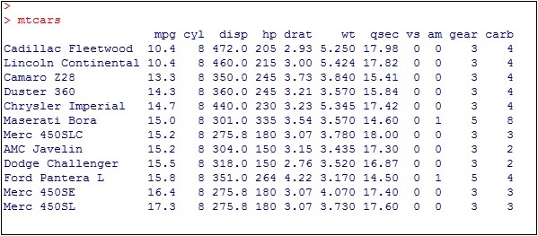
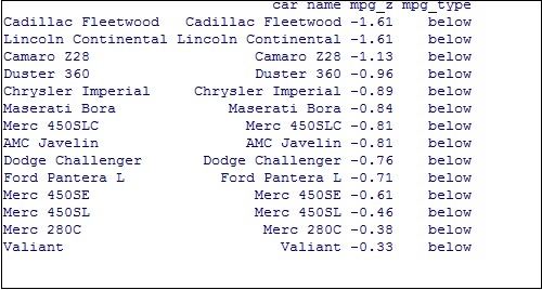
#Load ggplot
> library(ggplot2)
> # create new column for car names
> mtcars$`car name` <- rownames(mtcars)
> # compute normalized mpg
> mtcars$mpg_z <- round((mtcars$mpg - mean(mtcars$mpg))/sd(mtcars$mpg), 2)
> # above / below avg flag
> mtcars$mpg_type <- ifelse(mtcars$mpg_z < 0, "below", "above")
> # sort
> mtcars <- mtcars[order(mtcars$mpg_z), ]
The above computation involves creating a new column for car names, computing the normalized dataset with the help of round function. We can also use above and below avg flag to get the values of “type” functionality. Later, we sort the values to create the required dataset.
The output received is as follows −
Convert the values to factor to retain the sorted order in a particular plot as mentioned below −
> # convert to factor to retain sorted order in plot.
> mtcars$`car name` <- factor(mtcars$`car name`, levels = mtcars$`car name`)
The output obtained is mentioned below −
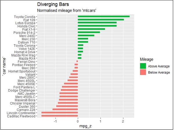
Diverging Bar Chart
Now create a diverging bar chart with the mentioned attributes which is taken as required co-ordinates.
> # Diverging Barcharts
> ggplot(mtcars, aes(x=`car name`, y=mpg_z, label=mpg_z)) +
+ geom_bar(stat='identity', aes(fill=mpg_type), width=.5) +
+ scale_fill_manual(name="Mileage",
+    labels = c("Above Average", "Below Average"),
+    values = c("above"="#00ba38", "below"="#f8766d")) +
+ labs(subtitle="Normalised mileage from 'mtcars'",
+    title= "Diverging Bars") +
+ coord_flip()
Note − A diverging bar chart marks for some dimension members pointing to up or down direction with respect to mentioned values.
The output of diverging bar chart is mentioned below where we use function geom_bar for creating a bar chart −
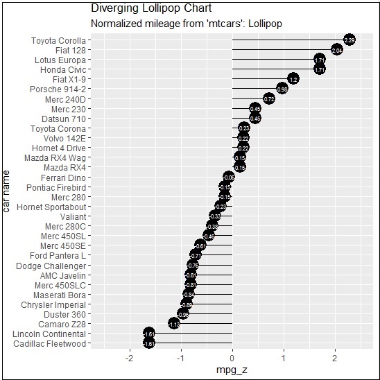
Diverging Lollipop Chart
Create a diverging lollipop chart with same attributes and co-ordinates with only change of function to be used, i.e. geom_segment() which helps in creating the lollipop charts.
> ggplot(mtcars, aes(x=`car name`, y=mpg_z, label=mpg_z)) +
+ geom_point(stat='identity', fill="black", size=6) +
+ geom_segment(aes(y = 0,
+    x = `car name`,
+    yend = mpg_z,
+    xend = `car name`),
+       color = "black") +
+ geom_text(color="white", size=2) +
+ labs(title="Diverging Lollipop Chart",
+    subtitle="Normalized mileage from 'mtcars': Lollipop") +
+ ylim(-2.5, 2.5) +
+ coord_flip()
Diverging Dot Plot
Create a diverging dot plot in similar manner where the dots represent the points in scattered plots in bigger dimension.
> ggplot(mtcars, aes(x=`car name`, y=mpg_z, label=mpg_z)) +
+  geom_point(stat='identity', aes(col=mpg_type), size=6) +
+  scale_color_manual(name="Mileage",
+     labels = c("Above Average", "Below Average"),
+     values = c("above"="#00ba38", "below"="#f8766d")) +
+ geom_text(color="white", size=2) +
+ labs(title="Diverging Dot Plot",
+     subtitle="Normalized mileage from 'mtcars': Dotplot") +
+ ylim(-2.5, 2.5) +
+ coord_flip()
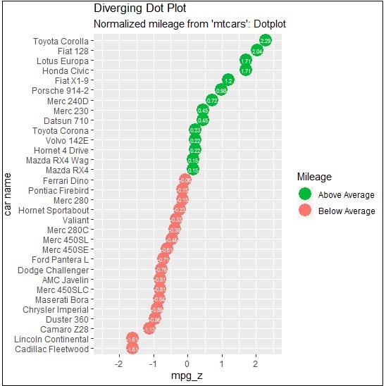
Here, the legends represent the values “Above Average” and “Below Average” with distinct colors of green and red. Dot plot convey static information. The principles are same as the one in Diverging bar chart, except that only point are used.