- ggplot2 Tutorial
- ggplot2 - Home
- ggplot2 - Introduction
- ggplot2 - Installation of R
- ggplot2 - Default Plot in R
- ggplot2 - Working with Axes
- ggplot2 - Working with Legends
- ggplot2 - Scatter Plots & Jitter Plots
- ggplot2 - Bar Plots & Histograms
- ggplot2 - Pie Charts
- ggplot2 - Marginal Plots
- ggplot2 - Bubble Plots & Count Charts
- ggplot2 - Diverging Charts
- ggplot2 - Themes
- ggplot2 - Multi Panel Plots
- ggplot2 - Multiple Plots
- ggplot2 - Background Colors
- ggplot2 - Time Series
- ggplot2 Useful Resources
- ggplot2 - Quick Guide
- ggplot2 - Useful Resources
- ggplot2 - Discussion
ggplot2 - Bar Plots & Histograms
Bar plots represent the categorical data in rectangular manner. The bars can be plotted vertically and horizontally. The heights or lengths are proportional to the values represented in graphs. The x and y axes of bar plots specify the category which is included in specific data set.
Histogram is a bar graph which represents the raw data with clear picture of distribution of mentioned data set.
In this chapter, we will focus on creation of bar plots and histograms with the help of ggplot2.
Understanding MPG Dataset
Let us understand the dataset which will be used. Mpg dataset contains a subset of the fuel economy data that the EPA makes available in the below link −
It consists of models which had a new release every year between 1999 and 2008. This was used as a proxy for the popularity of the car.
Following command is executed to understand the list of attributes which is needed for dataset.
> library(ggplot2)
The attaching package is ggplot2.
The following object is masked _by_ .GlobalEnv −
mpg
Warning messages
- package arules was built under R version 3.5.1
- package tuneR was built under R version 3.5.3
- package ggplot2 was built under R version 3.5.3
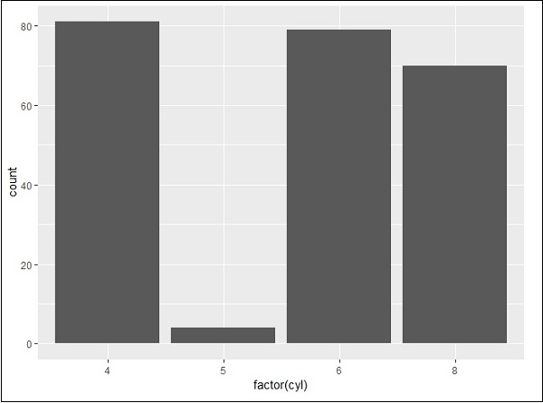
Creating Bar Count Plot
The Bar Count plot can be created with below mentioned plot −
> # A bar count plot
> p <- ggplot(mpg, aes(x=factor(cyl)))+
+    geom_bar(stat="count")
> p
geom_bar() is the function which is used for creating bar plots. It takes the attribute of statistical value called count.
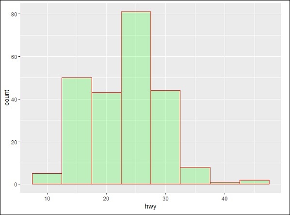
Histogram
The histogram count plot can be created with below mentioned plot −
> # A historgram count plot
> ggplot(data=mpg, aes(x=hwy)) +
+    geom_histogram( col="red",
+       fill="green",
+       alpha = .2,
+       binwidth = 5)
geom_histogram() includes all the necessary attributes for creating a histogram. Here, it takes the attribute of hwy with respective count. The color is taken as per the requirements.
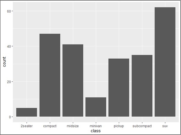
Stacked Bar Chart
The general plots of bar graphs and histogram can be created as below −
> p <- ggplot(mpg, aes(class))
> p + geom_bar()
> p + geom_bar()
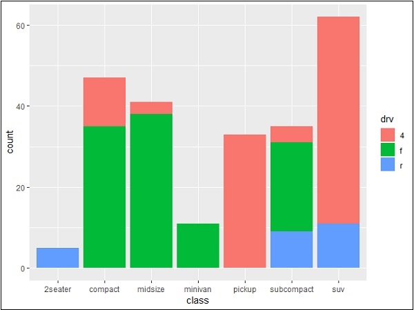
This plot includes all the categories defined in bar graphs with respective class. This plot is called stacked graph.