- ggplot2 Tutorial
- ggplot2 - Home
- ggplot2 - Introduction
- ggplot2 - Installation of R
- ggplot2 - Default Plot in R
- ggplot2 - Working with Axes
- ggplot2 - Working with Legends
- ggplot2 - Scatter Plots & Jitter Plots
- ggplot2 - Bar Plots & Histograms
- ggplot2 - Pie Charts
- ggplot2 - Marginal Plots
- ggplot2 - Bubble Plots & Count Charts
- ggplot2 - Diverging Charts
- ggplot2 - Themes
- ggplot2 - Multi Panel Plots
- ggplot2 - Multiple Plots
- ggplot2 - Background Colors
- ggplot2 - Time Series
- ggplot2 Useful Resources
- ggplot2 - Quick Guide
- ggplot2 - Useful Resources
- ggplot2 - Discussion
ggplot2 - Scatter Plots & Jitter Plots
Scatter Plots are similar to line graphs which are usually used for plotting. The scatter plots show how much one variable is related to another. The relationship between variables is called as correlation which is usually used in statistical methods. We will use the same dataset called “Iris” which includes a lot of variation between each variable. This is famous dataset which gives measurements in centimeters of the variables sepal length and width with petal length and width for 50 flowers from each of 3 species of iris. The species are called Iris setosa, versicolor and virginica.
Creating Basic Scatter Plot
Following steps are involved for creating scatter plots with “ggplot2” package −
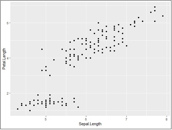
For creating a basic scatter plot following command is executed −
> # Basic Scatter Plot
> ggplot(iris, aes(Sepal.Length, Petal.Length)) +
+    geom_point()
Adding attributes
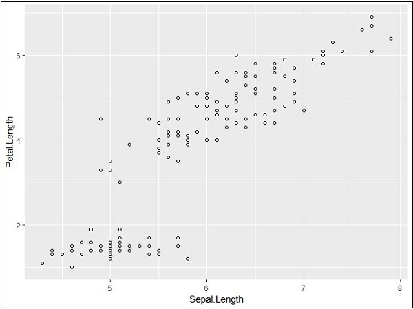
We can change the shape of points with a property called shape in geom_point() function.
> # Change the shape of points
> ggplot(iris, aes(Sepal.Length, Petal.Length)) +
+    geom_point(shape=1)
We can add color to the points which is added in the required scatter plots.
> ggplot(iris, aes(Sepal.Length, Petal.Length, colour=Species)) +
+    geom_point(shape=1)
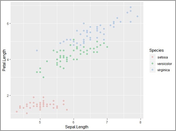
In this example, we have created colors as per species which are mentioned in legends. The three species are uniquely distinguished in the mentioned plot.
Now we will focus on establishing relationship between the variables.
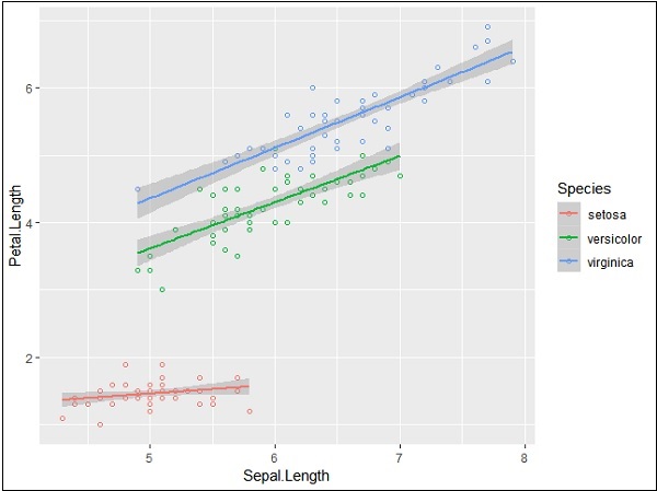
> ggplot(iris, aes(Sepal.Length, Petal.Length, colour=Species)) +
+    geom_point(shape=1) +
+    geom_smooth(method=lm)
geom_smooth function aids the pattern of overlapping and creating the pattern of required variables.
The attribute method “lm” mentions the regression line which needs to be developed.
> # Add a regression line
> ggplot(iris, aes(Sepal.Length, Petal.Length, colour=Species)) +
+    geom_point(shape=1) +
+    geom_smooth(method=lm)
We can also add a regression line with no shaded confidence region with below mentioned syntax −
># Add a regression line but no shaded confidence region
> ggplot(iris, aes(Sepal.Length, Petal.Length, colour=Species)) +
+    geom_point(shape=1) +
+    geom_smooth(method=lm, se=FALSE)
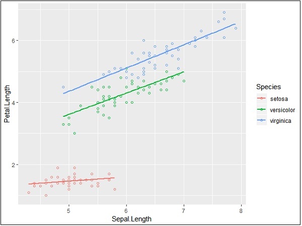
Shaded regions represent things other than confidence regions.
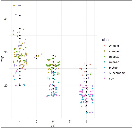
Jitter Plots
Jitter plots include special effects with which scattered plots can be depicted. Jitter is nothing but a random value that is assigned to dots to separate them as mentioned below −
> ggplot(mpg, aes(cyl, hwy)) +
+    geom_point() +
+    geom_jitter(aes(colour = class))