- Excel Power View Tutorial
- Excel Power View - Home
- Overview
- Creation
- Sheet
- Visualizations
- Table Visualization
- Matrix Visualization
- Card Visualization
- Chart Visualizations
- Line Chart Visualization
- Bar Chart Visualization
- Column Chart Visualization
- Scatter & Bubble Chart Visualization
- Pie Chart Visualization
- Map Visualization
- Multiple Visualizations
- Tiles Visualizations
- Advanced Features
- Excel Power View and Data Model
- Hierarchies
- Key Performance Indicators
- Formatting a Report
- Sharing
- Excel Power View Useful Resources
- Excel Power View - Quick Guide
- Excel Power View - Useful Resources
- Excel Power View - Discussion
Scatter and Bubble Chart Visualization
You can use Scatter Charts and Bubble Charts to display many related data in one Chart. In both these charts, the X-axis displays one numeric field and the y-axis displays another, making it easy to see the relationship between the two values for all the items in the chart. In Bubble charts, a third numeric field controls the size of the data points.
As you are aware from the previous chapters, you need to start with a Table and then convert it to Scatter Chart visualization.
Select the fields – Sport, Medal Count and Event. By default, Table will be displayed.
Click the arrow next to Event in the Power View Fields list.
Click Count (Distinct).
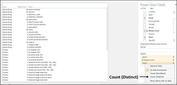
The field Event changes to the numeric field Count of Event.
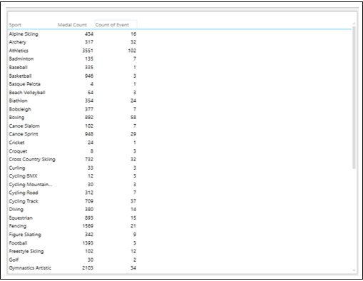
There is one category field Sport, and two numeric fields, Medal Count and Count of Event.
Switching to Scatter Chart Visualization
Convert the Table to Scatter Chart as follows −
- Click on the Table.
- Click the DESIGN tab.
- Click Other Chart in the Switch Visualization group.
- Select Scatter from the dropdown list.
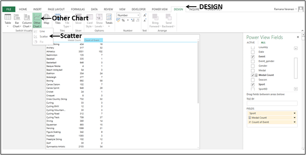
The Table will be converted to Scatter Chart.
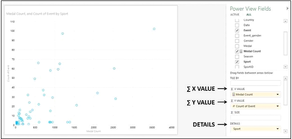
You will observe the following −
The data points are displayed as circles of same size, showing how the Count of Event and Medal Count values are related for each sport.
Medal Count is displayed on X-Axis and Count of Event on Y-Axis.
Medal Count is placed under area - ∑ X VALUE in the Power View Fields pane.
Count of Event is placed under area - ∑ Y VALUE in the Power View Fields pane.
Sport is placed under area - DETAILS in the Power View Fields pane.
Adding Data Labels to Scatter Chart
Add Data Labels to the data points in the Scatter Chart as follows −
- Click on the LAYOUT tab on the Ribbon.
- Click on Data Labels in the Labels group.
- Select Right from the drop down list.
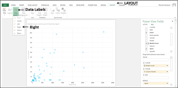
Data Labels appear for the data points.

You will observe the following −
Data Labels appear to the right of the data points, as you have chosen Right.
The sport wrestling has less number of medals in more number of events as compared to the sport, rowing that has more number of medals in less number of events.
Converting to Bubble Chart Visualization
You can convert the Scatter Chart visualization to Bubble Chart visualization by adding a third numeric field that controls the size of the data points.
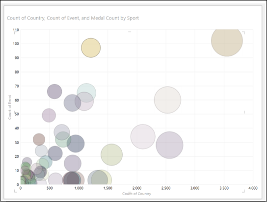
Drag Country to ∑ Size area. The Scatter chart will be converted to Bubble Chart.
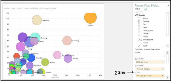
- Drag Medal Count to ∑ Size area.
- Drag Country to ∑ X VALUE area.
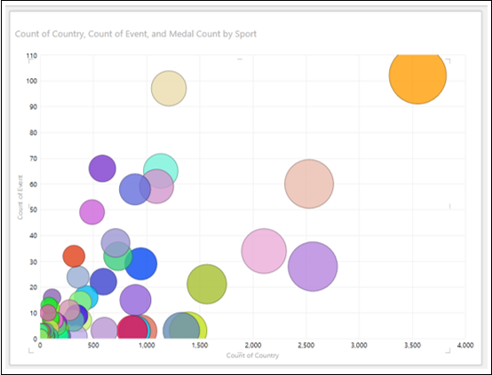
The Count of Country will be displayed on X-Axis and Count of Event on Y-Axis. Size of each Bubble shows Medal Count. The Data Labels show the Sport.
Exploring Data with Bubble Chart Visualization
You can explore data with Bubble Chart in several ways. You will understand the various methods that you can use for data visualization and exploration with Bubble Chart in this section and the subsequent sections.
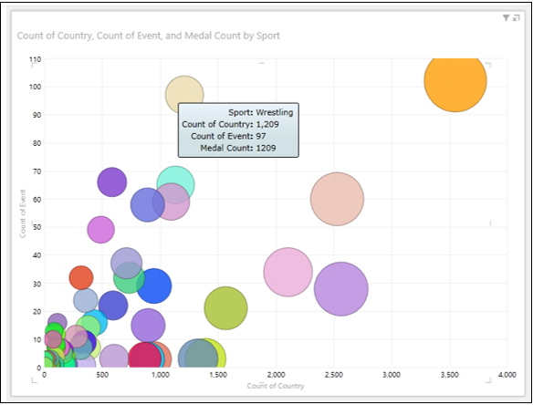
Place the cursor on a Bubble. The values of that data point will be displayed next to the Bubble.
Click on the Bubble. Only that particular Bubble will be highlighted. All the other Bubbles will be inactive.
Visualization with Colors
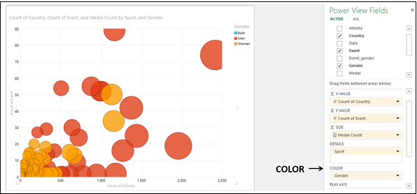
You can explore the data by adding color to a category, so that the bubbles are colored according to the category values −
Drag the field Gender to COLOR area in the Power View Fields pane. The Bubbles will be colored by the values of Gender. Gender appears in the Legend.
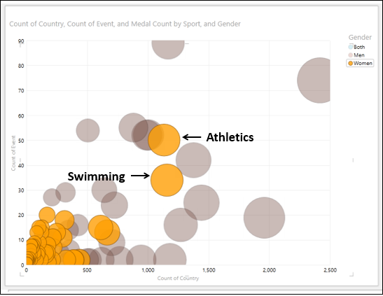
Click on the value – Women in the Legend.
You will observe the following −
In the Legend, the selected value – Women is highlighted.
In the Chart, all the Bubbles with value – Women are highlighted and all the other Bubbles will get greyed.
From the highlighted Bubbles, you can find that for the Sports – Athletics and Swimming, Women got highest number of Medals. You can find the values of these data points by placing the cursor on them.
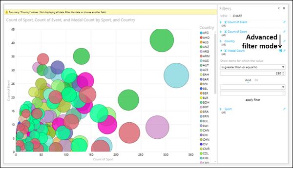
Filtering in Bubble Chart
To filter the data in Bubble Chart, proceed as follows −
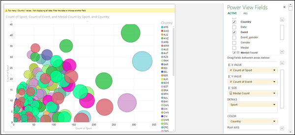
- Drag Sport to ∑ X VALUE area.
- Drag Event to ∑ Y VALUE area.
- Drag Medal Count to ∑ SIZE area.
- Drag Country to COLOR area.
You will observe the following −
The Bubbles are colored by the values of the field – Country.
The field – Country appears in the Legend.
A warning message is displayed on the top of Chart - Too many ‘Country’ values. Not displaying all data. Filter the data or choose another field.
Filter the data as follows −
- In the Filters area, click Medal Count.
- Click Advanced Filter mode on the right side.
- Set the filter criteria to – Medal Count is greater than or equal to 250.
Click Apply filter. The data in the Bubble Chart will be filtered to display only the data points satisfying the set filter criteria.
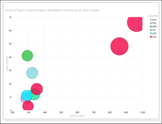
After applying the filter, the number of values in the Legend is few and that is accepted by Power View.
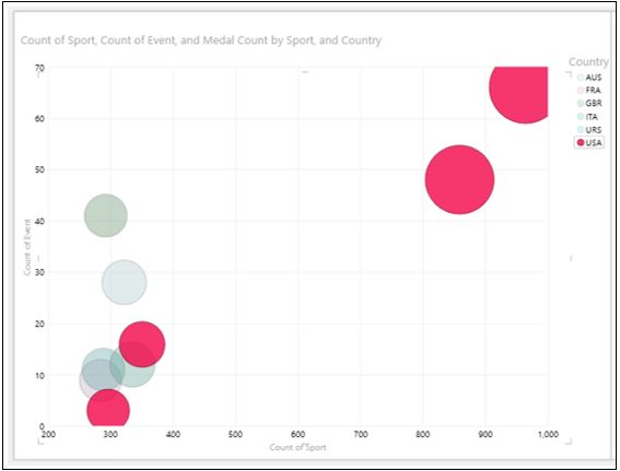
Click on the value – USA in the Legend. Bubbles that correspond to the Country value – USA will be highlighted. All the other Bubbles will become inactive.
Combination of Bubble Chart and Table Visualizations
You can view the interactive features of Bubble Chart visualization by placing a Table on the same Power View.
- Create a Table with the fields – Country, Sport, and Medal Count.
- Filter the Table with the same filter criteria as that in Bubble Chart.
- Adjust the sizes and positions of Bubble Chart and Table to appear as shown below.
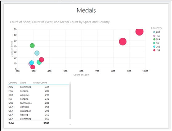
Click USA in the Legend.
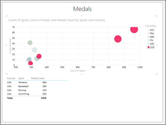
You will observe the following −
The data points corresponding to the value selected in the Legend are highlighted. All other Bubbles are greyed out.
The table shows the values of the data points that are highlighted in the Bubble Chart.
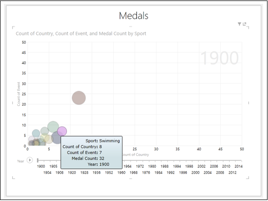
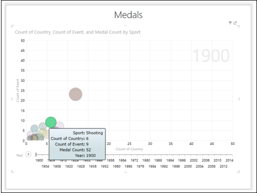
Visualization with Play Axis
Another powerful feature that you can use in the data exploration in Bubble Chart is the Play Axis. You can visualize the data changes over a period of time using Play Axis.
Drag the field Country to ∑ X VALUE area in the Power View Fields pane.
Drag the field Year to PLAY AXIS area. A timeline with a Play button will be inserted in your Bubble Chart.
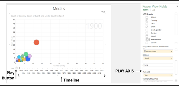
The timeline spans from Year 1900 to Year 2014, for which you have data in your Data Model.
Click the Play Button.
The bubbles travel, grow, and shrink to show how the values change based on the play axis. A small vertical line appears on the timeline that moves across the timeline. The Time value, Year in this case will be displayed at the top right corner of the Chart that changes as the timeline progresses.
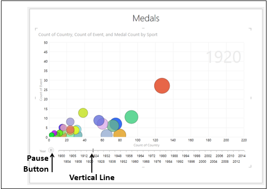
Click the Pause Button. You can view the data at that point of time. The Time value, Year, at that point of time will be displayed at the top right corner of the Chart.
Click and drag the vertical line to the left or right, to a point of time of your interest. You can view the data at that point of time.
You can adjust the timeline by filtering the Year field values in the Filters area. This would be useful if you want to focus on a particular time range or if the timeline is too wide.
Suppose you want to visualize the data changes during the period 2004 – 2014.
Set the filter for Year in Range filter mode to 2004 – 2014 in the Filters area. The timeline changes to display the selected range that has fewer values.
Click the Play Button.
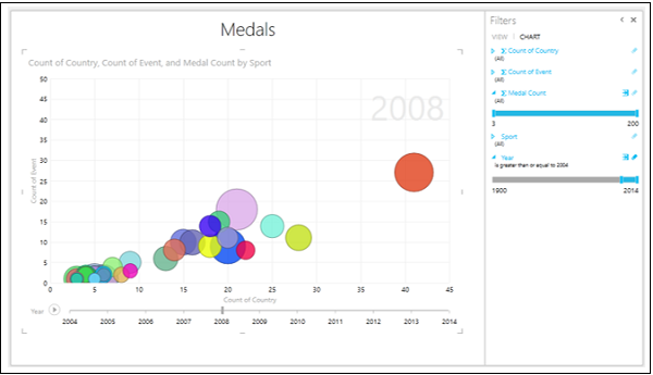
You will have a more detailed view of the data that is in the restricted window of the timeline. You can pause at any point to study the data in more detail.
You can also view the history in the trail that a bubble has followed over time.
Click on the Bubble that represents the sport- Swimming. Only that Bubble will be highlighted and all other Bubbles will be inactive.
Click the Play Button.
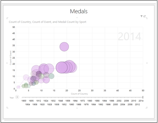
You can see the trail that the bubble have followed over time.
Click on the Bubble that represents the sport- Shooting. Only that Bubble will be highlighted and all other Bubbles will become inactive.
Click the Play button.
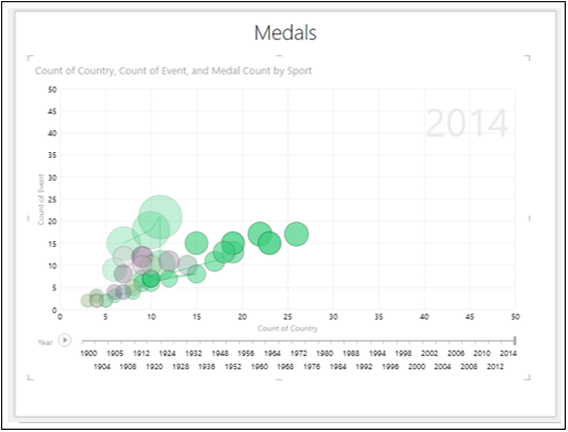
You can the trail that the bubble has followed over time.