- Excel Power View Tutorial
- Excel Power View - Home
- Overview
- Creation
- Sheet
- Visualizations
- Table Visualization
- Matrix Visualization
- Card Visualization
- Chart Visualizations
- Line Chart Visualization
- Bar Chart Visualization
- Column Chart Visualization
- Scatter & Bubble Chart Visualization
- Pie Chart Visualization
- Map Visualization
- Multiple Visualizations
- Tiles Visualizations
- Advanced Features
- Excel Power View and Data Model
- Hierarchies
- Key Performance Indicators
- Formatting a Report
- Sharing
- Excel Power View Useful Resources
- Excel Power View - Quick Guide
- Excel Power View - Useful Resources
- Excel Power View - Discussion
Excel Power View - Line Chart Visualization
Line Charts are used for comparing data points in one or more data series. Line Charts distribute category data evenly along the horizontal (category) axis, and all numerical value data along the vertical (value) axis.
As you are aware from the previous chapters, you need to start with a Table and then convert it to Line Chart.
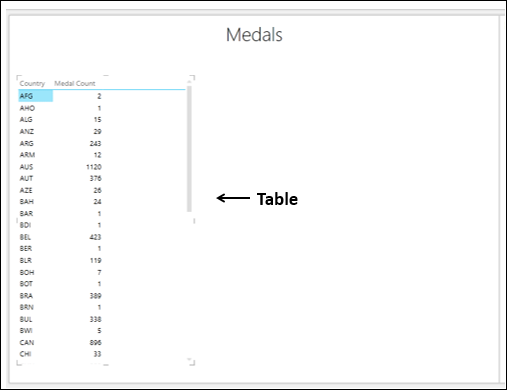
Select the fields – Country and Medal Count. By default, Table will be displayed.
Switching to Line Chart Visualization
Convert the Table to Line Chart as follows −
Click on the Table.
Click the DESIGN tab.
Click Other Chart in the Switch Visualization group.
Select Line from the dropdown list.
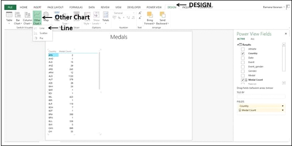
The Table is converted to Line Chart.
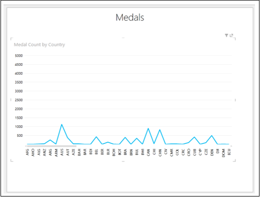
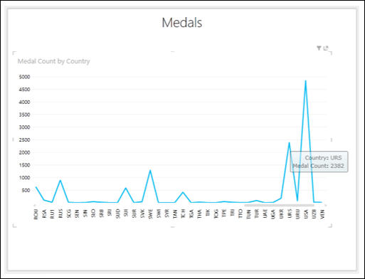
The category data is displayed along the horizontal axis and numerical value data along the vertical axis.
Exploring Data with Line Chart Visualization
The categories are distributed evenly along the x-axis and all the categories (countries in this case) are not visible in the display. To view the categories that are not in the display, do the following −
- Click and hold on the Line or the Category (x-axis) axis.
- Drag to left or right.
The categories to the left or right will be displayed and Line Chart will be displayed accordingly.
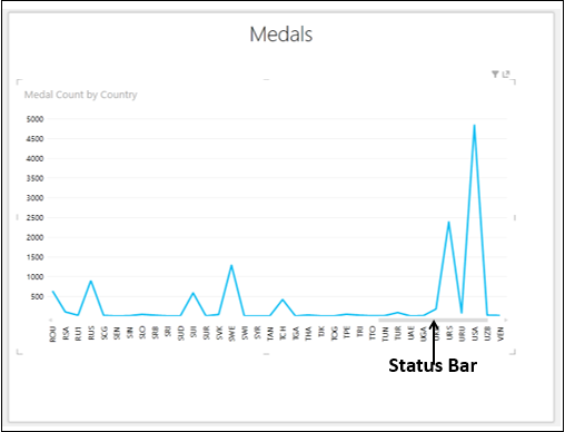
The Status Bar shows you the position of the current display as compared to the complete category range. You can drag the Status Bar to the left or right to display the categories that are on the left or right side of the current display.
You might want to know the data values of a data point on the Line Chart.
Place the cursor on the data point on the Line Chart. The values corresponding to that data point will be displayed at that point.