- Excel Power View Tutorial
- Excel Power View - Home
- Overview
- Creation
- Sheet
- Visualizations
- Table Visualization
- Matrix Visualization
- Card Visualization
- Chart Visualizations
- Line Chart Visualization
- Bar Chart Visualization
- Column Chart Visualization
- Scatter & Bubble Chart Visualization
- Pie Chart Visualization
- Map Visualization
- Multiple Visualizations
- Tiles Visualizations
- Advanced Features
- Excel Power View and Data Model
- Hierarchies
- Key Performance Indicators
- Formatting a Report
- Sharing
- Excel Power View Useful Resources
- Excel Power View - Quick Guide
- Excel Power View - Useful Resources
- Excel Power View - Discussion
Excel Power View - Chart Visualizations
In Power View, you have a number of Chart options. The Charts in Power View are interactive. Further, the Charts are interactive in a presentation setting also, which would enable you to highlight the analysis results interactively.
In this chapter, you will have an overview of the Chart visualizations. You will learn them in detail in the subsequent chapters.
Types of Chart Visualizations
In Power View, you have the following types of Chart visualizations −
- Line
- Bar
- Column
- Scatter
- Bubble
- Pie
Line, Bar and Column Charts
You can use Line, Bar and Column charts for comparing data points in one or more data series.
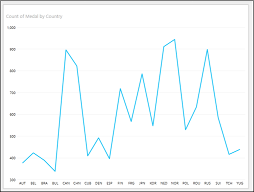
Line Chart
In a Line Chart, categories are along the horizontal axis and values along the vertical axis.
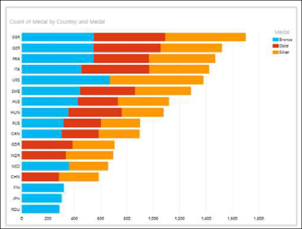
Bar Chart
In a Bar Chart, categories are along the vertical axis and values along the horizontal axis.
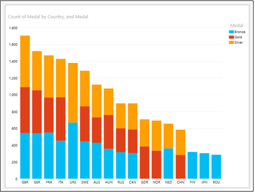
Column Chart
In a Column Chart, categories are along the horizontal axis and values along the vertical axis.
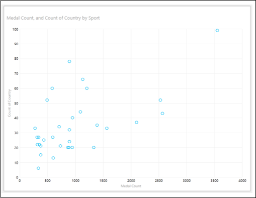
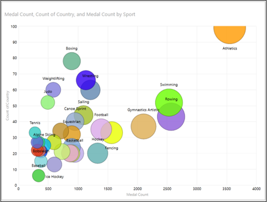
Scatter and Bubble Charts
You can use Scatter Charts and Bubble Charts to display many related data in one Chart. In Scatter Charts and Bubble Charts, the x-axis displays one numeric field and the y-axis displays another. In Bubble Charts, a third numeric field controls the size of the data points.
Scatter Chart − A scatter chart is shown below −
Bubble Chart − A bubble chart is shown below −
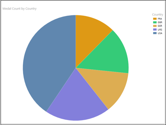
Pie Charts
In a Pie Chart, the numeric field can be shown by the Pie slice size, and categories by colors.
In Power View, Pie Charts can be simple or sophisticated. In a sophisticated Pie Chart, you can have the following additional features −
- Drill down when you double-click a Pie slice.
- Show sub-slices within the larger Pie slices.
Pie Chart − A Pie chart is shown below −
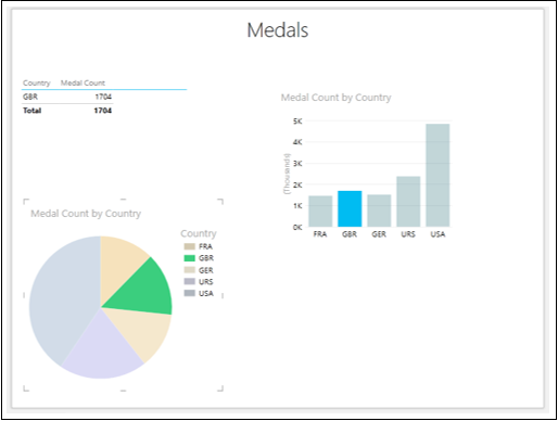
Interactive Nature of Chart Visualizations
The Charts in Power View are interactive. If you click on a value in one Chart −
- That value in that Chart is highlighted.
- That value in all the other Charts in Power View is also highlighted.
- All the Tables, Matrices and Tiles in Power View are filtered to that value.
You will learn more about this and other additional interactive features such as Play Axis, Colors, and Tiles in subsequent chapters.