- Excel Power View Tutorial
- Excel Power View - Home
- Overview
- Creation
- Sheet
- Visualizations
- Table Visualization
- Matrix Visualization
- Card Visualization
- Chart Visualizations
- Line Chart Visualization
- Bar Chart Visualization
- Column Chart Visualization
- Scatter & Bubble Chart Visualization
- Pie Chart Visualization
- Map Visualization
- Multiple Visualizations
- Tiles Visualizations
- Advanced Features
- Excel Power View and Data Model
- Hierarchies
- Key Performance Indicators
- Formatting a Report
- Sharing
- Excel Power View Useful Resources
- Excel Power View - Quick Guide
- Excel Power View - Useful Resources
- Excel Power View - Discussion
Excel Power View - Map Visualization
You can use Maps to display your data in the context of geography. Maps in Power View use Bing map tiles, so you can zoom and pan as you would with any other Bing map. To make maps work, Power View has to send the data to Bing through a secured web connection for geocoding. Therefore, it asks you to enable content, adding locations and values places dots on the map. The larger the value, the bigger will be the dot. When you add a multi-value series, you will get Pie charts for data points on the map, with the size of the Pie Chart showing the size of the total.
Your data has a geographic field Country that can be used for Map visualization. To create a Map visualization for the Medal Count with Country values, proceed as follows −
- Click the POWERVIEW tab on the Ribbon.
- Click Power View in the Insert group.
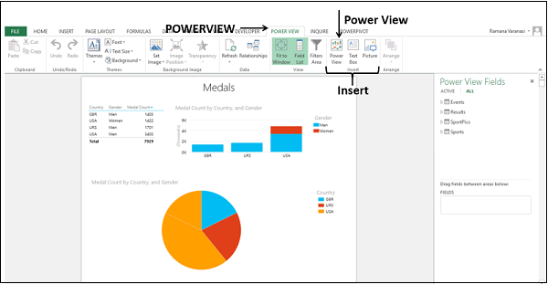
A new Power View sheet will be created in the workbook.
Setting Data Category for Geographic Field
To set the data category for Geographic Field proceed as follows −
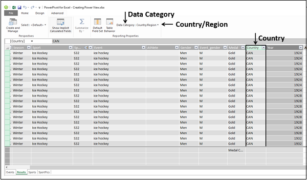
Select the fields – Country and Medal Count. By default, Table will be displayed.
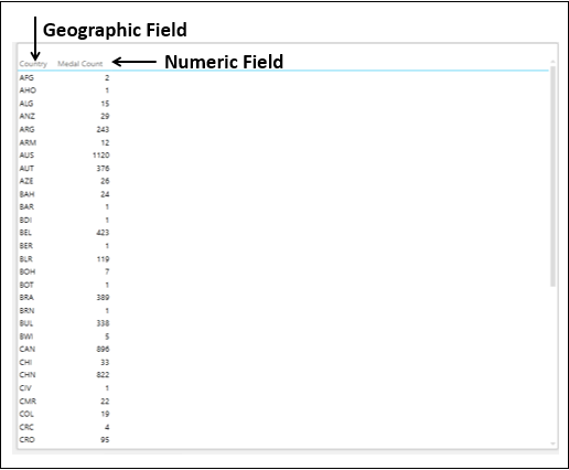
You have a geographic field and a numeric field.
You need to set the category of the field Country for Power View to create reports dynamically.
Click the POWERPIVOT tab on the Ribbon.
Click Manage in the Data Model group. The Power Pivot window appears.
Click the Results tab. Select the Country field.
Click the Advanced tab on the Ribbon.
Click Data Category.
Select Country/Region from the dropdown list.
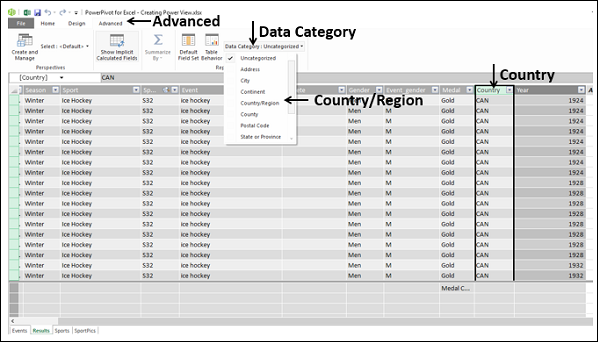
The Data Category of the field Country will be set as Country/Region.
Click on the Power View sheet. A small globe icon appears beside the field Country in the Results table in the Power View fields list. This indicates that the field Country contains a geographic location.
Switching to Map Visualization
Convert the Table to Map visualization as follows −
Click on the Table.
Click the DESIGN tab.
Click Map in the Switch Visualization group.
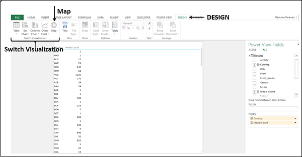
The Table visualization will be converted to Map visualization.
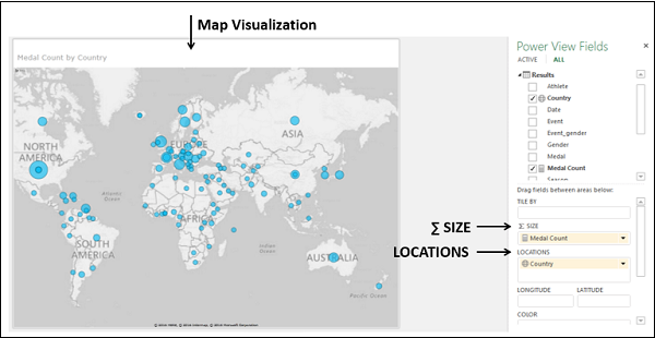
Power View creates a Map with a dot representing each geographic location, Country. The size of the dot is the value of the corresponding numeric field Medal Count.
In the Power View Fields pane, the geographic field Country is in the LOCATIONS area and the numeric field Medal Count is in the ∑ SIZE area
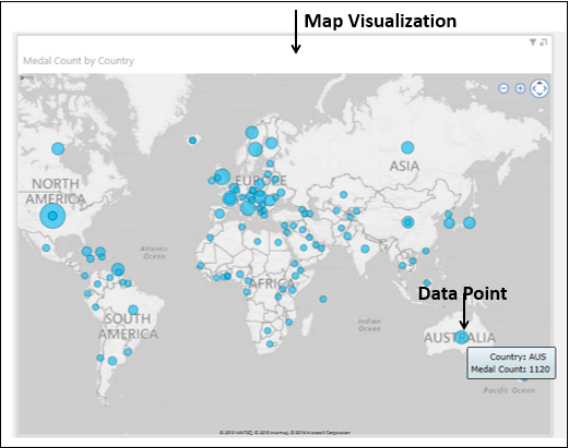
To display more information about a data point, you can do one of the following −
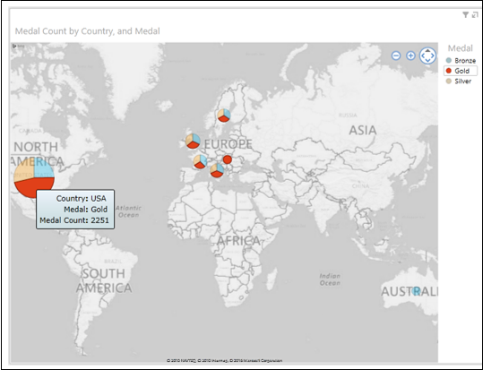
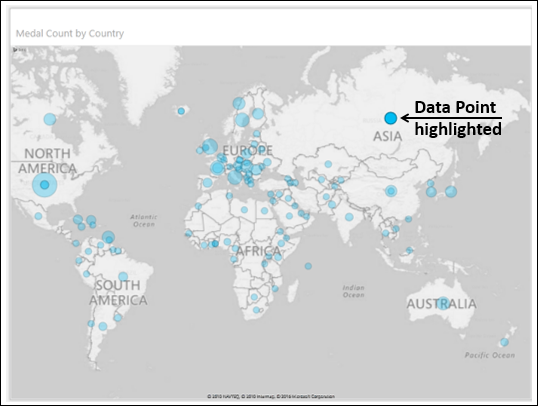
Step 1 − Place the cursor on a dot on the Map. A box appears displaying the geographic location name and the corresponding numeric value.
Step 2 − Click on a dot on the Map. That particular dot will be highlighted and all other dots will become inactive.
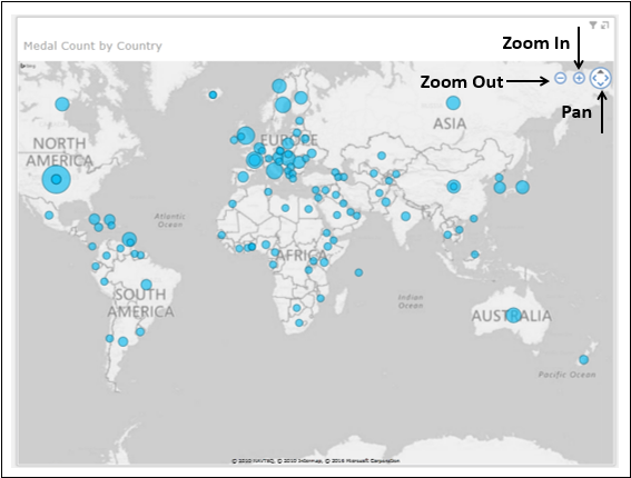
Zooming and Panning in Map
You can find the zoom in, zoom out, pan buttons on the top right corner of the Map when you hover the mouse on that area.
Pie Charts in Map Visualization
Suppose you want to add another field to the Map visualization. For example, you might want to display the medal types – Gold, Silver, and Bronze. You can do it as follows −
Drag the field Medal to the COLOR area in the Power View Fields pane. The dots will be converted to Pie Charts.
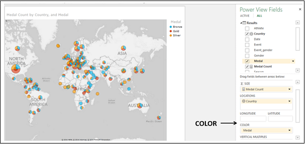
A Legend for Medal appears displaying the types of medals and respective colors. Each color in the Pie Charts represents the type of the medal as given in the Legend.
You can also observe that the size of a Pie Chart corresponds to the Medal Count and the size of each slice in the Pie Chart corresponds to the count of that medal type.
Exploring Data with Pie Charts in Map Visualization
You can filter your data and highlight a significant data point as follows −
In the Filters area, set the Medal Count to display only the values greater than or equal to 400.
Apply the filter. The Map zooms and displays only the filtered values.
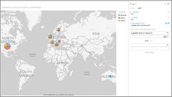
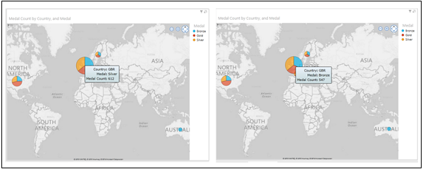
Place the cursor on the Pie Chart representing Great Britain and the details of the Pie Chart will be displayed.
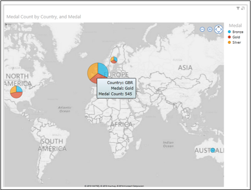
You can see that the gold Medal Count for Great Britain is 545. You can find the silver Medal Count and bronze Medal Count for Great Britain by placing the cursor on those slices on the Pie Chart.
Highlighting a Pie Slice in Map Visualization
You might want to highlight the gold Medal Count of all countries
Click on Gold in the Legend.
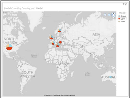
The Pie slices representing Gold in all Pie Charts are highlighted. The other Pie slices in all the other Pie Charts are inactive.
Place the cursor on any Pie Chart on the Map. The Pie slice representing gold will be highlighted. The details of the Pie slice will be displayed.