- Advanced Excel Charts Tutorial
- Advanced Excel Charts - Home
- Advanced Excel - Introduction
- Advanced Excel - Waterfall Chart
- Advanced Excel - Band Chart
- Advanced Excel - Gantt Chart
- Advanced Excel - Thermometer
- Advanced Excel - Gauge Chart
- Advanced Excel - Bullet Chart
- Advanced Excel - Funnel Chart
- Advanced Excel - Waffle Chart
- Advanced Excel Charts - Heat Map
- Advanced Excel - Step Chart
- Box and Whisker Chart
- Advanced Excel Charts - Histogram
- Advanced Excel - Pareto Chart
- Advanced Excel - Organization Chart
- Advanced Excel Charts Resources
- Advanced Excel Charts - Quick Guide
- Advanced Excel Charts - Resources
- Advanced Excel Charts - Discussion
Advanced Excel - Pareto Chart
Pareto chart is widely used in Statistical Analysis for decision-making. It represents the Pareto principle, also called the 80/20 Rule.
Pareto Principle (80/20 Rule)
Pareto principle, also called the 80/20 Rule means that 80% of the results are due to 20% of the causes. For example, 80% of the defects can be attributed to the key 20% of the causes. It is also termed as vital few and trivial many.
Vilfredo Pareto conducted surveys and observed that 80% of income in most of the countries went to 20% of the population.
Examples of Pareto Principle (80/20 Rule)
The Pareto principle or the 80/20 Rule can be applied to various scenarios −
- 80% of customer complaints arise from 20% of your supplies.
- 80% of schedule delays result from 20% of the key causes.
- 80% of a company profit can be attributed to 20% of its products.
- 80% of a company revenues are produced by 20% of the employees.
- 80% of the system problems are caused by 20% of causes of defects.
What is a Pareto Chart?
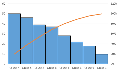
A Pareto chart is a combination of a Column chart and a Line chart. The Pareto chart shows the Columns in descending order of the Frequencies and the Line depicts the cumulative totals of Categories.
A Pareto chart will be as shown below −
Advantages of Pareto Charts
You can use a Pareto chart for the following −
- To analyze data about the frequency of problems in a process.
- To identify the significant causes for problems in a process.
- To identify the significant areas of defects in a product.
- To understand the significant bottlenecks in a process pipeline.
- To identify the largest issues being faced by a team or an organization.
- To know the top few reasons for employee attrition.
- To identify the topmost products that result in high profit.
- To decide on the significant improvements that increase the value of a company.
Preparation of Data
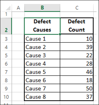
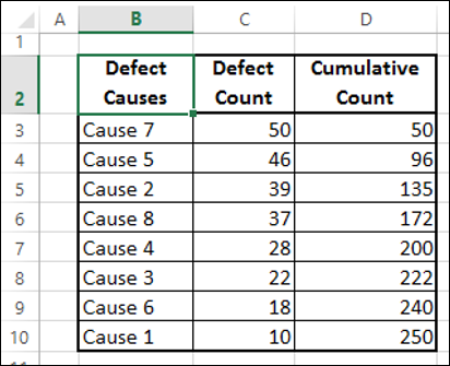
Consider the following data, where the defect causes and the respective counts are given.
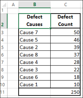
Step 1 − Sort the table by the column - Defect Count in descending order (Largest to Smallest).
Step 2 − Create a column Cumulative Count as given below −
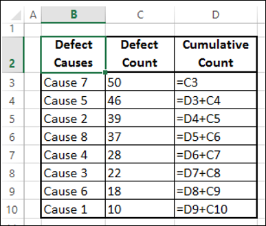
This would result in the following table −
Step 3 − Sum the column Defect Count.
Step 4 − Create a column Cumulative % as given below.
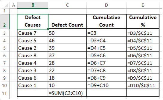
Step 5 − Format the column Cumulative % as Percentage.
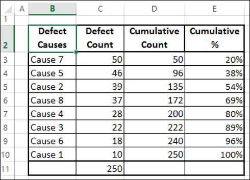
You will use this table to create a Pareto chart.
Creating a Pareto Chart
By creating a Pareto chart, you can conclude what are the key causes for the defects. In Excel, you can create a Pareto chart as a combo chart of Column chart and Line chart.
Following are the steps to create Pareto chart −
Step 1 − Select the columns Defect Causes and Defect Count in the table.
Step 2 − Insert a Clustered Column chart.
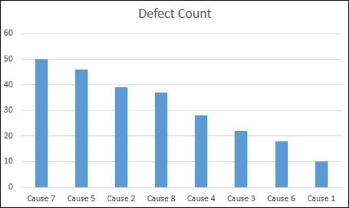
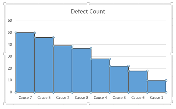
Step 3 − As you can see, the columns representing causes are in descending order. Format the chart as follows.
- Right click on the Columns and click on Format Data Series.
- Click SERIES OPTIONS in the Format Data Series pane.
- Change the Gap Width to 0 under SERIES OPTIONS.
- Right click on the Columns and select Outline.
- Select a dark color and a Weight to make the border conspicuous.
Your chart will be as shown below.
Step 4 − Design the chart as follows.
- Click on the chart.
- Click the DESIGN tab on the Ribbon.
- Click Select Data in the Data group. The Select Data Source dialog box appears.
- Click the Add button.
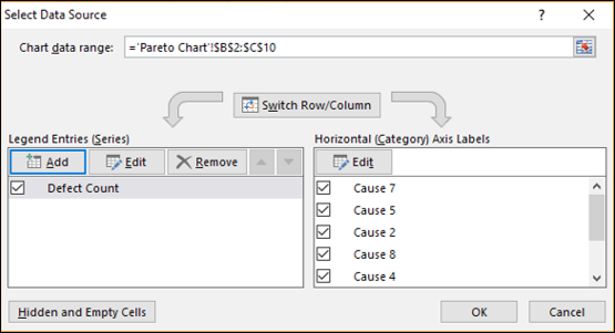
The Edit Series dialog box appears.
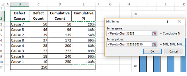
Step 5 − Click on the cell – Cumulative % for Series name.
Step 6 − Select the data in Cumulative % column for Series values. Click OK.
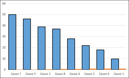
Step 7 − Click OK in the Select Data Source dialog box. Your chart will be as shown below.
Step 8 − Click the DESIGN tab on the Ribbon.
Step 9 − Click Change Chart Type in the Type group.
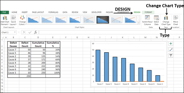
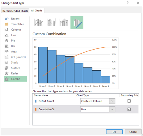
Step 10 − Change Chart Type dialog box appears.
- Click the All Charts tab.
- Click the Combo button.
- Select Clustered Column for Defect Count and Line for Cumulative %.
- Check the box – Secondary Axis for Line chart. Click OK.
As you can observe, 80% of the defects are due to two causes.