- Advanced Excel Charts Tutorial
- Advanced Excel Charts - Home
- Advanced Excel - Introduction
- Advanced Excel - Waterfall Chart
- Advanced Excel - Band Chart
- Advanced Excel - Gantt Chart
- Advanced Excel - Thermometer
- Advanced Excel - Gauge Chart
- Advanced Excel - Bullet Chart
- Advanced Excel - Funnel Chart
- Advanced Excel - Waffle Chart
- Advanced Excel Charts - Heat Map
- Advanced Excel - Step Chart
- Box and Whisker Chart
- Advanced Excel Charts - Histogram
- Advanced Excel - Pareto Chart
- Advanced Excel - Organization Chart
- Advanced Excel Charts Resources
- Advanced Excel Charts - Quick Guide
- Advanced Excel Charts - Resources
- Advanced Excel Charts - Discussion
Advanced Excel - Waterfall Chart
Waterfall chart is one of the most popular visualization tools used in small and large businesses, especially in Finance. Waterfall charts are ideal for showing how you have arrived at a net value such as net income, by breaking down the cumulative effect of positive and negative contributions.
What is a Waterfall Chart?
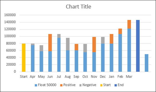
A Waterfall chart is a form of data visualization that helps in understanding the cumulative effect of sequentially introduced positive or negative values. A typical Waterfall chart is used to show how an initial value is increased and decreased by a series of intermediate values, leading to a final value.
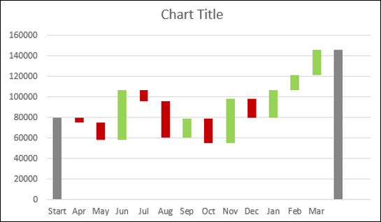
In a Waterfall chart, the columns are color coded so that you can quickly tell positive from negative numbers. The initial and the final value columns start on the horizontal axis, while the intermediate values are floating columns.
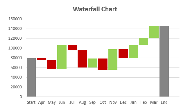
Because of this look, Waterfall charts are also called Bridge charts, Flying Bricks charts or Cascade charts.
Advantages of Waterfall Charts
A Waterfall chart has the following advantages −
Analytical purposes − Used especially for understanding or explaining, the gradual transition in the quantitative value of an entity, which is subjected to increment or decrement.
Quantitative analysis − Used in quantitative analysis ranging from inventory analysis to performance analysis.
Tracking contracts − Starting with the number of contracts at hand at the beginning of the year, taking into account −
The new contracts that are added
The contracts that got cancelled
The contracts that are finished, and
Finally ending with the number of contracts at hand at the end of the year.
Tracking performance of company over a given number of years.
In general, if you have an initial value, and changes (positive and negative) occur to that value over a period of time, then Waterfall chart can be used to depict the initial value, positive and negative changes in their order of occurrence and the final value.
Preparation of Data
You need to prepare the data from the given input data, so that it can be portrayed as a Waterfall chart.
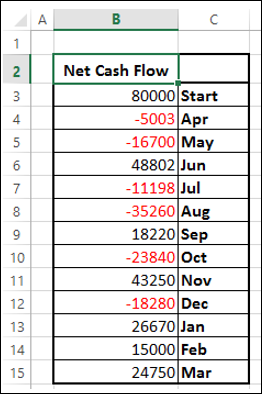
Consider the following data −
Prepare the data for the Waterfall chart as follows −
Ensure the column Net Cash Flow is to the left of the Months Column (This is because you will not include Net Cash Flow column while creating the chart).
Add two columns − Increase and Decrease for positive and negative cash flows respectively.
Add a column Start − the first column in the chart with the start value in the Net Cash Flow.
Add a column End − the last column in the chart with the end value in the Net Cash Flow.
Add a column Float − that supports the intermediate columns.
Insert formulas to compute the values in these columns as given in the table below.
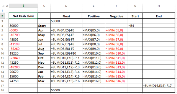
In the Float column, insert a row in the beginning and at the end. Place an arbitrary value 50000. This is just to have some space to the left and right sides of the chart.
The data will look as given in the following table −
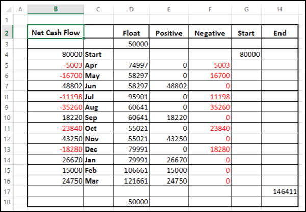
The data is ready to create a Waterfall chart.
Creating a Waterfall Chart
You can create a Waterfall chart customizing Stacked Column chart as follows −
Step 1 − Select the cells C2:H18 (i.e. excluding the Net Cash Flow column).
Step 2 − Insert Stacked Column chart.
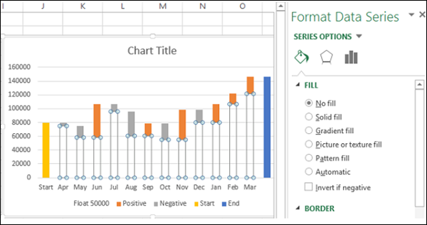
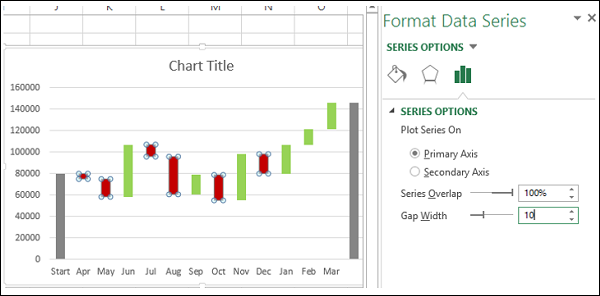
Step 3 − Right click on the Float series.
Step 4 − Click Format Data Series in the dropdown list.
Step 5 − Select No fill for FILL in the SERIES OPTIONS in the Format Data Series pane.
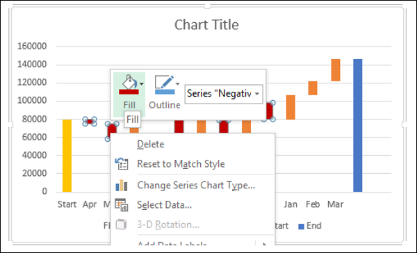
Step 6 − Right click on the Negative series.
Step 7 − Select Fill color as red.
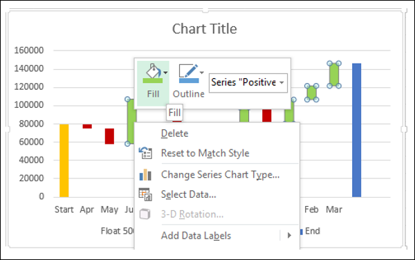
Step 8 − Right click on the Positive series.
Step 9 − Select Fill color as green.
Step 10 − Right click on the Start series.
Step 11 − Select Fill color as gray.
Step 12 − Right click on the End series.
Step 13 − Select Fill color as gray.
Step 14 − Right click on any of the series.
Step 15 − Select Gap Width as 10% under SERIES OPTIONS in the Format Data Series pane.
Step 16 − Give a name to the chart.
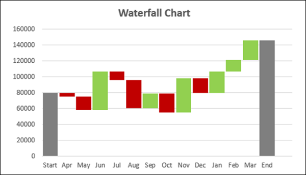
Your Waterfall chart is ready.