- Advanced Excel Charts Tutorial
- Advanced Excel Charts - Home
- Advanced Excel - Introduction
- Advanced Excel - Waterfall Chart
- Advanced Excel - Band Chart
- Advanced Excel - Gantt Chart
- Advanced Excel - Thermometer
- Advanced Excel - Gauge Chart
- Advanced Excel - Bullet Chart
- Advanced Excel - Funnel Chart
- Advanced Excel - Waffle Chart
- Advanced Excel Charts - Heat Map
- Advanced Excel - Step Chart
- Box and Whisker Chart
- Advanced Excel Charts - Histogram
- Advanced Excel - Pareto Chart
- Advanced Excel - Organization Chart
- Advanced Excel Charts Resources
- Advanced Excel Charts - Quick Guide
- Advanced Excel Charts - Resources
- Advanced Excel Charts - Discussion
Advanced Excel Charts - Histogram
A Histogram is a graphical representation of the distribution of numerical data. It is widely used in Statistical Analysis. Karl Pearson introduced histogram.
In Excel, you can create a Histogram from the Analysis ToolPak that comes as an add-in with Excel. However, in such a case, when the data is updated, Histogram will not reflect the changed data unless it is modified through Analysis ToolPak again.
In this chapter, you will learn how to create a Histogram from a Column chart. In this case, when the source data is updated the chart also gets refreshed.
What is a Histogram?
A Histogram is represented by rectangles with lengths corresponding to the number of occurrences of a variable in successive numerical intervals. The numerical intervals are called bins and the number of occurrences is called frequency.
The bins are usually specified as consecutive, non-overlapping intervals of the variable. The bins must be adjacent and are of equal size. A rectangle over a bin with height proportional to the frequency of the bin depicts the number of cases in that bin. Thus, the horizontal axis represents the bins whereas the vertical axis represents the frequency. The rectangles are colored or shaded.
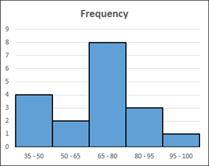
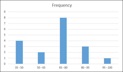
A Histogram will be as shown below.
Advantages of Histograms
Histogram is used to inspect the data for its underlying distribution, outliers, skewness, etc. For example, Histogram can be used in statistical analysis in the following scenarios −
A census of a country to obtain the people of various age groups.
A survey focused on the demography of a country to obtain the literacy levels.
A study on the effect of tropical diseases during a season across different regions in a state.
Preparation of Data
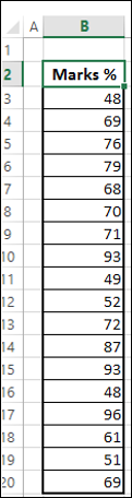
Consider the data given below.
Create bins and calculate the number of values in each bin from the above data as shown below −
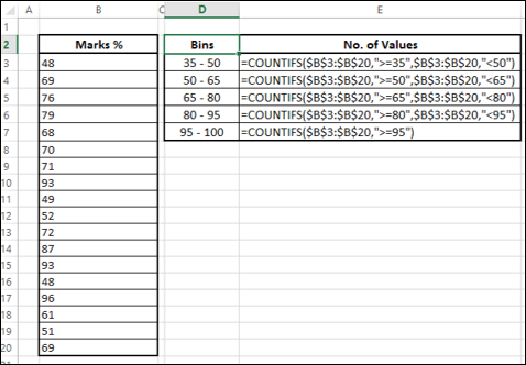
The number of values in a bin is referred to as the frequency of that bin.
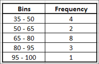
This table is called a Frequency table and we will use it to create the Histogram.
Creating a Histogram
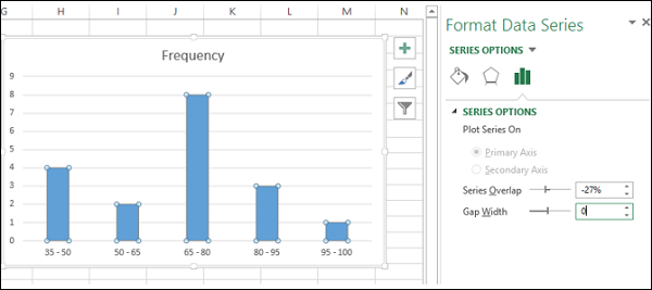
Following are the steps to create a Histogram.
Step 1 − Select the data in the Frequency table.
Step 2 − Insert a Clustered Column chart.
Step 3 − Right click on the Columns and select Format Data Series from the dropdown list.
Step 4 − Click SERIES OPTIONS and change the Gap Width to 0 under SERIES OPTIONS.
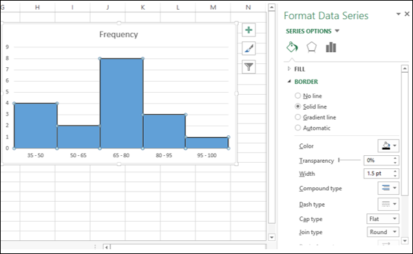
Step 5 − Format the chart as follows.
- Click on Fill & Line.
- Click on Solid Line under Border.
- Select black for color.
- Type 1.5 for Width.
Step 6 − Adjust the size of the chart.
Your Histogram is ready. As you can observe, the length of each column corresponds to the frequency of that particular bin.