- Advanced Excel Charts Tutorial
- Advanced Excel Charts - Home
- Advanced Excel - Introduction
- Advanced Excel - Waterfall Chart
- Advanced Excel - Band Chart
- Advanced Excel - Gantt Chart
- Advanced Excel - Thermometer
- Advanced Excel - Gauge Chart
- Advanced Excel - Bullet Chart
- Advanced Excel - Funnel Chart
- Advanced Excel - Waffle Chart
- Advanced Excel Charts - Heat Map
- Advanced Excel - Step Chart
- Box and Whisker Chart
- Advanced Excel Charts - Histogram
- Advanced Excel - Pareto Chart
- Advanced Excel - Organization Chart
- Advanced Excel Charts Resources
- Advanced Excel Charts - Quick Guide
- Advanced Excel Charts - Resources
- Advanced Excel Charts - Discussion
Advanced Excel - Gauge Chart
A Gauge is a device for measuring the amount or size of something, for example, fuel/rain/temperature gauge.
There are various scenarios where a Gauge is utilized −
- To Gauge the temperature of a person, a thermometer is used.
- To Gauge the speed of an automotive, a speedometer is used.
- To Gauge the performance of a student, a mark sheet is used.
Gauge charts came into usage to visualize the performance as against a set goal. The Gauge charts are based on the concept of speedometer of the automobiles. These have become the most preferred charts by the executives, to know at a glance whether values are falling within an acceptable value (green) or the outside acceptable value (red).
What is a Gauge Chart?
Gauge charts, also referred to as Dial charts or Speedometer charts, use a pointer or a needle to show information as a reading on a dial. A Gauge Chart shows the minimum, the maximum and the current value depicting how far from the maximum you are. Alternatively, you can have two or three ranges between the minimum and maximum values and visualize in which range the current value is falling.
A Gauge chart looks as shown below −

Advantages of Gauge Charts
Gauge charts can be used to display a value relative to one to three data ranges. They are commonly used to visualize the following −
- Work completed as against total work.
- Sales compared to a target.
- Service tickets closed as against total service tickets received.
- Profit compared to the set goal.
Disadvantages of Gauge Charts
Though the Gauge charts are still the preferred ones by most of the executives, there are certain drawbacks with them. They are −
Very simple in nature and cannot portray the context.
Often mislead by omitting key information, which is possible in the current Big Data visualization needs.
They waste space in case multiple charts are to be used. For example, to display information regarding different cars on a single dashboard.
They are not color-blind friendly.
For these reasons Bullet charts, introduced by Stephen Few are becoming prominent. The data analysts find Bullet charts to be the means for data analysis.
Creating a Gauge Chart
You can create Gauge charts in two ways −
Creating a simple Gauge chart with one value − This simple Gauge chart is based on a Pie chart.
Creating a Gauge chart with more number of Ranges − This Gauge chart is based on the combination of a Doughnut chart and a Pie chart.
Simple Gauge Chart with One Value
We will learn how to prepare the data and create a simple Gauge chart with single value.
Preparation of Data
Consider the following data −
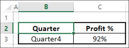
Step 1 − Create data for Gauge chart as shown below.
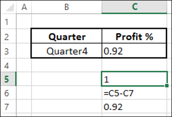
Step 2 − The data will look as follows −
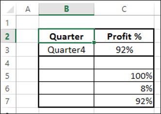
You can observe the following −
- C7 contains the value corresponding to C2.
- C5 has 100% to represent half of the Pie chart.
- C6 has a value to make C6 and C7 to be 100% that makes second half of the Pie chart.
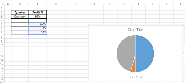
Creating a Simple Gauge Chart
Following are the steps to create a simple Gauge chart with one value −
Step 1 − Select the data – C5:C7.
Step 2 − Insert a Pie chart.
Step 3 − Right click on the chart.
Step 4 − Select Format Data Series from the dropdown list.
Step 5 − Click SERIES OPTIONS.
Step 6 − Type 90 in the box – Angle of first slice.
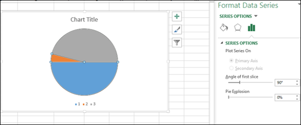
As you can observe, the upper half of the Pie chart is what you will convert to a Gauge chart.
Step 7 − Right click on the bottom Pie slice.
Step 8 − Click on Fill. Select No Fill.
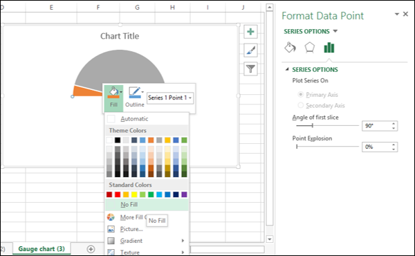
This will make the bottom Pie slice invisible.
You can see that the Pie slice on the right represents the Profit %.
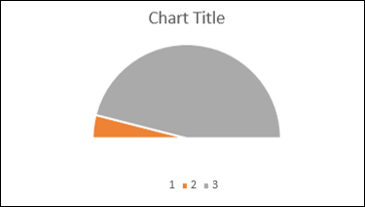
Step 9 − Make the chart appealing as follows.
- Change the Fill colors of the Pie slices.
- Click on the right Pie slice, select 3-D FORMAT as Top bevel, and choose Angle.
- Click on the left Pie slice, select 3-D FORMAT as Top bevel, and choose Divot.
- Click on the right Pie slice, select 1% as Point Explosion under SERIES OPTIONS.
- Click on the right Pie slice and add Data Label.
- Size and Position the Data Label.
- Deselect Legend in Chart Elements.
- Give the chart Title as Profit % and Position it.
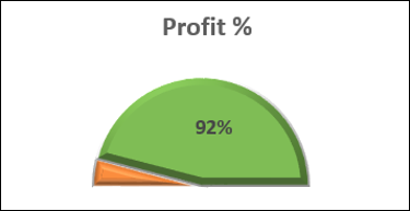
Your Gauge chart is ready.
Gauge Chart with Multiple Ranges
Now let us see how to make a gauge chart with more ranges.
Preparation of Data
Arrange the data for values as given below.
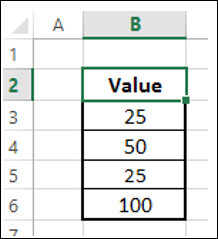
This data will be used for Doughnut chart. Arrange the data for Pointer as given below.
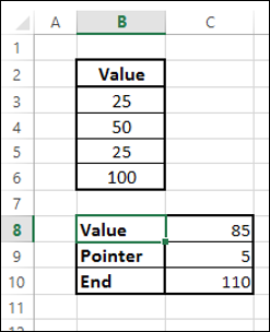
You can observe the following −
The value in the cell C8 is the value you want display in the Gauge chart.
The value in the cell C9 is the Pointer size. You can take it as 5 for brevity in formatting and later change to 1, to make it a thin pointer.
The value in the cell C10 is calculated as 200 – (C8+C9). This is to complete the Pie chart.
Creating Gauge Chart with Multiple Ranges
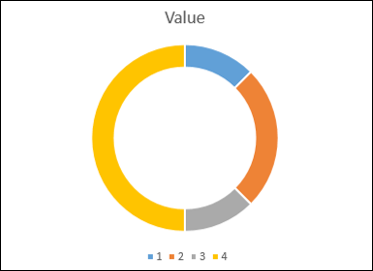
You can create the Gauge chart with a Doughnut chart showing different regions corresponding to different Values and a Pie chart denoting the pointer. Such a Gauge chart looks as follows −
Step 1 − Select the values data and create a Doughnut chart.
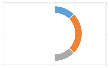
Step 2 − Double click on the half portion of the Doughnut chart (shown in yellow color in the above chart).
Step 3 − Right click and under the Fill category, select No Fill.
Step 4 − Deselect Chart Title and Legend from Chart Elements.
Step 5 − Right click on the chart and select Format Data Series.
Step 6 − Type 271 in the box – Angle of first slice in the SERIES OPTIONS in the Format Data Series pane.

Step 7 − Change the Doughnut Hole Size to 50% in the SERIES OPTIONS in the Format Data Series pane.
Step 8 − Change the colors to make the chart appealing.

As you can observe, the Gauge chart is complete in terms of values. The next step is to have a pointer or needle to show the status.
Step 9 − Create the pointer with a Pie chart as follows.
- Click on the Doughnut chart.
- Click the DESIGN tab on the Ribbon.
- Click Select Data in the Data group.
- Select Data Source dialog box appears. Click the Add button.
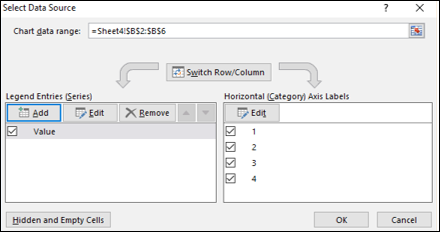
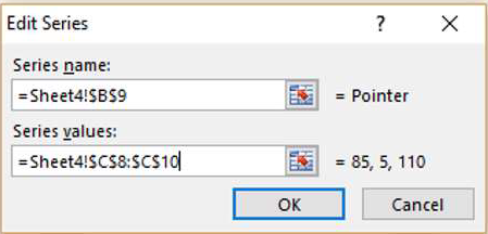
Step 10 − The Edit Series dialog box appears.
Select the cell containing the name Pointer for Series name.
Select the cells containing data for Value, Pointer and End, i.e. C8:C10 for Series values. Click OK.
Step 11 − Click OK in the Select Data Source dialog box.
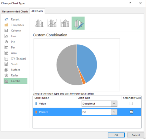
Click the DESIGN tab on the Ribbon.
Click Change Chart Type in the Type group.
Change Chart Type dialog box appears. Select Combo under the tab All Charts.
Select the chart types as following −
Doughnut for Value series.
Pie for Pointer series.
Check the box Secondary Axis for the Pointer series. Click OK.
Your chart looks as shown below.
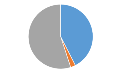
Step 12 − Right click on each of the two bigger Pie slices.
Click on Fill and then select No Fill. Right click on the Pointer Pie slice and select Format Data Series.
Type 270 for Angle of first slice in the SERIES OPTIONS. Your chart looks as shown below.

Step 13 − Right click on the Pointer Pie slice.
- Click on Format Data Series.
- Click on Fill & Line.
- Select Solid Fill for Fill and select the color as black.
- Select Solid Line for Border and select the color as black.

Step 14 − Change the Pointer value from 5 to 1 in the data to make the Pointer Pie slice a thin line.

Step 15 − Add a Data Label that depicts % complete.
Your Gauge chart is ready.