- Advanced Excel Charts Tutorial
- Advanced Excel Charts - Home
- Advanced Excel - Introduction
- Advanced Excel - Waterfall Chart
- Advanced Excel - Band Chart
- Advanced Excel - Gantt Chart
- Advanced Excel - Thermometer
- Advanced Excel - Gauge Chart
- Advanced Excel - Bullet Chart
- Advanced Excel - Funnel Chart
- Advanced Excel - Waffle Chart
- Advanced Excel Charts - Heat Map
- Advanced Excel - Step Chart
- Box and Whisker Chart
- Advanced Excel Charts - Histogram
- Advanced Excel - Pareto Chart
- Advanced Excel - Organization Chart
- Advanced Excel Charts Resources
- Advanced Excel Charts - Quick Guide
- Advanced Excel Charts - Resources
- Advanced Excel Charts - Discussion
Advanced Excel - Band Chart
Suppose you have data across a time period to represent graphically, confiding each data point to a defined interval. For example, you might have to present customer survey results of a product from different regions. Band chart is suitable for this purpose.
What is Band Chart?
A Band chart is a Line chart with added shaded areas to display the upper and lower boundaries of the defined data ranges. The shaded areas are the Bands.
Band chart is also referred to as Range chart, High-Low Line chart or Corridor chart.
Advantages of Band Charts
Band chart is used in the following scenarios −
Monitoring a metric within standard defined bands.
Profit % for each of the regions (represented by Line chart) and bands with defined intervals in the range 0% - 100%.
Performance measurements of an employee or company responses to client’s complaints.
Monitoring Service Tickets- Responded service tickets as line and the throughput time as bands.
Preparation of Data
You need to prepare the data that can be used to create a Band chart from the given input data.
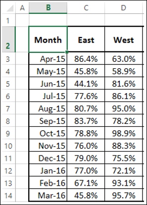
Step 1 − Consider the following data that you have from the customer survey for two regions – East and West across the financial year April - March.
Suppose you want to compare this data across three intervals −
- Low (<50%).
- Medium (50% - 80%).
- High (>80%).
Step 2 − Add three columns to the above table as shown below.
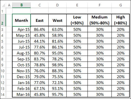
As you can observe, the values in the column Low are 50%, denoting the band 0% - 50% and the values in the column Medium are 30%, denoting the bandwidth of Medium above the band Low. Similarly the values in the column High are 20%, denoting the band width of High above the band Low.
Use this data to create a Band chart.
Creating a Band Chart
Follow the steps given below to create a Band chart −
Step 1 − Select the data in the above table.
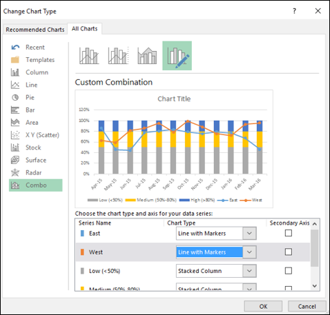
Step 2 − Insert a Combo chart.
Step 3 − Click on Change Chart Type. Change the chart types for the data series as follows −
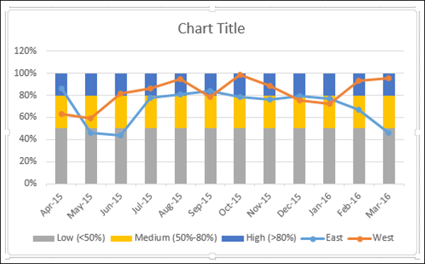
- Line with Markers for East series and West series.
- Stacked Column for the series - Low, Medium and High.
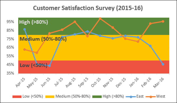
Your chart looks as shown below.
Step 4 − Click one of the Columns.
Step 5 − Change Gap Width to 0% in the Format Data Series pane.
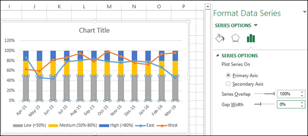
You will get Bands instead of Columns.
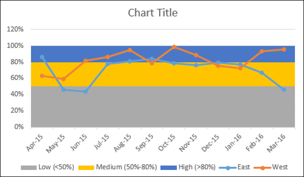
Step 6 − Make the chart appealing −
- Add Chart Title.
- Adjust Vertical Axis range.
- Change the colors of the bands to Green-Yellow-Red.
- Add Data Labels to bands.
The result is a Band chart with defined boundaries depicted by bands. The survey results are represented across the bands. One can quickly and clearly make out from the chart whether the survey results are satisfactory or they need attention.
Your Band chart is ready.