- Advanced Excel Charts Tutorial
- Advanced Excel Charts - Home
- Advanced Excel - Introduction
- Advanced Excel - Waterfall Chart
- Advanced Excel - Band Chart
- Advanced Excel - Gantt Chart
- Advanced Excel - Thermometer
- Advanced Excel - Gauge Chart
- Advanced Excel - Bullet Chart
- Advanced Excel - Funnel Chart
- Advanced Excel - Waffle Chart
- Advanced Excel Charts - Heat Map
- Advanced Excel - Step Chart
- Box and Whisker Chart
- Advanced Excel Charts - Histogram
- Advanced Excel - Pareto Chart
- Advanced Excel - Organization Chart
- Advanced Excel Charts Resources
- Advanced Excel Charts - Quick Guide
- Advanced Excel Charts - Resources
- Advanced Excel Charts - Discussion
Advanced Excel Charts - Introduction
You are aware that charts are the efficient data visualization means to convey the results. In addition to the chart types that are available in Excel, some widely used application charts are popular. In this tutorial, you will learn about these advanced charts and how you can create them in Excel.
Types of Advanced Charts
Following are the advanced charts that you will learn in this tutorial −
- Waterfall Chart
- Band Chart
- Gantt Chart
- Thermometer Chart
- Gauge Chart
- Bullet Chart
- Funnel Chart
- Waffle Chart
- Heat Map
- Step Chart
- Box and Whisker Chart
- Histogram
- Pareto Chart
- Organization Chart
Advanced Charts in Brief
We will see all the advanced charts briefly.
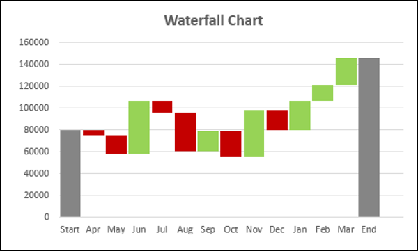
Waterfall Chart
A Waterfall chart is a form of data visualization that helps in understanding the cumulative effect of sequentially introduced positive or negative values.
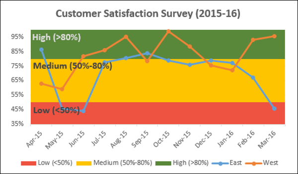
Band Chart
A Band chart is a Line chart with added shaded areas to display the upper and lower boundaries of the defined data ranges.
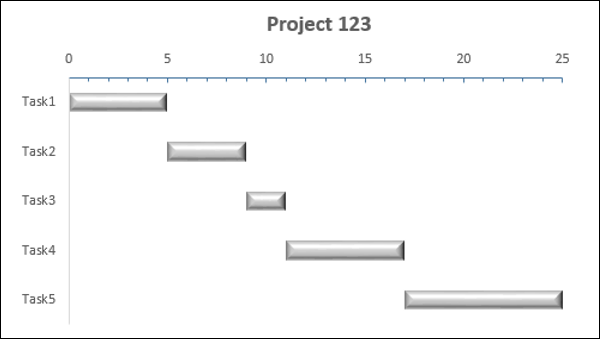
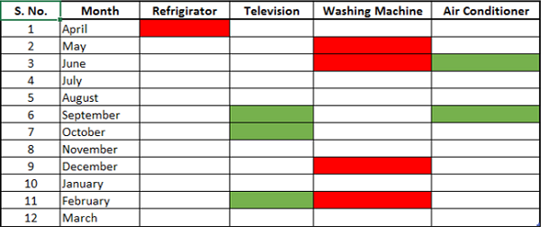
Gantt Chart
A Gantt chart is a chart in which a series of horizontal lines depicting tasks, task duration and task hierarchy are used planning and tracking projects.
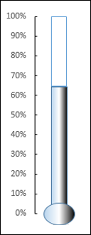
Thermometer Chart
A Thermometer chart keeps track of a single task, for e.g. completion of work, representing the current status as compared to a Target. It displays the percentage of the task completed, taking Target as 100%.
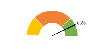
Gauge Chart
Gauge charts, also referred to as Dial charts or Speedometer charts, use a pointer or a needle to show information as a reading on a dial.
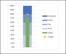
Bullet Chart
Bullet charts support the comparison of a measure to one or more related measures with a linear design.
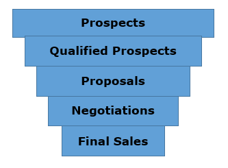
Funnel Chart
Funnel chart is used to visualize the progressive reduction of data as it passes from one phase to another in a process.
Waffle Chart
Waffle chart is a 10 × 10 cell grid with the cells colored as per conditional formatting to portray a percent value such % work complete.
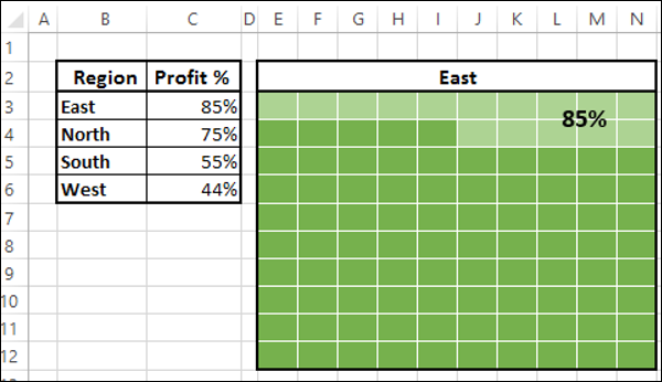
Heat Map
A Heat Map is a visual representation of data in a Table to highlight the data points of significance.
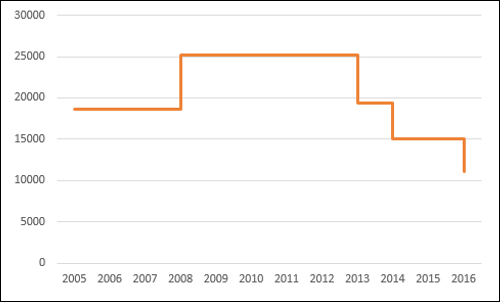
Step Chart
A Step chart is a Line chart that uses vertical and horizontal lines to connect the data points in a series, forming a step-like progression.
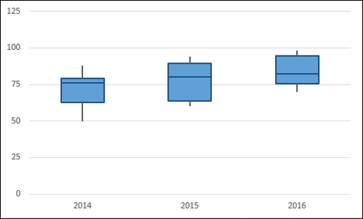
Box and Whisker Chart
Box and Whisker charts, also referred to as Box Plots are commonly used in statistical analysis. In a Box and Whisker chart, numerical data is divided into quartiles and a box is drawn between the first and third quartiles, with an additional line drawn along the second quartile to mark the median. The minimums and maximums outside the first and third quartiles are depicted with lines, which are called whiskers. Whiskers indicate variability outside the upper and lower quartiles, and any point outside the whiskers is considered as an outlier.
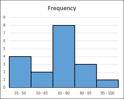
Histogram
A Histogram is a graphical representation of the distribution of numerical data and is widely used in Statistical Analysis. A Histogram is represented by rectangles with lengths corresponding to the number of occurrences of a variable in successive numerical intervals.
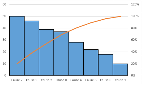
Pareto Chart
Pareto chart is widely used in Statistical Analysis for decision-making. It represents the Pareto principle, also called 80/20 Rule, which states that 80% of the results are due to 20% of the causes.
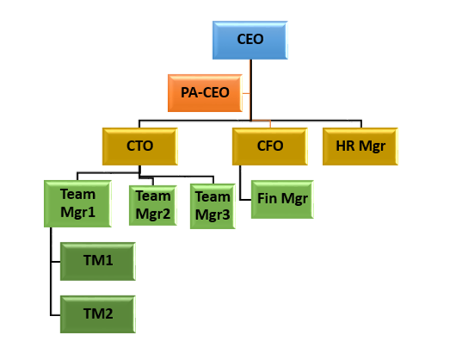
Organization Chart
An Organization chart graphically represents the management structure of an organization.
Though some of these charts are included in Excel 2016, Excel 2013 and earlier versions do not have them as built-in charts. In this tutorial, you will learn how to create these charts from the built-in chart types in Excel.
Methodology for Creating Advanced Excel Charts
For each of the advanced charts mentioned above, you will learn how to create them in Excel with the following steps −
Prepare data for the chart − Your input data might have to be put in a format that can be used to create the chart at hand. Hence, for each of the charts you will learn how to prepare the data.
Create the chart − You will learn step by step how you can arrive at the chart, with illustrations.