- Advanced Excel Tutorial
- Advanced Excel - Home
- Excel New Features
- Excel - Chart Recommendations
- Advanced Excel - Format Charts
- Advanced Excel - Chart Design
- Advanced Excel - Richer Data Labels
- Advanced Excel - Leader Lines
- Advanced Excel - New Functions
- Fundamental Data Analysis
- Excel - Instant Data Analysis
- Excel - Sorting Data by Color
- Advanced Excel - Slicers
- Advanced Excel - Flash Fill
- Powerful Data Analysis
- Excel - PivotTable Recommendations
- Powerful Data Analysis – 1
- Advanced Excel - Data Model
- Advanced Excel - Power Pivot
- Excel - External Data Connection
- Advanced Excel - Pivot Table Tools
- Powerful Data Analysis – 2
- Advanced Excel - Power View
- Advanced Excel - Visualizations
- Advanced Excel - Pie Charts
- Advanced Excel - Additional Features
- Advanced Excel - Power View Services
- Advanced Excel - Format Reports
- Advanced Excel - Handling Integers
- Other Features
- Advanced Excel - Templates
- Advanced Excel - Inquire
- Advanced Excel - Workbook Analysis
- Advanced Excel - Manage Passwords
- Advanced Excel - File Formats
- Excel - Discontinued Features
- Advanced Excel Useful Resources
- Advanced Excel - Quick Guide
- Advanced Excel - Useful Resources
- Advanced Excel - Discussion
Advanced Excel - Chart Recommendations
Change in Charts Group
The Charts Group on the Ribbon in MS Excel 2013 looks as follows −
You can observe that −
The subgroups are clubbed together.
A new option ‘Recommended Charts’ is added.
Let us create a chart. Follow the steps given below.
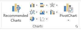
Step 1 − Select the data for which you want to create a chart.
Step 2 − Click on the Insert Column Chart icon as shown below.
When you click on the Insert Column chart, types of 2-D Column Charts, and 3-D Column Charts are displayed. You can also see the option of More Column Charts.
Step 3 − If you are sure of which chart you have to use, you can choose a Chart and proceed.
If you find that the one you pick is not working well for your data, the new Recommended Charts command on the Insert tab helps you to create a chart quickly that is just right for your data.
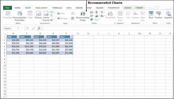
Chart Recommendations
Let us see the options available under this heading. (use another word for heading)
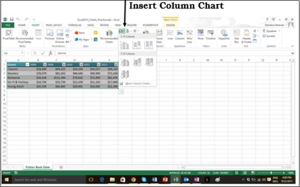
Step 1 − Select the Data from the worksheet.
Step 2 − Click on Recommended Charts.
The following window displaying the charts that suit your data will be displayed.
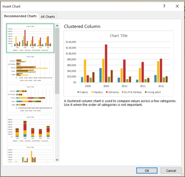
Step 3 − As you browse through the Recommended Charts, you will see the preview on the right side.
Step 4 − If you find the chart you like, click on it.
Step 5 − Click on the OK button. If you do not see a chart you like, click on All Charts to see all the available chart types.
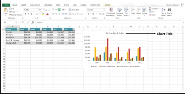
Step 6 − The chart will be displayed in your worksheet.
Step 7 − Give a Title to the chart.
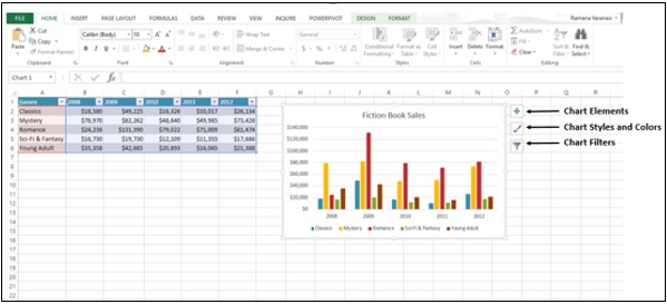
Fine Tune Charts Quickly
Click on the Chart. Three Buttons appear next to the upper-right corner of the chart. They are −
- Chart Elements
- Chart Styles and Colors, and
- Chart Filters
You can use these buttons −
- To add chart elements like axis titles or data labels
- To customize the look of the chart, or
- To change the data that’s shown in the chart
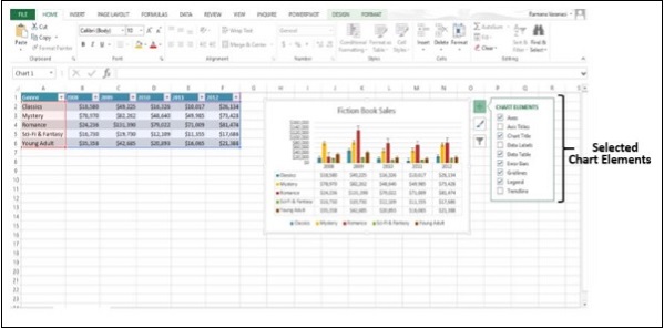
Select / De-select Chart Elements
Step 1 − Click on the Chart. Three Buttons will appear at the upper-right corner of the chart.
Step 2 − Click on the first button Chart Elements. A list of chart elements will be displayed under the Chart Elements option.
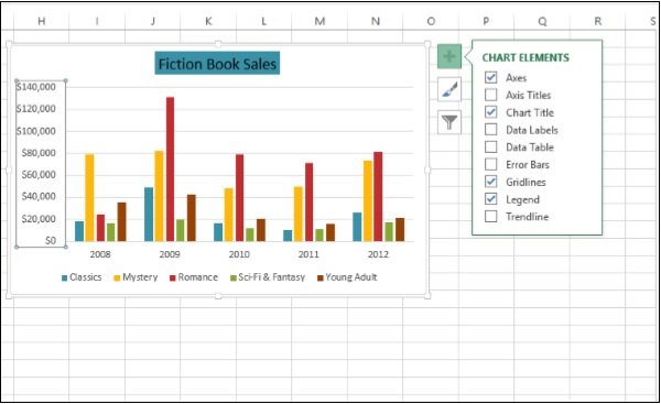
Step 3 − Select / De-select Chart Elements from the given List. Only the selected chart elements will be displayed on the Chart.
Format Style
Step 1 − Click on the Chart. Three Buttons will appear at the upper-right corner of the chart.
Step 2 − Click on the second button Chart Styles. A small window opens with different options of STYLE and COLOR as shown in the image given below.
Step 3 − Click on STYLE. Different options of Style will be displayed.
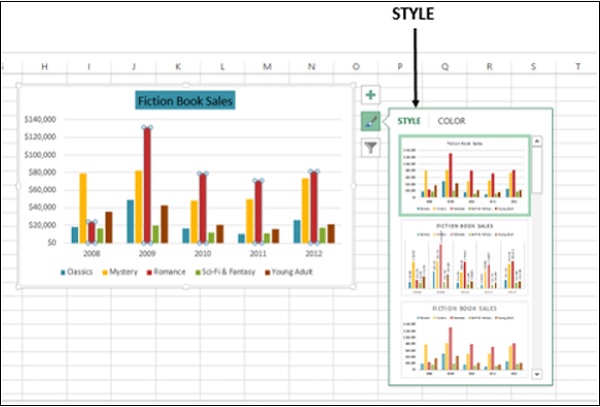
Step 4 − Scroll down the gallery. The live preview will show you how your chart data will look with the currently selected style.
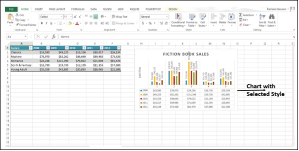
Step 5 − Choose the Style option you want. The Chart will be displayed with the selected Style as shown in the image given below.
Format Color
Step 1 − Click on the Chart. Three Buttons will appear at the upper-right corner of the chart.
Step 2 − Click on Chart Styles. The STYLE and COLOR window will be displayed.
Step 3 − Click on the COLOR tab. Different Color Schemes will be displayed.
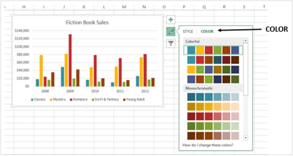
Step 4 − Scroll down the options. The live preview will show you how your chart data will look with the currently selected color scheme.
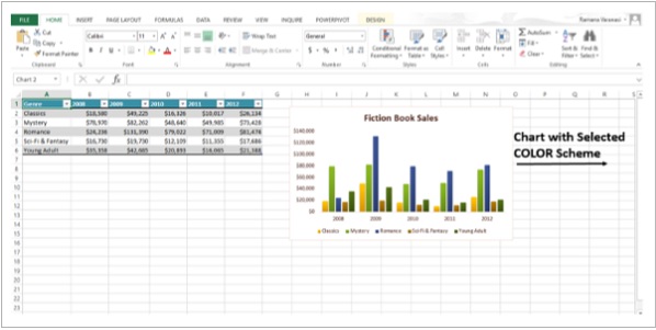
Step 5 − Pick the color scheme you want. Your Chart will be displayed with the selected Style and Color scheme as shown in the image given below.
You can change color schemes from Page Layout Tab also.
Step 1 − Click the tab Page Layout.
Step 2 − Click on the Colors button.
Step 3 − Pick the color scheme you like. You can also customize the Colors and have your own color scheme.
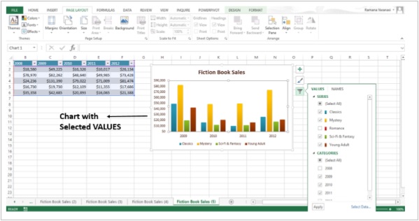
Filter Data being displayed on the Chart
Chart Filters are used to edit the data points and names that are visible on the chart being displayed, dynamically.
Step 1 − Click on the Chart. Three Buttons will appear at the upper-right corner of the chart.
Step 2 − Click on the third button Chart Filters as shown in the image.
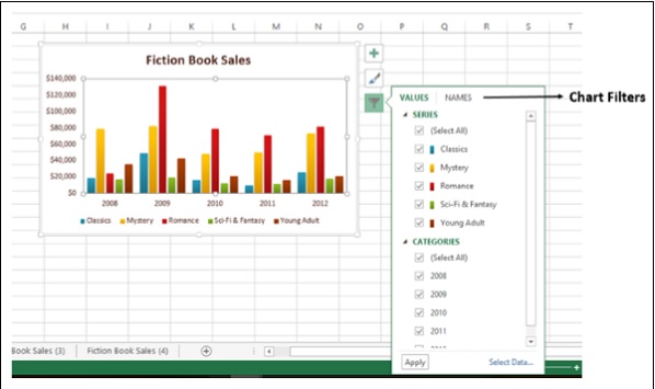
Step 3 − Click on VALUES. The available SERIES and CATEGORIES in your Data appear.
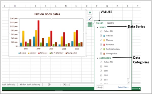
Step 4 − Select / De-select the options given under Series and Categories. The chart changes dynamically.
Step 5 − After, you decide on the final Series and Categories, click on Apply. You can see that the chart is displayed with the selected data.