- Advanced Excel Tutorial
- Advanced Excel - Home
- Excel New Features
- Excel - Chart Recommendations
- Advanced Excel - Format Charts
- Advanced Excel - Chart Design
- Advanced Excel - Richer Data Labels
- Advanced Excel - Leader Lines
- Advanced Excel - New Functions
- Fundamental Data Analysis
- Excel - Instant Data Analysis
- Excel - Sorting Data by Color
- Advanced Excel - Slicers
- Advanced Excel - Flash Fill
- Powerful Data Analysis
- Excel - PivotTable Recommendations
- Powerful Data Analysis – 1
- Advanced Excel - Data Model
- Advanced Excel - Power Pivot
- Excel - External Data Connection
- Advanced Excel - Pivot Table Tools
- Powerful Data Analysis – 2
- Advanced Excel - Power View
- Advanced Excel - Visualizations
- Advanced Excel - Pie Charts
- Advanced Excel - Additional Features
- Advanced Excel - Power View Services
- Advanced Excel - Format Reports
- Advanced Excel - Handling Integers
- Other Features
- Advanced Excel - Templates
- Advanced Excel - Inquire
- Advanced Excel - Workbook Analysis
- Advanced Excel - Manage Passwords
- Advanced Excel - File Formats
- Excel - Discontinued Features
- Advanced Excel Useful Resources
- Advanced Excel - Quick Guide
- Advanced Excel - Useful Resources
- Advanced Excel - Discussion
Advanced Excel - Power View in Services
When you create Power View sheets in Excel, you can view and interact with them onpremises in Excel Services, and in Office 365. You can only edit Power View sheets in Excel 2013 on a client computer.
Power View sheets cannot be viewed on OneDrive.
If you save an Excel workbook with Power View sheets to a Power Pivot Gallery, the Power View sheets in the workbook will not be displayed in the Gallery, but they are still in the file. You will see them when you open the workbook.
When you publish Excel workbooks with Power View sheets to Power BI. Power BI saves the Power View sheets in your workbook as a Power BI report.
Pie Charts
We have already discussed Pie Chart Visualization in the previous chapter.
Maps
We have already discussed Maps in the previous chapter.
Key Performance Indicators (KPIs)
A KPI is a quantifiable measurement for gauging business objectives. For example,
Sales department of an organization might use a KPI to measure the monthly gross profit against the projected gross profit.
Accounting department might measure monthly expenditures against revenue to evaluate costs.
Human resources department might measure quarterly employee turnover.
Business professionals frequently use KPIs that are grouped together in a business scorecard to obtain a quick and accurate historical summary of business success or to identify trends.
A KPI includes Base Value, Target Value / Goal, and Status.
A Base Value is defined by a calculated field that resolves to a value. The calculated field represents the current value for the item in that row of the table or matrix, for example, aggregate of sales, profit for a given period, etc.
A Target Value (or Goal) is defined by a calculated field that resolves to a value, or by an absolute value. The current value is evaluated against this value. This could be a fixed number, some goal all the rows should achieve, or a calculated field, which might have a different goal for each row. For example, budget (calculated field), average number of sick-leave days (absolute value).
Status is the visual indicator of the value. In Power View in Excel, you can edit the KPI, choosing which indicators to use and what values to trigger each indicator.
Hierarchies
If your data model has a hierarchy, you can use it in Power View. You can also create a new hierarchy from scratch in Power View.
Step 1 − Click on the Matrix Visualization.
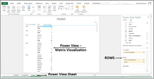
Step 2 − Add ROWS / COLUMNS to the ROWS / COLUMNS box. The hierarchy is decided by the order of the fields in the ROWS box. You can put fields in any order in a hierarchy in Power View. You can change the order be simply dragging the fields in the ROWS Box.
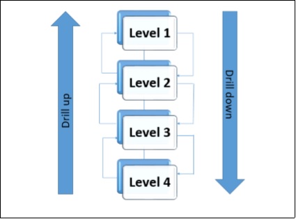
Drill-Up and Drill-Down
Once you create a hierarchy in Power View, you can drill up and drill down such that you can show just one level at a time. You can drill down for details and drill up for summary.
You can use drill up and drill down in Matrix, Bar, Column, and Pie Chart Visualizations.
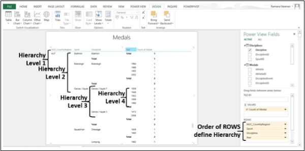
Step 1 − Order the Fields in the Rows Box to define Hierarchy. Say, we have four Levels in the hierarchy.
The Hierarchy, Drill down and Drill up are depicted as follows −
Step 2 − Click on the DESIGN tab on the ribbon.
Step 3 − Click on Show Levels in the Options group.
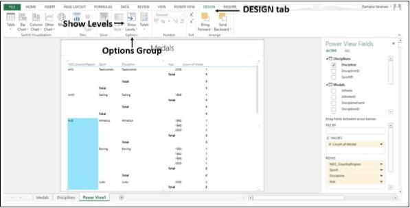
Step 4 − Click on Rows – Enable Drill Down one Level at a time.
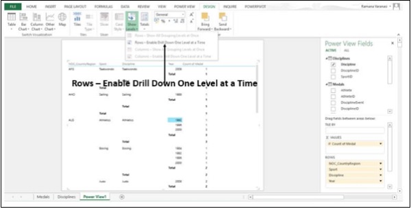
The Matrix collapses to display only Level 1 Data. You find an arrow on right side of the Level 1 Data item indicating Drill down.
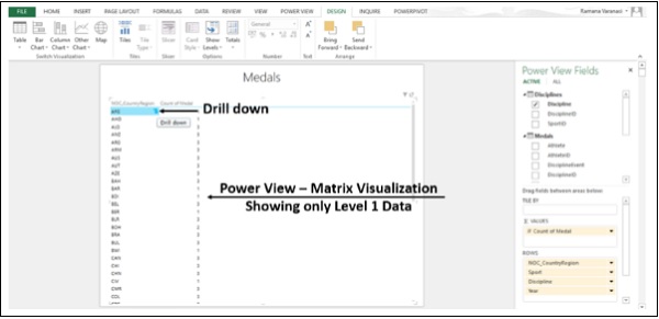
Step 5 − Click on the Drill down arrow. Alternatively, you can double-click on the Data item to Drill down. That particular Data item Drills down by one Level.
You have one arrow on the left indicating Drill up and one arrow on the right indicating Drill down.
You can double-click one value in a level to expand to show the Values under that one in the Hierarchy. You click the up arrow to drill back up. You can use Drill up and Drill down in Bar, Column, and Pie Charts also.
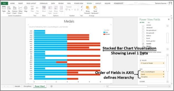
Step 6 − Switch to Stacked Bar Chart Visualization.
Step 7 − Order the Fields in the AXIS Box to define the Hierarchy. Stacked Bar Chart with only Level 1 Data is displayed.
Step 8 − Double-click on a Bar. The Data in the next Level of that particular bar is displayed.
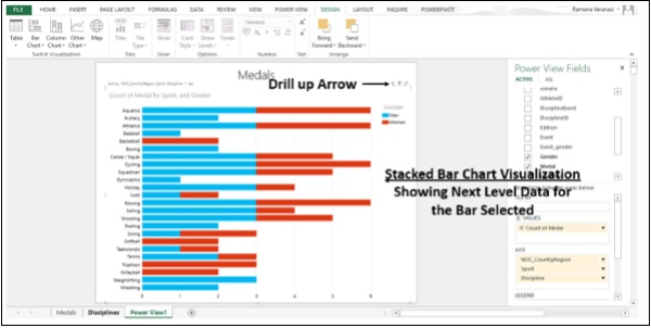
You can Drill down one Level at a time by double-clicking on any bar. You can Drill up one Level by clicking the Drill up arrow on the Right Top Corner.