- Xamarin - Home
- Xamarin - Installation
- Xamarin - First Application
- Xamarin - Application Manifest
- Xamarin - Android Resources
- Xamarin - Android Activity Lifecycle
- Xamarin - Permissions
- Xamarin - Building the App GUI
- Xamarin - Menus
- Xamarin - Layouts
- Xamarin - Android Widgets
- Xamarin - Android Dialogs
- Xamarin - Gallery
- Xamarin - Andriod Views
- Xamarin - Multiscreen App
- Xamarin - Deploying Your App
Xamarin - Quick Guide
Xamarin - Installation
Xamarin is built on the .NET Framework. It allows one to create apps that easily run across multiple platforms. In this tutorial, we will explain how you can use Xamarin to deliver native iOS, Android, and Windows Apps.
Lets start the tutorial with a discussion on how to install Xamarin in Windows and Mac systems.
System Requirements
Windows
A computer with at least 2GB of RAM and running Windows 7 or higher (Windows 8-10 is highly recommended)
Visual Studio 2012 Professional or higher
Xamarin for Visual Studio
Mac
- A Mac computer running OS X Yosemite (10.10) or higher
- Xamarin iOS SDK
- Apples Xcode (7+) IDE and iOS SDK
- Xamarin Studio
Installation on Windows
Download the Xamarin Installer from https://dotnet.microsoft.com/en-us/apps/xamarin Before running the Xamarin installer, make sure you have installed Android SDK and Java SDK on your computer.
Run the downloaded installer to begin the installation process −
The Xamarin license agreement screen appears. Click the Next button to accept the agreement.
The installer will search for any missing components and prompt you to download and install them.
After the Xamarin installation is complete, click the Close button to exit and get ready to start using Xamarin.
Installation on Mac
Download the Xamarin Studio Installer on your Mac system.
Run the Xamarin installer you downloaded and follow the steps given in the Installation Wizard.
After the installation is complete, you can start using Xamarin on your system.
Xamarin - First Application
In this chapter, we will see how to create a small Android application using Xamarin.
Hello Xamarin! Application
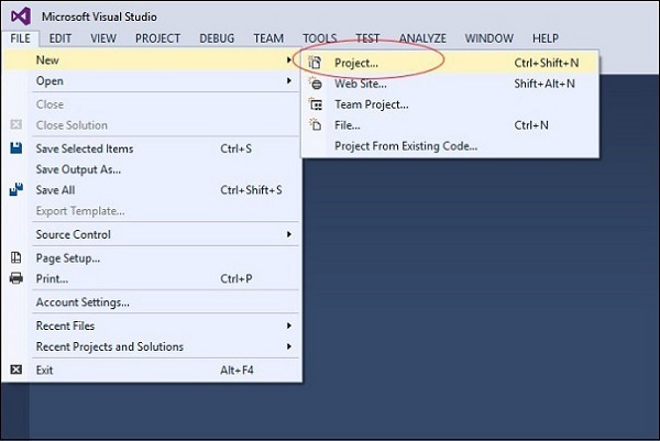
First of all, start a new instance of Visual Studio and go to File → New → Project.
On the Menu dialog box that appears, go to Templates → Visual C# → Android → Blank App (Android).
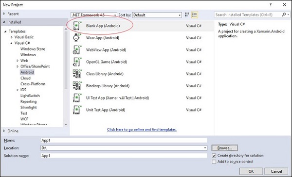
Give an appropriate name for your application. In our case, we name it helloWorld and save it in the default location provided. Next, click the OK button for the new helloXamarin project to load.
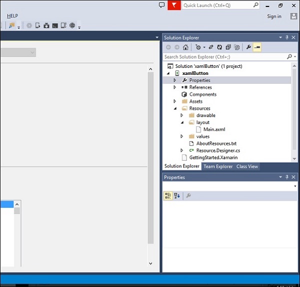
On the solution, open Resources → layout → Main.axml file. Switch from Design View and go to the Source file and type the following lines of code to build your app.
<?xml version = "1.0" encoding = "utf-8"?>
<LinearLayout xmlns:android = "http://schemas.android.com/apk/res/android"
   android:orientation = "vertical"
   android:background = "#d3d3d3"
   android:layout_width = "fill_parent"
   android:layout_height = "fill_parent">
   <TextView
      android:text = "@string/HelloXamarin"
      android:textAppearance = "?android:attr/textAppearanceLarge"
      android:layout_width = "match_parent"
      android:layout_height = "wrap_content"
      android:id = "@+id/textView2"
      android:textColor = "@android:color/black" />
</LinearLayout>
In the above code, we have created a new Android textview. Next, open the folder values and double-click Strings.xml to open it. Here, we are going to store information and values about the button created above.
<?xml version = "1.0" encoding = "utf-8"?>
<resources>
   <string name = "HelloXamarin">Hello World, I am Xamarin!</string>
   <string name = "ApplicationName">helloWorld</string>
</resources>
Open MainActivity.cs file and replace the existing code with the following lines of code.
using System;
using Android.App;
using Android.Content;
using Android.Runtime;
using Android.Views;
using Android.Widget;
using Android.OS;

namespace HelloXamarin {
   public class MainActivity : Activity {
      protected override void OnCreate(Bundle bundle) {
         base.OnCreate(bundle);
         SetContentView(Resource.Layout.Main);
      }
   }
}
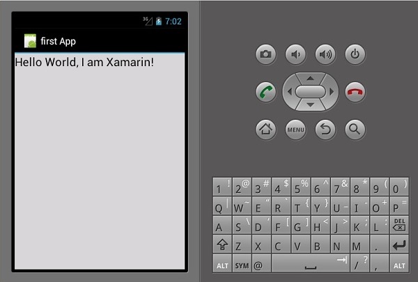
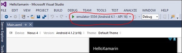
Save the application. Build and then run it to display the created app in an Android Emulator.
If you do not have an Android Emulator, then follow the steps given in the next section to create one.
Setting Up an Android Emulator
On your Visual Studio menu, go to Tools → Android → Android Emulator Manager. On the pop-up window that appears, click the Create button. It will display the following screen.
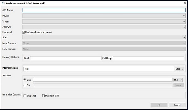
On the above screen, supply the AVD name you want. Select a device that is appropriate for your display, e.g., Nexus 4 display. Select your target platform. It is always advisable to test on a minimum target platform, e.g., API 10 Android 2.3 (Gingerbread) so as to ensure your App works across all Android platforms.
Fill in the rest of the fields and click the OK button. Your emulator is now ready. You can select it from the list of existing Android Virtual Devices and then click Start to launch it.
Modifying HelloXamarin App
In this section, we will modify our project and create a button which will display text upon click. Open main.axml and switch to source view. After our textview that we created, we will add a button as shown below.
<Button
   android:id = "@+id/MyButton"
   android:layout_width = "fill_parent"
   android:layout_height = "wrap_content"
   android:text = "@string/ButtonClick" />
After adding a button, our full code will look like this −
<?xml version = "1.0" encoding = "utf-8"?>
<LinearLayout xmlns:android = "http://schemas.android.com/apk/res/android"
   android:orientation = "vertical"
   android:layout_width = "fill_parent"
   android:layout_height = "fill_parent">
   <TextView
      android:text = "@string/HelloXamarin"
      android:textAppearance = "?android:attr/textAppearanceLarge"
      android:layout_width = "match_parent"
      android:layout_height = "wrap_content"
      android:id = "@+id/textView2" />

   <Button
      android:id = "@+id/MyButton"
      android:layout_width = "fill_parent"
      android:layout_height = "wrap_content"
      android:text = "@string/ButtonClick" />
</LinearLayout>
Next, we register our button values in the strings.xml file.
<string name = "ButtonClick">Click Me!</string>
After adding our button in the strings.xml file, we will open MainActivity.cs file to add an action for our button when it is clicked, as shown in the following code.
using System;
using Android.App;
using Android.Content;
using Android.Runtime;
using Android.Views;
using Android.Widget;
using Android.OS;

namespace HelloXamarin {
   [Activity(Label = "HelloXamarin", MainLauncher = true, Icon = "@drawable/icon")]
   public class MainActivity : Activity {
      protected override void OnCreate(Bundle bundle) {
         base.OnCreate(bundle);
         SetContentView(Resource.Layout.Main);
         Button button = FindViewById<Button>(Resource.Id.MyButton);
         button.Click += delegate { button.Text = "Hello world I am your first App"; };
      }
   }
}
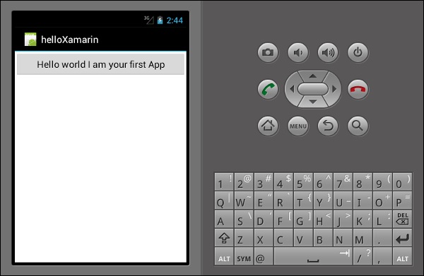
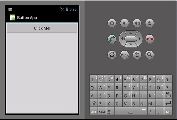
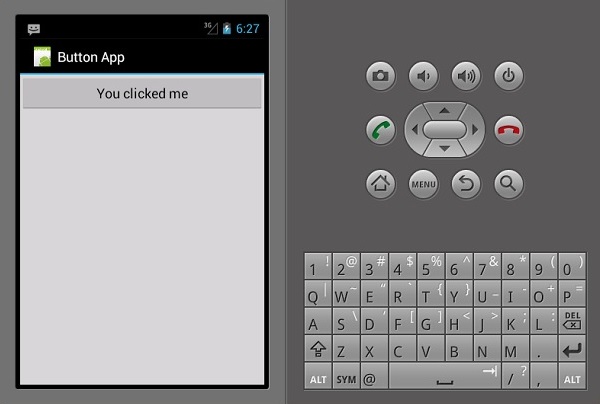
Next, build and run your application.

After clicking on the button, you will get the following output −
Xamarin - Application Manifest
All Android Apps have a manifest file commonly referred to as AndroidManifest.xml. The manifest file contains everything about the Android platform that an App needs in order to run successfully.
Here, we have listed down some of the important functions of a manifest file −
It declares the minimum API level required by the application.
It declares the permissions required by the application, e.g., camera, location, etc.
It gives permissions to hardware and software features used or required by the application.
It lists the libraries that the application must be linked.
The following screenshot shows a Manifest file.
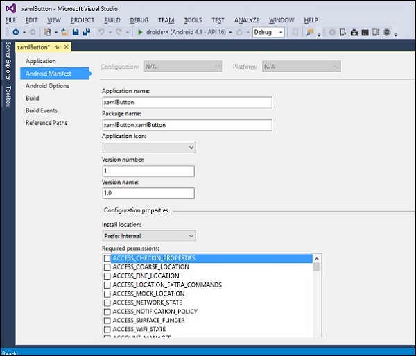
Application name − It refers to the title of your App
Package name − It is an unique name used to identify your App.
Application Icon − It is the icon displayed on the Android home screen for your App.
Version Number − It is a single number that is used to show one version of your App is more recent than another.
<manifest xmlns:android="http://schemas.android.com/apk/res/android"
   android:versionCode="1" >
Version Name − It is a user-friendly version string for your App that users will see on your App settings and on the Google PlayStore. The following code shows an example of a version name.
<manifest xmlns:android="http://schemas.android.com/apk/res/android"
   android:versionName="1.0.0">
Minimum Android Version − It is the lowest Android version platform which your application supports.
<uses-sdk android:minSdkVersion="16" />
In the above example, our minimum Android version is API Level 16, commonly referred to as JELLY BEAN.
Target Android Version − It is the Android version on which your App is compiled against.
Xamarin - Android Resources
When a new Android project is created, there are some files that are added to the project, by default. We call these default project files and folders as Android Resources. Take a look at the following screenshot.
The default Android resources include the following −
AndroidManifest.xml file − It contains information about your Android applications, e.g., the application name, permissions, etc.
Resources folder − Resources can be images, layouts, strings, etc. that can be loaded via Androids resource system.
Resources/drawable folder − It stores all the images that you are going to use in your application.
Resources/layout folder − It contains all the Android XML files (.axml) that Android uses to build user interfaces.
The Resources/values folder − It contains XML files to declare key-value pairs for strings (and other types) throughout an application. This is how localization for multiple languages is normally set up on Android.
Resources.designer.cs − This file is created automatically when the Android projected is created and it contains unique identifiers that reference the Android resources.
MainActivity.cs file − This is the first activity of your Android application and from where the main application actions are launched from.
Resource files can be accessed programmatically through a unique ID which is stored in the resources.designer.cs file. The ID is contained under a class called Resource. Any resource added to the project is automatically generated inside the resource class.
The following code shows how to create a gridview project containing seven images −
namespace HelloGridView {
   [System.CodeDom.Compiler.GeneratedCodeAttribute
      ("Xamarin.Android.Build.Tas ks",
      "1.0.0.0")]
   public partial class Resource {
      static Resource() {
         global::Android.Runtime.ResourceIdManager.UpdateIdValues();
      }

      public static void UpdateIdValues() {}
      public partial class Attribute {
         static Attribute() {
            global::Android.Runtime.ResourceIdManager.UpdateIdValues();
         }

         private Attribute() {}
      }

      public partial class Drawable {
         // aapt resource value: 0x7f020000
         public const int Icon = 2130837504;

         // aapt resource value: 0x7f020001
         public const int img1 = 2130837505;

         // aapt resource value: 0x7f020002
         public const int img2 = 2130837506;

         // aapt resource value: 0x7f020003
         public const int img3 = 2130837507;

         // aapt resource value: 0x7f020004
         public const int img4 = 2130837508;

         // aapt resource value: 0x7f020005
         public const int img5 = 2130837509;

         // aapt resource value: 0x7f020006
         public const int img6 = 2130837510;

         // aapt resource value: 0x7f020007
         public const int img7 = 2130837511;

         static Drawable() {
            global::Android.Runtime.ResourceIdManager.UpdateIdValues();
         }

         private Drawable() {}
      }

      public partial class Id {
         // aapt resource value: 0x7f050000
         public const int gridview = 2131034112;

         static Id() {
            global::Android.Runtime.ResourceIdManager.UpdateIdValues();
         }

         private Id() {}
      }

      public partial class Layout {
         // aapt resource value: 0x7f030000
         public const int Main = 2130903040;
         static Layout() {
            global::Android.Runtime.ResourceIdManager.UpdateIdValues();
         }
         private Layout() {}
      }

      public partial class String {
         // aapt resource value: 0x7f040001
         public const int ApplicationName = 2130968577;

         // aapt resource value: 0x7f040000
         public const int Hello = 2130968576;

         static String() {
            global::Android.Runtime.ResourceIdManager.UpdateIdValues();
         }
         private String() {}
      }
   }
}
From the above code, the seven images are referenced in a class called drawable. These images are added programmatically. If a user adds another image to the project, it will also be added to the drawable class. The gridview contained in the project is also added and stored in a class on its own. Each item contained in the resources folder is automatically generated and stored in a class.
Xamarin - Android Activity Lifecycle
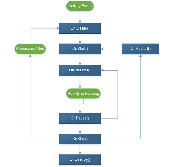
When a user navigates through an Android App, a series of events occurs. For example, when a user launches an app, e.g., the Facebook App, it starts and becomes visible on the foreground to the user, onCreate() → onStart() → onResume().
If another activity starts, e.g., a phone call comes in, then the Facebook app will go to the background and the call comes to the foreground. We now have two processes running.
onPause() --- > onStop()
When the phone call ends, the Facebook app returns to the foreground. Three methods are called.
onRestart() --- > onStart() --- > onResume()
There are 7 lifecycle processes in an Android activity. They include −
onCreate − It is called when the activity is first created.
onStart − It is called when the activity starts and becomes visible to the user.
onResume − It is called when the activity starts interacting with the user. User input takes place at this stage.
onPause − It is called when the activity runs in the background but has not yet been killed.
onStop − It is called when the activity is no longer visible to the user.
onRestart − It is called after the activity has stopped, before starting again. It is normally called when a user goes back to a previous activity that had been stopped.
onDestroy − This is the final call before the activity is removed from the memory.
The following illustration shows the Android Activity Lifecycle −
Xamarin - Permissions
In Android, by default, no application has permissions to perform any operations that would have an effect on the user or the operating system. In order for an App to perform a task, it must declare the permissions. The App cannot perform the task until the permission are granted by the Android system. This mechanism of permissions stops applications from doing as they wish without the users consent.
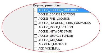
Permissions are to be recorded in AndroidManifest.xml file. To add permissions, we double-click on properties, then go to Android ManRequired permissions will appear. Check the appropriate permissions you wish to add.
Camera − It provides permission to access the devices camera.
<uses-permission android:name="android.permission.CAMERA" />
Internet − It provides access to network resources.
<uses-permission android:name="android.permission.INTERNET" />
ReadContacts − It provides access to read the contacts on your device.
<uses-permission android:name="android.permission.READ_CONTACTS" />
ReadExternalStorage − It provides access to read and store data on an external storage.
<uses-permission android:name="android.permission.READ_EXTERNAL_STORAGE" />
Calendars − It allows an app access to the calendar on the user device and events. This permission can be dangerous, as it grants an app the ability to send emails to guests without the owners awareness. The syntax for adding this permission is as shown below −
<uses-permission android:name="android.permission-group.CALENADAR" />
SMS − An app with this permission has the ability to use the devices messaging services. It includes reading, writing, and editing SMS and MMS messages. Its syntax is as shown below.
<uses-permission android:name="android.permission-group.SMS" />
Location − An app with this permission can access the devices location using the GPS network.
<uses-permission android:name="android.permission-group.LOCATION" />
Bluetooth − An app with this permission can exchange data files with other Bluetooth enabled devices wirelessly.
<uses-permission android:name="android.permission.BLUETOOTH" />
Xamarin - Building the App GUI
TextView
TextView is a very important component of the Android widgets. It is primarily used for displaying texts on an Android screen.
To create a textview, simply open main.axml and add the following code between the linear layout tags.
<TextView
   android:text = "Hello I am a text View"
   android:layout_width = "match_parent"
   android:layout_height = "wrap_content"
   android:id = "@+id/textview1" />
Button
A button is a control used to trigger an event when it is clicked. Under your Main.axml file, type the following code to create a button.
<Button
   android:id = "@+id/MyButton"
   android:layout_width = "fill_parent"
   android:layout_height = "wrap_content"
   android:text = "@string/Hello" />
Open Resources\Values\Strings.xml and type the following line of code in between <resources> tag.
<string name="Hello">Click Me!</string>
The above code provides the value of the button we created. Next, we open MainActivity.cs and create the action to be performed when the button is clicked. Type the following code under base.OnCreate (bundle) method.
Button button = FindViewById<Button>(Resource.Id.MyButton);
button.Click += delegate { button.Text = "You clicked me"; };
The above code displays You Clicked Me when a user clicks on the button.
FindViewById<< --> This method finds the ID of a view that was identified. It searches for the id in the .axml layout file.
Checkbox
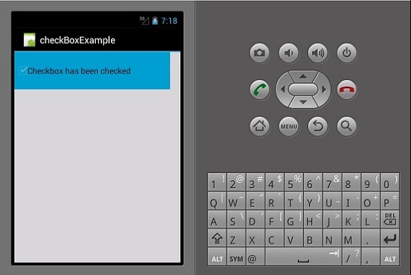
A checkbox is used when one wants to select more than one option from a group of options. In this example, we are going to create a checkbox which on selected, displays a message that it has been checked, else it displays unchecked.
To start with, we open Main.axml file in our project and type the following line of code to create a checkbox.
<?xml version = "1.0" encoding = "utf-8"?>
<LinearLayout xmlns:android = "http://schemas.android.com/apk/res/android"
   android:orientation = "vertical"
   android:background = "#d3d3d3"
   android:layout_width = "fill_parent"
   android:layout_height = "fill_parent">
   <CheckBox
      android:text = "CheckBox"
      android:padding = "25dp"
      android:layout_width = "300dp"
      android:layout_height = "wrap_content"
      android:id = "@+id/checkBox1"
      android:textColor = "@android:color/black"
      android:background = "@android:color/holo_blue_dark" />
</LinearLayout>
Next, go to MainActivity.cs to add the functionality code.
CheckBox checkMe = FindViewById<CheckBox>(Resource.Id.checkBox1);
checkMe.CheckedChange += (object sender, CompoundButton.CheckedChangeEventArgs e) => {
   CheckBox check = (CheckBox)sender;
   if(check.Checked) {
      check.Text = "Checkbox has been checked";
   } else {
      check.Text = "Checkbox has not been checked";
   }
};
From the above code, we first find the checkbox using findViewById. Next, we create a handler method for our checkbox and in our handler, we create an if else statement which displays a message depending on the outcome selected.
CompoundButton.CheckedChangeEventArgs → This method fires an event when the checkbox state changes.
Progress Bar
A progress bar is a control that is used to show the progression of an operation. To add a progress bar, add the following line of code in Main.axml file.
<ProgressBar
   style="?android:attr/progressBarStyleHorizontal"
   android:layout_width = "match_parent"
   android:layout_height = "wrap_content"
   android:id = "@+id/progressBar1" />
Next, go to MainActivity.cs and set the value of the progress bar.
ProgressBar pb = FindViewById<ProgressBar>(Resource.Id.progressBar1);
pb.Progress = 35;
In the above code, we have created a progress bar with a value of 35.
Radio Buttons
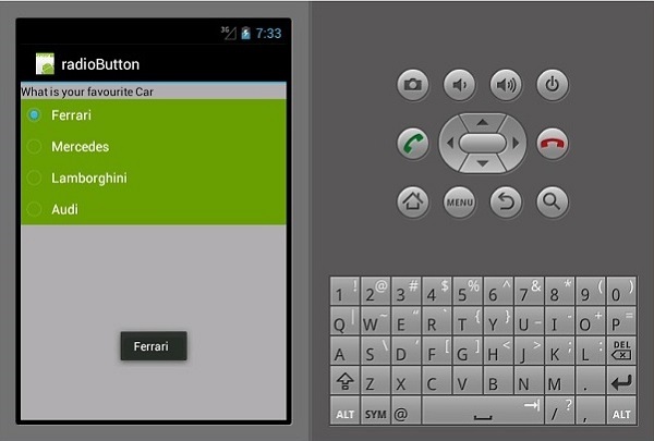
This is an Android widget which allows a person to choose one from a set of options. In this section, we are going to create a radio group containing a list of cars which will retrieve a checked radio button.
First, we add a radio group and a textview as shown in the following code −
<?xml version = "1.0" encoding = "utf-8"?>
<LinearLayout xmlns:android = "http://schemas.android.com/apk/res/android"
   android:orientation = "vertical"
   android:background = "@android:color/darker_gray"
   android:layout_width = "fill_parent"
   android:layout_height = "fill_parent">
   <TextView
      android:text = "What is your favourite Car"
      android:layout_width = "match_parent"
      android:layout_height = "wrap_content"
      android:id = "@+id/textView1"
      android:textColor = "@android:color/black" />
   <RadioGroup
      android:layout_width = "match_parent"
      android:layout_height = "wrap_content"
      android:id = "@+id/radioGroup1"
      android:backgroundTint = "#a52a2aff"
      android:background = "@android:color/holo_green_dark">
   <RadioButton
      android:layout_width = "wrap_content"
      android:layout_height = "wrap_content"
      android:text = "Ferrari"
      android:id = "@+id/radioFerrari" />
   <RadioButton
      android:layout_width = "wrap_content"
      android:layout_height = "wrap_content"
      android:text = "Mercedes"
      android:id = "@+id/radioMercedes" />
   <RadioButton
      android:layout_width = "wrap_content"
      android:layout_height = "wrap_content"
      android:text = "Lamborghini"
      android:id = "@+id/radioLamborghini" />
   <RadioButton
      android:text = "Audi"
      android:layout_width = "match_parent"
      android:layout_height = "wrap_content"
      android:id = "@+id/radioAudi" />
   </RadioGroup>
</LinearLayout>
To perform an action, when a radio button is clicked, we add an activity. Go to MainActivity.cs and create a new event handler as shown below.
private void onClickRadioButton(object sender, EventArgs e) {
   RadioButton cars = (RadioButton)sender;
   Toast.MakeText(this, cars.Text, ToastLength.Short).Show
   ();
}
Toast.MakeText() → This is a view method used to display a message/output in a small pop up. At the bottom of the OnCreate() method just after SetContentView(), add the following piece of code. This will capture each of the radio buttons and add them to the event handler we created.
RadioButton radio_Ferrari = FindViewById<RadioButton>
   (Resource.Id.radioFerrari);
   RadioButton radio_Mercedes = FindViewById<RadioButton>
   (Resource.Id.radioMercedes);
   RadioButton radio_Lambo = FindViewById<RadioButton>
   (Resource.Id.radioLamborghini);
   RadioButton radio_Audi = FindViewById<RadioButton>
   (Resource.Id.radioAudi);
   radio_Ferrari.Click += onClickRadioButton;
   radio_Mercedes.Click += onClickRadioButton;
   radio_Lambo.Click += onClickRadioButton;
   radio_Audi.Click += onClickRadioButton;
Now, run your application. It should display the following screen as the output −
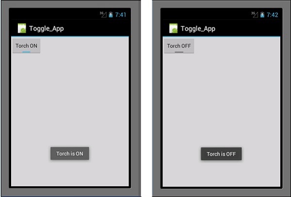
Toggle Buttons
Toggle button are used to alternate between two states, e.g., it can toggle between ON and OFF. Open Resources\layout\Main.axml and add the following lines of code to create a toggle button.
<?xml version = "1.0" encoding = "utf-8"?>
<LinearLayout xmlns:android = "http://schemas.android.com/apk/res/android"
   android:orientation = "vertical"
   android:background = "#d3d3d3"
   android:layout_width = "fill_parent"
   android:layout_height = "fill_parent">
   <ToggleButton
      android:id = "@+id/togglebutton"
      android:layout_width = "wrap_content"
      android:layout_height = "wrap_content"
      android:textOn = "Torch ON"
      android:textOff = "Torch OFF"
      android:textColor = "@android:color/black" />
</LinearLayout>
We can add actions to the toggle bar when it is clicked. Open MainActivity.cs and add the following lines of code after the OnCreate() method class.
ToggleButton togglebutton = FindViewById<ToggleButton> (Resource.Id.togglebutton);
togglebutton.Click += (o, e) => {
   if (togglebutton.Checked)
      Toast.MakeText(this, "Torch is ON", ToastLength.Short).Show ();
   else
      Toast.MakeText(this, "Torch is OFF",
      ToastLength.Short).Show();
};
Now, when you run the App, it should display the following output −
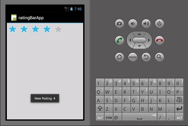
Ratings Bar
A Ratings Bar is a form element that is made up of stars which app users can use to rate things you have provided for them. In your Main.axml file, create a new rating bar with 5 stars.
<?xml version = "1.0" encoding = "utf-8"?>
<LinearLayout xmlns:android = "http://schemas.android.com/apk/res/android"
   android:orientation = "vertical"
   android:background = "#d3d3d3"
   android:layout_width = "fill_parent"
   android:layout_height = "fill_parent">
   <RatingBar
      android:layout_width = "wrap_content"
      android:layout_height = "wrap_content"
      android:id = "@+id/ratingBar1"
      android:numStars = "5"
      android:stepSize = "1.0" />
</LinearLayout>
On running the app, it should display the following output −
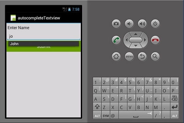
Autocomplete Textview
This is a textview that shows full suggestions while a user is typing. We are going to create an autocomplete textview containing a list of peoples names and a button which on click will show us the selected name.
Open Main.axml and write the following code.
<?xml version = "1.0" encoding = "utf-8"?>
<LinearLayout xmlns:android = "http://schemas.android.com/apk/res/android"
   android:orientation = "vertical"
   android:layout_width = "fill_parent"
   android:background = "#d3d3d3"
   android:layout_height = "fill_parent">
   <TextView
      android:text = "Enter Name"
      android:textAppearance = "?android:attr/textAppearanceMedium"
      android:layout_width = "fill_parent"
      android:layout_height = "wrap_content"
      android:id = "@+id/textView1"
      android:padding = "5dp"
      android:textColor = "@android:color/black" />
   <AutoCompleteTextView
      android:layout_width = "fill_parent"
      android:layout_height = "wrap_content"
      android:id = "@+id/autoComplete1"
      android:textColor = "@android:color/black" />
   <Button
      android:text = "Submit"
      android:layout_width = "fill_parent"
      android:layout_height = "wrap_content"
      android:id = "@+id/btn_Submit"
      android:background="@android:color/holo_green_dark" />
</LinearLayout>
The above code generates a TextView for typing, AutoCompleteTextView for showing suggestions, and a button to display the names entered from the TextView. Go to MainActivity.cs to add the functionality.
Create a new event handler method as shown below.
protected void ClickedBtnSubmit(object sender, System.EventArgs e){
   if (autoComplete1.Text != ""){
      Toast.MakeText(this, "The Name Entered ="
         + autoComplete1.Text, ToastLength.Short).Show();
   } else {
      Toast.MakeText(this, "Enter a Name!", ToastLength.Short).Show();
   }
}
The created handler checks whether the autocomplete textview is empty. If it is not empty, then it displays the selected autocomplete text. Type the following code inside the OnCreate() class.
autoComplete1 = FindViewById<AutoCompleteTextView>(Resource.Id.autoComplete1);
btn_Submit = FindViewById<Button>(Resource.Id.btn_Submit);
var names = new string[] { "John", "Peter", "Jane", "Britney" };
ArrayAdapter adapter = new ArrayAdapter<string>(this,
   Android.Resource.Layout.SimpleSpinnerItem, names);
autoComplete1.Adapter = adapter;
btn_Submit.Click += ClickedBtnSubmit;
ArrayAdapter − This is a collection handler that reads data items from a list collection and returns them as a view or displays them on the screen.
Now, when you run the application, it should display the following output.
Xamarin - Menus
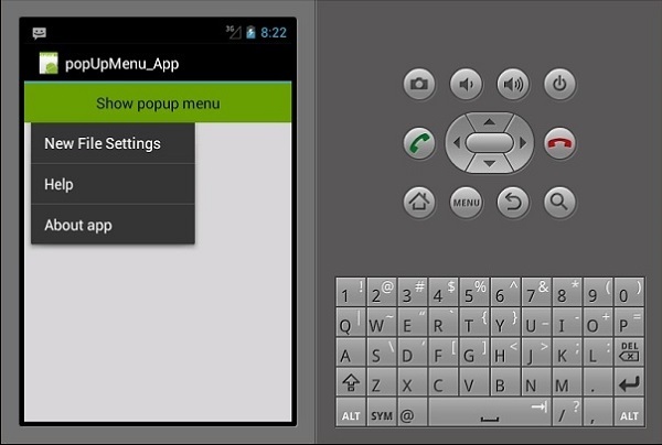
Popup Menus
A popup menu refers to a menu that is attached to a view; it is also referred to as a shortcut menu. Lets see how to add a popup menu to an Android App.
Create a new project and call it popUpMenu App. Open Main.axml and create a button which will be used to display the popup menu.
<?xml version = "1.0" encoding = "utf-8"?>
<LinearLayout xmlns:android = "http://schemas.android.com/apk/res/android"
   android:orientation = "vertical"
   android:background = "#d3d3d3"
   android:layout_width = "fill_parent"
   android:layout_height = "fill_parent">
   <Button
      android:id = "@+id/popupButton"
      android:layout_width = "fill_parent"
      android:layout_height = "wrap_content"
      android:text = "Show popup menu"
      android:background = "@android:color/holo_green_dark"
      android:textColor = "@android:color/black" />
</LinearLayout>
Create a new folder under the Resources folder and call it Menu. Inside the Menu folder, add a new xml file called popMenu.xml.
Under popMenu.xml, add the following menu items.
<?xml version = "1.0" encoding="utf-8"?>
<menu xmlns:android = "http://schemas.android.com/apk/res/android">
   <item
      android:id = "@+id/file_settings"
      android:icon = "@drawable/img_settings"
      android:title = "Settings"
      android:showAsAction = "ifRoom">

      <item
         android:id = "@+id/new_game1"
         android:icon = "@drawable/imgNew"
         android:title = "New File Settings"/>
      <item
         android:id = "@+id/help"
         android:icon = "@drawable/img_help"
         android:title = "Help" />
      <item
         android:id = "@+id/about_app"
         android:icon = "@drawable/img_help"
         android:title = "About app"/>
   </item>
</menu>
After adding the menu items, go to mainActivity.cs to display the popup menu on button click.
protected override void OnCreate(Bundle bundle) {
   base.OnCreate(bundle);
   SetContentView(Resource.Layout.Main);
   Button showPopupMenu = FindViewById<Button>(Resource.Id.popupButton);
   showPopupMenu.Click += (s, arg) => {
      PopupMenu menu = new PopupMenu(this, showPopupMenu);
      menu.Inflate(Resource.Menu.popMenu);
      menu.Show();
   };
}
Now, build and run your application. It should produce the following output −
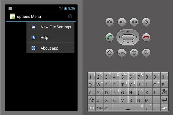
Options Menu
Options Menu is a collection of menus that are primary to an App and are mainly used to store settings, search, etc. Here, we are going to create a menu for settings with three items inside, i.e., New File Settings, Help, and About App.
To create an options menu, we must create a new XML layout file in the resources folder. First of all, we will add a new XML file. Right-click on the Layout folder, then go to Add → New item → Visual C# → XML File.
Choose an appropriate name for the layout file. In our example, we will call our file myMenu.xml.
Inside myMenu.xml, we are going to create a new menu and add items inside. The following code shows how to do it.
<?xml version = "1.0" encoding = "utf-8"?>
<menu xmlns:android = "http://schemas.android.com/apk/res/android">
  <item
      android:id = "@+id/file_settings"
      android:icon = "@drawable/img_settings"
      android:title = "Settings"
      android:showAsAction = "ifRoom">

      <menu>
         <item
            android:id = "@+id/new_game1"
            android:icon = "@drawable/imgNew"
            android:title = "New File Settings" />
         <item
            android:id = "@+id/help"
            android:icon = "@drawable/img_help"
            android:title = "Help" />
         <item
            android:id = "@+id/about_app"
            android:icon = "@drawable/img_help"
            android:title = "About app"/>
      </menu>
   </item>
</menu>
Next, we navigate to MainActivity.cs and create an override class for onOptionsMenu().
public override bool OnCreateOptionsMenu(IMenu menu) {
   MenuInflater.Inflate(Resource.Menu.myMenu, menu);
   return base.OnPrepareOptionsMenu(menu);
}
Next, we create an action to respond to the settings menu when it is selected. To do this, we create another override class for the OnOptionsItemSelected() menu.
public override bool OnOptionsItemSelected(IMenuItem item) {
   if (item.ItemId == Resource.Id.file_settings) {
      // do something here...
      return true;
   }
   return base.OnOptionsItemSelected(item);
}
Our final complete code will look as follows −
namespace optionsMenuApp {
   [Activity(Label = "options Menu", MainLauncher = true, Icon = "@drawable/icon")]
   public class MainActivity : Activity {
      public override bool OnCreateOptionsMenu(IMenu menu) {
         MenuInflater.Inflate(Resource.Menu.myMenu, menu);
         return base.OnPrepareOptionsMenu(menu);
      }
      public override bool OnOptionsItemSelected(IMenuItem item) {
         if (item.ItemId == Resource.Id.file_settings) {
            // do something here...
            return true;
         }
         return base.OnOptionsItemSelected(item);
      }
   }
}
Now, build and run your application. It should produce the following output −
Xamarin - Layouts
Linear Layout
In linear layout, the contents are arranged in either horizontal or vertical manner.
Linear Layout Horizontal
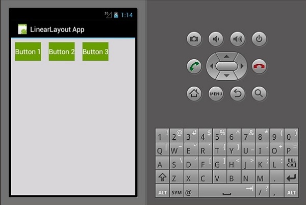
The contents of this layout are arranged horizontally. For this demo, we are going to create 3 buttons and arrange them horizontally in a linear layout.
<?xml version = "1.0" encoding = "utf-8"?>
<LinearLayout xmlns:android = "http://schemas.android.com/apk/res/android"
   android:orientation = "horizontal"
   android:layout_width = "fill_parent"
   android:layout_height = "fill_parent"
   android:background = "#d3d3d3"
   android:minWidth="25px"
   android:minHeight="25px">
   <Button
      android:id="@+id/MyButton1"
      android:layout_width="wrap_content"
      android:layout_margin="10dp"
      android:layout_height="wrap_content"
      android:text="Button 1"
      android:background="@android:color/holo_green_dark" />
   <Button
      android:id="@+id/MyButton2"
      android:layout_width="wrap_content"
      android:layout_margin="10dp"
      android:layout_height="wrap_content"
      android:text="Button 2"
      android:background="@android:color/holo_green_dark" />
   <Button
      android:id="@+id/MyButton3"
      android:layout_width="wrap_content"
      android:layout_margin="10dp"
      android:layout_height="wrap_content"
      android:text="Button 3"
      android:background="@android:color/holo_green_dark" />
</LinearLayout>
The resulting output is as shown below −
Linear Layout Vertical
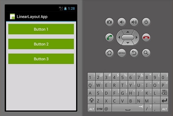
This type of layout places the child view in a vertical manner.
<?xml version = "1.0" encoding = "utf-8"?>
<LinearLayout xmlns:android = "http://schemas.android.com/apk/res/android"
   android:orientation = "vertical"
   android:layout_width = "fill_parent"
   android:layout_height = "fill_parent"
   android:background = "#d3d3d3"
   android:minWidth = "25px"
   android:minHeight = "25px">
   <Button
      android:id = "@+id/MyButton1"
      android:layout_width = "fill_parent"
      android:layout_margin = "10dp"
      android:layout_height = "wrap_content"
      android:text = "Button 1"
      android:background = "@android:color/holo_green_dark" />
   <Button
      android:id = "@+id/MyButton2"
      android:layout_width = "fill_parent"
      android:layout_margin = "10dp"
      android:layout_height = "wrap_content"
      android:text = "Button 2"
      android:background = "@android:color/holo_green_dark" />
   <Button
      android:id = "@+id/MyButton3"
      android:layout_width = "fill_parent"
      android:layout_margin = "10dp"
      android:layout_height = "wrap_content"
      android:text="Button 3"
      android:background = "@android:color/holo_green_dark" />
</LinearLayout>
Its resulting output is as follows −
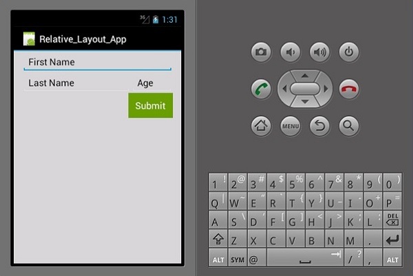
Relative Layout
In this view, the position of the child view is relative to its parent or to its sibling view. In the following example, we are going to create 3 EditText views and a button and then, align them relatively.
Create a new project and call it relative layout app. Open main.axml and add the following code.
<?xml version = "1.0" encoding = "utf-8"?>
<RelativeLayout xmlns:android = "http://schemas.android.com/apk/res/android"
   android:layout_width = "match_parent"
   android:layout_height = "match_parent"
   android:paddingLeft = "16dp"
   android:background = "#d3d3d3"
   android:paddingRight = "16dp">
   <EditText
      android:id = "@+id/name"
      android:layout_width = "match_parent"
      android:layout_height = "wrap_content"
      android:hint = "First Name"
      android:textColorHint = "@android:color/background_dark"
      android:textColor = "@android:color/background_dark" />
   <EditText
      android:id = "@+id/lastName"
      android:layout_width = "0dp"
      android:layout_height = "wrap_content"
      android:hint = "Last Name"
      android:layout_below = "@id/name"
      android:textColorHint = "@android:color/background_dark"
      android:textColor = "@android:color/background_dark"
      android:layout_alignParentLeft = "true"
      android:layout_toLeftOf = "@+id/age" />
   <EditText
      android:id = "@id/age"
      android:layout_width = "80dp"
      android:layout_height = "wrap_content"
      android:layout_below = "@id/name"
      android:hint = "Age"
      android:textColorHint = "@android:color/background_dark"
      android:textColor = "@android:color/background_dark"
      android:layout_alignParentRight = "true" />
   <Button
      android:layout_width = "85dp"
      android:layout_height = "wrap_content"
      android:layout_below = "@id/age"
      android:layout_alignParentRight = "true"
      android:text = "Submit"
      android:background = "@android:color/holo_green_dark" />
</RelativeLayout>
The important parameters that we have used in this code are −
android:layout_below − It aligns the child view element below its parent.
android:layout_alignParentLeft − It aligns the parent element to the left.
android:layout_toLeftOf − This property aligns an element to the left of another element.
android:layout_alignParentRight − It aligns the parent to the right.
When you build and run the App now, it would produce the following output screen −
Frame Layout
The frame layout is used to display only one item. Its difficult to arrange multiple items in this layout without having them overlap each other.
Start a new project and call it frameLayoutApp. Create a new Frame Layout as shown below.
<?xml version = "1.0" encoding = "utf-8"?>
<FrameLayout xmlns:android = "http://schemas.android.com/apk/res/android"
   android:layout_width = "fill_parent"
   android:layout_height = "fill_parent">
  <ImageView
      android:id = "@+id/ImageView1"
      android:scaleType = "matrix"
      android:layout_height = "fill_parent"
      android:layout_width = "fill_parent"
      android:src = "@drawable/img1" />
   <TextView
      android:layout_width = "fill_parent"
      android:layout_height = "wrap_content"
      android:textSize = "50dp"
      android:textColor = "#000"
      android:text = "This is a Lake" />
   <TextView
      android:gravity = "right"
      android:layout_width = "fill_parent"
      android:layout_height = "wrap_content"
      android:textSize = "50dp"
      android:text = "A very Deep Lake"
      android:layout_gravity = "bottom"
      android:textColor = "#fff" />
</FrameLayout>
The above code creates an imageView which fills the entire screen. Two textviews then float above the imageView.
Now, build and run your application. It will display the following output −
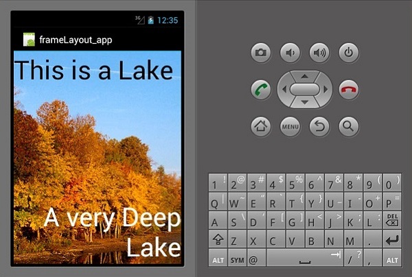
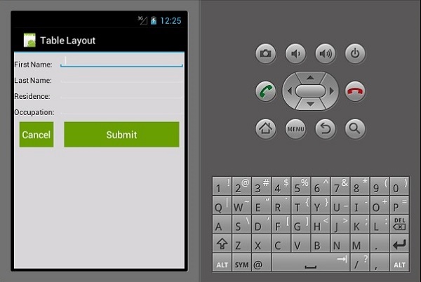
Table Layout
In this layout, the view is arranged into rows and columns. Lets see how it works.
<?xml version = "1.0" encoding = "utf-8"?>
<TableLayout xmlns:android = "http://schemas.android.com/apk/res/android"
   android:layout_width = "fill_parent"
   android:background = "#d3d3d3"
   android:layout_height = "fill_parent"
   android:stretchColumns = "1">

   <TableRow>
      <TextView
         android:text = "First Name:"
         android:layout_width = "wrap_content"
         android:layout_height = "wrap_content"
         android:textColor = "@android:color/black" />
      <EditText
         android:width = "100px"
         android:layout_width = "fill_parent"
         android:layout_height = "30dp"
         android:textColor = "@android:color/black" />
   </TableRow>

   <TableRow>
      <TextView
         android:text = "Last Name:"
         android:layout_width = "wrap_content"
         android:layout_height = "wrap_content"
         android:textColor = "@android:color/black" />
      <EditText
         android:width = "50px"
         android:layout_width = "fill_parent"
         android:layout_height = "30dp"
         android:textColor = "@android:color/black" />
   </TableRow>

   <TableRow>
      <TextView
         android:text = "Residence:"
         android:layout_width = "wrap_content"
         android:layout_height = "wrap_content"
         android:textColor = "@android:color/black" />
      <EditText
         android:width = "100px"
         android:layout_width = "fill_parent"
         android:layout_height = "30dp"
         android:textColor = "@android:color/black" />
   </TableRow>

   <TableRow>
      <TextView
         android:text = "Occupation:"
         android:layout_width = "wrap_content"
         android:layout_height = "wrap_content"
         android:textColor = "@android:color/black" />
      <EditText
         android:width = "100px"
         android:layout_width = "fill_parent"
         android:layout_height = "30dp"
         android:textColor = "@android:color/black" />
   </TableRow>

   <TableRow>
      <Button
         android:text = "Cancel"
         android:layout_width = "wrap_content"
         android:layout_margin = "10dp"
         android:layout_height = "wrap_content"
         android:background = "@android:color/holo_green_dark" />
      <Button
         android:text = "Submit"
         android:width = "100px"
         android:layout_margin = "10dp"
         android:layout_width = "wrap_content"
         android:layout_height = "wrap_content"
         android:background = "@android:color/holo_green_dark" />
   </TableRow>
</TableLayout>
The above code creates a simple data entry form arranged using tables and rows.
Xamarin - Android Widgets
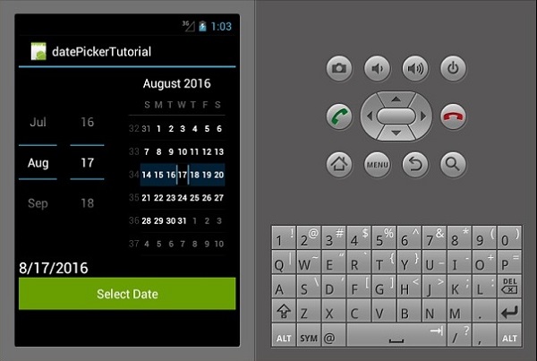
Date Picker
This is a widget used to display date. In this example, we are going to create a date picker which displays the set date on a text view.
First of all, create a new project and call it datePickerExample. Open Main.axml and create a datepicker, textview, and a button.
<?xml version = "1.0" encoding = "utf-8"?>
<LinearLayout xmlns:android = "http://schemas.android.com/apk/res/android"
   android:orientation = "vertical"
   android:layout_width = "fill_parent"
   android:layout_height = "fill_parent">
   <DatePicker
      android:layout_width = "match_parent"
      android:layout_height = "wrap_content"
      android:id = "@+id/datePicker1" />
   <TextView
      android:text = "Current Date"
      android:textAppearance = "?android:attr/textAppearanceLarge"
      android:layout_width = "match_parent"
      android:layout_height = "wrap_content"
      android:id = "@+id/txtShowDate" />
   <Button
      android:text = "Select Date"
      android:layout_width = "match_parent"
      android:layout_height = "wrap_content"
      android:id = "@+id/btnSetDate" />
</LinearLayout>
Next, go to Mainactivity.cs. We first create a private instance of a textview inside the mainActivity:Activity class.
The instance will be used to store the date selected or the default date.
private TextView showCurrentDate;
Next, add the following code after setContentView() method.
DatePicker pickDate = FindViewById<DatePicker>(Resource.Id.datePicker1);
showCurrentDate = FindViewById<TextView>(Resource.Id.txtShowDate);
setCurrentDate();
Button button = FindViewById<Button>(Resource.Id.btnSetDate);
button.Click += delegate {
   showCurrentDate.Text = String.Format("{0}/{1}/{2}",
      pickDate.Month, pickDate.DayOfMonth, pickDate.Year);
};
In the above code, we have referenced our datepicker, textview, and button by finding them from our main.axml file using FindViewById class.
After referencing, we set the button click event which is responsible for passing the selected date from the date picker to the textview.
Next, we create the setCurrentDate() method for displaying the default current date to our textview. The following code explains how it is done.
private void setCurrentDate() {
   string TodaysDate = string.Format("{0}",
      DateTime.Now.ToString("M/d/yyyy").PadLeft(2, '0'));
   showCurrentDate.Text = TodaysDate;
}
DateTime.Now.ToString() class binds todays time to a string object.
Now, build and run the App. It should display the following output −
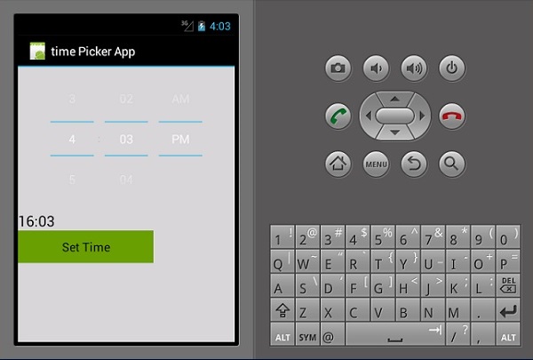
Time Picker
Time Picker is a widget used to display time as well as allowing a user to pick and set time. We are going to create a basic time picker app that displays the time and also allows a user to change the time.
Go to main.axml and add a new button, textview, and a time picker as shown in the following code.
<?xml version = "1.0" encoding = "utf-8"?>
<LinearLayout xmlns:android = "http://schemas.android.com/apk/res/android"
   android:orientation = "vertical"
   android:background = "#d3d3d3"
   android:layout_width = "fill_parent"
   android:layout_height = "fill_parent">
   <TimePicker
      android:layout_width = "match_parent"
      android:layout_height = "wrap_content"
      android:id = "@+id/timePicker1" />
   <TextView
      android:text = "Time"
      android:textAppearance = "?android:attr/textAppearanceLarge"
      android:layout_width = "match_parent"
      android:layout_height = "wrap_content"
      android:id = "@+id/txt_showTime"
      android:textColor = "@android:color/black" />
   <Button
      android:text = "Set Time"
      android:layout_width = "200dp"
      android:layout_height = "wrap_content"
      android:id = "@+id/btnSetTime"
      android:textColor = "@android:color/black"
      android:background = "@android:color/holo_green_dark" />
</LinearLayout>
Go to MainActivity.cs to add the functionality for displaying a set date on the textview we created.
public class MainActivity : Activity {

   private TextView showCurrentTime;

   protected override void OnCreate(Bundle bundle) {

      base.OnCreate(bundle);
      SetContentView(Resource.Layout.Main);
      TimePicker Tpicker = FindViewById<TimePicker>(Resource.Id.timePicker1);
      showCurrentTime = FindViewById<TextView>(Resource.Id.txt_showTime);
      setCurrentTime();
      Button button = FindViewById<Button>(Resource.Id.btnSetTime);

      button.Click += delegate {
         showCurrentTime.Text = String.Format("{0}:{1}",
            Tpicker.CurrentHour, Tpicker.CurrentMinute);
      };
   }
   private void setCurrentTime() {
      string time = string.Format("{0}",
         DateTime.Now.ToString("HH:mm").PadLeft(2, '0'));
      showCurrentTime.Text = time;
   }
}
In the above code, we first referenced the timepicker,set time button and the textview for showing time through the FindViewById<> class. We then created a click event for the set time button which on click sets the time to the time selected by a person. By default, it shows the current system time.
The setCurrentTime() method class initializes the txt_showTime textview to display the current time.
Now, build and run your application. It should display the following output −
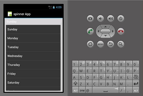
Spinner
A spinner is a widget used to select one option from a set. It is an equivalent of a dropdown/Combo box. First of all, create a new project and call it Spinner App Tutorial.
Open Main.axml under the layout folder and create a new spinner.
<?xml version = "1.0" encoding = "utf-8"?>
<LinearLayout xmlns:android = "http://schemas.android.com/apk/res/android"
   android:orientation = "vertical"
   android:layout_width = "fill_parent"
   android:layout_height = "fill_parent">
   <Spinner
      android:layout_width = "match_parent"
      android:layout_height = "wrap_content"
      android:id = "@+id/spinner1"
      android:prompt = "@string/daysOfWeek" />
</LinearLayout>
Open Strings.xml file located under values folder and add the following code to create the spinner items.
<resources>
  <string name = "daysOfWeek">Choose a planet</string>
  <string-array name = "days_array">
      <item>Sunday</item>
      <item>Monday</item>
      <item>Tuesday</item>
      <item>Wednesday</item>
      <item>Thursday</item>
      <item>Friday</item>
      <item>Saturday</item>
      <item>Sunday</item>
   </string-array>
</resources>
Next, open MainActivity.cs to add the functionality for displaying the selected day of the week.
protected override void OnCreate(Bundle bundle) {
   base.OnCreate(bundle);
   // Set our view from the "main" layout resource
   SetContentView(Resource.Layout.Main);
   Spinner spinnerDays = FindViewById<Spinner>(Resource.Id.spinner1);
   spinnerDays.ItemSelected += new EventHandler
      <AdapterView.ItemSelectedEventArgs>(SelectedDay);
   var adapter = ArrayAdapter.CreateFromResource(this,
      Resource.Array.days_array, Android.Resource.Layout.SimpleSpinnerItem);
   adapter.SetDropDownViewResource(Android.Resource.Layout.SimpleSpinnerDropD ownItem);
   spinnerDays.Adapter = adapter;
}
private void SelectedDay(object sender, AdapterView.ItemSelectedEventArgs e) {
   Spinner spinner = (Spinner)sender;
   string toast = string.Format("The selected
      day is {0}", spinner.GetItemAtPosition(e.Position));
   Toast.MakeText(this, toast, ToastLength.Long).Show();
}
Now, build and run the application. It should display the following output −
In the above code, we referenced the spinner we created in our main.axml file through the FindViewById<> class. We then created a new arrayAdapter() which we used to bind our array items from the strings.xml class.
Finally we created the method SelectedDay() which we used to display the selected day of the week.
Xamarin - Android Dialogs
Alert Dialog
In this section, we are going to create a button which on clicked displays an alert dialog box. The dialog box contains two buttons, i.e., Delete and Cancel buttons.
First of all, go to main.axml and create a new button inside the linear layout as shown in the following code.
<?xml version = "1.0" encoding = "utf-8"?>
<LinearLayout xmlns:android = "http://schemas.android.com/apk/res/android"
   android:orientation = "vertical"
   android:layout_width = "fill_parent"
   android:background = "#d3d3d3"
   android:layout_height = "fill_parent">
   <Button
      android:id="@+id/MyButton"
      android:layout_width = "fill_parent"
      android:layout_height = "wrap_content"
      android:text = "Click to Delete"
      android:textColor = "@android:color/background_dark"
      android:background = "@android:color/holo_green_dark" />
</LinearLayout>
Next, open MainActivity.cs to create the alert dialog and add its functionality.
protected override void OnCreate(Bundle bundle) {
   base.OnCreate(bundle);
   SetContentView(Resource.Layout.Main);
   Button button = FindViewById<Button>(Resource.Id.MyButton);
   button.Click += delegate {
      AlertDialog.Builder alertDiag = new AlertDialog.Builder(this);
      alertDiag.SetTitle("Confirm delete");
      alertDiag.SetMessage("Once deleted the move cannot be undone");
      alertDiag.SetPositiveButton("Delete", (senderAlert, args) => {
         Toast.MakeText(this, "Deleted", ToastLength.Short).Show();
      });
      alertDiag.SetNegativeButton("Cancel", (senderAlert, args) => {
         alertDiag.Dispose();
      });
      Dialog diag = alertDiag.Create();
      diag.Show();
   };
}
Once done, build and run your Application to view the outcome.
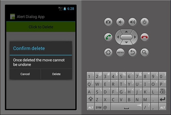
In the above code, we have created an alert dialog called alertDiag, with the following two buttons −
setPositiveButton − It contains the Delete button action which on clicked displays a confirmation message Deleted.
setNegativeButton − It contains a Cancel button which when clicked simply closes the alert dialog box.
Xamarin - Gallery
A Gallery is a type of view that is used to show items in a horizontal scrollable list. The selected item is then shown at the center. In this example, you are going to create a gallery containing images which are scrollable horizontally. An image when clicked will display a number for the selected image.
First of all, create a new project and give it a name, e.g., Gallery App Tutorial. Before you start to code, paste 7 images into the resource /drawable folder. Navigate to main.axml under resources folder and a gallery in between the linear layout tags.
<?xml version="1.0" encoding="utf-8"?>
<LinearLayout xmlns:android="http://schemas.android.com/apk/res/android"
   android:orientation="vertical"
   android:layout_width="fill_parent"
   android:layout_height="fill_parent"
   android:background="#d3d3d3">
   <Gallery
      android:id="@+id/gallery"
      android:layout_width="fill_parent"
      android:layout_height="wrap_content"
      android:padding="10dp" />
</LinearLayout>
Create a new class called ImageAdapter. This class is going to be used to bind the images to the gallery we created above.
The first step is to add a class that contains a context cont which we use to store fields.
public class ImageAdapter : BaseAdapter {
   Context cont;
   public ImageAdapter(Context ct) {
      cont = ct;
   }
}
Next, we count the array list which contains our image and returns its size.
public override int Count {
   get {
      return imageArraylist.Length;
   }
}
In the next step, we get the position of the item. The following code shows how to do it.
public override Java.Lang.Object GetItem(int position) {
   return null;
}
public override long GetItemId(int position) {
   return 0;
}
In the next step, we create an imageview for the items referenced by the adapter.
public override View GetView(int position,View convertView, ViewGroup parent) {
   ImageView img = new ImageView(cont);
   img.SetImageResource(imageArraylist[position]);
   img.SetScaleType(ImageView.ScaleType.FitXy);
   img.LayoutParameters = new Gallery.LayoutParams(200, 100);
   return img;
}
In the final step, we create a reference to the images we added in the resources.drawable folder. To do this, we create an array to hold the collection of images. The following code explains how to do it.
int[] imageArraylist = {
   Resource.Drawable.img1,
   Resource.Drawable.img2,
   Resource.Drawable.img3,
   Resource.Drawable.img4,
   Resource.Drawable.img5,
   Resource.Drawable.img6,
  };
}
Next, we go to mainActivity.cs and insert the following code under the OnCreate() method.
Gallery myGallery = (Gallery)FindViewById<Gallery>(Resource.Id.gallery);
myGallery.Adapter = new ImageAdapter(this);
myGallery.ItemClick += delegate(object sender, AdapterView.ItemClickEventArgs args) {
   Toast.MakeText(this,
      args.Position.ToString(), ToastLength.Short).Show();
}
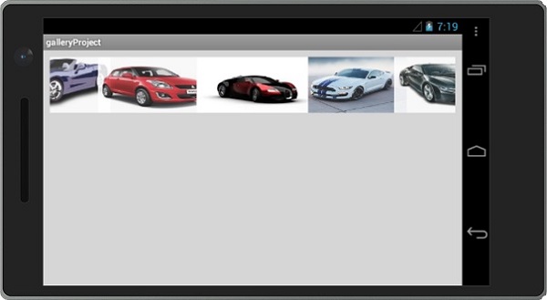
Finally, build and run your application to view the output.
Xamarin - Andriod Views
ListViews
A Listview is a user interface element that displays lists of items that are scrollable.
Binding data to listviews
In this example, you are going to create a listView that displays the days of the week. To start with, let us create a new XML file and name it listViewTemplate.xml.
In listViewTemplate.xml, we add a new textview as shown below.
<?xml version = "1.0" encoding = "utf-8" ?>
<TextView xmlns:android = "http://schemas.android.com/apk/res/android"
android:id = "@+id/textItem"
android:textSize ="20sp"
android:layout_width = "fill_parent"
android:layout_height = "wrap_content"/>
Next, go to Main.axml and create a new listview inside the Linear Layout.
<ListView
   android:minWidth="25px"
   android:minHeight="25px"
   android:layout_width="match_parent"
   android:layout_height="match_parent"
   android:id="@+id/listView1" />
Open MainActivity.cs and type the following code to bind the data to the listview we created. The code must be written inside the OnCreate() method.
SetContentView(Resource.Layout.Main);
var listView = FindViewById<ListView>(Resource.Id.listView1);
var data = new string[] {
   "Sunday", "Monday", "Tuesday", "Wednesday", "Thursday", "Friday", "Saturday"
};
listView.Adapter = new ArrayAdapter(this, Resource.Layout.ListViewTemplate, data);
Var data = new string[] simply holds our items as an array.
Array Adapter returns the items in our collection as a view. By default, the Array Adapter uses a default textView to display each item. In the above code, we created our own textview in ListViewTemplate.xml and referenced it using the constructor shown below.
ArrayAdapter(this, Resource.Layout.ListViewTemplate, data);
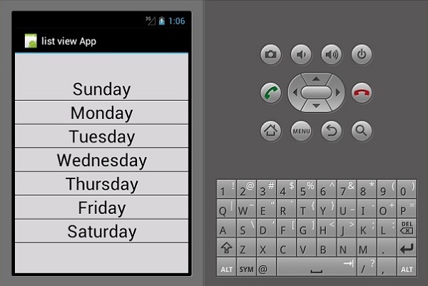
Finally, build and run your application to view the output.
GridViews
A gridView is a view group that allows applications to lay out content in a two-dimensional way, scrollable grid.
To add a GridView, create a new project and call it gridViewApp. Go to Main.axml and add a grid as shown below.
<?xml version = "1.0" encoding="utf-8"?>
<GridView xmlns:android = "http://schemas.android.com/apk/res/android"
   android:id = "@+id/gridview"
   android:layout_width = "fill_parent"
   android:layout_height = "fill_parent"
   android:columnWidth = "90dp"
   android:numColumns = "auto_fit"
   android:verticalSpacing = "10dp"
   android:horizontalSpacing = "10dp"
   android:stretchMode = "columnWidth"
   android:gravity = "center" />
Next, create a new class and name it ImageAdpter.cs. This class will contain the adapter classes for all items which will be shown in the grid.
Inside ImageAdapter, add the following code −
public class ImageAdapter : BaseAdapter {
   Context context;
   public ImageAdapter(Context ch) {
      context = ch;
   }

   public override int Count {
      get {
         return cars.Length;
      }
   }

   public override long GetItemId(int position) {
   return 0;
   }

   public override Java.Lang.Object GetItem(int position) {
      return null;
   }

   public override View GetView(int position,
      View convertView, ViewGroup parent) {
      ImageView imageView;
      if (convertView == null) {
         imageView = new ImageView(context);
         imageView.LayoutParameters = new GridView.LayoutParams(100, 100);
         imageView.SetScaleType(ImageView.ScaleType.CenterCrop);
         imageView.SetPadding(8, 8, 8, 8);
      } else {
         imageView = (ImageView)convertView;
      }

      imageView.SetImageResource(cars[position]);
      return imageView;
   }

   int[] cars = {
      Resource.Drawable.img1, Resource.Drawable.img2,
      Resource.Drawable.img3, Resource.Drawable.img4,
      Resource.Drawable.img5, Resource.Drawable.img6,
   };
}
In the above code, we have simply bound our car images to the image adapters. Next, open MainActivity.cs and add the following code after setContentView().
var gridview = FindViewById<GridView>(Resource.Id.gridview);
gridview.Adapter = new ImageAdapter(this);
gridview.ItemClick += delegate(object sender,
   AdapterView.ItemClickEventArgs args) {
      Toast.MakeText(this,
         args.Position.ToString(), ToastLength.Short).Show();
};
The above code finds the gridView in main.axml and binds it to the imageAdapter class. Gridview.ItemClick creates an onClick event which returns the position of the selected image when a user clicks on an image.
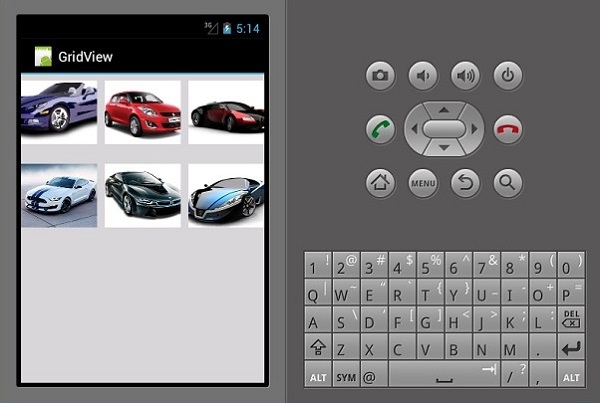
Now, build and run your application to view the output.
Xamarin - Multiscreen App
In this chapter, we are going to create a login system that enables a user to register. Then, we will take the registered user to the home screen of our App upon successful login.
First of all, create a new project and call it Login System. On your new project, go to main.axml and add two buttons and a progress bar as shown below.
<?xml version = "1.0" encoding = "utf-8"?>
<LinearLayout xmlns:android = "http://schemas.android.com/apk/res/android"
   android:orientation = "vertical"
   android:layout_width = "fill_parent"
   android:layout_height = "fill_parent"
   android:background = "@android:color/background_light"
   android:weightSum = "100"
   android:minWidth = "25px"
   android:minHeight = "25px">
   <TextView
      android:text = "Login App"
      android:textAppearance = "?android:attr/textAppearanceMedium"
      android:layout_width = "match_parent"
      android:layout_weight = "20"
      android:layout_height = "0dp"
      android:textColor = "#368DEB"
      android:id = "@+id/txtCreatAccount"
      android:gravity = "center"
      android:textStyle = "bold"
      android:textSize = "25sp" />
   <Button
      android:text = "Sign In"
      android:layout_width = "match_parent"
      android:layout_weight = "15"
      android:layout_height = "0dp"
      android:background = "@drawable/btnSignInStyle"
      android:id = "@+id/btnSignIn"
      android:layout_marginLeft = "20dp"
      android:layout_marginRight = "20dp"
      android:textSize = "15sp" />
   <Button
      android:text = "Sign Up"
      android:layout_width = "match_parent"
      android:layout_weight = "15"
      android:layout_height = "0dp"
      android:background = "@drawable/btnSignUpStyle"
      android:id = "@+id/btnSignUp"
      android:layout_marginLeft = "20dp"
      android:layout_marginRight = "20dp"
      android:textSize = "15sp" />
   <RelativeLayout
      android:layout_width = "match_parent"
      android:layout_height = "0dp"
      android:layout_weight = "50"
      android:minWidth = "25px"
      android:minHeight = "25px">
      <ProgressBar
         android:layout_width = "wrap_content"
         android:layout_height = "wrap_content"
         android:id = "@+id/progressBar1"
         android:background = "@drawable/progressBarStyle"
         android:layout_centerInParent="true"
         android:indeterminate = "true"
         xmlns:tools = "
            http://schemas.android.com/tools"
         tools:visibility = "invisible" />
   </RelativeLayout>
</LinearLayout>
After creating the user interface, its important to style the buttons to make them look more attractive. To do this, create a new XML file under drawable folder and name the file as btnSignInStyle.xml.
In the XML file, add the following lines of code −
<selector xmlns:android = "http://schemas.android.com/apk/res/android">
   <item android:state_pressed = "false">
      <layer-list>
         <item android:right = "5dp" android:top = "5dp">
            <shape>
               <corners android:radius = "2dp"/>
               <solid android:color = "#D6D6D6"/>
            </shape>
         </item>
         <item android:left = "2dp" android:bottom = "2dp">
            <shape>
               <corners android:radius = "4dp"/>
               <gradient android:angle = "270"
                  android:endColor = "#486EA9" android:startColor = "#486EA9"/>
               <stroke android:width = "1dp" android:color = "#BABABA"/>
               <padding android:bottom = "10dp"
                  android:right = "10dp" android:left = "10dp" android:top = "10dp"/>
            </shape>
         </item>
      </layer-list>
   </item>
   <item android:state_pressed = "true">
      <layer-list>
         <item android:right = "5dp" android:top = "5dp">
            <shape>
               <corners android:radius = "2dp"/>
               <solid android:color = "#D6D6D6"/>
            </shape>
         </item>
         <item android:left = "2dp" android:bottom = "2dp">
            <shape>
               <corners android:radius = "4dp"/>
               <gradient android:angle = "270"
                  android:endColor = "#79C791" android:startColor = "#486EA9"/>
               <stroke android:radius = "4dp" android:color = "#BABABA"/>
               <padding android:bottom = "10dp"
                  android:right = "10dp" android:left = "10dp" android:top = "10dp"/>
            </shape>
         </item>
      </layer-list>
  </item>
</selector>
The above code sets the colors of the button on load and on click, it also sets the border radius of the button.
Next, we create a similar styling XML as above for the signup button. To do this, create another XML under drawable folder and call it btnSignUpStyle.xml. It will inherit everything from btnSignInStyle.xml. The only difference will be the buttons gradient start and end color.
Change the startColor and endColor in btnSignUpStyle.xml to
<gradient android:angle="270"
   android:endColor="#008000" android:startColor="#008000"/>
Go to layout folder and create a new AXML file and call it registerDailog.axml. This file will contain registration details for new users in our app. The page will contain three EditTexts and a button to submit the data. Add the following code inside your linear layout code.
<EditText
   android:layout_width = "match_parent"
   android:layout_marginBottom = "10dp"
   android:layout_marginTop = "25dp"
   android:layout_marginRight = "25dp"
   android:layout_marginLeft = "25dp"
   android:layout_height = "35dp"
   android:paddingLeft = "10dp"
   android:id = "@+id/txtUsername"
   android:hint = "Username"
   android:textColor = "#000" />
<EditText
   android:layout_width = "match_parent"
   android:layout_height = "35dp"
   android:id = "@+id/txtEmail"
   android:layout_marginBottom = "10dp"
   android:layout_marginTop = "25dp"
   android:layout_marginRight = "25dp"
   android:layout_marginLeft = "25dp"
   android:paddingLeft = "10dp"
   android:textColor = "#000"
   android:hint = "Email" />
<EditText
   android:layout_width = "match_parent"
   android:layout_height = "35dp"
   android:layout_marginBottom = "10dp"
   android:layout_marginTop = "25dp"
   android:layout_marginRight = "25dp"
   android:layout_marginLeft = "25dp"
   android:paddingLeft = "10dp"
   android:textColor = "#000"
   android:id = "@+id/txtPassword"
   android:hint = "Password" />
<Button
   android:text = "Sign Up"
   android:layout_width = "match_parent"
   android:layout_height = "wrap_content"
   android:id = "@+id/btnSave"
   android:textSize = "20dp"
   android:textColor = "#fff"
   android:textStyle = "bold"
   android:height = "70dp"
   android:background = "@drawable/btnSignUpStyle"
   android:paddingLeft = "5dp"
   android:paddingRight = "5dp"
   android:paddingTop = "5dp"
   android:paddingBottom = "5dp"
   android:layout_marginLeft = "25dp"
   android:layout_marginRight = "25dp"
   android:layout_centerHorizontal = "true" />
Next, add a new class called signUpDialog.cs. This class will contain the code required to create a dialog box. The following example shows the code.
public class OnSignUpEvent:EventArgs {
   private string myUserName;
   private string myEmail;
   private string myPassword;
   public string UserName {
      get {
         return myUserName;
      }
      set{
         myUserName = value;
      }
   }

   public string Email {
      get {
         return myEmail;
      }
      set {
         myEmail = value;
      }
   }

   public string Password {
      get {
         return myPassword;
      }
      set {
         myPassword = value;
      }
   }
   public OnSignUpEvent(string username, string
      email, string password):base() {
      UserName = username;
      Email = email;
      Password = password;
   }

   class SignUpDialog:DialogFragment {
      private EditText txtUsername;
      private EditText txtEmail;
      private EditText txtPassword;
      private Button btnSaveSignUp;
      public event EventHandler<OnSignUpEvent> onSignUpComplete;
      public override View OnCreateView(LayoutInflater inflater,
         ViewGroup container, Bundle savedInstanceState) {
         base.OnCreateView(inflater, container, savedInstanceState);
         var view = inflater.Inflate(Resource.Layout.registerDialog, container, false);
         txtUsername = view.FindViewById<EditText>(Resource.Id.txtUsername);
         txtEmail = view.FindViewById<EditText>(Resource.Id.txtEmail);
         txtPassword = view.FindViewById<EditText>(Resource.Id.txtPassword);
         btnSaveSignUp = view.FindViewById<Button>(Resource.Id.btnSave);
         btnSaveSignUp.Click += btnSaveSignUp_Click;
         return view;
      }
      void btnSaveSignUp_Click(object sender, EventArgs e) {
         onSignUpComplete.Invoke(this, new OnSignUpEvent(txtUsername.Text,

            txtEmail.Text, txtPassword.Text));
         this.Dismiss();
      }
   }
}
In the above code, we have used the get and set properties. The get method returns a variable, while the set method assigns a value to the returned variable. Here is an example −
public string Color {
   get {
      return color;
   }
   set {
      color = value;
   }
}
In our previous example, we created a method that overrides a view. Inside the method, we created a var called view which referenced to a registerDialog.axml contained in the layout folder.
Next, go to mainActivity.cs to create the dialog fragment.
private Button signUp;
private Button submitNewUser;
private EditText txtUsername;
private EditText txtEmail;
private EditText txtPassword;

protected override void OnCreate(Bundle bundle) {
   base.OnCreate(bundle);
   SetContentView(Resource.Layout.Main);
   signUp = FindViewById<Button>(Resource.Id.btnSignUp);
   submitNewUser = FindViewById<Button>(Resource.Id.btnSave);
   txtUsername = FindViewById<EditText>(Resource.Id.txtUsername);
   txtEmail = FindViewById<EditText>(Resource.Id.txtEmail);
   txtPassword = FindViewById<EditText>(Resource.Id.txtPassword);

   signUp.Click += (object sender, EventArgs args) => {
      FragmentTransaction transFrag = FragmentManager.BeginTransaction();
      SignUpDialog diagSignUp = new SignUpDialog();
      diagSignUp.Show(transFrag, "Fragment Dialog");
      diagSignUp.onSignUpComplete += diagSignUp_onSignUpComplete;
   };
}
void diagSignUp_onSignUpComplete(object sender, OnSignUpEvent e) {
   StartActivity(typeof(Activity2));
}
The above code contains a button click event which when clicked loads the signUp dialog. Inside the button click, we created a SignUpDialog class which loads the registerDialog.axml file.
We then used FragmentTransaction transFrag = FragmentManager.BeginTransaction(); to show our registerDialog page as an Android Dialog Fragment.
We are going to add another .axml file called home.axml. This layout will be the landing screen once a user successfully logs into the system. Inside this layout, we are going to add a textview as shown in the following code.
<TextView
   android:text = "You have been succesfully registered. Welcome!"
   android:textAppearance = "?android:attr/textAppearanceLarge"
   android:layout_width = "match_parent"
   android:layout_height = "wrap_content"
   android:id = "@+id/textView1" />
Next, we create a final activity called Activity2.cs. In this activity, we are going to find the home.axml using findViewById.
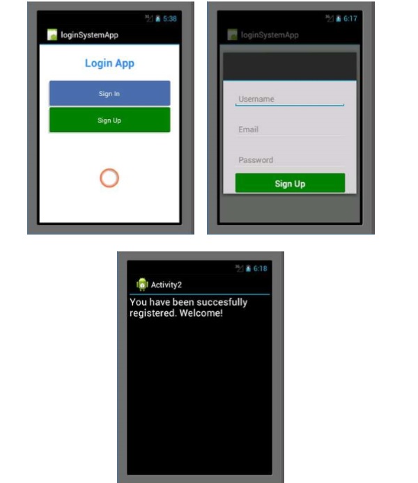
Finally, build and run your App. It will display the following screens as output.
Xamarin - Deploying Your App
After completing the process of building your App, its important to use this App on a physical Android device or allow other people to download your App and install it on their devices.
Releasing Your App
Before releasing your App, it is important to convert it into a format that can be read by an Android system. This type of format is called an apk file. To create an apk file.
Open your project.
Go to Build Menu and select Configuration Manager
On Configuration Manager, set Active Solution Configuration to release the App.
Next, click the Build Menu again and select Export Android Package(.apk).
Once finished, the apk file will be stored in your project folder /bin/Release.
Publishing Your App
There are 3 ways of publishing an App −
Online Attachment
It involves uploading your apk file online as an attachment. Then the users having Android devices can download and directly install your App on their devices.
Google PlayStore
PlayStore is the largest market for Android apps. To upload your App to the PlayStore, you need to have a developer account with Google. The developer account is created once and costs $25 to get a license.
Manual Installation
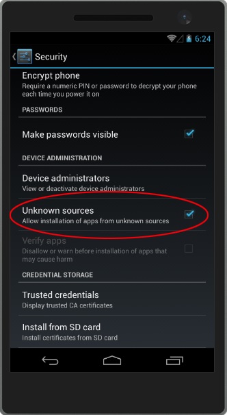
Manual installation involves installing the .apk file generated directly on a physical device. Copy the file to your Android devices physical memory or an SD card and then run the file from your device.
Android, by default, blocks installation of Apps that are not from PlayStore. To install your App, you must enable it to accept the App installation from the Settings. To do this, go to Settings on your device, look for Security menu, and then then check "Allow installation of apps from unknown sources."