- Silverlight - Home
- Silverlight - Overview
- Silverlight - Environment Setup
- Silverlight - Getting Started
- Silverlight - XAML Overview
- Silverlight - Project Types
- Silverlight - Fixed Layouts
- Silverlight - Dynamic Layout
- Constrained vs. Unconstrained
- Silverlight - CSS
- Silverlight - Controls
- Silverlight - Buttons
- Silverlight - Content Model
- Silverlight - ListBox
- Silverlight - Templates
- Silverlight - Visual State
- Silverlight - Data Binding
- Silverlight - Browser Integration
- Silverlight - Out-of-Browser
- Silverlight - Applications, Resources
- Silverlight - File Access
- Silverlight - View Model
- Silverlight - Input Handling
- Silverlight - Isolated Storage
- Silverlight - Text
- Silverlight - Animation
- Silverlight - Video and Audio
- Silverlight - Printing
Silverlight - ListBox
Listbox is a control that provides a list of items to the user for selection of an item. A user can select one or more items from a predefined list of items at a time. In a ListBox, multiple options are always visible to the user without any user interaction.
A Listbox presents a scrollable list of items. If a user selects an item, the selected item changes appearance to indicate selection. It supports a more extensive form of content model and Button. A major difference between a button and a list box is that a button contains a single piece of content whereas a listbox allows every single item in the list.
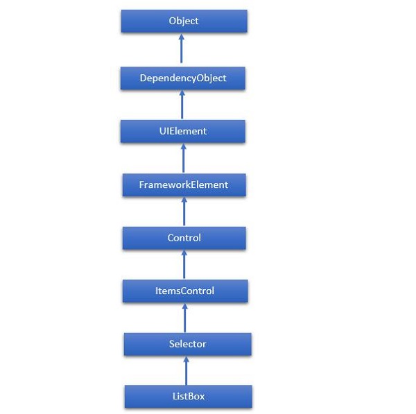
The hierarchical inheritance of ListBox class is as follows −
Given below are the commonly used Properties of ListBox class.
| Sr. No. | Property & Description |
|---|---|
| 1 | Background Gets or sets a brush that provides the background of the control. (Inherited from Control) |
| 2 | BorderThickness Gets or sets the border thickness of a control. (Inherited from Control) |
| 3 | FontFamily Gets or sets the font used to display text in the control. (Inherited from Control) |
| 4 | FontSize Gets or sets the size of the text in this control. (Inherited from Control) |
| 5 | FontStyle Gets or sets the style in which the text is rendered. (Inherited from Control) |
| 6 | FontWeight Gets or sets the thickness of the specified font. (Inherited from Control) |
| 7 | Foreground Gets or sets a brush that describes the foreground color. (Inherited from Control) |
| 8 | GroupStyle Gets a collection of GroupStyle objects that define the appearance of each level of groups. (Inherited from ItemsControl) |
| 9 | Height Gets or sets the suggested height of a FrameworkElement. (Inherited from FrameworkElement) |
| 10 | HorizontalAlignment Gets or sets the horizontal alignment characteristics that are applied to a FrameworkElement when it is composed in a layout parent, such as a panel or items control. (Inherited from FrameworkElement) |
| 11 | IsEnabled Gets or sets a value indicating whether the user can interact with the control. (Inherited from Control) |
| 12 | Item Gets the collection used to generate the content of the control. (Inherited from ItemsControl) |
| 13 | ItemsSource Gets or sets an object source used to generate the content of the ItemsControl. (Inherited from ItemsControl) |
| 14 | Margin Gets or sets the outer margin of a FrameworkElement. (Inherited from FrameworkElement) |
| 15 | Name Gets or sets the identifying name of the object. When a XAML processor creates the object tree from XAML markup, run-time code can refer to the XAML-declared object by this name. (Inherited from FrameworkElement) |
| 16 | Opacity Gets or sets the degree of the object's opacity. (Inherited from UIElement) |
| 17 | SelectedIndex Gets or sets the index of the selected item. (Inherited from Selector) |
| 18 | SelectedItem Gets or sets the selected item. (Inherited from Selector) |
| 19 | SelectedValue Gets or sets the value of the selected item, obtained by using the SelectedValuePath. (Inherited from Selector) |
| 20 | Style Gets or sets an instance Style that is applied for this object during layout and rendering. (Inherited from FrameworkElement) |
| 21 | VerticalAlignment Gets or sets the vertical alignment characteristics that are applied to a FrameworkElement when it is composed in a parent object such as a panel or items control. (Inherited from FrameworkElement) |
| 22 | Width Gets or sets the width of a FrameworkElement. (Inherited from FrameworkElement) |
Given below are the most commonly used Events of ListBox.
| Sr. No. | Event & Description |
|---|---|
| 1 | DragEnter Occurs when the input system reports an underlying drag event with this element as the target. (Inherited from UIElement) |
| 2 | DragLeave Occurs when the input system reports an underlying drag event with this element as the origin. (Inherited from UIElement) |
| 3 | DragOver Occurs when the input system reports an underlying drag event with this element as the potential drop target. (Inherited from UIElement) |
| 4 | DragStarting Occurs when a drag operation is initiated. (Inherited from UIElement) |
| 5 | Drop Occurs when the input system reports an underlying drop event with this element as the drop target. (Inherited from UIElement) |
| 6 | DropCompleted Occurs when a drag-and-drop operation is ended. (Inherited from UIElement) |
| 7 | GotFocus Occurs when a UIElement receives focus. (Inherited from UIElement) |
| 8 | IsEnabledChanged Occurs when the IsEnabled property changes. (Inherited from Control) |
| 9 | KeyDown Occurs when a keyboard key is pressed while the UIElement has focus. (Inherited from UIElement) |
| 10 | KeyUp Occurs when a keyboard key is released while the UIElement has focus. (Inherited from UIElement) |
| 11 | LostFocus Occurs when a UIElement loses focus. (Inherited from UIElement) |
| 12 | SelectionChanged Occurs when the currently selected item changes. (Inherited from Selector) |
| 13 | SizeChanged Occurs when either the ActualHeight or the ActualWidth property changes value on a FrameworkElement. (Inherited from FrameworkElement) |
Given below are the most commonly used Methods of ListBox.
| Sr. No. | Method & Description |
|---|---|
| 1 | Arrange Positions child objects and determines a size for a UIElement. Parent objects that implement custom layout for their child elements should call this method from their layout override implementations to form a recursive layout update. (Inherited from UIElement) |
| 2 | FindName Retrieves an object that has the specified identifier name. (Inherited from FrameworkElement) |
| 3 | Focus Attempts to set the focus on the control. (Inherited from Control) |
| 4 | GetValue Returns the current effective value of a dependency property from a DependencyObject. (Inherited from DependencyObject) |
| 5 | IndexFromContainer Returns the index to the item that has the specified, generated container. (Inherited from ItemsControl) |
| 6 | OnDragEnter Called before the DragEnter event occurs. (Inherited from Control) |
| 7 | OnDragLeave Called before the DragLeave event occurs. (Inherited from Control) |
| 8 | OnDragOver Called before the DragOver event occurs. (Inherited from Control) |
| 9 | OnDrop Called before the Drop event occurs. (Inherited from Control) |
| 10 | OnKeyDown Called before the KeyDown event occurs. (Inherited from Control) |
| 11 | OnKeyUp Called before the KeyUp event occurs. (Inherited from Control) |
| 12 | OnLostFocus Called before the LostFocus event occurs. (Inherited from Control) |
| 13 | ReadLocalValue Returns the local value of a dependency property, if a local value is set. (Inherited from DependencyObject) |
| 14 | SetBinding Attaches a binding to a FrameworkElement, using the provided binding object. (Inherited from FrameworkElement) |
| 15 | SetValue Sets the local value of a dependency property on a DependencyObject. (Inherited from DependencyObject) |
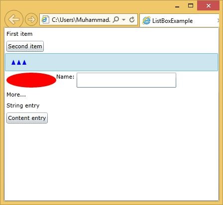
Let us look at a simple example in which different UI elements are added in a ListBox.
<UserControl x:Class = "ListBoxExample.MainPage"
   xmlns = "http://schemas.microsoft.com/winfx/2006/xaml/presentation"
   xmlns:x = "http://schemas.microsoft.com/winfx/2006/xaml"
   xmlns:d = "http://schemas.microsoft.com/expression/blend/2008"
   xmlns:mc = "http://schemas.openxmlformats.org/markup-compatibility/2006"
   mc:Ignorable = "d" d:DesignWidth = "640" d:DesignHeight = "480">

   <Grid x:Name = "LayoutRoot">

      <ListBox x:Name = "myList">

         <TextBlock Text = "First item" />
         <Button Content = "Second item" />
         <Path Fill = "Blue" Data = "M4,0 l-4,10 8,0z M15,0 l-4,10 8,0z M26,0 l4,10 8,0z"
            Margin = "10" />

         <StackPanel Orientation = "Horizontal">
            <Ellipse Fill = "Red" Height = "30" Width = "100" />
            <TextBlock Text = "Name: " />
            <TextBox Width = "200" />
         </StackPanel>

         <TextBlock Text = "More..." />

      </ListBox>

   </Grid>

</UserControl>
Given below is the C# implementation.
using System.Windows.Controls;

namespace ListBoxExample {

   public partial class MainPage : UserControl {

      public MainPage() {
         InitializeComponent();

         myList.Items.Add("String entry");
         myList.Items.Add(new Button { Content = "Content entry" });
      }
   }
}
When the above code is compiled and executed, you will see a list box which contains mixture of graphics text and also an editable field where you can type the text.
| Sr. No. | Controls & Description |
|---|---|
| 1 | Calendar & DatePicker
Calendar & DatePicker represents a control that enables a user to select a date by using a visual calendar display. It provides some basic navigation using either the mouse or the keyboard. |
| 2 | TabControl
A container that places items into separate tabs and allows the user to view just one tab at a time. It allows the user to select from a number of different views by clicking on the tab headers. |
| 3 | Popup
This class displays the content on top of the existing content, within the bounds of the application window. It is a temporarily display on the other content. |
| 4 | ToolTip
Tooltip represents a control that creates a pop-up window that displays information for an element in the GUI. Silverlight lets you attach a tooltip to any control. |
