- Silverlight - Home
- Silverlight - Overview
- Silverlight - Environment Setup
- Silverlight - Getting Started
- Silverlight - XAML Overview
- Silverlight - Project Types
- Silverlight - Fixed Layouts
- Silverlight - Dynamic Layout
- Constrained vs. Unconstrained
- Silverlight - CSS
- Silverlight - Controls
- Silverlight - Buttons
- Silverlight - Content Model
- Silverlight - ListBox
- Silverlight - Templates
- Silverlight - Visual State
- Silverlight - Data Binding
- Silverlight - Browser Integration
- Silverlight - Out-of-Browser
- Silverlight - Applications, Resources
- Silverlight - File Access
- Silverlight - View Model
- Silverlight - Input Handling
- Silverlight - Isolated Storage
- Silverlight - Text
- Silverlight - Animation
- Silverlight - Video and Audio
- Silverlight - Printing
Constrained vs. Unconstrained Layout
Layout in Silverlight always occurs in one of the two modes, either Constrained, or Unconstrained. A Constrained layout is one, where a container imposes the width or height. For example, the web browser, usually with CSS, always determines the overall dimensions of the Silverlight plug-ins.
Some important features are −
The top-level elements layout is constrained both horizontally and vertically. Whatever layout it produces, it must always end up with the results that are of the size imposed by the browser.
Some elements end up with Unconstrained Layout, meaning that the elements are free to choose their own size. For example, elements inside a vertical StackPanel are vertically unconstrained.
The StackPanel will give them as much height as they require. In fact, it will do this even if there is no enough space. It will tell the elements that they have the height they need, and then crop anything that does not fit.
Most Silverlight user interfaces contain a mixture of these two layout styles. Regardless of whether its parent imposes constraints or not, a StackPanel will always perform Unconstrained Layout in the direction of stacking. The same is true for a Grid row or column when the height or width set to Auto.
Suppose you have an element, which is inside a container that imposes a fixed horizontal width. By default, your element will be stretched to fill the space. If you set the alignment to Left, Right, or Center, it will remove the constraint.
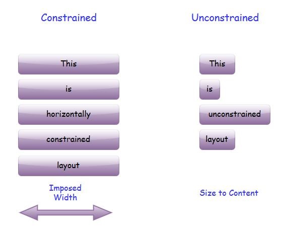
The element will take only the width that it needs.Of course, you can introduce a constraint with a fixed width or height.
Unconstrained Layout is sometimes called Size to Content, because the size of an unconstrained element is typically determined by its content.
Size to Content is an important idea in Silverlight layout. It is what enables the layout to adapt itself to whatever information is being displayed.
| Sr. No. | Controls & Description |
|---|---|
| 1 | GridSplitter
Constraints can come from the containing browser, or fixed dimensions in your design. However, it is sometimes useful to let the user impose constraints. |
| 2 | ScrollViewer
Some user interfaces end up needing to display more information than will fit in the available space. One common solution to this is to provide a scrollable region. Silverlight makes this very easy with the ScrollViewer. |
| 3 | Border
One more useful element to bear in mind when laying out the user interface is Border. |
Full Screen Mode
The Silverlight plug-in is able to take over the entire screen. There is a property you can set on a helper class to go into full screen mode. However, there are a couple of constraints for security purposes. To prevent a website from being able to take over the screen at will, and to do something evil, like faking up a prompt asking for the user's password.
To enter full screen mode, you need to get hold of the Host.Content property from the application object, and set its IsFullScreen property to true.
Let us have a look at a simple example which toggles the property, so it will flip back and forth between full screen and normal.
<UserControl x:Class = "FullScreenExample.MainPage"
   xmlns = "http://schemas.microsoft.com/winfx/2006/xaml/presentation"
   xmlns:x = "http://schemas.microsoft.com/winfx/2006/xaml"
   xmlns:d = "http://schemas.microsoft.com/expression/blend/2008"
   xmlns:mc = "http://schemas.openxmlformats.org/markup-compatibility/2006"
   mc:Ignorable = "d"
   d:DesignHeight = "300" d:DesignWidth = "400">

   <Border BorderBrush = "Gray" BorderThickness = "4" CornerRadius = "30" Padding = "20">

      <Border.Background>
         <LinearGradientBrush StartPoint = "0,0" EndPoint = "0,1">
            <GradientStop Offset = "0" Color = "Wheat" />
            <GradientStop Offset = "1" Color = "BurlyWood" />
         </LinearGradientBrush>
      </Border.Background>

      <Grid x:Name = "LayoutRoot">
         <Button x:Name = "fullScreenButton" HorizontalAlignment = "Center"
            VerticalAlignment = "Center" FontSize = "30" Width = "300"
            Height = "100" Content = "Go Full Screen" Click = "Button_Click" />
      </Grid>

   </Border>

</UserControl>
Here is a code in C# that initiates the return from full screen to normal. You can find out when this happens by handling the Host.Content objects FullScreenChanged event.
using System;
using System.Windows;
using System.Windows.Controls;

namespace FullScreenExample {

   public partial class MainPage : UserControl {

      public MainPage() {
         InitializeComponent();
         App.Current.Host.Content.FullScreenChanged += Content_FullScreenChanged;
      }

      void Content_FullScreenChanged(object sender, EventArgs e) {

         if (Application.Current.Host.Content.IsFullScreen) {
            fullScreenButton.Content = "Return to Normal";
         } else {
            fullScreenButton.Content = "Go Full Screen";
         }
      }

      private void Button_Click(object sender, RoutedEventArgs e) {
         var content = Application.Current.Host.Content;
         content.IsFullScreen = !content.IsFullScreen;
      }

   }
}
When the above code is compiled and executed, you will see the following output.
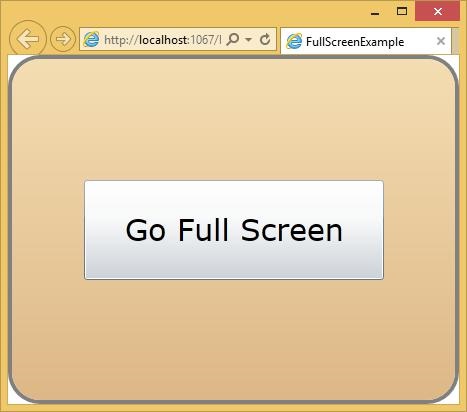
When the user clicks the Go Full Screen button, then it will switch to the full screen mode.
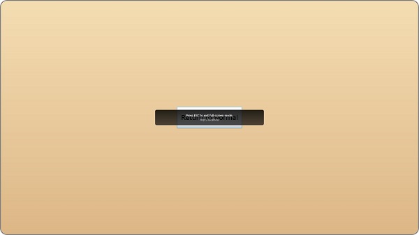
Notice that the button's text has changed. It now says Return to Normal. If you click it again or by hit Escape, it will flip back out of full screen mode.
