- Silverlight - Home
- Silverlight - Overview
- Silverlight - Environment Setup
- Silverlight - Getting Started
- Silverlight - XAML Overview
- Silverlight - Project Types
- Silverlight - Fixed Layouts
- Silverlight - Dynamic Layout
- Constrained vs. Unconstrained
- Silverlight - CSS
- Silverlight - Controls
- Silverlight - Buttons
- Silverlight - Content Model
- Silverlight - ListBox
- Silverlight - Templates
- Silverlight - Visual State
- Silverlight - Data Binding
- Silverlight - Browser Integration
- Silverlight - Out-of-Browser
- Silverlight - Applications, Resources
- Silverlight - File Access
- Silverlight - View Model
- Silverlight - Input Handling
- Silverlight - Isolated Storage
- Silverlight - Text
- Silverlight - Animation
- Silverlight - Video and Audio
- Silverlight - Printing
Silverlight - Templates
A Template describes the overall look and visual appearance of the control. For each control, there is a default template associated with it, which gives the appearance to that control.
In WPF application, you can easily create your own templates when you want to customize the visual behavior and visual appearance of a control.
Some important features are −
All of the UI elements have some kind of appearance as well as behavior e.g. Button has an appearance and behavior.
Click event or mouse hover event are the behaviors, which are fired in response to a click and hover and there is a default appearance of button, which can be changed by the Control template.
Let us look at a simple example again in which a button is defined with template.
<UserControl x:Class = "ButtonTemplate.MainPage"
xmlns = "http://schemas.microsoft.com/winfx/2006/xaml/presentation"
xmlns:x = "http://schemas.microsoft.com/winfx/2006/xaml"
xmlns:d = "http://schemas.microsoft.com/expression/blend/2008"
xmlns:mc = "http://schemas.openxmlformats.org/markup-compatibility/2006"
mc:Ignorable = "d" d:DesignWidth = "640" d:DesignHeight = "480">
<Grid x:Name = "LayoutRoot" HorizontalAlignment = "Center"
VerticalAlignment = "Center">
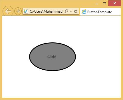
<Button Height = "100" Width = "100" Content = "Click!"
HorizontalContentAlignment = "Left" Click = "button_Click">
<Button.Template>
<ControlTemplate TargetType = "Button">
<Grid>
<Ellipse Fill = "Gray" Stroke = "Black"
StrokeThickness = "3" Margin = "-64,0,0,0" />
<ContentPresenter HorizontalAlignment = "{TemplateBinding
HorizontalContentAlignment}" VerticalAlignment = "Center"
Content = "{TemplateBinding Content}" />
</Grid>
</ControlTemplate>
</Button.Template>
</Button>
</Grid>
</UserControl>
When the above code is compiled and executed, you will see the following output.
Connecting the Template
All of the control features, which we want to template, are with template bindings. Some aspects are a little more complex. For example, anytime you have a form of content model, Template binding alone is not enough that you saw on the button. We also have to use a content presenter as shown in the example above.
