- Silverlight - Home
- Silverlight - Overview
- Silverlight - Environment Setup
- Silverlight - Getting Started
- Silverlight - XAML Overview
- Silverlight - Project Types
- Silverlight - Fixed Layouts
- Silverlight - Dynamic Layout
- Constrained vs. Unconstrained
- Silverlight - CSS
- Silverlight - Controls
- Silverlight - Buttons
- Silverlight - Content Model
- Silverlight - ListBox
- Silverlight - Templates
- Silverlight - Visual State
- Silverlight - Data Binding
- Silverlight - Browser Integration
- Silverlight - Out-of-Browser
- Silverlight - Applications, Resources
- Silverlight - File Access
- Silverlight - View Model
- Silverlight - Input Handling
- Silverlight - Isolated Storage
- Silverlight - Text
- Silverlight - Animation
- Silverlight - Video and Audio
- Silverlight - Printing
Silverlight - ToolTip
Tooltip represents a control that creates a pop-up window that displays information for an element in the GUI. Silverlight lets you attach a tooltip to any control. In that tooltip, you can add text as well as other element such as panels, ellipse etc.
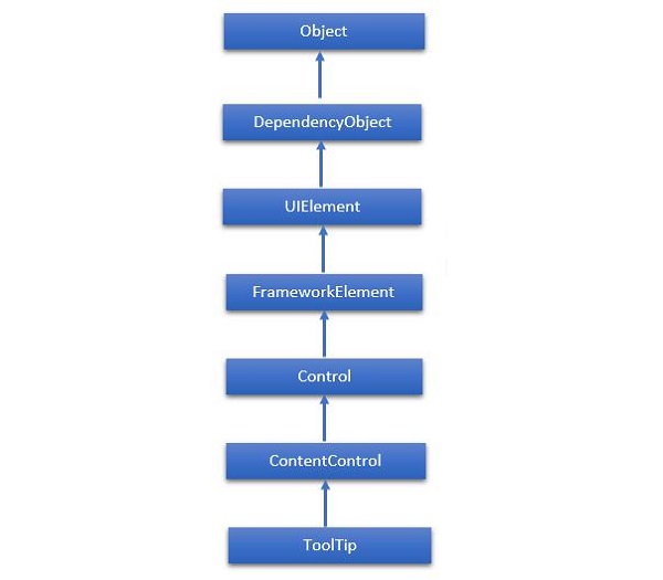
The hierarchical inheritance of ToolTip class is as follows −
Given below are the commonly used properties of ToolTip class.
| Sr. No. | Property & Description |
|---|---|
| 1 | IsOpen Gets or sets a value that indicates whether the ToolTip is visible. |
| 2 | IsOpenProperty Identifies the IsOpen dependency property. |
| 3 | Placement Gets or sets how a ToolTip is positioned in relation to the placement target element. |
| 4 | PlacementProperty Identifies the Placement dependency property. |
| 5 | PlacementTarget Gets or sets the visual element or control that the tool tip should be positioned in relation to when opened by the ToolTipService. |
| 6 | PlacementTargetProperty Identifies the PlacementTarget dependency property. |
| 7 | TemplateSettings Gets an object that provides calculated values that can be referenced as TemplateBinding sources when defining templates for a ToolTip. |
Given below are the commonly used Events of ToolTip class.
| Sr. No. | Event & Description |
|---|---|
| 1 | Closed Occurs when a ToolTip is closed and is no longer visible. |
| 2 | Opened Occurs when a ToolTip becomes visible. |
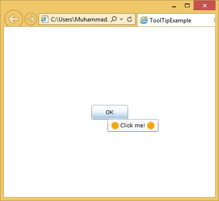
A simple example is explained, in which a tooltip is added for a button, which contains an ellipse and a TextBlock etc.
<UserControl x:Class = "ToolTipExample.MainPage"
   xmlns = "http://schemas.microsoft.com/winfx/2006/xaml/presentation"
   xmlns:x = "http://schemas.microsoft.com/winfx/2006/xaml"
   xmlns:d = "http://schemas.microsoft.com/expression/blend/2008"
   xmlns:mc = "http://schemas.openxmlformats.org/markup-compatibility/2006"
   mc:Ignorable = "d" d:DesignWidth = "640" d:DesignHeight  = "480">

   <Grid x:Name = "LayoutRoot">

      <Button Content = "OK" Width = "75" Height = "30">
         <ToolTipService.ToolTip>
            <StackPanel Orientation = "Horizontal">
               <Ellipse Fill = "Orange" Width = "15" Height = "15" />
               <TextBlock Text = "Click me!" Margin = "3" />
               <Ellipse Fill = "Orange" Width = "15" Height = "15" />
            </StackPanel>
         </ToolTipService.ToolTip>
      </Button>

   </Grid>

</UserControl>
When the above code is compiled and executed, you will see the following output by holding mouse courser on button.