- Silverlight - Home
- Silverlight - Overview
- Silverlight - Environment Setup
- Silverlight - Getting Started
- Silverlight - XAML Overview
- Silverlight - Project Types
- Silverlight - Fixed Layouts
- Silverlight - Dynamic Layout
- Constrained vs. Unconstrained
- Silverlight - CSS
- Silverlight - Controls
- Silverlight - Buttons
- Silverlight - Content Model
- Silverlight - ListBox
- Silverlight - Templates
- Silverlight - Visual State
- Silverlight - Data Binding
- Silverlight - Browser Integration
- Silverlight - Out-of-Browser
- Silverlight - Applications, Resources
- Silverlight - File Access
- Silverlight - View Model
- Silverlight - Input Handling
- Silverlight - Isolated Storage
- Silverlight - Text
- Silverlight - Animation
- Silverlight - Video and Audio
- Silverlight - Printing
Silverlight - Calendar & DatePicker
Calendar & DatePicker represents a control that enables a user to select a date by using a visual calendar display. It provides some basic navigation using either the mouse or the keyboard. As you already know, Silverlight is not a strict subset of WPF. For example, WPF does not have controls for picking dates and Silverlight offers both calendar control and DatePicker.
Some important features are −
The calendar control is relatively large and its useful if you want to have a view of the whole.
The default appearance of DatePicker is more compact.
Its dimensions are more like those of a text field making it more suitable for forms with many fields.
The DatePicker expends to the Calendar like user interface.
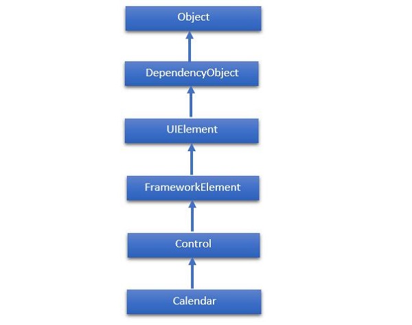
The hierarchical inheritance of Calendar class is as follows −
Given below are the most commonly used properties of Calendar Class.
| Sr. No. | Properties & Description |
|---|---|
| 1 | BlackoutDates Gets a collection of dates that are marked as not selectable. |
| 2 | CalendarButtonStyle Gets or sets the Style associated with the control's internal CalendarButton object. |
| 3 | CalendarDayButtonStyle Gets or sets the Style associated with the control's internal CalendarDayButton object. |
| 4 | CalendarItemStyle Gets or sets the Style associated with the control's internal CalendarItem object. |
| 5 | DisplayDate Gets or sets the date to display. |
| 6 | DisplayDateEnd Gets or sets the last date in the date range that is available in the calendar. |
| 7 | DisplayDateStart Gets or sets the first date that is available in the calendar. |
| 8 | DisplayMode Gets or sets a value that indicates whether the calendar displays a month, year, or decade. |
| 9 | FirstDayOfWeek Gets or sets the day that is considered the beginning of the week. |
| 10 | IsTodayHighlighted Gets or sets a value that indicates whether the current date is highlighted. |
| 11 | SelectedDate Gets or sets the currently selected date. |
| 12 | SelectedDates Gets a collection of selected dates. |
| 13 | SelectionMode Gets or sets a value that indicates what kind of selections are allowed. |
Given below are the commonly used methods of Calendar class.
| Sr. No. | Method & Description |
|---|---|
| 1 | OnApplyTemplate Builds the visual tree for the Calendar control when a new template is applied. (Overrides FrameworkElement.OnApplyTemplate()). |
| 2 | ToString Provides a text representation of the selected date. (Overrides Control.ToString()). |
Given below are the commonly used events of Calendar class.
| Sr. No. | Events & Description |
|---|---|
| 1 | DisplayDateChanged Occurs when the DisplayDate property is changed. |
| 2 | DisplayModeChanged Occurs when the DisplayMode property is changed. |
| 3 | SelectedDatesChanged Occurs when the collection returned by the SelectedDates property is changed. |
| 4 | SelectionModeChanged Occurs when the SelectionMode changes. |
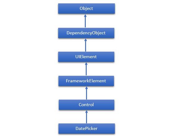
The hierarchical inheritance of DatePicker class is as follows −
Given below are some of the most commonly used properties of DatePicker.
| Sr. No. | Property & Description |
|---|---|
| 1 | CalendarIdentifier Gets or sets the calendar system to use. |
| 2 | CalendarIdentifierProperty Gets the identifier for the CalendarIdentifier dependency property. |
| 3 | Date Gets or sets the date currently set in the date picker. |
| 4 | DateProperty Gets the identifier for the Date dependency property. |
| 5 | DayFormat Gets or sets the display format for the day value. |
| 6 | DayFormatProperty Gets the identifier for the DayFormat dependency property. |
| 7 | DayVisible Gets or sets a value that indicates whether the day selector is shown. |
| 8 | DayVisibleProperty Gets the identifier for the DayVisible dependency property. |
| 9 | Header Gets or sets the content for the control's header. |
| 10 | HeaderProperty Identifies the Header dependency property. |
| 11 | HeaderTemplate Gets or sets the DataTemplate used to display the content of the control's header. |
| 12 | HeaderTemplateProperty Identifies the HeaderTemplate dependency property. |
| 13 | MaxYear Gets or sets the maximum Gregorian year available for picking. |
| 14 | MaxYearProperty Gets the identifier for the MaxYear dependency property. |
| 15 | MinYear Gets or sets the minimum Gregorian year available for picking. |
| 16 | MinYearProperty Gets the identifier for the MinYear dependency property. |
| 17 | MonthFormat Gets or sets the display format for the month value. |
| 18 | MonthFormatProperty Gets the identifier for the MonthFormat dependency property. |
| 19 | MonthVisible Gets or sets a value that indicates whether the month selector is shown. |
| 20 | MonthVisibleProperty Gets the identifier for the MonthVisible dependency property. |
| 21 | Orientation Gets or sets a value that indicates whether the day, month, and year selectors are stacked horizontally or vertically. |
| 22 | OrientationProperty Gets the identifier for the Orientation dependency property. |
| 23 | YearFormat Gets or sets the display format for the year value. |
| 24 | YearFormatProperty Gets the identifier for the YearFormat dependency property. |
| 25 | YearVisible Gets or sets a value that indicates whether the year selector is shown. |
| 26 | YearVisibleProperty Gets the identifier for the YearVisible dependency property. |
Given below are some of the most commonly used events of DatePicker class.
| Sr. No. | Event & Description |
|---|---|
| 1 | DateChanged Occurs when the date value is changed. |
| 2 | DragEnter Occurs when the input system reports an underlying drag event with this element as the target. (Inherited from UIElement) |
| 3 | DragLeave Occurs when the input system reports an underlying drag event with this element as the origin. (Inherited from UIElement) |
| 4 | DragOver Occurs when the input system reports an underlying drag event with this element as the potential drop target. (Inherited from UIElement) |
| 5 | DragStarting Occurs when a drag operation is initiated. (Inherited from UIElement) |
| 6 | GotFocus Occurs when a UIElement receives focus. (Inherited from UIElement) |
| 7 | Holding Occurs when an otherwise unhandled Hold interaction occurs over the hit test area of this element. (Inherited from UIElement) |
| 8 | IsEnabledChanged Occurs when the IsEnabled property changes. (Inherited from Control) |
| 9 | KeyDown Occurs when a keyboard key is pressed while the UIElement has focus. (Inherited from UIElement) |
| 10 | KeyUp Occurs when a keyboard key is released while the UIElement has focus. (Inherited from UIElement) |
| 11 | LostFocus Occurs when a UIElement loses focus. (Inherited from UIElement) |
Given below are the most commonly used methods in DatePicker class.
| Sr. No. | Method & Description |
|---|---|
| 1 | ClearValue Clears the local value of a dependency property. (Inherited from DependencyObject) |
| 2 | FindName Retrieves an object that has the specified identifier name. (Inherited from FrameworkElement) |
| 3 | OnApplyTemplate Invoked whenever application code or internal processes (such as a rebuilding layout pass) call ApplyTemplate. In simplest terms, this means the method is called just before a UI element displays in your app. Override this method to influence the default post-template logic of a class. (Inherited from FrameworkElement) |
| 4 | OnDragEnter Called before the DragEnter event occurs. (Inherited from Control) |
| 5 | OnDragLeave Called before the DragLeave event occurs. (Inherited from Control) |
| 6 | OnDragOver Called before the DragOver event occurs. (Inherited from Control) |
| 7 | OnDrop Called before the Drop event occurs. (Inherited from Control) |
| 8 | OnGotFocus Called before the GotFocus event occurs. (Inherited from Control) |
| 9 | OnKeyDown Called before the KeyDown event occurs. (Inherited from Control) |
| 10 | OnKeyUp Called before the KeyUp event occurs. (Inherited from Control) |
| 11 | OnLostFocus Called before the LostFocus event occurs. (Inherited from Control) |
| 12 | SetBinding Attaches a binding to a FrameworkElement, using the provided binding object. (Inherited from FrameworkElement) |
Let us look at a simple example, which contains Calendar and DatePicker control.
<UserControl
   xmlns = "http://schemas.microsoft.com/winfx/2006/xaml/presentation"
   xmlns:x = "http://schemas.microsoft.com/winfx/2006/xaml"
   xmlns:d = "http://schemas.microsoft.com/expression/blend/2008"
   xmlns:mc = "http://schemas.openxmlformats.org/markup-compatibility/2006"
   xmlns:sdk = "http://schemas.microsoft.com/winfx/2006/xaml/presentation/sdk"
   x:Class = "DateControls.MainPage"
   mc:Ignorable = "d"
   d:DesignHeight = "300" d:DesignWidth = "400">

   <Grid x:Name = "LayoutRoot" Background = "White">
      <sdk:Calendar HorizontalAlignment = "Left" Height = "169"
         Margin = "0,45,0,0" VerticalAlignment = "Top" Width = "230"/>

      <sdk:DatePicker HorizontalAlignment = "Left" Height = "23"
         Margin = "216,29,0,0" VerticalAlignment = "Top" Width = "120"/>
   </Grid>

</UserControl>
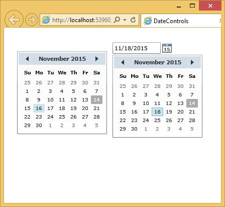
When the above code is compiled and executed, you will see the following output.