- Silverlight - Home
- Silverlight - Overview
- Silverlight - Environment Setup
- Silverlight - Getting Started
- Silverlight - XAML Overview
- Silverlight - Project Types
- Silverlight - Fixed Layouts
- Silverlight - Dynamic Layout
- Constrained vs. Unconstrained
- Silverlight - CSS
- Silverlight - Controls
- Silverlight - Buttons
- Silverlight - Content Model
- Silverlight - ListBox
- Silverlight - Templates
- Silverlight - Visual State
- Silverlight - Data Binding
- Silverlight - Browser Integration
- Silverlight - Out-of-Browser
- Silverlight - Applications, Resources
- Silverlight - File Access
- Silverlight - View Model
- Silverlight - Input Handling
- Silverlight - Isolated Storage
- Silverlight - Text
- Silverlight - Animation
- Silverlight - Video and Audio
- Silverlight - Printing
Silverlight - ScrollViewer
Some user interfaces end up needing to display more information than will fit in the available space. One common solution to this is to provide a scrollable region. Silverlight makes this very easy with the ScrollViewer. You can wrap this around any element. It must be a single child element, but it can be a panel, which in turn contains more children if you want.
The ScrollViewer performs unconstrained layouts on the child, offering it exactly as much space as it wants.
The viewer expects to be put in a constrained layout context, because the whole idea is to adapt a fixed space to hold variable-sized content.
It will then provide Scroll Bars when necessary. The child element is completely oblivious to being scrolled.
Given below are the commonly used properties of ScrollViewer class.
| Sr. No. | Property & Description |
|---|---|
| 1 | ComputedHorizontalScrollBarVisibility Gets a value that indicates whether the horizontal ScrollBar is visible. |
| 2 | ComputedHorizontalScrollBarVisibilityProperty Identifies the ComputedHorizontalScrollBarVisibility dependency property. |
| 3 | HorizontalScrollBarVisibility Gets or sets a value that indicates whether a horizontal ScrollBar should be displayed. |
| 4 | HorizontalScrollBarVisibilityProperty Identifies the HorizontalScrollBarVisibility dependency property. |
| 5 | HorizontalScrollMode Gets or sets a value that determines how manipulation input influences scrolling behavior on the horizontal axis. |
| 6 | HorizontalScrollModeProperty Identifies the HorizontalScrollMode dependency property. |
| 7 | HorizontalSnapPointsAlignment Gets or sets a value that indicates how the existing snap points are horizontally aligned versus the initial viewport. |
| 8 | HorizontalSnapPointsAlignmentProperty Identifies the HorizontalSnapPointsAlignment dependency property. |
| 9 | IsHorizontalScrollChainingEnabled Gets or sets a value that indicates whether scroll chaining is enabled from this child to its parent, for the horizontal axis. |
| 10 | IsHorizontalScrollChainingEnabledProperty Identifies the IsHorizontalScrollChainingEnabled dependency property. |
| 11 | IsScrollInertiaEnabled Gets or sets a value that indicates whether scroll actions should include inertia in their behavior and value. |
| 12 | IsScrollInertiaEnabledProperty Identifies the IsScrollInertiaEnabled dependency property. |
| 13 | IsVerticalScrollChainingEnabled Gets or sets a value that indicates whether scroll chaining is enabled from this child to its parent, for the vertical axis. |
| 14 | IsVerticalScrollChainingEnabledProperty Identifies the IsVerticalScrollChainingEnabled dependency property. |
| 15 | ScrollableHeight Gets a value that represents the vertical size of the area that can be scrolled; the difference between the width of the extent and the width of the viewport. |
| 16 | ScrollableHeightProperty Identifies the ScrollableHeight dependency property. |
| 17 | ScrollableWidth Gets a value that represents the horizontal size of the area that can be scrolled; the difference between the width of the extent and the width of the viewport. |
| 18 | ScrollableWidthProperty Identifies the ScrollableWidth dependency property. |
| 19 | VerticalScrollBarVisibility Gets or sets a value that indicates whether a vertical ScrollBar should be displayed. |
| 20 | VerticalScrollBarVisibilityProperty Identifies the VerticalScrollBarVisibility dependency property. |
| 21 | VerticalScrollMode Gets or sets a value that determines how manipulation input influences scrolling behavior on the vertical axis. |
| 22 | VerticalScrollModeProperty Identifies the VerticalScrollMode dependency property. |
Given below are the commonly used events of ScrollViewer class.
| Sr. No. | Event & Description |
|---|---|
| 1 | DirectManipulationCompleted Occurs when any direct manipulation of the ScrollViewer finishes. |
| 2 | DirectManipulationStarted Occurs when any direct manipulation of the ScrollViewer begins. |
| 3 | ViewChanged Occurs when manipulations such as scrolling and zooming have caused the view to change. |
| 4 | ViewChanging Occurs when manipulations such as scrolling and zooming cause the view to change. |
Given below are the commonly used methods of ScrollViewer class.
| Sr. No. | Method & Description |
|---|---|
| 1 | GetHorizontalScrollBarVisibility Gets the value of the HorizontalScrollBarVisibility dependency property / ScrollViewer.HorizontalScrollBarVisibility XAML attached property from a specified element. |
| 2 | GetHorizontalScrollMode Gets the value of the HorizontalScrollMode dependency property / ScrollViewer.HorizontalScrollMode XAML attached property from a specified element. |
| 3 | GetIsDeferredScrollingEnabled Gets the value of the IsDeferredScrollingEnabled dependency property / ScrollViewer.IsDeferredScrollingInertiaEnabled XAML attached property from a specified element. |
| 4 | GetIsHorizontalScrollChainingEnabled Gets the value of the IsHorizontalScrollChainingEnabled dependency property / ScrollViewer.IsHorizontalScrollChainingEnabled XAML attached property from a specified element. |
| 5 | GetIsScrollInertiaEnabled Gets the value of the IsScrollInertiaEnabled dependency property / ScrollViewer.IsScrollInertiaEnabled XAML attached property from a specified element. |
| 6 | GetIsVerticalScrollChainingEnabled Gets the value of the IsVerticalScrollChainingEnabled dependency property / ScrollViewer.IsVerticalScrollChainingEnabled XAML attached property from a specified element. |
| 7 | GetVerticalScrollBarVisibility Gets the value of the VerticalScrollBarVisibility dependency property / ScrollViewer.VerticalScrollBarVisibility XAML attached property from a specified element. |
| 8 | GetVerticalScrollMode Gets the value of the VerticalScrollMode dependency property / ScrollViewer.VerticalScrollMode XAML attached property from a specified element. |
| 9 | InvalidateScrollInfo Called when the value of properties that describe the size and location of the scroll area change. |
| 10 | ScrollToHorizontalOffset Scrolls the content that is within the ScrollViewer to the specified horizontal offset position. |
| 11 | ScrollToVerticalOffset Scrolls the content that is within the ScrollViewer to the specified vertical offset position. |
| 12 | SetHorizontalScrollBarVisibility Sets the value of the HorizontalScrollBarVisibility dependency property / ScrollViewer.HorizontalScrollBarVisibility XAML attached property on a specified element. |
| 13 | SetHorizontalScrollMode Sets the value of the HorizontalScrollMode dependency property / ScrollViewer.HorizontalScrollMode XAML attached property on a specified element. |
| 14 | SetIsDeferredScrollingEnabled Sets the value of the IsDeferredScrollingEnabled dependency property / ScrollViewer.IsDeferredScrollingEnabled XAML attached property on a specified element. |
| 15 | SetIsHorizontalScrollChainingEnabled Sets the value of the IsHorizontalScrollChainingEnabled dependency property / ScrollViewer.IsHorizontalScrollChainingEnabled XAML attached property on a specified element. |
| 16 | SetIsScrollInertiaEnabled Sets the value of the IsScrollInertiaEnabled dependency property / ScrollViewer.IsScrollInertiaEnabled XAML attached property on a specified element. |
| 17 | SetIsVerticalScrollChainingEnabled Sets the value of the IsVerticalScrollChainingEnabled dependency property / ScrollViewer.IsVerticalScrollChainingEnabled XAML attached property on a specified element. |
| 18 | SetVerticalScrollBarVisibility Sets the value of the VerticalScrollBarVisibility dependency property / ScrollViewer.VerticalScrollBarVisibility XAML attached property on a specified element. |
| 19 | SetVerticalScrollMode Sets the value of the VerticalScrollMode dependency property / ScrollViewer.VerticalScrollMode XAML attached property on a specified element. |
Given below is the implementation of Scroll view properties.
<UserControl
   xmlns = "http://schemas.microsoft.com/winfx/2006/xaml/presentation"
   xmlns:x = "http://schemas.microsoft.com/winfx/2006/xaml"
   xmlns:d = "http://schemas.microsoft.com/expression/blend/2008"
   xmlns:mc = "http://schemas.openxmlformats.org/markup-compatibility/2006"
   xmlns:sdk = "http://schemas.microsoft.com/winfx/2006/xaml/presentation/sdk"
   x:Class = "ScrollViewerExample.MainPage"
   mc:Ignorable = "d"
   d:DesignHeight = "300" d:DesignWidth = "400">

   <Grid x:Name = "LayoutRoot" Background = "White">
      <ScrollViewer HorizontalScrollBarVisibility = "Auto"
         VerticalScrollBarVisibility = "Auto">

         <StackPanel>
            <Rectangle Fill = "Gray" Width = "100" Height = "100" />
            <Button x:Name = "button" Content = "Button" Width = "75"/>
            <sdk:Calendar Height = "169" Width = "230"/>
            <Rectangle Fill = "AliceBlue" Width = "475" Height = "100" />
         </StackPanel>

      </ScrollViewer>

   </Grid>

</UserControl>
When the above code is compiled, you will see the following output.
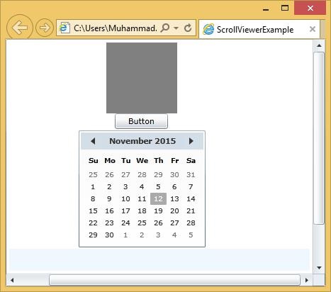
As you can see that you can scroll around, and this works for any content, shapes, bitmaps, or more complex content, such as a Grid containing other user interface elements.
