- Silverlight - Home
- Silverlight - Overview
- Silverlight - Environment Setup
- Silverlight - Getting Started
- Silverlight - XAML Overview
- Silverlight - Project Types
- Silverlight - Fixed Layouts
- Silverlight - Dynamic Layout
- Constrained vs. Unconstrained
- Silverlight - CSS
- Silverlight - Controls
- Silverlight - Buttons
- Silverlight - Content Model
- Silverlight - ListBox
- Silverlight - Templates
- Silverlight - Visual State
- Silverlight - Data Binding
- Silverlight - Browser Integration
- Silverlight - Out-of-Browser
- Silverlight - Applications, Resources
- Silverlight - File Access
- Silverlight - View Model
- Silverlight - Input Handling
- Silverlight - Isolated Storage
- Silverlight - Text
- Silverlight - Animation
- Silverlight - Video and Audio
- Silverlight - Printing
Silverlight - GridSplitter
Constraints can come from the containing browser, or fixed dimensions in your design. However, it is sometimes useful to let the user impose constraints. It is common for a user interface to allow the user to decide how tall or wide some parts of that user interface should be, by providing a splitter.
Silverlight offers the GridSplitter control to do just that. This works in conjunction with a Grid.
You just add it to the cells of the row, or column you wish to make resizable, aligning it to the relevant edge.
You just have to instruct whether it's a vertical or a horizontal splitter, and then it does the rest for you.
Given below are the commonly used properties of Gridsplitter class.
| Sr. No. | Name & Description |
|---|---|
| 1 | AllowDrop Gets or sets a value indicating whether this element can be used as the target of a drag-and-drop operation. This is a dependency property.(Inherited from UIElement.) |
| 2 | Background Gets or sets a brush that describes the background of a control. (Inherited from Control.) |
| 3 | Cursor Gets or sets the cursor that displays when the mouse pointer is over this element.(Inherited from FrameworkElement.) |
| 4 | Foreground Gets or sets a brush that describes the foreground color. (Inherited from Control.) |
| 5 | Height Gets or sets the suggested height of the element.(Inherited from FrameworkElement.) |
| 6 | HorizontalAlignment Gets or sets the horizontal alignment characteristics applied to this element when it is composed within a parent element, such as a panel or items control.(Inherited from FrameworkElement.) |
| 7 | IsMouseOver Gets a value indicating whether the mouse pointer is located over this element (including child elements in the visual tree). This is a dependency property.(Inherited from UIElement.) |
| 8 | Margin Gets or sets the outer margin of an element.(Inherited from FrameworkElement.) |
| 9 | Name Gets or sets the identifying name of the element. The name provides a reference so that code-behind, such as event handler code, can refer to a markup element after it is constructed during processing by a XAML processor.(Inherited from FrameworkElement.) |
| 10 | Resources Gets or sets the locally-defined resource dictionary. (Inherited from FrameworkElement.) |
| 11 | Style Gets or sets the style used by this element when it is rendered. (Inherited from FrameworkElement.) |
| 12 | VerticalAlignment Gets or sets the vertical alignment characteristics applied to this element when it is composed within a parent element such as a panel or items control.(Inherited from FrameworkElement.) |
| 13 | Width Gets or sets the width of the element.(Inherited from FrameworkElement.) |
The following are the methods of GridSplitter class.
| Sr. No. | Method & Description |
|---|---|
| 1 | OnDragEnter(DragEventArgs) Invoked when an unhandled DragDrop.DragEnter attached event reaches an element in its route that is derived from this class. Implement this method to add class handling for this event. (Inherited from UIElement.) |
| 2 | OnDraggingChanged(DependencyPropertyChangedEventArgs) Responds to a change in the value of the IsDragging property. (Inherited from Thumb.) |
| 3 | OnDragLeave(DragEventArgs) Invoked when an unhandled DragDrop.DragLeave attached event reaches an element in its route that is derived from this class. Implement this method to add class handling for this event. (Inherited from UIElement.) |
| 4 | OnDragOver(DragEventArgs) Invoked when an unhandled DragDrop.DragOver attached event reaches an element in its route that is derived from this class. Implement this method to add class handling for this event. (Inherited from UIElement.) |
| 5 | OnDrop(DragEventArgs) Invoked when an unhandled DragDrop.DragEnter attached event reaches an element in its route that is derived from this class. Implement this method to add class handling for this event. (Inherited from UIElement.) |
Commonly used events of GridSplitter class are given below.
| Sr. No. | Event & Description |
|---|---|
| 1 | DragCompleted Occurs when the Thumb control loses mouse capture.(Inherited from Thumb.) |
| 2 | DragDelta Occurs one or more times as the mouse changes position when a Thumb control has logical focus and mouse capture. (Inherited from Thumb.) |
| 3 | DragEnter Occurs when the input system reports an underlying drag event with this element as the drag target. (Inherited from UIElement.) |
| 4 | DragLeave Occurs when the input system reports an underlying drag event with this element as the drag origin. (Inherited from UIElement.) |
| 5 | DragOver Occurs when the input system reports an underlying drag event with this element as the potential drop target. (Inherited from UIElement.) |
| 6 | DragStarted Occurs when a Thumb control receives logical focus and mouse capture. (Inherited from Thumb.) |
| 7 | Drop Occurs when the input system reports an underlying drop event with this element as the drop target. (Inherited from UIElement.) |
| 8 | FocusableChanged Occurs when the value of the Focusable property changes.(Inherited from UIElement.) |
| 9 | KeyDown Occurs when a key is pressed while focus is on this element. (Inherited from UIElement.) |
| 10 | KeyUp Occurs when a key is released while focus is on this element. (Inherited from UIElement.) |
Example
Let us have a look at a simple example in which Grid Splitter is added.
<UserControl x:Class = "GridSpliter.MainPage"
   xmlns:sdk = "http://schemas.microsoft.com/winfx/2006/xaml/presentation/sdk"
   xmlns = "http://schemas.microsoft.com/winfx/2006/xaml/presentation"
   xmlns:x = "http://schemas.microsoft.com/winfx/2006/xaml"
   Width = "400" Height = "300">

   <Grid x:Name = "LayoutRoot"  Width = "400" Height = "300" Background = "AliceBlue">

      <Grid.RowDefinitions>
         <RowDefinition Height = "200" />
         <RowDefinition Height = "200" />
      </Grid.RowDefinitions>

      <Grid.ColumnDefinitions>
         <ColumnDefinition Width = "150" />
         <ColumnDefinition Width = "150" />
      </Grid.ColumnDefinitions>

      <sdk:GridSplitter x:Name = "gridSplitter" Grid.Column = "1"
         HorizontalAlignment = "Left" Height = "300" VerticalAlignment = "Top"
         Width = "5" Grid.RowSpan = "2" Background = "Black"/>

      <Button x:Name = "button" Content = "Button" Grid.Column = "1"
         HorizontalAlignment = "Left" Height = "40" Margin = "5,42,0,0"
         VerticalAlignment = "Top" Width = "109"/>

      <Button x:Name = "button1" Content = "Button" HorizontalAlignment = "Left"
         Height = "40" Margin = "37,93,0,0" VerticalAlignment = "Top" Width = "113"/>

   </Grid>

</UserControl>
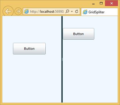
Two buttons are also added on both the sides of the grid splitter. When the above code is compiled and executed you will see the following output.
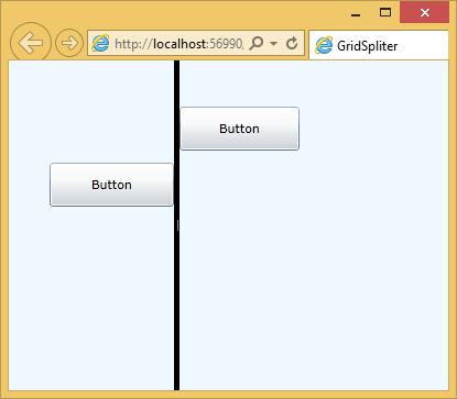
You can move the grid splitter and you will see that the button on right side is also moving with grid splitter.