- Matplotlib - Home
- Matplotlib - Introduction
- Matplotlib - Vs Seaborn
- Matplotlib - Environment Setup
- Matplotlib - Anaconda distribution
- Matplotlib - Jupyter Notebook
- Matplotlib - Pyplot API
- Matplotlib - Simple Plot
- Matplotlib - Saving Figures
- Matplotlib - Markers
- Matplotlib - Figures
- Matplotlib - Styles
- Matplotlib - Legends
- Matplotlib - Colors
- Matplotlib - Colormaps
- Matplotlib - Colormap Normalization
- Matplotlib - Choosing Colormaps
- Matplotlib - Colorbars
- Matplotlib - Working With Text
- Matplotlib - Text properties
- Matplotlib - Subplot Titles
- Matplotlib - Images
- Matplotlib - Image Masking
- Matplotlib - Annotations
- Matplotlib - Arrows
- Matplotlib - Fonts
- Matplotlib - Font Indexing
- Matplotlib - Font Properties
- Matplotlib - Scales
- Matplotlib - LaTeX
- Matplotlib - LaTeX Text Formatting in Annotations
- Matplotlib - PostScript
- Matplotlib - Mathematical Expressions
- Matplotlib - Animations
- Matplotlib - Celluloid Library
- Matplotlib - Blitting
- Matplotlib - Toolkits
- Matplotlib - Artists
- Matplotlib - Styling with Cycler
- Matplotlib - Paths
- Matplotlib - Path Effects
- Matplotlib - Transforms
- Matplotlib - Ticks and Tick Labels
- Matplotlib - Radian Ticks
- Matplotlib - Dateticks
- Matplotlib - Tick Formatters
- Matplotlib - Tick Locators
- Matplotlib - Basic Units
- Matplotlib - Autoscaling
- Matplotlib - Reverse Axes
- Matplotlib - Logarithmic Axes
- Matplotlib - Symlog
- Matplotlib - Unit Handling
- Matplotlib - Ellipse with Units
- Matplotlib - Spines
- Matplotlib - Axis Ranges
- Matplotlib - Axis Scales
- Matplotlib - Axis Ticks
- Matplotlib - Formatting Axes
- Matplotlib - Axes Class
- Matplotlib - Twin Axes
- Matplotlib - Figure Class
- Matplotlib - Multiplots
- Matplotlib - Grids
- Matplotlib - Object-oriented Interface
- Matplotlib - PyLab module
- Matplotlib - Subplots() Function
- Matplotlib - Subplot2grid() Function
- Matplotlib - Anchored Artists
- Matplotlib - Manual Contour
- Matplotlib - Coords Report
- Matplotlib - AGG filter
- Matplotlib - Ribbon Box
- Matplotlib - Fill Spiral
- Matplotlib - Findobj Method
- Matplotlib - Hyperlinks
- Matplotlib - Image Thumbnail
- Matplotlib - Plotting with Keywords
- Matplotlib - Create Logo
- Matplotlib - Multipage PDF
- Matplotlib - Multiprocessing
- Matplotlib - Print Stdout
- Matplotlib - Compound Path
- Matplotlib - Sankey Class
- Matplotlib - MRI with EEG
- Matplotlib - Stylesheets
- Matplotlib - Background Colors
- Matplotlib - Basemap
Matplotlib Events
- Matplotlib - Event Handling
- Matplotlib - Close Event
- Matplotlib - Mouse Move
- Matplotlib - Click Events
- Matplotlib - Scroll Event
- Matplotlib - Keypress Event
- Matplotlib - Pick Event
- Matplotlib - Looking Glass
- Matplotlib - Path Editor
- Matplotlib - Poly Editor
- Matplotlib - Timers
- Matplotlib - Viewlims
- Matplotlib - Zoom Window
Matplotlib Widgets
- Matplotlib - Cursor Widget
- Matplotlib - Annotated Cursor
- Matplotlib - Button Widget
- Matplotlib - Check Buttons
- Matplotlib - Lasso Selector
- Matplotlib - Menu Widget
- Matplotlib - Mouse Cursor
- Matplotlib - Multicursor
- Matplotlib - Polygon Selector
- Matplotlib - Radio Buttons
- Matplotlib - RangeSlider
- Matplotlib - Rectangle Selector
- Matplotlib - Ellipse Selector
- Matplotlib - Slider Widget
- Matplotlib - Span Selector
- Matplotlib - Textbox
Matplotlib Plotting
- Matplotlib - Line Plots
- Matplotlib - Area Plots
- Matplotlib - Bar Graphs
- Matplotlib - Histogram
- Matplotlib - Pie Chart
- Matplotlib - Scatter Plot
- Matplotlib - Box Plot
- Matplotlib - Arrow Demo
- Matplotlib - Fancy Boxes
- Matplotlib - Zorder Demo
- Matplotlib - Hatch Demo
- Matplotlib - Mmh Donuts
- Matplotlib - Ellipse Demo
- Matplotlib - Bezier Curve
- Matplotlib - Bubble Plots
- Matplotlib - Stacked Plots
- Matplotlib - Table Charts
- Matplotlib - Polar Charts
- Matplotlib - Hexagonal bin Plots
- Matplotlib - Violin Plot
- Matplotlib - Event Plot
- Matplotlib - Heatmap
- Matplotlib - Stairs Plots
- Matplotlib - Errorbar
- Matplotlib - Hinton Diagram
- Matplotlib - Contour Plot
- Matplotlib - Wireframe Plots
- Matplotlib - Surface Plots
- Matplotlib - Triangulations
- Matplotlib - Stream plot
- Matplotlib - Ishikawa Diagram
- Matplotlib - 3D Plotting
- Matplotlib - 3D Lines
- Matplotlib - 3D Scatter Plots
- Matplotlib - 3D Contour Plot
- Matplotlib - 3D Bar Plots
- Matplotlib - 3D Wireframe Plot
- Matplotlib - 3D Surface Plot
- Matplotlib - 3D Vignettes
- Matplotlib - 3D Volumes
- Matplotlib - 3D Voxels
- Matplotlib - Time Plots and Signals
- Matplotlib - Filled Plots
- Matplotlib - Step Plots
- Matplotlib - XKCD Style
- Matplotlib - Quiver Plot
- Matplotlib - Stem Plots
- Matplotlib - Visualizing Vectors
- Matplotlib - Audio Visualization
- Matplotlib - Audio Processing
Matplotlib Useful Resources
- Matplotlib - Quick Guide
- Matplotlib - Cheatsheet
- Matplotlib - Useful Resources
- Matplotlib - Discussion
Matplotlib - Violin Plots
A violin plot is used to represent the distribution of a dataset. It combines elements of a box plot and a kernel density plot. The plot consists of symmetrical shapes that look like violins to represent different groups. The "width" of these shapes represents the density of the data at that value. Wider sections indicate higher density i.e. more data points fall within that range, while narrower sections indicate lower density.
- Box Plot Elements: Inside the violin, you may find a box plot, which includes elements such as the median, quartiles, and outliers. This provides additional information about the central tendency and distribution of the data.
- Kernel Density Plot: The smooth outline of the violin is derived from a kernel density estimation (KDE) plot, providing a continuous representation of the data distribution.
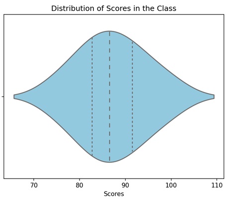
Imagine you have data on the scores of students in a class. The box in the violin plot will represent where most students scored, and the wider sections of the violin will show which scores are more common. If the violin is wider around 80 points, it means many students scored around 80 −
Violin Plot in Matplotlib
We can create a violin bin plot in Matplotlib using the violinplot() function. This function creates a graphical representation of the distribution of a dataset, consisting of both box plot elements and kernel density estimation.
The violinplot() Function
The violinplot() function in Matplotlib takes one or more datasets and produces a plot where each dataset is represented by a "violin" shape. The width of the violin corresponds to the data density, and the plot displays the median, quartiles, and probability density function of the data distribution.
Following is the syntax of the violinplot() function in Matplotlib −
plt.violinplot(
   dataset,
   positions=None,
   vert=True,
   widths=0.5,
   showmeans=False,
   showextrema=True,
   showmedians=False,
   quantiles=None,
   points=100,
   bw_method=None,
   *,
   data=None
)
Where,
- dataset is the input sequence of datasets to be plotted as violins.
- positions (optional) is the positions of the violins along the x-axis. If not specified, they will be placed at integer positions.
- If vert (optional) is True, the violins are vertically oriented; if False, they are horizontally oriented.
- widths (optional) is the width of the violins.
- If showmeans (optional) is True, the mean of each violin is marked as a point on the plot.
- If showextrema (optional) is True, the minimum and maximum values are marked as points on the plot.
- quantiles are the quartiles to be plotted, specified as a list of floats.
- points are the number of points to evaluate and plot the kernel density estimation.
- bw_method is the bandwidth method for kernel density estimation. If None, the method is automatically determined.
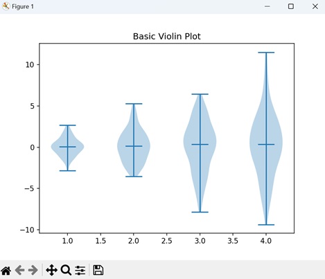
Example - Basic Violin Plot
A basic violin plot is a way to show the distribution of data. Imagine your data as a bunch of violins. Each violin represents a set of values, and its shape gives you an idea of how those values are spread. The wider parts of the violin indicate more data points, and the narrower parts indicate less data points. The line inside the violin is the median value, indicating the center of your data.
In the following example, we are creating a simple violin plot using random data with different standard deviations, without displaying mean markers but showing median markers −
import matplotlib.pyplot as plt
import numpy as np

# Generating data with different standard deviations
data = [np.random.normal(0, std, 100) for std in range(1, 5)]

# Creating a basic violin plot
plt.violinplot(data, showmeans=False, showmedians=True)
plt.title('Basic Violin Plot')
plt.show()
Output
After executing the above code, we get the following output −
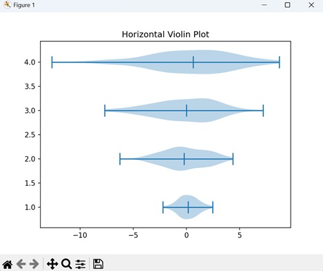
Example - Horizontal Violin Plot
To create a horizontal violin plot, the orientation of the usual violins is changed. Instead of extending up and down, they stretch from left to right. Just like regular violins, each one represents a set of data, showing you how the values are spread out. So, a horizontal violin plot helps you understand the distribution of your data, just like the regular one, but in a horizontal direction.
In here, we are creating a horizontal violin plot instead of a vertical one. This is achieved by setting the "vert" parameter to "False" in the violinplot() function −
import matplotlib.pyplot as plt
import numpy as np

# Generating data with different standard deviations
data = [np.random.normal(0, std, 100) for std in range(1, 5)]

# Creating a horizontal violin plot
plt.violinplot(data, showmeans=False, showmedians=True, vert=False)
plt.title('Horizontal Violin Plot')
plt.show()
Output
Following is the output of the above code −
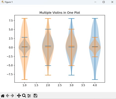
Example - Multiple Violins in One Plot
In Matplotlib, you can use multiple violins in in a single plot to represent various sets of data. By stacking these violins together, you can compare the distributions of multiple datasets, observing how they differ or overlap.
Now, we are generating two sets of data with different standard deviations and creating a plot with multiple violins −
import matplotlib.pyplot as plt
import numpy as np

# Generating data with different standard deviations
data = [np.random.normal(0, std, 100) for std in range(1, 5)]

# Creating a plot with multiple violins
plt.violinplot(data, showmeans=False, showmedians=True)
plt.violinplot(data[::-1], showmeans=False, showmedians=True)
plt.title('Multiple Violins in One Plot')
plt.show()
Output
Output of the above code is as follows −
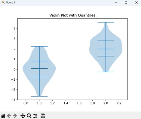
Example - Violin Plot with Quantiles
A violin plot with quantiles displays specific points that divide your data into quarters. Imagine each violin being divided into four equal sections, marking different levels of your data. The width of each section represents the number of data points. Now, you can also observe the plot, marking specific portions where your data lie, such as 25%, 50% (median), and 75%.
In the example below, we are creating a violin plot, displaying the distribution of each dataset with median markers and quantiles specified at 25th, 50th, and 75th percentiles −
import matplotlib.pyplot as plt
import numpy as np

# Data
data1 = np.random.normal(0, 1, 100)
data2 = np.random.normal(2, 1, 100)

# Creating a violin plot with specified quantiles for each dataset
plt.violinplot([data1, data2], showmeans=False, showmedians=True, quantiles=[[0.25, 0.5, 0.75], [0.25, 0.5, 0.75]])
plt.title('Violin Plot with Quantiles')
plt.show()
Output
The output obtained is as shown below −