- Matplotlib - Home
- Matplotlib - Introduction
- Matplotlib - Vs Seaborn
- Matplotlib - Environment Setup
- Matplotlib - Anaconda distribution
- Matplotlib - Jupyter Notebook
- Matplotlib - Pyplot API
- Matplotlib - Simple Plot
- Matplotlib - Saving Figures
- Matplotlib - Markers
- Matplotlib - Figures
- Matplotlib - Styles
- Matplotlib - Legends
- Matplotlib - Colors
- Matplotlib - Colormaps
- Matplotlib - Colormap Normalization
- Matplotlib - Choosing Colormaps
- Matplotlib - Colorbars
- Matplotlib - Working With Text
- Matplotlib - Text properties
- Matplotlib - Subplot Titles
- Matplotlib - Images
- Matplotlib - Image Masking
- Matplotlib - Annotations
- Matplotlib - Arrows
- Matplotlib - Fonts
- Matplotlib - Font Indexing
- Matplotlib - Font Properties
- Matplotlib - Scales
- Matplotlib - LaTeX
- Matplotlib - LaTeX Text Formatting in Annotations
- Matplotlib - PostScript
- Matplotlib - Mathematical Expressions
- Matplotlib - Animations
- Matplotlib - Celluloid Library
- Matplotlib - Blitting
- Matplotlib - Toolkits
- Matplotlib - Artists
- Matplotlib - Styling with Cycler
- Matplotlib - Paths
- Matplotlib - Path Effects
- Matplotlib - Transforms
- Matplotlib - Ticks and Tick Labels
- Matplotlib - Radian Ticks
- Matplotlib - Dateticks
- Matplotlib - Tick Formatters
- Matplotlib - Tick Locators
- Matplotlib - Basic Units
- Matplotlib - Autoscaling
- Matplotlib - Reverse Axes
- Matplotlib - Logarithmic Axes
- Matplotlib - Symlog
- Matplotlib - Unit Handling
- Matplotlib - Ellipse with Units
- Matplotlib - Spines
- Matplotlib - Axis Ranges
- Matplotlib - Axis Scales
- Matplotlib - Axis Ticks
- Matplotlib - Formatting Axes
- Matplotlib - Axes Class
- Matplotlib - Twin Axes
- Matplotlib - Figure Class
- Matplotlib - Multiplots
- Matplotlib - Grids
- Matplotlib - Object-oriented Interface
- Matplotlib - PyLab module
- Matplotlib - Subplots() Function
- Matplotlib - Subplot2grid() Function
- Matplotlib - Anchored Artists
- Matplotlib - Manual Contour
- Matplotlib - Coords Report
- Matplotlib - AGG filter
- Matplotlib - Ribbon Box
- Matplotlib - Fill Spiral
- Matplotlib - Findobj Method
- Matplotlib - Hyperlinks
- Matplotlib - Image Thumbnail
- Matplotlib - Plotting with Keywords
- Matplotlib - Create Logo
- Matplotlib - Multipage PDF
- Matplotlib - Multiprocessing
- Matplotlib - Print Stdout
- Matplotlib - Compound Path
- Matplotlib - Sankey Class
- Matplotlib - MRI with EEG
- Matplotlib - Stylesheets
- Matplotlib - Background Colors
- Matplotlib - Basemap
Matplotlib Events
- Matplotlib - Event Handling
- Matplotlib - Close Event
- Matplotlib - Mouse Move
- Matplotlib - Click Events
- Matplotlib - Scroll Event
- Matplotlib - Keypress Event
- Matplotlib - Pick Event
- Matplotlib - Looking Glass
- Matplotlib - Path Editor
- Matplotlib - Poly Editor
- Matplotlib - Timers
- Matplotlib - Viewlims
- Matplotlib - Zoom Window
Matplotlib Widgets
- Matplotlib - Cursor Widget
- Matplotlib - Annotated Cursor
- Matplotlib - Button Widget
- Matplotlib - Check Buttons
- Matplotlib - Lasso Selector
- Matplotlib - Menu Widget
- Matplotlib - Mouse Cursor
- Matplotlib - Multicursor
- Matplotlib - Polygon Selector
- Matplotlib - Radio Buttons
- Matplotlib - RangeSlider
- Matplotlib - Rectangle Selector
- Matplotlib - Ellipse Selector
- Matplotlib - Slider Widget
- Matplotlib - Span Selector
- Matplotlib - Textbox
Matplotlib Plotting
- Matplotlib - Line Plots
- Matplotlib - Area Plots
- Matplotlib - Bar Graphs
- Matplotlib - Histogram
- Matplotlib - Pie Chart
- Matplotlib - Scatter Plot
- Matplotlib - Box Plot
- Matplotlib - Arrow Demo
- Matplotlib - Fancy Boxes
- Matplotlib - Zorder Demo
- Matplotlib - Hatch Demo
- Matplotlib - Mmh Donuts
- Matplotlib - Ellipse Demo
- Matplotlib - Bezier Curve
- Matplotlib - Bubble Plots
- Matplotlib - Stacked Plots
- Matplotlib - Table Charts
- Matplotlib - Polar Charts
- Matplotlib - Hexagonal bin Plots
- Matplotlib - Violin Plot
- Matplotlib - Event Plot
- Matplotlib - Heatmap
- Matplotlib - Stairs Plots
- Matplotlib - Errorbar
- Matplotlib - Hinton Diagram
- Matplotlib - Contour Plot
- Matplotlib - Wireframe Plots
- Matplotlib - Surface Plots
- Matplotlib - Triangulations
- Matplotlib - Stream plot
- Matplotlib - Ishikawa Diagram
- Matplotlib - 3D Plotting
- Matplotlib - 3D Lines
- Matplotlib - 3D Scatter Plots
- Matplotlib - 3D Contour Plot
- Matplotlib - 3D Bar Plots
- Matplotlib - 3D Wireframe Plot
- Matplotlib - 3D Surface Plot
- Matplotlib - 3D Vignettes
- Matplotlib - 3D Volumes
- Matplotlib - 3D Voxels
- Matplotlib - Time Plots and Signals
- Matplotlib - Filled Plots
- Matplotlib - Step Plots
- Matplotlib - XKCD Style
- Matplotlib - Quiver Plot
- Matplotlib - Stem Plots
- Matplotlib - Visualizing Vectors
- Matplotlib - Audio Visualization
- Matplotlib - Audio Processing
Matplotlib Useful Resources
- Matplotlib - Quick Guide
- Matplotlib - Cheatsheet
- Matplotlib - Useful Resources
- Matplotlib - Discussion
Matplotlib - Pie Chart
A pie chart is a circular graph that represents data in slices, where each slice corresponds to a category or portion of the whole. The size of each slice reflects the proportion of data it represents. It is a visual way to show how parts contribute to a whole.
Pie Chart in Matplotlib
We can create a pie chart in Matplotlib using the pie() function. This function allows us to customize the appearance of the pie chart, including colors, labels, and the starting angle.
The pie() Function
The pie() function in Matplotlib takes an array or a list of values, where each value represents the size of a slice in the pie. The function provides visual proportions and distributions of categorical data in a circular format.
Following is the syntax of pie() function in Matplotlib −
plt.pie(x, explode=None, labels=None, colors=None, autopct=None, shadow=False, startangle=0)
Where,
- x is an array or list of values representing the sizes of slices.
- explode (optional) is an array or list specifying the fraction of the radius with which to offset each slice.
- labels (optional) is the list of strings providing labels for each slice.
- colors (optional) is list of colors for each slice.
- autopct (optional) format string or function for adding percentage labels on the pie.
- If shadow (optional) is True, it adds a shadow to the pie.
- startangle (optional) is the angle by which the start of the pie is rotated counterclockwise from the x-axis.
These are just a few parameters; there are more optionals parameters available for customization.
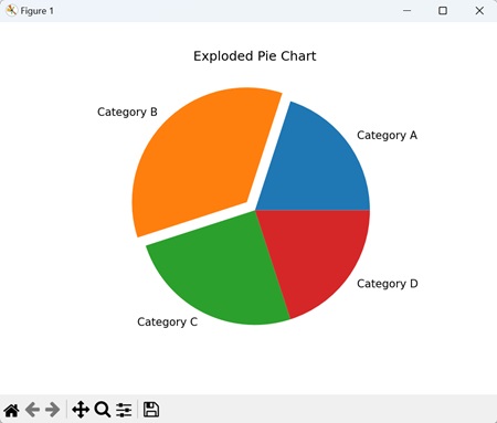
Example - Exploded Pie Chart
When creating an exploded pie chart, we separate one or more slices, "exploding" them away from the center of the chart. This highlights specific categories as we visually pull them away from the rest of the pie.
In the following example, we are creating a pie chart to show proportions of categories like 'Category A', 'Category B', 'Category C', and 'Category D'. We are using the explode parameter to move the second slice ('Category B') away from the center by a distance of 0.1 times the radius −
import matplotlib.pyplot as plt

# Data for proportions
sizes = [20, 35, 25, 20]
explode = (0, 0.1, 0, 0)

# Creating an exploded pie chart
plt.pie(sizes, explode=explode, labels=['Category A', 'Category B', 'Category C', 'Category D'])
plt.title('Exploded Pie Chart')
plt.show()
Output
After executing the above code, we get the following output −
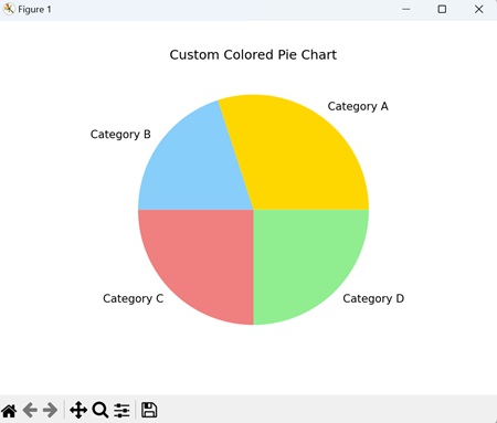
Example - Custom Colored Pie Chart
A custom-colored pie chart allows you to assign specific colors to different slices of the pie, adding a visually distinct touch to each category.
In here, we are creating a pie chart to represent proportions of categories such as 'Category A', 'Category B', 'Category C', and 'Category D'. We are using the colors parameter to assign custom colors to each slice −
import matplotlib.pyplot as plt

# Data for proportions
sizes = [30, 20, 25, 25]
colors = ['gold', 'lightskyblue', 'lightcoral', 'lightgreen']

# Creating a custom colored pie chart
plt.pie(sizes, labels=['Category A', 'Category B', 'Category C', 'Category D'], colors=colors)
plt.title('Custom Colored Pie Chart')
plt.show()
Output
Following is the output of the above code −
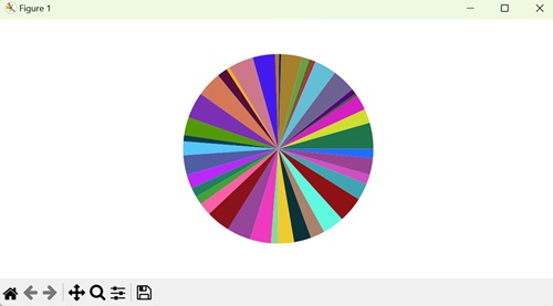
Example - Enhancing Pie Chart Colors
Here, we enhance pie chart colors in Matplotlib by generating "n" data points randomly, setting the figure size and padding, then creating a pie chart subplot with varying colors using the pie() method −
import matplotlib.pyplot as plt
import random
import numpy as np

plt.rcParams["figure.figsize"] = [7.50, 3.50]
plt.rcParams["figure.autolayout"] = True

n = 40
color = ["#" + ''.join([random.choice('0123456789ABCDEF')
                        for j in range(6)]) for i in range(n)]
a = np.random.random(n)
f = plt.figure()
ax = f.add_subplot(111, aspect='equal')
p = plt.pie(a, colors=color)

plt.show()
Output
Output of the above code is as shown below −
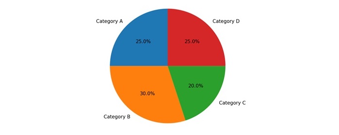
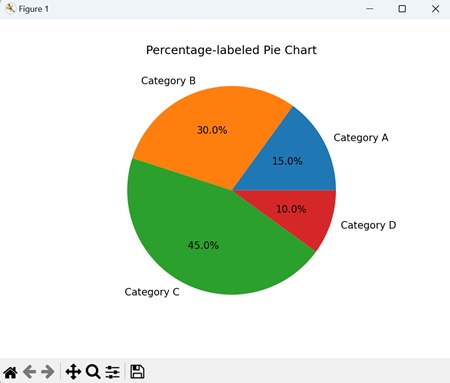
Example - Percentage-labeled Pie Chart
A percentage-labeled pie chart is a type of pie chart where we lable each slice with its percentage of the whole. This helps us by providing a clear understanding of the proportional contribution of each category.
Now, we create a pie chart that represents the distribution of categories ('Category A', 'Category B', 'Category C', 'Category D'). We use the autopct='%1.1f%%' parameter to display the percentage contribution of each slice −
import matplotlib.pyplot as plt

# Data for proportions
sizes = [15, 30, 45, 10]

# Creating a pie chart with percentage labels
plt.pie(sizes, labels=['Category A', 'Category B', 'Category C', 'Category D'], autopct='%1.1f%%')
plt.title('Percentage-labeled Pie Chart')
plt.show()
Output
Output of the above code is as follows −
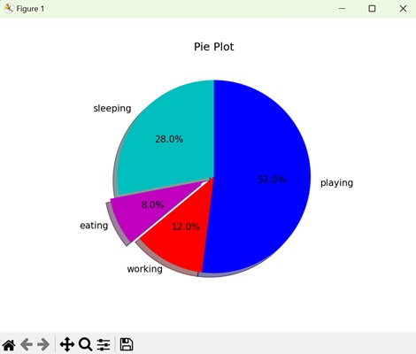
Example - Proportional Data
We can also show the percentage or proportional data where each slice of pie represents a category.
In here, we create a pie chart to show our daily activities, i.e. sleeping, eating, working, and playing. Using plt.pie() method, we create a pie chart with the given different data sets for different activities −
import matplotlib.pyplot as plt

days = [1, 2, 3, 4, 5]

sleeping = [7, 8, 6, 11, 7]
eating = [2, 3, 4, 3, 2]
working = [7, 8, 7, 2, 2]
playing = [8, 5, 7, 8, 13]
slices = [7, 2, 3, 13]
activities = ['sleeping', 'eating', 'working', 'playing']
cols = ['c', 'm', 'r', 'b']

plt.pie(slices,
   labels=activities,
   colors=cols,
   startangle=90,
   shadow=True,
   explode=(0, 0.1, 0, 0),
   autopct='%1.1f%%')

plt.title('Pie Plot')
plt.show()
Output
We get the output as shown below −
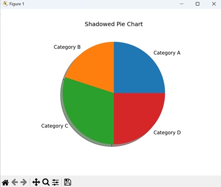
Example - Shadowed Pie Chart
A shadowed pie chart is a type of pie chart that includes a shadow effect, giving it a three-dimensional appearance. The shadows are generally projected to one side, creating a sense of depth and highlighting separation of each slice.
In the example below, we are using the shadow=True parameter used to add a shadow effect to the chart, providing a visual depth that enhances the separation between slices −
import matplotlib.pyplot as plt
sizes = [25, 20, 30, 25]

# Creating a shadowed pie chart
plt.pie(sizes, labels=['Category A', 'Category B', 'Category C', 'Category D'], shadow=True)
plt.title('Shadowed Pie Chart')
plt.show()
Output
The output obtained is as shown below −