- Matplotlib - Home
- Matplotlib - Introduction
- Matplotlib - Vs Seaborn
- Matplotlib - Environment Setup
- Matplotlib - Anaconda distribution
- Matplotlib - Jupyter Notebook
- Matplotlib - Pyplot API
- Matplotlib - Simple Plot
- Matplotlib - Saving Figures
- Matplotlib - Markers
- Matplotlib - Figures
- Matplotlib - Styles
- Matplotlib - Legends
- Matplotlib - Colors
- Matplotlib - Colormaps
- Matplotlib - Colormap Normalization
- Matplotlib - Choosing Colormaps
- Matplotlib - Colorbars
- Matplotlib - Working With Text
- Matplotlib - Text properties
- Matplotlib - Subplot Titles
- Matplotlib - Images
- Matplotlib - Image Masking
- Matplotlib - Annotations
- Matplotlib - Arrows
- Matplotlib - Fonts
- Matplotlib - Font Indexing
- Matplotlib - Font Properties
- Matplotlib - Scales
- Matplotlib - LaTeX
- Matplotlib - LaTeX Text Formatting in Annotations
- Matplotlib - PostScript
- Matplotlib - Mathematical Expressions
- Matplotlib - Animations
- Matplotlib - Celluloid Library
- Matplotlib - Blitting
- Matplotlib - Toolkits
- Matplotlib - Artists
- Matplotlib - Styling with Cycler
- Matplotlib - Paths
- Matplotlib - Path Effects
- Matplotlib - Transforms
- Matplotlib - Ticks and Tick Labels
- Matplotlib - Radian Ticks
- Matplotlib - Dateticks
- Matplotlib - Tick Formatters
- Matplotlib - Tick Locators
- Matplotlib - Basic Units
- Matplotlib - Autoscaling
- Matplotlib - Reverse Axes
- Matplotlib - Logarithmic Axes
- Matplotlib - Symlog
- Matplotlib - Unit Handling
- Matplotlib - Ellipse with Units
- Matplotlib - Spines
- Matplotlib - Axis Ranges
- Matplotlib - Axis Scales
- Matplotlib - Axis Ticks
- Matplotlib - Formatting Axes
- Matplotlib - Axes Class
- Matplotlib - Twin Axes
- Matplotlib - Figure Class
- Matplotlib - Multiplots
- Matplotlib - Grids
- Matplotlib - Object-oriented Interface
- Matplotlib - PyLab module
- Matplotlib - Subplots() Function
- Matplotlib - Subplot2grid() Function
- Matplotlib - Anchored Artists
- Matplotlib - Manual Contour
- Matplotlib - Coords Report
- Matplotlib - AGG filter
- Matplotlib - Ribbon Box
- Matplotlib - Fill Spiral
- Matplotlib - Findobj Method
- Matplotlib - Hyperlinks
- Matplotlib - Image Thumbnail
- Matplotlib - Plotting with Keywords
- Matplotlib - Create Logo
- Matplotlib - Multipage PDF
- Matplotlib - Multiprocessing
- Matplotlib - Print Stdout
- Matplotlib - Compound Path
- Matplotlib - Sankey Class
- Matplotlib - MRI with EEG
- Matplotlib - Stylesheets
- Matplotlib - Background Colors
- Matplotlib - Basemap
Matplotlib Events
- Matplotlib - Event Handling
- Matplotlib - Close Event
- Matplotlib - Mouse Move
- Matplotlib - Click Events
- Matplotlib - Scroll Event
- Matplotlib - Keypress Event
- Matplotlib - Pick Event
- Matplotlib - Looking Glass
- Matplotlib - Path Editor
- Matplotlib - Poly Editor
- Matplotlib - Timers
- Matplotlib - Viewlims
- Matplotlib - Zoom Window
Matplotlib Widgets
- Matplotlib - Cursor Widget
- Matplotlib - Annotated Cursor
- Matplotlib - Button Widget
- Matplotlib - Check Buttons
- Matplotlib - Lasso Selector
- Matplotlib - Menu Widget
- Matplotlib - Mouse Cursor
- Matplotlib - Multicursor
- Matplotlib - Polygon Selector
- Matplotlib - Radio Buttons
- Matplotlib - RangeSlider
- Matplotlib - Rectangle Selector
- Matplotlib - Ellipse Selector
- Matplotlib - Slider Widget
- Matplotlib - Span Selector
- Matplotlib - Textbox
Matplotlib Plotting
- Matplotlib - Line Plots
- Matplotlib - Area Plots
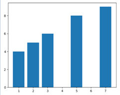
- Matplotlib - Bar Graphs
- Matplotlib - Histogram
- Matplotlib - Pie Chart
- Matplotlib - Scatter Plot
- Matplotlib - Box Plot
- Matplotlib - Arrow Demo
- Matplotlib - Fancy Boxes
- Matplotlib - Zorder Demo
- Matplotlib - Hatch Demo
- Matplotlib - Mmh Donuts
- Matplotlib - Ellipse Demo
- Matplotlib - Bezier Curve
- Matplotlib - Bubble Plots
- Matplotlib - Stacked Plots
- Matplotlib - Table Charts
- Matplotlib - Polar Charts
- Matplotlib - Hexagonal bin Plots
- Matplotlib - Violin Plot
- Matplotlib - Event Plot
- Matplotlib - Heatmap
- Matplotlib - Stairs Plots
- Matplotlib - Errorbar
- Matplotlib - Hinton Diagram
- Matplotlib - Contour Plot
- Matplotlib - Wireframe Plots
- Matplotlib - Surface Plots
- Matplotlib - Triangulations
- Matplotlib - Stream plot
- Matplotlib - Ishikawa Diagram
- Matplotlib - 3D Plotting
- Matplotlib - 3D Lines
- Matplotlib - 3D Scatter Plots
- Matplotlib - 3D Contour Plot
- Matplotlib - 3D Bar Plots
- Matplotlib - 3D Wireframe Plot
- Matplotlib - 3D Surface Plot
- Matplotlib - 3D Vignettes
- Matplotlib - 3D Volumes
- Matplotlib - 3D Voxels
- Matplotlib - Time Plots and Signals
- Matplotlib - Filled Plots
- Matplotlib - Step Plots
- Matplotlib - XKCD Style
- Matplotlib - Quiver Plot
- Matplotlib - Stem Plots
- Matplotlib - Visualizing Vectors
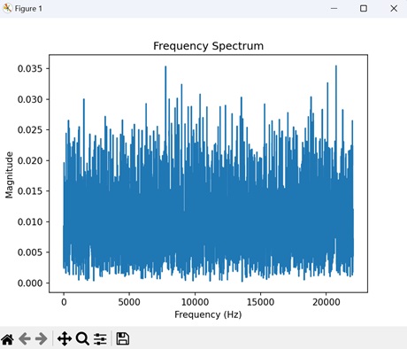
- Matplotlib - Audio Visualization
- Matplotlib - Audio Processing
Matplotlib Useful Resources
- Matplotlib - Quick Guide
- Matplotlib - Cheatsheet
- Matplotlib - Useful Resources
- Matplotlib - Discussion
Matplotlib - Quick Guide
Matplotlib - Introduction
Matplotlib is a powerful and widely-used plotting library in Python which enables us to create a variety of static, interactive and publication-quality plots and visualizations. It's extensively used for data visualization tasks and offers a wide range of functionalities to create plots like line plots, scatter plots, bar charts, histograms, 3D plots and much more. Matplotlib library provides flexibility and customization options to tailor our plots according to specific needs.
It is a cross-platform library for making 2D plots from data in arrays. Matplotlib is written in Python and makes use of NumPy, the numerical mathematics extension of Python. It provides an object-oriented API that helps in embedding plots in applications using Python GUI toolkits such as PyQt, WxPythonotTkinter. It can be used in Python and IPython shells. Jupyter notebook and web application servers also.
Matplotlib has a procedural interface named the Pylab which is designed to resemble MATLAB a proprietary programming language developed by MathWorks. Matplotlib along with NumPy can be considered as the open source equivalent of MATLAB.
Matplotlib was originally written by John D. Hunter in 2003. The current stable version is 2.2.0 released in January 2018.
The most common way to use Matplotlib is through its pyplot module.
The following are the in-depth overview of Matplotlib's key components and functionalities −
Components of Matplotlib
Figure
A figure is the entire window or page that displays our plot or collection of plots. It acts as a container that holds all elements of a graphical representation which includes axes, labels, legends and other components.
Example - Creating a Basic Plot
This is the basic plot which represents the figure.
import matplotlib.pyplot as plt
# Create a new figure
fig = plt.figure()

# Add a plot or subplot to the figure
plt.plot([1, 2, 3], [4, 5, 6])
plt.show()
Output
Axes/Subplot
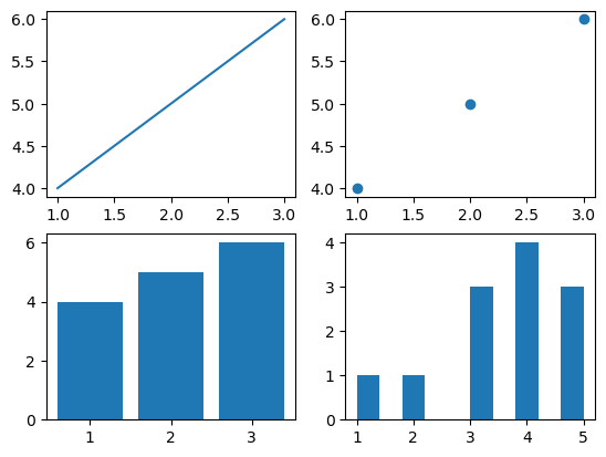
A specific region of the figure in which the data is plotted. Figures can contain multiple axes or subplots. The following is the example of the axes/subplot.
Example - Multiple Subplots
import matplotlib.pyplot as plt
# Creating a 2x2 grid of subplots
fig, axes = plt.subplots(nrows=2, ncols=2)

# Accessing individual axes (subplots)
axes[0, 0].plot([1, 2, 3], [4, 5, 6])  # Plot in the first subplot (top-left)
axes[0, 1].scatter([1, 2, 3], [4, 5, 6])  # Second subplot (top-right)
axes[1, 0].bar([1, 2, 3], [4, 5, 6])  # Third subplot (bottom-left)
axes[1, 1].hist([1, 2, 3, 3, 3, 4, 4, 4, 4, 5, 5, 5])  # Fourth subplot (bottom-right)
plt.show()
Output
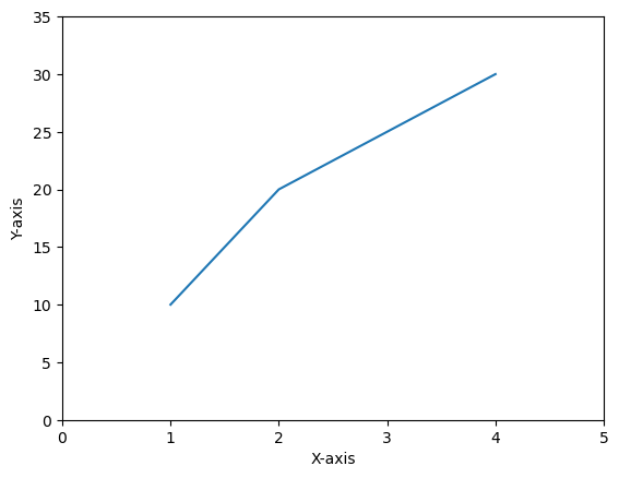
Axis
An axis refers to the X-axis or Y-axis in a plot or it can also denote an individual axis within a set of subplots. Understanding axes is essential for controlling and customizing the appearance and behavior of plots in Matplotlib. The following is the plot which contains the axis.
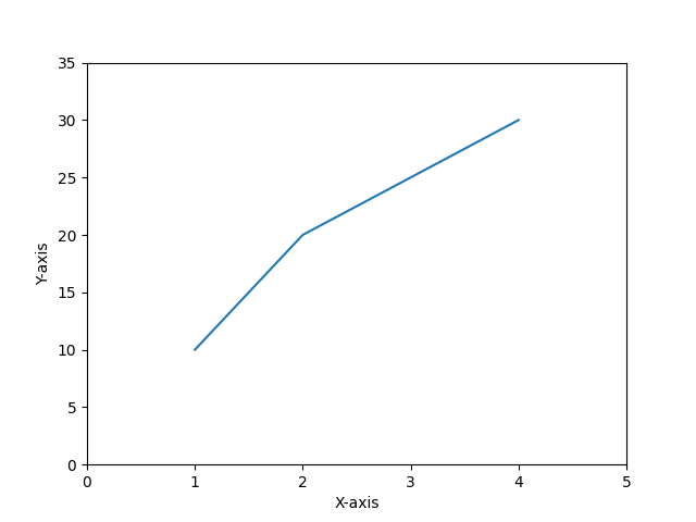
Example - Axis
import matplotlib.pyplot as plt
# Creating a plot
plt.plot([1, 2, 3, 4], [10, 20, 25, 30])

# Customizing axis limits and labels
plt.xlim(0, 5)
plt.ylim(0, 35)
plt.xlabel('X-axis')
plt.ylabel('Y-axis')
plt.show()
Output
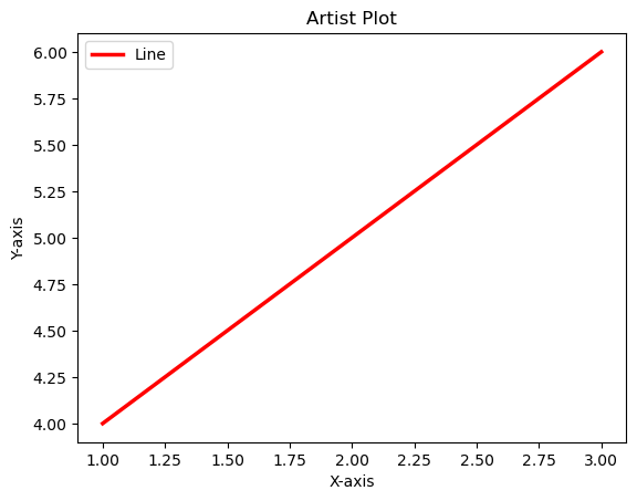
Artist
Artists refer to the various components or entities that make up a plot such as figures, axes, lines, text, patches, shapes (rectangles or circles) and more. They are the building blocks used to create visualizations and are organized in a hierarchy.
The below is the plot which resembles all the components of an artist.
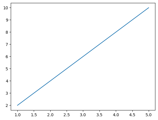
Example - Usage of Various Components
import matplotlib.pyplot as plt
# Create a figure and an axis (subplot)
fig, ax = plt.subplots()

# Plot a line (artist)
line = ax.plot([1, 2, 3], [4, 5, 6], label='Line')[0]

# Modify line properties
line.set_color('red')
line.set_linewidth(2.5)

# Add labels and title (text artists)
ax.set_xlabel('X-axis')
ax.set_ylabel('Y-axis')
ax.set_title('Artist Plot')
plt.legend()
plt.show()
Output
Key Features
Simple Plotting − Matplotlib allows us to create basic plots easily with just a few lines of code.
Customization − We can extensively customize plots by adjusting colors, line styles, markers, labels, titles and more.
Multiple Plot Types − It supports a wide variety of plot types such as line plots, scatter plots, bar charts, histograms, pie charts, 3D plots, etc.
Publication Quality − Matplotlib produces high-quality plots suitable for publications and presentations with customizable DPI settings.
Support for LaTeX Typesetting − We can use LaTeX for formatting text and mathematical expressions in plots.
Types of Plots
Matplotlib supports various types of plots which are as mentioned below. Each plot type has its own function in the library.
| Name of the plot | Definition | Image |
|---|---|---|
| Line plot |
A line plot is a type of graph that displays data points connected by straight line segments. The plt.plot() function of the matplotlib library is used to create the line plot. |
 |
| Scatter plot |
A scatter plot is a type of graph that represents individual data points by displaying them as markers on a two-dimensional plane. The plt.scatter() function is used to plot the scatter plot. |
|
| Line plot |
A line plot is a type of graph that displays data points connected by straight line segments. The plt.plot() function of the matplotlib library is used to create the line plot. |
 |
| Bar plot |
A bar plot or bar chart is a visual representation of categorical data using rectangular bars. The plt.bar() function is used to plot the bar plot. |
 |
| Pie plot |
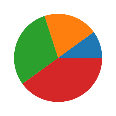
A pie plot is also known as a pie chart. It is a circular statistical graphic used to illustrate numerical proportions. It divides a circle into sectors or slices to represent the relative sizes or percentages of categories within a dataset. The plt.pie() function is used to plot the pie chart. |
 |
The above mentioned are the basic plots of the matplotlib library. We can also visualize the 3-d plots with the help of Matplotlib.
Subplots
We can create multiple plots within a single figure using subplots. This is useful when we want to display multiple plots together.
Saving Plots
Matplotlib allows us to save our plots in various formats such as PNG, PDF, SVG etc.
Matplotlib vs SeaBorn
Matplotlib and Seaborn are both powerful Python libraries used for data visualization but they have different strengths that are suited for different purposes.
What is Matplotlib?
Matplotlib is a comprehensive and widely used Python library for creating static, interactive and publication-quality visualizations. It provides a versatile toolkit for generating various types of plots and charts which makes it an essential tool for data scientists, researchers, engineers and analysts. The following are the features of the matplotlib library.
Core Library
Matplotlib is the foundational library for plotting in Python. It provides low-level control over visualizations by allowing users to create a wide variety of plots from basic to highly customize.
Customization
It offers extensive customization options by allowing users to control every aspect of a plot. This level of control can sometimes result in more code for creating complex plots.
Basic Plotting
While it's highly flexible for creating certain complex plots might require more effort and code compared to specialized libraries like Seaborn.
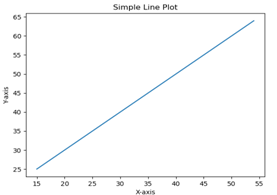
Simple plot by matplotlib
The following is the simple line plot created by using the matplotlib lbrary pyplot module.
Example - Usage of matplotlib
import matplotlib.pyplot as plt
# Creating a plot
plt.plot([1, 2, 3, 4], [10, 20, 25, 30])

# Customizing axis limits and labels
plt.xlim(0, 5)
plt.ylim(0, 35)
plt.xlabel('X-axis')
plt.ylabel('Y-axis')
plt.show()
Output
What is Seaborn?
Seaborn is a Python data visualization library that operates as an abstraction layer over Matplotlib. It's designed to create visually appealing and informative statistical graphics, simplifying the process of generating complex visualizations from data. The following are the key features of the seaborn library.
Statistical Data Visualization
Seaborn is built on top of Matplotlib and is particularly well-suited for statistical data visualization. It simplifies the process of creating complex plots by providing high-level abstractions.
Default Aesthetics
Seaborn comes with attractive default styles and color palettes that make plots aesthetically pleasing with minimal effort.
Specialized Plots
It specializes in certain types of plots like violin plots, box plots, pair plots and more which are easier to create in Seaborn compared to Matplotlib.
Basic seaborn plot
The following is the basic seaborn line plot.
Example
import seaborn as sns
import matplotlib.pyplot as plt

# Sample data
x_values = [1, 2, 3, 4, 5]
y_values = [2, 4, 6, 8, 10]

# Creating a line plot using Seaborn
sns.lineplot(x=x_values, y=y_values)
plt.show()
Output
| Matplotlib | Seaborn | |
|---|---|---|
| Level of Abstraction | Matplotlib is more low-level and requires more code for customizations. |
Seaborn abstracts some complexities by enabling easier creation of complex statistical plots. |
| Default Styles |
Matplotlib doesnt have better default styles and color palettes when compared to seaborn. |
Seaborn has better default styles and color palettes by making its plots visually appealing without much customization. |
| Specialized Plots | Matplotlib require more effort to plot certain plots readily. |
Seaborn offers certain types of plots that are not readily available or require more effort in Matplotlib. |
| When to use each library | We can use this library when we need fine-grained control over the appearance of our plots or when creating non-standard plots that may not be available in other libraries. |
We can use this library when working with statistical data especially for quick exploration and visualization of distributions, relationships and categories within the data. Seaborn's high-level abstractions and default styles make it convenient for this purpose. |
Both libraries are valuable in their own way and sometimes they can be used together to combine the strengths of both for advanced visualization tasks.
Matplotlib - Environment Setup
Matplotlib llibrary is highly compatible with various operating systems and Python environments. Setting up Matplotlib is relatively straightforward and its versatility makes it a valuable tool for visualizing data in Python. It involves ensuring that it is installed and configuring its behavior within our Python environment.
The below is the step-by-step guide to set the environment of the matplotlib library.
Installation
Matplotlib is often included in Python distributions like Anaconda. However if it's not installed we can do so using pip. The following is the command to install the matplotlib library.
pip install matplotlib
Checking the Installation
If we want to verify whether the installation is done or not then open a Python interpreter or a Jupyter Notebook and import Matplotlib library pyplot module by using the below code line.
import matplotlib.pyplot as plt
If no errors occur then the installation is successful otherwise there is a trouble in installation.
Backend Selection
Matplotlib has different "backends" responsible for rendering the plots. These backends can display figures in different environments e.g. in a Jupyter Notebook a separate window etc.
Interactive Backends (Great for Jupyter Notebook)
For enabling interactive plotting within Jupyter Notebook, we use the magic command %matplotlib. The below is the code line to be executed.
%matplotlib inline
# or
%matplotlib notebook
The %matplotlib inline command displays static images of our plot in the notebook while %matplotlib notebook allows interactive plots such as panning and zooming.
Non-Interactive Backend (when not using Jupyter)
When not working within a Jupyter environment then Matplotlib can use non-interactive backends. It automatically selects a suitable backend for our system. We can set a backend explicitly.
import matplotlib
matplotlib.use('Agg')  # Backend selection, 'Agg' for non-interactive backend
Configuration and Style
Matplotlib allows customization of default settings and styles. We can create a configuration file named `matplotlibrc` to customize the behavior.
Locating the Configuration File
To find where our Matplotlib configuration file is located we can run the below code using the Python editor.
import matplotlib
matplotlib.matplotlib_fname()
Creating/Editing Configuration
We can modify this file directly or create a new one to adjust various settings such as default figure size, line styles, fonts etc.Testing the Setup
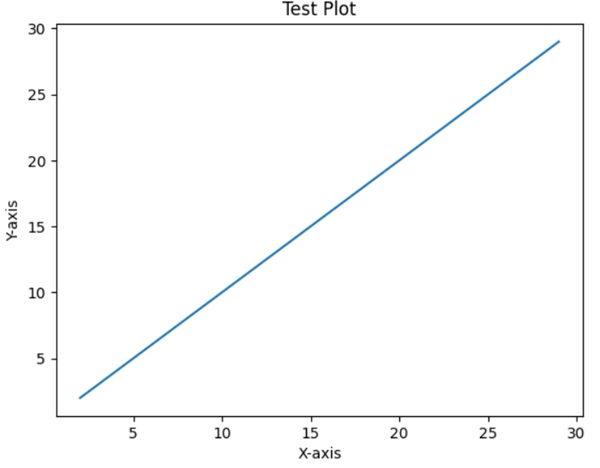
To ensure everything is set up correctly we can create a simple plot using Matplotlib.
Example
import matplotlib.pyplot as plt
x = list(range(2,30))
y = list(range(2,30))
plt.plot(x, y)
plt.xlabel('X-axis')
plt.ylabel('Y-axis')
plt.title('Test Plot')
plt.show()
Running this code should display a simple plot with a line chart in the selected environment.
Output
Incase Python 2.7 or 3.4 versions are not installed for all users, the Microsoft Visual C++ 2008 (64 bit or 32 bit forPython 2.7) or Microsoft Visual C++ 2010 (64 bit or 32 bit for Python 3.4) redistributable packages need to be installed.
If you are using Python 2.7 on a Mac, execute the following command −
xcode-select -install
Upon execution of the above command, the subprocess32 - a dependency, may be compiled.
On extremely old versions of Linux and Python 2.7, you may need to install the master version of subprocess32.
Matplotlib requires a large number of dependencies −
Python (>= 2.7 or >= 3.4)
NumPy
setuptools
dateutil
pyparsing
libpng
pytz
FreeType
cycler
six
Optionally, you can also install a number of packages to enable better user interface toolkits.
tk
PyQt4
PyQt5
pygtk
wxpython
pycairo
Tornado
For better support of animation output format and image file formats, LaTeX, etc., you can install the following −
_mpeg/avconv
ImageMagick
Pillow (>=2.0)
LaTeX and GhostScript (for rendering text with LaTeX).
LaTeX and GhostScript (for rendering text with LaTeX).
Matplotlib - Anaconda Distribution
Matplotlib library is a widely-used plotting library in Python and it is commonly included in the Anaconda distribution.
What is Anaconda Distribution?
Anaconda is a distribution of Python and other open-source packages that aims to simplify the process of setting up a Python environment for data science, machine learning and scientific computing.
Anaconda distribution is available for installation at https://www.anaconda.com/download/. For installation on Windows, 32 and 64 bit binaries are available −
Anaconda3-2025.12-1-Windows-x86_64.exe
Installation is a fairly straightforward wizard based process. You can choose between adding Anaconda in PATH variable and registering Anaconda as your default Python.
For installation on Linux, download installers for 32 bit and 64 bit installers from the downloads page −
Anaconda3-2025.12-1-Linux-aarch64.sh
Anaconda3-2025.12-1-Linux-x86_64.sh
Now, run the following command from the Linux terminal −
Syntax
$ bash Anaconda3-2025.12-1-Linux-x86_64.sh
Canopy and ActiveState are the most sought after choices for Windows, macOS and common Linux platforms. The Windows users can find an option in WinPython.
Here is how Matplotlib is typically associated with the Anaconda distribution:
Matplotlib in Anaconda
Pre-Installed
Matplotlib library is often included in the default installation of the Anaconda distribution. When we install Anaconda Matplotlib is available along with many other essential libraries for data visualization.
Integration with Jupyter
Anaconda comes with Jupyter Notebook which is a popular interactive computing environment. Matplotlib seamlessly integrates with Jupyter and makes our work easy to create and visualize plots within Jupyter Notebooks.
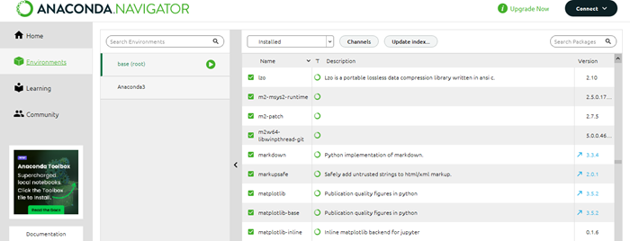
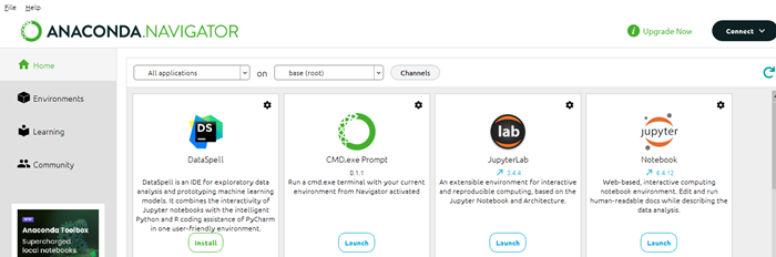
Anaconda Navigator
Anaconda Navigator is a graphical user interface that comes with the Anaconda distribution. This allows users to manage environments, install packages and launch applications. It provides an easy way to access and launch Jupyter Notebooks for Matplotlib plotting.
Conda Package Manager
Anaconda uses the 'conda' package manager which simplifies the installation, updating and managing of Python packages. We can use 'conda' to install or update Matplotlib within our Anaconda environment.
Verifying Matplotlib Installation
To verify whether Matplotlib is installed in our Anaconda environment we can use the following steps.
Open the Anaconda Navigator.
Navigate to the "Envinornments" tab.
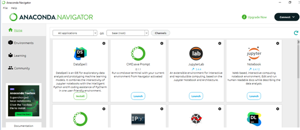
Look for "Matplotlib" in the list of installed packages. If it's there Matplotlib is installed.
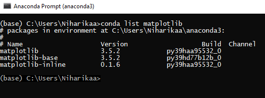
Alternatively we can open Anaconda Prompt or a terminal and run the below mentioned code
Syntax
conda list matplotlib
This command will list the installed version of Matplotlib in our current Anaconda environment.
Output
Installing or Updating Matplotlib in Anaconda
If Matplotlib is not installed or we want to update it then we can use the following commands in the Anaconda Prompt or terminal.
To install Matplotlib
Syntax
conda install matplotlib
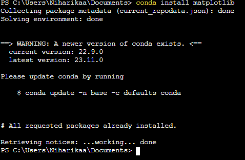
As the matplotlib is already installed in the system its shown the message the All requested packages already installed.
To update Matplotlib
Syntax
conda update matplotlib
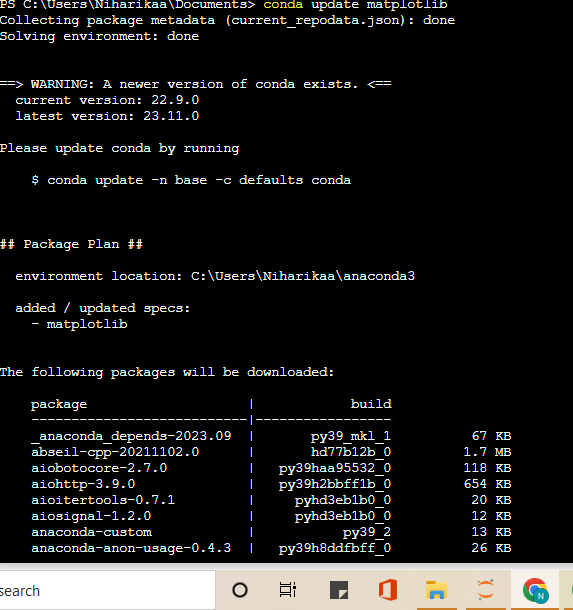
The above mentioned commands will manage the installation or update of Matplotlib and its dependencies in our Anaconda environment.
Finally we can say Matplotlib is a fundamental part of the Anaconda distribution making it convenient for users to create high-quality visualizations in their Python environments for data analysis and scientific computing.
Matplotlib - Jupyter Notebook
Jupyter is a loose acronym meaning Julia, Python, and R. These programming languages were the first target languages of the Jupyter application, but nowadays, the notebook technology also supports many other languages.
In 2001, Fernando Prez started developing Ipython. IPython is a command shell for interactive computing in multiple programming languages, originally developed for the Python.
Matplotlib in Jupyter Notebook provides an interactive environment for creating visualizations right alongside our code. Let's go through the steps to start using Matplotlib in a Jupyter Notebook.
Matplotlib library in Jupyter Notebook provides a convenient way to visualize data interactively by allowing for an exploratory and explanatory workflow when working on data analysis, machine learning or any other Python-based project.
Consider the following features provided by IPython −
Interactive shells (terminal and Qt-based).
A browser-based notebook with support for code, text, mathematical expressions, inline plots and other media.
Support for interactive data visualization and use of GUI toolkits.
Flexible, embeddable interpreters to load into one's own projects.
In 2014, Fernando Prez announced a spin-off project from IPython called Project Jupyter. IPython will continue to exist as a Python shell and a kernel for Jupyter, while the notebook and other language-agnostic parts of IPython will move under the Jupyter name. Jupyter added support for Julia, R, Haskell and Ruby.
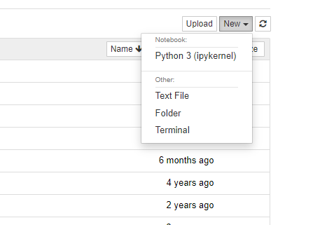
Starting Jupyter Notebook
The below are the steps to be done by one by one to work in the Jupyter Notebook.
Launch Jupyter Notebook
Open Anaconda Navigator.
Launch Jupyter Notebook from the Navigator or in the terminal/Anaconda Prompt type jupyter notebook and hit Enter.
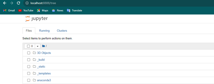
Create or Open a Notebook
Once Jupyter Notebook opens in our web browser then navigate to the directory where we want to work.
After click on "New" and choose a Python notebook which is often referred to as an "Untitled" notebook.
Import Matplotlib
In a Jupyter Notebook cell import Matplotlib library by using the lines of code.
import matplotlib.pyplot as plt
%matplotlib inline
%matplotlib inline is a magic command that tells Jupyter Notebook to display Matplotlib plots inline within the notebook.
Create Plots
We can now use Matplotlib functions to create our plots. For example lets create a line plot by using the numpy data.
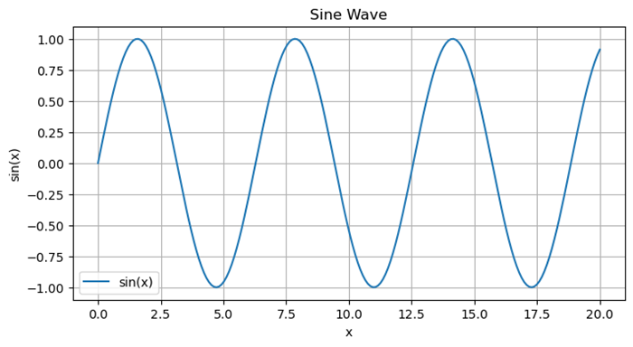
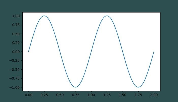
Example - Creating a Line Plot
import numpy as np
import matplotlib.pyplot as plt
# Generating sample data
x = np.linspace(0, 20, 200)
y = np.sin(x)
# Plotting the data
plt.figure(figsize=(8, 4))
plt.plot(x, y, label='sin(x)')
plt.title('Sine Wave')
plt.xlabel('x')
plt.ylabel('sin(x)')
plt.legend()
plt.grid(True)
plt.show()
Output
Interact with Plots
Once the plot is generated then it will be displayed directly in the notebook below the cell. We can interact with the plot i.e. panning, zooming can be done if we used %matplotlib notebook instead of %matplotlib inline at the import stage.
Multiple Plots
We can create multiple plots by creating new cells and running more Matplotlib commands.
Markdown Cells
We can add explanatory text in Markdown cells above or between code cells to describe our plots or analysis.
Saving Plots
We can use plt.savefig('filename.png') to save a plot as an image file within our Jupyter environment.
Closing Jupyter Notebook
Once we have finished working in the notebook we can shut it down from the Jupyter Notebook interface or close the terminal/Anaconda Prompt where Jupyter Notebook was launched.
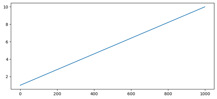
Hide Matplotlib descriptions in Jupyter notebook
To hide matplotlib descriptions of an instance while calling plot() method, we can take the following steps
Open Ipython instance.
import numpy as np
from matplotlib, import pyplot as plt
Create points for x, i.e., np.linspace(1, 10, 1000)
Now, plot the line using plot() method.
To hide the instance, use plt.plot(x); i.e., (with semi-colon)
Or, use _ = plt.plot(x)
Example - Hiding Description Code
In this example we are hiding the description code.
import numpy as np
from matplotlib import pyplot as plt
x = np.linspace(1, 10, 1000)
plt.plot(x)
plt.show()
Output
Matplotlib - Pyplot API
A new untitled notebook with the .ipynbextension (stands for the IPython notebook) is displayed in the new tab of the browser.
matplotlib.pyplot is a collection of command style functions that make Matplotlib work like MATLAB. Each Pyplot function makes some change to a figure. For example, a function creates a figure, a plotting area in a figure, plots some lines in a plotting area, decorates the plot with labels, etc.
Types of Plots
| Sr.No | Function & Description |
|---|---|
| 1 |
Bar Make a bar plot. |
| 2 |
Barh Make a horizontal bar plot. |
| 3 |
Boxplot Make a box and whisker plot. |
| 4 |
Hist Plot a histogram. |
| 5 |
hist2d Make a 2D histogram plot. |
| 6 |
Pie Plot a pie chart. |
| 7 |
Plot Plot lines and/or markers to the Axes. |
| 8 |
Polar Make a polar plot.. |
| 9 |
Scatter Make a scatter plot of x vs y. |
| 10 |
Stackplot Draws a stacked area plot. |
| 11 |
Stem Create a stem plot. |
| 12 |
Step Make a step plot. |
| 13 |
Quiver Plot a 2-D field of arrows. |
Image Functions
| Sr.No | Function & Description |
|---|---|
| 1 |
Imread Read an image from a file into an array. |
| 2 |
Imsave Save an array as in image file. |
| 3 |
Imshow Display an image on the axes. |
Axis Functions
| Sr.No | Function & Description |
|---|---|
| 1 |
Axes Add axes to the figure. |
| 2 |
Text Add text to the axes. |
| 3 |
Title Set a title of the current axes. |
| 4 |
Xlabel Set the x axis label of the current axis. |
| 5 |
Xlim Get or set the x limits of the current axes. |
| 6 |
Xscale . |
| 7 |
Xticks Get or set the x-limits of the current tick locations and labels. |
| 8 |
Ylabel Set the y axis label of the current axis. |
| 9 |
Ylim Get or set the y-limits of the current axes. |
| 10 |
Yscale Set the scaling of the y-axis. |
| 11 |
Yticks Get or set the y-limits of the current tick locations and labels. |
Figure Functions
| Sr.No | Function & Description |
|---|---|
| 1 |
Figtext Add text to figure. |
| 2 |
Figure Creates a new figure. |
| 3 |
Show Display a figure. |
| 4 |
Savefig Save the current figure. |
| 5 |
Close Close a figure window. |
Matplotlib - Saving Figures
Saving figures in Matplotlib library allows us to export our plots to various file formats such as PNG, PDF, SVG and so on to use those saved plots in various reports, presentations or publications. Matplotlib library provides the savefig() function for to save the plot that we have created.
Common File Formats for Saving
PNG (.png) − Good for general-purpose images which supports transparency.
JPEG (.jpg) − Suitable for images with smooth gradients but may lose some quality due to compression.
PDF (.pdf) − Ideal for vector-based images scalable without loss of quality.
SVG (.svg) − Scalable Vector Graphics which suitable for web-based or vector-based graphics.
Saving figures in Matplotlib library is useful for preserving visualizations in various formats by ensuring they can be shared, used or embedded in different contexts as needed. Adjusting the file format and resolution allows us to balance image quality and file size based on your requirements.
Syntax
The following is the syntax and parameters for using the savefig() method.
plt.savefig(fname, dpi=None, bbox_inches='tight', pad_inches=0.1, format=None, kwargs)
Where,
fname − The file name or path of the file to save the figure. The file extension determines the file format such as ".png", ".pdf".
dpi − Dots per inch i.e. resolution for the saved figure. Default is "None" which uses the Matplotlib default.
bbox_inches − Specifies which part of the figure to save. Options include 'tight', 'standard' or a specified bounding box in inches.
pad_inches − Padding around the figure when bbox_inches='tight'.
format − Explicitly specify the file format. If 'None' the format is inferred from the file extension in fname.
kwargs − Additional keyword arguments specific to the chosen file format.
Example - Saving the plot in specified location
In this example we are creating a simple line plot by using the plot() function and then we are trying to save the plotted image in the specified location with the specified filename.
import matplotlib.pyplot as plt
# Data
x = [22,1,7,2,21,11,14,5]
y = [24,2,12,5,5,5,9,12]
plt.plot(x,y)

# Customize the plot (optional)
plt.xlabel('X-axis')
plt.ylabel('Y-axis')
plt.title('Simple Line Plot')

# Display the plot
plt.savefig('matplotlib/Savefig/lineplot.png')
plt.show()
Output
On executing the above code we will get the following output −
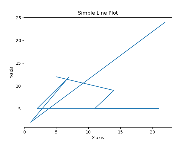
Example - Saving plot in .svg format
Here, this is another example of saving the plotted plot by using the savefig() by specifying the file format as svg and dpi as 300 to set the resolution.
import matplotlib.pyplot as plt
# Data
x = [22,1,7,2,21,11,14,5]
y = [24,2,12,5,5,5,9,12]
plt.plot(x,y)

# Customize the plot (optional)
plt.xlabel('X-axis')
plt.ylabel('Y-axis')
plt.title('Simple Line Plot')

# Display the plot
plt.savefig('matplotlib/Savefig/lineplot2.svg',dpi = 500)
plt.show()
Output
On executing the above code we will get the following output −
Note
We should call savefig() before calling show() if we want to save the figure with the exact appearance shown on the screen otherwise empty file will be saved.
The file extension in the fname parameter determines the format of the saved file. Matplotlib automatically infers the format if format is None.
Matplotlib - Markers
In Matplotlib markers are used to highlight individual data points on a plot. The marker parameter in the plot() function is used to specify the marker style. The following is the syntax for using markers in Matplotlib.
Syntax
The following is the syntax and parameters of using the markers in matplotlib library.
plt.plot(x, y, marker='marker_style')
Where,
x and y − Arrays or sequences of values representing the data points to be plotted.
marker − Specifies the marker style to be used. It can be a string or one of the following marker styles:
| Sr.No. | Marker & Definition |
|---|---|
| 1 |
. Point marker |
| 2 |
, Pixel marker |
| 3 |
o Circle marker |
| 4 |
v Triangle down marker |
| 5 |
^ Triangle up marker |
| 6 |
Triangle left marker |
| 7 |
> Triangle right marker |
| 8 |
1 Downward-pointing triangle marker |
| 9 |
2 Upward-pointing triangle marker |
| 10 |
3 Left-pointing triangle marker |
| 11 |
4 Right-pointing triangle marker |
| 12 |
s Square marker |
| 13 |
p Pentagon marker |
| 14 |
* Star marker |
| 15 |
h Hexagon marker (1) |
| 16 |
H Hexagon marker (2) |
| 17 |
+ Plus marker |
| 18 |
x Cross marker |
| 19 |
D Diamond marker |
| 20 |
d Thin diamond marker |
| 21 |
− Horizontal line marker |
Scatterplot with pentagonal marker
Here in this example we are creating the scatterplot with the pentagonal marker by using the scatter() function of the pyplot module.
Example
import matplotlib.pyplot as plt
# Data
x = [22,1,7,2,21,11,14,5]
y = [24,2,12,5,5,5,9,12]
plt.scatter(x,y, marker = 'p')

# Customize the plot (optional)
plt.xlabel('X-axis')
plt.ylabel('Y-axis')
plt.title(' Scatter Plot with pentagonal marker')

# Display the plot
plt.show()
Output

Line plot with triangular marker
In this example we are creating a line plot with the triangle marker by providing marker values as 'v' to the plot() function of the pyplot module.
Example
import matplotlib.pyplot as plt
# Data
x = [22,1,7,2,21,11,14,5]
y = [24,2,12,5,5,5,9,12]
plt.plot(x,y, marker = 'v')

# Customize the plot (optional)
plt.xlabel('X-axis')
plt.ylabel('Y-axis')
plt.title(' Line Plot with triangular marker')

# Display the plot
plt.show()
Output

Matplotlib - Figures
In Matplotlib library a figure is the top-level container that holds all elements of a plot or visualization. It can be thought of as the window or canvas where plots are created. A single figure can contain multiple subplots i.e. axes, titles, labels, legends and other elements. The figure() function in Matplotlib is used to create a new figure.
Syntax
The below is the syntax and parameters of the figure() method.
plt.figure(figsize=(width, height), dpi=resolution)
Where,
figsize=(width, height) − Specifies the width and height of the figure in inches. This parameter is optional.
dpi=resolution − Sets the resolution or dots per inch for the figure. Optional and by default is 100.
Creating a Figure
To create the Figure by using the figure() method we have to pass the figure size and resolution values as the input parameters.
Example
import matplotlib.pyplot as plt
# Create a figure
plt.figure(figsize=(3,3), dpi=100)
plt.show()
Output
Figure size 300x300 with 0 Axes
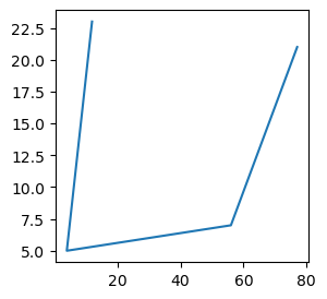
Adding Plots to a Figure
After creating a figure we can add plots or subplots (axes) within that figure using various plot() or subplot() functions in Matplotlib.
Example
import matplotlib.pyplot as plt
# Create a figure
plt.figure(figsize=(3, 3), dpi=100)
x = [12,4,56,77]
y = [23,5,7,21]
plt.plot(x,y)
plt.show()
Output
Displaying and Customizing Figures
To display and customize the figures we have the functions plt.show(),plt.title(), plt.xlabel(), plt.ylabel(), plt.legend().
plt.show()
This function displays the figure with all the added plots and elements.
Customization
We can perform customizations such as adding titles, labels, legends and other elements to the figure using functions like plt.title(), plt.xlabel(), plt.ylabel(), plt.legend() etc.
Example
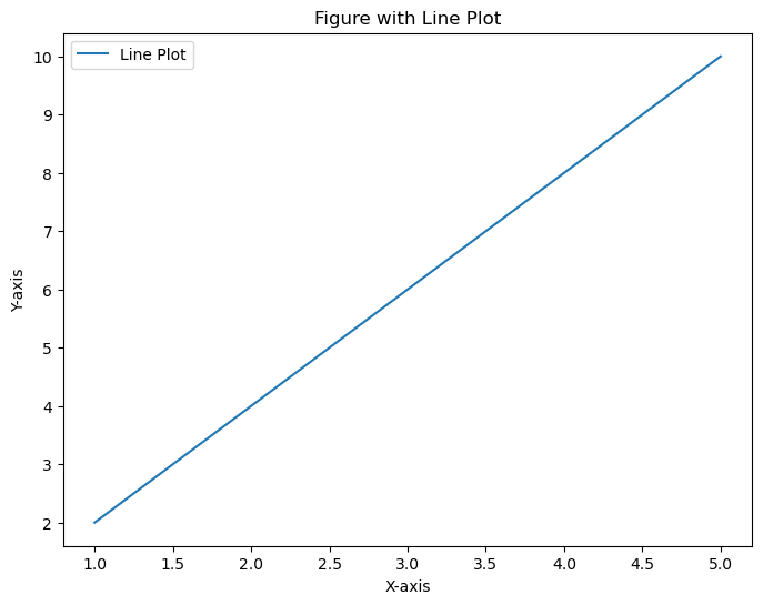
In this example we are using the figure() method of the pyplot module by passing the figsize as (8,6) and dpi as 100 to create a figure with a line plot and includes customization options such as a title, labels and a legend. Figures can contain multiple plots or subplots allowing for complex visualizations within a single window.
import matplotlib.pyplot as plt
# Data
x = [1, 2, 3, 4, 5]
y = [2, 4, 6, 8, 10]

# Create a figure
plt.figure(figsize=(8, 6), dpi=100)

# Add a line plot to the figure
plt.plot(x, y, label='Line Plot')

# Customize the plot
plt.title('Figure with Line Plot')
plt.xlabel('X-axis')
plt.ylabel('Y-axis')
plt.legend()

# Display the figure
plt.show()
Output
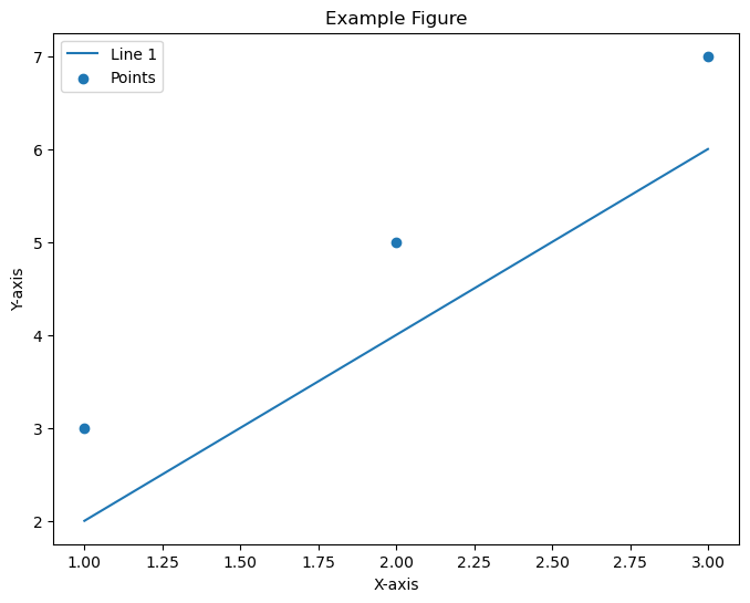
Example
Here this is another example of using the figure() method of the pyplot module to create the subplots.
import matplotlib.pyplot as plt
# Create a figure
plt.figure(figsize=(8, 6))

# Add plots or subplots within the figure
plt.plot([1, 2, 3], [2, 4, 6], label='Line 1')
plt.scatter([1, 2, 3], [3, 5, 7], label='Points')

# Customize the figure
plt.title('Example Figure')
plt.xlabel('X-axis')
plt.ylabel('Y-axis')
plt.legend()

# Display the figure
plt.show()
Output
Matplotlib - Styles
What is Style in Matplotlib?
In Matplotlib library styles are configurations that allow us to change the visual appearance of our plots easily. They act as predefined sets of aesthetic choices by altering aspects such as colors, line styles, fonts, gridlines and more. These styles help in quickly customizing the look and feel of our plots without manually adjusting individual elements each time.
We can experiment with different styles to find the one that best suits our data or visual preferences. Styles provide a quick and efficient way to enhance the visual presentation of our plots in Matplotlib library.
Built-in Styles
Matplotlib comes with a variety of built-in styles that offer different color schemes, line styles, font sizes and other visual properties.
Examples include ggplot, seaborn, classic, dark_background and more.
Changing Styles
Use plt.style.use('style_name') to apply a specific style to our plots.Key Aspects of Matplotlib Styles
Predefined Styles − Matplotlib library comes with various built-in styles that offer different aesthetics for our plots.
Ease of Use − By applying a style we can instantly change the overall appearance of our plot to match different themes or visual preferences.
Consistency − Styles ensure consistency across multiple plots or figures within the same style setting.
Using Styles
There are several steps involved in using the available styles in matlplotlib library. Lets see them one by one.
Setting a Style
For setting the required style we have to use plt.style.use('style_name') to set a specific style before creating our plots.
For example if we want to set the ggplot style we have to use the below code.
import matplotlib.pyplot as plt
plt.style.use('ggplot')  # Setting the 'ggplot' style
Available Styles
We can view the list of available styles using plt.style.available.
Example
import matplotlib.pyplot as plt
print(plt.style.available)  # Prints available styles
Output
['Solarize_Light2', '_classic_test_patch', '_mpl-gallery', '_mpl-gallery-nogrid', 'bmh', 'classic', 'dark_background', 'fast', 'fivethirtyeight', 'ggplot', 'grayscale', 'seaborn', 'seaborn-bright', 'seaborn-colorblind', 'seaborn-dark', 'seaborn-dark-palette', 'seaborn-darkgrid', 'seaborn-deep', 'seaborn-muted', 'seaborn-notebook', 'seaborn-paper', 'seaborn-pastel', 'seaborn-poster', 'seaborn-talk', 'seaborn-ticks', 'seaborn-white', 'seaborn-whitegrid', 'tableau-colorblind10']
Applying Custom Styles
We can create custom style files with specific configurations and then use plt.style.use('path_to_custom_style_file') to apply them.
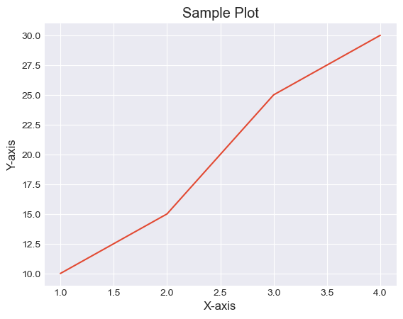
Example - Applying the seaborn-darkgrid style
In this example the style 'seaborn-darkgrid' is applying to the plot altering its appearance.
import matplotlib.pyplot as plt
# Using a specific style
plt.style.use('seaborn-darkgrid')

# Creating a sample plot
plt.plot([1, 2, 3, 4], [10, 15, 25, 30])
plt.xlabel('X-axis')
plt.ylabel('Y-axis')
plt.title('Sample Plot')
plt.show()
Output
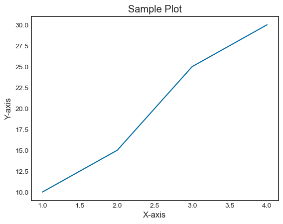
Example - Applying ggplot style
In this example we are using the ggplot style for our plot.
import matplotlib.pyplot as plt
# Using a specific style
plt.style.use('seaborn-white')

# Creating a sample plot
plt.plot([1, 2, 3, 4], [10, 15, 25, 30])
plt.xlabel('X-axis')
plt.ylabel('Y-axis')
plt.title('Sample Plot')
plt.show()
Output
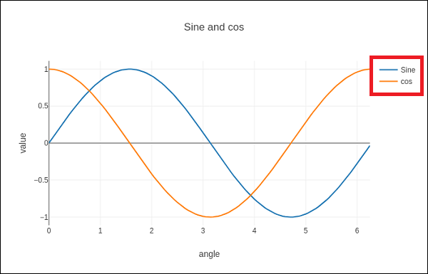
Matplotlib - Legends
In general, a legend in a graph provides a visual representation of the data depicted along the Y-axis, often referred to as the graph series. It is a box containing a symbol and a label for each series in the graph. A series could be a line in a line chart, a bar in a bar chart, and so on. The legend is helpful when you have multiple data series on the same plot, and you want to distinguish between them. In the following image, we can observe the legend in a plot (highlighted with a red color rectangle) −
Adding legend to a matplotlib plot
To add a legend to a Matplotlib plot, you typically use the matplotlib.pyplot.legend() function. This function is used to add a legend to the Axes, providing a visual guide for the elements in the plot.
Syntax
Following is the syntax of the function
matplotlib.pyplot.legend(*args, **kwargs)
The function can be called in different ways, depending on how you want to customize the legend.
Matplotlib automatically determines the elements to be added to the legend while call legend() without passing any extra arguments,. The labels for these elements are taken from the artists in the plot. You can specify these labels either at the time of creating the artist or by using the set_label() method.
Example - Usage of Legend Label
In this example, the legend takes the data from the label argument is used when creating the plot.
import matplotlib.pyplot as plt

# Example data
x = [1, 2, 3]
y = [2, 4, 6]

# Plotting the data with labels
line, = plt.plot(x, y, label='Legend describing a single line')

# Adding a legend
plt.legend()

# Show the plot
plt.show()
print('Successfully Placed a legend on the Axes...')
Output
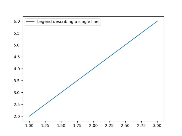
Successfully Placed a legend on the Axes...
Example - Setting Label via Method
Here is the alternative way of using the set_label() method on the artist.
import matplotlib.pyplot as plt

# Example data
x = [1, 2, 3]
y = [2, 4, 6]

# Plotting the data with labels
line, = plt.plot(x, y)
line.set_label('Place a legend via method')

# Adding a legend
plt.legend()

# Show the plot
plt.show()
print('Successfully Placed a legend on the Axes...')
Output
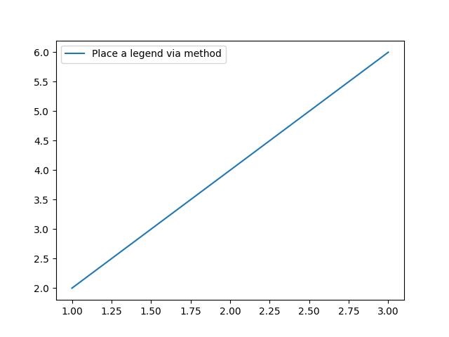
Successfully Placed a legend on the Axes...
Manually adding the legend
You can pass an iterable of legend artists followed by an iterable of legend labels to explicitly control which artists have a legend entry.
Example - Using iterable of legends
Here is an example of calling the legend() function by listing artists and labels.
import matplotlib.pyplot as plt

# Example data
x = [1, 2, 3]
y1 = [2, 4, 6]
y2 = [1, 3, 5]
y3 = [3, 6, 9]

# Plotting the data
line1, = plt.plot(x, y1)
line2, = plt.plot(x, y2)
line3, = plt.plot(x, y3)

# calling legend with explicitly listed artists and labels
plt.legend([line1, line2, line3], ['Label 1', 'Label 2', 'Label 3'])

# Show the plot
plt.show()
print('Successfully Placed a legend on the Axes...')
Output
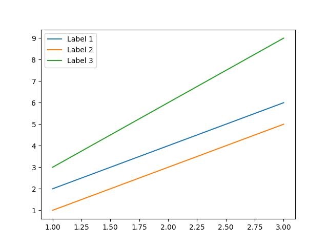
Successfully Placed a legend on the Axes...
Example - Using Handlers for Legends
Here is an example of calling the legend() function only by listing the artists. This approach is similar to the previous one but in this case, the labels are taken from the artists' label properties.
import matplotlib.pyplot as plt

# Example data
x = [1, 2, 3]
y1 = [2, 4, 6]
y2 = [1, 3, 5]

# Plotting the data with labels
line1, = plt.plot(x, y1, label='Label 1')
line2, = plt.plot(x, y2, label='Label 2')

# Adding a legend with explicitly listed artists
plt.legend(handles=[line1, line2])

# Show the plot
plt.show()
print('Successfully Placed a legend on the Axes...')
Output
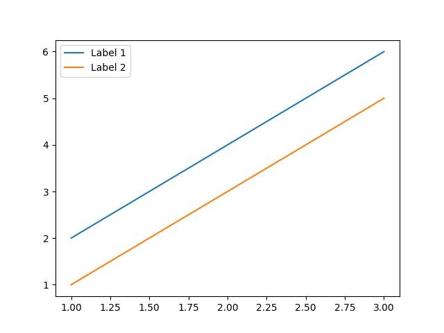
Successfully Placed a legend on the Axes...
Example - Adding a legend
In this example, we first plot two sets of data, and then we add a legend by calling the legend() function with a list of strings representing the legend items.
import matplotlib.pyplot as plt

# Example data
x = [1, 2, 3, 4, 5, 6]
y1 = [1, 4, 2, 6, 8, 5]
y2 = [1, 5, 3, 7, 9, 6]

# Plotting the data
plt.plot(x, y1)
plt.plot(x, y2)

# Adding a legend for existing plot elements
plt.legend(['First line', 'Second line'], loc='center')

# Show the plot
plt.show()
print('Successfully Placed a legend on the Axes...')
Output
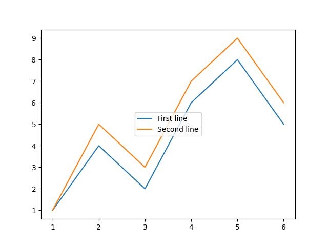
Successfully Placed a legend on the Axes...
Adding legend in subplots
To add the legends in each subplot, we can use the legend() function on each axes object of the figure.
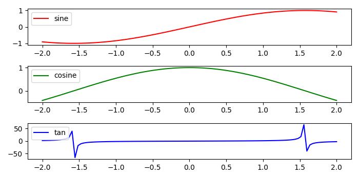
Example - Adding Legend to each Subplot
Here is an example that adds the legend to the each subplot of a matplotlib figure. This approach uses the legend() function on the axes object.
import numpy as np
from matplotlib import pyplot as plt

plt.rcParams["figure.figsize"] = [7, 3.50]
plt.rcParams["figure.autolayout"] = True

# Sample data
x = np.linspace(-2, 2, 100)
y1 = np.sin(x)
y2 = np.cos(x)
y3 = np.tan(x)

# Create the figure with subplots
f, axes = plt.subplots(3)

# plot the data on each subplot and add lagend
axes[0].plot(x, y1, c='r', label="sine")
axes[0].legend(loc='upper left')
axes[1].plot(x, y2, c='g', label="cosine")
axes[1].legend(loc='upper left')
axes[2].plot(x, y3, c='b', label="tan")
axes[2].legend(loc='upper left')

# Display the figure
plt.show()
Output
On executing the above code we will get the following output −
Adding multiple legends in one axes
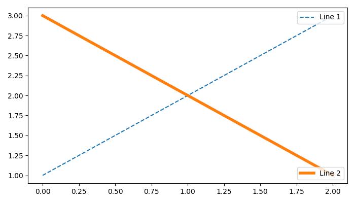
To draw multiple legends on the same axes in Matplotlib, we can use the axes.add_artist() method along with the legend() function.
Example - Adding Multiple Legends to one Axes
The following example demonstrates how to add multiple legends in one axes of the matplotlib figure.
from matplotlib import pyplot as plt

plt.rcParams["figure.figsize"] = [7, 4]
plt.rcParams["figure.autolayout"] = True

# plot some data
line1, = plt.plot([1, 2, 3], label="Line 1", linestyle='--')
line2, = plt.plot([3, 2, 1], label="Line 2", linewidth=4)

# Add first legend at upper right of the axes
first_legend = plt.legend(handles=[line1], loc='upper right')

# Get the current axes to add legend
plt.gca().add_artist(first_legend)

# Add second legend at lower right of the axes
plt.legend(handles=[line2], loc='lower right')

# Display the output
plt.show()
Output
On executing the above code we will get the following output −
Matplotlib - Colors
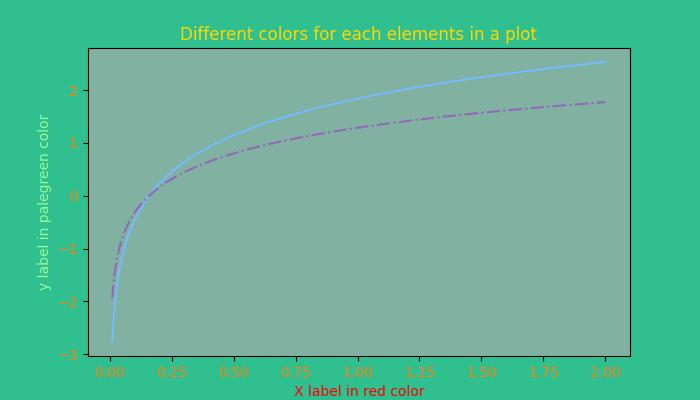
Matplotlib provides several options for managing colors in plots, allowing users to enhance the visual appeal and convey information effectively.
Colors can be set for different elements in a plot, such as lines, markers, and fill areas. For instance, when plotting data, the color parameter can be used to specify the line color. Similarly, scatter plots allow setting colors for individual points. The image below illustrates the colors for the different elements in a plot −
Color Representation Formats in Matplotlib
Matplotlib supports various formats for representing colors, which include −
RGB or RGBA Tuple
Hex RGB or RGBA String
Gray Level String
"Cn" Color Spec
Named colors
Below are the brief discussions about each format with an appropriate example.
The RGB or RGBA Tuple format
You can use the tuple of float values in the range between [0, 1] to represent Red, Green, Blue, and Alpha (transparency) values. like: (0.1, 0.2, 0.5) or (0.1, 0.2, 0.5, 0.3).
Example - Usage of RGB tuple
The following example demonstrates how to specify the face color of a plot using the RGB or RGBA tuple.
import matplotlib.pyplot as plt
import numpy as np

# sample data
t = np.linspace(0.0, 2.0, 201)
s = np.sin(2 * np.pi * t)

# RGB tuple for specifying facecolor
fig, ax = plt.subplots(figsize=(7,4), facecolor=(.18, .31, .31))

# Plotting the data
plt.plot(t, s)

# Show the plot
plt.show()
print('successfully used the RGB tuple for specifying colors..')
Output
On executing the above code we will get the following output −
successfully used the RGB tuple for specifying colors..
The Hex RGB or RGBA String format
A string representing the case-insensitive hex RGB or RGBA, like: '#0F0F0F' or '#0F0F0F0F' can be used to specify a color in matplotlib.
Example - Usage of Hex RGB
This example uses the hex string to specify the axis face color.
import matplotlib.pyplot as plt
import numpy as np

# Example data
t = np.linspace(0.0, 2.0, 201)
s = np.sin(2 * np.pi * t)

# Hex string for specifying axis facecolor
fig, ax = plt.subplots(figsize=(7,4))
ax.set_facecolor('#eafff5')

# Plotting the data
plt.plot(t, s)

# Show the plot
plt.show()
print('successfully used the Hex string for specifying colors..')
Output
On executing the above code we will get the following output −
successfully used the Hex string for specifying colors..
Also, a shorthand hex RGB or RGBA string(case-insensitive) can be used to specify colors in matplotlib. Which are equivalent to the hex shorthand of duplicated characters. like: '#abc' (equivalent to '#aabbcc') or '#abcd' (equivalent to '#aabbccdd').
The Gray Level String format
We can use a string representation of a float value in the range of [0, 1] inclusive for the gray level. For example, '0' represents black, '1' represents white, and '0.8' represents light gray.
Example - Usage of Gray Level Format
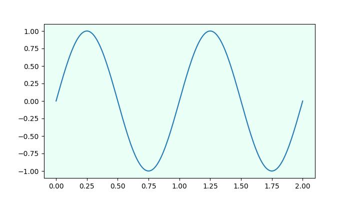
Here is an example of using the Gray level string for specifying the title color.
import matplotlib.pyplot as plt
import numpy as np

# Example data
t = np.linspace(0.0, 2.0, 201)
s = np.sin(2 * np.pi * t)

# create a plot
fig, ax = plt.subplots(figsize=(7,4))

# Plotting the data
plt.plot(t, s)

# using the Gray level string for specifying title color
ax.set_title('Voltage vs. time chart', color='0.7')

# Show the plot
plt.show()
print('successfully used the Gray level string for specifying colors..')
Output
On executing the above code we will get the following output −
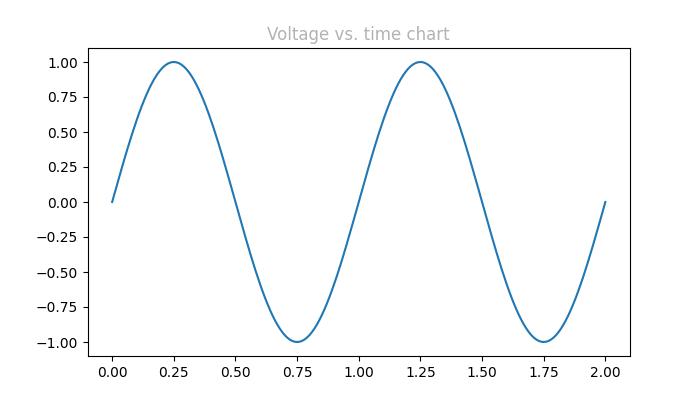
successfully used the Gray level string for specifying colors..
The "Cn" Color notation
A "Cn" color Spec, i.e., 'C' followed by a number, which is an index into the default property cycle (rcParams["axes.prop_cycle"]) can be used to specify the colors in matplotlib.
Example - Usage of Cn Color
In this example, a plot is drawn using the Cn notation (color='C1'), which corresponds to the 2nd color in the default property cycle.
import matplotlib.pyplot as plt
import numpy as np

# Example data
t = np.linspace(0.0, 2.0, 201)
s = np.sin(2 * np.pi * t)

# create a plot
fig, ax = plt.subplots(figsize=(7,4))

# Cn notation for plot
ax.plot(t, .7*s, color='C1', linestyle='--')

# Show the plot
plt.show()
print('successfully used the Cn notation for specifying colors..')
Output
On executing the above code we will get the following output −
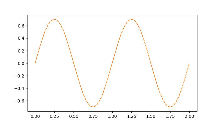
successfully used the Cn notation for specifying colors..
The Single Letter String format
In Matplotlib, single-letter strings are used as shorthand notations to represent a set of basic colors. These shorthand notations are part of the base colors available as a dictionary in matplotlib.colors.BASE_COLORS container. And each letter corresponds to a specific color.
The single-letter shorthand notations include: 'b': Blue, 'g': Green, 'r': Red, 'c': Cyan, 'm': Magenta, 'y': Yellow, 'k': Black, and 'w': White.
Example - Usage of Single letter Format
In this example, each base color is plotted as a bar with its corresponding single-letter shorthand notation.
import matplotlib.pyplot as plt
import matplotlib.colors as mcolors
import numpy as np

# Get the base colors and their names
base_colors = mcolors.BASE_COLORS
color_names = list(base_colors.keys())

# Create a figure and axis
fig, ax = plt.subplots(figsize=(7, 4))

# Plot each color as a bar
for i, color_name in enumerate(color_names):
   ax.bar(i, 1, color=base_colors[color_name], label=color_name)

# Set the x-axis ticks and labels
ax.set_xticks(np.arange(len(color_names)))
ax.set_xticklabels(color_names)

# Set labels and title
ax.set_title('Base Colors')

# Add legend
ax.legend()

# Show the plot
plt.show()
print('Successfully visualized all the available base colors..')
Output
On executing the above code we will get the following output −
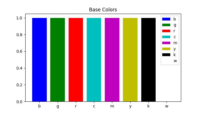
Successfully visualized all the available base colors..
Other formats
Also we can use the Case-insensitive color name from the xkcd color survey with 'xkcd:' prefix, X11/CSS4 ("html") Color Names, and Tableau Colors.
Example - Usage of various Color Formats
Here is an example that demonstrates the use of different color formats, including X11/CSS4 colors, xkcd colors, and Tableau Colors in a Matplotlib plot.
import matplotlib.pyplot as plt
import numpy as np

# Example data
t = np.linspace(0.0, 2.0, 201)
s = np.sin(2 * np.pi * t)

# create a plot
fig, ax = plt.subplots(figsize=(7, 4))

# Plotting the data
plt.plot(t, s)

# 5) a named color:
ax.set_ylabel('Specifying color using the X11/CSS4 name', color='peachpuff')

# 6) a named xkcd color:
ax.set_xlabel('Specifying color name from the xkcd color survey', color='xkcd:crimson')

# 8) tab notation:
ax.set_title('Specifying color using the Tableau Colors', color='tab:orange')

plt.show()
print('Successfully used the X11/CSS4, xkcd, and Tableau Colors formats...')
Output
On executing the above code we will get the following output −
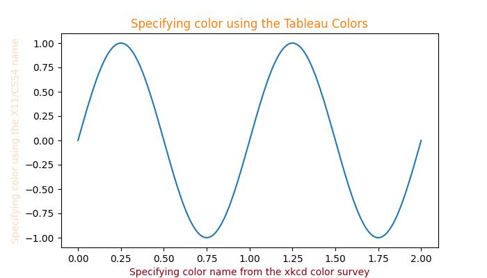
Successfully used the X11/CSS4, xkcd, and Tableau Colors formats...
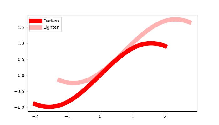
Darken or lighten a color
To darken or lighten any color, you can use the apha parameter of the plot() method, greater the aplha value will darker the color and smaller value will lighten the color.
Example - Usage of Alpha
Here is an example that creates a Plot of two lines with different value of alpha, to replicate darker and lighter color of the lines.
import numpy as np
from matplotlib import pyplot as plt

# Sample data
xs = np.linspace(-2, 2, 100)
ys = np.sin(xs)

# Create a figure
fig, ax = plt.subplots(figsize=(7, 4))

# plot two lines with different alpha values
ax.plot(xs, ys, c='red', lw=10, label="Darken")
ax.plot(xs+.75, ys+.75, c='red', lw=10, alpha=0.3, label="Lighten")
ax.legend(loc='upper left')

plt.show()
Output
On executing the above code we will get the following output −
Matplotlib - ColorMaps
Colormap (often called a color table or a palette), is a set of colors arranged in a specific order, it is used to visually represent data. See the below image for reference −
In the context of Matplotlib, colormaps play a crucial role in mapping numerical values to colors in various plots. Matplotlib offers built-in colormaps and external libraries like Palettable, or even it allows us to create and manipulate our own colormaps.
Colormaps in Matplotlib
Matplotlib provides number of built-in colormaps like 'viridis' or 'copper', those can be accessed through matplotlib.colormaps container. It is an universal registry instance, which returns a colormap object.
Example - Getting List of Colormaps
Following is the example that gets the list of all registered colormaps in matplotlib.
from matplotlib import colormaps
print(list(colormaps))
Output
['magma', 'inferno', 'plasma', 'viridis', 'cividis', 'twilight', 'twilight_shifted', 'turbo', 'Blues', 'BrBG', 'BuGn', 'BuPu', 'CMRmap', 'GnBu', 'Greens', 'Greys', 'OrRd', 'Oranges', 'PRGn', 'PiYG', 'PuBu', 'PuBuGn', 'PuOr', 'PuRd', 'Purples', 'RdBu', 'RdGy', 'RdPu', 'RdYlBu', 'RdYlGn', 'Reds', 'Spectral', 'Wistia', 'YlGn', 'YlGnBu', 'YlOrBr', 'YlOrRd', 'afmhot', 'autumn', 'binary', 'bone', 'brg', 'bwr', 'cool', 'coolwarm', 'copper', 'cubehelix', 'flag', 'gist_earth', 'gist_gray', 'gist_heat', 'gist_ncar', 'gist_rainbow', 'gist_stern', 'gist_yarg', 'gnuplot', 'gnuplot2', 'gray', 'hot', 'hsv', 'jet', 'nipy_spectral', 'ocean', ]
Accessing Colormaps and their Values
You can get a named colormap using matplotlib.colormaps['viridis'], and it returns a colormap object. After obtaining a colormap object, you can access its values by resampling the colormap. In this case, viridis is a colormap object, when passed a float between 0 and 1, it returns an RGBA value from the colormap.
Example - Accessing a Colormap value
Here is an example that accessing the colormap values.
import matplotlib
viridis = matplotlib.colormaps['viridis'].resampled(8)
print(viridis(0.37))
Output
(0.212395, 0.359683, 0.55171, 1.0)
Creating and Manipulating Colormaps
Matplotlib provides the flexibility to create or manipulate your own colormaps. This process involves using the classes ListedColormap or LinearSegmentedColormap.
Example - Creating Colormaps with ListedColormap
The ListedColormaps class is useful for creating custom colormaps by providing a list or array of color specifications. You can use this to build a new colormap using color names or RGB values.
The following example demonstrates how to create custom colormaps using the ListedColormap class with specific color names.
import matplotlib as mpl
from matplotlib.colors import ListedColormap
import matplotlib.pyplot as plt
import numpy as np

# Creating a ListedColormap from color names
colormaps = [ListedColormap(['rosybrown', 'gold', "crimson", "linen"])]

# Plotting examples
np.random.seed(19680801)
data = np.random.randn(30, 30)
n = len(colormaps)

fig, axs = plt.subplots(1, n, figsize=(7, 3), layout='constrained', squeeze=False)
for [ax, cmap] in zip(axs.flat, colormaps):
   psm = ax.pcolormesh(data, cmap=cmap, rasterized=True, vmin=-4, vmax=4)
   fig.colorbar(psm, ax=ax)

plt.show()
Output
On executing the above program, you will get the following output −
Example - Creating Colormaps with LinearSegmentedColormap
The LinearSegmentedColormap class allows more control by specifying anchor points and their corresponding colors. This enables the creation of colormaps with interpolated values.
The following example demonstrates how to create custom colormaps using the LinearSegmentedColormap class with a specific list of color names.
import matplotlib as mpl
from matplotlib.colors import LinearSegmentedColormap
import matplotlib.pyplot as plt
import numpy as np

# Creating a LinearSegmentedColormap from a list
colors = ["rosybrown", "gold", "lawngreen", "linen"]
cmap_from_list = [LinearSegmentedColormap.from_list("SmoothCmap", colors)]

# Plotting examples
np.random.seed(19680801)
data = np.random.randn(30, 30)
n = len(cmap_from_list)

fig, axs = plt.subplots(1, n, figsize=(7, 3), layout='constrained', squeeze=False)
for [ax, cmap] in zip(axs.flat, cmap_from_list):
   psm = ax.pcolormesh(data, cmap=cmap, rasterized=True, vmin=-4, vmax=4)
   fig.colorbar(psm, ax=ax)

plt.show()
Output
On executing the above program, you will get the following output −
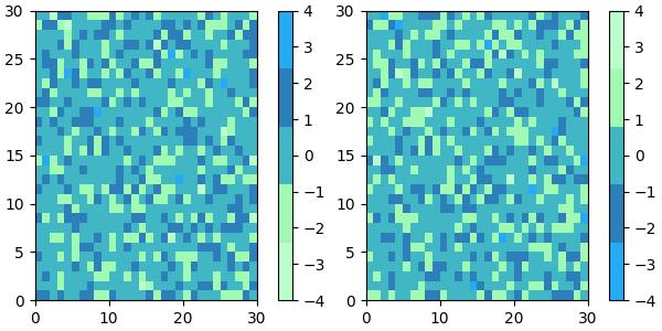
Example - Reversing Colormaps
Reversing a colormap can be done by using the colormap.reversed() method. This creates a new colormap that is the reversed version of the original colormap.
This example generates side-by-side visualizations of the original colormap and its reversed version.
from matplotlib.colors import ListedColormap
import matplotlib.pyplot as plt
import numpy as np

# Define a list of color values in hexadecimal format
colors = ["#bbffcc", "#a1fab4", "#41b6c4", "#2c7fb8", "#25abf4"]

# Create a ListedColormap with the specified colors
my_cmap = ListedColormap(colors, name="my_cmap")

# Create a reversed version of the colormap
my_cmap_r = my_cmap.reversed()

# Define a helper function to plot data with associated colormap
def plot_examples(colormaps):
   np.random.seed(19680801)
   data = np.random.randn(30, 30)
   n = len(colormaps)
   fig, axs = plt.subplots(1, n, figsize=(n * 2 + 2, 3), layout='constrained', squeeze=False)

   for [ax, cmap] in zip(axs.flat, colormaps):
      psm = ax.pcolormesh(data, cmap=cmap, rasterized=True, vmin=-4, vmax=4)
      fig.colorbar(psm, ax=ax)
   plt.show()

# Plot the original and reversed colormaps
plot_examples([my_cmap, my_cmap_r])
Output
On executing the above program, you will get the following output −
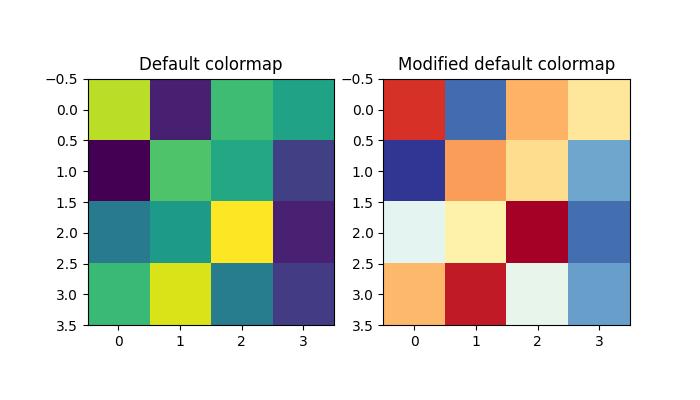
Example - Changing the default colormap
To change the default colormap for all subsequent plots, you can use mpl.rc() to modify the default colormap setting.
Here is an example that changes the default colormap to RdYlBu_r by modifying the global Matplotlib settings like mpl.rc('image', cmap='RdYlBu_r').
import numpy as np
from matplotlib import pyplot as plt
import matplotlib as mpl

# Generate random data
data = np.random.rand(4, 4)

# Create a figure with two subplots
fig, (ax1, ax2) = plt.subplots(1, 2, figsize=(7, 4))

# Plot the first subplot with the default colormap
ax1.imshow(data)
ax1.set_title("Default colormap")

# Set the default colormap globally to 'RdYlBu_r'
mpl.rc('image', cmap='RdYlBu_r')

# Plot the modified default colormap
ax2.imshow(data)
ax2.set_title("Modified default colormap")

# Display the figure with both subplots
plt.show()
Output
On executing the above code we will get the following output −
Example - Plotting Lines with Colors through Colormap
To plot multiple lines with different colors through a colormap, you can utilize Matplotlib's plot() function along with a colormap to assign different colors to each line.
The following example plot multiple lines by iterating over a range and plotting each line with a different color from the colormap using the color parameter in the plot() function.
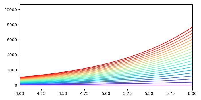
import numpy as np
import matplotlib.pyplot as plt

plt.rcParams["figure.figsize"] = [7.00, 3.50]
plt.rcParams["figure.autolayout"] = True

# Generate x and y data
x = np.linspace(0, 2 * np.pi, 64)
y = np.exp(x)

# Plot the initial line
plt.plot(x, y)

# Define the number of lines and create a colormap
n = 20
colors = plt.cm.rainbow(np.linspace(0, 1, n))

# Plot multiple lines with different colors using a loop
for i in range(n):
   plt.plot(x, i * y, color=colors[i])

plt.xlim(4, 6)
plt.show()
Output
On executing the above code we will get the following output −
Matplotlib - ColorMap Normalization
The term normalization refers to the rescaling of real values to a common range, such as between 0 and 1. It is commonly used as perprocessing technique in data processing and analysis.
Colormap Normalization in Matplotlib
In this context, Normalization is the process of mapping data values to colors. The Matplotlib library provides various normalization techniques, including −
Logarithmic
Centered
Symmetric logarithmic
Power-law
Discrete bounds
Two-slope
Custom normalization
Linear Normalization
The default behavior in Matplotlib is to linearly map colors based on data values within a specified range. This range is typically defined by the minimum (vmin) and maximum (vmax) values of the matplotlib.colors.Normalize() instance arguments.
This mapping occurs in two steps, first normalizing the input data to the [0, 1] range and then mapping ont the indices in the colormap.
Example - Linear Normalization
This example demonstrates Matplotlib's linear normalization process using the Normalize() class from the matplotlib.colors module.
import matplotlib as mpl
from matplotlib.colors import Normalize

# Creates a Normalize object with a specified range
norm = Normalize(vmin=-1, vmax=1)

# Normalizing a value
normalized_value = norm(0)

# Display the normalized value
print('Normalized Value', normalized_value)
Output
On executing the above code we will get the following output −
Normalized Value: 0.5
While linear normalization is the default and often suitable, there are scenarios where non-linear mappings can be more informative or visually appealing.
Logarithmic Normalization
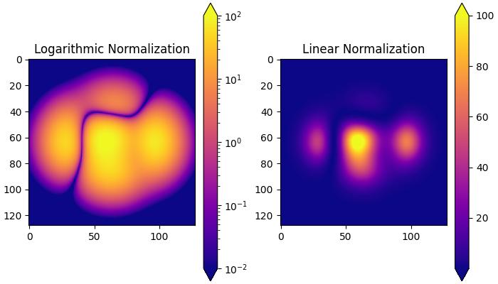
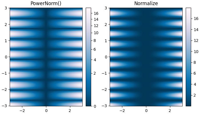
It is a common transformation that takes the logarithm (base-10) of the data. This is useful when displaying changes across disparate scales. The colors.LogNorm() class is used for this normalization.
Example - Logarithmic Normalization
In this example, two subplots are created to demonstrate the difference between logarithmic and linear normalization transformations.
import matplotlib.pyplot as plt
import numpy as np
from matplotlib import colors

# Sample Data
X, Y = np.meshgrid(np.linspace(-3, 3, 128), np.linspace(-3, 3, 128))
Z = (1 - X/2 + X**5 + Y**3) * np.exp(-X**2 - Y**2)

# Create subplots
fig, ax = plt.subplots(1, 2, figsize=(7,4), layout='constrained')

# Logarithmic Normalization
pc = ax[0].imshow(Z**2 * 100, cmap='plasma',
   norm=colors.LogNorm(vmin=0.01, vmax=100))
fig.colorbar(pc, ax=ax[0], extend='both')
ax[0].set_title('Logarithmic Normalization')

# Linear Normalization
pc = ax[1].imshow(Z**2 * 100, cmap='plasma',
   norm=colors.Normalize(vmin=0.01, vmax=100))
fig.colorbar(pc, ax=ax[1], extend='both')
ax[1].set_title('Linear Normalization')
plt.show()
Output
On executing the above code we will get the following output −
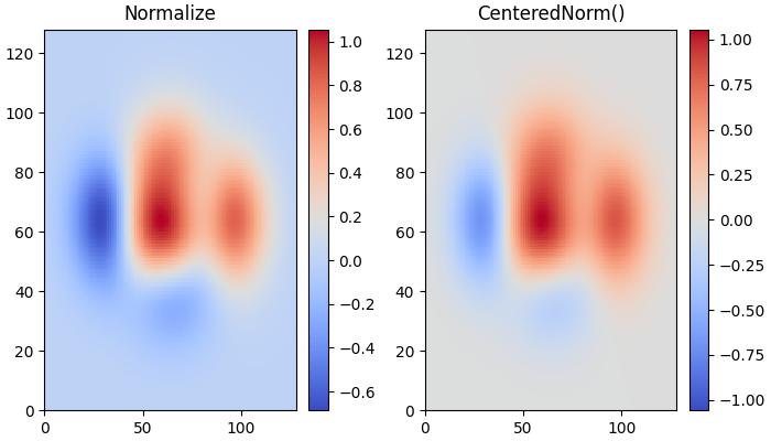
Centered Normalization
When data is symmetrical around a center (e.g., positive and negative anomalies around 0), the colors.CenteredNorm() class can be used. It automatically maps the center to 0.5, and the point with the largest deviation from the center to 1.0 or 0.0, depending on its value.
Example - Centered Normalization
This example compares the effects of default linear normalization and centered normalization (CenteredNorm()) on the dataset using a coolwarm colormap.
import matplotlib.pyplot as plt
import numpy as np
from matplotlib import colors, cm

X, Y = np.meshgrid(np.linspace(-3, 3, 128), np.linspace(-3, 3, 128))
Z = (1 - X/2 + X**5 + Y**3) * np.exp(-X**2 - Y**2)

# select a divergent colormap
cmap = cm.coolwarm

# Create subplots
fig, ax = plt.subplots(1, 2, figsize=(7,4), layout='constrained')

# Default Linear Normalization
pc = ax[0].pcolormesh(Z, cmap=cmap)
fig.colorbar(pc, ax=ax[0])
ax[0].set_title('Normalize')

# Centered Normalization
pc = ax[1].pcolormesh(Z, norm=colors.CenteredNorm(), cmap=cmap)
fig.colorbar(pc, ax=ax[1])
ax[1].set_title('CenteredNorm()')

plt.show()
Output
On executing the above code we will get the following output −
Symmetric Logarithmic Normalization
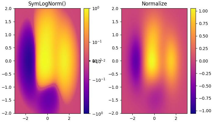
If data may contain both positive and negative values, and logarithmic scaling is desired for both. The colors.SymLogNorm() Class in Matplotlib is designed for such cases. This normalization maps negative numbers logarithmically to smaller values, and positive numbers to larger values.
Example - Symmetric Logarithmic Normalization
Here is an example that uses the colors.SymLogNorm() Class to transform the data.
import matplotlib.pyplot as plt
import numpy as np
from matplotlib import colors, cm

X, Y = np.mgrid[-3:3:complex(0, 128), -2:2:complex(0, 128)]
Z = (1 - X/2 + X**5 + Y**3) * np.exp(-X**2 - Y**2)

# Create subplots
fig, ax = plt.subplots(1, 2, figsize=(7, 4), layout='constrained')

# Symmetric Logarithmic Normalization
pcm = ax[0].pcolormesh(X, Y, Z,
   norm=colors.SymLogNorm(linthresh=0.03, linscale=0.03,vmin=-1.0, vmax=1.0, base=10),
   cmap='plasma', shading='auto')
fig.colorbar(pcm, ax=ax[0])
ax[0].set_title('SymLogNorm()')

# Default Linear Normalization
pcm = ax[1].pcolormesh(X, Y, Z, cmap='plasma', vmin=-np.max(Z), shading='auto')
fig.colorbar(pcm, ax=ax[1])
ax[1].set_title('Normalize')

plt.show()
Output
On executing the above code we will get the following output −
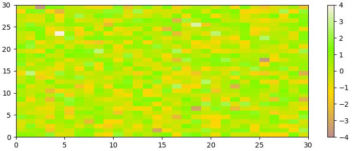
Power-law Normalization
This normalization is useful to remap colors onto a power-law relationship using the colors.PowerNorm() class.
Example - Power-law Normalization
Here is an example that compares the power-law (colors.PowerNorm()) and linear normalizations.
import matplotlib.pyplot as plt
import numpy as np
from matplotlib import colors, cm

X, Y = np.meshgrid(np.linspace(-3, 3, 128), np.linspace(-3, 3, 128))
Z = (1 + np.sin(Y * 10.)) * X**2

# Create subplots
fig, ax = plt.subplots(1, 2, figsize=(7, 4), layout='constrained')

# Power-law Normalization
pcm = ax[0].pcolormesh(X, Y, Z, norm=colors.PowerNorm(gamma=0.5),
   cmap='PuBu_r', shading='auto')
fig.colorbar(pcm, ax=ax[0])
ax[0].set_title('PowerNorm()')

# Default Linear Normalization
pcm = ax[1].pcolormesh(X, Y, Z, cmap='PuBu_r', shading='auto')
fig.colorbar(pcm, ax=ax[1])
ax[1].set_title('Normalize')

plt.show()
Output
On executing the above code we will get the following output −
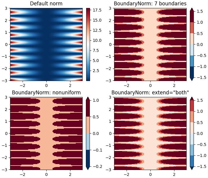
Discrete Bounds Normalization
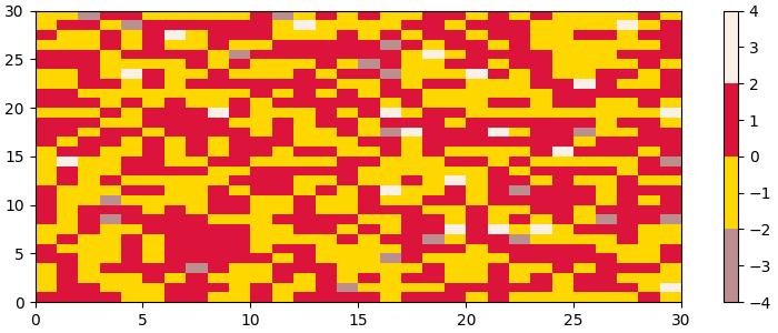
Another normalization provided by Matplotlib is colors.BoundaryNorm. This is particularly useful when data needs to be mapped between specified boundaries with linearly distributed colors.
Example - Discrete Bounds Normalization
This example demonstrates the use of the Discrete Bounds normalization using the BoundaryNorm() class to create different visual effects when displaying a colormesh plot.
import matplotlib.pyplot as plt
import numpy as np
import matplotlib.colors as colors

X, Y = np.meshgrid(np.linspace(-3, 3, 128), np.linspace(-3, 3, 128))
Z = (1 + np.sin(Y * 10.)) * X**2

fig, ax = plt.subplots(2, 2, figsize=(7, 6), layout='constrained')
ax = ax.flatten()

# Default norm:
pcm = ax[0].pcolormesh(X, Y, Z, cmap='RdBu_r')
fig.colorbar(pcm, ax=ax[0], orientation='vertical')
ax[0].set_title('Default norm')

# Even bounds give a contour-like effect:
bounds = np.linspace(-1.5, 1.5, 7)
norm = colors.BoundaryNorm(boundaries=bounds, ncolors=256)
pcm = ax[1].pcolormesh(X, Y, Z, norm=norm, cmap='RdBu_r')
fig.colorbar(pcm, ax=ax[1], extend='both', orientation='vertical')
ax[1].set_title('BoundaryNorm: 7 boundaries')

# Bounds may be unevenly spaced:
bounds = np.array([-0.2, -0.1, 0, 0.5, 1])
norm = colors.BoundaryNorm(boundaries=bounds, ncolors=256)
pcm = ax[2].pcolormesh(X, Y, Z, norm=norm, cmap='RdBu_r')
fig.colorbar(pcm, ax=ax[2], extend='both', orientation='vertical')
ax[2].set_title('BoundaryNorm: nonuniform')

# With out-of-bounds colors:
bounds = np.linspace(-1.5, 1.5, 7)
norm = colors.BoundaryNorm(boundaries=bounds, ncolors=256, extend='both')
pcm = ax[3].pcolormesh(X, Y, Z, norm=norm, cmap='RdBu_r')
# The colorbar inherits the "extend" argument from BoundaryNorm.
fig.colorbar(pcm, ax=ax[3], orientation='vertical')
ax[3].set_title('BoundaryNorm: extend="both"')

plt.show()
Output
On executing the above code we will get the following output −
The TwoSlopeNorm normalization is used when different colormaps on either side of a conceptual center point, it is commonly used in scenarios such as topographic maps where land and ocean have different elevation and depth ranges.
When built-in norms fall short, then the FuncNorm enables custom normalization using arbitrary functions.
Additionally, Matplotlib supports crafting custom normalizations like MidpointNormalize, useful for defining mappings in specialized visualizations.
These tools provide flexibility in adapting color representations to diverse data and visualization requirements.
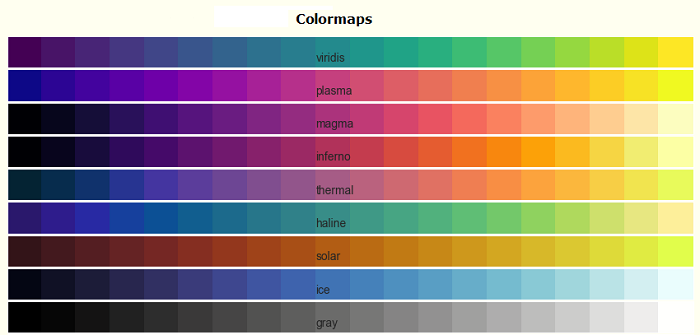
Matplotlib - Choosing ColorMaps
Colormap also known as a color table or a palette, is a range of colors that represents a continuous range of values. Allowing you to represent information effectively through color variations.
See the below image referencing a few built-in colormaps in matplotlib −

Matplotlib offers a variety of built-in (available in matplotlib.colormaps module) and third-party colormaps for various applications.
Choosing Colormaps in Matplotlib
Choosing an appropriate colormap involves finding a suitable representation in 3D colorspace for your dataset.
The factors for selecting an appropriate colormap for any given data set include −
Nature of Data − Whether representing form or metric data
Knowledge of the Dataset − Understanding the dataset's characteristics.
Intuitive Color Scheme − Considering if there's an intuitive color scheme for the parameter being plotted.
Field Standards − Considering if there is a standard in the field the audience may be expecting.
A perceptually uniform colormap is recommended for most of the applications, ensuring equal steps in data are perceived as equal steps in the color space. This improves human brain interpretation, particularly when changes in lightness are more perceptible than changes in hue.
Categories of Colormaps
Colormaps are categorized based on their function −
Sequential − Incremental changes in lightness and saturation, often using a single hue. Suitable for representing ordered information.
Diverging − Changes in lightness and saturation of two colors, meeting at an unsaturated color. Ideal for data with a critical middle value, like topography or data deviating around zero.
Cyclic − Changes in the lightness of two colors, meeting at the middle and beginning/end at an unsaturated color. Suitable for values that wrap around at endpoints, such as phase angle or time of day.
Qualitative − Miscellaneous colors with no specific order. Used for representing information without ordering or relationships.
Example - Sequential Colormaps
Sequential colormaps show a monotonically increasing in lightness values as they increase through the colormap. This characteristic ensures a smooth transition in the perception of color changes, making them suitable for representing ordered information. However, it's essential to note that the perceptual range may vary among colormaps, depending on the range of values they span.
Let's explore Sequential colormaps by visualizing their gradients and understanding how their lightness values evolve.
The following example provides a visual representation of the gradients for different Sequential colormaps available in Matplotlib.
import matplotlib.pyplot as plt
import numpy as np
import matplotlib as mpl

# List of Sequential colormaps to visualize
cmap_list = ['Greys', 'Purples', 'Blues', 'Greens', 'Oranges', 'Reds',
   'YlOrBr', 'YlOrRd', 'OrRd', 'PuRd', 'RdPu', 'BuPu',
   'GnBu', 'PuBu', 'YlGnBu', 'PuBuGn', 'BuGn', 'YlGn']

# Plot the color gradients

gradient = np.linspace(0, 1, 256)
gradient = np.vstack((gradient, gradient))

# Create figure and adjust figure height to the number of colormaps
nrows = len(cmap_list)
figh = 0.35 + 0.15 + (nrows + (nrows - 1) * 0.1) * 0.22
fig, axs = plt.subplots(nrows=nrows + 1, figsize=(7, figh))
fig.subplots_adjust(top=1 - 0.35 / figh, bottom=0.15 / figh,
   left=0.2, right=0.99)
axs[0].set_title('Sequential colormaps', fontsize=14)

for ax, name in zip(axs, cmap_list):
   ax.imshow(gradient, aspect='auto', cmap=mpl.colormaps[name])
   ax.text(-0.1, 0.5, name, va='center', ha='right', fontsize=10,
      transform=ax.transAxes)

# Turn off all ticks & spines, not just the ones with colormaps.
for ax in axs:
   ax.set_axis_off()

# Show the plot
plt.show()
Output
On executing the above code we will get the following output −
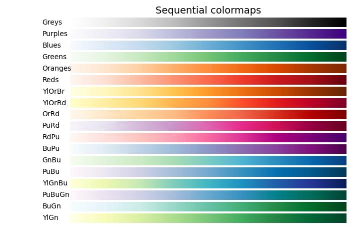
Example - Diverging Colormaps
Diverging colormaps are characterized by monotonically increasing and then decreasing lightness values, with the maximum lightness close to a neutral midpoint.
The following example provides a visual representation of the gradients for different Diverging colormaps available in Matplotlib.
import matplotlib.pyplot as plt
import numpy as np
import matplotlib as mpl

# List of Diverging colormaps to visualize
cmap_list = ['PiYG', 'PRGn', 'BrBG', 'PuOr', 'RdGy', 'RdBu', 'RdYlBu',
   'RdYlGn', 'Spectral', 'coolwarm', 'bwr', 'seismic']

# Plot the color gradients
gradient = np.linspace(0, 1, 256)
gradient = np.vstack((gradient, gradient))

# Create figure and adjust figure height to the number of colormaps
nrows = len(cmap_list)
figh = 0.35 + 0.15 + (nrows + (nrows - 1) * 0.1) * 0.22
fig, axs = plt.subplots(nrows=nrows + 1, figsize=(7, figh))
fig.subplots_adjust(top=1 - 0.35 / figh, bottom=0.15 / figh,
   left=0.2, right=0.99)
axs[0].set_title('Diverging colormaps', fontsize=14)

for ax, name in zip(axs, cmap_list):
   ax.imshow(gradient, aspect='auto', cmap=mpl.colormaps[name])
   ax.text(-0.1, 0.5, name, va='center', ha='left', fontsize=10,
      transform=ax.transAxes)

# Turn off all ticks & spines, not just the ones with colormaps.
for ax in axs:
   ax.set_axis_off()

# Show the plot
plt.show()
Output
On executing the above code we will get the following output −
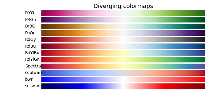
Example - Cyclic Colormaps
Cyclic colormaps present a unique design where the colormap starts and ends on the same color, meeting at a symmetric center point. The progression of lightness values should change monotonically from the start to the middle and inversely from the middle to the end.
In the following example, you can explore and visualize various Cyclic colormaps available in Matplotlib.
import matplotlib.pyplot as plt
import numpy as np
import matplotlib as mpl

# List of Cyclic colormaps to visualize
cmap_list = ['twilight', 'twilight_shifted', 'hsv']

# Plot the color gradients
gradient = np.linspace(0, 1, 256)
gradient = np.vstack((gradient, gradient))

# Create figure and adjust figure height to the number of colormaps
nrows = len(cmap_list)
figh = 0.35 + 0.15 + (nrows + (nrows - 1) * 0.1) * 0.22
fig, axs = plt.subplots(nrows=nrows + 1, figsize=(7, figh))
fig.subplots_adjust(top=1 - 0.35 / figh, bottom=0.15 / figh,
   left=0.2, right=0.99)
axs[0].set_title('Cyclic colormaps', fontsize=14)

for ax, name in zip(axs, cmap_list):
   ax.imshow(gradient, aspect='auto', cmap=mpl.colormaps[name])
   ax.text(-0.1, 0.5, name, va='center', ha='left', fontsize=10,
      transform=ax.transAxes)

# Turn off all ticks & spines, not just the ones with colormaps.
for ax in axs:
   ax.set_axis_off()

# Show the plot
plt.show()
Output
On executing the above code we will get the following output −

Example - Qualitative colormaps
Qualitative colormaps are distinct from perceptual maps, as they are not designed to provide a perceptual uniformity but are rather intended for representing information that does not possess ordering or relationships. The lightness values vary widely throughout the colormap and are not monotonically increasing. As a result, Qualitative colormaps are not recommended for use as perceptual colormaps.
The following example provides a visual representation of the different Qualitative colormaps available in Matplotlib.
import matplotlib.pyplot as plt
import numpy as np
import matplotlib as mpl

# List of Qualitative colormaps to visualize
cmap_list = ['Pastel1', 'Pastel2', 'Paired', 'Accent', 'Dark2',
   'Set1', 'Set2', 'Set3', 'tab10', 'tab20', 'tab20b', 'tab20c']

# Plot the color gradients
gradient = np.linspace(0, 1, 256)
gradient = np.vstack((gradient, gradient))

# Create figure and adjust figure height to the number of colormaps
nrows = len(cmap_list)
figh = 0.35 + 0.15 + (nrows + (nrows - 1) * 0.1) * 0.22
fig, axs = plt.subplots(nrows=nrows + 1, figsize=(7, figh))
fig.subplots_adjust(top=1 - 0.35 / figh, bottom=0.15 / figh,
   left=0.2, right=0.99)
axs[0].set_title('Qualitative colormaps', fontsize=14)

for ax, name in zip(axs, cmap_list):
   ax.imshow(gradient, aspect='auto', cmap=mpl.colormaps[name])
   ax.text(-0.1, 0.5, name, va='center', ha='left', fontsize=10,
      transform=ax.transAxes)

# Turn off all ticks & spines, not just the ones with colormaps.
for ax in axs:
   ax.set_axis_off()

# Show the plot
plt.show()
Output
On executing the above code we will get the following output −
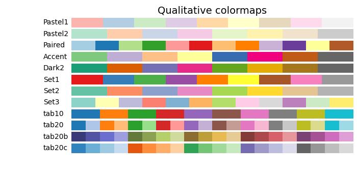
Matplotlib - Colorbars
A colorbar is a visual representation of the color scale used in a plot. It displays the color scale from the minimum to the maximum values in the data, helping us understand the color variations in the plot.
In the following image you can observe a simple colorbar that is highlighted with a red color rectangle −
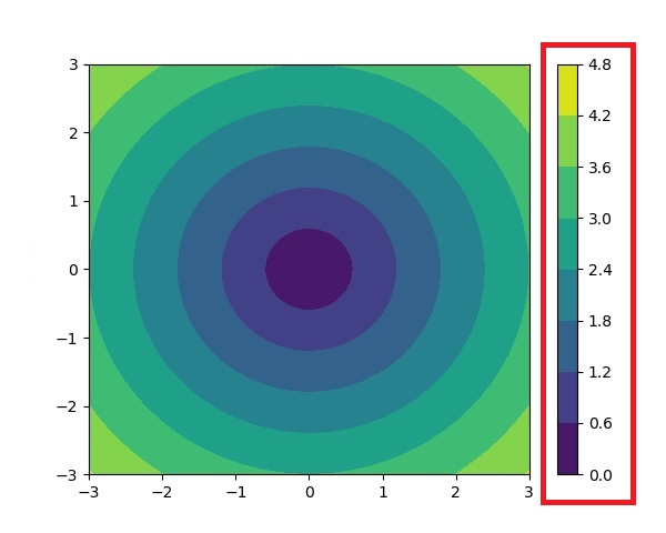
Colorbars in Matplotlib
The Matplotlib library provides a tool for working with colorbars, including their creation, placement, and customization.
The matplotlib.colorbar module is responsible for creating colorbars, however a colorbar can be created using the Figure.colorbar() or its equivalent pyplot wrapper pyplot.colorbar() functions. These functions are internally uses the Colorbar class along with make_axes_gridspec (for GridSpec-positioned axes) or make_axes (for non-GridSpec-positioned axes).
And a colorbar needs to be a "mappable" (i.e, matplotlib.cm.ScalarMappable) object typically an AxesImage generated via the imshow() function. If you want to create a colorbar without an attached image, you can instead use a ScalarMappable without an associated data.
Example - Usage of Horizontal Colorbar
Here is an simple example that creates a horizontal colorbar without an attached plotusing the ScalarMappable class.
import numpy as np
import matplotlib as mpl
import matplotlib.pyplot as plt

# Create a figure and axis for the colorbar
fig, ax = plt.subplots(figsize=(6, 1), constrained_layout=True)

# Define a colormap and normalization for the colorbar
cmap = mpl.cm.cool
norm = mpl.colors.Normalize(vmin=5, vmax=10)

# Create a ScalarMappable without associated data using the defined cmap and norm
scalar_mappable = mpl.cm.ScalarMappable(norm=norm, cmap=cmap)

# Add a horizontal colorbar to the figure
colorbar = fig.colorbar(scalar_mappable, cax=ax, orientation='horizontal', label='Some Units')

# Set the title and display the plot
plt.title('Basic Colorbar')
plt.show()
Output
On executing the above code we will get the following output −
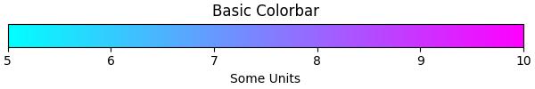
Example - Creating a Simple Colorbar
Here is another example creates a simple colorbar for the plot using the pyplot.colorbar() function with default parameters.
import matplotlib.pyplot as plt
import numpy as np

# Generate sample data
data = np.random.random((10, 10))

# Create a plot with an image and a colorbar
fig, ax = plt.subplots(figsize=(7,4))
im = ax.imshow(data, cmap='viridis')

# Add a colorbar to the right of the image
cbar = plt.colorbar(im, ax=ax)

# Show the plot
plt.show()
print('Successfully drawn the colorbar...')
Output
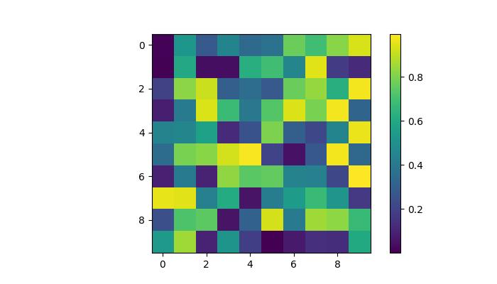
Successfully drawn the colorbar...
Automatic Colorbar Placement
Automatic placement of colorbars is a straightforward approach. This ensures that each subplot has its own colorbar, providing a clear indication of the quantitative extent of the image data in each subplot.
Example - Automatic Colorbar Placement
This example demonstrates the automatic colorbar placement for multiple subplots.
import matplotlib.pyplot as plt
import numpy as np

# Create a 2x2 subplot grid
fig, axs = plt.subplots(1, 2, figsize=(7,3))
cmaps = ['magma', 'coolwarm']

# Add random data with different colormaps to each subplot
for col in range(2):
   ax = axs[col]
   pcm = ax.pcolormesh(np.random.random((20, 20)) * (col + 1), cmap=cmaps[col])

   # Add a colorbar for the each subplots
   fig.colorbar(pcm, ax=ax, pad=0.03)

plt.show()
print('Successfully drawn the colorbar...')
Output
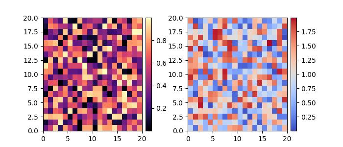
Successfully placed the colorbar...
Manual Colorbar Placement
This approach allows us to explicitly determine the location and appearance of a colorbar in a plot. Which may be necessary when the automatic placement does not achieve the desired layout.
By creating inset axes, either using inset_axes() or add_axes(), and then assigning it to the colorbar through the cax keyword argument, users can get the desired output.
Example - Manual Colorbar Placement
Here is an example that demonstrates how to determine the colorbar placement manually in a plot.
import numpy as np
import matplotlib as mpl
import matplotlib.pyplot as plt

# Generate random data points
npoints = 1000
x, y = np.random.normal(10, 2, (2, npoints))

# Create a subplot
fig, ax = plt.subplots(figsize=(7,4))

# Set title
plt.title('Manual Colorbar Placement')

# Draw the plot
hexbin_artist = ax.hexbin(x, y, gridsize=20, cmap='gray_r', edgecolor='white')

# Manually create an inset axes for the colorbar
cax = fig.add_axes([0.8, 0.15, 0.05, 0.3])

# Add a colorbar using the hexbin_artist and the manually created inset axes
colorbar = fig.colorbar(hexbin_artist, cax=cax)

# Display the plot
plt.show()
Output
On executing the above code we will get the following output −
Customizing Colorbars
The appearance of colorbars, including ticks, tick labels, and labels, can be customized to specific requirements. Vertical colorbars typically have these elements on the y-axis, while horizontal colorbars display them on the x-axis. The ticks parameter is used to set the ticks, and the format parameter helps format the tick labels on the visible colorbar axes.
Example - Horizontal and Labelled Colorbar
This example uses the imshow() method to display the data as an image, and places a colorbar horizontally to the image with a specified label.
import matplotlib.pyplot as plt
import numpy as np

# Create a subplot
fig, ax = plt.subplots(figsize=(7, 4))

# Generate random data
data = np.random.normal(size=(250, 250))
data = np.clip(data, -1, 1)

# Display the data using imshow with a specified colormap
cax = ax.imshow(data, cmap='afmhot')
ax.set_title('Horizontal Colorbar with Customizing Tick Labels')

# Add a horizontal colorbar and set its orientation and label
cbar = fig.colorbar(cax, orientation='horizontal', label='A colorbar label')

# Adjust ticks on the colorbar
cbar.set_ticks(ticks=[-1, 0, 1])
cbar.set_ticklabels(['Low', 'Medium', 'High'])

# Show the plot
plt.show()
Output
On executing the above code we will get the following output −
Example - Customizing a Color Bar
This example demonstrates how to customize the position, width, color, number of ticks, font size and more properties of a colorbar.
import numpy as np
from matplotlib import pyplot as plt

# Adjust figure size and autolayout
plt.rcParams["figure.figsize"] = [7.00, 3.50]
plt.rcParams["figure.autolayout"] = True

# Generate random data
data = np.random.randn(4, 4)

# Plot the data with imshow
im = plt.imshow(data, interpolation='nearest', cmap="PuBuGn")

# Add colorbar and adjust its position
# Decrease colorbar width and shift position to the right
clb = plt.colorbar(im, shrink=0.9, pad=0.05)

# Set the top label for colorbar
clb.ax.set_title('Color Bar Title')

# Customize color of ticks
clb.ax.set_yticks([0, 1.5, 3, 4.5], labels=["A", "B", "C", "D"])

# Change color and font size of ticks
clb.ax.tick_params(labelcolor='red', labelsize=20)

plt.show()
Output
On executing the above code you will get the following output −
Matplotlib - Working with Text
Matplotlib offers robust text support for creating and customizing text in plots, offering flexibility and control over various text properties. Includes features like writing mathematical expressions, font customization, newline-separated text with arbitrary rotations, and Unicode support. Below is the reference image that shows how to use text in Matplotlib plots −

To maintain consistency between on-screen and hard copy outputs, Matplotlib embeds fonts directly into documents.
This text support extends to both implicit and explicit interfaces. The implicit API involves functions like text, annotate, xlabel, ylabel, title, figtext, and suptitle. The explicit API uses functions like text, annotate, set_xlabel, set_ylabel, set_title, text, and suptitle.
Each function returns a Text instance that can be customized with different fonts and properties.
Writing Text as Title
To write text or specify titles for the entire figure or individual subplots, you can use the suptitle function at the figure level and the set_title function at the subplot (Axes) level, respectively.
Example - Setting Subtitle and axes title
This example demonstrates the basics of creating a plot with a figure subtitle and axes title.
import matplotlib.pyplot as plt
import numpy as np

# Generate data
x_values = np.linspace(0.0, 5.0, 100)
y_values = np.cos(2 * np.pi * x_values) * np.exp(-x_values)

# Create a plot
fig, ax = plt.subplots(figsize=(7, 4))
fig.subplots_adjust(bottom=0.15, left=0.2)
ax.plot(x_values, y_values)

# Add titles to the figure and axes
fig.suptitle('Figure Suptitle', fontsize=14, fontweight='bold')
ax.set_title('Axes Title')

# Display the plot
plt.show()
Output
On executing the above code we will get the following output −
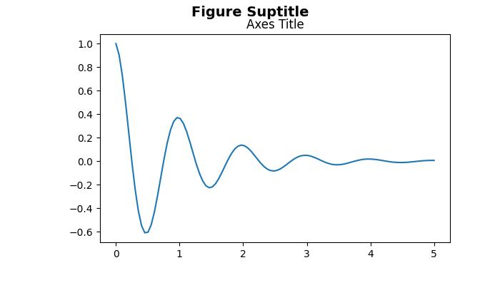
Text is added successfully to the figure and subplot...
Adding Text as Labels for Axes
For labeling or adding text to the x-axis and y-axis, you can use the functions xlabel, ylabel for the implicit interface and set_xlabel, set_ylabel for the explicit interface.
Example - X-Axis, Y-Axis labels
This example demonstrates the basics of Specifying labels for the x- and y-axis.
import matplotlib.pyplot as plt
import numpy as np

# Generate data
x_values = np.linspace(0.0, 5.0, 100)
y_values = np.cos(2 * np.pi * x_values) * np.exp(-x_values)

# Create a plot
fig, ax = plt.subplots(figsize=(7, 4))
fig.subplots_adjust(bottom=0.15, left=0.2)
ax.plot(x_values, y_values)

# Add labels to the x-axis and y-axis
ax.set_xlabel('X-Axis Label')
ax.set_ylabel('Y-Axis Label')

# Display the plot
plt.show()
print('Labels added successfully to the x-axis and y-axis...')
Output
On executing the above code we will get the following output −
Labels added successfully to the x-axis and y-axis...
Mathematical Expressions & Unicode Text
By using the text function, it becomes possible to write mathematical expressions and Unicode text at any location within the Axes.
Example - Usage of Mathematical Expression
The following example demonstrates the integration of mathematical expressions and Unicode text within the plot. Here the text will add into a rectangle box by specifying the "bbox={'facecolor': 'red', 'alpha': 0.5, 'pad': 10}" values to the bbox parameter of the axes.text() method.
import matplotlib.pyplot as plt

# Create a subplot
fig, ax = plt.subplots(figsize=(7, 4))
fig.subplots_adjust(top=0.85)

# Set the figure suptitle
fig.suptitle('Exploring Mathematical Expressions and Unicode Text')

# Set both x- and y-axis limits to [0, 10] instead of the default [0, 1]
ax.axis([0, 10, 0, 10])

# Add text with Mathematical Expression
ax.text(1.5, 7, "Einstein's energy-mass equivalence equation: $E=mc^2$",
        bbox={'facecolor': 'red', 'alpha': 0.5, 'pad': 10},
        style='italic')

# Add Unicode text with specified color and font size
ax.text(3, 5, 'Unicode: pTHn', color='green', fontsize=15)

# Display the plot
plt.show()
print('Successfully created a plot with Mathematical expressions and Unicode Text.')
Output
On executing the above code we will get the following output −
Successfully created a plot with Mathematical expressions and Unicode Text.
Plotting Animated Text
Text animations can be created to dynamically display changing text content or properties over time.
Example - Animated Text
This example demonstrates how to create a simple animation in Matplotlib by updating the properties of text within a plot.
from matplotlib import animation
import matplotlib.pyplot as plt

# Adjust figure size and autolayout
plt.rcParams["figure.figsize"] = [7.00, 3.50]
plt.rcParams["figure.autolayout"] = True

# Create figure and axes
fig = plt.figure()
ax = fig.add_subplot(111)

# Initial text
text = 'You are welcome!'
txt = ax.text(.20, .5, text, fontsize=15)

# Define colors for animation
colors = ['#1f77b4', '#ff7f0e', '#2ca02c', '#d62728', '#9467bd', '#8c564b', '#e377c2',    '#7f7f7f', '#bcbd22', '#17becf']

# Define animation function
def animate(num):
    txt.set_fontsize(num * 2 + num)
    txt.set_color(colors[num % len(colors)])
    return txt,

# Create animation
anim = animation.FuncAnimation(fig, animate, frames=len(text) - 1, blit=True)

# Display animation
plt.show()
Output
On executing the above code you will get the following output −
Matplotlib - Text Properties
Text properties in Matplotlib refer to a set of attributes that can be configured to control the appearance and layout of text elements within a plot. These properties include various characteristics such as −
- font style
- color
- size
- alignment, and more.
By manipulating these properties, you can customize the visual aspects of text within the plots.
Controlling text properties and layout in Matplotlib involves configuring various attributes of the matplotlib.text.Text instances. These properties can be adjusted through keyword arguments in functions like set_title, set_xlabel, and text.
Below, we explore key text properties in Matplotlib along with examples.
Text layout and positioning properties
Text layout and positioning are crucial aspects for placing and aligning text elements within a plot. Following are the list of properties and their details.
Position − Specifies the coordinates (x, y) where the text is placed.
Rotation − Defines the angle of rotation for the text. Options include degrees, 'vertical', or 'horizontal'.
Horizontal Alignment (ha) − Determines the alignment of the text along the x-axis. Options include 'center', 'right', and 'left'.
Vertical Alignment (va) − Controls the alignment of the text along the y-axis. Options include 'center', 'top', 'bottom', and 'baseline'.
Multialignment − For newline-separated strings, this property controls left, center, or right justification for different lines.
Example - Text Layout and Positioning
This example demonstrates the application of various layout and positioning properties.
import matplotlib.pyplot as plt

# Create a figure
fig, ax = plt.subplots(figsize=(7, 4))

# Set the axis limits
plt.axis((0, 10, 0, 10))

# Add text with various layout and positioning properties
ax.text(5, 7, 'Centered Text with 0 rotation', horizontalalignment='center', verticalalignment='center', rotation=0)
ax.text(1, 5, 'Right Aligned Text with 90 degrees rotation', ha='right', va='center', rotation=90)
ax.text(9, 5, 'Left Aligned Text with -90 degrees rotation', ha='left', va='center', rotation=-90)
ax.text(5, 2, 'Multiline\nText', ha='center', va='center', multialignment='center')

# Display the plot
plt.show()
print('Text is added successfully with the various layout and positioning properties..')
Output
On executing the above code we will get the following output −
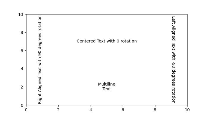
Text is added successfully with the various layout and positioning properties..
Text color and transparency properties
Color and transparency properties enhance the visual appearance of text elements within a plot.
color − Specifies the color of the text. This can be any valid matplotlib color.
backgroundcolor − Defines the background color behind the text. It can be set using any valid matplotlib color.
alpha − Represents the transparency of the text. It is specified as a float, where 0.0 is fully transparent, and 1.0 is fully opaque.
Example - Text color and transparency
This example demonstrates how to use color and transparency properties in Matplotlib.
import matplotlib.pyplot as plt

# Create a figure
fig, ax = plt.subplots(figsize=(7, 4))

# Set the axis limits
plt.axis((0, 10, 0, 10))

# Add text with color and transparency properties
ax.text(3, 8, 'Plain text without any property')
ax.text(3, 6, 'Colored Text', color='blue')
ax.text(3, 4, 'Background Color', backgroundcolor='yellow')
ax.text(3, 2, 'Transparent Text', alpha=0.5)

# Display the plot
plt.show()
print('Text added successfully...')
Output
On executing the above code we will get the following output −
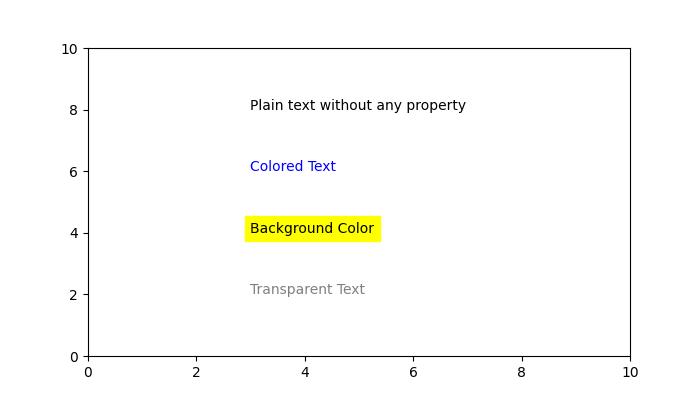
Text added successfully...
Different font properties
Font properties are essential for customizing the appearance of text elements within a plot. These properties provide control over the type, style, thickness, size, variant, and name of the font used for rendering text.
Family − Specifies the type of font to be used, such as 'serif', 'sans-serif', or 'monospace'.
Style or Fontstyle − Determines the style of the font, with options like 'normal', 'italic', or 'oblique'.
Weight or Fontweight − The thickness or boldness of the font. Options include 'normal', 'bold', 'heavy', 'light', 'ultrabold', and 'ultralight'.
Size or Fontsize − Specifies the size of the font in points or relative sizes like 'smaller' or 'x-large'.
Name or Fontname − Defines the name of the font as a string. Examples include 'Sans', 'Courier', 'Helvetica', and more.
Variant − Describes the font variant, with options like 'normal' or 'small-caps'.
Example - Font Properties
This example demonstrates how to use various font properties to customize the appearance of text in Matplotlib.
import matplotlib.pyplot as plt

# Create a figure
fig = plt.figure(figsize=(7, 4))

# Set the axis limits
plt.axis((0, 10, 0, 10))

# Define a long string
sample_text = ("Tutorialspoint")

# Add text at various locations with various configurations
plt.text(0, 9, 'Oblique text placed at the center with a 25-degree rotation',
   fontstyle='oblique', fontweight='heavy', ha='center', va='baseline', rotation=45, wrap=True)
plt.text(7.5, 0.5, 'Text placed at the left with a 45-degree rotation', ha='left', rotation=45, wrap=True)
plt.text(5, 5, sample_text + '\nMiddle', ha='center', va='center', color='green', fontsize=24)
plt.text(10.5, 7, 'Text placed at the right with a -45-degree rotation', ha='right', rotation=-45, wrap=True)
plt.text(5, 10, 'Sans text with oblique style is placed at the center', fontsize=10, fontname='Sans',
   style='oblique', ha='center', va='baseline', wrap=True)
plt.text(6, 3, 'A serif family text is placed right with the italic style', family='serif',
   style='italic', ha='right', wrap=True)
plt.text(-0.5, 0, 'Small-caps variant text is placed at the left with a -25-degree rotation',
   variant='small-caps', ha='left', rotation=-25, wrap=True)

# Display the plot
plt.show()
print('Text added successfully...')
Output
On executing the above code we will get the following output −
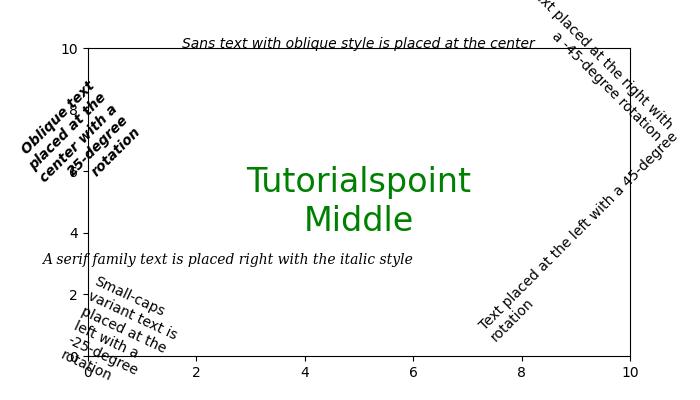
Text added successfully...
The bounding box and Clipping Properties
Bounding box and Clipping properties are used to control the layout and visibility of text elements within a plot. These properties include specifying a bounding box for text, defining clipping parameters, and enabling or disabling clipping.
Bbox − Defines a bounding box for the text. It includes properties like color, padding, and more.
Clip Box and Clip Path − Specify a bounding box or path for clipping the text. These properties allow you to control the region where the text is visible.
Clip On − A boolean indicating whether clipping is enabled. When set to True, the text is clipped to the specified region.
Example - Bounding Box and Clipping
This example demonstrates the use of a bounding box and clipping properties while adding text to a plot.
import matplotlib.pyplot as plt

# Create a figure
fig = plt.figure(figsize=(7, 4))

# Set the axis limits
plt.axis((0, 10, 0, 10))

# Add text with bounding box and clipping properties
plt.text(3, 7, 'Text with Bounding Box', bbox={'facecolor': 'yellow', 'edgecolor': 'blue', 'pad': 5})
plt.text(3, 5, 'Clipped Text', bbox={'facecolor': 'lightgreen', 'edgecolor': 'darkgreen', 'pad': 5}, clip_on=True)

# Display the plot
plt.show()
print('Text added successfully...')
Output
On executing the above code we will get the following output −
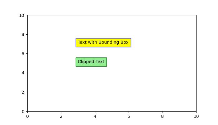
Text added successfully...
Other Properties
Also matplotlib provides other properties like Label, Linespacing, picker, and more.
Matplotlib - Subplot Titles
What is Subplot Title?
Subplot titles in Matplotlib refer to the individual titles assigned to each subplot within a larger figure. When we have multiple subplots arranged in a grid such as a matrix of plots it's often beneficial to add titles to each subplot to provide context or describe the content of that specific subplot.
Setting subplot titles is a useful practice when creating multiple visualizations within a single figure by enhancing the readability and comprehension of our overall plots. We have the method namely set_title() for setting the title of the subplot.
By utilizing set_title() we can add descriptive titles to individual subplots within a figure allowing for better organization and comprehension of complex visualizations.
Purpose of Subplot title
Provide Context − Subplot titles offer descriptive information about the content of each subplot within a larger figure aiding in better understanding the visualizations.
Differentiate Subplots − Titles help distinguish between multiple plots by allowing viewers to identify and interpret each subplot's data or purpose easily.
Importance of Subplot title
Subplot titles help clarify the content or purpose of individual plots within a grid of subplots, especially when presenting multiple visualizations together.
They aid in quickly identifying the information presented in each subplot, improving the overall interpretability of the visualizations.
Syntax
The below is the syntax and parameters for setting up the subplot title.
ax.set_title('Title')
Where,
ax − It represents the axes object of the subplot for which the title is being set.
set_title() − The method used to set the title.
'Title' − It is the string representing the text of the title.
Subplots with title
In this example we are creating the subplots and setting up the title for each subplot by using the set_title() method available in the Matplotlib library.
Example - Subplots with Titles
import matplotlib.pyplot as plt
import numpy as np

# Generating sample data
x = np.linspace(0, 10, 100)
y1 = np.sin(x)
y2 = np.cos(x)

# Creating subplots
fig, (ax1, ax2) = plt.subplots(1, 2)

# Plotting on the first subplot
ax1.plot(x, y1)
ax1.set_title('Sine Wave')

# Plotting on the second subplot
ax2.plot(x, y2)
ax2.set_title('Cosine Wave')

# Displaying the subplots
plt.show()
Output
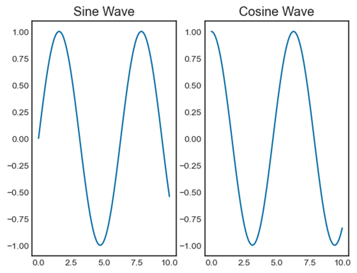
Example - Adding Title to Subplot
Here in this example we are creating the subplots and adding the title to each subplot.
import matplotlib.pyplot as plt
import numpy as np

# Generating sample data
x = np.linspace(0, 10, 50)
y = np.sin(x)

# Generating random data for scatter plot
np.random.seed(0)
x_scatter = np.random.rand(50) * 10
y_scatter = np.random.rand(50) * 2 - 1  # Random values between -1 and 1

# Creating subplots
fig, (ax1, ax2) = plt.subplots(1, 2, figsize=(12, 4))  # 1 row, 2 columns

# Line plot on the first subplot
ax1.plot(x, y, color='blue', label='Line Plot')
ax1.set_title('Line Plot')
ax1.set_xlabel('X-axis')
ax1.set_ylabel('Y-axis')
ax1.legend()

# Scatter plot on the second subplot
ax2.scatter(x_scatter, y_scatter, color='red', label='Scatter Plot')
ax2.set_title('Scatter Plot')
ax2.set_xlabel('X-axis')
ax2.set_ylabel('Y-axis')
ax2.legend()

# Displaying the subplots
plt.show()
Output
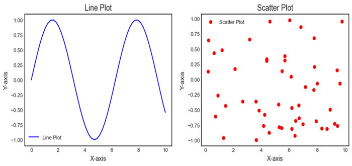
Matplotlib - Images
What are Images in Matplotlib?
In Matplotlib library displaying and manipulating images involves using the imshow() function. This function visualizes 2D arrays or images. This function is particularly useful for showing images in various formats such as arrays representing pixel values or actual image files.
Images in Matplotlib provide a way to visualize gridded data, facilitating the interpretation and analysis of information represented in 2D arrays. This capability is crucial for various scientific, engineering and machine learning applications that deal with image data.
Use Cases for Images in Matplotlib
The following are the use cases of Images in Matplotlib library.
Visualizing Gridded Data
The matplotlib library can be used for displaying scientific data such as heatmaps, terrain maps, satellite images etc.
Image Processing
Analyzing and manipulating image data in applications such as computer vision or image recognition.
Artificial Intelligence and Machine Learning
Handling and processing image data in training and evaluation of models.
Loading and Displaying Images
To load and display an image using Matplotlib library we can use the following lines of code.
Example - Loading Images in Plots
import matplotlib.pyplot as plt
import matplotlib.image as mpimg

# Load the image
img = mpimg.imread('Images/flowers.jpg')  # Load image file

# Display the image
plt.imshow(img)
plt.axis('off')  # Turn off axis labels and ticks (optional)
plt.show()
Output

Key Points of the above code
matplotlib.image.imread() − Loads an image file and returns it as an array. The file path ('image_path') should be specified.
plt.imshow() − Displays the image represented by the array.
plt.axis('off') − Turns off axis labels and ticks, which is optional for purely displaying the image without axes.
Customizing Image Display
We can customize the image as per the requirement by thebelow mentioned functions.
Colormap − We can apply a colormap to enhance image visualization by specifying the cmap parameter in imshow().
Colorbar − To add a colorbar indicating the intensity mapping we can use plt.colorbar() after imshow().
Example - Enhanceing Image Visualization
import matplotlib.pyplot as plt
import matplotlib.image as mpimg

# Load the image
img = mpimg.imread('Images/flowers.jpg')  # Load image file

# Display the image
plt.imshow(img, cmap = 'Oranges')
plt.colorbar()

# Turn on axis labels and ticks (optional)
plt.axis('on')
plt.show()
Output
Image Manipulation
We can perform manipulation for our images by using the below mentioned functions.
Cropping − Select a specific portion of the image by slicing the array before passing it to imshow().
Resizing − Use various image processing libraries such as Pillow, OpenCV to resize images before displaying them.
Example - Manipulating Images
In this example we are manipulating the image and displaying the image by using the above mentioned functions.
import matplotlib.pyplot as plt
import matplotlib.image as mpimg
import cv2

# Load the image
img = mpimg.imread('Images/flowers.jpg')

# Display the image with grayscale colormap and colorbar
plt.imshow(img, cmap='gray')
plt.colorbar()

# Display only a portion of the image (cropping)
plt.imshow(img[100:300, 200:400])

# Display a resized version of the image
resized_img = cv2.resize(img, (new_width, new_height))
plt.imshow(resized_img)
plt.show()
Output
Remember Matplotlib's imshow() is suitable for basic image display and visualization. For more advanced image processing tasks such as resizing, filtering, etc. using dedicated image processing libraries like OpenCV or Pillow is recommended.
Matplotlib - Image Masking
In Matplotlib library image masking involves selectively displaying parts of an image based on a specified mask which is essentially a binary image defining regions to be shown or hidden. It allows us to apply a filter or condition to reveal or hide specific portions of an image.
Process of Image Masking
The below are the process steps for performing Image Masking.
Create a Mask
Define the criteria or pattern to create the mask. It can be based on colors, shapes, gradients or specific pixel values.
Apply the Mask
Use the mask to modify the transparency or visibility of the corresponding pixels in the original image. Pixels that correspond to areas defined in the mask as "masked" are usually hidden or made transparent while others remain visible.
Overlay or Blend
Overlay or blend the masked image with another image or a background revealing only the unmasked portions. The masked image can be superimposed on another image to combine and display the visible areas.
Types of Image Masks
The below are the types of Image masks.
Binary Masks
Consist of black and white pixels where white represents visible areas and black represents masked areas.
Grayscale Masks
Use various shades of gray to define levels of transparency or partial visibility.
Tools and Techniques for Image Masking
We can use the different tools and techniques for Image masking.
Manual Masking
Tools like Photoshop or GIMP allow users to manually create and edit masks using selection tools, brushes or layer masks.
Programmatic Masking
In programming languages like Python with libraries such as OpenCV or PIL (Pillow) we can create masks using algorithms based on color thresholds, contours or specific image features.
Key Points
Image masking in Matplotlib involves creating a mask array with the same dimensions as the image where specific regions are marked to hide (masked) or reveal (unmasked) portions of the image.
Masking arrays consist of boolean or numerical values where True or non-zero values indicate the regions to be displayed, and False or zero values indicate the regions to be hidden.
Masking allows for selective visualization or manipulation of specific parts of an image based on specified conditions or criteria.
Masking the particular region of an Image
Let's say we have an image and want to mask a particular region displaying only a portion of the image based on certain criteria.
Example - Masking a Region of an Image
import matplotlib.pyplot as plt
import numpy as np

# Create a sample image (random pixels)
image = np.random.rand(100, 100)

# Create a mask to hide certain parts of the image
mask = np.zeros_like(image)
mask[30:70, 30:70] = 1  # Masking a square region

# Apply the mask to the image
masked_image = np.ma.masked_array(image, mask=mask)

# Display the original and masked images
plt.figure(figsize=(8, 4))
plt.subplot(1, 2, 1)
plt.imshow(image, cmap='gray')
plt.title('Original Image')
plt.axis('off')
plt.subplot(1, 2, 2)
plt.imshow(masked_image, cmap='gray')
plt.title('Masked Image')
plt.axis('off')
plt.show()
Output
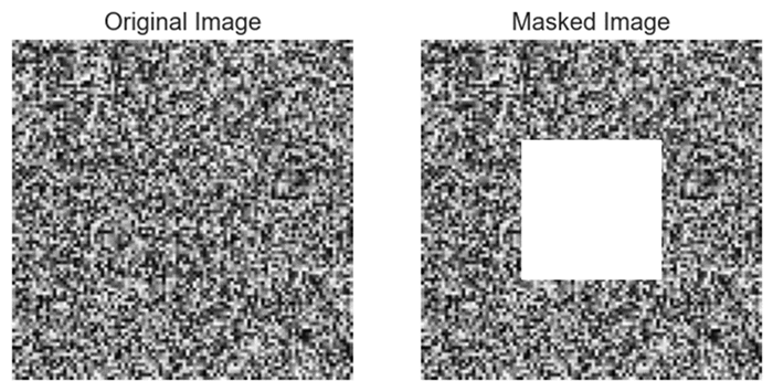
Applying mask to an Image
Here this is another of masking an image using the matplotlib library.
Example - Applying mask to an Image
import matplotlib.pyplot as plt
import numpy as np

# Create a sample image
image_size = 100
img = np.zeros((image_size, image_size, 3), dtype=np.uint8)
img[:, :image_size // 2] = [255, 0, 0]  # Set the left half to blue

# Create a binary mask
mask = np.zeros((image_size, image_size), dtype=np.uint8)
mask[:, image_size // 4:] = 1  # Set the right quarter to 1

# Apply the mask to the image
masked_img = img * mask[:, :, np.newaxis]

# Display the original image, mask, and the masked image
plt.figure(figsize=(12, 4))
plt.subplot(131)
plt.imshow(img)
plt.title('Original Image')
plt.axis('off')
plt.subplot(132)
plt.imshow(mask, cmap='gray')
plt.title('Mask')
plt.axis('off')
plt.subplot(133)
plt.imshow(masked_img)
plt.title('Masked Image')
plt.axis('off')
plt.show()
Output
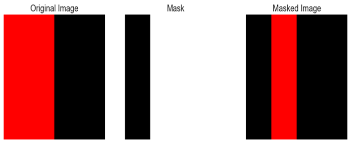
Matplotlib - Annotations
In Matplotlib library annotations refer to the capability of adding text or markers to specific locations on a plot to provide additional information or highlight particular features. Annotations allow users to label data points and indicate trends or add descriptions to different parts of a plot.
Key Aspects of Annotations in Matplotlib
The following are the key aspects of annotations in matplotlib library.
Text Annotations
Text annotations in data visualization are used to add explanatory or descriptive text to specific points, regions, or features within a plot. Annotations help in highlighting important information, providing context, or explaining trends and patterns within the visualized data.
Marker Annotations
Marker annotations in data visualization typically involve placing markers or symbols on specific points of interest within a plot to highlight or provide additional information about those points. These annotations can be textual or graphical and are commonly used to draw attention to significant data points, peaks, valleys, outliers or any crucial information in a visual representation.
Callouts
Callouts in data visualization refer to a specific type of annotation that uses visual elements like arrows, lines, or text to draw attention to a particular area or feature within a plot. They are often used to provide additional context or explanations about specific data points or regions of interest.
The plt.annotate() function in Matplotlib library is used to add an annotation to a plot. It allows us to place a text annotation with optional arrows pointing to specific data points on the plot.
Syntax
The following is the syntax for the plt.annotate() function.
plt.annotate(text, xy, xytext=None, xycoords='data', textcoords='data', arrowprops=None, annotation_clip=None, kwargs)
Where,
text (str) − The text of the annotation.
xy (tuple or array) − The point (x, y) to annotate.
xytext (tuple or array, optional) − The position (x, y) to place the text. If None defaults to `xy`.
xycoords (str, Artist, or Transform, optional) − The coordinate system that `xy` is given in. Default is 'data'.
textcoords (str, Artist, or Transform, optional) − The coordinate system that `xytext` is given in. Default is 'data'.
arrowprops (dict, optional) − A dictionary of arrow properties. If not None an arrow is drawn from the annotation to the text.
annotation_clip (bool or None, optional) − If True the text will only be drawn when the annotation point is within the axes. If None it will take the value from rcParams["text.clip"].
kwargs (optional) − Additional keyword arguments that are passed to Text.
Adding the annotation to the plot
In this example we are using the plt.annotate() function to add an annotation with the text 'Peak' at the point (3, 5) on the plot.
Example - Adding Annotation with text 'Peak'
import matplotlib.pyplot as plt
# Plotting data
x = [1, 2, 3, 4, 5]
y = [2, 3, 5, 7, 11]
plt.plot(x, y, marker='o', linestyle='-', color='blue')

# Adding annotation
plt.annotate('Peak', xy=(3, 5), xytext=(3.5, 6), arrowprops=dict(facecolor='black', arrowstyle='->'), fontsize=10)
plt.xlabel('X-axis')
plt.ylabel('Y-axis')
plt.title('Annotated Plot')
plt.grid(True)
plt.show()
Output
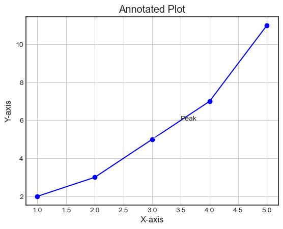
Example - Adding annotation as 'Point of Interest'
Here this is another example of using the plt.annotate() function for adding the annotation to the image.
import matplotlib.pyplot as plt
# Sample data
x = [1, 2, 3, 4, 5]
y = [2, 4, 6, 8, 10]

# Plotting data
plt.plot(x, y, marker='+', linestyle='-')

# Adding an annotation
plt.annotate('Point of Interest', xy=(3, 6), xytext=(3.5, 7), arrowprops=dict(facecolor='black', arrowstyle='->'))
plt.xlabel('X-axis')
plt.ylabel('Y-axis')
plt.title('Annotated Plot')
plt.grid(True)
plt.show()
Output
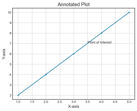
Insert statistical annotations (stars or p-values)
In this example we are inserting the statistical annotations as stars r p-values.
Example - Statistical Annotations
import numpy as np
from matplotlib import pyplot as plt
plt.rcParams["figure.figsize"] = [7.00, 3.50]
plt.rcParams["figure.autolayout"] = True
x = np.linspace(-1, 1, 5)
y = np.linspace(-2, 2, 5)
mean_x = np.mean(x)
mean_y = np.mean(y)
fig, ax = plt.subplots()
ax.plot(x, y, linestyle='-.')
ax.annotate('*', (mean_y, mean_y), xytext=(-.50, 1), arrowprops=dict(arrowstyle='-|>'))
fig.autofmt_xdate()
plt.show()
Output
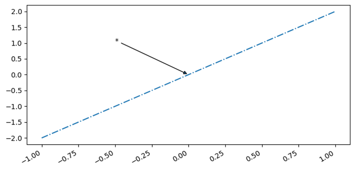
Annotate Matplotlib Scatter Plots
Here in this example we are adding the annotations to the scatter plot that we have plotted.
Example - Annotating Scatter Plot
# Import necessary libraries
import matplotlib.pyplot as plt
import numpy as np

# Create data points to be plotted
x = np.random.rand(30)
y = np.random.rand(30)

# Define the scatter plot using Matplotlib
fig, ax = plt.subplots()
ax.scatter(x, y)

# Add annotations to specific data points using text or arrow annotations
ax.annotate('Outlier', xy=(0.9, 0.9), xytext=(0.7, 0.7),arrowprops=dict(facecolor='black', shrink=0.05))
ax.annotate('Important point', xy=(0.5, 0.3), xytext=(0.3, 0.1),arrowprops=dict(facecolor='red', shrink=0.05))
ax.annotate('Cluster of points', xy=(0.2, 0.5), xytext=(0.05, 0.7),arrowprops=dict(facecolor='green', shrink=0.05))

# Adjust the annotation formatting as needed
plt.title('Annotated Scatter Plot')
plt.xlabel('X-axis')
plt.ylabel('Y-axis')

# Show the scatter plot with annotations
plt.show()
Output
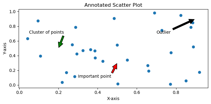
Annotate the points on a scatter plot with automatically placed arrows
In this example we are annotating the point on a scatter plot with automatically placed arrows.
Example - Annotating Automatically placed Arrows
import numpy as np
from matplotlib import pyplot as plt
plt.rcParams["figure.figsize"] = [7.00, 3.50]
plt.rcParams["figure.autolayout"] = True
xpoints = np.linspace(1, 10, 25)
ypoints = np.random.rand(25)
labels = ["%.2f" % i for i in xpoints]
plt.scatter(xpoints, ypoints, c=xpoints)
for label, x, y in zip(labels, xpoints, ypoints):
   plt.annotate(
      label,
      xy=(x, y), xytext=(-20, 20),
      textcoords='offset points', ha='right', va='bottom',
      bbox=dict(boxstyle='round,pad=0.5', fc='yellow', alpha=0.5),
      arrowprops=dict(arrowstyle='->', connectionstyle='arc3,rad=0')
   )
plt.show()
Output
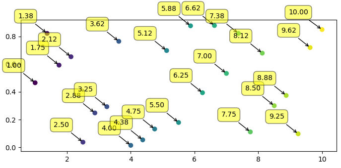
Matplotlib - Arrows
What are Arrows in Matplotlib?
In Matplotlib library Arrows refer to the graphical elements used to indicate direction, connection between points and to highlight specific features within plots. Arrows can be added to plots using the plt.arrow() function or incorporated within annotations by using the plt.annotate() function.
Arrows in Matplotlib library are versatile elements used to visually depict directionality, connections or highlights within the plots for aiding in better communication of information in visualizations. We can adjust parameters like coordinates, lengths, colors and styles to suit the specific visualization needs.
The plt.arrow() function in matplotlib library creates arrows between two points on a plot.
Syntax
The following is the syntax and parameters of the plt.arrow() function.
plt.arrow(x, y, dx, dy, kwargs)
Where,
x, y − These are the starting point coordinates of the arrow.
dx, dy − These are lengths of the arrow in the x and y directions.
kwargs − We can add additional keyword arguments to customize arrow properties such as color, width, style etc.
Adding arrows to the line plot
In this example we are plotting a plot by creating the arrows between the given two points on the plot by using the plt.arrow() function. To this function we passed the x, y, dx and dy points as input parameters for creating arrows in those mentioned points. In addition we passed the parameters such as length, width and color of the arrow.
Example - Line Plot with Arrows
import matplotlib.pyplot as plt
# Creating a line plot
plt.plot([0, 1], [0, 1])
# Adding an arrow
plt.arrow(0.2, 0.2, 0.4, 0.4, head_width=0.05, head_length=0.1, fc='red', ec='blue')
plt.xlabel('X-axis')
plt.ylabel('Y-axis')
plt.title('Arrow created by using plt.arrow() function')
# show grid of the plot
plt.grid(True)
plt.show()
Output
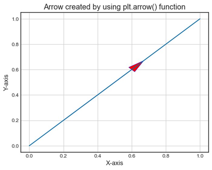
Adding arrow separately
Here this is another example of creating the arrows. As we know arrows can also be integrated into annotations using plt.annotate() by specifying arrowprops to define arrow styles. In this example 'Arrow Annotation' is connected to point (0.5, 0.5) with an arrow style specified by arrowprops.
Example - Adding Arrow using Annotation
import matplotlib.pyplot as plt
# Creating a plot
plt.plot([0, 1], [0, 1])
# Adding an arrow with annotation
plt.annotate('Arrow Annotation', xy=(0.5, 0.5), xytext=(0.2, 0.2), arrowprops=dict(facecolor='yellow',ec = 'red', arrowstyle='->'))
plt.xlabel('X-axis')
plt.ylabel('Y-axis')
plt.title('Arrow Annotation Example')
# Displaying the grid
plt.grid(True)
plt.show()
Output
Plotting distance arrows in technical drawing
To plot the distance arrows in technical drawing in matplotlib we can use annotate() method with arrow properties.
Example - Plotting Distance Arrows
from matplotlib import pyplot as plt
plt.rcParams["figure.figsize"] = [7.50, 3.50]
plt.rcParams["figure.autolayout"] = True
plt.axhline(3.5)
plt.axhline(2.5)
plt.annotate(
   '', xy=(0.5, 3.5), xycoords='data',
   xytext=(0.5, 2.5), textcoords='data',
   arrowprops={'arrowstyle': ''})
plt.annotate(
   '$\it{d=1}$', xy=(0.501, 3.0), xycoords='data',
   xytext=(0.5, 3.5), textcoords='offset points')
plt.show()
Output
Matplotlib - Fonts
Fonts play a crucial role in customizing text elements within plots. We can control font styles, sizes, families and other properties to enhance the appearance and readability of text in our visualizations.
In Matplotlib library Fonts refer to the typefaces used for rendering text in plots and visualizations. Fonts play a significant role in customizing the appearance of text elements such as labels, titles, annotations and legends within plots.
Key Aspects of Fonts in Matplotlib library
Font Family − Refers to the style or category of the font. Common font families include serif, sans-serif, monospace etc. Each family has its own visual characteristics.
Font Style − Determines the appearance of text such as normal, italic or oblique.
Font Weight − Specifies the thickness or boldness of the font ranging from normal to various levels of boldness.
Controlling Fonts in Matplotlib
Setting Font Properties − We can control font properties for text elements in plots using parameters such as 'fontsize', 'fontstyle', 'fontweight' and 'fontfamily' in the functions such as 'plt.xlabel()', 'plt.title()' etc.
plt.xlabel('X-axis Label',
   fontsize=12, fontstyle='italic',
	fontweight='bold', fontfamily='serif')
Global Font Configuration − Adjusting font properties globally for the entire plot using 'plt.rcParams' allows us to set default font settings for consistency.
plt.rcParams['font.family'] = 'sans-serif'
plt.rcParams['font.size'] = 12
Importance of Fonts in Visualization
Readability − The choice of fonts significantly impacts the readability of text elements in plots. Selecting appropriate fonts improves the clarity of visualized information.
Aesthetics − Fonts contribute to the overall aesthetics of the plot by affecting its visual appeal and presentation.
Emphasis and Style − Different fonts convey various tones and styles allowing users to emphasize specific elements or create a particular visual atmosphere.
Setting Font Properties Globally
We can configure font properties globally for the entire plot using plt.rcParams.
plt.rcParams['font.family'] = 'sans-serif'
plt.rcParams['font.size'] = 12
In the upcoming chapters lets go through the each parameter of the fonts in detail.
Common Font-related Functions in Matplotlib
The following are the common font related functions in matplotlib library.
plt.rcParam − plt.rcParams in Matplotlib is a dictionary-like object that allows you to globally configure various settings that affect the appearance and behavior of plots and figures. It serves as a central configuration system for Matplotlib, providing a convenient way to set default parameters for different elements in visualizations.
Functions to set font properties − We can set the font properties for axis labels and titles using the plt.xlabel(), plt.ylabel() and, plt.title() functions.
Setting font properties to annotations − Similarly, we can set font properties for annotations and text elements using plt.text() and, plt.annotate() functions
Example - Listing All the Available Fonts
To get a list of all the fonts currently available for matplotlib we can use the font_manager.findSystemFonts() method as shown below −
from matplotlib import font_manager
print("List of all fonts currently available in the matplotlib:")
print(*font_manager.findSystemFonts(fontpaths=None, fontext='ttf'), sep="")
Output
The above program generates the following output −
List of all fonts currently available in the matplotlib:
C:\WINDOWS\Fonts\PERBI___.TTFC:\WINDOWS\Fonts\ARIALUNI.TTFC:\Windows\Fonts\BRLNSR.TTFC:\Windows\Fonts\calibri.ttfC:\WINDOWS\Fonts\BOD_PSTC.TTFC:\WINDOWS\Fonts\WINGDNG3.TTFC:\Windows\Fonts\segoeuisl.ttfC:\Windows\Fonts\HATTEN.TTFC:\WINDOWS\Fonts\segoepr.ttfC:\Windows\Fonts\TCCM____.TTFC:\Windows\Fonts\BOOKOS.TTFC:\Windows\Fonts\BOD_B.TTFC:\WINDOWS\Fonts\corbelli.ttfC:\WINDOWS\Fonts\TEMPSITC.TTFC:\WINDOWS\Fonts\arial.ttfC:\WINDOWS\Fonts\cour.ttfC:\Windows\Fonts\OpenSans-Semibold.ttfC:\WINDOWS\Fonts\palai.ttfC:\Windows\Fonts\ebrimabd.ttfC:\Windows\Fonts\taileb.ttfC:\Windows\Fonts\SCHLBKI.TTFC:\Windows\Fonts\AGENCYR.TTFC:\Windows\Fonts\tahoma.ttfC:\Windows\Fonts\ARLRDBD.TTFC:\WINDOWS\Fonts\corbeli.ttfC:\WINDOWS\Fonts\arialbd.ttfC:\WINDOWS\Fonts\LTYPEBO.TTFC:\WINDOWS\Fonts\LTYPEB.TTFC:\WINDOWS\Fonts\BELLI.TTFC:\WINDOWS\Fonts\YuGothR.ttcC:\WINDOWS\Fonts\OpenSans-Semibold.ttfC:\Windows\Fonts\trebucbd.ttfC:\WINDOWS\Fonts\OCRAEXT.TTFC:\WINDOWS\Fonts\JUICE___.TTFC:\WINDOWS\Fonts\comic.ttfC:\Windows\Fonts\VIVALDII.TTFC:\Windows\Fonts\Candarali.ttfC:\WINDOWS\Fonts\comici.ttfC:\WINDOWS\Fonts\RAVIE.TTFC:\WINDOWS\Fonts\LeelUIsl.ttfC:\Windows\Fonts\ARIALNB.TTFC:\WINDOWS\Fonts\LSANSDI.TTFC:\Windows\Fonts\seguibl.ttfC:\WINDOWS\Fonts\himalaya.ttfC:\WINDOWS\Fonts\TCBI___
..................................................................................................................................................................................................................................................................................................................................................................................................................................................................................................................................................................
TTFC:\Windows\Fonts\BOD_BLAR.TTFC:\WINDOWS\Fonts\ebrima.ttfC:\Windows\Fonts\LTYPEB.TTFC:\WINDOWS\Fonts\FRABKIT.TTFC:\WINDOWS\Fonts\REFSAN.TTFC:\WINDOWS\Fonts\gadugi.ttfC:\Windows\Fonts\times.ttfC:\WINDOWS\Fonts\MTCORSVA.TTFC:\WINDOWS\Fonts\ERASDEMI.TTFC:\Windows\Fonts\himalaya.ttfC:\WINDOWS\Fonts\georgiai.ttf
Example - Listing all the font families (or Name of Fonts)
Here by using the below code we will get the list of the font family i.e. Name of fonts.
from matplotlib import font_manager
print("List of all fonts currently available in the matplotlib:")
print(*font_manager.findSystemFonts(fontpaths=None, fontext='ttf'), sep="")
Output
The above program generates the following output −
List of all fonts currently available in the matplotlib:
cmsy10
STIXGeneral
STIXSizeThreeSym
DejaVu Sans Mono
STIXGeneral
STIXSizeOneSym
.......................................................................
ITC Bookman
Computer Modern
Times
Palatino
New Century Schoolbook
Controlling Font Properties
Font Size ('fontsize')
Set the size of text elements using the fontsize parameter in functions like plt.xlabel(), plt.ylabel(), plt.title() etc.
Example - Setting Font Size
In this example we are setting the size of the text by passing the fontsize parameter to the plt.xlabel(), plt.ylabel() and plt.title() functions.
import matplotlib.pyplot as plt
# Creating a data
x = [i for i in range(10,40)]
y = [i for i in range(30,60)]

# Creating a plot
plt.scatter(x,y,color = 'blue')
plt.xlabel('X-axis cube values', fontsize = 10)
plt.ylabel('Y-axis cube values', fontsize = 12)
plt.title('plot with defined font size')
plt.show()
Output
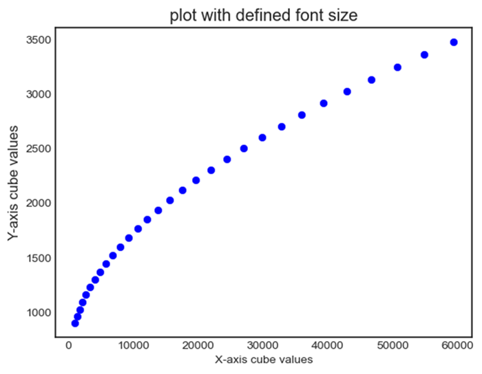
Font Style ('fontstyle')
We can choose the font styles such as 'normal', 'italic', or 'oblique' for the font that we want to use on the created plot.
Example - Setting Font Style
Here we are setting the font style of the fonts that we are displaying on the plot by passing fontstyle parameter as 'normal'', 'italic', or 'oblique' to the plt.xlabel(), plt.ylabel() and plt.title().
import matplotlib.pyplot as plt
# Creating a data
x = [i for i in range(10,40)]
y = [i for i in range(30,60)]

# Creating a plot
plt.scatter(x,y,color = 'blue')
plt.xlabel('X-axis cube values', fontsize = 10)
plt.ylabel('Y-axis cube values', fontsize = 12)
plt.title('plot with defined font size')
plt.show()
Output
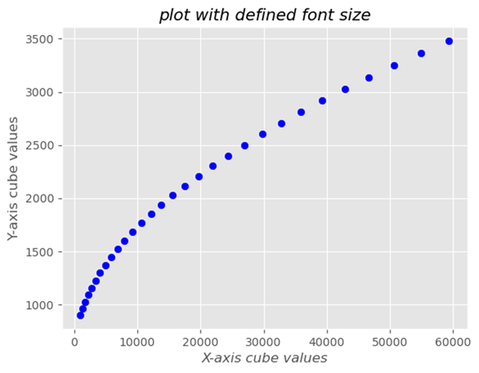
Font Weight ('fontweight')
Adjust the thickness of the font using weights like 'normal', 'bold', or numerical values such as 400, 700, etc.
Example - Setting Font Weight
import matplotlib.pyplot as plt
# Creating a data
x = [i for i in range(10,40)]
y = [i for i in range(30,60)]

# Creating a plot
plt.scatter(x,y,color = 'blue')
plt.xlabel('X-axis cube values', fontweight='bold')
plt.ylabel('Y-axis cube values', fontweight='bold')
plt.title('plot with defined font size',fontweight='bold')
plt.show()
Output
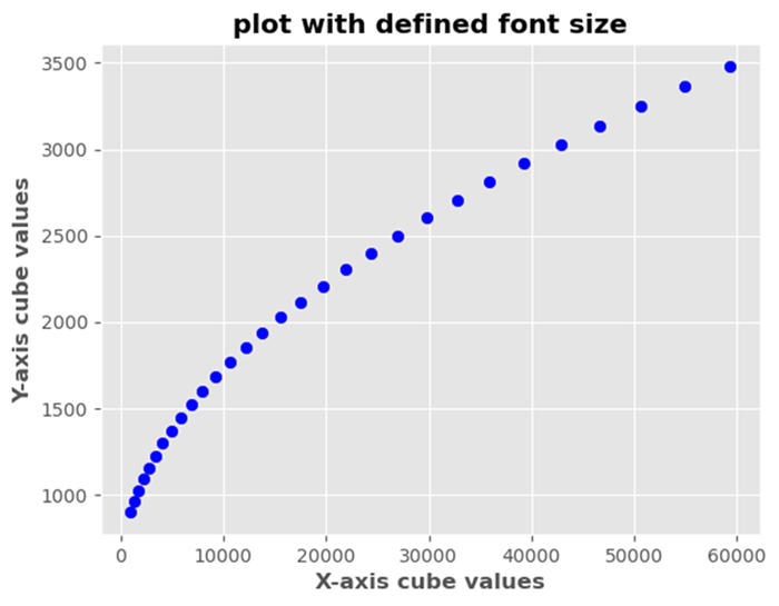
Changing Font Family
We can modify the font family for various text elements in Matplotlib library. Some available font families are mentioned below.
'serif' − Serif fonts such as Times New Roman
'sans-serif' − Sans-serif fonts such as Arial
'monospace' − Monospaced fonts such as Courier New
Change size of the fonts
We can change the size of the font by using the plt.text() function.
Example - Seting Font Size
import matplotlib.pyplot as plt
plt.plot([1, 2, 4], [1, 2, 4])
plt.text(2, 3, "y=x", color='red', fontsize=20)

# Increase fontsize by increasing value.
plt.show()
Output
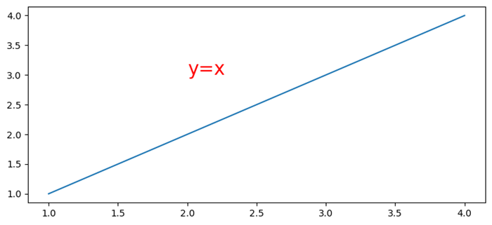
Embed fonts in PDFs produced by Matplotlib
To embed fonts in PDFs produced by Matplotlib we can use rc.Params['pdf.fonttype']=42.
Example - Embedding Fonts
import numpy as np
from matplotlib import pyplot as plt, font_manager as fm

plt.rcParams["figure.figsize"] = [7.50, 3.50]
plt.rcParams["figure.autolayout"] = True
plt.rcParams['pdf.fonttype'] = 42

fig, ax = plt.subplots()
x = np.random.rand(100)
y = np.random.rand(100)

ax.scatter(x, y, c=y, marker="v")

fprop = fm.FontProperties(fname='C:\Windows\Fonts\MISTRAL.TTF')

ax.set_title('Scatter Plot With Random Points',
   fontproperties=fprop, size=20, fontweight="bold")

plt.savefig("demo.pdf")
Output
When we execute the code it will save the following plot in the project directory with the file name as "demo.pdf".
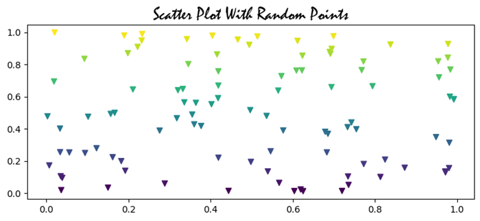
Setting Font Properties Globally
Setting font properties globally in Matplotlib library involves configuring default font settings for the entire plot using plt.rcParams method. This is useful when we want to apply consistent font styles, sizes or families to all text elements in our visualizations without specifying them individually for each component.
It's important to note that we can tailor these settings based on our preferences and the visual style we want to achieve in our plots. We can adjust the values to match our desired font styles, sizes and families for a consistent and aesthetically pleasing appearance across our visualizations.
The following are the different settings that we can make by using the plt.rcParams method.
plt.rcParams['font.family'] = font_name
This sets the default font family for text elements such as 'sans-serif'. We can replace font_name with the available font families such as 'serif', 'monospace' or specific font names.
Example - Setting Font Family
In this example we are trying to set the font family to 'sans-serif' by using the plt.rcParams['font.family'].
import matplotlib.pyplot as plt
# Set font properties globally
plt.rcParams['font.family'] = 'sans-serif'

# Create a plot
plt.plot([1, 2, 3], [4, 5, 6])
plt.xlabel('X-axis Label')
plt.ylabel('Y-axis Label')
plt.title('Font Family setting')
plt.show()
Output
plt.rcParams['font.size'] = font_size
We can specify the default font size for text elements in numerical values as per the requirement. This ensures that all text elements use this font size unless overridden for specific components.
Example - Setting Font Size
In this example we are specifying the fontsize as 8 points to the plt.rcParams['font.size'] to display font size globally all over the plot.
import matplotlib.pyplot as plt
# Set font properties globally
plt.rcParams['font.size'] = 8

# Create a plot
plt.plot([1, 2, 3], [4, 5, 6])
plt.xlabel('X-axis Label')
plt.ylabel('Y-axis Label')
plt.title('Font Size setting')
plt.show()
Output
plt.rcParams['font.style'] = 'fontstyle'
We can define the font style such as italic etc., as per our interest to the plt.rcParams['font.style']. This applies the defined appearance to text elements throughout the plot.
Example - Setting Font Style
In this example we are specifying the font style as italic to the plt.rcParams['font.style'].
import matplotlib.pyplot as plt
# Set font properties globally
plt.rcParams['font.style'] = 'italic'

# Create a plot
plt.plot([1, 2, 3], [4, 5, 6])
plt.xlabel('X-axis Label')
plt.ylabel('Y-axis Label')
plt.title('Font Style setting')
plt.show()
Output
plt.rcParams['font.weight'] = font_weight
By using this we can set the font weight such as 'bold' etc. This makes the characters in text elements appear in the defined style as per the user requirement.
Example - Setting Font Weight
Here in this example we are specifying the font weight as bold to the plt.rcParams['font.weight'].
import matplotlib.pyplot as plt
# Set font properties globally
plt.rcParams['font.weight'] = 'bold'

# Create a plot
plt.plot([1, 2, 3], [4, 5, 6])
plt.xlabel('X-axis Label')
plt.ylabel('Y-axis Label')
plt.title('Font weight setting')
plt.show()
Output
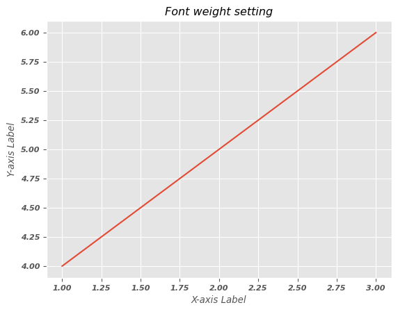
Note − By setting these parameters globally using plt.rcParams we can ensure that these default font properties are applied to all text elements in our Matplotlib plots. When we create labels, titles or other text components they will inherit these global settings unless we specify different properties locally.
Change the font properties of a Matplotlib colorbar label
In this example we are changing the font properties of a matplotlib colorbar label.
Example - Changing Font Properties
import numpy as np
import matplotlib.pyplot as plt
plt.rcParams["figure.figsize"] = [7.50, 3.50]
plt.rcParams["figure.autolayout"] = True
x, y = np.mgrid[-1:1:100j, -1:1:100j]
z = (x + y) * np.exp(-5.0 * (x ** 2 + y ** 2))
plt.imshow(z, extent=[-1, 1, -1, 1])
cb = plt.colorbar(label='my color bar label')
plt.show()
Output
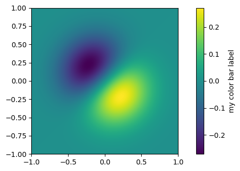
Setting the size of the plotting canvas
Here in this example we are setting the size of the plotting canvas in matplotlib.
Example - Setting Size of Canvas
import numpy as np
from matplotlib import pyplot as plt
plt.rcParams["figure.figsize"] = [7.50, 3.50]
plt.rcParams["figure.autolayout"] = True
x = np.linspace(-2, 2, 100)
y = np.sin(x)
plt.plot(x, y)
plt.show()
Output
Auto adjust font size in Seaborn heatmap using Matplotlib
Here we are auto adjusting the font size in seaborn heatmap by using the Matplotlib library.
Example - Auto Adjust Font Size
import numpy as np
import seaborn as sns
from matplotlib import pyplot as plt
import pandas as pd
plt.rcParams["figure.figsize"] = [7.00, 3.50]
plt.rcParams["figure.autolayout"] = True
d = {
   'y=1/x': [1 / i for i in range(1, 10)],
   'y=x': [i for i in range(1, 10)],
   'y=x^2': [i * i for i in range(1, 10)],
   'y=x^3': [i * i * i for i in range(1, 10)]
}
df = pd.DataFrame(d)
ax = sns.heatmap(df, vmax=1)
plt.xlabel('Mathematical Expression', fontsize=16)
plt.show()
Output
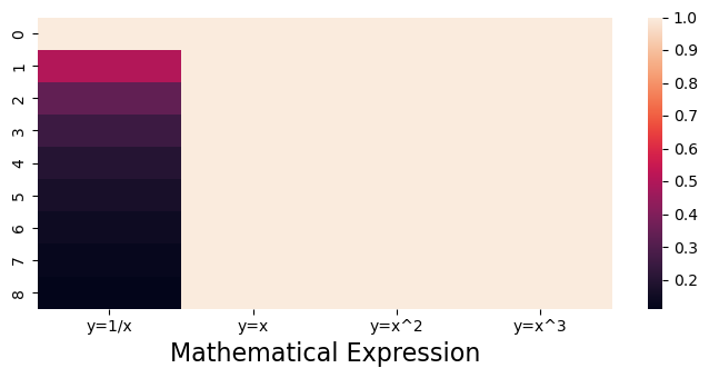
Set the font size of Matplotlib axis Legend
In this example we are setting the font size of matplotlib axis legend
Example - Setting Font Size of Axis Legend
import numpy as np
from matplotlib import pyplot as plt
import matplotlib
plt.rcParams["figure.figsize"] = [7.50, 3.50]
plt.rcParams["figure.autolayout"] = True
x = np.linspace(1, 10, 50)
y = np.sin(x)
plt.plot(x, y, c="red", lw=7, label="y=sin(x)")
plt.title("Sine Curve")
matplotlib.rcParams['legend.fontsize'] = 20
plt.legend(loc=1)
plt.show()
Output
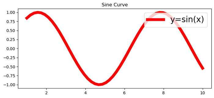
Modify the font size in Matplotlib-venn
To work with the Matplotlib-venn, first we have to install the package by using the below code. If previously installed we can import directly.
pip install matplotlib-venn
Example - Setting Font Size
In this example we are modifying the font size in Matplotlib-venn by using the set_fontsize() method.
from matplotlib import pyplot as plt
from matplotlib_venn import venn3
plt.rcParams["figure.figsize"] = [7.50, 3.50]
plt.rcParams["figure.autolayout"] = True
set1 = {'a', 'b', 'c', 'd'}
set2 = {'a', 'b', 'e'}
set3 = {'a', 'd', 'f'}
out = venn3([set1, set2, set3], ('Set1', 'Set2', 'Set3'))
for text in out.set_labels:
   text.set_fontsize(25)
for text in out.subset_labels:
   text.set_fontsize(12)
plt.show()
Output
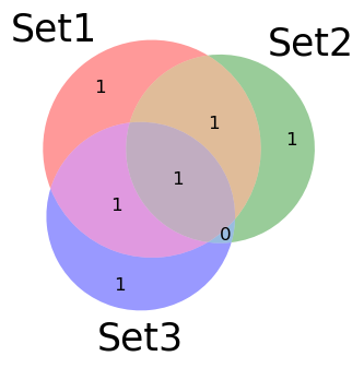
Change xticks font size
To change the font size of xticks in a matplotlib plot we can use the fontsize parameter.
Example - Chanding xticks Font Size
from matplotlib import pyplot as plt
import numpy as np

# Set the figure size
plt.rcParams["figure.figsize"] = [7.50, 3.50]
plt.rcParams["figure.autolayout"] = True

# x and y data points
x = np.linspace(-5, 5, 100)
y = np.sin(x)
plt.plot(x, y)

# Set the font size of xticks
plt.xticks(fontsize=25)

# Display the plot
plt.show()
Output
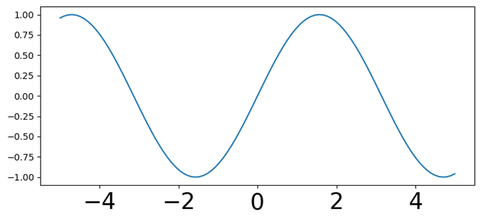
Matplotlib - Font Indexing
In Matplotlib library font indexing refers to accessing and utilizing different fonts or typefaces available for rendering text elements within plots. Matplotlib library provides access to various fonts and understanding font indexing involves knowing how to use these fonts by their names or indices. This is particularly relevant when we want to use fonts that are not in the default set or if we need to use system-specific fonts.
The font.family parameter in Matplotlib accepts either a string representing a known font family or an integer representing a specific font index. The numeric indices are used to reference fonts that are registered with Matplotlib library.
Font Indexing in Matplotlib
The following are the font indexing ways in matplotlib library.
Font Families
Matplotlib library offers several font families such as 'serif', 'sans-serif', 'monospace' and more.
These font families have their unique characteristics and are used to define the general design of the typeface.
Font Names
Matplotlib library allows the use of specific font names to access particular fonts available on our system.
Font names enable the selection of custom or installed fonts for rendering text in plots.
Accessing Fonts by Name
To access fonts in Matplotlib we can use both the font names and their indices if available.
Font Names
We can access the fonts available in matplotlib by using the font names. Here is the example of accessing the font 'Times New Roman' by using the plt.rcParams['font.family'] method.
Example - Using Font Names
import matplotlib.pyplot as plt
plt.rcParams['font.family'] = 'Times New Roman'
# Creating a data
x = [i for i in range(10,40)]
y = [i for i in range(30,60)]
# Creating a plot
plt.scatter(x,y,color = 'blue')
plt.xlabel('X-axis cube values')
plt.ylabel('Y-axis cube values')
plt.title('Title with Times New Roman Font')
plt.show()
Output
Available Fonts on the System
Matplotlib library can also uses the available fonts on our system. The fonts available might vary based on the operating system such as Windows, macOS, Linux and also the installed font libraries.
Indexing Fonts with findSystemFonts()
Matplotlib provide the function namely matplotlib.font_manager.findSystemFonts() which returns a list of paths to available fonts on the system.
Example - Indexing Fonts
In this example we are using the matplotlib.font_manager.findSystemFonts() function to get the required indices list of font names.
import matplotlib.font_manager as fm
# Get a list of available fonts
font_list = fm.findSystemFonts()

# Display the first five fonts path
print("The first five fonts path:",font_list[:5])
Output
The first five fonts path: ['C:\\Windows\\Fonts\\gadugi.ttf', 'C:\\WINDOWS\\Fonts\\COPRGTB.TTF', 'C:\\WINDOWS\\Fonts\\KUNSTLER.TTF', 'C:\\Windows\\Fonts\\OLDENGL.TTF', 'C:\\Windows\\Fonts\\taileb.ttf']
Accessing Fonts by Indexing
Font indexing involves knowing the names or paths of available fonts on our system. We can refer these fonts by their names, aliases or file paths to set the font family in Matplotlib plots by ensuring that the desired font is used for text elements.
Example - Accessing Font By Index
Here in this example we are accessing the fonts from the system by using the font path.
import matplotlib as mpl
import matplotlib.font_manager as fm
plt.rcParams['font.family'] = 'C:\Windows\Fonts\Comicz.ttf'

# Creating a data
x = [i for i in range(10,40)]
y = [i for i in range(30,60)]

# Creating a plot
plt.plot(x,y,color = 'violet')
plt.xlabel('X-axis cube values')
plt.ylabel('Y-axis cube values')
plt.title("The plot fonts with font indexing")
plt.show()
Output
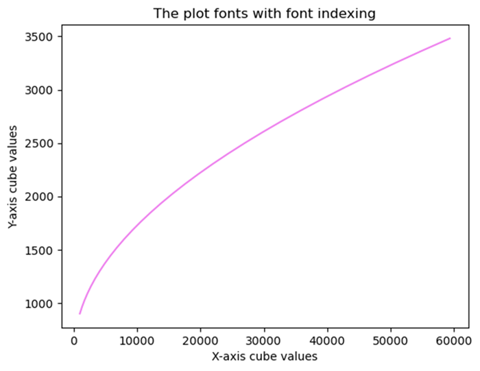
Note
Font indexing and availability may vary depending on the backend being used in Matplotlib library.
Customizing fonts with indices might be backend-specific or require special configurations such as LaTeX rendering.
Matplotlib - Font Properties
What are Font properties?
In Matplotlib library font properties are attributes that determine the appearance and styling of text elements within plots and figures. These properties include various aspects such as font family, size, weight, style and other settings that affect the visual presentation of text.
Key Font Properties in Matplotlib
Font Family
The Font family specifies the typeface or used for text elements. Common families include serif, sans-serif, monospace etc.
- serif − Fonts with decorative strokes often used for a more traditional or formal appearance.
- sans-serif − Fonts without decorative strokes known for a clean and modern look which are commonly used for readability.
- monospace − Fonts where each character occupies the same amount of horizontal space, often used for code or tabular data.
- Custom or Specific Fonts − Users can also use custom fonts installed on their system or provide font paths for specific typefaces.
Font Size
The Font size determines the size of the text in points (pt) influencing readability and visibility. Font size is specified in points (pt) where 1 point is approximately 1/72 inch. Matplotlib uses points as a standard unit for font size by allowing for consistency across different devices and display resolutions.
Font Weight
The Font weight controls the thickness or boldness of the text. Options range from normal to bold. It allows users to control the visual emphasis of text elements such as labels, titles, annotations and other textual components.
Font Weight Options
- normal − Specifies normal font weight.
- bold − Specifies a bold font weight.
- Integer Values − Some fonts support numeric values ranging from 100 to 900 to specify the weight level.
Font Style
The Font style specifies the style of the text such as normal, italic or oblique. It allows users to control the slant or style of the text elements such as labels, titles, annotations and other textual components.
Font Style Options
- normal − Specifies normal font style (no slant or italicization).
- italic − Specifies italic font style slanting the characters.
- oblique − Similar to italic but may differ slightly in appearance in some fonts.
Setting Font Properties in Matplotlib
The following are the ways to set the font properties in matplotlib.
Global Configuration (using plt.rcParams)
This is used to configure default font properties for all text elements in a plot or figure.
Example - Usage of Global Configuration
import matplotlib.pyplot as plt
# Set global font properties
x = [2,3,4,6]
y = [9,2,4,7]
plt.rcParams['font.family'] = 'sans-serif'
plt.rcParams['font.size'] = 8
plt.rcParams['font.weight'] = 'normal'
plt.rcParams['font.style'] = 'italic'
plt.plot(x,y)
plt.xlabel("x-axis")
plt.ylabel("y-axis")
plt.title("Setting fonts globally")
plt.show()
Output

Individual Text Elements
Through this method we can set font properties for specific text elements within a plot.
Example - Setting Font Properties
import matplotlib.pyplot as plt
# Set Individual font properties
x = [2,3,4,6]
y = [9,2,4,7]
plt.plot(x,y)
plt.xlabel('X-axis Label', fontsize=14, fontweight='bold', fontstyle='italic')
plt.ylabel('Y-axis Label', fontsize=14, fontweight='bold', fontstyle='normal')
plt.title("Setting fonts Individually")
plt.show()
Output

Importance of Font Properties
The below are the importance of the font properties.
Readability
Proper font selection and size enhance the legibility of text elements.
Aesthetics
Font styles and families contribute to the visual appeal of plots.
Communication
Font properties aid in conveying emphasis or context within visualizations.
Using Font Properties for Customization
- Adjusting font properties allows users to tailor the appearance of text to match the requirements of the visualization or presentation.
- Consistent and appropriate use of font properties ensures a visually cohesive and informative display of textual information within plots and figures.
Finally we can font properties in Matplotlib library provide users with the flexibility to customize text appearance, ensuring clarity, readability and visual appeal in visualizations. These properties enable precise control over how text elements are displayed within plots helping effectively communicate information to viewers.
Multiple font sizes in one label
In this example we use multiple font sizes in one label in Python with the help of fontsize parameter in title() method.
Example - Setting Multiple Font Sizes
import numpy as np
from matplotlib import pyplot as plt
plt.rcParams["figure.figsize"] = [7.50, 3.50]
plt.rcParams["figure.autolayout"] = True
x = np.linspace(-5, 5, 100)
y = np.cos(x)
plt.plot(x, y)
fontsize = 20
plt.title("$bf{y=cos(x)}$", fontsize=fontsize)
plt.axis('off')
plt.show()
Output

Change the text color of font in the legend
Here in this example we will change the text color of the font in the legend.
Example - Updating Text Color
import numpy as np
from matplotlib import pyplot as plt
plt.rcParams["figure.figsize"] = [7.00, 3.50]
plt.rcParams["figure.autolayout"] = True
x = np.linspace(-2, 2, 100)
y = np.exp(x)
plt.plot(x, y, label="y=exp(x)", c='red')
leg = plt.legend(loc='upper left')
for text in leg.get_texts():
   text.set_color("green")
plt.show()
Output

Change the default font color for all text
In this example we will change the default font color for all the text in the plot.
Example - Changing Font Color
import matplotlib.pyplot as plt
plt.rcParams["figure.figsize"] = [7.50, 3.50]
plt.rcParams["figure.autolayout"] = True
print("Default text color is: ", plt.rcParams['text.color'])
plt.rcParams.update({'text.color': "red",
   'axes.labelcolor': "green"})
plt.title("Title")
plt.xlabel("X-axis")
plt.show()
Output
Default text color is: black

Change the font size of ticks of axes object
In this example we will change the default font color for all the text in the plot.
Example - Change Font Size of Tick
import numpy as np
from matplotlib import pyplot as plt
plt.rcParams["figure.figsize"] = [7.00, 3.50]
plt.rcParams["figure.autolayout"] = True
x = np.linspace(-2, 2, 10)
y = np.sin(x)
fig, ax = plt.subplots()
ax.plot(x, y, c='red', lw=5)
ax.set_xticks(x)
for tick in ax.xaxis.get_major_ticks():
   tick.label1.set_fontsize(14)
   tick.label2.set_rotation('vertical')
plt.tight_layout()
plt.show()
Output

Increase the font size of the seaborn plot legend
In this example we increase the font size of the legend in a Seaborn plot, we can use the fontsize variable and can use it in legend() method argument.
Example - Increasing Font Size
import pandas
import matplotlib.pylab as plt
import seaborn as sns
plt.rcParams["figure.figsize"] = [7.00, 3.50]
plt.rcParams["figure.autolayout"] = True
df = pandas.DataFrame(dict(
   number=[2, 5, 1, 6, 3],
   count=[56, 21, 34, 36, 12],
   select=[29, 13, 17, 21, 8]
))
bar_plot1 = sns.barplot(x='number', y='count', data=df, label="count", color="red")
bar_plot2 = sns.barplot(x='number', y='select', data=df, label="select", color="green")
fontsize = 20
plt.legend(loc="upper right", frameon=True, fontsize=fontsize)
plt.show()
Output

Matplotlib - Scales
What are Scales in Matplotlib?
In Matplotlib library scales refer to the mapping of data values to the physical dimensions of a plot. They determine how data values are represented and visualized along the axes of a plot. Matplotlib supports various types of scales and the choice of scale can significantly impact how the data is perceived in visualization.
The below are the common types of scales available in matplotlib library.
- Linear Scale − Suitable for most numerical data without large variations in magnitude.
- Logarithmic Scale − Ideal for datasets covering several orders of magnitude or exhibiting exponential growth.
- Symmetrical Logarithmic Scale − Suitable for datasets with both positive and negative values.
Let us go through these one by one.
Linear Scale
The linear scale is the default scale used to represent data along axes in a plot. It's a straightforward mapping where the data values are plotted in direct proportion to their actual numerical values. In a linear scale equal distances along the axis represent equal differences in the data.
Characteristics of Linear Scale
- Equal Intervals − In a linear scale equal distances on the axis correspond to equal differences in data values.
- Linear Mapping − The relationship between data values and their position on the axis is linear.
Using Linear Scale
By default the Matplotlib library uses a linear scale for both the x-axis and y-axis. To explicitly set a linear scale we don't need to use any specific function as it's the default behavior. However we can specify it explicitly using plt.xscale('linear') or plt.yscale('linear') for the x-axis or y-axis respectively.
The following is the example of applying the linear scale to a plot.
Example - Usage of Linear Scale
import matplotlib.pyplot as plt
x = [1, 2, 3, 4, 5]
y = [2, 4, 6, 8, 10]
plt.plot(x, y)
plt.xlabel('X-axis')
plt.ylabel('Y-axis')
plt.title('Linear Scale')
plt.show()
Output
Following is the output of the above program −

When to Use Linear Scale
- Linear scales are commonly used when the data doesn't have exponential growth or when the range of values isn't too large.
- It's suitable for representing most numerical data that doesn't exhibit significant nonlinear behavior.
Logarithmic Scale
The Logarithmic scale represents data using a logarithmic mapping. This is useful when there is a wide range of values and the logarithmic scale helps to emphasize changes in smaller values.
Characteristics of Logarithmic Scale
The below are the characteristics of the logarithmic scale −
- Equal Ratios − In a logarithmic scale, equal distances on the axis represent equal ratios between values rather than equal differences.
- Compression of Data − It compresses a wide range of data into a more readable and interpretable visualization.
- Emphasizes Smaller Values − It emphasizes changes in smaller values more than larger ones.
Using Logarithmic Scale
To use a logarithmic scale we have to specify plt.xscale('log') or plt.yscale('log') for the x-axis or y-axis respectively. Logarithmic scales are particularly useful for visualizing exponential growth or phenomena that cover several orders of magnitude.
When to Use Logarithmic Scale
Logarithmic scales are suitable for data with large variations in magnitude or when there's a need to highlight changes in smaller values. Commonly used in fields like finance (stock prices), scientific research (decibel levels, earthquake magnitudes) and biology (pH levels).
Example - Usage of Logarithmic Scale
The following is the example plot with the logarithmic scale −
import matplotlib.pyplot as plt
import numpy as np

# Generating logarithmically spaced data
x = np.linspace(1, 10, 100)
y = np.log(x)

# Creating a plot with a logarithmic scale for the x-axis
plt.plot(x, y)
plt.xscale('log')  # Set logarithmic scale for the x-axis
plt.xlabel('X-axis (log scale)')
plt.ylabel('Y-axis')
plt.title('Logarithmic Scale')
plt.show()
Output
Following is the output of the above program −

Using a logarithmic scale in a plot can provide insights into data with a wide range of values making it easier to visualize patterns and trends across different scales within the same plot.
Example - Logarithmic plot of a cumulative distribution function
The example given below, shows the Logarithmic plot of a cumulative distribution function.
import numpy as np
import matplotlib.pyplot as plt
plt.rcParams["figure.figsize"] = [7.50, 3.50]
plt.rcParams["figure.autolayout"] = True
N = 100
data = np.random.randn(N)
X2 = np.sort(data)
F2 = np.array(range(N))/float(N)
plt.plot(X2, F2)
plt.xscale('log')
plt.yscale('log')
plt.show()
Output
Following is the output of the above program −

Symmetrical Logarithmic Scale
The Symmetrical Logarithmic scale is similar to the logarithmic scale. It often abbreviated as symlog which is a type of scale used to represent data on an axis where the values are distributed symmetrically around zero using logarithmic intervals. It provides a logarithmic-like scale for both positive and negative values while accommodating zero.
To apply the Symmetrical Logarithmic scale on x-axis and y-axis, we have to use plt.xscale(symlog) and plt.yscale(symlog) respectively.
Characteristics of Symmetrical Logarithmic Scale
The symmetrical logarithmic scale has the following characteristics.
- Symmetrical Behaviour − Represents both positive and negative values logarithmically while handling zero.
- Linear Near Zero − The scale is linear around zero within a specified range (linthresh) before transitioning to logarithmic behaviour.
Parameters for Symmetrical Logarithmic Scale
linthresh − Linear threshold that determines the range around zero where the scale behaves linearly before transitioning to a logarithmic scale.
When to Use Symmetrical Logarithmic Scale:
- Data around Zero − Suitable for datasets containing values centered around zero with a wide range of positive and negative values.
- Avoiding Symmetry Bias − When symmetric representation of positive and negative values is needed without bias towards either side.
Importance of Symmetrical Logarithmic Scale
The Symmetrical Logarithmic Scale provides a logarithmic-like scale that accommodates both positive and negative values, making it useful for visualizing datasets with a balanced distribution around zero.
It also helps in highlighting smaller variations around zero while accommodating larger values without skewing the representation.
Example - Symmetrical Logarithmic Scale
In this plot we are creating the symmetrical Logarithmic Scale on the y-axis by using the plt.yscale('symlog', linthresh=0.01).
import matplotlib.pyplot as plt
import numpy as np

# Generating data for a sine wave with values around zero
x = np.linspace(-10, 10, 500)
y = np.sin(x)

# Creating a plot with a symmetrical logarithmic scale for the y-axis
plt.plot(x, y)

# Set symmetrical logarithmic scale for the y-axis
plt.yscale('symlog', linthresh=0.01)
plt.xlabel('X-axis')
plt.ylabel('Y-axis (symlog scale)')
plt.title('Symmetrical Logarithmic Scale')
plt.show()
Output
Following is the output of the above program −

Using a symmetrical logarithmic scale in Matplotlib allows for the visualization of datasets containing values around zero by enabling effective representation and analysis of symmetrically distributed data. Adjusting the linear threshold (linthresh) parameter is crucial to determine the range where the scale behaves linearly around zero before transitioning to a logarithmic scale.
Logit Scale
The Logit scale is a specialized type of scale used to represent data on an axis where the values are confined between 0 and 1. It's specifically designed for data that exists within this range commonly encountered in probabilities or values representing probabilities.
Setting the Scale
The plt.xscale() and plt.yscale() functions can be used to set the scale for the x-axis and y-axis respectively.
Characteristics of Logit Scale
The below are the characteristics of Logit Scale.
- Constrains Data − Specifically used for data bounded between 0 and 1.
- Transformation − Utilizes the logit function to map values from the standard logistic distribution.
When to Use Logit Scale
- Probability Data − Suitable for visualizing probabilities or values representing probabilities, especially when dealing with logistic regression or logistic models.
- Data within 0 to 1 Range − Specifically designed for data bounded within the 0 to 1 interval.
Importance of Logit Scale
- The Logit Scale facilitates the visualization and analysis of data that represents probabilities or has a probabilistic interpretation.
- It also helps in understanding and visualizing transformations of probability-related data.
Example - Creating a Logic Scale
In this plot we are creating the Logit scale on x-axis and y-axis.
import matplotlib.pyplot as plt
import numpy as np

# Generating data within the 0 to 1 range
x = np.linspace(0.001, 0.999, 100)
y = np.log(x / (1 - x))

# Creating a plot with a logit scale for the x-axis
plt.plot(x, y)
plt.xscale('logit')  # Set logit scale for the x-axis
plt.xlabel('X-axis (logit scale)')
plt.ylabel('Y-axis')
plt.title('Logit Scale')
plt.show()
Output
Following is the output of the above program −

Understanding and choosing the appropriate scale for a plot is important for accurately representing the underlying data and ensuring that patterns and trends are effectively communicated in visualizations.
Example - yscale class
In this plot we are plotting the yscale class linear, log, logit and symlog by name.
import numpy as np
import matplotlib.pyplot as plt
plt.rcParams["figure.figsize"] = [7.50, 3.50]
plt.rcParams["figure.autolayout"] = True
y = np.random.normal(loc=0.5, scale=0.4, size=1000)
y = y[(y > 0) & (y < 1)]
y.sort()
x = np.arange(len(y))

# linear
plt.subplot(221)
plt.plot(x, y)
plt.yscale('linear')
plt.title('linear')

# log
plt.subplot(222)
plt.plot(x, y)
plt.yscale('log')
plt.title('log')

# symmetric log
plt.subplot(223)
plt.plot(x, y - y.mean())
plt.yscale('symlog', linthresh=0.01)
plt.title('symlog')

# logit
plt.subplot(224)
plt.plot(x, y)
plt.yscale('logit')
plt.title('logit')
plt.show()
Output
Following is the output of the above program −

Matplotlib - Latex
What is LaTeX?
LaTeX is a typesetting system widely used for producing scientific and technical documents, particularly in disciplines such as mathematics, physics, computer science, engineering and academic writing. It's highly regarded for its superior typesetting of complex mathematical equations, scientific notations, and structured text formatting.
Key Aspects of LaTeX
The below are the key aspects of LaTeX.
- Markup Language: LaTeX is a markup language, meaning it uses commands and tags to format text rather than WYSIWYG which is abbreviated as What You See Is What You Get editors. Users write plain text with embedded commands that specify the structure and formatting.
- High-Quality Typesetting: LaTeX excels in producing professional-looking documents with precise typographical and typesetting features. It handles complex structures like mathematical formulas, tables, bibliographies and cross-references exceptionally well.
- Package System: LaTeX offers a vast array of packages that extend its functionality for specific tasks or document types, providing templates, styles and additional features.
- Free and Open Source: LaTeX is free to use and is supported by a strong open-source community by ensuring continuous development and a rich ecosystem of packages and resources.
- Components of LaTeX: The LaTex of matplotlib library have the following components. Let's see each of them in detail.
- Document Class: The document class specifies the type of document being created and defines its overall structure, layout and formatting. It acts as a template that sets the style and behaviour for the entire document. Different document classes are available to suit various types of documents such as articles, reports, books, presentations and more.
- Preamble: In LaTeX the preamble is the section of the document that precedes the main content and the \begin{document} command. It is where we define the document settings, load packages, set parameters and configure global settings that apply to the entire document. The preamble acts as a setup area where we prepare LaTeX for processing the main body of the document.
- Document Body: The document body in LaTeX is the main section where the content of our document resides. It starts after the preamble and the \begin{document} command and continues until the \end{document} command. This section includes the actual text, sections, subsections, equations, figures, tables and any other elements that constitute the core content of the document.
Advantages of LaTeX
The following are the advantages of LaTex −
- Quality Typesetting: Produces high-quality output, especially for scientific and technical documents.
- Cross-Referencing: Simplifies referencing and cross-referencing of equations, figures, tables, and sections.
- Version Control: Facilitates version control and collaboration through plain text-based files.
- Customization: Allows extensive customization of document styles, layouts and formatting.
Disadvantages of LaTeX
The following are the disadvantages of LaTex −
- Learning Curve: Requires learning its syntax and commands which can be daunting for beginners.
- Limited WYSIWYG: Lack of immediate visual feedback (WYSIWYG) might be challenging for some users accustomed to graphical editors.
Usage of LaTeX
Following is the usage of Latex −
- Academic Writing: Academic papers, theses, dissertations
- Scientific: Scientific reports, articles, and journals
- Technical Documents: Technical documentation, manuals
- Presentations: Presentations using tools like Beamer
Basic document structure of the LaTex
Following is the basic document structure of LaTeX. It defines a basic article document with a hierarchical structure comprising a section and a subsection.
\documentclass{article}
\begin{document}
\section{Introduction}
This is a simple LaTeX document.
\subsection{Subsection}
Some text in a subsection.
\end{document}
Writing our own LaTeX preamble
To write our own LaTeX preamble in Matplotlib we can use this example as reference.
Example - Creating a LaTeX preamble
import numpy as np
from matplotlib import pyplot as plt
plt.rcParams["figure.figsize"] = [7.50, 3.50]
plt.rcParams["figure.autolayout"] = True
x = np.linspace(-10, 10, 100)
y = np.exp(x)
plt.plot(x, y, color='red', label="$y=e^{x}$")
plt.legend(loc='upper right')
plt.show()
Output
This will generate the following output −

Example - Using LaTeX formula
In this example we are using the Latex formula in the legend of a plot inside a .py file.
import numpy as np
import matplotlib.pyplot as plt
plt.rcParams["figure.figsize"] = [7.50, 3.50]
plt.rcParams["figure.autolayout"] = True
x = np.linspace(1, 10, 1000)
y = np.sin(x)
plt.plot(x, y, label=r'$\sin (x)$', c="red", lw=2)
plt.legend()
plt.show()
Output
This will generate the following output −

Put a little more complex equation in the label, for example, label=r'i+1=0'. Now look at the legend at the top-right corner of the plot.
Example - Using a Complex Equation
import numpy as np
import matplotlib.pyplot as plt
plt.rcParams["figure.figsize"] = [7.50, 3.50]
plt.rcParams["figure.autolayout"] = True
x = np.linspace(1, 10, 1000)
y = np.sin(x)
plt.plot(x, y, label=r'$\sin (x)$', c="red", lw=2)
plt.legend(r'i+1=0')
plt.show()
Output
This will generate the following output −

Rendering Mathematical Expressions
Rendering mathematical expressions in LaTeX involves using LaTeX syntax to write mathematical equations, symbols and formulas. LaTeX provides a comprehensive set of commands and notation to create complex mathematical expressions with precision and clarity.
Importance of LaTeX for Mathematics
- Precision and Clarity: LaTeX allows precise typesetting of mathematical notation and symbols.
- Consistency: Maintains consistency in formatting across mathematical documents.
- Publication-Quality: Produces high-quality mathematical expressions suitable for academic and scientific publications.
- LaTeX's support for mathematical typesetting makes it a preferred choice for researchers, mathematicians, scientists and academics when writing technical or mathematical documents that require accurate and well-formatted mathematical notation.
LaTeX for Mathematical Expressions
The below are the components of LaTex in Mathematical Expressions.
- Inline Math Mode: Inline math mode in LaTeX is used to include mathematical expressions within the text of a document. We can use inline math mode by enclosing the mathematical expression between a pair of single dollar signs $...$.
- Using the inline math mode: In this example the mathematical expression `\frac{-b \pm \sqrt{b^2 - 4ac}}{2a}` is included within the text using inline math mode. The result is that the mathematical expression is rendered within the line of text.
Example - Mathematical Expression
Following is an example −
import matplotlib.pyplot as plt
equation = r'$x = \frac{{-b \pm \sqrt{{b^2 - 4ac}}}}{{2a}}$'
plt.text(0.5, 0.5, equation, fontsize=12, ha='center')
plt.axis('off')
plt.show()
Output
This will generate the following output −

Display Math Mode
Display math mode in LaTeX is used to showcase mathematical expressions in a separate block, centered and distinct from the surrounding text. It's commonly used for larger or stand-alone equations that deserve prominence in a document.
To use display math mode in LaTeX we have several options let's see them one by one.
Double Dollar Sign `$$...$$`
Enclose the mathematical expression between $$ symbols for displayed equations. In the following example we are displaying the given input equation by using the $$..$$ −
Example
$$
   f(x) = \int_{a}^{b} g(x) \, dx
$$
Output
This will generate the following output −

The 'equation' Environment
Use the 'equation' environment to create a numbered equation.
Example
\begin{equation}
   f(x) = \int_{a}^{b} g(x) \, dx
   \end{equation}
Output
This will generate the following output −
Note: The above code lines can be executed in the Jupyter Notebook markdown mode.
Symbols and Operators
In LaTeX we can use a wide range of symbols and operators to represent mathematical notation, expressions and operations. Here are some commonly used symbols and operators along with their LaTeX commands.
- Greek Letters: Alpha: `\alpha`, Beta: `\beta`, Gamma: `\gamma`, Delta: `\delta` and so on.
- Arithmetic Operators: Plus: `+`, Minus: `-`, Multiplication: `\times` or `*`, Division: `\div` or `/`
- Relations and Comparisons: Equals: `=`, Not equals: `\neq`, Less than: `<`, Greater than: `>` and so on.
- Set Theory: Union: `\cup`, Intersection: `\cap`, Subset: `\subset`, Superset: `\supset` and so on
- Calculus and Limits: Integral: `\int`, Summation: `\sum`, Limit: `\lim`, Derivative: `\frac{dy}{dx}`
- Functions: Sine: `\sin`, Cosine: `\cos`, Tangent: `\tan`, Logarithm: `\log`, Exponential: `\exp`
- Roots and Exponents: Square root: `\sqrt{x}`, Exponent: `x^2`, Subscript: `x_1`, Superscript: `x^i`
Other Notations
- Fractions: `\frac{numerator}{denominator}`
- Matrices: `bmatrix`, `pmatrix`, `vmatrix`, etc., using the `amsmath` package
- Special Symbols: For example, `\infty` for infinity, `\emptyset` for an empty set, etc.
Example - Using $ symbol
In this example we are using the $..$, to display the symbols and operators in the LaTex of matplotlib library.
import matplotlib.pyplot as plt
import matplotlib as mpl
equation = r'$(\alpha + \beta = \gamma \times \delta)$'
plt.figure(figsize=(6, 3))
plt.text(0.5, 0.5, equation, fontsize=12, ha='center', va='center')
plt.axis('off')
plt.show()
This will display the following equation −

By utilizing these LaTeX commands for symbols and operators we can create complex mathematical expressions with precision and clarity in our LaTeX documents.
Fractions
In LaTeX we can easily create fractions, subscripts and superscripts to represent mathematical expressions using specific commands and notation.
To create fractions we can use the `\frac{numerator}{denominator}` command. In this example we are creating the fraction \frac{3}{4} .
Example - Using frac
import matplotlib.pyplot as plt
import matplotlib as mpl
equation = r'The fraction is $\frac{3}{4}$'
plt.figure(figsize=(6, 3))
plt.text(0.5, 0.5, equation, fontsize=12, ha='center', va='center')
plt.axis('off')
plt.show()
Output
This will generate the following equation −

Matrices and Arrays
In LaTeX matrices and arrays are used to represent data in matrix form or to display sets of equations. The array environment is the basic structure for creating matrices and arrays in LaTeX while the matrix environments provided by the amsmath package offer additional functionality and easier syntax for matrices.
Creating Matrices and Arrays
Here are we are creating the arrays and matrices using respective environments.
Using 'array' Environment
The 'array' environment allows us to create matrices or arrays in LaTeX.
Example
\[
\begin{array}{ccc}
1 & 2 & 3 \\
4 & 5 & 6 \\
7 & 8 & 9 \\
\end{array}
\]
Output
This will generate the following equation −

Note: The above code lines can be executed in the Jupyter Notebook markdown mode.
Using 'amsmath' Package's 'matrix' Environments
The amsmath package provides convenient matrix environments such as matrix, pmatrix, bmatrix, Bmatrix, vmatrix, Vmatrix which simplify the creation of matrices.
Example
\[
\begin{matrix}
1 & 2 & 3 \\
4 & 5 & 6 \\
7 & 8 & 9 \\
\end{matrix}
\]
Output
This will generate the following equation −

Note: The above code lines can be executed in the Jupyter Notebook markdown mode.
Matrix Formatting
Here are going to align the columns of the matrix using the LaTex. In matrices or arrays we can specify column alignment using c for centered, l for left-aligned and r for right-aligned columns within the array environment.
The below is the example of applying the column alignment on a matrix.
Example
\[
\begin{array}{ccc}
1 & 222 & 3 \\
4 & 55555 & 6 \\
7 & 888 & 999999 \\
\end{array}
\]
Output
This will generate the following equation −

Note: The above code lines can be executed in the Jupyter Notebook markdown mode.
Additional Notes
- Matrices and arrays in LaTeX are enclosed within the \[ ... \] or equation environment to display them as standalone equations.
- The & symbol separates elements within a row and \\ starts a new row.
LaTeX provides versatile tools for displaying matrices and arrays allowing us to represent mathematical data or equations in matrix form with various alignments and configurations. LaTeX enables the creation of matrices and arrays for mathematical notation.
Example
\begin{bmatrix}
1 & 2 \\
3 & 4
\end{bmatrix}
Output
This will generate the following equation −

Note: The above code lines can be executed in the Jupyter Notebook markdown mode.
Special Functions
LaTeX supports notation for special functions like trigonometric functions, logarithms, etc.
Example - Usage of Trignometric Functions
import matplotlib.pyplot as plt

# LaTeX code for the bold text
bold_text = r'$\sin(\theta), \log(x), \lim_{x \to \infty} f(x)$'

# Create a figure and display the bold text
plt.figure(figsize=(6, 3))
plt.text(0.5, 0.5, bold_text, fontsize=12, ha='center', va='center')
plt.axis('off')
plt.show()
Output

Remove random unwanted space in LaTeX-style maths
LaTeX ignores the spaces you type and uses spacing the way it's done in mathematics texts. You can use the following four commands in case you want a different spacing style.
- \;: thick space
- \:: medium space
- \,: a thin space
- \!: a negative thin space
To remove random unwanted space in LaTeX-style maths in matplotlib plot we can use "\!" which will reduce the extra spacing.
The below is the example of applying the column alignment on a matrix.
Example - Usage of Column Alignment
from matplotlib import pyplot as plt
plt.rcParams["figure.figsize"] = [7.00, 3.50]
plt.rcParams["figure.autolayout"] = True
plt.subplot(211)
plt.text(0.4, 0.4, r'$\sum_{n=1}^{\infty}\; \frac{-e^{i\pi}}{2^n}!\left[a^2+\delta ^2- \frac{\pi}{2} \right ]$', fontsize=16, color='r')
plt.title("With thick space")
plt.subplot(212)
plt.text(0.4, 0.4, r'$\sum_{n=1}^{\infty}\! \frac{-e^{i\pi}}{2^n}!\left[a^2+\delta ^2- \frac{\pi}{2} \right ]$', fontsize=16, color='r')
plt.title("With thin space")
plt.show()
Output
This will generate the following equation −

Notice the difference in spacing after the " (sigma)" symbol. In the first case, we have used thick space (\;) and in the second case, we have used the thin space (\!) to reduce extra spacing.
Matplotlib - LaTeX Text Formatting in Annotations
What is Text formatting in LaTex?
In LaTeX text formatting in annotations within figures, graphs or plots such as those created. Matplotlib library can be accomplished using a subset of LaTeX commands within the annotation text. Annotations help add explanatory labels, descriptions or notes to elements within a graph.
When working with tools like Matplotlib that support LaTeX for text rendering in annotations we can use a subset of LaTeX commands to format the text within these annotations. This allows for the incorporation of styled text, mathematical expressions and special formatting within annotations.
LaTeX Formatting in Annotations
The below are the LaTex formatting in Annotations. Lets see them one by one.
- Mathematical Expressions: The mathematical expressions are given as fractions, Greek letters, superscripts and subscripts using LaTeX math mode.
- Text Styling: The text styling includes bold, italics, underline or different font sizes using LaTeX commands like \textbf{}, \textit{}, \underline{} and font size commands.
- Special Characters: Escaping special characters like dollar signs, percentage signs or underscores using LaTeX escape sequences.
Alignment: Control over alignment, though limited, using
\begin{flushleft}...\end{flushleft},
\begin{center}...\end{center},
\begin{flushright}...\end{flushright}.
Now, lets see the text formatting in Annotations using LaTex.
LaTeX Text Formatting in Annotations
The below are the various text formatting in Annotations using LaTex.
Basic Text Formatting
LaTeX commands for basic text formatting can be used in annotations. The following are some.
-
Bold: To make text bold
\textbf{Bold Text} -
Italics: To make text italic
\textit{Italic Text} -
Underline: To add an underline to text
\underline{Underlined Text} Font Size: LaTeX provides different font size commands such as \tiny, \small, \large, \Large, \huge, \Huge
Example: Annotations with Bold text using LaTex
Here in this example we are using the LaText text formatting in the Annotations for making the text to look bold on a plot.
import matplotlib.pyplot as plt
# Create a simple plot
x = [1, 2, 3, 4]
y = [2, 5, 7, 10]
plt.plot(x, y, marker='o', linestyle='-')
# Add an annotation with LaTeX text formatting
plt.annotate(r'\textbf{Max Value}',
   xy=(x[y.index(max(y))], max(y)),
   xytext=(2.5, 8),
   arrowprops=dict(facecolor='black', shrink=0.05),
   fontsize=12,
   color='blue',
   bbox=dict(boxstyle='round,pad=0.3', edgecolor='blue', facecolor='lightblue'))
# Set axis labels and title
plt.xlabel('X-axis')
plt.ylabel('Y-axis')
plt.title('Example Plot with LaTeX Annotation')
# Show the plot
plt.show()
Output
On executing the above code you will get the following output −

Mathematical Notation
In LaTeX text formatting within mathematical notation involves using commands and syntax within math mode to stylize text elements while expressing mathematical content. It allows for the integration of text formatting features within mathematical expressions or equations.
Basic Text Formatting within Mathematical Notation
The basic text formatting within the mathematical notations are as follows.
Bold Text: This text formatting renders the enclosed text in bold within a mathematical expression.
\mathbf{Bold Text}Italic Text: The Italic text displays the enclosed text in italics within a mathematical expression.
\textit{Italic Text}Sans-serif Text: This renders the enclosed text in sans-serif font style within math mode.
\textsf{Sans-serif Text}Typewriter Text: This displays the enclosed text in a typewriter or monospaced font within math mode.
\texttt{Typewriter Text}
Important points to remember
Following are the points to be followed −
- Text formatting within mathematical notation can be achieved using \text{} or specific formatting commands within math mode.
- Some formatting commands may not work in all math environments or may need additional packages or configurations.
- LaTeX offers a variety of text formatting options that can be applied within mathematical expressions to enhance the presentation of text-based content.
- By utilizing text formatting commands within mathematical notation LaTeX allows for the integration of styled text elements within mathematical expressions by aiding in the clarity and visual appeal of mathematical content.
Subscripts and Superscripts
In LaTeX subscripts and superscripts are used to position text or symbols below subscripts or above superscripts the baseline of a mathematical expression. They're commonly employed to denote indices, exponents or special annotations within mathematical notation.
- Subscripts: Subscripts are used to create a subscript in LaTeX we can use the underscore '_'.
- Superscripts: Superscripts to create a superscript in LaTeX we can use the caret '^'.
Example - Usage of Subscripts and Superscripts
In this example we are using the subscripts and superscripts usage in annotations of a plot by using the LaTex.
import matplotlib.pyplot as plt
# Generating some data points
x = [1, 2, 3, 4]
y = [2, 5, 7, 10]
plt.plot(x, y, 'o-', label='Data')
# Annotating a point with a subscript and a superscript
plt.annotate(r'$\mathrm{Point}_{\mathrm{max}}^{(4, 10)}$',
   xy=(x[y.index(max(y))], max(y)),
   xytext=(3, 8),
   arrowprops=dict(facecolor='black', arrowstyle='->'),
   fontsize=12,
   color='red')
plt.xlabel('X-axis')
plt.ylabel('Y-axis')
plt.title('Example Plot with Annotation')
plt.legend()
plt.show()
Output
On executing the above code you will get the following output −

Important points to remember
Following are the points to be remember −
- Subscripts and superscripts can be used independently or combined within LaTeX mathematical notation.
- They are crucial for denoting variables, indices, exponents and other related mathematical annotations.
- LaTeX automatically handles the positioning and sizing of subscripts and superscripts based on the context and surrounding elements within the mathematical expression.
- By using subscripts and superscripts in LaTeX we can precisely express mathematical formulas and notations, improving clarity and readability within mathematical content.
Combining Text & Math using Latex
Combining text and math in annotations using LaTeX involves embedding both regular text and mathematical expressions within annotations in a coherent and visually effective manner.
Example - Combining Text and Math
Here in this example we are combining the text and math in annotations by using the LaTex.
import matplotlib.pyplot as plt
# Generating some data points
x = [1, 2, 3, 4]
y = [2, 5, 7, 10]
plt.plot(x, y, 'o-', label='Data')
# Annotating a point with combined text and math in LaTeX
plt.annotate(r'$\frac{dx}{dt} = \alpha \cdot x(t) + \beta$ is the differential equation',
   xy=(x[2], y[2]),
   xytext=(2, 6),
   arrowprops=dict(facecolor='black', arrowstyle='->'),
   fontsize=12,
   color='blue')
plt.xlabel('X-axis')
plt.ylabel('Y-axis')
plt.title('Example Plot with Annotation by Latex')
plt.legend()
plt.show()
Output
On executing the above code you will get the following output −

Text Color and Font Styles
In LaTeX annotations within Matplotlib we can set text color and font styles using LaTeX commands to enhance the visual appearance of the annotations.
Text Color
To set text color within a LaTeX annotation we can use LaTeX color commands like
\textcolor{color_name}{text}
Font styles
The following are the different font styles applied on an annotation of a plot.
- Bold Text: To display text in bold by using the command \textbf{}.
- Italics: To display the text in italic style we can use \textit{}.
- Underline: To underline the text we use \underline{}.
Example: Text & Font Styles on Annotations
In this example we are using the LaTex for changing the text color and applying the defined style to the annotations of a plot.
import matplotlib.pyplot as plt
# Generating some data points
x = [1, 2, 3, 4]
y = [2, 5, 7, 10]
plt.plot(x, y, 'o-', label='Data')
# Annotating a point with different text color and font style
plt.annotate(r'\mathbf{\textcolor{red}{Max value:}} \ \textit{\textcolor{blue}{y_{\text{max}} = 10}}',
   xy=(x[y.index(max(y))], max(y)),
   xytext=(3, 8),
   arrowprops=dict(facecolor='black', arrowstyle='->'),
   fontsize=12)
plt.xlabel('X-axis')
plt.ylabel('Y-axis')
plt.title('Example Plot with Annotation of color and font style')
plt.legend()
plt.show()
Output
On executing the above code you will get the following output −

Important Points to be noted
- Ensure that LaTeX is correctly interpreted within Matplotlib annotations by using the `r` prefix before the string.
- Adjust the colors, font styles and other formatting parameters as needed to suit our visualization requirements.
- By leveraging LaTeX commands for text color and font styles within Matplotlib annotations we can create visually appealing and informative annotations in our plots. Adjusting these attributes helps in highlighting important information and improving the overall aesthetics of the visualization.
Finally we can say by using LaTeX within Matplotlib's annotations we can enrich our graphs and figures with formatted text, mathematical notations and stylized labels by allowing for clearer and more informative visualizations.
Example: Bold font weight for LaTeX axes label
In this example we are setting the LaTex axes label as Bold font weight.
import numpy as np
from matplotlib import pyplot as plt, font_manager as fm
plt.rcParams["figure.figsize"] = [7.50, 3.50]
plt.rcParams["figure.autolayout"] = True
plt.rcParams["font.fantasy"] = "Comic Sans MS"
x = np.array([1, 2, 3, 4])
y = np.exp(x)
ax1 = plt.subplot()
ax1.set_xticks(x)
ax1.set_yticks(y)
ax1.plot(x, y, c="red")
ax1.set_xticklabels([r"$\bf{one}$", r"$\bf{two}$", r"$\bf{three}$",
   r"$\bf{four}$"], rotation=45)
ax1.set_yticklabels([r"$\bf{:.2f}$".format(y[0]), r"$\bf{:.2f}$".format(y[1]),
   r"$\bf{:.2f}$".format(y[2]), r"$\bf{:.2f}$".format(y[3])], rotation=45)
plt.tight_layout()
plt.show()
Output
On executing the above code you will get the following output −

Example: Format a Float Using LaTeX formatter
Here in this example we are formatting a float using matplotlib's Latex formatter.
import numpy as np
from matplotlib import pyplot as plt
# Set the figures size
plt.rcParams["figure.figsize"] = [7.50, 3.50]
plt.rcParams["figure.autolayout"] = True
# x and y data points
x = np.linspace(-5, 5, 100)
y = x**3/3
# Plot the data points
plt.plot(x, y)
# Fill the area between the curve
plt.fill_between(x, y)
# LaTex representation
plt.title("$area=\\int_a^b{x^2dx}$=83.3")
# Display the plot
plt.show()
Output
On executing the above code you will get the following output −

Example: Same Output as in LaTex Output
Here in this example we are formatting a float using matplotlib's Latex formatter.
import numpy as np
from matplotlib import pyplot as plt
# Set the figures size
plt.rcParams["figure.figsize"] = [7.50, 3.50]
plt.rcParams["figure.autolayout"] = True
# x and y data points
x = np.linspace(-5, 5, 100)
y = x**3/3
# Plot the data points
plt.plot(x, y)
# Fill the area between the curve
plt.fill_between(x, y)
# LaTex representation
plt.title("$area=\\int_a^b{x^2dx}$=83.3")
# Display the plot
plt.show()
Output
On executing the above code you will get the following output −
What is LaTex Rendering?
LaTeX rendering refers to the process of converting LaTeX markup language which contains typesetting instructions and commands, into formatted output. This output is typically high-quality documents, mathematical formulas, scientific papers or technical reports with precise and consistent typography.
LaTeX rendering is widely used in academia, scientific research, technical documentation and publishing due to its robust typesetting capabilities and its ability to produce professional-looking documents.
Key Aspects of LaTeX Rendering
Following are the key aspects of LaTeX Rendering −
Typesetting: LaTeX is renowned for its superior typesetting capabilities ensuring professional-grade document formatting for academic and technical content.
Mathematical Formulas: LaTeX is extensively used for its exceptional support in typesetting complex mathematical equations by making it a preferred choice for academic and scientific publications.
Markup Language: LaTeX uses a markup language in which, where users write documents with plain text and include commands to specify formatting, structure and content.
Compilation: The LaTeX source code needs to be compiled using a LaTeX compiler such as pdflatex, xelatex, lualatex. During compilation the compiler interprets the LaTeX commands and generates the final output in various formats like PDF, DVI or PostScript.
Customization: LaTeX allows users to create custom styles, templates and packages by enabling precise control over document formatting and layout.
Benefits of LaTeX Rendering
Following are the benefits of LaTeX Rendering −
Quality and Consistency: LaTeX ensures high-quality and consistent document formatting across various platforms and devices.
Mathematical Typesetting: It excels in handling complex mathematical notation and making it indispensable for scientific and mathematical content.
Cross-Platform Compatibility: LaTeX documents can be easily compiled and viewed on different operating systems.
Version Control: Plain text-based source files facilitate version control systems by making collaboration and document history management easier.
Enabling Latex Rendering
To enable LaTeX rendering for creating documents, equations or annotations we need to follw the steps given below −
- Step 1: Install Latex Install a LaTeX distribution like TeX Live, MiKTeX or MacTeX which includes the necessary LaTeX compiler and packages.
- Step 2: Choose Text Editor Choose a text editor or an integrated development environment (IDE) that supports LaTeX such as TeXstudio, TeXworks, Overleaf or editors like Sublime Text, VS Code or Atom with LaTeX plugins/extensions.
- Step 3: Write LaTeX Code Create a .tex file and write LaTeX code using the appropriate commands and syntax to structure our document which include equations or format text.
- Step 4: Compile the Code Use the LaTeX compiler to compile the .tex file into the desired output format such as PDF, DVI, PS. Run the appropriate command in the terminal or use the integrated features of our chosen editor/IDE.
Example of Latex Rendering
For example in a terminal we might run the following code.
pdflatex your_file.tex
Or within an editor/IDE there's often a Build or Compile button to initiate the compilation process.
LaTeX Rendering in Matplotlib for Annotations
For Matplotlib annotations using LaTeX for text formatting within plots we have to ensure the below.
- Matplotlib Support: Matplotlib supports LaTeX for annotations by using LaTeX syntax within plt.annotate() or similar functions.
- LaTeX Installation: Ensure we have a working LaTeX installation on our system that Matplotlib can access for rendering LaTeX text within annotations.
- Correct Syntax: Use the correct LaTeX syntax r'$...$' within Matplotlib functions for annotations to render the desired LaTeX-formatted text.
By following the above mentioned steps we can enable LaTeX rendering for various purposes such as document creation, mathematical notation or annotations in visualization libraries like Matplotlib.
Example: Enabling LaTex Rendering
In this example we are going to use the LaTex rendering in the annotations of the plot.
import matplotlib.pyplot as plt
# Sample data
x = [1, 2, 3, 4]
y = [2, 5, 7, 10]
plt.plot(x, y, 'o-', label='Data')
# Annotating a point with LaTeX-rendered text
plt.annotate(r'$\sum_{i=1}^{4} y_i$',   # LaTeX expression within the annotation
   xy=(x[2], y[2]),           # Coordinates of the annotation point
   xytext=(2.5, 6),           # Text position
   arrowprops=dict(facecolor='black', arrowstyle='->'),
   fontsize=12,
   color='green')
# Labeling axes and title
plt.xlabel('X-axis')
plt.ylabel('Y-axis')
plt.title('Plot with LaTeX rendering in Annotation')
plt.legend()
plt.show()
Output
On executing the above code you will get the following output −

Example - Latex Rendering
Here this is another example of using the LaTex rendering in annotations of a plot.
import matplotlib.pyplot as plt
# Generating some data points
x = [1, 2, 3, 4]
y = [2, 5, 7, 10]
plt.plot(x, y, 'o-', label='Data')
# Annotating a point with LaTeX rendering
plt.annotate(r'\textbf{Max Value}',
   xy=(x[y.index(max(y))], max(y)),
   xytext=(2.5, 8),
   arrowprops=dict(facecolor='black', shrink=0.05),
   fontsize=12,
   color='white',
   bbox=dict(boxstyle='round,pad=0.3', edgecolor='red', facecolor='green'))
plt.xlabel('X-axis')
plt.ylabel('Y-axis')
plt.title('Example Plot with LaTeX Annotation')
plt.legend()
plt.show()
Output
On executing the above code you will get the following output −

Example: Changing the Axis Tick Font
Here this is the example to change the axis tick font in matplotlib when rendering using LaTeX
import numpy as np
import matplotlib.pyplot as plt
plt.rcParams["figure.figsize"] = [7.00, 3.50]
plt.rcParams["figure.autolayout"] = True
x = np.array([1, 2, 3, 4])
y = np.exp(x)
ax1 = plt.subplot()
ax1.set_xticks(x)
ax1.set_yticks(y)
ax1.plot(x, y, c="red")
ax1.set_xticklabels([r"$\bf{one}$", r"$\bf{two}$", r"$\bf{three}$", r"$\bf{four}$"], rotation=45)
ax1.set_yticklabels([r"$\bf{:.2f}$".format(y[0]), r"$\bf{:.2f}$".format(y[1]),
   r"$\bf{:.2f}$".format(y[2]), r"$\bf{:.2f}$".format(y[3])], rotation=45)
plt.tight_layout()
plt.show()
Output
On executing the above code you will get the following output −

Matplotlib - PostScript
PostScript is a page description language and a dynamically typed, stack-based programming language often abbreviated as PS. Created by Adobe Systems in the early 1980s, its primary purpose is to describe the layout and graphics of printed pages. It is widely used in electronic publishing and desktop publishing applications.
A PostScript file can be printed or displayed on different devices without losing quality. This is the key advantage when generating plots for different purposes.
PostScript in Matplotlib
In the context of Matplotlib, PostScript serves as a backend rendering engine (used for displaying figures on the screen or writing to files), enabling users to generate publication-quality plots and graphics. When you choose the PostScript backend, Matplotlib generates PostScript code to describe the layout and appearance of the plot.
The PostScript code generated by Matplotlib includes instructions for drawing lines, shapes, text, and other graphical elements on a page. These instructions are written in the PostScript programming language.
The Matplotlib PostScript Backend (matplotlib.backends.backend_ps) can produce both .ps and .eps files.
Create a PostScript file
Let's explore how to create a simple plot and save it as a PostScript file using Matplotlib.
Example - Creating a Simple Plot
This example demonstrates how to create a simple plot with wrapped text and saves it as a PostScript file(.ps).
import matplotlib
import matplotlib.pyplot as plt

import textwrap
from pylab import *

# Generate a string containing printable characters (ASCII 32 to 126)
text_to_wrap = "".join(c for c in map(chr, range(32, 127)) if c.isprintable())

# Wrap the string to fit within the figure
wrapped_text = "\n".join(textwrap.wrap(text_to_wrap))

# Add the wrapped text to the figure
figtext(0, 0.5, wrapped_text)

# Save the figure to a PostScript file named "test.ps"
savefig("test.ps")
print('Successfully created the PostScript (PS) file...')
Output
If you visit the folder where the Output is saved you can observe resultant PostScript file named test.ps.
Successfully created the PostScript (PS) file...
Example - Using PostScript Backend
Here is another example that demonstrates how to use the PostScript backend to generate a plot and save it to an encapsulated PostScript (EPS) file.
import numpy as np
from matplotlib import pyplot as plt

# Generate data
x_data = np.linspace(1, 10, 100)
y_data = np.sin(x_data)

# Create the plot
plt.plot(x_data, y_data, c='green', marker='o')
plt.grid()

# Save the figure to a PostScript file named "example.eps"
plt.savefig("example.eps")

print('Successfully created the encapsulated PostScript (EPS) file...')
Output
If you visit the folder where the Output is saved you can observe resultant PostScript file named example.eps.
Successfully created the encapsulated PostScript (EPS) file...
Customizing PostScript Output
Adjusting the PostScript output settings in Matplotlib allows you to enhance the visual quality of Encapsulated PostScript (EPS) files. By default, Matplotlib uses a distillation process when creating EPS files. This distillation step removes specific PostScript operators that LaTeX considers illegal in an EPS file.
One effective workaround involves modifying the resolution parameter to achieve better visual results. The rcParams["ps.distiller.res"] parameter controls the resolution of the EPS files, with the default value set to 6000. Increasing this value can result in larger files but may significantly improve visual quality and maintain reasonable scalability.
Example - Adjusting Resolution Parameter
This example demonstrates how adjusting resolution parameter can enhance the visual quality of EPS files.
import numpy as np
import matplotlib.pyplot as plt

# Set the resolution for EPS files
plt.rcParams["ps.distiller.res"] = 12000

# Set the figure size and enable autolayout
plt.rcParams["figure.figsize"] = [7, 3.50]
plt.rcParams["figure.autolayout"] = True

# Generate data
x_data = np.linspace(1, 10, 100)
y_data = np.sin(x_data)

# Plotting
plt.plot(x_data, y_data, label='Sine Wave', color='green')

# Save the figure as an EPS file
plt.savefig('Output customized file.eps', format='eps', bbox_inches='tight')
print('Successfully created the output customized PostScript (EPS) file...')
Output
If you visit the folder where the Output is saved you can observe resultant PostScript file named Output customized file.eps.
Successfully created the output customized PostScript (EPS) file...
Example - Preserving Transparency
Here is an example that demonstrates how the transparency is preserved when saving the plot as an .eps file by setting the transparent=True parameter in the savefig() function.
import numpy as np
import matplotlib.pyplot as plt

# Adjust figure size and autolayout
plt.rcParams["figure.figsize"] = [7.50, 3.50]
plt.rcParams["figure.autolayout"] = True

# Generate data
x_data = np.linspace(1, 10, 100)
y_data = np.sin(x_data)

# Plot data with transparency
plt.plot(x_data, y_data, c='green', marker='o', alpha=.35, ms=10, lw=1)
plt.grid()

# Save plot as .eps by preserving the transparency
plt.savefig("lost_transparency_img.eps", transparent=True)

# Display plot
plt.show()
Output
On executing the above code you will get the following output −

Whenever plots are saved in .eps/.ps, then the transparency of the plots get lost. You can observe the difference in the above image.
Matplotlib - Mathematical Expressions
In general, mathematical expressions are combinations of symbols that obey specific rules within a given mathematical context. These symbols can represent numbers, variables, operations, functions, and more. The structure of mathematical expressions follows rules that determine the order of operations and other aspects of logical syntax.
Following are a few examples of mathematical expressions −
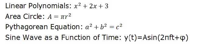
Mathematical Expressions in Matplotlib
Matplotlib allows users to include mathematical expressions in text elements(text object) to enhance the visual representation of mathematical elements in plots and figures.
The following image shows the inclusion of mathematical expressions in matplotlib plot −
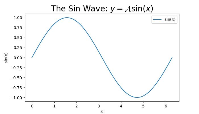
Mathtext in Matplotlib
Matplotlib uses a module called Mathtext to render the math expressions in plots. It is a lightweight TeX expression parser and layout engine to render the math expressions in Matplotlib.
Key Features of Mathtext
Mathtext supports various features such as −
Symbols
Special characters
Subscripts, Superscripts, and Standard Function Names
Fractions and binomials
Radicals
Different fonts and more
The Mathtext expressions should be enclosed in dollar signs ('$') and can include various symbols and commands. The text objects like titles, lables, annotations, and figure text are the common places in Matplotlib where mathematical expressions are included.
Basic Mathematical Text
Basic mathematical text can include binary operation symbols like +, -, *,... to represent various mathematical operations between two elements.
Example - Usage of Binary Operations
This example demonstrates the inclusion of binary operation symbols like +, to denote addition, subtraction respectively.
import matplotlib.pyplot as plt

# Create a plot
fig = plt.figure(figsize=(7, 4))

# Displaying basic mathematical text
plt.text(.5, .5, r"$x^2 - 4x + 7$", fontsize=16, ha='center')

# Show the plot
plt.show()
Output
On executing the above code we will get the following output −
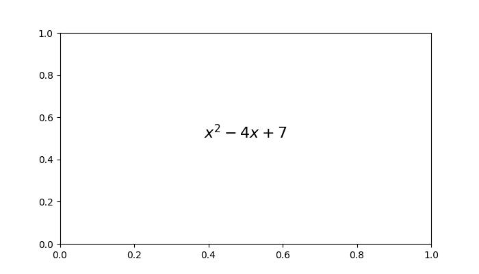
Radical, Greek Letters, and Delimiters
Radicals, Greek letters, and delimiters are key components in mathematical expressions.
A radical, denoted by the square root symbol(), represents the root of a number or expression.
Greek letters, such as (alpha), (beta), (gamma), and more are the symbols used to represente the standard mathematical notation.
Delimiters, including parentheses, brackets, and braces, are used to group the expressions, while mainting the the proper order of operations in mathematical statements.
Example - Usage of Radicals, Greek Letters
Here is an example of including the mathmetical expression with radicals, greek latters and delimiters.
import matplotlib.pyplot as plt

# Create a figure
fig = plt.figure(figsize=(7, 4))

# Add Greek Letters within the plots
plt.text(0.25, 0.2, r'Greek Letters: $\alpha, \beta, \gamma$', fontsize=16)

# Radicals
plt.text(0.3, 0.5, r'Radical: $\sqrt{2}$', fontsize=16)

# delimiters
plt.text(0.2, 0.8, r'delimiters: $(a + b) \left\{c - d\right\}$', fontsize=16)

# Show the plot
plt.show()
Output
On executing the above code we will get the following output −
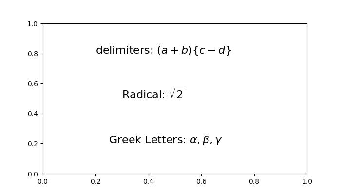
Fractions, Binomials, and Stacked Numbers
Fractions are ratio of two numbers, written as one number over another, conveying the division of one quantity by another.
Binomials involve expressions with two terms, often connected by addition or subtraction. In the context of binomial coefficients, binomials can represent combinations or choices within a set.
Stacked numbers refer to the vertical alignment of numerical values, commonly seen in mathematical notations such as exponents or nested expressions.
Example - Usage of Fractions, Binomials
Here is an example of including the mathmetical expreassion with Fractions, Binomials, and Stacked Numbers.
import matplotlib.pyplot as plt

# Create a plot
fig = plt.figure(figsize=(7, 4))

# Fractions, binomials, and stacked numbers
plt.text(0.4, 0.7, r'$\frac{3}{4} \binom{3}{4} \genfrac{}{}{0}{}{3}{4}$', fontsize=16)
plt.text(0.4, 0.3, r'$\left(\frac{5 - \frac{1}{x}}{4}\right)$', fontsize=16)

plt.show()
Output
The above example produces the following output −
Subscripts, Superscripts and Standard Function Names
In mathematical notation, subscripts and superscripts are used to denote indices or exponents, respectively. Whereas, Standard function names are commonly used mathematical functions such as sine, cosine, logarithm, and summation, often denoted by specific symbols or abbreviations.
Example - Using Subscripts, SuperScripts
Here is the example of including the mathmetical expression with Subscripts, Superscripts and Standard Function Names.
import matplotlib.pyplot as plt

# Create a figure
fig = plt.figure(figsize=(7, 4))

# Add mathmetical expression with Subscripts, Superscripts and Standard Function Names
plt.text(0.3, 0.6, r'$\sum_{i=0}^\infty x_i \quad \sin(\theta) \quad \log(e^x)$', fontsize=16)

# Subscripts and superscripts
plt.text(0.5, 0.3, r'$\log^a_i (x)$', fontsize=16)

# Show the plot
plt.show()
Output
Here is the output of the above example −
Example - Using Subscript in Axis Labels
Here is another example that writes text in subscript in the axis labels and the legend.
import numpy as np
import matplotlib.pyplot as plt

# Adjust figure size and autolayout
plt.rcParams["figure.figsize"] = [7.00, 3.50]
plt.rcParams["figure.autolayout"] = True

# Generate data
x = np.linspace(1, 10, 1000)
y = np.exp(x)

# Plot data
plt.plot(x, y, label=r'$e^x$', color="red", linewidth=2)

# Set axis labels
plt.xlabel("$X_{\mathrm{axis}}$")
plt.ylabel("$Y_{\mathrm{axis}}$")

# Set legend
plt.legend(loc='upper left')

# Display plot
plt.show()
Output
On executing the above code you will get the following output −
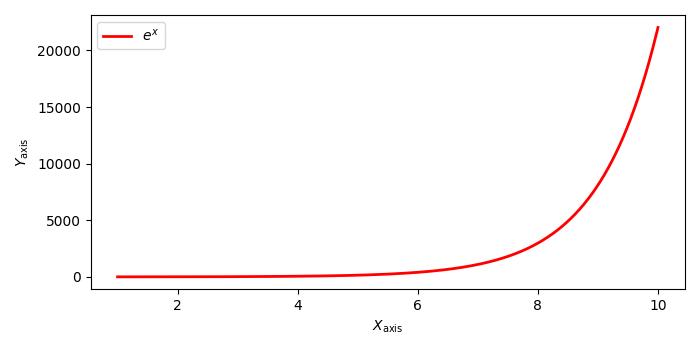
Matplotlib - Animations
Animation is a visual technique that involves the creation of moving images through a sequence of individual frames. Each frame represents a specific moment in time, and when played consecutively at a high speed, they create the illusion of movement. For instance, a common example of an animated object is a GIF. Here is an example −

The popular file formats of animations are GIFs, APNG (Animated Portable Network Graphics), mkv, mp4, and more.
Animations in Matplotlib
Matplotlib provides a dedicated module for creating animations. In this context, an animation is a series of frames, and each frame is associated with a plot on a Figure.
To integrate the animation capabilities into our working environment we can import the dedicated module by using the following command −
import matplotlib.animation as animation
Creating Animations
Creating animations in Matplotlib can be done through two different approaches. The matplotlib.animation module provides two primary classes for this purpose −
- FuncAnimation
- ArtistAnimation
The FuncAnimation class
The approach of Using the FuncAnimation class is an efficient way to create animations by modifying the data of a plot for each frame. It allows us to create an animation by passing a user-defined function that iteratively modifies the data of a plot. This class involves generating data for the initial frame and subsequently modifying this data for each subsequent frame.
Example - Usage of FuncAnimation Class
This example demonstrates the use of FuncAnimation class to animate a sine wave plot, illustrating the motion of the object. And it is also updates the X-axis values using Matplotlib animation.
import matplotlib.pyplot as plt
import numpy as np
import matplotlib.animation as animation

# Creating a figure and axis
fig, ax = plt.subplots(figsize=(7, 4))

# Generating x values
x = np.arange(0, 2*np.pi, 0.01)

# Plotting the initial sine curve
line, = ax.plot(x, np.sin(x))
ax.legend([r'$\sin(x)$'])

# Function to update the plot for each frame of the animation
def update(frame):
   line.set_ydata(np.sin(x + frame / 50))
   ax.set_xlim(left=0, right=frame)
   return line

# Creating a FuncAnimation object
ani = animation.FuncAnimation(fig=fig, func=update, frames=40, interval=30)

# Displaying the output
plt.show()
Output
The above example produces the following output −

Example - Animated 3D Surface Plot
Here is another example that creates an animated 3D surface plot using FuncAnimation class.
import numpy as np
import matplotlib.pyplot as plt
import matplotlib.animation as animation

# Generate data
N = 50
fps = 250
frn = 75
x = np.linspace(-2, 2, N + 1)
x, y = np.meshgrid(x, x)
zarray = np.zeros((N + 1, N + 1, frn))
f = lambda x, y, sig: 1 / np.sqrt(sig) * np.exp(-(x ** 2 + y ** 2) / sig ** 2)

# Create data array
for i in range(frn):
   zarray[:, :, i] = f(x, y, 1.5 + np.sin(i * 2 * np.pi / frn))

# Update plot function
def change_plot(frame_number, zarray, plot):
   plot[0].remove()
   plot[0] = ax.plot_surface(x, y, zarray[:, :, frame_number], cmap="afmhot_r")

# Create figure and subplot
fig = plt.figure(figsize=(7, 4))
ax = fig.add_subplot(111, projection='3d')

# Initial plot
plot = [ax.plot_surface(x, y, zarray[:, :, 0], color='0.75', rstride=1, cstride=1)]

# Set axis limits
ax.set_zlim(0, 1.1)

# Animation
ani = animation.FuncAnimation(fig, change_plot, frn, fargs=(zarray, plot), interval=1000 / fps)

# Turn off axis and grid
ax.axis('off')
ax.grid(False)

# Show plot
plt.show()
Output
The above example produces the following output −

ArtistAnimation
ArtistAnimation is a flexible approach suitable for scenarios where different artists need to be animated in a sequence. This approach involves generating a list (iterable) of artists to draw them into each frame of the animation.
Example - Usage of ArtistAnimation Class
This example demonstrates the using of ArtistAnimation class to create the animation.
import matplotlib.pyplot as plt
import numpy as np
import matplotlib.animation as animation

# Create a figure and axis
fig, ax = plt.subplots(figsize=(7,4))

# Define the function
def f(x, y):
   return np.sin(x) + np.cos(y)

# Generate x and y values for the function
x = np.linspace(0, 2 * np.pi, 180)
y = np.linspace(0, 2 * np.pi, 100).reshape(-1, 1)

# ims is a list of lists, each row is a list of artists to draw in the current frame
ims = []

# Generate frames for the animation
for i in range(60):
   x += np.pi / 10
   y += np.pi / 30
   im = ax.imshow(f(x, y), animated=True)
   if i == 0:
      ax.imshow(f(x, y))  # show an initial one first
   ims.append([im])

# Create an ArtistAnimation with the specified interval, blit, and repeat_delay
ani = animation.ArtistAnimation(fig, ims, interval=50, blit=True, repeat_delay=1000)
# Display the animation
plt.show()
Output
The above code generates the following results −

Saving animations
Saving animation objects to disk is possible using different multimedia writers, such as Pillow, ffmpeg, and imagemagick. However, it's important to note that not all video formats are supported by every writer. There are four primary types of writers:
- PillowWriter
- HTMLWriter
- Pipe-based writers
- File-based writers
PillowWriter
It uses the Pillow library to save animations in various formats, such as GIF, APNG, and WebP.
Example - Usage of PillowWriter Class
An example demonstrates animating a scatterplot and saving that as a GIF using the PillowWriter.
import matplotlib.pyplot as plt
import matplotlib.animation as animation
import numpy as np

# Generate data
steps = 50
nodes = 100
positions = []
solutions = []

for i in range(steps):
   positions.append(np.random.rand(2, nodes))
   solutions.append(np.random.random(nodes))

# Create a figure and axes
fig, ax = plt.subplots(figsize=(7, 4))
marker_size = 50

# Function to update the plot for each frame of the animation
def animate(i):
   fig.clear()
   ax = fig.add_subplot(111, aspect='equal', autoscale_on=False, xlim=(0, 1), ylim=(0, 1))
   ax.set_xlim(0, 1)
   ax.set_ylim(0, 1)
   s = ax.scatter(positions[i][0], positions[i][1], s=marker_size, c=solutions[i], cmap="RdBu_r", marker="o", edgecolor='black')

plt.grid(None)

# Creating a FuncAnimation object
ani = animation.FuncAnimation(fig, animate, interval=100, frames=range(steps))

# Save the animation as a GIF using the PillowWriter
ani.save('animation.gif', writer='pillow')
If you visit the folder where the output is saved you can observe below gif file −
Output

HTMLWriter
HTMLWriter is used for creating JavaScript-based animations, supporting HTML and PNG formats. This writer is useful for embedding animations in web pages.
Pipe-based writers
These writers use external utilities like FFMpegWriter and ImageMagickWriter to create animations. They support various video formats and frames are piped to the utility, which stitches them together to create the animation.
File-based writers
File-based writers (FFMpegFileWriter and ImageMagickFileWriter) are slightly slower but offer the advantage of saving each frame before creating the final animation.
Example - Enabling ffmpeg
The following example shows how to properly enable ffmpeg for matplotlib.animation. Here the plot is created with an animated image matrix and the animated colorbar.
import numpy as np
import matplotlib.pyplot as plt
import matplotlib.animation as animation
from mpl_toolkits.axes_grid1 import make_axes_locatable

plt.rcParams["figure.figsize"] = [7.50, 3.50]
plt.rcParams["figure.autolayout"] = True
plt.rcParams['animation.ffmpeg_path'] = 'ffmpeg'

fig = plt.figure()
ax = fig.add_subplot(111)
div = make_axes_locatable(ax)
cax = div.append_axes('right', '5%', '5%')
data = np.random.rand(5, 5)
im = ax.imshow(data)
cb = fig.colorbar(im, cax=cax)
tx = ax.set_title('Frame 0')

cmap = ["copper", 'RdBu_r', 'Oranges', 'cividis', 'hot', 'plasma']

def animate(i):
   cax.cla()
   data = np.random.rand(5, 5)
   im = ax.imshow(data, cmap=cmap[i%len(cmap)])
   fig.colorbar(im, cax=cax)
   tx.set_text('Frame {0}'.format(i))

ani = animation.FuncAnimation(fig, animate, frames=10)
FFwriter = animation.FFMpegWriter()
ani.save('plot.mp4', writer=FFwriter)
Output
On executing the above code you will get the following output −

Matplotlib - Celluloid Library
The celluloid library is a third-party library that works with Matplotlib to create animations. It simplifies the process of creating moving visuals by managing the figure and axis changes for each animation frame. It provides a user-friendly interface, allowing you to focus on the content of each frame rather than dealing with complex animation details.
Matplotlib Celluloid Library
Matplotlib is a useful Python library for creating various visualizations, such as charts and graphs. If you want to add animation to your plots, you can use the celluloid library. It simplifies the process of generating dynamic and interesting animations using Matplotlib. In this tutorial, we will go through the basics of using Matplotlib with the celluloid library to make animated plots.
Before starting, make sure you have installed the required libraries −
pip install matplotlib
pip install celluloid
Creating Matplotlib Animations
Once you have installed the required libraries, let us go through the steps involved in creating Matplotlib animations using celluloid −
Step 1 − Import Libraries
Let us start by importing the necessary libraries i.e. Matplotlib for plotting, NumPy for numerical operations, and the Camera class from the celluloid library.
import matplotlib.pyplot as plt
import numpy as np
from celluloid import Camera
Step 2 − Setting Up Matplotlib Figure and Axis
Next, set up a standard Matplotlib figure and axis, just like you would for a static plot. These will be used to visualize the data in each frame.
fig, ax = plt.subplots()
Step 3 − Initializing the Camera Object
Now, we initialize the "Camera" object from the "celluloid" library. This object will capture each frame for the animation, allowing you to flawlessly create the final animated plot.
camera = Camera(fig)
Step 4 − Update Frames in a Loop
Inside a loop, update the plot for each frame by modifying the data or layout. In this example, the sine wave is shifted horizontally for each frame. The "camera.snap()" method captures the current frame.
num_frames = 50

for i in range(num_frames):
    # Update your plot for each frame
    x = np.linspace(0, 2 * np.pi, 100)
    y = np.sin(x + i * 0.1)
    ax.plot(x, y)

    # Capture the current frame
    camera.snap()
Step 5 − Show Animation
After capturing all frames, use the "animate()" method of the "Camera" object to create the animation and display it.
animation = camera.animate()
plt.show()
Complete Example
Following is the complete example of a simple animated plot. Here, we use the celluloid library in Matplotlib to generate an animated plot of a sine wave. The animation iterates through a specified number of frames (num_frames), updating the sine wave by shifting it horizontally in each frame −
import matplotlib.pyplot as plt
import numpy as np
from celluloid import Camera

# Setting up Matplotlib figure and axis
fig, ax = plt.subplots()
camera = Camera(fig)

# Creating animated plot
num_frames = 50
for i in range(num_frames):
    x = np.linspace(0, 2 * np.pi, 100)
    y = np.sin(x + i * 0.1)

    # Updating plot for each frame
    ax.plot(x, y)

    # Capturing the frame
    camera.snap()

# Displaying the animation
animation = camera.animate()
plt.show()
The resulting animation shows the sine wave oscillating horizontally, creating a visual representation of a dynamic signal. The celluloid library captures each frame, allowing the animation to be displayed
Animated Scatter Plot
An animated scatter plot is a dynamic visualization that shows points moving or changing over time. Each point on the plot represents data, and as time progresses, the positions of these points changes, creating a visually engaging animation.
Example - Animated Scatter Plot
In here, we are generating an animated scatter plot using the celluloid library in Matplotlib. The animation iterates through a specified number of frames (num_frames) and updates the scatter plot by generating random x and y coordinates for each frame −
import matplotlib.pyplot as plt
import numpy as np
from celluloid import Camera

# Setting up Matplotlib figure and axis
fig, ax = plt.subplots()
camera = Camera(fig)

# Creating animated scatter plot
num_frames = 50
for i in range(num_frames):
    x = np.random.rand(20)
    y = np.random.rand(20)

    # Updating scatter plot for each frame
    ax.scatter(x, y)

    # Capturing the frame
    camera.snap()

# Displaying the animated scatter plot
animation = camera.animate()
plt.show()
The resulting animation shows a dynamic set of points moving randomly within the plot. The celluloid library captures each frame, allowing the animated scatter plot to be displayed.
Animated Bar Chart
In an animated bar chart, bars representing different categories fluctuates in height as the animation progresses, creating a visual of how values in each category change over time.
Example - Animated Bar Chart
In this example, we are creating an animated bar chart with random bar heights in each frame −
import matplotlib.pyplot as plt
import numpy as np
from celluloid import Camera

# Setting up Matplotlib figure and axis
fig, ax = plt.subplots()
camera = Camera(fig)

# Creating animated bar chart
num_frames = 50
x = np.arange(10)
for i in range(num_frames):
    y = np.random.randint(1, 10, size=10)

    # Updating bar chart for each frame
    ax.bar(x, y)

    # Capturing the frame
    camera.snap()

# Displaying the animated bar chart
animation = camera.animate()
plt.show()
Matplotlib - Blitting
Blitting, short for "bit block transfer", is a technique used in computer graphics to quickly move blocks of pixels from one place to another on a screen. The basic idea is to copy a rectangular section of an image (often called a "bitmap" or "sprite") and paste it onto another part of the screen.
Imagine you have two images, and you want to combine them or move one of them to a different location on the screen. Instead of manually changing each pixel one by one, blitting allows you to copy a block of pixels from one image and paste it onto another image.
Blitting in Matplotlib
Blitting in matplotlib is a technique used to update and redraw only the specific portion of a plot that have changed during an animation, rather than redrawing the entire figure. By selectively updating only the changed elements, blitting improves performance and provides a smoother experience when working with dynamic visualizations in matplotlib.
Implementing Blitting in Matplotlib
Following are the basic steps used to implement blitting in Matplotlib −
Step 1 − Create a Background
Start by creating the initial background of your plot.
fig, ax = plt.subplots()
background = fig.canvas.copy_from_bbox(ax.bbox)
Step 2 − Update Plot Elements
Within each animation frame, update the specific plot elements that undergo changes.
for i in range(num_frames):
    # Update plot elements (e.g., scatter points, lines, etc.)
    # ...
Step 3 − Restore Background
After updating, restore the background to clear the previously drawn elements.
fig.canvas.restore_region(background)
Step 4 − Update Frames in a Loop
Inside a loop, update the plot for each frame by modifying the data or layout. In this example, the sine wave is shifted horizontally for each frame. The "camera.snap()" method captures the current frame.
num_frames = 50

for i in range(num_frames):
    # Update your plot for each frame
    x = np.linspace(0, 2 * np.pi, 100)
    y = np.sin(x + i * 0.1)
    ax.plot(x, y)

    # Capture the current frame
    camera.snap()
Step 5 − Redraw Modified Elements
Redraw only the elements that have been modified during the current frame.
ax.draw_artist(modified_element)
Step 6 − Blit to the Screen
Finally, use "fig.canvas.blit(ax.bbox)" to efficiently transfer the updated regions to the screen.
fig.canvas.blit(ax.bbox)
Complete Example
Following is the complete example of blitting in Matplotlib. In here, a plot is initialized with a sine wave. Instead of redrawing the entire plot in each frame, the background is saved once. For each iteration, the saved background is restored, and only the sine wave is updated and redrawn, reducing computational load −
import matplotlib.pyplot as plt
import numpy as np

# Initializing the background
fig, ax = plt.subplots()
background = fig.canvas.copy_from_bbox(ax.bbox)

# Updating plot elements
num_frames = 100
x = np.linspace(0, 2 * np.pi, 100)
line, = ax.plot(x, np.sin(x))

for i in range(num_frames):
    # Restoring background
    fig.canvas.restore_region(background)

    # Updating plot elements (Redrawing modified elements)
    line.set_ydata(np.sin(x + i * 0.1))
    ax.draw_artist(line)

    # Blitting to the screen
    fig.canvas.blit(ax.bbox)

# Displaying the final plot
plt.show()
The resulting animated plot displays the sine wave evolving over a specified number of frames.
Animated Scatter Plot with Blitting
An animated scatter plot with blitting is like visualizing a group of points moving around a plot over time. Each point represents data, and as time progresses, the positions of these points change, creating a dynamic and visually engaging animation. Blitting is used to update only the parts of the plot that have changed, making the animation smoother and more efficient.
Example - Animated Scatter Plot
In here, we are creating an animated scatter plot using Matplotlib. The initial state of the scatter plot is saved as the background. The animation loop iterates through a specified number of frames. For each frame, the background is restored, and the scatter plot is updated by generating new random x and y coordinates. The modified scatter plot is then redrawn, and the process is optimized using blitting, resulting in a visually dynamic animated scatter plot −
import matplotlib.pyplot as plt
import numpy as np

# Initializing the background
fig, ax = plt.subplots()
background = fig.canvas.copy_from_bbox(ax.bbox)

# Creating initial scatter plot
x_initial = np.random.rand(20)
y_initial = np.random.rand(20)
scatter_initial = ax.scatter(x_initial, y_initial)

# Displaying the initial plot
plt.draw()
# Pause for a short time to display the initial plot
plt.pause(1)

# Creating animated scatter plot
num_frames = 50
x_final = np.random.rand(20)
y_final = np.random.rand(20)
scatter_final = ax.scatter(x_final, y_final)

# Main animation loop
for i in range(num_frames):
    # Restoring background
    fig.canvas.restore_region(background)

    # Updating scatter plot (redrawing modified elements)
    x_final = np.random.rand(20)
    y_final = np.random.rand(20)
    scatter_final.set_offsets(np.column_stack((x_final, y_final)))
    ax.draw_artist(scatter_final)

    # Blitting to the screen
    fig.canvas.blit(ax.bbox)

# Displaying the final plot
plt.show()
Animated Bar Chart with Blitting
An animated bar chart with blitting is like visualizing a set of bars dynamically change in height over time. Each bar represents a different category, and as the animation progresses, the heights of these bars fluctuate, creating a dynamic visualization. Blitting is used to update only the parts of the chart that have undergone changes.
Example - Animated Bar Chart
In this example, we are creating an animated bar chart. The initial state of the bar chart is saved as the background. The animation loop iterates through a specified number of frames. For each frame, the background is restored, and the bar chart is updated by generating new random heights for each bar. The modified bar chart is then redrawn, and the process is optimized using blitting, resulting in an efficient and visually dynamic animated bar chart −
import matplotlib.pyplot as plt
import numpy as np

# Initializing the background
fig, ax = plt.subplots()
background = fig.canvas.copy_from_bbox(ax.bbox)

# Creating initial bar chart
x = np.arange(10)
heights_initial = np.random.randint(1, 10, size=10)
bars_initial = ax.bar(x, heights_initial)

# Displaying the initial plot
plt.draw()
# Pause for a short time to display the initial plot
plt.pause(1)

# Creating animated bar chart
num_frames = 50
bars_final = ax.bar(x, np.random.randint(1, 10, size=10))

# Main animation loop
for i in range(num_frames):
    # Restoring background
    fig.canvas.restore_region(background)

    # Updating bar chart (redrawing modified elements)
    heights_final = np.random.randint(1, 10, size=10)
    for bar, height in zip(bars_final, heights_final):
        bar.set_height(height)
        ax.draw_artist(bar)

    # Blitting to the screen
    fig.canvas.blit(ax.bbox)

# Displaying the final plot
plt.show()
Matplotlib - Toolkits
A toolkit consists of a set of tools for a specific purpose. It contains different resources or software that work together to help you achieve a task. It is like having a handy package with everything you need to get a job done efficiently. Toolkits are often used in various fields, like technology, education, or research.
Toolkits in Matplotlib
Matplotlib toolkits are additional sets of tools and functions that you can use to extend the capabilities of Matplotlib. These toolkits are like add-ons that give you extra features for creating specific types of plots or addressing certain requirements.
For example, if you want to create 3D plots, you can use the "mplot3d" toolkit that comes with Matplotlib. It provides functions and classes specifically designed for 3D plotting.
Let us explore various toolkits in this tutorial −
The mpl_toolkits.mplot3d (3D Plotting)
The mpl_toolkits.mplot3d toolkit is used to create three-dimensional plots, including 3D scatter plots, surface plots, and wireframe plots. To use this toolkit, import a module called "Axes3D" −
from mpl_toolkits.mplot3d import Axes3D
Example - Creating a 3D Scatter Plot
In the following example, we are creating a 3D scatter plot using the "mpl_toolkits.mplot3d" toolkit. We use the scatter() function to plot points in a 3D space, where the "x", "y", and "z" lists represent the coordinates of the data points −
import matplotlib.pyplot as plt
from mpl_toolkits.mplot3d import Axes3D

# Creating a 3D scatter plot
fig = plt.figure()
ax = fig.add_subplot(111, projection='3d')
x, y, z = [1, 2, 3, 4, 5], [5, 6, 7, 8, 9], [2, 3, 4, 5, 6]
ax.scatter(x, y, z)

# Customizing the plot
ax.set_xlabel('X Label')
ax.set_ylabel('Y Label')
ax.set_zlabel('Z Label')
ax.set_title('3D Scatter Plot')

plt.show()
Output
Following is the output of the above code −
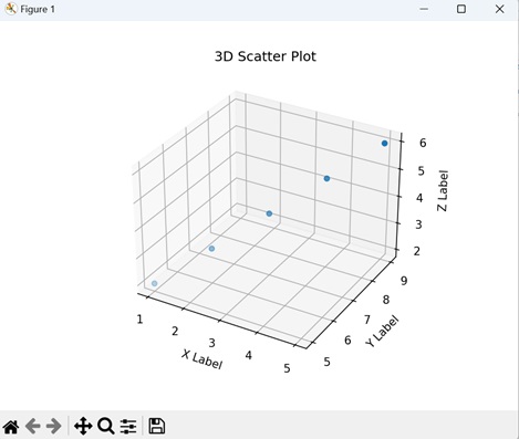
The mpl_toolkits.axes_grid: Axes Grid
The mpl_toolkits.axes_grid toolkit is a set of tools that helps you create complex layouts of subplots and arrange custom axes in Matplotlib. To use this toolkit, import a specific module called "ImageGrid" −
from mpl_toolkits.axes_grid1 import ImageGrid
Example - Creating a Grid of Subplots
Here, we are creating a grid of subplots (2 rows and 2 columns) using the "mpl_toolkits.axes_grid1" toolkit. The for loop iterates over each subplot in the grid, and a simple line plot is added to each subplot using the plot() function −
import matplotlib.pyplot as plt
from mpl_toolkits.axes_grid1 import ImageGrid

# Creating a grid of subplots
fig = plt.figure(figsize=(6, 4))
grid = ImageGrid(fig, 111, nrows_ncols=(2, 2), axes_pad=0.1,)

# Plotting on each subplot
for ax in grid:
    ax.plot([1, 2, 3, 4], [5, 6, 7, 8])

plt.show()
Output
The resulting visualization displays a 2x2 grid of subplots, each containing a line plot as shown below −
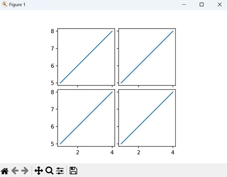
The mpl_toolkits.axisartist (Custom Axes)
The mpl_toolkits.axisartist toolkit offers additional features for creating customized axes and tick arrangements. To use this toolkit, import the module "Subplot" −from mpl_toolkits.axisartist import Subplot
Example - Custom Subplot
Now, we are creating a custom subplot with enhanced axes using the "mpl_toolkits.axisartist" toolkit. We then use the plot() function to add a simple line plot to the custom subplot −
import matplotlib.pyplot as plt
from mpl_toolkits.axisartist import Subplot

# Creating a custom subplot with enhanced axes
fig = plt.figure()
ax = Subplot(fig, 111)
fig.add_subplot(ax)

# Plotting on the custom subplot
ax.plot(range(10))

# Displaying the plot
plt.show()
Output
Output of the above code is as follows −
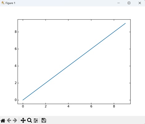
The mpl_toolkits.axes_grid1.inset_locator
The mpl_toolkits.axes_grid1.inset_locator enables the placement of inset axes within a larger plot, allowing for detailed views. To use this toolkit, import the module "inset_axes" −
from mpl_toolkits.axes_grid1.inset_locator import inset_axes
Example - Creating inset plot
In the following example, we are creating a main plot and an inset plot using the "mpl_toolkits.axes_grid1.inset_locator" toolkit. We use the inset_axes() function to define the inset axes, specifying its width, height, and location. Thereafter, we populate both the main plot and the inset plot with simple line plots using the plot() function −
import matplotlib.pyplot as plt
from mpl_toolkits.axes_grid1.inset_locator import inset_axes

# Creating a main plot
fig, ax = plt.subplots()

# Defining the inset axes
axins = inset_axes(ax, width='30%', height='30%', loc='upper right')

# Plotting on both axes
ax.plot(range(10))
axins.plot(range(5))

# Displaying the plot
plt.show()
Output
We get the output as shown below −
Matplotlib - Artists
Understanding Artists in Matplotlib
In Matplotlib, almost everything you see on a plot is an instance of an Artist, which are objects that represent various components of a plot. Whether it's a line representing data, a text label, or even the tick marks on an axis, everything in a Matplotlib plot is an Artist object.
Before exploring the Artist hierarchy, lets observe the below image to understand the basic components of a figure in matplotlib −

In the figure, each element, such as lines and points that represent data, along with minor ticks and points associated text labels, can be identified as individual Artist objects.
Artist Hierarchy
In matplotlib's hierarchy, Artists can be broadly categorized into two types −
- Primitive Artists − These are the basic building blocks of a plot. Examples include Line2D, Rectangle, Text, AxesImage, and more. These are the standard graphical objects that we want to paint onto our canvas.
- Composite Artists − These are higher-level structures that contain other Artists. Examples include Figure, Axis, and Axes. A Figure is like a canvas that holds everything, while Axes represents a specific plot within the figure.
Creating and Accessing the Artists
Artists are typically created through plotting methods on an Axes object. These methods not only facilitate the creation of visual elements but also return specific artist instances corresponding to the plotted elements.
Below are some common plotting methods and the corresponding artists they generate −
- annotate − Generates an Annotation artist for text annotations.
- bar − Creates a Rectangle artist for bar charts.
- errorbar − Produces Line2D and Rectangle artists for error bar plots.
- fill − Generates a Polygon artist for shared areas.
- hist − Creates Rectangle artists for histograms.
- imshow − Generates an AxesImage artist for image data.
- legend − Produces a Legend artist for Axes legends.
- plot − Creates Line2D artists for XY plots. Returns a list when multiple datasets are plotted.
- scatter − Generates a PolyCollection artist for scatter charts.
- text − Produces a Text artist for displaying text on the plot.
Example - Artist Plot
Let's see an example for creating and accessing the artists using the plot() method.
import matplotlib.pyplot as plt
import matplotlib.artist as martist
import numpy as np

# Create a subplot
fig, ax = plt.subplots()

# Generate random data
x, y = np.random.rand(2, 100)

# Use the plot method to create a Line2D artist
lines = ax.plot(x, y, '-', label='example')

# Accessing the Line2D artists created by the plot method
print('Line2D artists created by the plot method:', lines)

# Retrieve all Line2D artists associated with the Axes
lines_on_axes = ax.get_lines()

# Display the retrieved Line2D artists
print('Line2D artists obtained using get_lines():', lines_on_axes)

# Accessing the first (and in this case, the only) Line2D artist
print('Accessing the first Line2D artist', ax.get_lines()[0])
Output
On executing the above code we will get the following output −
Line2D artists created by the plot method: [<matplotlib.lines.Line2D object at 0x000002327F74F770>]
Line2D artists obtained using get_lines(): <a list of 1 Line2D objects>
Accessing the first Line2D artist Line2D(example)
Modifying the Artists Properties
Artists have various properties that define their appearance and behavior. These properties include color, linestyle, linewidth, and markers. Modifying these properties enables us to control the visual aspects of the plot.
Example - Modifying Properties
The following example demonstrates how to create a simple plot and then modify the properties of the associated Line2D artist.
import matplotlib.pyplot as plt
import numpy as np

# Creating a simple plot
fig, ax = plt.subplots(figsize=(7, 4))
x = np.linspace(0, 2 * np.pi, 100)
y = np.sin(x)

# Use the plot method to create a Line2D artist
lines = ax.plot(x, y)

# Displaying initial properties of the Line2D artist
print('Initial properties of the Line2D artist:')
print('Color:', ax.get_lines()[0].get_color())
print('Line Style:', ax.get_lines()[0].get_linestyle())
print('Marker Size:', ax.get_lines()[0].get_markersize())

# Modifying properties
lines[0].set(color='green', linewidth=2)
lines[0].set_linestyle(':')
lines[0].set_marker('s')
lines[0].set_markersize(10)

# Accessing the modified properties of the Line2D artist
print('\nModified properties of the Line2D artist:')
print('Color:', ax.get_lines()[0].get_color())
print('Line Style:', ax.get_lines()[0].get_linestyle())
print('Marker Size:', ax.get_lines()[0].get_markersize())
Output
On executing the above code we will get the following output −
Initial properties of the Line2D artist:
Color: #1f77b4
Line Style: -
Marker Size: 6.0

Modified properties of the Line2D artist:
Color: green
Line Style: :
Marker Size: 10.0
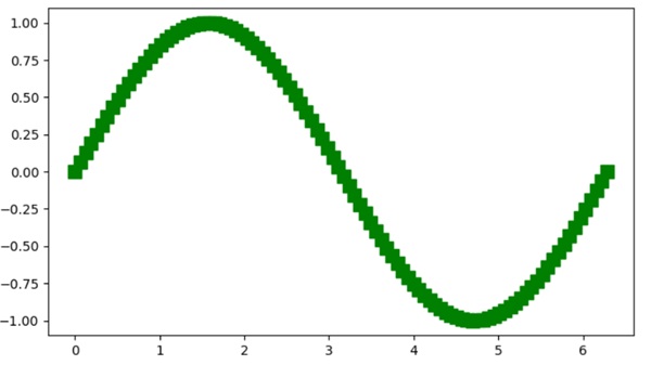
Manipulating Artist Data
Beyond styling properties, artists may also contain data. For example, the Line2D object has a data property that can be modified using the set_data() method.
Example - Manipulating Artist Data
Here is an example that manipulate artist data.
import matplotlib.pyplot as plt
import numpy as np

# Creating a simple plot
fig, ax = plt.subplots(figsize=(7, 4))
x = np.linspace(0, 2 * np.pi, 100)

# Initial sinusoidal curve
y = np.sin(x)

# Use the plot method to create a Line2D artist a sinusoidal curve
lines = ax.plot(x, y)

# Modifying the artist data with the cosine
lines[0].set_data([x, np.cos(x)])

# Displaying the plot
plt.show()
Output
On executing the above code we will get the following output −

Manual Addition of Artists
While many artists have helper methods, there are scenarios where manual addition is necessary. For instance, adding patches like circles or rectangles directly to an Axes object can be possible by using the add_artist() method.
Example - Adding Circular Patches
In this example, we manually add circle patches to the axes.
import matplotlib.pyplot as plt
import numpy as np
import matplotlib.patches as mpatches

# Creating a simple plot
fig, ax = plt.subplots(figsize=(7, 4))
x = np.linspace(0, 2 * np.pi, 100)

# Initial sinusoidal curve
y = np.sin(x)

# Use the plot method to create a Line2D artist for a sinusoidal curve
lines = ax.plot(x, y)

# Adding a circle
circle = mpatches.Circle((3, 0), 0.25, ec="none")
ax.add_artist(circle)

# Adding another clipped circle
clipped_circle = mpatches.Circle((3, 1), 0.125, ec="none", facecolor='C1')
ax.add_artist(clipped_circle)
ax.set_aspect(1)

# Adding a title to the plot
plt.title('Manual Addition of Artists')

# Displaying the plot
plt.show()
Output
On executing the above code we will get the following output −

Removing Artists
Matplotlib provides a flexible way to remove specific artists from a plot. The remove() method of an artist allows for removing an Artist from its Axes list.
Example - Removing Artists
Here is an example that demonstrates how to remove specific artists (Line2D and text) from the plot.
import numpy as np
import matplotlib.pyplot as plt

# Create the figure
fig, ax = plt.subplots(figsize=(7, 4))
x = np.linspace(-10, 10, 100)
y = np.sin(x)

# plot the scatter plot
scat = ax.scatter(x, y)

# Assign the another Line2D artist to line_2
line_2 = plt.plot(x, np.cos(x), linestyle='dashed')

plt.margins(0.2)
plt.title("After removing the text and line artist")

text = fig.text(0.5, 0.96, "$y=sin(x)$")

# Remove the line_2 artist
l = line_2.pop(0)
l.remove()

# Remove the text artist
text.remove()

# Displaying the plot
plt.show()
Output
On executing the above code you will get the following output −

Matplotlib - Styling with Cycler
Cycler is a separate package that is extracted from Matplotlib, and it is designed to control the style properties like color, marker, and linestyle of the plots. This tool allows you to easily cycle through different styles for plotting multiple lines on a single axis.
Importing the Cycler − To start using Cycler, you need to import it into your Python script.
from cycler import cycler
This enables you to create and manipulate Cyclers for styling your plots.
Creating a Cycler − The cycler function is used to create a new Cycler object. It can be called with a single positional argument, a pair of positional arguments, or a combination of keyword arguments.
# Creating a color Cycler
color_cycle = cycler(color=['r', 'g', 'b'])
The "color_cycle" is a Cycler object that cycles through the colors red, green, and blue. Once you have a Cycler, you can link it to the matplotlibs plot attribute.
Cycling Through Multiple Properties
The Cycler package provides advanced operations for combining and manipulating multiple Cyclers to create complex style variations. It means that you can add cyclers together or multiply them to combine different properties.
Following are the different operations in cycler −
- Cycler Addition − Multiple Cycler objects can be combined using the + operator. For example −
cycler(color=['r', 'g', 'b']) + cycler(linestyle=['-', '--', ':'])
- Cycler Multiplication − Cyclers can be multiplied to create a wider range of unique styles. For example:
cycler(color=['r', 'g', 'b']) * cycler(linestyle=['-', '--', ':'])
- Integer Multiplication − Cycler objects can be multiplied by integer values to increase their length. Both cycler * 2 and 2 * cycler yield the same result, repeating the elements. Here is the syntax:
color_cycle * 2
- Cycler Concatenation − Cycler objects can be concatenated using the Cycler.concat() method or the top-level concat() function.
In this tutorial, we will explore two distinct approaches for customizing the style of plots in Matplotlib using the Cycler package.
- Setting Default Property Cycle (rc parameter) − This is the global setting that ensures that every subsequent plot will be set to the specified style.
- Setting Property Cycle for a Single Pair of Axes − This is the local setting that applies a custom property cycle exclusively to a particular set of axes.
Setting Default Property Cycle (rc parameter)
In matplotlib, specifying a default style for all future plots will be possible by using matplotlib.pyplot.rc() method, this will set the default cycler for lines in your plots and axes. This means every plot you make in the future will follow this color and linestyle cycle unless you override it.
Example - Cycling through Multiple Line Styles
This is a basic example that demonstrates how to cycle through different line styles for multiple plots. Here the plt.rc() method is used to set the default linestyle for the plot.
import matplotlib.pyplot as plt
from cycler import cycler

# Set the property cycle for the linestyle of lines in the axes
linestyle_cycler = cycler('linestyle', ['-', ':', '-.'])
plt.rc('axes', prop_cycle=linestyle_cycler)

# Create multiple plots using a loop
for i in range(5):
   x = range(i, i + 5)
   plt.plot(range(5), x)

# Display the plot
plt.legend(['first', 'second', 'third', 'fourth', 'fifth'], loc='upper left', fancybox=True, shadow=True)
plt.show()
Output
On executing the above code we will get the following output −

Lets combine multiple (color and a linestyle) cyclers together by adding (+) symbol to them.
Example - Combining Color and Linestyles
This example demonstrates how to define a default style (cycle through both colors and linestyles) for your plots using Cycler, making it easy to visualize all plots with different colors ('r', 'g', 'b', 'y') and linestyles ('-', '--', ':', '-.').
from cycler import cycler
import matplotlib.pyplot as plt
import numpy as np

# Generate sample data
x = np.linspace(0, 2 * np.pi, 50)
offsets = np.linspace(0, 2 * np.pi, 4, endpoint=False)
yy = np.transpose([np.sin(x + phi) for phi in offsets])

# Set default prop_cycle
default_cycler = (cycler(color=['r', 'g', 'b', 'y']) +
   cycler(linestyle=['-', '--', ':', '-.']))
plt.rc('lines', linewidth=4)
plt.rc('axes', prop_cycle=default_cycler)

# Plot with the default color cycle
plt.plot(yy)
plt.title('Set Default Color Cycle')
plt.show()
Output
On executing the above code we will get the following output −

Example - Setting Property Cycle for a Single Pair of Axes
Customize the style for a specific pair of axes within a figure without affecting others. you use the matplotlib.axes.Axes.set_prop_cycle() to apply this custom cycler. This means that only the plots on this particular set of axes will follow the specified color and linewidth cycle.
In this example, the first set of plots on ax0 follows the default color and linestyle cycle. The second set of plots on ax1 uses a custom color and linewidth cycle defined specifically for this axis using the set_prop_cycle() method.
from cycler import cycler
import matplotlib.pyplot as plt
import numpy as np

# Generate sample data
x = np.linspace(0, 2 * np.pi, 50)
offsets = np.linspace(0, 2 * np.pi, 4, endpoint=False)
yy = np.transpose([np.sin(x + phi) for phi in offsets])

# Define a default cycler for colors and linestyles
default_cycler = (cycler(color=['r', 'g', 'b', 'y']) +
   cycler(linestyle=['-', '--', ':', '-.']))

# Set the default linewidth for lines in all plots
plt.rc('lines', linewidth=4)

# Set the default property cycle for axes to the default cycler
plt.rc('axes', prop_cycle=default_cycler)

# Create a figure and two axes
fig, (ax0, ax1) = plt.subplots(nrows=2, figsize=(7, 8))

# Plot on the first axis using the default color cycle
ax0.plot(yy)
ax0.set_title('Default Color Cycle: rgby')

# Define a custom cycler
custom_cycler = (cycler(color=['c', 'm', 'y', 'k']) +
   cycler(lw=[1, 2, 3, 4]))

# Set the custom property cycle for the second axis
ax1.set_prop_cycle(custom_cycler)

# Plot on the second axis using the custom color and linewidth cycle
ax1.plot(yy)
ax1.set_title('Custom Color Cycle: cmyk')

# Add space between the two plots
fig.subplots_adjust(hspace=0.3)

# Show the plots
plt.show()
Output
On executing the above code we will get the following output −

Matplotlib - Paths
A path is a route (track) that guides movement from one place to another. It can be physical, like a trail or road, or abstract, like a series of steps to achieve a goal. Paths provide direction and help us to navigate through spaces. They signify a way to reach a destination.

Paths in Matplotlib
In Matplotlib, paths are fundamental objects used to draw shapes and lines on plots. A path consists of a series of connected points, known as vertices or nodes, along with instructions on how to connect these points to form shapes like lines, curves, or polygons.
You can create a path in Matplotlib using the "Path" class. These paths can be used to create various types of plots such as lines, curves, polygons, and even custom shapes. Paths provide a way to define the appearance of objects in plots, allowing you to control their size, position, and style.
Lets start by drawing a basic straight line path.
Straight Line Path
In Matplotlib, a straight line path refers to a basic geometric element consisting of two points connected by a straight line. This path is created by specifying the coordinates of the starting point (often called the "origin") and the ending point of the line. Matplotlib then draws a straight line between these two points, forming the path.
Example - Creating a Straight Line Path
In the following example, we are creating a straight line path using the Path class in Matplotlib. We define two vertices representing the starting and ending points of the line. Additionally, we specify the path codes to indicate that the path moves to the first vertex and then creates a line to the second vertex. By constructing the path using these vertices and codes, we achieve the representation of a straight line −
import matplotlib.pyplot as plt
from matplotlib.path import Path
import matplotlib.patches as patches

# Defining the vertices for the straight line path
verts = [
   # Starting point
   (0, 0),
   # Ending point
   (1, 1)
]

# Defining the codes for the straight line path
codes = [Path.MOVETO, Path.LINETO]

# Creating the straight line path
path = Path(verts, codes)

# Plotting the path
fig, ax = plt.subplots()
patch = patches.PathPatch(path, facecolor='none', lw=2)
ax.add_patch(patch)
ax.set_title('Straight Line Path')
ax.set_xlim(0, 1)
ax.set_ylim(0, 1)
ax.set_xlabel('X-axis')
ax.set_ylabel('Y-axis')
ax.grid(True)
plt.show()
Output
Following is the output of the above code −

Circle Path
In Matplotlib, a circle path represents a circular shape drawn on a plot. It is created by specifying the center point of the circle and its radius. Matplotlib then generates a series of points around the circumference of the circle, connecting them to form a closed path.
Example - Creating a Circular Path
In here, we are creating a circular path using the Path class in Matplotlib. We generate a sequence of vertices along the circumference of a circle by defining angles uniformly spaced around the unit circle. Using trigonometric functions, we compute the coordinates of these vertices. Subsequently, we define the path codes to connect these vertices with lines −
import matplotlib.pyplot as plt
from matplotlib.path import Path
import matplotlib.patches as patches
import numpy as np

# Defining the angles for the circle path
theta = np.linspace(0, 2*np.pi, 100)

# Defining the vertices for the circle path
verts = np.column_stack([np.cos(theta), np.sin(theta)])

# Definng the codes for the circle path
codes = [Path.MOVETO] + [Path.LINETO] * (len(verts) - 1)

# Creating the circle path
path = Path(verts, codes)

# Plotting the path
fig, ax = plt.subplots()
patch = patches.PathPatch(path, facecolor='none', lw=2)
ax.add_patch(patch)
ax.set_title('Circle Path')
ax.set_xlim(-1.1, 1.1)
ax.set_ylim(-1.1, 1.1)
ax.set_xlabel('X-axis')
ax.set_ylabel('Y-axis')
ax.grid(True)
plt.show()
Output
On executing the above code we will get the following output −

Bezier Curve Path
In Matplotlib, a Bezier curve path is a smooth, curved line created using control points to define its shape.
To construct a Bezier curve, you specify a series of control points that guide the curve's path. These control points determine the curve's direction and shape, allowing you to create smooth, flowing shapes. Matplotlib then generates the curve by connecting the dots these control points.
Example - Creating a Bezier Curve Path
Now, we are creating a Bezier curve path in Matplotlib using the Path class. We specify the control points that define the shape of the Bezier curve. Additionally, we define the path codes to indicate the type of curve segments between consecutive control points. By constructing the path with these control points and codes, we create a smooth Bezier curve −
import matplotlib.pyplot as plt
from matplotlib.path import Path
import matplotlib.patches as patches

# Defining the control points for the Bezier curve
verts = [
   (0.1, 0.1),
   (0.2, 0.8),
   (0.8, 0.8),
   (0.9, 0.1),
]

# Defining the codes for the Bezier curve path
codes = [Path.MOVETO, Path.CURVE4, Path.CURVE4, Path.CURVE4]

# Creating the Bezier curve path
path = Path(verts, codes)

# Plotting the path
fig, ax = plt.subplots()
patch = patches.PathPatch(path, facecolor='none', lw=2)
ax.add_patch(patch)
ax.set_title('Bezier Curve Path')
ax.set_xlim(0, 1)
ax.set_ylim(0, 1)
ax.set_xlabel('X-axis')
ax.set_ylabel('Y-axis')
ax.grid(True)
plt.show()
Output
After executing the above code, we get the following output −

Polygon Path
In Matplotlib, a polygon path represents a closed shape with multiple straight sides, similar to a geometric polygon. This shape is created by specifying the coordinates of its vertices, or corner points, in a specific order. Matplotlib then connects these points sequentially to form the edges of the polygon and closes the path by connecting the last point to the first.
Polygon paths are versatile elements used to represent various shapes, such as triangles, rectangles, pentagons, or any other multi-sided figures. They can be filled with color to represent areas or used as outlines to highlight specific regions in plots.
Example - Creating a Polygon Path
In this example, we create a polygonal path using the Path class in Matplotlib. We define the vertices of the polygon, representing the corners of the polygonal shape. Additionally, we specify the path codes to connect these vertices and close the polygon. By constructing the path with the vertices and codes, we form a closed polygonal shape −
import matplotlib.pyplot as plt
from matplotlib.path import Path
import matplotlib.patches as patches

# Defining the vertices for the polygon
verts = [
   (0.1, 0.1),
   (0.5, 0.9),
   (0.9, 0.1),
   # Closing the polygon
   (0.1, 0.1)
]

# Defining the codes for the polygon path
codes = [Path.MOVETO, Path.LINETO, Path.LINETO, Path.CLOSEPOLY]

# Creating the polygon path
path = Path(verts, codes)

# Plotting the path
fig, ax = plt.subplots()
patch = patches.PathPatch(path, facecolor='none', lw=2)
ax.add_patch(patch)
ax.set_title('Polygon Path')
ax.set_xlim(0, 1)
ax.set_ylim(0, 1)
ax.set_xlabel('X-axis')
ax.set_ylabel('Y-axis')
ax.grid(True)
plt.show()
Output
On executing the above code we will get the following output −

Matplotlib - Path Effects
A path effects refer to the ways in which a path (route) can be manipulated in computer graphics. A "path" is a line or shape that you create using a drawing tool, and "path effects" allow you to apply various modifications to that line or shape.
Imagine you draw a simple line, and with path effects, you can make that line look wavy, dotted, or apply other visual changes without having to redraw it manually. It is like adding special effects to the path you have created, making your drawings more interesting and dynamic.

Path Effects in Matplotlib
You can use the "path_effects" module in matplotlib to enhance the visual representation of your plots by creating path effects. To get started, consider the "withStroke()" function within the "path_effects" module. This function allows you to add a stroke, or outline, to lines and markers.
Path effects in Matplotlib allow you to enhance the appearance of lines and shapes in your plots by applying special visual effects to them.
Simple Line with Shadow Path Effect
In Matplotlib, creating a simple line with a shadow involves drawing a basic line on a plot and then enhancing it with a shadow effect to make it visually interesting. This effect gives the appearance of a shadow under the line, as if it were creating a subtle shade on the plotting surface.
Example - Applying Shadow Path Effect
In the following example, we are drawing a wavy line, and then adding shadow effect to the line using the path_effects module. The shadow effect consists of a "gray" stroke, creating the appearance of a shadow behind the line.
import matplotlib.pyplot as plt
import matplotlib.patheffects as path_effects
import numpy as np

# Generating data
x = np.linspace(0, 10, 100)
y = np.sin(x)

# Creating a simple line plot
fig, ax = plt.subplots()
line, = ax.plot(x, y, label='Simple Line')

# Adding a shadow effect to the line
shadow_effect = path_effects.withStroke(linewidth=5, foreground='gray')
line.set_path_effects([shadow_effect])

ax.set_title('Simple Line with Shadow Effect')
plt.legend()
plt.show()
Output
Following is the output of the above code −

Dashed Line with Outline Path Effect
Creating a dashed line with an outline path effect in Matplotlib involves drawing a dotted line on a plot and then enhancing it by adding a bold outline. To create an outline, you can draw another line on top of the dashed line with a thicker linewidth and a solid linestyle.
Example - Using Outline Path Effect
In here, we are creating a dashed line and enhancing it with a "black" stroke outline to give the line a bold border and make it stand out.
import matplotlib.pyplot as plt
import matplotlib.patheffects as path_effects
import numpy as np

# Generating data
x = np.linspace(0, 10, 100)
y = np.cos(x)

# Creating a dashed line plot with outline
fig, ax = plt.subplots()
line, = ax.plot(x, y, linestyle='dashed', label='Dashed Line')

# Adding an outline effect to the line
outline_effect = path_effects.withStroke(linewidth=3, foreground='black')
line.set_path_effects([outline_effect])

ax.set_title('Dashed Line with Outline Effect')
plt.legend()
plt.show()
Output
On executing the above code we will get the following output −

Bold Outlined Scatter Plot Path Effect
Creating a bold outlined scatter plot with path effects in Matplotlib involves plotting a set of points on a graph and enhancing each point by adding a strong outline.
Example - Using Bold Outline Effect
In the example below, we generate a scatter with random data points. To enhance the visibility of these points, we apply a bold outline effect to each one by adding a "black" stroke with an increased "linewidth" around each scatter point.
import matplotlib.pyplot as plt
import matplotlib.patheffects as path_effects
import numpy as np

# Generating data
x = np.random.rand(50)
y = np.random.rand(50)

# Creating a scatter plot with bold outline effect
fig, ax = plt.subplots()
scatter = ax.scatter(x, y, label='Scatter Plot')

# Adding a bold outline effect to the scatter points
outline_effect = path_effects.withStroke(linewidth=3, foreground='black')
scatter.set_path_effects([outline_effect])

ax.set_title('Scatter Plot with Bold Outline')
plt.legend()
plt.show()
Output
After executing the above code, we get the following output −

Combined Path Effects
Creating a combined path effects plot in Matplotlib allows us to apply multiple artistic enhancements to a line such as linestyle, markers, color gradients, and transparency.
- Linestyle − You can choose various linestyle options like solid lines ('-'), dashed lines ('--'), dotted lines (':'), and more.
- Markers − Markers can be added to highlight specific data points. Common markers include circles ('o'), squares ('s'), triangles ('^'), etc.
- Color Gradients − You can use color gradients to create visually appealing lines. You can achieve this by specifying a "colormap" and using it to color the line based on a variable.
- b>Transparency − Adding transparency to the line can make overlapping lines more distinguishable. You can adjust transparency using the "alpha" parameter.
Example - Combining Effects
Now, we are applying three path effects to the line: a subtle shadow effect, a bold black outline, and a slight blur effect. The result displays a line plot with a combination of these effects.
import matplotlib.pyplot as plt
import matplotlib.patheffects as path_effects
import numpy as np

# Generating data
x = np.linspace(0, 10, 100)
y = np.sin(x)

# Creating a line plot
fig, ax = plt.subplots()
line, = ax.plot(x, y, label='Combined Effects Line')

# Combine multiple path effects: Shadow, Bold Outline, and Blur
shadow_effect = path_effects.withStroke(linewidth=5, foreground='cyan')
outline_effect = path_effects.withStroke(linewidth=3, foreground='red')
blur_effect = path_effects.withStroke(linewidth=5, foreground='magenta', alpha=0.4)

# Applying the combined effects to the line
line.set_path_effects([shadow_effect, outline_effect, blur_effect])

ax.set_title('Combined Path Effects Line')
plt.legend()
plt.show()
Output
On executing the above code we will get the following output −

Matplotlib - Transforms
Transform in general is a way to change something from one form to another. It is like taking an input and turning it into a different output. Transforms are used in various fields, such as mathematics, physics, and computer science.
For example, in mathematics, a transform can be a mathematical operation that changes a set of numbers or functions into a different representation. The Fourier transform, for instance, converts a function in the time domain (like a sound wave) into its frequency components.

Transforms in Matplotlib
In Matplotlib, transforms refer to the conversion process from data coordinates to pixel coordinates, allowing to place the graphical elements such as points, lines, and text within a plot accurately.
You can use various types of transformations in matplotlib, such as linear transformations, logarithmic transformations, and more. To handle these transformations, Matplotlib provides the "transform" parameter.
The "transform" parameter can take various values, such as instances of the "matplotlib.transforms.Transform" class or strings representing common transformations like 'ax.transData' for data coordinates or 'ax.transAxes' for axes coordinates. By using the transform parameter, you can customize the coordinate system and apply different transformations to enhance the visualization of their data on the Matplotlib plots.
Data to Axes Transform
In Matplotlib, the data to axes transform refers to the process of converting your actual data points into coordinates within the axes of your plot. When you plot data, you use specific "x" and "y" values. The transformation ensures that these data points are correctly positioned within the axes of your plot, taking into account the scaling and limits of the "x" and "y" axes.
Example - Data To Axes Transformation
In the following example, we are creating a simple line plot using data coordinates (x, y). We then use the ax.text() function to add text to the plot, specifying the position (2, 25) in data coordinates. The "transform=ax.transData" parameter ensures that the text is positioned using data coordinates −
import matplotlib.pyplot as plt
# Data
x = [1, 2, 3, 4]
y = [10, 20, 25, 30]

# Creating a plot
fig, ax = plt.subplots()
ax.plot(x, y, marker='o', linestyle='-', label='Data points')
ax.legend()

# Transforming data coordinates to axes coordinates
ax.text(2, 25,'Text in Data Coordinates' , transform=ax.transData)

# Setting plot title and labels
ax.set_title('Data to Axes Transform')
ax.set_xlabel('X-axis')
ax.set_ylabel('Y-axis')

plt.show()
Output
Following is the output of the above code −

Axes to Data Transform
The axes to data transform in Matplotlib is the reverse of the "data to axes transform". While the "data to axes transform" converts your actual data points into coordinates within the axes of your plot, the "axes to data transform" does the opposite. It takes coordinates specified in terms of the axes of your plot and converts them into the corresponding data values.
Example - Axes to Data Transformation
In here, we are creating a plot with axis limits set between "0" and "1" for both "x" and "y" axes. We use the ax.text() function to add text to the plot, specifying the position "(0.5, 0.5)" in axes coordinates. The "transform=ax.transAxes" parameter ensures that the text position is interpreted as relative to the axes rather than the data −
import matplotlib.pyplot as plt
# Creating a plot with normalized axes
fig, ax = plt.subplots()
ax.set_xlim(0, 1)
ax.set_ylim(0, 1)
# Transforming axes coordinates to data coordinates
ax.text(0.5, 0.5, 'Text in Axes Coordinates', transform=ax.transAxes, ha='center', va='center')
# Setting plot title and labels
ax.set_title('Axes to Data Transform Example')
ax.set_xlabel('X-axis (normalized)')
ax.set_ylabel('Y-axis (normalized)')
plt.show()
Output
On executing the above code we will get the following output −

Blended Transform
In Matplotlib, a blended transform is a way to combine or blend different coordinate systems when placing elements on a plot. It allows you to create a custom transformation that contains aspects of both data coordinates and axes coordinates.
Example - Usage of Blended Transformation
In the example below, we are creating a plot and using the blended_transform_factory() function to create a blended transformation. The resulting "trans" object is a blend of both data and axes coordinates. The ax.text() function then uses this blended transformation to position text at (0.8, 0.2), effectively combining data and axes coordinates −
import matplotlib.pyplot as plt
from matplotlib.transforms import blended_transform_factory
# Creating a plot
fig, ax = plt.subplots()
# Creating a blended transformation
trans = blended_transform_factory(ax.transData, ax.transAxes)
# Adding text using the blended transformation
ax.text(0.8, 0.2, 'Blended Transform', transform=trans, ha='center', va='center')
# Setting plot title and labels
ax.set_title('Blended Transform')
ax.set_xlabel('X-axis')
ax.set_ylabel('Y-axis')
plt.show()
Output
After executing the above code, we get the following output −

Offset Transform
In Matplotlib, an offset transform is a way to add a precise offset to the position of elements on a plot. It involves shifting or translating the coordinates of the elements by a specified amount. This type of transformation is useful when you want to fine-tune the placement of text, markers, or other graphical elements.
For example, if you have a data point at (2, 10) and you want to display a label slightly to the right and above this point, you can use an Offset Transform to apply a specific offset to the original coordinates. This allows you to control the exact positioning of elements relative to their original locations in the data.
Example - Usage of Offset Transformation
Now, we are creating a plot, and using the "ScaledTranslation" class to create an offset transformation. The "trans" object is a combination of the original data transformation (ax.transData) and a scaled translation of (0.1, 0.2) in data coordinates. The ax.text() function then uses this transformed coordinate to position text at (2, 25) with the specified offset −
import matplotlib.pyplot as plt
from matplotlib.transforms import ScaledTranslation
# Creating a plot
fig, ax = plt.subplots()
# Creating an offset transformation
trans = ax.transData + ScaledTranslation(0.1, 0.2, ax.transData)
# Adding text with the offset transformation
ax.text(0.4, 0.2, 'Text with Offset', transform=trans)
# Setting plot title and labels
ax.set_title('Offset Transform Example')
ax.set_xlabel('X-axis')
ax.set_ylabel('Y-axis')
plt.show()
Output
On executing the above code we will get the following output −

Matplotlib - Tick and Tick Labels
In the context of graphs and plotting, ticks are the small lines that show the scale of x and y-axes, providing a clear representation of the value associated with each tick. Whereas tick labels are the textual or numeric annotations associated with each tick on an axis, providing a clear representation of the value associated with each tick.
The following image represents the ticks and tick labels on a graph −

There are two types of ticks in a visualization: major and minor. Major tick marks are positions where labels can be placed, providing significant reference points. On the other hand, minor tick marks indicate values between the major ticks. See the below image for reference −

Ticks and Tick labels in Matplotlib
Matplotlib provides several tools for controlling ticks and tick labels on the axes, allowing you to customize ticks and tick labels by specifying custom positions and labels.
While the default behavior of Matplotlib is, automatically determines the number of ticks and their positions based on the range and scale of the data being plotted, this flexibility is useful for providing additional information or formatting the labels according to the preferences.
Basic Plot with Default Ticks and Labels
By default Matplotlib determines suitable tick positions and labels based on the provided data.
Example - Usage of Default Ticks and Labels
This example generates a simple sine wave plot with default ticks and labels.
import matplotlib.pyplot as plt
import numpy as np
# Sample data
t = np.linspace(0.0, 2.0, 201)
s = np.sin(2 * np.pi * t)
# Create plot
fig, ax = plt.subplots(figsize=(7,4))
# Plot the data
plt.plot(t, s)
plt.title('Sine Wave')
plt.xlabel('X-axis')
plt.ylabel('Y-axis')
# Show the plot
plt.show()
Output
On executing the above program you will get the following example −

Customizing Ticks and Tick Labels
Customizing ticks and tick labels can be achieved by using functions such as axes.set_xticks() and axes.set_yticks(), as well as plt.xticks() and plt.yticks().
Basic customization of ticks and tick labels may involve labeling ticks with customized strings, rotating custom tick labels, and few more.
Example - Customized Ticks and Labels
The following example demonstrates how to customize the x-axis ticks with specific positions, labels, and rotation. It converts or scales the axis values and redefine the tick frequency.
import matplotlib.pyplot as plt
import numpy as np
# Create plot
fig, ax = plt.subplots(figsize=(7,4))
# Sample data
x = np.linspace(0, 2 * np.pi, 100)
y = np.sin(x)
# Plotting the data
plt.plot(x, y)
plt.title('Sine Wave')
plt.xlabel('X-axis')
plt.ylabel('Y-axis')
# Custom ticks and tick labels
custom_ticks = [0, np.pi/2, np.pi, (3*np.pi)/2, 2*np.pi]
custom_tick_labels = ['0', '$\\pi/2$', '$\\pi$', '3$\\pi/2$', '2$\\pi$']
ax.set_xticks(custom_ticks, custom_tick_labels, rotation='vertical')
# Display the plot
plt.show()
Output
On executing the above program you will get the following example −
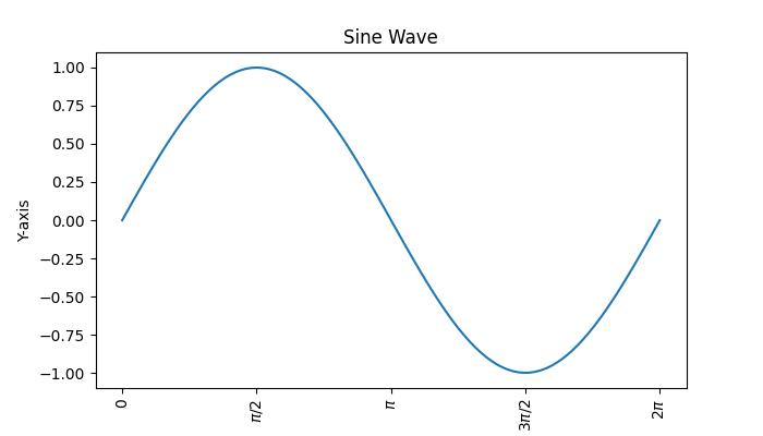
Example - Customizing Tick Label Positions
This example demonstrates how to customize tick label positions and visibility, adjust separation between tick labels and axis labels, and turn off ticks and marks on a Matplotlib plot axis.
import numpy as np
import matplotlib.pyplot as plt
# Create subplots
fig, ax = plt.subplots(1, 1)
# Plot some data
plt.plot([1, 2, 3, 4, 5])
# Set tick positions and labels
plt.xticks([1, 2, 3, 4, 5])
# show the tick labels on top of the plot?
ax.xaxis.set_tick_params(labeltop=True)
# set gap between the tick labels and axis labels
plt.xlabel("X-axis", labelpad=25)
# turn off the ticks and marks on botton x axis
ax.tick_params(axis='both', which='both', bottom=False, top=True, left=True, right=False, labelbottom=True, labelleft=True)
# Displaying the plot
plt.show()
Output
On executing the above code you will get the following output −

Adding Minor Ticks
Minor ticks are initially disabled but can be enabled without labels by configuring the minor locator. The ticker module within the Matplotlib library provides two classes, namely MultipleLocator and AutoMinorLocator. These classes facilitate the placement of ticks at multiples of a specified base and allow you to specify a fixed number of minor intervals per major interval, respectively. As an alternative, the minorticks_on() method can be used to enable them.
Example - Usage of Minor Ticks
The following example demonstrates how to add the minor ticks to a plot. Here we will use the minorticks_on() method.
import matplotlib.pyplot as plt
import numpy as np
# Sample data
x = np.linspace(0, 2 * np.pi, 100)
y = np.sin(x)
fig, ax = plt.subplots(figsize=(7,4))
# Plotting the data
plt.plot(x, y)
plt.title('Sine Wave')
plt.xlabel('X-axis')
plt.ylabel('Y-axis')
# Adding minor ticks
plt.minorticks_on()
# Display the plot
plt.show()
Output
On executing the above program you will get the following example −
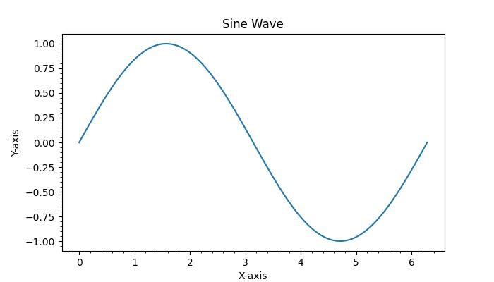
Matplotlib - Radian Ticks
A radian is a unit of angular measure used to express angles in mathematics and physics. Ticks, in the field of data visualization, refer to the small lines or marks indicating the scale of the axes.
Radian Ticks in Matplotlib
In the context of Matplotlib, radian ticks typically denote the ticks or markers on an axis that represent values in radians. When dealing with circular or angular data, it is common to use radian ticks on the axis to indicate specific angles. Setting radian ticks involves placing tick marks at specific intervals corresponding to certain radian values on the axis.
Here is a reference image illustrating Radian ticks on a plot −

In the image, you can observe that radian ticks represent the angles of the sine wave along the x-axis.
Radian Ticks for the x axis
Setting Radian Ticks for the x-axis involves using two key methods which are axes.set_xticks() and axes.set_xticklabels(). These methods are allowing you to specify the positions and labels of ticks on the x-axis, respectively.
In addition to these methods, the FormatStrFormatter and MultipleLocator classes from the matplotlib.ticker module can be used to enhance the customization of tick positions and labels.
Example - Using Custom Radian Ticks
The following example demonstrates how to create a plot with custom radian ticks.
import matplotlib.pyplot as plt
import numpy as np
# Create plot
fig, ax = plt.subplots(figsize=(7, 4))
# Sample data
theta = np.linspace(0, 2 * np.pi, 100)
y = np.sin(theta)
# Plotting the data
plt.plot(theta, y)
plt.title('Sine Wave')
plt.xlabel('Angle (radians)')
plt.ylabel('Y-axis')
# Custom radian ticks and tick labels
custom_ticks = [0, np.pi/2, np.pi, (3*np.pi)/2, 2*np.pi]
custom_tick_labels = ['$0$', '$\\pi/2$', '$\\pi$', '$3\\pi/2$', '$2\\pi$']
ax.set_xticks(custom_ticks)
ax.set_xticklabels(custom_tick_labels)
plt.grid(axis='x')
# Display the plot
plt.show()
Output
On executing the above code we will get the following output −

Example - Formatting Ticks
This example uses the FormatStrFormatter and MultipleLocator classes from the matplotlib.ticker module to control the format and positions of ticks.
import matplotlib.pyplot as plt
import matplotlib.ticker as tck
import numpy as np
# Create Plot
f,ax=plt.subplots(figsize=(7,4))
# Sample Data
x=np.linspace(0, 2 * np.pi, 100)
y=np.sin(x)
# Plot the sine wave
ax.plot(x/np.pi,y)
# Customizing X-axis Ticks
ax.xaxis.set_major_formatter(tck.FormatStrFormatter('%g $\\pi$'))
ax.xaxis.set_major_locator(tck.MultipleLocator(base=1.0))
# Set the titles
plt.title('Sine Wave')
plt.xlabel('Angle (radians)')
plt.ylabel('Y-axis')
plt.grid()
plt.show()
Output
On executing the above code we will get the following output −

Radian Ticks for the y axis
Similar to the x-axis, setting radian ticks for the y-axis can be done by using the ax.set_yticks() and ax.set_yticklabels() methods. These methods allow you to define the positions and labels of ticks on the y-axis. Additionally, the FormatStrFormatter and MultipleLocator classes from the matplotlib.ticker module can also used.
Example - Custom Radian Ticks for Y-Axis
This example demonstrates how to set customized radian ticks for the y-axis. using the FormatStrFormatter and MultipleLocator classes from the matplotlib.ticker module.
import matplotlib.pyplot as plt
import matplotlib.ticker as tck
import numpy as np
# Create Plot
f,ax=plt.subplots(figsize=(7,4))
# Sample Data
x=np.arange(-10.0,10.0,0.1)
y=np.arctan(x)
# Plot the data
ax.plot(x/np.pi,y)
# Customizing y-axis Ticks
ax.yaxis.set_major_formatter(tck.FormatStrFormatter('%g $\\pi$'))
ax.yaxis.set_major_locator(tck.MultipleLocator(base=0.5))
plt.grid()
plt.show()
Output
On executing the above code we will get the following output −

Custom Package for Radian Ticks
A custom package named "basic_units.py" can denote the tick marks using the radians. This package is not part of the standard or widely recognized packages and needs to be downloaded separately(available in the examples folder of Matplotlib).
Example - Using Custom Package
This example demonstrates how to create a plot with radians using the basic_units mockup example package.
import matplotlib.pyplot as plt
from basic_units import radians
import numpy as np
# Create Plot
f,ax=plt.subplots(figsize=(7,4))
x = np.arange(-10.0,10.0,0.1)
y = list(map(lambda y: y*radians,np.arctan(x)))
x = list(map(lambda x: x*radians,x))
ax.plot(x,y,'b.')
plt.xlabel('radians')
plt.ylabel('radians')
plt.show()
Output
On executing the above code we will get the following output −

Matplotlib - Dateticks
In general plotting, dateticks refer to the labels of the tick lines or markers on the axes of a plot with dates or times, replacing the default numeric values. This feature is especially useful when dealing with time series data.
The image below illustrates Dateticks on a plot −

Dateticks in Matplotlib
Matplotlib provides powerful tools for plotting time-series data, allowing users to represent dates or times instead of the default numeric values on the tick lines or markers (dateticks). The library simplifies the process of working with dates by converting date instances into days since the default epoch (1970-01-01T00:00:00). This conversion, along with tick locating and formatting, occurs in the background, making it transparent to the user.
The matplotlib.dates module plays a key role in handling various date-related functionalities. This includes converting data to datetime objects, formatting dateticks labels, and setting the frequency of ticks.
Basic Dateticks with DefaultFormatter
Matplotlib sets the default tick locator and formatter for the axis, using the AutoDateLocator and AutoDateFormatter classes respectively.
Example - Usage of Default Dateticks
This example demonstrates the plotting of time-series data, here Matplotlib handles the date formatting automatically.
import numpy as np
import matplotlib.pylab as plt
# Generate an array of dates
times = np.arange(np.datetime64('2023-01-02'),
np.datetime64('2024-02-03'), np.timedelta64(75, 'm'))
# Generate random data for y axis
y = np.random.randn(len(times))
# Create subplots
fig, ax = plt.subplots(figsize=(7,4), facecolor='.9')
ax.plot(times, y)
ax.set_xlabel('Dataticks',color='xkcd:crimson')
ax.set_ylabel('Random data',color='xkcd:black')
plt.show()
Output
On executing the above code we will get the following output −

Customizing Dateticks with DateFormatter
For manual customization of date formats, Matplotlib provides the DateFormatter module, which allows users to change the format of dateticks.
Example - Customizing Dateticks
This example demonstrates how to manually customize the format of Dateticks.
import numpy as np
import matplotlib.pylab as plt
import matplotlib.dates as mdates
# Generate an array of dates
times = np.arange(np.datetime64('2023-01-02'),
np.datetime64('2024-02-03'), np.timedelta64(75, 'm'))
# Generate random data for y axis
y = np.random.randn(len(times))
# Create subplots
fig, ax = plt.subplots(figsize=(7,5))
ax.plot(times, y)
ax.set_title('Customizing Dateticks using DateFormatter')
ax.xaxis.set_major_formatter(mdates.DateFormatter('%Y-%b'))
# Rotates and right-aligns the x labels so they don't overlap each other.
for label in ax.get_xticklabels(which='major'):
label.set(rotation=30, horizontalalignment='right')
plt.show()
Output
On executing the above code we will get the following output −

Advanced Formatting with ConciseDateFormatter
The ConciseDateFormatter class in Matplotlib simplifies and enhances the appearance of dateticks. This formatter is designed to optimize the choice of strings for tick labels and minimizes their length, which often removes the need to rotate the labels.
Example - Advanced Formatting
This example uses the ConciseDateFormatter and AutoDateLocator classes to set the best tick limits and date formats for the plotting.
import datetime
import matplotlib.pyplot as plt
import matplotlib.dates as mdates
import numpy as np
# Define a starting date
base_date = datetime.datetime(2023, 12, 31)
# Generate an array of dates with a time delta of 2 hours
num_hours = 732
dates = np.array([base_date + datetime.timedelta(hours=(2 * i)) for i in range(num_hours)])
date_length = len(dates)
# Generate random data for the y-axis
np.random.seed(1967801)
y_axis = np.cumsum(np.random.randn(date_length))
# Define different date ranges
date_ranges = [
(np.datetime64('2024-01'), np.datetime64('2024-03')),
(np.datetime64('2023-12-31'), np.datetime64('2024-01-31')),
(np.datetime64('2023-12-31 23:59'), np.datetime64('2024-01-01 13:20'))
]
# Create subplots for each date range
figure, axes = plt.subplots(3, 1, constrained_layout=True, figsize=(6, 6))
for nn, ax in enumerate(axes):
# AutoDateLocator and ConciseDateFormatter for date formatting
locator = mdates.AutoDateLocator(minticks=3, maxticks=7)
formatter = mdates.ConciseDateFormatter(locator)
ax.xaxis.set_major_locator(locator)
ax.xaxis.set_major_formatter(formatter)
# Plot the random data within the specified date range
ax.plot(dates, y_axis)
ax.set_xlim(date_ranges[nn])
axes[0].set_title('Concise Date Formatter')
# Show the plot
plt.show()
Output
On executing the above code we will get the following output −

Matplotlib - Tick Formatters
Understanding Ticks and Tick Labels
In general graphs and plotting, ticks are the small lines that show the scale of x and y-axes, providing a clear representation of the value associated with each tick. Tick labels are the textual or numeric annotations associated with each tick on an axis, providing a clear representation of the value associated with each tick.
The following image represents the ticks and tick labels on a graph −

In this context Tick formatters, controls the appearance of the tick labels, specifying how the tick notations are displayed. This customization can include formatting options like specifying decimal places, adding units, using scientific notation, or applying date and time formats.
Tick Formatters in Matplotlib
Matplotlib allows users to customize tick properties, including locations and labels, through the matplotlib.ticker module. This module contains classes for configuring both tick locating and formatting. It provides a range of generic tick locators and formatters, as well as domain-specific custom ones.
To set the tick format, Matplotlib allows ypu to use either −
- a format string,
- a function,
- or an instance of a Formatter subclass.
Applying Tick Formatters
Matplotlib provides a straightforward way to configure tick formatters using the set_major_formatter and set_minor_formatter functions. These functions enable you to set the major and minor tick label formats for a specific axis.
The syntax is as follows −
Syntax
ax.xaxis.set_major_formatter(xmajor_formatter) ax.xaxis.set_minor_formatter(xminor_formatter) ax.yaxis.set_major_formatter(ymajor_formatter) ax.yaxis.set_minor_formatter(yminor_formatter)
String Formatting
String Formatting is a technique, which implicitly creates the StrMethodFormatter method, allowing you to use new-style format strings (str.format).
Example - String Formatted Tick Labels
In this example, the x-axis tick labels will be formatted using a string.
import matplotlib.pyplot as plt
from matplotlib import ticker
# Create a sample plot
fig, ax = plt.subplots(figsize=(7,4))
ax.plot([1, 2, 3, 4], [10, 20, 15, 20])
# Set up the major formatter for the x-axis
ax.xaxis.set_major_formatter('{x} km')
ax.set_title('String Formatting')
plt.show()
Output
On executing the above code we will get the following output −

Function Based Formatting
This approach provides a flexible way to customize tick labels using a user-defined function. The function should accept two inputs: x (the tick value) and pos (the position of the tick on the axis). Then it returns a string representing the desired tick label corresponding to the given inputs.
Example - Using function to format Tick Labels
This example demonstrates using a function to format x-axis tick labels.
from matplotlib.ticker import FuncFormatter
from matplotlib import pyplot as plt
def format_tick_labels(x, pos):
return '{0:.2f}%'.format(x)
# sample data
values = range(20)
# Create a plot
f, ax = plt.subplots(figsize=(7,4))
ax.plot(values)
# Set up the major formatter for the x-axis using a function
ax.xaxis.set_major_formatter(FuncFormatter(format_tick_labels))
ax.set_title('Function Based Formatting')
plt.show()
Output
On executing the above code we will get the following output −

Formatter Object Formatting
Formatter object Formatting allows for advanced customization of tick labels using specific formatter subclass. Some common Formatter subclasses include −
- NullFormatter − This object ensures that no labels are displayed on the ticks.
- StrMethodFormatter − This object utilizes the string str.format method for formatting tick labels.
- FormatStrFormatter − This object employs %-style formatting for tick labels.
- FuncFormatter − It define labels through a custum function.
- FixedFormatter − It allows users to set label strings explicitly.
- ScalarFormatter − It is the default formatter for scalars.
- PercentFormatter − It format labels as percentages.
Example - Using Formatters
The following example demonstrates how different Formatter Objects can be applied to the x-axis to achieve different formatting effects on tick labels.
from matplotlib import ticker
from matplotlib import pyplot as plt
# Create a plot
fig, axs = plt.subplots(5, 1, figsize=(7, 5))
fig.suptitle('Formatter Object Formatting', fontsize=16)
# Set up the formatter
axs[0].xaxis.set_major_formatter(ticker.NullFormatter())
axs[0].set_title('NullFormatter()')
# Add other formatters
axs[1].xaxis.set_major_formatter(ticker.StrMethodFormatter("{x:.3f}"))
axs[1].set_title('StrMethodFormatter("{x:.3f}")')
axs[2].xaxis.set_major_formatter(ticker.FormatStrFormatter("#%d"))
axs[2].set_title('FormatStrFormatter("#%d")')
axs[3].xaxis.set_major_formatter(ticker.ScalarFormatter(useMathText=True))
axs[3].set_title('ScalarFormatter(useMathText=True)')
axs[4].xaxis.set_major_formatter(ticker.PercentFormatter(xmax=5))
axs[4].set_title('PercentFormatter(xmax=5)')
plt.tight_layout()
plt.show()
Output
On executing the above code we will get the following output −

Example - Formatting Tick Label on both Axis
This example demonstrates how to format tick labels on both the x-axis and y-axis using a string formatting method (StrMethodFormatter) to display the numbers with comma separators.
import matplotlib.pyplot as plt
from matplotlib.ticker import StrMethodFormatter
# Data
x = [10110, 20110, 40110, 6700]
y = [20110, 10110, 30110, 9700]
# Create plot
fig, ax = plt.subplots(figsize=(7, 4))
ax.plot(x, y)
# Format tick labels for both x-axis and y-axis to include comma separators
ax.yaxis.set_major_formatter(StrMethodFormatter('{x:,}'))
ax.xaxis.set_major_formatter(StrMethodFormatter('{x:,}'))
# Show plot
plt.show()
Output
On executing the above code you will get the following output −

Matplotlib - Tick Locators
In general graphs and plottings, ticks play a crucial role in representing the scale of x and y-axes through small lines, offering a clear indication of the associated values. Tick locators, on the other hand, define the positions of these ticks along the axis, offering a visual representation of the scale.
The below image represents the major and minor ticks on a graph −
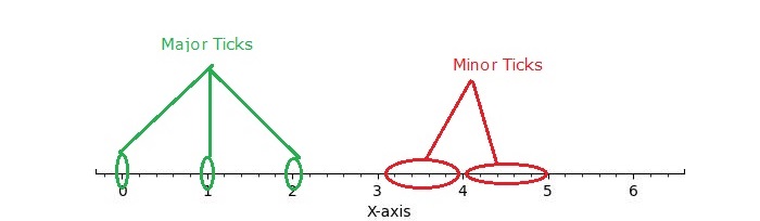
Tick Locators in Matplotlib
Matplotlib provides a mechanism for controlling the positioning of ticks on axes through its tick locators. The matplotlib.ticker module contains classes for configuring tick locating and formatting. These classes include generic tick locators, Formatters, and domain-specific custom ones. While locators are unaware of major or minor ticks, they are used by the Axis class to support major and minor tick locating and formatting.
Different Tick Locators
The matplotlib provides different tick locator within its ticker module, allowing users to customize the tick positions on axes. Some of the Tick Locators include −
- AutoLocator
- MaxNLocator
- LinearLocator
- LogLocator
- MultipleLocator
- FixedLocator
- IndexLocator
- NullLocator
- SymmetricalLogLocator
- AsinhLocator
- LogitLocator
- AutoMinorLocator
- Defining Custom Locators
Basic Setup
Before diving into specific tick locators, let's establish a common setup function to draw the plot with ticks.
import matplotlib.pyplot as plt
import numpy as np
import matplotlib.ticker as ticker
def draw_ticks(ax, title):
# it shows the bottom spine only
ax.yaxis.set_major_locator(ticker.NullLocator())
ax.spines[['left', 'right', 'top']].set_visible(False)
ax.xaxis.set_ticks_position('bottom')
ax.tick_params(which='major', width=1.00, length=5)
ax.tick_params(which='minor', width=0.75, length=2.5)
ax.set_xlim(0, 5)
ax.set_ylim(0, 1)
ax.text(0.0, 0.2, title, transform=ax.transAxes,
fontsize=14, fontname='Monospace', color='tab:blue')
Now, let's explore the working of each tick locator.
Auto Locator
The AutoLocator and AutoMinorLocator are used for automatically determining the positions of major and minor ticks on an axis, respectively.
Example - Using Auto Locators
This example demonstrates how to use the AutoLocator and AutoMinorLocator to automatically handle the positioning of major and minor ticks on an axis.
import matplotlib.pyplot as plt
import numpy as np
import matplotlib.ticker as ticker
def draw_ticks(ax, title):
# it shows the bottom spine only
ax.yaxis.set_major_locator(ticker.NullLocator())
ax.spines[['left', 'right', 'top']].set_visible(False)
ax.xaxis.set_ticks_position('bottom')
ax.tick_params(which='major', width=1.00, length=5)
ax.tick_params(which='minor', width=0.75, length=2.5)
ax.set_xlim(0, 5)
ax.set_ylim(0, 1)
ax.text(0.0, 0.2, title, transform=ax.transAxes,
fontsize=14, fontname='Monospace', color='tab:blue')
# Auto Locator
fig, ax = plt.subplots(1,1,figsize=(7,1.5), facecolor='#eaffff')
plt.subplots_adjust(bottom=0.3, top=0.6, wspace=0.2, hspace=0.4)
draw_ticks(ax, title="AutoLocator() and AutoMinorLocator()")
ax.xaxis.set_major_locator(ticker.AutoLocator())
ax.xaxis.set_minor_locator(ticker.AutoMinorLocator())
ax.set_title('Auto Locator and Auto Minor Locator')
plt.show()
Output
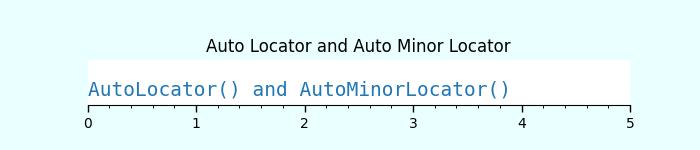
Null Locator
The NullLocator places no ticks on the axis.
Example - Using Null Locator
Lets see the following example for working of the NullLocator.
import matplotlib.pyplot as plt
import numpy as np
import matplotlib.ticker as ticker
def draw_ticks(ax, title):
# it shows the bottom spine only
ax.yaxis.set_major_locator(ticker.NullLocator())
ax.spines[['left', 'right', 'top']].set_visible(False)
ax.xaxis.set_ticks_position('bottom')
ax.tick_params(which='major', width=1.00, length=5)
ax.tick_params(which='minor', width=0.75, length=2.5)
ax.set_xlim(0, 5)
ax.set_ylim(0, 1)
ax.text(0.0, 0.2, title, transform=ax.transAxes,
fontsize=14, fontname='Monospace', color='tab:blue')
# Null Locator
fig, ax = plt.subplots(1,1,figsize=(7,1.5), facecolor='#eaffff')
plt.subplots_adjust(bottom=0.3, top=0.6, wspace=0.2, hspace=0.4)
draw_ticks(ax, title="NullLocator()")
ax.xaxis.set_major_locator(ticker.NullLocator())
ax.xaxis.set_minor_locator(ticker.NullLocator())
ax.set_title('Null Locator (No ticks)')
plt.show()
Output

Multiple Locator
The MultipleLocator() class allows ticks to be positioned at multiples of a specified base, supporting both integer and float values.
Example - Using Multiple Locators
The following example demonstrates how to use the MultipleLocator() class.
import matplotlib.pyplot as plt
import numpy as np
import matplotlib.ticker as ticker
def draw_ticks(ax, title):
# it shows the bottom spine only
ax.yaxis.set_major_locator(ticker.NullLocator())
ax.spines[['left', 'right', 'top']].set_visible(False)
ax.xaxis.set_ticks_position('bottom')
ax.tick_params(which='major', width=1.00, length=5)
ax.tick_params(which='minor', width=0.75, length=2.5)
ax.set_xlim(0, 5)
ax.set_ylim(0, 1)
ax.text(0.0, 0.2, title, transform=ax.transAxes,
fontsize=14, fontname='Monospace', color='tab:blue')
# Multiple Locator
fig, ax = plt.subplots(1,1,figsize=(7,1.5), facecolor='#eaffff')
plt.subplots_adjust(bottom=0.3, top=0.6, wspace=0.2, hspace=0.4)
draw_ticks(ax, title="MultipleLocator(0.5)")
ax.xaxis.set_major_locator(ticker.MultipleLocator(0.5))
ax.xaxis.set_minor_locator(ticker.MultipleLocator(0.1))
ax.set_title('Multiple Locator')
plt.show()
Output
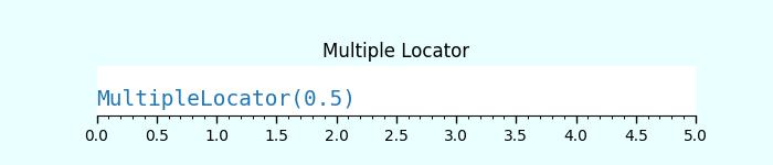
Fixed Locator
The FixedLocator() places ticks at specified fixed locations.
Example - Using Fixed Locator
Here is an example of using the FixedLocator() class.
import matplotlib.pyplot as plt
import numpy as np
import matplotlib.ticker as ticker
def draw_ticks(ax, title):
# it shows the bottom spine only
ax.yaxis.set_major_locator(ticker.NullLocator())
ax.spines[['left', 'right', 'top']].set_visible(False)
ax.xaxis.set_ticks_position('bottom')
ax.tick_params(which='major', width=1.00, length=5)
ax.tick_params(which='minor', width=0.75, length=2.5)
ax.set_xlim(0, 5)
ax.set_ylim(0, 1)
ax.text(0.0, 0.2, title, transform=ax.transAxes,
fontsize=14, fontname='Monospace', color='tab:blue')
# Fixed Locator
fig, ax = plt.subplots(1,1,figsize=(7,1.5), facecolor='#eaffff')
plt.subplots_adjust(bottom=0.3, top=0.6, wspace=0.2, hspace=0.4)
draw_ticks(ax, title="FixedLocator([0, 1, 3, 5])")
ax.xaxis.set_major_locator(ticker.FixedLocator([0, 1, 3, 5]))
ax.xaxis.set_minor_locator(ticker.FixedLocator(np.linspace(0.2, 0.8, 4)))
ax.set_title('Fixed Locator')
plt.show()
Output
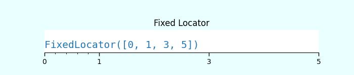
Linear Locator
The LinearLocator spaces ticks evenly between specified minimum and maximum values.
Example - Using Linear Locator
Here is an example that applies the Linear Locator to the major and minor ticks of an axes.
import matplotlib.pyplot as plt
import numpy as np
import matplotlib.ticker as ticker
def draw_ticks(ax, title):
# it shows the bottom spine only
ax.yaxis.set_major_locator(ticker.NullLocator())
ax.spines[['left', 'right', 'top']].set_visible(False)
ax.xaxis.set_ticks_position('bottom')
ax.tick_params(which='major', width=1.00, length=5)
ax.tick_params(which='minor', width=0.75, length=2.5)
ax.set_xlim(0, 5)
ax.set_ylim(0, 1)
ax.text(0.0, 0.2, title, transform=ax.transAxes,
fontsize=14, fontname='Monospace', color='tab:blue')
# Linear Locator
fig, ax = plt.subplots(1,1,figsize=(7,1.5), facecolor='#eaffff')
plt.subplots_adjust(bottom=0.3, top=0.6, wspace=0.2, hspace=0.4)
draw_ticks(ax, title="LinearLocator(numticks=3)")
ax.xaxis.set_major_locator(ticker.LinearLocator(3))
ax.xaxis.set_minor_locator(ticker.LinearLocator(10))
ax.set_title('Linear Locator')
plt.show()
Output
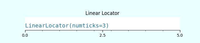
Index Locator
This locator is suitable for index plots, where x = range(len(y)).
Example - Using Index Locator
Here is an example that uses the index loctator (ticker.IndexLocator() class).
import matplotlib.pyplot as plt
import numpy as np
import matplotlib.ticker as ticker
def draw_ticks(ax, title):
# it shows the bottom spine only
ax.yaxis.set_major_locator(ticker.NullLocator())
ax.spines[['left', 'right', 'top']].set_visible(False)
ax.xaxis.set_ticks_position('bottom')
ax.tick_params(which='major', width=1.00, length=5)
ax.tick_params(which='minor', width=0.75, length=2.5)
ax.set_xlim(0, 5)
ax.set_ylim(0, 1)
ax.text(0.0, 0.2, title, transform=ax.transAxes,
fontsize=14, fontname='Monospace', color='tab:blue')
# Index Locator
fig, ax = plt.subplots(1,1,figsize=(7,1.5), facecolor='#eaffff')
plt.subplots_adjust(bottom=0.3, top=0.6, wspace=0.2, hspace=0.4)
draw_ticks(ax, title="IndexLocator(base=0.5, offset=0.25)")
ax.plot([0]*5, color='white')
ax.xaxis.set_major_locator(ticker.IndexLocator(base=0.5, offset=0.25))
ax.set_title('Index Locator')
plt.show()
Output
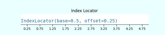
MaxN Locator
The MaxNLocator finds up to a maximum number of intervals with ticks at nice locations.Example - Using MaxN Locator
Here is an example of using the MaxNLocator() class for both major and minor ticks.
import matplotlib.pyplot as plt
import numpy as np
import matplotlib.ticker as ticker
def draw_ticks(ax, title):
# it shows the bottom spine only
ax.yaxis.set_major_locator(ticker.NullLocator())
ax.spines[['left', 'right', 'top']].set_visible(False)
ax.xaxis.set_ticks_position('bottom')
ax.tick_params(which='major', width=1.00, length=5)
ax.tick_params(which='minor', width=0.75, length=2.5)
ax.set_xlim(0, 5)
ax.set_ylim(0, 1)
ax.text(0.0, 0.2, title, transform=ax.transAxes,
fontsize=14, fontname='Monospace', color='tab:blue')
# MaxN Locator
fig, ax = plt.subplots(1,1,figsize=(7,1.5), facecolor='#eaffff')
plt.subplots_adjust(bottom=0.3, top=0.6, wspace=0.2, hspace=0.4)
draw_ticks(ax, title="MaxNLocator(n=4)")
ax.xaxis.set_major_locator(ticker.MaxNLocator(4))
ax.xaxis.set_minor_locator(ticker.MaxNLocator(40))
ax.set_title('MaxN Locator')
plt.show()
Output
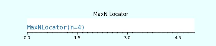
Log Locator
The LogLocator is used for spacing ticks logarithmically from min to max.
Example - Using Log Locator
Let's see an example of using the Log Locator. It shows the minor tick labels on a log-scale.
import matplotlib.pyplot as plt
import numpy as np
import matplotlib.ticker as ticker
def draw_ticks(ax, title):
# it shows the bottom spine only
ax.yaxis.set_major_locator(ticker.NullLocator())
ax.spines[['left', 'right', 'top']].set_visible(False)
ax.xaxis.set_ticks_position('bottom')
ax.tick_params(which='major', width=1.00, length=5)
ax.tick_params(which='minor', width=0.75, length=2.5)
ax.set_xlim(0, 5)
ax.set_ylim(0, 1)
ax.text(0.0, 0.2, title, transform=ax.transAxes,
fontsize=14, fontname='Monospace', color='tab:blue')
# Log Locator
fig, ax = plt.subplots(1,1,figsize=(7,1.5), facecolor='#eaffff')
plt.subplots_adjust(bottom=0.3, top=0.6, wspace=0.2, hspace=0.4)
draw_ticks(ax, title="LogLocator(base=10, numticks=15)")
ax.set_xlim(10**3, 10**10)
ax.set_xscale('log')
ax.xaxis.set_major_locator(ticker.LogLocator(base=10, numticks=15))
ax.set_title('Log Locator')
plt.show()
Output
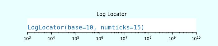
Matplotlib - Basic Units
What are Basic Units?
In Matplotlib basic units refer to the fundamental elements used to define and measure various aspects of a plot such as length, width, positions and coordinates. Understanding these units is crucial for accurately placing elements within a plot and controlling its overall layout.
Common Basic Units in Matplotlib
The following are the common basic units available in matplotlib library.
Points (pt)
In Matplotlib points typically refer to a unit of measurement used for specifying various visual properties within a plot such as line widths, marker sizes and text sizes. The point (pt) is a standard unit in typography and graphics often used for its device-independent size representation.
Usage of Points in Matplotlib
Line Widths − The linewidth parameter in Matplotlib functions such as plt.plot() allows us to specify the width of lines in points.
Text Sizes − The fontsize parameter in Matplotlib functions plt.xlabel(), plt.ylabel(), plt.title() enables setting the size of text in points.
Marker Sizes − The markersize parameter in plot functions such as plt.plot() defines the size of markers in points.
Figure Size − When specifying the figure size using plt.figure(figsize=(width, height)) the dimensions are in inches. However the default size might differ across systems such as 1 inch might not always equal 72 points but this is the typical convention.
Converting Points to Other Units
Matplotlib works internally with points but when setting figure sizes or dimensions it's common to use inches. As a reference 1 inch is approximately equal to 72 points.
- 1 inch = 72 points
- 1 point 0.01389 inches
Understanding and utilizing points as a unit of measurement in Matplotlib allows for precise control over the visual properties of elements within plots ensuring the desired appearance and readability.
Example - Setting Size in Points
In this example we are setting the line width in points for the line plot.
import matplotlib.pyplot as plt
plt.figure(figsize=(6, 4)) # 6 inches wide, 4 inches tall
plt.plot([1, 2, 3], [4, 5, 6], linewidth=3.5) # Line width in points
plt.xlabel('X-axis', fontsize=12) # Text size in points
plt.ylabel('Y-axis', fontsize=12)
plt.show()
Output
Following is the output of the above code −

Example - Setting Size in Inches
Inches are used to specify the overall size of a figure or subplots in Matplotlib. For example figsize = (width, height) in inches defines the width and height of a figure.
In this example we are specifying the size of figure in inches.
import matplotlib.pyplot as plt
plt.figure(figsize=(4, 4)) # 6 inches wide, 4 inches tall
plt.plot([1, 2, 3], [4, 5, 6])
plt.xlabel('X-axis')
plt.ylabel('Y-axis')
plt.title('Example Plot with 4x4 Inches')
plt.show()
Output
Following is the output of the above code −

Conversion
The conversion factor between inches and other units commonly used in Matplotlib:
1 inch 2.54 centimeters
Data Units
Data units represent the actual values plotted along the x-axes and y-axes. Matplotlib uses these units to plot data points on the graph. The conversion from data units to physical units on the plot is determined by the axis scales such as linear, logarithmic etc.
Key Points about Data Units in Matplotlib
Numerical Data − Data units represent the numeric values that we plot along the x-axis and y-axis.
Mapping to Plot Space − Matplotlib maps these numerical data values to specific positions within the plot space based on the defined axis limits and scaling.
Plotting Data − When we plot data using Matplotlib then we have to specify the x and y coordinates using numerical data. Matplotlib takes care of scaling and positioning these data points within the plot.
Axis Limits − The limits set on the x-axis using xlim and y-axis using ylim define the range of data units displayed in the plot.
Axis Ticks − The tick marks on the axes represent specific data units providing a visual reference for the data range present in the plot.
Example - Setting Data Units
In this example we are setting the data units of a plot.
import matplotlib.pyplot as plt
# Sample data
x = [1, 2, 3, 4, 5]
y = [2, 4, 6, 8, 10]
# Plotting using data units
plt.plot(x, y, marker='o')
# Setting axis limits in data units
plt.xlim(0, 6) # X-axis limits from 0 to 6
plt.ylim(0, 12) # Y-axis limits from 0 to 12
plt.xlabel('X-axis (Data Units)')
plt.ylabel('Y-axis (Data Units)')
plt.title('Plot with Data Units')
plt.show()
Output
Following is the output of the above code −
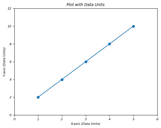
Understanding data units in Matplotlib is essential for accurately visualizing data and ensuring that the plotted representation corresponds correctly to the underlying numerical values.
Axes Coordinates
Axes coordinates range from 0.0 to 1.0 and specify the relative position within an individual subplot or axis. (0, 0) represents the bottom-left corner and (1, 1) represents the top-right corner of the subplot.
Axes coordinates offer a flexible way to position annotations, text, or other elements within a subplot relative to its size and boundaries, ensuring consistent and responsive positioning across different plot sizes or dimensions.
Example - Setting Axes Coordinates
Here n this example we are setting the axes coordinates x and y of a plot.
import matplotlib.pyplot as plt
# Creating a subplot
fig, ax = plt.subplots()
# Plotting data
ax.plot([1, 2, 3], [2, 4, 3])
# Annotating at axes coordinates
ax.annotate('Important Point',
xy=(2, 4), # Data point to annotate
xytext=(0.5, 0.5), # Position in axes coordinates
textcoords='axes fraction', # Specifying axes coordinates
arrowprops=dict(facecolor='black', arrowstyle='->'))
plt.show()
Output
Following is the output of the above code −

Figure Coordinates
Figure coordinates also range from 0.0 to 1.0 but specify positions relative to the entire figure canvas. (0, 0) is the bottom-left corner and (1, 1) is the top-right corner of the entire figure.
Example - Setting Figure Coordinates
This is an example of setting the figure coordinates of a plot.
import matplotlib.pyplot as plt # Creating subplots fig, (ax1, ax2) = plt.subplots(1, 2) # Plotting data in subplot 1 ax1.plot([1, 2, 3], [2, 4, 3]) # Plotting data in subplot 2 ax2.plot([1, 2, 3], [3, 1, 4]) # Annotating at figure coordinates fig.text(0.5, 0.9, 'Figure Annotation', ha='center', fontsize=12, color='red') plt.show()
Output
Following is the output of the above code −

Plot with Matplolib all basic units
This example showcases the usage of various units in Matplotlib such as inches for figure size, points for text sizes, data units for plotting data points and axes coordinates for positioning annotations within a subplot.
Example - Using Various Basic Units
import matplotlib.pyplot as plt
# Define a figure with specified size in inches
fig = plt.figure(figsize=(6, 4)) # Width: 6 inches, Height: 4 inches
# Create an axis within the figure
ax = fig.add_subplot(111)
# Plotting data points using data units
x = [1, 2, 3, 4]
y = [2, 4, 6, 8]
ax.plot(x, y, marker='o')
# Setting labels and titles using text in points
ax.set_xlabel('X-axis Label', fontsize=12)
ax.set_ylabel('Y-axis Label', fontsize=12)
ax.set_title('Plot Title', fontsize=14)
# Setting the position of a text annotation using axes coordinates
ax.text(0.5, 0.5, 'Annotation', transform=ax.transAxes, fontsize=10)
plt.show()
Output
Following is the output of the above code −

Matplotlib - Autoscaling
What is Autoscaling?
Autoscaling in Matplotlib refers to the automatic adjustment of axis limits based on the data being plotted, ensuring that the plotted data fits within the visible area of the plot without getting clipped or extending beyond the plot boundaries. This feature aims to provide an optimal view of the data by dynamically adjusting the axis limits to accommodate the entire dataset.
Key Aspects of Autoscaling in Matplotlib
The below are the key aspects of Autoscaling in Matplotlib library.
Automatic Adjustment
In Matplotlib automatic adjustment or autoscaling refers to the process by which the library dynamically determines and sets the axis limits both x-axis and y-axis based on the data being plotted. The aim is to ensure that the entire dataset is visible within the plot without any data points being clipped or extending beyond the plot boundaries.
The key aspects of automatic adjustment are as follows.
Data-Based Limits − Matplotlib examines the range of the data being plotted to determine suitable minimum and maximum limits for both axes.
Data Visibility − The goal is to display all data points clearly within the plot area, optimizing the view for visualization.
Dynamic Updates − When the plot is created or modified, Matplotlib recalculates and adjusts the axis limits as needed to accommodate the entire data range.
Preventing Clipping − Autoscaling ensures, that no data points are clipped or hidden due to the plot boundaries.
Manual Override − Users can also explicitly enable autoscaling using commands like plt.axis('auto') or plt.axis('tight') to let Matplotlib dynamically adjust the axis limits.
Example - Enabling Autoscaling
In this example plt.axis('auto') or plt.axis('tight') enables autoscaling by allowing Matplotlib to dynamically adjust the axis limits based on the data being plotted. The library recalculates the limits to ensure that all data points are visible within the plot area by providing an optimal view of the data.
import matplotlib.pyplot as plt
# Sample data
x = [1, 2, 3, 4, 5]
y = [2, 4, 6, 8, 10]
# Creating a plot with autoscaling
plt.plot(x, y, marker='o')
# Automatically adjust axis limits
plt.axis('auto') # or simply plt.axis('tight') for tight axis limits
plt.xlabel('X-axis')
plt.ylabel('Y-axis')
plt.title('Plot with Autoscaling')
plt.show()
Output
Following is the output of the above code −

Tight Layout
In Matplotlib tight_layout() is a function that automatically adjusts the subplot parameters to ensure that the plot elements such as axis labels, titles and other items which fit within the figure area without overlapping or getting cut off. This function optimizes the layout by adjusting the spacing between subplots and other plot elements.
The below are the key Aspects of tight_layout:
Optimizing Layout − tight_layout() function optimizes the arrangement of subplots and plot elements within a figure to minimize overlaps and maximize space utilization.
Preventing Overlapping Elements − It adjusts the padding and spacing between subplots, axes, labels and titles to prevent any overlapping or clipping of plot elements.
Automatic Adjustment − This function is particularly useful when creating complex multi-subplot figures or when dealing with various plot elements.
Example - Adjusting subplots layouts
In this example we are automatically adjusting the layout of the subplots by ensuring that all elements such as titles, labels etc are properly spaced and fit within the figure area.
import matplotlib.pyplot as plt
# Creating subplots
fig, axes = plt.subplots(2, 2)
# Plotting in subplots
for i, ax in enumerate(axes.flatten()):
ax.plot([i, i+1, i+2], [i, i+1, i+2])
ax.set_title(f'Subplot {i+1}')
# Applying tight layout
plt.tight_layout()
plt.show()
Output
Following is the output of the above code −

plt.axis('auto')
This command allows us to explicitly enable autoscaling for a specific axis.
Here's how plt.axis('auto') is typically used,
Example - Using axis('auto')
import matplotlib.pyplot as plt
# Creating a subplot
fig, ax = plt.subplots()
# Plotting data
ax.plot([1, 2, 3], [2, 4, 3])
plt.axis('auto')
plt.xlabel('X-axis')
plt.ylabel('Y-axis')
plt.title('Plot with Autoscaling')
plt.show()
Output
Following is the output of the above code −

plt.axis('tight')
In Matplotlib plt.axis('tight') is a command used to set the axis limits of a plot to tightly fit the range of the data being plotted. This command adjusts the axis limits to exactly encompass the minimum and maximum values of the provided data by removing any excess space between the data points and the plot edges.
Example - Using plt.axis('tight')
import matplotlib.pyplot as plt
# Sample data
x = [1, 2, 3, 4, 5]
y = [2, 4, 6, 8, 10]
# Creating a plot with tight axis limits
plt.plot(x, y, marker='o')
# Setting axis limits tightly around the data range
plt.axis('tight')
plt.xlabel('X-axis')
plt.ylabel('Y-axis')
plt.title('Plot with Tight Axis Limits')
plt.show()
Output
Following is the output of the above code −

Dynamic Updates
In Matplotlib dynamic updates refer to the ability of the library to automatically adjust or update plot elements when changes are made to the data or the plot itself. This feature ensures that the visualization remains up-to-date and responsive to changes in the underlying data without requiring manual intervention.
Key Points about Dynamic Updates in Matplotlib
Real-Time Updates − When new data is added to an existing plot or modifications are made to the plot elements Matplotlib dynamically updates the visualization to reflect these changes.
Automatic Redrawing − Matplotlib automatically redraws the plot when changes occur such as adding new data points, adjusting axis limits or modifying plot properties.
Interactive Plotting − Interactive features in Matplotlib such as in Jupyter Notebooks or interactive backends allow for real-time manipulation and updates of plots in response to user interactions.
Efficient Rendering − Matplotlib optimizes the rendering process to efficiently update the plot elements while maintaining visual accuracy.
Example - Dynamic Updates
In this example the initial plot displays a sine wave. A loop simulates dynamic updates by adding new cosine waves and modifying the plot title in each iteration. plt.pause(1) introduces a pause to demonstrate the changes but in an interactive environment such as Jupyter Notebook which wouldn't be necessary.
import matplotlib.pyplot as plt
import numpy as np
# Initial plot with random data
x = np.linspace(0, 10, 100)
y = np.sin(x)
plt.plot(x, y)
plt.xlabel('X-axis')
plt.ylabel('Y-axis')
plt.title('Dynamic Updates Example')
# Simulating dynamic updates by modifying the plot
for _ in range(5):
# Adding new data to the plot
x_new = np.linspace(0, 10, 100)
y_new = np.cos(x_new + _)
plt.plot(x_new, y_new, linestyle='--') # Plotting new data
# Updating plot properties
plt.title(f'Dynamic Update {_+1}') # Updating the plot title
plt.pause(1) # Pause to display changes (for demonstration)
plt.show()
Output
Following is the output of the above code −

Matplotlib - Reverse Axes
What is Reverse Axes?
In Matplotlib reverse axes refers to changing the direction of an axis, flipping it from its default orientation. This action alters the visual representation of the plot by reversing the order of the data along a specific axis usually the x-axis or y-axis.
Reversing X-axis
To reverse the x-axis in Matplotlib we can use the plt.gca().invert_xaxis() function. This method inverts the direction of the x-axis effectively flipping the plot horizontally. Data points that were originally plotted from left to right will now be displayed from right to left.
Here is a detailed breakdown of how to reverse the x-axis:
Steps to Reverse the X-axis
The below are the steps to be followed to reverse the x-axis.
Example - Create a Plot
Generate a plot with our data using Matplotlib.
import matplotlib.pyplot as plt
# Sample data
x = [1, 2, 3, 4, 5]
y = [2, 4, 6, 8, 10]
# Plot with default axis orientation
plt.plot(x, y, marker='o')
plt.xlabel('X-axis')
plt.ylabel('Y-axis')
plt.title('Default X-axis')
plt.show()
Output
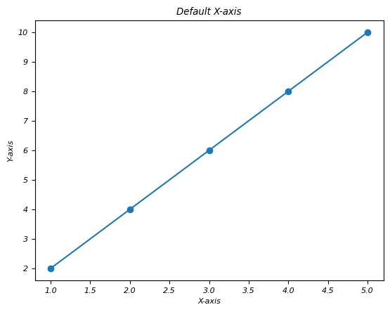
Example - Reverse the X-axis
After creating the plot use plt.gca().invert_xaxis() to reverse the x-axis.
import matplotlib.pyplot as plt
# Sample data
x = [1, 2, 3, 4, 5]
y = [2, 4, 6, 8, 10]
# Plot with default axis orientation
plt.plot(x, y, marker='o')
plt.xlabel('X-axis')
plt.ylabel('Y-axis')
plt.title('Default X-axis')
plt.show()
# Reversing the x-axis
plt.plot(x, y, marker='o')
plt.gca().invert_xaxis() # Reverse x-axis
plt.xlabel('Reversed X-axis')
plt.ylabel('Y-axis')
plt.title('Reversed X-axis')
plt.show()
Output
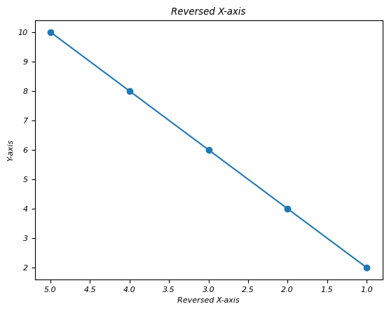
The second plot will display the same data as the first one but the x-axis will be reversed. Data points that were initially on the left side will now appear on the right side by altering the visual representation of the data.
Use Cases for Reversing the X-axis
Flipping Time Series Data − When we are plotting time series data then reversing the x-axis might better align with the chronological order.
Reorienting Geographical Plots − In some geographical plots reversing the x-axis could match the expected orientation or conventions.
Reversing the x-axis provides an alternative perspective for visualizing data allowing us to present information in a different order or orientation for clearer insights or better alignment with conventions.
This function reverses the direction of the x-axis by flipping the plot horizontally. Data points that were originally plotted from left to right will now be displayed from right to left.
Reversing Y-axis
The plt.gca().invert_yaxis() function reverses the direction of the y-axis by flipping the plot vertically. Data points that were originally plotted from bottom to top will now be displayed from top to bottom.
The reversing of Y - axis is also as same as the reversing the X - axis of a plot which we seen in the upper section. The below are the steps to be followed for reversing the Y - axis.
Example - Create a Plot
Generate a plot with our data using Matplotlib.
import matplotlib.pyplot as plt
# Sample data
x = [1, 2, 3, 4, 5]
y = [2, 4, 6, 8, 10]
# Plot with default axis orientation
plt.plot(x, y, marker='o')
plt.xlabel('X-axis')
plt.ylabel('Y-axis')
plt.title('Default Y-axis')
plt.show()
Output
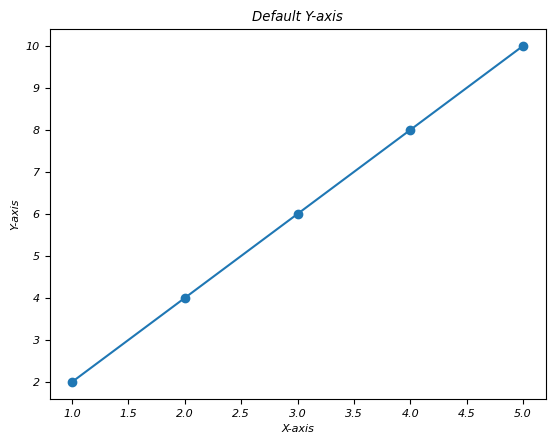
Example - Reverse the Y-axis
After creating the plot use plt.gca().invert_yaxis() to reverse the y-axis.
import matplotlib.pyplot as plt
# Sample data
x = [1, 2, 3, 4, 5]
y = [2, 4, 6, 8, 10]
# Plot with default axis orientation
plt.plot(x, y, marker='o')
plt.xlabel('X-axis')
plt.ylabel('Y-axis')
plt.title('Default Y-axis')
plt.show()
# Reversing the x-axis
# Reversing the y-axis
plt.plot(x, y, marker='o')
plt.gca().invert_yaxis() # Reverse y-axis
plt.xlabel('X-axis')
plt.ylabel('Reversed Y-axis')
plt.title('Reversed Y-axis')
plt.show()
Output
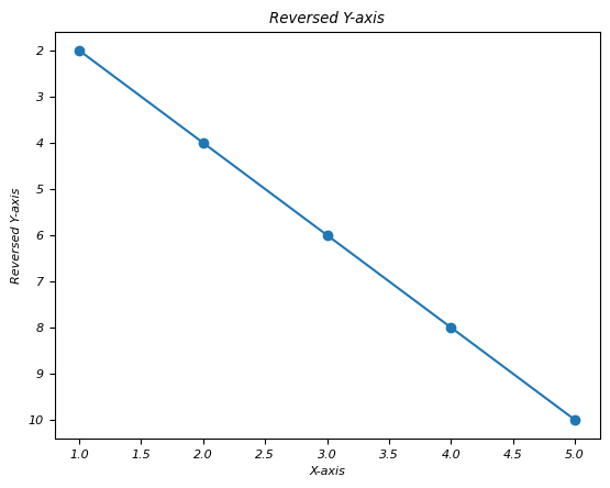
Matplotlib - Logarithmic Axes
What is Logarithmic axes?
Logarithmic axes in Matplotlib allow for plots where one or both axes use a logarithmic scale rather than a linear scale. This scaling is particularly useful when dealing with a wide range of data values spanning several orders of magnitude. Instead of representing each unit equally as in linear scaling we can use logarithmic scaling which represents equal intervals in terms of orders of magnitude.
Now before seeing the comparison between Linear axes and Logarithmic axes lets go through the Linear Axes once.
What is Linear Axes?
Linear axes in the context of plotting and graphing refers to the standard Cartesian coordinate system where the axes are represented in a linear or arithmetic scale. In this system we have the following.
X-Axis and Y-Axis − The horizontal axis is typically the x-axis representing one variable while the vertical axis is the y-axis representing another variable.
Equal Spacing − The linear scale along each axis represents equal increments in the plotted values. For instance in a linear scale the distance between 0 and 1 is the same as the distance between 5 and 6.
Proportional Representation − Each unit along the axis corresponds directly to a unit change in the represented value. For example moving from 10 to 11 represents the same increase as moving from 20 to 21.
Straight Lines − Relationships between variables are represented as straight lines on a linear scale. For linear relationships the plotted data points form a straight line when connected.
Applicability − Linear axes are suitable for visualizing data where the relationships between variables are linear or when the values being represented do not vary widely across the scale.
Linear vs. Logarithmic Scales
Linear and logarithmic scales are different ways to represent data on an axis in a plot each with distinct characteristics that suit different types of data distributions and visualizations.
| Linear Axes | Logarthmic Axes | |
|---|---|---|
| Scaling | This used linear scaling; the distance between each value on the axis is uniform and represents an equal increment in the plotted quantity. | Logarithmic scaling represents values based on orders of magnitude rather than linear increments. Each tick on the axis corresponds to a power of a base value (e.g., 10 or e). |
| Intervals | The units along the axis correspond directly to the data values. For example on a linear scale from 0 to 10, each unit (e.g., from 0 to 1, 1 to 2) represents an equal increment of 1. | In a logarithmic scale, equal distances along the axis represent multiplicative factors rather than additive ones. For example on a log scale from 1 to 100, the distances might represent powers of 10 (1, 10, 100). |
| Representation | Linear axes are typically used for data where the relationship between plotted points is best described by a linear progression. | Logarithmic axes are suitable for data that spans multiple orders of magnitude, such as exponential growth or decay. They compress large ranges of values, making them visually manageable. |
| When to use | Typically used for data that shows a linear relationship between variables or data that does not span a wide range of values. | Useful for visualizing data that spans several orders of magnitude, especially when dealing with exponential growth or decay, frequency distributions, or data that concentrates in certain ranges with outliers. |
| Plot | 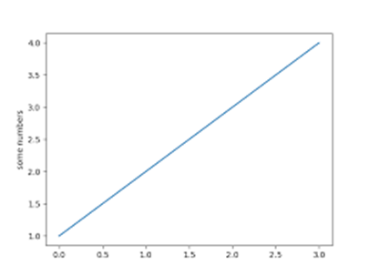 |
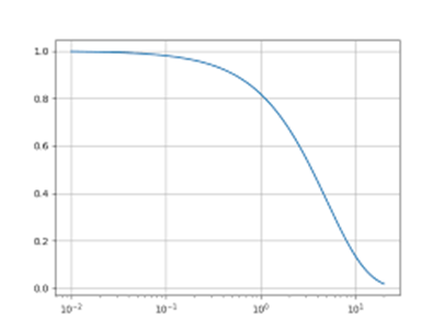 |
Types of Logarithmic Scales
There are different types of Logarithmic scales available in Logarithmic axes. Lets see one by one.
Logarithmic X-axis
A logarithmic x-axis in a plot refers to an x-axis where the scale is logarithmic rather than linear. This scaling transforms the representation of data on the x-axis from a linear progression to a logarithmic progression by making it suitable for visualizing data that spans multiple orders of magnitude or exhibits exponential behavior along the x-axis.
Characteristics of Logarithmic X-axis
Scaling Method − Instead of representing values in equal increments along the x-axis as in linear scaling a logarithmic x-axis represents values based on powers of a base value (e.g., 10 or e).
Unequal Spacing − Equal distances on the axis correspond to multiplicative factors or orders of magnitude rather than fixed intervals.
Use Case − Logarithmic x-axes are valuable when dealing with datasets that cover a wide range of values such as exponential growth, large spans of time or data distributions that concentrate in specific ranges with outliers.
Example - Logarithmic X-axis
In this example plt.xscale('log') function sets the x-axis to a logarithmic scale. It transforms the x-axis from a linear scale to a logarithmic scale allowing for better visualization of the data especially when dealing with exponential or wide-ranging x-values.
import matplotlib.pyplot as plt
import numpy as np
# Generating sample data
x = np.linspace(1, 1000, 100)
y = np.sin(x) * np.log10(x) # Generating data for demonstration
# Creating a plot with logarithmic x-axis
plt.figure(figsize=(8, 4))
plt.plot(x, y)
plt.xscale('log') # Set x-axis to logarithmic scale
plt.xlabel('X-axis (Logarithmic Scale)')
plt.ylabel('Y-axis')
plt.title('Plot with Logarithmic X-axis')
plt.show()
Output
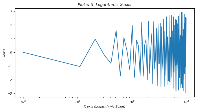
A logarithmic x-axis provides a different perspective on data visualization, emphasizing exponential behavior or patterns across varying orders of magnitude along the x-axis.
Logarithmic Y-axis
A logarithmic y-axis we often denoted as a log scale on the y-axis, represents a scaling method in plotting where the values along the y-axis are displayed logarithmically rather than linearly. This scaling is particularly useful when dealing with data that spans several orders of magnitude.
The logarithmic y-axis in Matplotlib allows for the effective visualization of data that covers a wide range of values by making it easier to observe patterns or trends that might not be apparent when using a linear scale.
Characteristics of Logarithmic Y-axis
Logarithmic Scaling − The values along the y-axis are scaled logarithmically where each unit increase represents a multiplicative factor i.e. powers of a base value typically 10 or e rather than an equal increment.
Equal Factors − Equal distances along the y-axis represent equal multiplicative factors, not equal numerical differences. For instance on a log scale, intervals of 1, 10, 100 represent factors of 10.
Compression of Data − Logarithmic scaling compresses a wide range of values by making it easier to visualize data that spans multiple orders of magnitude.
Example - Logarithmic Y-Axis
In this example plt.yscale('log') sets the y-axis to a logarithmic scale. As a result the exponential growth data is displayed on a logarithmic scale along the y-axis by facilitating the visualization of data across a broad range of values.
import matplotlib.pyplot as plt
import numpy as np
# Sample data with a wide range
x = np.linspace(1, 100, 100)
y = np.exp(x) # Exponential growth for demonstration
# Creating a plot with a logarithmic y-axis
plt.plot(x, y)
plt.yscale('log') # Set y-axis to logarithmic scale
plt.xlabel('X-axis')
plt.ylabel('Y-axis (Logarithmic Scale)')
plt.title('Plot with Logarithmic Y-axis')
plt.show()
Output
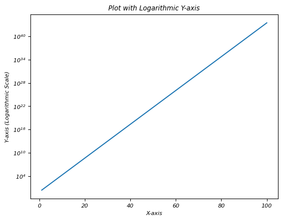
Logarithmic both axes
Logarithmic scaling for both axes i.e. x-axis and y-axis in a plot involves using a logarithmic scale for both dimensions representing values based on orders of magnitude rather than linear increments. This scaling is particularly useful when dealing with data that spans multiple orders of magnitude in both the horizontal and vertical directions.
Logarithmic scaling for both axes is effective when visualizing data that spans multiple orders of magnitude in both horizontal and vertical directions compressing the range of values for improved visualization and pattern identification.
Use Cases for Logarithmic Both Axes
Wide Range of Data − When both x and y-axis data spans several orders of magnitude then logarithmic scaling for both axes compresses the visual representation for better insights.
Exponential Relationships − Visualizing data with exponential relationships in both dimensions.
Scientific and Engineering Data − Commonly used in scientific and engineering plots where values span multiple scales.
Example - Logarithmic Scaling for Both Axes
In this example plt.xscale('log') and plt.yscale('log') functions set both the x-axis and y-axis to logarithmic scales respectively. The plot visualizes data points in a manner where each axis represents values in terms of orders of magnitude by allowing for better visualization of data that spans a wide range of values in both dimensions.
import matplotlib.pyplot as plt
import numpy as np
# Generating sample data with a wide range
x = np.linspace(1, 1000, 100)
y = np.logspace(1, 4, 100) # Logarithmically spaced data for demonstration
# Creating a plot with logarithmic scaling for both axes
plt.figure(figsize=(8, 6))
plt.scatter(x, y)
plt.xscale('log') # Set x-axis to logarithmic scale
plt.yscale('log') # Set y-axis to logarithmic scale
plt.xlabel('X-axis (Logarithmic Scale)')
plt.ylabel('Y-axis (Logarithmic Scale)')
plt.title('Plot with Logarithmic Both Axes')
plt.show()
Output
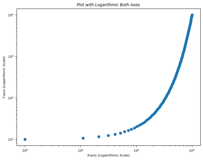
Logarithmic Y-axis bins
In this example we are plotting the logarithmic Y-Axis bins using the matplotlib library.
Example - Logarithmic Y-Axis Bins
import numpy as np
from matplotlib import pyplot as plt
plt.rcParams["figure.figsize"] = [7.50, 3.50]
plt.rcParams["figure.autolayout"] = True
x = np.linspace(1, 100, 1000)
y = np.log(x)
plt.yscale('log')
plt.plot(x, y, c="red", lw=3, linestyle="dashdot", label="y=log(x)")
plt.legend()
plt.show()
Output
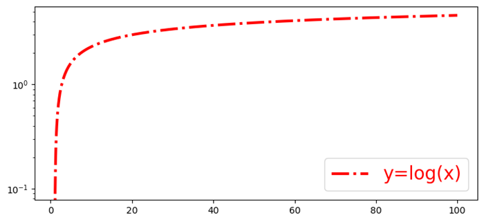
Matplotlib - Symlog
What is Symlog?
symlog is a scale in Matplotlib that combines both linear and logarithmic scaling by providing a way to plot data that includes both positive and negative values while accommodating a wide range of magnitudes.
Characteristics of Symlog Scale
The below are the characteristics of Symlog scale. Lets go through one by one in detail.
Linear Near Zero
In the context of the symlog scale in Matplotlib library linear near zero refers to the behavior of the scale around the zero point. The symlog scale combines linear and logarithmic scaling particularly in the vicinity of zero to allow for a more nuanced representation of data.
Linear Behavior Near Zero
Close to Zero − For values close to zero i.e. within a defined range around zero the symlog scale behaves linearly and similar to a linear scale.
Linear Threshold (linthresh) − The linthresh parameter defines the range around zero where the scale behaves linearly. Values within this threshold are represented linearly.
Linear Region − Within the specified threshold around zero the symlog scale behaves like a typical linear scale preserving the direct relationship between data values and their representation on the plot.
Example - Linear Near Zero
In this example we are setting the linthresh parameter as 0.1 to range around zero (-0.1 to 0.1 in this case) behaves linearly. Values within this range are represented linearly on the plot by allowing for a more focused and precise visualization of data close to zero while accommodating larger values away from zero logarithmically.
import matplotlib.pyplot as plt
import numpy as np
# Sample data with positive and negative values
x = np.linspace(-10, 10, 100)
y = np.sinh(x) # Hyperbolic sine function for demonstration
# Creating a plot with symlog scale on y-axis
plt.plot(x, y)
plt.yscale('symlog', linthresh=0.1) # Set y-axis to symlog scale with a linear threshold of 0.1
plt.xlabel('X-axis')
plt.ylabel('Y-axis (Symlog Scale)')
plt.title('Plot with Symlog Scale (Linear Near Zero)')
plt.show()
Output

The use cases of Linear near zero
Focus on Small Changes near Zero − Allows better representation of small changes or variations near zero without losing information about larger values.
Handling Data with Zero-Centered Patterns − Useful for datasets where patterns or changes are centered around zero.
Symmetric logarithmic scaling
Symmetric logarithmic scaling is often referred to as symlog scaling in Matplotlib which is a scaling method that combines both linear and logarithmic scales to represent data symmetrically around zero. This scale is particularly useful when dealing with datasets that contain values spanning positive and negative ranges and require a nuanced representation across a wide range of values.
Characteristics of Symlog Scaling
Symmetric Behavior − Symlog scaling maintains symmetry around zero,accommodating both positive and negative values.
Linear Region Near Zero − Close to zero within a defined range around zero the scale behaves linearly by preserving the direct proportionality of values and their representation on the plot.
Logarithmic Scaling Away from Zero − As values move away from zero i.e. both positive and negative the scale transitions into a logarithmic scale allowing representation of larger absolute values logarithmically.
Linear Threshold (linthresh) − The linthresh parameter defines the range around zero where the scale behaves linearly.
Example - Symmetric logarithmic scaling
In this example the symlog scale with a linthresh of 0.1 specifies that values within the range of -0.1 to 0.1 (around zero) are represented linearly on the x-axis.
import matplotlib.pyplot as plt
import numpy as np
# Sample data with positive and negative values
x = np.linspace(-10, 10, 100)
y = np.sinh(x) # Hyperbolic sine function for demonstration
# Creating a plot with symlog scale on y-axis
plt.plot(x, y)
plt.xscale('symlog', linthresh=0.1) # Set x-axis to symlog scale with a linear threshold of 0.1
plt.xlabel('X-axis')
plt.ylabel('Y-axis (Symlog Scale)')
plt.title('Plot with Symlog Scale')
plt.show()
Output

Use Cases
Handling Data with Both Positive and Negative Values − Useful for datasets spanning positive and negative ranges.
Focused Visualization − This allows to focus on small changes near zero while accommodating larger values away from zero logarithmically.
Logarithmic away from zero
Logarithmic away from zero refers to the behavior of a logarithmic scale in a plot particularly in the context of the symlog scale in Matplotlib.
The below are the characteristics of the Logarithmic away from zero.
Near Zero − Close to zero within a specified range around zero which is defined by the linthresh parameter. The scale behaves linearly by preserving a direct relationship between the plotted values and their representation on the plot.
Away from Zero − As the values move further away from zero both positively and negatively the scale transitions into a logarithmic scaling behavior.
Logarithmic Behavior − The scale represents larger absolute values logarithmically using powers of a base value i.e. usually 10 or e to visually compress the range of these larger values.
Compression of Values − Larger absolute values away from zero are compressed on the plot due to the logarithmic scaling making it easier to visualize a wide range of values efficiently.
Example - Logarithmic away from zero
In this example we are setting the linthresh parameters as 0.2 and 0.1 for xscale and yscale repectively.
import matplotlib.pyplot as plt
import numpy as np
# Sample data with positive and negative values
x = np.linspace(-10, 10, 100)
y = np.sinh(x) # Hyperbolic sine function for demonstration
# Creating a plot with symlog scale on y-axis
plt.plot(x, y)
plt.xscale('symlog', linthresh=0.2) # Set x-axis to symlog scale with a linear threshold of 0.2
plt.yscale('symlog', linthresh=0.1) # Set x-axis to symlog scale with a linear threshold of 0.1
plt.xlabel('X-axis')
plt.ylabel('Y-axis (Symlog Scale)')
plt.title('Plot with Symlog Scale')
plt.show()
Output

Matplotlib - Unit Handling
What is Unit Handling?
In Matplotlib library unit handling refers to the capability of the library to manage and interpret different types of units for plotting data accurately. Matplotlib allows users to specify and work with various units for defining and displaying data on plots whether they are related to length, time, angle or other physical quantities.
Key Aspects of Unit Handling in Matplotlib
The below are the key aspects of unit handling in matplotlib library.
Support for Various Units
Matplotlib supports multiple units such as pixels, inches, centimeters, points, fractions of the figure size and more. This flexibility allows users to define plot elements like positions, sizes and spacing using the unit of their choice.
Conversion and Transformation
Matplotlib handles unit conversions and transformations seamlessly. It enables automatic conversion between different units when plotting or specifying attributes such as size, location or dimensions.
Unit-Aware Functions
Many Matplotlib functions and methods are unit-aware which means they accept arguments or parameters in different units and internally manage the conversion for plotting purposes.
Functions and Techniques for Unit Handling
There are few techniques and functions available for unit handling.
Automatic Conversion
Matplotlib automatically handles unit conversion for plotting data. When using plot() function or other plotting functions the library converts data units to display units based on the chosen coordinate system.
This automatic conversion simplifies the process of plotting data in Matplotlib by handling the conversion between different units without requiring explicit conversion steps from the user. Here's an example demonstrating auto-conversion in unit handling.
Example - Automatic Unit Conversion
import matplotlib.pyplot as plt
# Sample data in different units
time_seconds = [1, 2, 3, 4, 5] # Time in seconds
distance_meters = [2, 4, 6, 8, 10] # Distance in meters
plt.plot(time_seconds, distance_meters) # Matplotlib handles unit conversion
plt.xlabel('Time (s)')
plt.ylabel('Distance (m)')
plt.title('Auto-Conversion of Units in Matplotlib')
plt.show()
Output

Axis Labeling
In Axis labeling we use xlabel() and ylabel() functions to label the x-axis and y-axis respectively. These functions allow us in specifying units for the axis labels.
We can adjust the labels accordingly to match the units of the data being plotted. This practice helps provide context and clarity to the plotted data for anyone viewing the graph. The below is an example demonstrating how to label axes with units using Matplotlib.
Example - Labeling Axes
import matplotlib.pyplot as plt
# Sample data
time = [0, 1, 2, 3, 4] # Time in seconds
distance = [0, 10, 20, 15, 30] # Distance in meters
# Creating a plot
plt.plot(time, distance)
# Labeling axes with units
plt.xlabel('Time (s)')
plt.ylabel('Distance (m)')
plt.title('Distance vs. Time')
plt.show()
Output

Custom Units
For more explicit control set_units() methods for axes ax.xaxis.set_units() and ax.yaxis.set_units() can be used to explicitly set the units for the x-axis and y-axis.
This custom axis unit handling ensures that the plot displays the data using specific units such as hours for time, kilometers for distance etc and labels the axes accordingly providing context and clarity to the visualization. Here's an example demonstrating custom axis unit handling in Matplotlib.
Example - Usage of Custom Units
import matplotlib.pyplot as plt
# Sample data
time_hours = [1, 2, 3, 4, 5] # Time in hours
distance_km = [50, 80, 110, 140, 170] # Distance in kilometers
fig, ax = plt.subplots()
# Plotting the data
ax.plot(time_hours, distance_km)
# Customizing x-axis and y-axis units
ax.xaxis.set_units('hours') # Set x-axis units to hours
ax.yaxis.set_units('km') # Set y-axis units to kilometers
# Labeling axes with units
ax.set_xlabel('Time')
ax.set_ylabel('Distance')
ax.set_title('Distance over Time')
plt.show()
Output

Unit Conversion
Functions like convert_xunits() and convert_yunits() within plt.gca() can convert data units to display units. Here is an example demonstrating unit conversion in unit handling in Matplotlib
Example - Unit Conversion
import matplotlib.pyplot as plt
# Specify figure size in inches
plt.figure(figsize=(6, 4)) # Width: 6 inches, Height: 4 inches
# Set x-axis label with different units
plt.xlabel('Distance (cm)') # Using centimeters as units
# Plotting data with specific units
x = [1, 2, 3, 4]
y = [10, 15, 12, 18]
plt.plot(x, y)
plt.title('Plot with Unit Handling')
plt.show()
Output

Use Cases for Unit Handling
Consistency in Measurement − Ensuring consistent units across labels, annotations and plot elements for clarity.
Dimension-Agnostic Plotting − Plotting data regardless of the unit type such as length, time etc. with Matplotlib handling conversions and scaling appropriately.
Customization Flexibility − Allowing users to define plot attributes using their preferred units for better control over visualizations.
Matplotlib - Ellipse with Units
An ellipse is a geometric shape that looks like a stretched circle. It is defined by two key properties: its major axis (the longest diameter) and its minor axis (the shortest diameter). These axes intersect at the center of the ellipse, and the shape of an ellipse is determined by the lengths of these axes. Both the distance from the center to the edge along the major axis and the distance from the center to the edge along the minor axis are important.
In terms of units, you would measure these distances using some kind of unit, like inches, centimeters, or any other measurement you choose. So, when we say an ellipse with units, we mean that we are using specific measurements (units) to describe the size of the ellipse, considering both the length of the major axis and the length of the minor axis.
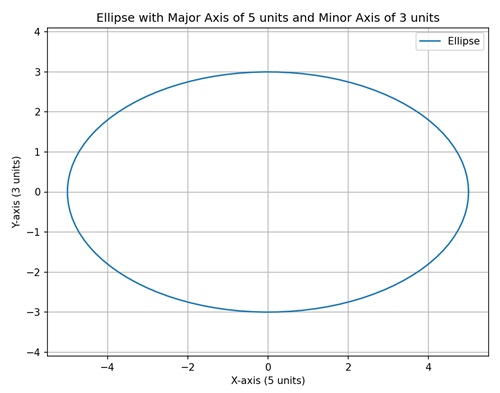
Ellipse with Units in Matplotlib
We can create an ellipse with units in Matplotlib using the "Ellipse" class in the "matplotlib.patches" module. The Ellipse class allows you to define the center, width and height (major and minor axes), angle of rotation, and other properties of the ellipse such as its rotation angle.
The units of measurement for the axes depend on the coordinate system you are using. For example, if you are working with a plot in inches, the major and minor axes lengths would be in inches.
Fixed Size Ellipse in Data Coordinates
In Matplotlib, creating a fixed size ellipse in data coordinates involves drawing an ellipse on a plot with a specific size and position determined by data coordinates. This means that the dimensions of the ellipse are specified in the same units as your actual data.
For instance, if you have a dataset with x and y values, you can draw an ellipse where the center is located at a particular (x, y) point, and the width and height of the ellipse are defined in terms of the data coordinates.
Example - Fixed Size Ellipse
we are drawing a simple ellipse with a fixed size specified in data coordinates. The center of the ellipse is located at (3, 5) on the plot, and the width is set to "4" units in meters, while the height is set to "2" units −
import matplotlib.pyplot as plt
from matplotlib.patches import Ellipse
# Creating a plot
fig, ax = plt.subplots()
# Ellipse in data coordinates (units: meters)
ellipse = Ellipse((3, 5), width=4, height=2, edgecolor='b', facecolor='none')
ax.add_patch(ellipse)
# Setting plot title and labels
ax.set_title('Fixed Size Ellipse in Data Coordinates')
ax.set_xlabel('X-axis (meters)')
ax.set_ylabel('Y-axis (meters)')
# Setting aspect ratio to 'equal'
ax.set_aspect('equal')
# Adjusting axis limits
ax.set_xlim(0, 6)
ax.set_ylim(3, 7)
# Displaying dimensions
plt.text(3, 5, f'Width: 4 meters\nHeight: 2 meters', ha='center', va='center', color='red', fontsize=10)
plt.show()
Output
Following is the output of the above code −
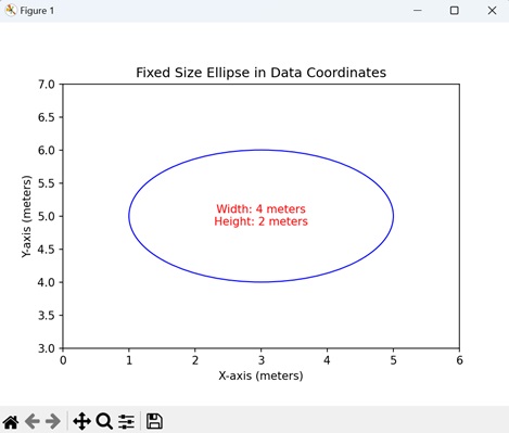
Ellipse with Variable Size in Axes Coordinates
Creating an ellipse with variable size in axes coordinates in Matplotlib involves drawing an ellipse on a plot where the dimensions are specified in terms of the axes, rather than the actual data. In other words, the width and height of the ellipse are given as a percentage of the total length of the x and y axes, respectively.
For example, if you want to visualize an ellipse that always covers 60% of the x-axis and 30% of the y-axis, regardless of the specific data values, you can use axes coordinates. This is particularly useful when you want the size of the ellipse to be relative to the overall dimensions of the plot.
Example - Variable Size Ellipse
In here, we are drawing a an ellipse with a variable size specified in axes coordinates. The center of the ellipse is placed at (0.5, 0.5), which corresponds to the center of the plot. The width and height are set to 60% and 30% of the respective axis lengths, allowing the ellipse to scale with changes in the axes −
import matplotlib.pyplot as plt
from matplotlib.patches import Ellipse
# Creating a plot
fig, ax = plt.subplots()
# Ellipse in axes coordinates
ellipse = Ellipse((0.5, 0.5), width=0.6, height=0.3, edgecolor='r', facecolor='none', transform=ax.transAxes)
ax.add_patch(ellipse)
# Setting plot title and labels
ax.set_title('Ellipse with Variable Size in Axes Coordinates')
ax.set_xlabel('X-axis (normalized)')
ax.set_ylabel('Y-axis (normalized)')
# Displaying dimensions in the output
plt.text(0.5, 0.5, f'Width: 0.6 (normalized)\nHeight: 0.3 (normalized)', ha='center', va='center', color='blue', fontsize=10, transform=ax.transAxes)
plt.show()
Output
On executing the above code we will get the following output −
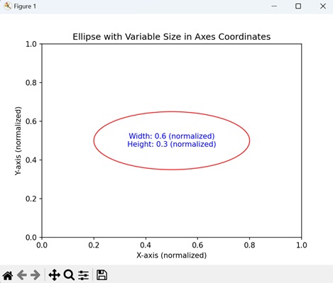
Ellipse Centered at Figure Origin
Creating an ellipse centered at figure origin in Matplotlib involves drawing an ellipse on a plot with its center positioned at the origin of the entire figure. The origin is the point (0, 0) in the coordinate system of the figure. In this case, the width and height of the ellipse are specified in the units of the figure, and the center of the ellipse is precisely at the origin.
This demonstrates how to position an ellipse with respect to the overall figure rather than the individual axes.
Example - Centered Ellipse
In the example below, we are creating an ellipse with its center at the origin of the figure (0, 0). The width is set to 4 units, and the height is set to 2 units −
import matplotlib.pyplot as plt
from matplotlib.patches import Ellipse
import numpy as np
# Creating a plot
fig, ax = plt.subplots()
# Ellipse centered at figure origin
ellipse = Ellipse((0, 0), width=4, height=2, edgecolor='g', facecolor='none', transform=ax.transData)
ax.add_patch(ellipse)
# Marking the center with a marker
center_x, center_y = 0, 0
ax.plot(center_x, center_y, marker='o', markersize=8, color='red', label='Center')
# Dotted line to represent the center
ax.plot([center_x, center_x], [center_y, center_y], 'r--')
# Horizontal and vertical lines passing through the center
ax.axhline(center_y, color='blue', linestyle='--', label='Horizontal Line')
ax.axvline(center_x, color='purple', linestyle='--', label='Vertical Line')
# Setting plot title and labels
ax.set_title('Ellipse Centered at Figure Origin')
ax.set_xlabel('X-axis (units)')
ax.set_ylabel('Y-axis (units)')
# Adjusting axis limits to make the ellipse and lines visible
ax.set_xlim(-2, 2)
ax.set_ylim(-1, 1)
# Adding legend
ax.legend()
plt.show()
Output
After executing the above code, we get the following output −
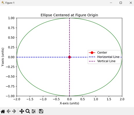
Rotated Ellipse with Custom Angle
Creating a rotated ellipse with custom angle in Matplotlib involves drawing an ellipse on a plot and specifying a custom angle to rotate it. The rotation angle determines how the ellipse is tilted or turned within the plot. This is useful when you want to highlight features in a specific orientation.
Example - Ellipse with Customized Angle
Now, we are creating a rotated ellipse with a custom angle of "45" degrees, resulting in an ellipse tilted at an angle. The center of the ellipse is located at (2, 3), and the width and height are specified in data coordinates −
import matplotlib.pyplot as plt
from matplotlib.patches import Ellipse
# Creating a plot
fig, ax = plt.subplots()
# Rotated ellipse with custom angle
ellipse = Ellipse((2, 3), width=3, height=1, angle=45, edgecolor='purple', facecolor='none', transform=ax.transData)
ax.add_patch(ellipse)
# Setting plot title and labels
ax.set_title('Rotated Ellipse with Custom Angle')
ax.set_xlabel('X-axis (units)')
ax.set_ylabel('Y-axis (units)')
# Setting aspect ratio to 'equal'
ax.set_aspect('equal')
# Adjusting axis limits
ax.set_xlim(0, 4)
ax.set_ylim(2, 5)
# Adding grid for better visualization
ax.grid(True, linestyle='--', alpha=0.7)
plt.show()
Output
On executing the above code we will get the following output −
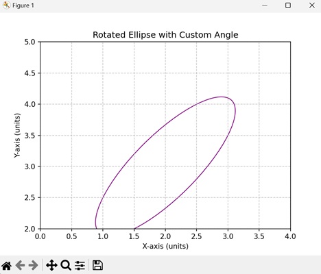
Matplotlib - Spines
What are Spines?
In Matplotlib library spines refer to the borders or edges of a plot that frame the data area. These spines encompass the boundaries of the plot defining the area where data points are displayed. By default a plot has four spines such as top, bottom, left and right.
Manipulating spines in Matplotlib offers flexibility in designing the visual aspects of a plot by allowing for a more tailored and aesthetically pleasing presentation of data.
Key Characteristics of Spines
The following are the characteristics of spines.
Borders of the Plot − Spines form the borders of the plot area enclose the region where data is visualized.
Configurable Properties − Each spine top, bottom, left, and right can be customized individually by allowing adjustments to their appearance, color, thickness and visibility.
Visibility Control − Spines can be made visible or hidden to modify the appearance of the plot.
Uses of Spines
Plot Customization − Spines allow customization of the plot's appearance enabling adjustments to the plot's boundaries and style.
Aesthetics and Visualization − Customizing spines can enhance the aesthetics of the plot and draw attention to specific areas of interest.
Types of spines
Now lets see the each and every spine available in a plot in detail.
Top Spine
The Top spine refers to the horizontal line at the top of the plot area that corresponds to the upper boundary of the y-axis. It's one of the four spines such as top, bottom, left and right that form the borders around the plot.
Characteristics of the Top Spine
Boundary Line − The top spine represents the upper boundary of the plot area along the y-axis.
Default Visibility − By default the top spine is visible in Matplotlib plots.
Customization − Similar to other spines the top spine can be customized in terms of its visibility, color, linestyle and linewidth.
Example - Removing Top Spine
In this example ax.spines['top'].set_visible(False) hides the top spine by removing the upper boundary of the plot area along the y-axis.
import matplotlib.pyplot as plt
# Creating a simple plot
x = [1, 2, 3, 4, 5]
y = [2, 4, 6, 8, 10]
plt.plot(x, y)
# Accessing and modifying the top spine
ax = plt.gca() # Get the current axes
ax.spines['top'].set_visible(False) # Hide the top spine
plt.xlabel('X-axis')
plt.ylabel('Y-axis')
plt.title('Plot with Hidden Top Spine')
plt.show()
Output

Use Cases for Modifying the Top Spine
Aesthetic Control − Customizing the visibility, color or style of the top spine can improve the appearance or match specific design requirements.
Adjusting Plot Boundaries − Hiding the top spine might be useful when the plot doesn't require an upper boundary or when creating specific visual effects.
Bottom Spine
In Matplotlib the bottom spine refers to the horizontal line that forms the bottom border of the plot area corresponding to the x-axis.
Characteristics of the Bottom Spine
Association with x-axis − The bottom spine represents the border of the plot along the x-axis defining the lower boundary of the plot area.
Customization − Similar to other spines the bottom spine can be customized in terms of its visibility, color, line style, thickness and position.
Example - Customizing the Bottom Spine
In this example by using ax.spines['bottom'].set_color('blue') changes the color of the bottom spine to blue, ax.spines['bottom'].set_linewidth(2) sets the thickness of the bottom spine to 2 and ax.spines['bottom'].set_visible(True) ensures the bottom spine is visible if in case it was hidden.
import matplotlib.pyplot as plt
# Creating a simple plot
x = [1, 2, 3, 4, 5]
y = [2, 4, 6, 8, 10]
plt.plot(x, y)
# Accessing and customizing the bottom spine
ax = plt.gca() # Get the current axes
ax.spines['bottom'].set_color('blue') # Change the color of the bottom spine to blue
ax.spines['bottom'].set_linewidth(2) # Set the thickness of the bottom spine to 2
ax.spines['bottom'].set_visible(True) # Make the bottom spine visible (if previously hidden)
plt.xlabel('X-axis')
plt.ylabel('Y-axis')
plt.title('Plot with Customized Bottom Spine')
plt.show()
Output

Use Cases for Bottom Spine Customization
Emphasizing Axes − By customizing the bottom spine can draw attention to the x-axis and enhance the plot's aesthetics.
Highlighting Plot Boundaries − By adjusting the appearance of the bottom spine can help in delineating the plot area and improving its clarity.
Left Spine
In Matplotlib the left spine refers to the vertical line that forms the left border of the plot area, corresponding to the y-axis.
Characteristics of the Left Spine
Association with y-axis − The left spine represents the border of the plot along the y-axis defining the left boundary of the plot area.
Customization − The customization of the left spine is similar to the other pines which can be customized by color, visibility, border width etc.
Example - Customizing the Left Spine
In this example ax.spines['left'].set_color('green') changes the color of the left spine to green, ax.spines['left'].set_linewidth(2) sets the thickness of the left spine to 2 and ax.spines['left'].set_visible(False) ensures the left spine is invisible if in case it was visible.
import matplotlib.pyplot as plt
# Creating a simple plot
x = [1, 2, 3, 4, 5]
y = [2, 4, 6, 8, 10]
plt.plot(x, y)
# Accessing and customizing the left spine
ax = plt.gca() # Get the current axes
ax.spines['left'].set_color('green') # Change the color of the left spine to green
ax.spines['left'].set_linewidth(2) # Set the thickness of the left spine to 2
ax.spines['left'].set_visible(False) # Make the left spine invisible (if previously visible)
plt.xlabel('X-axis')
plt.ylabel('Y-axis')
plt.title('Plot with Customized Left Spine')
plt.show()
Output

Right Spine
In Matplotlib the right spine represents the vertical line forming the right border of the plot area corresponding to the y-axis on the right side.
Characteristics of the Right Spine
Associated with y-axis − The right spine defines the right border of the plot along the y-axis representing, the y-axis on the right side of the plot.
Customization − Similar to other spines the right spine can be customized in terms of its visibility, color, line style, thickness and position.
Example - Customizing the Right Spine
In this example we are using ax.spines['right'] to customize the right spine to the plot.
import matplotlib.pyplot as plt
# Creating a simple plot
x = [1, 2, 3, 4, 5]
y = [2, 4, 6, 8, 10]
plt.plot(x, y)
# Accessing and customizing the right spine
ax = plt.gca() # Get the current axes
ax.spines['right'].set_color('green') # Change the color of the right spine to green
ax.spines['right'].set_linewidth(2) # Set the thickness of the right spine to 2
ax.spines['right'].set_visible(True) # Make the right spine visible (if previously hidden)
plt.xlabel('X-axis')
plt.ylabel('Y-axis')
plt.title('Plot with Customized Right Spine')
plt.show()
Output

Example - Customize spines of Matplotlib figures
In this example we are creating six figures to see and customize the spines for it.
#First import the required libraries for the workbook.
import numpy as np
import matplotlib.pyplot as plt
#draw graph for sines
theta = np.linspace(0, 2*np.pi, 128)
y = np.sin(theta)
fig = plt.figure(figsize=(8,6))
#Define the axes with default spines
ax1 = fig.add_subplot(2, 3, 1)
ax1.plot(theta, np.sin(theta), 'b-*')
ax1.set_title('default spines')
#Define the function to plot the graph
def plot_graph(axs, title, lposition, bposition):
ax = fig.add_subplot(axs)
ax.plot(theta, y, 'b-*')
ax.set_title(title)
ax.spines['left'].set_position(lposition)
ax.spines['right'].set_visible(False)
ax.spines['bottom'].set_position(bposition)
ax.spines['top'].set_visible(False)
ax.xaxis.set_ticks_position('bottom')
ax.yaxis.set_ticks_position('left')
#plot 3 graphs
plot_graph(232, 'centered spines', 'center', 'center')
plot_graph(233, 'zeroed spines', 'zero', 'zero')
plot_graph(234, 'spines at axes [0.25, 0.75]', ('axes', 0.25),('axes', 0.75))
plot_graph(235, 'spines at data [1.0, -1.0]', ('data', 1.0),('data', -1.0))
plot_graph(236, 'adjusted spines', ('outward', 10), ('outward', 10))
#fit the plot in the grid and display.
plt.tight_layout()
plt.show()
Output

Matplotlib - Axis Ranges
What is Axis Range?
Axis range in Matplotlib refers to the span of values displayed along the x-axis and y-axis in a plot. These ranges determine the visible data within the plot area and are defined by the minimum and maximum values displayed on each axis.
Customizing axis ranges in Matplotlib allows for better control over the visible data within the plot by enabling the emphasis of specific ranges or patterns to enhance the visualization.
The Key Points about Axis Ranges
X-axis and Y-axis Ranges − Axis ranges can be adjusted independently for the x-axis and y-axis to display specific portions of the data.
Setting Ranges − We can manually set the axis ranges using functions like plt.xlim() and plt.ylim() or their equivalent methods when working with an axis object ax.set_xlim() and ax.set_ylim().
Automatic Ranges − By default the Matplotlib library automatically calculates and sets the axis ranges based on the data provided. However manual adjustment allows focusing on specific data ranges or enhancing visualization.
Use Cases for Axis Ranges
Zooming In or Out − Adjusting axis ranges to focus on specific parts of the data by zooming in or out within the plot.
Data Emphasis − Highlighting specific ranges of the data to emphasize patterns or trends.
Avoiding Clutter − We can adjust the ranges of the plot axis, to prevent the overlapping of data point to improve the visualization of certain sections of the plot.
Key Concepts in Axis Range
The following are the key concepts of the axis range of the plot. Lets see each of them in detail.
X-Axis Range
The x-range in axis range refers to the span of values displayed along the x-axis in a plot. It determines the minimum and maximum values visible on the horizontal axis by defining the range of data shown in that dimension.
In Matplotlib library we can set the x-axis range using plt.xlim() or ax.set_xlim() to specify the limits for the x-axis. This allows us to control the displayed range of data along the x-axis.
Controlling the x-range in axis ranges provides flexibility in visualizing specific segments of data along the x-axis by enabling better interpretation and analysis of the plotted information.
Example - Using plt.xlim()
In this example plt.xlim(1, 5) sets the x-axis limits from 1 to 5 by defining the x-range visible in the plot to cover data points between 1 and 5 along the x-axis.
import matplotlib.pyplot as plt
# Sample data
x = [1, 2, 3, 4, 5]
y = [2, 4, 6, 8, 10]
# Creating a plot
plt.plot(x, y)
# Setting x-axis limits (x-range)
plt.xlim(1, 5) # Set x-axis limits from 1 to 5
plt.xlabel('X-axis')
plt.ylabel('Y-axis')
plt.title('Plot with Custom X-axis Range')
plt.show()
Output
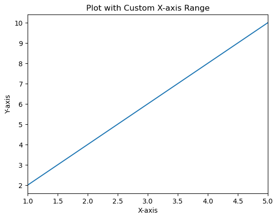
Example - Using the ax.set_xlim()
Here's an example demonstrating the use of ax.set_xlim() to set the x-axis limits when working with an axis object ax.
import matplotlib.pyplot as plt
# Sample data
x = [1, 2, 3, 4, 5]
y = [2, 4, 6, 8, 10]
# Creating a figure and axis
fig, ax = plt.subplots()
# Plotting on the axis
ax.plot(x, y)
# Setting x-axis limits using axis object
ax.set_xlim(0, 6) # Set x-axis limits from 0 to 6
# Labeling axes and adding title
ax.set_xlabel('X-axis')
ax.set_ylabel('Y-axis')
ax.set_title('Plot with Custom X-axis Limits')
plt.show()
Output
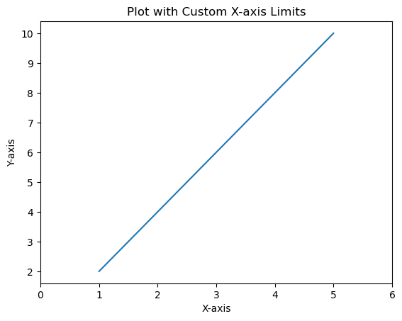
Y-Axis Range
Setting the y-axis range or limits in Matplotlib allows us to specify the range of values displayed along the vertical y-axis of a plot. We can control the minimum and maximum values shown on the y-axis to focus on specific data ranges or patterns. The setting of range or limits of the y-axis in Matplotlib can be done using the plt.ylim() function or ax.set_ylim() method when working with an axis object ax. The range of values displayed along the vertical y-axis.
Setting y-axis range is beneficial for focusing on specific data ranges, highlighting trends and ensuring the visualization emphasizes the relevant parts of the data along the y-axis.
Example - Using plt.ylim() for Y-axis Range
In this example the plt.ylim(0, 12) function sets the y-axis limits from 0 to 12 by specifying the range of values displayed on the y-axis.
import matplotlib.pyplot as plt
# Sample data
x = [1, 2, 3, 4, 5]
y = [2, 4, 6, 8, 10]
# Creating a plot
plt.plot(x, y)
# Setting y-axis limits
plt.ylim(0, 12) # Set y-axis limits from 0 to 12
plt.xlabel('X-axis')
plt.ylabel('Y-axis')
plt.title('Plot with Custom Y-axis Range')
plt.show()
Output
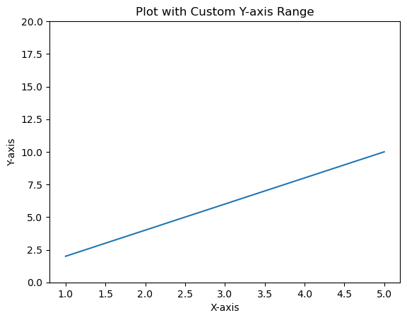
Example - Using ax.set_ylim() for Y-axis Range in Subplots
When working with an axis object ax we can set the y-axis limits for a specific subplot as per our requirement.
In this example ax.set_ylim(0, 20) sets the y-axis limits from 0 to 20 specifically for the subplot or axis ax.
import matplotlib.pyplot as plt
# Sample data
x = [1, 2, 3, 4, 5]
y = [2, 4, 6, 8, 10]
# Creating subplots
fig, ax = plt.subplots()
# Plotting on the axis
ax.plot(x, y)
# Setting y-axis limits using axis object
ax.set_ylim(0, 20) # Set y-axis limits from 0 to 12
ax.set_xlabel('X-axis')
ax.set_ylabel('Y-axis')
ax.set_title('Plot with Custom Y-axis Range')
plt.show()
Output
Change the range of the X-axis and Y-axis
This example changes the range of X and Y axes, we can use xlim() and ylim() methods.
Example - Changing Range of X-Axis and Y-Axis
import numpy as np import matplotlib.pyplot as plt plt.rcParams["figure.figsize"] = [7.50, 3.50] plt.rcParams["figure.autolayout"] = True x = np.linspace(-15, 15, 100) y = np.sin(x) plt.plot(x, y) plt.xlim(-10, 10) plt.ylim(-1, 1) plt.show()
Output
Matplotlib - Axis Scales
What is Axis Scale?
In Matplotlib library, axis scales refer to the method by which the values along an axis are displayed and spaced. Matplotlib supports various types of scales that affect how data is visualized and distributed along the axes.
There are different common Axis Scales in matplotlib library. They are,
Linear Scale (Default)
Logarithmic Scale
Symmetrical Logarithmic Scale (Symlog)
Choosing the appropriate axis scale depends on the nature of your data and the desired visualization. It's important to select a scale that effectively represents your data to convey accurate information in the plot.
Use Cases for Different Scales
Linear − Suitable for displaying data with uniform spacing between values.
Logarithmic − Useful for representing data covering a wide range of magnitudes.
Symmetrical Logarithmic − Ideal for datasets containing both positive and negative values without excluding zero.
Implementing Different Scales
Lets see each and every scale in detail how they should be implemented in the plots.
Linear Scale
In Matplotlib the linear scale represents a standard linear coordinate system used for plotting data. It is the default scaling applied to both the x-axis and y-axis unless specified otherwise.
Characteristics of Linear Scale
Uniform Spacing − On a linear scale equal increments along the axis represent equal differences in the data. For instance the distance between 0 and 1 is the same as between 1 and 2.
Linear Relationship − Data points plotted on a linear scale adhere to a linear relationship where changes in the plotted points are proportional to the changes in the data.
Example - Using Linear Scale
In this example the x-axis and y-axis use a linear scale by default. Each unit along the axis represents a constant increment in the data.
import matplotlib.pyplot as plt
# Sample data
x = [1, 2, 3, 4, 5]
y = [2, 4, 6, 8, 10]
# Creating a plot with linear scale (default)
plt.plot(x, y)
plt.xlabel('X-axis')
plt.ylabel('Y-axis')
plt.title('Plot with Linear Scale')
plt.show()
Output
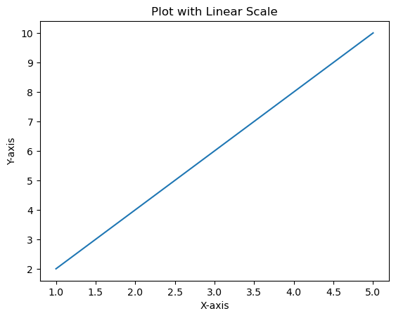
Logarithmic Scale
In Matplotlib we can set a logarithmic scale for an axis using the plt.xscale() and plt.yscale() functions or their corresponding methods ax.set_xscale() and ax.set_yscale() when working with an axis object ax. These functions allow us to change the scale of the axis to logarithmic.
Syntax
The below is the syntax for changing the x-axis to the logarithmic scale using, plt.xscale() −
plt.xscale('log')
ax.set_xscale()
ax.set_xscale('log')
The below is the syntax for changing the y-axis to the logarithmic scale using, plt.yscale() −
plt.yscale('log')
Using ax.set_yscale()
ax.set_yscale('log')
Example - Using logarithmic Scale
Here's an example demonstrating how to set a logarithmic scale for the x-axis and y-axes
import matplotlib.pyplot as plt
# Sample data
x = [1, 2, 3, 4, 5]
y = [10, 100, 1000, 10000, 100000]
# Creating a plot with logarithmic scale on both axes
plt.plot(x, y)
# Setting logarithmic scale for x-axis and y-axis
plt.xscale('log')
plt.yscale('log')
plt.xlabel('X-axis (Log Scale)')
plt.ylabel('Y-axis (Log Scale)')
plt.title('Logarithmic Scale Plot')
plt.show()
Output
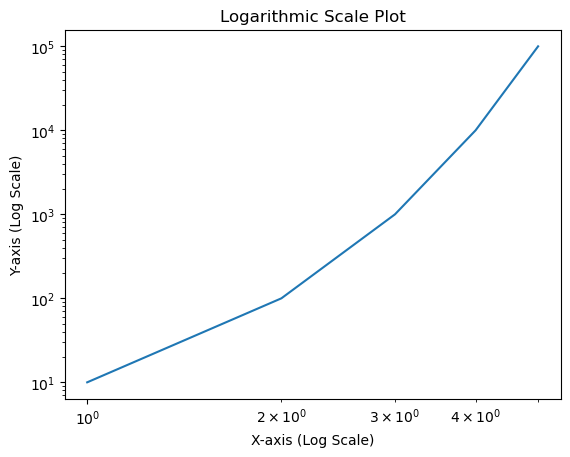
Symmetrical Logarithmic Scale (Symlog)
In Matplotlib the symmetric logarithmic scale is often referred to as symlog which allows plotting data on a logarithmic scale while also accommodating both positive and negative values symmetrically around zero.
The symlog scale combines linear scaling for values close to zero and logarithmic scaling for values farther from zero.
Syntax
Here's the syntax to set a symmetric logarithmic scale for an axis −
For the x-axis
plt.xscale('symlog', linthresh=base, linscale=lin_scale)
For the y-axis
plt.yscale('symlog', linthresh=base, linscale=lin_scale)
Where,
linthresh − Linear threshold value that determines where the transition between linear and logarithmic behavior occurs.
base − Base value for the logarithm (default is 10).
linscale − Scale factor for the linear range close to zero (default is 1.0).
Example - Using Symmetrical Logarithmic Scale
In this example plt.yscale('symlog', linthresh=0.1) sets the y-axis to a symmetric logarithmic scale with a linear threshold (linthresh) of 0.1. Values closer to zero will be displayed linearly while those farther from zero will follow a logarithmic scale.
import matplotlib.pyplot as plt
import numpy as np
x = np.linspace(-10, 10, 500)
y = np.sinh(x)
plt.plot(x, y)
plt.yscale('symlog', linthresh=0.1) # Applying symmetric logarithmic scale for y-axis
plt.title('Plot with Symmetric Logarithmic Scale')
plt.show()
Output
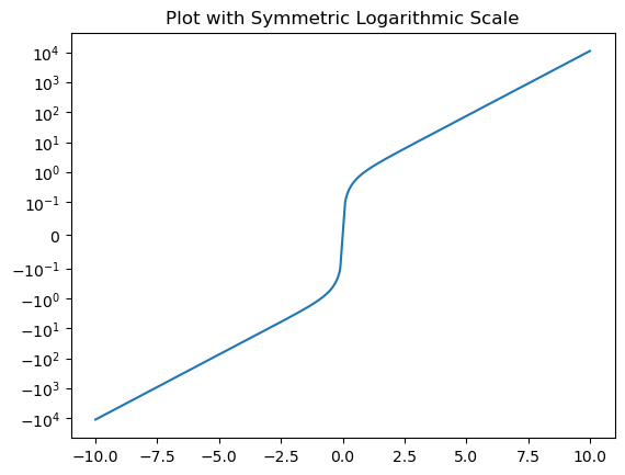
Plot with Different Scales
In this example we are plotting the plot with different scales using the matplotlib library.
Example - Using Various Scales together
import numpy as np
import matplotlib.pyplot as plt
plt.rcParams["figure.figsize"] = [7.50, 3.50]
plt.rcParams["figure.autolayout"] = True
t = np.arange(0.01, 10.0, 0.01)
data1 = np.exp(t)
data2 = np.sin(2 * np.pi * t)
fig, ax1 = plt.subplots()
color = 'red'
ax1.set_xlabel('time (s)')
ax1.set_ylabel('exp', color=color)
ax1.plot(t, data1, color=color)
ax1.tick_params(axis='y', labelcolor=color)
ax2 = ax1.twinx()
color = 'blue'
ax2.set_ylabel('sin', color=color)
ax2.plot(t, data2, color=color)
ax2.tick_params(axis='y', labelcolor=color)
plt.show()
Output
Multiple axes in Matplotlib with different scales
In this example we will see how to create a shared Y-axis.
Example - Using Scales with Multiple Axes
import matplotlib.pyplot as plt fig, ax1 = plt.subplots() ax1.plot([1, 2, 3, 4, 5], [3, 5, 7, 1, 9], color='red') ax2 = ax1.twinx() ax2.plot([11, 12, 31, 41, 15], [13, 51, 17, 11, 76], color='blue') fig.tight_layout() plt.show()
Output
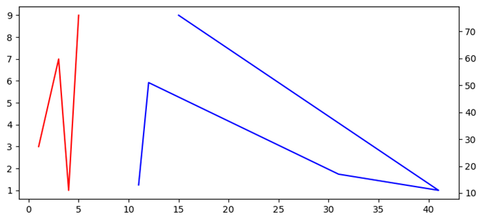
Matplotlib - Axis Ticks
What are Axis Ticks?
Axis ticks in Matplotlib refer to the markers along the axes that denote specific data values. They aid in understanding the scale of the plot and provide reference points for data visualization. Let's delve into the details of axis ticks −
Key Concepts in Axis ticks
The below are the key concepts available in axis ticks.
Major Ticks − These are the prominent ticks along the axis that represent significant data values.
Minor Ticks − These are the smaller ticks between major ticks which provides more granularity in the scale but usually less prominent.
Customizing Axis Ticks
We can customize the axis ticks on the plot as per the requirement and need. There are few steps to be followed to perform customization.
Setting Ticks
We can set the axis ticks in two ways, one is by manual setting and the other is by automatic adjustment.
Manual Setting
We can set specific tick locations and labels for the axis using plt.xticks() or plt.yticks() functions.
Example - Setting Ticks Manually
import matplotlib.pyplot as plt
import numpy as np
x = np.linspace(0, 10, 100)
y = np.sin(x)
plt.plot(x, y)
plt.xlabel('X-axis')
plt.ylabel('Y-axis')
plt.title('Plot with Custom Axis Ticks')
# Customize x-axis ticks
plt.xticks([0, 1, 2, 3, 4, 5, 6, 7, 8, 9, 10], ['A', 'B', 'C', 'D', 'E', 'F', 'G', 'H', 'I', 'J', 'K'])
# Customize y-axis ticks and labels
plt.yticks([-1, 0, 1], ['Min', 'Zero', 'Max'])
plt.show()
Output
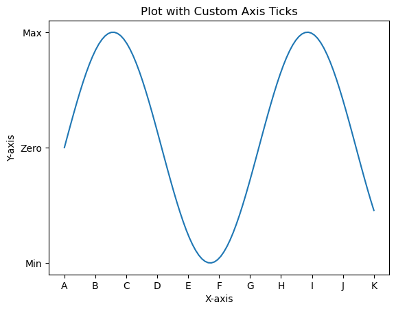
Automatic Adjustment
In Matplotlib the automatic adjustment of axis ticks involves letting the library determine the positions and labels of ticks based on the data range. This process is handled by default when we create a plot but we can fine-tune the automatic adjustment using various formatting options or by adjusting the locator and formatter settings. Here are some aspects related to automatic adjustment of axis ticks.
Default Automatic Adjustment
In this example Matplotlib automatically adjusts the positions and labels of ticks based on the data range.
Example - Automatic Adjustment of Ticks
import matplotlib.pyplot as plt
# Example data
x = [1, 2, 3, 4, 5]
y = [2, 4, 6, 8, 10]
# Creating a plot (automatic adjustment of ticks)
plt.plot(x, y)
plt.xlabel('X-axis')
plt.ylabel('Y-axis')
plt.title('Automatic Adjustment of Axis Ticks')
plt.show()
Output

Customizing Automatic Adjustment
We can customize the ticks automatically by using few functions available in pyplot. These adjustments can be made to suit the nature of our data and enhance the readability of the plot.
Understanding and leveraging automatic adjustment of axis ticks is crucial for creating clear and informative visualizations in Matplotlib.
Adjusting the Number of Ticks
We can use plt.locator_params(axis='x', nbins=5) to control the number of ticks on the x-axis. Adjust the parameter nbins set to the desired number.
Scientific Notation
To display tick labels in scientific notation we can use the plt.ticklabel_format(style='sci', axis='both', scilimits=(min, max)).
Date Ticks (For Time Series Data)
If we are dealing with date/time data then Matplotlib can automatically format date ticks.
Example - Customized Adjustment of Ticks
In this example we are applying the customizing automatic adjustment to the axis ticks of the plot.
import matplotlib.dates as mdates
from datetime import datetime
# Example date data
dates = [datetime(2022, 1, 1), datetime(2022, 2, 1), datetime(2022, 3, 1)]
# Creating a plot with automatic adjustment of date ticks
plt.plot(dates, [2, 4, 6])
# Formatting x-axis as date
plt.gca().xaxis.set_major_locator(mdates.MonthLocator())
plt.gca().xaxis.set_major_formatter(mdates.DateFormatter('%Y-%m-%d'))
plt.xlabel('Date')
plt.ylabel('Y-axis')
plt.title('Automatic Adjustment of Date Ticks')
plt.show()
Output
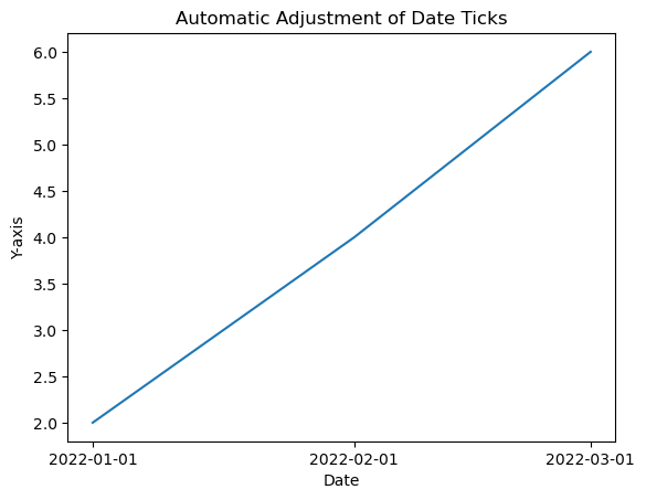
Tick Formatting
We can customize the appearance of tick labels based on font size, color and rotation using fontsize, color and rotation parameters.
Example - Customize Appearance of Tick Labels
import matplotlib.pyplot as plt
# Example data
x = [1, 2, 3, 4, 5]
y = [2, 4, 6, 8, 10]
# Creating a plot (automatic adjustment of ticks)
plt.plot(x, y)
plt.xticks(fontsize=10, color='red', rotation=45)
plt.xlabel('X-axis')
plt.ylabel('Y-axis')
plt.title('Automatic Adjustment of Axis Ticks')
plt.show()
Output
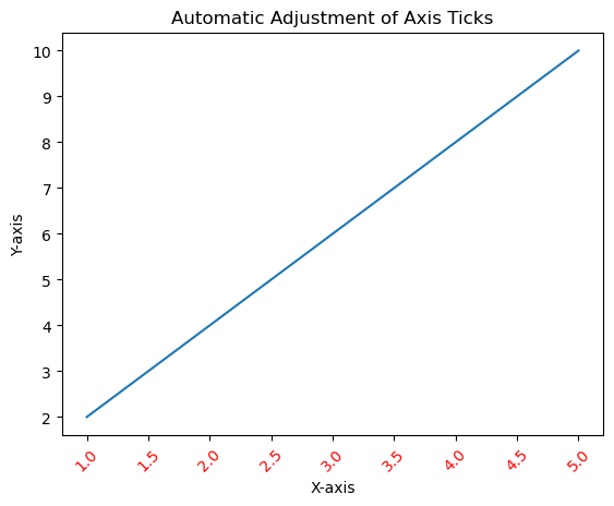
Tick Frequency and Appearance
Setting Tick Frequency
We can adjust the frequency of ticks using plt.locator_params(axis='x', nbins=5) to control the number of ticks displayed.
Example - Setting Tick Frequency
import matplotlib.pyplot as plt
# Example data
x = [1, 2, 3, 4, 5]
y = [2, 4, 6, 8, 10]
# Creating a plot (automatic adjustment of ticks)
plt.plot(x, y)
plt.locator_params(axis='x', nbins=10)
plt.xlabel('X-axis')
plt.ylabel('Y-axis')
plt.title('Automatic Adjustment of Axis Ticks')
plt.show()
Output

Minor Ticks
We can enable the minor ticks using plt.minorticks_on(). We can customize their appearance with plt.minorticks_on(), plt.minorticks_off() or by specifying their positions.
Example - Enabling Minor Ticks
import matplotlib.pyplot as plt
# Example data
x = [1, 2, 3, 4, 5]
y = [2, 4, 6, 8, 10]
# Creating a plot (automatic adjustment of ticks)
plt.plot(x, y)
plt.minorticks_on()
plt.xlabel('X-axis')
plt.ylabel('Y-axis')
plt.title('Automatic Adjustment of Axis Ticks')
plt.show()
Output
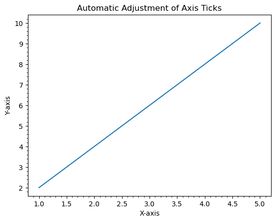
Use Cases
Precision Control − Adjust ticks to provide more precise information about data values.
Enhanced Readability − Customize tick labels and appearance for better readability.
Fine-tuning − Manually set ticks to emphasize specific data points or intervals.
Understanding and customizing axis ticks is crucial for effectively communicating information in plots by allowing us to tailor the presentation of data according to our visualization needs.
Adding extra axis ticks
In this example to add extra ticks we use xticks() function and increase the range of ticks to 1 to 20 from 1 to 10.
Example - Adding Extra Axis Ticks
import numpy as np from matplotlib import pyplot as plt plt.rcParams["figure.figsize"] = [7.50, 3.50] plt.rcParams["figure.autolayout"] = True x = np.linspace(1, 10, 100) y = np.sin(x) plt.plot(x, y) plt.xticks(range(1, 20)) plt.show()
Output
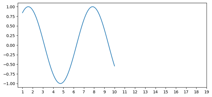
Customize X-axis ticks
In this example to add extra ticks we use xticks() function and increase the range of ticks to 1 to 20 from 1 to 10.
Example - Customizing Ticks
import numpy as np
import matplotlib.pyplot as plt
plt.rcParams["figure.figsize"] = [7.50, 3.50]
plt.rcParams["figure.autolayout"] = True
height = [3, 12, 5, 18, 45]
bars = ('A', 'B', 'C', 'D', 'E')
y_pos = np.arange(len(bars))
plt.bar(y_pos, height, color='yellow')
plt.tick_params(axis='x', colors='red', direction='out', length=7, width=2)
plt.show()
Output
Remove the X-axis ticks while keeping the grids
To remove the X-ticks while keeping the grids we can use the below code as the reference.
Example - Removing Ticks
import matplotlib.pyplot as plt import numpy as np plt.rcParams["figure.figsize"] = [7.00, 3.50] plt.rcParams["figure.autolayout"] = True x = np.linspace(0, 2*np.pi, 100) ax = plt.gca() ax.plot(x, np.sin(x), c='r', lw=5, label='y=sin(x)') ax.set_xticklabels([]) ax.set_yticklabels([]) ax.grid(True) plt.legend(loc="upper right") plt.show()
Output
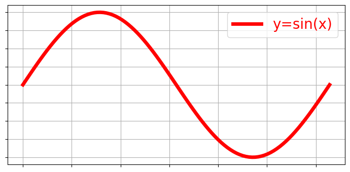
Turn off the ticks and marks
In this example we turn off the ticks and marks of a matplotlib axes we can use set_tick_params() to hide X and Y axes label marks, set_xticks() and set_yticks() to hide X and Y axes tick marks.
Example = Turning Off Ticks
import numpy as np from matplotlib import pyplot as plt # Set the figure size plt.rcParams["figure.figsize"] = [7.00, 3.50] plt.rcParams["figure.autolayout"] = True # Create x and y data points x = np.linspace(-10, 10, 100) y = np.sin(x) plt.plot(x, y) ax = plt.gca() # Hide X and Y axes label marks ax.xaxis.set_tick_params(labelbottom=False) ax.yaxis.set_tick_params(labelleft=False) # Hide X and Y axes tick marks ax.set_xticks([]) ax.set_yticks([]) plt.show()
Output
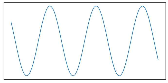
Remove the digits after the decimal point in axis ticks
In this example we use use x.astype(int) function to set the xtick labels only in digits.
Example - Removing Digits after Decimal Point
import matplotlib.pyplot as plt import numpy as np plt.rcParams["figure.figsize"] = [7.50, 3.50] plt.rcParams["figure.autolayout"] = True x = np.array([1.110, 2.110, 4.110, 5.901, 6.00, 7.90, 8.90]) y = np.array([2.110, 1.110, 3.110, 9.00, 4.001, 2.095, 5.890]) fig, ax = plt.subplots() ax.plot(x, y) ax.set_xticks(x.astype(int)) plt.show()
Output
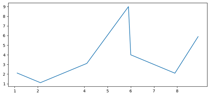
Add Matplotlib Colorbar Ticks
Here in this example we create a colorbar for a ScalarMappable instance, *mappable* with ticks=ticks to add colorbar ticks.
Example - Adding Colorbar Ticks
import numpy as np import matplotlib.pyplot as plt plt.rcParams["figure.figsize"] = [7.50, 3.50] plt.rcParams["figure.autolayout"] = True x, y = np.mgrid[-1:1:100j, -1:1:100j] z = (x + y) * np.exp(-5.0 * (x ** 2 + y ** 2)) plt.imshow(z, extent=[-1, 1, -1, 1]) ticks = np.linspace(z.min(), z.max(), 5, endpoint=True) cb = plt.colorbar(ticks=ticks) plt.show()
Output
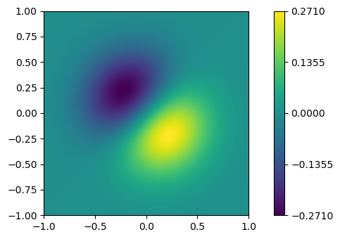
Adjusting gridlines and ticks in Matplotlib imshow
In this example we set the xticklabels and yticklabels by using the set_xticklabels and set_yticklabels method.
Example - Adjusting Gridlines
import numpy as np from matplotlib import pyplot as plt plt.rcParams["figure.figsize"] = [7.00, 3.50] plt.rcParams["figure.autolayout"] = True data = np.random.rand(9, 9) plt.imshow(data, interpolation="nearest") ax = plt.gca() ax.set_xticks(np.arange(-.5, 9, 1)) ax.set_yticks(np.arange(-.5, 9, 1)) ax.set_xticklabels(np.arange(0, 10, 1)) ax.set_yticklabels(np.arange(0, 10, 1)) ax.grid(color='red', linestyle='-.', linewidth=1) plt.show()
Output
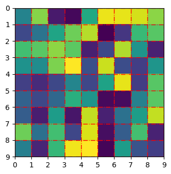
Change the spacing between ticks
In this example we set ticks on a fixed position or change the spacing between ticks in matplotlib
Example - Adjusting Spacing between Ticks
import matplotlib.pyplot as plt plt.rcParams["figure.figsize"] = [7.00, 3.50] plt.rcParams["figure.autolayout"] = True fig, ax = plt.subplots() xtick_loc = [0.20, 0.75, 0.30] ytick_loc = [0.12, 0.80, 0.76] ax.set_xticks(xtick_loc) ax.set_yticks(ytick_loc) plt.show()
Output
Move the Y-axis ticks from the left side of the plot to the right side
In this example to shift the Y-axis ticks from left to right we use ax.yaxis.tick_right()
Example - Moving Ticks from Left Side to Right Side
from matplotlib import pyplot as plt
import numpy as np
f = plt.figure()
ax = f.add_subplot(111)
ax.yaxis.tick_right()
xpoints = np.array([0, 5])
ypoints = np.array([0, 5])
plt.plot(xpoints, ypoints)
plt.ylabel("Y-axis ")
plt.xlabel("X-axis ")
plt.show()
Output
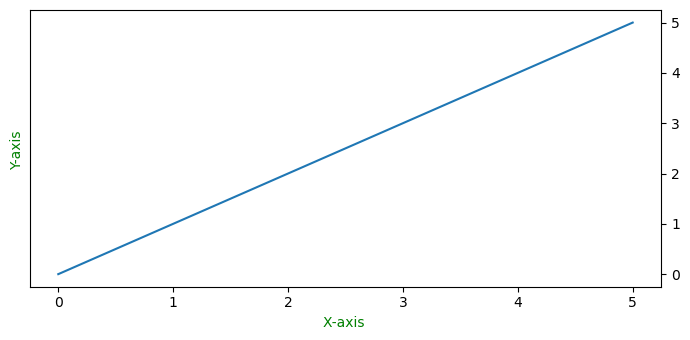
Add third level of ticks
This example is a reference for adding the third level of ticks.
Example - Adding Third Level of Ticks
import matplotlib.pyplot as plt
import numpy as np
import matplotlib.ticker
plt.rcParams["figure.figsize"] = [7.50, 3.50]
plt.rcParams["figure.autolayout"] = True
t = np.arange(0.0, 100.0, 0.1)
s = np.sin(0.1 * np.pi * t) * np.exp(-t * 0.01)
fig, ax = plt.subplots()
plt.plot(t, s)
ax1 = ax.twiny()
ax1.plot(t, s)
ax1.xaxis.set_ticks_position('bottom')
majors = np.linspace(0, 100, 6)
minors = np.linspace(0, 100, 11)
thirds = np.linspace(0, 100, 101)
ax.xaxis.set_major_locator(matplotlib.ticker.FixedLocator(majors))
ax.xaxis.set_minor_locator(matplotlib.ticker.FixedLocator(minors))
ax1.xaxis.set_major_locator(matplotlib.ticker.FixedLocator([]))
ax1.xaxis.set_minor_locator(matplotlib.ticker.FixedLocator(thirds))
ax1.tick_params(which='minor', length=2)
ax.tick_params(which='minor', length=4)
ax.tick_params(which='major', length=6)
ax.grid(which='both', axis='x', linestyle='--')
plt.axhline(color='gray')
plt.show()
Output
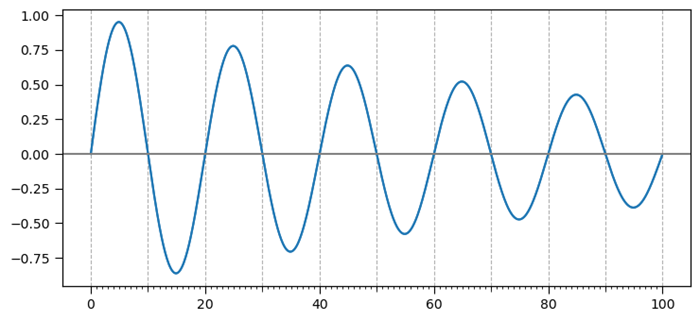
Create minor ticks for a polar plot
This example is a reference for adding the third level of ticks.
Example - Creating Minor Ticks
import numpy as np import matplotlib.pyplot as plt # Set the figure size plt.rcParams["figure.figsize"] = [7.00, 3.50] plt.rcParams["figure.autolayout"] = True # radius and theta for the polar plot r = np.arange(0, 5, 0.1) theta = 2 * np.pi * r # Add a subplot ax = plt.subplot(111, projection='polar') tick = [ax.get_rmax(), ax.get_rmax() * 0.97] # Iterate the points between 0 to 360 with step=10 for t in np.deg2rad(np.arange(0, 360, 10)): ax.plot([t, t], tick, lw=1, color="red") # Display the plot plt.show()
Output
Overlapping Y-axis tick label and X-axis tick label
In this example we reduce the chances of overlapping between x and y tick labels in matplotlib.
Example - Overlapping tick Labels
import matplotlib.pyplot as plt
from matplotlib.ticker import MaxNLocator
import numpy as np
plt.rcParams["figure.figsize"] = [7.00, 3.50]
plt.rcParams["figure.autolayout"] = True
xs = np.linspace(0, 5, 10)
ys = np.linspace(0, 5, 10)
plt.subplot(121)
plt.margins(x=0, y=0)
plt.plot(xs, ys)
plt.title("Overlapping")
plt.subplot(122)
plt.margins(x=0, y=0)
plt.plot(xs, ys)
plt.title("Non overlapping")
plt.gca().xaxis.set_major_locator(MaxNLocator(prune='lower'))
plt.gca().yaxis.set_major_locator(MaxNLocator(prune='lower'))
plt.show()
Output
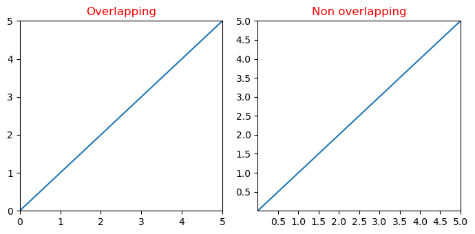
Disable the minor ticks of a log-plot
This example disable the minor ticks of a log plot in matplotlib by using minorticks_off() function.
Example - Disabling Minor Ticks
import numpy as np
from matplotlib import pyplot as plt
plt.rcParams["figure.figsize"] = [7.50, 3.50]
plt.rcParams["figure.autolayout"] = True
x = np.random.randint(-3, 3, 10)
y = np.exp(x)
plt.subplot(121)
plt.plot(y, x, c='red')
plt.xscale('log')
plt.title("With minor ticks")
plt.subplot(122)
plt.plot(y, x, c='green')
plt.xscale('log')
plt.minorticks_off()
plt.title("Without minor ticks")
plt.show()
Output
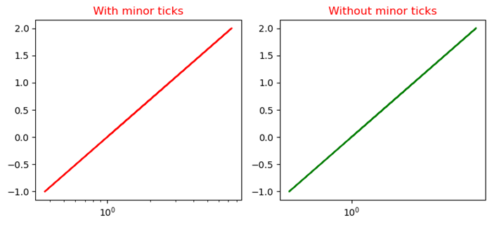
Matplotlib - Formatting Axes
What is Formatting Axes?
Formatting axes in Matplotlib involves customizing various aspects of the plot's axes such as ticks, labels, scale, limits and more. This customization enhances the readability and presentation of the data visualization.
Formatting the axes in Matplotlib allows us to tailor the visualization according to our data's characteristics and presentation requirements. Experiment with various formatting options to create clear and informative plots.
Use Cases
The following are the use cases of Formatting Axes.
Enhancing Readability − Adjust font sizes, colors and labels for better visualization.
Data Emphasis − Set limits and scale to focus on specific data ranges.
Aesthetics − Customize appearance with titles, grid lines and spine properties.
Clarity and Context − Label axes and add titles for understanding the plot's content.
Axes Formatting Options
We have different Axes formatting options lets go through each and everyone in detail.
Ticks and Tick Labels
In Matplotlib ticks are the small marks on an axis that denote specific data points and where as tick labels are the values corresponding to those ticks. We can customize their appearance using various functions in Matplotlib.
To modify ticks and tick labels we can use methods like plt.xticks() and plt.yticks() to set their positions and labels. plt.xticks() and plt.yticks() allow us to set the locations and labels of ticks on the x and y axes respectively. We can adjust the appearance of ticks using plt.tick_params() to change aspects like size, color, direction etc.
Formatting the tick labels can be done through plt.gca().xaxis or plt.gca().yaxis with methods like set_major_formatter() to control their display such as scientific notation, decimal places, date format and etc.
Additionally for more granular control we can access specific ticks and labels using ax.get_xticks(), ax.get_yticks(), ax.get_xticklabels(), ax.get_yticklabels() and then modify them individually.
Example - Customizing Tick and Tick Label
In this example we are setting the ticks and tick labels of a plot with the use of above discussed functions and methods available in matplotlib library.
import matplotlib.pyplot as plt
import numpy as np
# Generating sample data
x = np.linspace(0, 10, 100)
y = np.sin(x)
# Creating a plot
plt.figure(figsize=(8, 5))
plt.plot(x, y)
# Customizing ticks and tick labels
plt.xticks(np.arange(0, 11, 2)) # Set x-axis ticks at intervals of 2
plt.yticks(fontsize=10, color='red') # Customize y-axis tick labels (font size and color)
plt.xlabel('X-axis', fontsize=12)
plt.ylabel('Y-axis', fontsize=12)
plt.title('Ticks and Tick Labels Formatting', fontsize=14)
plt.show()
Output
On executing the above code we will get the following output −
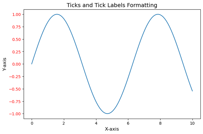
Axis Limits and Scale
Axis limits and scale are fundamental aspects when creating visualizations. They control the range and appearance of the data displayed along the axes of a plot or chart.
Axis Limits
The Axis limits define the span of values shown on each axis. By setting limits we can focus on a specific range of data by emphasizing particular details or trends. For example in a scatter plot if we set axis limits then it can zoom in on a particular region of interest.
Scale
The scale determines how the data is distributed and represented along an axis. Common scales include linear, logarithmic and categorical. Linear scale represents data equally spaced along the axis where as logarithmic scale emphasizes changes in orders of magnitude and categorical scale is used for non-numeric data or categories.
Here are key considerations and actions related to axis limits and scale.
Setting Limits − Define the minimum and maximum values for each axis to control what portion of the data is displayed.
Zooming In/Out − Adjust axis limits to focus on specific data ranges or zoom out to show the overall context.
Scale Transformation − Changing the scale type can alter how the data is perceived. For instance by using a logarithmic scale can better visualize exponential growth or wide-ranging data.
Normalization − Normalize data if needed to bring different scales into a comparable range especially when plotting multiple datasets on the same graph.
- Limiting Outliers − Set axis limits to exclude outliers or anomalies by providing a clearer view of the main data distribution.
Scale Customization − Some visualization libraries allow customization of scale aesthetics such as tick placement and labeling for different scales.
In Python libraries like Matplotlib or Seaborn provide functionalities to manipulate axis limits and scales by allowing user for detailed control over how data is presented in plots.
Example - Setting Axis Limits and Scales
Here's an example using Python's Matplotlib library to demonstrate setting axis limits and changing scales.
import matplotlib.pyplot as plt
import numpy as np
# Generating data
x = np.linspace(0.1, 100, 500)
y = np.sin(x)
# Creating a figure and axes object
fig, axs = plt.subplots(1, 2, figsize=(12, 5))
# Plot with default linear scale
axs[0].plot(x, y)
axs[0].set_title('Linear Scale')
# Plot with logarithmic scale for the y-axis
axs[1].plot(x, y)
axs[1].set_yscale('log') # Set logarithmic scale for the y-axis
axs[1].set_title('Logarithmic Scale (y-axis)')
plt.tight_layout()
plt.show()
Output
On executing the above code we will get the following output −
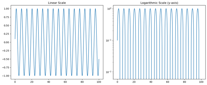
Axis Labels and Titles
Axis labels and titles are crucial components of any visualization in providing context and information about the data represented on the plot. They help readers understand what each axis represents and the overall purpose of the visualization.
Customizing axis labels and titles involves specifying text, adjusting font size, setting font weight, changing color and positioning them appropriately within the plot to ensure clarity and readability.
Axis Labels
The Axis labels describe the quantity or nature of the data displayed along each axis. For example in a scatter plot with height on the y-axis and weight on the x-axis, the labels might be "Height (cm)" and "Weight (kg)". They make it clear what the plotted values signify.
Titles
A title provides an overarching description or context for the entire plot. It gives a brief explanation of what the visualization is about, what relationships or patterns it might illustrate or what insights can be drawn from it.
Example - Creating Labeled Axes
The following is an example using Python's Matplotlib library to create a simple plot with labeled axes and a title.
import matplotlib.pyplot as plt
import numpy as np
# Generating data
x = np.linspace(0, 10, 100)
y = np.cos(x)
# Creating the plot
plt.plot(x, y)
# Adding axis labels and title
plt.xlabel('X-axis Label')
plt.ylabel('Y-axis Label')
plt.title('Cosine Wave Plot')
plt.show()
Output
On executing the above code we will get the following output −
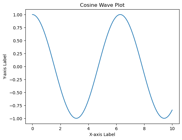
Grid Lines and Spines
Grid lines and spines are visual components that aid in understanding and interpreting plots by providing reference points and delineating the plot area.
Customizing grid lines and spines allows for better presentation and emphasis on certain aspects of the plot by enhancing its clarity and visual appeal. We can adjust the appearance, visibility and properties of grid lines and spines to suit the visualization's requirements.
Grid Lines
These are horizontal and vertical lines that span the plot area, intersecting at the ticks along the axes. They help in visually estimating data points and relationships within the plot. Grid lines can be present along one or both axes and they can be customized in terms of style, color and visibility.
Spines
Spines are the lines that form the boundaries of the plot box. They connect the axis tick marks and define the boundaries of the data area. Spines can be customized individually for each side of the plot such as top, bottom, left, right which allows changes in their appearance, thickness and position.
In Matplotlib we can control grid lines and spines using various methods and attributes.
Example - Using Gridlines and Spines
Here is the example of setting the gridlines and spines of a plot by using the plt.grid() and plt.gca().spines methods.
import matplotlib.pyplot as plt
# Generating data
x = [1, 2, 3, 4, 5]
y = [2, 4, 6, 8, 10]
# Creating a plot
plt.plot(x, y)
# Displaying grid lines
plt.grid(True) # Show grid lines
# Customizing spines
plt.gca().spines['top'].set_linestyle('--') # Customize top spine style
plt.gca().spines['right'].set_visible(False) # Hide right spine
plt.show()
Output
On executing the above code we will get the following output −
Axis spines are the lines connecting axis tick marks demarcating boundaries of plot area. The axes object has spines located at top, bottom, left and right.
Each spine can be formatted by specifying color and width. Any edge can be made invisible if its color is set to none.
Example - Formatting Spines
import matplotlib.pyplot as plt
fig = plt.figure()
ax = fig.add_axes([0,0,1,1])
ax.spines['bottom'].set_color('blue')
ax.spines['left'].set_color('red')
ax.spines['left'].set_linewidth(2)
ax.spines['right'].set_color(None)
ax.spines['top'].set_color(None)
ax.plot([1,2,3,4,5])
plt.show()
Output
On executing the above code we will get the following output −
Example - Labeling X, Y-Axis
Here's an example code for Labeling x, y-Axis in Python's Matplotlib library.
# importing matplotlib module
import matplotlib.pyplot as plt
import numpy as np
# x-axis & y-axis values
x = [1, 2, 3, 4, 5]
y = [10, 5, 15, 20, 25]
# create a figure and axes
fig, ax = plt.subplots()
# setting title to graph
ax.set_title('Tutorials Point')
# label x-axis and y-axis
ax.set_ylabel('y-AXIS')
ax.set_xlabel('x-AXIS')
# function to plot and show graph
ax.plot(x, y)
plt.show()
Output
On executing the above code we will get the following output −
Example - Setting Limits of X, Y Axis
Formatting Axes in Python matplotlib Limits of x, y-axis which in this case is, (10,0) and (0,40) respectively. Limits of axes set the highest plots to be covered in the graph. By default the max value of x-axis and max value of y-axis of the given points will be pointed.
import matplotlib.pyplot as plt
import numpy as np
x = [1, 2, 3, 4, 5]
y = [10, 5, 15, 20, 25]
# create a figure and axes
fig, ax = plt.subplots()
ax.set_title('Tutorials Point')
ax.set_ylabel('y-AXIS')
ax.set_xlabel('x-AXIS')
# sets x, y-axis limits on the graph
ax.set_xlim(0, 10)
ax.set_ylim(0, 40)
# function to plot and show graph
ax.plot(x, y)
plt.show()
Output
On executing the above code we will get the following output −
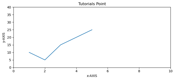
Matplotlib - Axes Class
In the context of Matplotlib, axes does not refer to the plural form of an axis. Instead, it represents the entire plotting area on a figure or canvas. Which includes the x-axis, y-axis, plotting data, ticks, ticks labels, and more.
Refer to the image below −
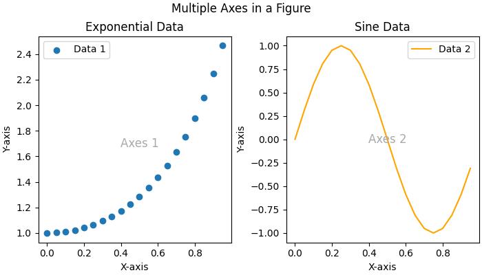
Consider the figure where two Axes objects are created using the ax = fig.subplots() method. The first axes display exponential data, while the second axes show a sine wave. Each Axes (subplot) has its own set of labels, ticks, and legends, providing a distinct representation within the same figure.
Axes class in matplotlib
The Axes() class serves as the gateway to creating data visualizations. Once an Axes object is instantiated on a figure, a variety of methods become available to add and manipulate data within that plotting area.
This class is part of the matplotlib.axes module, providing fundamental functionalities to work with the Matplotlib object-oriented programming (OOP) interface. Most of the essential plotting methods are defined on the Axes class, making it a central component for customizing and enhancing visualizations.
Creating an Axes
Creating an Axes object is typically the first step in Matplotlib plotting. This can be done through methods on Figure object like Figure.subplots(), Figure.add_axes(), or via the pyplot interface function, pyplot.subplots(). These methods provides the creation of one or more Axes objects in a figure.
Example - Usage of Axes Class
The following example uses the pyplot.subplot() method to creat two axes on a figure. The subplots() method is useful for generating the axes instance.
import matplotlib.pyplot as plt
import numpy as np
# Creating a 1x2 subplot layout
fig, (axes1, axes2) = plt.subplots(1, 2, figsize=(7, 4),
layout="constrained")
# Adding labels to each subplot
axes1.annotate('axes1', (0.5, 0.5),transform=axes1.transAxes,
ha='center', va='center', fontsize=18,
color='darkgrey')
axes2.annotate('axes2', (0.5, 0.5),transform=axes2.transAxes,
ha='center', va='center', fontsize=18,
color='darkgrey')
fig.suptitle('Creating Two Axes on a Figure')
# Displaying the plot
plt.show()
Output
On executing the above code we will get the following output −
Changing an Axes properties
To set the properties of an axes, you have to access the axes object, after that you can use various `set_*` methods to modify its properties.
Example - Changing Axes Properties
import matplotlib.pyplot as plt
import numpy as np
# Creating a 1x2 subplot layout
fig, (axes1, axes2) = plt.subplots(1, 2, figsize=(7, 4),
constrained_layout=True)
# Changing the properties of the first axes
axes1.set_xlabel("X-axis") # Set label for X-axis
axes1.set_ylabel("Y-axis") # Set label for Y-axis
axes1.set_facecolor('lightgreen') # Setting background color
axes1.annotate('axes1', (0.5, 0.5), transform=axes1.transAxes,
ha='center', va='center', fontsize=18,
color='darkgrey')
axes2.set_title('Second axes')
axes2.annotate('axes2', (0.5, 0.5), transform=axes2.transAxes,
ha='center', va='center', fontsize=18,
color='darkgrey')
# Adding a title to the figure
fig.suptitle('Changing Axes Properties')
# Displaying the plot
plt.show()
Output
On executing the above code you will get the following output −
Plotting on an Axes
This class offers several high-level plotting methods to create different plot on axes.
Example - Plotting Axes
Here is an example uses the Axes.plot() method to create a line plot representing the sin(x).
import matplotlib.pyplot as plt import numpy as np # Sample Data x = np.linspace(0, 2 * np.pi, 400) y = np.sin(x**2) # Create subplots fig, axs = plt.subplots(figsize=(7,4)) # Draw the plot axs.plot(x, y) # Show the plot plt.show()
Output
On executing the above code we will get the following output −
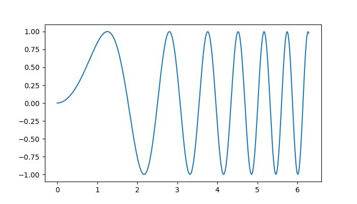
Customizing the axes Data
The Axes object contains most of the figure elements such as Axis, Tick, Line2D, Text, Polygon, etc., and sets the coordinate system. These elements can be customized by adding labels, titles, legends, and annotations to the Axes enhances the clarity of visualizations.
Example - Adding Labels, titles to Axes
Here is a simple example that adds the labels, titles, legends to an Axes.
import matplotlib.pyplot as plt
import numpy as np
# Sample Data
x = np.linspace(0, 2 * np.pi, 400)
y = np.sin(x**2)
# Create subplots
fig, axs = plt.subplots(figsize=(7,4))
# Draw the plot
axs.plot(x, y, label='Sin(x)')
# Add titles
axs.set_title('Sin Plot')
# Add X and Y labels
axs.set_xlabel('X-axis')
axs.set_ylabel('Y-axis')
# Add legend
axs.legend()
# Show the plot
plt.show()
Output
On executing the above code we will get the following output −
Clearing the Axes
To clear the contents of an axes, you can use the axes.cla() or axes.clear() method.
Example - Clearing An Axes
Here is an example that show how you can clear the first axes in a subplot.
import matplotlib.pyplot as plt
import numpy as np
# Sample data
x = np.linspace(-1, 1, 10)
y = np.exp(x)
# Creating subplots
fig, (axes1, axes2) = plt.subplots(1, 2, figsize=(7, 4),
constrained_layout=True)
# Plotting on the first axes
axes1.plot(x, y, c='red')
axes1.set_xlabel("X-axis") # Set label for X-axis
axes1.set_ylabel("Y-axis") # Set label for Y-axis
axes1.set_facecolor('lightgreen') # Setting background color
axes1.annotate('axes1', (0.5, 0.5), transform=axes1.transAxes,
ha='center', va='center', fontsize=18,
color='darkgrey')
# Adding a title to the second axes
axes2.set_title('Second axes')
axes2.annotate('axes2', (0.5, 0.5), transform=axes2.transAxes,
ha='center', va='center', fontsize=18,
color='darkgrey')
# Clearing the first axes
axes1.cla()
# Adding a title to the figure
fig.suptitle('Clearing the Axes')
# Displaying the plot
plt.show()
Output
On executing the above code you will get the following output −
Matplotlib - Twin Axes
Twin axes in Matplotlib refer to the creation of two independent axes that share either the x-axis or the y-axis scales, enabling the display of a plot with two sets of data having different scales on the same axes. This technique is particularly useful when you want to visualize two datasets on the same plot, but they have significantly different scales.
See the below image for reference −

In the above image, you can observe that two y-axes share the same x-axis, allowing us to compare the sin(x) and exp(x) datasets on the same plot with different y-axis scales.
Matplotlib's Axes class provides the twinx() and twiny() methods to create twin axes that share the same x-axis or y-axis, respectively.
Creating Twin Axes Sharing X-Axis
The Axes.twinx() method is used to create a set of twin axes sharing the x-axis. It generates a new set of axes with an invisible x-axis and an independent y-axis positioned opposite to the original one (i.e., at the right). The x-axis autoscale setting is inherited from the original axes.
Example - Creating Different Scales on Same Axis
Here is an example that demonstrates how to use the twinx() method to create plots with different scales on the same set of axes.
import matplotlib.pyplot as plt
import numpy as np
# Create the input data
x = np.linspace(0, 10, 100)
# First Dataset
y1 = np.sin(x)
# Second Dataset
y2 = np.exp(x/1.5)
# Create the main set of axes
fig, ax1 = plt.subplots(figsize=(7, 4))
# Plot the first dataset on the left y-axis
ax1.plot(x, y1, color='blue', label='Sin(x)')
ax1.set_xlabel('X-axis')
ax1.set_ylabel('Left Y-axis', color='blue')
ax1.tick_params('y', colors='blue')
# Create a set of twin axes sharing the same x-axis
ax2 = ax1.twinx()
# Plot the second dataset on the right y-axis
ax2.plot(x, y2, color='red', label='Exp(x)')
ax2.set_ylabel('Right Y-axis', color='red')
ax2.tick_params('y', colors='red')
# Add legends for both datasets
ax1.legend(loc='upper left')
ax2.legend(loc='upper right')
# Display the plot
plt.title('Matplotlib Twin Axes Example')
plt.show()
Output
On executing the above code we will get the following output −
Example - Sharing Secondary Y-Axis
Here is an example that shares secondary Y-axis between subplots in Matplotlib
import numpy as np
import matplotlib.pyplot as plt
plt.rcParams["figure.figsize"] = [7.00, 3.50]
plt.rcParams["figure.autolayout"] = True
# Generate sample data
x = np.linspace(-2, 2, 10)
# Create subplots and their twinned axes
ax0 = plt.subplot(211)
ax1 = ax0.twinx() # Create a twin of Axes with a shared x-axis but independent y-axis.
ax2 = plt.subplot(212)
ax3 = ax2.twinx() # Create a twin of Axes with a shared x-axis but independent y-axis.
# Join the twinned axes for sharing secondary Y-axis
ax1.sharey(ax3)
# Plot data on each subplot and twinned axes
c1, = ax0.plot(x, np.sin(x), c='red')
c2, = ax1.plot(x, np.cos(x), c='blue')
c3, = ax2.plot(x, np.tan(x), c='green')
c4, = ax3.plot(x, np.exp(x), c='yellow')
# Add legend
plt.legend([c1, c2, c3, c4], ["y=sin(x)", "y=cos(x)", "y=tan(x)", "y=exp(x)"],
loc="upper left", bbox_to_anchor=(0.070, 2.25))
# Display the plot
plt.show()
Output
On executing the above code you will get the following output −
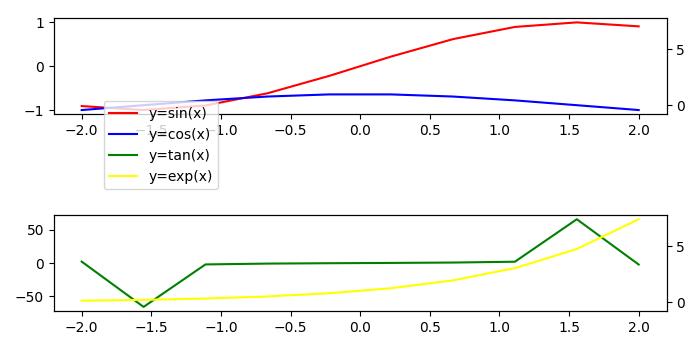
Creating Twin Axes Sharing Y-Axis
If you want to share the y-axis while maintaining independent x-axes, you can use Axes.twiny() method. This method creates a set of twin axes that share the y-axis, with an invisible y-axis and an independent x-axis positioned opposite to the original one (i.e., at the top). The y-axis autoscale setting is inherited from the original axes.
Example - Creating Different Scales on Same Set of Axes
Here is an example that demonstrates how to use the twiny() method to create plots with different scales on the same set of axes.
import matplotlib.pyplot as plt
import numpy as np
# First Dataset
x1 = np.linspace(0, 10, 100)
y = np.sin(x1)
# Second Dataset
x2 = np.linspace(0, 7, 50)
z = np.cos(x2)
# Create the main set of axes
fig, ax1 = plt.subplots(figsize=(7, 4))
# Plot the first dataset on the bottom x-axis
ax1.plot(x1, y, color='blue', label='Sin(x)')
ax1.set_xlabel('Bottom X-axis')
ax1.set_ylabel('Y-axis', color='blue')
ax1.tick_params('y', colors='blue')
# Create a set of twin axes sharing the same y-axis
ax2 = ax1.twiny()
# Plot the second dataset on the top x-axis
ax2.plot(x2, z, color='red', label='Cos(x)')
ax2.set_xlabel('Top X-axis', color='red')
ax2.tick_params('x', colors='red')
# Add legends for both datasets
ax1.legend(loc='upper left')
ax2.legend(loc='upper right')
# Display the plot
plt.title('Matplotlib Twiny Axes Example')
plt.show()
Output
On executing the above code we will get the following output −
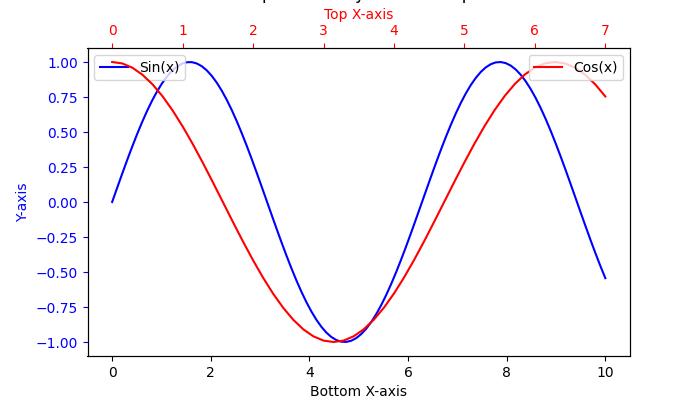
Matplotlib - Figure Class
In Matplotlib, a Figure is a top-level container that holds all the elements of a plot or visualization. It is an overall window or canvas that contains various components like axes, labels, titles, legends, colorbars, and other elements.
See the below image for reference −
In the above image, the green region represents the figure and the white region is the axes area.
Figure Class in Matplotlb
The Figure() class in Matplotlib is a top-level artist that acts as the primary container for all plot elements. It holds everything together, including subplots, axes, titles, legends, and other artistic elements.
This class is available in the matplotlib.figure module with several customization options, in addition to the Figure() class, the module also contains classes related to creating and managing figures.
Creating a Figure
A Figure instance is typically created using pyplot methods such as figure, subplots, and subplot_mosaic. These methods return both a Figure instance and a set of Axes, providing a convenient way to create and work with visualizations.
Example - Creating a Figure
Here is an example that uses the pyplot.figure() method to create a figure.
import matplotlib.pyplot as plt
import numpy as np
# Creating the Figure instance
fig = plt.figure(figsize=[7, 3], facecolor='lightgreen', layout='constrained')
# Adding a title to the Figure
fig.suptitle('Figure')
# Adding a subplot (Axes) to the Figure
ax = fig.add_subplot()
# Setting a title for the subplot
ax.set_title('Axes', loc='left', fontstyle='oblique', fontsize='medium')
# Showing the plot
plt.show()
Output
On executing the above code we will get the following output −

Example - Creating Multiple Figures
This example demonstrates how to create multiple figures separately within a single script in Matplotlib.
from matplotlib import pyplot as plt
plt.rcParams["figure.figsize"] = [7, 3.50]
plt.rcParams["figure.autolayout"] = True
# Create Figure 1
fig1 = plt.figure("Figure 1")
plt.plot([1, 3, 7, 3, 1], c="red", lw=2)
plt.title("Figure 1")
# Create Figure 2
fig2 = plt.figure("Figure 2")
plt.plot([1, 3, 7, 3, 1], c="green", lw=5)
plt.title("Figure 2")
# Display both figures
plt.show()
Output
On executing the above code you will get the following output −
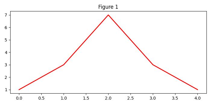
Creating a Figure with Grids of Subplots
When creating figures, various options can be customized, including subplots, size, resolution, colors, and layout. The Figure class attributes such as figsize, dpi, facecolor, edgecolor, linewidth, and layout play crucial roles in shaping the appearance of your visualizations.
Example - Creating Subplots Grid
Here is an example that uses the pyplot.subplots() method to create a 2x2 grid of subplots with multiple various customization options.
import matplotlib.pyplot as plt
import numpy as np
# Create a 2x2 grid of subplots with various customization options
fig, axs = plt.subplots(2, 2, figsize=(7, 4), facecolor='lightgreen',
layout='constrained')
# Super title for the entire figure
fig.suptitle('2x2 Grid of Subplots', fontsize='x-large')
# Display the Figure
plt.show()
Output
On executing the above code we will get the following output −
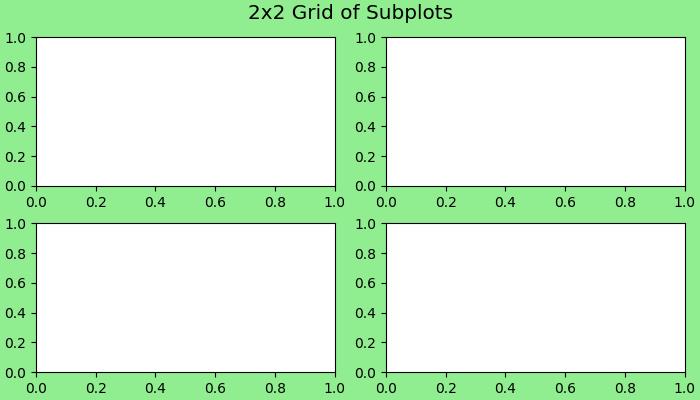
Example - A Comple Layout
Here is another example that creates a more complex layout using the plt.subplot_mosaic() method.
import matplotlib.pyplot as plt
# Create a more complex layout using plt.subplot_mosaic()
fig, axs = plt.subplot_mosaic([['A', 'right'], ['B', 'right']],
facecolor='lightgreen',
layout='constrained')
# Add text to each subplot
for ax_name, ax in axs.items():
ax.text(0.5, 0.5, ax_name, ha='center', va='center',
fontsize='large', fontweight='bold', color='blue')
# Super title for the entire figure
fig.suptitle('Complex Layout using subplot_mosaic()', fontsize='x-large')
# Display the Figure
plt.show()
Output
On executing the above code we will get the following output −
Saving a Figure
After completing a visualization, saving Figures to disk is simple using the savefig() method. This method allows you to specify the file format (e.g., PNG, PDF) and customize options such as resolution and bounding box.
Example - Saving a Figure
Lets see a simple example to save the Figure object.
import matplotlib.pyplot as plt
# Create a 2x2 grid of subplots with various customization options
fig, axs = plt.subplots(2, 2, figsize=(7, 4), facecolor='lightgreen',
layout='constrained')
# Super title for the entire figure
fig.suptitle('2x2 Grid of Subplots', fontsize='x-large')
# Super title for the entire figure
fig.suptitle('Saving a Figure', fontsize='x-large')
# Display the Figure
plt.show()
# Save the Figure object to a file
fig.savefig('Saved Figure.png', dpi=300)
Output
On executing the above program, the following figure will be saved in your working direcory −
Matplotlib - Multiplots
In general data visualization and plotting, multiplots, or multiple plots, refer to the creation of more than one plot within a single figure or canvas. These are useful when you want to compare different datasets or visualize various aspects of the same data.
The below image represents the 4 different plots in a single figure −

Multiplots in Matplotlib
Matplotlib provides tools for creating multiplots, and the most common approach is through the use of subplots. The subplot() is a function available in the pyplot module, and it provides good control over the arrangement of individual plots within the figure. For more advanced layout customization, GridSpec or Figure.add_subplot() functions can be used.
Creating Simple Multiplots
Creating simple multiplots involves the basic use of the subplot() function in Matplotlib. Simple multiplots are useful when you want to showcase different datasets or aspects of the same data in a clear and organized manner.
Example - Creating a Multiplots
In this example, a 2x2 grid of subplots is created, and individual data are plotted on each subplot.
import matplotlib.pyplot as plt
import numpy as np
# Sample Data
x = np.linspace(0, 2 * np.pi, 400)
y1 = np.sin(x ** 2)
y2 = np.cos(x)
y3 = np.tan(x)
y4 = np.exp(-x) * np.sin(2 * np.pi * x)
# Creating a 2x2 grid of subplots
fig, axs = plt.subplots(2, 2, figsize=(7,4))
# Plot data on individual subplots
axs[0, 0].plot(x, y1)
axs[0, 1].plot(x, y2, color='orange')
axs[1, 0].plot(x, y3, color='green')
axs[1, 1].plot(x, y4, color='red')
# Set titles to subplots
axs[0, 0].set_title('Sin Plot')
axs[0, 1].set_title('Cos Plot')
axs[1, 0].set_title('Tan Plot')
axs[1, 1].set_title('Exponential Plot')
# Display the Multiplots
plt.tight_layout()
plt.show()
Output
On executing the above code we will get the following output −

Stacked Multiplots
Stacked multiplots are nothing but arranging subplots in one direction either vertically(top-and-bottom) or horizontally(side-by-side). When stacking in one direction, the plt.subplots() function returns a 1D NumPy array.
Example - Creating Vertically Stacked Multiplots
This example creates two vertically stacked subplots, each showcasing different plots.
import matplotlib.pyplot as plt
import numpy as np
# Sample Data
x = np.linspace(0, 2 * np.pi, 400)
y1 = np.sin(x**2)
y2 = np.cos(x**2)
# Creating vertically stacked subplots
fig, axs = plt.subplots(2, figsize=(7,4))
fig.suptitle('Vertically stacked subplots')
# Plotting data on individual subplots
axs[0].plot(x, y1)
axs[1].plot(x, y2)
# Adding titles to subplots
axs[0].set_title('Sin Plot')
axs[1].set_title('Cos Plot')
# Adjust the layout
plt.tight_layout()
# Displaying the multiplot
plt.show()
Output
On executing the above code we will get the following output −

Multiplots with Sharing Axes
By default, each subplot Axes is scaled individually. For sharing axes between subplots you can use the sharex and sharey parameters of the plt.subplots() function.
Example - Creating Horizontally Stacked Subplots
This example creates two Horizontally stacked subplots with a shared y-axis.
import matplotlib.pyplot as plt
import numpy as np
# Sample Data
x = np.linspace(0, 2 * np.pi, 400)
y1 = np.sin(x ** 2)
y2 = np.cos(x)
# Creating subplots with shared y-axis
fig, (ax1, ax2) = plt.subplots(1, 2, sharey=True, figsize=(7, 4))
fig.suptitle('Multiplots with Shared y-Axis')
# Plotting data on individual subplots
ax1.plot(x, y1)
ax2.plot(x, y2)
# Adding titles to subplots
ax1.set_title('Sin Plot')
ax2.set_title('Cos Plot')
# Adjust the layout
plt.tight_layout()
# Display the multiplots
plt.show()
Output
On executing the above code we will get the following output −
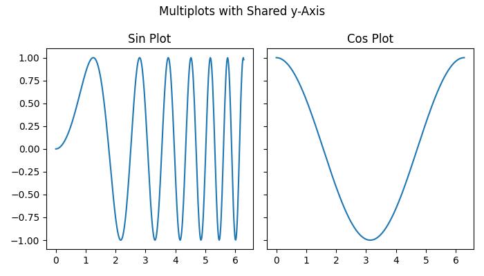
Matplotlib - Grids
In general data visualization and plotting, grids refer to the set of horizontal and vertical lines over the plot area. Gridlines are useful for a better understanding of the data on the plots. Typically, these lines are aligned with the major tick marks on both the x-axis and the y-axis. They can enhance the readability of the plot and make it easier to estimate values.
See the below image for reference −
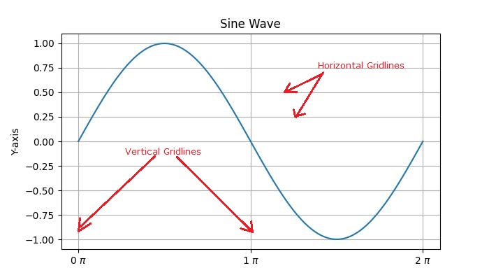
There are two main types of gridlines −
Major Gridlines − These are the primary gridlines that align with the major tick marks on the axes.
Minor Gridlines − These are additional gridlines between the major gridlines and align with the minor tick marks on the axes.
Introduction to Grids in Matplotlib
Enabling gridlines is a straightforward process in Matplotlib. The pyplot.grid() method adds major gridlines to the plot with additional customization options including adjusting the linestyle, linewidth, color, and transparency.
Let's explore different approaches to adding gridlines to plots.
Basic Plot with Grids
In Matplotlib, the default grid is a set of major gridlines that align with the major tick marks on both the x-axis and the y-axis.
Example - Creating a Grid
In this example, we create a basic sine wave plot and add the default grid.
import matplotlib.pyplot as plt
import numpy as np
# Create some data
x = np.linspace(0, 2 * np.pi, 100)
y = np.sin(x)
# create a plot
fig, ax = plt.subplots(figsize=(7,4))
# Plot the data
plt.plot(x, y)
# Add grid
ax.grid(True)
# set the title
ax.set_title('Basic Plot with Grids')
# Show the plot
plt.show()
Output
On executing the above code we will get the following output −
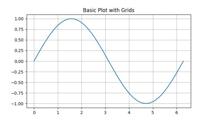
Customizing Grid
Customizing gridlines includes linestyle, linewidth, color, and transparency.
Example - Customizing a Grid
This example demonstrates how to customize the gridline by changing its linestyle, linewidth, color, and transparency.
import matplotlib.pyplot as plt
import numpy as np
# Create some data
x = np.arange(0, 1, 0.05)
y = x**2
# Create the plot
fig, ax = plt.subplots(figsize=(7,4))
# Plot the data
plt.scatter(x, y)
# Customize grid
ax.grid(True, linestyle='-.', linewidth=1, color='red', alpha=0.9)
# set the title
ax.set_title('Customizing Grids')
# Show the plot
plt.show()
Output
On executing the above code we will get the following output −
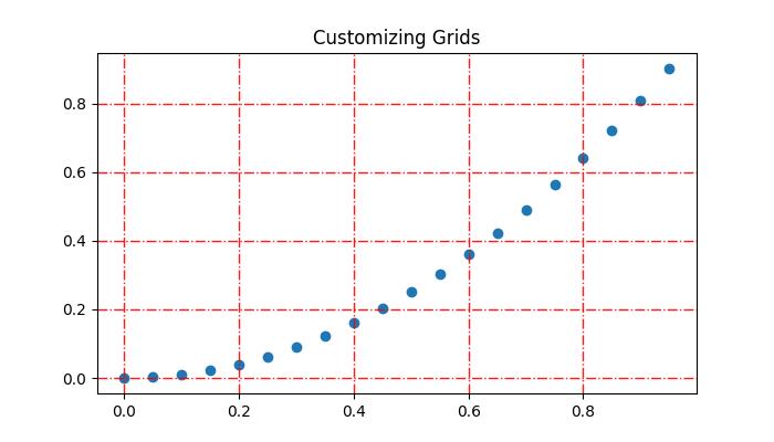
Adding Minor Gridlines
In addition to major gridlines, Matplotlib supports the inclusion of minor gridlines. These are the lines positioned between the major gridlines and aligning with the minor tick marks on both the x-axis and the y-axis. You can use the pyplot.minorticks_on() and plt.grid(which='minor') to add gridlines corresponding to the minor ticks.Example - Creating Minor Gridlines
This example demonstrates how to add both the major and minor gridlines to a plot.
import matplotlib.pyplot as plt
import numpy as np
# Create some data
x = np.arange(0, 1, 0.05)
y = x**2
# Create the plot
fig, ax = plt.subplots(figsize=(7,4))
# Plot the data
plt.scatter(x, y)
# Add major grid
ax.grid(True)
# Add minor grid
ax.minorticks_on()
ax.grid(which='minor', linestyle=':', linewidth=0.5, color='red', alpha=0.5)
# set the title
ax.set_title('Major and Minor Gridlines')
# Show the plot
plt.show()
Output
On executing the above code we will get the following output −
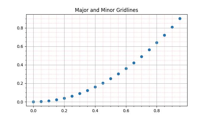
Manually adding the grids
This approach involves explicitly specifying the positions of vertical and horizontal lines. By iterating through specific intervals or values, users can draw gridlines at desired locations. This involves using functions like pyplot.axvline() and pyplot.axhline() to draw vertical and horizontal lines, respectively.
Example - Manually Adding Grid Lines
Here is an example that manually draws vertical grid lines at every third point on the x-axis.
import matplotlib.pyplot as plt
import numpy as np
# Create some data
x = np.arange(0, 1, 0.05)
y = x**2
# Create the plot
plt.subplots(figsize=(7,4))
# Plot the data
plt.scatter(x, y)
# Set x and y tick locations
plt.xticks(np.arange(0, 1.01, 0.1))
plt.yticks(np.arange(0, 1.01, 0.1))
plt.title('Manually Drawing the Grids ')
# Draw grid lines for every third point on the x-axis
for pt in np.arange(0, 1.01, 0.3):
plt.axvline(pt, lw=0.5, color='black', alpha=0.5)
# Show the plot
plt.show()
Output
On executing the above code we will get the following output −
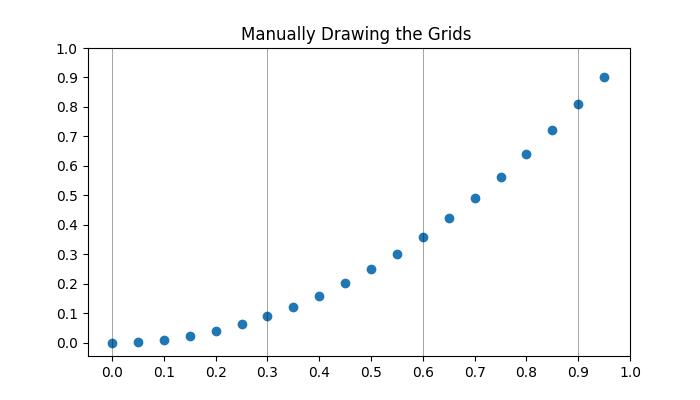
Hiding the gridlines
Hiding or removing the gridlines in a plot can be achieved by specifying the boolean value False to the grid() function.
Example - Hiding Gridlines
Here is an example that hide gridlines and axes (X and Y axis) of a plot.
import numpy as np
import matplotlib.pyplot as plt
# Create a figure
fig = plt.figure(figsize=(7, 4))
# Generate data
x = np.linspace(-10, 10, 50)
y = np.sin(x)
# Plot horizontal line
plt.axhline(y=0, c="green", linestyle="dashdot", label="y=0")
# Plot sine curve
plt.plot(x, y, c="red", lw=5, linestyle="dashdot", label="y=sin(x)")
# Hide gridlines
plt.grid(False)
# Hide axes
plt.axis('off')
# Add legend
plt.legend()
# Show plot
plt.show()
Output
On executing the above code you will get the following output −
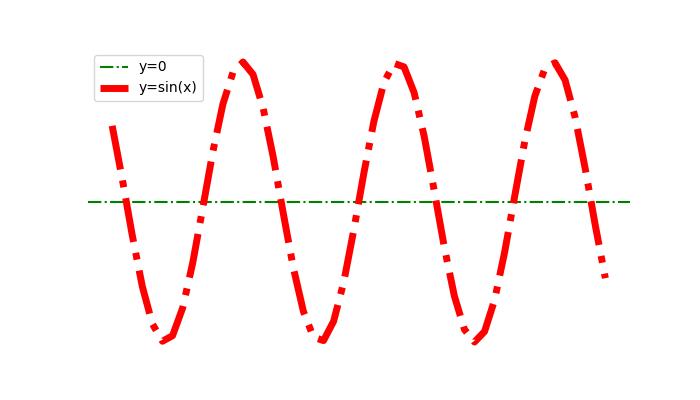
Gridlines Across The Subplots
When comparing data across multiple subplots, it's useful to have gridlines across all subplots to maintain visual comparisons between plots.
Example - Gridlines Across Subplots
Here is an example that demonstrates how to plot grids across subplots.
import matplotlib.pyplot as plt # Data d = [1, 2, 3, 4, 5, 6, 7, 8, 9] f = [0, 1, 0, 0, 1, 0, 1, 1, 0] # Create figure and subplots fig = plt.figure(figsize=(7,4)) fig.set_size_inches(30, 10) ax1 = fig.add_subplot(211) ax2 = fig.add_subplot(212) # Plot data on subplots ax1.plot(d, marker='.', color='b', label="1 row") # Draw grid lines behind bar graph ax2.bar(range(len(d)), d, color='red', alpha=0.5) # Enable grids on both subplots ax1.grid() ax2.grid() # Display the plot plt.show()
Output
On executing the above code you will get the following output −
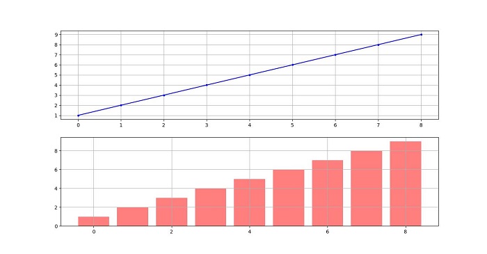
Matplotlib - Object-oriented Interface
The Object-Oriented Interface in Matplotlib is an approach to creating plots that involves explicitly creating and manipulating objects representing different elements of the plot. In this context, interfaces refer to the different programming approaches or styles provided by the library for creating visualizations.
Interfaces in Matplotlib
The Matplotlib offers two primary approaches for creating plots −
- The functional interface (also known as An implicit or pyplot interface) and
- The object-oriented interface (called An explicit or Axes interface).
Functional Interface (Pyplot)
The functional interface, also known as the pyplot interface, is an implicit and state-based approach. It keeps track of the last Figure and Axes created and it implicitly adds artists to the object, because it assumes the user wants that artist. This interface is convenient for quick plot generation and modification but may lack scalability for intricate plots.
Example - Creating a Plot
Here is a simple example that creates a plot using the implicit "pyplot" interface.
import matplotlib.pyplot as plt plt.plot([1, 2, 3, 4], [0, 0.5, 1, 0.2]) plt.show()
Output
On executing the above code you will get the following output −
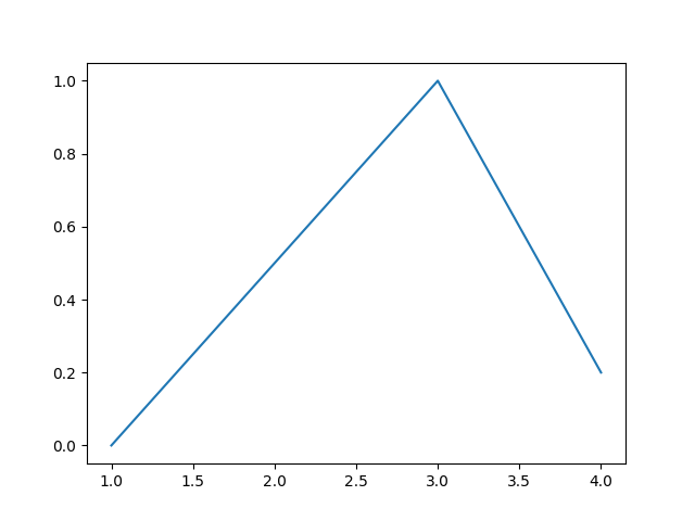
Object-Oriented Interface
The object-oriented interface, on the other hand, offers explicit control over the creation of Figure and Axes objects. It involves creating instances of these objects and calling methods on them to build a visualization step by step. This approach is more structured and recommended for complex and multi-plot scenarios.
The main idea behind using the more formal object-oriented method is to create figure objects and then just call methods or attributes off of that object. This approach helps better in dealing with a canvas that has multiple plots on it.
In object-oriented interface, Pyplot is used only for a few functions such as figure creation, and the user explicitly creates and keeps track of the figure and axes objects. At this level, the user uses Pyplot to create figures, and through those figures, one or more axes objects can be created. These axes objects are then used for most plotting actions.
Example - Object Oriented Interface
This example creates a simple plot using the object-oriented interface.
import matplotlib.pyplot as plt # Create a Figure instance fig = plt.figure() # Create an Axes object using subplots method ax = fig.subplots() # Plot the data ax.plot([1, 2, 3, 4], [0, 0.5, 1, 0.2]) # Display the plot plt.show()
Output
On executing the above code you will get the following output −

Difference Between Both the Interfaces
From the above two examples, you can observe the difference between above two approaches. The functional approach uses the plt.plot() function, which is belongs to the matplotlib.pyplot family.
Whereas the ax.plot() function is a method available to all Figure objects, specifically an Axes method. This follows an object-oriented approach, where a Figure object is created, and Axes objects are explicitly referenced and used to build the plot step-by-step.
Working with Object-Oriented Interface
In this approach, a plot is structured as a Figure object, which acts as a canvas, and artists are the elements contributing to the final graphic image. The Axes class represents an individual plot, and a Figure can contain multiple Axes objects.
Example - Creating Figure and Axes Objects
In this example, we explicitly create a Figure and an Axes object, providing a foundation for customizing and building complex visualizations.
import matplotlib.pyplot as plt
import numpy as np
# Sample data
x = np.linspace(0, 2 * np.pi, 400)
y = np.sin(x ** 2)
# Create a Figure instance
fig, ax = plt.subplots(figsize=(7,4))
# Plot data
ax.plot(x, y)
# Customize the plot
ax.set_title("Sine Wave")
ax.set_xlabel('x_label')
ax.set_ylabel('y_label')
# Display the plot
plt.show()
Output
On executing the above code you will get the following output −
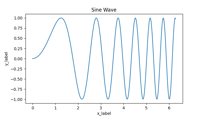
Creating Subplots in OO Interface
To create subplots in the Object-Oriented Interface, we explicitly create both Figure and Axes objects, allowing for more control over layout and customization.
Example - Creating Subplots using OO Interface
The following example creates the subplot using the Object-Oriented Interface.
import matplotlib.pyplot as plt
import numpy as np
# Sample Data
x = np.linspace(0, 2 * np.pi, 400)
y1 = np.sin(x**2)
y2 = np.cos(x**2)
# Create subplots
fig, axs = plt.subplots(2, figsize=(7,4))
fig.suptitle('Creating Subplots in explicit interface')
# Plotting data on individual subplots
axs[0].plot(x, y1)
axs[1].plot(x, y2)
# Adding titles to subplots
axs[0].set_title('Sin Plot')
axs[1].set_title('Cos Plot')
# Adjust the layout
plt.tight_layout()
# Displaying the plot
plt.show()
Output
On executing the above code you will get the following output −

Matplotlib - PyLab Module
It's important to avoid using the Pylab module in Matplotlib as it's strongly discouraged.
PyLab is a procedural interface to the Matplotlib object-oriented plotting library. Matplotlib is the whole package; matplotlib.pyplot is a module in Matplotlib; and PyLab is a module that gets installed alongside Matplotlib.
PyLab is a convenience module that bulk imports matplotlib.pyplot (for plotting) and NumPy (for Mathematics and working with arrays) in a single name space. Although many examples use PyLab, it is no longer recommended.
Basic Plotting
Plotting curves is done with the plot command. It takes a pair of same-length arrays (or sequences) −
Example - Creating Curves
from numpy import * from pylab import * x = linspace(-3, 3, 30) y = x**2 plot(x, y) show()
Output
The above line of code generates the following output −
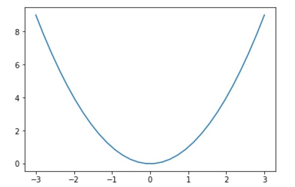
To plot symbols rather than lines, provide an additional string argument.
| symbols | - , -, -., , . , , , o , ^ , v , , s , + , x , D , d , 1 , 2 , 3 , 4 , h , H , p , | , _ |
|---|---|
| colors | b, g, r, c, m, y, k, w |
Now, consider executing the following code −
Example - Using Symbols
from pylab import * x = linspace(-3, 3, 30) y = x**2 plot(x, y, 'r.') show()
Output
It plots the red dots as shown below −
Plots can be overlaid. Just use the multiple plot commands. Use clf() to clear the plot.
Example - Clearing the Plot
from numpy import * from pylab import * x = linspace(-3, 3, 30) y = x**2 plot(x, sin(x)) plot(x, cos(x), 'r-') plot(x, -sin(x), 'g--') show()
Output
The above line of code generates the following output −
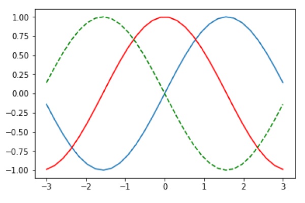
Matplotlib - Subplots() Function
In the context of data visualization, subplots refer to a layout within a single figure where multiple plots (or axes) are arranged in rows and columns. It is a common and useful task, especially when you want to display multiple plots within the same figure for analysing different aspects of data.
In Matplotlib, the subplots() function is a powerful tool for creating subplot layouts (means groups of axes) within a single figure.
Understanding subplots() Function
The subplots() function is a part of the Matplotlib library and is available in both matplotlib interfaces, the object-oriented approach (matplotlib.figure.Figure.subplots()) and the functional interface (matplotlib.pyplot.subplots()).
The matplotlib.figure.Figure.subplots() method is called on a Figure object and returns an Axes or array of Axes.
The matplotlib.pyplot.subplots() function is a wrapper for matplotlib.figure.Figure.subplots() and directly creates a figure object along with an axes or array of axes object.
Following is the syntax of the function −
matplotlib.pyplot.subplots(nrows=1, ncols=1, *, sharex=False, sharey=False, squeeze=True, width_ratios=None, height_ratios=None, subplot_kw=None, gridspec_kw=None, **fig_kw)
Here are the details of its parameters −
Both matplotlib.figure.Figure.subplots() and matplotlib.pyplot.subplots() accept several parameters to customize the subplot layout.
- nrows, ncols: Number of rows and columns of the subplot grid.
- sharex, sharey: Controls sharing of properties among x or y axes.
- squeeze: Controls the squeezing of extra dimensions from the returned array of axes.
- subplot_kw: Dictionary with keywords passed to the add_subplot call used to create each subplot.
- gridspec_kw: Dictionary with keywords passed to the GridSpec constructor used to create the grid the subplots are placed on.
- Additional keyword arguments are passed to the pyplot.figure() call.
Creating Subplots
Creating subplots is straightforward and can be achieved by simply calling the subplot() function. This will allows you to create a simple figure with only one subplot or to define a grid layout for multiple subplots within the same figure.
By specifying the number of rows and columns in the subplot grid, you can control the layout of the subplots.
Example - Creating A Subplot
Here is an example that uses the matplotlib.pyplot.subplots() method to create a simple figure with only one subplot.
import matplotlib.pyplot as plt
import numpy as np
# First create sample data
x = np.linspace(0, 2*np.pi, 400)
y = np.sin(x**2)
# Create just a figure and only one subplot
fig, ax = plt.subplots()
ax.plot(x, y)
ax.set_title('Simple plot')
plt.show()
Output
On executing the above code we will get the following output −
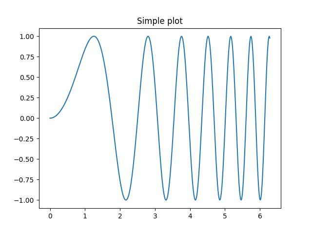
Example - Object Oriented Approach to create a Subplot
Here is the object-oriented approach to create a simple figure with only one subplot.
import matplotlib.pyplot as plt
import numpy as np
# First create sample data
x = np.linspace(0, 2*np.pi, 400)
y = np.cos(x**2)
# Create a figure
fig = plt.figure()
# Create a subplot
ax = fig.subplots()
ax.plot(x, y)
ax.set_title('Simple plot')
plt.show()
Output
On executing the above code we will get the following output −
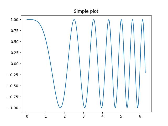
Accessing Subplots
Subplots can be accessed by unpacking the output array immediately after creation or can be accessed by using indexing on the axes array.
Example - Accessing subplots
In this example, subplots are accessed through unpacking the output array immediately after creation.
import matplotlib.pyplot as plt
import numpy as np
# First create sample data
x = np.linspace(0, 2*np.pi, 400)
y = np.sin(x**2)
# Create two subplots and unpack the output array immediately
fig, (ax1, ax2) = plt.subplots(1, 2)
ax1.plot(x, y)
ax2.scatter(x, y)
plt.suptitle('Two Subplots')
plt.show()
Output
On executing the above code we will get the following output −
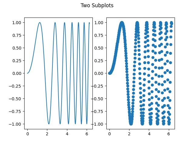
Example - Accessing Subplots using Axes Array
In this example subplots are access through index of the axes array. And legend is add to the each subplot.
import matplotlib.pyplot as plt import numpy as np # First create sample data x = np.linspace(1, 2*np.pi, 400) y = np.cos(x**2) # Create a figure fig = plt.figure() # Create a subplot axes = fig.subplots(2, 2) axes[0, 0].plot(x, y, label='cos') axes[0, 0].legend() axes[0, 1].plot(np.exp(x), label='Exponential') axes[0, 1].legend() axes[1, 0].plot(np.log10(x), label='Log') axes[1, 0].legend() axes[1, 1].scatter(x, y, label='Scatter') axes[1, 1].legend() plt.show()
Output
On executing the above code we will get the following output −
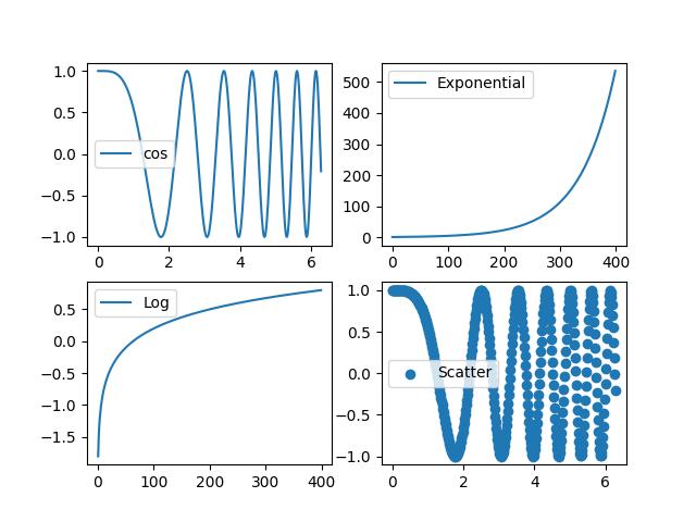
Sharing Axes
The subplots() function also allows you to control the sharing of properties among x or y axes using the sharex and sharey parameters. This can be useful for ensuring consistency in axis scaling and tick labeling across subplots.
Example - Subplots with shared subplots
This example demonstrates how to create a grid of subplots that share the same y-axis.
import matplotlib.pyplot as plt
import numpy as np
# First create sample data
x = np.arange(1, 5)
# Create a figure
fig = plt.figure()
plt.title('Sharing Axes')
# Create a subplot
axes = fig.subplots(2, 2, sharey=True)
axes[0, 0].plot(x,x*x)
axes[0, 1].plot(x,np.sqrt(x))
axes[1, 0].plot(x,np.exp(x))
axes[1, 1].plot(x,np.log10(x))
plt.show()
Output
On executing the above code we will get the following output −
Matplotlib - Subplot2grid() Function
Matplotlib's subplot2grid() function allows you to create subplots within a grid layout and provides flexibility in specifying the location, rowspan, and colspan of each subplot. we'll explore the usage of subplot2grid() function with examples.
Understanding subplot2grid() Function
The subplot2grid() function is a part of the Matplotlib library and is available only in the functional interface (matplotlib.pyplot). It creates a subplot at a specific location inside a regular grid. It offers more flexibility in creating axes objects at precise locations within the grid and allows the axes to span across multiple rows or columns.
This function is similar to pyplot.subplot() function, but it uses 0-based indexing and two-dimensional Python slicing to select cells within a grid layout for placing subplots.
Following is the syntax of the function −
matplotlib.pyplot.subplot2grid(shape, loc, rowspan=1, colspan=1, fig=None, **kwargs)
Here are the details of its parameters −
- shape: Specifies the number of rows and columns in the grid.
- loc: Determines the position of the subplot within the grid.
- rowspan: Specifies the number of rows the subplot spans (default: 1).
- colspan: Specifies the number of columns the subplot spans (default: 1).
- fig: Optional parameter to specify the figure where the subplot is placed.
- **kwargs: Additional keyword arguments passed to add_subplot().
Example - Usage of subplot2grid() function
This example creates a 3x3 grid of subplots using subplot2grid(). Each subplot is positioned within the grid, and their sizes are adjusted using rowspan and colspan parameters.
import matplotlib.pyplot as plt
# Define subplot layout and create subplots
a1 = plt.subplot2grid((3,3),(0,0), colspan=2)
a2 = plt.subplot2grid((3,3),(0,2), rowspan=3)
a3 = plt.subplot2grid((3,3),(1,0), rowspan=2, colspan=2)
# Plot data on subplots
import numpy as np
x = np.arange(1, 10)
a1.plot(x, np.exp(x))
a1.set_title('exp')
a2.plot(x, x*x)
a2.set_title('square')
a3.plot(x, np.log(x))
a3.set_title('log')
plt.tight_layout()
plt.show()
Output
On executing the above code we will get the following output −
Example - Defining Multiple Subplots
In this example, we create a figure with a constrained layout and define 4 subplots using the subplot2grid() function. Each subplot's position and size are specified within the grid.
import matplotlib.pyplot as plt
# Function to create plot
def draw_plot(ax, title):
ax.plot([1, 2, 3], [4, 5, 6])
ax.set_xlabel('X')
ax.set_ylabel('Y')
ax.set_title(title)
# Create a figure with constrained layout
fig = plt.figure(layout="constrained", facecolor='#eaffff')
# Define subplot layout using subplot2grid
ax1 = plt.subplot2grid((3, 3), (0, 0))
ax2 = plt.subplot2grid((3, 3), (0, 1), colspan=2)
ax3 = plt.subplot2grid((3, 3), (1, 0), colspan=2, rowspan=2)
ax4 = plt.subplot2grid((3, 3), (1, 2), rowspan=2)
# Plot data on subplots
draw_plot(ax1, 'plot_1 at axes 1')
draw_plot(ax2, 'plot_2 at axes 2')
draw_plot(ax3, 'plot_3 at axes 3')
draw_plot(ax4, 'plot_4 at axes 4')
# Add a title to the figure
fig.suptitle('subplot2grid')
plt.show()
Output
On executing the above code we will get the following output −
Example - Large Number of Subplots
Here's another example that creates a layout with a larger number of subplots.
import matplotlib.pyplot as plt
# Function to create plot
def draw_plot(ax, title):
ax.plot([1, 2, 3], [4, 5, 6])
ax.set_xlabel('X')
ax.set_ylabel('Y')
ax.set_title(title)
# Create a figure with constrained layout
fig = plt.figure(layout="constrained", facecolor='#eaffff')
# Define subplot layout using subplot2grid
ax1 = plt.subplot2grid((3, 3), (0, 0), colspan=3)
ax2 = plt.subplot2grid((3, 3), (1, 0), colspan=2)
ax3 = plt.subplot2grid((3, 3), (1, 2), rowspan=2)
ax4 = plt.subplot2grid((3, 3), (2, 0))
ax5 = plt.subplot2grid((3, 3), (2, 1))
# Plot data on subplots
draw_plot(ax1, 'plot_1 at axes 1')
draw_plot(ax2, 'plot_2 at axes 2')
draw_plot(ax3, 'plot_3 at axes 3')
draw_plot(ax4, 'plot_4 at axes 4')
draw_plot(ax5, 'plot_5 at axes 5')
# Add a title to the figure
fig.suptitle('subplot2grid')
plt.show()
Output
On executing the above code we will get the following output −
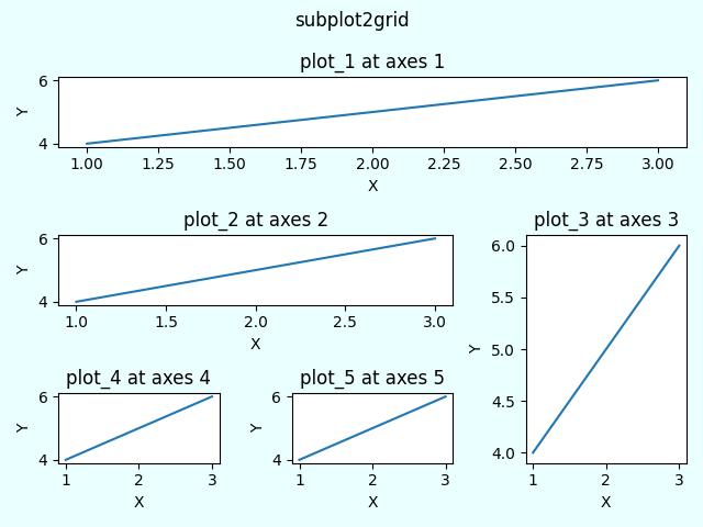
Matplotlib - Anchored Artists
In Matplotlib, an Artist is a fundamental object that represents almost all components of a plot. Whether it's a line, text, axis, or any other graphical element, everything in a Matplotlib plot is an instance of an Artist or is derived from the Artist class.
Anchored Artists are a special type of custom artist that can be anchored to specific positions on a plot. They are useful for adding annotations, arrows, and other custom elements that are anchored to a particular point or region.
See the below example for refence −
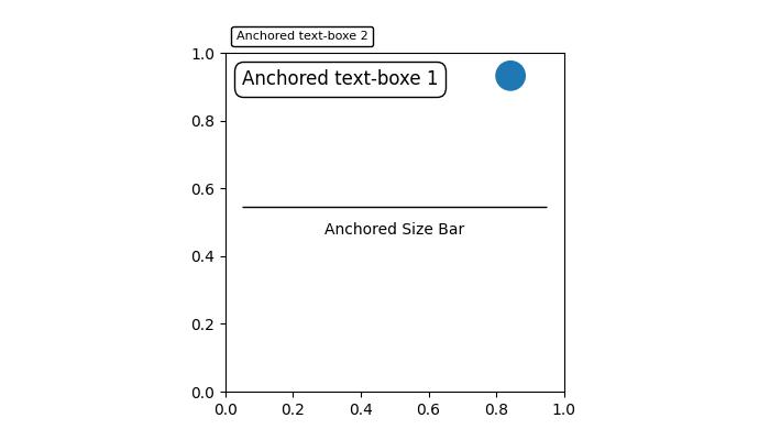
In the above image, you can observe that text boxes, circles, and size bars are anchored at specific positions on the plot.
Anchored Artists in Matplotlib
There are two modules that provides Anchored Artists in Matplotlib, which are −
Matplotlib.offsetbox
Mpl_toolkits.axes_grid1.anchored_artists
The matplotlib.offsetbox module
This module provides classes like AnchoredOffsetbox and AnchoredText, allowing you to anchor arbitrary artists or text relative to the parent axes or a specific anchor point. These can be used for more general-purpose annotations and decorations.
Example - Usage of AnchoredText
Now, let's use the AnchoredText class from the matplotlib.offsetbox module to implement two anchored text boxes at specific location on the plot.
import matplotlib.pyplot as plt
from matplotlib.offsetbox import AnchoredText
# Create a figure and axis
fig, ax = plt.subplots(figsize=(7, 4))
# Anchored Text Box 1
at = AnchoredText("Anchored text-box 1",
loc='upper left', prop=dict(size=10), frameon=True)
at.patch.set_boxstyle("round,pad=0.,rounding_size=0.2")
ax.add_artist(at)
# Anchored Text Box 2
at2 = AnchoredText("Anchored text-box 2",
loc='center', prop=dict(size=16), frameon=True,
bbox_to_anchor=(0.5, 0.5),
bbox_transform=ax.transAxes)
at2.patch.set_boxstyle("round,pad=0.,rounding_size=0.5")
ax.add_artist(at2)
# Display the plot
plt.show()
Output
On executing the above code we will get the following output −
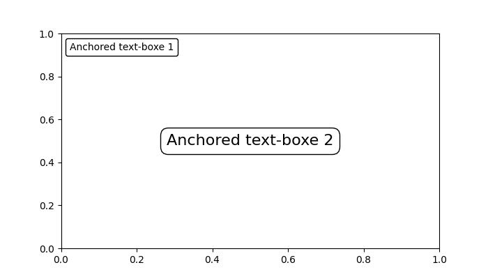
The mpl_toolkits.axes_grid1.anchored_artists module
This module offers specialized Anchored Artists like AnchoredDirectionArrows, AnchoredAuxTransformBox, AnchoredDrawingArea, and AnchoredSizeBar. Eachof this class is used to different porposes.
Lets see the usage of the each class −
AnchoredAuxTransformBox − An anchored container with transformed coordinates.
AnchoredDirectionArrows − Draw two perpendicular arrows to indicate directions.
AnchoredDrawingArea − An anchored container with a fixed size and fillable DrawingArea.
AnchoredSizeBar − Draw a horizontal scale bar with a center-aligned label underneath.
Example - Usage of AnchoredDirectionArrows
This example demonstrates how to use AnchoredDirectionArrows class to add a visually appealing anchored direction arrow to the Matplotlib plot.
import matplotlib.pyplot as plt import numpy as np import matplotlib.font_manager as fm from mpl_toolkits.axes_grid1.anchored_artists import AnchoredDirectionArrows np.random.seed(19680801) fig, ax = plt.subplots(figsize=(7, 4)) ax.imshow(np.random.random((10, 10))) # Rotated arrow fontprops = fm.FontProperties(family='serif') rotated_arrow = AnchoredDirectionArrows( ax.transAxes, '30', '120', loc='center', color='w', angle=30, fontproperties=fontprops ) ax.add_artist(rotated_arrow) plt.show()
Output
On executing the above code we will get the following output −
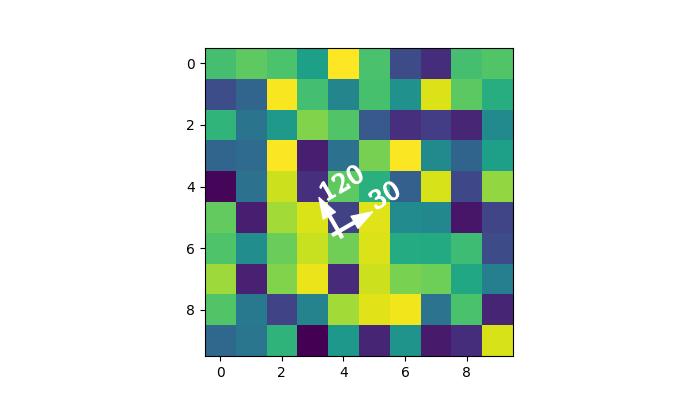
Matplotlib - Manual Contour
Manual contouring in general refers to the process of outlining the boundaries of an object or a specific area by hand rather than relying on automated methods. This is usually done to create accurate representations of the shapes and boundaries within the image.
A contour line represents a constant value on a map or a graph. It is like drawing a line to connect points that share the same height on a topographic map or lines on a weather map connecting places with the same temperature.
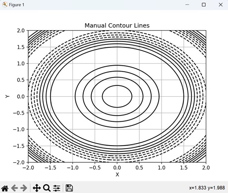
Manual Contour in Matplotlib
In Matplotlib, a manual contour plot is a way to represent three-dimensional data on a two-dimensional surface using contour lines. These lines connect points of equal value in a dataset, creating a map-like visualization of continuous data.
For a manual contour plot, you specify the contour levels or values at which the lines should be drawn. The plot then displays these contour lines, with each line representing a specific value in the dataset.
Basic Manual Contour Plot
Creating a basic manual contours in Matplotlib involves drawing lines to connect points with the same value, forming closed loops or curves that represent distinct levels of the measured quantity. This process allows for customization and fine-tuning of the contour lines to accurately represent the given data.
While manual contouring can be time-consuming, it provides a level of control and precision that may be necessary in certain situations where automated methods may not be adequate.
Example - Creating a Simple Contour Plot
In the following example, we are creating a simple contour plot using Matplotlib. We are using the contour() function to generate contour lines of a sine function, with manually specified levels, overlaying them on the XY-plane −
import matplotlib.pyplot as plt
import numpy as np
# Generating data
x = np.linspace(-3, 3, 100)
y = np.linspace(-3, 3, 100)
# Creating a grid of x and y values
X, Y = np.meshgrid(x, y)
# Calculating the value of Z using the given function
Z = np.sin(X**2 + Y**2)
# Creating contour plot with manual levels
levels = [-0.9, -0.6, -0.3, 0, 0.3, 0.6, 0.9]
plt.contour(X, Y, Z, levels=levels)
plt.xlabel('X')
plt.ylabel('Y')
plt.title('Manual Contour Plot')
# Displaying the plot
plt.show()
Output
Following is the output of the above code −
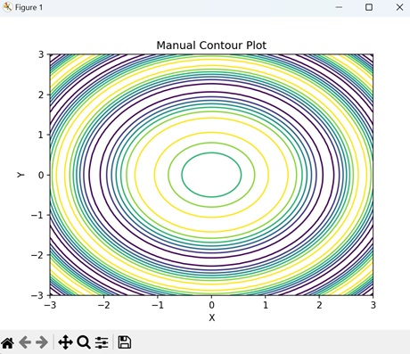
Manual Contour Plot with Labeling
In Matplotlib, a manual contour plot with labeling represents three-dimensional data on a two-dimensional surface with contour lines, and annotate specific contour levels with labels.
This type of plot displays contour lines to show regions of equal data value, and adds text labels to these lines to indicate the corresponding data values. The labels help to identify important features or values in the dataset, making it easier to interpret the plot and understand the distribution of the data.
Example - Manual Contour Plot
In here, we are creating a contour plot with inline labels to the contour lines using the clabel() function −
import matplotlib.pyplot as plt
import numpy as np
# Generating data
x = np.linspace(-3, 3, 100)
y = np.linspace(-3, 3, 100)
X, Y = np.meshgrid(x, y)
Z = np.sin(X**2 + Y**2)
# Contour plot with labels
levels = [-0.9, -0.6, -0.3, 0, 0.3, 0.6, 0.9]
CS = plt.contour(X, Y, Z, levels=levels)
plt.clabel(CS, inline=True, fontsize=12)
plt.xlabel('X')
plt.ylabel('Y')
plt.title('Manual Contour Plot with Labeling')
plt.show()
Output
On executing the above code we will get the following output −
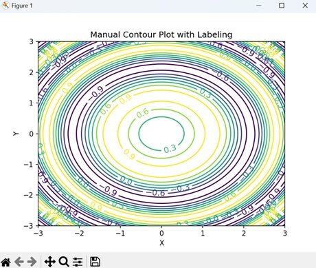
Manual Contour Plot with Filled Regions
In Matplotlib, a manual contour plot with filled regions use colors to visually represent different levels or values in the dataset, unlike traditional contour plots that only show contour lines.
Each filled region corresponds to a specific range of values, with colors indicating the intensity or magnitude of those values.
Example - Contour with Filled Regions
In the example below, we are creating a filled contour plot of a sine function using the contourf() function with the "RdYlBu" colormap. We then add a color bar to indicate the intensity scale of the filled contours −
import matplotlib.pyplot as plt
import numpy as np
# Generating data
x = np.linspace(-3, 3, 100)
y = np.linspace(-3, 3, 100)
X, Y = np.meshgrid(x, y)
Z = np.sin(X**2 + Y**2)
# Creating contour plot with filled regions
plt.contourf(X, Y, Z, levels=[-0.9, -0.6, -0.3, 0, 0.3, 0.6, 0.9], cmap='RdYlBu')
plt.colorbar()
plt.xlabel('X')
plt.ylabel('Y')
plt.title('Manual Contour Plot with Filled Regions')
plt.show()
Output
After executing the above code, we get the following output −
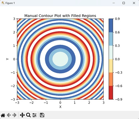
Manual Contour Plot with Custom Line Styles
In Matplotlib, a manual contour plot with custom line styles is a way to represent contour lines, where each line can have a distinct visual style.
Generally, contour lines are drawn as solid lines, but with custom line styles, you can modify aspects like the line width, color, and pattern to distinguish different levels or values in the dataset. For example, you might use dashed lines, dotted lines, or thicker lines to highlight specific contour levels or regions of interest.
Example - Contour with Custom Line Styles
Now, we are creating a manual contour plot with custom line styles by specifying a list of line styles to use for different levels. We achieve this by passing the "linestyles" parameter to the contour() function −
import matplotlib.pyplot as plt
import numpy as np
# Generating data
x = np.linspace(-3, 3, 100)
y = np.linspace(-3, 3, 100)
X, Y = np.meshgrid(x, y)
Z = np.sin(X**2 + Y**2)
# Contour plot with custom line styles
levels = [-0.9, -0.6, -0.3, 0, 0.3, 0.6, 0.9]
plt.contour(X, Y, Z, levels=levels, linestyles=['-', '--', '-.', ':', '-', '--'])
plt.xlabel('X')
plt.ylabel('Y')
plt.title('Manual Contour Plot with Customized Line Styles')
plt.show()
Output
On executing the above code we will get the following output −
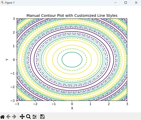
Matplotlib - Coords Report
A coords report, short for "coordinates report," is a document or data file that contains information about different locations or points on a map. These locations are described using coordinates, which are like a set of directions that pinpoint exactly where something is on the Earth's surface.
Imagine you have a big map of your neighborhood, and you want to tell someone exactly where your house is. You can give them the coordinates, which are like the map's secret code for your house's exact location. This code might look something like this: Latitude 40.7128 N, Longitude 74.0060 W −
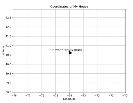
Coords Report in Matplotlib
In Matplotlib, a coordinates report provides information about the position of points or objects within a plot. This report includes details such as the x-coordinate and y-coordinate of each point, as well as any additional properties like size, color, or label.
You create a coord report or any other type of plot that involves coordinates in Matplotlib using the scatter() function. This function takes two arguments: x and y, which represent the coordinates of the points to be plotted.
Scatter Plot Coord Report
In Matplotlib, a scatter plot coordinate report provides detailed information about the individual data points displayed in a scatter plot. This report includes the x and y coordinates of each point, allowing you to precisely identify your positions on the plot. Additionally, it may contain other properties such as the size, color, or label associated with each data point.
Example - Creating a Scatter Plot
In the following example, we are creating a scatter plot with two sets of data: x and y, where x represents the values on the x-axis and y represents the corresponding values on the y-axis. Additionally, we iterate through each pair of coordinates in x and y using a for loop, and for each point, we use the text() function to display the coordinates as text on the plot. This provides a visual representation of the coordinates for each point on the scatter plot −
import matplotlib.pyplot as plt
x = [1, 2, 3, 4, 5]
y = [2, 3, 5, 7, 11]
plt.scatter(x, y)
plt.xlabel('X Axis')
plt.ylabel('Y Axis')
plt.title('Scatter Plot Coord Report')
plt.grid(True)
# Displaying coordinates
for i in range(len(x)):
plt.text(x[i], y[i], f'({x[i]}, {y[i]})', fontsize=8, verticalalignment='bottom')
plt.show()
Output
Following is the output of the above code −
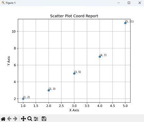
Line Plot Coord Report
In Matplotlib, a line plot coordinate report provides detailed information about the points plotted along a line in a line plot. This report includes the x and y coordinates of each point, indicating their positions on the plot. Additionally, it may contain other attributes such as markers, colors, or labels associated with each point.
Example - Line Plot
In here, we are creating a line plot using two sets of data: x and y, where x represents the values on the x-axis and y represents the corresponding values on the y-axis −
import matplotlib.pyplot as plt
x = [1, 2, 3, 4, 5]
y = [2, 3, 5, 7, 11]
plt.plot(x, y)
plt.xlabel('X Axis')
plt.ylabel('Y Axis')
plt.title('Line Plot Coord Report')
plt.grid(True)
# Display coordinates
for i in range(len(x)):
plt.text(x[i], y[i], f'({x[i]}, {y[i]})', fontsize=8, verticalalignment='bottom')
plt.show()
Output
On executing the above code we will get the following output −
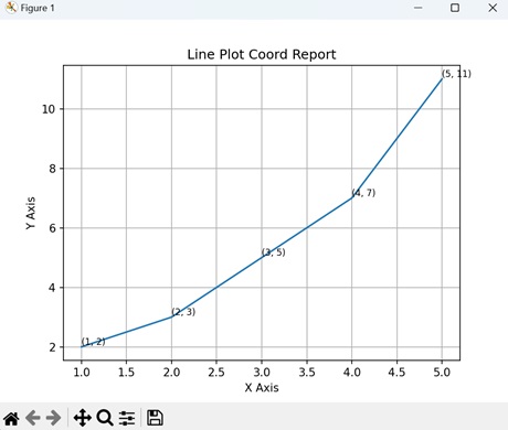
Bar Plot Coord Report
In Matplotlib, a bar plot coordinate report provides detailed information about the bars displayed in a bar plot. This report includes the x and y coordinates of each bar, indicating their positions on the plot. Additionally, it may contain other attributes such as the width, height, or color of each bar.
Example - Bar Plot
In the example below, we create a bar plot by first defining two sets of data: 'x' and 'y'. Then, we place a coordinate report on the plot using the text() function. This function specifies the coordinates (2, 7) with the label of the third data point 'C' and its corresponding value '7', formatted in red color and centered horizontally −
import matplotlib.pyplot as plt
# Sample data
x = ['A', 'B', 'C', 'D', 'E']
y = [10, 15, 7, 10, 12]
plt.bar(x, y)
plt.xlabel('X Axis')
plt.ylabel('Y Axis')
plt.title('Bar Plot Coord Report')
plt.grid(axis='y')
# Coordinate report
plt.text(2, 7, f'({x[2]}, {y[2]})', fontsize=12, color='red', ha='center')
plt.show()
Output
After executing the above code, we get the following output −
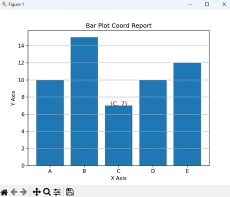
Pie Chart Coord Report
In Matplotlib, a pie chart coordinate report provides detailed information about the segments displayed in a pie chart. This report includes the position and size of each segment, represented as a fraction of the whole pie. Additionally, it may contain other attributes such as labels or colors associated with each segment.
Example - Pie Chart
Now, we are creating a pie chart pie chart with labels and corresponding sizes. The "autopct" parameter formats the percentage values displayed on the chart. Additionally, we are placing a coordinate report at the center of the chart with coordinates (0, 0) −
import matplotlib.pyplot as plt
# Sample data
labels = ['A', 'B', 'C', 'D', 'E']
sizes = [15, 30, 20, 10, 25]
plt.pie(sizes, labels=labels, autopct='%1.1f%%', startangle=140)
plt.axis('equal')
plt.title('Pie Chart Coord Report')
# Coordinate report
plt.text(0, 0, f'(0.0, 0.0)', fontsize=12, color='yellow', ha='center')
plt.show()
Output
On executing the above code we will get the following output −
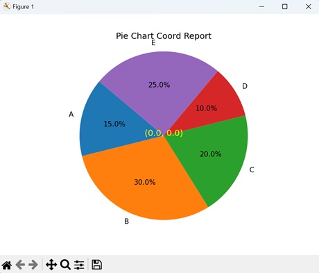
Matplotlib - AGG Filter
An AGG filter, which stands for "Aggregate Filter", is used to sort through large amounts of data and only show the information that meets certain conditions. Imagine you have a big box of toys, and you only want to see the red ones. The AGG filter would help you quickly find and pick out all the red toys from the box while ignoring the others −
AGG filter in Matplotlib
In Matplotlib, an AGG filter, or Anti-Grain Geometry filter, is used to apply certain transformations to graphical elements, such as lines, markers, or text, before they are displayed on a plot. The AGG filter allows us to modify the appearance of elements in a plot, such as adjusting their transparency, blurring them, or applying other visual effects.
You can use the "FigureCanvasAgg()" function to create an AGG filter in Matplotlib. This function creates a canvas with the AGG filter, allowing you to show plots and images with improved quality and clarity.
Image Smoothing with AGG Filter
In Matplotlib, image smoothing with the AGG filter is a technique used to blur or soften an image to reduce noise. The AGG filter is one of the options available for image smoothing, and it applies a mathematical algorithm to the image pixels, averaging neighboring pixels to create a smoother appearance. This process helps to remove uneven edges and create a more visually appealing image.
Example - Image Smoothing
In the following example, we perform image smoothing using the AGG filter. We begin by generating a random noisy image and then apply Gaussian smoothing using the gaussian_filter() function. Afterward, we create a Matplotlib figure with two subplots to display the original and smoothed images side by side −
import matplotlib.pyplot as plt
from matplotlib.backends.backend_agg import FigureCanvasAgg
import numpy as np
from scipy.ndimage import gaussian_filter
# Generating random noisy image
np.random.seed(0)
image = np.random.rand(100, 100)
# Applying Gaussian smoothing to the image
smoothed_image = gaussian_filter(image, sigma=2)
# Creating a figure and plot the original and smoothed images
fig, axs = plt.subplots(1, 2, figsize=(10, 5))
axs[0].imshow(image, cmap='gray')
axs[0].set_title('Original Image')
axs[1].imshow(smoothed_image, cmap='gray')
axs[1].set_title('Smoothed Image (AGG Filter)')
# Hiding the axes
for ax in axs:
ax.axis('off')
# Saving the figure as an image file
canvas = FigureCanvasAgg(fig)
canvas.print_png('smoothed_image.png')
plt.show()
Output
Following is the output of the above code −
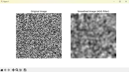
Sharpening Image with AGG Filter
In Matplotlib, sharpening an image with the AGG filter enhances the clarity and detail in an image by increasing the contrast along edges. It involves convolving the image with a sharpening kernel, which generally has positive values at the center surrounded by negative values.
Example - Image Sharpening
In here, we perform image sharpening using the AGG filter. We start by loading an image, then apply a sharpening filter to enhance the image's edges. This involves defining a sharpening kernel and convolving it with the image using the scipy.ndimage.convolve() function. Finally we display the image −
import matplotlib.pyplot as plt
from matplotlib.backends.backend_agg import FigureCanvasAgg
import numpy as np
from scipy.ndimage import convolve
# Loading an example image
image = plt.imread('sun.jpg')
# Converting to grayscale if image has multiple channels
if len(image.shape) > 2:
image = image.mean(axis=2)
# Defining a sharpening kernel
kernel = np.array([[-1, -1, -1],
[-1, 9, -1],
[-1, -1, -1]])
# Applying the kernel to the image
sharpened_image = np.clip(convolve(image, kernel, mode='constant', cval=0.0), 0, 1)
# Creating a figure and plot the original and sharpened images
fig, axs = plt.subplots(1, 2, figsize=(10, 5))
axs[0].imshow(image, cmap='gray')
axs[0].set_title('Original Image')
axs[1].imshow(sharpened_image, cmap='gray')
axs[1].set_title('Sharpened Image (AGG Filter)')
# Hiding the axes
for ax in axs:
ax.axis('off')
# Saving the figure as an image file
canvas = FigureCanvasAgg(fig)
canvas.print_png('sharpened_image.png')
plt.show()
Output
On executing the above code we will get the following output −
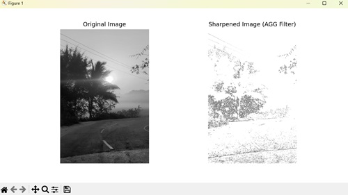
Embossing Image with AGG Filter
In Matplotlib, embossing an image with the AGG filter emphasizes the edges in an image, giving it a three-dimensional appearance by enhancing the contrast between neighboring pixels. It achieves this effect by convolving the image with an embossing kernel, which generally includes negative and positive values. Embossed images often have a raised or recessed appearance, simulating the effect of stamping or carving.
Example - Embossing Image
In the example below, we use AGG filter to emboss an image. We start by loading an example image, then define an embossing kernel, a specific matrix designed to emphasize edges. Applying this kernel to the image using convolution generates the embossed image −
import matplotlib.pyplot as plt
from matplotlib.backends.backend_agg import FigureCanvasAgg
import numpy as np
from scipy.ndimage import convolve
# Loading an example image
image = plt.imread('sun.jpg')
# Converting to grayscale if image has multiple channels
if len(image.shape) > 2:
image = image.mean(axis=2)
# Defining an embossing kernel
kernel = np.array([[-2, -1, 0],
[-1, 1, 1],
[0, 1, 2]])
# Applying the kernel to the image
embossed_image = np.clip(convolve(image, kernel, mode='constant', cval=0.0), 0, 1)
# Creating a figure and plot the original and embossed images
fig, axs = plt.subplots(1, 2, figsize=(10, 5))
axs[0].imshow(image, cmap='gray')
axs[0].set_title('Original Image')
axs[1].imshow(embossed_image, cmap='gray')
axs[1].set_title('Embossed Image (AGG Filter)')
# Hiding the axes
for ax in axs:
ax.axis('off')
# Saving the figure as an image file
canvas = FigureCanvasAgg(fig)
canvas.print_png('embossed_image.png')
plt.show()
Output
After executing the above code, we get the following output −
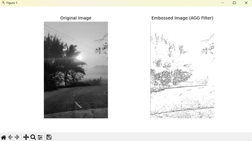
Matplotlib - Ribbon Box
In general, a "ribbon box" is a graphical representation used to visualize data distributions across different categories or groups. The term "ribbon box" refers to a specific type of plot that displays these distributions in a visually appealing and informative manner. It is particularly useful when you have multiple categories or groups and want to compare the distributions of a variable across these categories.
In a ribbon box plot −
Each category or group is typically represented along the x-axis.
The y-axis often represents the range or distribution of a numeric variable.
Each "ribbon" corresponds to the distribution of the numeric variable within a particular category or group.
The ribbon can be shaded or colored to indicate the density or intensity of the distribution within each category. This allows for easy comparison of distributions across different categories.
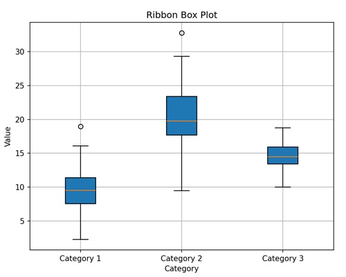
Here, we created a simple ribbon box plot with three categories (Category 1, Category 2, Category 3) along the x-axis and their corresponding distribution of values along the y-axis. We shade the ribbon boxes to indicate the intensity of the distribution within each category.
Ribbon Box in Matplotlib
In Matplotlib, a "ribbon box" is a visual representation used to display the distribution of a numeric variable across different categories or groups. While matplotlib does not have a specific function to create ribbon box plots, you can use other techniques available, such as −
Use matplotlib's plot() function to plot the central line for each category or group. This line represents the central tendency of the data within each category, such as the mean or median.
Using the fill_between function to fill the area between two curves, where one curve represents the upper boundary of the ribbon and the other curve represents the lower boundary.
Customize the appearance of the plot as needed by adding labels, titles, legends, gridlines, etc.
Ribbon Box Plot with Confidence Interval
In matplotlib, a simple ribbon box plot with confidence interval is a graphical representation used to display the central tendency of a dataset along with the uncertainty around that central value.
It is like plotting the average of something (like daily temperatures) and shading an area around it to show how much the actual values might vary due to uncertainty.
Example - Ribbon Box Plot
In the following example, we are creating a ribbon box plot showing the central tendency and confidence interval (uncertainity) around a sine wave, using matplotlib's plot() and fill_between() functions, respectively −
import matplotlib.pyplot as plt
import numpy as np
# Generating data
x = np.linspace(0, 10, 100)
y_mean = np.sin(x)
# Standard deviation
y_std = 0.1
# Plotting the central line
plt.plot(x, y_mean, color='blue', label='Mean')
# Plotting the shaded area representing the uncertainty (confidence interval)
plt.fill_between(x, y_mean - y_std, y_mean + y_std, color='blue', alpha=0.2, label='Uncertainty')
plt.xlabel('X')
plt.ylabel('Y')
plt.title('Simple Ribbon Box Plot with Confidence Interval')
plt.legend()
plt.grid(True)
plt.show()
Output
Following is the output of the above code −
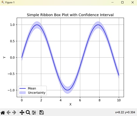
Multiple Ribbon Box Plots
In Matplotlib, multiple ribbon box plots are a way to compare the distributions of multiple datasets using ribbon box plots within the same plot. Each ribbon box plot represents the spread and central tendency of a different dataset, allowing for easy comparison between them.
Example - Creating Multiple Ribbon Box Plot
In here, we are generating multiple ribbon box plots with different colors to represent two sine and cosine waves along with their uncertainty bands using matplotlib −
import matplotlib.pyplot as plt
import numpy as np
# Generating data
x = np.linspace(0, 10, 100)
y_means = [np.sin(x), np.cos(x)]
# Standard deviations
y_stds = [0.1, 0.15]
colors = ['blue', 'green']
# Plotting multiple ribbon box plots with different colors
for y_mean, y_std, color in zip(y_means, y_stds, colors):
plt.plot(x, y_mean, color=color, label='Mean', alpha=0.7)
plt.fill_between(x, y_mean - y_std, y_mean + y_std, color=color, alpha=0.2)
plt.xlabel('X')
plt.ylabel('Y')
plt.title('Multiple Ribbon Box Plots with Different Colors')
plt.legend()
plt.grid(True)
plt.show()
Output
On executing the above code we will get the following output −
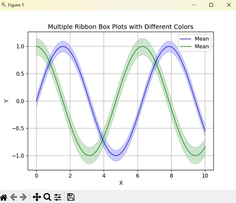
Stacked Ribbon Box Plot
In Matplotlib, stacked ribbon box plots are a type of graphical representation used to compare the distributions of multiple datasets while also showing the combined distribution of all the datasets.
In a stacked ribbon box plot, each dataset is represented by its own ribbon box plot, just like in multiple ribbon box plots. However, instead of displaying the box plots side by side, they are stacked vertically on top of each other. This stacking allows for a direct comparison of the distributions of each dataset while also showing how they contribute to the overall distribution when combined.
Example - Creating Stacked Ribbon Box Plot
Now, we are plotting a stacked ribbon box plot, stacking the distributions of a sine and cosine wave to compare their variations across the x-axis using matplotlib −
import matplotlib.pyplot as plt
import numpy as np
# Generating example data
x = np.linspace(0, 10, 100)
y1 = np.sin(x)
y2 = np.cos(x)
# Plotting stacked ribbon box plot
plt.plot(x, y1, color='blue', label='Dataset 1')
plt.fill_between(x, y1, color='blue', alpha=0.2)
plt.plot(x, y2, color='green', label='Dataset 2')
plt.fill_between(x, y2, color='green', alpha=0.2)
plt.xlabel('X')
plt.ylabel('Y')
plt.title('Stacked Ribbon Box Plot')
plt.legend()
plt.grid(True)
plt.show()
Output
After executing the above code, we get the following output −
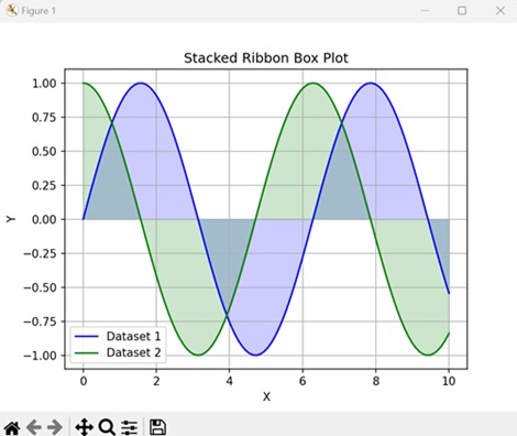
Horizontal Ribbon Box Plot
A horizontal ribbon box plot in Matplotlib is a graphical representation that shows the distribution of a dataset along a horizontal axis using ribbon-shaped boxes.
In a horizontal ribbon box plot, the dataset's values are grouped into categories or bins, and for each category, a ribbon-shaped box is drawn horizontally. The length of each box represents the range of values within that category, while the position along the horizontal axis indicates the category itself.
Example - Creating Horizontal Ribbon Box Plot
In the following example, we are creating a horizontal ribbon box plot to represent categories along the y-axis and their corresponding mean values with uncertainty using matplotlib −
import matplotlib.pyplot as plt
import numpy as np
# Generating data
y = np.arange(1, 6)
x_means = [5, 7, 6, 8, 9]
x_stds = [0.5, 0.3, 0.4, 0.2, 0.6]
# Plotting horizontal ribbon box plot
plt.plot(x_means, y, color='blue', label='Mean', linestyle='none', marker='o')
plt.fill_betweenx(y, np.subtract(x_means, x_stds), np.add(x_means, x_stds), color='blue', alpha=0.2) # Fixing this line
plt.xlabel('X')
plt.ylabel('Y')
plt.title('Horizontal Ribbon Box Plot')
plt.legend()
plt.grid(True)
plt.show()
Output
On executing the above code we will get the following output −
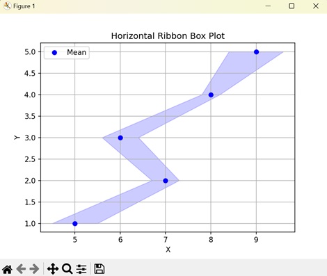
Matplotlib - Fill Spiral
In general definition, a spiral is a geometric curve that emanates from a central point and moves farther away as it revolves around that point. Spirals exhibit a whorled pattern and come in various forms, including Archimedean spirals, and logarithmic spirals. See the below image for reference −

On the other hand, a Fill Spiral refers to the visual representation of a spiral curve in which the space enclosed by the spiral is filled with a color or pattern.
In this tutorial, we'll see two different ways of creating and filling spirals using Matplotlib. the process involves defining the mathematical equations that represent the spiral and then using a function like pyplot.fill() to color the region enclosed by the spiral.
Creating a Basic Fill Spiral
A basic fill spiral can be defined using parametric equations in polar coordinates. The pyplot.fill() function is tthen used to fill the region enclosed by the spiral with a color.
Example - A Fill Spiral
Here is an example that creates the basic fill spiral using the pyplot.fill() and np.concatenate() functions.
import matplotlib.pyplot as plt import numpy as np # Define parameters theta = np.radians(np.linspace(0,360*5,1000)) a = 1 b = 0.2 fig, axes = plt.subplots(figsize=(7, 4)) # Create a spiral for dt in np.arange(0, 2 * np.pi, np.pi / 2.0): x = a * np.cos(theta + dt) * np.exp(b * theta) y = a * np.sin(theta + dt) * np.exp(b * theta) dt = dt + np.pi / 4.0 x2 = a * np.cos(theta + dt) * np.exp(b * theta) y2 = a * np.sin(theta + dt) * np.exp(b * theta) # Concatenate points for filling xf = np.concatenate((x, x2[::-1])) yf = np.concatenate((y, y2[::-1])) # Fill the spiral plt.fill(xf, yf) # Display the plot plt.show()
Output
On executing the above code we will get the following output −
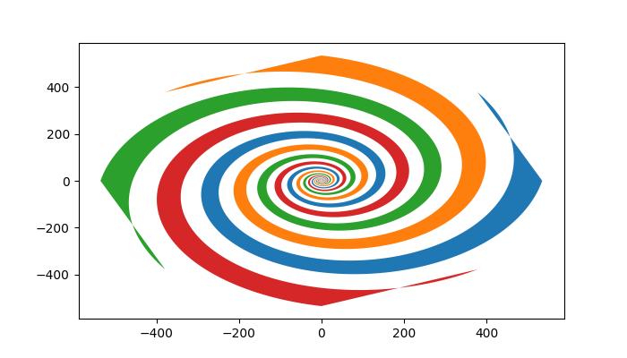
Creating the Logarithmic Fill Spiral
A logarithmic spiral is a specific type of spiral where the radius grows exponentially with the angle.
Example - logarithmic Fill Spiral
The example constructs the logarithmic spiral in pieces, combining segments with different parameters.
import matplotlib.pyplot as plt import numpy as np # Define parameters for the logarithmic spiral a = 2 b = 0.2 # Generate theta and radius values for different pieces theta1 = np.linspace(0, np.pi * 3.0, 1000, endpoint=True) r1 = np.exp(b * theta1) * a theta2 = np.linspace(np.pi, np.pi * 4.0, 1000, endpoint=True) r2 = np.exp(b * theta1) * a theta3 = np.linspace(np.pi, 0, 1000) r3 = r1[-1] * np.ones_like(theta3) theta4 = np.linspace(np.pi, 2 * np.pi, 1000) r4 = a * np.ones_like(theta4) theta5 = np.linspace(np.pi, 2 * np.pi, 1000) r5 = r1[-1] * np.ones_like(theta5) theta6 = np.linspace(0, np.pi, 1000) r6 = a * np.ones_like(theta6) # Concatenate pieces for filling theta_final_red = np.concatenate([theta1, theta3, np.flip(theta2), theta4]) radius_red = np.concatenate([r1, r3, np.flip(r2), r4]) theta_final_blue = np.concatenate([theta1, theta5, np.flip(theta2), theta6]) radius_blue = np.concatenate([r1, r5, np.flip(r2), r6]) # Plot the filled spirals fig = plt.figure(figsize=(7,4)) ax = fig.add_subplot(111, projection='polar') ax.set_rmax(r1[-1]) ax.fill(theta_final_red, radius_red, "g") ax.fill(theta_final_blue, radius_blue, "r") # Plot the individual pieces ax.plot(theta1, r1) ax.plot(theta2, r2) # Black inner circle theta_inner = np.linspace(0, np.pi * 2.0, 1000, endpoint=True) r_inner = [a] * len(theta_inner) ax.fill(theta_inner, r_inner, c='black') ax.axis(False) ax.grid(False) # Display the plot plt.show()
Output
On executing the above code we will get the following output −
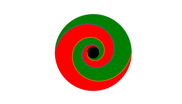
Matplotlib - FindObj() Method
In Matplotlib, the findobj() is a method used for locating and manipulating graphical objects within a figure. Its primary purpose is to provide a flexible and convenient way to search for specific artist instances and modify their properties within a plot.
This method is available in both the interfaces such as pyplot.findobj() and axes.Axes.findobj() (pyplot and Object-oriented interfaces). All Artist objects in Matplotlib inherit this method, allowing for recursive searches within their hierarchy. The findobj method takes a matching criterion and optionally includes the object itself in the search.
In this tutorial, we will explore the fundamental concepts behind the findobj method in Matplotlib.
Finding object
The findobj() method can be used to locate specific types of objects within a plot. For example, users can search for Line2D instances to identify plotted lines within the current Axes.
Example - Creating Sets of Line Plots
The following example creates two sets of line plots using the plot() method then you can use the findobj() method to find out the Line2D instance corresponding to the sinusoidal line.
import matplotlib.pyplot as plt
from matplotlib.lines import Line2D
import numpy as np
# Generate data
t = np.arange(0, 4, 0.1)
F1 = np.sin(2 * t)
F2 = np.exp(-t*4)
# Plot two lines
fig, ax = plt.subplots(figsize=(7, 4))
line1, = ax.plot(t, F1, 'green', label='Sinusoidal')
line2, = ax.plot(t, F2, 'b--', label='Exponential Decay')
# Find the Line object corresponding to the sinusoidal line
line_handle = plt.gca().findobj(Line2D)[0]
# Display the results
print("Found Line2D instance:", line_handle)
# Display the modified plot
plt.legend()
plt.show()
Output
On executing the above code we will get the following output −
Found Line2D instance: Line2D(Sinusoidal)
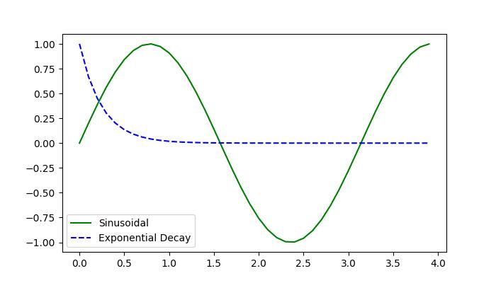
Modifying Objects
Once an object is located/identified using the findobj() method, users can modify its properties to achieve the desired visualization. This includes changing attributes such as color, linestyle, text content, and more.
Example - Modify Plot Text Content
Here is an example that creates a plot with three Text objects containing different text content. The Axes.findobj() method is used to locate a Text object with specific text content ('tutorialspoint'). Once found, the text content is modified to 'Tutorialspoint :)' and its color is changed to green.
import matplotlib.pyplot as plt
from matplotlib.text import Text
# Create a plot with a text object
fig, ax = plt.subplots()
ax.text(.4, .5, s='tutorialspoint')
ax.text(.1, .1, s='Python')
ax.text(.8, .8, s='Matplotlib')
# Find the Text object with the text 'tutorialspoint'
text_handle = ax.findobj(
lambda artist: isinstance(artist, Text) and artist.get_text() == 'tutorialspoint')[0]
# Modify the text
text_handle.set_text('Tutorialspoint :)')
text_handle.set_color('green')
plt.show()
Output
On executing the above code we will get the following output −
Users can also define custom matching functions to filter objects based on specific criteria. This allows for more complex searches and enables advanced manipulation of graphical objects.
Example - Modify Plot Objects
Here is another example that demonstrates how to use of a custom matching function to modify objects using the Figure.findobj() method.
import matplotlib.pyplot as plt
import matplotlib.text as text
import numpy as np
# Generate data
t = np.arange(0, 4, 0.1)
F1 = np.sin(2 * t)
F2 = np.exp(-t * 4)
# Plot two lines
fig, ax = plt.subplots(figsize=(7, 4))
line1, = ax.plot(t, F1, 'red', label='Sinusoidal')
line2, = ax.plot(t, F2, 'k--', label='Exponential Decay')
plt.grid(False)
plt.xlabel('x label')
plt.ylabel('y label')
plt.title('Modifying the Objects')
# Define a custom function for matching
def myfunc(x):
return hasattr(x, 'set_color') and not hasattr(x, 'set_facecolor')
# Modify objects based on the custom function
for o in fig.findobj(myfunc):
o.set_color('green')
# Display the modified plot
plt.show()
Output
On executing the above code we will get the following output −
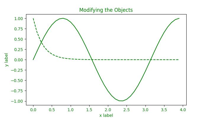
Matplotlib - Hyperlinks
A hyperlink, often referred to as a link, is a navigational element that present in various forms, such as text, images, icons, or buttons, within a document or on a webpage. When clicked or activated, a hyperlink redirects the user to a specified URL or resource, creating a seamless and interactive experience.
Matplotlib provides a variety of tools to include hyperlinks in plots. In this tutorial, you will explore how to add hyperlinks in Matplotlib plots, such as SVG figures and PdfPages.
Creating SVG figures with hyperlinks
SVG (known as Scalable Vector Graphics) is an XML-based image format that supports hyperlinks. However, it's crucial to note that hyperlinks in Matplotlib specifically apply to SVG output. If the plot is saved as a static image, such as PNG or JPEG, or is displayed as plot in a window, the hyperlink functionality will not be operational.
In such case, you can use this feature in interactive plots with clickable elements.
Example - Hyperlink in Scatter Plot
In this example, a scatter plot is created, and hyperlinks are assigned to individual data points using the set_urls method.
import matplotlib.pyplot as plt
import numpy as np
fig = plt.figure()
s = plt.scatter([1, 2, 3], [4, 5, 6])
s.set_urls(['https://www.tutorialspoint.com', 'https://www.tutorialspoint.com/matplotlib/index.htm', None])
fig.savefig('scatter.svg')
Output
After running the above code, you can check the output directory for the .svg image file.
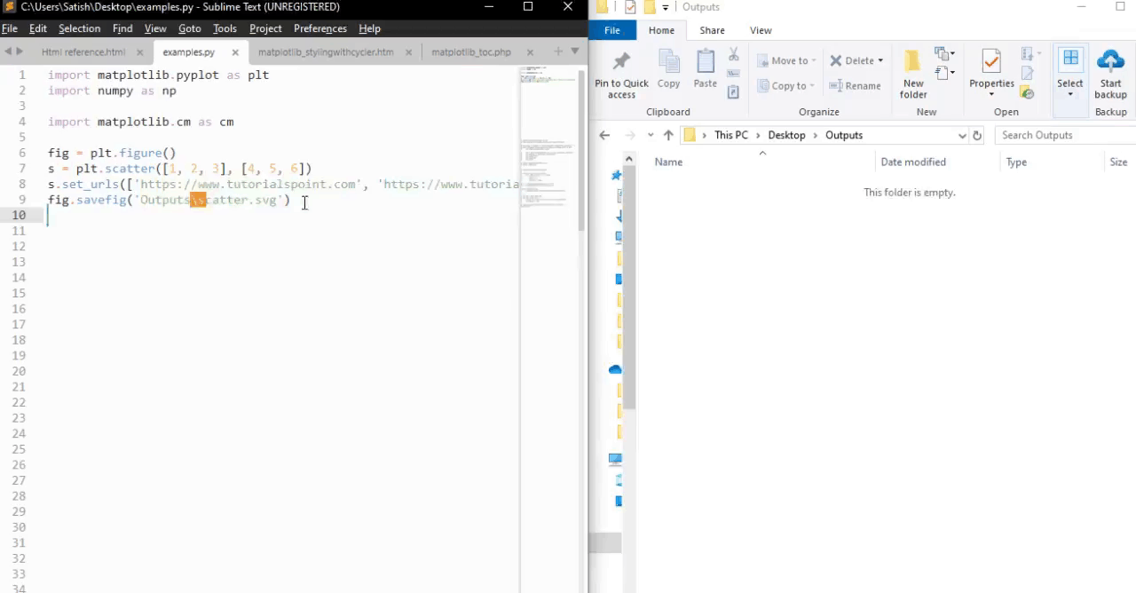
Adding Hyperlinks in PdfPages
The PdfPages module in matplotlib enables the creation of multipage PDF documents. You can add hyperlinks to those pdf pages using the matplotlib text elements.
Example - HyperLink in PDF Document
In this example, a PDF document is created using PdfPages, and a text element with a hyperlink is added to the plot.
import matplotlib.pyplot as plt
from matplotlib.backends.backend_pdf import PdfPages
msr_line4 = r'$\bf{' + 'Tutorialspoint\ Matplotlib\ Resource : ' + '}$' + "https://www.tutorialspoint.com/matplotlib/index.htm"
with PdfPages('Adding_hyperlink_inside_a_PdfPage.pdf') as pdf:
plt.figure(figsize=(11, 8.5))
ax2 = plt.subplot2grid((9, 5), (1, 0), rowspan=1, colspan=2)
ax2.text(0, 0, msr_line4, fontsize=9)
plt.axis('off')
pdf.savefig()
plt.close
Output
After running the above code, you can check the output directory for the .pdf file.
Hyperlinks in Interactive Plots
For plots that are not rendered as SVG, such as interactive plots displayed in a Matplotlib window, hyperlinks can be implemented using event handlers. By creating a function to handle the "pick" event, you can define actions to be taken when specific elements, like data points, are clicked.
Example - Hyperlink in Interactive Plots
The following example demonstrates how to open a specified hyperlink in a web browser when clicking on a data point.
import matplotlib.pyplot as plt
import webbrowser
class CustomObject:
def __init__(self, x, y, name):
self.x = x
self.y = y
self.name = name
def on_pick(event):
webbrowser.open('https://www.tutorialspoint.com')
# Create custom objects
obj_a = CustomObject(0.1, 0.3, "Object A")
obj_b = CustomObject(0.2, 0.5, "Object B")
# Plotting objects with picker attribute
fig, ax = plt.subplots()
for obj in [obj_a, obj_b]:
artist = ax.plot(obj.x, obj.y, 'ro', picker=10)[0]
artist.obj = obj
# Connect pick event to the handler
fig.canvas.callbacks.connect('pick_event', on_pick)
plt.show()
Output
See the below video for how the output looks like.
Matplotlib - Image Thumbnail
Thumbnails, smaller and compressed versions of original images, serve as essential components in various applications, including image previews, web development, and optimizing the loading speed of web pages and applications with heavy images.
In this tutorial, we'll explore using Matplotlib to efficiently generate image thumbnails. Matplotlib takes the support of the Python Pillow library for image processing and allows us to easily generate thumbnails from existing images.
Image thumbnail in Matplotlib
Matplotlib offers the thumbnail() function within its image module to generate thumbnails with customizable parameters, allowing users to efficiently create scaled-down versions of images for various purposes.
Following is the syntax of the function −
Syntax
matplotlib.image.thumbnail(infile, thumbfile, scale=0.1, interpolation='bilinear', preview=False)
Here are the details of its parameters −
infile − The input image file. As you know that Matplotlib relies on Pillow for image reading, so it supports a wide range of file formats, including PNG, JPG, TIFF, and others.
thumbfile − The filename or file-like object where the thumbnail will be saved.
scale − The scale factor for the thumbnail. It determines the size reduction of the thumbnail relative to the original image. A smaller scale factor generates a smaller thumbnail.
interpolation − The interpolation scheme used in the resampling process. This parameter specifies the method used to estimate pixel values in the thumbnail.
preview − If set to True, the default backend (presumably a user interface backend) will be used, which may raise a figure if show() is called. If set to False, the figure is created using FigureCanvasBase, and the drawing backend is selected as Figure.savefig would normally do.
The function returns a Figure instance containing the thumbnail. This Figure object can be further manipulated or saved as needed.
Generating Thumbnails for a single image
Matplotlib supports various image formats like png, pdf, ps, eps svg, and more, making it flexible for different use cases.
Example - Generating Thumbnails
Here is an example that creates a thumbnail for a single .jpg image.
import matplotlib.pyplot as plt
import matplotlib.image as mpimg
input_image_path = "Images/Tajmahal.jpg"
output_thumbnail_path = "Images/Tajmahal_thumbnail.jpg"
# Load the original image
img = mpimg.imread(input_image_path)
# Create a thumbnail using Matplotlib
thumb = mpimg.thumbnail(input_image_path, output_thumbnail_path, scale=0.15)
print(f"Thumbnail generated for {input_image_path}. Saved to {output_thumbnail_path}")
Output
If you visit the folder where the images are saved you can observe both the original and output Thumbnail images as shown below −

Generating Thumbnails for multiple Images
Consider a scenario where you have multiple images in a directory, and you want to generate thumbnails for each of them.
Example - Generating Multiple Thumbnails
Here is an example that creates thumbnails of multiple PNG images in a directory. Save the following script as generate_thumbnails.py file.
from argparse import ArgumentParser
from pathlib import Path
import sys
import matplotlib.image as image
parser = ArgumentParser(description="Generate thumbnails of PNG images in a directory.")
parser.add_argument("imagedir", type=Path)
args = parser.parse_args()
if not args.imagedir.is_dir():
sys.exit(f"Could not find the input directory {args.imagedir}")
outdir = Path("thumbs")
outdir.mkdir(parents=True, exist_ok=True)
for path in args.imagedir.glob("*.png"):
outpath = outdir / path.name
try:
fig = image.thumbnail(path, outpath, scale=0.15)
print(f"Saved thumbnail of {path} to {outpath}")
except Exception as e:
print(f"Error generating thumbnail for {path}: {e}")
Then run the script as follows in command prompt
py generate_thumbnails.py /path/to/all_images
Output
On executing the above program, will create a directory named "thumbs" and generate thumbnails for PNG images in your working directory. If it encounters an image with a different format, it will print an error message and continue processing other images.
Saved thumbnail of Images\3d_Star.png to thumbs\3d_Star.png Saved thumbnail of Images\balloons_noisy.png to thumbs\balloons_noisy.png Saved thumbnail of Images\binary image.png to thumbs\binary image.png Saved thumbnail of Images\black and white.png to thumbs\black and white.png Saved thumbnail of Images\Black1.png to thumbs\Black1.png Saved thumbnail of Images\Blank.png to thumbs\Blank.png Saved thumbnail of Images\Blank_img.png to thumbs\Blank_img.png Saved thumbnail of Images\Circle1.png to thumbs\Circle1.png Saved thumbnail of Images\ColorDots.png to thumbs\ColorDots.png Saved thumbnail of Images\colorful-shapes.png to thumbs\colorful-shapes.png Saved thumbnail of Images\dark_img1.png to thumbs\dark_img1.png Saved thumbnail of Images\dark_img2.png to thumbs\dark_img2.png Saved thumbnail of Images\decore.png to thumbs\decore.png Saved thumbnail of Images\deform.png to thumbs\deform.png Saved thumbnail of Images\Different shapes.png to thumbs\Different shapes.png Error generating thumbnail for Images\Different shapes_1.png: not a PNG file Saved thumbnail of Images\Ellipses.png to thumbs\Ellipses.png Error generating thumbnail for Images\Ellipses_and_circles.png: not a PNG file Saved thumbnail of Images\images (1).png to thumbs\images (1).png Saved thumbnail of Images\images (3).png to thumbs\images (3).png Saved thumbnail of Images\images.png to thumbs\images.png Saved thumbnail of Images\image___1.png to thumbs\image___1.png Saved thumbnail of Images\Lenna.png to thumbs\Lenna.png Saved thumbnail of Images\logo-footer-b.png to thumbs\logo-footer-b.png Saved thumbnail of Images\logo-w.png to thumbs\logo-w.png Saved thumbnail of Images\logo.png to thumbs\logo.png Saved thumbnail of Images\logo_Black.png to thumbs\logo_Black.png
Matplotlib - Plotting with Keywords
Plotting with keywords generally refers to using specific words or commands to customize and control how data is displayed in a plot or graph.
Imagine you have some data, like the temperatures of different cities over a week. You want to create a graph to show this data, but you also want to make it look nice and informative. Plotting with keywords allows you to do just that.
Instead of manually specifying every little detail of the plot, like the color of the lines, the labels on the axes, or the size of the points, you can use keywords or commands to tell the plotting software what you want.
For example, you might use a keyword like "color" followed by a specific color name to change the color of a line in your plot. Or you might use "xlabel" and "ylabel" to add labels to the x-axis and y-axis respectively.
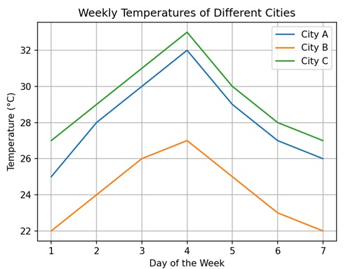
Plotting with Keywords in Matplotlib
When you create a plot using Matplotlib, you can use keywords to control various aspects of the plot, such as the color, line style, marker style, labels, titles, and many other attributes. Instead of providing numerical values or configurations directly, you specify these attributes using descriptive keywords.
For example, to add labels to the x-axis and y-axis, you can use the keywords "xlabel" and "ylabel", respectively.
Plotting with Keyword "Color"
When plotting in Matplotlib, you can use the "color" keyword argument to specify the color of the elements you are drawing. You can specify colors in several ways −
Named Colors − You can use common color names such as "red", "blue", "green", etc., to specify colors.
Hexadecimal Colors − You can use hexadecimal color codes (e.g., "#FF5733") to specify precise colors.
RGB or RGBA Colors − You can specify colors using RGB or RGBA values, where R stands for red, G for green, B for blue, and A for alpha (opacity).
Example - Line Plot with Red Line Color
In the following example, we are creating a line plot where the line color is changed to red using the "color" keyword −
import matplotlib.pyplot as plt
# Data
x = [1, 2, 3, 4, 5]
y = [2, 3, 5, 7, 11]
# Changing line color to red
plt.plot(x, y, color='red')
# Customizing Plot
plt.title('Line Plot with Red Color')
plt.xlabel('X-axis')
plt.ylabel('Y-axis')
# Displaying Plot
plt.show()
Output
Following is the output of the above code −
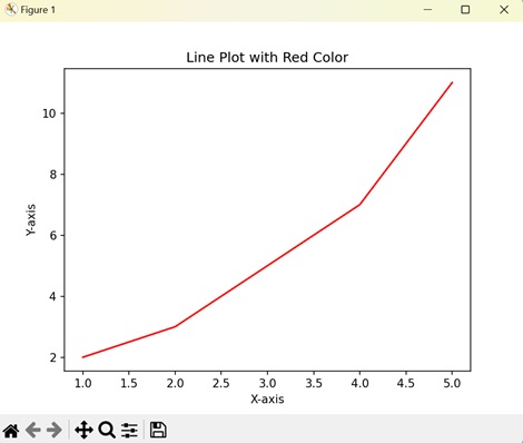
Plotting with Keyword "marker"
In Matplotlib, plotting with the keyword "marker" is used to specify the symbols or markers used to denote individual data points on a plot.
When you create a scatter plot or line plot in Matplotlib, each data point can be represented by a marker, which is a small symbol or shape. The "marker" keyword allows you to choose the shape, size, and color of these markers. Common marker options include circles, squares, triangles, and dots.
Example - Circular Marker on Line Plot
In here, we are using the "marker" keyword to add circle markers to the data points on the line plot −
import matplotlib.pyplot as plt
# Data
x = [1, 2, 3, 4, 5]
y = [2, 3, 5, 7, 11]
# Adding circle markers
plt.plot(x, y, marker='o')
# Customizing Plot
plt.title('Line Plot with Circle Markers')
plt.xlabel('X-axis')
plt.ylabel('Y-axis')
# Displaying Plot
plt.show()
Output
On executing the above code we will get the following output −
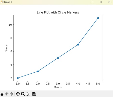
Plotting with Keyword "linestyle"
In Matplotlib, plotting with the keyword "linestyle" is used to specify the style of the lines connecting data points in a plot.
When you create a line plot in Matplotlib, each data point is connected by a line. The "linestyle" keyword allows you to choose the style of these lines. Common linestyle options include solid lines, dashed lines, dotted lines, and dash-dot lines. You can specify these styles using strings such as "-", "--", ":", and "-." respectively.
Example - Dash Styled Line Plot
Now, we are using the "linestyle" keyword to change the line style to "dashed" −
import matplotlib.pyplot as plt
# Data
x = [1, 2, 3, 4, 5]
y = [2, 3, 5, 7, 11]
# Changing line style to dashed
plt.plot(x, y, linestyle='--')
# Customizing Plot
plt.title('Line Plot with Dashed Line Style')
plt.xlabel('X-axis')
plt.ylabel('Y-axis')
# Displaying Plot
plt.show()
Output
After executing the above code, we get the following output −
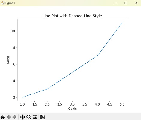
Plotting with Keyword "grid"
In Matplotlib, plotting with the keyword "grid" is used to add gridlines to your plot. Gridlines are horizontal and vertical lines that help in visually aligning data points on the plot.
The "grid" keyword allows you to control whether gridlines are displayed on the plot. You can specify whether you want gridlines along the x-axis, y-axis, or both axes. When you enable the gridlines, they appear as faint lines spanning the plot area, forming a grid-like pattern.
Example - Adding Grid to the Plot
In the following example, we are using the "grid" keyword to add a grid to the plot −
import matplotlib.pyplot as plt
# Data
x = [1, 2, 3, 4, 5]
y = [2, 3, 5, 7, 11]
# Plotting
plt.plot(x, y)
# Customizing Plot
plt.title('Line Plot with Grid')
plt.xlabel('X-axis')
plt.ylabel('Y-axis')
# Adding grid
plt.grid(True)
# Displaying Plot
plt.show()
Output
On executing the above code we will get the following output −
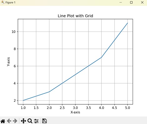
Matplotlib - Create Logo
Creating a logo generally means designing a unique symbol or image that represents a brand, company, product, or organization. It involves combining visual elements like shapes, colors, and text to convey the identity and message of the entity it represents.
Create Logo in Matplotlib
You can create a logo in Matplotlib using the library's plotting functionalities to design a visual symbol or image that represents a brand, company, product, or organization.
Similar to other plotting tasks, creating a logo in Matplotlib requires combining various graphical elements such as shapes, colors, text, and possibly images to craft a unique and recognizable emblem.
Simple Geometric Logo
A simple geometric logo in Matplotlib refers to creating a basic graphical representation using geometric shapes like squares, circles, triangles, or lines.
You can use functions like plt.plot(), plt.scatter(), plt.fill(), or plt.text() to draw various geometric shapes and add text to your plot. By combining these elements and arranging them creatively, you can design a simple logo for your project, brand, or visualization.
Example - Creating a Circular Log
In the following example, we create a simple circular logo using Matplotlib. We use the Circle() function to draw a blue-colored circle and add it to the plot using the add_artist() function. We then turn off the axes, and set the aspect ratio to ensure the circle appears round −
import matplotlib.pyplot as plt
# Creating a circle
circle = plt.Circle((0.5, 0.5), 0.4, color='blue')
# Creating the plot
fig, ax = plt.subplots()
ax.add_artist(circle)
# Customizing the plot
ax.set_aspect('equal')
ax.axis('off')
# Displaying the logo
plt.show()
Output
Following is the output of the above code −
Creating a Text Logo
A text logo in Matplotlib involves creating a logo or visual representation using text elements. Instead of relying on geometric shapes or images, a text logo uses characters and symbols to convey a brand or identity.
In Matplotlib, you can use the plt.text() function to add text to your plot. This function allows you to specify the position, text content, font size, color, and other properties of the text you want to display.
Example - Creating Text Based Logo
In here, we create a text-based logo using Matplotlib. We use the text() function to place the word "Logo" at the center of the plot with "red" color and customized font size −
import matplotlib.pyplot as plt
# Creating text
text = plt.text(0.5, 0.5, 'Logo', fontsize=50, color='red', ha='center', va='center')
# Customizing the plot
plt.axis('off')
# Displaying the logo
plt.show()
Output
On executing the above code we will get the following output −
Creating a Complex Shape Logo
A complex shape logo in Matplotlib refers to creating a logo using intricate or detailed shapes, patterns, and designs. Unlike simple geometric logos, which rely on basic shapes like squares, circles, or triangles, complex shape logos often involve more elaborate and intricate elements.
In Matplotlib, you can combine various plotting functions, such as plt.plot(), plt.fill(), plt.scatter(), and plt.polygon(), to create complex shapes and patterns. By carefully arranging these elements and applying different colors, styles, and transformations, you can design intricate logos that convey a unique brand identity or message.
Complex shape logos can include a wide range of elements, such as curves, curves, arcs, polygons, and other geometric shapes. They may also consist of text, images, or other visual elements.
Example - Creating a Complex Logo
Now, we create a logo with a complex shape by combining an ellipse, a polygon, and a star. We create each shape the Ellipse and Polygon classes, respectively. We then use the add_artist() function to add each shape to the plot −
import matplotlib.pyplot as plt
from matplotlib.patches import Ellipse, Polygon
# Creating an ellipse
ellipse = Ellipse((0.5, 0.5), width=0.7, height=0.4, angle=45, color='orange')
# Creating a polygon
vertices = [[0.2, 0.4], [0.8, 0.4], [0.6, 0.8], [0.4, 0.8]]
polygon = Polygon(vertices, closed=True, color='blue')
# Creating a star
star_vertices = [[0.3, 0.6], [0.4, 0.9], [0.5, 0.6], [0.6, 0.9], [0.7, 0.6],
[0.5, 0.4], [0.3, 0.6]]
star = Polygon(star_vertices, closed=True, color='green')
# Creating the plot
fig, ax = plt.subplots()
ax.add_artist(ellipse)
ax.add_patch(polygon)
ax.add_patch(star)
# Customizing the plot
ax.set_aspect('equal')
ax.axis('off')
# Displaying the logo
plt.show()
Output
After executing the above code, we get the following output −
Creating an Image Logo
An image logo in Matplotlib refers to using an image or picture as a logo in a plot. Instead of creating shapes, lines, or text to form a logo, you can insert an existing image file, such as a PNG, JPEG, or GIF, into your Matplotlib plot.
To add an image logo to a Matplotlib plot, you can use the plt.imshow() function, which displays an image on the plot. You will first need to load the image file and then pass the image data to plt.imshow() to display it within your plot.
Example - Creating Image based Logo
In the following example, we create a logo using an external image file with Matplotlib. We load the image using the imread() function and then display it using the imshow() function −
import matplotlib.pyplot as plt
import matplotlib.image as mpimg
# Loading image
img = mpimg.imread('tutorialspoint_logo.png')
# Displaying image
plt.imshow(img)
plt.axis('off')
# Displaying the logo
plt.show()
Output
On executing the above code we will get the following output −
Matplotlib - Multipage PDF
A multipage PDF(Portable Document Format) is a type of file that can store multiple pages or images in a single document. Each page within the PDF can have different content, such as plots, images, or text.
Matplotlib provides support for creating multipage PDFs through its backend_pdf.PdfPages module. This feature allows users to save plots and visualizations across multiple pages within the same PDF file.
In certain situations, it becomes necessary to save several plots in one file. While many image file formats like PNG, SVG, or JPEG typically support only a single image per file, Matplotlib provides a solution for creating multipage output. PDF is one such supported format, allowing users to organize and share visualizations effectively.
Creating a Basic multipage PDF
To save plots on multiple pages in a PDF document using Matplotlib, you can make use of the PdfPages class. This class simplifies the process of generating a PDF file with several pages, each containing different visualizations.
Example - Creating a Basic PDF with multiple pages
Let's start with a basic example demonstrating how to create a multipage PDF with Matplotlib. This example saves multiple figures in one PDF file at once.
from matplotlib.backends.backend_pdf import PdfPages
import numpy as np
import matplotlib.pyplot as plt
# sample data for plots
x1 = np.arange(10)
y1 = x1**2
x2 = np.arange(20)
y2 = x2**2
# Create a PdfPages object to save the pages
pp = PdfPages('Basic_multipage_pdf.pdf')
def function_plot(X,Y):
plt.figure()
plt.clf()
plt.plot(X,Y)
plt.title('y vs x')
plt.xlabel('x axis', fontsize = 13)
plt.ylabel('y axis', fontsize = 13)
pp.savefig()
# Create and save the first plot
function_plot(x1,y1)
# Create and save the second plot
function_plot(x2,y2)
pp.close()
Output
On executing the above program, 'Basic_multipage_pdf.pdf' will be generated in the directory where the script is saved.
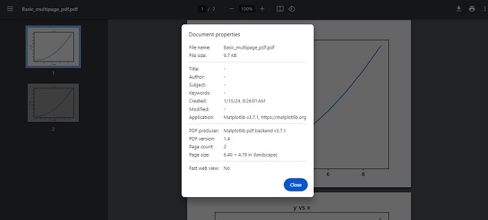
Adding Metadata and Annotations
Matplotlib also supports the addition of metadata and annotations to a multipage PDF. Metadata can include information such as the title, author, and creation date, providing additional context or details about the content within the PDF.
Example - Creating Multi page PDF with Metadata
Here is an advanced example, that creates a multipage PDF with metadata and annotations.
import datetime
import matplotlib.pyplot as plt
import numpy as np
from matplotlib.backends.backend_pdf import PdfPages
# Create the PdfPages object to save the pages
with PdfPages('Advanced_multipage_pdf.pdf') as pdf:
# Page One
plt.figure(figsize=(3, 3))
plt.plot(range(7), [3, 1, 4, 1, 5, 9, 2], 'r-o')
plt.title('Page One')
# saves the current figure into a pdf page
pdf.savefig()
plt.close()
# Page Two
# Initially set it to True. If LaTeX is not installed or an error is caught, change to `False`
# The usetex setting is particularly useful when you need LaTeX features that aren't present in matplotlib's built-in mathtext.
plt.rcParams['text.usetex'] = False
plt.figure(figsize=(8, 6))
x = np.arange(0, 5, 0.1)
plt.plot(x, np.sin(x), 'b-')
plt.title('Page Two')
# attach metadata (as pdf note) to page
pdf.attach_note("plot of sin(x)")
pdf.savefig()
plt.close()
# Page Three
plt.rcParams['text.usetex'] = False
fig = plt.figure(figsize=(4, 5))
plt.plot(x, x ** 2, 'ko')
plt.title('Page Three')
pdf.savefig(fig)
plt.close()
# Set file metadata
d = pdf.infodict()
d['Title'] = 'Multipage PDF Example'
d['Author'] = 'Tutorialspoint'
d['Subject'] = 'How to create a multipage pdf file and set its metadata'
d['Keywords'] = 'PdfPages multipage keywords author title subject'
d['CreationDate'] = datetime.datetime(2024, 1, 15)
d['ModDate'] = datetime.datetime.today()
Output
On executing the above program, 'Advanced_multipage_pdf.pdf' will be generated in the directory where the script is saved. you will be able to observe the details like below −
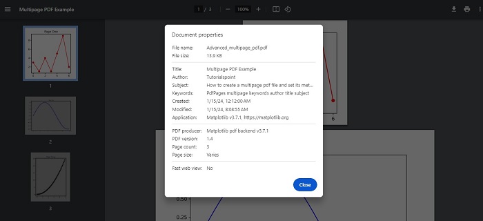
Matplotlib - Multiprocessing
Multiprocessing is a technique used to execute multiple processes concurrently, taking advantage of multi-core processors. In Python, the multiprocessing module provides a convenient way to create and manage parallel processes. This is useful for tasks that can be parallelized, such as generating plots, running simulations, or performing computations on large datasets.
Multiprocessing in Matplotlib
Matplotlib is traditionally used in a single-threaded manner, combining it with the multiprocessing library allows for the creation of plots in parallel. This can be useful when dealing with a large number of plots or computationally intensive tasks.
Creating Multiple Matplotlib Plots
Creating multiple plots sequentially can lead to a slower execution, especially when dealing with a large number of plots. In such cases, using the multiprocessing technique can significantly improve performance by allowing the creation of multiple plots concurrently.
Example - Creating Plots Parallelly
Let's see a basic example that demonstrates how to create multiple Matplotlib plots in parallel using multiprocessing.
import matplotlib.pyplot as plt
import numpy as np
import multiprocessing
def plot(datax, datay, name):
x = datax
y = datay**2
plt.scatter(x, y, label=name)
plt.legend()
plt.show()
def multiP():
for i in range(4):
p = multiprocessing.Process(target=plot, args=(i, i, i))
p.start()
if __name__ == "__main__":
input('Press Enter to start parallel plotting...')
multiP()
Output
On executing the above program, 4 matplotlib plots are created in parallel see the video below for reference −
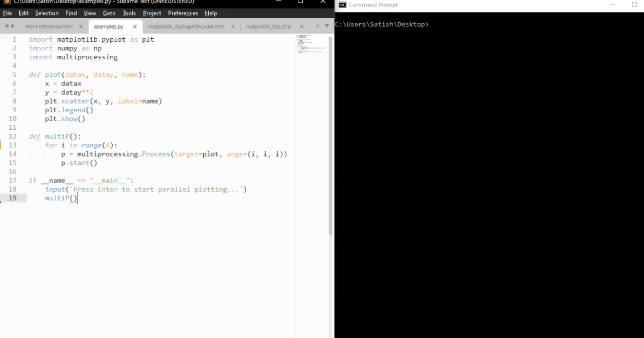
Saving Multiple Matplotlib Figures
Saving multiple Matplotlib figures concurrently is another scenario where multiprocessing can be advantageous.
Example - Saving Multiple Figures Concurrently
Here is an example that uses multiprocessing to save multiple Matplotlib figures concurrently.
import matplotlib.pyplot as plt
import numpy.random as random
from multiprocessing import Pool
def do_plot(number):
fig = plt.figure(number)
a = random.sample(1000)
b = random.sample(1000)
# generate random data
plt.scatter(a, b)
plt.savefig("%03d.jpg" % (number,))
plt.close()
print(f"Image {number} saved successfully...")
if __name__ == '__main__':
pool = Pool()
pool.map(do_plot, range(1, 5))
Output
On executing the above code we will get the following output −
Image 1 saved successfully... Image 2 saved successfully... Image 3 saved successfully... Image 4 saved successfully...
If you navigate to the directory where the plots were saved, you will be able to observe the ved 001.jpg, 002.jpg, 003.jpg, and 004.jpg images as shown below −
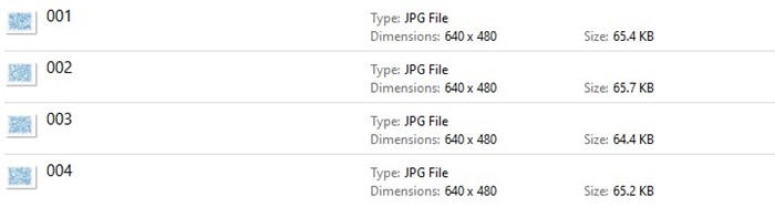
Example - Multiprocessing to generate data
Here is another example that demonstrates how to use multiprocessing to generate data in one process and plot it in another using Matplotlib.
import multiprocessing as mp
import time
import matplotlib.pyplot as plt
import numpy as np
# Fixing random state for reproducibility
np.random.seed(19680801)
class ProcessPlotter:
def __init__(self):
self.x = []
self.y = []
def terminate(self):
plt.close('all')
def call_back(self):
while self.pipe.poll():
command = self.pipe.recv()
if command is None:
self.terminate()
return False
else:
self.x.append(command[0])
self.y.append(command[1])
self.ax.plot(self.x, self.y, 'ro')
self.fig.canvas.draw()
return True
def __call__(self, pipe):
print('Starting plotter...')
self.pipe = pipe
self.fig, self.ax = plt.subplots()
timer = self.fig.canvas.new_timer(interval=1000)
timer.add_callback(self.call_back)
timer.start()
print('...done')
plt.show()
class NBPlot:
def __init__(self):
self.plot_pipe, plotter_pipe = mp.Pipe()
self.plotter = ProcessPlotter()
self.plot_process = mp.Process(
target=self.plotter, args=(plotter_pipe,), daemon=True)
self.plot_process.start()
def plot(self, finished=False):
send = self.plot_pipe.send
if finished:
send(None)
else:
data = np.random.random(2)
send(data)
# Main function for the integrated code
def main_with_multiprocessing():
pl = NBPlot()
for _ in range(10):
pl.plot()
time.sleep(0.5)
pl.plot(finished=True)
if __name__ == '__main__':
if plt.get_backend() == "MacOSX":
mp.set_start_method("forkserver")
input('Press Enter to start integrated example...')
main_with_multiprocessing()
Output
On executing the above program, will generate the matplotlib plots with random data see the video below for reference −
Matplotlib - Print and stdout
Print − usually refers to displaying something, like text or numbers, on a screen or on paper.
stdout − stands for "standard output." It is a way for a program to send information (like text or data) out of itself. When a program "prints" something to stdout, it is essentially saying, "Here's some information I want to show or share".
So, when you hear "print stdout" together, it means a program is sending some information to be displayed in a standard way, usually on your screen. It is a basic method for programs to communicate with users or other parts of the computer system.
Print Stdout in Matplotlib
The term "print stdout" is not specific to Matplotlib. It generally refers to printing output to the standard output stream in Python, which is the console or terminal where you run your Python code.
In Matplotlib, if you want to print output to the console, you can use Python's built-in print() function. For example, you can print information about your plot, data, or any messages or debugging information.
Print Text on Plot
Printing text on a plot in Matplotlib allows you to add labels, titles, annotations, or any other textual information to enhance the understanding of your data visualization. You can place text at specific locations on the plot to provide explanations, highlight important points, or label different elements.
Example - Printing Text
In the following example, we plot a line and add the text "Hello, Matplotlib!" to the plot using the text() function. We position the text at coordinates (2, 5) with a specified "fontsize" and "color" −
import matplotlib.pyplot as plt # Creating a simple plot plt.plot([1, 2, 3], [4, 5, 6]) # Adding text annotation to the plot plt.text(2, 5, 'Hello, Matplotlib!', fontsize=12, color='red') # Displaying the plot plt.show()
Output
Following is the output of the above code −
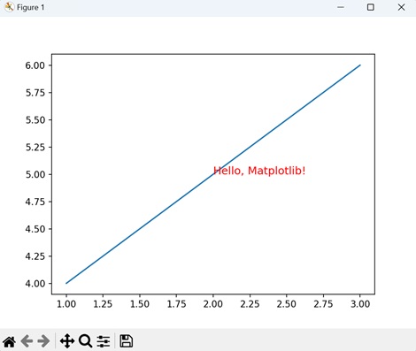
Print Text on Polar Plot
Printing text on a polar plot in Matplotlib allows you to add labels, annotations, or any other textual information to enhance the understanding of your polar visualization. Just like in Cartesian plots, you can place text at specific locations on the polar plot to provide explanations, highlight important points, or label different elements.
Example - Adding Text to Polar Plot
In here, we create a polar plot and add the text "Polar Plot" to the plot using the text() function. We position the text at an angle of "/2" (90 degrees) and a radius of "0.5" from the origin, with a specified fontsize, color, and horizontal alignment −
import matplotlib.pyplot as plt import numpy as np # Creating a polar plot theta = np.linspace(0, 2*np.pi, 100) r = np.sin(3*theta) plt.polar(theta, r) # Adding text annotation to the polar plot plt.text(np.pi/2, 0.5, 'Polar Plot', fontsize=12, color='blue', ha='center') # Displaying the polar plot plt.show()
Output
On executing the above code we will get the following output −
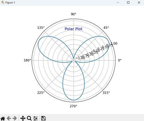
Print Text with Rotation
Printing text with rotation in Matplotlib allows you to display text at an angle, which can be useful for labeling elements with slanted or diagonal orientations, or for adding stylistic effects to your plots.
Example - Rotated Text
Now, we plot a line and add rotated text to the plot using the "rotation" parameter of the text() function. We position the text "Rotated Text" at coordinates (2, 5) with a specified fontsize, color, and rotation angle of "45" degrees −
import matplotlib.pyplot as plt # Creating a simple plot plt.plot([1, 2, 3], [4, 5, 6]) # Adding rotated text annotation to the plot plt.text(2, 5, 'Rotated Text', fontsize=12, color='purple', rotation=45) # Displaying the plot plt.show()
Output
After executing the above code, we get the following output −
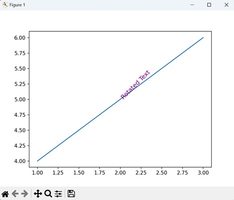
Print Text with Box
Printing text with a box in Matplotlib refers to adding textual annotations to a plot with a surrounding box, highlighting important information. These annotations can include labels, titles, or descriptions, and are enclosed within a rectangular or square-shaped box to draw attention to them.
To print text with a box around it in Matplotlib, you can use the "bbox" parameter of the text() function. This parameter allows you to specify the properties of the box, such as its color, transparency, and border width.
Example - Printing Text with Box
In the following example, we plot a line and add boxed text to the plot using the text() function. We position the text "Boxed Text" at coordinates (2, 5) with a specified fontsize, color, and a box with rounded corners, light yellow face color, and orange edge color −
import matplotlib.pyplot as plt # Creating a simple plot plt.plot([1, 2, 3], [4, 5, 6]) # Adding boxed text annotation to the plot plt.text(2, 5, 'Boxed Text', fontsize=12, color='orange', bbox=dict(facecolor='lightyellow', edgecolor='orange', boxstyle='round,pad=0.5')) # Displaying the plot plt.show()
Output
On executing the above code we will get the following output −
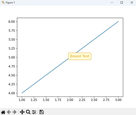
Matplotlib - Compound Path
In graphics and design, a "path" is a sequence of points connected by lines or curves. It is like drawing a line from one point to another. "Compound" means made up of multiple parts or elements.
Imagine you have several basic shapes like circles, rectangles, and lines. Individually, these shapes are simple and limited in what they can represent. However, by combining them together in different arrangements and orientations, you can create more complex and interesting shapes. This process of combining simple shapes to create more complex ones is what is referred to as using compound paths.
Compound Path in Matplotlib
A compound path in Matplotlib refers to a combination of multiple simple paths or shapes that are grouped together to form a more complex shape. These simple paths could be lines, curves, polygons, or other basic shapes.
In Matplotlib, you can create compound paths using the "Path" class, which allows you to define custom paths by specifying the vertices and codes that describe the path segments. You can then use these custom paths to draw complex shapes or patterns on your plots.
Compound Path: Intersection of Circle and Rectangle
A compound path of the intersection of a circle and a rectangle in Matplotlib refers to creating a single shape that represents the area where the circle and the rectangle overlap or intersect. Instead of treating the circle and the rectangle as separate entities, you combine them together to form a new, more complex shape that captures the common region where they intersect.
In Matplotlib, you can create a compound path of the intersection of a circle and a rectangle by defining the vertices and codes that describe the path segments for each shape. Then, you combine these paths together to form the compound path representing the intersection. Once created, you can use this compound path to draw the intersecting area on your plot.
Example - Intersection of Circle and Rectangle
In the following example, we are creating a compound path representing the intersection of a circle and a rectangle by combining their vertices and codes into a single Path object −
import matplotlib.pyplot as plt
from matplotlib.path import Path
from matplotlib.patches import PathPatch
# Defining the paths for the shapes
circle = Path.unit_circle()
rect = Path([(0.5, 0.5), (0.5, 1.5), (1.5, 1.5), (1.5, 0.5), (0.5, 0.5)], closed=True)
# Combining the paths into a compound path (Intersection)
compound_vertices = circle.vertices.tolist() + rect.vertices.tolist()
compound_codes = circle.codes.tolist() + rect.codes.tolist()
compound_path = Path(compound_vertices, compound_codes)
# Plotting the compound path
fig, ax = plt.subplots()
patch = PathPatch(compound_path, facecolor='blue', edgecolor='black')
ax.add_patch(patch)
# Setting plot limits and aspect ratio
ax.set_xlim(0, 2)
ax.set_ylim(0, 2)
ax.set_aspect('equal')
# Showing the plot
plt.title('Intersection of Circle and Rectangle')
plt.show()
Output
Following is the output of the above code −
Compound Path of Union of Two Rectangles
A compound path of the union of two rectangles in Matplotlib refers to creating a single shape by combining the areas covered by two separate rectangles. Instead of treating the rectangles as individual shapes, you merge them together to form a new, more complex shape.
In Matplotlib, you can create a compound path of the union of two rectangles by defining the vertices and codes that describe the path segments for each rectangle. Then, you combine these paths together to form the compound path representing the union of the rectangles. Once created, you can use this compound path to draw the combined shape on your plot.
Example - Union of Rectangle
In here, we are creating a compound path representing the union of two rectangles by combining their vertices and codes into a single Path object −
import matplotlib.pyplot as plt
from matplotlib.path import Path
from matplotlib.patches import PathPatch
# Defining the paths for the shapes
# Rectangle 1
path1 = Path([(1, 1), (1, 2), (2, 2), (2, 1), (1, 1)], closed=True)
# Rectangle 2
path2 = Path([(1.5, 0), (1.5, 1), (2.5, 1), (2.5, 0), (1.5, 0)], closed=True)
# Combining the paths into a compound path (Union)
compound_vertices = path1.vertices.tolist() + path2.vertices.tolist()
compound_codes = path1.codes.tolist() + path2.codes.tolist()
compound_path = Path(compound_vertices, compound_codes)
# Plotting the compound path
fig, ax = plt.subplots()
patch = PathPatch(compound_path, facecolor='blue', edgecolor='black')
ax.add_patch(patch)
# Setting plot limits and aspect ratio
ax.set_xlim(0, 3)
ax.set_ylim(0, 2.5)
ax.set_aspect('equal')
# Displaying the plot
plt.title('Union of Two Rectangles')
plt.show()
Output
On executing the above code we will get the following output −
Compound Path: Difference of Two Circles
A compound path of the difference of two circles in Matplotlib refers to creating a single shape that represents the area remaining when one circle is subtracted from another.
In Matplotlib, you can create a compound path of the difference of two circles by defining the vertices and codes that describe the path segments for each circle. Then, you combine these paths together and subtract the path of the smaller circle from the path of the larger circle to form the compound path representing the difference. Once created, you can use this compound path to draw the remaining ring-shaped area on your plot.
Example - Difference between Circles
Now, we are creating a compound path representing the difference between two circles by combining their vertices and codes into a single Path object −
import matplotlib.pyplot as plt
from matplotlib.path import Path
from matplotlib.patches import PathPatch
import numpy as np
# Defining the paths for the shapes
circle1 = Path.unit_circle()
circle2 = Path.unit_circle().transformed(plt.matplotlib.transforms.Affine2D().scale(0.5))
# Combining the paths into a compound path (Difference)
compound_vertices = np.concatenate([circle1.vertices, circle2.vertices])
compound_codes = np.concatenate([circle1.codes, circle2.codes])
compound_path = Path(compound_vertices, compound_codes)
# Plotting the compound path
fig, ax = plt.subplots()
patch = PathPatch(compound_path, facecolor='blue', edgecolor='black')
ax.add_patch(patch)
# Setting plot limits and aspect ratio
ax.set_xlim(-1, 2)
ax.set_ylim(-1, 2)
ax.set_aspect('equal')
# Displaying the plot
plt.title('Difference of Two Circles')
plt.show()
Output
After executing the above code, we get the following output −
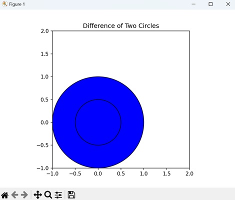
Compound Path: XOR of Two Polygons
A compound path of the XOR (exclusive OR) of two polygons in Matplotlib represents a combination of the two polygons where only the areas that do not overlap are retained. In other words, it shows the regions that belong exclusively to one of the polygons, but not to both.
In Matplotlib, you can create a compound path of the exclusive XOR of two polygons by defining the vertices and codes that describe the path segments for each polygon. Then, you combine these paths together and apply the exclusive XOR operation to determine the regions that belong exclusively to one polygon or the other. The resulting compound path represents these non-overlapping areas, which you can use to draw on your plot.
Example - XOR of Polygons
In this example, we are creating a compound path representing the exclusive XOR operation on two polygons by combining their vertices and codes into a single Path object −
import matplotlib.pyplot as plt
from matplotlib.path import Path
from matplotlib.patches import PathPatch
# Defining the paths for the shapes
poly1 = Path([(1, 1), (1, 2), (2, 2), (2, 1), (1, 1)], closed=True) # Rectangle
poly2 = Path([(1.5, 0), (1.5, 1), (2.5, 1), (2.5, 0), (1.5, 0)], closed=True) # Triangle
# Combining the paths into a compound path (Exclusive XOR)
compound_vertices = poly1.vertices.tolist() + poly2.vertices.tolist()
compound_codes = poly1.codes.tolist() + poly2.codes.tolist()
compound_path = Path(compound_vertices, compound_codes)
# Plotting the compound path
fig, ax = plt.subplots()
patch = PathPatch(compound_path, facecolor='blue', edgecolor='black')
ax.add_patch(patch)
# Setting plot limits and aspect ratio
ax.set_xlim(0, 3)
ax.set_ylim(0, 2.5)
ax.set_aspect('equal')
# Displaying the plot
plt.title('Exclusive XOR of Two Polygons')
plt.show()
Output
On executing the above code we will get the following output −
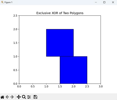
Matplotlib - Sankey Class
Sankey Class in matplotlib is used to create Sankey diagrams, Before diving into the Sankey Class, it's essential to understand the basics of Sankey diagrams.
A Sankey diagram is a powerful visualization tool that represents the flow of resources, energy, or information between different entities or processes. It uses arrows of varying widths to depict the quantity of flow, with the width being proportional to the quantity being represented. See the below image for the reference of a simple Sankey Diagram
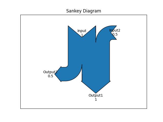
Key Components of a Sankey Diagram
Nodes − Entities or processes between which the flow occurs.
Flows − Arrows connecting nodes, representing the quantity of the flow.
Labels − Descriptions associated with nodes or flows.
Sankey Class in Matplotlib
In Matplotlib, the Sankey() class provides a convenient way to create these diagrams. Below is the syntax of the class −
Syntax
class matplotlib.sankey.Sankey(ax=None, scale=1.0, unit='', format='%G', gap=0.25, radius=0.1, shoulder=0.03, offset=0.15, head_angle=100, margin=0.4, tolerance=1e-06, **kwargs)
Following are the steps to create a Sankey diagram using matplotlib Sankey Class −
Creating a Sankey Object − This can be done by using the Sankey() class which initializes an instance of the Sankey class, which will be used to build the diagram.
Adding the Flows and Labels − The Sankey.add() method is used to specify the flows and labels.
Finish and Display − The Sankey.finish() method finalizes the diagram, and plt.show() displays it.
Drawing a Basic Sankey Diagram
Now, let's build a simple Sankey diagram with The default settings. The below example creates a diagram of one input and output flow. The flows are specified with the flows argument, while labels are provided using labels argument.
Example - Creating a Sankey Diagram
Here is the example that crates the Sankey diagram with one input and output flows.
import matplotlib.pyplot as plt
from matplotlib.sankey import Sankey
sankey = Sankey()
sankey.add(flows=[1, -1],
labels=['input', 'output'])
plt.title("Sankey Diagram")
sankey.finish()
plt.show()
Output
On executing the above program, will generate the following Sankey diagram −
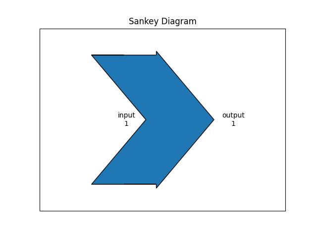
Example - Creating Sankey using Constructor
Another example demonstrates how to create a simple diagram by implicitly calling the Sankey class constructor and by appending finish() to the call to the class.
import matplotlib.pyplot as plt
from matplotlib.sankey import Sankey
Sankey(flows=[0.25, 0.15, 0.60, -0.20, -0.15, -0.05, -0.50, -0.10],
labels=['', '', '', 'First', 'Second', 'Third', 'Fourth', 'Fifth'],
orientations=[-1, 1, 0, 1, 1, 1, 0, -1]).finish()
plt.title("The default settings produce a diagram like this.")
plt.show()
Output
On executing the above program, will generate the following Sankey diagram −
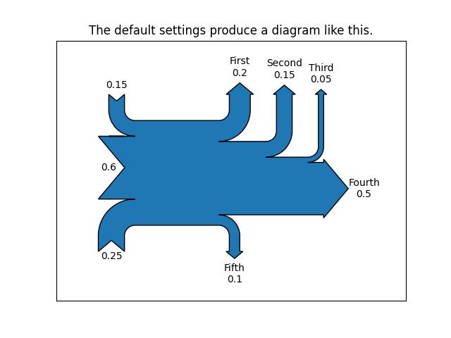
Customized Sankey Diagram
The Matplotlib Sankey class provides more customization options, including connecting multiple Sankey diagrams together, placing a label in the middle of the diagram, implicitly passing keyword arguments to PathPatch(), changing the angle of the arrowheads, changing the appearance of the patch and the labels after the figure is created, and more.
Example - Customized Sankey Diagram
Here is an example that creates a complex customized Sankey Diagram using matplotlib sankey() class.
import matplotlib.pyplot as plt
from matplotlib.sankey import Sankey
# Create a subplot
fig = plt.figure()
ax = fig.add_subplot(1, 1, 1, xticks=[], yticks=[], title="Customized Sankey Diagram with Two Systems")
# Create a Sankey diagram
sankey = Sankey(ax=ax, scale=0.01, offset=0.2, format='%.0f', unit='%')
# Add flows and labels for the first system
sankey.add(flows=[25, 0, 60, -10, -20, -5, -15, -10, -40], label='one',
labels=['', '', '', 'First', 'Second', 'Third', 'Fourth','Fifth', 'Hurray!'],
orientations=[-1, 1, 0, 1, 1, 1, -1, -1, 0],
pathlengths=[0.25, 0.25, 0.25, 0.25, 0.25, 0.6, 0.25, 0.25, 0.25],
patchlabel="Widget\nA")
# Add flows and labels for the second system, connected to the first
sankey.add(flows=[-25, 15, 10], label='two',
orientations=[-1, -1, -1], prior=0, connect=(0, 0))
# Finish the Sankey diagram and apply customizations
diagrams = sankey.finish()
diagrams[-1].patch.set_hatch('/')
diagrams[0].texts[-1].set_color('r')
diagrams[0].text.set_fontweight('bold')
# Display the diagram
plt.legend()
plt.show()
Output
On executing the above program, will generate the following Sankey diagram −
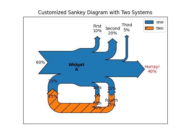
Matplotlib - MRI With EEG
MRI with EEG refers to a medical imaging technique that combines two different methods to study the brain: Magnetic Resonance Imaging (MRI) and Electroencephalography (EEG).
MRI (Magnetic Resonance Imaging) − MRI uses strong magnetic fields and radio waves to create detailed images of the inside of the body, including the brain. It helps doctors see the structure and anatomy of the brain, detecting abnormalities like tumors, injuries, or other conditions.
EEG (Electroencephalography) − EEG measures the electrical activity in the brain by placing electrodes on the scalp. It records the patterns of electrical impulses produced by brain cells, called neurons.
When MRI and EEG are combined, it allows doctors and researchers to study both the structure and activity of the brain simultaneously.
MRI with EEG in Matplotlib
Matplotlib allows you to create visualizations that integrate MRI images with EEG data, enabling the exploration and analysis of brain function and connectivity.
In Matplotlib, there isn't a specific function for creating MRI with EEG visualizations. Instead, you need to use a combination of Matplotlib's plotting functions to overlay EEG data onto MRI images. This involves loading and processing the MRI and EEG data separately, then using Matplotlib to display them together in a single plot.
You can use functions like imshow() to display the MRI image and plot() or scatter() to overlay the EEG data onto the MRI image. Additionally, you can adjust the appearance and layout of the plot using various customization options provided by Matplotlib.
Displaying MRI Slice
In Matplotlib, displaying an MRI slice involves visualizing a single two-dimensional cross-section of a three-dimensional MRI volume. This allows you to examine the internal structures of the body captured by the MRI scanner. You can load and display the MRI slice as an image within a plot using Matplotlib's plotting functions, such as imshow().
Example - Generating MRI Data
In the following example, we are generating synthetic MRI data using np.random.rand, creating a 3D array of random numbers representing MRI voxel intensities. We save this synthetic MRI data to a NIfTI file named 'sample_mri.nii.gz' using Nibabel's nib.save. We then load the synthetic MRI data from the saved file using nib.load and display a single slice (slice index 50) of the MRI data using Matplotlib's imshow() function−
import matplotlib.pyplot as plt
import nibabel as nib
import numpy as np
# Generating sample MRI data
sample_data = np.random.rand(100, 100, 100)
# Saving sample MRI data to a NIfTI file
nib.save(nib.Nifti1Image(sample_data, np.eye(4)), 'sample_mri.nii.gz')
# Loading sample MRI data
mri_img = nib.load('sample_mri.nii.gz')
mri_data = mri_img.get_fdata()
# Displaying a single MRI slice
plt.imshow(mri_data[:, :, 50], cmap='gray')
plt.title('Sample MRI Slice')
plt.axis('off')
plt.show()
Output
Following is the output of the above code −
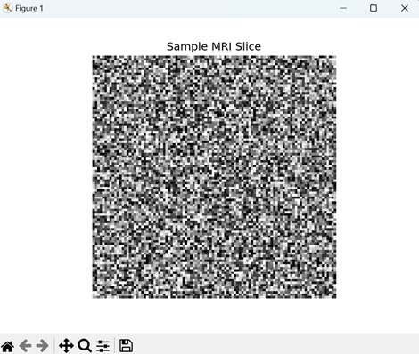
Plot EEG Signal
Plotting an EEG signal in Matplotlib involves visualizing the electrical activity recorded from electrodes placed on the scalp. EEG signals represent the brain's neural activity over time, capturing changes in electrical potentials associated with various brain states and activities.
In Matplotlib, you can plot EEG data using functions like plot() to display the signal amplitude over time. EEG plots typically have time on the x-axis and voltage or signal amplitude on the y-axis, allowing researchers and clinicians to analyze brain activity patterns, detect abnormalities, and study cognitive processes.
Example - Plotting EEG Signal
In here, we are generating synthetic EEG data and plotting the EEG signal over time using Matplotlib's plot() function −
import matplotlib.pyplot as plt
import numpy as np
# Generating sample EEG data
# Sampling frequency (Hz)
fs = 1000
# Time vector (10 seconds)
t = np.arange(0, 10, 1/fs)
# Sample EEG signal
eeg_signal = np.sin(2 * np.pi * 10 * t) + 0.5 * np.random.randn(len(t))
# Plotting EEG signal
plt.plot(t, eeg_signal)
plt.title('EEG Signal')
plt.xlabel('Time (s)')
plt.ylabel('Amplitude')
plt.show()
Output
On executing the above code we will get the following output −
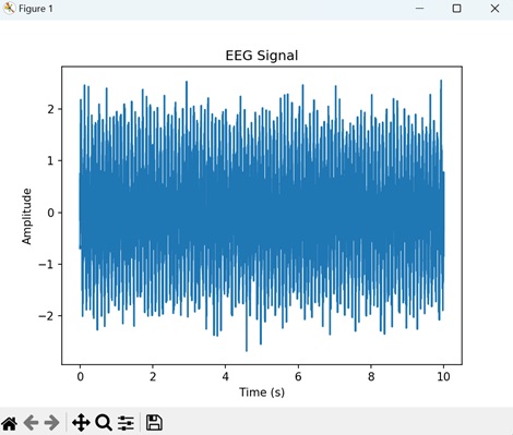
MRI Overlay with EEG Electrodes
Overlaying EEG electrodes onto an MRI image in Matplotlib involves combining two different types of medical data for visualization. The MRI provides detailed anatomical information about the brain's structures, while the EEG electrodes capture electrical signals from the brain's surface. By overlaying EEG electrodes onto the MRI image, researchers and clinicians can correlate brain activity with specific brain regions.
You can achieve this overlay in Matplotlib by plotting the MRI image using the imshow() function and then superimposing the EEG electrode positions using symbols or markers.
Example - MRI Overlay
The following example generates an MRI image and overlays EEG electrode positions on a single MRI slice using Matplotlib −
import matplotlib.pyplot as plt
import numpy as np
# Generating synthetic MRI data
mri_shape = (100, 100, 100)
mri_data = np.random.rand(*mri_shape)
# Generating sample EEG electrode positions (x, y coordinates)
eeg_electrodes = np.array([[30, 40], [50, 60], [70, 80]])
# Displaying a single MRI slice
plt.imshow(mri_data[:, :, 50], cmap='gray')
# Overlaying EEG electrode positions
plt.scatter(eeg_electrodes[:, 0], eeg_electrodes[:, 1], color='red', marker='o', label='EEG Electrodes')
# Adding legend
plt.legend()
# Adding title and axis labels
plt.title('MRI Slice with EEG Electrodes')
plt.xlabel('X')
plt.ylabel('Y')
# Displaying plot
plt.show()
Output
After executing the above code, we get the following output −
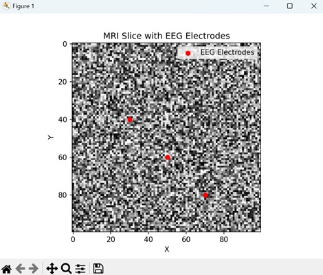
Matplotlib - Stylesheets
What are StyleSheets?
In Matplotlib library stylesheets are predefined sets of aesthetic configurations that control the overall appearance of plots. They offer a convenient way to change the look and feel of our plots with minimal effort.
A stylesheet consists of predefined settings for various elements of a plot such as colors, line styles, fonts, grid styles and much more. Matplotlib provides a collection of built-in stylesheets that allow us to quickly apply different visual themes to our plots.
The default style is used when no specific style is set but Matplotlib includes several other styles like gplot, seaborn, bmh, dark_background and more. These stylesheets offer different color schemes, line styles, font settings and overall aesthetics.
Matplotlib provides a variety of built-in stylesheets. Here's an overview of how you can work with them −
Viewing Available Stylesheets
Matplotlib provides different stylesheets that change the overall appearance of plots and altering elements such as colors, line styles, font sizes etc. Stylesheets offer a quick and easy way to change the aesthetics of our visualizations.
Syntax
We can check the available stylesheets using the below syntax.
plt.style.available
Example - Printing Available Stylesheets
Here in this example we are using the plt.style.available to get all the available stylesheets in the Matplotlib library.
import matplotlib.pyplot as plt
# List available stylesheets
print("Available stylesheets:", plt.style.available)
Output
Available stylesheets: [ 'Solarize_Light2', '_classic_test_patch', '_mpl-gallery', '_mpl-gallery-nogrid', 'bmh', 'classic', 'dark_background', 'fast', 'fivethirtyeight', 'ggplot', 'grayscale', 'seaborn', 'seaborn-bright', 'seaborn-colorblind', 'seaborn-dark', 'seaborn-dark-palette', 'seaborn-darkgrid', 'seaborn-deep', 'seaborn-muted', 'seaborn-notebook', 'seaborn-paper', 'seaborn-pastel', 'seaborn-poster', 'seaborn-talk', 'seaborn-ticks', 'seaborn-white', 'seaborn-whitegrid', 'tableau-colorblind10']
Using Stylesheets
Absolutely to use the Matplotlib stylesheets is straightforward. We can apply a specific style to our plots. Here's the syntax.
Syntax
plt.style.use('stylesheet_name')
Where,
plt.style.use() − This is used to use the defined stylesheets to the entire plot.
stylesheet_name − This is the name of the stylesheet that we want to apply.
Example - Using stylesheets
In this example we are using the stylesheet ggplot by employing the plt.style.use('ggplot') before creating our plot.
import matplotlib.pyplot as plt
# Using a specific stylesheet
plt.style.use('ggplot') # Example: Using the 'ggplot' style
x = [10,30,20,50]
y = [30,23,45,10]
plt.plot(x,y)
plt.title("Plot with ggplot style sheet")
plt.show()
Output
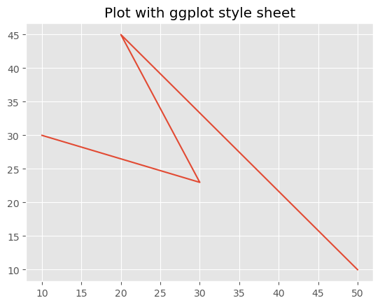
Applying Stylesheet Temporarily
If we want to apply a stylesheet temporarily to a specific block of code without affecting other plots we can use with plt.style.context('stylesheet_name').
This temporary context applies the specified style only within the block of code indented under the with statement.
Example - Using seaborn-dark style
In this example we are setting the stylesheet to seaborn-dark by using the plt.style.context() functin available in matplotlib library.
import matplotlib.pyplot as plt
x = [10,30,20,50]
y = [30,23,45,10]
with plt.style.context('seaborn-dark'):
# Code for a plot with 'seaborn-dark' style
plt.plot(x, y)
plt.title('Seaborn-Dark Style')
plt.show() # The 'seaborn-dark' style will only affect this plot
Output
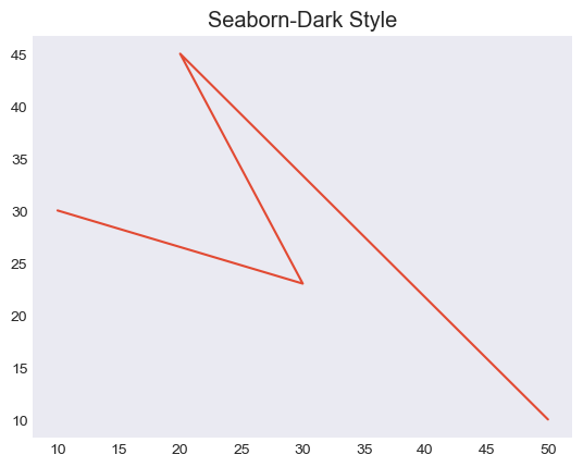
Creating Custom Stylesheets
We can also create our custom stylesheets by defining a .mplstyle file or using a Python dictionary specifying the style parameters −
Example - Creating Custom Style
In this example we are creating the custom stylesheets by using the dictionary.
import matplotlib.pyplot as plt
# Define a custom style using a dictionary
custom_style = {
'lines.linewidth': 10,
'lines.color': 'red',
'axes.labelsize': 30,
# Add more style configurations as needed
}
# Use the custom style
plt.style.use(custom_style)
x = [10,30,20,50]
y = [30,23,45,10]
plt.plot(x,y)
plt.title("Plot with custom style sheet")
plt.show()
Output
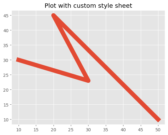
Stylesheets offer an efficient way to maintain consistency across multiple plots or to experiment with various visual styles easily. We can select stylesheets that best suit our preferences or the specific requirements of our data visualization.
Matplotlib - Background Colors
What are Background Colors in Matplotlib?
Matplotlib provides extensive options to control background colors enabling users to customize the visual appearance of plots and figures. The background color plays a crucial role in enhancing the aesthetics and readability of visualizations, setting the tone and mood for the displayed data.
The following are the different features available in the Background colors of Matplotlib library. Lets see each one in detailed view.
Figure and Plot Background Color
The figure's background color encompasses the entire area where plots are rendered. By default it's often white but it can be changed using plt.figure(facecolor='color_name') or plt.gcf().set_facecolor('color_name'). This affects the area around the plots.
The plot background color on the other hand refers to the area within the plot's axes. It can be altered with plt.gca().set_facecolor('color_name') by providing a different background color within the actual plot.
Changing Figure Bacground color
In this example demonstrating how to set the background color for the figure using Matplotlib library.
Example - Updating Figure Background Color
import matplotlib.pyplot as plt
import numpy as np
# Generating data
x = np.linspace(0, 10, 100)
y = np.sin(x)
# Changing Figure Background Color
plt.figure(facecolor='lightblue') # Set figure background color
plt.plot(x, y)
plt.title('Figure Background Color Example')
plt.xlabel('X-axis')
plt.ylabel('Y-axis')
plt.show()
Output
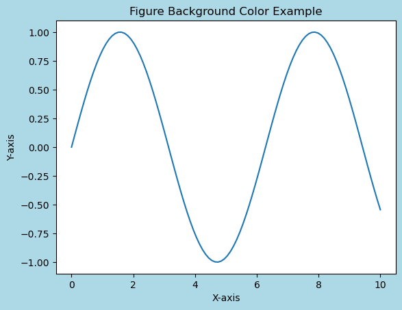
Changing Plot Area Background Color
In this example we use plt.gca().set_facecolor('lightgreen') to set the background color for the plot area specifically.
Example - Updating Area Background Color
import matplotlib.pyplot as plt
import numpy as np
# Generating data
x = np.linspace(0, 10, 100)
y = np.sin(x)
# Changing plot area Background Color
plt.plot(x, y)
plt.gca().set_facecolor('lightgreen') # Set plot area background color
plt.title('Plot Area Background Color Example')
plt.xlabel('X-axis')
plt.ylabel('Y-axis')
plt.show()
Output
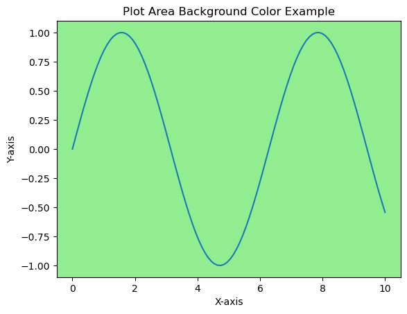
Stylesheets for Background Colors
Matplotlib offers stylesheets that provide predefined configurations including background colors. Stylesheets like 'dark_background', 'ggplot' or 'seaborn' have distinctive color schemes that affect the background color of plots, figures and other elements.
Stylesheets not only modify the background colors but also encompass various other stylistic elements such as line colors, text sizes and grid styles. Experimenting with different stylesheets allows us to quickly explore and visualize how different styles affect the appearance of our plots.
Example - Using stylesheets
Here's an example showcasing how stylesheets in Matplotlib can be used to modify
import matplotlib.pyplot as plt
import numpy as np
# Generating data
x = np.linspace(0, 10, 100)
y = np.sin(x)
# Plot using different stylesheets
stylesheets = ['ggplot', 'dark_background', 'seaborn-poster']
for style in stylesheets:
plt.style.use(style) # Apply the selected stylesheet
plt.plot(x, y)
plt.title(f'Plot with {style.capitalize()} Stylesheet')
plt.xlabel('X-axis')
plt.ylabel('Y-axis')
plt.show()
Output
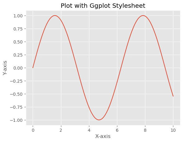
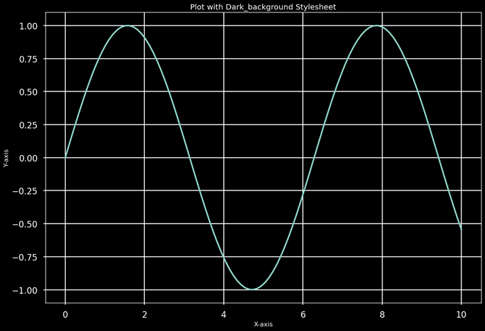
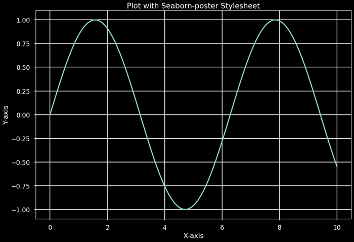
Impact on Visualization
Background colors influence the visual perception of data. Dark backgrounds might emphasize bright or contrasting data while light backgrounds often offer a clean and conventional look suitable for most contexts. Background colors should be chosen carefully to ensure readability and accessibility for viewers.
Customization and Color Representation
We can customize background colors using various representations such as color names ('blue', 'red'), hexadecimal strings ('#RRGGBB'), RGB tuples ((0.1, 0.2, 0.5)), or RGBA tuples with alpha transparency ((0.1, 0.2, 0.5, 0.3)).
These color string representations offer flexibility in specifying colors for various elements within the plot by allowing us to precisely control the visual appearance of our visualizations. We can use named colors, hexadecimal strings, RGB tuples or RGBA values to customize colors for different elements in Matplotlib plots.
Customizing with Color Strings
We can directly use color names or hexadecimal strings to set the background color.
Example - Customizing using Color Strings
import matplotlib.pyplot as plt
import numpy as np
# Generating data
x = np.linspace(0, 10, 100)
y = np.sin(x)
# Customizing with color strings
plt.figure(facecolor='green') # Set figure background color using color name
plt.plot(x, y)
plt.title('Customizing with Color Strings')
plt.xlabel('X-axis')
plt.ylabel('Y-axis')
plt.show()
Output
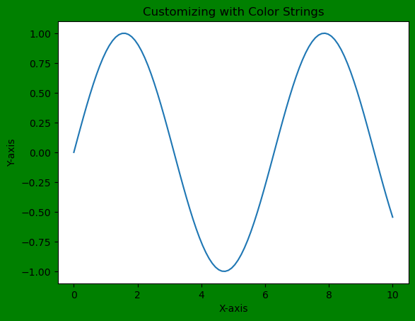
Customization Options
We can also customize other elements using color strings or RGB values such as line colors, marker colors or even modifying the color of specific text elements in the plot.
Example
import matplotlib.pyplot as plt
import numpy as np
# Generating data
x = np.linspace(0, 10, 100)
y = np.sin(x)
# Customizing with color strings
plt.figure(facecolor='lightblue') # Set figure background color using color name
plt.plot(x, y, color='orange') # Set line color using a color name
plt.scatter(x, y, color='#00FF00') # Set marker color using hexadecimal color string
plt.xlabel('X-axis', color='red') # Set x-axis label color using a color name
plt.ylabel('Y-axis', color=(0.5, 0.1, 0.7)) # Set y-axis label color using RGB tuple
plt.show()
Output
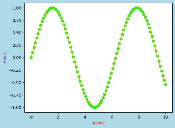
Importance of Background Colors
The choice of background color significantly impacts the aesthetics and interpretation of visualizations. It can affect readability, visual contrast and the overall impression of the displayed data. Context, audience and the specific purpose of the visualization should guide the selection of background colors.
Use Cases
Contrast and Visibility − Contrast between data elements and the background can be adjusted to highlight or de-emphasize certain information.
Themes and Branding − Background colors can align with branding or thematic considerations by ensuring consistency across multiple visualizations.
Accessibility − Selecting appropriate background color is very crucial for ensuring accessibility, especially for individuals with visual impairments.
Matplotlib offers diverse options for controlling background colors in plots and figures. These choices have a substantial impact on the aesthetics, readability and interpretation of visualization by making them a fundamental aspect of creating effective and engaging plots. Properly chosen background colors enhance the overall appeal and communication of data representations.
Change the default background color
In this example we will change the default background color for Matplotlib plots.
Example - Changing Background Color
import numpy as np
import matplotlib.pyplot as plt
plt.rcParams["figure.figsize"] = [7.50, 3.50]
plt.rcParams["figure.autolayout"] = True
ax = plt.gca()
print("Default face color is: ", ax.get_facecolor())
plt.subplot(121)
plt.plot(np.random.rand(10), np.random.rand(10))
plt.title("With default face color")
plt.subplot(122)
ax = plt.gca()
ax.set_facecolor("orange")
plt.plot(np.random.rand(10), np.random.rand(10))
plt.title("With customize face color")
plt.show()
Output
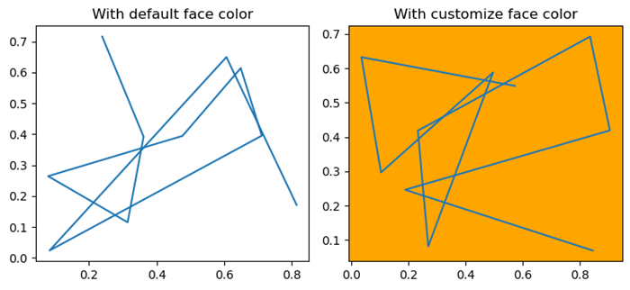
Change axes background color
Here in this example we change the axes background color by using the set_facecolor() method.
Example - Changes Axes Background Color
import numpy as np
import matplotlib.pyplot as plt
plt.rcParams["figure.figsize"] = [7.50, 3.50]
plt.rcParams["figure.autolayout"] = True
ax = plt.gca()
ax.set_facecolor("orange")
x = np.linspace(-2, 2, 10)
y = np.exp(-x)
plt.plot(x, y, color='red')
plt.show()
Output
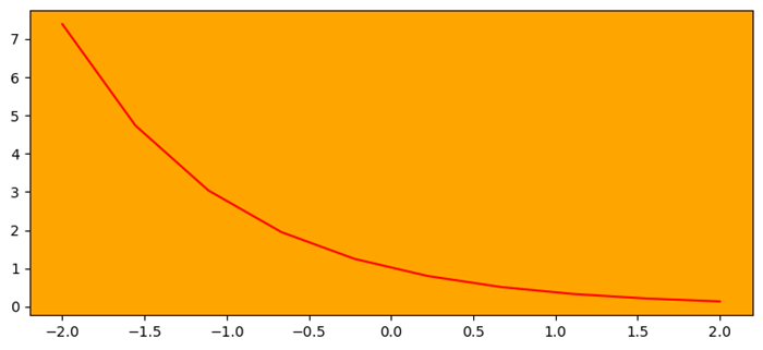
Set the background color of a column in a matplotlib table
This is the reference example for setting the background color of a column in a matplotlib table.
Example - Changing Background Color of Column
import matplotlib.pyplot as plt
plt.rcParams["figure.figsize"] = [7.50, 3.50]
plt.rcParams["figure.autolayout"] = True
columns = ('name', 'age', 'marks', 'salary')
cell_text = [["John", "23", "98", "234"], ["James", "24", "90", "239"]]
colors = [["red", "yellow", "blue", "green"], ["blue", "green", "yellow", "red"]]
fig, ax = plt.subplots()
the_table = ax.table(cellText=cell_text, cellColours=colors, colLabels=columns, loc='center')
ax.axis('off')
plt.show()
Output
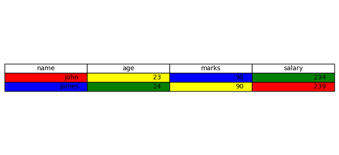
Matplotlib - BaseMap
What is Basemap?
The Matplotlib Basemap toolkit is an extension to Matplotlib that provides functionality for creating maps and visualizations involving geographical data. It allows users to plot data on various map projections, draw coastlines, countries and other map features . These are used to handle geographic coordinates seamlessly within Matplotlib.
The below are the key features of Matplotlib Basemap.
Map Projections
Basemap supports various map projections by allowing users to visualize data in different coordinate systems like cylindrical, conic or azimuthal projections. Examples are Mercator, Lambert Conformal Conic and Orthographic projections.
Plotting Geographic Data
Basemap allows the plotting of geographical data such as points, lines, or polygons over maps. Users can overlay datasets onto maps and visualize geographic relationships.
Map Elements
Basemap provides functions to add map elements like coastlines, countries, states, rivers and political boundaries by enhancing the visual context of the maps.
Coordinate Transformation
It facilitates seamless conversion between different coordinate systems such as latitude and longitude to map projection coordinates and vice versa.
Installing Basemap
If we want to work with Basemap of matplotlib library we have to install it in our working environment. The below is the code.
pip install basemap
Note − When we are working with Jupyter notebook then we have to install basemap through the anaconda command terminal.
Output
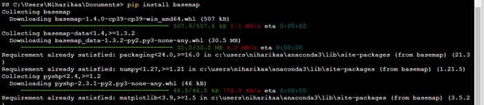
Basic Workflow with Basemap
The below is the basic workflow of the Basemap of the Matplotlib library. Lets see each of them in detail for better understanding.
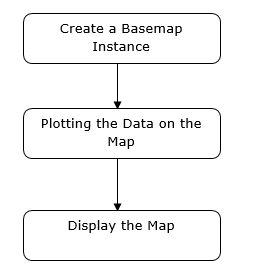
Create a Basemap Instance
Instantiate a Basemap object by specifying the map projection, bounding coordinates and other parameters. To create a Basemap instance using the Basemap toolkit in Matplotlib we can define the map projection and specify the desired map boundaries.
Example- Generating a Basic Map
In this example we are generating a basic map with coastlines and country boundaries using the specified Mercator projection and the provided bounding coordinates. We can further customize the map by adding features, plotting data points or using different projections and resolutions based on our requirements.
from mpl_toolkits.basemap import Basemap import matplotlib.pyplot as plt # Create a Basemap instance with a specific projection and bounding coordinates map = Basemap( projection='merc', llcrnrlat=-80, urcrnrlat=80, llcrnrlon=-180, urcrnrlon=180, resolution='c') # Draw coastlines and countries map.drawcoastlines() map.drawcountries() # Show the map plt.show()
Output
Plot Data on the Map
In this we use the Basemap methods to draw map features, plot data points or visualize geographical datasets.
Example = Flow Data Map
In this example we are generating random latitude and longitude points and then uses the map() function to project these coordinates onto the Basemap instance. The scatter() method is then used to plot these projected points on the map as red markers.
from mpl_toolkits.basemap import Basemap
import matplotlib.pyplot as plt
import numpy as np
# Create a Basemap instance with a specific projection and bounding coordinates
map = Basemap(
projection='merc', llcrnrlat=-80, urcrnrlat=80,
llcrnrlon=-180, urcrnrlon=180, resolution='c')
# Draw coastlines and countries
map.drawcoastlines()
map.drawcountries()
# Generate random data (longitude, latitude) for plotting
num_points = 100
lons = np.random.uniform(low=-180.0, high=180.0, size=num_points)
lats = np.random.uniform(low=-80.0, high=80.0, size=num_points)
# Plot the data points on the map
x, y = map(lons, lats) # Project the latitudes and longitudes to map coordinates
map.scatter(x, y, marker='o', color='red', zorder=10) # Plotting the data points
# Show the map with plotted data
plt.title('Data Points on Map')
plt.show()
Output
Display the Map
We can use Matplotlib library to show() function to display the final map.
Example - Creating Map
Here's an example demonstrating the usage of Basemap to create a map and plot data points.
from mpl_toolkits.basemap import Basemap
import matplotlib.pyplot as plt
import numpy as np
# Creating a Basemap instance with a specific projection and bounding coordinates
map = Basemap(
projection='merc', llcrnrlat=-80, urcrnrlat=80,
llcrnrlon=-180, urcrnrlon=180, resolution='c')
# Drawing coastlines, countries, and states
map.drawcoastlines()
map.drawcountries()
map.drawstates()
# Generating random data for plotting
num_points = 100
lons = np.random.uniform(low=-180.0, high=180.0, size=num_points)
lats = np.random.uniform(low=-80.0, high=80.0, size=num_points)
data_values = np.random.rand(num_points) * 100 # Random values for data
# Plotting data points on the map
x, y = map(lons, lats) # Projecting latitudes and longitudes to map coordinates
map.scatter(x, y, c=data_values, cmap='viridis', marker='o', alpha=0.7)
# Adding a colorbar to represent the data values
plt.colorbar(label='Data Values')
# Display the map with plotted data
plt.title('Basemap Example with Data Points')
plt.show()
Output
Applications of Matplotlib Basemap
Geospatial Analysis − Analyzing and visualizing geographical data such as climate patterns, population distributions or seismic activities.
Cartography − Creating custom maps for publications, presentations or research purposes.
Data Visualization − Integrating geographical data with other datasets for exploratory data analysis.
Note
Matplotlib Basemap is being phased out in favor of newer geospatial libraries like Cartopy which offer more extensive functionality and better integration with Matplotlib. Cartopy builds on the concepts of Basemap but provides a more modern, flexible and actively developed interface for handling geospatial data within Matplotlib.
Matplotlib - Event Handling
In general programming, an event is defined as the change in the state of an object, that occurs when a user interacts with graphical user interface components, triggering a response from the application. Consider actions like clicking a button, moving the mouse, typing on the keyboard, selecting an item from a list, or scrolling a page - each of these activities is an event, describing a change in the state of the source.
Whereas, event handling is the backbone of interactive software applications. Which is the mechanism that controls the response to these events, determining what should occur when a particular event takes place.
Event Handling in Matplotlib
Matplotlib works with various user interface toolkits, including wxPython, Tkinter, Qt, GTK, and MacOSX. To ensure consistent support for interactive features like panning and zooming across different interfaces, Matplotlib uses a GUI-neutral event handling API. This API was initially based on the GTK model, which was the first user interface Matplotlib supported.
Connecting to Events
The main idea behind event handling in Matplotlib is connecting a callback functions to events. A callback function is executed when a specific event, such as a mouse click or key press, occurs. This mechanism enables you to respond to user interactions and implement customized behavior.
If needed, you can disconnect the callback using the connection ID obtained from the mpl_connect method.
fig.canvas.mpl_disconnect(cid)
Example - Printing Mouse Events
This example demonstrates a basic implementation that prints the mouse click location and the pressed button on a Matplotlib plot.
import matplotlib.pyplot as plt
import numpy as np
# Generate sample data
x = np.linspace(0, 10, 100)
y = np.sin(x)
# Create a Matplotlib figure and axis
fig, ax = plt.subplots(figsize=(7, 4))
# Plot the data
ax.plot(x, y)
# Define a callback function to handle events
def onclick(event):
print('%s click: button=%d, x=%d, y=%d, xdata=%f, ydata=%f' %
('double' if event.dblclick else 'single', event.button,
event.x, event.y, event.xdata, event.ydata))
# Connect the event handler to the figure canvas
cid = fig.canvas.mpl_connect('button_press_event', onclick)
plt.show()
Output
On executing the above program you will get the following output −

single click: button=1, x=271, y=266, xdata=3.220737, ydata=0.485644 single click: button=1, x=218, y=226, xdata=2.146083, ydata=0.200062 single click: button=3, x=218, y=226, xdata=2.146083, ydata=0.200062 single click: button=1, x=360, y=245, xdata=5.025346, ydata=0.335713
Watch the video below to observe the works of this example.
Common Events in Matplotlib
Matplotlib supports various events, each represented by a specific class −
button_press_event − Triggered when a mouse button is pressed.
button_release_event − Triggered when a mouse button is released.
close_event − Triggered when the figure is closed.
draw_event − Triggered when the canvas has been drawn but the screen widget is not updated.
key_press_event − Triggered when a key is pressed.
key_release_event − Triggered when a key is released.
motion_notify_event − Triggered when the mouse moves.
pick_event − Triggered when an artist in the canvas is selected.
resize_event − Triggered when the figure canvas is resized.
scroll_event − Triggered when the mouse scroll wheel is rolled.
figure_enter_event − Triggered when the mouse enters a new figure.
figure_leave_event − Triggered when the mouse leaves a figure.
axes_enter_event − Triggered when the mouse enters a new axes.
axes_leave_event − Triggered when the mouse leaves an axes.
By using these events, you can create dynamic and interactive visualizations in matplotlib.
Event Attributes
All Matplotlib events inherit from the matplotlib.backend_bases.Event class, which has attributes like name, canvas, and guiEvent. Common attributes for MouseEvent include x, y, inaxes, xdata, and ydata.
Example - Generating Line segment on mouse press
Let's see this simple example where a line segment is generated with each mouse press on the plot.
from matplotlib import pyplot as plt
import numpy as np
# LineBuilder Class
# It creats line segments based on mouse clicks.
class LineBuilder:
def __init__(self, line):
self.line = line
self.xs = list(line.get_xdata())
self.ys = list(line.get_ydata())
self.cid = line.figure.canvas.mpl_connect('button_press_event', self)
def __call__(self, event):
if event.inaxes != self.line.axes:
return
self.xs.append(event.xdata)
self.ys.append(event.ydata)
self.line.set_data(self.xs, self.ys)
self.line.figure.canvas.draw()
# Create a figure and axis
fig, ax = plt.subplots(figsize=(7, 4))
# Set the title
ax.set_title('Click to Build Line Segments')
# empty line
line, = ax.plot([0], [0])
# Create an instance for LineBuilder class
linebuilder = LineBuilder(line)
# Show the Plot
plt.show()
Output
On executing the above program you will get the following figure click on this figure to observe the working of this example −
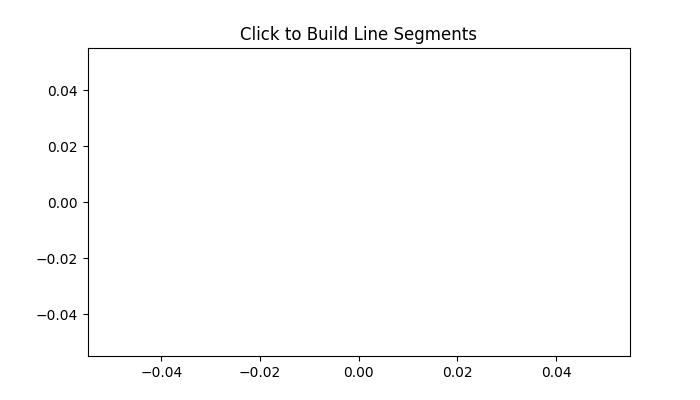
Watch the video below to observe working of this example.
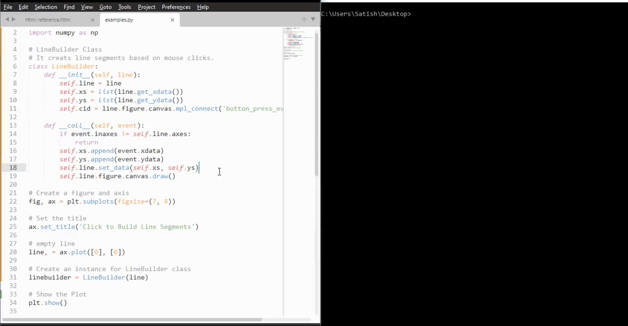
Detecting the Mouse moves
To detect when the mouse enters or leaves a figure or an axes, we can connect to the figure/axes enter/leave events.
Example - Changing frame color with mouse in/out movement
Here is another example that demonstrates how to change frame colors when the mouse enters or leaves specific regions of the figure.
import matplotlib.pyplot as plt
def enter_axes(event):
event.inaxes.patch.set_facecolor('yellow')
event.canvas.draw()
def leave_axes(event):
event.inaxes.patch.set_facecolor('white')
event.canvas.draw()
def enter_figure(event):
event.canvas.figure.patch.set_facecolor('red')
event.canvas.draw()
def leave_figure(event):
event.canvas.figure.patch.set_facecolor('grey')
event.canvas.draw()
fig, axs = plt.subplots(2, figsize=(7, 4))
fig.suptitle('Mouse Hover Over Figure or Axes to Trigger Events')
fig.canvas.mpl_connect('figure_enter_event', enter_figure)
fig.canvas.mpl_connect('figure_leave_event', leave_figure)
fig.canvas.mpl_connect('axes_enter_event', enter_axes)
fig.canvas.mpl_connect('axes_leave_event', leave_axes)
plt.show()
Output
On executing the above program you will get the following output −
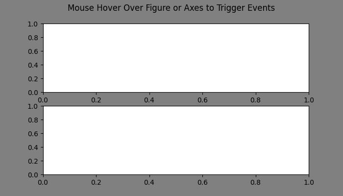
Watch the video below to observe the works of this example.
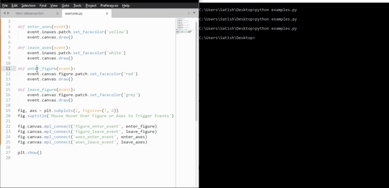
Example - Handling Mouse Release Event
Here is another example that demonstrates how to show mouse release event coordinates with Matplotlib
from matplotlib import pyplot as plt
plt.rcParams['backend'] = 'TkAgg'
plt.rcParams["figure.figsize"] = [7, 4]
plt.rcParams["figure.autolayout"] = True
# Define a callback function to handle events
def onclick(event):
print(event.button, event.xdata, event.ydata)
# Create a Matplotlib figure and axis
fig, ax = plt.subplots()
# Plot the data
ax.plot(range(10))
# Connect the event handler to the figure canvas
fig.canvas.mpl_connect('button_release_event', onclick)
# Show the Plot
plt.show()
Output
On executing the above code we will get the following output −
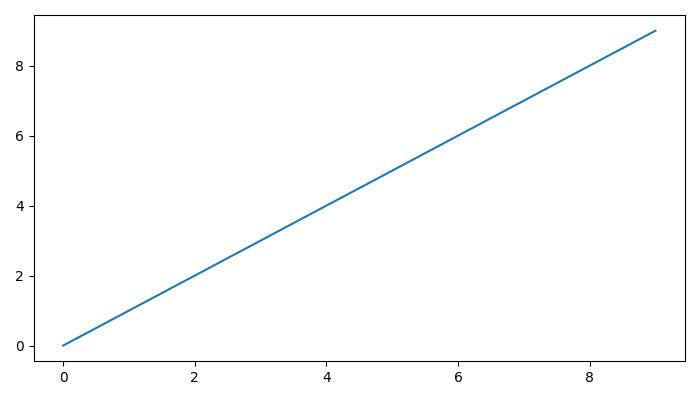
Watch the video below to observe the works of this example.
Matplotlib - Close Event
In the context of programming and software design, an event refers to an action or incident that is identified by the software. These events can be initiated by the system, user inputs, or other sources and are subject to handling by the software.
Specifically, a close event is an occurrence triggered when a figure is closed within the software interface. This event means the termination or closure of the graphical representation or window associated with the figure and reminds the software to respond accordingly.
Close Events in Matplotlib
Matplotlib provides a set of tools to handle events, among them is the ability to handle close events. A close event in Matplotlib occurs when a figure window is closed, triggering specific actions within your Python script. By connecting to the close_event you can execute custom code in response to a figure being closed.
In this tutorial, we will explore how to use close events in Matplotlib to enhance interactive plots.
Example - Handling Close Event
Here is a simple example that displays a message when the user closes the figure.
import matplotlib.pyplot as plt
def on_close(event):
print('The Figure is Closed!')
fig, ax = plt.subplots(figsize=(7, 4))
ax.annotate('X', xy=(1, 1), xytext=(0.9, 0.65), fontsize=20,
arrowprops=dict(facecolor='red'),
horizontalalignment='left',
verticalalignment='bottom')
fig.canvas.mpl_connect('close_event', on_close)
ax.text(0.15, 0.5, 'Close This Figure!', dict(size=30))
plt.show()
Output
On executing the above code we will get the following output −
After closing the above output figure, the following message is displayed in the console −
The Figure is Closed!
Detecting Closed Axes
When dealing with multiple axes in a figure, you need to determine if a specific axis has been closed you can use the close event action in Matlotlib.
Example - Handling Axes close event
Here is an example that demonstrates how to determine if a specific axis has been closed or not, using the close event in Matplotlib.
import matplotlib.pyplot as plt
# Function to handle the event
def on_close(event):
event.canvas.figure.axes[0].has_been_closed = True
print('The Figure is Closed!')
# Create the figure
fig, ax = plt.subplots(figsize=(7, 4))
ax.set_title('Detecting Closed Axes')
ax.has_been_closed = False
ax.plot(range(10))
# connect the event with the callable function
fig.canvas.mpl_connect('close_event', on_close)
plt.show()
print('Check the attribute has_been_closed:', ax.has_been_closed)
Output
On executing the above program you will get the following output −
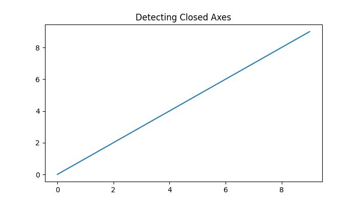
After closing the above output figure, the following message is displayed in the console −
The Figure is Closed! Check the attribute has_been_closed: True
Continuing Code After Closing
In some cases, it may be necessary for your code to continue running even after the figure is closed (close event triggered). This is particularly useful for background processes or animations.
Example - Continuing Code Execution after Closing the Figure
The following example demonstrates how to continue code execution after the figure is closed.
import matplotlib.pyplot as plt
import matplotlib.animation as animation
import numpy as np
import time
close_flag = 0
def handle_close(evt):
global close_flag
close_flag = 1
print('The Figure is Closed!')
# Activate interactive mode
plt.ion()
fig, ax = plt.subplots()
# listen to close event
fig.canvas.mpl_connect('close_event', handle_close)
# Generating x values
x = np.arange(0, 2*np.pi, 0.01)
y = np.sin(x)
# Plotting the initial sine curve
line, = ax.plot(x, y)
ax.legend([r'$\sin(x)$'])
# Function to update the plot for each frame of the animation
def update(frame):
line.set_ydata(np.sin(x + frame / 50))
return line
t = 0
delta_t = 0.1
while close_flag == 0:
if abs(t - round(t)) < 1e-5:
print(round(t))
x = x + delta_t
y = y - delta_t
# Creating a FuncAnimation object
ani = animation.FuncAnimation(fig=fig, func=update, frames=40, interval=30)
# draw the figure
fig.canvas.draw()
fig.canvas.flush_events()
# wait a little bit of time
time.sleep(delta_t)
t += delta_t
if close_flag == 1:
break
print('ok')
Output
On executing the above program you will get the following output −
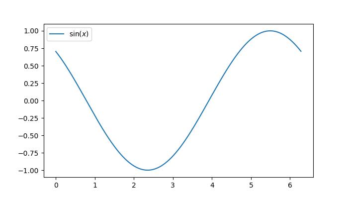
After closing the above output figure, the following message is displayed in the console −
0 1 2 3 4 5 The Figure is Closed! ok
Watch the video below to observe how the close event feature works here.
Matplotlib - Mouse Move Event
In general computer programming and software design, the term mouse move refers to an action of moving a computer mouse device across a surface to create the corresponding cursor or pointer movement on-screen.
Mouse Move in Matplotlib
The mouse move event in Matplotlib allows users to capture the cursor's position over a plotted figure. This capability enables the creation of interactive features, such as displaying information at the cursor location or updating visualizations in real time based on the cursor's movements.
In this tutorial, we will explore how to use Mouse movement events in Matplotlib to enhance interactive plots. This is done by connecting to the motion_notify_event, you can capture the cursor's position and implement various actions, providing users with an intuitive way to explore and analyze plotted data.
Example - Prints Coordinates with Mouse Move
Let's start with a simple example that prints the data and pixel coordinates as the mouse moves over output figure.
import matplotlib.pyplot as plt
import numpy as np
# Input data for ploting a circle
angs = np.linspace(0, 2 * np.pi, 10**6)
rs = np.zeros_like(angs) + 1
xs = rs * np.cos(angs)
ys = rs * np.sin(angs)
# Create a figure
fig, ax = plt.subplots(figsize=(7, 4))
# Plot the data
plt.plot(xs, ys)
# Function to handle the event
def on_move(event):
if event.inaxes:
print(f'data coords {event.xdata}, {event.ydata},',
f'pixel coords {event.x}, {event.y}')
# connect the event with the callable function
binding_id = plt.connect('motion_notify_event', on_move)
# Display the plot
plt.show()
Output
On executing the above program you will get the following output −
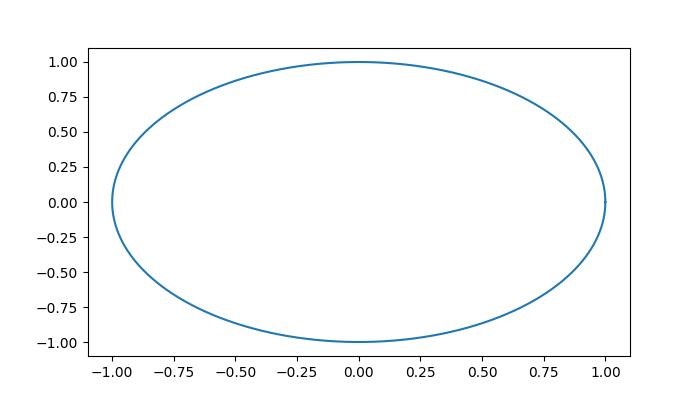
From the above figure, you can continuously read the coordinates of the mouse when it is moved −
data coords 0.22000000000192466, 0.8999999999988899, pixel coords 413, 324 data coords 0.21188940092360364, 0.9071428571417381, pixel coords 411, 325 data coords 0.20377880184528263, 0.9142857142845864, pixel coords 409, 326 data coords 0.19972350230612212, 0.9214285714274346, pixel coords 408, 327 data coords 0.1916129032278011, 0.9214285714274346, pixel coords 406, 327 data coords 0.1916129032278011, 0.9285714285702829, pixel coords 406, 328 data coords 0.18755760368864083, 0.9285714285702829, pixel coords 405, 328 data coords 0.18350230414948032, 0.9357142857131315, pixel coords 404, 329 data coords 0.17944700461031982, 0.9357142857131315, pixel coords 403, 329 data coords 0.1753917050711593, 0.9357142857131315, pixel coords 402, 329 data coords 0.1753917050711593, 0.9428571428559798, pixel coords 402, 330 data coords 0.1713364055319988, 0.9428571428559798, pixel coords 401, 330 data coords 0.1672811059928383, 0.949999999998828, pixel coords 400, 331 data coords 0.1632258064536778, 0.949999999998828, pixel coords 399, 331
Watch the video below to observe how the mouse move event feature works here.

Real-Time Plotting of Mouse Movement
It is possible to achieve near real-time plotting of mouse movement by using the motion_notify_event in matplotlib. This event allows you to capture the dynamic movement of the mouse cursor, enabling the creation of interactive and responsive visualizations.
Example - Plotting the Mouse movement path
The following example demonstrates how to plot the mouse path in near real-time using Matplotlib.
import matplotlib.pyplot as plt
# Create the plot
fig, ax = plt.subplots(figsize=(7, 4))
# Set the limits of the plot
ax.set_xlim(0, 1920-1)
ax.set_ylim(0, 1080-1)
# Initialize lists to store mouse coordinates
x,y = [0], [0]
# create empty plot
points, = ax.plot([], [], '-', color='green')
# cache the background
background = fig.canvas.copy_from_bbox(ax.bbox)
def on_move(event):
# Append the current mouse coordinates
x.append(event.xdata)
y.append(event.ydata)
# Update the plot data
points.set_data(x,y)
# Restore the background
fig.canvas.restore_region(background)
# Redraw the points
ax.draw_artist(points)
# Fill in the axes rectangle
fig.canvas.blit(ax.bbox)
# Connect the on_move function to the motion_notify_event
fig.canvas.mpl_connect("motion_notify_event", on_move)
# Display the plot
plt.show()
Output
On executing the above program you will get the following output −
Watch the video below to observe how the mouse move event feature works here.
Highlighting Triangles with TriFinder
Using the TriFinder class from the matplotlib.tri module to identify triangles within a Triangulation. By combining it with the motion_notify_event, you can dynamically highlight the triangle where the mouse moved over the triangulated plot.
Example - Highlighting using TriFinder Class
This example demonstrates the use of a TriFinder object in Matplotlib. As the mouse is moved over a triangulation, the triangle under the cursor is highlighted, and the index of the triangle is displayed in the plot title.
import matplotlib.pyplot as plt
import numpy as np
from matplotlib.patches import Polygon
from matplotlib.tri import Triangulation
def update_highlighted_triangle(triangle_index):
if triangle_index == -1:
points = [0, 0, 0]
else:
points = triangulation.triangles[triangle_index]
xs = triangulation.x[points]
ys = triangulation.y[points]
highlighted_polygon.set_xy(np.column_stack([xs, ys]))
def on_mouse_move(event):
if event.inaxes is None:
triangle_index = -1
else:
triangle_index = tri_finder(event.xdata, event.ydata)
update_highlighted_triangle(triangle_index)
ax.set_title(f'In triangle {triangle_index}')
event.canvas.draw()
# Create a Triangulation.
num_angles = 16
num_radii = 5
min_radius = 0.25
radii = np.linspace(min_radius, 0.95, num_radii)
angles = np.linspace(0, 2 * np.pi, num_angles, endpoint=False)
angles = np.repeat(angles[..., np.newaxis], num_radii, axis=1)
angles[:, 1::2] += np.pi / num_angles
x_values = (radii*np.cos(angles)).flatten()
y_values = (radii*np.sin(angles)).flatten()
triangulation = Triangulation(x_values, y_values)
triangulation.set_mask(np.hypot(x_values[triangulation.triangles].mean(axis=1),
y_values[triangulation.triangles].mean(axis=1))
< min_radius)
# Use the triangulation's default TriFinder object.
tri_finder = triangulation.get_trifinder()
# Setup plot and callbacks.
fig, ax = plt.subplots(subplot_kw={'aspect': 'equal'}, figsize=(7, 4))
ax.triplot(triangulation, 'bo-')
highlighted_polygon = Polygon([[0, 0], [0, 0]], facecolor='y') # dummy data for (xs, ys)
update_highlighted_triangle(-1)
ax.add_patch(highlighted_polygon)
fig.canvas.mpl_connect('motion_notify_event', on_mouse_move)
plt.show()
Output
On executing the above program you will get the following output −
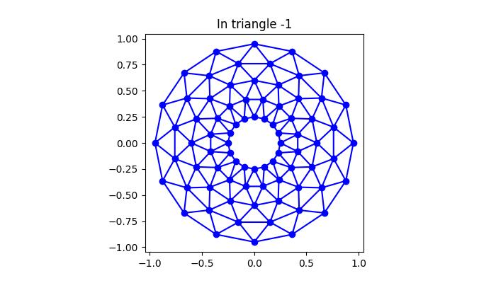
Watch the video below to observe how the mouse move event feature works here.
Matplotlib - Click Events
In general, a click event occurs when a user interacts with a computer interface by pressing and releasing a mouse button or tapping on a touchscreen device. This event serves as a trigger for the computer system to recognize and respond to the user's input.
In the context of data visualization, like in Matplotlib or other plotting libraries, a click event can be used to capture specific user interactions with the plot, offering a dynamic and interactive experience. This could include tasks such as selecting data points, triggering updates or enabling user-initiated actions.
Click Events in Matplotlib
In Matplotlib, a click event occurs when a user interacts with a plot by clicking on the figure or a specific region within it. These events are associated with callback functions that are executed when the click happens. This can be done by connecting a callback function to the button_press_event using the mpl_connect() method on the figure canvas.
Let's see a basic example that demonstrates how a simple click event works.
Example - Handling a Single Click Event
In this example, a click event is handled by the onclick function, which prints a message to the console when the user clicks anywhere on the plot. The figure contains a text element prompting the user to click.
import numpy as np
import matplotlib.pyplot as plt
def onclick(event):
print('The Click Event Triggered!')
fig, ax = plt.subplots(figsize=(7, 4))
ax.text(0.1, 0.5, 'Click me anywhere on this plot!', dict(size=20))
cid = fig.canvas.mpl_connect('button_press_event', onclick)
plt.show()
Output
On executing the above code we will get the following output −
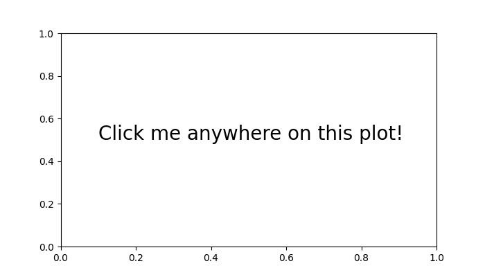
The Click Event Triggered! The Click Event Triggered! The Click Event Triggered! The Click Event Triggered! The Click Event Triggered! The Click Event Triggered!
Watch the video below to observe how the click event feature works here.
Storing Click Event Coordinates
Storing click event coordinates allows you to gather information about user interactions on a plot, facilitating tasks such as data point selection or analysis.
Example - Printing Mouse Coordinates on Click Event
Here is an example that stores and prints the coordinates of mouse clicks on the plot. This demonstrates how click events can be used to gather information about user interactions on a plot.
import numpy as np
import matplotlib.pyplot as plt
x = np.arange(0, 2*np.pi, 0.01)
y = np.sin(x)
fig = plt.figure()
ax = fig.add_subplot(111)
ax.plot(x, y)
clicked_coords = []
def onclick(event):
global ix, iy
ix, iy = event.xdata, event.ydata
print(f'Clicked at x = {ix}, y = {iy}')
global clicked_coords
clicked_coords.append((ix, iy))
# Disconnect the click event after collecting 5 coordinates
if len(clicked_coords) == 5:
fig.canvas.mpl_disconnect(cid)
print('Reached the maximum clicks...')
cid = fig.canvas.mpl_connect('button_press_event', onclick)
plt.show()
Output
On executing the above code we will get the following output −
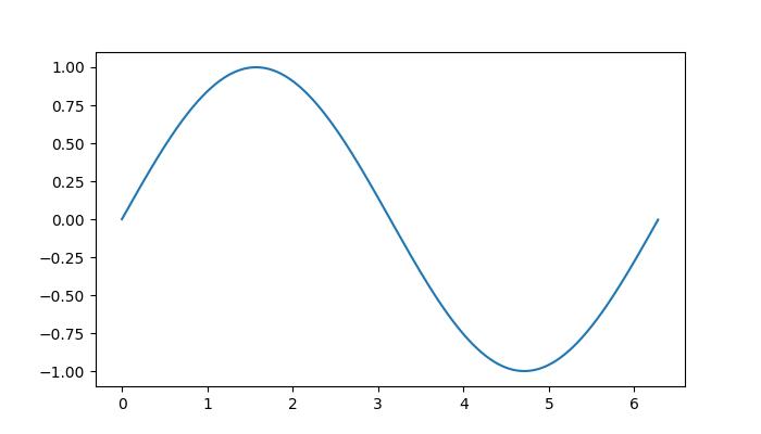
Clicked at x = 0.0743760368663593, y = 0.11428680137603275 Clicked at x = 1.4368755760368663, y = 0.9928568371128363 Clicked at x = 3.130449769585254, y = 0.10714395555703438 Clicked at x = 4.7221548387096774, y = -1.014282838025715 Clicked at x = 6.377528110599078, y = 0.04285834318604875 Reached the maximum clicks...
Watch the video below to observe how the click event feature works here.
Click Event with Checkbox
Integrating the checkbox widget with click events offers a dynamic way to control user interactions on the plots. By combining checkboxes with click events, you can enable or disable certain features, providing users with interactive control over the plot.
Example - Handling Checkbox Click Event
In this example, a checkbox is used to control the adding text on the plot where the click event is triggered.
import matplotlib.pyplot as plt
from matplotlib.widgets import CheckButtons
import numpy as np
def onclick(event):
# Only use events within the axes.
if not event.inaxes == ax1:
return
# Check if Checkbox is "on"
if check_box.get_status()[0]:
ix, iy = event.xdata, event.ydata
coords3.append((ix, iy))
# write text with coordinats where clicks occur
if len(coords3) >= 1:
ax1.annotate(f"* {ix:.1f}, {iy:.1f}", xy=(ix, iy), color="green")
fig.canvas.draw_idle()
# Disconnect after 6 clicks
if len(coords3) >= 6:
fig.canvas.mpl_disconnect(cid)
print('Reached the maximum clicks...')
plt.close(fig)
x = np.arange(0, 2*np.pi, 0.01)
y = np.sin(2*x)
fig, ax1 = plt.subplots(figsize=(7, 4))
ax1.plot(x, y)
ax1.set_title('This is my plot')
ax2 = plt.axes([0.7, 0.05, 0.1, 0.075])
check_box = CheckButtons(ax2, ['On',], [False,], check_props={'color':'red', 'linewidth':1})
coords3 = []
cid = fig.canvas.mpl_connect('button_press_event', onclick)
plt.show()
Output
On executing the above code we will get the following output −
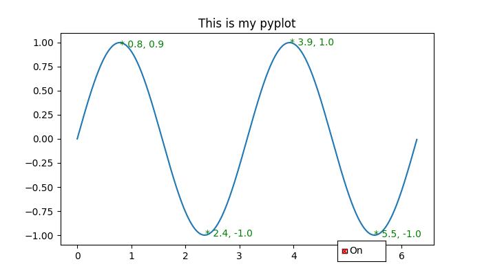
Reached the maximum clicks...
Watch the video below to observe how the click event feature works here.
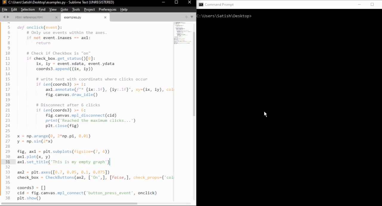
Matplotlib - Scroll Event
In general, a scroll event occurs when a user interacts with the mouse scroll wheel. The scroll wheel that is located in the middle of the mouse is used to scroll up and down on any page without using the vertical scroll bar on the right hand side of a document or webpage. In this tutorial, we will explore about the scroll event handling in Matplotlib.
Scroll event in Matplotlib
Matplotlib provides a mechanism for handling the scroll events through MouseEvent class. This scroll_event event is triggered when a user rolled the mouse scroll wheel. Which is used for providing a mechanism for interactive navigation or zooming within plots.
Example - Handing Scroll Event
Here is a simple example that detects scroll events and displays the messages based on whether the user scrolls up or down the mouse scroll wheel.
import matplotlib.pyplot as plt
import numpy as np
def on_scroll(event):
if event.button == 'up':
print('Scroll Up Event Triggered..')
elif event.button == 'down':
print('Scroll Down Event Triggered..')
# Create a figure and axis
fig, ax = plt.subplots()
ax.text(0.13, 0.5, 'Scroll Mouse Wheel on me!', dict(size=20))
# Connect the on_scroll method to the scroll_event
fig.canvas.mpl_connect('scroll_event', on_scroll)
plt.show()
Output
On executing the above code we will get the following output −
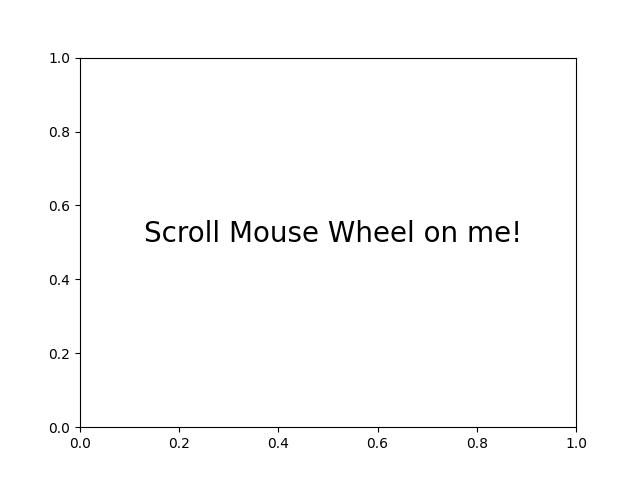
Scroll Up Event Triggered.. Scroll Up Event Triggered.. Scroll Down Event Triggered.. Scroll Up Event Triggered.. Scroll Down Event Triggered.. Scroll Up Event Triggered.. Scroll Up Event Triggered..
Watch the video below to observe how the this scroll event feature works here.
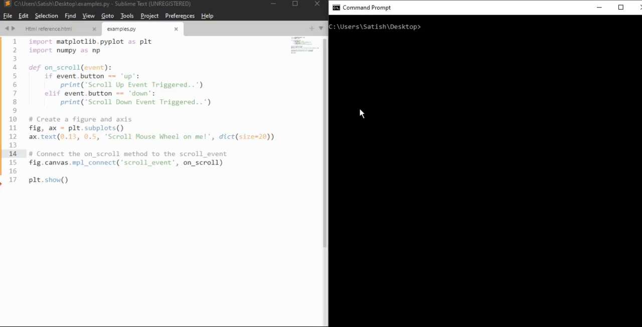
Zooming with Scroll Event
Scroll events in Matplotlib can be used for dynamically zooming the plots. By connecting the scroll event to a callable function, users can dynamically adjust the view within a plot.
Example - Zooming Plot on Scroll
Let's see an example that demonestrates how to implement zoom functionality using the scroll event.
import matplotlib.pyplot as plt
def zoom_factory(axs, base_scale=2.):
def zoom_fun(event):
# get the current x and y limits
cur_xlim = axs.get_xlim()
cur_ylim = axs.get_ylim()
cur_xrange = (cur_xlim[1] - cur_xlim[0]) * 0.2
cur_yrange = (cur_ylim[1] - cur_ylim[0]) * 0.2
# get event x location
xdata = event.xdata
ydata = event.ydata
if event.button == 'up':
# deal with zoom in
scale_factor = 1/base_scale
elif event.button == 'down':
# deal with zoom out
scale_factor = base_scale
else:
# deal with something that should never happen
scale_factor = 1
print(event.button)
# set new limits
axs.set_xlim([xdata - cur_xrange*scale_factor,
xdata + cur_xrange*scale_factor])
axs.set_ylim([ydata - cur_yrange*scale_factor,
ydata + cur_yrange*scale_factor])
# force re-draw
plt.draw()
# get the figure of interest
fig = axs.get_figure()
# Connect the call back function to the scroll_event
fig.canvas.mpl_connect('scroll_event', zoom_fun)
# return the function
return zoom_fun
# Example Usage
fig, axs = plt.subplots(figsize=(7, 4))
axs.plot(range(100))
scale = 1.5
f = zoom_factory(axs, base_scale=scale)
plt.show()
Output
On executing the above program you will get the following figure roll the mouse scroll wheel to observe the Zooming effect in this plot −
Watch the video below to observe how the this scroll event feature works here.
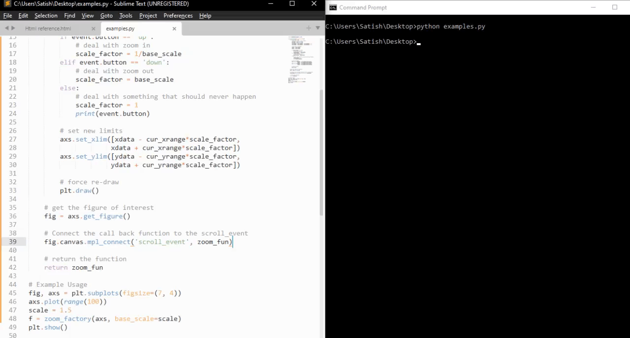
Interactive Scrolling through Images
The scroll event in Matplotlib can also be applied to interactively scroll through a series of images. This feature is particularly useful when navigating through multi-dimensional datasets or a collection of images.
Example - Updating Image on Scroll
This example, creates a class IndexTracker to navigate through a series of 2D slices using the scroll event. The on_scroll method adjusts the index based on the scroll direction, then it updates and displayed image.
import matplotlib.pyplot as plt
import numpy as np
class IndexTracker:
def __init__(self, axs, X):
self.index = 0
self.X = X
self.axs = axs
self.im = axs.imshow(self.X[:, :, self.index])
self.update()
def on_scrolling(self, event):
print(event.button, event.step)
increment = 1 if event.button == 'up' else -1
maxs_index = self.X.shape[-1] - 1
self.index = np.clip(self.index + increment, 0, maxs_index)
self.update()
def update(self):
self.im.set_data(self.X[:, :, self.index])
self.axs.set_title(
f'Use scroll wheel to navigate\nindex {self.index}')
self.im.axes.figure.canvas.draw()
# 3D data
x, y, z = np.ogrid[-25:25:100j, -25:25:100j, 1:50:100j]
X = np.sin(x * y * z) / (x * y * z)
# Create a figure
fig, axs = plt.subplots()
tracker = IndexTracker(axs, X)
fig.canvas.mpl_connect('scroll_event', tracker.on_scrolling)
plt.show()
Output
On executing the above program you will get the following figure roll the mouse scroll wheel to observe working of this example −
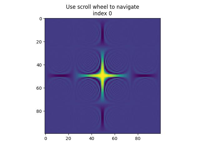
up 1.0 up 2.0 down -1.0 down -2.0 down -1.0 up 1.0 up 1.0 down -1.0 down -1.0 up 1.0 up 3.0 down -1.0 down -3.0
Watch the video below to observe how the this scroll event feature works here.
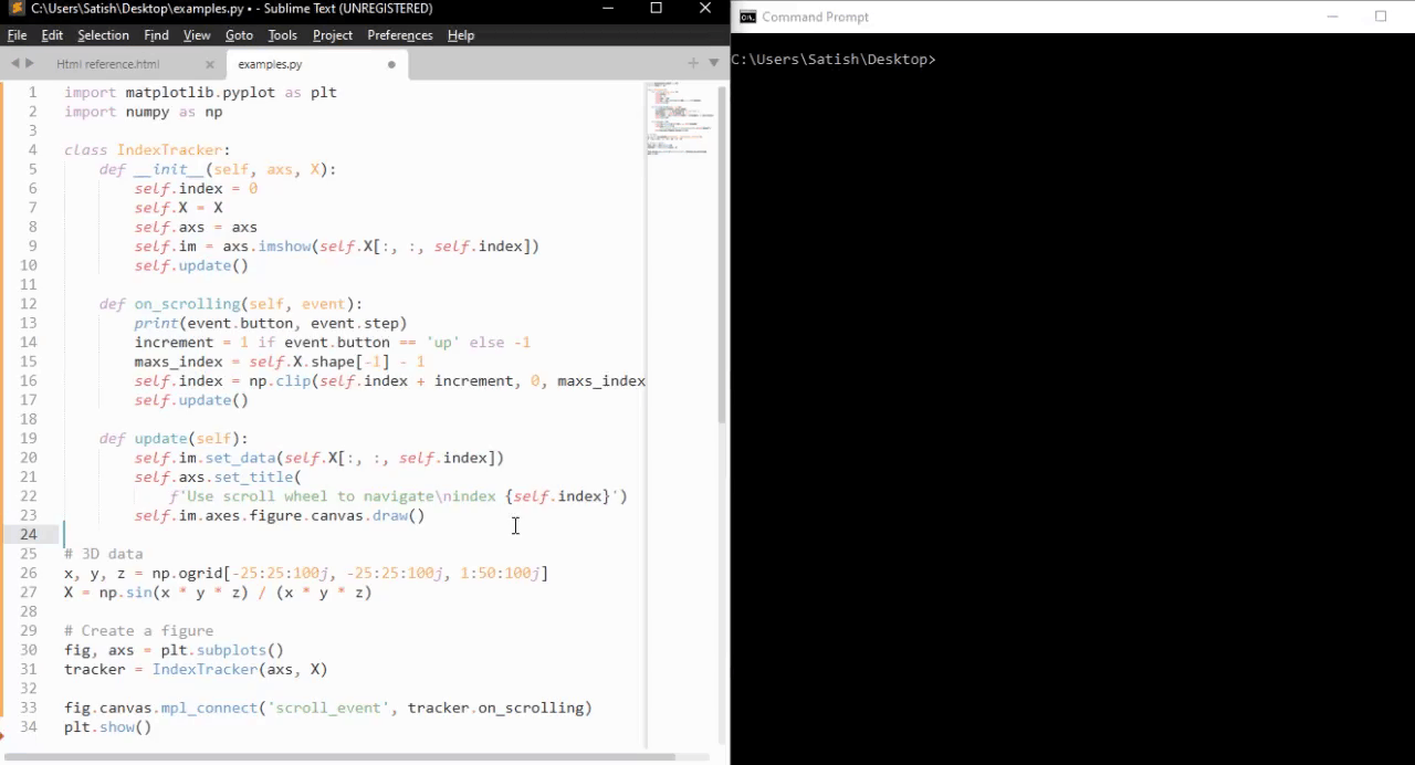
Matplotlib - KeyPress Event
In computer programming, the detection and handling of keypress events are fundamental for capturing user input and enabling various functionalities within applications. Whether it's navigating through menus, entering text, triggering actions, or controlling interactive elements, keypress events play a crucial role in user interaction.
Matplotlib provides the tools for handling the keypress events, allowing you to capture and respond to keyboard inputs during interactive plotting sessions. When a key is pressed, Matplotlib triggers the key_press_event, allowing users to define custom actions based on the pressed keys.
The library attaches some keypress callbacks by default for enhanced interactivity. These default callbacks are documented in the Navigation keyboard shortcuts section of the Matplotlib documentation.
Example - Handling Keypress Event
Let's see this basic example, which demonstrates the default keypress events in Matplotlib.
import numpy as np
import matplotlib.pyplot as plt
# Define a function to handle keypress events
def press(event):
print('You pressed:', event.key)
# Create a Matplotlib figure and axis
fig, ax = plt.subplots()
# Connect the keypress event handler to the figure canvas
cid = fig.canvas.mpl_connect('key_press_event', press)
# Plot sin wave
x = np.linspace(0, 10, 100)
ax.plot(x, np.sin(x))
# Display the plot
plt.show()
Output
On executing the above program you will get the following figure, and press any key to observe the working of this example −
You pressed: tab You pressed: caps_lock You pressed: shift You pressed: control You pressed: alt You pressed: meta You pressed: a You pressed: b You pressed: c You pressed: d You pressed: s You pressed: g You pressed: g You pressed: g You pressed: g You pressed: k You pressed: k You pressed: k You pressed: k You pressed: k You pressed: k You pressed: l You pressed: l You pressed: p You pressed: p You pressed: q
Watch the video below to observe how this keypress event feature works here.
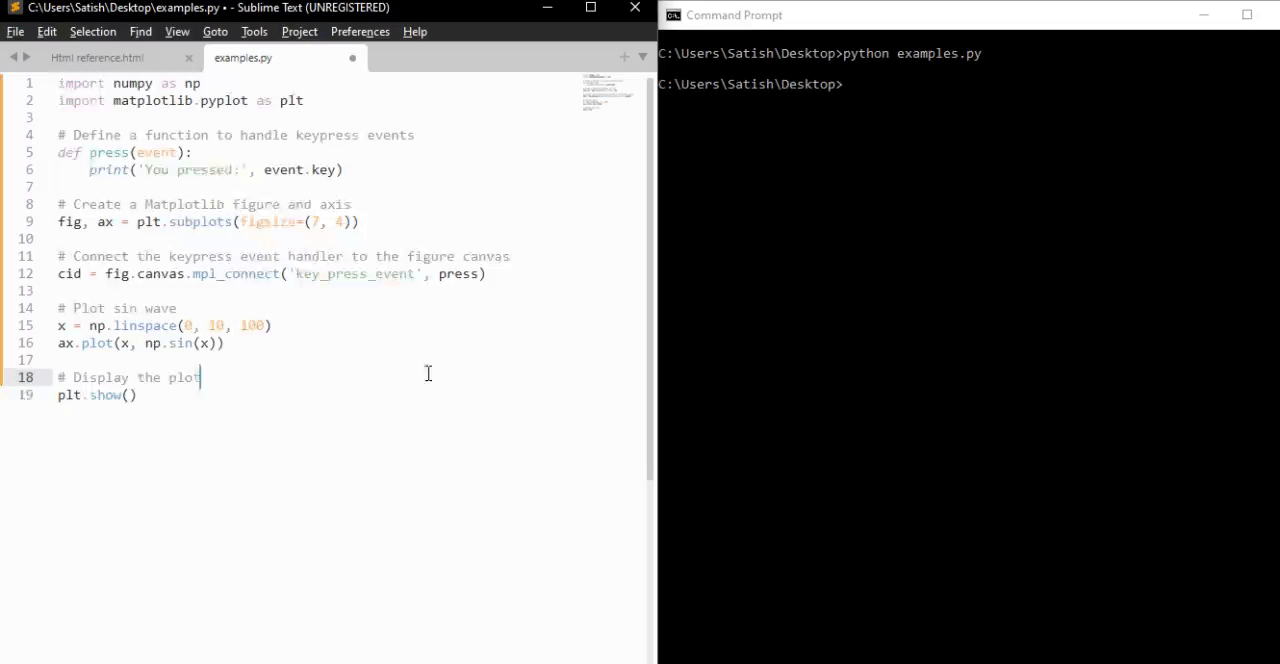
From the above output, you can observe the working of some of the default keys like 'g' (toggling the grid), 's' (saving the figure), 'q' (closing the figure), and more.
Creating a Custom Keypress Event Function
To handle keypress events to specific needs, you can create a custom function and connect it to the key_press_event using the mpl_connect method.
Example - Custom KeyPress Event Handler
The following example demonstrates a simple keypress event function that toggles the visibility of an xlabel when the 'x' key is pressed.
import sys
import matplotlib.pyplot as plt
import numpy as np
def on_press(event):
print('Pressed key:', event.key)
sys.stdout.flush()
# Toggle visibility of xlabel when 'x' key is pressed
if event.key == 'x':
visible = xl.get_visible()
xl.set_visible(not visible)
fig.canvas.draw()
fig, ax = plt.subplots()
fig.canvas.mpl_connect('key_press_event', on_press)
# Plot random data points
ax.plot(np.random.rand(12), np.random.rand(12), 'go')
xl = ax.set_xlabel('Toggle this label when the "x" key is pressed',
fontsize=16, color='red')
ax.set_title('Press x key')
plt.show()
Output
On executing the above program you will get the following figure, and press any key to observe the working of this example −
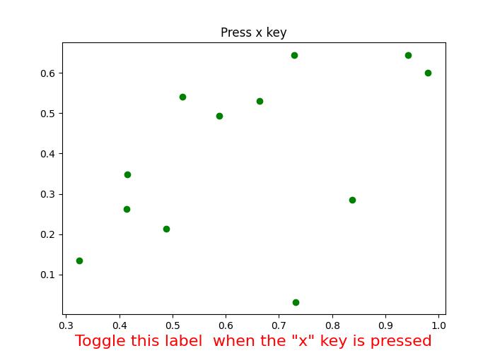
Pressed key: x Pressed key: x Pressed key: x Pressed key: x Pressed key: a Pressed key: enter
Watch the video below to observe how this keypress event feature works here.
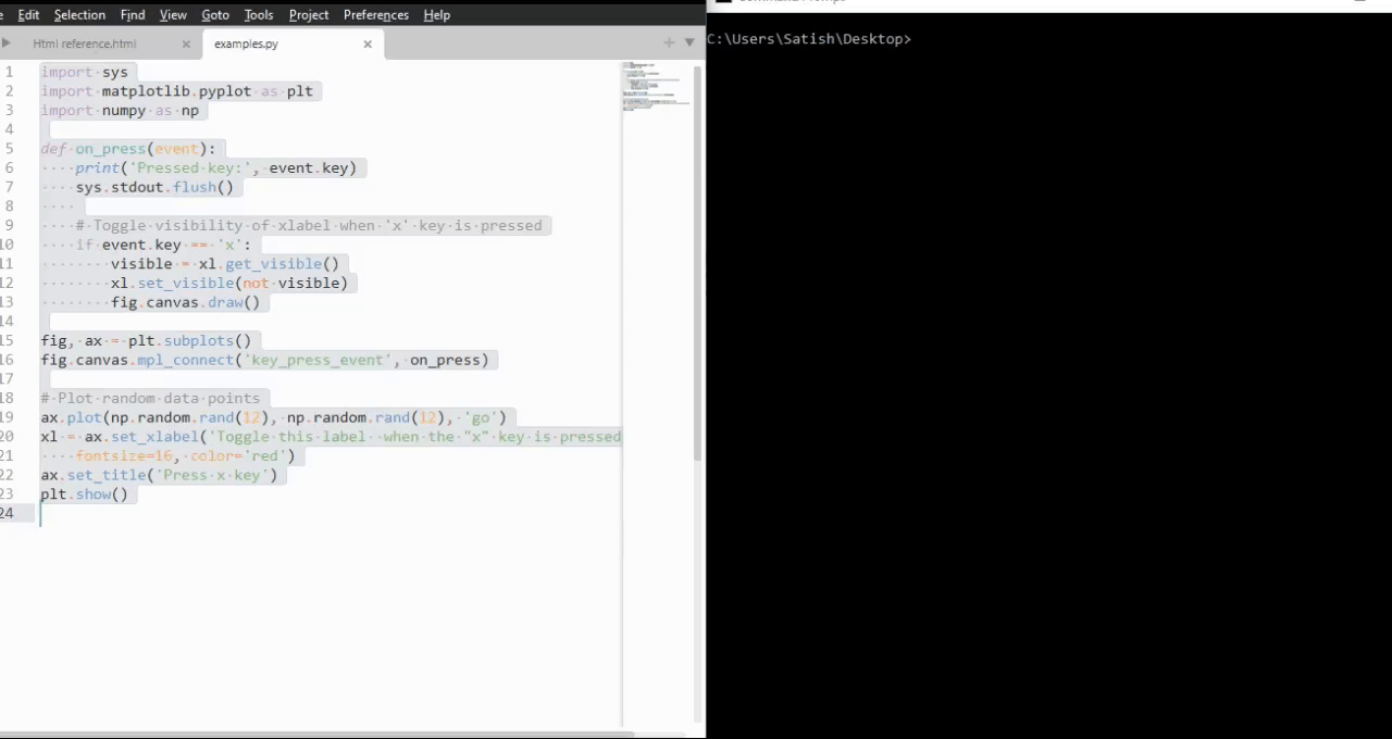
Example - Handling Escape Key to Exit Figure
Here is another example that demonstrates how to add the escape key to exit the figure in addition to the "q" key and also it calculates the how many number of times the enter key is pressed.
import numpy as np
import matplotlib.pyplot as plt
# Define a function to handle keypress events
def press(event):
print('Pressed key:', event.key)
# If the 'enter' key is pressed, append 1 to the count list
if event.key == 'enter':
cnt.append(1)
# If the 'escape' key is pressed, close the plot
if event.key == "escape":
plt.close()
cnt = []
# Create a figure
fig, ax = plt.subplots()
# Connect the keypress event handler to the figure canvas
fig.canvas.mpl_connect('key_press_event', press)
ax.plot(np.random.rand(12), np.random.rand(12), 'go')
plt.show()
# Calculate and print the sum of counts
result = sum(cnt)
print(result, cnt)
Output
On executing the above program you will get the following figure, and press any key to observe the working of this example −
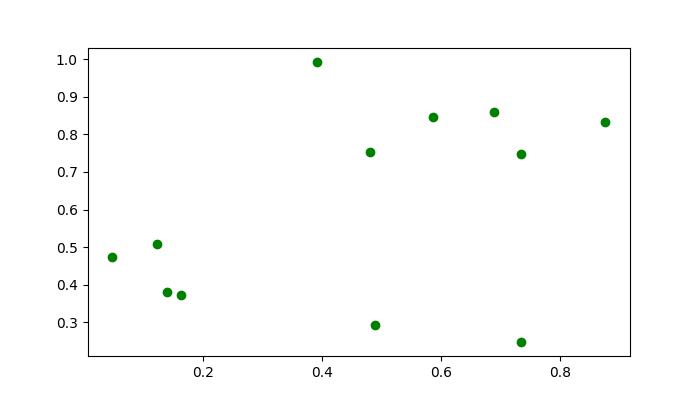
Pressed key: b Pressed key: enter Pressed key: enter Pressed key: caps_lock Pressed key: caps_lock Pressed key: enter Pressed key: escape 3 [1, 1, 1]
Matplotlib - Pick Event
In computer programming, a click event refers to an occurrence where a user interacts with an element on the screen, typically by selecting or clicking on it. The event is triggered when the user's input device, such as a mouse or touchscreen, interacts with an object in the graphical representation.
Pick Event in Matplotlib
A pick event in matplotlib occurs when a user selects a location on the canvas close to an artist that has been designated as pickable using Artist.set_picker. This event provides a way to interactively respond to user actions such as clicking on points, rectangles, or text in a plot.
Enabling the Pick Event
Enabling the picking ability of an object can be done by setting the "picker" property of an artist such as Line2D, Text, Patch, Polygon, AxesImage, etc. This property determines whether the artist can trigger a pick event based on user interactions. The options available for the "picker" property are −
None − Picking is disabled, which is the default behavior.
bool − If True, picking is enabled, and the artist fires a pick event if the mouse event is over it.
function − A user-supplied function that determines whether the artist is hit by the mouse event. The function should return hit, props = picker(artist, mouseevent).
After enabling an artist for picking, you need to connect to the figure canvas using the fig.canvas.mpl_connect('pick_event', callback_function) method to receive pick callbacks on mouse press events.
Picking the Points, Rectangles, and Text
It is possible to enable the picking of specific elements like points, rectangles, and text within a plot. This allows users to click on these elements and trigger custom actions.
Example - Picking Objects in a Plot
The following example demonstrates picking points, rectangles, and text in a plot to get the properties of those picked objects.
import matplotlib.pyplot as plt
import numpy as np
from numpy.random import rand
from matplotlib.lines import Line2D
from matplotlib.patches import Rectangle
from matplotlib.text import Text
# Fixing random state for reproducibility
np.random.seed(19680801)
fig, (ax1, ax2) = plt.subplots(2, 1, figsize=(7, 7))
ax1.set_title('click on points, rectangles or text', picker=True)
ax1.set_xlabel('xlabel', picker=True, bbox=dict(facecolor='green'))
ax1.set_ylabel('ylabel', picker=True, bbox=dict(facecolor='red'))
line, = ax1.plot(rand(100), 'o', picker=True, pickradius=5)
# Pick the rectangle.
ax2.bar(range(10), rand(10), picker=True)
# Make the xtick labels pickable.
for label in ax2.get_xticklabels():
label.set_picker(True)
def onpick(event):
if isinstance(event.artist, Line2D):
thisline = event.artist
xdata = thisline.get_xdata()
ydata = thisline.get_ydata()
ind = event.ind
print('onpick line:', np.column_stack([xdata[ind], ydata[ind]]))
elif isinstance(event.artist, Rectangle):
patch = event.artist
print('onpick patch:', patch.get_path())
elif isinstance(event.artist, Text):
text = event.artist
print('onpick text:', text.get_text())
fig.canvas.mpl_connect('pick_event', onpick)
plt.show()
Output
On executing the above program you will get the following figure, and click on any points, rectangles, or text to observe the working of this example −
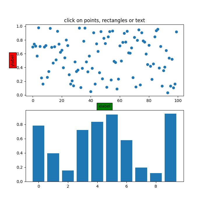
Following are the properties observed on console window −
onpick line: [[45. 0.63297416]] onpick text: xlabel onpick text: ylabel onpick patch: Path(array([[0., 0.], [1., 0.], [1., 1.], [0., 1.], [0., 0.]]), array([ 1, 2, 2, 2, 79], dtype=uint8)) onpick patch: Path(array([[0., 0.], [1., 0.], [1., 1.], [0., 1.], [0., 0.]]), array([ 1, 2, 2, 2, 79], dtype=uint8)) onpick line: [[85. 0.93665595]] onpick text: click on points, rectangles or text onpick text: 4
Watch the video below to observe how this pick event feature works here.
Picking on a Scatter Plot
Picking on a scatter plot involves selecting individual points represented by markers. Scatter plots are commonly used to visualize relationships between two variables. Enabling picking on a scatter plot allows users to interactively identify and respond to specific data points.
Example - Picking Points on a Scatter Plot
This example demonstrates picking on a scatter plot where scatter points are backed by a PathCollection.
from numpy.random import rand
import matplotlib.pyplot as plt
# Generate sample data
x, y, c, s = rand(4, 100)
# Define a function to handle pick events on the scatter plot
def onpick3(event):
ind = event.ind
print('onpick3 scatter:', ind, x[ind], y[ind])
# Create a Matplotlib figure and axis
fig, ax = plt.subplots(figsize=(7, 4))
ax.set_title('Click on the points')
# Create a scatter plot
ax.scatter(x, y, 100*s, c, picker=True)
# Connect the pick event handler to the figure canvas
fig.canvas.mpl_connect('pick_event', onpick3)
plt.show()
Output
On executing the above program you will get the following figure, and click on any points, rectangles, or text to observe the working of this example −
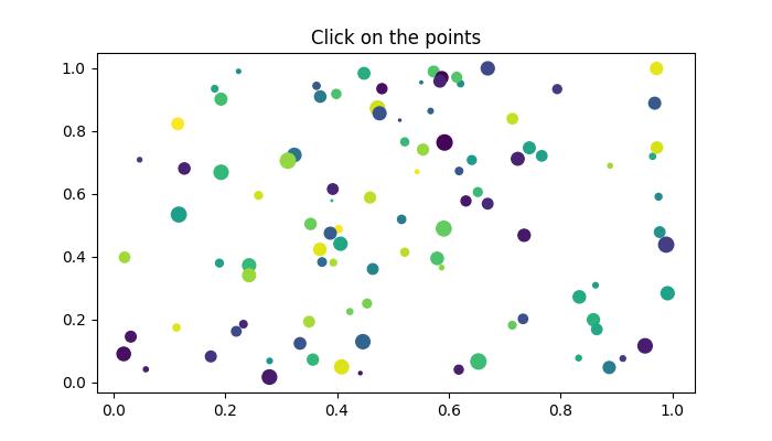
onpick scatter: [25] [0.11699828] [0.53441235] onpick scatter: [27 44] [0.24286321 0.24281114] [0.37273147 0.3410762 ] onpick scatter: [86] [0.40636809] [0.44143683] onpick scatter: [60] [0.38819555] [0.47496597] onpick scatter: [51] [0.63094438] [0.57754482] onpick scatter: [71] [0.27925334] [0.01716168] onpick scatter: [72 94] [0.859042 0.86511669] [0.19949375 0.16885001] onpick scatter: [37] [0.95150989] [0.11653306]
Watch the video below to observe how this pick event feature works here.
Images Picking
Images that are plotted using Axes.imshow can also be made pickable.
Example - Picking Images
In this example, picking is demonstrated on images plotted using Axes.imshow() method.
import numpy as np
import matplotlib.pyplot as plt
from matplotlib.image import AxesImage
# Create a Matplotlib figure and axis
fig, ax = plt.subplots(figsize=(7, 4))
# Display the images
ax.imshow(np.random.rand(10, 5), extent=(1, 2, 1, 2), picker=True)
ax.imshow(np.random.rand(5, 10), extent=(3, 4, 1, 2), picker=True)
ax.imshow(np.random.rand(20, 25), extent=(1, 2, 3, 4), picker=True)
ax.imshow(np.random.rand(30, 12), extent=(3, 4, 3, 4), picker=True)
ax.set(xlim=(0, 5), ylim=(0, 5))
# Define a function to handle pick events
def onpick(event):
artist = event.artist
if isinstance(artist, AxesImage):
im = artist
A = im.get_array()
print('onpick image', A.shape)
# Connect the pick event handler to the figure canvas
fig.canvas.mpl_connect('pick_event', onpick)
plt.show()
Output
On executing the above program you will get the following figure, and click on any points, rectangles, or text to observe the working of this example −
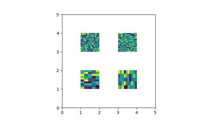
onpick image (20, 25) onpick image (30, 12) onpick image (10, 5) onpick image (5, 10) onpick image (5, 10)
Watch the video below to observe how this pick event feature works here.
Legend Picking
Matplotlib allows picking on legend items, providing a way to interact with the legend elements in a plot. Users can click on legend entries to toggle the visibility of corresponding plot elements.
Example - Legend Picking
Here is an example demonstrating how to enable legend picking.
import numpy as np
import matplotlib.pyplot as plt
# Generate sample data
x = np.linspace(0, 10, 100)
y1 = np.sin(x)
y2 = np.cos(x)
# Create a Matplotlib figure and axis
fig, ax = plt.subplots(figsize=(7, 4))
ax.set_title('Click on legend line to toggle line on/off')
# Plot two lines and create a legend
line1, = ax.plot(x, y1, label='Sin(x)')
line2, = ax.plot(x, y2, label='Cos(x)')
legend = ax.legend(fancybox=True, shadow=True)
lines = [line1, line2]
map_legend_to_ax = {}
pickradius = 5
# Enable picking on the legend
for legend_line, ax_line in zip(legend.get_lines(), lines):
legend_line.set_picker(pickradius)
map_legend_to_ax[legend_line] = ax_line
# Define a function to handle pick events on the legend
def on_legend_pick(event):
legend_line = event.artist
# Do nothing if the source of the event is not a legend line.
if legend_line not in map_legend_to_ax:
return
ax_line = map_legend_to_ax[legend_line]
visible = not ax_line.get_visible()
ax_line.set_visible(visible)
# Change the alpha on the line in the legend, so we can see what lines
# have been toggled.
legend_line.set_alpha(1.0 if visible else 0.2)
fig.canvas.draw()
# Connect the pick event handler to the figure canvas
fig.canvas.mpl_connect('pick_event', on_legend_pick)
# Works even if the legend is draggable.
legend.set_draggable(True)
plt.show()
Output
On executing the above program you will get the following figure, and click on any points, rectangles, or text to observe the working of this example −
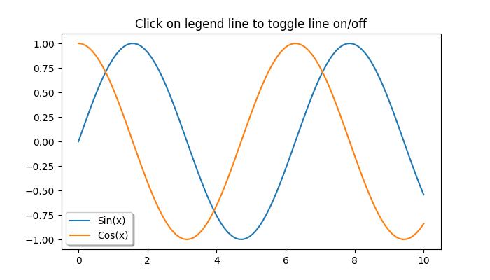
Watch the video below to observe how this pick event feature works here.
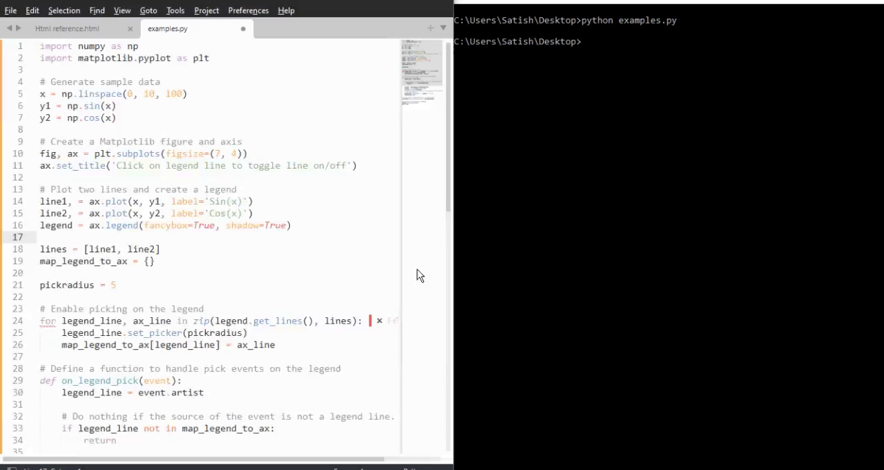
Matplotlib - Looking Glass
A looking glass is a term often refers to an object with a reflective surface, such as a mirror, through which one can observe their own reflection or the surrounding environment.
In terms of the graphical user interfaces, the term "looking glass" is sometimes used to describe a feature that provides a detailed view or insight into a specific aspect of a system or application.
Looking Glass in Matplotlib
In the context of Matplotlib, looking glass is a GUI application or example that implements an interactive circular window that reveals or hides portions of a Matplotlib plot. This looking glass example uses the Matplotlib's patches module to create a interactive circular window. With this interactive nature allows users to explore the underlying data dynamically.
This tutorial demonstrates how to create an interactive circular window, which is similar to a looking glass, that can be moved to reveal or hide portions of a plot beneath it.
Defining and Visualizing initial plot
Start by defining a predefined looking glass using the patches.Circle() class object.
Following is the set up for the Initial plot appearance −
import matplotlib.pyplot as plt
import numpy as np
import matplotlib.patches as patches
np.random.seed(19680801)
x, y = np.random.rand(2, 200)
fig, ax = plt.subplots(figsize=(7, 4))
circle_= patches.Circle((0.5, 0.5), 0.25, alpha=0.8, fc='yellow')
ax.add_patch(circle_)
ax.plot(x, y, alpha=0.2)
line, = ax.plot(x, y, alpha=1.0, clip_path=circle_)
ax.set_title("Left click and drag to move looking glass")
Implementing the Looking Glass Interaction
Lets see the implementation of the EventHandler class used for creating the interactive looking glass. This class captures the mouse events, allowing users to click, drag, and reposition the looking glass.
class EventHandler:
def __init__(self):
# Connect event handlers to the figure canvas
fig.canvas.mpl_connect('button_press_event', self.on_press)
fig.canvas.mpl_connect('button_release_event', self.on_release)
fig.canvas.mpl_connect('motion_notify_event', self.on_move)
# Initialize the center coordinates of the circular window
self.x0, self.y0 = circle_.center
self.pressevent = None
def on_press(self, event):
# Check if the event occurred inside the plot area
if event.inaxes != ax:
return
# Check if the click is inside the circular window
if not circle_.contains(event)[0]:
return
# Store the press event
self.pressevent = event
def on_release(self, event):
# Reset the press event and update the center coordinates
self.pressevent = None
self.x0, self.y0 = circle_.center
def on_move(self, event):
# Check if a press event has occurred and if the mouse is still inside the plot
if self.pressevent is None or event.inaxes != self.pressevent.inaxes:
return
# Calculate the change in coordinates
dx = event.xdata - self.pressevent.xdata
dy = event.ydata - self.pressevent.ydata
# Update the center coordinates of the circle_ular window
circle_.center = self.x0 + dx, self.y0 + dy
# Update the clip path and redraw the plot
line.set_clip_path(circle_)
fig.canvas.draw()
Running the implementation
Create an instance of the EventHandler class to create the looking glass on a plot.
handler = EventHandler()
Example - Looking Glass Implementation
Lets see the complete code of the Matplotlib Looking Glass example.
import matplotlib.pyplot as plt
import numpy as np
import matplotlib.patches as patches
np.random.seed(19680801)
# Generate random data for plot
x, y = np.random.rand(2, 200)
# Create a Matplotlib figure and axis
fig, ax = plt.subplots(figsize=(7, 4))
# Create a circular window (looking glass) and add it to the plot
circle_= patches.Circle((0.5, 0.5), 0.25, alpha=0.8, fc='yellow')
ax.add_patch(circle_)
# Plot the random data with transparency
ax.plot(x, y, alpha=0.2)
# Plot the same data again, but clip it to the circular window
line, = ax.plot(x, y, alpha=1.0, clip_path=circle_)
# Set the plot title
ax.set_title("Left click and drag to move looking glass")
class EventHandler:
def __init__(self):
# Connect event handlers to the figure canvas
fig.canvas.mpl_connect('button_press_event', self.on_press)
fig.canvas.mpl_connect('button_release_event', self.on_release)
fig.canvas.mpl_connect('motion_notify_event', self.on_move)
# Initialize the center coordinates of the circular window
self.x0, self.y0 = circle_.center
self.pressevent = None
def on_press(self, event):
# Check if the event occurred inside the plot area
if event.inaxes != ax:
return
# Check if the click is inside the circular window
if not circle_.contains(event)[0]:
return
# Store the press event
self.pressevent = event
def on_release(self, event):
# Reset the press event and update the center coordinates
self.pressevent = None
self.x0, self.y0 = circle_.center
def on_move(self, event):
# Check if a press event has occurred and if the mouse is still inside the plot
if self.pressevent is None or event.inaxes != self.pressevent.inaxes:
return
# Calculate the change in coordinates
dx = event.xdata - self.pressevent.xdata
dy = event.ydata - self.pressevent.ydata
# Update the center coordinates of the circle_ular window
circle_.center = self.x0 + dx, self.y0 + dy
# Update the clip path and redraw the plot
line.set_clip_path(circle_)
fig.canvas.draw()
# Create an instance of the EventHandler class
handler = EventHandler()
# Display the plot
plt.show()
Output
On executing the above program you will get the following figure left click on mouse and drag the looking glass to observe the working of this example −
Watch the video below to observe the works of this example.
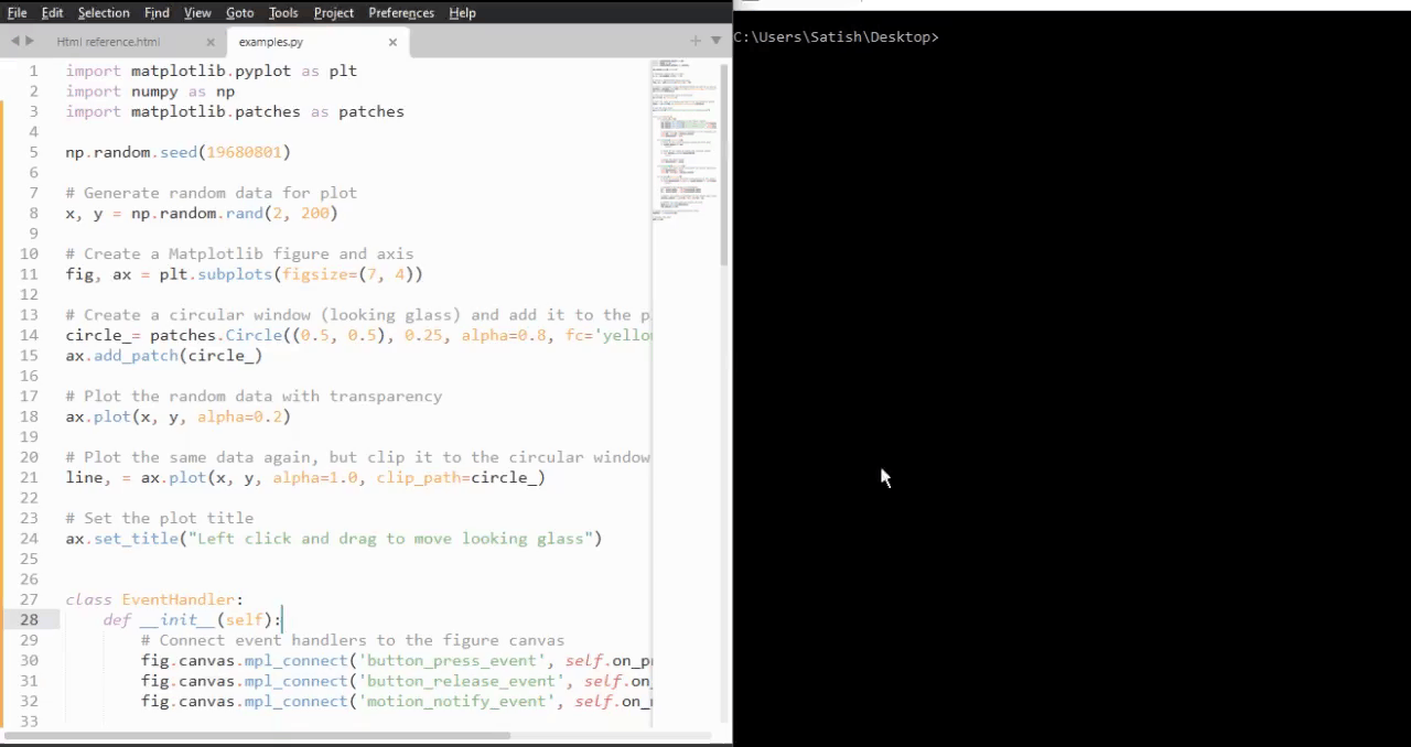
Matplotlib - Path Editor
A Path Editor is an application that allows users to interactively edit and manipulate paths in a graphical environment. In the context of Matplotlib, a Path Editor typically refers to a graphical user interface (GUI) application that facilitates the editing of paths defined using Matplotlib's Path class.
Before diving into the Path Editor, it's essential to understand the basics of Matplotlib paths. A Path is a fundamental object in Matplotlib that contains various elements like line segments, curves, and shapes within the matplotlib.patches module. Paths provide a versatile way to define complex outlines by specifying a series of commands such as moveto, lineto, and curveto.
Matplotlib offers a powerful Path class that serves as the foundation for creating and manipulating paths in visualizations.
Step by Step implementation
In this tutorial, we'll explore the Matplotlib Path Editor, a cross-GUI application that uses Matplotlib's event handling capabilities to edit and modify paths on the canvas interactively.
Creating the PathInteractor class
Create a path editor (PathInteractor) class to handle the interaction with the defined path. This class includes methods to toggle vertex markers (using the 't' key), drag vertices, and respond to mouse and key events.
Example
import matplotlib.pyplot as plt
import numpy as np
from matplotlib.backend_bases import MouseButton
from matplotlib.patches import PathPatch
from matplotlib.path import Path
class PathInteractor:
showverts = True
# max pixel distance to count as a vertex hit
epsilon = 5
def __init__(self, pathpatch):
# Initialization and event connections
self.ax = pathpatch.axes
canvas = self.ax.figure.canvas
self.pathpatch = pathpatch
self.pathpatch.set_animated(True)
x, y = zip(*self.pathpatch.get_path().vertices)
self.line, = ax.plot(
x, y, marker='o', markerfacecolor='r', animated=True)
self._ind = None # the active vertex
canvas.mpl_connect('draw_event', self.on_draw)
canvas.mpl_connect('button_press_event', self.on_button_press)
canvas.mpl_connect('key_press_event', self.on_key_press)
canvas.mpl_connect('button_release_event', self.on_button_release)
canvas.mpl_connect('motion_notify_event', self.on_mouse_move)
self.canvas = canvas
def get_ind_under_point(self, event):
# Return the index of the point closest to the event position or *None*
xy = self.pathpatch.get_path().vertices
xyt = self.pathpatch.get_transform().transform(xy) # to display coords
xt, yt = xyt[:, 0], xyt[:, 1]
d = np.sqrt((xt - event.x)**2 + (yt - event.y)**2)
ind = d.argmin()
return ind if d[ind] < self.epsilon else None
def on_draw(self, event):
# Callback for draws.
self.background = self.canvas.copy_from_bbox(self.ax.bbox)
self.ax.draw_artist(self.pathpatch)
self.ax.draw_artist(self.line)
self.canvas.blit(self.ax.bbox)
def on_button_press(self, event):
# Callback for mouse button presses
if (event.inaxes is None
or event.button != MouseButton.LEFT
or not self.showverts):
return
self._ind = self.get_ind_under_point(event)
def on_button_release(self, event):
# Callback for mouse button releases
if (event.button != MouseButton.LEFT
or not self.showverts):
return
self._ind = None
def on_key_press(self, event):
# Callback for key presses
if not event.inaxes:
return
if event.key == 't':
self.showverts = not self.showverts
self.line.set_visible(self.showverts)
if not self.showverts:
self._ind = None
self.canvas.draw()
def on_mouse_move(self, event):
# Callback for mouse movements
if (self._ind is None
or event.inaxes is None
or event.button != MouseButton.LEFT
or not self.showverts):
return
vertices = self.pathpatch.get_path().vertices
vertices[self._ind] = event.xdata, event.ydata
self.line.set_data(zip(*vertices))
self.canvas.restore_region(self.background)
self.ax.draw_artist(self.pathpatch)
self.ax.draw_artist(self.line)
self.canvas.blit(self.ax.bbox)
Event Handling and Canvas Interaction
The PathInteractor class connects various callbacks to canvas events, enabling users to interact with the defined path. These interactions include pressing and releasing mouse buttons, dragging vertices, and toggling vertex markers with key presses.
canvas.mpl_connect('draw_event', self.on_draw)
canvas.mpl_connect('button_press_event', self.on_button_press)
canvas.mpl_connect('key_press_event', self.on_key_press)
canvas.mpl_connect('button_release_event', self.on_button_release)
canvas.mpl_connect('motion_notify_event', self.on_mouse_move)
Defining and Visualizing a Path
Start by defining a predefined path, consisting of various path codes and vertices, which is created using the Matplotlib Path class. This path is then visualized on the canvas using a PathPatch instance, adding an interactive component to the plot.
fig, ax = plt.subplots() pathdata = [ (Path.MOVETO, (1.58, -2.57)), (Path.CURVE4, (0.35, -1.1)), (Path.CURVE4, (-1.75, 2.0)), (Path.CURVE4, (0.375, 2.0)), (Path.LINETO, (0.85, 1.15)), (Path.CURVE4, (2.2, 3.2)), (Path.CURVE4, (3, 0.05)), (Path.CURVE4, (2.0, -0.5)), (Path.CLOSEPOLY, (1.58, -2.57)), ] codes, verts = zip(*pathdata) path = Path(verts, codes) patch = PathPatch( path, facecolor='green', edgecolor='yellow', alpha=0.5) ax.add_patch(patch)
Running the Path Editor
Instantiate the PathInteractor class, set plot properties, and display the plot. Users can now interactively drag vertices, toggle vertex markers using the key "t", and observe real-time updates.
interactor = PathInteractor(patch)
ax.set_title('drag vertices to update path')
ax.set_xlim(-3, 4)
ax.set_ylim(-3, 4)
plt.show()
Example - Path Editor Application
Lets see the complete example of the Matplotlib Path Editor.
import matplotlib.pyplot as plt
import numpy as np
from matplotlib.backend_bases import MouseButton
from matplotlib.patches import PathPatch
from matplotlib.path import Path
class PathInteractor:
showverts = True
# max pixel distance to count as a vertex hit
epsilon = 5
def __init__(self, pathpatch):
# Initialization and event connections
self.ax = pathpatch.axes
canvas = self.ax.figure.canvas
self.pathpatch = pathpatch
self.pathpatch.set_animated(True)
x, y = zip(*self.pathpatch.get_path().vertices)
self.line, = ax.plot(
x, y, marker='o', markerfacecolor='r', animated=True)
self._ind = None # the active vertex
canvas.mpl_connect('draw_event', self.on_draw)
canvas.mpl_connect('button_press_event', self.on_button_press)
canvas.mpl_connect('key_press_event', self.on_key_press)
canvas.mpl_connect('button_release_event', self.on_button_release)
canvas.mpl_connect('motion_notify_event', self.on_mouse_move)
self.canvas = canvas
def get_ind_under_point(self, event):
# Return the index of the point closest to the event position or *None*
xy = self.pathpatch.get_path().vertices
xyt = self.pathpatch.get_transform().transform(xy) # to display coords
xt, yt = xyt[:, 0], xyt[:, 1]
d = np.sqrt((xt - event.x)**2 + (yt - event.y)**2)
ind = d.argmin()
return ind if d[ind] < self.epsilon else None
def on_draw(self, event):
# Callback for draws.
self.background = self.canvas.copy_from_bbox(self.ax.bbox)
self.ax.draw_artist(self.pathpatch)
self.ax.draw_artist(self.line)
self.canvas.blit(self.ax.bbox)
def on_button_press(self, event):
# Callback for mouse button presses
if (event.inaxes is None
or event.button != MouseButton.LEFT
or not self.showverts):
return
self._ind = self.get_ind_under_point(event)
def on_button_release(self, event):
# Callback for mouse button releases
if (event.button != MouseButton.LEFT
or not self.showverts):
return
self._ind = None
def on_key_press(self, event):
# Callback for key presses
if not event.inaxes:
return
if event.key == 't':
self.showverts = not self.showverts
self.line.set_visible(self.showverts)
if not self.showverts:
self._ind = None
self.canvas.draw()
def on_mouse_move(self, event):
# Callback for mouse movements
if (self._ind is None
or event.inaxes is None
or event.button != MouseButton.LEFT
or not self.showverts):
return
vertices = self.pathpatch.get_path().vertices
vertices[self._ind] = event.xdata, event.ydata
self.line.set_data(zip(*vertices))
self.canvas.restore_region(self.background)
self.ax.draw_artist(self.pathpatch)
self.ax.draw_artist(self.line)
self.canvas.blit(self.ax.bbox)
fig, ax = plt.subplots()
pathdata = [
(Path.MOVETO, (1.58, -2.57)),
(Path.CURVE4, (0.35, -1.1)),
(Path.CURVE4, (-1.75, 2.0)),
(Path.CURVE4, (0.375, 2.0)),
(Path.LINETO, (0.85, 1.15)),
(Path.CURVE4, (2.2, 3.2)),
(Path.CURVE4, (3, 0.05)),
(Path.CURVE4, (2.0, -0.5)),
(Path.CLOSEPOLY, (1.58, -2.57)),
]
codes, verts = zip(*pathdata)
path = Path(verts, codes)
patch = PathPatch(
path, facecolor='green', edgecolor='yellow', alpha=0.5)
ax.add_patch(patch)
interactor = PathInteractor(patch)
ax.set_title('drag vertices to update path')
ax.set_xlim(-3, 4)
ax.set_ylim(-3, 4)
plt.show()
Output
On executing the above program you will get the following figure. Press the "t" key on your keyboard. This action toggles the visibility of vertex markers on and off. When the vertex markers are visible (after pressing "t"), you can drag these markers with your mouse. Observe how dragging the vertices affects the shape of the path.
Watch the video below to observe how the path editor works here.

Matplotlib - Poly Editor
Poly Editor is short for Polygon Editor is an application that allows users to interactively edit and manipulate vertices of a polygon in a graphical environment.
In the context of Matplotlib, a Poly Editor typically refers to a cross-GUI application that allows users to interactively modify polygons displayed on a canvas. This application provides features such as adding, deleting, and moving vertices of a polygon, as well as adjusting its shape and position using mouse clicks and keybindings.
This tutorial will demonstrate how to create a polygon editor using Matplotlib's event handling capabilities.
Creating the Polygon Interactor Class
To create the Poly Editor, define a Python class called PolygonInteractor, which handles interactions with the polygon vertices. This class implements event handling methods to respond to user interactions −
on_draw − Handles the drawing of the polygon and its vertices.
on_button_press − Responds to mouse button presses to select vertices.
on_button_release − Handles mouse button releases.
on_key_press − Handles key presses to toggle vertex markers(using the 't' key), delete vertices(using the d key), or insert new vertices(using the 'i' key).
on_mouse_move − Handles mouse movements to drag vertices and update the polygon.
Below is the implementation of the PolygonInteractor class −
class PolygonInteractor:
showverts = True
epsilon = 3
def __init__(self, ax, poly):
if poly.figure is None:
raise RuntimeError('You must first add the polygon to a figure '
'or canvas before defining the interactor')
self.ax = ax
canvas = poly.figure.canvas
self.poly = poly
x, y = zip(*self.poly.xy)
self.line = Line2D(x, y,
marker='o', markerfacecolor='r',
animated=True)
self.ax.add_line(self.line)
self.cid = self.poly.add_callback(self.poly_changed)
self._ind = None # the active vert
canvas.mpl_connect('draw_event', self.on_draw)
canvas.mpl_connect('button_press_event', self.on_button_press)
canvas.mpl_connect('key_press_event', self.on_key_press)
canvas.mpl_connect('button_release_event', self.on_button_release)
canvas.mpl_connect('motion_notify_event', self.on_mouse_move)
self.canvas = canvas
def on_draw(self, event):
self.background = self.canvas.copy_from_bbox(self.ax.bbox)
self.ax.draw_artist(self.poly)
self.ax.draw_artist(self.line)
def poly_changed(self, poly):
vis = self.line.get_visible()
Artist.update_from(self.line, poly)
self.line.set_visible(vis) # don't use the poly visibility state
def get_ind_under_point(self, event):
xy = np.asarray(self.poly.xy)
xyt = self.poly.get_transform().transform(xy)
xt, yt = xyt[:, 0], xyt[:, 1]
d = np.hypot(xt - event.x, yt - event.y)
indseq, = np.nonzero(d == d.min())
ind = indseq[0]
if d[ind] >= self.epsilon:
ind = None
return ind
def on_button_press(self, event):
if not self.showverts:
return
if event.inaxes is None:
return
if event.button != 1:
return
self._ind = self.get_ind_under_point(event)
def on_button_release(self, event):
if not self.showverts:
return
if event.button != 1:
return
self._ind = None
def on_key_press(self, event):
if not event.inaxes:
return
if event.key == 't':
self.showverts = not self.showverts
self.line.set_visible(self.showverts)
if not self.showverts:
self._ind = None
elif event.key == 'd':
ind = self.get_ind_under_point(event)
if ind is not None:
self.poly.xy = np.delete(self.poly.xy,
ind, axis=0)
self.line.set_data(zip(*self.poly.xy))
elif event.key == 'i':
xys = self.poly.get_transform().transform(self.poly.xy)
p = event.x, event.y # display coords
for i in range(len(xys) - 1):
s0 = xys[i]
s1 = xys[i + 1]
d = dist_point_to_segment(p, s0, s1)
if d <= self.epsilon:
self.poly.xy = np.insert(
self.poly.xy, i+1,
[event.xdata, event.ydata],
axis=0)
self.line.set_data(zip(*self.poly.xy))
break
if self.line.stale:
self.canvas.draw_idle()
def on_mouse_move(self, event):
if not self.showverts:
return
if self._ind is None:
return
if event.inaxes is None:
return
if event.button != 1:
return
x, y = event.xdata, event.ydata
self.poly.xy[self._ind] = x, y
if self._ind == 0:
self.poly.xy[-1] = x, y
elif self._ind == len(self.poly.xy) - 1:
self.poly.xy[0] = x, y
self.line.set_data(zip(*self.poly.xy))
self.canvas.restore_region(self.background)
self.ax.draw_artist(self.poly)
self.ax.draw_artist(self.line)
self.canvas.blit(self.ax.bbox)
Defining Utility Function
Define a utility function dist_point_to_segment to calculate the distance between a point and a line segment. This function is used to determine which vertex is closest to the mouse cursor during interaction.
def dist_point_to_segment(p, s0, s1):
s01 = s1 - s0
s0p = p - s0
if (s01 == 0).all():
return np.hypot(*s0p)
p1 = s0 + np.clip((s0p @ s01) / (s01 @ s01), 0, 1) * s01
return np.hypot(*(p - p1))
Initializing the Polygon Editor
To initialize the polygon editor, we need to create an instance of the PolygonInteractor class and pass it the axis object and the polygon object:
if __name__ == '__main__':
import matplotlib.pyplot as plt
from matplotlib.patches import Polygon
theta = np.arange(0, 2*np.pi, 0.2)
r = 1.5
xs = r * np.cos(theta)
ys = r * np.sin(theta)
poly = Polygon(np.column_stack([xs, ys]), animated=True)
fig, ax = plt.subplots()
ax.add_patch(poly)
p = PolygonInteractor(ax, poly)
ax.set_title('Click and drag a point to move it')
ax.set_xlim((-2, 2))
ax.set_ylim((-2, 2))
plt.show()
Running the Poly Editor
By executing the complete code provided below, we will get a Matplotlib window displaying a plot with a polygon. We can interact with the polygon by clicking and dragging its vertices, toggling vertex markers by pressing the t key, pressing the 'd' key to delete vertices, and pressing the 'i' key to insert new vertices.
Example - Poly Editor Application
import matplotlib.pyplot as plt
import numpy as np
from matplotlib.backend_bases import MouseButton
from matplotlib.patches import PathPatch
from matplotlib.path import Path
from matplotlib.lines import Line2D
class PolygonInteractor:
showverts = True
epsilon = 3
def __init__(self, ax, poly):
if poly.figure is None:
raise RuntimeError('You must first add the polygon to a figure '
'or canvas before defining the interactor')
self.ax = ax
canvas = poly.figure.canvas
self.poly = poly
x, y = zip(*self.poly.xy)
self.line = Line2D(x, y,
marker='o', markerfacecolor='r',
animated=True)
self.ax.add_line(self.line)
self.cid = self.poly.add_callback(self.poly_changed)
self._ind = None # the active vert
canvas.mpl_connect('draw_event', self.on_draw)
canvas.mpl_connect('button_press_event', self.on_button_press)
canvas.mpl_connect('key_press_event', self.on_key_press)
canvas.mpl_connect('button_release_event', self.on_button_release)
canvas.mpl_connect('motion_notify_event', self.on_mouse_move)
self.canvas = canvas
def on_draw(self, event):
self.background = self.canvas.copy_from_bbox(self.ax.bbox)
self.ax.draw_artist(self.poly)
self.ax.draw_artist(self.line)
def poly_changed(self, poly):
vis = self.line.get_visible()
Artist.update_from(self.line, poly)
self.line.set_visible(vis) # don't use the poly visibility state
def get_ind_under_point(self, event):
xy = np.asarray(self.poly.xy)
xyt = self.poly.get_transform().transform(xy)
xt, yt = xyt[:, 0], xyt[:, 1]
d = np.hypot(xt - event.x, yt - event.y)
indseq, = np.nonzero(d == d.min())
ind = indseq[0]
if d[ind] >= self.epsilon:
ind = None
return ind
def on_button_press(self, event):
if not self.showverts:
return
if event.inaxes is None:
return
if event.button != 1:
return
self._ind = self.get_ind_under_point(event)
def on_button_release(self, event):
if not self.showverts:
return
if event.button != 1:
return
self._ind = None
def on_key_press(self, event):
if not event.inaxes:
return
if event.key == 't':
self.showverts = not self.showverts
self.line.set_visible(self.showverts)
if not self.showverts:
self._ind = None
elif event.key == 'd':
ind = self.get_ind_under_point(event)
if ind is not None:
self.poly.xy = np.delete(self.poly.xy,
ind, axis=0)
self.line.set_data(zip(*self.poly.xy))
elif event.key == 'i':
xys = self.poly.get_transform().transform(self.poly.xy)
p = event.x, event.y # display coords
for i in range(len(xys) - 1):
s0 = xys[i]
s1 = xys[i + 1]
d = dist_point_to_segment(p, s0, s1)
if d <= self.epsilon:
self.poly.xy = np.insert(
self.poly.xy, i+1,
[event.xdata, event.ydata],
axis=0)
self.line.set_data(zip(*self.poly.xy))
break
if self.line.stale:
self.canvas.draw_idle()
def on_mouse_move(self, event):
if not self.showverts:
return
if self._ind is None:
return
if event.inaxes is None:
return
if event.button != 1:
return
x, y = event.xdata, event.ydata
self.poly.xy[self._ind] = x, y
if self._ind == 0:
self.poly.xy[-1] = x, y
elif self._ind == len(self.poly.xy) - 1:
self.poly.xy[0] = x, y
self.line.set_data(zip(*self.poly.xy))
self.canvas.restore_region(self.background)
self.ax.draw_artist(self.poly)
self.ax.draw_artist(self.line)
self.canvas.blit(self.ax.bbox)
def dist_point_to_segment(p, s0, s1):
s01 = s1 - s0
s0p = p - s0
if (s01 == 0).all():
return np.hypot(*s0p)
p1 = s0 + np.clip((s0p @ s01) / (s01 @ s01), 0, 1) * s01
return np.hypot(*(p - p1))
if __name__ == '__main__':
import matplotlib.pyplot as plt
from matplotlib.patches import Polygon
theta = np.arange(0, 2*np.pi, 0.2)
r = 1.5
xs = r * np.cos(theta)
ys = r * np.sin(theta)
poly = Polygon(np.column_stack([xs, ys]), animated=True)
fig, ax = plt.subplots()
ax.add_patch(poly)
p = PolygonInteractor(ax, poly)
ax.set_title('Click and drag a point to move it')
ax.set_xlim((-2, 2))
ax.set_ylim((-2, 2))
plt.show()
Output
On executing the above code we will get the following output −
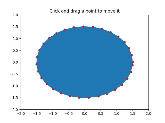
Watch the video below to observe the works of this application −

Matplotlib - Timers
In general computer programming, timers are refers to a mechanism that allows users to schedule the execution of a specific task or code snippet at predefined intervals. Timers are useful for various applications, enabling the automation of repetitive actions, periodic updates, or the triggering of events based on time-related conditions.
Timers in Matplotlib
Matplotlib timers are powerful features that enable you to integrate periodic events into the plots. And designed to work independently of specific graphical user interface (GUI) backends.
To utilize the Matplotlib timers feature, the figure.canvas.new_timer() function works as a key component to integrate timers with various GUI event loops. While its call signature may appear unconventional, due to this understanding the call signature is crucial (you need to explicitly specify the empty sequences and dictionaries if your call back function(s) don't take arguments or keyword arguments).
Here is the syntax −
Syntax
timer = figure.canvas.new_timer(interval=5000, callbacks=[(callback_function, [], {})])
timer.start()
This syntax creates a timer with a 5-second interval, demonstrating the timer's integration into Matplotlib plots.
Example - Usage of 5 second Timer
Here is an example, That demonstrates a simple usage of timers in Matplotlib. It sets up a timer to print "Matplotlib Timer Event" to the console every 5 seconds. This showcases how timers can be employed for periodic tasks within plots.
import matplotlib.pyplot as plt
# Function to handle the timer event
def handle_timer_event():
print('Matplotlib Timer Event')
# Create a new Matplotlib figure and axis
custom_fig, custom_ax = plt.subplots(figsize=(7, 4))
# Create a timer with a 5000 milliseconds interval
custom_timer = custom_fig.canvas.new_timer(interval=5000, callbacks=[(handle_timer_event, [], {})])
# Start the timer
custom_timer.start()
plt.show()
Output
On executing the above program you will get the following output −
Matplotlib Timer Event Matplotlib Timer Event Matplotlib Timer Event Matplotlib Timer Event Matplotlib Timer Event Matplotlib Timer Event
Watch the video below to observe the works of this example.
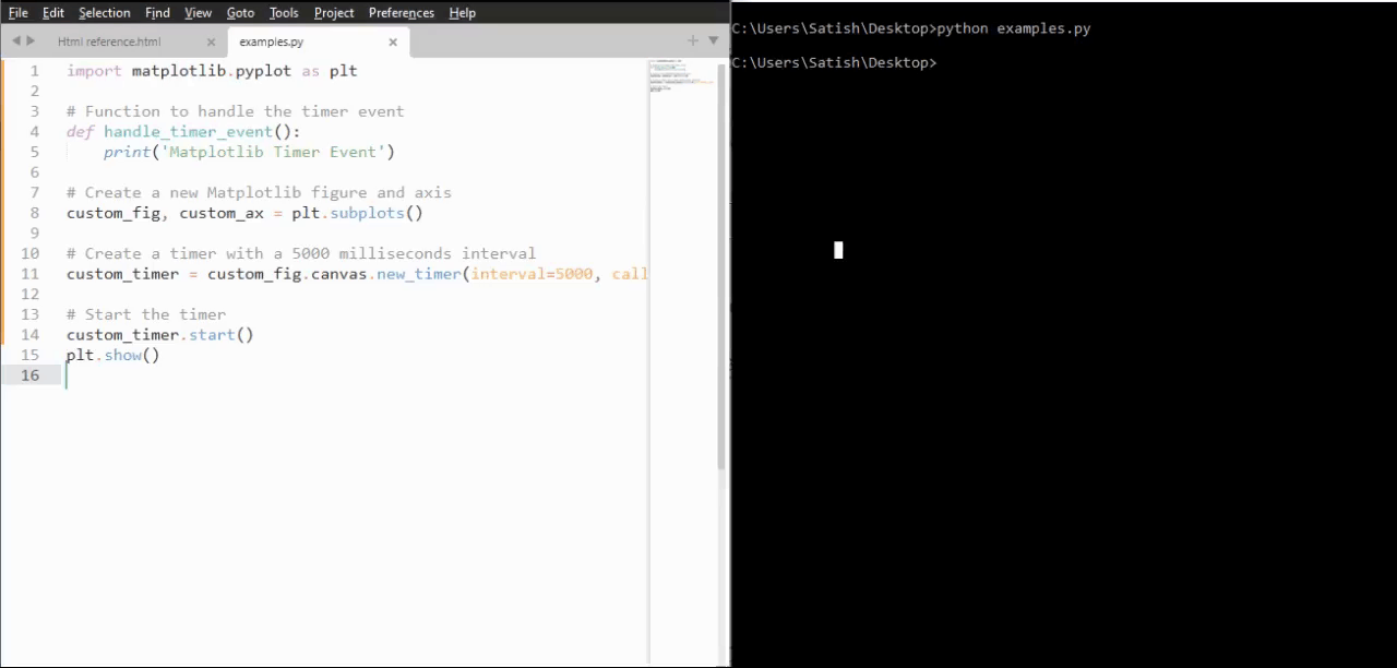
Timer for Real-Time Updates
Timers can be used to achieve real-time updates within a plot, enhancing the dynamic nature of visualizations.
Example - Real Time updates using a Timer
In the example, a timer is used to update the title of a figure with the current timestamp at intervals of 500 milliseconds. Which shows that, how timers can be used for dynamic, time-sensitive updates in visualizations.
from datetime import datetime import matplotlib.pyplot as plt import numpy as np # Function to update the title with the current timestamp def update_title(axes): axes.set_title(datetime.now()) axes.figure.canvas.draw() # Create a Matplotlib figure and axis fig, ax = plt.subplots(figsize=(7, 4)) # Generate sample data x = np.linspace(0, 10, 100) ax.plot(x, np.sin(x)) # Create a new timer with an interval of 500 milliseconds timer = fig.canvas.new_timer(interval=500) # Add the update_title function as a callback to the timer timer.add_callback(update_title, ax) # Start the timer timer.start() plt.show()
Output
On executing the above program you will get the following output −
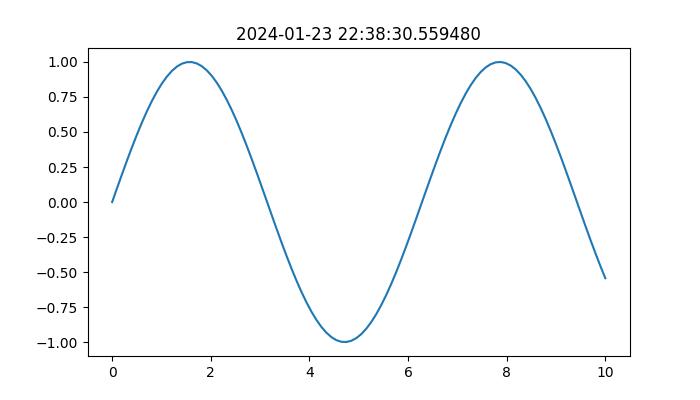
Watch the video below to observe the works of this example.
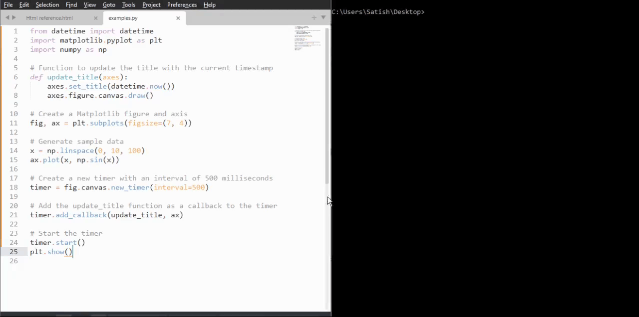
Animated Brownian Walk with Timer
In a more advanced scenario, we use the advantages of timers to animate a 2D Brownian walk, creating a visually dynamic plot that produces over time.
Example - Animated Walk
This example demonstrates the application of timers in creating animated visualizations.
import numpy as np
import matplotlib.pyplot as plt
# Callback function for the timer to update line data
def update_line_data(line, x_data, y_data):
x_data.append(x_data[-1] + np.random.normal(0, 1))
y_data.append(y_data[-1] + np.random.normal(0, 1))
line.set_data(x_data, y_data)
line.axes.relim()
line.axes.autoscale_view()
line.axes.figure.canvas.draw()
# Initial data points
x_coords, y_coords = [np.random.normal(0, 1)], [np.random.normal(0, 1)]
# Create a Matplotlib figure and axis
fig, ax = plt.subplots(figsize=(7, 4))
line, = ax.plot(x_coords, y_coords, color='aqua', marker='o')
# Create a new timer with a 100-millisecond interval
animation_timer = fig.canvas.new_timer(interval=1000, callbacks=[(update_line_data, [line, x_coords, y_coords], {})])
animation_timer.start()
# Display the animated plot
plt.show()
Output
On executing the above program you will get a figure with animation −
Watch the video below to observe the works of this example.
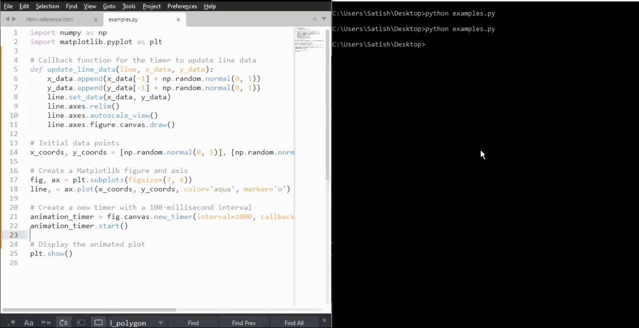
Matplotlib - View Limits
Viewlims or View limits, refer to the range of data that is displayed within a plot along the x and y axes. Viewlims are useful for interactive data visualization because they allow users to dynamically adjust the display of data.
Matplotlib provides various methods and tools for setting and updating viewlims interactively, enabling users to explore and analyze data effectively. In general, view limits are automatically determined based on the data being plotted in matplotlib plots.
This tutorial will see step by setp implementation of creating interactive zoom functionality in a Matplotlib plot with viewlims to create dynamic visualizations coresponding to the user interactions.
Creating an Interactive Zoom Plot
Create a class that regenerates a fractal set (the Mandelbrot set is a famous fractal in mathematics) as we zoom in, allowing us to observe increasing detail. Additionally, we'll display a box in the left panel to show the area to which we are zoomed.
This class defines the compute_image method to calculate the Mandelbrot set based on the provided bounds. And the axes_update method updates the plot based on the current view limits. It ensures that the Mandelbrot set is recalculated and redrawn whenever the view limits change.
class InteractiveFractal:
def __init__(self, h=500, w=500, niter=50, radius=2., power=2):
self.height = h
self.width = w
self.niter = niter
self.radius = radius
self.power = power
def compute_image(self, xstart, xend, ystart, yend):
self.x = np.linspace(xstart, xend, self.width)
self.y = np.linspace(ystart, yend, self.height).reshape(-1, 1)
c = self.x + 1.0j * self.y
threshold_time = np.zeros((self.height, self.width))
z = np.zeros(threshold_time.shape, dtype=complex)
mask = np.ones(threshold_time.shape, dtype=bool)
for i in range(self.niter):
z[mask] = z[mask]**self.power + c[mask]
mask = (np.abs(z) < self.radius)
threshold_time += mask
return threshold_time
def axes_update(self, ax):
ax.set_autoscale_on(False)
self.width, self.height = \
np.round(ax.patch.get_window_extent().size).astype(int)
vl = ax.viewLim
extent = vl.x0, vl.x1, vl.y0, vl.y1
im = ax.images[-1]
im.set_data(self.compute_image(*extent))
im.set_extent(extent)
ax.figure.canvas.draw_idle()
Updating View Limits
We'll create a class UpdateRectangle to create a rectangle that represents the area to which we are zoomed in the Mandelbrot set. This class extends the Rectangle class and is used to update the rectangle representing the zoom area as the view limits change. As we zoom in on the left panel, the rectangle will update its shape to match the bounds of the axes.
class UpdateRectangle(Rectangle):
def __call__(self, ax):
self.set_bounds(*ax.viewLim.bounds)
ax.figure.canvas.draw_idle()
Connecting Callbacks
Callbacks are connected to the xlim_changed and ylim_changed events of the second subplot (ax2). These callbacks trigger the update of the rectangle and the Mandelbrot set whenever the view limits change.
# Connect for changing the view limits
ax2.callbacks.connect('xlim_changed', rect)
ax2.callbacks.connect('ylim_changed', rect)
ax2.callbacks.connect('xlim_changed', md.ax_update)
ax2.callbacks.connect('ylim_changed', md.ax_update)
Here is the complete code
The Mandelbrot set is initially plotted in two subplots (ax1 and ax2). The rectangle representing the zoom area is added to ax1, and callbacks are connected to ax2 to handle view limit changes.
Example - View Limits Application
import matplotlib.pyplot as plt
import numpy as np
from matplotlib.patches import Rectangle
class UpdateRectangle(Rectangle):
def __call__(self, ax):
self.set_bounds(*ax.viewLim.bounds)
ax.figure.canvas.draw_idle()
class InteractiveFractal:
def __init__(self, h=500, w=500, niter=50, radius=2., power=2):
self.height = h
self.width = w
self.niter = niter
self.radius = radius
self.power = power
def compute_image(self, xstart, xend, ystart, yend):
self.x = np.linspace(xstart, xend, self.width)
self.y = np.linspace(ystart, yend, self.height).reshape(-1, 1)
c = self.x + 1.0j * self.y
threshold_time = np.zeros((self.height, self.width))
z = np.zeros(threshold_time.shape, dtype=complex)
mask = np.ones(threshold_time.shape, dtype=bool)
for i in range(self.niter):
z[mask] = z[mask]**self.power + c[mask]
mask = (np.abs(z) < self.radius)
threshold_time += mask
return threshold_time
def axes_update(self, ax):
ax.set_autoscale_on(False)
self.width, self.height = \
np.round(ax.patch.get_window_extent().size).astype(int)
vl = ax.viewLim
extent = vl.x0, vl.x1, vl.y0, vl.y1
im = ax.images[-1]
im.set_data(self.compute_image(*extent))
im.set_extent(extent)
ax.figure.canvas.draw_idle()
md = InteractiveFractal()
Z = md.compute_image(-2., 0.5, -1.25, 1.25)
fig1, (ax1, ax2) = plt.subplots(1, 2, figsize=(7, 4))
ax1.imshow(Z, origin='lower',
extent=(md.x.min(), md.x.max(), md.y.min(), md.y.max()))
ax2.imshow(Z, origin='lower',
extent=(md.x.min(), md.x.max(), md.y.min(), md.y.max()))
rect = UpdateRectangle(
[0, 0], 0, 0, facecolor='none', edgecolor='black', linewidth=1.0)
rect.set_bounds(*ax2.viewLim.bounds)
ax1.add_patch(rect)
# Connect for changing the view limits
ax2.callbacks.connect('xlim_changed', rect)
ax2.callbacks.connect('ylim_changed', rect)
ax2.callbacks.connect('xlim_changed', md.axes_update)
ax2.callbacks.connect('ylim_changed', md.axes_update)
ax2.set_title("Zoom here")
plt.show()
Output
On executing the above program you will get the following output −
Observe the below video to see how the viewlims works here −
Matplotlib - Zoom Window
Zooming a window in data visualizations/plotings refers to the process of adjusting the view to make specific objects or regions larger or smaller. This interactive feature is particularly useful when exploring graphs, charts, or any visual representation, allowing users to focus on specific areas of interest or get a comprehensive view of the entire content.
Zoom Window in Matplotlib
One of the key features of Matplotlib is its support for event handling, which allows users to connect events such as mouse clicks to specific actions in the plot. In this tutorial, we will explore the Zoom Window Event Handling in Matplotlib with a focus on the button_press_event and how it can be used to create zoomable windows.
Example - Zoom Window Application
This example creates two figures (source and Zoom). The source figure displays a scatter plot, and the zoom figure displays an initial zoomed-in view. When a point is clicked in the source figure, the on_press function is triggered by using the button_press_event. This on_press function adjusts the limits of the zoomable figure to create a zoom effect centered at the clicked point.
import matplotlib.pyplot as plt
import numpy as np
# Fixing random state for reproducibility
np.random.seed(19601)
# Create source and zoomable figures and axes
figsrc, axsrc = plt.subplots(figsize=(3.7, 3.7))
figzoom, axzoom = plt.subplots(figsize=(3.7, 3.7))
# Set initial limits and titles for both axes
axsrc.set(xlim=(0, 1), ylim=(0, 1), autoscale_on=False, title='Click to zoom')
axzoom.set(xlim=(0.45, 0.55), ylim=(0.4, 0.6), autoscale_on=False, title='Zoom window')
# Generate random data for scatter plots
x, y, s, c = np.random.rand(4, 100)
s *= 200
# Plot the scatter plots on both axes
axsrc.scatter(x, y, s, c)
axzoom.scatter(x, y, s, c)
# Define the event handling function
def on_press(event):
if event.button != 1:
return
x, y = event.xdata, event.ydata
axzoom.set_xlim(x - 0.1, x + 0.1)
axzoom.set_ylim(y - 0.1, y + 0.1)
figzoom.canvas.draw()
# Connect the event handler to the source figure
figsrc.canvas.mpl_connect('button_press_event', on_press)
# Show the plots
plt.show()
Output
On executing the above program you will get the following output −
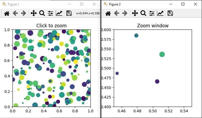
Watch the video below to observe how the zoom window feature works here.
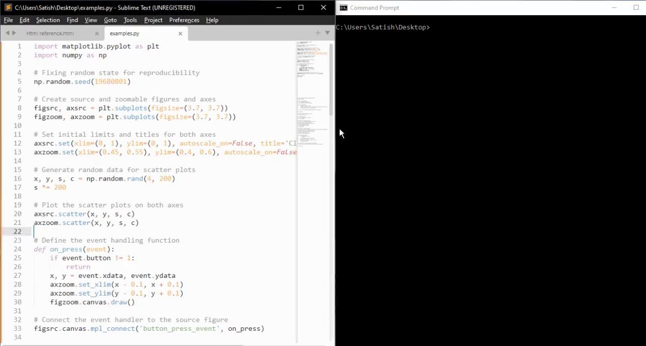
Example - Zoom Window on a Sine Wave
Let's create another example of creating Zoom Window using Matplotlib. In this example, a simple sine wave plotted on the main axis, and a smaller zoomable window created using the plt.axes() method. When you click on a point in the main plot, the on_press function is triggered, adjusting the limits of the zoomed window to create a zoom effect centered at the clicked point.
import matplotlib.pyplot as plt
import numpy as np
# Generate data
x = np.linspace(0, 10, 100)
y = np.sin(x)
# Create a figure and axis
fig, ax = plt.subplots(figsize=(7, 4))
ax.plot(x, y, label='Sin(x)')
ax.set_title('Zoom Window Example')
ax.set_xlabel('X-axis')
ax.set_ylabel('Y-axis')
ax.legend()
# Create a zoomable window
zoomed_ax = plt.axes([0.55, 0.25, 0.3, 0.3], facecolor='lightgoldenrodyellow')
zoomed_ax.plot(x, y, label='Sin(x)')
zoomed_ax.set_title('Zoomed Window')
zoomed_ax.set_xlim(2, 4)
zoomed_ax.set_ylim(0.5, 1)
def on_press(event):
if event.button != 1:
return
x, y = event.xdata, event.ydata
zoomed_ax.set_xlim(x - 1, x + 1)
zoomed_ax.set_ylim(y - 0.2, y + 0.2)
fig.canvas.draw()
# Connect the event handler to the figure
fig.canvas.mpl_connect('button_press_event', on_press)
plt.show()
Output
On executing the above program, you will get the following output −
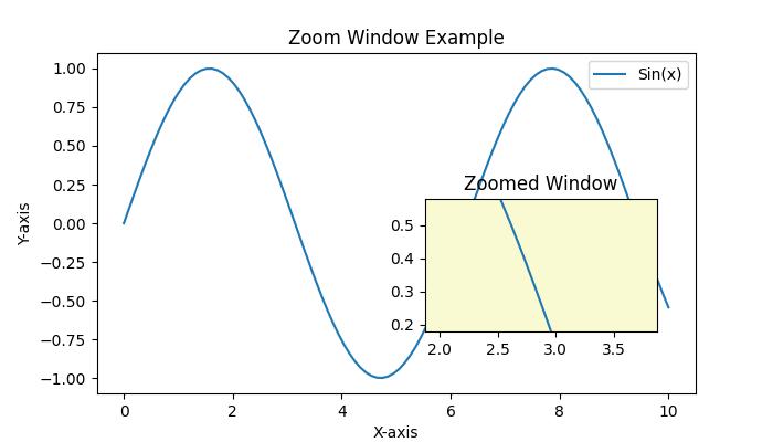
Watch the video below to observe how the zoom window feature works here.
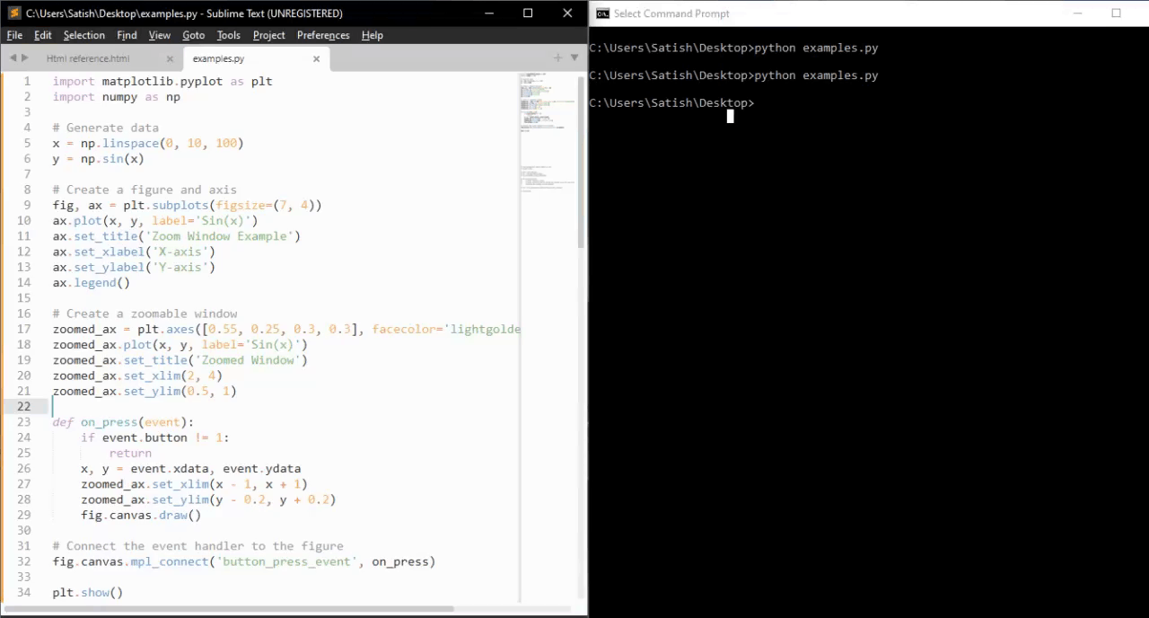
Matplotlib - Cursor Widget
What is Cursor Widget?
The Matplotlib Cursor Widget is specifically the Cursor class in Matplotlib's widgets module. This provides a way to interactively display the coordinates and data values of a plot as the cursor moves across it. This functionality is particularly useful for exploring data points or obtaining specific information from plots interactively.
Key Features of Cursor Widget
The following are the key features of cursor widgets of the matplotlb library.
Interactive Cursor − The Cursor class creates an interactive cursor that tracks the position of the mouse pointer as it moves over a Matplotlib plot.
Coordinate Display − When the cursor hovers over the plot the widget displays the x and y coordinates in data coordinates which corresponds to the cursor's position.
Data Value Display − Optionally we can configure the cursor to show the data value or other relevant information at the cursor position which is useful for visualizing specific data points.
Basic Workflow with Cursor Widget
The following is the basic flowchart of the cursor widget usage.
Example - Enable Cursor Widget
For enabling the cursor widget in Matplotlib involves connecting a function to the 'motion_notify_event' using plt.connect() to handle cursor movements over the plot.
This setup allows us to interactively view the cursor's coordinates in the console as we move it over the plot. We can modify the function on_move() to perform other actions or display information in different ways based on our specific requirements.
In this example on_move() is a function that handles the cursor movement event. It checks if the cursor is within the plot area event.inaxes and retrieves the cursor's x and y coordinates event.xdata and event.ydata. And the plt.connect('motion_notify_event', on_move) connects the 'motion_notify_event' to the on_move() function which enables the cursor widget. When the cursor moves over the plot the on_move() function gets triggered.
import matplotlib.pyplot as plt
# Function to handle cursor movement
def on_move(event):
if event.inaxes: # Check if the cursor is within the plot area
x, y = event.xdata, event.ydata # Get cursor position
print(f'Cursor at x={x:.2f}, y={y:.2f}') # Display coordinates
# Creating a plot
fig, ax = plt.subplots()
ax.plot([1, 2, 3], [4, 5, 6])
# Connecting the 'motion_notify_event' to the function 'on_move'
plt.connect('motion_notify_event', on_move)
plt.show()
Output
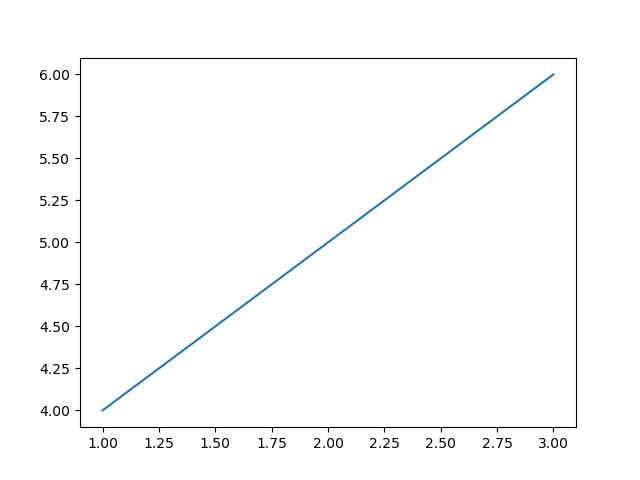
Example - Displaying Information
Displaying information in custom widgets within Matplotlib allows us to create interactive plots with customized elements to showcase specific information or enhance user interaction. Let's create a simple example. In this we are setting the frequency to 45.
import matplotlib.pyplot as plt
from matplotlib.widgets import TextBox, Button
import numpy as np
# Generate sample data
x = np.linspace(0, 10, 100)
y = np.sin(x)
# Create a plot
fig, ax = plt.subplots()
line, = ax.plot(x, y)
# Function to update the plot based on input
def update(text):
frequency = float(text) # Get the frequency value from the input
new_y = np.sin(frequency * x) # Generate new y values based on frequency
line.set_ydata(new_y) # Update the plot
ax.set_title(f'Sine Wave with Frequency={frequency:.2f}') # Update plot title
fig.canvas.draw_idle() # Redraw the plot
# Create a textbox widget for input
text_box = TextBox(plt.axes([0.1, 0.9, 0.1, 0.075]), 'Frequency')
text_box.on_submit(update) # Connect the textbox to the update function
# Display the plot
plt.show()
Output
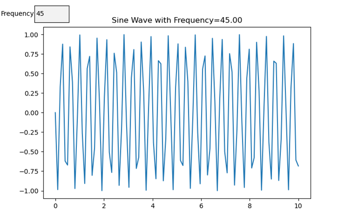
Example - Customizing Display Information
When using cursor widgets in Matplotlib we can customize the information displayed based on the cursor's position on the plot. Here's an example of how we can achieve it.
import matplotlib.pyplot as plt
import numpy as np
# Generating sample data
x = np.linspace(0, 10, 100)
y = np.sin(x)
# Creating a plot
fig, ax = plt.subplots()
line, = ax.plot(x, y)
# Function to update displayed information based on cursor position
def update_cursor_info(event):
if event.inaxes:
x_cursor, y_cursor = event.xdata, event.ydata
ax.set_title(f'Cursor at x={x_cursor:.2f}, y={y_cursor:.2f}')
fig.canvas.draw_idle()
# Connecting the 'motion_notify_event' to update_cursor_info function
plt.connect('motion_notify_event', update_cursor_info)
plt.show()
Output
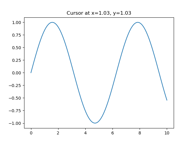
Example - Interactivity and Application
Interactivity in cursor widgets provides a powerful way to enhance user engagement with plots. By using cursor widgets in which users can interactively explore data points and gain insights. Let's enhance the previous example to demonstrate interactivity and potential applications.
import matplotlib.pyplot as plt
import numpy as np
# Generating sample data
x = np.linspace(0, 10, 100)
y = np.sin(x)
# Creating a plot
fig, ax = plt.subplots()
line, = ax.plot(x, y, label='Sine Wave')
# Function to update displayed information based on cursor position
def update_cursor_info(event):
if event.inaxes:
x_cursor, y_cursor = event.xdata, event.ydata
ax.set_title(f'Cursor at x={x_cursor:.2f}, y={y_cursor:.2f}')
fig.canvas.draw_idle()
# Connecting the 'motion_notify_event' to update_cursor_info function
plt.connect('motion_notify_event', update_cursor_info)
# Adding a legend
ax.legend()
# Adding interactivity with a button to toggle visibility of the sine wave
def toggle_visibility(event):
current_visibility = line.get_visible()
line.set_visible(not current_visibility)
ax.legend().set_visible(not current_visibility)
fig.canvas.draw_idle()
# Creating a button widget
button_ax = plt.axes([0.8, 0.025, 0.1, 0.04])
toggle_button = plt.Button(button_ax, 'Toggle Visibility')
toggle_button.on_clicked(toggle_visibility)
plt.show()
Output
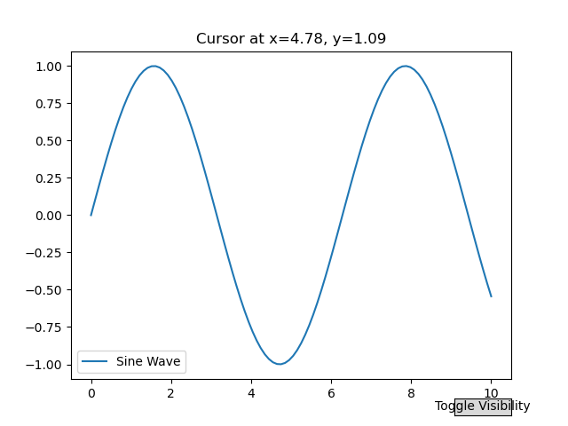
Example - Add a cursor to a curve
In this example we add a cursor to a curve in Matplotlib
import matplotlib.pyplot as plt
import numpy as np
plt.rcParams["figure.figsize"] = [7.50, 3.50]
plt.rcParams["figure.autolayout"] = True
class CursorClass(object):
def __init__(self, ax, x, y):
self.ax = ax
self.ly = ax.axvline(color='yellow', alpha=0.5)
self.marker, = ax.plot([0], [0], marker="o", color="red", zorder=3)
self.x = x
self.y = y
self.txt = ax.text(0.7, 0.9, '')
def mouse_event(self, event):
if event.inaxes:
x, y = event.xdata, event.ydata
indx = np.searchsorted(self.x, [x])[0]
x = self.x[indx]
y = self.y[indx]
self.ly.set_xdata(x)
self.marker.set_data([x], [y])
self.txt.set_text('x=%1.2f, y=%1.2f' % (x, y))
self.txt.set_position((x, y))
self.ax.figure.canvas.draw_idle()
else:
return
t = np.arange(0.0, 1.0, 0.01)
s = np.sin(2 * 2 * np.pi * t)
fig, ax = plt.subplots()
cursor = CursorClass(ax, t, s)
cid = plt.connect('motion_notify_event', cursor.mouse_event)
ax.plot(t, s, lw=2, color='green')
plt.axis([0, 1, -1, 1])
plt.show()
Output
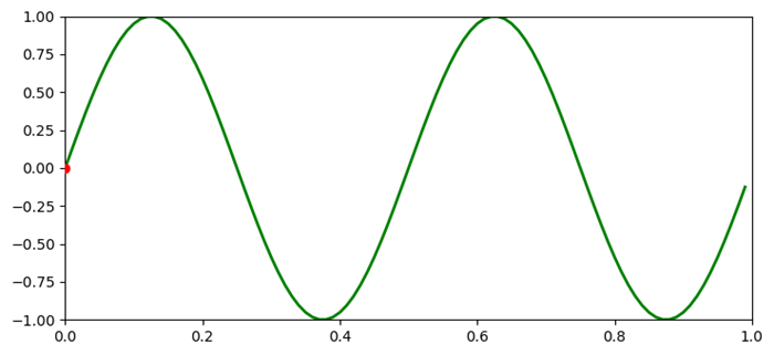
Matplotlib - Annotated Cursor
What is Annotated Cursor?
An annotated cursor is a feature in data visualization that combines cursor tracking with additional information, annotations or tooltips displayed alongside the cursor position as it moves across the plot. It helps users gain insights into specific data points or regions of interest by providing contextual information.
In the view of Matplotlib or other plotting libraries an annotated cursor typically involves displaying annotations, tooltips or supplementary information at the cursor's location on the plot. This information could include data values, labels or any relevant details associated with the plotted data points.
The annotated cursor enhances the interactive exploration of plots by providing immediate and contextual information about specific data coordinates or regions aiding in data analysis and interpretation.
Implementing an annotated cursor involves using cursor tracking events such as the 'motion_notify_event' in Matplotlib to update annotations or tooltips dynamically based on the cursor's position. This enables users to explore data points interactively and gain deeper insights by accessing additional information relevant to the plotted data.
Annotated Cursor Features
The below are the features of the annotated Cursor of the Matplotlib widgets.
Interactive Cursor
The Annotated cursor is similar to a standard cursor but it enables users to navigate across the plot by displaying coordinate information (x, y values) as the cursor moves over data points.
Annotation Capability
The annotated cursor is alongside used for displaying coordinates and it allows marking or annotating specific data points with text or markers to highlight or provide additional information about those points.
Customization
Customizable properties for both cursor and annotations such as marker style, text content, position, color and other visual attributes.
Annotated Cursor in Matplotlib
Using cursor widgets in Matplotlib involves capturing cursor movements or clicks and executing functions to enhance the plot with annotations or information about specific data points. Let's delve deeper into how cursor widgets can be utilized to create annotated widgets in Matplotlib.
Cursor Widgets in Annotated Widgets
To use the cursor widgets in annotated widgets there are two ways. Lets see them one by one.
Event Handling
Event handling in annotated cursors involves capturing specific events such as cursor movements or mouse clicks and executing functions to annotate or remove annotations from a plot in Matplotlib. Here is a detailed breakdown of event handling in annotated cursors.
Defining Functions for Event Handling
The below are the functions which has to be defined for Event handling.
annotate_point(event) − This function gets triggered when the cursor hovers over the plot. It retrieves cursor coordinates that finds the nearest data point and annotates it with information (e.g., x and y values).
Removing Annotations on Mouse Click
remove_annotation(event) − This function removes annotations when a mouse click occurs within the plot area.
Handling Events
plt.connect('motion_notify_event', annotate_point) − Connects the cursor movement event to the annotate_point function. When the cursor moves over the plot this function is triggered to annotate the nearest data point.
plt.connect('button_press_event', remove_annotation) − Connects the mouse click event to the remove_annotation function. When a mouse click occurs within the plot this function removes annotations.
Example - Event Handling in Annotated Cursors
In this example we are demonstrating the event handling in annotated cursors. As the cursor hovers over the plot, annotations are dynamically added to display information about specific data points. Upon clicking within the plot area and the annotations are removed allowing for a clean exploration of the plot without clutter.
import matplotlib.pyplot as plt
import numpy as np
# Generating sample data
x = np.linspace(0, 10, 100)
y = np.sin(x)
# Creating a plot
fig, ax = plt.subplots()
line, = ax.plot(x, y, label='Sine Wave')
# Annotate points on cursor hover
def annotate_point(event):
if event.inaxes:
x_cursor, y_cursor = event.xdata, event.ydata
index = np.argmin(np.abs(x - x_cursor)) # Find nearest index to the cursor position
ax.annotate(
f'({x[index]:.2f}, {y[index]:.2f})', xy=(x[index], y[index]),
xytext=(x[index] + 1, y[index] + 0.5), arrowprops=dict(facecolor='black', arrowstyle='->'),
fontsize=8, color='black')
fig.canvas.draw_idle()
# Remove annotations on mouse click
def remove_annotation(event):
if event.inaxes:
for annotation in ax.texts:
annotation.remove()
fig.canvas.draw_idle()
# Connect events to functions
plt.connect('motion_notify_event', annotate_point)
plt.connect('button_press_event', remove_annotation)
plt.show()
Output
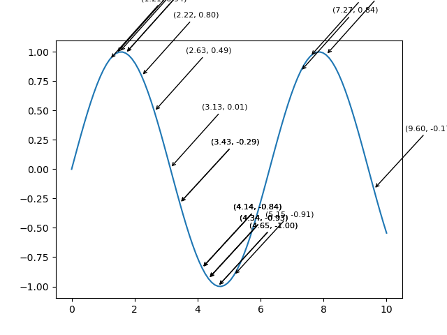
Example - Adding Annotations
Annotations or text labels are added to the plot to display information about data points when the cursor hovers over or clicks on them. Annotations can include data values, coordinates or any relevant information related to the plotted data.
Cursor Widgets in Annotated Widgets
This example illustrates how cursor widgets can be used to dynamically annotate data points as the cursor moves over the plot by providing valuable information about specific coordinates. The annotations are removed upon clicking by allowing for a clean exploration of the plot.
import matplotlib.pyplot as plt
import numpy as np
# Generating sample data
x = np.linspace(0, 10, 100)
y = np.cos(x)
# Creating a plot
fig, ax = plt.subplots()
line, = ax.plot(x, y, label='Cosine Wave')
# Annotate points on mouse hover
def annotate_point(event):
if event.inaxes:
x_cursor, y_cursor = event.xdata, event.ydata
index = np.argmin(np.abs(x - x_cursor)) # Find nearest index to the cursor position
ax.annotate(
f'({x[index]:.2f}, {y[index]:.2f})',
xy=(x[index], y[index]),
xytext=(x[index] + 1, y[index] + 0.5),
arrowprops=dict(facecolor='black', arrowstyle='->'),
fontsize=8, color='black')
fig.canvas.draw_idle()
# Remove annotations on mouse click
def remove_annotation(event):
if event.inaxes:
for annotation in ax.texts:
annotation.remove()
fig.canvas.draw_idle()
# Connect events to functions
plt.connect('motion_notify_event', annotate_point)
plt.connect('button_press_event', remove_annotation)
plt.show()
Output
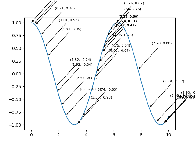
Use Cases
Data Highlighting: Use annotations to emphasize specific data points or regions.
Informational Markers − Provide additional details or labels for key data points.
Interactive Exploration − Combine cursor interactivity with annotations for dynamic data exploration.
Matplotlib - Button Widget
What is Button Widget?
In Matplotlib library the Buttons widget allows the creation of interactive buttons within a plot or figure. These buttons can trigger specific actions or functions when clicked providing users with an intuitive way to control plot elements or perform operations without writing additional code.
Key Aspects of the Buttons Widget
Interactive Interface − Buttons provide a user-friendly interface within a plot by enhancing interactivity for users exploring data.
Function Triggering − Each button is associated with a specific function or action that gets executed when the button is clicked.
Customization − Buttons can be customized in terms of appearance, position, label and functionality to suit specific application needs.
The Button widget in Matplotlib library is found in the matplotlib.widgets module. This allows users to incorporate interactive buttons directly into their plots. These buttons can trigger specific actions or functions when clicked by providing a way to add interactivity and control to visualizations.
Basic Usage of Button Widget
Here's a breakdown of how to use the Button widget in Matplotlib library, lets see them one by one.
Importing Necessary Libraries
To use the Button widget in Matplotlib we need to import necessary modules from Matplotlib. Here's is the way how to import the required libraries for working with button widgets.
import matplotlib.pyplot as plt from matplotlib.widgets import Button
Where,
matplotlib.pyplot − This module provides a MATLAB-like plotting framework in Matplotlib. It's typically imported as plt and offers functions to create figures, axes, plots and widgets within the plot.
matplotlib.widgets.Button − The Button class is part of the matplotlib.widgets module which contains various interactive widgets such as buttons. Importing Button from this module allows us to create and customize buttons within our plots.
Once these libraries are imported we can create buttons and define their functionalities within our Matplotlib plots as needed. The Button widget when integrated into plots provides interactive elements for triggering specific actions or functions upon user interaction.
Example - Creating a Figure and Axes
Creating a figure and axes in Matplotlib involves setting up the canvas (figure) and the plotting area (axes) where your visualizations will be displayed. Here's an example of how to create a figure and axes.
import matplotlib.pyplot as plt # Create a figure and axes fig, ax = plt.subplots() # Plotting on the axes ax.plot([1, 2, 3], [4, 5, 6]) # Show the plot plt.show()
Output

Example - Defining Functionality on Button Click
Defining functionality for a button in Matplotlib involves creating a function that specifies the actions to be performed when the button is clicked. Here's an example of defining functionality for a button click.
import matplotlib.pyplot as plt
from matplotlib.widgets import Button
# Function to be triggered by the button click
def button_click(event):
print("Button Clicked!") # Perform actions or call functions here
# Creating a plot
fig, ax = plt.subplots()
ax.plot([1, 2, 3], [4, 5, 6])
# Define the position and dimensions of the button
button_ax = plt.axes([0.7, 0.05, 0.2, 0.075]) # [left, bottom, width, height]
button = Button(button_ax, 'Click me') # Create a button object
# Connect the button's click event to the function
button.on_clicked(button_click)
plt.show()
Output
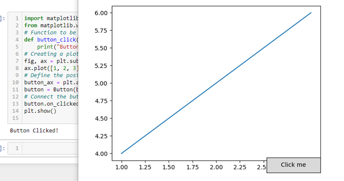
Example - Creating the Button
Create a button object and define its position and dimensions within the plot by using the Button class from the matplotlib.widgets module. Here's an example demonstrating how to create a button.
import matplotlib.pyplot as plt
from matplotlib.widgets import Button
# Function to be triggered by the button click
def button_click(event):
print("Button Clicked!") # Perform actions or call functions here
# Creating a figure and axes
fig, ax = plt.subplots()
# Define the position and dimensions of the button
button_ax = plt.axes([0.5, 0.5, 0.12, 0.15]) # [left, bottom, width, height]
# Create a button object
button = Button(button_ax, 'Click me') # 'Click me' is the text displayed on the button
# Connect the button's click event to the function
button.on_clicked(button_click)
# Show the plot
plt.show()
Output
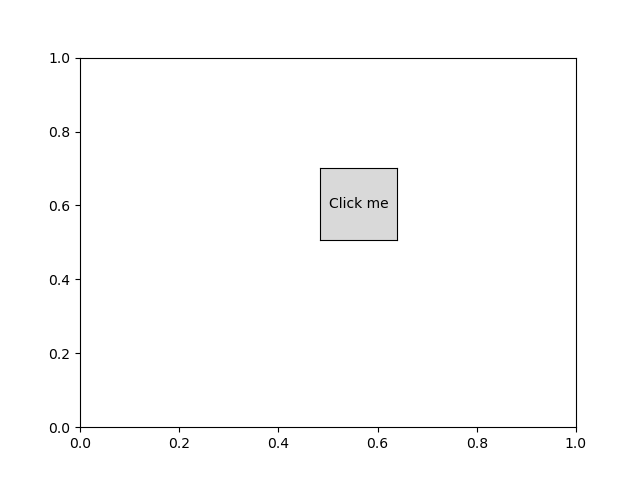
Now when we run this code and display the plot we will see a button labeled 'Click me'. Clicking on this button will trigger the button_click function and prints "Button Clicked!" to the console. We can customize the `button_click` function to perform different actions based on our specific needs.
Example - Connecting Button Click Event
Connecting a button's click event to a function involves using the on_clicked method provided by the Button widget in Matplotlib. Here's an example demonstrating how to connect a button's click event to a function.
import matplotlib.pyplot as plt
from matplotlib.widgets import Button
# Function to be triggered by the button click
def button_click(event):
print("Button Clicked!") # Perform actions or call functions here
# Creating a figure and axes
fig, ax = plt.subplots()
ax.plot([1, 2, 3], [4, 5, 6])
# Define the position and dimensions of the button
button_ax = plt.axes([0.7, 0.05, 0.2, 0.075]) # [left, bottom, width, height]
# Create a button object
button = Button(button_ax, 'Click me') # 'Click me' is the text displayed on the button
# Connect the button's click event to the function
button.on_clicked(button_click)
# Show the plot
plt.show()
Output
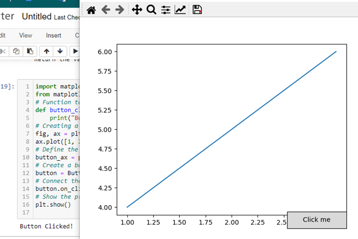
Customization and Functionality
Position and Size − Adjust the position and size of the button using [left, bottom, width, height] coordinates.
Button Text − Specify the text displayed on the button.
Button Action − Define the function that executes when the button is clicked. This can include actions such as updating the plot, calculating new data or triggering other events.
The Button widget provides an interactive element within Matplotlib plots by allowing users to trigger actions or functions directly from the plot interface. It's useful for controlling various functionalities or executing specific tasks associated with the visualization.
Matplotlib - Check Buttons
What is Check Buttons?
Matplotlib's Check Buttons provide a powerful mechanism for adding interactive checkbox functionality to our plots. This feature allows users to toggle the visibility of specific elements, datasets or annotations within the plot dynamically. Check Buttons are particularly useful when dealing with complex visualizations where displaying or hiding certain components enhances the clarity of the data presentation.
Overview of the check buttons
Check Buttons consist of a set of checkboxes associated with specific actions or functionalities in our plot. Users can interact with these checkboxes to control the visibility or behavior of corresponding elements. Common use cases include toggling the display of different datasets, showing or hiding annotations or activating/deactivating specific features within the plot.
There is step by step process for applying the check buttons to the plot.
Creating Check Buttons
Importing Necessary Libraries
Here to apply the check buttons to the matplotlib plots first we have to import the necessary required libraries by using the below code.
import matplotlib.pyplot as plt from matplotlib.widgets import CheckButtons
Example - Creating a Figure and Axes
Creating a figure and axes in Matplotlib for use with Check Buttons involves setting up the canvas (figure) and the plotting area (axes). Here's an example of how to create a figure and axes and use them with Check Buttons.
import matplotlib.pyplot as plt # Creating a figure and axes fig, ax = plt.subplots() # Plotting elements with initial visibility based on the list line1, = ax.plot([1, 2, 3], [4, 5, 6], label='Line 1') line2, = ax.plot([1, 2, 3], [6, 5, 4], label='Line 2') line3, = ax.plot([1, 2, 3], [2, 1, 2], label='Line 3') plt.show()
Output
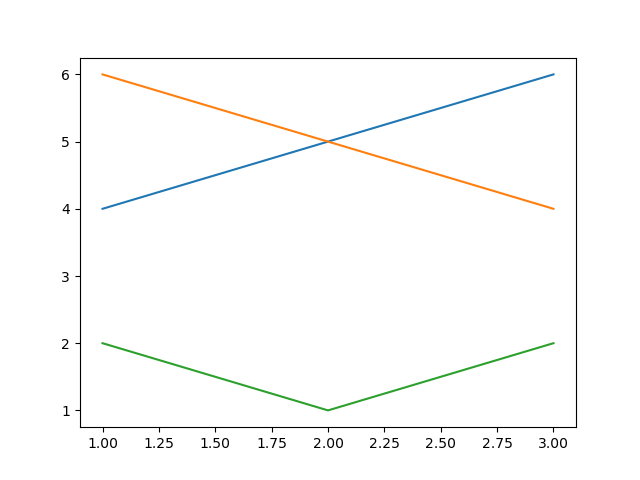
Example - Defining Initial Visibility Status
Defining the initial visibility status is a crucial step when working with Check Buttons in Matplotlib. The initial visibility status determines whether the associated elements such as lines in a plot are initially visible or hidden. Here's how we can define the initial visibility status for Check Buttons.
In this example the list visibility_status contains three Boolean values such as True or False each corresponding to the initial visibility status of a specific element.
import matplotlib.pyplot as plt
from matplotlib.widgets import CheckButtons
def update_visibility(label):
if label == 'Line 1':
line1.set_visible(not line1.get_visible())
elif label == 'Line 2':
line2.set_visible(not line2.get_visible())
elif label == 'Line 3':
line3.set_visible(not line3.get_visible())
plt.draw()
# Creating a figure and axes
fig, ax = plt.subplots()
# Defining initial visibility status
visibility_status = [True, True, True]
# Plotting elements with initial visibility based on the list
line1, = ax.plot([1.5, 4.2, 6.3], [4, 5, 6], label='Line 1', visible=visibility_status[0])
line2, = ax.plot([1.23, 2.2, 1.3], [6, 5, 4], label='Line 2', visible=visibility_status[1])
line3, = ax.plot([1, 2, 3], [2, 1, 2], label='Line 3', visible=visibility_status[2])
plt.show()
Output
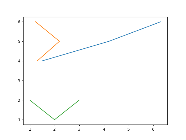
Plotting Elements and Updating Plot Based on Checkbox State
Create the elements that we want to control with Check Buttons and add them to the plot.
Creating Check Buttons
Define the location and dimensions of the Check Buttons within the plot and create the CheckButtons object. The CheckButtons object is associated with the checkboxes for each line and the visibility_status list determines their initial state.
Example - Connecting Check Button Click Event
Connect the click event of the Check Buttons to the update function.
import matplotlib.pyplot as plt
from matplotlib.widgets import CheckButtons
# Creating a figure and axes
fig, ax = plt.subplots()
# Defining initial visibility status
visibility_status = [True, True, True]
# Plotting elements with initial visibility based on the list
line1, = ax.plot([1, 2, 3], [4, 5, 6], label='Line 1', visible=visibility_status[0])
line2, = ax.plot([1, 2, 3], [6, 5, 4], label='Line 2', visible=visibility_status[1])
line3, = ax.plot([1, 2, 3], [2, 1, 2], label='Line 3', visible=visibility_status[2])
# Creating Check Buttons
check_ax = plt.axes([0.7, 0.05, 0.2, 0.1])
check_buttons = CheckButtons(check_ax, ['Line 1', 'Line 2', 'Line 3'], visibility_status)
# Function to update visibility based on checkbox state
def update_visibility(label):
if label == 'Line 1':
line1.set_visible(not line1.get_visible())
elif label == 'Line 2':
line2.set_visible(not line2.get_visible())
elif label == 'Line 3':
line3.set_visible(not line3.get_visible())
plt.draw()
# Connecting Check Button Click Event
check_buttons.on_clicked(update_visibility)
plt.show()
Output
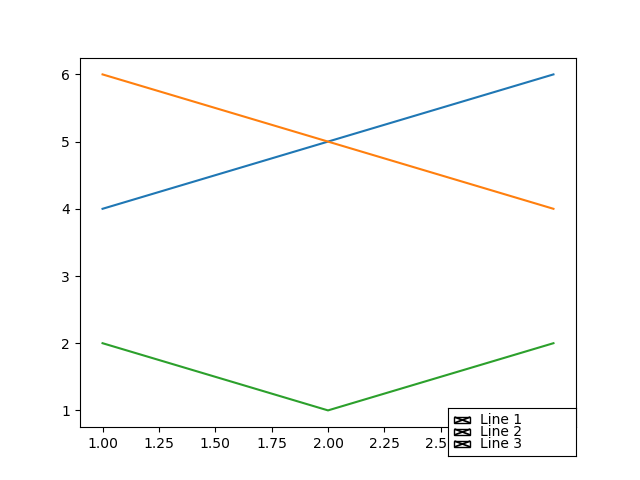
Customization and Interaction
We can apply the customizations and Interactions as per our requirement and need.
Checkbox Labels − Customize the labels of the checkboxes to match the elements they control.
Colors and Styling − Adjust the appearance of checkboxes, including colors, sizes and styles.
Dynamic Updates − The update_visibility function can be extended to include additional actions or modifications based on checkbox states.
Integration with Widgets − Combine Check Buttons with other widgets like buttons or sliders for comprehensive interactive features.
Matplotlib - Lasso Selector
What is Lasso Selector?
The Lasso Selector in Matplotlib is a powerful tool that enables users to interactively select data points or regions of interest within a plot by drawing free-form, irregular shapes (lassos). It provides a visual and intuitive way to subset or manipulates data dynamically by making it particularly useful in exploratory data analysis and interactive visualization applications.
The Lasso Selector in Matplotlib provides a versatile tool for interactive data exploration and analysis. By combining it with callback functions and customization options users can create dynamic and engaging visualizations tailored to their specific needs.
Use Cases and Applications
The below are the use cases and applications of the lasso selector.
Data Subsetting − The Lasso Selector is valuable for selecting and isolating specific data points within a plot by enabling users to focus on subsets of interest in large datasets.
Outlier Detection − It can be used for identifying outliers or unusual patterns in the data by interactively highlighting and examining regions of interest.
Data Analysis − The Lasso Selector facilitates exploratory data analysis by allowing users to dynamically explore relationships and patterns in the data.
Interactive Visualizations − In interactive visualization applications, the Lasso Selector enhances user engagement by providing a direct and intuitive means of interacting with plotted data.
Integration with Other Widgets − The Lasso Selector can be combined with other Matplotlib widgets such as buttons or sliders to create more complex and interactive visualizations.
Key Features and Components of the Lasso selector
The below are the key features and components of the Lasso selector. Lets see each and every one in detail.
Activation
To use the Lasso Selector we need to activate it within a Matplotlib plot. This is typically done through the use of the LassoSelector class provided by the matplotlib.widgets module. And also we need to import the matplotlib library pyplot module.
from matplotlib import pyplot as plt from matplotlib.widgets import LassoSelector
Initialization
Create an instance of the LassoSelector class and associate it with the specific axes where we want the lasso selection to occur. We also need to define a callback function that will be executed when the lasso is completed.
In the below example ax is the axes object where the lasso selection will take place and onlasso is the callback function that will be called with the selected vertices.
from matplotlib import pyplot as plt from matplotlib.widgets import LassoSelector def onlasso(vertices): # Process selected data based on vertices pass lasso = LassoSelector(ax, onlasso)
Interactive Selection
Once the Lasso Selector is active the users can interact with the plot by clicking and dragging the mouse to draw a lasso around the desired data points. The vertices of the lasso are continuously updated during the dragging process.
Callback Function
The callback function onlasso in this example is executed when the lasso selection is completed. It receives the list of vertices defining the shape of the lasso. Within the callback function we can implement logic to process or manipulate the data points that fall within the selected region.
def onlasso(vertices): # Process selected data based on vertices selected_data = process_data_within_lasso(vertices) # Perform further actions with the selected data
Customization
The Lasso Selector can be customized to suit specific requirements. Parameters such as the appearance of the lasso line, the tolerance for lasso detection or the cursor style can be adjusted to enhance the user experience.
Here in the below line of code lineprops allows customization of the appearance of the lasso line and other parameters define properties such as the button used for selection, span coordinates and interactivity.
lasso = LassoSelector(ax, onlasso, lineprops=dict(color='red', linewidth=2), button=1, spancoords='data', interactive=True)
Example - Usage of LassoSelector on a Polygon
Now lets create the code by combining all the above defined steps together. In this example the PointInPolygon function checks whether each data point is inside the lasso polygon. The selected points are then highlighted in the plot.
import matplotlib.pyplot as plt
from matplotlib.widgets import LassoSelector
import numpy as np
# Generate sample data
x = np.random.rand(100)
y = np.random.rand(100)
# Create a scatter plot
fig, ax = plt.subplots()
scatter = ax.scatter(x, y)
# Callback function for lasso selection
def onlasso(selected):
indices = np.nonzero(selected)[0]
selected_points = [(x, y)]
print("Selected points:", selected_points)
# Create a Lasso Selector
lasso_selector = LassoSelector(ax, onlasso)
plt.show()
Output
Example - Usage of Lasso Selector on a Scatter Plot
Below is an example of how to use the Lasso Selector in Matplotlib. In this example we'll create a scatter plot and users can interactively select data points using the Lasso Selector. The selected data points will be printed to the console.
import matplotlib.pyplot as plt
from matplotlib.widgets import LassoSelector
import numpy as np
# Generate random data for the scatter plot
np.random.seed(42)
x_data = np.random.rand(50)
y_data = np.random.rand(50)
# Function to be called on lasso selection
def onlasso(vertices):
selected_indices = lasso_selector.ind_verts
selected_data = [(x_data, y_data)]
print("Selected Data:", selected_data)
# Create a scatter plot
fig, ax = plt.subplots()
scatter = ax.plot(x_data, y_data, picker=True) # Enable picker for each data point
# Add Lasso Selector to the plot
lasso_selector = LassoSelector(ax, onlasso)
# Function to handle pick events (enable data point picking)
def onpick(event):
if event.artist == scatter:
lasso_selector.set_active(True)
# Connect the pick event to the onpick function
fig.canvas.mpl_connect('pick_event', onpick)
plt.show()
Output
Matplotlib - Menu Widget
Introduction
In Matplotlib library we do not have a specific Menu Widget, in its core functionality while as there is no built-in menu widget but we can achieve similar functionality by combining Matplotlib with other libraries like Tkinter or PyQt.
Here we will see the overview of creating a simple menu using Tkinter along with Matplotlib for plotting. Tkinter is a standard GUI i.e. Graphical User Interface library for Python and it can be used to create interactive menus and windows.
Overview of Creating a Menu in Matplotlib with Tkinter
The below are the key points of creating a menu in matplotlib library by using the Tkinter library.
Tkinter Integration
Tkinter is a powerful GUI library that integrates well with Matplotlib. We use Tkinter to create the main application window, menus and handle user interactions.
Matplotlib Figure and Canvas
The Matplotlib figure and canvas are embedded into the Tkinter application using FigureCanvasTkAgg. This allows Matplotlib plots to be displayed within a Tkinter window.
Menu Creation
We create a menu bar using tk.Menu() and add various menu items with associated actions. Here we are using the menu items such as Open and Exit under the File menu and Plot Data under the Plot menu.
Menu Actions
Functions like open_file and plot_data are defined to specify the actions associated with each menu item. For example the Open menu item invokes a file dialog to open a file and the Plot Data menu item plots a simple line on the Matplotlib axes.
Menu Cascades
Menu cascades are created using add_cascade(). This allows us to organize related menu items under a common menu header.
Running Tkinter Main Loop
The root.mainloop() call starts the Tkinter main loop where the application waits for user interactions.
Steps for creating the Menu widget using Tkinter
The following are the steps to be followed for creating the menu widget in matplotlib library using the Tkinter library.
Importing Necessary Libraries
First we have to import Matplotlib library for plotting and Tkinter library for GUI components by using the below line code.
import tkinter as tk from tkinter import filedialog import matplotlib.pyplot as plt from matplotlib.backends.backend_tkagg import FigureCanvasTkAgg
Creating a Tkinter Application
After importing the required libraries we have to create a Tkinter application and set up the main window.
import tkinter as tk
from tkinter import filedialog
import matplotlib.pyplot as plt
from matplotlib.backends.backend_tkagg import FigureCanvasTkAgg
root = tk.Tk()
root.title("Matplotlib Menu Widget")
Example - Creating a Matplotlib Figure and Axes
After that we have to create a Matplotlib figure and axes within the Tkinter application by using the below lines of code.
import tkinter as tk
from tkinter import filedialog
import matplotlib.pyplot as plt
from matplotlib.backends.backend_tkagg import FigureCanvasTkAgg
root = tk.Tk()
root.title("Matplotlib Menu Widget")
fig, ax = plt.subplots()
canvas = FigureCanvasTkAgg(fig, master=root)
canvas_widget = canvas.get_tk_widget()
canvas_widget.pack(side=tk.TOP, fill=tk.BOTH, expand=1)
Output
Defining Menu Actions
In this step we have to define functions that will be triggered when menu items are selected.
def open_file():
file_path = filedialog.askopenfilename(title="Open File", filetypes=[("Text Files", "*.txt")])
# Add your file processing logic here
print(f"File opened: {file_path}")
def plot_data():
# Add your data plotting logic here
ax.plot([1, 2, 3], [4, 5, 6])
canvas.draw()
Example - Creating a Menu and Running the Tkinter Main Loop
Next we have to create a menu bar and add menu items with associated actions and then run the Tkinter main loop to display the GUI.
Now lets combine the entire defined steps together and frame the menu widget using the tkinter library.
import tkinter as tk
from tkinter import filedialog
import matplotlib.pyplot as plt
from matplotlib.backends.backend_tkagg import FigureCanvasTkAgg
root = tk.Tk()
root.title("Matplotlib Menu Widget")
fig, ax = plt.subplots()
canvas = FigureCanvasTkAgg(fig, master=root)
canvas_widget = canvas.get_tk_widget()
canvas_widget.pack(side=tk.TOP, fill=tk.BOTH, expand=1)
def open_file():
file_path = filedialog.askopenfilename(title="Open File", filetypes=[("Text Files", "*.txt")])
# Add your file processing logic here
print(f"File opened: {file_path}")
def plot_data():
# Add your data plotting logic here
fig, ax = plt.subplots()
ax.plot([1, 2, 3], [4, 5, 6])
canvas.draw()
menu_bar = tk.Menu(root)
file_menu = tk.Menu(menu_bar, tearoff=0)
file_menu.add_command(label="Open", command=open_file)
file_menu.add_separator()
file_menu.add_command(label="Exit", command=root.destroy)
plot_menu = tk.Menu(menu_bar, tearoff=0)
plot_menu.add_command(label="Plot Data", command=plot_data)
menu_bar.add_cascade(label="File", menu=file_menu)
menu_bar.add_cascade(label="Plot", menu=plot_menu)
root.config(menu=menu_bar)
root.mainloop()
Output
With menu widget
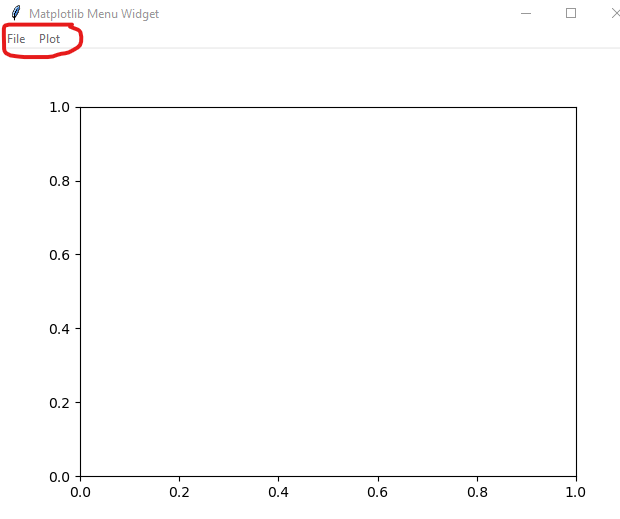
Display of plot info

Use Cases
The following are the use cases of the menu widget of the matplotlib library using Tkinter library.
File Operations − Use the menu to open files, save plots or perform various file-related operations.
Plotting Options − Provide options in the menu to trigger different types of plots or visualize different datasets.
Custom Actions − Implement custom actions in the menu for specific tasks relevant to our application.
Integration with Matplotlib Widgets − Combine the menu with other Matplotlib widgets for more interactive visualizations.
Customization
Menu Appearance − Customize the appearance of menus, menu items and cascades using options like tearoff, font, background and foreground.
Integration with Matplotlib Styles − We can integrate Matplotlib styles to maintain a consistent appearance across our Matplotlib plots and Tkinter GUI.
Matplotlib - Mouse Cursor
Introduction
Matplotlib itself does not have a specific Mouse Cursor widget but however Matplotlib library provides various mechanisms to interact with the mouse cursor by allowing developers to enhance the interactivity of plots. Let's explore these aspects in detail.
Developers can leverage these events to enhance the interactivity of plots, track cursor positions and respond to user actions in a customized manner. The ability to change cursor styles further enriches the user experience when exploring data visualizations.
Handling Mouse Events in Matplotlib
Matplotlib provides the mpl_connect function, which allows us to connect callback functions to various events such as mouse events. This functionality enables us to capture mouse movements, clicks and other interactions within our Matplotlib plots.
Matplotlib offers event handling for mouse interactions which allows us to capture mouse-related events such as button clicks, mouse motion and scrolling. This capability is essential for creating interactive plots.
The below are the common mouse events in Matplotlib library lets see them.
button_press_event and button_release_event
The button_press_event is triggered when a mouse button is pressed and the button_release_event is triggered when a mouse is released. We can use them to capture the state of the mouse buttons.
motion_notify_event
This event is triggered when the mouse is moved. It's useful for tracking the mouse cursor's position and updating the plot accordingly.
scroll_event
This event is triggered when the mouse scroll wheel is used. It allows us to respond to scrolling actions.
Retrieving Cursor Coordinates
To obtain the coordinates of the mouse cursor within a plot we can use the event.xdata and event.ydata attributes which represent the data coordinates corresponding to the cursor position. The motion_notify_event is commonly used for tracking mouse movements.
Example - Displaying Cursor Coordinates
To display the cursor coordinates we can use the two functions on_mouse_move() and fig.canvas.mpl_connect() combinedly.
on_mouse_move(event) − This function is triggered on mouse movement. It checks if the cursor is within the plot event.inaxes and then prints the cursor coordinates.
fig.canvas.mpl_connect('motion_notify_event', on_mouse_move) − This line connects the mouse movement event to the on_mouse_move function.
Here in this example we are displaying the cursor coordinates of a matplotlib plot.
import matplotlib.pyplot as plt
# Function to be triggered on mouse movement
def on_mouse_move(event):
if event.inaxes:
x_cursor, y_cursor = event.xdata, event.ydata
print(f"Cursor at x={x_cursor}, y={y_cursor}")
# Creating a figure and axes
fig, ax = plt.subplots()
# Displaying a plot (for illustration)
ax.scatter([1, 2, 3], [4, 5, 6])
# Connecting the mouse movement event to the on_mouse_move function
fig.canvas.mpl_connect('motion_notify_event', on_mouse_move)
plt.show()
Output
Cursor at x=2.2306451612903224, y=5.127380952380952 Cursor at x=2.23508064516129, y=5.127380952380952 Cursor at x=2.23508064516129, y=5.121428571428572 Cursor at x=2.239516129032258, y=5.121428571428572 Cursor at x=2.2439516129032255, y=5.121428571428572 Cursor at x=2.2483870967741932, y=5.121428571428572 Cursor at x=2.2483870967741932, y=5.1154761904761905 Cursor at x=2.2528225806451614, y=5.1154761904761905 Cursor at x=2.257258064516129, y=5.1154761904761905 ---------------------------------------------------- ---------------------------------------------------- Cursor at x=2.0, y=5.591666666666667 Cursor at x=2.013306451612903, y=5.728571428571429 Cursor at x=2.013306451612903, y=5.817857142857143 Cursor at x=2.013306451612903, y=5.895238095238096 Cursor at x=2.013306451612903, y=5.966666666666667 Cursor at x=2.0044354838709677, y=6.026190476190476 Cursor at x=1.9955645161290323, y=6.085714285714285 Cursor at x=2.9314516129032255, y=4.014285714285714
Example - Responding to Mouse Clicks
We can also respond to mouse clicks using the button_press_event or button_release_event events.
import matplotlib.pyplot as plt
# Function to be triggered on mouse click
def on_mouse_click(event):
if event.inaxes:
x_click, y_click = event.xdata, event.ydata
print(f"Mouse clicked at x={x_click}, y={y_click}")
# Creating a figure and axes
fig, ax = plt.subplots()
# Displaying a plot (for illustration)
ax.plot([1, 2, 3], [4, 5, 6])
# Connecting the mouse click event to the on_mouse_click function
fig.canvas.mpl_connect('button_press_event', on_mouse_click)
plt.show()
Output

Mouse clicked at x=0.9975806451612903, y=4.002380952380952 Mouse clicked at x=0.9354838709677418, y=5.9904761904761905
Example - Creating Custom Mouse Cursors
While Matplotlib doesn't provide a specific Mouse Cursor widget we can create custom visualizations or annotations at the cursor position to simulate a cursor effect. For instance we can use the annotate function to display information dynamically as the cursor moves.
In this example the annotate() function is used to dynamically display cursor coordinates as the mouse moves. The plt.draw() method is called to update the plot in real-time.
import matplotlib.pyplot as plt
# Function to be triggered on mouse movement
def on_mouse_move(event):
if event.inaxes:
x_cursor, y_cursor = event.xdata, event.ydata
ax.annotate(f'Cursor at x={x_cursor:.2f}, y={y_cursor:.2f}',
xy=(x_cursor, y_cursor), xytext=(10, 10),
textcoords='offset points', ha='left', va='bottom',
bbox=dict(boxstyle='round,pad=0.3', edgecolor='black', facecolor='white'))
plt.draw()
# Creating a figure and axes
fig, ax = plt.subplots()
# Displaying a plot (for illustration)
ax.plot([1, 2, 3], [4, 5, 6])
# Connecting the mouse movement event to the on_mouse_move function
fig.canvas.mpl_connect('motion_notify_event', on_mouse_move)
plt.show()
Output
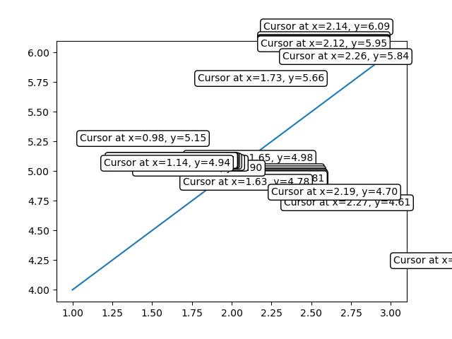
Use Cases
The following are the use cases of the mouse widgets.
Interactive Data Exploration − Tracking the mouse cursor position allows users to interactively explore data points on a plot.
Coordinate Selection − By capturing mouse clicks we can enable users to select specific coordinates or regions of interest.
Custom Interactions − Utilizing mouse events we can implement custom interactions based on user actions such as highlighting data points or triggering specific functions.
Matplotlib - Multicursor
Introduction
Matplotlib does not have a dedicated Multicursor widget. However Matplotlib provides the Cursor widget which can be used to add a cursor to a plot for displaying information at a specific location. Additionally the matplotlib.widgets module offers a tool called MultiCursor that allows us to have multiple cursor lines in a single plot. This can be useful for comparing values at different points along the x-axis.
Let's explore how to use the MultiCursor tool along with the Cursor widget in Matplotlib and discuss its features, implementation and potential use cases.
Features of MultiCursor
The following are the features of the Multicursor widget.
Multiple Cursors − The MultiCursor tool in Matplotlib allows us to add multiple cursor lines to a single plot. Each cursor line corresponds to a specific set of axes.
Coordination between Cursors − The cursors are linked i.e. they move together when interacting with one of them. This facilitates easy comparison of data points across different axes.
Customizable Appearance − The appearance of the cursors such as line color and linestyle can be customized based on our preferences.
Dynamic Data Display − As we move the cursors along the x-axis the corresponding y-values at the cursor position are dynamically displayed by providing real-time information.
Example - Basic Cursor Example
Here's a basic example demonstrating the usage of the Cursor class.
import matplotlib.pyplot as plt from matplotlib.widgets import Cursor import numpy as np # Generating sample data x = np.linspace(0, 10, 100) y = np.sin(x) # Creating a plot fig, ax = plt.subplots() line, = ax.plot(x, y, label='Sine Wave') # Adding a cursor to the plot cursor = Cursor(ax, horizOn=True, vertOn=True, useblit=True, color='red', linewidth=1) # Displaying the plot plt.show()
Output
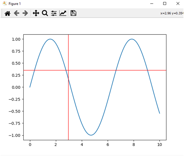
Example - Using mplcursors for Multicursor
To implement a multicursor in Matplotlib we can use the mplcursors package which provides additional cursor functionalities. We can install the mplcursors package by using the below line of code.
pip install mplcursors
Output
Collecting mplcursors
Downloading mplcursors-0.5.3.tar.gz (88 kB)
-------------------------------------- 88.8/88.8 kB 557.3 kB/s eta 0:00:00
Installing build dependencies: started
Installing build dependencies: finished with status 'done'
Getting requirements to build wheel: started
Getting requirements to build wheel: finished with status 'done'
Installing backend dependencies: started
Installing backend dependencies: finished with status 'done'
Preparing metadata (pyproject.toml): started
Preparing metadata (pyproject.toml): finished with status 'done'
Example - Usage of mplcursors
Now let's explore an example using mplcursors to create a multicursor in Matplotlib.
import matplotlib.pyplot as plt
import mplcursors
import numpy as np
# Generate sample data
x = np.linspace(0, 10, 100)
y1 = np.sin(x)
y2 = np.cos(x)
# Create subplots
fig, (ax1, ax2) = plt.subplots(2, 1, sharex=True, figsize=(8, 6))
# Plot data on the first subplot
ax1.plot(x, y1, label='Sin(x)')
ax1.set_ylabel('Amplitude')
ax1.legend()
# Plot data on the second subplot
ax2.plot(x, y2, label='Cos(x)')
ax2.set_xlabel('x')
ax2.set_ylabel('Amplitude')
ax2.legend()
# Enable multicursor on both subplots
mplcursors.cursor(hover=True, multiple=True)
# Display the plot
plt.show()
Output
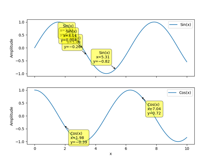
Extending to Multi-Cursor
To extend this concept to a true multi-cursor scenario where multiple cursors move independently we would need to create separate instances of the Cursor class for each line or data source and update the information accordingly.
Use Cases for Multicursor
The following are the use cases of the multicursor widget usage.
Comparative Analysis − Multicursors are beneficial when comparing corresponding data points between different plots which aids in visualizing relationships.
Time Series Exploration − For time series data the multicursors allow simultaneous inspection of values at specific time points across multiple time series.
Interactive Data Exploration − Multicursors enhance the interactivity of data visualizations by allowing users to explore data points across different dimensions.
Correlation Analysis − When studying the correlation between two or more variables then multicursors assist in identifying patterns and correlations.
Matplotlib - Polygon Selector
Introduction
Matplotlib does not have a dedicated Polygon Selector widget. However Matplotlib does provide a mechanism for handling mouse events and we can implement a custom polygon selection functionality using these event-handling capabilities.
Matplotlib allows us to capture mouse events such as button clicks, mouse movements, and releases. We can leverage these events to implement a polygon selection tool where users can interactively draw a polygon around the desired data points.
Key Concepts
The following the key concepts of the polygon selector widget.
Event Handling in Matplotlib
Matplotlib provides a flexible event-handling system that allows us to capture user interactions with the plot. Common events include mouse clicks, key presses and motion.
Path Class
The Path class in the matplotlib.path module represents a series of connected line and curve segments that can be used to define shapes such as polygons. We'll use it to define and check whether a point is inside the selected polygon.
Use Cases and Extensions
The following are the use cases and extensions of the polygon selector widget.
- Region Selection − The custom Polygon Selector can be used to define and select specific regions of interest in a plot by allowing users to focus on particular areas of data.
- Data Filtering − The selected polygon points can be used to filter and analyze specific subsets of data within the plotted dataset.
- Integration with Callbacks − We can extend the functionality by integrating callback functions that respond to the selection of a polygon by allowing for custom actions or analyses based on the selected region.
- Dynamic Visualization − Implementing dynamic visualization updates such as highlighting points within the polygon and can enhance the user experience.
Customization
We can enhance and customize the polygon selector based on specific needs. For instance we can add functionality to clear the current polygon dynamically update the plot based on the selected region or integrate it into a larger interactive application.
Implementation Steps
Now let's go through the steps to create a basic example of a custom polygon selector in Matplotlib.
Import Necessary Libraries
First we have to import Matplotlib and NumPy libraries for plotting and array manipulation.
import matplotlib.pyplot as plt import numpy as np
Define Polygon Selector Class
After importing the necessary libraries we have to create a class that handles mouse events and allows users to draw a polygon.
class PolygonSelector:
def __init__(self, ax):
self.ax = ax
self.polygon = None
self.vertices = []
self.cid_press = ax.figure.canvas.mpl_connect('button_press_event', self.on_press)
self.cid_release = ax.figure.canvas.mpl_connect('button_release_event', self.on_release)
self.cid_motion = ax.figure.canvas.mpl_connect('motion_notify_event', self.on_motion)
Define Event Callbacks
We have to define the event callbacks to implement methods for handling mouse press, release and motion events.
def on_press(self, event):
if event.inaxes != self.ax:
return
if event.button == 1: # Left mouse button
if self.polygon is None:
self.polygon = plt.Polygon([event.xdata, event.ydata], closed=False, fill=None, edgecolor='r')
self.ax.add_patch(self.polygon)
self.vertices.append((event.xdata, event.ydata))
else:
self.vertices.append((event.xdata, event.ydata))
def on_release(self, event):
if event.inaxes != self.ax:
return
if event.button == 1: # Left mouse button
if len(self.vertices) > 2:
self.vertices.append(self.vertices[0]) # Closing the polygon
self.polygon.set_xy(np.array(self.vertices))
plt.draw()
def on_motion(self, event):
if event.inaxes != self.ax:
return
if event.button == 1 and self.polygon is not None:
self.vertices[-1] = (event.xdata, event.ydata)
self.polygon.set_xy(np.array(self.vertices))
plt.draw()
Create a Plot
Next we have to generate sample data and create a plot to that generated data.
x = np.random.rand(50) y = np.random.rand(50) fig, ax = plt.subplots() ax.scatter(x, y)
Initialize Polygon Selector and display the plot
Now instantiate the PolygonSelector class with the plot's axes, then display the plot.
polygon_selector = PolygonSelector(ax) plt.show()
Now lets combine all the above mentioned steps together.
Output
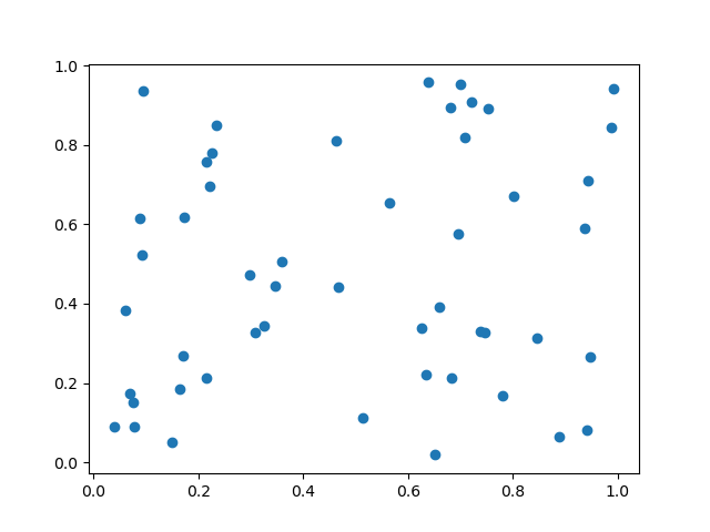
Example - Usage of Polygon Selector
import matplotlib.pyplot as plt
from matplotlib.patches import Polygon
from matplotlib.backend_bases import PickEvent
import numpy as np
class PolygonSelector:
def __init__(self, ax):
self.ax = ax
self.points = []
self.polygon = None
self.cid_click = ax.figure.canvas.mpl_connect('button_press_event', self.on_click)
self.cid_key = ax.figure.canvas.mpl_connect('key_press_event', self.on_key_press)
def on_click(self, event):
if event.inaxes == self.ax:
if event.button == 1: # Left mouse button
self.points.append((event.xdata, event.ydata))
self.update_polygon()
def on_key_press(self, event):
if event.key == 'enter':
print("Polygon points:", self.points)
self.reset_polygon()
def update_polygon(self):
if self.polygon:
self.polygon.remove()
if len(self.points) > 2:
self.polygon = Polygon(self.points, edgecolor='red', alpha=0.2, closed=True)
self.ax.add_patch(self.polygon)
self.ax.figure.canvas.draw()
def reset_polygon(self):
self.points = []
if self.polygon:
self.polygon.remove()
self.ax.figure.canvas.draw()
# Create a scatter plot with random data
np.random.seed(42)
x_data = np.random.rand(50)
y_data = np.random.rand(50)
fig, ax = plt.subplots()
ax.scatter(x_data, y_data)
# Initialize the PolygonSelector
polygon_selector = PolygonSelector(ax)
plt.show()
Output
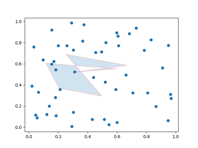
Example - Polygon Selector
Here this is another example of creating the polygon selector on a matpltlib plot.
import matplotlib.pyplot as plt
from matplotlib.patches import Polygon
from matplotlib.backend_bases import PickEvent
import numpy as np
class PolygonSelector:
def __init__(self, ax):
self.ax = ax
self.points = []
self.polygon = None
self.highlighted_points = None
self.cid_click = ax.figure.canvas.mpl_connect('button_press_event', self.on_click)
self.cid_key = ax.figure.canvas.mpl_connect('key_press_event', self.on_key_press)
def on_click(self, event):
if event.inaxes == self.ax:
if event.button == 1: # Left mouse button
self.points.append((event.xdata, event.ydata))
self.update_polygon()
def on_key_press(self, event):
if event.key == 'enter':
self.highlight_points_inside_polygon()
self.reset_polygon()
def update_polygon(self):
if self.polygon:
self.polygon.remove()
if len(self.points) > 2:
self.polygon = Polygon(self.points, edgecolor='red', alpha=0.2, closed=True)
self.ax.add_patch(self.polygon)
self.ax.figure.canvas.draw()
def reset_polygon(self):
self.points = []
if self.polygon:
self.polygon.remove()
self.ax.figure.canvas.draw()
def highlight_points_inside_polygon(self):
if self.highlighted_points:
for point in self.highlighted_points:
point.set_markersize(5)
self.highlighted_points = []
if self.polygon:
path = self.polygon.get_path()
points_inside_polygon = self.ax.plot([], [], 'o', markersize=8, markerfacecolor='yellow')[0]
for i in range(len(self.ax.collections)):
if isinstance(self.ax.collections[i], PickEvent):
xs, ys = self.ax.collections[i].get_offsets().T
points_inside = path.contains_points(np.column_stack((xs, ys)))
self.highlighted_points.extend(
self.ax.plot(
xs[points_inside], ys[points_inside], 'o', markersize=8, markerfacecolor='yellow'))
self.ax.figure.canvas.draw()
# Create a scatter plot with random data
np.random.seed(42)
x_data = np.random.rand(50)
y_data = np.random.rand(50)
fig, ax = plt.subplots()
ax.scatter(x_data, y_data)
# Initialize the PolygonSelector
polygon_selector = PolygonSelector(ax)
plt.show()
Output
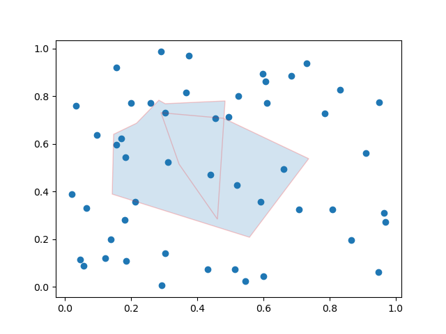
Example - Fill an area within a polygon
In this example we are filling the area within a polygon using the matplotlib library.
import matplotlib.pyplot as plt from matplotlib.collections import PatchCollection from matplotlib.patches import Polygon import numpy as np plt.rcParams["figure.figsize"] = [7.50, 3.50] plt.rcParams["figure.autolayout"] = True fig, ax = plt.subplots(1) polygon = Polygon(np.random.rand(6, 2), closed=True, alpha=1) collection = PatchCollection([polygon]) ax.add_collection(collection) plt.show()
Output
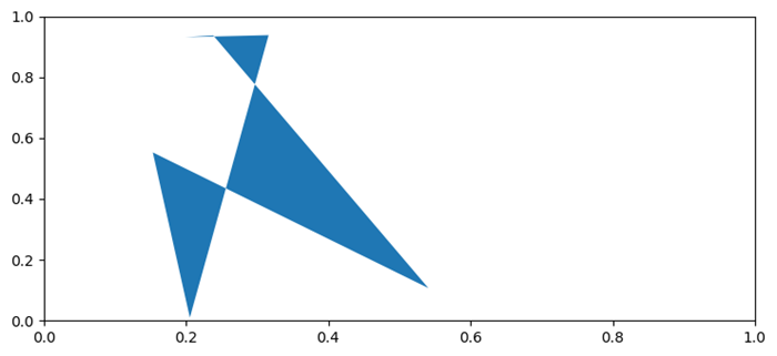
Note − To Draw the Polygon on the plot drag the cursor and the values of the coordinates will be varied as per the user selection.
Matplotlib - Radio Button
Introduction
Matplotlib provides the RadioButtons widget in the matplotlib.widgets module for creating radio button groups in plots. Radio buttons are commonly used in graphical user interfaces to allow users to choose one option from a set of mutually exclusive options. In Matplotlib library RadioButtons offer a way to integrate this interactive element directly into a plot.
Now we will explore the key features, implementation detail and use cases of RadioButtons in Matplotlib library.
Key Features
The following are the key features of the Radiobuttons widget of the matplotlib library.
Mutually Exclusive Options − RadioButtons allow users to choose only one option from a set of mutually exclusive options. When one radio button is selected the others in the group are automatically deselected.
Integration with Callback Functions − The widget is often used in conjunction with callback functions. These functions are executed when a radio button is clicked by allowing developers to define custom actions based on the user's selection.
Customizable Appearance − RadioButtons provide customization options for appearance such as the label text, color and layout. This allows developers to align the appearance of radio buttons with the overall design of the plot.
Implementation of the Radiobuttons on a plot
Let's walk through a basic example to illustrate the implementation of RadioButtons in Matplotlib library. In this example we'll create a simple plot with two radio buttons and the plot will be updated based on the selected option.
The following is the explaination of the important functions and modules used in the below example.
plot_function − This is a simple function that generates random data around a sine wave. The line style of this function will be modified based on the selected radio button.
radio_callback − This function is called when a radio button is clicked. It sets the line style of the plotted function based on the selected option and redraws the plot.
RadioButtons(rax, ('solid', 'dashed', 'dashdot', 'dotted'), active=0) − This line creates the RadioButtons widget specifying the axes (rax), the labels for the line styles, and the initially selected line style (index 0).
radio_buttons.on_clicked(radio_callback) − This line connects the on_clicked event of the RadioButtons to the radio_callback function. The radio_callback function is called when a radio button is clicked.
Example - Usage of Radio Buttons
import matplotlib.pyplot as plt
from matplotlib.widgets import RadioButtons
import numpy as np
# Function to be triggered by radio button selection
def radio_callback(label):
ax.clear() # Clear the axes for updating the plot
ax.plot(x, plot_function(x, label), label=label, linestyle=label)
ax.legend()
plt.draw() # Redraw the plot
# Function to generate random data around a sine wave
def plot_function(x, label):
return np.sin(x) + np.random.normal(scale=0.1, size=x.shape)
# Create a figure and axes
fig, ax = plt.subplots()
# Generate x values
x = np.linspace(0, 2 * np.pi, 100)
# Create RadioButtons
radio_ax = plt.axes([0.05, 0.5, 0.15, 0.15])
radio_buttons = RadioButtons(radio_ax, ('solid', 'dashed', 'dashdot', 'dotted'), active=0)
# Connect the radio buttons to the callback function
radio_buttons.on_clicked(radio_callback)
# Initialize the plot with the initial line style
radio_callback('solid')
plt.show()
Output
When Solid radio button selected
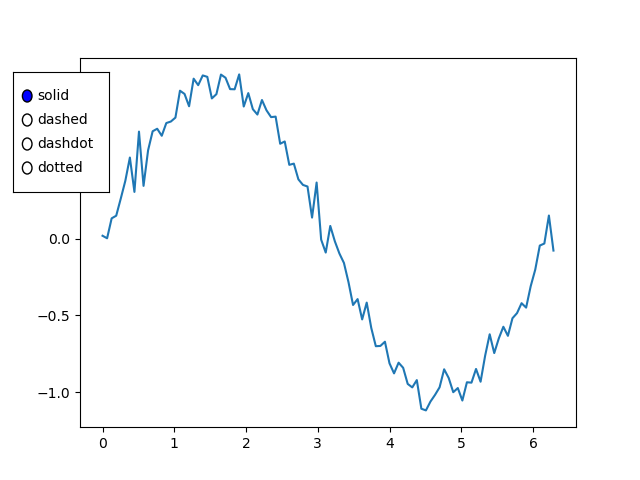
When dashed radio button selected
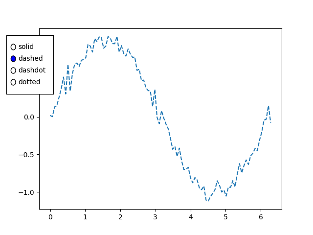
When dashdot radio button selected
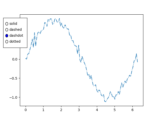
When dotted radio button selected
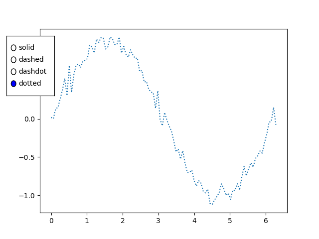
Use Cases
The below are the use cases of the radio buttons widget of the matplotli library.
Data Filtering − Radio buttons can be used to filter and display different subsets of data in a plot. Each option corresponds to a specific set of data and selecting an option updates the plot accordingly.
Parameter Selection − Radio buttons are useful for selecting different parameters or configurations in a visualization. For example we might use radio buttons to toggle between linear and logarithmic scales.
Interactive Control − Incorporating radio buttons adds interactive control to the plot by allowing users to dynamically change settings or switch between different views.
Scenario-based Visualization − In scenarios where the data can be presented in different ways such as different chart types or representations, radio buttons help users quickly switch between options.
Customization
Label and Color Customization:
We can customize the labels and colors of the radio buttons to match the design of our plot. This can be achieved by providing appropriate arguments when creating the RadioButtons widget.
Layout Customization:
Adjusting the layout of radio buttons as demonstrated in the example which allows us to control their position within the plot area.
Matplotlib - Range Slider
Introduction
Matplotlib library itself does not provide a RangeSlider widget as part of its standard set of widgets. However it's worth noting that external libraries or interactive tools built on top of Matplotlib such as matplotlib-widgets or other custom implementations which may offer range slider functionality.
A range slider is a graphical user interface (GUI) element commonly used to specify a range of values by dragging two sliders. Each slider represents an endpoint of the range and the area between the sliders represents the selected range.
Given that a RangeSlider is not a native part of Matplotlib here we will provide a conceptual explanation of how a RangeSlider might work and some potential use cases.
Key Features of a RangeSlider
The following are the key features of a range slider of the matplotlib.widgets library.
Dual Slider Interaction − A RangeSlider typically consists of two sliders that can be independently moved along a linear track. The position of each slider represents the selected range's lower and upper bounds.
Real-time Feedback − As the sliders are moved there is real-time feedback visually indicating the selected range. This interactive aspect allows users to precisely choose the desired range.
Integration with Plots − Range sliders are often integrated into plots or charts to dynamically filter or highlight data within a specific range. For example users might want to zoom in on a specific time period in a time-series plot.
Callback Functions − The RangeSlider is associated with callback functions that are triggered when the sliders are moved. These callbacks enable developers to respond to user interactions and update the plot or perform other actions accordingly.
Example - Conceptual Implementation
Here's a conceptual explanation of how a RangeSlider might be implemented using Matplotlib's event handling and interactive features.
In this conceptual example we have used some important modules and functions lets see them in detail
generate_data − This function generates some sample data (x, y) to be used for plotting.
update − This function is called whenever the sliders are moved. It updates the plot based on the selected range.
Slider − Two sliders i.e. slider_lower and slider_upper are created to represent the lower and upper bounds of the selected range.
The initial plot is created and displayed and users can interactively adjust the range using the sliders.
import matplotlib.pyplot as plt
from matplotlib.widgets import Slider
# Function to generate sample data
def generate_data():
x = range(100)
y = [val for val in x]
return x, y
# Function to update the plot based on the selected range
def update(val):
lower_val = slider_lower.val
upper_val = slider_upper.val
selected_x = x[lower_val:upper_val]
selected_y = y[lower_val:upper_val]
ax.clear()
ax.plot(x, y, label='Original Data')
ax.plot(selected_x, selected_y, label='Selected Range', color='orange')
ax.legend()
ax.set_title(f'Selected Range: {lower_val} to {upper_val}')
# Generate sample data
x, y = generate_data()
# Create a figure and axes
fig, ax = plt.subplots()
plt.subplots_adjust(bottom=0.25)
# Define initial range
initial_lower = 0
initial_upper = 20
# Create sliders
ax_lower = plt.axes([0.1, 0.1, 0.65, 0.03])
ax_upper = plt.axes([0.1, 0.05, 0.65, 0.03])
slider_lower = Slider(ax_lower, 'Lower', 0, len(x) - 1, valinit=initial_lower, valstep=1)
slider_upper = Slider(ax_upper, 'Upper', 0, len(x) - 1, valinit=initial_upper, valstep=1)
# Connect sliders to the update function
slider_lower.on_changed(update)
plt.show()
Output
Initial plot
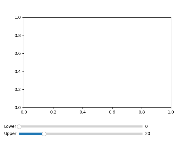
Selected range plot
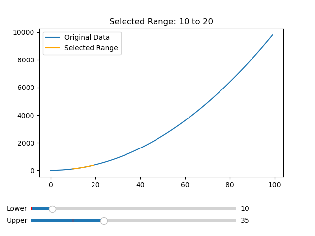
Example - Dynamic selection
In this example we are selecting the data values using the slider dynamically.
import matplotlib.pyplot as plt
from matplotlib.widgets import Slider
import numpy as np
# Function to generate data for the plot
def generate_data(start, end):
x = np.linspace(start, end, 100)
y = np.sin(x)
return x, y
# Function to update the plot based on the selected range
def update_plot(val):
lower_val = slider_lower.val
upper_val = slider_upper.val
x, y = generate_data(lower_val, upper_val)
line.set_data(x, y)
ax.relim()
ax.autoscale_view()
plt.draw()
# Create a figure and axes
fig, ax = plt.subplots()
plt.subplots_adjust(bottom=0.25)
# Initial range
initial_lower = 0
initial_upper = 10
# Create sliders
ax_lower = plt.axes([0.1, 0.1, 0.65, 0.03])
ax_upper = plt.axes([0.1, 0.05, 0.65, 0.03])
slider_lower = Slider(ax_lower, 'Lower', 0, 20, valinit=initial_lower)
slider_upper = Slider(ax_upper, 'Upper', 0, 20, valinit=initial_upper)
# Connect sliders to the update function
slider_lower.on_changed(update_plot)
slider_upper.on_changed(update_plot)
# Generate initial data and plot
x_initial, y_initial = generate_data(initial_lower, initial_upper)
line, = ax.plot(x_initial, y_initial)
ax.set_xlabel('X-axis')
ax.set_ylabel('Y-axis')
ax.set_title('Dynamic Plot based on RangeSlider')
plt.show()
Output
Intital plot
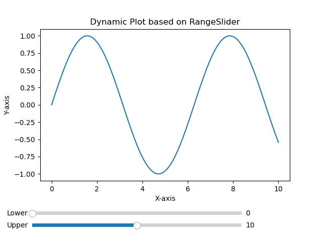
Dynamic selection plot
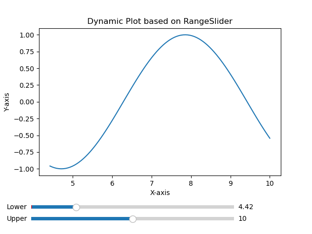
Use Cases
The below are the use cases of the Range slider of the matplotlib library.
Zooming and Selection − Range sliders are commonly used in scenarios where users need to zoom in on specific regions of a plot or select a range of values within a dataset.
Time-Series Filtering − In time-series data range sliders allow users to filter data based on a specific time range by enabling a closer examination of trends or anomalies.
Data Exploration − Range sliders facilitate interactive data exploration by allowing users to dynamically adjust the visible range and focus on specific portions of the data.
Parameter Adjustment − For plots representing parameterized functions or simulations, range sliders can control the range of parameter values providing a dynamic way to observe changes in the output.
Matplotlib - Rectangle Selector
Introduction
Matplotlib library does not have a built-in RectangleSelector widget. However we can implement similar functionality using Matplotlib's event handling mechanisms. A RectangleSelector typically allows users to draw a rectangle on a plot and the data points within the rectangle are selected.
Key Concepts of a Rectangle Selector
The following are the key concepts of a Rectangule selector.
- User Interaction − A RectangleSelector provides a way for users to interactively draw a rectangle on a plot by clicking and dragging the mouse.
- Data Selection − The primary purpose of a RectangleSelector is to select a subset of data points within the drawn rectangle. This is valuable for tasks such as data exploration and analysis.
- Event Handling − The implementation involves handling mouse events such as button presses and releases to track the coordinates of the drawn rectangle.
Use Cases
The following are the use cases of RectangularSelector widgets.
- Data Subsetting − A RectangleSelector is useful for selecting and analyzing a subset of data points within a larger dataset.
- Data Exploration − Users can interactively explore different regions of a plot to understand patterns or trends in specific areas.
- Interactive Dashboards − For interactive dashboards or applications a RectangleSelector can be integrated to allow users to dynamically select and analyze data.
- Region of Interest (ROI) Selection − In scientific or engineering applications users might want to define a region of interest for further investigation.
Implementation Steps
To implement a custom Rectangle Selector in Matplotlib we can typically follow these steps.
- Enable Mouse Events − Matplotlib allows us to capture mouse events such as button presses, releases and motion. We need to enable these events to track the user's interactions.
- Capture Mouse Press Event − When the user clicks the mouse button to start drawing the rectangle it capture the initial mouse position.
- Capture Mouse Motion Event − As the user moves the mouse capture the current position to dynamically update the size of the rectangle being drawn.
- Capture Mouse Release Event − When the user releases the mouse button it finalizes the rectangle's position and size.
- Highlight or Select Data Points − Determine the data points within the selected rectangle and perform any necessary actions such as highlighting, selecting or zooming into the selected region.
Example - Usage of Custom Rectangle Selector
Heres another example of using the all the implementation steps defined above.
import matplotlib.pyplot as plt
from matplotlib.patches import Rectangle
class RectangleSelector:
def __init__(self, ax):
self.ax = ax
self.start_point = None
self.rect = None
self.cid_press = ax.figure.canvas.mpl_connect('button_press_event', self.on_press)
self.cid_release = ax.figure.canvas.mpl_connect('button_release_event', self.on_release)
self.cid_motion = ax.figure.canvas.mpl_connect('motion_notify_event', self.on_motion)
def on_press(self, event):
if event.inaxes == self.ax:
self.start_point = (event.xdata, event.ydata)
self.rect = Rectangle(self.start_point, 0, 0, edgecolor='red', alpha=0.2)
self.ax.add_patch(self.rect)
def on_motion(self, event):
if self.start_point is not None and event.inaxes == self.ax:
width = event.xdata - self.start_point[0]
height = event.ydata - self.start_point[1]
self.rect.set_width(width)
self.rect.set_height(height)
self.ax.figure.canvas.draw()
def on_release(self, event):
if self.start_point is not None:
# Determine the data points within the rectangle and perform actions as needed
selected_data = self.get_data_within_rectangle()
print("Selected Data:", selected_data)
self.start_point = None
self.rect.remove()
self.ax.figure.canvas.draw()
def get_data_within_rectangle(self):
# Placeholder function to determine data points within the rectangle
# Implement logic to identify data points based on the rectangle's coordinates
return [(1, 2), (3, 4)] # Example data points
# Create a scatter plot with random data
import numpy as np
np.random.seed(42)
x_data = np.random.rand(50)
y_data = np.random.rand(50)
fig, ax = plt.subplots()
ax.scatter(x_data, y_data)
# Initialize the RectangleSelector
rect_selector = RectangleSelector(ax)
plt.show()
Output
Selected Data: [(1, 2), (3, 4)]
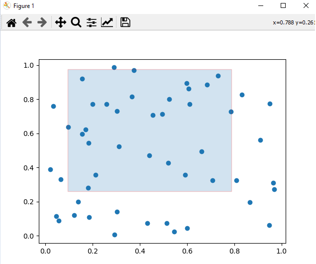
Considerations for Implementation
While we are implementing the RectangularSelector on a plot we have to consider the below mentioned points.
Callback Function − The callback function should handle the selected data or trigger specific actions based on the selected region.
Customization − The RectangleSelector can be customized to suit specific requirements such as changing the appearance of the rectangle or setting minimum span constraints.
Performance − Depending on the size of the dataset the performance of the implementation may vary. For large datasets optimizations might be necessary.
Example - Usage of built-in Rectangle Selector
Here's an example of how we can implement a simple RectangleSelector like functionality in Matplotlib.
In this example we are using the functions onselect and RectangleSelector() to create a rectangularselector.
onselect() − This function is triggered when the user finishes drawing the rectangle. It prints the coordinates of the selected rectangle.
RectangleSelector() − The RectangleSelector is created by specifying the axes ax, the callback function onselect, the draw type box(default) for rectangle and additional parameters for customization.
import matplotlib.pyplot as plt
from matplotlib.widgets import RectangleSelector
import numpy as np
# Sample data
np.random.seed(42)
x_data = np.random.rand(100)
y_data = np.random.rand(100)
# Function to be triggered on rectangle selection
def onselect(eclick, erelease):
x1, y1 = eclick.xdata, eclick.ydata
x2, y2 = erelease.xdata, erelease.ydata
print(f"Selected rectangle coordinates: ({x1}, {y1}) to ({x2}, {y2})")
# Create a scatter plot
fig, ax = plt.subplots()
ax.scatter(x_data, y_data)
# Define the RectangleSelector
rect_selector = RectangleSelector(ax, onselect, useblit=True, button=[1], minspanx=5, minspany=5, spancoords='pixels')
plt.show()
Output
Selected rectangle coordinates: (0.23518152400439746, 0.6559523809523811) to (0.6729136329804333, 1.05)
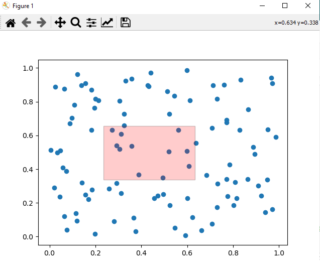
Note − To Draw the rectangle on the plot drag the cursor and the values of the coordinates will be varied as per the user selection.
Matplotlib - Ellipse Selector
Introduction
Matplotlib does not have a direct built-in Ellipse Selector widget but we can achieve the similar functionality by implementing a custom Ellipse Selector using Matplotlib's event handling capabilities.
Concept of Ellipse Selector
An ellipse selector is an interactive tool that allows users to draw and select data points within an elliptical region. This tool is particularly useful when exploring datasets or images and wanting to focus on a specific area of interest defined by an ellipse.
Key Features of an Ellipse Selector
The below are the key features of an Ellipse Selector.
Interactive Selection − An Ellipse Selector allows users to interactively define and modify an elliptical region within a plot. This is valuable for selecting specific areas of interest in data visualizations.
Dynamic Updates − As users drag or resize the ellipse the selected region dynamically updates. Real-time feedback enhances the user experience and allows for precise selection.
Integration with Plots − The Ellipse Selector is typically integrated into Matplotlib plots by enabling users to visually inspect and interact with data points within the selected ellipse.
Implementation Approaches
Creating an Ellipse Selector involves capturing mouse events to define and update the elliptical region. Below are two potential approaches for implementing an Ellipse Selector in Matplotlib.
Example - Using matplotlib.patches.Ellipse
We can leverage the Ellipse patch in Matplotlib to visually represent the Ellipse Selector. The idea is to handle mouse events to define the ellipse's center, width, height and rotation.
import matplotlib.pyplot as plt
from matplotlib.patches import Ellipse
import numpy as np
class EllipseSelector:
def __init__(self, ax):
self.ax = ax
self.ellipse = None
self.cid_press = ax.figure.canvas.mpl_connect('button_press_event', self.on_press)
self.cid_release = ax.figure.canvas.mpl_connect('button_release_event', self.on_release)
self.cid_motion = ax.figure.canvas.mpl_connect('motion_notify_event', self.on_motion)
def on_press(self, event):
if event.inaxes == self.ax:
center = (event.xdata, event.ydata)
self.ellipse = Ellipse(center, 1, 1, edgecolor='red', alpha=0.5)
self.ax.add_patch(self.ellipse)
def on_release(self, event):
self.ellipse = None
def on_motion(self, event):
if self.ellipse:
width = event.xdata - self.ellipse.center[0]
height = event.ydata - self.ellipse.center[1]
self.ellipse.width = width
self.ellipse.height = height
self.ax.figure.canvas.draw()
# Create a scatter plot with random data
np.random.seed(42)
x_data = np.random.rand(50)
y_data = np.random.rand(50)
fig, ax = plt.subplots()
ax.scatter(x_data, y_data)
# Initialize the EllipseSelector
ellipse_selector = EllipseSelector(ax)
plt.show()
Output
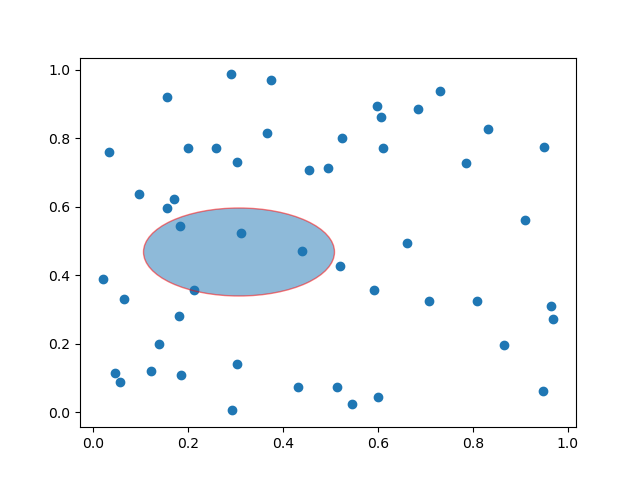
Example - Using matplotlib.widgets (Custom Widget)
Another approach involves creating a custom widget using matplotlib.widgets to encapsulate the Ellipse Selector's logic. This approach might offer a more modular solution.
import matplotlib.pyplot as plt
from matplotlib.widgets import EllipseSelector
import numpy as np
# Function to be triggered when the ellipse is selected
def on_select(eclick, erelease):
print(f"Selected Ellipse: Center={eclick.xdata, eclick.ydata}, Width={abs(erelease.xdata - eclick.xdata)}, Height={abs(erelease.ydata - eclick.ydata)}")
# Create a scatter plot with random data
np.random.seed(42)
x_data = np.random.rand(50)
y_data = np.random.rand(50)
fig, ax = plt.subplots()
ax.scatter(x_data, y_data)
# Create Ellipse Selector
ellipse_selector = EllipseSelector(ax, on_select, props=dict(facecolor='red', edgecolor='red', alpha=0.5))
plt.show()
Output
Selected Ellipse: Center=(0.17951154118643367, 0.2584893480158592), Width=0.3678226677251435, Height=0.5797088949246063
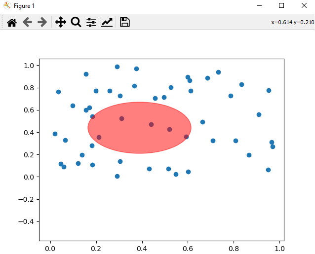
Use Cases and Considerations
The following are the use cases and considerations of the Ellipse Selector widget.
Data Region Selection − Ellipse Selectors are useful for selecting specific regions of interest within scatter plots or other types of data visualizations.
Data Analysis − Users can utilize Ellipse Selectors to visually analyze and interpret patterns or clusters of data points within the selected elliptical region.
Integration with Callbacks − To enhance functionality Ellipse Selectors can be associated with callback functions that respond to the selection. For example if we perform actions based on the data points within the ellipse.
Visual Exploration − The interactive nature of Ellipse Selectors allows users to dynamically explore and refine their selection by aiding in the understanding of complex datasets.
Finally we can say as Matplotlib does not have a dedicated Ellipse Selector widget in creating a custom Ellipse Selector is feasible using existing Matplotlib components. The examples provided demonstrate two potential approaches for implementing an Ellipse Selector. By capturing mouse events and updating the ellipse's properties accordingly we can create an interactive tool for selecting and exploring data within a Matplotlib plot.
Matplotlib - Slider Widget
Introduction
The Matplotlib Slider widget is a powerful interactive tool that allows users to dynamically control a parameter within a plot by sliding a knob along a predefined axis. This widget provides a visually intuitive and engaging way to explore the impact of changing a variable in real-time by making it a valuable component for creating interactive data visualizations.
Key Features
The below are the key features of the Slider Widget of the Matplotlib library.
Interactive Parameter Control
The primary purpose of the Slider widget is to enable users to interactively control a parameter in a Matplotlib plot. This parameter can represent a wide range of variables such as time, thresholds, frequencies or any other continuous parameter relevant to the visualization.
Real-time Updates
As users slide the knob along the slider axis the associated parameter is updated in real-time. This provides immediate visual feedback and allows users to observe how changes in the parameter affect the plot.
Integration with Callbacks
Sliders can be associated with callback functions by allowing developers to define custom actions that respond to changes in the slider's value. This flexibility facilitates the creation of dynamic and responsive visualizations.
Customizable Appearance
Matplotlib's Slider widget offers various customization options such as adjusting the appearance of the slider by specifying the range of values, setting initial values and defining step sizes. These features help tailor the widget to fit specific visualization requirements.
Considerations
When we use the Matplotlib Slider widget we have to keep few points in mind. Lets see them one by one.
Callback Efficiency
When we are associating complex or resource-intensive callbacks with sliders then we have to consider optimizing the callback functions for efficiency to maintain a smooth user experience.
Range and Step Size
Carefully choose the range and step size of the slider to ensure that users can easily navigate and find meaningful values for the controlled parameter.
Multiple Sliders
In some cases where multiple parameters need control then consider using multiple sliders or a combined interface to avoid clutter and confusion.
Implementation
For creating a Slider widget in Matplotlib it involves importing the Slider class from the matplotlib.widgets module and defining callback functions to handle parameter updates. Below is a simple example demonstrating the implementation of a basic Slider.
In the below example we have we used few functions and their explaination is given below.
update_plot − This function is called whenever the slider is moved. It updates the y-values of the sine wave based on the slider's value and redraws the plot.
Slider − An instance of the Slider class is created by specifying the axes, label, range of values (0.1 to 2.0) and the initial value (valinit).
slider.on_changed(update_plot) − This line connects the on_changed event of the slider to the update_plot function by ensuring that the plot is dynamically updated as the slider is moved.
Example - Usage of Slider
import matplotlib.pyplot as plt from matplotlib.widgets import Slider import numpy as np # Function to update the plot based on the slider value def update_plot(val): amplitude = slider.val y = amplitude * np.sin(x) line.set_ydata(y) fig.canvas.draw_idle() # Create a figure and axes fig, ax = plt.subplots() plt.subplots_adjust(bottom=0.25) # Generate initial data x = np.linspace(0, 2 * np.pi, 100) y_initial = np.sin(x) # Plot the initial data line, = ax.plot(x, y_initial) # Create a Slider ax_slider = plt.axes([0.1, 0.1, 0.65, 0.03], facecolor='lightgoldenrodyellow') slider = Slider(ax_slider, 'Amplitude', 0.1, 2.0, valinit=1.0) # Connect the Slider to the update function slider.on_changed(update_plot) plt.show()
Output
Initial plot
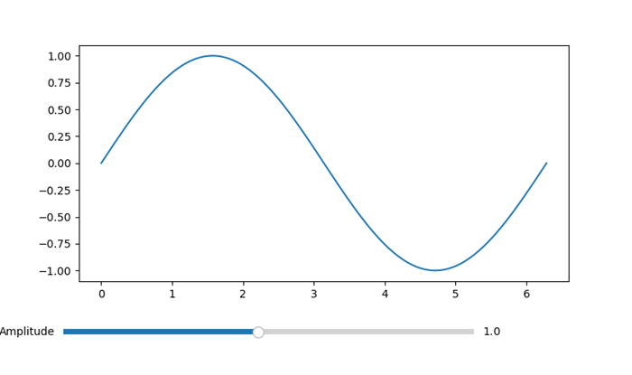
Plot with reduced Amplitude using Slider
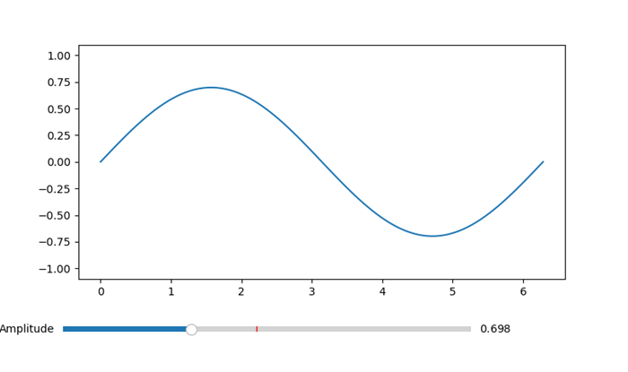
Example - Multiple Sliders Example
Here is an example that showcases how multiple sliders can be utilized in a Matplotlib plot. In this instance we will construct a plot featuring two sliders, each for controlling a distinct parameter. As the values are selected the sliders will dynamically update the plot in time.
import matplotlib.pyplot as plt from matplotlib.widgets import Slider import numpy as np # Function to be triggered on slider update def update(val): amplitude = slider_amplitude.val frequency = slider_frequency.val x = np.linspace(0, 10, 1000) y = amplitude * np.sin(2 * np.pi * frequency * x) line.set_ydata(y) fig.canvas.draw_idle() # Create a figure and axes fig, ax = plt.subplots() plt.subplots_adjust(bottom=0.25) # Initial values initial_amplitude = 1.0 initial_frequency = 1.0 # Create sliders ax_amplitude = plt.axes([0.1, 0.1, 0.65, 0.03]) ax_frequency = plt.axes([0.1, 0.05, 0.65, 0.03]) slider_amplitude = Slider(ax_amplitude, 'Amplitude', 0.1, 2.0, valinit=initial_amplitude) slider_frequency = Slider(ax_frequency, 'Frequency', 0.1, 5.0, valinit=initial_frequency) # Connect sliders to the update function slider_amplitude.on_changed(update) slider_frequency.on_changed(update) # Plot initial data x = np.linspace(0, 10, 1000) y = initial_amplitude * np.sin(2 * np.pi * initial_frequency * x) line, = ax.plot(x, y) plt.show()
Output
Initial Plot
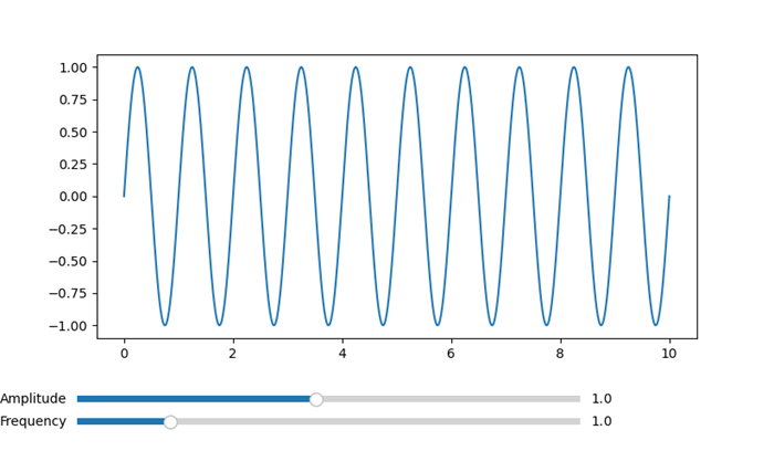
Frequency and Amplitude varied plot
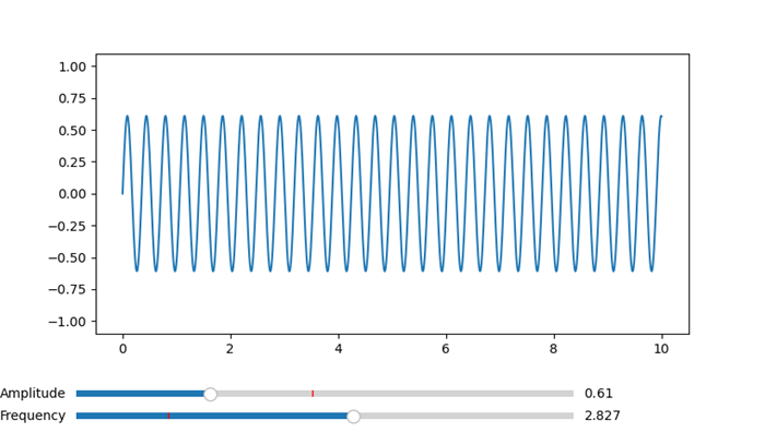
Use Cases
The below are the use cases of the Slider widget of the Matplotlib library.
- Parameter Exploration − Sliders are valuable for exploring the impact of changing parameters in scientific, engineering or data analysis applications. Users can smoothly adjust parameters to observe their effects.
- Real-time Data Manipulation − Sliders are commonly used in real-time data visualizations where users need to interactively control aspects such as zoom level, time intervals or data thresholds.
- Model Tuning − In machine learning or simulation scenarios sliders can be used to adjust model parameters or input variables dynamically by providing a hands-on approach to model tuning.
- Interactive Dashboards − Sliders are integral components of interactive dashboards which enable users to control and customize the displayed data on-the-fly.
Customization
The appearance and behavior of Matplotlib's Slider widget can be customized to suit specific design preferences. Key customization options are given below.
Orientation − Sliders can be horizontal or vertical based on the visualization layout.
Colors and Styles − Customize the colors and styles of the slider knob, slider track and other components to match the overall design.
Tick Marks and Labels − Specify the presence and formatting of tick marks and labels along the slider axis for better readability.
Logarithmic Scale − Sliders can operate on a logarithmic scale which is useful for visualizing data with a wide range of magnitudes.
Finally we can say Matplotlib's Slider widget is a versatile tool for creating interactive and user-friendly data visualizations. Whether used for exploring data, tuning models or providing dynamic control in dashboards then sliders enhance the interactivity of Matplotlib plots. The combination of real-time updates, customization options and integration with callback functions makes sliders a powerful component for creating engaging and informative visualizations.
Matplotlib - Span Selector
Introduction
Matplotlib's SpanSelector is a widget that provides an interactive way to select a range along a specific axis in a plot. It is a valuable tool for interactive range selection in plots. It allows users to define a span i.e. a selected interval by dragging the mouse across the plot. Its simplicity coupled with the ability to associate custom callback functions, makes it versatile for various data exploration and analysis tasks. Whether analyzing time series data, zooming into specific regions or triggering events based on user selections the SpanSelector enhances the interactive capabilities of Matplotlib plots. Its ease of use and integration with existing Matplotlib plots make it a valuable component for creating dynamic and user-friendly data visualizations.
Key Features of SpanSelector
The following are the key features of the Span Selector of the Matplotlib library.
- Interactive Range Selection − The primary purpose of the SpanSelector is to enable users to interactively select a range along the x-axis or y-axis of a plot. This is useful for focusing on specific regions of interest in the data.
- Dynamic Updates − As users drag the mouse to define the span the selected range dynamically updates in real-time. This provides continuous feedback by allowing users to precisely choose the desired interval.
- Integration with Callbacks − The SpanSelector can be associated with callback functions that are triggered when the span is selected. This allows developers to perform custom actions based on the selected range.
- Customization Options − The appearance and behavior of the SpanSelector can be customized. Users can choose between horizontal and vertical spans by specifying the color and alpha of the span, and set additional parameters.
Implementation of SpanSelector
The following is an example of how to implement a basic SpanSelector in Matplotlib. In this example we used few functions their explaination is given below.
- onselect − This function is called when a span is selected. It receives the minimum (xmin) and maximum (xmax) x-values of the selected span.
- SpanSelector − This class from matplotlib.widgets creates the interactive span selector. It is associated with the axes (ax), the callback function (onselect) and additional parameters such as the selection direction i.e. horizontal or vertical and appearance properties of the selected span.
- rectprops − This parameter allows customization of the appearance of the selected span. Here in this example the span is set to be a red rectangle with 50% transparency.
Example - Usage of SpanSelector Widget
import matplotlib.pyplot as plt
from matplotlib.widgets import SpanSelector
import numpy as np
# Function to be triggered when a span is selected
def onselect(xmin, xmax):
print(f"Selected Span: xmin={xmin}, xmax={xmax}")
# Generate example data
x_data = np.linspace(0, 10, 100)
y_data = np.sin(x_data)
# Create a figure and axes
fig, ax = plt.subplots()
# Plot the data
ax.plot(x_data, y_data)
# Create a SpanSelector
span_selector = SpanSelector(ax, onselect, direction='horizontal', useblit=True, props=dict(alpha=0.5, facecolor='red'))
plt.show()
Output
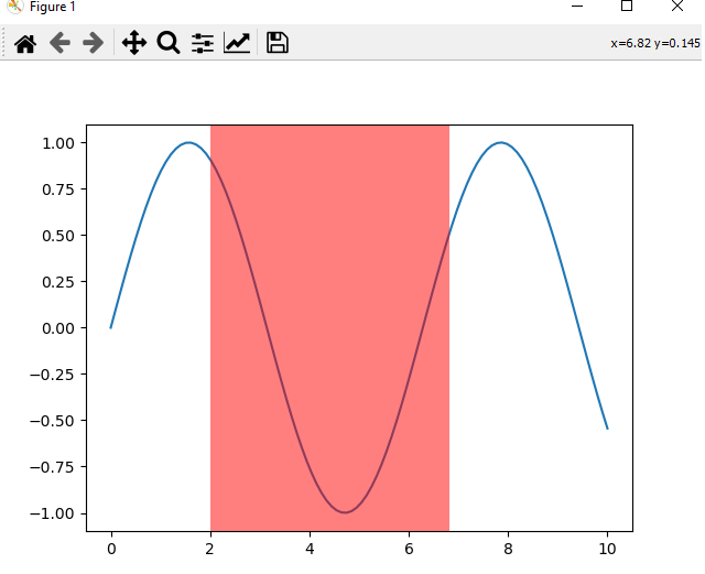
Example - Customized Span Selector
Customizing the appearance of the SpanSelector involves modifying its visual properties such as color, transparency and other styling options. Here's an example of how we can customize the SpanSelector appearance in Matplotlib library.
import matplotlib.pyplot as plt
from matplotlib.widgets import SpanSelector
import numpy as np
# Function to be triggered when a span is selected
def onselect(xmin, xmax):
print(f"Selected Span: xmin={xmin}, xmax={xmax}")
# Generate example data
x_data = np.linspace(0, 10, 100)
y_data = np.tan(x_data)
# Create a figure and axes
fig, ax = plt.subplots()
# Plot the data
ax.plot(x_data, y_data)
# Customizing the appearance of the SpanSelector
span_selector = SpanSelector(
ax,
onselect,
direction='vertical',
useblit=True,
props=dict(facecolor='yellow', alpha=0.3, edgecolor='black', linewidth=5),
button=1 # Use the left mouse button for selection
)
# Set axis labels and title
ax.set_xlabel('X-axis')
ax.set_ylabel('Y-axis')
ax.set_title('Customized SpanSelector')
plt.show()
Output
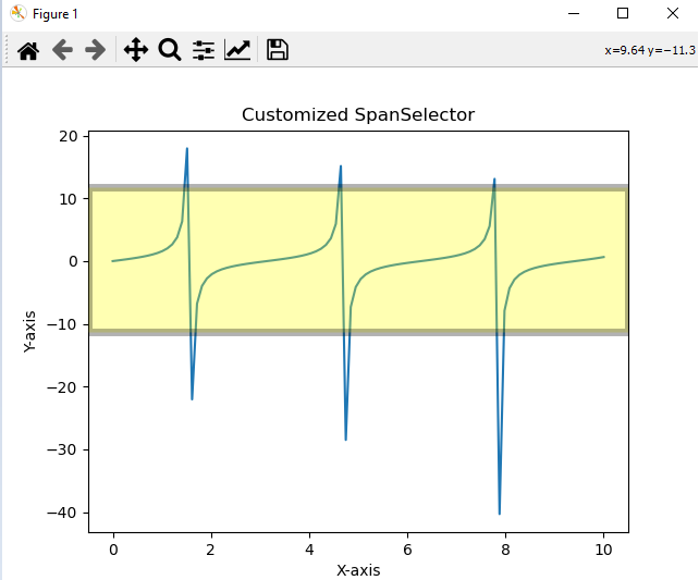
Use Cases and Considerations
The following are the use cases and the considerations of the Span selector of the matplotlib library.
- Data Exploration − SpanSelector is valuable for exploring specific intervals within a dataset. Users can dynamically select and analyze different portions of the data.
- Zooming In − Instead of zooming the entire plot we can use the SpanSelector to zoom into a particular range for focusing on the details within that interval.
- Event Triggering − Callback functions associated with the SpanSelector can perform various actions based on the selected span such as updating other parts of the plot or performing calculations.
- Time Series Analysis − For time series data users can use the SpanSelector to select specific time periods for in-depth analysis or visualization.
- Customizing Appearance − The appearance of the selected span can be customized such as match the style of the plot or highlight specific areas of interest.
Matplotlib - TextBox
A textbox is an area in a document or on a screen where you can type or display text. It is like a little box where you can input or output words, sentences, or paragraphs. Think of it like this −
Input Textbox − When you see a blank area on a form or a website where you can type your name, email, or any other information, that is a textbox. You can click on it and start typing.
Output Textbox − When you see a section of a webpage or document where there is text displayed, like a message or a description, that's also a textbox. It just shows text instead of letting you type into it.
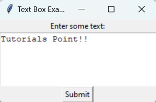
Textbox in Matplotlib
In Matplotlib, a Textbox is a graphical element used to display text within a plot, providing additional information or annotations. It allows you to include descriptive text, labels, or explanations directly on the plot.
You can create a textbox in Matplotlib using the text() function. In Matplotlib, the function used to create a textbox is plt.text(). This function allows you to add text directly to a plot, specifying the text content and its position within the plot. Additionally, you can customize various attributes of the textbox, such as font style, size, color, alignment, and background color, to suit their visualization needs.
Example - Basic Text Box
A basic text box in Matplotlib is a simple way to add text to a plot. It allows you to include labels or annotations directly onto the plot. You can specify the content of the text and its position within the plot using the text() function.
In the following example, we are creating a basic text box with the text "Sample Text Box" at the coordinates (2, 10) on the plot −
import matplotlib.pyplot as plt # Creating a plot plt.plot([1, 2, 3, 4], [1, 4, 9, 16]) # Adding a basic text box plt.text(2, 10, 'Sample Text Box', fontsize=12, bbox=dict(facecolor='yellow', alpha=0.5)) # Displaying the plot plt.show()
Output
Following is the output of the above code −
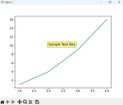
Example - Rounded Text Box
A rounded text box in Matplotlib is a variation of a basic text box with rounded corners. It allows you to add text to a plot within a rectangular-shaped box, but with softened corners.
In here, we are creating a rounded text box with the text "Rounded Text Box" at the coordinates (2, 10) on the plot −
import matplotlib.pyplot as plt # Creating a plot plt.plot([1, 2, 3, 4], [1, 4, 9, 16]) # Adding a rounded text box plt.text(2, 10, 'Rounded Text Box', fontsize=12, bbox=dict(facecolor='lightblue', alpha=0.5, edgecolor='blue', boxstyle='round,pad=0.5')) # Displaying the plot plt.show()
Output
On executing the above code we will get the following output −
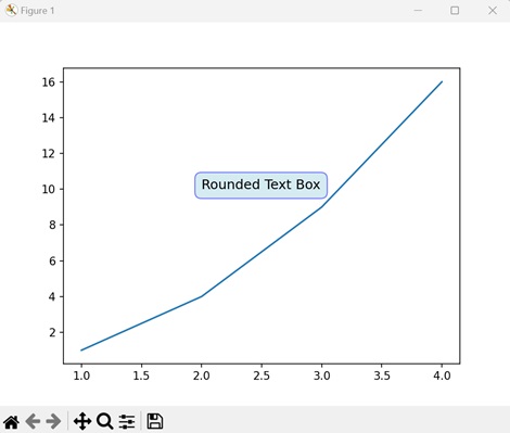
Example - Custom Text Box with Arrow
A custom text box with an arrow in Matplotlib is a special type of annotation that combines a text box with an arrow pointing to a specific location on a plot. It is a way to draw attention to particular features or data points within a plot.
The following example creates a custom text box with an arrow pointing to the text "Custom Text Box" at the coordinates (2, 10) on the plot −
import matplotlib.pyplot as plt
# Creating a plot
plt.plot([1, 2, 3, 4], [1, 4, 9, 16])
# Adding a custom text box with arrow
plt.annotate('Custom Text Box', xy=(2, 10), xytext=(3, 15),
arrowprops=dict(facecolor='orange', shrink=0.05))
# Displaying the plot
plt.show()
Output
After executing the above code, we get the following output −
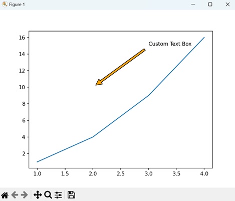
Example - Multiline Text Box
In Matplotlib, a multiline text box allows you to include multiple lines of text within a single annotation box on a plot. This feature is useful for adding longer explanations, descriptions, or labels that span across multiple lines.
Now, we are creating a multiline text box with three lines of text at the coordinates (2, 10) on the plot. We separate each line by "\n" −
import matplotlib.pyplot as plt # Creating a plot plt.plot([1, 2, 3, 4], [1, 4, 9, 16]) # Adding a multiline text box plt.text(2, 10, 'Line 1\nLine 2\nLine 3', fontsize=12, bbox=dict(facecolor='lightgrey', alpha=0.5)) # Displaying the plot plt.show()
Output
On executing the above code we will get the following output −
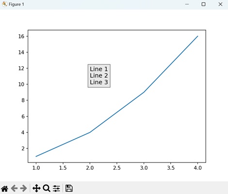
Matplotlib - Line Plots
A line plot is a type of graph that displays data points called markers connected by straight line segments. It is generally used to visualize the relationship between two variables; one variable on the x-axis and another on the y-axis.
Line plots are useful for showing trends, patterns, or fluctuations in data over a continuous interval or time. For instance, let us create a graph where we have the population data of a city over several years. The x-axis will represent the years, and the y-axis will represent the population in thousands −
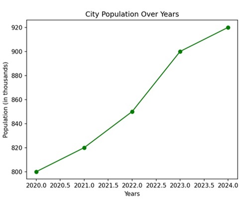
Line Plots in Matplotlib
We can use the plot() function in Matplotlib to draw a line plot by specifying the x and y coordinates of the data points. This function is used to create line plots, which are graphical representations of data points connected by straight lines.
The Plot() Function
The plot() function takes the x and y coordinates of the data points as an input and returns a line plot based on those coordinates.
Following is the syntax of plot() function in Matplotlib −
matplotlib.pyplot.plot(*args, scalex=True, scaley=True, data=None, **kwargs)
Where,
- *args represents the positional arguments.
- scalex and scaley are Boolean values that control whether the x-axis and y-axis should be automatically adjusted to fit the data.
- data allows you to pass a DataFrame or similar structure for plotting.
- **kwargs represents the additional keyword arguments that allow you to customize the appearance of the plot, such as line style, color, markers, etc.
Lets start by drawing a basic line plot.
Example - Creating a Basic Line Plot
A basic line plot in Matplotlib connects data points with a line. For instance, if you have pairs of x and y values, the plot() function helps visualize how y changes with respect to x. By specifying these coordinates, you can create a simple line graph to observe trends or patterns.
In the following example, we are drawing a basic line plot using Matplotlib, where x and y are lists representing data points −
import matplotlib.pyplot as plt
# data points
x = [1, 2, 3, 4, 5]
y = [10, 15, 7, 12, 8]
# Create a line plot
plt.plot(x, y)
# Add labels to the axes
plt.xlabel('X-axis')
plt.ylabel('Y-axis')
# Add a title to the plot
plt.title('Basic Line Plot')
# Display the plot
plt.show()
Output
Following is the output of the above code −
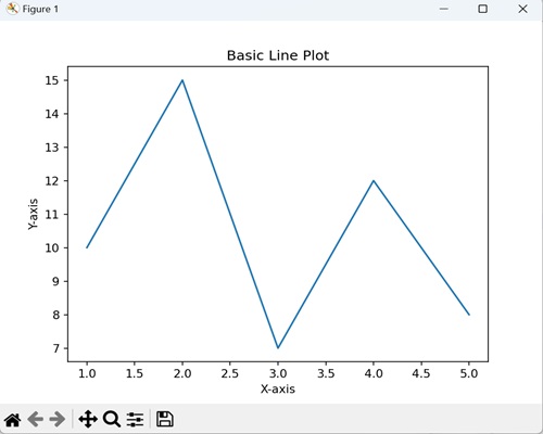
Example - Line plot with Multiple lines
In a line plot with multiple lines using Matplotlib, you can compare and visualize various datasets simultaneously on a single graph. The legend provide labels for each line on the plot, which helps in identifying each line.
The following example determine a plot with two sets of data represented by lines. The legend labels these lines as 'Line 1' and 'Line 2', helping to identify which line corresponds to which dataset −
import matplotlib.pyplot as plt
x = [1, 2, 3, 4, 5]
y1 = [10, 15, 7, 12, 8]
y2 = [8, 12, 6, 10, 15]
plt.plot(x, y1, label='Line 1')
plt.plot(x, y2, label='Line 2', linestyle='--', marker='o')
plt.xlabel('X-axis')
plt.ylabel('Y-axis')
plt.title('Multiple Lines with Legend')
plt.legend()
plt.show()
Output
After executing the above code, we get the following output −
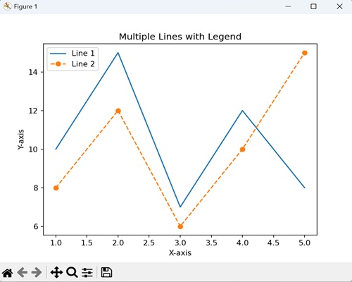
Example - Line Plot using numpy Array
In this example, we are plotting the lines with the help of numpy array instead of lists to represent our datasets −
import numpy as np
import matplotlib.pyplot as plt
# Data points of line 1
x1 = np.array([1, 2, 3, 4, 5])
y1 = np.array([2, 4, 6, 8, 10])
# Data points of line 2
x2 = np.array([2,
3, 4, 5, 6])
y2 = np.array([1, 3, 5, 7, 9])
# Data points of line 3
x3 = np.array([1, 2, 3, 4, 5])
y3 = np.array([5, 4, 3, 2, 1])
# Plotting all lines with labels
plt.plot(x1, y1, label='Line 1')
plt.plot(x2, y2, label='Line 2')
plt.plot(x3, y3, label='Line 3')
# Adding legend, x and y labels, and title for the lines
plt.legend()
plt.xlabel('X-axis')
plt.ylabel('Y-axis')
plt.title('Multiple Line Plot')
# Displaying the plot
plt.show()
Output
We get the output as shown below −
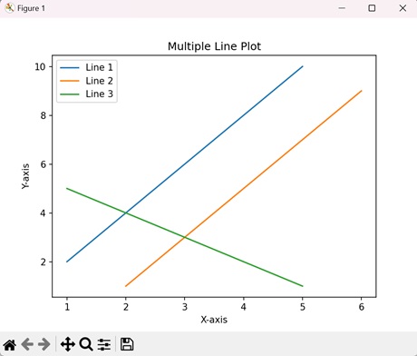
Creating Customized Line Plot
In a customized line plot using Matplotlib, you can control the appearance by specifying details like color, linestyle, and markers, enhancing the visual representation of data −
- Color − You can choose a color for the line, such as 'red' or '#FF0000' (hexadecimal RGB value).
- Linestyle − It determines the pattern of the line, whether it is solid ('-'), dashed ('--'), dotted (':'), or something else.
- Markers − These are symbols placed at data points. They can be customized with various shapes, such as circles ('o'), squares ('s'), or stars ('*').
Example - Line Plot with Green Dashed Line
In here, we are retrieving a line plot with a green dashed line, circular markers, and a labeled legend −
import matplotlib.pyplot as plt
x = [1, 2, 3, 4, 5]
y = [10, 15, 7, 12, 8]
plt.plot(x, y, color='green', linestyle='--', marker='o', label='Data Line')
plt.xlabel('X-axis')
plt.ylabel('Y-axis')
plt.title('Customized Line Plot')
plt.legend()
plt.show()
Output
Output of the above code is as follows −
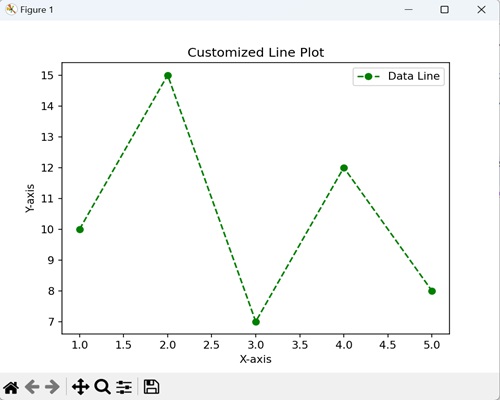
Example - Line plot with customized axes limits
You can also customize axes limits of a line plot using Matplotlib by defining the range of values for the x and y axes. This enables you to focus on specific portions of the data for a more detailed view.
We can customize axes limits using the functions plt.xlim() and plt.ylim() for the x-axis and y-axis respectively.
Following is the basic syntax of the xlim() function −
plt.xlim(left, right)
Where, left is the leftmost value of the x-axis and rightis the rightmost value of the x-axis.
Similarly, you can use the ylim() function for the y-axis to set specific limits.
Now, we are using the xlim() and ylim() functions to set the range of the x-axis as (0, 10) and y-axis as (0, 20) and ensure that only values within this specified range are displayed −
import matplotlib.pyplot as plt
x = [1, 2, 3, 4, 5]
y = [10, 15, 7, 12, 8]
plt.plot(x, y, marker='o', linestyle='-', color='blue', label='Data Line')
plt.xlabel('X-axis')
plt.ylabel('Y-axis')
plt.title('Customized Axes Limits')
plt.legend()
# Set x-axis limits
plt.xlim(0, 6)
# Set y-axis limits
plt.ylim(0, 20)
plt.show()
Output
The output obtained is as shown below −
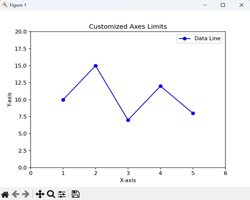
Matplotlib - Area Plots
An area plot is like a line graph, but instead of just showing the lines, it fills the space below them with colors. It is a type of data visualization that displays quantitative data using shaded areas to represent different categories or groups over a continuous range.
Imagine you have data that changes over time, like sales for different products. An area plot is a way to show how much each product contributes to the total sales at each point in time. It uses shaded areas to represent each product, and when you stack them together, you get a visual picture of how they add up over time.
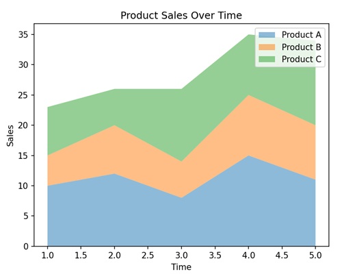
Area Plots in Matplotlib
In Matplotlib, we can create an area plot using the fill_between() function or the stackplot() function. These functions allows us to customize colors, transparency, and labels to enhance the visual representation of the data.
The fill_between() Function
The fill_between() function shades the area between two specified curves. It is commonly used to highlight specific areas of interest in a plot.
Syntax
Following is the syntax of fill_between() function in Matplotlib −
fill_between(x, y1, y2=0, where=None, interpolate=False, step=None, **kwargs)
Where,
- x is the x-coordinates of the data points.
- y1 is the y-coordinates of the first curve.
- y2 is the y-coordinates of the second curve or the baseline. If not specified, it defaults to 0, creating a fill between the curve and the x-axis.
- where is an optional condition to limit the filling. If provided, only the regions where the condition is True will be filled.
- If interpolate is True, the filled area will be interpolated. If False (default), steps are used to create stairs-like filling.
- If step is not None, it defines the step type to use for interpolation (plotting). Possible values are 'pre', 'post', or 'mid'.
- **kwargs is the additional keyword arguments that control the appearance of the filled region, such as color, alpha, label, etc.
Example - Filling Area Between Curves
In the following example, we are filling the area between the curves y=x2 and y=x with a sky-blue color, and using the alpha parameter to control the transparency of the filled region. We are then passing label argument to add a legend to the plot −
import matplotlib.pyplot as plt
import numpy as np
# Generate sample data
x = np.linspace(0, 5, 100)
y1 = x**2
y2 = x
# Fill the region between y1 and y2 with a sky-blue color and set transparency
plt.fill_between(x, y1, y2, color='skyblue', alpha=0.4, label='Filled Area')
# Plot the curves for y=x^2 and y=x
plt.plot(x, y1, label='y=x^2')
plt.plot(x, y2, label='y=x')
# Add labels to the axes
plt.xlabel('X-axis')
plt.ylabel('Y-axis')
# Add a title to the plot
plt.title('Fill Between Example')
# Add a legend to identify the filled area and the curves
plt.legend()
# Show the plot
plt.show()
Output
Following is the output of the above code −
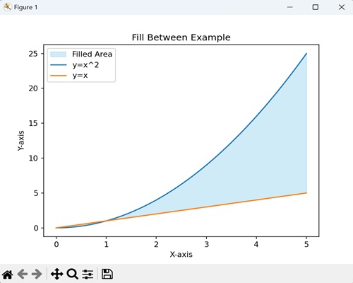
The stackplot() Function
The stackplot() function is used to create a stacked area plots. It allows you to represent the cumulative contribution of multiple datasets or categories to a whole over a continuous range. Each category is represented by a filled area, and the combined areas give an overview of the overall trend.
Syntax
Following is the syntax of stackplot() function in Matplotlib −
stackplot(x, *args, labels=(), colors=None, baseline='zero', alpha=1, **kwargs)
Where,
- x is the x-coordinates of the data points.
- *args is the variable-length argument list of y-coordinates for each dataset or category to be stacked.
- labels is a tuple or list of labels for each dataset, used for creating a legend.
- colors is a tuple or list of colors for each dataset. If not specified, Matplotlib will automatically choose colors.
- baseline specifies whether stacking is relative to 'zero' (default) or 'sym' (symmetric around zero).
- alpha specifies the transparency of the filled areas.
- **kwargs is the additional keyword arguments that control the appearance of the filled region, such as color, alpha, label, etc.
Example - Usage of stackplot() function
In here, we are using the stackplot() function to create a visual representation of three datasets 'y1', 'y2' and'y3' stacked on top of each other. The legend helps identify each dataset in the plot and the transparency effect enhances the visualization of the filled areas −
import matplotlib.pyplot as plt
import numpy as np
x = np.linspace(0, 10, 100)
y1 = np.sin(x)
y2 = np.cos(x)
y3 = np.exp(-0.1 * x) * np.sin(x)
# Create a stacked area plot
plt.stackplot(x, y1, y2, y3, labels=['Sin(x)', 'Cos(x)', 'Exp(-0.1*x)*Sin(x)'], alpha=0.7)
plt.xlabel('X-axis')
plt.ylabel('Y-axis')
plt.title('Stacked Area Plot Example')
plt.legend()
plt.show()
Output
After executing the above code, we get the following output −
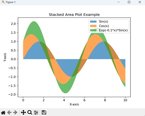
Example - Gradient-Filled Area Plot
A gradient-filled area plot is like coloring the space under a curve with a smooth transition of colors. It helps emphasize the shape of the curve and how it changes.
In the following example, we are creating a smooth curve representing the sine function using numpy. We are then using the fill_between() function to fill the area under the curve with a gradient, starting from the x-axis up to the curve −
import numpy as np
import matplotlib.pyplot as plt
x = np.linspace(0, 10, 100)
y = np.sin(x)
plt.fill_between(x, y, color='purple', interpolate=True)
plt.xlabel('X-axis')
plt.ylabel('Y-axis')
plt.title('Gradient-Filled Area Plot')
plt.show()
Output
The resulting plot shows a gradual color transition under the curve −
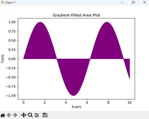
Example - Percentage Stacked Area Plot
A percentage stacked area plot refers to visualizing different parts of a whole over time, where each part is shown as a percentage contribution to the total. It helps to understand how the proportions of various components change relative to the entire set.
In here, we are representing the percentage contribution of various energy sources (such as coal, natural gas, renewable energy, and nuclear) to the overall energy consumption in a country over several years −
import matplotlib.pyplot as plt
years = [2010, 2012, 2014, 2016, 2018]
# Percentage contribution of coal to total energy consumption
coal = [40, 35, 30, 25, 20]
# Percentage contribution of natural gas
natural_gas = [30, 25, 20, 18, 15]
# Percentage contribution of renewable energy
renewable_energy = [15, 20, 25, 30, 35]
# Percentage contribution of nuclear energy
nuclear = [15, 20, 25, 27, 30]
plt.stackplot(years, coal, natural_gas, renewable_energy, nuclear,
labels=['Coal', 'Natural Gas', 'Renewable Energy', 'Nuclear'],
colors=['#1f78b4', '#33a02c', '#a6cee3', '#fdbf6f'],
alpha=0.7, baseline='zero')
plt.xlabel('Years')
plt.ylabel('Percentage of Total Energy Consumption')
plt.title('Energy Source Composition Over Time')
plt.legend(loc='upper left')
plt.show()
Output
The output obtained is as shown below −
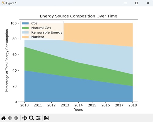
Example - Area Plot with Annotations
An area plot with annotations allows you to add textual or graphical elements to the plot, highlighting specific points or regions on it. It provides additional information about significant data points or regions. These annotations can include labels, arrows, or other markers to draw attention to specific area of interest.
In here, we are determining monthly sales data with a light blue filled area, representing the sales trend. We are adding annotations to highlight significant points on the plot, such as a sales peak and the month with the lowest sales. The annotate() function is used to position text and arrows at specific locations −
import numpy as np
import matplotlib.pyplot as plt
# Simulating monthly sales data
months = np.arange(1, 13)
sales = np.array([10, 15, 12, 18, 25, 30, 28, 35, 32, 28, 20, 15])
# Create an area plot
plt.fill_between(months, sales, color='lightblue', alpha=0.7, label='Monthly Sales')
# Add annotations for significant points
plt.annotate('Sales Peak', xy=(5, 30), xytext=(6, 32),
arrowprops=dict(facecolor='black', shrink=0.05),
fontsize=8, ha='center')
plt.annotate('Lowest Sales', xy=(11, 15), xytext=(10, 18),
arrowprops=dict(facecolor='black', shrink=0.05),
fontsize=8, ha='center')
# Add labels and title
plt.xlabel('Months')
plt.ylabel('Sales (in units)')
plt.title('Monthly Sales Trend with Annotations')
# Show the plot
plt.legend()
plt.show()
Output
The output obtained is as shown below −
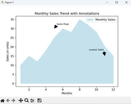
Matplotlib - Bar Graphs
A bar plot is a graphical representation of data where rectangular bars or columns are used to represent different categories. The height of each bar corresponds to the value it represents.
The horizontal axis (x-axis) typically represents the categories or groups being compared, while the vertical axis (y-axis) represents the values or quantities associated with each category. Each bar starts at the axis and extends horizontally or vertically, depending on the orientation of the graph.
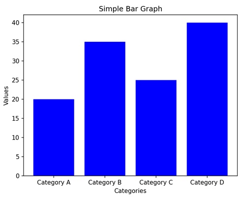
Bar Graphs in Matplotlib
We can create a bar graph in Matplotlib using the bar() function. We can specify the categories or positions for the bars along with their corresponding heights. To customize the graph, we can use additional options like colors, labels, and titles.
The bar() Function
The bar() function is used to create bar graphs. It takes two main parameters: the positions of the bars on the x-axis and the heights of the bars.
Following is the syntax of bar() function in Matplotlib −
Syntax
plt.bar(x, height, width=0.8, align='center', color=None, label=None)
Where,
x is the positions of the bars on the x-axis.
height is the heights of the bars.
width (optional) is the width of the bars. Default is 0.8.
align (optional) is alignment of the bars. Default is 'center'.
color (optional) is the color of the bars. Default is None, which results in the default color.
label (optional is a label for the legend.
Let us start by drawing a basic vertical bar graph.
Example - Basic Vertical Bar Graph
In a basic vertical bar graph, we represent data where each bar or column corresponds to different categories, and we use the heights of these bars to indicate the values associated with that category.
In the following example, we have three categories ('Category A', 'Category B', 'Category C') with corresponding values (15, 24, 30). We are then using the plt.bar() function to create a vertical bar graph, where each bar represents the value of its respective category −
import matplotlib.pyplot as plt
categories = ['Category A', 'Category B', 'Category C']
values = [15, 24, 30]
plt.bar(categories, values, color='skyblue')
plt.xlabel('Categories')
plt.ylabel('Values')
plt.title('Basic Vertical Bar Graph')
plt.show()
Output
After executing the above code, we get the following output −
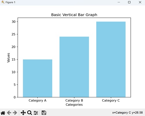
Example - Horizontal Bar Graph
In a horizontal bar graph, we represent data by plotting bars horizontally along a horizontal axis (x-axis). In this type of graph, we associate the lengths of the bars with the values they represent, and we display the categories along the vertical axis (y-axis).
In here, we are providing three categories ('Category X', 'Category Y', 'Category Z') with corresponding values (40, 28, 35). We are then using the barh() function to create a horizontal bar graph, where each bar extends horizontally based on its value. We are also customizing the color of each bar by passing the color argument to the function −
import matplotlib.pyplot as plt
categories = ['Category X', 'Category Y', 'Category Z']
values = [40, 28, 35]
plt.barh(categories, values, color=['green', 'orange', 'blue'])
plt.xlabel('Values')
plt.ylabel('Categories')
plt.title('Horizontal Bar Graph with Color Customization')
plt.show()
Output
Following is the output of the above code −
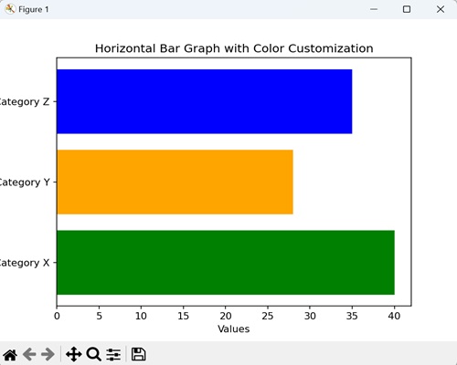
Example - Grouped Bar Graph
In a grouped bar graph, we stack multiple vertical bars next to each other for different categories. It is useful when you want to compare values for the same subcategories across different groups.
Now, we are providing three categories ('Category A', 'Category B', 'Category C') with values for two different groups (Group 1 and Group 2). We are then using the bar() function twice, once for each group, and positioning the bars side by side for each category −
import matplotlib.pyplot as plt
import numpy as np
# Defining categories and their corresponding values for two groups
categories = ['Category A', 'Category B', 'Category C']
values1 = [15, 24, 30]
values2 = [20, 18, 25]
# Setting the width of the bars
bar_width = 0.35
# Calculating bar positions for both groups
bar_positions1 = np.arange(len(categories))
bar_positions2 = bar_positions1 + bar_width
# Creating the first set of bars (Group 1)
plt.bar(bar_positions1, values1, width=bar_width, label='Group 1', color='skyblue')
# Create the second set of bars (Group 2) next to the first set
plt.bar(bar_positions2, values2, width=bar_width, label='Group 2', color='orange')
# Adding labels to the axes
plt.xlabel('Categories')
plt.ylabel('Values')
# Adding a title to the graph
plt.title('Grouped Bar Graph')
# Displaying a legend to identify the groups
plt.legend()
# Showing the plot
plt.show()
Output
On executing the above code we will get the following output −
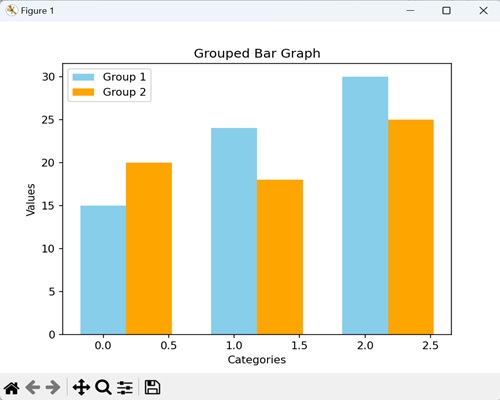
Example - Stacked Bar Graph
In a stacked bar graph, we put one bar on top of another. Each bar represents a category, and the height of the combined bars at each category shows the total value. It is useful for comparing the total values across categories.
In the example below, we have three categories ('Category A', 'Category B', 'Category C') with values for two different groups (Group 1 and Group 2). We are using the bar() function twice, but this time, the bars for Group 2 are stacked on top of the bars for Group 1. The bottom parameter called in the second bar() function indicates that Group 2 bars should start where Group 1 bars end −
import matplotlib.pyplot as plt
# Defining categories and values for two groups
categories = ['Category A', 'Category B', 'Category C']
values1 = [15, 24, 30]
values2 = [20, 18, 25]
# Creating the first set of bars (Group 1) without any offset
plt.bar(categories, values1, label='Group 1', color='skyblue')
# Creating the second set of bars (Group 2) plotted with 'bottom' set to the values of Group 1
# This makes Group 2 bars stacked on top of Group 1 bars
plt.bar(categories, values2, bottom=values1, label='Group 2', color='orange')
# Adding labels to the axes
plt.xlabel('Categories')
plt.ylabel('Values')
plt.title('Stacked Bar Graph')
plt.legend()
plt.show()
Output
On executing the above code we will get the following output −
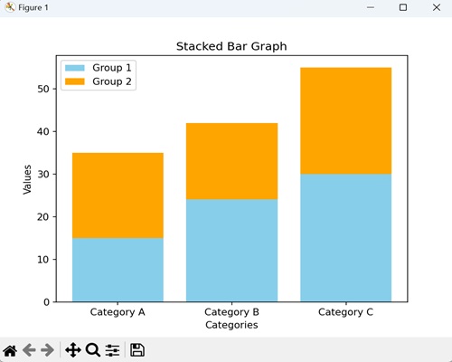
Example - Dynamically Updating a Bar Graph
In Matplotlib, dynamically updating a bar graph refers to the process of continuously changing or refreshing the data displayed in the bars of a bar graph in real-time.
This updating can occur based on external factors such as live data streams, user interactions, or changes in underlying data.
In the example below, we dynamically update a bar plot in Matplotlib. We begin by creating a new figure or activating an existing one. Next, we specify the data points and colors for plotting bars using the bar() method. Finally, we use the FuncAnimation() function to animate the bar heights and face colors −
import numpy as np from matplotlib import animation as animation, pyplot as plt, cm plt.rcParams["figure.figsize"] = [7.50, 3.50] plt.rcParams["figure.autolayout"] = True fig = plt.figure() data = [1, 4, 3, 2, 6, 7, 3] colors = ['red', 'yellow', 'blue', 'green', 'black'] bars = plt.bar(data, data, facecolor='green', alpha=0.75) def animate(frame): global bars index = np.random.randint(1, 7) bars[frame].set_height(index) bars[frame].set_facecolor(colors[np.random.randint(0, len(colors))]) ani = animation.FuncAnimation(fig, animate, frames=len(data)) plt.show()
Output
The output obtained is as follows −
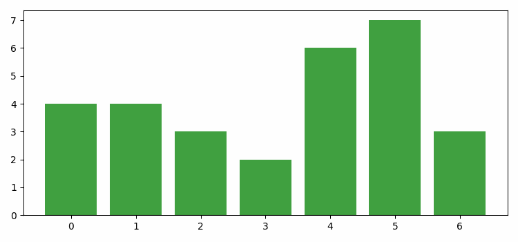
Matplotlib - Histogram
A histogram is like a visual summary that shows how often different values appear in a set of data. Imagine you have a collection of numbers, like ages of people. A histogram divides these numbers into groups, called "bins," and then uses bars to represent how many numbers fall into each bin. The taller the bar, the more numbers are in that group.
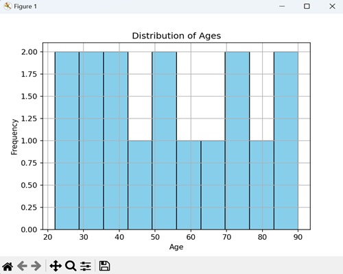
Histogram in Matplotlib
We can create a histogram in Matplotlib using the hist() function. This function allows us to customize various aspects of the histogram, such as the number of bins, color, and transparency. Histogram in Matplotlib is used to represent the distribution of numerical data, helping you to identify patterns.
The hist() Function
The hist() function in Matplotlib takes a dataset as input and divides it into intervals (bins). It then displays the frequency (count) of data points falling within each bin as a bar graph.
Following is the syntax of hist() function in Matplotlib −
Syntax
plt.hist(x, bins=None, range=None, density=False, cumulative=False, color=None, edgecolor=None, ...)
Where,
x is the input data for which the histogram is determined.
bins (optional) is the number of bins or the bin edges.
range (optional) is the lower and upper range of the bins. Default is the minimum and maximum of x
If density (optional) is True, the histogram represents a probability density function. Default is False.
If cumulative (optional) is True, a cumulative histogram is computed. Default is False.
These are just a few parameters; there are more optionals parameters available for customization.
Example - Creating a Vertical Histogram
In Matplotlib, creating a vertical histogram involves plotting a graphical representation of the frequency distribution of a dataset, with the bars oriented vertically along the y-axis. Each bar represents the frequency or count of data points falling within a particular interval or bin along the x-axis.
In the following example, we are creating a vertical histogram by setting the "orientation" parameter to "vertical" within the hist() function −
import matplotlib.pyplot as plt plt.rcParams["figure.figsize"] = [7.50, 3.50] plt.rcParams["figure.autolayout"] = True x = [1, 2, 3, 1, 2, 3, 4, 1, 3, 4, 5] plt.hist(x, orientation="vertical") plt.show()
Output
We get the output as shown below −
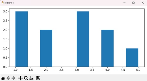
Example - Customized Histogram with Density
When we create a histogram with density, we are providing a visual summary of how data is distributed. We use this graph to see how likely different numbers are occurring, and the density option makes sure the total area under the histogram is normalized to one.
In the following example, we are visualizing random data as a histogram with 30 bins, displaying it in green with a black edge. We are using the density=True parameter to represent the probability density −
import matplotlib.pyplot as plt
import numpy as np
# Generate random data
data = np.random.randn(1000)
# Create a histogram with density and custom color
plt.hist(data, bins=30, density=True, color='green', edgecolor='black', alpha=0.7)
plt.xlabel('Values')
plt.ylabel('Probability Density')
plt.title('Customized Histogram with Density')
plt.show()
Output
After executing the above code, we get the following output −
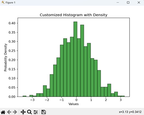
Example - Cumulative Histogram
When we create a cumulative histogram, we graphically represent the total number of occurrences of values up to a certain point. It shows how many data points fall below or equal to a certain value.
In here, we are using a histogram where each bar represents a range of exam scores, and the height of the bar tells us how many students, in total, scored within that range. By setting the cumulative=True parameter in the hist() function, we make sure that the histogram shows the cumulative progression of scores −
import matplotlib.pyplot as plt
import numpy as np
# Generate random exam scores (out of 100)
exam_scores = np.random.randint(0, 100, 150)
# Create a cumulative histogram
plt.hist(exam_scores, bins=20, cumulative=True, color='orange', edgecolor='black', alpha=0.7)
plt.xlabel('Exam Scores')
plt.ylabel('Cumulative Number of Students')
plt.title('Cumulative Histogram of Exam Scores')
plt.show()
Output
Following is the output of the above code −
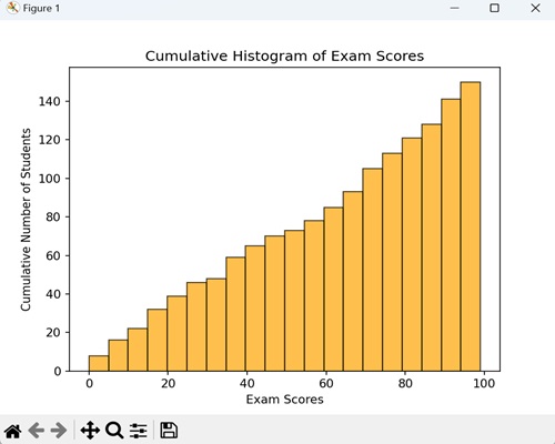
Example - Histogram with Different Color and Edge Color
When creating a histogram, we can customize the fill color and edge color, adding a visual touch to represent the data distribution. By doing this, we blend the histogram with a stylish and distinctive appearance.
Now, we are generating a histogram for random data with 25 bins, and we are presenting it in purple color with blue edges −
import matplotlib.pyplot as plt
import numpy as np
data = np.random.randn(1000)
# Creating a histogram with different color and edge color
plt.hist(data, bins=25, color='purple', edgecolor='blue')
plt.xlabel('Values')
plt.ylabel('Frequency')
plt.title('Histogram with Different Color and Edge Color')
plt.show()
Output
On executing the above code we will get the following output −
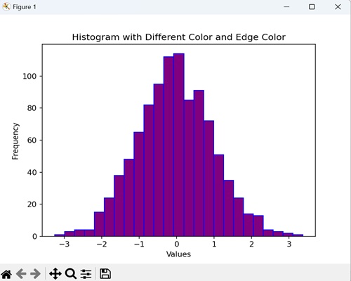
Example - Histogram with Colors
To plot a histogram with colors, we can also extract colors from the "cm" parameter in the setp() method.
import numpy as np
from matplotlib import pyplot as plt
plt.rcParams["figure.figsize"] = [7.00, 3.50]
plt.rcParams["figure.autolayout"] = True
data = np.random.random(1000)
n, bins, patches = plt.hist(data, bins=25, density=True, color='red', rwidth=0.75)
col = (n-n.min())/(n.max()-n.min())
cm = plt.cm.get_cmap('RdYlBu')
for c, p in zip(col, patches):
plt.setp(p, 'facecolor', cm(c))
plt.show()
Output
On executing the above code we will get the following output −
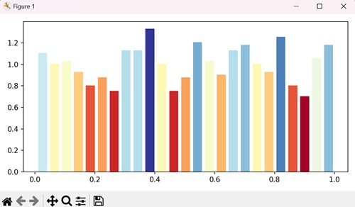
Example - Histogram with different Colors
In here, we are specifying different colors for different bars in a matplotlib histogram by iterating in the range of number of bins and setting random facecolor for each bar −
import numpy as np
import matplotlib.pyplot as plt
import random
import string
# Set the figure size
plt.rcParams["figure.figsize"] = [7.50, 3.50]
plt.rcParams["figure.autolayout"] = True
# Figure and set of subplots
fig, ax = plt.subplots()
# Random data
data = np.random.rand(100)
# Plot a histogram with random data
N, bins, patches = ax.hist(data, edgecolor='black', linewidth=1)
# Random facecolor for each bar
for i in range(len(N)):
patches[i].set_facecolor("#" + ''.join(random.choices("ABCDEF" + string.digits, k=6)))
# Display the plot
plt.show()
Output
On executing the above code we will get the following output −
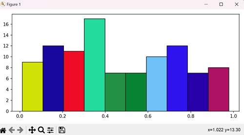
Example - Stacked Histogram with Multiple Datasets
A stacked histogram with multiple datasets is a visual representation that combines the distributions of two or more sets of data. The bars are stacked on top of each other, allowing for a comparison of how different datasets contribute to the overall distribution.
In the example below, we represent two different datasets "data1" and "data2" with specific values, showing their distributions in different colors (skyblue and salmon) −
import matplotlib.pyplot as plt
import numpy as np
# Sample data for two datasets
data1 = np.array([2, 4, 5, 7, 9, 10, 11, 13, 14, 15])
data2 = np.array([6, 7, 8, 10, 11, 12, 13, 14, 15, 16])
# Creating a stacked histogram with different colors
plt.hist([data1, data2], bins=10, stacked=True, color=['skyblue', 'salmon'], edgecolor='black')
plt.xlabel('Values')
plt.ylabel('Frequency')
plt.title('Stacked Histogram with Multiple Datasets')
plt.legend(['Dataset 1', 'Dataset 2'])
plt.show()
Output
On executing the above code we will get the following output −
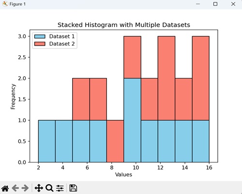
Matplotlib - Pie Chart
A pie chart is a circular graph that represents data in slices, where each slice corresponds to a category or portion of the whole. The size of each slice reflects the proportion of data it represents. It is a visual way to show how parts contribute to a whole.
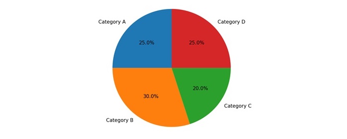
Pie Chart in Matplotlib
We can create a pie chart in Matplotlib using the pie() function. This function allows us to customize the appearance of the pie chart, including colors, labels, and the starting angle.
The pie() Function
The pie() function in Matplotlib takes an array or a list of values, where each value represents the size of a slice in the pie. The function provides visual proportions and distributions of categorical data in a circular format.
Following is the syntax of pie() function in Matplotlib −
plt.pie(x, explode=None, labels=None, colors=None, autopct=None, shadow=False, startangle=0)
Where,
- x is an array or list of values representing the sizes of slices.
- explode (optional) is an array or list specifying the fraction of the radius with which to offset each slice.
- labels (optional) is the list of strings providing labels for each slice.
- colors (optional) is list of colors for each slice.
- autopct (optional) format string or function for adding percentage labels on the pie.
- If shadow (optional) is True, it adds a shadow to the pie.
- startangle (optional) is the angle by which the start of the pie is rotated counterclockwise from the x-axis.
These are just a few parameters; there are more optionals parameters available for customization.
Example - Exploded Pie Chart
When creating an exploded pie chart, we separate one or more slices, "exploding" them away from the center of the chart. This highlights specific categories as we visually pull them away from the rest of the pie.
In the following example, we are creating a pie chart to show proportions of categories like 'Category A', 'Category B', 'Category C', and 'Category D'. We are using the explode parameter to move the second slice ('Category B') away from the center by a distance of 0.1 times the radius −
import matplotlib.pyplot as plt
# Data for proportions
sizes = [20, 35, 25, 20]
explode = (0, 0.1, 0, 0)
# Creating an exploded pie chart
plt.pie(sizes, explode=explode, labels=['Category A', 'Category B', 'Category C', 'Category D'])
plt.title('Exploded Pie Chart')
plt.show()
Output
After executing the above code, we get the following output −
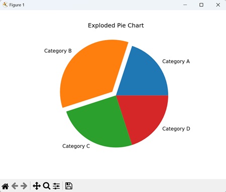
Example - Custom Colored Pie Chart
A custom-colored pie chart allows you to assign specific colors to different slices of the pie, adding a visually distinct touch to each category.
In here, we are creating a pie chart to represent proportions of categories such as 'Category A', 'Category B', 'Category C', and 'Category D'. We are using the colors parameter to assign custom colors to each slice −
import matplotlib.pyplot as plt
# Data for proportions
sizes = [30, 20, 25, 25]
colors = ['gold', 'lightskyblue', 'lightcoral', 'lightgreen']
# Creating a custom colored pie chart
plt.pie(sizes, labels=['Category A', 'Category B', 'Category C', 'Category D'], colors=colors)
plt.title('Custom Colored Pie Chart')
plt.show()
Output
Following is the output of the above code −
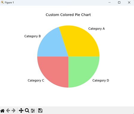
Example - Enhancing Pie Chart Colors
Here, we enhance pie chart colors in Matplotlib by generating "n" data points randomly, setting the figure size and padding, then creating a pie chart subplot with varying colors using the pie() method −
import matplotlib.pyplot as plt
import random
import numpy as np
plt.rcParams["figure.figsize"] = [7.50, 3.50]
plt.rcParams["figure.autolayout"] = True
n = 40
color = ["#" + ''.join([random.choice('0123456789ABCDEF')
for j in range(6)]) for i in range(n)]
a = np.random.random(n)
f = plt.figure()
ax = f.add_subplot(111, aspect='equal')
p = plt.pie(a, colors=color)
plt.show()
Output
Output of the above code is as shown below −
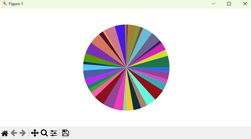
Example - Percentage-labeled Pie Chart
A percentage-labeled pie chart is a type of pie chart where we lable each slice with its percentage of the whole. This helps us by providing a clear understanding of the proportional contribution of each category.
Now, we create a pie chart that represents the distribution of categories ('Category A', 'Category B', 'Category C', 'Category D'). We use the autopct='%1.1f%%' parameter to display the percentage contribution of each slice −
import matplotlib.pyplot as plt
# Data for proportions
sizes = [15, 30, 45, 10]
# Creating a pie chart with percentage labels
plt.pie(sizes, labels=['Category A', 'Category B', 'Category C', 'Category D'], autopct='%1.1f%%')
plt.title('Percentage-labeled Pie Chart')
plt.show()
Output
Output of the above code is as follows −
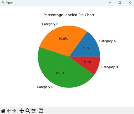
Example - Proportional Data
We can also show the percentage or proportional data where each slice of pie represents a category.
In here, we create a pie chart to show our daily activities, i.e. sleeping, eating, working, and playing. Using plt.pie() method, we create a pie chart with the given different data sets for different activities −
import matplotlib.pyplot as plt
days = [1, 2, 3, 4, 5]
sleeping = [7, 8, 6, 11, 7]
eating = [2, 3, 4, 3, 2]
working = [7, 8, 7, 2, 2]
playing = [8, 5, 7, 8, 13]
slices = [7, 2, 3, 13]
activities = ['sleeping', 'eating', 'working', 'playing']
cols = ['c', 'm', 'r', 'b']
plt.pie(slices,
labels=activities,
colors=cols,
startangle=90,
shadow=True,
explode=(0, 0.1, 0, 0),
autopct='%1.1f%%')
plt.title('Pie Plot')
plt.show()
Output
We get the output as shown below −
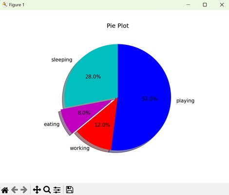
Example - Shadowed Pie Chart
A shadowed pie chart is a type of pie chart that includes a shadow effect, giving it a three-dimensional appearance. The shadows are generally projected to one side, creating a sense of depth and highlighting separation of each slice.
In the example below, we are using the shadow=True parameter used to add a shadow effect to the chart, providing a visual depth that enhances the separation between slices −
import matplotlib.pyplot as plt
sizes = [25, 20, 30, 25]
# Creating a shadowed pie chart
plt.pie(sizes, labels=['Category A', 'Category B', 'Category C', 'Category D'], shadow=True)
plt.title('Shadowed Pie Chart')
plt.show()
Output
The output obtained is as shown below −
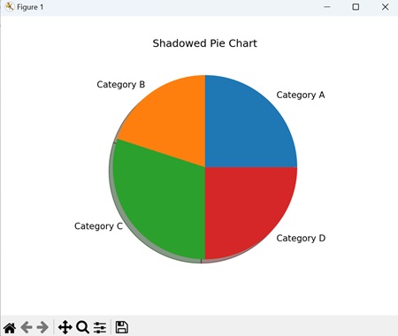
Matplotlib - Scatter Plot
A scatter plot is a type of graph where individual data points are plotted on a two-dimensional plane. Each point represents the values of two variables, with one variable on the x-axis and the other on the y-axis. Scatter plots are useful for visualizing the correlation between two continuous variables.
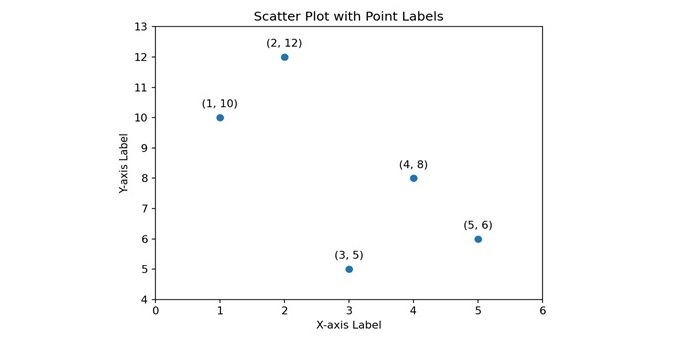
Scatter Plot in Matplotlib
We can create a scatter plot in Matplotlib using the scatter() function. This function allows us to customize the appearance of the scatter plot, including markers, colors, and sizes of the points.
The scatter() Function
The scatter() function in Matplotlib takes two arrays or lists as input, where each array corresponds to the values of a different variable. The points are then plotted on a set of axes, with the position of each point determined by the values of the two variables.
Following is the syntax of scatter() function in Matplotlib −
plt.scatter(x, y, s=None, c=None, marker=None, cmap=None, norm=None, vmin=None, vmax=None, ...)
Where,
- x and y is an array or list representing the x-coordinate and y-coordinate values respectively of the data points.
- s (optional) is the size of the markers.
- c (optional) is the color of the markers.
- marker (optional) is the marker style.
- cmap (optional) is the colormap for mapping the color of the markers.
- norm (optional) is the normalize object for mapping the data values to the colormap.
- vmin, vmax (optional) is the minimum and maximum values for normalizing the colormap.
These are just a few parameters; there are more optionals parameters available for customization.
Example - Colored and Sized Scatter Plot
We can create a colored and sized scatter plot to represent each data point not only by its position on the plot but also by its color and size, providing additional information about the characteristics of each point.
In the following example, we are creating a scatter plot to represent data points with x and y coordinates. We are using the "sizes" list to determine the size of each point, and the "colors" list to specify the color of each point −
import matplotlib.pyplot as plt
# Data
x = [1, 3, 5, 7, 9]
y = [10, 5, 15, 8, 12]
sizes = [30, 80, 120, 40, 60]
colors = ['red', 'green', 'blue', 'yellow', 'purple']
# Creating a scatter plot with varied sizes and colors
plt.scatter(x, y, s=sizes, c=colors)
plt.title('Colored and Sized Scatter Plot')
plt.xlabel('X-axis')
plt.ylabel('Y-axis')
plt.show()
Output
After executing the above code, we get the following output −
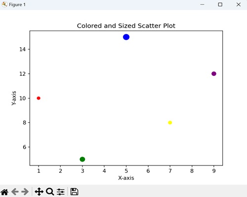
Example - Custom Marker Scatter Plot
A custom marker scatter plot is a type of scatter plot where we represent each data point by a user-defined marker shape. The result is a visually distinctive representation, where each marker shape serves as a unique identifier for individual data points.
In here, we are using square markers (marker='s') of red color in the scatter plot −
import matplotlib.pyplot as plt
x = [2, 4, 6, 8, 10]
y = [5, 8, 12, 6, 9]
# Creating a scatter plot with custom markers
plt.scatter(x, y, marker='s', color='red', edgecolors='black')
plt.title('Custom Marker Scatter Plot')
plt.xlabel('X-axis')
plt.ylabel('Y-axis')
plt.show()
Output
Following is the output of the above code −
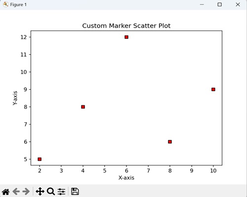
Example - Transparent Scatter Plot
In a transparent scatter plot, we plot data points with a certain level of transparency, allowing overlapping points to be partially visible. This transparency can help reveal patterns in densely populated areas of the plot.
Now, we are creating a scatter plot with a level of transparency (i.e. alpha) as 0.6 −
import matplotlib.pyplot as plt
x = [3, 6, 9, 12, 15]
y = [8, 12, 6, 10, 14]
# Creating a scatter plot with transparency
plt.scatter(x, y, alpha=0.2, edgecolors='black')
plt.title('Transparent Scatter Plot')
plt.xlabel('X-axis')
plt.ylabel('Y-axis')
plt.show()
Output
Output of the above code is as follows −
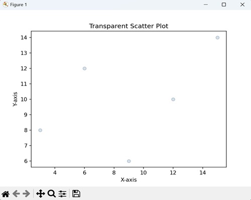
Example - Connected Scatter Plot
A connected scatter plot is a variation where data points are represented individually, but lines are drawn between consecutive points. This helps to visualize connections between the points over the two-dimensional space.
In the example below, we are creating the scatter plot that shows individual data points connected by dashed lines (linestyle='--') −
import matplotlib.pyplot as plt
x = [1, 2, 3, 4, 5]
y = [10, 15, 5, 12, 8]
# Create a connected scatter plot with dashed lines
plt.scatter(x, y, linestyle='--', color='orange', marker='o')
plt.plot(x, y, linestyle='--', color='orange')
plt.title('Connected Scatter Plot with Dashed Lines')
plt.xlabel('X-axis')
plt.ylabel('Y-axis')
plt.show()
Output
The output obtained is as shown below −
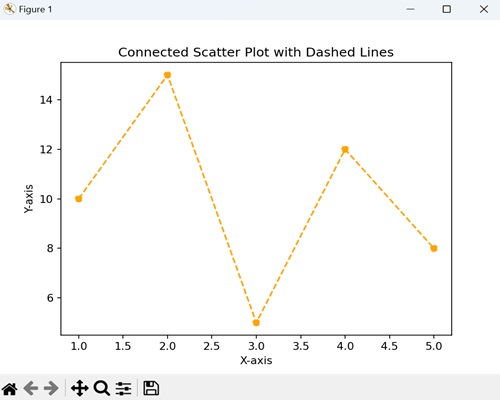
Matplotlib - Box Plots
A box plot represents the distribution of a dataset in a graph. It displays the summary statistics of a dataset, including the minimum, first quartile (Q1), median (Q2), third quartile (Q3), and maximum. The box represents the interquartile range (IQR) between the first and third quartiles, while whiskers extend from the box to the minimum and maximum values. Outliers, if present, may be displayed as individual points beyond the whiskers.
Imagine you have the exam scores of students from three classes. A box plot is a way to show how these scores are spread out −
Minimum and Maximum − The smallest and largest scores are shown as the ends of the plot.
Quartiles (Q1, Q2, Q3) − The scores are split into four parts. The middle score is the median (Q2). The scores below the median are the first quartile (Q1), and those above are the third quartile (Q3). It helps you see where most of the scores lie.
Interquartile Range (IQR) − The range between Q1 and Q3 is called the interquartile range.
Box − The box in the middle represents the interquartile range. So, it is showing you where half of the scores are.
Whiskers − Lines (whiskers) extend from the box to the smallest and largest scores, helping you see how spread out the scores are.
Outliers − If there are any scores way above or below the rest, they might be shown as dots beyond the whiskers. These are like the standout scores.
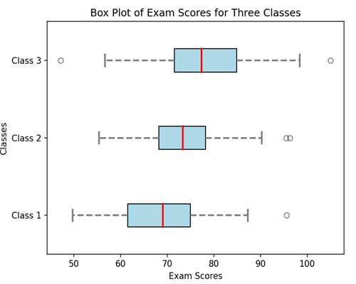
Box Plot in Matplotlib
We can create a box plot in Matplotlib using the boxplot() function. This function allows us to customize the appearance of the box plot, such as changing the whisker length, adding notches, and specifying the display of outliers.
The boxplot() Function
The boxplot() function in Matplotlib takes one or more datasets as input and generates a box plot for each dataset.
Following is the syntax of boxplot() function in Matplotlib −
Syntax
plt.boxplot(x, notch=None, patch_artist=None, widths=None, labels=None, ...)
Where,
x is the dataset or a list of datasets for which the box plot is to be created.
If notch (optional) is True, it creates a vertical box plot; if False, creates a horizontal box plot.
If patch_artist (optional) is True, it fills the box with color.
widths (optional) represents the width of the boxes.
labels (optional) sets labels for each dataset, useful when plotting multiple box plots.
These are just a few parameters; there are more optionals parameters available for customization.
Example - Horizontal Box Plot with Notches
We can create a horizontal box plot with notches to display the distribution of a dataset in a horizontal orientation. It includes notches around the median lines, providing a visual estimate of the uncertainty around the median values.
In the following example, we are creating a horizontal box plot with notches around the medians for three data sets, where each box represents a set of values along the y-axis categories −
import matplotlib.pyplot as plt
# Data
data = [[1, 2, 3, 4, 5], [3, 6, 8, 10, 12], [5, 10, 15, 20, 25]]
# Creating a horizontal box plot with notches
plt.boxplot(data, vert=False, notch=True)
plt.title('Horizontal Box Plot with Notches')
plt.xlabel('Values')
plt.ylabel('Categories')
plt.show()
Output
After executing the above code, we get the following output −
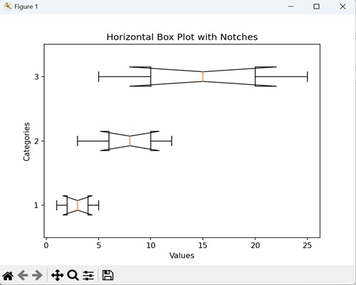
Example - Box Plot with Custom Colors
We can create a box plot with custom colors, graphically representing the data with different colors to fill the boxes. Each box represents the distribution of values within a category, and by adding a custom color, we introduce a stylistic touch that makes it easier to differentiate between categories.
In here, we are enhancing the box plot by filling the boxes with a custom color i.e. skyblue −
import matplotlib.pyplot as plt
data = [[1, 2, 3, 4, 5], [3, 6, 8, 10, 12], [5, 10, 15, 20, 25]]
# Creating a box plot with custom colors
plt.boxplot(data, patch_artist=True, boxprops=dict(facecolor='skyblue'))
plt.title('Box Plot with Custom Colors')
plt.xlabel('Categories')
plt.ylabel('Values')
plt.show()
Output
Following is the output of the above code −
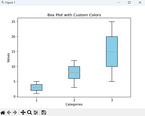
Example - Grouped Box Plot
We can create a grouped box plot to compare the distributions of multiple groups side by side. Each group has its own set of boxes, where each box represents the distribution of values within that group.
Now, we are creating a grouped box plot to compare the exam scores of students from three different classes (A, B, and C). Each box represents the distribution of scores within a class, allowing us to easily observe and compare the central tendencies, spreads, and potential outliers across the three classes −
import matplotlib.pyplot as plt
import numpy as np
class_A_scores = [75, 80, 85, 90, 95]
class_B_scores = [70, 75, 80, 85, 90]
class_C_scores = [65, 70, 75, 80, 85]
# Creating a grouped box plot
plt.boxplot([class_A_scores, class_B_scores, class_C_scores], labels=['Class A', 'Class B', 'Class C'])
plt.title('Exam Scores by Class')
plt.xlabel('Classes')
plt.ylabel('Scores')
plt.show()
Output
On executing the above code we will get the following output −
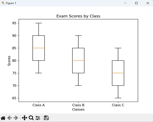
Example - Box Plot with Outliers
A box plot with outliers is a graphical representation of data that includes additional information about extreme values in the dataset. In a standard box plot, we represent outliers, data points significantly different from the majority, as individual points beyond the "whiskers" that extend from the box.
This plot helps in identifying exceptional values that may have a significant impact on the overall distribution of the data.
In the example below, we are creating a box plot that provides a visual representation of the sales distribution for each product, and the outliers highlight months with exceptionally high or low sales −
import matplotlib.pyplot as plt
import numpy as np
# Data for monthly sales
product_A_sales = [100, 110, 95, 105, 115, 90, 120, 130, 80, 125, 150, 200]
product_B_sales = [90, 105, 100, 98, 102, 105, 110, 95, 112, 88, 115, 250]
product_C_sales = [80, 85, 90, 78, 82, 85, 88, 92, 75, 85, 200, 95]
# Introducing outliers
product_A_sales.extend([300, 80])
product_B_sales.extend([50, 300])
product_C_sales.extend([70, 250])
# Creating a box plot with outliers
plt.boxplot([product_A_sales, product_B_sales, product_C_sales], sym='o')
plt.title('Monthly Sales Performance by Product with Outliers')
plt.xlabel('Products')
plt.ylabel('Sales')
plt.show()
Output
On executing the above code we will get the following output −
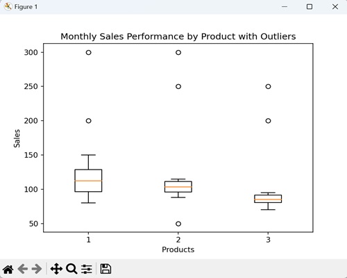
Matplotlib - Arrow Demo
An "arrow demo" in general is a graphical representation where arrows are used to convey information, point up a direction, or highlight specific points. Arrows are commonly used to indicate vector quantities, movement, or relationships between elements.
For instance, if you are analyzing sales data over several months, you can visually highlight a significant increase in sales during a specific month as shown below −
Arrow Demo in Matplotlib
We can create an arrow demo in Matplotlib using the arrow() function. This function allows you to create arrows on a plot with specified starting and ending points, arrowhead style, color, and linestyle.
The arrow() Function
The arrow() function in Matplotlib takes parameters for the starting point (x, y), the arrow direction (dx, dy), and optional properties such as color and style.
Syntax
Following is the syntax of the arrow() function in Matplotlib −
matplotlib.pyplot.arrow(x, y, dx, dy, **kwargs)
Where,
- x, y is the starting point of the arrow.
- dx, dy is the change in x and y that defines the arrow direction.
- **kwargs is the additional keyword arguments for customization (e.g., color, linestyle, arrowhead style).
Example - Arrow Demo with Custom Color
We can create an arrow demo with custom color, graphically displaying arrows in a plot, allowing you to choose specific colors to fill the arrowhead.
In the following example, we are creating a arrow starting from the point (0, 0) and pointing in the direction of (1, 1). We then set the arrow to have a red fill color (fc) while keeping a black edge color (ec)−
import matplotlib.pyplot as plt
# Starting point
x = 0
y = 0
# Arrow direction
dx = 1
dy = 1
# Plotting an arrow with a custom color
plt.arrow(x, y, dx, dy, head_width=0.05, head_length=0.1, fc='red', ec='black')
plt.title('Arrow Demo with Custom Color')
plt.show()
Output
After executing the above code, we get the following output −
Example - Double-Headed Arrow Demo
A double-headed arrow demo is like drawing a line on a graph, but instead of just one arrowhead at the end, you have arrowheads at both ends. This is useful when you want to show a two-way connection or movement in a plot, making it clear that things go in both directions.
In here, we are creating a double-headed arrow by plotting two arrows: one from (0, 0) to (1, 1) and another in the opposite direction. We are filling the arrows with same fill color (fc) and edge color (ec) −
import matplotlib.pyplot as plt
# Starting point
x = 0
y = 0
# Arrow direction
dx = 1
dy = 1
# Plotting a double-headed arrow
plt.arrow(x, y, dx, dy, head_width=0.05, head_length=0.1, fc='green', ec='black')
plt.arrow(x+dx, y+dy, -dx, -dy, head_width=0.05, head_length=0.1, fc='green', ec='black')
plt.title('Double-Headed Arrow Demo')
plt.show()
Output
Following is the output of the above code −
Example - Arrow Demo with Dashed Line
Arrow demo with dashed line refers to outlining the arrow with a dashed line instead of a continuous line. We can draw a dashed line in matplotlib by passing the linestyle argument and setting it to 'dashed' when drawing the arrow.
Now, we are customizing the linestyle of the arrow as a dashed line, having orange fill color and blue edge color −
import matplotlib.pyplot as plt
# Starting point
x = 0
y = 0
# Arrow direction
dx = 1
dy = 1
# Plotting an arrow with a dashed line
plt.arrow(x, y, dx, dy, head_width=0.05, head_length=0.1, fc='orange', ec='blue', linestyle='dashed')
plt.title('Arrow Demo with Dashed Line')
plt.show()
Output
Output of the above code is as follows −
Example - Arrow Demo with Custom Arrowhead Shape
While creating an arrow in a plot, we can also customize the shape of the arrowheads. Instead of the standard full arrowhead, you can choose a unique shape, like a right-pointing triangle or a left-pointing triangle, positioned at the right-half or the left-half respectively at the end of the arrow line.
In the example below, we are customizing the arrowhead shape to be a right-pointing triangle i.e. the arrowhead is positioned at the right end of the arrow line −
import matplotlib.pyplot as plt
# Starting point
x = 0
y = 0
# Arrow direction
dx = 1
dy = 1
# Plotting an arrow with a custom arrowhead shape
plt.arrow(x, y, dx, dy, head_width=0.05, head_length=0.1, fc='purple', ec='green', shape='right')
plt.title('Arrow Demo with Custom Arrowhead Shape')
plt.show()
Output
The output obtained is as shown below −
Matplotlib - Fancy Boxes
Fancy boxes, in general, are special and attractive boxes that are made to be visually appealing. These creatively designed boxes are used for various purposes, such as packaging, presentation, or decoration. These boxes incorporate unique shapes and colors.
Fancy Boxes in Matplotlib
In Matplotlib, fancy boxes refer to a style of annotation or text box that goes beyond the basic rectangular shape. We can draw a fancy box in Matplotlib using the FancyBboxPatch() function. This function allows you to create a fancy box with different customizable styles, including rounded corners, edge color, face color, and more.
The FancyBboxPatch() function
The FancyBboxPatch() function is a part of patches module in matplotlib. It is used for creating fancy rectangular patches with customizable styles. This is useful when you want to highlight or annotate certain regions of a plot with a visually appealing and customized bounding box.
Syntax
Following is the syntax of the FancyBboxPatch() function in Matplotlib −
matplotlib.patches.FancyBboxPatch(xy, width, height, boxstyle='round', bbox_transmuter=None, mutation_scale=1.0, mutation_aspect=None, **kwargs)
Where,
- xy is the (x, y) coordinates of the lower-left corner of the rectangle.
- width is the width of the rectangle.
- height is the height of the rectangle.
- boxstyle is the style of the box. Default is 'round' for rounded corners.
- bbox_transmuter (optional) is transformation for the bounding box.
- mutation_scale (optional) is a scale factor for the mutation.
- mutation_aspect (optional) is the aspect ratio of the mutation.
- **kwargs is the dditional keyword arguments for customization, such as edgecolor, facecolor, etc.
Let us start by creating a rounded fancy box.
Example - Rounded Fancy Box
A rounded fancy box refers to a rectangle with softened corners. Instead of sharp edges, it has rounded corners, giving it a more stylish and visually appealing look.
In the following example, we are creating a rectangular fancy box with rounded corners, where the box has a blue edge color and light green fill color −
import matplotlib.pyplot as plt
import matplotlib.patches as patches
# Creating a fancy box with rounded corners
fancy_box = patches.FancyBboxPatch((0.2, 0.5), 0.4, 0.3, boxstyle='round,pad=0.1', edgecolor='blue', facecolor='lightgreen')
# Adding the fancy box to the plot
plt.gca().add_patch(fancy_box)
# Displaying the plot
plt.title('Rounded Fancy Box')
# Maintaining aspect ratio
plt.axis('equal')
plt.show()
Output
After executing the above code, we get the following output −
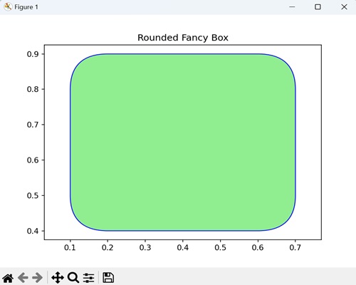
Example - Squared Fancy Box with Dashed Edge
A squared fancy box with dashed edge is a special kind of square-shaped frame. Unlike a regular square, it has a unique design with a dashed line along its edges, giving it a distinctive appearance.
In here, we are creating a squared fancy box with a red dashed edge and light yellow fill color −
import matplotlib.pyplot as plt
import matplotlib.patches as patches
# Creating a squared fancy box with dashed edge
fancy_box = patches.FancyBboxPatch((0.2, 0.5), 0.4, 0.3, boxstyle='square,pad=0.1', edgecolor='red', linestyle='dashed', facecolor='lightyellow')
# Adding the fancy box to the plot
plt.gca().add_patch(fancy_box)
# Displaying the plot
plt.title('Squared Fancy Box with Dashed Edge')
plt.axis('equal')
plt.show()
Output
Following is the output of the above code −
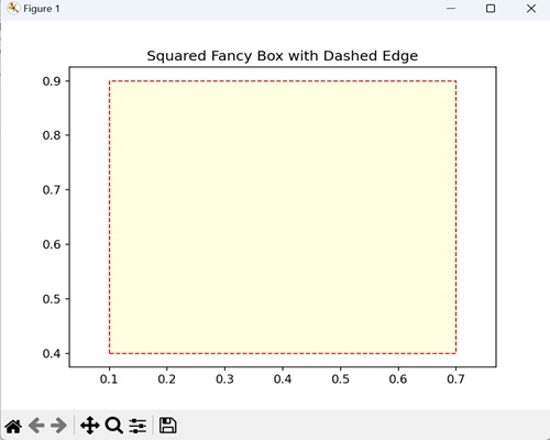
Example - Oval Fancy Box
An oval fancy box is a decorative shape that looks like an elongated circle. Unlike a regular box, it has a smoother and more curved outline, resembling an oval.
Now, we are creating an oval shape fancy box with four rounded corners, and the box has a green edge color and light blue fill color −
import matplotlib.pyplot as plt
import matplotlib.patches as patches
# Creating an oval fancy box
fancy_box = patches.FancyBboxPatch((0.2, 0.5), 0.4, 0.3, boxstyle='round4,pad=0.1', edgecolor='green', facecolor='lightblue')
# Adding the fancy box to the plot
plt.gca().add_patch(fancy_box)
# Displaying the plot
plt.title('Oval Fancy Box')
plt.axis('equal')
plt.show()
Output
Output of the above code is as follows −
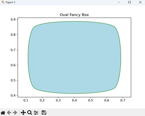
Example - Serrated Fancy Box
In Matplotlib, a serrated fancy box is a type of rectangular shape with jagged edges. It is like a regular box, but the edges have small, sharp peaks and valleys, giving it a serrated or tooth-like appearance.
We can create a serrated fancy box by specifying the boxstyle="sawtooth" parameter to the FancyBboxPatch() function.
In the example below, we are creating a plot with a serrated (sawtooth) fancy box, defined by its coordinates, dimensions, box style, edge color (orange), and face color (lightcoral) −
import matplotlib.pyplot as plt
import matplotlib.patches as patches
# Creating a figure and axis
fig, ax = plt.subplots()
# Defining the coordinates (bottom-left corner), width, height etc. for the fancy box
fancy_box = patches.FancyBboxPatch((0.1, 0.1), 0.6, 0.3, boxstyle="sawtooth,pad=0.1", edgecolor="orange", facecolor="lightcoral")
# Adding the fancy box to the axis
ax.add_patch(fancy_box)
ax.set_title('Serrated Box')
plt.show()
Output
The output obtained is as shown below −
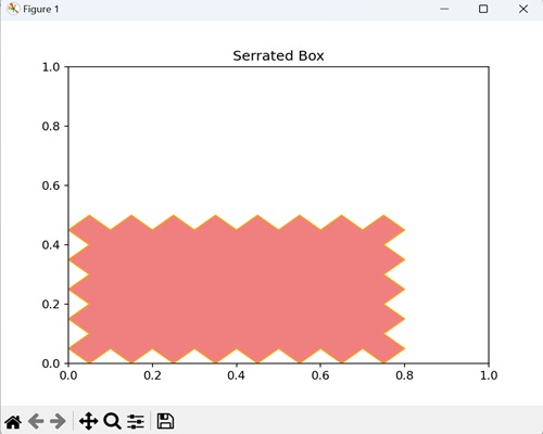
Matplotlib - Z-Order Demo
The z-order demo (depth order) refers to the arrangement of objects along the z-axis (depth axis) in a three-dimensional space. Objects with a higher z-order value appear closer to the viewer, while those with a lower z-order value appear farther away.
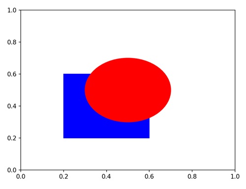
We can see in the above image that a blue square and a red circle are plotted on the same axes. The circle has a higher Z-order, so it is drawn on top of the square, despite their overlapping coordinates.
Zorder Demo in Matplotlib
In Matplotlib, we can use the set_zorder() function to specify the drawing order (z-order) of a plot element. Elements with a higher zorder will be drawn on top of elements with a lower zorder.
This function is particularly useful when you have multiple plot elements, such as lines, markers, or patches, and you want certain elements to be visually prominent.
The set_zorder() Function
The set_zorder() function is used to control the stacking order of different plot elements. This function takes a numerical value representing the desired z-order and modifies the internal state of the Matplotlib artist on which it is called, setting the specified z-order for that artist.
Syntax
Following is the syntax of the set_zorder() function in Matplotlib −
artist.set_zorder(z_order_value)
Where,
- artist refers to the Matplotlib artist (e.g., line, patch, etc.) for which you want to specify the z-order.
- z_order_value is a numerical value indicating the desired z-order.
Example - Controlling Drawing Order with zorder
You can manage the layering of different elements in a plot in matplotlib by controlling drawing order with zorder. The zorder parameter assigns a numerical value to each element, determining the order in which they are drawn. Higher values mean an element is drawn on top, helping you to customize the visual hierarchy of plot.
In the following example, we are creating a blue line and a red circle. We are then using the set_zorder() function to draw the line on top by specifying higher zorder value to it −
import matplotlib.pyplot as plt
# Creating a line and a circle
line, = plt.plot([0, 1], [0, 1], color='blue', linewidth=2, label='Line')
circle = plt.Circle((0.5, 0.5), 0.1, color='red', label='Circle')
# Setting different z-orders
line.set_zorder(2)
circle.set_zorder(1)
# Adding elements to the plot
plt.gca().add_patch(circle)
plt.legend()
# Displaying the plot
plt.title('Controlling Drawing Order with zorder')
plt.show()
Output
After executing the above code, we get the following output −
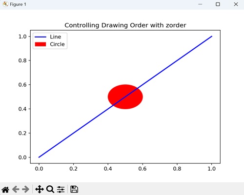
Example - Layering Bars and Text with zorder
You can control the stacking order of layering bars and text as well in matplotlib. You can manage their drawing order by assigning different zorder values to bars and text, making the plot more informative and visually appealing.
In here, we are creating a green bar chart and a blue text annotation. We are then setting different zorder values to make the text appear on top of the bar −
import matplotlib.pyplot as plt
# Creating a bar and text
bar = plt.bar([1, 2, 3], [4, 7, 2], color='green', label='Bars')
text = plt.text(2, 5, 'Important', color='blue', fontsize=12)
# Setting different z-orders
bar[0].set_zorder(2)
text.set_zorder(1)
# Displaying the plot
plt.title('Layering Bars and Text with zorder')
plt.legend()
plt.show()
Output
Following is the output of the above code −
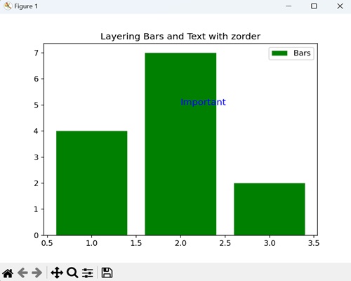
Example - Ordering Scatter Plots with zorder
You can also control the ordering of multiple scatter plots with zorder on the same graph in matplotlib. This helps in comparing different sets of data points, ensuring that certain scatter plots appear in front of others for clarity in your overall visualization.
Now, we are creating two scatter plots, and controlling their drawing order using the zorder parameter −
import matplotlib.pyplot as plt
import numpy as np
# Creating scatter plots with different z-orders
x = np.random.rand(10)
y = np.random.rand(10)
plt.scatter(x, y, s=100, color='orange', label='Scatter (Low Z-Order)', zorder=1)
plt.scatter(x, y + 0.1, s=100, color='blue', label='Scatter (High Z-Order)', zorder=2)
# Displaying the plot
plt.title('Ordering Scatter Plots with zorder')
plt.legend()
plt.show()
Output
Output of the above code is as follows −
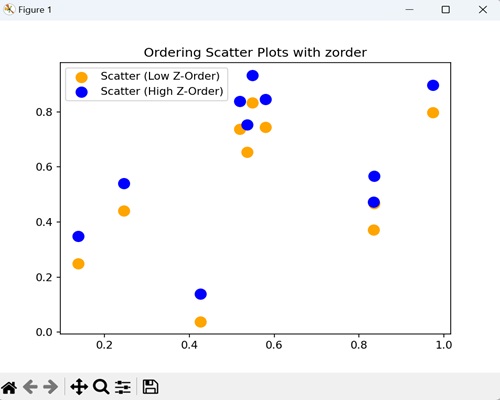
Example - Overlaying Multiple Plots with zorder
In Matplotlib, overlaying multiple plots with zorder allows you to super-impose different plots on the same graph. This helps you to showcase multiple datasets simultaneously, ensuring that specific plots are visually layered on top of others for a clear view.
In the example below, we are overlaying three plots (Sin(x), Cos(x), and the sum of Sin(x) and Cos(x)) on the same graph with different zorder values, controlling their drawing order −
import matplotlib.pyplot as plt
import numpy as np
# Creating data for three different plots
x = np.linspace(0, 10, 100)
y1 = np.sin(x)
y2 = np.cos(x)
y3 = np.sin(x) + np.cos(x)
# Plotting each dataset with specific z-order
plt.plot(x, y1, label='Sin(x)', color='blue', zorder=1)
plt.plot(x, y2, label='Cos(x)', color='orange', zorder=2)
plt.plot(x, y3, label='Sin(x) + Cos(x)', color='green', zorder=3)
# Displaying legend and title
plt.legend()
plt.title('Overlaying Multiple Plots with zorder')
# Displaying the plot
plt.show()
Output
The output obtained is as shown below −
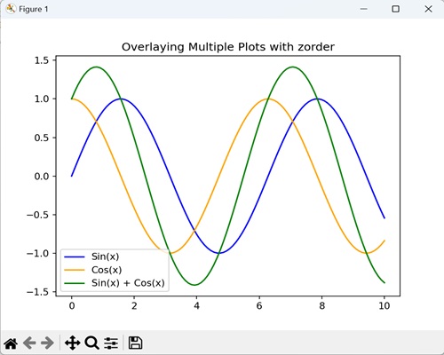
Matplotlib - Hatch Demo
A hatch pattern is a set of evenly spaced, diagonal lines (crosshatching), slashes, or other symbols used to fill the interior of the elements (diagram). It is a graphical representation generally used to distinguish different regions or elements.
For instance, we can create a bar chart with different hatch patterns for each bar, as shown in the image below −
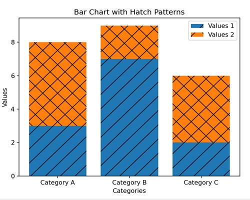
Hatch Demo in Matplotlib
In Matplotlib, we can use the "hatch" parameter to show various hatch patterns that can be applied to filled areas, such as bars or shapes, in a plot. Using this parameter, we can provide examples of different hatch styles and their visual representation in a graph.
The hatch Parameter
The hatch parameter in Matplotlib generates a plot that shows different hatch patterns. You can directly call the function without providing any arguments.
Syntax
Following is the syntax of using the hatch parameter in Matplotlib −
import matplotlib.pyplot as plt
# Creating a sample bar chart with hatch patterns
plt.bar(
# hatch pattern (use '/' for diagonal lines, '\\' for the opposite diagonal, '|' for vertical lines, '-' for horizontal lines, etc.
hatch='/', )
)
We have seen the example image of basic hatch pattern above. Now, let us start by creating multiple hatch patterns.
Example - Multiple Hatch Patterns
You can use multiple hatch patterns in matplotlib by applying different filling patterns for distinct elements in a plot. It is generally applied to elements like bars in a bar chart. This helps you distinguish between different categories in a more colorful and informative way.
In the following example, we are creating a bar chart with multiple hatching patterns (backslash, vertical bar, and forward slash) for each category (X, Y, Z), by setting the hatch parameter set to '\|/' −
import matplotlib.pyplot as plt
# Creating a bar chart with different hatching patterns
bars = plt.bar(['X', 'Y', 'Z'], [2, 4, 6], hatch='\\|/', color='lightgreen', edgecolor='black')
# Adding labels and title
plt.xlabel('Categories')
plt.ylabel('Values')
plt.title('Multiple Hatch Patterns Demo')
# Displaying the plot
plt.show()
Output
After executing the above code, we get the following output −
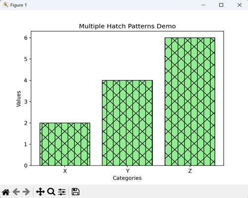
Example - Hatch Density Variation
You can adjust the closeness or density of the hatch patterns applied to elements like bars a bar chart as well in matplotlib. You can achieve this by setting the hatch parameter to 'xx', creating a visual representation where some parts appear more densely hatched than others.
In here, we are creating a bar chart to display the variation in hatch density for categories One, Two, and Three. We are passing the hatch parameter with the pattern "xx" with varying density to represent different values in a bar chart −
import matplotlib.pyplot as plt
# Creatng a bar chart with various hatch density
bars = plt.bar(['One', 'Two', 'Three'], [1, 3, 5], hatch='xx', color='lightcoral', edgecolor='black')
# Adding labels and title
plt.xlabel('Categories')
plt.ylabel('Values')
plt.title('Hatch Density Variation Demo')
# Displaying the plot
plt.show()
Output
Following is the output of the above code −
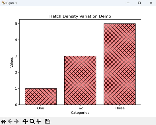
Example - Hatch Styles for Bar Charts
You can also create various hatch styles for bar charts by using different visual patterns or symbols to fill the interior of bars. This is helpful when you want to represent different categories with unique and easily distinguishable hatch styles.
Now, we are creating various hatch styles for different bars representing fruits (Apple, Banana, Orange). We are setting the hatch parameter to '//-|\\', creating a combination of double forward slash, single hyphen, single vertical bar and double backslash patterns −
import matplotlib.pyplot as plt
# Creating a bar chart with different hatch styles
bars = plt.bar(['Apple', 'Banana', 'Orange'], [4, 6, 8], hatch='//-|\\', color='lightgoldenrodyellow', edgecolor='black')
# Adding labels and title
plt.xlabel('Fruits')
plt.ylabel('Quantities')
plt.title('Hatch Styles for Bar Charts Demo')
# Displaying the plot
plt.show()
Output
Output of the above code is as follows −
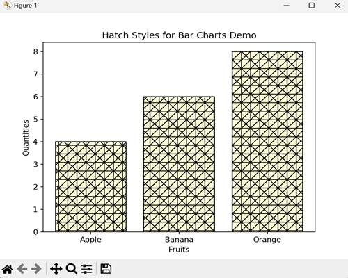
Example - Hatch Demo for Patch
A patch is a geometric shape, like a rectangle, circles or ellipse, that can be customized and added to a plot. A hatch demo for a patch in matplotlib allows you to extend the use of hatch patterns beyond typical bar charts.
In the example below, we are creating a rectangle patch with a circular hatch pattern ("o") using matplotlib.patches.Rectangle −
import matplotlib.pyplot as plt
import matplotlib.patches as patches
# Creating a patch with a hatch pattern
rect = patches.Rectangle((0.1, 0.1), 0.6, 0.3, hatch='o', edgecolor='black', facecolor='lightblue')
# Adding the patch to the plot
plt.gca().add_patch(rect)
# Adding labels and title
plt.xlabel('X-axis')
plt.ylabel('Y-axis')
plt.title('Hatch Demo for Patch')
# Displaying the plot
plt.show()
Output
The output obtained is as shown below −
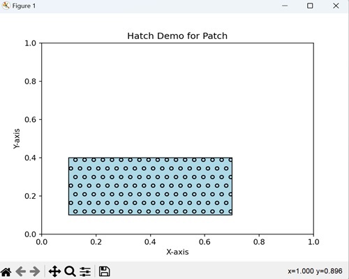
Matplotlib - MMH Donuts
A donut is a circular pastry with a hole in the center, giving it a classic ring shape. The outer surface of donut is usually smooth and glazed, adding a shiny finish. The shape defines a perfect balance of curvature.

Mmh Donuts in Matplotlib
In Matplotlib, we can create a donut shape by drawing circular wedges for both the outer and inner circles. We can use the Wedge class in the "matplotlib.patches" module to define these circles and combine them to create a donut appearance.
You can customize the donut by adjusting the center, inner and outer radii, and colors, and remember to set equal aspect ratios for a circular look.
The matplotlib.patches.Wedge Class
The matplotlib.patches.Wedge class in Matplotlib is used to make wedge-shaped patches, which are like circular sectors. These wedges are created by specifying their center coordinates, inner and outer radii, and angular extent. By instantiating objects of this class, you can easily add these wedge shapes to your Matplotlib plot.
Syntax
Following is the syntax for creating a donut using the Wedge class in Matplotlib −
matplotlib.patches.Wedge(center, r, theta1, theta2, width=None, **kwargs)
Where,
- centeris the tuple (x, y) representing the center coordinates of the wedge.
- r is the outer radius of the wedge.
- theta1is the starting angle of the wedge in degrees.
- theta2 is the ending angle of the wedge in degrees.
- width (optional) is the width of the wedge (default is None).
- **kwargs is the additional keyword arguments for customizing the wedge appearance.
Let us start by creating a basic donut.
Example - Basic Donut
You can create a basic donut shape in Matplotlib using the matplotlib.patches.Wedge class. The donut is defined by specifying its center coordinates, outer and inner radii, and the width of the ring. The resulting plot displays a circular ring with a different face color and edge color, representing a basic donut.
In the following example, we are creating a basic donut shape using the matplotlib.patches.Wedge class. We are first defining the outer and inner radii as "0.8" and "0.4" respectively. We are then passing the arguments such as center coordinates, outer radius, inner radius, and width to the patches.wedge() function −
import matplotlib.pyplot as plt
import matplotlib.patches as patches
# Creating a figure and axis
fig, ax = plt.subplots()
# Defining the outer and inner radii
outer_radius = 0.8
inner_radius = 0.4
# Creating a Wedge representing the donut
donut = patches.Wedge((0, 0), outer_radius, 0, 360, width=outer_radius - inner_radius, facecolor='brown', edgecolor='black')
# Adding the donut to the plot
ax.add_patch(donut)
# Setting equal aspect ratio for a circular look
ax.set_aspect('equal', adjustable='box')
# Display the plot
plt.title('Basic Donut')
# Adjust the x-axis limit
plt.xlim(-1, 1)
# Adjust the y-axis limit
plt.ylim(-1, 1)
plt.show()
Output
After executing the above code, we get the following output −
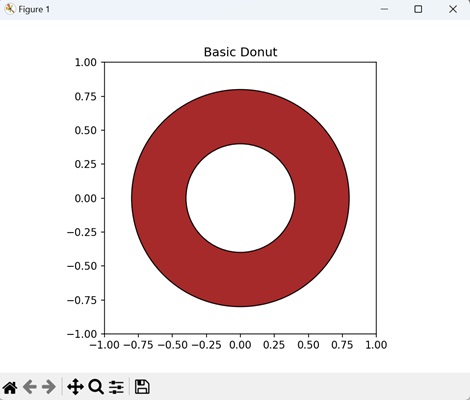
Example - Double Donut
You can create a double donut as well in matplotlib by drawing two concentric circles. To achieve this, define each donut by specifying the center coordinates, outer and inner radii, and width. The resulting plot will displays two distinct donuts with different face colors and edges.
In here, we are creating two concentric donuts in the same plot. We are defining each donut by its unique outer and inner radii, and applying distinct face colors and edge colors −
import matplotlib.pyplot as plt
import matplotlib.patches as patches
# Creating a figure and axis
fig, ax = plt.subplots()
# Defining the radii for the outer and inner circles of the first donut
outer_radius_1 = 0.8
inner_radius_1 = 0.4
# Creating a Wedge representing the first donut
donut1 = patches.Wedge((0, 0), outer_radius_1, 0, 360, width=outer_radius_1 - inner_radius_1, facecolor='brown', edgecolor='black')
# Defining the radii for the outer and inner circles of the second donut
outer_radius_2 = 0.6
inner_radius_2 = 0.2
# Creating a Wedge representing the second donut
donut2 = patches.Wedge((0, 0), outer_radius_2, 0, 360, width=outer_radius_2 - inner_radius_2, facecolor='lightgreen', edgecolor='black')
# Adding the donuts to the plot
ax.add_patch(donut1)
ax.add_patch(donut2)
# Setting equal aspect ratio for a circular look
ax.set_aspect('equal', adjustable='box')
# Displaying the plot
plt.title('Double Donut')
plt.xlim(-1, 1)
plt.ylim(-1, 1)
plt.show()
Output
Following is the output of the above code −
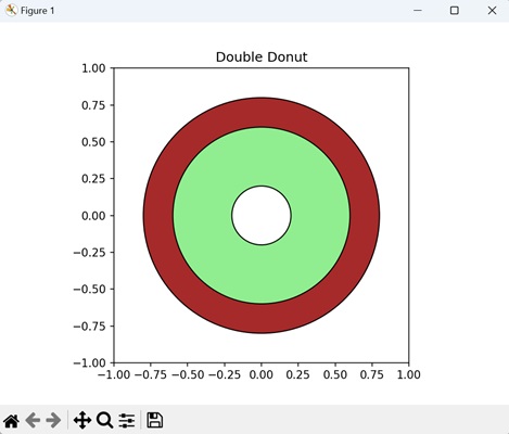
Example - Patterned Donut
You can also create a patterned donut with a textured appearance using the matplotlib.patches.Wedge class. This class allows you to specify the center coordinates, outer and inner radii, as well as the width of the donut. To enhance its visual appeal, fill the donut's face with a crosshatch pattern ('xx') using the hatch parameter.
The resulting plot displays a donut with a distinct style, combining the circular shape with a specific hatch pattern.
Now, we are creating a donut with a light yellow face color, a black edge, and 'xx' hatch patterns applied to its face −
import matplotlib.pyplot as plt
import matplotlib.patches as patches
fig, ax = plt.subplots()
outer_radius = 0.8
inner_radius = 0.4
# Creating a Wedge representing the donut
donut = patches.Wedge((0, 0), outer_radius, 0, 360, width=outer_radius - inner_radius, edgecolor='black', hatch='xx', facecolor='yellow')
ax.add_patch(donut)
ax.set_aspect('equal', adjustable='box')
plt.title('Patterned Donut')
plt.xlim(-1, 1)
plt.ylim(-1, 1)
plt.show()
Output
Output of the above code is as follows −
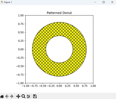
Example - Custom Donut
We can create a unique donut shape by customizing it using the matplotlib.patches.Wedge class. We can provide distinct angular extent to the donut, forming a partial circle. To enhance the shape visually, we can style the donut's edge with a dashed line ('--').
In the example below, we are customizing the donut with a specific angular extent, creating a partial circle. We are styling the donut with a light blue face color, a dark blue edge, and a dashed linestyle as shown below −
import matplotlib.pyplot as plt
import matplotlib.patches as patches
fig, ax = plt.subplots()
outer_radius = 0.8
inner_radius = 0.4
# Creating a Wedge representing the custom donut with a specific angular extent
donut = patches.Wedge((0, 0), outer_radius, 45, 315, width=outer_radius - inner_radius, edgecolor='darkblue', linestyle='--', facecolor='lightblue')
# Adding the donut to the plot
ax.add_patch(donut)
ax.set_aspect('equal', adjustable='box')
plt.title('Custom Donut')
plt.xlim(-1, 1)
plt.ylim(-1, 1)
plt.show()
Output
The output obtained is as shown below −
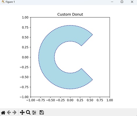
Matplotlib - Ellipse Demo
An ellipse is a geometric shape that looks like a slightly stretched circle. It has a curved outline, and unlike a circle, it has two different diameters; a longer one called the major axis and a shorter one called the minor axis. The center of the ellipse is a point around which the shape is symmetrically balanced.
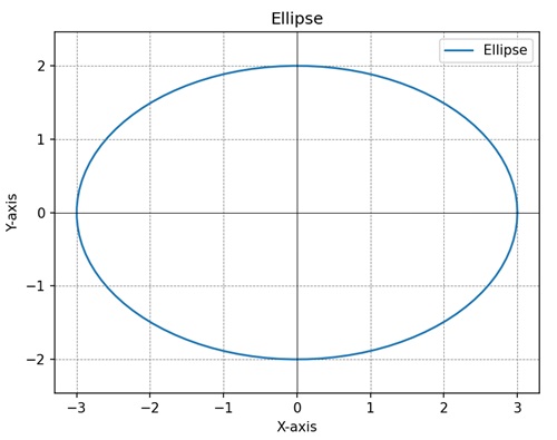
Ellipse Demo in Matplotlib
We can create an ellipse demo in Matplotlib using the "Ellipse" class in the "matplotlib.patches" module. The Ellipse class allows you to define the center, width and height (major and minor axes), angle of rotation, and other properties of the ellipse.
The matplotlib.patches.Ellipse Class
The matplotlib.patches.Ellipse class constructs an elliptical patch in Matplotlib plots. It takes parameters for the center coordinates, width (major axis length), height (minor axis length), and angle (rotation angle in degrees) and returns an ellipse instance.
Syntax
Following is the syntax for creating an ellipse using the Ellipse class in Matplotlib −
patches.Ellipse(xy, width, height, angle=0.0, **kwargs)
Where,
- xy is the center of the ellipse as a tuple (x, y).
- width is the width of the ellipse.
- height is the height of the ellipse.
- angle (optional) is the rotation angle of the ellipse in degrees (default is 0.0).
- **kwargs is the additional keyword arguments for customization.
Let us start by creating a rotated ellipse.
Example - Rotated Ellipse
We can create a rotated ellipse in Matplotlib using the Ellipse class from the matplotlib.patches module. The rotation angle allows the ellipse to be tilted or rotated around its center. This can be achieved by specifying the angle parameter when creating the Ellipse object.
In the following example, we are creating a rotated ellipse with a 45-degree angle. The ellipse has a width of 3 units, a height of 2 units, an edgecolor of blue ('b'), and no face color −
import matplotlib.pyplot as plt
import matplotlib.patches as patches
fig, ax = plt.subplots()
# Rotated ellipse
ellipse = patches.Ellipse((0, 0), 3, 2, angle=45, edgecolor='b', facecolor='none')
ax.add_patch(ellipse)
plt.title('Rotated Ellipse')
# Setting axis to be equal
plt.axis('equal')
plt.show()
Output
After executing the above code, we get the following output −
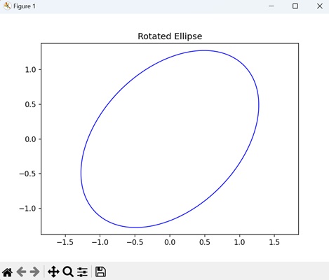
Example - Ellipse with Custom Color
We can customize the color of an ellipse as well in matplotlib. We achieve this by specifying the desired edge and face colors when creating the Ellipse object. The "edgecolor" parameter determines the color of the ellipse's outline, while the "facecolor" parameter sets the color of its interior.
In here, we are creating an ellipse having a green ('g') edge color and a yellow face color, providing a colorful appearance −
import matplotlib.pyplot as plt
import matplotlib.patches as patches
fig, ax = plt.subplots()
# Ellipse with custom colors
ellipse = patches.Ellipse((0, 0), 3, 2, edgecolor='g', facecolor='yellow')
ax.add_patch(ellipse)
plt.title('Ellipse with Custom Colors')
# Setting axis to be equal
plt.axis('equal')
plt.show()
Output
Following is the output of the above code −
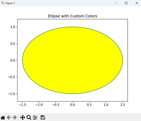
Example - Multiple Ellipses
We can also add multiple ellipses to a single plot by creating multiple instances of the Ellipse class. This allows us to represent various shapes simultaneously, each with its own unique characteristics and positions.
Now, we are creating two ellipses "ellipse1" and "ellipse2" with different sizes and colors, and adding them to the axes −
import matplotlib.pyplot as plt
import matplotlib.patches as patches
fig, ax = plt.subplots()
# Multiple ellipses
ellipse1 = patches.Ellipse((0, 0), 3, 2, edgecolor='r', facecolor='none')
ellipse2 = patches.Ellipse((0, 0), 2, 4, edgecolor='b', facecolor='none')
ax.add_patch(ellipse1)
ax.add_patch(ellipse2)
plt.title('Multiple Ellipses')
# Setting axis to be equal
plt.axis('equal')
plt.show()
Output
Output of the above code is as follows −
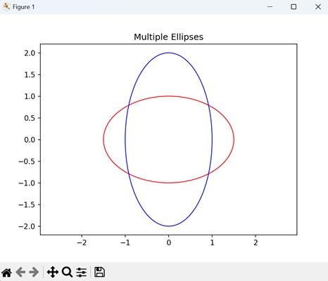
Example - Ellipse with Transparency
You can customize the transparency, often referred to as alpha blending, of an ellipse, by setting the alpha parameter when creating the Ellipse object. This parameter controls the opacity of the ellipse, allowing us to create semi-transparent shapes that overlay with other elements in the plot.
In the example below, we are creating an ellipse with a pink face color and 10% transparency (alpha=0.1) −
import matplotlib.pyplot as plt
import matplotlib.patches as patches
fig, ax = plt.subplots()
# Ellipse with transparency
ellipse = patches.Ellipse((0, 0), 3, 2, edgecolor='r', facecolor='pink', alpha=0.1)
ax.add_patch(ellipse)
plt.title('Ellipse with Transparency')
# Setting axis to be equal
plt.axis('equal')
plt.show()
Output
The output obtained is as shown below −
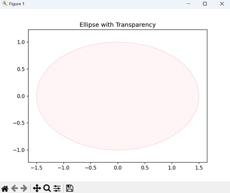
Matplotlib - Bezier Curve
A Bezier curve connects two points, A and B, through a smooth path influenced by control points. These control points act like invisible strings attached to A and B, shaping the form and direction of the curve. The curve does not necessarily touch the control points but is guided by their positions.
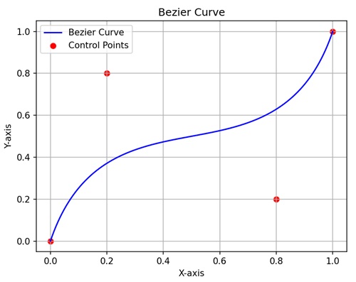
Bezier Curve in Matplotlib
We can create a Bezier curve in Matplotlib using the "Path" class in the "matplotlib.path" module. The Path class allows you to define the control points, allowing to create smooth flowing curves. For a quadratic Bezier curve, you need three control points (start, control, and end), and for a cubic Bezier curve, you need four control points.
The matplotlib.patches.Ellipse Class
The matplotlib.patches.Ellipse class constructs an elliptical patch in Matplotlib plots. It takes parameters for the center coordinates, width (major axis length), height (minor axis length), and angle (rotation angle in degrees) and returns an ellipse instance.
Syntax
Following is the syntax for creating a Bezier curve using the Path class in Matplotlib −
Path(vertices, codes)
Where,
- vertices is a list of tuples representing the coordinates of the control points. For a cubic Bezier curve, you need four control points: the starting point and three additional points that define the curve.
- codes specifies the type of each path segment. For a cubic Bezier curve, the path codes include "Path.MOVETO" to set the initial point and "Path.CURVE4" to define the cubic Bezier curve.
- For example − [Path.MOVETO, Path.CURVE4, Path.CURVE4, Path.CURVE4] indicates that the first point is a move-to operation, and the subsequent points define a cubic Bezier curve.
Let us start by creating a basic Bezier curve.
Example - Basic Bezier Curve
We can create a basic Bezier curve in matplotlib using control points that define its shape. Control points act like magnets, pulling the curve towards them. These control points are specified as coordinates in a list.
In the following example, we are creating a basic Bezier curve through the control points defined at (0, 0), (1, 1), (2, -1), and (3, 0) −
import matplotlib.pyplot as plt
import matplotlib.path as mpath
import matplotlib.patches as mpatches
# Defining control points
verts = [(0, 0), (1, 1), (2, -1), (3, 0)]
# Creating a Path object using Bezier curve
path = mpath.Path(verts, [mpath.Path.MOVETO, mpath.Path.CURVE4, mpath.Path.CURVE4, mpath.Path.CURVE4])
# Creating a patch representing the Bezier curve
patch = mpatches.PathPatch(path, facecolor='none', lw=2)
# Plotting the Bezier curve
fig, ax = plt.subplots()
ax.add_patch(patch)
# Highlighting control points
ax.scatter(*zip(*verts), c='red', marker='o')
ax.set_xlim(-1, 4)
ax.set_ylim(-2, 2)
plt.title('Simple Bezier Curve')
plt.show()
Output
After executing the above code, we get the following output −
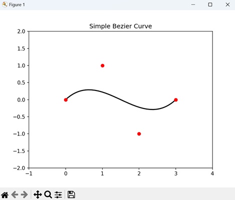
Example - Quadratic Bezier Curve
We can create a quadratic Bezier curve in matplotlib by defining three control points. The first and last points determine the endpoints of the curve, while the middle point determines the curvature.
In here, we are creating a quadratic Bezier curve using three control points: (0, 0), (1, 1), and (2, 0). The Bezier curve is defined using the Path class with the CURVE3 command for quadratic curves. We are highlighting the control points on the plot with blue squares −
import matplotlib.pyplot as plt
import matplotlib.patches as mpatches
from matplotlib.path import Path
# Defining control points for a quadratic Bezier curve
verts = [(0, 0), (1, 1), (2, 0)]
# Creating a Path object using quadratic Bezier curve
path = Path(verts, [Path.MOVETO, Path.CURVE3, Path.CURVE3])
# Creating a patch representing the quadratic Bezier curve
patch = mpatches.PathPatch(path, facecolor='none', lw=2)
# Plotting the quadratic Bezier curve
fig, ax = plt.subplots()
ax.add_patch(patch)
# Highlighting control points
ax.scatter(*zip(*verts), c='blue', marker='s')
ax.set_xlim(-1, 3)
ax.set_ylim(-1, 2)
plt.title('Quadratic Bezier Curve')
plt.show()
Output
Following is the output of the above code −
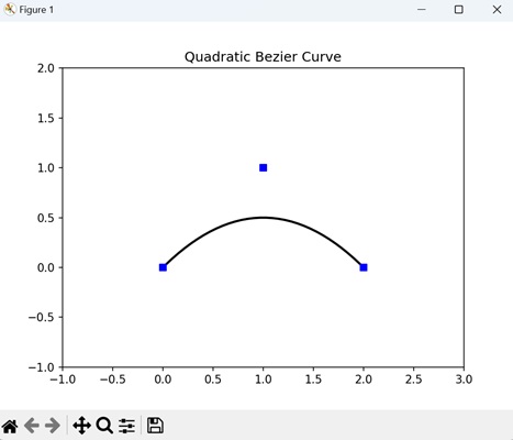
Example - Animated Bezier Curve
An animated Bezier curve in matplotlib is a dynamic representation of a curve that smoothly connects a series of control points. The control points define the shape of the curve shape, and the animation shows how the curve evolves as these points move. This is achieved using the "FuncAnimation module", where each frame updates the positions of the control points, and the resulting Bezier curve adjusts accordingly.
Now, we are using matplotlib to create an animated cubic Bezier curve. The control points for the curve are initially set at (0, 0), (1, 1), (2, -1), and (3, 0). The animation iteratively updates and displays the positions of these control points over ten frames, highlighting their movement, with a 500-millisecond interval. The resulting Bezier curve dynamically adjusts based on the changing positions of the control points −
import matplotlib.pyplot as plt
import matplotlib.patches as mpatches
from matplotlib.path import Path
from matplotlib.animation import FuncAnimation
# Defining control points for an animated Bezier curve
verts = [(0, 0), (1, 1), (2, -1), (3, 0)]
# Creating a Path object using cubic Bezier curve
path = Path(verts, [Path.MOVETO, Path.CURVE4, Path.CURVE4, Path.CURVE4])
# Creating a patch representing the Bezier curve
patch = mpatches.PathPatch(path, facecolor='none', lw=2)
# Plotting the Bezier curve with control points
fig, ax = plt.subplots()
ax.add_patch(patch)
# Placeholder for control points
control_points, = ax.plot([], [], 'ro')
# Animation function to update control points
def update(frame):
# Highlighting control points
control_points.set_data(*zip(*verts))
return control_points,
ani = FuncAnimation(fig, update, frames=range(10), interval=500, blit=True)
plt.title('Animated Bezier Curve')
plt.show()
Output
Output of the above code is as follows −
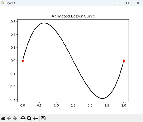
Example - Custom Bezier Curve with Arrowhead
In Matplotlib, we can create a custom Bezier curve with arrowhead by first defining a set of control points that shape the Bezier curve. These control points are connected smoothly, forming the curve. Then, we use the "FancyArrowPatch" class to add an arrowhead to the end of the curve, indicating its direction.
In the example below we are creating a custom Bezier curve. The control points for the curve are specified at (0, 0), (1, 1), (2, -1), and (3, 0). The curve is drawn through these points, and an arrowhead is added at the end of the curve using the "FancyArrowPatch" class −
import matplotlib.pyplot as plt
from matplotlib.patches import FancyArrowPatch
from matplotlib.path import Path
# Defining control points for a custom Bezier curve
verts = [(0, 0), (1, 1), (2, -1), (3, 0)]
# Creating a Path object using cubic Bezier curve
path = Path(verts, [Path.MOVETO, Path.CURVE4, Path.CURVE4, Path.CURVE4])
# Creating a patch representing the Bezier curve
patch = FancyArrowPatch(path=path, color='blue', arrowstyle='-|>', mutation_scale=15)
# Plotting the Bezier curve with an arrowhead
fig, ax = plt.subplots()
ax.add_patch(patch)
ax.scatter(*zip(*verts), c='red', marker='o')
ax.set_xlim(-1, 4)
ax.set_ylim(-2, 2)
plt.title('Custom Bezier Curve with Arrowhead')
plt.show()
Output
The output obtained is as shown below −
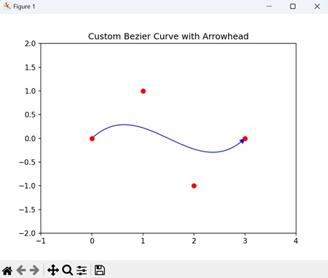
Matplotlib - Bubble Plots
A bubble plot is a type of scatter plot where each data point is represented by a marker (generally a circle or "bubble") on a two-dimensional axis. In addition to the traditional x and y coordinates, a third variable is used to determine the size of the marker, creating the illusion of three dimensions. The size of each bubble provides additional information about the data point.
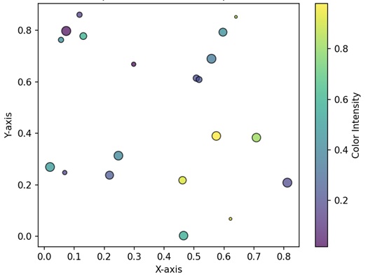
Bubble Plots in Matplotlib
We can create a bubble plot in Matplotlib using the scatter() function. This function allows us to customize the appearance of the bubble plot, including markers, colors, and sizes of the points.
This function takes two arrays or lists as input, where each array corresponds to the values of a different variable. The points are then plotted on a set of axes, with the position of each point determined by the values of the two variables.
The scatter() Function
In Matplotlib, a bubble plot can be created using the scatter() function, where the "s" parameter is used to set the size of the markers (bubbles). The scatter function allows you to represent three dimensions of data: the x and y coordinates determine the position of the markers, while the s parameter controls their size.
Syntax
Following is the syntax of the scatter() function in Matplotlib −
plt.scatter(x, y, s=None, c=None, marker=None, cmap=None, norm=None, vmin=None, vmax=None, ...)
Where,
- x and y is an array or list representing the x-coordinate and y-coordinate values respectively of the data points.
- s (optional) is the size of the markers.
- c (optional) is the color of the markers.
- marker (optional) is the marker style.
- cmap (optional) is the colormap for mapping the color of the markers.
- norm (optional) is the normalize object for mapping the data values to the colormap.
- vmin, vmax (optional) is the minimum and maximum values for normalizing the colormap.
These are just a few parameters; there are more optionals parameters available for customization.
Example - Basic Bubble Plot
In a Basic Bubble Plot using Matplotlib, we represent data points as bubbles on a two-dimensional plane. The position of each bubble is determined by its corresponding x and y coordinates, while the size of the bubble indicates a third dimension, representing a quantitative variable.
In the following example, we are creating a basic bubble plot using plt.scatter() function. The size of each bubble is determined by the "sizes" list, and the "alpha" parameter controls the transparency. The edges of the bubbles are set to "white" −
import matplotlib.pyplot as plt
# Data
x = [1, 2, 3, 4, 5]
y = [10, 20, 15, 25, 30]
sizes = [50, 100, 75, 120, 90]
# Creating a bubble plot
plt.scatter(x, y, s=sizes, alpha=0.5, edgecolors='w', linewidth=2)
# Adding title and axis labels
plt.title('Basic Bubble Plot')
plt.xlabel('X-axis')
plt.ylabel('Y-axis')
# Displaying the plot
plt.show()
Output
After executing the above code, we get the following output −
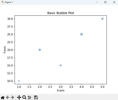
Example - Color-Mapped Bubble Plot
We enhance the basic bubble plot in Matplotlib by using a color dimension to create a Color-Mapped Bubble Plot. In this type of plot, each bubble not only conveys information through its x and y coordinates but also displays a unique color, creating a color-mapped effect. This coloring is often associated with a third variable, adding another layer of meaning to the plot.
We construct the Color-Mapped Bubble Plot using the plt.scatter() function, with the "c" parameter specifying the color mapping.
In here, we are creating a bubble plot by adding color to each bubble. The "colors" list assigns a unique color to each bubble, creating a color-mapped effect. We are outlining the bubbles with black edges −
import matplotlib.pyplot as plt
# Data
x = [1, 2, 3, 4, 5]
y = [10, 20, 15, 25, 30]
sizes = [50, 100, 75, 120, 90]
colors = ['red', 'green', 'blue', 'orange', 'purple']
# Color-Mapped Bubble Plot
plt.scatter(x, y, s=sizes, c=colors, alpha=0.8, edgecolors='k', linewidth=2)
# Adding title and axis labels
plt.title('Color-Mapped Bubble Plot')
plt.xlabel('X-axis')
plt.ylabel('Y-axis')
# Displaying the plot
plt.show()
Output
Following is the output of the above code −
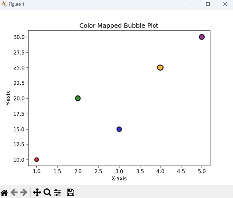
Example - Customized Bubble Plot
We can also customize the appearance of the bubbles in a bubble plot. This is achieved by changing the marker style, edge color, transparency etc. using various parameters in the plt.scatter() function.
Now, we are customizing the bubble plot by changing the marker style to a triangle (marker='^') −
import matplotlib.pyplot as plt
# Data
x = [1, 2, 3, 4, 5]
y = [10, 20, 15, 25, 30]
sizes = [50, 100, 75, 120, 90]
colors = ['red', 'green', 'blue', 'orange', 'purple']
# Customized Bubble Plot
plt.scatter(x, y, s=sizes, c=colors, alpha=0.8, edgecolors='k', linewidth=2, marker='^')
# Adding title and axis labels
plt.title('Customized Bubble Plot')
plt.xlabel('X-axis')
plt.ylabel('Y-axis')
# Displaying the plot
plt.show()
Output
Output of the above code is as follows −
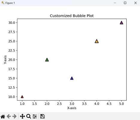
Example - Bubble Plot with Annotations
In a bubble plot with annotations using Matplotlib, data points are represented as bubbles, with the size of each bubble corresponding to a specific numerical value (annotations). These annotations provide textual information associated with each data point.
In the example below, we are adding annotations to the bubble plot, displaying the exact size value of each bubble. We are using the plt.annotate() function to place text labels near each bubble −
import matplotlib.pyplot as plt
# Data
x = [1, 2, 3, 4, 5]
y = [10, 20, 15, 25, 30]
sizes = [50, 100, 75, 120, 90]
# Bubble Plot with Annotations
plt.scatter(x, y, s=sizes, alpha=0.5, edgecolors='w', linewidth=2)
for i, txt in enumerate(sizes):
# Adding annotations
plt.annotate(f'{int(txt)}', (x[i], y[i]), textcoords="offset points", xytext=(0, -15), ha='center')
# Adding title and axis labels
plt.title('Bubble Plot with Annotations')
plt.xlabel('X-axis')
plt.ylabel('Y-axis')
# Displaying the plot
plt.show()
Output
The output obtained is as shown below −
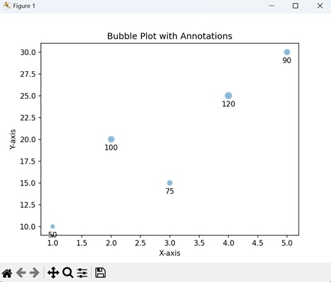
Matplotlib - Stacked Plots
A stacked plot is a type of chart where multiple sets of data are represented on top of each other, creating a stack or layer. Each set of data is represented as a colored section, and when you stack them together, you can see how they contribute to the whole.
Imagine you have different categories fruits, and you want to show how much of each fruit contributes to the total quantity. In a stacked plot, you would have a bar for each fruit, and these bars would be stacked on top of each other. The total height of the stack represents the overall quantity, and the height of each individual bar within the stack shows the contribution of that specific fruit to the total.
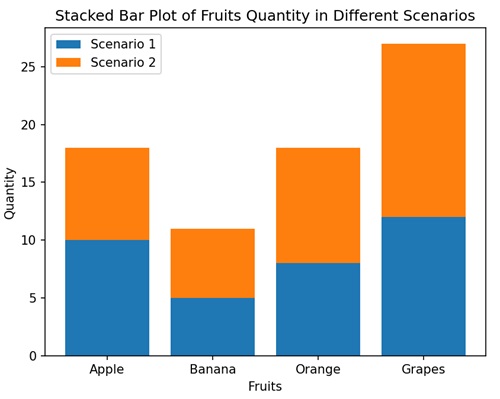
Stacked Plots in Matplotlib
We can create a stacked plot in Matplotlib using the stackplot() function. This function takes multiple arrays or sequences as input, each representing a different layer of the stack. The areas between the layers are then filled with different colors.
The stackplot() Function
In Matplotlib, the stackplot() function takes the x-axis values and multiple sets of y-axis values, stacking them on top of each other. Each set of y-values represents a different layer in the stack.
Syntax
Following is the syntax of the stackplot() function in Matplotlib −
matplotlib.pyplot.stackplot(x, *args, labels=None, colors=None, baseline='zero', **kwargs)
Where,
- x represents x-axis values.
- *args is the multiple sets of y-axis values. You can provide them as separate arguments, like y1, y2, y3, ....
- labels (optional) is list of labels for each set of y-values.
- colors is a list of colors for each set of y-values. If not provided, Matplotlib automatically selects colors.
- baseline specifies where the baseline of the stack should be. The default is 'zero', but you can also use 'sym' for symmetric, 'wiggle' for a wiggly baseline, or a specific value.
- **kwargs are the additional keyword arguments that can be passed to customize the plot.
Example - Basic Stacked Area Plot
A Basic Stacked Area Plot in Matplotlib is like stacking different layers of colors on top of each other to create a colorful mountain-like shape. Each color represents a category of data, and as you move from left to right on the plot, you see how the combined "height" of the colors changes. It is a way to show the overall pattern and the individual parts that make up the whole.
In the following example, we are creating a simple stacked area plot of three layers (y1, y2, and y3) on top of each other along the x-axis (x) using the stackplot() function with default colors −
import matplotlib.pyplot as plt
# Data
x = [1, 2, 3, 4, 5]
y1 = [1, 2, 4, 3, 6]
y2 = [2, 3, 5, 1, 2]
y3 = [0, 1, 2, 4, 3]
# Basic stacked area plot
plt.stackplot(x, y1, y2, y3, labels=['Layer 1', 'Layer 2', 'Layer 3'])
# Adding labels and legend
plt.xlabel('X-axis')
plt.ylabel('Y-axis')
plt.legend()
plt.title('Basic Stacked Area Plot')
# Displaying the plot
plt.show()
Output
After executing the above code, we get the following output −
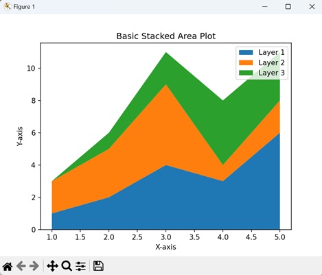
Example - Stacked Plot with Symmetric Baseline
A symmetric baseline in a stacked plot means that the different parts of the plot are arranged above and below a central line (usually at zero on the y-axis) in a balanced way. It is like having a see-saw where the weights on both sides are equal, ensuring that the positive and negative elements of the stacked bars are evenly distributed above and below the baseline.
Using a symmetric baseline helps us to show the contribution of each part visually, maintaining a clear starting reference for comparison at the center point (at zero).
In here, we are creating a stacked plot with symmetric baseline, by setting the "baseline" parameter to "sym" −
import matplotlib.pyplot as plt
# Data
x = [1, 2, 3, 4, 5]
y1 = [1, 2, 4, 3, 6]
y2 = [2, 3, 5, 1, 2]
y3 = [0, 1, 2, 4, 3]
# Stacked plot with symmetric baseline
plt.stackplot(x, y1, y2, y3, labels=['Layer 1', 'Layer 2', 'Layer 3'], baseline='sym')
# Adding labels and legend
plt.xlabel('X-axis')
plt.ylabel('Y-axis')
plt.legend()
plt.title('Stacked Plot with Symmetric Baseline')
# Displaying the plot
plt.show()
Output
Following is the output of the above code −
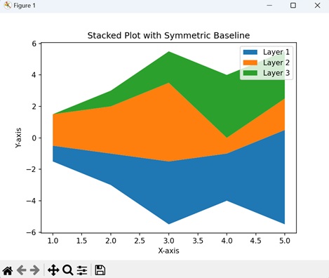
Example - Stacked Plot with Transparency
To create a stacked plot with transparency in Matplotlib, you can adjust the alpha parameter to control the opacity of each layer. This helps us to enhance the visualization by allowing overlapping areas to be visible to some extent, providing a clear view of the overall pattern.
Now, we are customizing the stacked plot by setting the alpha parameter to 0.7 in the stackplot() function, making each layer semi-transparent −
import matplotlib.pyplot as plt
# Data
x = [1, 2, 3, 4, 5]
y1 = [2, 3, 1, 4, 2]
y2 = [1, 2, 3, 1, 2]
y3 = [0, 1, 2, 4, 3]
# Creating a stacked plot with transparency
plt.stackplot(x, y1, y2, y3, alpha=0.2, labels=['Layer 1', 'Layer 2', 'Layer 3'])
# Adding labels, legend, and title
plt.xlabel('X-axis')
plt.ylabel('Y-axis')
plt.legend()
plt.title('Stacked Plot with Transparency')
# Showing the plot
plt.show()
Output
Output of the above code is as follows −
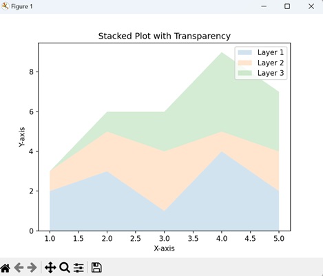
Example - Stacked Percentage Plot
A Stacked Percentage Plot in Matplotlib is like a colorful graph that shows the proportion of different parts in a whole for each category. The height of the stack at any point represents the percentage contribution of each component to the total.
You can create a stacked percentage plot in Matplotlib by taking the total for each category, calculating the percentage of each component (normalizing data), and then using the stackplot() function to visualize the proportions.
In the example below, we first calculate the percentages for each layer (y1, y2, y3) by dividing each value by the total sum of values at that position. The resulting y1_percent, y2_percent, and y3_percent represent the percentages of each layer relative to the total at each position. The stackplot() function is then used to create a stacked plot using these percentages −
import matplotlib.pyplot as plt
# Data
x = [1, 2, 3, 4, 5]
y1 = [10, 20, 15, 25, 30]
y2 = [15, 25, 20, 15, 10]
y3 = [5, 10, 8, 12, 15]
# Calculating percentages
total = [sum(i) for i in zip(y1, y2, y3)]
y1_percent = [i / t * 100 for i, t in zip(y1, total)]
y2_percent = [i / t * 100 for i, t in zip(y2, total)]
y3_percent = [i / t * 100 for i, t in zip(y3, total)]
# Creating a stacked percentage plot
plt.stackplot(x, y1_percent, y2_percent, y3_percent, labels=['Component 1', 'Component 2', 'Component 3'], baseline='zero')
# Adding labels, legend, and title
plt.xlabel('X-axis')
plt.ylabel('Percentage')
plt.legend(loc='upper left')
plt.title('Stacked Percentage Plot')
# Showing the plot
plt.show()
Output
The output obtained is as shown below −
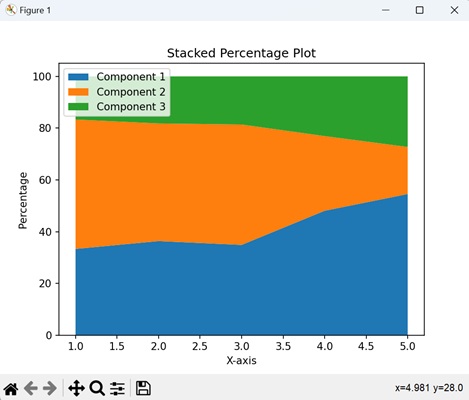
Matplotlib - Table Charts
A table chart is a way of organizing information in a tabular format. It looks like a set of rows and columns, where each row represents a different item, and each column represents a specific characteristic of those items.
Imagine you have a list of fruits and their corresponding colors. In a table chart, you can create two columns: one for the fruits and another for their colors. Each row in the table will then contain the name of a fruit and its associated color −
Table Charts in Matplotlib
We can create a table chart in Matplotlib using the table() function. This function is useful for presenting detailed data along with your charts. The table can consist of headers, row labels, and cell values, making it easy to show your information in an enhanced way.
The table() Function
The table() function in Matplotlib is used to create a table within a plot. It requires parameters such as the table data, column and row labels, and positioning coordinates. The function returns a Table object, which can be further customized to the existing the plot −
Following is the syntax of the table() function in matplotlib −
matplotlib.pyplot.table(cellText=None, cellColours=None, cellLoc='right', colWidths=None, rowLabels=None, rowColours=None, rowLoc='left', colLabels=None, colColours=None, colLoc='center', loc='bottom', bbox=None, edges='closed', **kwargs)
Where,
- cellText is the data for table cells (2D list or array).
- cellColours is the colors for table cells.
- cellLoc is the text alignment within cells ('right', 'center', 'left'). Default is right.
- colWidths is list of labels for each set of y-values.
- rowLabels is the labels for table rows.
- rowColours is the colors for table rows.
- rowLoc is the text alignment for row labels ('right', 'center', 'left'). Default is left.
- loc is the location of the table within the plot ('bottom', 'top', 'center'). Default is bottom.
- bbox is the bounding box coordinates (left, bottom, width, height). Default is bottom.
- edges is the style of cell borders ('closed', 'open', or 'vertical'). Default is closed.
- **kwargs are the additional keyword arguments that can be passed to customize the chart.
Example - Basic Table Chart
A Basic Table Chart in Matplotlib is like presenting simple tabular data within a plot. This chart allows us to display categorical information in a structured grid format.
In the following example, we are creating a simple table chart with numerical data. The table() function is used to display the data in a table format at the center of the plot with the axis turned off for a cleaner display −
import matplotlib.pyplot as plt
data = [[1, 2, 3], [4, 5, 6], [7, 8, 9]]
table = plt.table(cellText=data, loc='center')
# Turning off axis for a cleaner display
plt.axis('off')
plt.show()
Output
After executing the above code, we get the following output −
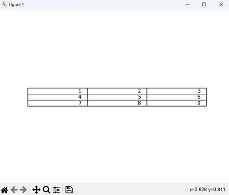
Example - Table Chart with Row and Column Labels
A Table Chart with row and column labels in Matplotlib resembles a grid that not only displays numerical values but also includes labels on the sides, providing additional information to the data.
We can use the "rowLabels" and "colLabels" parameters in the table() function to add labels to the rows and columns.
In here, we are adding row labels as 'Row 1', 'Row 2' and 'Row 3'; and column labels as 'Col A', 'Col B' and 'Col C' to the table chart −
import matplotlib.pyplot as plt
data = [[1, 2, 3], [4, 5, 6], [7, 8, 9]]
row_labels = ['Row 1', 'Row 2', 'Row 3']
col_labels = ['Col A', 'Col B', 'Col C']
table = plt.table(cellText=data, rowLabels=row_labels, colLabels=col_labels, loc='center')
plt.axis('off')
plt.show()
Output
Following is the output of the above code −
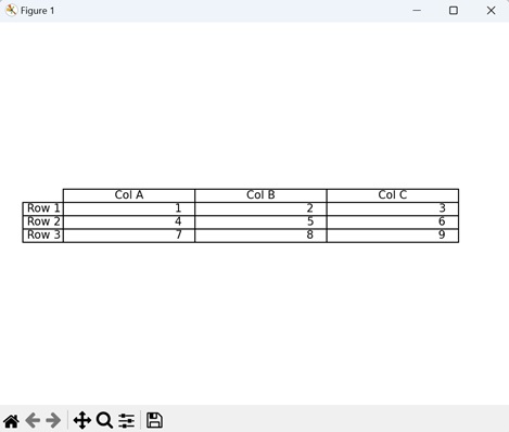
Example - Table Chart with Customized Borders
We can also customize the border styles of the table between cells. Instead of regular lines between the numbers, it has special open spaces i.e. open borders. We can use the "edges" parameter in the table() function to customize the borders of a table.
Now, we are customizing the table chart to have open borders between cells by setting the "edges" parameter to "open") −
import matplotlib.pyplot as plt
data = [[1, 2, 3], [4, 5, 6], [7, 8, 9]]
table = plt.table(cellText=data, loc='center', edges='open')
plt.axis('off')
plt.show()
Output
Output of the above code is as follows −
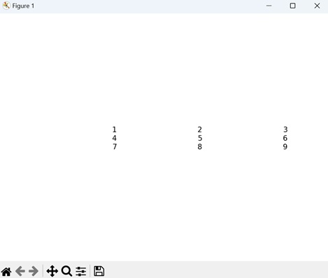
Example - Table Chart with Custom Location and Size
In Matplotlib, it is possible to customize the location and size of a table, allowing you to place it precisely where you want it on a plot using custom coordinates. You have the flexibility to determine its placement, such as the upper-left corner, and adjust the size of the table according to specific layout requirements.
We can use the "loc" and "bbox" parameters in the table() function to customize the position and size of the table respectively.
In the example below, we are positioning the table in the upper-left corner, and adjusting its size using the bounding box coordinates −
import matplotlib.pyplot as plt
data = [[1, 2, 3], [4, 5, 6], [7, 8, 9]]
table = plt.table(cellText=data, loc='upper left', bbox=[0.2, 0.6, 0.4, 0.3])
plt.axis('on')
plt.show()
Output
The output obtained is as shown below −
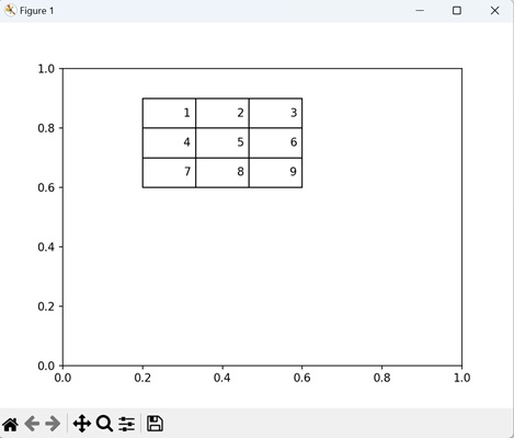
Matplotlib - Polar Charts
A polar chart is a type of graph that displays data in a circular format. Instead of using traditional x and y axes like in a regular chart, a polar chart uses a circular grid. The center of the circle represents the starting point, and data points are plotted at various distances from the center and at different angles.
Imagine a compass where the center is north, and as you move outward, you are going in different directions. Each direction corresponds to an angle on the polar chart. The distance from the center to a point represents a value −
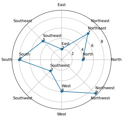
Polar Charts in Matplotlib
We can create a polar chart in Matplotlib using the polar() function. This function allows us to plot data in a polar coordinate system. The radial axis represents the distance from the center, while the angular axis represents the angle around the circle.
This type of chart is useful for applications such as radar systems, astronomy, and any scenario where cyclical information needs to be visually shown.
The polar() Function
The polar() function in Matplotlib is used to create polar plots, which represent data in a polar coordinate system. Instead of the typical x and y axes, polar plots use radial and angular axes to visualize data points in a circular manner.
Syntax
Following is the syntax of the polar() function in Matplotlib −
plt.polar(theta, r, marker='o', linestyle='-', label='Data')
Where,
- theta is an array representing the angles in radians for data points.
- r is an array representing the radial distance from the center for each data point.
- marker (optional) specifies the marker style for each data point like 's' for squares, 'o' for circles or 'x' for crosses.
- linestyle (optional) specifies the style of connecting lines between data points like '-' for solid line, ':' for dotted lines or '--' for dashed lines.
- label (optional) provides a label for the plotted data, which is useful when adding a legend to the plot.
Example - Basic Polar Plot with Sine Function
Creating a polar plot with a sine function in Matplotlib is like displaying data in a circular coordinate system, where the angle around the circle corresponds to the independent variable, and the radial distance from the center represents the value of the sine function at that angle.
In the following example, we are creating a basic polar plot using the plt.polar() function with polar coordinates derived from a sine function. The resulting plot shows a sine wave pattern around the circle −
import matplotlib.pyplot as plt import numpy as np # Generating polar coordinates using a sine function theta = np.linspace(0, 2*np.pi, 360) r = np.sin(3 * theta) # Plotting the polar data and adding a legend plt.polar(theta, r, label='Sine Function') plt.legend() plt.show()
Output
After executing the above code, we get the following output −
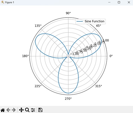
Example - Polar Scatter Plot
A Polar Scatter Plot in Matplotlib is a graphical representation that displays individual data points in a circular coordinate system. Unlike traditional scatter plots that use Cartesian coordinates, polar scatter plots use radial distance and angular position to represent data. Each point is plotted based on its angle and distance from the center, creating a scatter of points around the circle.
In here, we are creating a polar plot with "20" custom data points (r) at evenly spaced angles (theta) around a circle −
import matplotlib.pyplot as plt import numpy as np # Specifying polar coordinates theta = np.linspace(0, 2*np.pi, 20) r = np.array([0.2, 0.5, 0.8, 1.2, 1.5, 1.8, 2.1, 2.5, 2.8, 3.0, 2.8, 2.5, 2.1, 1.8, 1.5, 1.2, 0.8, 0.5, 0.2, 0.0]) # Creating a polar scatter plot with data points plt.polar(theta, r, marker='o', linestyle='None', label='Data Points') plt.legend() plt.show()
Output
Following is the output of the above code −
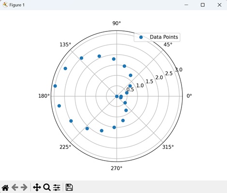
Example - Multiple Data Series in Polar Plot
A Multiple Data Series in a Polar Plot in Matplotlib is a visual representation that includes plotting more than one set of data in a circular coordinate system. In this type of plot, each data series is represented by its own set of angles and radial distances, creating distinct patterns around the center of the plot. We can distinguish each series by using different colors, markers, or linestyles.
Now, we are creating a polar plot with two data series. To achieve this, we are using sine and cosine functions to generate two distinct radial patterns (r1 and r2) at various angles (theta) −
import matplotlib.pyplot as plt import numpy as np # Generating polar coordinates using both sine and cosine functions theta = np.linspace(0, 2*np.pi, 360) r1 = np.sin(3 * theta) r2 = np.cos(2 * theta) # Plotting multiple data series in a polar plot plt.polar(theta, r1, label='Sine Function') plt.polar(theta, r2, label='Cosine Function') plt.legend() plt.show()
Output
Output of the above code is as follows −
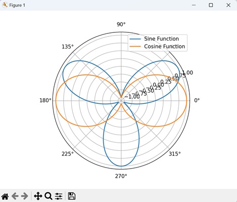
Example - Rose Plot
A Rose Plot in Matplotlib is a specialized type of polar plot that combines circular coordinates with a filled area under the curve. It represents data using a periodic function, such as the sine function, to create petal-like patterns like a rose flower. Each "petal" corresponds to a certain range of angles, and the radial distance from the center indicates the magnitude of the function at those angles.
In the example below, we are creating a polar plot by taking the absolute value of a sine function. The plot displays a petal-like pattern at various angles (theta). Additionally, the fill() function is used to fill the area under the curve −
import matplotlib.pyplot as plt import numpy as np # Generating polar coordinates using the absolute value of a sine function theta = np.linspace(0, 2*np.pi, 360) r = np.abs(np.sin(5 * theta)) # Plotting a rose plot with a filled area under the curve plt.polar(theta, r, label='Rose Plot') # Filled area under the curve plt.fill(theta, r, alpha=0.5) plt.legend() plt.show()
Output
The output obtained is as shown below −
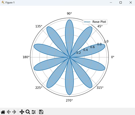
Matplotlib - Hexagonal Bin Plots
A hexagonal bin plot is used to display the distribution of points in a two-dimensional space, such as a scatter plot. Instead of showing individual data points, the plot divides the space into hexagonal bins and counts the number of points that fall into each bin.
Imagine a garden where you are counting the number of flowers. A hexagonal bin plot of the garden would divide it into hexagons, and the color of each hexagon would show how many flowers are in that part of the garden. Darker hexagons mean more flowers, giving you a simple way to identify the areas with the most blooms quickly −

Hexagonal Bin Plots in Matplotlib
We can create a hexagonal bin plot in Matplotlib using the hexbin() function. This plot is useful for visualizing the distribution and density of data points, particularly in scenarios where there are a large number of data points that could overlap in a traditional scatter plot.
The hexbin() Function
The hexbin() function in Matplotlib takes in the x and y coordinates of the data points, divides the plot into hexagonal bins, and assigns colors or intensities based on the number of points in each bin. The resulting plot displays the density and distribution of data in a two-dimensional space.
Syntax
Following is the syntax of the hexbin() function in Matplotlib −
matplotlib.pyplot.hexbin(x, y, C=None, gridsize=100, bins=None, cmap=None, vmin=None, vmax=None, **kwargs)
Where,
- x is the x-coordinate values of the data points.
- y is the y-coordinate values of the data points.
- C (optional) is the values associated with the data points, which determine the color of the hexagons.
- gridsize (optional) specifies the number of hexagons in the x-direction. Higher values result in finer binning.
- bins (optional) provides an alternative way to specify the bin edges instead of gridsize.
- cmap (optional) is the colormap for coloring the hexagons.
- vmin and vmax (optional) are the minimum and maximum values for the colormap scale.
- **kwargs is the additional keyword arguments for customizing the hexagonal bin plot.
Example - Basic Hexagonal Bin Plot
A basic hexagonal bin plot in Matplotlib is like a honeycomb map for your data. It groups points into hexagons, and the color of each hexagon shows how many points it contains. It helps to see where things are more crowded or scattered in your scatter plot.
In the following example, we are creating a simple hexagonal bin plot by generating random data points (x and y). The color of each hexagon represents the density of points in that area −
import matplotlib.pyplot as plt
import numpy as np
# Generating random data
np.random.seed(42)
x = np.random.normal(size=100)
y = np.random.normal(size=100)
# Creating a basic hexagonal bin plot
plt.hexbin(x, y, gridsize=10, cmap='copper_r', mincnt=1)
# Adding labels and a colorbar
plt.title('Basic Hexagonal Bin Plot')
plt.xlabel('X-axis')
plt.ylabel('Y-axis')
plt.colorbar(label='Counts')
# Displaying the plot
plt.show()
Output
After executing the above code, we get the following output −

Example - Hexagonal Bin Plot with Marginal Histograms
A hexagonal bin plot with marginal histograms in Matplotlib is like a map with honeycomb shapes, where each hexagon represents a group of points. It not only shows where points are concentrated but also displays histograms along the plot margins. These histograms provide a view of individual distributions of each variable along the X and Y axes.
In here, we are creating a hexagonal bin plot with marginal histograms using Matplotlib. We use the hexbin() function to plot the hexagonal bins, and set the "marginals" parameter to "True" parameter for adding histograms along the x and y axes −
import matplotlib.pyplot as plt
import numpy as np
# Generating random data
np.random.seed(42)
x = np.random.normal(size=100)
y = np.random.normal(size=100)
# Creating a hexagonal bin plot with marginal histograms
plt.hexbin(x, y, gridsize=10, cmap='plasma', mincnt=1, marginals=True)
# Adding labels and a colorbar
plt.title('Hexagonal Bin Plot with Marginal Histograms')
plt.xlabel('X-axis')
plt.ylabel('Y-axis')
plt.colorbar(label='Counts')
plt.show()
Output
Following is the output of the above code −

Example - Hexagonal Bin Plot with Log-Scaled Colorbar
When you use a log-scaled colorbar in a hexagonal bin plot, the color variation is based on the logarithm of the point counts rather than the raw counts.
This is useful in where the data shows a wide range of values, and you want to highlight differences in denser regions while still providing information about less dense areas.
Now, we are creating a hexagonal bin plot with a log-scaled colorbar. We generate random data points (x, y) and visualize their distribution using hexagonal bins with a "gridsize" of "12". The color of each bin represents the logarithmically-scaled count of points within that bin −
import numpy as np
import matplotlib.pyplot as plt
from matplotlib.colors import LogNorm
# Generating random data
np.random.seed(42)
x = np.random.normal(size=100)
y = np.random.normal(size=100)
# Creating a hexagonal bin plot with log-scaled colorbar
plt.hexbin(x, y, gridsize=12, cmap='cubehelix_r', mincnt=1, norm=LogNorm())
plt.title('Hexagonal Bin Plot with Log-Scaled Colorbar')
plt.xlabel('X-axis')
plt.ylabel('Y-axis')
plt.colorbar(label='Log Counts')
plt.show()
Output
Output of the above code is as follows −
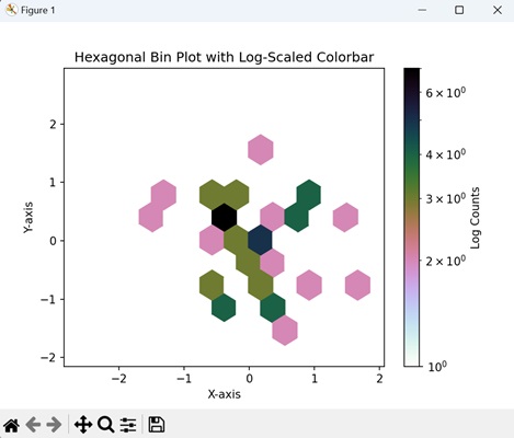
Example - Hexagonal Bin Plot with Customized Edge Color
We can also customize the color of the hexagon borders in the plot. This is achieved by specifying the "edgecolors" parameter in the matplotlib hexbin() function, helpful in highlighting patterns within the data.
In the example below, we generate two random datasets, 'x' and 'y', each of size 100. Using the hexbin() function, a hexagonal bin plot is created with a gridsize of 10 and the 'Pastel1_r' colormap. The hexagon edges are colored in blue −
import numpy as np
import matplotlib.pyplot as plt
# Generating random data
np.random.seed(42)
x = np.random.normal(size=100)
y = np.random.normal(size=100)
# Creating a hexagonal bin plot with hexagon edge coloring
plt.hexbin(x, y, gridsize=10, cmap='Pastel1_r', mincnt=1, edgecolors='blue', linewidths=0.5)
plt.title('Hexagonal Bin Plot with Edge Coloring')
plt.xlabel('X-axis')
plt.ylabel('Y-axis')
plt.colorbar(label='Counts')
plt.show()
Output
The output obtained is as shown below −

Matplotlib - Violin Plots
A violin plot is used to represent the distribution of a dataset. It combines elements of a box plot and a kernel density plot. The plot consists of symmetrical shapes that look like violins to represent different groups. The "width" of these shapes represents the density of the data at that value. Wider sections indicate higher density i.e. more data points fall within that range, while narrower sections indicate lower density.
- Box Plot Elements: Inside the violin, you may find a box plot, which includes elements such as the median, quartiles, and outliers. This provides additional information about the central tendency and distribution of the data.
- Kernel Density Plot: The smooth outline of the violin is derived from a kernel density estimation (KDE) plot, providing a continuous representation of the data distribution.
Imagine you have data on the scores of students in a class. The box in the violin plot will represent where most students scored, and the wider sections of the violin will show which scores are more common. If the violin is wider around 80 points, it means many students scored around 80 −
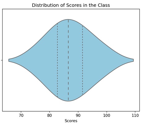
Violin Plot in Matplotlib
We can create a violin bin plot in Matplotlib using the violinplot() function. This function creates a graphical representation of the distribution of a dataset, consisting of both box plot elements and kernel density estimation.
The violinplot() Function
The violinplot() function in Matplotlib takes one or more datasets and produces a plot where each dataset is represented by a "violin" shape. The width of the violin corresponds to the data density, and the plot displays the median, quartiles, and probability density function of the data distribution.
Following is the syntax of the violinplot() function in Matplotlib −
plt.violinplot( dataset, positions=None, vert=True, widths=0.5, showmeans=False, showextrema=True, showmedians=False, quantiles=None, points=100, bw_method=None, *, data=None )
Where,
- dataset is the input sequence of datasets to be plotted as violins.
- positions (optional) is the positions of the violins along the x-axis. If not specified, they will be placed at integer positions.
- If vert (optional) is True, the violins are vertically oriented; if False, they are horizontally oriented.
- widths (optional) is the width of the violins.
- If showmeans (optional) is True, the mean of each violin is marked as a point on the plot.
- If showextrema (optional) is True, the minimum and maximum values are marked as points on the plot.
- quantiles are the quartiles to be plotted, specified as a list of floats.
- points are the number of points to evaluate and plot the kernel density estimation.
- bw_method is the bandwidth method for kernel density estimation. If None, the method is automatically determined.
Example - Basic Violin Plot
A basic violin plot is a way to show the distribution of data. Imagine your data as a bunch of violins. Each violin represents a set of values, and its shape gives you an idea of how those values are spread. The wider parts of the violin indicate more data points, and the narrower parts indicate less data points. The line inside the violin is the median value, indicating the center of your data.
In the following example, we are creating a simple violin plot using random data with different standard deviations, without displaying mean markers but showing median markers −
import matplotlib.pyplot as plt
import numpy as np
# Generating data with different standard deviations
data = [np.random.normal(0, std, 100) for std in range(1, 5)]
# Creating a basic violin plot
plt.violinplot(data, showmeans=False, showmedians=True)
plt.title('Basic Violin Plot')
plt.show()
Output
After executing the above code, we get the following output −
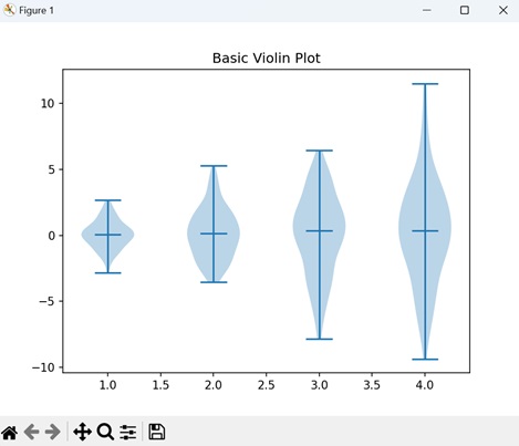
Example - Horizontal Violin Plot
To create a horizontal violin plot, the orientation of the usual violins is changed. Instead of extending up and down, they stretch from left to right. Just like regular violins, each one represents a set of data, showing you how the values are spread out. So, a horizontal violin plot helps you understand the distribution of your data, just like the regular one, but in a horizontal direction.
In here, we are creating a horizontal violin plot instead of a vertical one. This is achieved by setting the "vert" parameter to "False" in the violinplot() function −
import matplotlib.pyplot as plt
import numpy as np
# Generating data with different standard deviations
data = [np.random.normal(0, std, 100) for std in range(1, 5)]
# Creating a horizontal violin plot
plt.violinplot(data, showmeans=False, showmedians=True, vert=False)
plt.title('Horizontal Violin Plot')
plt.show()
Output
Following is the output of the above code −
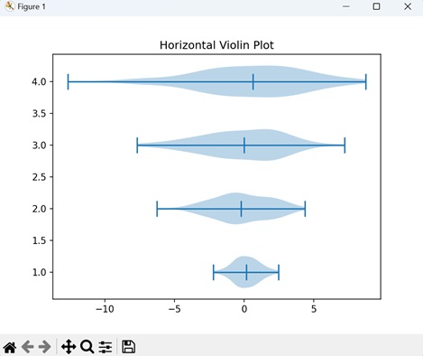
Example - Multiple Violins in One Plot
In Matplotlib, you can use multiple violins in in a single plot to represent various sets of data. By stacking these violins together, you can compare the distributions of multiple datasets, observing how they differ or overlap.
Now, we are generating two sets of data with different standard deviations and creating a plot with multiple violins −
import matplotlib.pyplot as plt
import numpy as np
# Generating data with different standard deviations
data = [np.random.normal(0, std, 100) for std in range(1, 5)]
# Creating a plot with multiple violins
plt.violinplot(data, showmeans=False, showmedians=True)
plt.violinplot(data[::-1], showmeans=False, showmedians=True)
plt.title('Multiple Violins in One Plot')
plt.show()
Output
Output of the above code is as follows −
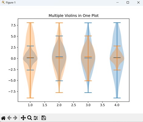
Example - Violin Plot with Quantiles
A violin plot with quantiles displays specific points that divide your data into quarters. Imagine each violin being divided into four equal sections, marking different levels of your data. The width of each section represents the number of data points. Now, you can also observe the plot, marking specific portions where your data lie, such as 25%, 50% (median), and 75%.
In the example below, we are creating a violin plot, displaying the distribution of each dataset with median markers and quantiles specified at 25th, 50th, and 75th percentiles −
import matplotlib.pyplot as plt
import numpy as np
# Data
data1 = np.random.normal(0, 1, 100)
data2 = np.random.normal(2, 1, 100)
# Creating a violin plot with specified quantiles for each dataset
plt.violinplot([data1, data2], showmeans=False, showmedians=True, quantiles=[[0.25, 0.5, 0.75], [0.25, 0.5, 0.75]])
plt.title('Violin Plot with Quantiles')
plt.show()
Output
The output obtained is as shown below −
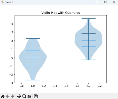
Matplotlib - Event Plot
An event plot is used to display the occurrences of events over a specific period of time. It consists of points (markers) along a timeline, where each point indicate the happening of a specific event. The vertical axis indicates different types of events, and the horizontal axis represents time.
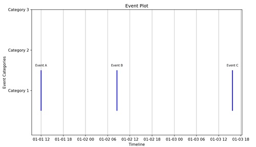
Event Plot in Matplotlib
We can create event plots in Matplotlib using the eventplot() function. This function allows you to specify the positions of the events to be plotted. Each vertical line or marker in the plot represents a particular event, and the resulting visualization displays the relationships between different events in a dataset.
The eventplot() Function
The eventplot() function in Matplotlib takes a list of arrays as input, where each array represents the positions of events along the timeline for a specific category or set. Event markers are then plotted at these positions, creating a visual representation of the events in different categories over time.
Following is the syntax of the eventplot() function in Matplotlib −
matplotlib.pyplot.eventplot(positions, orientation='horizontal', lineoffsets=1, linelengths=1, linewidths=None, colors=None, linestyles='solid', alpha=None, **kwargs)
Where,
- positions is the sequence specifying the positions of the events along the chosen orientation.
- orientation specifies whether the events are plotted vertically or horizontally. Default is 'horizontal'.
- lineoffsets is the vertical or horizontal offset from the baseline where the events are plotted.
- linelengths is the length of the lines or markers representing the events.
- linewidths is the width of the lines representing the events. If None, the default linewidth is used.
- colors is the sequence of colors for the events.
- linestyles is the line style of the events. Default is 'solid'.
- alpha represents the pacity of the lines or markers.
- **kwargs is the additional keyword arguments for customizing the event plot.
Example - Basic Horizontal Event Plot
A basic horizontal event plot is like a timeline where specific moments are highlighted. Imagine a horizontal line representing time, and then, at certain points along that line, you have events marked by vertical lines. Each of these lines indicates a particular occurrence or moment in time.
In the following example, we are creating a simple horizontal event plot with events at positions 1, 2, 4, 6, and 8. The events are represented by blue vertical lines with a specified line length "0.5", linewidth "2", and color "blue" −
import matplotlib.pyplot as plt
# Event positions
events = [1, 2, 4, 6, 8]
# Creating a basic horizontal event plot
plt.eventplot(events, orientation='horizontal', linelengths=0.5, linewidths=2, colors='blue')
plt.title('Basic Horizontal Event Plot')
plt.show()
Output
After executing the above code, we get the following output −

Example - Vertical Event Plot with Custom Colors
In Matplotlib, a vertical event plot with custom colors is a visual representation of events occurring at different points in time, displayed along a vertical timeline. Each event is marked by a distinct color, making it easy to identify and understand the occurrences.
In here, we are creating an event plot with events at positions '2', '5', and '8'. The events have custom colors 'red', 'green' and 'blue' to distinguish them −
import matplotlib.pyplot as plt
import numpy as np
# positions of events
events = [2, 5, 8]
# colors for each event
event_colors = ['red', 'green', 'blue']
# Ensuring that events and event_colors have the same length
if len(events) != len(event_colors):
raise ValueError("The lengths of events and event_colors must be equal.")
# Creating a figure and axis
fig, ax = plt.subplots()
# Plotting vertical lines for each event with custom colors using eventplot
ax.eventplot(events, lineoffsets=0, linelengths=1, colors=[event_colors], linewidths=2)
# Setting labels and title
ax.set_xlabel('Time')
ax.set_ylabel('Value')
ax.set_title('Vertical Event Plot with Custom Colors')
# Setting x-axis ticks
ax.set_xticks(np.arange(0, 11, 1))
# Displaying the plot
plt.show()
Output
Following is the output of the above code −
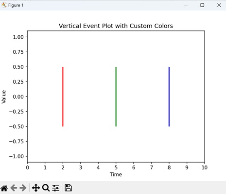
Example - Combined Horizontal and Vertical Event Plot
A combined horizontal and vertical event plot displays events occurring at different times and positions simultaneously. Vertical events are represented by lines along the timeline, while horizontal events are marked by lines extending vertically. It is like merging two types of timelines in one plot.
Now, we are combining both horizontal and vertical event plots in a single visualization. Horizontal events are at positions 1, 2, 4, 6, and 8 (blue lines), and vertical events are at positions 3, 5, 7, and 9 (green lines) −
import matplotlib.pyplot as plt
# Event positions
horizontal_events = [1, 2, 4, 6, 8]
vertical_events = [3, 5, 7, 9]
# Creating a combined event plot
plt.eventplot(horizontal_events, orientation='horizontal', linelengths=0.5, linewidths=2, colors='blue')
plt.eventplot(vertical_events, orientation='vertical', linelengths=0.8, linewidths=2, colors='green')
plt.title('Combined Horizontal and Vertical Event Plot')
plt.show()
Output
Output of the above code is as follows −
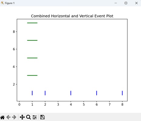
Example - Multiple Event Plots
In Matplotlib, when you want to compare events from different datasets, you can create multiple event plots. Each plot represents a set of events, and by stacking them together on the same axis, you can easily observe how events are distributed across various timeframes. This helps in visually comparing the timing and frequency of events from different sources, making it easy to identify patterns.
In the example below, we are generating two sets of random event positions and creating a single plot with multiple event plots on one axis. Each set of events is plotted with a different color ('b' for blue and 'r' for red), allowing for easy comparison between the two datasets −
import matplotlib.pyplot as plt
import numpy as np
# Generating random event positions for two sets
events1 = np.random.rand(10)
events2 = np.random.rand(10)
# Creating multiple event plots on one axis
plt.eventplot(events1, orientation='horizontal', linelengths=0.5, colors='b')
plt.eventplot(events2, orientation='horizontal', linelengths=0.5, colors='r')
plt.title('Multiple Event Plots')
plt.show()
Output
The output obtained is as shown below −
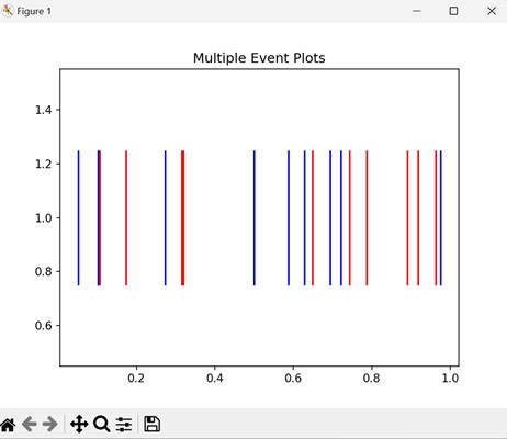
Matplotlib - Heat Map
A heatmap is a visual representation of data where values are represented using different colors. It is like a map where colors indicate the intensity or concentration of something on a surface.
Imagine you have a table of numbers, and each number represents a specific value. In a heatmap, these numbers are translated into colors. Higher numbers might be shown in warmer colors like red or orange, while lower numbers are represented by cooler colors like blue or green −
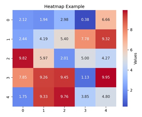
Heatmap in Matplotlib
A heatmap in matplotlib is a graphical representation of data where values in a matrix are represented as colors. It is used to visualize the magnitude of values in a 2D space. Each cell in the matrix is assigned a color based on its numeric value, allowing you to easily identify the patterns. Higher values are often represented by warmer colors (e.g., red or yellow), while lower values are represented by cooler colors (e.g., blue or green).
In Matplotlib, we can craete a heatmap using the imshow() function to display the matrix of data as a grid of colored cells.
The imshow() Function
The imshow() function in Matplotlib is used to display images or visual representations of two-dimensional data, such as matrices or arrays. It is commonly used to create heatmaps, where the values in a matrix are represented as colors.
Syntax
Following is the syntax of the imshow() function in Matplotlib −
matplotlib.pyplot.imshow(X, cmap=None, aspect=None, interpolation=None, alpha=None, origin=None, extent=None, **kwargs)
Where,
- X is the input data, generally a 2D array or matrix, representing the image or heatmap.
- cmap is the colormap to be used for mapping data values to colors. It specifies the color scheme of the plot.
- aspect is the aspect ratio of the plot. By default, it is set to 'equal'.
- interpolation is the method used for image interpolation. Common options include 'nearest', 'bilinear', and 'bicubic'.
- alpha is the transparency of the image.
- origin specifies the origin position of the image. Default is 'upper'.
- extent specifies the image data limits along the x and y axes.
Example - Basic Heatmap
A basic heatmap is a visual representation of a matrix of data using colors. Imagine you have a grid of numbers, and each number is assigned a color based on its magnitude. The imshow() function is used to display this grid, and the colors help you quickly grasp the intensity of values. Warmer colors represents higher values, while cooler colors represents lower values.
In the following example, we are creating a simple heatmap using random 2D data. The colormap 'viridis' is applied to represent the intensity of values, and a colorbar is added for reference −
import matplotlib.pyplot as plt
import numpy as np
# Generating random 2D data
data = np.random.random((10, 10))
# Creating a basic heatmap
plt.imshow(data, cmap='viridis', aspect='auto', origin='upper')
plt.colorbar(label='Intensity')
plt.title('Basic Heatmap')
plt.show()
Output
After executing the above code, we get the following output −
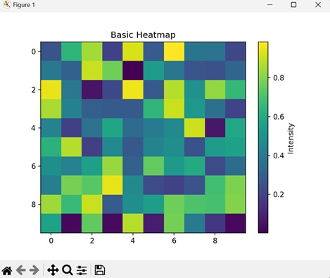
Example - Annotated Heatmap
An annotated heatmap in Matplotlib is an extension of the basic heatmap concept with an added layer of information. In addition to representing data values using colors, an annotated heatmap includes text annotations within each cell of the grid. These annotations display the numerical value corresponding to each data point, making it easier to precisely interpret the data.
In here, we are creating a heatmap with random 2D data, and adding text annotations in each cell with its numerical value. We are setting the colormap to 'plasma' −
import matplotlib.pyplot as plt
import numpy as np
# Generating random 2D data
data = np.random.random((5, 7))
# Creating an annotated heatmap with text annotations
plt.imshow(data, cmap='plasma', aspect='auto', origin='upper')
# Adding text annotations to each cell
for i in range(data.shape[0]):
for j in range(data.shape[1]):
plt.text(j, i, f'{data[i, j]:.2f}', ha='center', va='center', color='white')
plt.colorbar(label='Values')
plt.title('Annotated Heatmap')
plt.show()
Output
Following is the output of the above code −
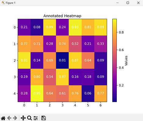
Example - Clustered Heatmap
A clustered heatmap is a heatmap that visualizes data where clusters or patterns are present. This type of heatmap highlights groups of similar values in a matrix. Clusters in a heatmap may appear as denser regions with similar color patterns, indicating that the corresponding rows or columns share similarities in their values.
Now, we are generating random 2D data and then creating clusters in a specific region. visually represents the data intensity using the 'YlGnBu' color map. The resulting plot shows the clustered patterns in the data, with a color bar indicating the intensity scale −
import matplotlib.pyplot as plt
import numpy as np
# Generating random clustered 2D data
data = np.random.random((8, 12))
# Creating clusters in a portion of the data
data[:, 3:8] += 1
# Creating a clustered heatmap
plt.imshow(data, cmap='YlGnBu', aspect='auto', origin='upper')
plt.colorbar(label='Intensity')
plt.title('Clustered Heatmap')
plt.show()
Output
Output of the above code is as follows −
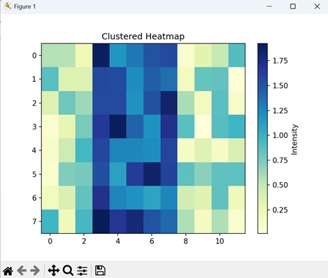
Example - Heatmap with Row and Column Labels
A Heatmap with row and column labels in Matplotlib combines a visual representation of data intensity using colors with labeled rows and columns. This enhancement makes it easier to relate specific data points to their corresponding categories along both axes.
In the example below, we are creating a heatmap with row and column labels. The data is displayed using a 'BuPu' color map, representing values transitioning from blue to purple. Additionally, a color bar is included to indicate the data range −
import matplotlib.pyplot as plt
import numpy as np
# Generating random 2D data
data = np.random.random((6, 10))
# Creating a heatmap with row and column labels
plt.imshow(data, cmap='BuPu', aspect='auto', origin='upper')
plt.colorbar(label='Values')
# Adding row and column labels
plt.xticks(range(data.shape[1]), [f'Col {i}' for i in range(data.shape[1])])
plt.yticks(range(data.shape[0]), [f'Row {i}' for i in range(data.shape[0])])
plt.title('Heatmap with Row and Column Labels')
plt.show()
Output
The output obtained is as shown below −
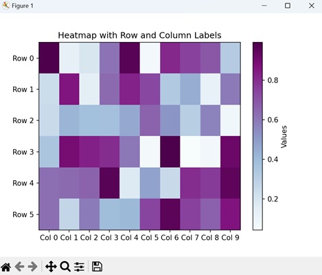
Matplotlib - Stair Plots
A stairs plot is a graph used to display data points in a way that highlights changes that occur at distinct intervals or steps. Instead of connecting data points with continuous lines, a stairs plot connects them with horizontal and vertical lines, creating a series of steps.
Imagine you have data points at specific time intervals or discrete events. In a staircase plot, you can draw a horizontal line to represent the value of the data point until the next time interval or event occurs. At that point, you can draw a vertical line to the new value, creating a step in the plot. This process repeats for each data point, resulting in a plot that looks like a staircase −
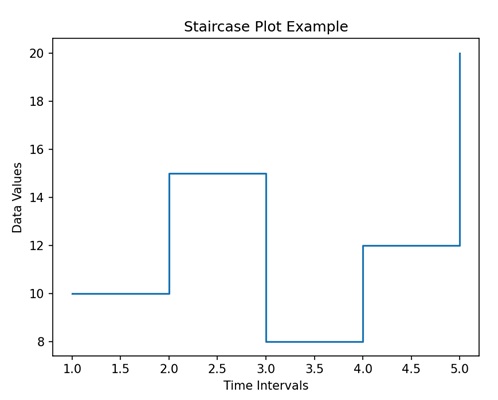
Stairs Plots in Matplotlib
We can create stair plots in Matplotlib using the step() function. This function connects data points with horizontal and vertical line segments, highlighting the discrete nature of the data.
The step() Function
The step() function in Matplotlib takes parameters for the x and y coordinates of the data points and the linestyle, and is used to represent various types of step plots, such as pre, post, and mid-step.
This function is used to create a step plot, where the values remain constant until the next data point is reached, at which point the value jumps to the new level. It is used to visualize data that changes rapidly at specific points.
Following is the syntax of the step() function in Matplotlib −
matplotlib.pyplot.step(x, y, where='pre', *kwargs)
Where,
- x is the x-coordinates of the data points.
- y is the y-coordinates of the data points.
- where (optional) specifies where the steps should be placed. It can be 'pre' (default), 'post', or 'mid'.
- *kwargs is the additional keyword arguments that is used to customize the appearance of the plot, such as line color, linestyle, and markers.
Example - Basic Stairs Plot
A basic stairs plot in Matplotlib is a visual representation of data that displays changes occurring at specific points, highlighting a stepwise pattern. Each step represents a change in the data, making it easy to visualize transitions over a sequence of values.
In the following example, we are creating a simple stairs plot. We define two lists, 'x' and 'y', as data points. We then use the plt.step() function to generate a step plot using the given data. The resulting graph displays a staircase-like pattern connecting the specified data points on the X and Y axes −
import matplotlib.pyplot as plt
# Data
x = [1, 2, 3, 4, 5]
y = [0, 1, 0, 2, 1]
# Creating a basic stairs plot
plt.step(x, y, label='Stairs')
# Customizing the plot
plt.xlabel('X-axis')
plt.ylabel('Y-axis')
plt.title('Basic Stairs Plot')
plt.legend()
# Displaying the plot
plt.show()
Output
After executing the above code, we get the following output −
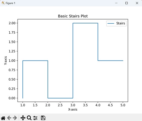
Example - Multiple Stairs Plots
A multiple sairs plot in Matplotlib is a visual representation that includes creating and displaying more than one set of stairs plots on the same graph. This allows us to compare multiple datasets or variables within a single plot simultaneously. Each set of stairs represents a distinct dataset, and the combined visualization helps us to highlight patterns, trends, or differences between them.
In here, we are creating a plot with two stair-like patterns. The data includes two sets of Y-values, 'y1' and 'y2', corresponding to the same X-values. The plt.step() function is used to generate two separate stair plots ('Stairs 1' and 'Stairs 2'). The resulting graph displays two distinct staircase patterns along the X and Y axes −
import matplotlib.pyplot as plt
# Data
x = [1, 2, 3, 4, 5]
y1 = [0, 1, 0, 2, 1]
y2 = [1, 2, 1, 3, 2]
# Creating multiple stairs plots
plt.step(x, y1, label='Stairs 1')
plt.step(x, y2, label='Stairs 2')
# Customizing plot
plt.xlabel('X-axis')
plt.ylabel('Y-axis')
plt.title('Multiple Stairs Plots')
plt.legend()
# Displaying the plot
plt.show()
Output
Following is the output of the above code −
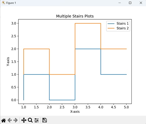
Example - Staircase Plot with Annotation
A staircase plot with annotation in Matplotlib is an extension of the basic stairs plot that includes additional information in the form of annotations. Annotations are text labels placed at specific points along the staircase plot to provide additional details about the data.
Now, we are creating a staircase plot with annotated points. The data defines X and Y values, and the plt.step() function generates the staircase plot. Two specific points on the plot are annotated using plt.text(), indicating a 'Peak' at coordinates (2, 1) and a 'High Point' at coordinates (4, 2) −
import matplotlib.pyplot as plt
# Data
x = [1, 2, 3, 4, 5]
y = [0, 1, 0, 2, 1]
# Creating a staircase plot
plt.step(x, y, label='Stairs')
# Annotate specific points
plt.text(2, 1, 'Peak', ha='center', va='bottom', color='red', fontsize=10)
plt.text(4, 2, 'High Point', ha='right', va='top', color='blue', fontsize=10)
# Customizing plot
plt.xlabel('X-axis')
plt.ylabel('Y-axis')
plt.title('Staircase Plot with Annotation')
plt.legend()
# Displaying the plot
plt.show()
Output
Output of the above code is as follows −
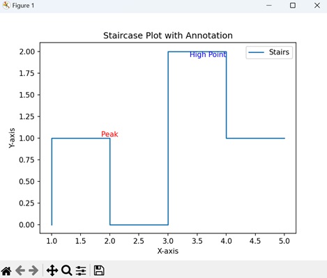
Example - Filled Staircase Plot
A filled staircase plot in Matplotlib is like creating a stairs plot where the area between the steps is filled, creating a visually distinct shape. This type of plot is used to highlight the region between two staircases. To achieve this in matplotlib, we use the fill_between() function.
The "alpha" parameter in the fill_between() function controls the transparency of the filled area, allowing both the stairs plots and the filled region to be visible simultaneously.
In the example below, we are creating two sets of stairs plots "y1" and "y2", and filling the area between them using the fill_between() function −
import matplotlib.pyplot as plt
# Data
x = [1, 2, 3, 4, 5]
y1 = [0, 1, 0, 2, 1]
y2 = [0, 2, 1, 3, 2]
# Creating a filled staircase plot
plt.step(x, y1, label='Stairs 1')
plt.step(x, y2, label='Stairs 2')
plt.fill_between(x, y1, y2, color='gray', alpha=0.3, label='Filled Area')
# Customizing the plot
plt.xlabel('X-axis')
plt.ylabel('Y-axis')
plt.title('Filled Staircase Plot')
plt.legend()
# Displaying the plot
plt.show()
Output
The output obtained is as shown below −
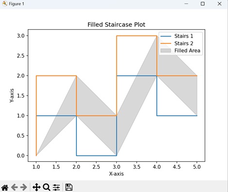
Matplotlib - ErrorBar
An error bar is a graphical representation that shows the amount of uncertainty or variation in a set of data. It consists of line(s) that extend from a data point on a graph to indicate the range within which the true value is probably located.
Imagine you are measuring the height of a plant every week for a month. Each time you measure, there might be a little bit of variation due to factors like changes in weather. The error bar on your graph will show this range of possible values for each height measurement, giving you an idea of how confident you can be in the accuracy of your data −
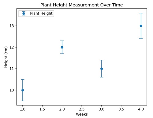
Errorbar in Matplotlib
We can create an errorbar in Matplotlib using the errorbar() function. It allows you to represent uncertainty in both the x and y directions, making it useful to depict error bars in various types of plots, such as scatter plots, line plots, or bar plots.
The errorbar() Function
The errorbar() function in Matplotlib takes x and y coordinates, indicating the uncertainty in data points. This function is particularly useful for visualizing the range of possible values around each data point, providing a better understanding of how certain or uncertain the measurements are.
Syntax
Following is the syntax of the errorbar() function in Matplotlib −
matplotlib.pyplot.errorbar(x, y, yerr=None, xerr=None, fmt='', barsabove=False, lolims=False, uplims=False, xlolims=False, xuplims=False, errorevery=1, capthick=None, *, data=None, **kwargs)
Where,
- x is the x-coordinates of the data points.
- y is the y-coordinates of the data points.
- yerr is the error in the y-direction. It can be a scalar or an array.
- xerr is the error in the x-direction. It can be a scalar or an array.
- fmt is the format code controlling the appearance of lines and markers.
- If barsabove is True, error bars are drawn above data points.
- lolims, uplims, xlolims, xuplims are the Booleans indicating whether the errors represent lower/upper limits or if x-limits are specified.
- errorevery subsample the error bars by an integer factor.
- capthick is the thickness of the caps on the error bars.
Example - Basic Errorbar Plot
A basic errorbar plot in Matplotlib is a visual representation of data points along with their associated uncertainties (errors). It is formed using the errorbar() function, which adds vertical or horizontal error bars to each data point.
In the following example, we are creating a simple error bar plot. We define 'x' and 'y' data points along with corresponding 'y-error' values. We then use the errorbar() function to plot the data with error bars −
import matplotlib.pyplot as plt
# Data
x = [1, 2, 3, 4, 5]
y = [2, 4, 3, 5, 6]
y_error = [0.5, 0.3, 0.4, 0.2, 0.6]
# Creating a basic errorbar plot
plt.errorbar(x, y, yerr=y_error, fmt='o', label='Data with Errorbars')
# Customizing the plot
plt.xlabel('X-axis')
plt.ylabel('Y-axis')
plt.title('Basic Errorbar Plot')
plt.legend()
# Displaying the plot
plt.show()
Output
After executing the above code, we get the following output −
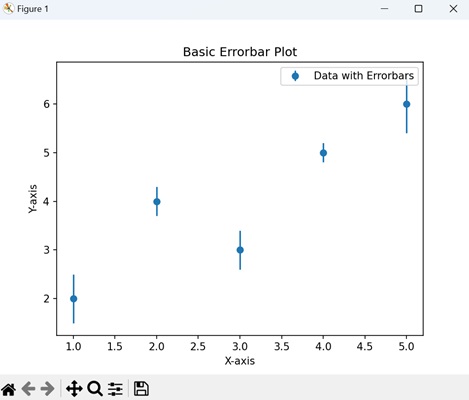
Example - Horizontal Errorbars
A horizontal errorbars plot in Matplotlib is a visual representation of data points with associated uncertainties in the horizontal direction. It is created using the errorbar() function, where error bars are drawn horizontally to show the variability or intervals in the x-direction.
In here, we are creating a plot with horizontal error bars. We first define y and x data points along with corresponding x-error values. We then use the errorbar() function to create the plot with horizontal error bars −
import matplotlib.pyplot as plt
# Data
y = [1, 2, 3, 4, 5]
x = [2, 4, 3, 5, 6]
x_error = [0.2, 0.3, 0.4, 0.1, 0.5]
# Creating horizontal errorbars
plt.errorbar(x, y, xerr=x_error, fmt='o', label='Data with Horizontal Errorbars')
# Customizing the plot
plt.xlabel('X-axis')
plt.ylabel('Y-axis')
plt.title('Horizontal Errorbar Plot')
plt.legend()
# Displaying the plot
plt.show()
Output
Following is the output of the above code −
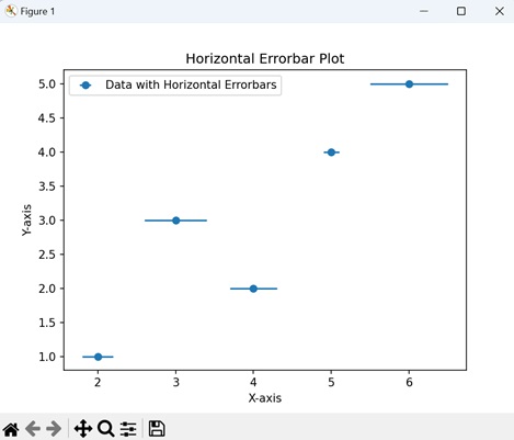
Error - Asymmetric Error Bars
In Matplotlib, asymmetric error bars allow you to represent varying levels of uncertainty or variation in both the positive and negative directions around each data point. This is useful when the errors in your measurements are not symmetrical.
You can customize the errorbar() function to handle asymmetric error bars by providing a list of two arrays to the "yerr" or "xerr" parameter, where the first array corresponds to the negative errors, and the second array corresponds to the positive errors.
Now, we are creating asymmetric error bars. The "yerr" parameter takes a list of two arrays, representing negative and positive errors separately. This allows for different error magnitudes in each direction −
import matplotlib.pyplot as plt
x = [1, 2, 3, 4, 5]
y = [2, 4, 3, 5, 6]
y_error_neg = [0.5, 0.3, 0.4, 0.2, 0.6]
y_error_pos = [0.2, 0.1, 0.3, 0.4, 0.5]
plt.errorbar(x, y, yerr=[y_error_neg, y_error_pos], fmt='o', label='Asymmetric Error Bars')
plt.xlabel('X-axis')
plt.ylabel('Y-axis')
plt.title('Asymmetric Error Bars')
plt.legend()
plt.show()
Output
Output of the above code is as follows −
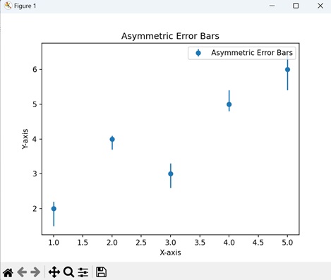
Example - Subsampled Errorbars
Subsampled error bars in Matplotlib is like selectively displaying only a subset of the error bars to improve the clarity and reduce visual noise in the plot. The errorbar() function provides the "errorevery" parameter for this purpose.
By setting "errorevery" to an integer value greater than 1, you can subsample the error bars to only show every Nth error bar, where N is the value of errorevery.
In the given example, we are generating a scatter plot with error bars. We define x and y data points, along with "y_error" values for error bars. The error bars are plotted using a purple 'o' marker and are displayed every 2 data points, thus reducing noise −
import matplotlib.pyplot as plt
# Data
x = [1, 2, 3, 4, 5]
y = [2, 4, 3, 5, 6]
y_error = [0.5, 0.3, 0.4, 0.2, 0.6]
# Creating errorbars with subsampling
plt.errorbar(x, y, yerr=y_error, fmt='o', color='purple', errorevery=2, label='Subsampled Errorbars')
# Customizing the plot
plt.xlabel('X-axis')
plt.ylabel('Y-axis')
plt.title('Subsampled Errorbars Plot')
plt.legend()
# Displaying the plot
plt.show()
Output
The output obtained is as shown below −
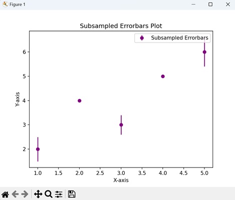
Matplotlib - Hinton Diagram
A Hinton diagram, also known as a "matrix diagram," is a way to represent data in a matrix (grid) format using colored squares. Each square in the matrix corresponds to a specific data point, and the intensity of the color represents the magnitude of that value.
Imagine that you are managing a small team consisting of members A, B, C, and D. Your aim is to represent the skill levels of each team member on a scale from 1 to 10 in three different areas: Programming, Design, and Communication. As you fill in the matrix, the darkness of each square will reflect the skill level of corresponding team member. Darker squares indicates higher skill levels, while lighter squares indicate areas where team members may have lower skills relative to others −
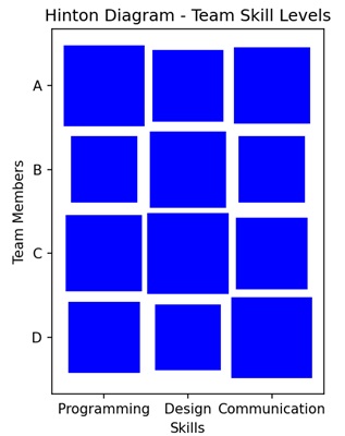
Hinton Diagram in Matplotlib
We can create hinton diagrams in Matplotlib using the hinton() function. This function automatically adjusts the appearance of the diagram to provide a clear visualization of the matrix structure.
The hinton() Function
The hinton() function is not a built-in function in Matplotlib. However, you can create a custom function for generating Hinton diagrams. It takes a matrix as input, where the size of each square corresponds to the magnitude of the matrix element, and the shading indicates the sign (positive or negative).
Let us start by drawing a random matrix hinton diagram.
Example - Random Matrix Hinton Diagram
In the random matrix Hinton diagram each square corresponds to an element in the matrix, and its size indicates the magnitude of the corresponding value. Larger squares represent larger magnitudes. The shading of the squares distinguishes between positive and negative values, with different intensities used for each.
In the following example, we first defining a function "hinton" to create a Hinton diagram, which represents a matrix with colored rectangles in a plot. We gnerate a random 10x10 matrix with values between -1 and 1 −
import matplotlib.pyplot as plt
import numpy as np
def hinton(matrix, max_value=None, ax=None):
# Function to create Hinton diagram
if ax is None:
fig, ax = plt.subplots()
if max_value is None:
max_value = matrix.max()
# Setting up the plot
ax.set_aspect('equal', 'box')
ax.xaxis.set_major_locator(plt.NullLocator())
ax.yaxis.set_major_locator(plt.NullLocator())
# Iterating over matrix elements and creating rectangles
for (i, j), val in np.ndenumerate(matrix):
color = 'blue'
size = np.sqrt(val / max_value)
rect = plt.Rectangle([j - size / 2, i - size / 2], size, size,
facecolor=color, edgecolor=color)
ax.add_patch(rect)
# Adjusting plot settings
ax.autoscale_view()
ax.invert_yaxis()
# Creating a random matrix
matrix_data = np.random.rand(10, 10) * 2 - 1
# Plotting the Hinton diagram
plt.figure(figsize=(8, 8))
hinton(matrix_data)
plt.title('Random Matrix Hinton Diagram')
plt.show()
Output
After executing the above code, we get the following output −
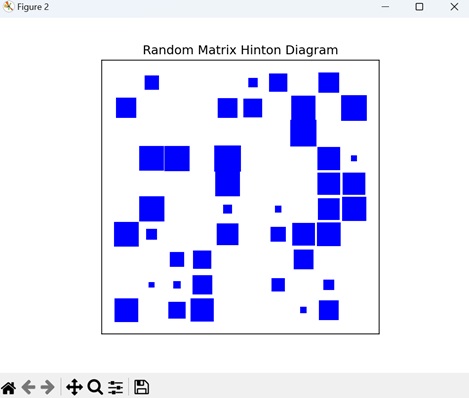
Example - Identity Matrix Hinton Diagram
In the context of a Hinton diagram for an identity matrix, an identity matrix is a square matrix in which all the elements of the principal diagonal are ones, and all other elements are zeros. The Hinton diagram for an identity matrix will have a distinct pattern where only the diagonal elements are filled, representing their value, and the non-diagonal elements are empty.
In here, creating a Hinton diagram for an 8x8 identity matrix. First, we define a function called "hinton" to generate the diagram. We set up the plot and iterate over the elements of the matrix, creating rectangles to represent the magnitude of each element. The identity matrix is generated using the NumPy library. The Hinton diagram is then plotted, with dark blue rectangles along the diagonal to reflect the non-zero values of the identity matrix −
import numpy as np
import matplotlib.pyplot as plt
def hinton(matrix, max_value=None, ax=None):
# Function to create Hinton diagram
if ax is None:
fig, ax = plt.subplots()
if max_value is None:
max_value = matrix.max()
# Setting up the plot
ax.set_aspect('equal', 'box')
ax.xaxis.set_major_locator(plt.NullLocator())
ax.yaxis.set_major_locator(plt.NullLocator())
# Iterating over matrix elements and creating rectangles
for (i, j), val in np.ndenumerate(matrix):
color = 'blue'
size = np.sqrt(val / max_value)
rect = plt.Rectangle([j - size / 2, i - size / 2], size, size,
facecolor=color, edgecolor=color)
ax.add_patch(rect)
# Adjusting plot settings
ax.autoscale_view()
ax.invert_yaxis()
# Creating an 8x8 identity matrix
matrix_data = np.eye(8)
# Plotting the Hinton Diagram for the identity matrix
plt.figure(figsize=(8, 8))
hinton(matrix_data)
plt.title('Identity Matrix Hinton Diagram')
plt.show()
Output
Following is the output of the above code −
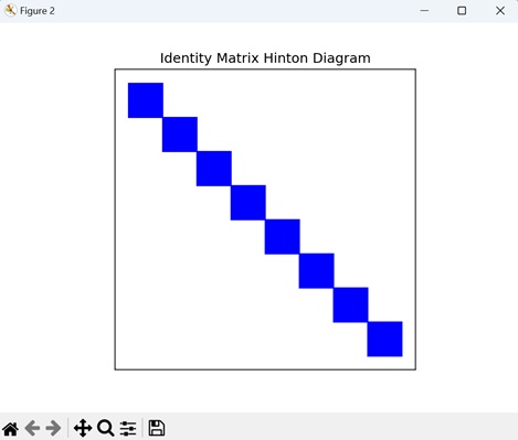
Example - Sparse Matrix Hinton Diagram
A sparse matrix Hinton diagram in Matplotlib is a visual representation of a sparse matrix where non-zero elements are represented by squares with varying sizes and colors. This visualization effectively highlights the sparse pattern of the matrix.
Now, we are creating sparse 12x12 matrix using NumPy, where most of the elements are set to zero. We are assigning non-zero values to two positions in the matrix: (3, 7) with a value of 1.5, and (9, 2) with a value of -1.2. We then use the hinton() function to generate a Hinton diagram for this sparse matrix. In the diagram, positive values are shown in blue, while negative values are shown in red −
import numpy as np
import matplotlib.pyplot as plt
def hinton(matrix, max_value=None, ax=None):
if ax is None:
fig, ax = plt.subplots()
# Setting the maximum value for scaling
if max_value is None:
max_value = np.max(np.abs(matrix))
# Setting up the plot
ax.set_aspect('equal', 'box')
ax.xaxis.set_major_locator(plt.NullLocator())
ax.yaxis.set_major_locator(plt.NullLocator())
# Iterating over matrix elements
for (i, j), val in np.ndenumerate(matrix):
# Determining color based on the sign of the value
color = 'blue' if val >= 0 else 'red'
# Scaling the size of rectangles based on the absolute value of the matrix element
size = np.sqrt(np.abs(val) / max_value)
# Creating a rectangle and adding it to the plot
rect = plt.Rectangle([j - size / 2, i - size / 2], size, size,
facecolor=color, edgecolor=color)
ax.add_patch(rect)
# Adjusting plot settings
ax.autoscale_view()
ax.invert_yaxis()
# Creating a sparse matrix with non-zero values at specific positions
matrix_data = np.zeros((12, 12))
matrix_data[3, 7] = 1.5
matrix_data[9, 2] = -1.2
# Plotting the Hinton Diagram for the sparse matrix
plt.figure(figsize=(8, 8))
hinton(matrix_data)
plt.title('Sparse Matrix Hinton Diagram')
plt.show()
Output
Output of the above code is as follows −
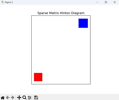
Example - Symmetric Matrix Hinton Diagram
A Hinton diagram for a symmetric matrix specifically highlights its symmetry by displaying only the values in one half of the matrix and mirroring them in the other half. The values above and below the diagonal are shown as mirror images of each other.
In the given example, we generate a Hinton diagram for a symmetric matrix. We begin by creating a random 10x10 matrix To ensure symmetry, we average this matrix with its transpose. We then plot the Hinton diagram using "white" and "black" rectangles to represent "positive" and "negative" values, respectively −
import matplotlib.pyplot as plt
import numpy as np
def hinton(matrix, max_weight=None, ax=None):
ax = ax if ax is not None else plt.gca()
if not max_weight:
max_weight = 2 ** np.ceil(np.log(np.abs(matrix).max()) / np.log(2))
ax.patch.set_facecolor('gray')
ax.set_aspect('equal', 'box')
ax.xaxis.set_major_locator(plt.NullLocator())
ax.yaxis.set_major_locator(plt.NullLocator())
for (x, y), w in np.ndenumerate(matrix):
color = 'white' if w > 0 else 'black'
size = np.sqrt(np.abs(w) / max_weight)
rect = plt.Rectangle([x - size / 2, y - size / 2], size, size,
facecolor=color, edgecolor=color)
ax.add_patch(rect)
ax.autoscale_view()
ax.invert_yaxis()
# Generating a random 10x10 matrix and creating a symmetric matrix
matrix_data = np.random.rand(10, 10)
symmetric_matrix = (matrix_data + matrix_data.T) / 2
# Plotting the Hinton Diagram for the symmetric matrix
plt.figure(figsize=(8, 8))
hinton(symmetric_matrix)
plt.title('Symmetric Matrix Hinton Diagram')
plt.show()
Output
The output obtained is as shown below −
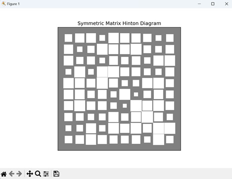
Matplotlib - Contour Plot
A contour plot, also known as a contour map or a level plot, is a graphical representation of a three-dimensional surface on a two-dimensional plane.
In a contour plot, the surface is represented by a series of contour lines. Each contour line connects points of equal value on the surface, showing regions where the function has the same value. These contour lines are drawn at constant intervals or "levels", hence the name "level plot".
Imagine you have a contour plot of temperature across a map. Each contour line represents areas with the same temperature, like 50F, 60F, and so on. By looking at the plot, you can easily see where it is hotter or cooler across the map −
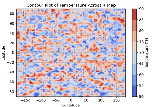
Contour Plot in Matplotlib
You can create contour plots in Matplotlib using the contour() function in the "matplotlib.pyplot" module. This function accepts X and Y coordinates as either 1D or 2D arrays, representing the grid on which the function "Z" is evaluated. "Z" is a 2D array containing the function values corresponding to the grid points defined by X and Y.
Let's start by drawing a basic contour plot.
Example - Basic Contour Plot
A basic 3D contour in Matplotlib shows contour lines that connect points of equal value, representing the levels or "heights" of the data. Each contour line corresponds to a specific value, forming a map-like representation of the dataset.
In the following example, we are create a basic contour plot. We define the x and y coordinates for the grid, and then use a mathematical function to generate the z values. With these x, y, and z values, we create a contour plot using the contour() function −
import matplotlib.pyplot as plt
import numpy as np
# Generating data
x = np.linspace(-2, 2, 100)
y = np.linspace(-2, 2, 100)
X, Y = np.meshgrid(x, y)
Z = np.sin(X) * np.cos(Y)
# Creating contour plot
plt.contour(X, Y, Z)
# Adding labels and title
plt.xlabel('X-axis')
plt.ylabel('Y-axis')
plt.title('Basic Contour Plot')
# Displaying the plot
plt.show()
Output
Following is the output of the above code −
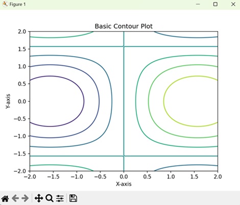
Example - Filled Contour Plot
In a filled contour plot in Matplotlib, instead of just showing contour lines, it fills in the areas between the lines with colors, creating a shaded representation of the data surface. Each color represents a different level or "height" of the data, allowing you to easily see the distribution within the dataset.
In here, we create a filled contour plot using the contourf() function, which colors the regions between contour lines −
import matplotlib.pyplot as plt
import numpy as np
# Generating data
x = np.linspace(-2, 2, 100)
y = np.linspace(-2, 2, 100)
X, Y = np.meshgrid(x, y)
Z = np.sin(X) * np.cos(Y)
# Creating a filled contour plot
plt.contourf(X, Y, Z)
# Adding labels and title
plt.xlabel('X-axis')
plt.ylabel('Y-axis')
plt.title('Filled Contour Plot')
# Displaying the plot
plt.show()
Output
On executing the above code we will get the following output −
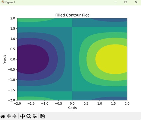
Example - Contour Plot with Specific Levels
In a contour plot with specific levels, you specify the levels at which you want the contours to be drawn. Each contour line connects points of equal value, representing different levels or "heights" of the data. This allows you to customize the visualization to highlight specific features or intervals within the dataset.
In this example, we customize the contour plot by specifying specific contour levels using Matplotlib. After generating the data and creating the contour plot, we use the levels parameter in the contour() function to define the contour levels −
import matplotlib.pyplot as plt
import numpy as np
# Generating data
x = np.linspace(-2, 2, 100)
y = np.linspace(-2, 2, 100)
X, Y = np.meshgrid(x, y)
Z = np.sin(X) * np.cos(Y)
# Defining contour levels
levels = np.linspace(-1, 1, 20)
# Creating contour plot with specific levels
plt.contour(X, Y, Z, levels=levels)
# Adding labels and title
plt.xlabel('X-axis')
plt.ylabel('Y-axis')
plt.title('Contour Plot with Specific Levels')
# Displaying the plot
plt.show()
Output
After executing the above code, we get the following output −
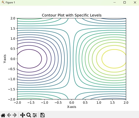
Example - Contour Plot with Colorbar
In Matplotlib, a contour plot with a colorbar displays contour lines to show points of equal value in the dataset, and a colorbar alongside the plot to indicate the correspondence between colors and data values. The colorbar acts as a visual guide, helping you to understand the range and distribution of data values represented by different colors in the plot.
Here, we create a contour plot with a colorbar using Matplotlib. After generating the data and creating the contour plot, we add a colorbar to the plot using the colorbar() function. This colorbar provides a visual representation of the z values corresponding to the contour plot −
import matplotlib.pyplot as plt
import numpy as np
# Generating data
x = np.linspace(-2, 2, 100)
y = np.linspace(-2, 2, 100)
X, Y = np.meshgrid(x, y)
Z = np.sin(X) * np.cos(Y)
# Creating a contour plot
contour = plt.contour(X, Y, Z)
# Adding colorbar
plt.colorbar(contour, label='Z-values')
# Adding labels and title
plt.xlabel('X-axis')
plt.ylabel('Y-axis')
plt.title('Contour Plot with Colorbar')
# Displaying the plot
plt.show()
Output
On executing the above code we will get the following output −
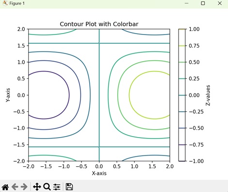
Matplotlib - Wireframe Plots
A wireframe plot is a visual representation of a design or structure. It is like the skeleton or outline of something, showing only the essential elements without details. In the context of graphics, a wireframe plot is used to sketch the basic layout and structure of a webpage, app, or other visual project.
Imagine that you are planning to build a new house. A wireframe is used to sketch out where rooms and doors will be placed. In 3D modeling, this is like defining the basic shape of a character before adding details−
Wireframe Plots in Matplotlib
We can create a wireframe plot in Matplotlib using the plot_wireframe() function. This function helps to visualize a three-dimensional wireframe plot that represents a surface using lines connecting data points. This type of plot is commonly used in scientific, engineering, and design applications.
The plot_wireframe() Function
The plot_wireframe() function in Matplotlib takes three sets of data points (X, Y, Z) representing a grid in 3D space and connects them with lines to form the wireframe structure. These data points can represent either a surface or a mathematical function in three dimensions.
Syntax
Following is the syntax of plot_wireframe() function in Matplotlib −
Axes3D.plot_wireframe(X, Y, Z, rstride=1, cstride=1, antialiased=True, *args, **kwargs)
Where,
- X is the x-coordinates of the data points (2D array or meshgrid).
- Y is the y-coordinates of the data points (2D array or meshgrid).
- Z is the z-coordinaes of the data points (2D array or meshgrid).
- rstride is the row stride used for downsampling the wireframe.
- cstride is the column stride used for downsampling the wireframe.
- antialiased is a boolean indicating whether to use antialiased rendering.
- *args and **kwargs are the additional keyword arguments for customization (e.g., colors, linestyles).
Example - Basic Wireframe Plot
Imagine a 3D landscape where the elevation is represented by a mathematical function. A basic wireframe plot shows the contours or outlines of this landscape using a mesh of lines, allowing you to observe how the landscape changes in different directions.
In the following example, we are creating a simple 3D wireframe plot for the sine function over a specified 2D grid −
import matplotlib.pyplot as plt
import numpy as np
# Generating data
x = np.linspace(-5, 5, 50)
y = np.linspace(-5, 5, 50)
X, Y = np.meshgrid(x, y)
Z = np.sin(np.sqrt(X**2 + Y**2))
# Creating a basic wireframe plot
fig = plt.figure()
ax = fig.add_subplot(111, projection='3d')
ax.plot_wireframe(X, Y, Z, color='blue', linewidth=1)
ax.set_title('Basic Wireframe Plot')
ax.set_xlabel('X-axis')
ax.set_ylabel('Y-axis')
ax.set_zlabel('Z-axis')
plt.show()
Output
After executing the above code, we get the following output −
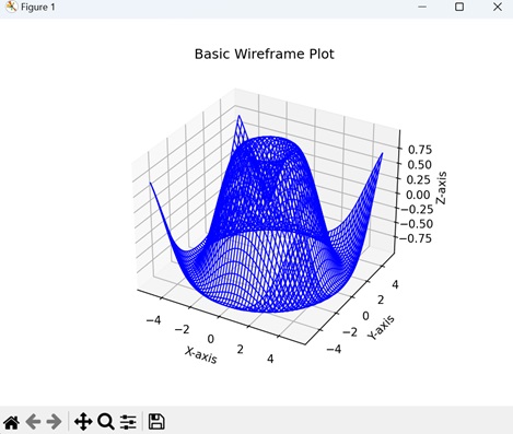
Example - Wireframe Plot with Increased Density
A wireframe plot with increased density in Matplotlib refers to a three-dimensional visualization where the density of lines connecting the data points in the wireframe is increased, resulting in a more detailed representation of the underlying surface.
In here, we are creating a 3D wireframe plot for the sine function, but with increased density specified by the 'rstride' and 'cstride' parameters in the plot_wireframe() function −
import matplotlib.pyplot as plt
import numpy as np
# Generating data
x = np.linspace(-5, 5, 100)
y = np.linspace(-5, 5, 100)
X, Y = np.meshgrid(x, y)
Z = np.sin(np.sqrt(X**2 + Y**2))
# Creating a wireframe plot with increased density
fig = plt.figure()
ax = fig.add_subplot(111, projection='3d')
ax.plot_wireframe(X, Y, Z, rstride=10, cstride=10, color='orange', linewidth=1)
ax.set_title('Dense Wireframe Plot')
ax.set_xlabel('X-axis')
ax.set_ylabel('Y-axis')
ax.set_zlabel('Z-axis')
plt.show()
Output
Following is the output of the above code −
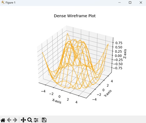
Example - Multiple Wireframe Plots
Multiple wireframe plots in Matplotlib refer to creating a single figure containing subplots, each displaying a distinct three-dimensional (3D) wireframe representation. This approach allows you to compare and visualize different aspects of your data in a structured manner.
Now, we are creating three wireframe plots, each representing a different mathematical function (sine, Gaussian, and hyperbolic). The add_subplot() function is used to create subplots, and the plot_wireframe() function is used to generate wireframe plots for each subplot −
import matplotlib.pyplot as plt
import numpy as np
# Generating data
x = np.linspace(-5, 5, 50)
y = np.linspace(-5, 5, 50)
X, Y = np.meshgrid(x, y)
# Sine function
Z1 = np.sin(np.sqrt(X**2 + Y**2))
# Gaussian function
Z2 = np.exp(-(X**2 + Y**2))
# Hyperbolic function
Z3 = np.sinh(np.sqrt(X**2 + Y**2))
# Creating subplots with multiple wireframe plots
fig = plt.figure(figsize=(12, 4))
# Subplot 1: Sine function
ax1 = fig.add_subplot(131, projection='3d')
ax1.plot_wireframe(X, Y, Z1, color='blue', linewidth=1)
ax1.set_title('Sine Function')
# Subplot 2: Gaussian function
ax2 = fig.add_subplot(132, projection='3d')
ax2.plot_wireframe(X, Y, Z2, color='green', linewidth=1)
ax2.set_title('Gaussian Function')
# Subplot 3: Hyperbolic function
ax3 = fig.add_subplot(133, projection='3d')
ax3.plot_wireframe(X, Y, Z3, color='orange', linewidth=1)
ax3.set_title('Hyperbolic Function')
plt.show()
Output
Output of the above code is as follows −
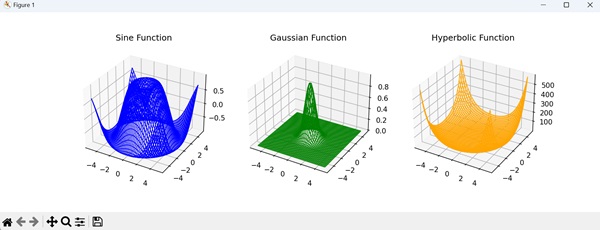
Example - Parametric Surface Wireframe Plot
A parametric surface wireframe plot in Matplotlib is a three-dimensional visualization that represents a surface using parametric equations. Parametric equations define the coordinates of points on the surface in terms of one or more parameters, allowing for a wide range of complex and dynamic shapes to be visualized.
In the example below, we are defining parametric equations for a torus in the "torus_parametric" function. We then generate parameter values, create a meshgrid from these parameters, and compute 3D coordinates using the parametric equations. Finally, we create a wireframe plot of the torus using the plot_wireframe() function −
import matplotlib.pyplot as plt
import numpy as np
from mpl_toolkits.mplot3d import Axes3D
# Parametric equations for a torus
def torus_parametric(u, v, R=1, r=0.3):
x = (R + r * np.cos(v)) * np.cos(u)
y = (R + r * np.cos(v)) * np.sin(u)
z = r * np.sin(v)
return x, y, z
# Generating parameter values
u_values = np.linspace(0, 2 * np.pi, 100)
v_values = np.linspace(0, 2 * np.pi, 100)
# Creating a meshgrid from parameter values
U, V = np.meshgrid(u_values, v_values)
# Providing coordinates using parametric equations
X, Y, Z = torus_parametric(U, V)
# Creating a parametric surface wireframe plot
fig = plt.figure()
ax = fig.add_subplot(111, projection='3d')
ax.plot_wireframe(X, Y, Z, color='blue', linewidth=1)
ax.set_title('Parametric Surface Wireframe (Torus)')
ax.set_xlabel('X-axis')
ax.set_ylabel('Y-axis')
ax.set_zlabel('Z-axis')
plt.show()
Output
The output obtained is as shown below −
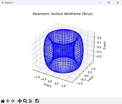
Matplotlib - Surface Plots
A surface plot is a way to represent three-dimensional mathematical function or data on a flat, two-dimensional surface. It shows how the value of the function or data changes across two input variables (usually represented on the x and y axes) and how this change affects the output variable (represented on the z-axis).
Imagine you have a table with two columns representing two independent variables, and a third column representing a dependent variable. The surface plot takes these three columns of data and creates a 3D representation where the two independent variables are on the x and y axes, and the dependent variable is represented by the height or color of the surface −
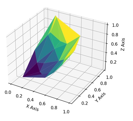
Surface Plots in Matplotlib
We can create a surface plot in Matplotlib using the plot_surface() function from the mpl_toolkits.mplot3d module. This function is useful for visualizing functions of two variables or three-dimensional datasets. It generates a surface plot that provides a more clear view of the data compared to traditional two-dimensional plots.
The plot_surface() Function
The plot_surface() function in Matplotlib accepts x and y coordinates, organized in a grid-like structure using meshgrid, and the corresponding z values determine the height or value at each grid point. The resulting plot gives you a visual representation of the 3D shape of your data.
Syntax
Following is the syntax of plot_surface() function in Matplotlib −
ax.plot_surface(X, Y, Z, cmap='viridis', edgecolor='black', **kwargs)
Where,
- X is the x-coordinates of the values (2D array or meshgrid).
- Y is the y-coordinates of the values (2D array or meshgrid).
- Z is the z-coordinaes of the values (2D array or meshgrid).
- cmap is the colormap for coloring the surface. It specifies the color mapping for the surface based on the Z values.
- edgecolor is the color of the edges of the surface.
- **kwargs are the additional keyword arguments for customization (e.g., colors, transparency).
Example - Saddle-shaped Surface Plot
The saddle-shaped surface is a type of three-dimensional plot in Matplotlib that visualizes a mathematical surface resembling a saddle or a hyperbolic paraboloid. This surface is defined by the mathematical function z=x2-y2. The plot provides a clear picture of how the function values change across the X and Y dimensions.
In the following example, we are defining a saddle-shaped surface using the "saddle_surface" function and generating data points for the surface over a specified range. We then create a 3D surface plot using the plot_surface() function, displaying the saddle-shaped surface with a "Viridis" colormap and "black" edges −
import matplotlib.pyplot as plt
import numpy as np
from mpl_toolkits.mplot3d import Axes3D
# Defining a saddle-shaped surface
def saddle_surface(x, y):
return x**2 - y**2
# Generating data points
x = np.linspace(-5, 5, 100)
y = np.linspace(-5, 5, 100)
X, Y = np.meshgrid(x, y)
Z = saddle_surface(X, Y)
# Creating a surface plot
fig = plt.figure()
ax = fig.add_subplot(111, projection='3d')
ax.plot_surface(X, Y, Z, cmap='viridis', edgecolor='black')
ax.set_title('Saddle-shaped Surface')
ax.set_xlabel('X-axis')
ax.set_ylabel('Y-axis')
ax.set_zlabel('Z-axis')
plt.show()
Output
After executing the above code, we get the following output −
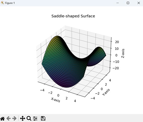
Example - Gaussian Surface Plot
The Gaussian surface plot in Matplotlib is a three-dimensional representation of a mathematical function known as a Gaussian distribution or bell curve. This type of surface plot provides a visual representation of the function z=e-(x2+y2), where x and y are the input variables.
In here, we are defining a Gaussian surface using the function "gaussian_surface", and then generating a set of data points for this surface over a specified range. We then create a 3D surface plot displaying the Gaussian surface using the plot_surface() function −
import matplotlib.pyplot as plt
import numpy as np
from mpl_toolkits.mplot3d import Axes3D
# Defining a Gaussian surface
def gaussian_surface(x, y):
return np.exp(-(x**2 + y**2))
# Generating points
x = np.linspace(-5, 5, 100)
y = np.linspace(-5, 5, 100)
X, Y = np.meshgrid(x, y)
Z = gaussian_surface(X, Y)
# Creating a surface plot
fig = plt.figure()
ax = fig.add_subplot(111, projection='3d')
ax.plot_surface(X, Y, Z, cmap='plasma', edgecolor='black')
ax.set_title('Gaussian Surface')
ax.set_xlabel('X-axis')
ax.set_ylabel('Y-axis')
ax.set_zlabel('Z-axis')
plt.show()
Output
Following is the output of the above code −
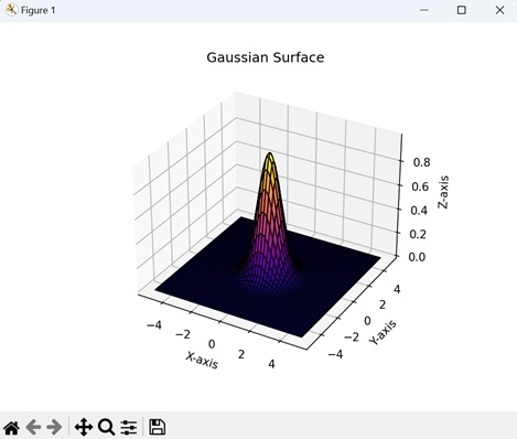
Example - Sine and Cosine Surface Plots
The sine and cosine surface plots in Matplotlib represent a three-dimensional visualization of a mathematical function combining sine and cosine terms. These plots show the behaviour of the function z=sin(√x2+y2)+cos(√x2+y2), where x and y are the input variables
Now, we are generating a 3D surface plot by combining the values of the sine and cosine functions over a meshgrid. The resulting surface is formed by adding the heights of the sine and cosine waves at each point in the grid −
import matplotlib.pyplot as plt
import numpy as np
from mpl_toolkits.mplot3d import Axes3D
# Creating a meshgrid
x = np.linspace(-5, 5, 100)
y = np.linspace(-5, 5, 100)
X, Y = np.meshgrid(x, y)
# Defining a surface using sine and cosine functions
Z = np.sin(np.sqrt(X**2 + Y**2)) + np.cos(np.sqrt(X**2 + Y**2))
# Creating a surface plot
fig = plt.figure()
ax = fig.add_subplot(111, projection='3d')
ax.plot_surface(X, Y, Z, cmap='viridis', edgecolor='black')
ax.set_title('Sine and Cosine Surface')
ax.set_xlabel('X-axis')
ax.set_ylabel('Y-axis')
ax.set_zlabel('Z-axis')
plt.show()
Output
Output of the above code is as follows −
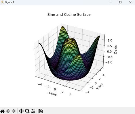
Example - Random Noise Surface Plot
The random noise surface plot in Matplotlib is a 3D representation of a surface generated with random noise. This type of plot is useful for visualizing data with an element of randomness or variability.
In the example below, we are generating a 3D surface plot representing random noise. The np.random.rand() function creates a grid of random values between 0 and 1, forming the heights of the surface. The plot is displayed using Matplotlib with a "Cividis" colormap and "black" edges, showing a surface with random fluctuations in height across the specified x and y ranges −
import matplotlib.pyplot as plt
import numpy as np
from mpl_toolkits.mplot3d import Axes3D
# Generating random noise for a surface
np.random.seed(42)
X = np.linspace(-5, 5, 100)
Y = np.linspace(-5, 5, 100)
X, Y = np.meshgrid(X, Y)
Z = np.random.rand(100, 100)
# Creating a surface plot
fig = plt.figure()
ax = fig.add_subplot(111, projection='3d')
ax.plot_surface(X, Y, Z, cmap='cividis', edgecolor='black')
ax.set_title('Random Noise Surface')
ax.set_xlabel('X-axis')
ax.set_ylabel('Y-axis')
ax.set_zlabel('Z-axis')
plt.show()
Output
The output obtained is as shown below −
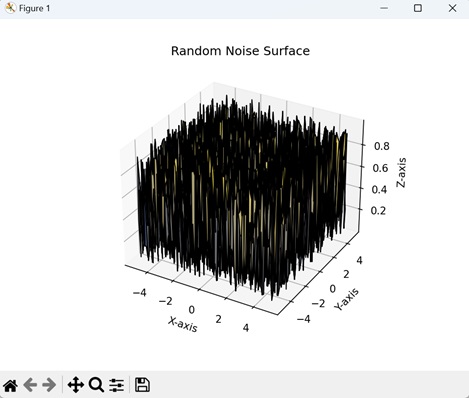
Matplotlib - Triangulations
Triangulation is a process of dividing a complex shape or area into simpler parts using triangles. Imagine you have a shape, like a polygon (a closed figure with straight sides), and you want to understand or represent it in a more easy way.
Triangulation involves drawing non-overlapping triangles inside that shape, connecting its vertices (corner points) with straight lines. By doing this, you break down the original shape into a series of triangles −
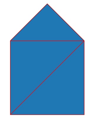
Triangulations in Matplotlib
In Matplotlib, triangulation refers to the process of dividing a set of points into triangles for visualization purposes. This is useful when you want to create plots having unstructured data.
We can perform triangulation on a set of points in Matplotlib using the "Triangulation" class in the "matplotlib.tri module". Once you have the triangulation, you can use it to create plots, such as 3D surfaces or contour plots, that accurately represent the shape of your data.
Let us start by creating a triangulated surface plot.
Example - Triangulated Surface Plot
A triangulated surface plot in Matplotlib is a 3D visualization that represents a surface using triangles. The term "triangulated" refers to the process of dividing the surface into a network of triangles, creating a simplified mesh that connects data points. This type of plot is generally used when scattered data points need to be visualized as a continuous surface.
In the following example, we are creating a 3D surface plot using a set of points and Delaunay triangulation. The 'x', 'y', and 'z' arrays represent coordinates and heights of points. The Triangulation() function from "matplotlib.tri" module is used to define triangles based on these points −
import matplotlib.pyplot as plt
import numpy as np
import matplotlib.tri as mtri
# Creating a set of points
x = np.array([0, 1, 2, 3, 4, 5])
y = np.array([0, 1, 0, 1, 0, 1])
z = np.array([1, 2, 1, 2, 1, 2])
# Defining triangulation using Delaunay triangulation
triang = mtri.Triangulation(x, y)
# Creating a custom triangulated surface plot
fig = plt.figure()
ax = fig.add_subplot(111, projection='3d')
ax.plot_trisurf(triang, z, cmap='viridis', edgecolor='black')
# Adding labels
ax.set_title('Triangulated Surface Plot')
ax.set_xlabel('X-axis')
ax.set_ylabel('Y-axis')
ax.set_zlabel('Z-axis')
plt.show()
Output
After executing the above code, we get the following output −
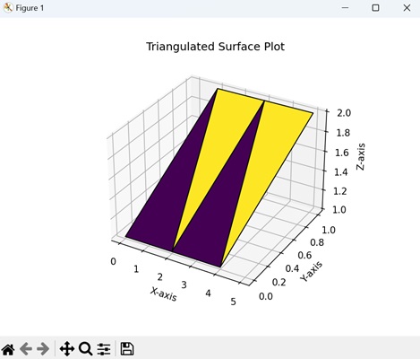
Example - Delaunay Triangulation for Scatter Plot
A delaunay triangulation for scatter plot in Matplotlib is a method of connecting a set of scattered data points with non-overlapping triangles in a manner that maximizes the minimum angle of all the triangles.
In here, we are generating 20 random data points and performing Delaunay triangulation using matplotlib.tri module. The triplot() function is used to visualize the Delaunay triangulation with blue dashed lines, and the scatter() function displays the random data points in red color −
import matplotlib.pyplot as plt
import numpy as np
import matplotlib.tri as mtri
# Generating random data points
np.random.seed(42)
x = np.random.rand(20)
y = np.random.rand(20)
# Performing Delaunay triangulation
triang = mtri.Triangulation(x, y)
# Creating a scatter plot with Delaunay triangulation
plt.figure()
plt.title('Delaunay Triangulation Scatter Plot')
plt.triplot(triang, 'bo--')
plt.scatter(x, y, c='red', marker='o')
plt.show()
Output
Following is the output of the above code −
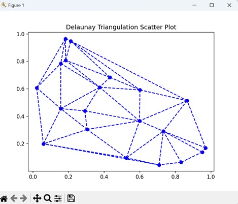
Example - Contour Plot with Triangulation
A contour plot with triangulation in Matplotlib involves creating a visualization where contour lines are drawn over a surface defined by a set of points. The triangulation process is used to connect these points with triangles, forming a mesh that helps in representing the surface more smoothly.
Now, we generate 20 random data points along with their corresponding function values. Next, we create a triangulated mesh using Delaunay triangulation. The triplot() function is used to display the Delaunay triangulation, while "tricontourf" generates a filled contour plot based on the function values −
import matplotlib.pyplot as plt
import numpy as np
import matplotlib.tri as mtri
# Generating random data points
np.random.seed(42)
x = np.random.rand(20)
y = np.random.rand(20)
z = np.sin(x * y)
# Defining triangulation using Delaunay triangulation
triang = mtri.Triangulation(x, y)
# Creating a contour plot with triangulation
plt.figure()
plt.title('Contour Plot with Triangulation')
plt.triplot(triang, 'ko-')
plt.tricontourf(triang, z, cmap='plasma')
plt.show()
Output
Output of the above code is as follows −
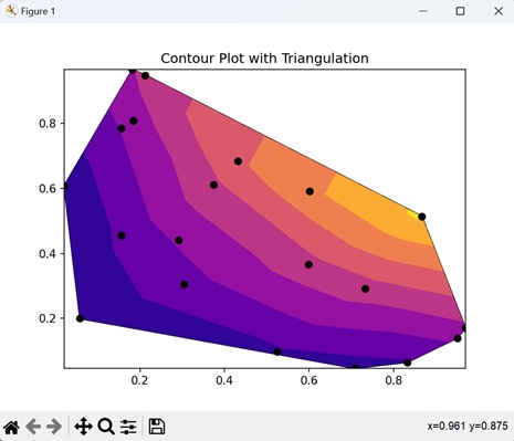
Example - Triangulated Line Plot
A triangulated line plot in Matplotlib involves creating a visual representation where lines are drawn to connect a set of points using triangles, forming a triangulated network. This type of plot is useful for representing data as a continuous curve, especially when the points are irregularly spaced.
In the example below, we are using the triplot() function to visualize the Delaunay triangulation with red lines, creating a line plot that connects the data points −
import matplotlib.pyplot as plt
import numpy as np
import matplotlib.tri as mtri
# Generating random data points
np.random.seed(42)
x = np.random.rand(20)
y = np.random.rand(20)
# Defining triangulation using Delaunay triangulation
triang = mtri.Triangulation(x, y)
# Creating a line plot with triangulation
plt.figure()
plt.title('Triangulated Line Plot')
plt.triplot(triang, 'ro-')
plt.show()
Output
The output obtained is as shown below −
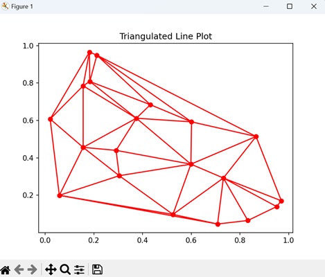
Matplotlib - Stream Plot
A stream plot is used to visualize the flow patterns of a fluid, such as air or water. It represents the movement of particles within the fluid over a particular area.
Imagine you have a river, and you want to see how the water is flowing at different points. A stream plot will use lines or curves to show the paths that imaginary particles will follow as they move with the flow of the river. The lines are drawn in a way that they are tangent to the velocity vector at any given point, i.e. they point in the direction the fluid is moving −

Stream Plot in Matplotlib
We can create a stream plot in Matplotlib using the streamplot() function. This function generates a stream plot by integrating a given vector field, creating streamlines that shows the paths of particles or fluid elements.
The streamplot() Function
The streamplot() function in creates a 2D streamplot to visualize vector fields. It takes grid coordinates (X, Y) and vector components (u, v) as input. Optional parameters control density, line width, color, and other plot characteristics. It provides a visual representation of the flow or direction of the vector field.
Syntax
Following is the syntax of the streamplot() function in Matplotlib −
matplotlib.pyplot.streamplot(x, y, u, v, density=1, norm=None, arrowsize=1, arrowstyle='-|>', minlength=0.1, **kwargs)
Where,
- x and y are the coordinates of the grid, where x and y can be 1D or 2D arrays.
- u and v are the components of the vector field, representing the velocity in the x and y directions, respectively.
- density controls the number of streamlines in the plot.
- norm is the normalize instance for mapping the data values to colors.
- arrowsize is the size of arrowheads at the end of the streamlines.
- arrowstyle is the style of arrowheads.
- minlength is the minimum length of streamlines.
- **kwargs is the additional keyword arguments that can be used for customization.
Example - Basic Stream Plot
A basic stream plot in Matplotlib is a visualization that shows the flow of a vector field using streamlines. Streamlines are curves that follow the direction of the velocity vector at each point, providing a visual representation of how particles or fluids would move.
In the following example, we are creating a grid of points in a 2D space and defining a vector field representing a rotational flow pattern, where particles would follow circular paths. The streamplot() function is then used to create a basic stream plot, visualizing the flow pattern with streamlines −
import matplotlib.pyplot as plt
import numpy as np
# Generating grid of points
x, y = np.meshgrid(np.linspace(-2, 2, 20), np.linspace(-2, 2, 20))
# Defining vector field (rotational field)
u = -y
v = x
# Creating a basic stream plot
plt.streamplot(x, y, u, v, density=1.5, linewidth=1, arrowsize=1.5)
plt.title('Basic Stream Plot')
plt.xlabel('X-axis')
plt.ylabel('Y-axis')
plt.show()
Output
After executing the above code, we get the following output −
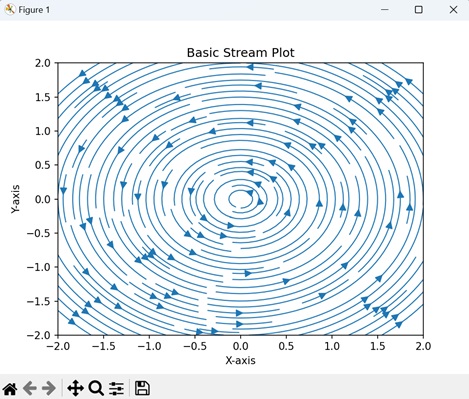
Example - Multiple Stream Plots
A multiple stream plots in Matplotlib involves creating more than one stream plot in a single visualization. Each stream plot represents the flow or movement of a vector field using streamlines, and combining them allows for the comparison of multiple vector fields or the same vector field under different conditions.
In here, we are creating a grid of points and defining vector fields for two sources "U1, V1" and "U2, V2". We then use the streamplot() function to generate two stream plots in red and blue color, each representing a vector field with streamlines −
import numpy as np
import matplotlib.pyplot as plt
# Creating a grid
x = np.linspace(-2, 2, 20)
y = np.linspace(-2, 2, 20)
X, Y = np.meshgrid(x, y)
# Defining vector fields for two sources
U1, V1 = X, Y
U2, V2 = -X, -Y
# Plotting multiple stream plots
plt.streamplot(X, Y, U1, V1, density=1, linewidth=1, color='red')
plt.streamplot(X, Y, U2, V2, density=1, linewidth=1, color='blue')
plt.title('Multiple Stream Plots')
plt.show()
Output
Following is the output of the above code −
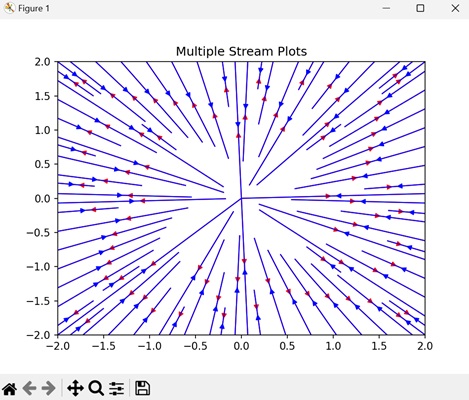
Example - Stream Plot with Annotations
A stream plot with annotations in Matplotlib involves creating a stream plot with additional annotations, such as arrows, text, or markers, to provide extra information about specific points or features in the vector field. Annotations help us to highlight the key features of the plot and enhance its analysis.
Now, we are creating a stream plot with annotations. The vector field represents a saddle point. Annotations are added using the text() function to label specific points on the plot. In here, "Source" and "Sink" are labeled near appropriate locations in the vector field, providing additional information about the features of the flow −
import numpy as np
import matplotlib.pyplot as plt
# Creating a grid
x = np.linspace(-2, 2, 20)
y = np.linspace(-2, 2, 20)
X, Y = np.meshgrid(x, y)
# Defining a vector field (here, a saddle)
U = X
V = -Y
# Plotting the stream plot with annotations
plt.streamplot(X, Y, U, V, density=1.5, linewidth=1, color='cyan')
# Adding annotations at specific points
plt.text(-1, 1.5, 'Source', color='red', fontsize=10, ha='right')
plt.text(1, -1.5, 'Sink', color='blue', fontsize=10, ha='left')
plt.title('Stream Plot with Annotations')
plt.show()
Output
Output of the above code is as follows −
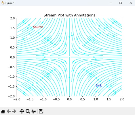
Example - Stream Plot with Start Points
A stream plot with start points in Matplotlib involves creating a stream plot with specified starting points for the streamlines. This allows for a more controlled visualization of the flow patterns, highlighting specific regions of interest in the vector field.
In the example below, we are creating a stream plot of the vector field with specified start points ([0.5, 0.5] and [-0.5, -0.5]), represented by arrow −
import matplotlib.pyplot as plt
import numpy as np
# Generating grid of points
x, y = np.meshgrid(np.linspace(-2, 2, 20), np.linspace(-2, 2, 20))
# Defining vector field (rotational field)
u = -y
v = x
# Specifying start points for streamlines
start_points = np.array([[0.5, 0.5], [-0.5, -0.5]])
# Creating a stream plot with start points
plt.streamplot(x, y, u, v, start_points=start_points, density=1.5, linewidth=1, arrowsize=1.5)
plt.title('Stream Plot with Start Points')
plt.xlabel('X-axis')
plt.ylabel('Y-axis')
plt.show()
Output
The output obtained is as shown below −
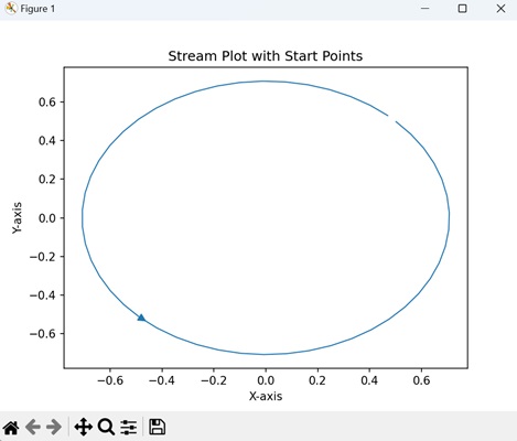
Matplotlib - Ishikawa Diagram
An Ishikawa diagram, also known as a fishbone diagram or cause-and-effect diagram, is a visual representation used to identify and analyze the possible causes of a specific problem or effect. The diagram looks like a fish skeleton, with the "head" representing the problem or effect, and the "bones" (branches extending from it) representing different categories of potential causes.
Imagine you work in a restaurant and customer complaints about long waiting times have increased. You can use an Ishikawa diagram to identify possible causes. The fishbone structure might include categories like "Processes," "Staff," "Equipment," and "Management." By visually mapping these factors, you can systematically analyze and address the root causes of the prolonged waiting times, leading to more improved service −
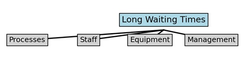
Ishikawa Diagram in Matplotlib
We can create an Ishikawa diagram in Matplotlib using a bar plot to represent the main categories (bones) and subcategories within each category. Each subcategory may contain potential causes contributing to the observed problem or effect. This diagram helps us to understand the root causes of issues in a structured way.
Now, let us learn and implement various categories and subcategories of the Ishikawa Diagram using Matplotlib.
Example - Ishikawa Diagram - Software Development Issues
The Ishikawa diagram titled "Software Development Issues" in matplotlib is a visualization used to identify and categorize potential causes of problems within the domain of software development.
In the following example, we are creating an Ishikawa diagram to represent potential causes of issues in software development. The diagram categorizes causes into People, Process, Product, and Technology. Subcategories within each category help identify specific factors that impact software development −
import matplotlib.pyplot as plt
# Defining categories and subcategories for software development issues
categories = ['People', 'Process', 'Product', 'Technology']
subcategories = {
'People': ['Skills', 'Team Dynamics', 'Communication'],
'Process': ['Requirements', 'Planning', 'Testing'],
'Product': ['Functionality', 'Usability', 'Performance'],
'Technology': ['Tools', 'Frameworks', 'Integration']
}
# Creating a Matplotlib figure and axis
fig, ax = plt.subplots(figsize=(10, 6))
# Plotting Ishikawa diagram for software development issues
for i, category in enumerate(categories):
ax.barh(category, 1, color='white', edgecolor='black')
for j, subcategory in enumerate(subcategories[category]):
ax.plot([0, 1], [i + (j + 1) / (len(subcategories[category]) + 1)] * 2, color='black')
# Customizing plot appearance and displaying it
ax.set_xlim(0, 1)
ax.set_yticks(range(len(categories)))
ax.set_yticklabels(categories)
ax.set_title('Ishikawa Diagram - Software Development Issues')
ax.grid(axis='x', linestyle='--', alpha=0.7)
plt.show()
Output
After executing the above code, we get the following output −
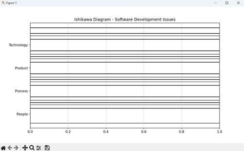
Example - Ishikawa Diagram - Manufacturing Defects
The Ishikawa Diagram titled "Manufacturing Defects" in Matplotlib is like a visual map that helps us understand why defects might happen during the manufacturing process.
In here, causes of manufacturing defects are categorized into Materials, Machines, Methods, Manpower, and Measurement. Each category breaks down into subcategories, allowing a detailed analysis of potential issues contributing to defects in the manufacturing process.
For instance, It checks if materials are good quality, machines are well-maintained, methods are followed correctly, workers are skilled and not overloaded, and measurements are accurate −
import matplotlib.pyplot as plt
# Defining categories and subcategories for manufacturing defects
categories = ['Materials', 'Machines', 'Methods', 'Manpower', 'Measurement']
subcategories = {
'Materials': ['Quality', 'Compatibility', 'Availability'],
'Machines': ['Equipment', 'Maintenance', 'Calibration'],
'Methods': ['Procedures', 'Standards', 'Workflows'],
'Manpower': ['Skills', 'Training', 'Workload'],
'Measurement': ['Tools', 'Accuracy', 'Frequency']
}
# Creating a Matplotlib figure and axis
fig, ax = plt.subplots(figsize=(10, 6))
# Plotting Ishikawa diagram for manufacturing defects
for i, category in enumerate(categories):
ax.barh(category, 1, color='white', edgecolor='black')
for j, subcategory in enumerate(subcategories[category]):
ax.plot([0, 1], [i + (j + 1) / (len(subcategories[category]) + 1)] * 2, color='black')
# Customizing plot appearance and show it
ax.set_xlim(0, 1)
ax.set_yticks(range(len(categories)))
ax.set_yticklabels(categories)
ax.set_title('Ishikawa Diagram - Manufacturing Defects')
ax.grid(axis='x', linestyle='--', alpha=0.7)
plt.show()
Output
Following is the output of the above code −
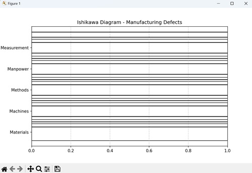
Example - Ishikawa Diagram - Project Management Challenges
The "Project Management Challenges" Ishikawa Diagram in Matplotlib acts like a visual map to understand the potential challenges faced in project management. It is organized like a fish skeleton, with different categories such as People, Process, Tools, and Communication. Under each category, it explores specific factors such as team dynamics, planning, software tools, and communication methods.
Now, we are creating the Ishikawa diagram for project management challenges, with categories and subcategories providing a structured way to analyze and address the identified challenges −
import matplotlib.pyplot as plt
# Defining categories and subcategories for project management challenges
categories = ['People', 'Process', 'Tools', 'Communication']
subcategories = {
'People': ['Skills', 'Team Dynamics', 'Leadership'],
'Process': ['Planning', 'Execution', 'Monitoring'],
'Tools': ['Software', 'Hardware', 'Productivity Apps'],
'Communication': ['Internal', 'External', 'Documentation']
}
# Creating a Matplotlib figure and axis
fig, ax = plt.subplots(figsize=(10, 6))
# Plotting Ishikawa diagram for project management challenges
for i, category in enumerate(categories):
ax.barh(category, 1, color='white', edgecolor='black')
for j, subcategory in enumerate(subcategories[category]):
ax.plot([0, 1], [i + (j + 1) / (len(subcategories[category]) + 1)] * 2, color='black')
# Customizing plot appearance and show it
ax.set_xlim(0, 1)
ax.set_yticks(range(len(categories)))
ax.set_yticklabels(categories)
ax.set_title('Ishikawa Diagram - Project Management Challenges')
ax.grid(axis='x', linestyle='--', alpha=0.7)
plt.show()
Output
Output of the above code is as follows −

Example - Ishikawa Diagram - Customer Service Issues
The "Customer Service Issues" Ishikawa Diagram in Matplotlib is a visual map to understand and tackle potential challenges in customer service. Resembling a fishbone, it categorizes issues into key areas: People, Process, Policies, and Technology. Within these categories, it searches specific factors like training, response time, policies, and technology usage.
In the example below, we are creating the Ishikawa diagram for customer service issues as discussed above −
import matplotlib.pyplot as plt
# Definng categories and subcategories for customer service issues
categories = ['People', 'Process', 'Policies', 'Technology']
subcategories = {
'People': ['Training', 'Customer Interaction', 'Communication'],
'Process': ['Response Time', 'Issue Resolution', 'Feedback Handling'],
'Policies': ['Return Policies', 'Refund Procedures', 'Complaint Handling'],
'Technology': ['Software', 'Hardware', 'Communication Channels']
}
# Creating a Matplotlib figure and axis
fig, ax = plt.subplots(figsize=(10, 6))
# Plotting Ishikawa diagram for customer service issues
for i, category in enumerate(categories):
ax.barh(category, 1, color='white', edgecolor='black')
for j, subcategory in enumerate(subcategories[category]):
ax.plot([0, 1], [i + (j + 1) / (len(subcategories[category]) + 1)] * 2, color='black')
# Customizing plot appearance and show it
ax.set_xlim(0, 1)
ax.set_yticks(range(len(categories)))
ax.set_yticklabels(categories)
ax.set_title('Ishikawa Diagram - Customer Service Issues')
ax.grid(axis='x', linestyle='--', alpha=0.7)
plt.show()
Output
The output obtained is as shown below −
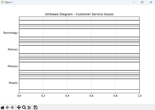
Matplotlib - 3D Plotting
A 3D plotting is a way to represent three dimensional data in a graphical format. It allows you to visualize the information in three spatial dimensions, represented as X, Y, and Z coordinates. In 3D plots, data points are not only located on a flat plane but also have depth, creating a more detailed representation of the dataset.
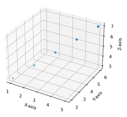
3D Plotting in Matplotlib
In Matplotlib, we can create a three-dimensional plot using the mpl_toolkits.mplot3d module. This module provides tools to create three-dimensional visualizations, including scatter plots, line plots, surface plots, and more. These plots provide a way to represent and explore data points or mathematical functions in three-dimensional space. You can customize aspects such as color, markers, labels, and perspective to convey information more effectively.
We can integrate the numpy library with the mpl_toolkits.mplot3d module to generate multidimensional data, and different functions, such as scatter, plot_surface, or plot_wireframe.
The mpl_toolkits.mplot3d Module
The "mpl_toolkits.mplot3d" module in Matplotlib enhances the library's capabilities for three-dimensional plotting. It introduces the "Axes3D" class, which enables the creation of 3D subplots. This module facilitates the visualization of data in three dimensions through functions such as scatter() for 3D scatter plots, plot_surface() for surface plots, and plot_wireframe() for wireframe representations.
Example - 3D Scatter Plot
A 3D scatter plot in Matplotlib is a visualization where data points are represented as individual markers in a three-dimensional space. Each data point is defined by three values, corresponding to its positions along the X, Y, and Z axes. These axes create a three-dimensional grid, and each marker is placed at the specified coordinates in this space. We can create this type of plot using the scatter() function.
In the following example, we are generating random 3D data points using NumPy and creating a 3D scatter plot with blue markers. We display the plot in a three-dimensional space, where the x, y, and z axes represent the coordinates of the points −
import matplotlib.pyplot as plt
from mpl_toolkits.mplot3d import Axes3D
import numpy as np
# Generating random 3D data
np.random.seed(42)
n_points = 100
x = np.random.rand(n_points)
y = np.random.rand(n_points)
z = np.random.rand(n_points)
# Creating a 3D scatter plot
fig = plt.figure()
ax = fig.add_subplot(111, projection='3d')
ax.scatter(x, y, z, c='blue', marker='o')
ax.set_xlabel('X Axis')
ax.set_ylabel('Y Axis')
ax.set_zlabel('Z Axis')
ax.set_title('3D Scatter Plot')
plt.show()
Output
The resulting plot shows a gradual color transition under the curve −
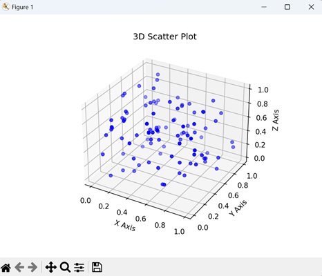
Example - 3D Line Plot
A 3D line plot in Matplotlib is a graphical representation that shows the connection between a sequence of points in a three-dimensional space. Unlike traditional 2D line plots where points are connected on a flat plane, a 3D line plot extends into three dimensions, forming a continuous line in the X, Y, and Z axes.
We can create 3D line plot in matplotlib using the plot() function. When we use this function in conjunction with the projection='3d' setting, it enables the generation of 3D line plots.
In here, we are generating data for a 3D line plot by defining coordinates (x, y, and z) based on a parameterized equation. The resulting plot displays a helical shape in three-dimensional space. The x, y, and z axes represent the respective coordinates −
import matplotlib.pyplot as plt
from mpl_toolkits.mplot3d import Axes3D
import numpy as np
# Generating data for a 3D line plot
theta = np.linspace(-4 * np.pi, 4 * np.pi, 100)
z = np.linspace(-2, 2, 100)
r = z**2 + 1
x = r * np.sin(theta)
y = r * np.cos(theta)
# Creating a 3D line plot
fig = plt.figure()
ax = fig.add_subplot(111, projection='3d')
ax.plot(x, y, z, label='3D Line Plot')
ax.set_xlabel('X Axis')
ax.set_ylabel('Y Axis')
ax.set_zlabel('Z Axis')
ax.set_title('3D Line Plot')
plt.show()
Output
On executing the above code we will get the following output −
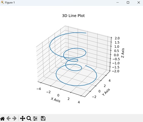
Example - 3D Surface Plot
A 3D surface plot in Matplotlib is a visual representation of a mathematical function or a dataset in three-dimensional space. Instead of using flat lines or markers, this plot uses a continuous surface to show how a variable changes across two input dimensions (X and Y) and is dependent on a third dimension (Z). We can create this type of plot using the plot_surface() function.
In here, we are generating data for a 3D surface plot by calculating the sine of the Euclidean distance from the origin for each point on a grid. The resulting plot visualizes a surface that rises and falls based on the sine function. The x, y, and z axes represent the coordinates and the height of the surface −
import matplotlib.pyplot as plt
from mpl_toolkits.mplot3d import Axes3D
import numpy as np
# Generating data for a 3D surface plot
x = np.linspace(-5, 5, 100)
y = np.linspace(-5, 5, 100)
x, y = np.meshgrid(x, y)
z = np.sin(np.sqrt(x**2 + y**2))
# Creating a 3D surface plot
fig = plt.figure()
ax = fig.add_subplot(111, projection='3d')
ax.plot_surface(x, y, z, cmap='viridis')
ax.set_xlabel('X Axis')
ax.set_ylabel('Y Axis')
ax.set_zlabel('Z Axis')
ax.set_title('3D Surface Plot')
plt.show()
Output
On executing the above code we will get the following output −
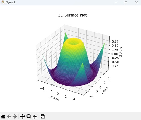
Example - 3D Bar Plot
A 3D bar plot in Matplotlib is a visual representation where data is presented using rectangular bars in three-dimensional space. Similar to a regular bar plot where bars are positioned along two axes (X and Y), a 3D bar plot adds a third dimension (Z) to represent the height or magnitude of each bar. We can create this type of plot using the bar3d() function.
In the example below, we are generating data for a 3D bar plot with five bars in both "x" and "y" directions. The height of each bar is determined by the values in the "z" array. The resulting plot visualizes a set of three-dimensional bars with varying heights, and the x, y, and z axes represent the dimensions of the plot −
import matplotlib.pyplot as plt
from mpl_toolkits.mplot3d import Axes3D
import numpy as np
# Generating data for a 3D bar plot
x_pos = np.arange(1, 6)
y_pos = np.arange(1, 6)
x_pos, y_pos = np.meshgrid(x_pos, y_pos)
z_pos = np.zeros_like(x_pos)
z = np.array([[5, 8, 3, 6, 2],
[1, 2, 3, 4, 5],
[2, 3, 6, 7, 8],
[5, 6, 7, 8, 9],
[3, 4, 5, 7, 8]])
# Creating a 3D bar plot
fig = plt.figure()
ax = fig.add_subplot(111, projection='3d')
ax.bar3d(x_pos.flatten(), y_pos.flatten(), z_pos.flatten(), 0.8, 0.8, z.flatten(), shade=True)
ax.set_xlabel('X Axis')
ax.set_ylabel('Y Axis')
ax.set_zlabel('Z Axis')
ax.set_title('3D Bar Plot')
plt.show()
Output
On executing the above code we will get the following output −
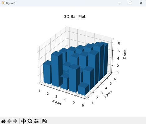
Matplotlib - 3D Lines
A 3D line is used to represent a straight path in three-dimensional space. It has length but no width or thickness. It is defined by three coordinates: one for the x-axis, one for the y-axis, and one for the z-axis.
You can imagine it as a straight trail in the air that goes in any direction: left, right, up, down, or diagonally. That trail represents a 3D line −
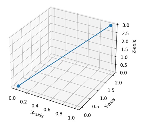
3D Lines in Matplotlib
In Matplotlib, a 3D line refers to a visual representation of a sequence of data points in a three-dimensional space. We can use the plot() function within the "mpl_toolkits.mplot3d" module in Matplotlib to create 3D lines.
This function takes arrays of X, Y, and Z coordinates and connects the points with lines, producing a continuous path through the 3D space.
Lets start by drawing a basic 3D line plot.
Example - Basic 3D Line Plot
A basic 3D line plot in Matplotlib is a way to visually represent a sequence of data points in a three-dimensional space. Imagine a series of connected dots forming a continuous line, but now extending not only in the horizontal (X) and vertical (Y) directions but also into a third dimension (Z).
Each dot on the line corresponds to a specific set of coordinates (X, Y, Z), and the line connects these points, creating a path through the 3D space.
In the following example, we are drawing a basic 3D line plot. We generate 3D data by parameterizing the x, y, and z coordinates based on time (t). The resulting plot is a 3D line that traces the motion of a point in space as it moves along a sinusoidal path −
import matplotlib.pyplot as plt
from mpl_toolkits.mplot3d import Axes3D
import numpy as np
# Generating 3D data
t = np.linspace(0, 20, 100)
x = np.sin(t)
y = np.cos(t)
z = t
# Creating a 3D line plot
fig = plt.figure()
ax = fig.add_subplot(111, projection='3d')
ax.plot(x, y, z, label='3D Line')
ax.set_xlabel('X Axis')
ax.set_ylabel('Y Axis')
ax.set_zlabel('Z Axis')
ax.set_title('Basic 3D Line Plot')
plt.legend()
plt.show()
Output
Following is the output of the above code −
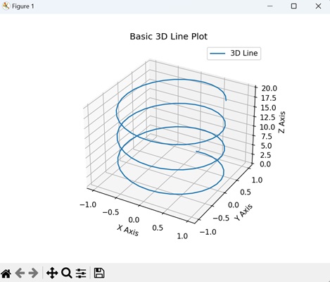
Example - Multiple 3D Lines
Multiple 3D lines in Matplotlib allow you to show more than one continuous path through a three-dimensional space on the same plot. Each line has its own unique path through the X, Y, and Z axes, and together, they create a network of interconnected lines.
In here, we are generating 3D data for two lines by parameterizing their x, y, and z coordinates based on time (t). The resulting plot shows two lines in three-dimensional space: one solid line (Line 1) and another dashed line (Line 2) that is a scaled-down version of the first −
import matplotlib.pyplot as plt
from mpl_toolkits.mplot3d import Axes3D
import numpy as np
# Generating 3D data for multiple lines
t = np.linspace(0, 20, 100)
x1, x2 = np.sin(t), 0.8 * np.sin(t)
y1, y2 = np.cos(t), 0.8 * np.cos(t)
z1, z2 = t, 0.8 * t
# Creating multiple 3D lines plot
fig = plt.figure()
ax = fig.add_subplot(111, projection='3d')
ax.plot(x1, y1, z1, label='Line 1')
ax.plot(x2, y2, z2, label='Line 2', linestyle='dashed')
ax.set_xlabel('X Axis')
ax.set_ylabel('Y Axis')
ax.set_zlabel('Z Axis')
ax.set_title('Multiple 3D Lines Plot')
plt.legend()
plt.show()
Output
Output of the above code is as follows −
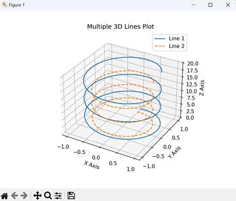
Example - Helix 3D Line
A helix 3D Line in Matplotlib is like drawing a spring or coil in a three-dimensional space. This visual representation creates a continuous curve that twists and turns in three directions: X, Y, and Z. You can easily generate this helical 3D line plot with Matplotlib's plot() function.
The following example generates 3D data for a helix by parameterizing the x, y, and z coordinates based on time (t). The resulting plot displays a 3D line representing a helix in three-dimensional space.
The x and y coordinates are determined by the cosine and sine functions, creating a circular pattern, while the z coordinate increases linearly with time −
import matplotlib.pyplot as plt
from mpl_toolkits.mplot3d import Axes3D
import numpy as np
# Generating helix 3D data
t = np.linspace(0, 10 * np.pi, 1000)
x = np.cos(t)
y = np.sin(t)
z = t
# Creating a helix 3D line plot
fig = plt.figure()
ax = fig.add_subplot(111, projection='3d')
ax.plot(x, y, z, label='Helix 3D Line', color='green')
ax.set_xlabel('X Axis')
ax.set_ylabel('Y Axis')
ax.set_zlabel('Z Axis')
ax.set_title('Helix 3D Line Plot')
plt.legend()
plt.show()
Output
After executing the above code, we get the following output −
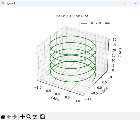
Example - Parametric 3D Line
A parametric 3D line in Matplotlib is a visual representation of a curve where each point is determined by a set of mathematical parameters. Instead of being defined by traditional X, Y, and Z coordinates, this type of line is created by using a set of equations that describe how each coordinate evolves based on a parameter.
Now, we are generating parametric 3D data by parameterizing the x, y, and z coordinates based on the angle "theta". The resulting plot is a 3D line representing a circular path in three-dimensional space.
The x and y coordinates are determined by the cosine and sine functions, creating a circular pattern, while the z coordinate increases linearly with the angle theta −
import matplotlib.pyplot as plt
from mpl_toolkits.mplot3d import Axes3D
import numpy as np
# Generating parametric 3D data
theta = np.linspace(0, 2 * np.pi, 100)
x = np.cos(theta)
y = np.sin(theta)
z = theta
# Creating a parametric 3D line plot
fig = plt.figure()
ax = fig.add_subplot(111, projection='3d')
ax.plot(x, y, z, label='Parametric 3D Line')
ax.set_xlabel('X Axis')
ax.set_ylabel('Y Axis')
ax.set_zlabel('Z Axis')
ax.set_title('Parametric 3D Line Plot')
plt.legend()
plt.show()
Output
The output obtained is as shown below −
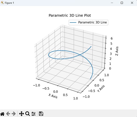
Matplotlib - 3D Scatter Plots
A scatter plot is a way to display individual data points on a two-dimensional graph. Each point on the graph represents the values of two variables.
In a 3D scatter plot, three variables are considered instead of just two, creating a three-dimensional space where each point is defined by three values. Each data point is represented by a marker in this 3D space, with its position determined by its values along the three axes.
For example, you can use a 3D scatter plot if you are plotting the heights, weights, and ages of a group of people. In this representation, the x-axis signifies height, the y-axis corresponds to weight, and the z-axis represents age. Data of each person is then represented by a point in the three-dimensional space, showing their specific combination of height, weight, and age −
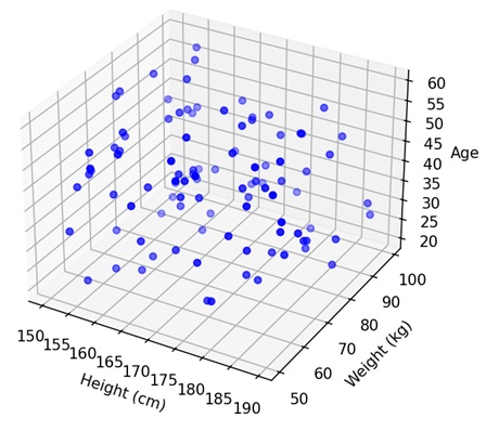
3D Scatter Plots in Matplotlib
We can create a 3D scatter plot in Matplotlib using the scatter() function from the "mpl_toolkits.mplot3d" module. This function allows you to specify the X, Y, and Z coordinates of each data point, and it places markers in the 3D space accordingly.
The resulting plot provides a visual representation of the distribution of data points and relationships between three variables.
Let's start by creating a basic 3D scatter plot.
Example - Basic 3D Scatter Plot
In a basic 3D scatter plot using Matplotlib, imagine a three-dimensional space where you have a bunch of points floating around. Each point has its own set of three coordinates: one for the position along the X-axis, one for the Y-axis, and one for the Z-axis. The plot displays these points as markers in space, creating a visual representation of your data in three dimensions.
In the following example, we are generating random 3D data points and creating a basic 3D scatter plot. The x, y, and z coordinates of each point are randomly chosen, and the resulting plot visualizes these points in three-dimensional space using blue markers −
import matplotlib.pyplot as plt
from mpl_toolkits.mplot3d import Axes3D
import numpy as np
# Generating 3D data
x = np.random.rand(50)
y = np.random.rand(50)
z = np.random.rand(50)
# Creating a basic 3D scatter plot
fig = plt.figure()
ax = fig.add_subplot(111, projection='3d')
ax.scatter(x, y, z, c='blue', marker='o', label='Data Points')
ax.set_xlabel('X Axis')
ax.set_ylabel('Y Axis')
ax.set_zlabel('Z Axis')
ax.set_title('Basic 3D Scatter Plot')
plt.legend()
plt.show()
Output
After executing the above code, we get the following output −

Example - Multiple 3D Scatter Plots
Multiple 3D scatter plots in Matplotlib allow you to represent multiple sets of points in a three-dimensional space. Each point corresponds to a unique dataset, and within each dataset, individual points are defined by their specific combinations of X, Y, and Z coordinates.
In here, we are generating two sets of random 3D data points and creates multiple 3D scatter plots to visualize them. Each set of points (Set 1 and Set 2) has x, y, and z coordinates randomly chosen. The resulting plot shows two sets of points in three-dimensional space, distinguished by blue circles (Set 1) and green triangles (Set 2) −
import matplotlib.pyplot as plt
from mpl_toolkits.mplot3d import Axes3D
import numpy as np
# Generating 3D data for two sets of points
x1 = np.random.rand(50)
y1 = np.random.rand(50)
z1 = np.random.rand(50)
x2 = np.random.rand(50)
y2 = np.random.rand(50)
z2 = np.random.rand(50)
# Creating multiple 3D scatter plots
fig = plt.figure()
ax = fig.add_subplot(111, projection='3d')
ax.scatter(x1, y1, z1, c='blue', marker='o', label='Set 1')
ax.scatter(x2, y2, z2, c='green', marker='^', label='Set 2')
ax.set_xlabel('X Axis')
ax.set_ylabel('Y Axis')
ax.set_zlabel('Z Axis')
ax.set_title('Multiple 3D Scatter Plots')
plt.legend()
plt.show()
Output
Following is the output of the above code −

Example - 3D Scatter Plot with Annotations
A 3D Scatter Plot with Annotations in Matplotlib is a way to represent points in a three-dimensional space, where each point is marked with additional information through text labels.
To add these annotations, you can use the text() function in matplotlib. This function places text labels at desired locations in the plot, usually near specific data points.
Now, we are creating a 3D scatter plot with annotations. We label each point with a number from 1 to the total number of points, and these labels are displayed next to their respective points in the plot −
import matplotlib.pyplot as plt
from mpl_toolkits.mplot3d import Axes3D
import numpy as np
# Generatng random data
np.random.seed(42)
n_points = 10
x = np.random.rand(n_points)
y = np.random.rand(n_points)
z = np.random.rand(n_points)
# Creating a 3D scatter plot with annotations
fig = plt.figure()
ax = fig.add_subplot(111, projection='3d')
ax.scatter(x, y, z)
# Annotating points
for i, txt in enumerate(range(1, n_points + 1)):
ax.text(x[i], y[i], z[i], str(txt), color='red')
# Show the plot
plt.show()
Output
Output of the above code is as follows −

Example - Connected 3D Scatter Plot
A connected 3D scatter plot is a variation where data points are represented individually, but lines are drawn between consecutive points. This helps to visualize connections between the points over the three-dimensional space.
In the example below, we are creating a connected 3D scatter plot that shows individual data points (blue) connected by dashed lines (linestyle='--') with red color −
import matplotlib.pyplot as plt
from mpl_toolkits.mplot3d import Axes3D
import numpy as np
# Generating random data
np.random.seed(42)
n_points = 10
x = np.random.rand(n_points)
y = np.random.rand(n_points)
z = np.random.rand(n_points)
# Creating a connected 3D scatter plot
fig = plt.figure()
ax = fig.add_subplot(111, projection='3d')
# Scatter plot
ax.scatter(x, y, z, c='blue', marker='o', label='Points')
# Connected lines
ax.plot(x, y, z, c='red', linestyle='-', linewidth=2, label='Lines')
# Adding labels
ax.set_xlabel('X')
ax.set_ylabel('Y')
ax.set_zlabel('Z')
# Adding a legend
ax.legend()
# Displaying the plot
plt.show()
Output
The output obtained is as shown below −

Matplotlib - 3D Contours
3D contours refer to the lines or curves that show the shape and height of objects in a three-dimensional space. These contours help us understand how high or low different parts of an object are. They are commonly used in fields like geography, engineering, and art to represent the shape of things in a more detailed way.
For example, if you have a mountain, its 3D contours will show the slopes, valleys, and peaks from all sides. Similarly, if you have a sculpture of an animal, its 3D contours will describe the shape of its body, head, and limbs from various viewpoints −
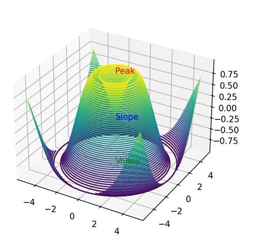
3D Contours in Matplotlib
In Matplotlib, 3D contours represent the surface of a three-dimensional object. It allows you to create 3D contour plots by providing your data points representing the x, y, and z coordinates. These points define the shape of the object you want to visualize. Then, Matplotlib can generate contour lines or surfaces to represent the contours of your 3D data.
You can create 3d contours in Matplotlib using the contour3D() function in the "mpl_toolkits.mplot3d" module. This function accepts the three coordinates - X, Y, and Z as arrays and plots a line across the X and Y coordinate to show the outline or change in height of a 3D object along the z-axis.
Let's start by drawing a basic 3D contour.
Example - Basic 3D Contour
A basic 3D contour in Matplotlib is like drawing elevation lines on a map but in three dimensions. It uses X, Y, and Z axes to show the changes in height of a surface across different points.
In the following example, we are creating a basic 3D contour by first plotting the X and Y coordinates. Then, we take the sum of sine and cosine values of X and Y to get the change in elevation. The resultant plot displays the outline of the shape with different heights on Z axis −
import matplotlib.pyplot as plt
import numpy as np
from mpl_toolkits.mplot3d import Axes3D
# Creating data
x = np.linspace(-5, 5, 100)
y = np.linspace(-5, 5, 100)
X, Y = np.meshgrid(x, y)
Z = np.sin(X) + np.cos(Y)
# Creating a 3D plot
fig = plt.figure()
ax = fig.add_subplot(111, projection='3d')
# Plotting the 3D contour
ax.contour3D(X, Y, Z, 50, cmap='viridis')
# Customizing the plot
ax.set_xlabel('X-axis')
ax.set_ylabel('Y-axis')
ax.set_zlabel('Z-axis')
ax.set_title('Basic 3D Contour Plot')
# Displaying the plot
plt.show()
Output
Following is the output of the above code −
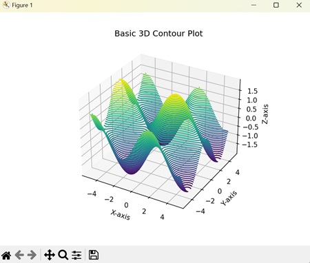
Example - Parametric 3D Contours
Parametric 3D contours in Matplotlib represent outline of shapes at different heights using mathematical parameters in three dimensions. The contours are not only defined by the changes in X, Y, and Z coordinates but also by changes in the parameters.
In here, we are parameterizing the X, Y, and Z coordinates based on the the size (R), thickeness (r) and initial coordinates (u, v) of the 3D object. The resultant plot creates a donut-shaped 3D contour −
import matplotlib.pyplot as plt
import numpy as np
from mpl_toolkits.mplot3d import Axes3D
# Parametric equations for a torus
def torus_parametric(u, v, R=1, r=0.3):
x = (R + r * np.cos(v)) * np.cos(u)
y = (R + r * np.cos(v)) * np.sin(u)
z = r * np.sin(v)
return x, y, z
# Creating data
u = np.linspace(0, 2 * np.pi, 100)
v = np.linspace(0, 2 * np.pi, 100)
U, V = np.meshgrid(u, v)
X, Y, Z = torus_parametric(U, V)
# Creating a 3D plot
fig = plt.figure()
ax = fig.add_subplot(111, projection='3d')
# Plotting the parametric 3D contour
ax.contour3D(X, Y, Z, 50, cmap='plasma')
# Customizing the plot
ax.set_xlabel('X-axis')
ax.set_ylabel('Y-axis')
ax.set_zlabel('Z-axis')
ax.set_title('Parametric 3D Contour Plot (Torus)')
# Displaying the plot
plt.show()
Output
On executing the above code we will get the following output −
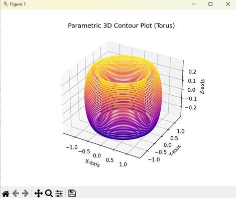
Example - 3D Contours from Irregular Data
In Matplotlib, 3D contours from irregular data show the outline of a 3D surface whose data points are random. In this type of contour, we calculate the missing data points by estimating the values based on the X, Y, and Z values.
The following example creates a 3D contour from irregular data. Here, we calculate the missing data points and interpolate them linearly with known data points. This creates a smooth and continuous 3D contour as the result −
import matplotlib.pyplot as plt
import numpy as np
from mpl_toolkits.mplot3d import Axes3D
from scipy.interpolate import griddata
# Creating irregularly spaced data
np.random.seed(42)
x = np.random.rand(100)
y = np.random.rand(100)
z = np.sin(x * y)
# Creating a regular grid
xi, yi = np.linspace(x.min(), x.max(), 100), np.linspace(y.min(), y.max(), 100)
xi, yi = np.meshgrid(xi, yi)
# Combining irregular data onto the regular grid
zi = griddata((x, y), z, (xi, yi), method='linear')
# Creating a 3D plot
fig = plt.figure()
ax = fig.add_subplot(111, projection='3d')
# Plotting the 3D contour from irregular data on the regular grid
ax.contour3D(xi, yi, zi, 50, cmap='viridis')
# Customizing the plot
ax.set_xlabel('X-axis')
ax.set_ylabel('Y-axis')
ax.set_zlabel('Z-axis')
ax.set_title('3D Contour Plot from Irregular Data')
# Displaying the plot
plt.show()
Output
After executing the above code, we get the following output −
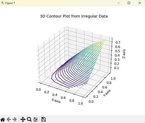
Example - Contour Lines in 3D Contours
In Matplotlib, contour lines in 3D contours visually represents the 3D contour of an object along with its contour lines in three dimensions. The contour lines represent the slope of a 3D contour and are represented in the XY plane as they do not have any Z value (no depth). The function "contour()" is used to show the contour lines of an object.
Now, we are creating a 3D contour and contour lines of an object. We plot a 3D contour on the z-axis and the contour lines on the XY plane. The resultant plot shows the outline of the object on the z-axis along with its slope on XY plane −
import matplotlib.pyplot as plt
import numpy as np
from mpl_toolkits.mplot3d import Axes3D
# Creating data
x = np.linspace(-5, 5, 100)
y = np.linspace(-5, 5, 100)
X, Y = np.meshgrid(x, y)
Z = np.sin(np.sqrt(X**2 + Y**2))
# Creating a 3D plot
fig = plt.figure()
ax = fig.add_subplot(111, projection='3d')
# Plotting the 3D contour
ax.contour3D(X, Y, Z, 50, cmap='plasma')
# Adding contour lines on the XY plane
ax.contour(X, Y, Z, zdir='z', offset=np.min(Z), cmap='plasma')
# Customizing the plot
ax.set_xlabel('X-axis')
ax.set_ylabel('Y-axis')
ax.set_zlabel('Z-axis')
ax.set_title('3D Contour Plot with Contour Lines')
# Displaying the plot
plt.show()
Output
On executing the above code we will get the following output −
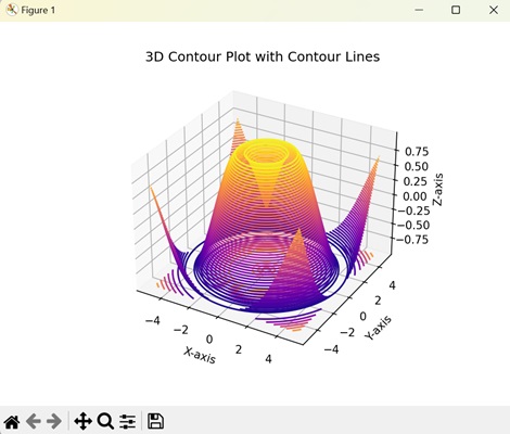
Matplotlib - 3D Bar Plots
A 3D bar graph is a way to visually represent data in three dimensions, like height, width, and depth. You might have seen regular bar graphs, where bars are used to represent data values along one or two axes. In a 3D bar graph, however, the bars also have depth, giving a full representation of the data.
In a 3D bar graph, data is plotted along three axes: the x-axis, y-axis, and the z-axis. The x-axis represents the categories, the y-axis represents the subcategories and the z-axis represents the values for each category and subcategory −
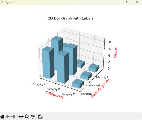
3D Bar Graphs in Matplotlib
3D bar graph in Matplotlib is a visual representations of columns in three-dimensions (2D columns with depth). To create 3D bar graphs, we use the bar3d() function in the "mpl_toolkits.mplot3d" module. This function takes X, Y, and Z coordinates as arrays to plot the position of each bar in the three-dimensional space.
Let us start by drawing basic 3D bar graph.
Example - Basic 3D Bar Graph
A basic 3D bar graph in Matplotlib is a representation of data using rectangular bars in a three-dimensional space. The position of each bar is defined along X, Y, and Z axes. The X axis defines the category, the Y axis defines the subcategory and the Z axis defines the values associated with each subcategory.
In this example, we are drawing basic 3D bar graphs. We first create a sample data, where the category is the vehicle type ('Car') and the subcategory is the sales region ('North', 'South'). The result is a 3D bar graph where the height of the bars represents the total sales volume of each vehicle type in each region −
import matplotlib.pyplot as plt
from mpl_toolkits.mplot3d import Axes3D
# Sample data
vehicle_type = ['Car']
sales_region = ['North', 'South']
sales_volume = [[150, 120]]
# Creating a 3D plot
fig = plt.figure()
ax = fig.add_subplot(111, projection='3d')
# Plotting 3D bars
for i in range(len(vehicle_type)):
for j in range(len(sales_region)):
ax.bar3d(i, j, 0, 0.8, 0.8, sales_volume[i][j])
ax.set_xlabel('Vehicle Type')
ax.set_ylabel('Sales Region')
ax.set_zlabel('Sales Volume')
ax.set_title('Basic 3D Bar Graph')
# Displaying the plot
plt.show()
Output
Following is the output of the above code −
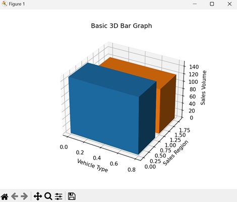
Example - Stacked 3D Bar Graphs
A stacked 3D bar graph in Matplotlib is combining multiple 3D bar graphs on top of each other. Each bar gives the contribution of a single category and subcategory, and when stacked with other graphs it helps us to see the contribution made by the individual categories and subcategories to a total value in a three-dimensional space.
The following example creates a stacked 3D graph, which allows us to see the total investment amount made for each investment category ('Equity', 'Mutual Fund', 'Gold') for each month ('January','February','March'). In the resultant plot, the individual bars represent contributions of each investment category while the stacked 3D bars gives the total invesment amount in each category −
import matplotlib.pyplot as plt
from mpl_toolkits.mplot3d import Axes3D
# Sample data
months = ['January', 'February', 'March']
investment_categories = ['Equity', 'Mutual Funds', 'Gold']
investment_amount = [[1000, 2000, 1500],[1800, 1600, 1200],[2100, 1700, 2500]]
# Creating a 3D plot
fig = plt.figure()
ax = fig.add_subplot(111, projection='3d')
# Plotting stacked 3D bars
for i in range(len(months)):
bottom = 0
for j in range(len(investment_categories)):
ax.bar3d(i, j, bottom, 0.8, 0.8, investment_amount[i][j], shade=True)
bottom += investment_amount[i][j]
ax.set_xlabel('Months')
ax.set_ylabel('Investment Categories')
ax.set_zlabel('Investment Amount')
ax.set_title('Stacked 3D Bar Graph')
# Displaying the plot
plt.show()
Output
Output of the above code is as follows −
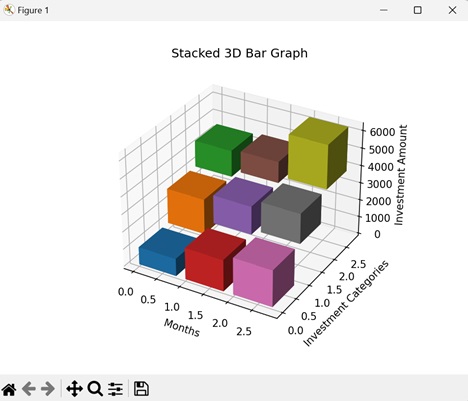
Example - Grouped 3D Bar Graphs
In Matplotlib, a grouped 3D bar graph creates a comparison between multiple groups across different categories. Each bar has a distinct value on the X, Y, and Z axes and represents a distinct category. A group is formed by combining the distinct bars of each category or subcategory.
In the following example, we are creating a grouped 3D bar graph for different products ('Ring', 'Bracelet', 'Necklace') across different regions ('West','East'). The graph is created by grouping the sales of each product over a time period. The resultant plot shows the regions, products and total sales on the x-axis, y-axis, and z-axis respectively −
import matplotlib.pyplot as plt
from mpl_toolkits.mplot3d import Axes3D
# Sample data
product_regions = ['West', 'East']
products = ['Ring', 'Bracelet', 'Necklace']
sales_volume = [[[105, 125, 85],[92, 112, 85],[84, 95, 75]],[[123, 93, 103],[118, 95, 105],[85, 109, 119]]]
# Creating a 3D plot
fig = plt.figure()
ax = fig.add_subplot(111, projection='3d')
# Plotting grouped 3D bars
bar_width = 0.3
for i in range(len(product_regions)):
for j in range(len(products)):
x_position = i + j * bar_width
ax.bar3d(x_position, range(len(products)), 0, bar_width, 0.8, sales_volume[i][j])
ax.set_xlabel('Product Regions')
ax.set_ylabel('Products')
ax.set_zlabel('Sales Volume')
ax.set_title('Grouped 3D Bar Graph')
# Displaying the plot
plt.show()
Output
After executing the above code, we get the following output −
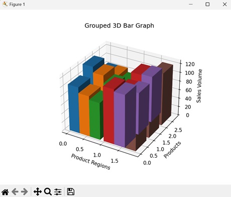
Example - 3D Bar Graphs with Custom Colors
In Matplotlib, we can customize the colors of bars in a 3D bar graph to improvise visual clarity. It is useful in situations where different categories need to be represented with different colors in a three dimensional space.
Here, we are having a category of subjects ('Mathematics', 'Physics', 'Chemistry') and subcategory of students ('A', 'B', 'C'). To assign different colors, we create a tuple of colors and set this tuple to the "color" property in bar3d() function. In the final plot, the bar color of each student is different based on their performance −
import matplotlib.pyplot as plt
from mpl_toolkits.mplot3d import Axes3D
# Sample data
subjects = ['Mathematics', 'Physics', 'Chemistry']
student_name = ['A', 'B', 'C']
marks = [[90, 95, 93],[75, 78, 70],[30, 25, 35]]
# Custom colors for each student based on marks
colors = {'A': 'green', 'B': 'yellow', 'C': 'red'}
# Creating a 3D plot
fig = plt.figure()
ax = fig.add_subplot(111, projection='3d')
# Plotting 3D bars with custom colors
for i in range(len(subjects)):
for j in range(len(student_name)):
ax.bar3d(i, j, 0, 0.8, 0.8, marks[j][i], color=colors[student_name[j]])
ax.set_xlabel('Subjects')
ax.set_ylabel('Student Name')
ax.set_zlabel('Marks')
ax.set_title('3D Bar Graph with Custom Colors')
# Displaying the plot
plt.show()
Output
The output obtained is as shown below −
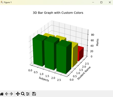
Matplotlib - 3D Wireframes
A 3D wireframe plot is a way of representing data in three dimensions using lines to represent the shape of an object. A wireframe plot connects the data points of an object to create a mesh-like structure to show the shape of the object.
Imagine we have a cube and instead of drawing the solid faces of the cube, we only show the lines outlining its edges and corners. The outline we get is the 3D wireframe plot −
3D Wireframe Plot in Matplotlib
In Matplotlib, a 3D wireframe plot is a type of visualization where data is represented by a network of lines forming the edges of a three-dimensional surface.
We can create a 3D wireframe plot in Matplotlib using the plot_wireframe() function in the 'mpl_toolkits.mplot3d' module. This function accepts the X, Y, and Z coordinates of a 3D object and connects these coordinates with lines to create a 3D outline of the object.
Example - Basic 3D Wireframe Plot
Lets start by drawing a basic 3D wireframe plot.
A basic 3D wireframe plot in Matplotlib displays the surface of a 3D object as a mesh of lines, allowing you to visualize the shape and structure of the surface. The wireframe plot is formed by joining a series of points on the sphere's surface with straight lines running along the x, y, and z axes.
To create a wireframe plot, you can define arrays for the x, y, and z coordinates of the surface points you want to visualize. Then, you can pass these arrays to the plot_wireframe() function to generate the wireframe plot.
In the following example, we are creating a basic 3D wireframe plot of a spherical surface. First, we generate the X, Y, and Z points of the sphere by varying them with the angles 'theta' and 'phi'. Then, we use the plot_wireframe() function to create lines that connect the data points of the sphere. In the resultant plot, we get a 3D wireframe plot of a spherical surface −
import numpy as np
import matplotlib.pyplot as plt
from mpl_toolkits.mplot3d import Axes3D
# Generating data for a spherical surface
theta = np.linspace(0, 2*np.pi, 100)
phi = np.linspace(0, np.pi, 100)
theta, phi = np.meshgrid(theta, phi)
r = 1
x = r * np.sin(phi) * np.cos(theta)
y = r * np.sin(phi) * np.sin(theta)
z = r * np.cos(phi)
# Creating a 3D plot
fig = plt.figure()
ax = fig.add_subplot(111, projection='3d')
# Plotting the spherical wireframe
ax.plot_wireframe(x, y, z, color='blue')
# Adding labels and title
ax.set_xlabel('X')
ax.set_ylabel('Y')
ax.set_zlabel('Z')
ax.set_title('Basic 3D Wireframe Plot')
# Displaying the plot
plt.show()
Output
Following is the output of the above code −
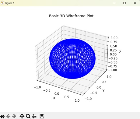
Example - Toroidal 3D Wireframe Plot
In Matplotlib, a toroidal 3D wireframe plot represents the surface of a torus using lines in three-dimensional space. A torus is a doughnut-shaped object with a hole in the middle. The wireframe plot connects the lines on surface of the torus to create its outline.
In here, we are generating a toroidal 3D wireframe plot. We start by creating the surface of the torus by varying the X and Y coordinates with angles 'theta' and 'phi' and with major radius 'R' and minor radius 'r', while the Z coordinate varies with 'r' and 'phi'. Then, we use the plot_wireframe() function to connect the coordinates with lines creating a resultant plot which represents a 3D wireframe plot of a torus −
import numpy as np
import matplotlib.pyplot as plt
from mpl_toolkits.mplot3d import Axes3D
# Generating data for a toroidal surface
theta = np.linspace(0, 2*np.pi, 100)
phi = np.linspace(0, 2*np.pi, 100)
theta, phi = np.meshgrid(theta, phi)
R = 2
r = 1
x = (R + r * np.cos(phi)) * np.cos(theta)
y = (R + r * np.cos(phi)) * np.sin(theta)
z = r * np.sin(phi)
# Creating a 3D plot
fig = plt.figure()
ax = fig.add_subplot(111, projection='3d')
# Plotting the toroidal wireframe
ax.plot_wireframe(x, y, z, color='green')
# Adding labels and title
ax.set_xlabel('X')
ax.set_ylabel('Y')
ax.set_zlabel('Z')
ax.set_title('Toroidal 3D Wireframe Plot')
# Displaying the plot
plt.show()
Output
On executing the above code we will get the following output −
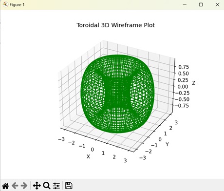
Example - Paraboloid 3D Wireframe Plot
A paraboloid 3D wireframe plot in Matplotlib displays the outline of a paraboloid using lines on a three-dimensional graph. A paraboloid is a three-dimensional parabola that resembles a bowl. The 3D wireframe plot connects the data points to create a mesh-like structure of the paraboloid.
The following example creates a 3D wireframe plot of a paraboloid in a 3D space. We create the paraboloid by evenly spacing the X, Y, and Z on a 3D graph. Then, we connect the coordinates with lines using the plot_wireframe() function to create a 3D wireframe plot −
import numpy as np
import matplotlib.pyplot as plt
from mpl_toolkits.mplot3d import Axes3D
# Generating data for a paraboloid surface
x = np.linspace(-5, 5, 100)
y = np.linspace(-5, 5, 100)
X, Y = np.meshgrid(x, y)
Z = X**2 + Y**2
# Creating a 3D plot
fig = plt.figure()
ax = fig.add_subplot(111, projection='3d')
# Plotting the paraboloid wireframe
ax.plot_wireframe(X, Y, Z, color='purple')
# Adding labels and title
ax.set_xlabel('X')
ax.set_ylabel('Y')
ax.set_zlabel('Z')
ax.set_title('Paraboloid 3D Wireframe Plot')
# Displaying the plot
plt.show()
Output
After executing the above code, we get the following output −
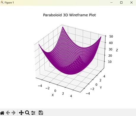
Example - Cylindrical 3D Wireframe Plot
In Matplotlib, a cylindrical wireframe plot is a visualization of the geometry of a cylinder in a three-dimensional space. A cylinder is a three-dimensional shape with a circular cross-section that extends along its length. The data points on the surface of the cylinder are connected with lines to create a 3D wireframe plot.
Now, we are generating a 3D wireframe plot for a cylinder on a 3D graph. We first plot the X and Y coordinates that represent the surface of the cylinder by varying them with the radius 'r' and the angle 'theta' (theta is in range 0 to 2 to cover a full circle). Then, we plot the Z coordinate that represents the height of the cylinder. After that, we use the plot_wireframe() function to join the coordinates with straight lines. This creates a resultant plot which shows the 3D wireframe plot of a cylinder −
import numpy as np
import matplotlib.pyplot as plt
from mpl_toolkits.mplot3d import Axes3D
# Defining the parameters
r = 1
h = 2
theta = np.linspace(0, 2*np.pi, 100)
z = np.linspace(0, h, 10)
# Generating cylinder coordinates
theta_3d, z_3d = np.meshgrid(theta, z)
x = r * np.cos(theta_3d)
y = r * np.sin(theta_3d)
# Creating a 3D plot
fig = plt.figure()
ax = fig.add_subplot(111, projection='3d')
# Plotting the cylindrical wireframe
ax.plot_wireframe(x, y, z_3d, color='orange')
# Adding labels and title
ax.set_xlabel('X')
ax.set_ylabel('Y')
ax.set_zlabel('Z')
ax.set_title('Cylindrical 3D Wireframe Plot')
# Displaying the plot
plt.show()
Output
On executing the above code we will get the following output −
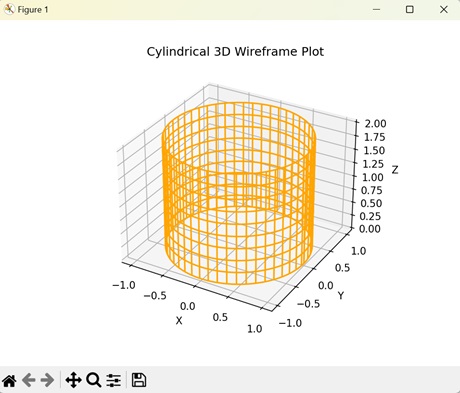
Matplotlib - 3D Surface Plots
A 3D surface plot is a way to visualize data that has three dimensions: length, width, and height.
Imagine a landscape with hills and valleys where each point on the surface represents a specific value. In a 3D surface plot, these points are plotted in a three-dimensional space, creating a surface that shows how the data varies across different positions. It is like looking at a three-dimensional map of the data, where the height of the surface represents the value of the data at each point.
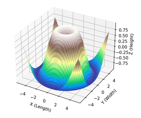
3D Surface Plot in Matplotlib
In Matplotlib, a 3D surface plot is a visual representation of multiple points connected like a graph with a specific area in three-dimensional space. We can create a 3d surface plot in Matplotlib using the plot_surface() function in "mpl_toolkits.mplot3d" module. It takes the X, Y, and Z coordinates as arrays and creates a continuous graph by joining the three coordinates.
Lets start by drawing a basic 3D surface plot.
Example - Basic 3D Surface Plot
A basic 3D surface plot in Matplotlib is way of representing a graph in three dimensions, with X, Y, and Z axes. The coordinates form a surface where height or depth (Z-axis) at each point gives the plot its three-dimensional shape.
In the following example, we are creating a basic 3D surface plot by evenly spacing the X and Y coordinates and then finding the Z coordinate based on the values of X and Y coordinates −
import matplotlib.pyplot as plt
import numpy as np
from mpl_toolkits.mplot3d import Axes3D
# Creating data
x = np.linspace(-5, 5, 100)
y = np.linspace(-5, 5, 100)
X, Y = np.meshgrid(x, y)
Z = np.sin(np.sqrt(X**2 + Y**2))
# Creating a 3D plot
fig = plt.figure()
ax = fig.add_subplot(111, projection='3d')
# Plotting the basic 3D surface
ax.plot_surface(X, Y, Z, cmap='viridis')
# Customizing the plot
ax.set_xlabel('X-axis')
ax.set_ylabel('Y-axis')
ax.set_zlabel('Z-axis')
ax.set_title('Basic 3D Surface Plot')
# Displaying the plot
plt.show()
Output
Following is the output of the above code −
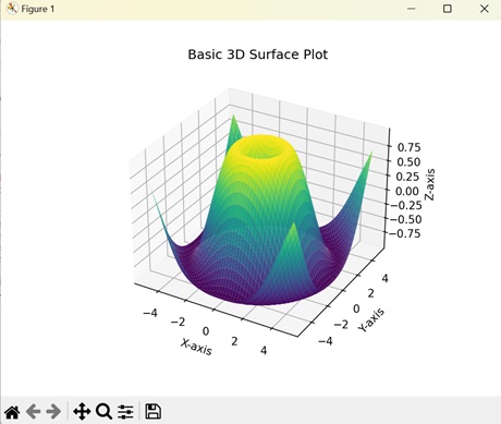
Example - Parametric 3D Surface Plots
Parametric 3D surface plots in Matplotlib use mathematical equations to define a graph in three-dimensional space. These equations describe how the values of X, Y, and Z coordinates changes with variations in parameter values.
In here, we are creating a parametric 3D surface plot by parametrizing the X, Y, and Z coordinates with respect to initial data points (u, v), size (R) and thickness (r). The resulting plot shows a donut-shaped surface plot −
import matplotlib.pyplot as plt
import numpy as np
from mpl_toolkits.mplot3d import Axes3D
# Parametric equations for a torus
def torus_parametric(u, v, R=1, r=0.3):
x = (R + r * np.cos(v)) * np.cos(u)
y = (R + r * np.cos(v)) * np.sin(u)
z = r * np.sin(v)
return x, y, z
# Generating data
u = np.linspace(0, 2 * np.pi, 100)
v = np.linspace(0, 2 * np.pi, 100)
U, V = np.meshgrid(u, v)
X, Y, Z = torus_parametric(U, V)
# Creating a 3D plot
fig = plt.figure()
ax = fig.add_subplot(111, projection='3d')
# Plotting the parametric 3D surface
ax.plot_surface(X, Y, Z, cmap='plasma')
# Customizing the plot
ax.set_xlabel('X-axis')
ax.set_ylabel('Y-axis')
ax.set_zlabel('Z-axis')
ax.set_title('Parametric 3D Surface Plot (Torus)')
# Displaying the plot
plt.show()
Output
On executing the above code we will get the following output −
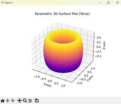
Example - Multiple 3D Surface Plots
In Matplotlib, multiple 3D surface plots displays multiple graphs stacked on top of each other in a three-dimensional space. Each graph has a distinct value for the X, Y, and Z coordinates.
The following example creates two 3D surface plots stacked on top of each other. We use different equations to create two distinct 3D surface plots. The resultant plot shows the two surface plots on different planes with different colors −
import matplotlib.pyplot as plt
import numpy as np
from mpl_toolkits.mplot3d import Axes3D
# Creating data for two surfaces
x = np.linspace(-5, 5, 100)
y = np.linspace(-5, 5, 100)
X, Y = np.meshgrid(x, y)
Z1 = np.sin(np.sqrt(X**2 + Y**2))
Z2 = np.exp(-(X**2 + Y**2))
# Creating a 3D plot
fig = plt.figure()
ax = fig.add_subplot(111, projection='3d')
# Plotting the two surfaces
surf1 = ax.plot_surface(X, Y, Z1, cmap='viridis', alpha=0.7)
surf2 = ax.plot_surface(X, Y, Z2, cmap='plasma', alpha=0.7)
# Customize the plot
ax.set_xlabel('X-axis')
ax.set_ylabel('Y-axis')
ax.set_zlabel('Z-axis')
ax.set_title('Multiple Surfaces in 3D Surface Plot')
# Adding a colorbar
fig.colorbar(surf1, ax=ax, orientation='vertical', shrink=0.5, aspect=20)
# Displaying the plot
plt.show()
Output
After executing the above code, we get the following output −
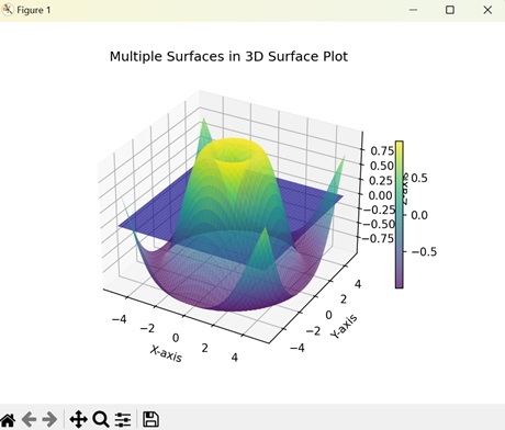
Example - Interpolated 3D Surface Plots
Interpolated 3D surface plots in Matplotlib help us to visualize a graph whose X, Y, and Z coordinates are scattered randomly. Interpolation helps to fill in the missing data points to create a continuous graph.
Now, we are creating an interpolated 3D surface plots. We generate random values for the X, Y, and Z coordinates and then use linear interpolation to estimate the values of missing data points using nearest data points −
import matplotlib.pyplot as plt
import numpy as np
from mpl_toolkits.mplot3d import Axes3D
from scipy.interpolate import griddata
# Creating irregularly spaced data
np.random.seed(42)
x = np.random.rand(100)
y = np.random.rand(100)
z = np.sin(x * y)
# Creating a regular grid
xi, yi = np.linspace(x.min(), x.max(), 100), np.linspace(y.min(), y.max(), 100)
xi, yi = np.meshgrid(xi, yi)
# Interpolating irregular data onto the regular grid
zi = griddata((x, y), z, (xi, yi), method='linear')
# Creating a 3D plot
fig = plt.figure()
ax = fig.add_subplot(111, projection='3d')
# Plotting the 3D surface from irregular data using grid interpolation
ax.plot_surface(xi, yi, zi, cmap='viridis', edgecolor='k')
# Customizing the plot
ax.set_xlabel('X-axis')
ax.set_ylabel('Y-axis')
ax.set_zlabel('Z-axis')
ax.set_title('3D Surface Plot from Irregular Data (Grid Interpolation)')
# Displaying the plot
plt.show()
Output
On executing the above code we will get the following output −
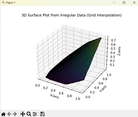
Matplotlib - 3D Vignettes
A 3D vignette is a visual effect that focuses on a specific area of a three-dimensional object. It achieves this by gradually fading out or darkening the edges of the frame, helping to draw attention to the center of the image.

3D Vignettes in Matplotlib
A 3D vignette in Matplotlib refers to a visualization effect applied to three-dimensional objects to highlight specific parts of the object. It creates a sense of depth by changing the shade of color, generally darkening the edges compared to the center, to draw attention to particular regions.
Matplotlib does not have a specific function for directly applying a vignette effect to a plot. However, we can achieve the effect by adjusting the shading (color or transparency) manually.
Lets start by drawing a spherical vignette.
Example - Spherical Vignette
In Matplotlib, a spherical vignette represents a visual shading effect on the surface of a sphere. The shading is darker on the poles and lightens towards the center, creating a gentle transition of light and dark area.
In the following example, we are creating a sphere with a vignette effect. We define the surface of the sphere using angles 'u' and 'v' and a "colormap" consisting of dark and light grey. The color at each point changes with the values of the Z coordinate. The resulting plot displays a sphere with varying shades of grey −
import numpy as np
import matplotlib.pyplot as plt
from mpl_toolkits.mplot3d import Axes3D
from matplotlib.colors import LinearSegmentedColormap
# Sphere with Vignette
u = np.linspace(0, 2 * np.pi, 100)
v = np.linspace(0, np.pi, 100)
x = 10 * np.outer(np.cos(u), np.sin(v))
y = 10 * np.outer(np.sin(u), np.sin(v))
z = 10 * np.outer(np.ones(np.size(u)), np.cos(v))
# Creating a sample 3D plot
fig = plt.figure()
ax = fig.add_subplot(111, projection='3d')
vignette_mask = np.exp(-(x**2 + y**2 + z**2))
cmap = LinearSegmentedColormap.from_list('vignette_color', [(0.5, 0.5, 0.5, 0), (0.5, 0.5, 0.5, 1)])
ax.scatter(x, y, z, c=z, cmap=cmap)
ax.set_title('Sphere with Vignette')
ax.set_xlabel('X')
ax.set_ylabel('Y')
ax.set_zlabel('Z')
plt.show()
Output
Following is the output of the above code −
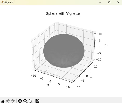
Example - Toroidal Vignette
A toroidal vignette in Matplotlib creates a vignette effect on a torus (donut-shape) object. The outer edge which is further from the center is shaded dark while the inner edge which is closer to center is shaded light.
In here, we are plotting a torus and applying vignette effect on it. We determine the torus size by major radius 'R' and minor radius 'r'. We then create a mask of grey color to apply shades at different areas of the torus −
import numpy as np
import matplotlib.pyplot as plt
from mpl_toolkits.mplot3d import Axes3D
from matplotlib.colors import LinearSegmentedColormap
# Torus with Vignette
u = np.linspace(0, 2 * np.pi, 100)
v = np.linspace(0, 2 * np.pi, 100)
u, v = np.meshgrid(u, v)
R = 10
r = 4
x = (R + r * np.cos(v)) * np.cos(u)
y = (R + r * np.cos(v)) * np.sin(u)
z = r * np.sin(v)
# Creating a sample 3D plot
fig = plt.figure()
ax = fig.add_subplot(111, projection='3d')
vignette_mask = np.exp(-np.sqrt(x**2 + y**2 + z**2))
cmap = LinearSegmentedColormap.from_list('vignette_color', [(0.5, 0.5, 0.5, 0), (0.5, 0.5, 0.5, 1)])
ax.scatter(x, y, z, c=z, cmap=cmap)
ax.set_title('Torus with Vignette')
ax.set_xlabel('X')
ax.set_ylabel('Y')
ax.set_zlabel('Z')
plt.show()
Output
Output of the above code is as follows −
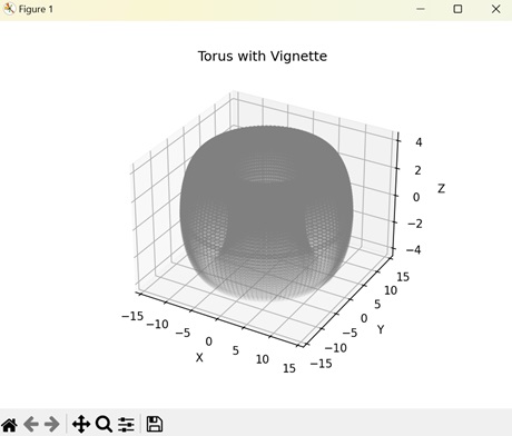
Example - Cylindrical Vignette
A cylindrical vignette in Matplotlib is a visual representation of vignette effect on a cylinder. The shade of the color is determined by the "Z" coordinate (depth) of the cylinder. As the depth decrease the vignette color shifts from dark to light.
The following example applies a vignette effect on a cylinder. Here, we create a cylinder represented by parametric equations that vary with angle (theta) and height (h). Then, we shade the surface of the cylinder light or dark based on the exponential value of the height at different points −
import numpy as np
import matplotlib.pyplot as plt
from mpl_toolkits.mplot3d import Axes3D
from matplotlib.colors import LinearSegmentedColormap
# Cylinder with Vignette
theta = np.linspace(0, 2 * np.pi, 100)
h = np.linspace(-5, 5, 100)
theta, h = np.meshgrid(theta, h)
x = 5 * np.cos(theta)
y = 5 * np.sin(theta)
z = h
# Creating a sample 3D plot
fig = plt.figure()
ax = fig.add_subplot(111, projection='3d')
vignette_mask = np.exp(-np.abs(z))
cmap = LinearSegmentedColormap.from_list('vignette_color', [(0.5, 0.5, 0.5, 0), (0.5, 0.5, 0.5, 1)])
ax.scatter(x, y, z, c=z, cmap=cmap)
ax.set_title('Cylinder with Vignette')
ax.set_xlabel('X')
ax.set_ylabel('Y')
ax.set_zlabel('Z')
plt.show()
Output
After executing the above code, we get the following output −
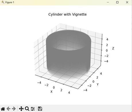
Example - Helical Vignette
In Matplotlib, a helical vignette represents a shading effect on a coiled shape that stretches upwards. The vignette effect is darker towards the outer edges while lighter towards the points closer to the center.
Now, we are applying a vignette effect on a helix. To create the helix, we parametrize the X, Y, and Z coordinates based on time (t). We then assign a "gray" colormap based on the depth of the helix. This creates a helical structure with different shades of dark and light based on the distance from center −
import numpy as np
import matplotlib.pyplot as plt
from mpl_toolkits.mplot3d import Axes3D
from matplotlib.colors import LinearSegmentedColormap
# Helix with Vignette
t = np.linspace(0, 10 * np.pi, 1000)
x = t * np.cos(t)
y = t * np.sin(t)
z = 0.1 * t
# Creating a sample 3D plot
fig = plt.figure()
ax = fig.add_subplot(111, projection='3d')
vignette_mask = np.exp(-np.abs(z))
cmap = LinearSegmentedColormap.from_list('vignette_color', [(0.5, 0.5, 0.5, 0), (0.5, 0.5, 0.5, 1)])
ax.scatter(x, y, z, c=z, cmap=cmap)
ax.set_title('Helix with Vignette')
ax.set_xlabel('X')
ax.set_ylabel('Y')
ax.set_zlabel('Z')
plt.show()
Output
The output obtained is as shown below −
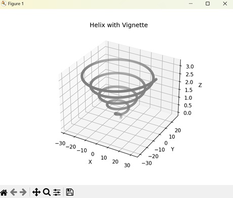
Matplotlib - 3D Volumes
A 3D volume represents the space occupied by an object in three-dimensions. When we talk about 3D, we are considering objects that have depth, not just length and width. The 3D volume of an object is the product of length, width, and height which are represented by the X, Y, and Z coordinates.
Imagine you have a regular book. You can see its width and height when looking at it from the front cover, and its length when you look at it from the side. Now, if you imagine that book as a cube, you will see that it has not just length and width, but also depth or height. That's what makes it three-dimensional −
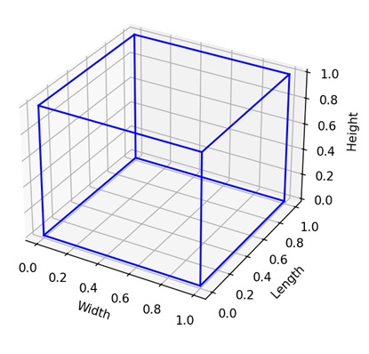
3D Volumes in Matplotlib
In Matplotlib, 3D volumes refer to the visual representation of a shape that occupies space across three dimensions. Various functions are available for generating 3D volumes of different shapes within Matplotlib.
One commonly used function for this purpose is the plot_surface() function found in the "mpl_toolkits.mplot3d" module. This function accepts arrays containing the X, Y, and Z coordinates and creates a 3D volume plot by connecting these coordinates to form a solid shape.
Lets start by drawing a basic 3D volume plot.
Example - Basic 3D Volume Plot
In Matplotlib, creating a basic 3D volume plot is like generating a three-dimensional model of a shape. Imagine you are building a sculpture with clay, but in this case, you are using numbers to define where each point of the shape should be in space.
With Matplotlib, you can easily visualize these shapes by providing the X, Y, and Z coordinates, and the library will display them into a three-dimensional plot, allowing you to see the shape from different angles.
In the following example, we are creating a basic 3D volume plot in Matplotlib. We use two Numpy arrays: the first array defines the "vertices", while the second array defines the "faces" of the cube −
import matplotlib.pyplot as plt
from mpl_toolkits.mplot3d.art3d import Poly3DCollection
import numpy as np
# Defining cube vertices using NumPy array
vertices = np.array([
[1, 1, 1], [-1, 1, 1], [-1, -1, 1], [1, -1, 1],
[1, 1, -1], [-1, 1, -1], [-1, -1, -1], [1, -1, -1]
])
# Defining cube faces using NumPy array reshaping
faces = np.array([
[0, 1, 2, 3],
[4, 5, 6, 7],
[0, 1, 5, 4],
[2, 3, 7, 6],
[1, 2, 6, 5],
[0, 3, 7, 4]
])
# Creating a 3D plot
fig = plt.figure()
ax = fig.add_subplot(111, projection='3d')
# Plotting the 3D cube
ax.add_collection3d(Poly3DCollection([vertices[face] for face in faces], facecolors='cyan', linewidths=1, edgecolors='r', alpha=.25))
# Customizing the plot
ax.set_xlim([-1.5, 1.5])
ax.set_ylim([-1.5, 1.5])
ax.set_zlim([-1.5, 1.5])
ax.set_xlabel('X-axis')
ax.set_ylabel('Y-axis')
ax.set_zlabel('Z-axis')
ax.set_title('3D Cube')
# Displaying the plot
plt.show()
Output
Following is the output of the above code −
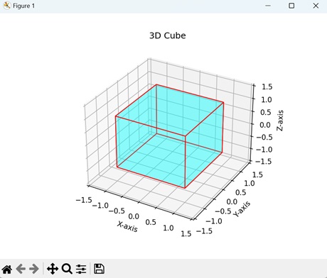
Example - 3D Cone Volume
A 3D cone volume in Matplotlib is a visual representation of a three-dimensional triangle. The data points define a shape with a circular base that narrows as it extends upwards, creating a pointed tip. We can imagine it as a triangle stacked on a circle.
In here, we are creating a 3D cone volume by parametrizing the X, Y, and Z coordinates with parameter (u) and height (v) of the cone. The resultant plots create a conical shape like an ice-cream cone −
import matplotlib.pyplot as plt
import numpy as np
from mpl_toolkits.mplot3d import Axes3D
# Creating a cone
u = np.linspace(0, 2 * np.pi, 100)
v = np.linspace(0, 1, 100)
u, v = np.meshgrid(u, v)
r = 1
h = 2
x = r * (1 - v) * np.cos(u)
y = r * (1 - v) * np.sin(u)
z = h * v
# Creating a 3D plot
fig = plt.figure()
ax = fig.add_subplot(111, projection='3d')
# Plotting the 3D cone
ax.plot_surface(x, y, z, color='green', alpha=0.6)
# Customizing the plot
ax.set_xlabel('X-axis')
ax.set_ylabel('Y-axis')
ax.set_zlabel('Z-axis')
ax.set_title('3D Cone')
# Displaying the plot
plt.show()
Output
Output of the above code is as follows −
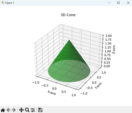
Example - 3D Sphere Volume
In Matplotlib, a 3D sphere volume is a visual representation of a round object with no edges or corners. We can imagine it as multiple circles stacked side by side, giving it depth to create a 3 dimension shape.
The following example creates a 3D sphere sphere by parametrizing the X, Y, and Z coordinates using the angles (u and v) and the radius (r) of the sphere −
import matplotlib.pyplot as plt
import numpy as np
from mpl_toolkits.mplot3d import Axes3D
# Creating sphere
u = np.linspace(0, 2 * np.pi, 100)
v = np.linspace(0, np.pi, 100)
u, v = np.meshgrid(u, v)
r = 1
x = r * np.sin(v) * np.cos(u)
y = r * np.sin(v) * np.sin(u)
z = r * np.cos(v)
# Creating a 3D plot
fig = plt.figure()
ax = fig.add_subplot(111, projection='3d')
# Plotting the 3D sphere
ax.plot_surface(x, y, z, color='orange', alpha=0.6)
# Customizing the plot
ax.set_xlabel('X-axis')
ax.set_ylabel('Y-axis')
ax.set_zlabel('Z-axis')
ax.set_title('3D Sphere')
# Displaying the plot
plt.show()
Output
After executing the above code, we get the following output −
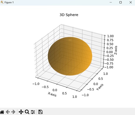
Example - 3D Parallelepiped Volume
A 3D parallelepiped volume in Matplotlib is a representation of a three-dimensional figure with six parallelogram faces. We can think of it as a shape with six faces, where all the opposite faces are parallel to each other.
Now, we are using two Numpy arrays to create a 3D parallelepiped. The first array creates the eight vertices, while the second array creates the six parallel faces of the parallelepiped −
import matplotlib.pyplot as plt
from mpl_toolkits.mplot3d.art3d import Poly3DCollection
import numpy as np
# Defining parallelogram vertices using NumPy array
vertices = np.array([
[0, 0, 0], [1, 0, 0], [1, 1, 0], [0, 1, 0],
[0.5, 0.5, 1], [1.5, 0.5, 1], [1.5, 1.5, 1], [0.5, 1.5, 1]
])
# Defining parallelogram faces using NumPy array reshaping
faces = np.array([
[0, 1, 2, 3],
[4, 5, 6, 7],
[0, 1, 5, 4],
[2, 3, 7, 6],
[1, 2, 6, 5],
[0, 3, 7, 4]
])
# Creating a 3D plot
fig = plt.figure()
ax = fig.add_subplot(111, projection='3d')
# Plotting the 3D parallelogram
ax.add_collection3d(Poly3DCollection([vertices[face] for face in faces], facecolors='yellow', linewidths=1, edgecolors='black', alpha=.25))
# Customizing the plot
ax.set_xlim([0, 2])
ax.set_ylim([0, 2])
ax.set_zlim([0, 2])
ax.set_xlabel('X-axis')
ax.set_ylabel('Y-axis')
ax.set_zlabel('Z-axis')
ax.set_title('3D Parallelepiped')
# Displaying the plot
plt.show()
Output
The output obtained is as shown below −
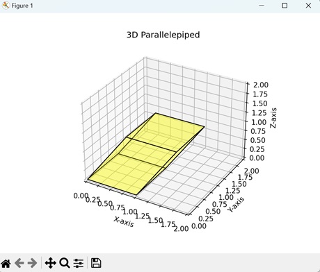
Matplotlib - 3D Voxels
A voxel is a combination of the words "volume" and "pixel", representing a point in three-dimensional space. It is similar to a pixel, which signifies a point in two-dimensional space, with the only difference being that a voxel adds a third dimension of depth.
A 3D voxel resembles a tiny cube that occupies a specific position in three-dimensional space. Think of it as a building block used to construct larger objects or represent data in a grid-like structure. Each voxel possess its own properties or attributes, such as color, density, or material. When many voxels are stacked together, they form a 3D grid, allowing us to visualize complex three-dimensional shapes.

3D Voxels in Matplotlib
In Matplotlib, 3D voxels represent a way to visualize a grid in 3D space using small cubes. We can use the voxels() function from the "mpl_toolkits.mplot3d" module to create voxels in Matplotlib. This functions accepts three arrays corresponding to X, Y, and Z coordinates and joins them to create a cube.
Lets start by drawing basic 3D voxels.
Example - Basic 3D Voxels
In Matplotlib, basic 3D voxels is visual representation of three-dimensional grid of cubes (voxels), where each cube is randomly assigned a value of 0 or 1. The value indicates presence (1) or absence (0) of a cube at a data point.
In the following example, we are creating a grid of 3D voxels. We initialize a "10x10x10" array and fill it with random binary values of 0 or 1. In the resultant plot, a voxel exists if the binary value is 1, it and does not exist if binary value is 0 −
import matplotlib.pyplot as plt
import numpy as np
from mpl_toolkits.mplot3d import Axes3D
# Creating a 3D array with random binary values
data = np.random.randint(0, 2, (10, 10, 10))
# Creating a figure and 3D axis
fig = plt.figure()
ax = fig.add_subplot(111, projection='3d')
# Plotting the random binary voxels
ax.voxels(data, edgecolor='k')
# Setting labels
ax.set_xlabel('X-axis')
ax.set_ylabel('Y-axis')
ax.set_zlabel('Z-axis')
plt.title('Basic 3D Voxels')
plt.show()
Output
Following is the output of the above code −
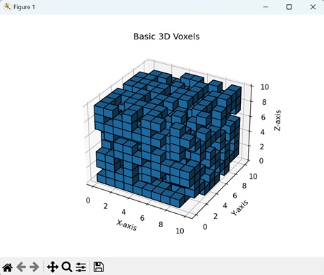
Example - Gradient 3D Voxels
Gradient voxels in Matplotlib represent a visualization of a three-dimensional grid of cubes where the values of the cubes change gradually. These values correspond to the "color" of each cube in the grid.
In here, we are creating a "3x3x3" grid of voxels. We construct the grid by reshaping values from 0 to 26 into a grid of voxels to create a gradient. The resultant plot creates voxels with varying intensities of colors −
import matplotlib.pyplot as plt
import numpy as np
from mpl_toolkits.mplot3d import Axes3D
# Creating a gradient-like 3D array
data = np.arange(0, 27).reshape((3, 3, 3))
# Creating a figure and 3D axis
fig = plt.figure()
ax = fig.add_subplot(111, projection='3d')
# Plotting the gradient voxels
ax.voxels(data, edgecolor='k', facecolors=plt.cm.viridis(data))
# Setting labels
ax.set_xlabel('X-axis')
ax.set_ylabel('Y-axis')
ax.set_zlabel('Z-axis')
plt.title('Gradient Voxels')
plt.show()
Output
Output of the above code is as follows −
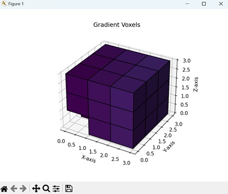
Example - Checkerboard Pattern 3D Voxels
In Matplotlib, a checkerboard pattern using 3D voxels involves creating a grid-like structure where cubes alternate in color, similar to a traditional checkerboard pattern seen on a two-dimensional surface.
The following example creates a "10x10x10" grid of voxels in a checkerboard pattern. We achieve this pattern by assigning alternating values of 0 or 1 to the cubes. If the first cube has a value 0 (black), then its adjacent cube will have value 1 (white) −
import matplotlib.pyplot as plt
import numpy as np
from mpl_toolkits.mplot3d import Axes3D
# Creating a checkerboard pattern in 3D
data = np.indices((10, 10, 10)).sum(axis=0) % 2
# Creating a figure and 3D axis
fig = plt.figure()
ax = fig.add_subplot(111, projection='3d')
# Plotting the checkerboard pattern voxels
ax.voxels(data, edgecolor='k', facecolors=plt.cm.gray(data))
# Setting labels
ax.set_xlabel('X-axis')
ax.set_ylabel('Y-axis')
ax.set_zlabel('Z-axis')
plt.title('Checkerboard Pattern Voxels')
plt.show()
Output
After executing the above code, we get the following output −
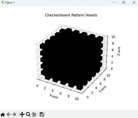
Example - Spherical 3D Voxels
In Matplotlib, spherical voxels display a three-dimensional grid of voxels arranged in the shape of a sphere. Each cube has distinct values for X, Y, and Z coordinates, and the aggregation of all the cubes forms a sphere.
Now, we are creating a spherical voxel in Matplotlib. To construct a sphere from voxels, we define a condition to check the sum of the squares of X, Y, and Z coordinates. If the value is less than 16, then those cubes are included in the grid. This results in a plot creating a sphere formed from voxels −
import matplotlib.pyplot as plt
import numpy as np
from mpl_toolkits.mplot3d import Axes3D
# Creating a 3D array representing a sphere
x, y, z = np.ogrid[-5:5:50j, -5:5:50j, -5:5:50j]
data = x**2 + y**2 + z**2 < 16
# Creating a figure and 3D axis
fig = plt.figure()
ax = fig.add_subplot(111, projection='3d')
# Plotting the spherical voxels
ax.voxels(data, edgecolor='k', facecolors=plt.cm.Blues(data))
# Setting labels
ax.set_xlabel('X-axis')
ax.set_ylabel('Y-axis')
ax.set_zlabel('Z-axis')
plt.title('Spherical Voxels')
plt.show()
Output
The output obtained is as shown below −
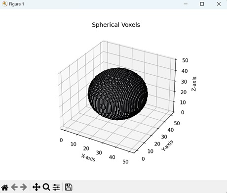
Matplotlib - Time Plots and Signals
A time plot is a graph that represents the change of a variable over a certain time period. Similarly, signals represent the change in the amplitude of a wave over a time period. In a two-dimensional space, time is plotted on the horizontal axis, while the value is plotted on the vertical axis.
Imagine we are measuring the temperature every hour for a day. We plot the time on x-axis and the temperature on y-axis. Connecting the y-axis values through a line represents the time plot −
Time Plots and Signals in Matplotlib
Time plots and signals in Matplotlib refer to visual representations of changes in data values over a time period. They display how data points vary with respect to time.
Matplotlib does not have a separate function specifically for creating time plots or signals. Instead, we use the plot() function to generate these plots. This function accepts the X and Y coordinates as arrays and connects them using lines to create a time plot or signal
Lets start by drawing a basic time plot.
Example - Basic Time Plot
A basic time plot in Matplotlib is a way to visualize changes in data over time. It involves plotting points on a graph where the x-axis represents time and the y-axis represents the values of the data. The plot is formed is formed by connecting the y-axis values as we progress along the x-axis.
The following example creates a basic time plot in Matplotlib. We create two arrays: 'time' represents the time period, and 'values' represents the corresponding values collected at each time period.
Then, we use the plot() function to connect the different values on y-axis. This results in a plot that shows changes in values over time −
import matplotlib.pyplot as plt
# Sample time-series data
time = [0, 1, 2, 3, 4, 5]
values = [10, 15, 20, 18, 25, 30]
# Creating a time plot
plt.plot(time, values, marker='o')
# Adding labels and title
plt.xlabel('Time')
plt.ylabel('Value')
plt.title('Basic Time Plot')
# Displaying the plot
plt.show()
Output
Following is the output of the above code −
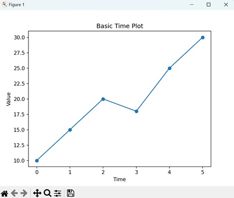
Example - Sine Wave Signal
A sine wave signal in Matplotlib represents a wave that varies sinusoidally over time. Time is plotted on the x-axis, while the amplitude of the wave is plotted on the y-axis. A sine wave signal looks like a smooth, wavy line when plotted on a graph, with peaks and troughs repeating at regular time intervals.
In here, we are generating a sine wave signal to display the amplitude of a wave over a time period. First, we create an array of evenly spaced time intervals 't' ranging from the 0 to 10.
Then, we define the amplitude (height of the wave) and frequency (number of cycles made in a given time interval) of the wave. Using time, frequency and amplitude, we create a sine wave signal. The resultant plot displays a sine signal that repeats at regular intervals −
import matplotlib.pyplot as plt
import numpy as np
# Generating time values
t = np.linspace(0, 10, 100)
# Generating sine wave signal
frequency = 0.5
amplitude = 5
signal = amplitude * np.sin(2 * np.pi * frequency * t)
# Plotting the sine wave signal
plt.plot(t, signal)
# Adding labels and title
plt.xlabel('Time')
plt.ylabel('Amplitude')
plt.title('Sine Wave Signal')
# Displaying the plot
plt.show()
Output
Output of the above code is as follows −
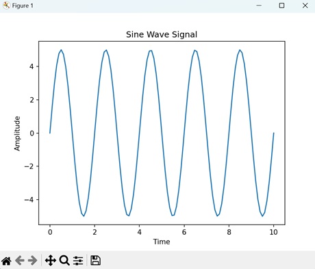
Example - Random Time Plot
In Matplotlib, a random time plot is a visualization of a sequence of data points that change randomly over a time period. This is achieved by adding a random value to the previous data point, resulting in an irregular time plot.
The following example creates a random time plot to display the random change in values over a time period. We start by creating a time interval ranging from 0 to 99.
Next, we generate random values for the y-axis by using the np.random.randn() function and calculate the cumulative sum at each time period using the np.cumsum() function. Then, we use the plot() function to generate the resultant plot where the data values are randomly plotted −
import matplotlib.pyplot as plt
import numpy as np
# Generating time values
t = np.arange(0, 100)
# Generating random walk time series
np.random.seed(5)
signal = np.cumsum(np.random.randn(100))
# Plotting the random walk time series
plt.plot(t, signal)
# Adding labels and title
plt.xlabel('Time')
plt.ylabel('Value')
plt.title('Random Time Plot')
# Displaying the plot
plt.show()
Output
After executing the above code, we get the following output −
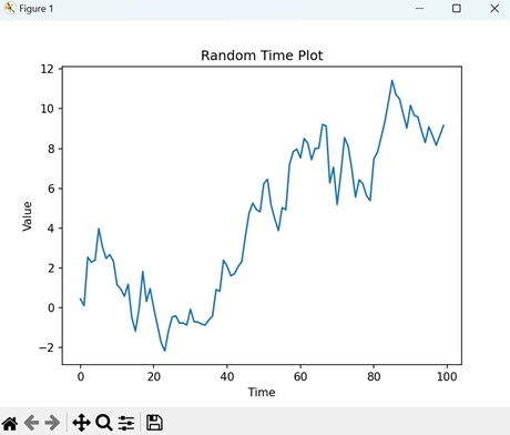
Example - Step Function Signal
A step function signal in Matplotlib defines a signal whose values change significantly at specific points in time. In a step function signal, horizontal lines are connected by vertical lines that indicate the moments when the value changes. Step function signals represent events that occur instantaneously.
Now, we are creating a step function signal in Matplotlib to display sudden changes in values at a given time period. We start by defining a time interval ranging from 0 to 10. Then, we use the np.piecewise() function to create the condition for when the values on y-axis should change.
The condition we use is as follows: "The amplitude remains 0 until t reaches 4 seconds. Then, at t=4 seconds, the amplitude changes to 1 and remains 1 until time reaches 6 seconds. Finally, at t=6 seconds, the amplitude returns to 0" −
import matplotlib.pyplot as plt
import numpy as np
# Generating time values
t = np.linspace(0, 10, 100)
# Generating step function signal
signal = np.piecewise(t, [t < 4, (t >= 4) & (t < 6), t >= 6], [0, 1, 0])
# Plotting the step function signal
plt.plot(t, signal)
# Adding labels and title
plt.xlabel('Time')
plt.ylabel('Amplitude')
plt.title('Step Function Signal')
# Displaying the plot
plt.show()
Output
The output obtained is as shown below −
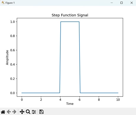
Matplotlib - Filled Plots
A filled plot, also known as a filled area plot or an area chart, is a type of graph used to represent data visually. In a filled plot, the area between the data line and either the x-axis or another reference line is filled with color or pattern.
Imagine you are tracking the daily temperature fluctuations in your city over a month. You can create a filled plot to visualize the range of temperatures each day. On the x-axis, you have the days of the month, and on the y-axis, you have the temperature in degrees Celsius. Each day's temperature range is represented by a filled area, with the area between the highest and lowest temperatures filled with color −
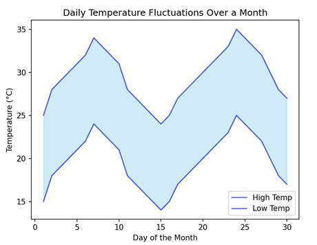
Filled Plots in Matplotlib
A filled plot in Matplotlib is like coloring between the lines on a graph. Instead of just showing points or lines, it fills in the area between those points or lines with color. This can help you see the shape of the data more clearly.
We can use the fill_between() function from the 'pyplot' module to create filled plots in Matplotlib. This function accepts the X and Y coordinates as arrays and fills a specific color in the area enclosed by the curves in a 2D space.
Lets start by drawing a basic filled plot.
Example - Basic Filled Plot
A basic filled plot in Matplotlib is a visualization where the area under a line connecting data points is filled with color. This type of plot helps to visually interpret data and identify patterns or trends more easily.
In the following example, we are creating a filled line plot. We generate the x-axis values ranging from 0 to 10 and then calculate the corresponding y-axis values by taking the sine of each x-axis value. Next, we fill the area under the line and above the x-axis with color, resulting in a filled line plot −
import matplotlib.pyplot as plt
import numpy as np
# Creating sample data
x = np.linspace(0, 10, 100)
y = np.sin(x)
# Creating a filled line plot
plt.fill_between(x, y, color='skyblue', alpha=0.4, label='Filled Line')
# Adding labels and title
plt.xlabel('X-axis')
plt.ylabel('Y-axis')
plt.title('Basic Filled Plot')
# Displaying the plot
plt.show()
Output
Following is the output of the above code −
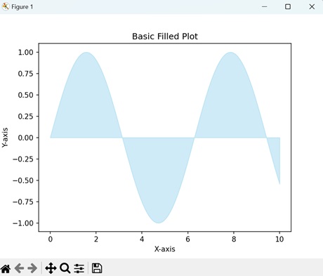
Example - Filled Plot between Two Lines
A filled plot between two lines in Matplotlib refers to coloring the area between two lines on a graph. The two lines traverse the XY plane, and wherever they form an enclosed region, it is filled with color.
In here, we are creating a filled plot between two lines in the XY plane. The two lines 'Y1' and 'Y2' are calculated by taking the sine and cosine values of the x-axis values, respectively. We then fill the area enclosed by the two lines to create the resultant filled plot between two lines −
import matplotlib.pyplot as plt
import numpy as np
# Creating sample data
x = np.linspace(0, 10, 100)
y1 = np.sin(x)
y2 = np.cos(x)
# Creating a filled plot between two lines
plt.fill_between(x, y1, y2, color='lightgreen', alpha=0.4, label='Filled Between Lines')
# Adding labels and title
plt.xlabel('X-axis')
plt.ylabel('Y-axis')
plt.title('Filled Plot between Two Lines')
# Displaying the plot
plt.show()
Output
Output of the above code is as follows −
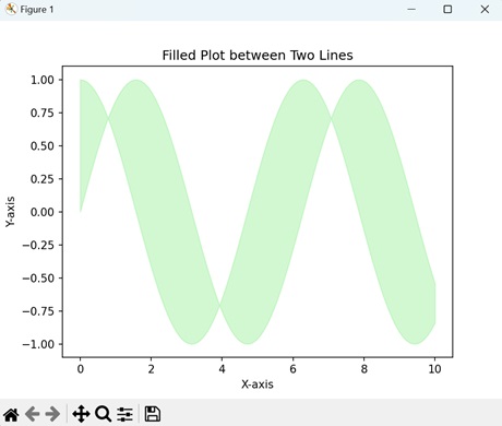
Example - Filled Plot between Vertical Lines
In here, we are creating a filled plot between two vertical lines. We use the axvspan() function to add vertical span(rectangle) across the axes. This rectangle spans from xmin to xmax horizontally, and, by default, the whole Y-axis vertically −
import matplotlib.pyplot as plt fig, ax = plt.subplots() line1 = 3 # vertical x = 3 line2 = 5 # vertical x = 5 ax.axvspan(line1, line2, alpha=.5, color='green') plt.show()
Output
We get the output as shown below −
Example - Filled Polar Area Plot
In Matplotlib, a filled polar area plot represents a visualization where the area enclosed by a curve is filled with color. The curve is created in the polar coordinate system, meaning that the position of the data points is determined by the radius and angle instead of X and Y coordinates.
The following example generates a filled polar area plot. The coordinates of the data points are defined by the angle (theta), ranging from 0 to 2, and the radius (r) of curve, which varies with the cosine of the angle. The area under the curve is filled with color. In the resultant plot, the polar area under the curve is filled −
import matplotlib.pyplot as plt
import numpy as np
# Creating sample data for a polar plot
theta = np.linspace(0, 2 * np.pi, 100)
r = 3 + 2 * np.cos(6 * theta)
# Creating a filled polar area plot
plt.fill_between(theta, r, color='purple', alpha=0.5, label='Filled Polar Area Plot')
# Adding title
plt.title('Filled Polar Area Plot')
# Displaying the plot
plt.show()
Output
After executing the above code, we get the following output −
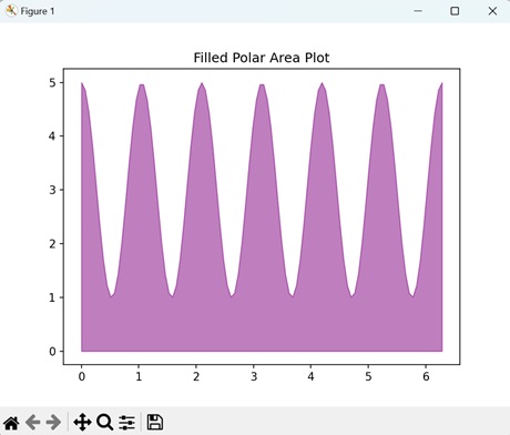
Example - Filled Plot from Irregular Data
In Matplotlib, a filled plot from irregular data is a way to represent a colored region on a graph, where the data points are irregularly spaced. The area enclosed by these points and the x-axis is filled with color.
Now, we are filling the plot under a curve created using irregularly spaced data points on a graph. We define the data points using arrays for the x-axis and the y-axis. The region enclosed by these points is filled with color −
import matplotlib.pyplot as plt
import numpy as np
# Creating irregular data points
x = np.array([1, 2, 3, 4, 5, 4, 3, 2, 1])
y = np.array([0, 1, 0, 1, 0, -1, 0, -1, 0])
# Plotting the irregular data points
plt.plot(x, y, color='blue', label='Irregular Data Points', marker='o')
# Creating a polygon to fill between the curve and the x-axis
plt.fill_between(x, y, color='lightgreen', alpha=0.5, label='Filled Plot from Irregular Data')
# Adding labels and title
plt.xlabel('X-axis')
plt.ylabel('Y-axis')
plt.title('Filled Plot from Irregular Data')
# Displaying the plot
plt.show()
Output
The output obtained is as shown below −
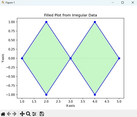
Matplotlib - Step Plots
A step plot is a type of graph that shows how values change abruptly at specific points, rather than changing continuously. It looks like a series of horizontal and vertical lines connecting the data points. Each horizontal line represents a period where the value remains constant, and each vertical line indicates when the value changes to a new level.
Imagine you are monitoring the temperature of a room throughout the day. You take measurements every hour, and instead of recording every slight change, you note the temperature only when it significantly shifts, like when the air conditioning turns on or off. A step plot of this data would show a horizontal line for each period when the temperature remains constant, connected by vertical lines where the temperature changes abruptly −
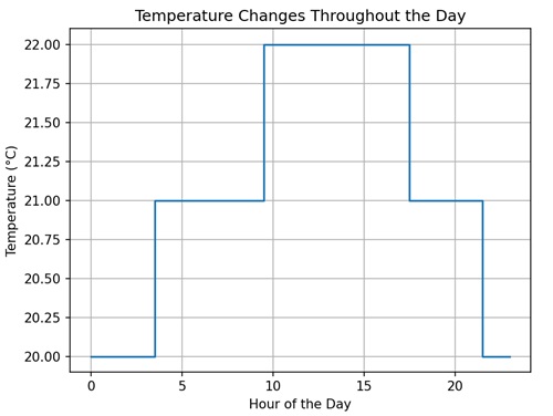
Step Plots in Matplotlib
In Matplotlib, a step plot is a type of graph that connects data points using horizontal and vertical lines in the XY plane, forming a series of steps. We can use the step() function from the 'pyplot' module to create a step plot. This function accepts the X and Y coordinates as arrays. It connects the X coordinates horizontally until it reaches an X coordinate where the value of Y coordinate changes vertically to a new constant.
Lets start by drawing a basic step plot.
Example - Basic Step Plot
A basic step plot in Matplotlib visually represents a plot where the steps are present at the midpoint of each interval. This means that the change in the y-axis value occurs at the midpoint between two x-axis values. For example, if the x-axis has values 1 and 2, then the step will be present at the value 1.5.
In the following example, we are creating a basic step plot. The data points consists of two arrays, 'x' and 'y,' which represent the values along the x-axis and y-axis, respectively. We are then joining the data points at the center of the interval −
import matplotlib.pyplot as plt
import numpy as np
# Generating data
x = np.array([1, 2, 3, 4, 5])
y = np.array([2, 4, 1, 3, 5])
# Creating a basic step plot
plt.step(x, y, where='mid', color='blue', label='Step Plot')
# Adding labels and title
plt.xlabel('X-axis')
plt.ylabel('Y-axis')
plt.title('Basic Step Plot')
# Displaying the plot
plt.show()
Output
Following is the output of the above code −
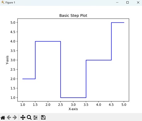
Example - Post Step Plot
A post step plot in Matplotlib represents a plot where the steps are positioned at the end of each interval. This means that the change in the y-axis value occurs at the endpoint of the x-axis values.
We can create a post step plot in Matplotlib by specifying the value 'post' to the 'where' parameter. This type of plot creates a staircase-like pattern. For example, if the x-axis has values 1 and 2, then the step will be present at the value 2.
In here, we are generating a post step plot. The data points are represented by two arrays, 'x' and 'y', for the x-axis and the y-axis values, respectively. We then join the data points at the end of each interval by setting the 'where' parameter to 'post' −
import matplotlib.pyplot as plt
import numpy as np
# Generating data
x = np.array([1, 2, 3, 4, 5])
y = np.array([2, 4, 1, 3, 5])
# Creating a step plot with 'post' where parameter
plt.step(x, y, where='post', color='green', label='Step Plot with "post"')
# Adding labels and title
plt.xlabel('X-axis')
plt.ylabel('Y-axis')
plt.title('Post Step Plot')
# Displaying the plot
plt.show()
Output
Output of the above code is as follows −
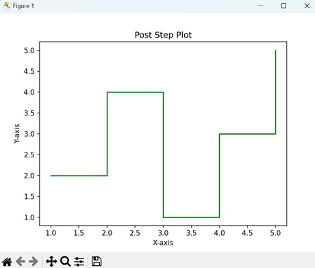
Example - Pre Step Plot
In Matplotlib, a pre step plot refers to creating a plot where the steps are positioned at the start of each interval. This means that the change in the y-axis value occurs at the starting point of the x-axis values.
We can create a pre step plot in Matplotlib by specifying the value 'pre' to the 'where' parameter. For example, if the x-axis has values 1 and 2, then the step will be present at the value 1.
The following example creates a pre step plot. The data points are represented by two arrays, 'x' and 'y', which define the values for the x-axis and the y-axis, respectively. We then join the data points at the start of each interval by setting the 'where' parameter to 'pre' −
import matplotlib.pyplot as plt
import numpy as np
# Generating data
x = np.array([1, 2, 3, 4, 5])
y = np.array([2, 4, 1, 3, 5])
# Creating a step plot with 'pre' where parameter
plt.step(x, y, where='pre', color='red', label='Step Plot with "pre"')
# Adding labels and title
plt.xlabel('X-axis')
plt.ylabel('Y-axis')
plt.title('Pre Step Plot')
# Displaying the plot
plt.show()
Output
After executing the above code, we get the following output −
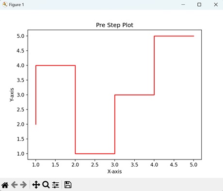
Example - Sinusoidal Step Plot
A sinusoidal step plot in Matplotlib is a visualization of a plot where the steps form a sinusoidal wave in the XY plane. This means that the steps are continuously present throughout the graph instead of being located at specific locations.
Now, we are generating a sinusoidal step plot in Matplotlib. Here, we first create the x-axis values from 0 to 10 and then calculate the y-axis values by taking the sine value of each x-axis value. We then combine the data points to produce a continuous step plot −
import matplotlib.pyplot as plt
import numpy as np
# Generating data
x = np.linspace(0, 10, 100)
y = np.sin(x)
# Creating a basic step plot
plt.step(x, y, where='mid', color='blue', label='Step Plot')
# Adding labels and title
plt.xlabel('X-axis')
plt.ylabel('Y-axis')
plt.title('Sinusoidal Step Plot')
# Displaying the plot
plt.show()
Output
The output obtained is as shown below −
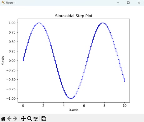
Matplotlib - XKCD Style
XKCD style refers to a particular type of comic art and humour inspired by the webcomic "XKCD", created by Randall Munroe. XKCD comics are generally known for their modest drawings, often stick-figure characters, and simple black-and-white artwork. The comic covers a wide range of topics, including science, mathematics, technology, and everyday life, presenting them in a humorous and thought-provoking manner.
XKCD Style in Matplotlib
In Matplotlib, XKCD style refers to a feature that allows you to make plots look like they are hand-drawn with a marker, similar to the style of the XKCD webcomic by Randall Munroe. This means the lines in your plots will appear wobbly and not perfectly straight, giving them a playful and informal look. It is a fun way to visualize your data with a touch of humour or character to your plots.
To draw plots in XKCD style in Matplotlib, you can use the plt.xkcd() function. This function enables the XKCD mode, which transforms subsequent plots to mimic the hand-drawn aesthetic characteristic of XKCD comics.
Example - Basic XKCD Style Plot
A basic XKCD style plot in Matplotlib is a type of graph that adopts the whimsical and hand-drawn appearance inspired by the XKCD webcomic. It gives your plots a playful and informal look with irregular lines, handwritten fonts, and exaggerated features, similar to the style used in XKCD comics.
In the following example, we are creating a simple line plot using XKCD style. The plot shows the relationship between X and Y values −
import matplotlib.pyplot as plt
# Enabling the XKCD mode
plt.xkcd()
# Creating a simple XKCD style plot
plt.plot([1, 2, 3, 4], [1, 4, 9, 16], 'b-')
plt.xlabel('X-axis')
plt.ylabel('Y-axis')
plt.title('XKCD Style Plot')
plt.show()
Output
Following is the output of the above code −
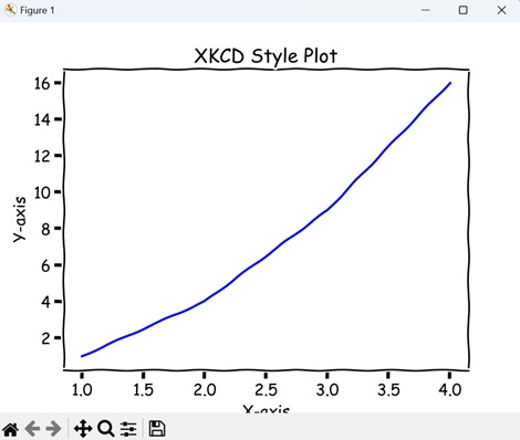
Example - XKCD Style Scatter Plot
In Matplotlib, the XKCD style scatter plot provides a quirky and hand-drawn look to your data visualization. By enabling XKCD mode with plt.xkcd(), your scatter plot takes on a whimsical appearance, with points resembling doodles drawn by hand. This style adds a fun and informal touch to your scatter plots, making them more engaging and visually interesting.
In here, we are using the XKCD mode to create a scatter plot with "red" points. Each point represents a pair of "X" and "Y" values −
import matplotlib.pyplot as plt
# Enabling XKCD mode
plt.xkcd()
# Creating an XKCD style scatter plot
plt.scatter([1, 2, 3, 4], [1, 4, 9, 16], color='r')
plt.xlabel('X-axis')
plt.ylabel('Y-axis')
plt.title('XKCD Style Scatter Plot')
plt.show()
Output
Output of the above code is as follows −
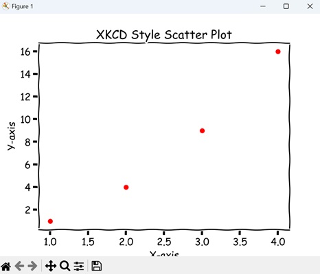
Example - XKCD Style Bar Plot
In Matplotlib, an XKCD style bar plot is a type of chart where rectangular bars represent data values. When XKCD mode is enabled with plt.xkcd(), the bars and axes take on a playful and hand-drawn appearance, resembling doodles rather than precise graphical elements.
Bar plots are commonly used to compare categorical data or show the distribution of a dataset across different categories, and the XKCD style adds a fun twist to this traditional chart type.
In the example below, we are using the XKCD mode to create a bar plot with four categories (A, B, C, D) and their corresponding values. We draw the bars in "green" color −
import matplotlib.pyplot as plt
# Enabling XKCD mode
plt.xkcd()
# Creating an XKCD style bar plot
plt.bar(['A', 'B', 'C', 'D'], [10, 20, 15, 25], color='g')
plt.xlabel('Categories')
plt.ylabel('Values')
plt.title('XKCD Style Bar Plot')
plt.show()
Output
After executing the above code, we get the following output −
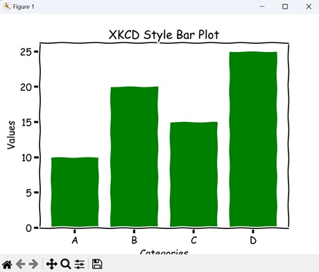
Example - XKCD Style Pie Chart
In Matplotlib, an XKCD style pie chart is a graphical representation of data where a circle is divided into slices to show numerical proportions. When XKCD mode is activated with plt.xkcd(), the pie chart takes on a hand-drawn appearance, resembling a sketch rather than a precise diagram. Each slice of the pie appears as if it were drawn by hand.
Pie charts are commonly used to display the composition of a dataset or the distribution of categories, and the XKCD style adds a fun twist to this classic chart type.
Now, we are using the XKCD mode to create a a pie chart displaying the proportions of different categories (A, B, C, D). The "autopct" parameter adds percentage labels to each wedge, while "startangle" sets the starting angle for the first wedge −
import matplotlib.pyplot as plt
# Enabling XKCD mode
plt.xkcd()
# Creating an XKCD style pie chart
sizes = [15, 30, 45, 10]
plt.pie(sizes, labels=['A', 'B', 'C', 'D'], autopct='%1.1f%%', startangle=140)
plt.title('XKCD Style Pie Chart')
plt.show()
Output
The output obtained is as shown below −
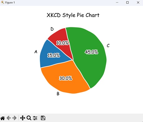
Matplotlib - Quiver Plot
A quiver plot is a type of graph used to visualize vector fields, which represent both direction and magnitude. In simple terms, it shows arrows on a grid, where each arrow represents a vector pointing in a specific direction with a certain length.
- Imagine you are studying the wind patterns over a region. You want to visualize both the direction and strength of the wind at various points across the area.
- You can use the quiver plot for this visualization, where each arrow in the plot represents the direction the wind is blowing, while the length of the arrow indicates the wind speed.
By looking at the quiver plot, you can quickly see how the wind flows across the region and identify areas with stronger or weaker winds −
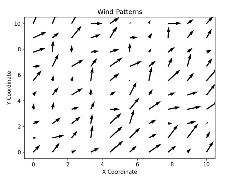
Quiver Plot in Matplotlib
In Matplotlib, a quiver plot is a visualization that represents vector fields using arrows. We can use the quiver() function from the 'pyplot' module to create arrows for displaying a quiver plot in Matplotlib.
This function takes the X and Y coordinates (and Z for a three-dimensional object) of a vector field, and represents its direction and magnitude as an arrow(s).
Lets start by drawing a basic quiver plot.
Example - Basic Quiver Plot
A basic quiver plot in Matplotlib visualizes a vector in a two-dimensional space. It consists of an arrow, where the length and direction of the arrow indicate the magnitude and direction of a vector.
In the following example, we are creating a basic quiver plot to represent a vector as an arrow. We first specify the starting position of the arrow by 'x_pos' and 'y_pos' which represent the X and Y coordinates, respectively.
The direction of the arrow is determined by 'x_direct' and 'y_direct' for the x-axis and the y-axis, respectively. The resultant plot shows an arrow originating at (1, 1) and pointing in a certain direction −
import numpy as np
import matplotlib.pyplot as plt
# Defining the arrows
x_pos = 1
y_pos = 1
x_direct = 2
y_direct = 1
# Creating the plot
fig, ax = plt.subplots(figsize=(12, 7))
# Plotting the quiver
ax.quiver(x_pos, y_pos, x_direct, y_direct, angles='xy', scale_units='xy', scale=1, color='green', width=0.02, label='Arrow')
# Setting axis limits
ax.set_xlim([0, 4])
ax.set_ylim([0, 3])
ax.set_title('Basic Quiver Plot')
# Displaying the plot
plt.show()
Output
Following is the output of the above code −
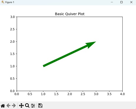
Example - Meshgrid Quiver Plot
In Matplotlib, a meshgrid quiver plot visually represents evenly spaced vectors as distinct arrows. The magnitude and direction of the entire vector field can be calculated by summing the magnitudes and directions of individual arrows.
In here, we are creating a meshgrid quiver plot of multiple vector fields by arranging the arrows on a 2D grid. The X and Y coordinates range from 0 to 4, with a step count of 0.3. The direction of each vector field is calculated by parameterizing the X and Y coordinates with the sine and cosine angles, respectively. This results in a plot where multiple vector fields are represented as different arrows −
import numpy as np
import matplotlib.pyplot as plt
# Creating the arrow
x = np.arange(0, 4, 0.3)
y = np.arange(0, 4, 0.3)
X, Y = np.meshgrid(x, y)
u = np.sin(X)*Y
v = np.cos(Y)*Y
# Creating the plot
fig, ax = plt.subplots(figsize =(14, 8))
# Plotting the quiver
ax.quiver(X, Y, u, v)
# Setting axis limits
ax.axis([-0.3, 2.3, -0.3, 2.3])
ax.set_aspect('equal')
ax.set_title('Meshgrid Quiver Plot')
# Displaying the plot
plt.show()
Output
Output of the above code is as follows −
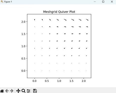
Example - Gradient Quiver Plot
A gradient quiver plot in Matplotlib represents a visualization of a vector field with a changing gradient in a 2D space. The gradient indicates the strength of the vector field, represented by the number of arrows. The more arrows there are in a particular region, the stronger the vector field is in that area.
The following example creates a gradient quiver plot to show the change in strength of a vector field. The X and Y coordinates range from -2 to 2, with a step count of 0.1. The gradient is calculated as the change in direction of X and Y values, represented by 'dx' and 'dy' −
import numpy as np
import matplotlib.pyplot as plt
# Creating the arrows
x = np.arange(-2, 2, 0.1)
y = np.arange(-2, 2, 0.1)
# Creating a gradient function
X, Y = np.meshgrid(x, y)
z = np.sin(X) * np.cos(Y)
dx, dy = np.gradient(z)
# Creating the plot
fig, ax = plt.subplots(figsize=(9, 9))
# Plotting the quiver
ax.quiver(X, Y, dx, dy)
# Setting axis limits
ax.set_aspect('equal')
ax.set_title('Gradient Quiver Plot')
# Displaying the plot
plt.show()
Output
After executing the above code, we get the following output −
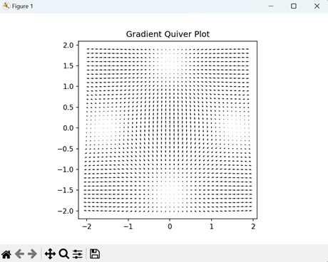
Example - Colored Quiver Plot
In Matplotlib, a colored quiver plot is an advance version of the basic quiver plot where the vector field is represented by arrows of different colors. The color of the arrows depends on specific parameters such as distance from origin, strength, or direction.
Now, we are creating a colored quiver plot to represent a vector field. We set the starting position of the arrows withing the range 0 to 2 and parameterize the direction based on the X and Y values.
Then, we assign a color to each arrow based on its distance from the center of the field. Arrow closer to the center are darker in color while arrows further away are lighter in color −
import numpy as np
import matplotlib.pyplot as plt
# Creating the arrow
x = np.arange(0, 2 * np.pi + 2 * np.pi / 20, 2 * np.pi / 20)
y = np.arange(0, 2 * np.pi + 2 * np.pi / 20, 2 * np.pi / 20)
X, Y = np.meshgrid(x, y)
u = np.cos(X) * np.sin(Y)
v = np.sin(X) * np.cos(Y)
# Defining the color
color = np.sqrt(u**2 + v**2)
# Creating the plot
fig, ax = plt.subplots(figsize=(14, 9))
# Plotting the quiver
ax.quiver(X, Y, u, v, color, alpha=1, cmap='viridis')
# Setting axis limits
ax.axis([0, 2 * np.pi, 0, 2 * np.pi])
ax.set_aspect('equal')
ax.set_title('Colored Quiver Plot')
# Displaying plot
plt.show()
Output
The output obtained is as shown below −
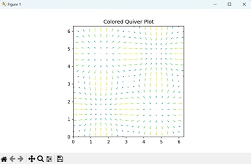
Matplotlib - Stem Plots
A stem plot is a type of graph used to represent data where each data point is shown as a marker along a vertical line, called a stem, extending from a horizontal axis. The marker represents the value of the data point, while the position along the horizontal axis represents its location or category.
Imagine you are conducting a survey to collect the number of cars passing through a particular road intersection each hour of the day. You want to visualize this data to understand the traffic patterns. You can create a stem plot in this case, such that each hour of the day is represented along the horizontal axis, while the number of cars passing through is indicated by the length of the stems extending vertically from the corresponding hour −
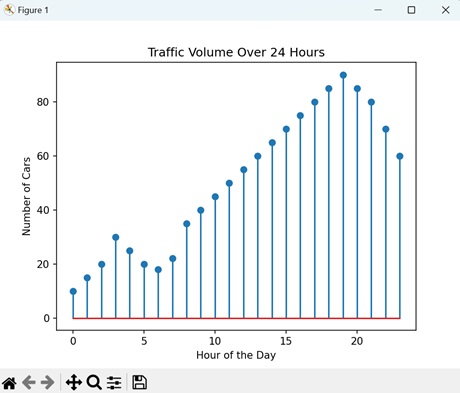
Stem Plots in Matplotlib
A stem plot in Matplotlib is a visual representation of the frequency of data points along a vertical axis in two-dimensional space. We can use the stem() function within the 'pyplot' module to create a stem plot in Matplotlib. This function takes two parameters: the data point values defined by X and their frequency defined by Y. It then creates a vertical line between the X value and its corresponding Y value.
Lets start by drawing a basic stem plot.
Example - Basic Stem Plot
A basic stem plot in Matplotlib is a simple way to visualize the frequency of data points along a vertical axis. The frequency of each data point is represented by a vertical line extending from the x-axis to the data value on the y-axis.
In the following example, we are creating a basic stem plot. We use two arrays, 'x' and 'y', to represent the data points and their frequencies. Then, we use the stem() function to plot a vertical line at each x value extending to the corresponding y value −
import matplotlib.pyplot as plt
# Sample data
x = [1, 2, 3, 4, 5]
y = [2, 3, 5, 7, 11]
# Creating a basic stem plot
plt.stem(x, y, linefmt='b-', markerfmt='bo', basefmt='r-')
plt.xlabel('X')
plt.ylabel('Y')
plt.title('Basic Stem Plot')
plt.show()
Output
Following is the output of the above code −
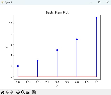
Example - Horizontal Stem Plot
In Matplotlib, a horizontal stem plot is similar to a basic stem plot, but the stems are oriented horizontally instead of vertically. This means that the frequency of each data point is represented by a horizontal line extending from the y-axis to the data value on the x-axis.
In here, we are creating a horizontal stem plot. We again use two arrays, 'x' and 'y', to represent the data points and their frequencies. Then, we use the stem() function with a horizontal orientation to make the vertical axis as the x-axis and the horizontal axis as the y-axis. In the resultant plot, horizontal lines extend from the x value to the y value −
import matplotlib.pyplot as plt
# Sample data
x = [1, 2, 3, 4, 5]
y = [2, 3, 5, 7, 11]
# Creating a stem plot with horizontal alignment
plt.stem(x, y, linefmt='b-', markerfmt='bo', basefmt='r-', orientation='horizontal')
plt.xlabel('Y')
plt.ylabel('X')
plt.title('Horizontal Stem Plot')
plt.show()
Output
Output of the above code is as follows −
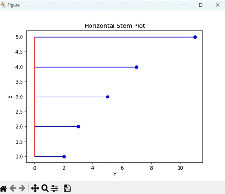
Example - Sinusoidal Stem Plot
A sinusoidal stem plot in Matplotlib a way to visually represent data points that follow a sinusoidal pattern.
Imagine data points distributed along a sinusoidal curve. Instead of connecting these points with straight lines, a stem plot places vertical stems at each data point, and the height of each stem corresponds to the value of the data point.
The following example creates a sinusoidal stem plot in Matplotlib using the stem() function. We start by creating evenly distributed data points and then find their frequencies by taking the sine value of each data point. The resultant plot creates a stem plot in a continuous form −
import matplotlib.pyplot as plt
import numpy as np
# Generating sinusoidal data
x = np.linspace(0, 2*np.pi, 50)
y = np.sin(x)
# Creating a stem plot of sinusoidal data
plt.stem(x, y, linefmt='b-', markerfmt='bo', basefmt='r-')
plt.xlabel('X')
plt.ylabel('Y')
plt.title('Sinusoidal Stem Plot')
plt.show()
Output
After executing the above code, we get the following output −
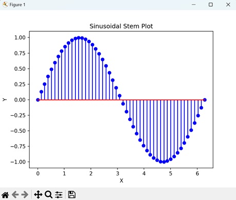
Example - Triangular Stem Plot
A triangular stem plot in Matplotlib is a graphical representation where data points are shown as vertical stems rising from the x-axis, forming a triangular shape.
Each stem represents a data point, with its height indicating the value of the data point. Unlike a regular stem plot where stems are vertical lines, in a triangular stem plot, the stems have a triangular shape.
Now, we are creating a triangular stem plot, where the leaf of the stem is a triangle instead of circle. We use arrays 'x' and 'y' to define the data points and their frequencies. To create a triangular leaf, we set the 'markerfmt' parameter (this parameter is used to define the shape of the leaves) to '^'. This results in a plot where the leaves of the steam are triangular −
import matplotlib.pyplot as plt
# Sample data
x = [1, 2, 3, 4, 5]
y = [1, 2, 3, 4, 5]
# Creating a stem plot with triangular markers
plt.stem(x, y, linefmt='g-', markerfmt='^b', basefmt='r-')
plt.xlabel('X')
plt.ylabel('Y')
plt.title('Triangular Stem Plot')
plt.show()
Output
The output obtained is as shown below −
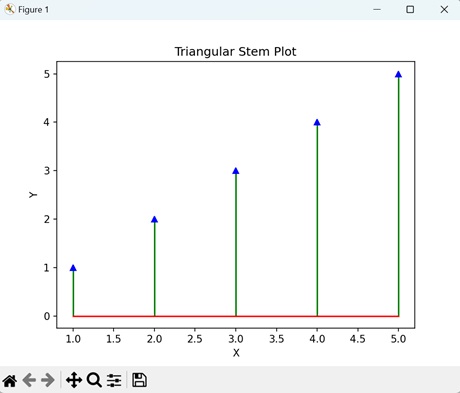
Matplotlib - Visualizing Vectors
Visualizing vectors is about using arrows to represent things that have both size and direction. It could be anything, like the speed and direction of a moving car, the force of wind, or even the way you move in a game. It helps you see and understand these things more clearly by turning them into simple arrows on a "map."
Imagine you have an arrow on a piece of paper. The length of the arrow tells you how far it is reaching in a specific direction, and the direction it points tells you where it is headed.
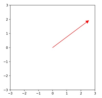
Visualizing Vectors in Matplotlib
We can visualize vectors in Matplotlib using the quiver() function. This function allows you to plot 2D vectors on a Cartesian plane. Each vector is represented by an arrow, where the length corresponds to the vector's magnitude, and the direction indicates its orientation.
By specifying the starting points and components of the vectors, you can create diagrams that visually communicate the relationships between different vectors.
This is particularly useful for illustrating concepts like velocity, force, or any other physical quantity that can be represented as a vector. The quiver() function in Matplotlib provides a simple and effective way to convey vector information graphically.
Below are different examples demonstrating how to visualize vectors in 2D using Matplotlib −
Example - Basic 2D Vectors
Creating a basic 2D vectors plot in Matplotlib is like drawing arrows on a graph to represent simple movements in two-dimensional space. Imagine a flat surface with an x-axis (horizontal) and a y-axis (vertical). Each arrow starts from the origin (0,0) and points to a specific location (x, y) on the graph.
In the following example, we are creating a single 2D vector. We first define a 2D vector [3, 4] and then visualize it as an arrow starting from the origin (0,0) using the quiver() function −
import matplotlib.pyplot as plt
# Defining a basic 2D vector
vector = [3, 4]
# Plotting the vector
plt.figure()
plt.quiver(0, 0, vector[0], vector[1], angles='xy', scale_units='xy', scale=1, color='r')
plt.xlim(0, 5)
plt.ylim(0, 5)
plt.title('Basic 2D Vector')
plt.grid(True)
plt.show()
Output
After executing the above code, we get the following output −
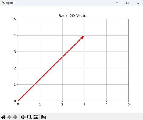
Example - Multiple 2D Vectors
Visualizing multiple 2D vectors in Matplotlib refers to plotting several arrows on a graph to represent different quantities or directions. Each arrow corresponds to a 2D vector and shows both its magnitude and direction. The arrows originate from the origin (0,0) and extend to the vector's endpoint.
In here, we are creating multiple 2D vectors. We first define three 2D vectors [2, 3], [-1, 2], and [4, -1] and then visualize them as arrows starting from the origin (0,0) using the quiver function −
import matplotlib.pyplot as plt
import numpy as np
# Defining multiple 2D vectors
vectors = np.array([[2, 3], [-1, 2], [4, -1]])
# Plotting the vectors
plt.figure()
for vector in vectors:
plt.quiver(0, 0, vector[0], vector[1], angles='xy', scale_units='xy', scale=1, color='darkmagenta')
plt.xlim(-2, 5)
plt.ylim(-2, 5)
plt.title('Multiple 2D Vectors')
plt.grid(True)
plt.show()
Output
Following is the output of the above code −
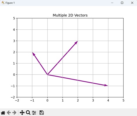
Example - Vector Addition
Visualizing vector addition in Matplotlib refers to showing how two arrows can be combined to create a new arrow. Imagine each arrow representing a 2D vector with both a length and a direction.
The starting point of each arrow is the origin (0,0), and the arrow extends to the endpoint defined by the vector's components. When you add two vectors together, it is like placing the tail of the second arrow at the head of the first arrow.
The resulting arrow from the origin to the new endpoint represents the sum of the two vectors.
Now, we are plotting the vector addition. We first define two 2D vectors, namely "vector1" and "vector2". We then visualize these vectors as arrows starting from the origin (0,0) using the quiver() function. Each arrow represent the magnitude and direction of its corresponding vector. The third arrow, displayed in the "saddle brown" color, will represent the sum of the two vectors −
import matplotlib.pyplot as plt
# Defining two 2D vectors
vector1 = [2, 3]
vector2 = [-1, 2]
# Plotting the vectors and their sum
plt.figure()
plt.quiver(0, 0, vector1[0], vector1[1], angles='xy', scale_units='xy', scale=1, color='mediumspringgreen', label='Vector 1')
plt.quiver(0, 0, vector2[0], vector2[1], angles='xy', scale_units='xy', scale=1, color='coral', label='Vector 2')
plt.quiver(0, 0, vector1[0] + vector2[0], vector1[1] + vector2[1], angles='xy', scale_units='xy', scale=1, color='saddlebrown', label='Vector 1 + Vector 2')
plt.xlim(-2, 4)
plt.ylim(-2, 5)
plt.title('Vector Addition')
plt.legend()
plt.grid(True)
plt.show()
Output
Output of the above code is as follows −
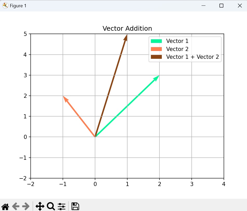
Example - Vector Dot Product
Visualizing the vector dot product in Matplotlib is essentially a measure of how much one vector points in the same direction as the other. When you calculate the dot product and visualize it, you are effectively finding the component of one vector in the direction of the other.
For example, if you have vectors A and B, the dot product A B is the product of their magnitudes and the cosine of the angle between them. In terms of arrows on a graph, it is like projecting one arrow onto the other and measuring the length of that projection. If the vectors are pointing in the same direction, the dot product is positive; if they are perpendicular, it is zero; and if they are pointing in opposite directions, it is negative.
In the example below, we are plotting a vector dot product. We first define two 2D vectors, namely "vector1" and "vector2". We then visualize them as arrows starting from the origin (0,0). The dot product of the vectors is calculated and displayed as a scalar value in "red" color −
import matplotlib.pyplot as plt
# Defining two 2D vectors
vector1 = [2, 3]
vector2 = [-1, 2]
# Plotting the vectors and their dot product
plt.figure()
plt.quiver(0, 0, vector1[0], vector1[1], angles='xy', scale_units='xy', scale=1, color='deepskyblue', label='Vector 1')
plt.quiver(0, 0, vector2[0], vector2[1], angles='xy', scale_units='xy', scale=1, color='lightseagreen', label='Vector 2')
# Plotting the dot product as a scalar value
dot_product = sum(x * y for x, y in zip(vector1, vector2))
plt.text(0.5, 2.5, f'Dot Product: {dot_product}', fontsize=10, color='red')
plt.xlim(-2, 3)
plt.ylim(-2, 4)
plt.title('Vector Dot Product')
plt.legend()
plt.grid(True)
plt.show()
Output
The output obtained is as shown below −
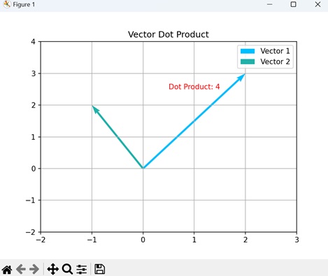
Matplotlib - Audio Visualization
Audio visualization is a way to see sound. When you listen to music or any other sound, there are patterns in the sound waves. Audio visualization takes these patterns and turns them into something you can see, like colorful shapes or moving lines.
It helps you understand the rhythm, pitch, and intensity of the sound by representing it visually. Imagine watching your favorite song as it plays, and seeing colorful patterns dancing along with the beat - that is audio visualization −
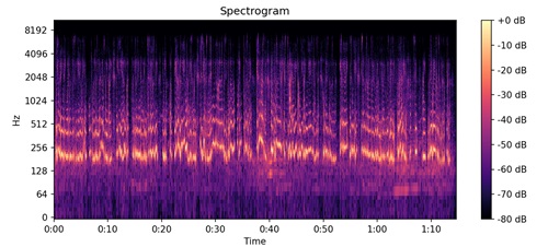
Audio Visualization in Matplotlib
Audio visualization using Matplotlib is a way to see and understand sound in a graphical format. Just like how we can draw pictures to represent data, we can use Matplotlib to create visual representations of audio, making it easier to analyze and interpret.
Imagine you are looking at a graph where one side represents time, and the other side represents how loud or quiet the sound is at each moment. When you play a song or speak into a microphone, the graph will show peaks and valleys that correspond to the changes in volume over time. This graph is called a waveform, and it gives us a visual understanding of the sound's intensity and duration.
Matplotlib does not have built-in functionalities for audio visualization. However, you can use it in conjunction with other libraries such as NumPy, librosa, and scipy to perform audio visualization tasks, allowing us to see the shape of the sound and how it changes over time. By examining these visual representations, we can identify patterns, compare different sounds, and even spot anomalies in the audio data.
Install librosa
pip install librosa Collecting librosa ... Successfully installed audioop-lts-0.2.2 audioread-3.1.0 lazy_loader-0.4 librosa-0.11.0 llvmlite-0.46.0 msgpack-1.1.2 numba-0.63.1 numpy-2.3.5 pooch-1.8.2 soundfile-0.13.1 soxr-1.0.0 standard-aifc-3.13.0 standard-chunk-3.13.0 standard-sunau-3.13.0
Example - Audio Visualization: Mel Spectrogram
In Matplotlib, an audio visualization Mel spectrogram is a graphical representation of the frequencies in an audio signal over time, using a Mel scale. The Mel scale is a perceptual scale of pitches that approximates the human ear's response to different frequencies. It divides the audible frequency range into a set of perceptually uniform intervals.
The Mel spectrogram displays time on the x-axis, frequency on the y-axis, and the intensity of each frequency at a specific moment as a color or grayscale shade. Brighter colors or lighter shades usually indicate higher intensity or amplitude of frequencies, while darker colors or shades represent lower intensity.
Mel spectrograms are commonly used in audio processing and analysis, particularly in speech recognition and music processing applications, as they provide a more accurate representation of how humans perceive sound.
In the following example, we visualize the Mel spectrogram of an audio file using librosa and Matplotlib. We load the audio file and compute its Mel spectrogram using librosa's melspectrogram() function. We then use Matplotlib to display the spectrogram, with the color intensity representing the power in decibels −
import matplotlib.pyplot as plt
import librosa.display
import numpy as np
# Loading audio file
audio_file = "audio_file.wav"
y, sr = librosa.load(audio_file)
# Calculating the mel spectrogram of the audio
S = librosa.feature.melspectrogram(y=y, sr=sr)
# Plotting mel spectrogram
plt.figure(figsize=(10, 4))
# Displaying the mel spectrogram
librosa.display.specshow(librosa.power_to_db(S, ref=np.max), sr=sr, x_axis='time', y_axis='mel')
# Adding a colorbar to the plot with dB format
plt.colorbar(format='%+2.0f dB')
plt.title('Mel Spectrogram')
# Displaying the plot
plt.show()
Output
Following is the output of the above code −
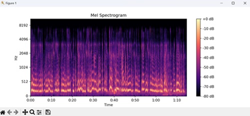
Example - Audio Visualization: Chromagram
In Matplotlib, an audio visualization chromagram is a graphical representation of the pitch content in an audio signal over time, focusing on musical notes or harmonics.
The chromagram displays time on the x-axis and musical pitch classes on the y-axis, usually represented as semitones or octaves. Each point in the chromagram indicates the presence or strength of a particular pitch class at a specific moment in time, typically shown as a color or grayscale shade.
Chromagrams are commonly used in music analysis and audio processing to identify musical patterns, chords, and key signatures within audio recordings.
In this example, we are visualizing the chromagram of an audio file using librosa and Matplotlib. We load the audio file and compute its chromagram, representing pitch classes over time using librosa's chroma_stft() function. Then, we use Matplotlib to display the chromagram, with a color bar indicating intensity −
import matplotlib.pyplot as plt
import librosa.display
# Loading audio file
audio_file = "audio_file.wav"
y, sr = librosa.load(audio_file)
# Calculating the chromagram of the audio
chromagram = librosa.feature.chroma_stft(y=y, sr=sr)
# Plotting chromagram
plt.figure(figsize=(10, 4))
# Displaying the mel chromagram
librosa.display.specshow(chromagram, x_axis='time', y_axis='chroma')
# Adding a colorbar to the plot
plt.colorbar()
plt.title('Chromagram')
# Displaying the plot
plt.show()
Output
Following is the output of the above code −
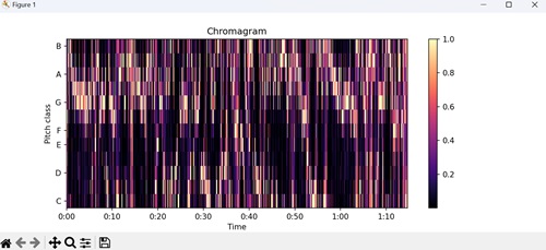
Example - Audio Processing: Beat Tracker
In Matplotlib, an audio processing beat tracker is a tool used to detect and visualize the rhythmic structure or tempo of an audio signal.
The beat tracker generally analyzes the audio signal to detect recurring patterns or accents in the sound, indicating the beat positions. It then generates a visualization, often as a plot, showing the detected beats or tempo changes over time.
In here, we visualize the beat positions detected in an audio file using librosa and Matplotlib. We load the audio file, and compute its tempo and beat positions using librosa's beat_track() function. We then use Matplotlib to plot the audio waveform with beat positions marked as vertical dashed red lines −
import matplotlib.pyplot as plt
import librosa.display
import numpy as np
# Loading audio file
audio_file = "audio_file.wav"
y, sr = librosa.load(audio_file)
# Calculating tempo and beat positions
tempo, beat_frames = librosa.beat.beat_track(y=y, sr=sr)
# Plotting beat positions
plt.figure(figsize=(10, 4))
# Plotting the audio waveform with transparency
plt.plot(librosa.frames_to_time(np.arange(len(y)), sr=sr), y, alpha=0.5)
# Adding vertical lines at beat positions
plt.vlines(librosa.frames_to_time(beat_frames, sr=sr), -1, 1, color='r', linestyle='--', label='Beats')
plt.xlabel("Time (s)")
plt.ylabel("Amplitude")
plt.title("Beat Tracker")
plt.legend()
# Displaying the plot
plt.show()
Output
Following is the output of the above code −
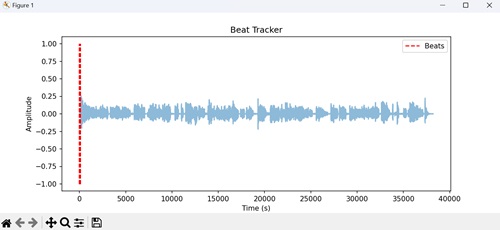
Matplotlib - Audio Processing
Audio processing is the technology that helps computers understand and work with sound. It involves using computers to manipulate, enhance, or analyze sounds. Think of it as a magical toolbox for making music, fixing noisy recordings, or even recognizing your voice commands when you talk to your phone or smart speaker.
So, audio processing is like a wizard that helps make sounds better and more useful in our digital world. It contains a range of techniques and methods for modifying, enhancing, or extracting information from audio signals.
For instance, we can perform time-frequency analysis on audio data. This analysis helps us understand how the frequency content of the audio signal changes over time. To achieve this, we need to create a spectrogram, which is a visual representation of the frequencies in the audio signal as it evolves over time.
The x-axis represents time, the y-axis represents frequency, and the color intensity represents the strength of each frequency component at a given time. By plotting the spectrogram, we can identify patterns, trends, and changes in the audio signal's frequency content, which is useful for tasks like detecting sound events or analyzing musical compositions −
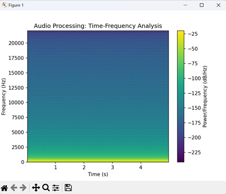
Audio Processing in Matplotlib
In Matplotlib, audio processing refers to the manipulation and visualization of audio data. While Matplotlib is primarily known for creating visualizations like charts and graphs, it can also be used to visualize audio signals.
For example, you can use Matplotlib to generate spectrograms, which provide a visual representation of the frequency content of an audio signal over time. Matplotlib does not have built-in functionalities for audio processing. However, you can use it in conjunction with other libraries such as NumPy, SciPy, and librosa to perform audio processing tasks, including filtering, spectral analysis, and signal transformations.
Below are different examples showing the use of Matplotlib with these libraries for basic audio processing and visualization tasks
Example - Audio Processing: Waveform Visualization
In Matplotlib, audio processing waveform visualization involves plotting the amplitude of audio signals over time. When audio data is loaded into Matplotlib, you can use its plotting functions to create a graphical representation of the waveform.
Each point on the plot represents the amplitude of the audio signal at a specific moment in time, and the waveform shows how the signal changes over the duration of the audio clip. This visualization helps users understand the characteristics of the audio, such as its volume and frequency components, and is commonly used in audio analysis and editing applications.
In the following example, we visualize the waveform of an audio signal using the plot() function. The x-axis represents time in seconds, and the y-axis represents the amplitude of the audio signal, with amplitude values plotted against time −
import matplotlib.pyplot as plt
import numpy as np
# Assuming audio_data is a numpy array containing audio samples
audio_data = np.random.randn(10000)
# Plotting the audio waveform
plt.plot(np.arange(len(audio_data)), audio_data)
plt.xlabel('Sample')
plt.ylabel('Amplitude')
plt.title('Audio Waveform')
# Displaying the plot
plt.show()
Output
Following is the output of the above code −

Example - Audio Processing: Spectrogram
Spectrograms are used to understand the frequency content of audio signals, identify patterns or changes in sound over time, and analyze the characteristics of audio recordings.
In Matplotlib, an audio processing spectrogram is a visual representation of the frequencies and intensities present in an audio signal over time. It is like taking a snapshot of the frequencies present in different parts of the audio clip as it plays.
The spectrogram displays time on the x-axis, frequency on the y-axis, and the intensity of each frequency at a given moment as a color. Brighter colors typically represent higher intensities or amplitudes of frequencies, while darker colors represent lower intensities.
In this example, we are using the specgram() function to generate and display the spectrogram of the audio signal. The x-axis represents time in seconds, the y-axis represents frequency in Hertz, and the color intensity represents the intensity of each frequency component at different points in time −
import matplotlib.pyplot as plt
import numpy as np
# Generating random audio data
# Sample rate in Hz
sample_rate = 44100
# Duration of the audio in seconds
duration = 5
# Creating a time array representing the time axis of the audio data
t = np.linspace(0, duration, int(sample_rate * duration))
# Generating audio data
# by creating a sine wave at 440 Hz frequency
audio_data = np.sin(2 * np.pi * 440 * t)
# Plotting the spectrogram of the audio data
plt.specgram(audio_data, Fs=sample_rate)
plt.xlabel('Time (s)')
plt.ylabel('Frequency (Hz)')
plt.title('Spectrogram')
# Adding a color bar to indicate intensity in decibels
plt.colorbar(label='Intensity (dB)')
# Displaying the plot
plt.show()
Output
Following is the output of the above code −
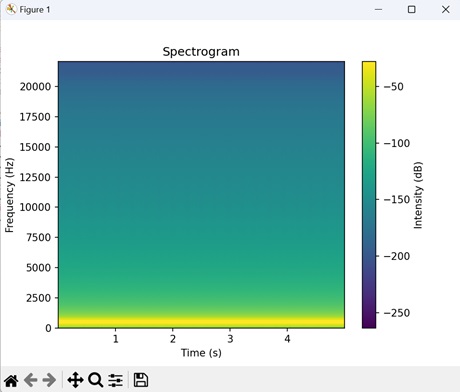
Example - Audio Processing: Frequency Spectrum
In Matplotlib, an audio processing frequency spectrum represents the distribution of frequencies present in an audio signal. It is like breaking down the sound into its individual frequency components to see how much of each frequency is present.
The frequency spectrum plot shows frequency on the x-axis and the intensity or amplitude of each frequency on the y-axis. Peaks or spikes in the plot indicate frequencies that are particularly strong or dominant in the audio signal.
This visualization helps to understand the composition of the audio, such as the pitch of the sound, the presence of different musical notes or tones, and any background noise or interference.
In here, we are using the magnitude_spectrum() function to calculate and display the frequency spectrum of the audio signal. The x-axis represents frequency in Hertz, and the y-axis represents the magnitude of each frequency component −
import matplotlib.pyplot as plt
import numpy as np
# Assuming audio_data is a numpy array containing audio samples
# Providing random audio data
audio_data = np.random.randn(10000)
# sample rate
sample_rate = 44100
# Plotting the magnitude spectrum of the audio data
plt.magnitude_spectrum(audio_data, Fs=sample_rate)
plt.xlabel('Frequency (Hz)')
plt.ylabel('Magnitude')
plt.title('Frequency Spectrum')
# Displaying the plot
plt.show()
Output
Following is the output of the above code −