- Matplotlib - Home
- Matplotlib - Introduction
- Matplotlib - Vs Seaborn
- Matplotlib - Environment Setup
- Matplotlib - Anaconda distribution
- Matplotlib - Jupyter Notebook
- Matplotlib - Pyplot API
- Matplotlib - Simple Plot
- Matplotlib - Saving Figures
- Matplotlib - Markers
- Matplotlib - Figures
- Matplotlib - Styles
- Matplotlib - Legends
- Matplotlib - Colors
- Matplotlib - Colormaps
- Matplotlib - Colormap Normalization
- Matplotlib - Choosing Colormaps
- Matplotlib - Colorbars
- Matplotlib - Working With Text
- Matplotlib - Text properties
- Matplotlib - Subplot Titles
- Matplotlib - Images
- Matplotlib - Image Masking
- Matplotlib - Annotations
- Matplotlib - Arrows
- Matplotlib - Fonts
- Matplotlib - Font Indexing
- Matplotlib - Font Properties
- Matplotlib - Scales
- Matplotlib - LaTeX
- Matplotlib - LaTeX Text Formatting in Annotations
- Matplotlib - PostScript
- Matplotlib - Mathematical Expressions
- Matplotlib - Animations
- Matplotlib - Celluloid Library
- Matplotlib - Blitting
- Matplotlib - Toolkits
- Matplotlib - Artists
- Matplotlib - Styling with Cycler
- Matplotlib - Paths
- Matplotlib - Path Effects
- Matplotlib - Transforms
- Matplotlib - Ticks and Tick Labels
- Matplotlib - Radian Ticks
- Matplotlib - Dateticks
- Matplotlib - Tick Formatters
- Matplotlib - Tick Locators
- Matplotlib - Basic Units
- Matplotlib - Autoscaling
- Matplotlib - Reverse Axes
- Matplotlib - Logarithmic Axes
- Matplotlib - Symlog
- Matplotlib - Unit Handling
- Matplotlib - Ellipse with Units
- Matplotlib - Spines
- Matplotlib - Axis Ranges
- Matplotlib - Axis Scales
- Matplotlib - Axis Ticks
- Matplotlib - Formatting Axes
- Matplotlib - Axes Class
- Matplotlib - Twin Axes
- Matplotlib - Figure Class
- Matplotlib - Multiplots
- Matplotlib - Grids
- Matplotlib - Object-oriented Interface
- Matplotlib - PyLab module
- Matplotlib - Subplots() Function
- Matplotlib - Subplot2grid() Function
- Matplotlib - Anchored Artists
- Matplotlib - Manual Contour
- Matplotlib - Coords Report
- Matplotlib - AGG filter
- Matplotlib - Ribbon Box
- Matplotlib - Fill Spiral
- Matplotlib - Findobj Method
- Matplotlib - Hyperlinks
- Matplotlib - Image Thumbnail
- Matplotlib - Plotting with Keywords
- Matplotlib - Create Logo
- Matplotlib - Multipage PDF
- Matplotlib - Multiprocessing
- Matplotlib - Print Stdout
- Matplotlib - Compound Path
- Matplotlib - Sankey Class
- Matplotlib - MRI with EEG
- Matplotlib - Stylesheets
- Matplotlib - Background Colors
- Matplotlib - Basemap
Matplotlib Events
- Matplotlib - Event Handling
- Matplotlib - Close Event
- Matplotlib - Mouse Move
- Matplotlib - Click Events
- Matplotlib - Scroll Event
- Matplotlib - Keypress Event
- Matplotlib - Pick Event
- Matplotlib - Looking Glass
- Matplotlib - Path Editor
- Matplotlib - Poly Editor
- Matplotlib - Timers
- Matplotlib - Viewlims
- Matplotlib - Zoom Window
Matplotlib Widgets
- Matplotlib - Cursor Widget
- Matplotlib - Annotated Cursor
- Matplotlib - Button Widget
- Matplotlib - Check Buttons
- Matplotlib - Lasso Selector
- Matplotlib - Menu Widget
- Matplotlib - Mouse Cursor
- Matplotlib - Multicursor
- Matplotlib - Polygon Selector
- Matplotlib - Radio Buttons
- Matplotlib - RangeSlider
- Matplotlib - Rectangle Selector
- Matplotlib - Ellipse Selector
- Matplotlib - Slider Widget
- Matplotlib - Span Selector
- Matplotlib - Textbox
Matplotlib Plotting
- Matplotlib - Line Plots
- Matplotlib - Area Plots
- Matplotlib - Bar Graphs
- Matplotlib - Histogram
- Matplotlib - Pie Chart
- Matplotlib - Scatter Plot
- Matplotlib - Box Plot
- Matplotlib - Arrow Demo
- Matplotlib - Fancy Boxes
- Matplotlib - Zorder Demo
- Matplotlib - Hatch Demo
- Matplotlib - Mmh Donuts
- Matplotlib - Ellipse Demo
- Matplotlib - Bezier Curve
- Matplotlib - Bubble Plots
- Matplotlib - Stacked Plots
- Matplotlib - Table Charts
- Matplotlib - Polar Charts
- Matplotlib - Hexagonal bin Plots
- Matplotlib - Violin Plot
- Matplotlib - Event Plot
- Matplotlib - Heatmap
- Matplotlib - Stairs Plots
- Matplotlib - Errorbar
- Matplotlib - Hinton Diagram
- Matplotlib - Contour Plot
- Matplotlib - Wireframe Plots
- Matplotlib - Surface Plots
- Matplotlib - Triangulations
- Matplotlib - Stream plot
- Matplotlib - Ishikawa Diagram
- Matplotlib - 3D Plotting
- Matplotlib - 3D Lines
- Matplotlib - 3D Scatter Plots
- Matplotlib - 3D Contour Plot
- Matplotlib - 3D Bar Plots
- Matplotlib - 3D Wireframe Plot
- Matplotlib - 3D Surface Plot
- Matplotlib - 3D Vignettes
- Matplotlib - 3D Volumes
- Matplotlib - 3D Voxels
- Matplotlib - Time Plots and Signals
- Matplotlib - Filled Plots
- Matplotlib - Step Plots
- Matplotlib - XKCD Style
- Matplotlib - Quiver Plot
- Matplotlib - Stem Plots
- Matplotlib - Visualizing Vectors
- Matplotlib - Audio Visualization
- Matplotlib - Audio Processing
Matplotlib Useful Resources
- Matplotlib - Quick Guide
- Matplotlib - Cheatsheet
- Matplotlib - Useful Resources
- Matplotlib - Discussion
Matplotlib - Box Plots
A box plot represents the distribution of a dataset in a graph. It displays the summary statistics of a dataset, including the minimum, first quartile (Q1), median (Q2), third quartile (Q3), and maximum. The box represents the interquartile range (IQR) between the first and third quartiles, while whiskers extend from the box to the minimum and maximum values. Outliers, if present, may be displayed as individual points beyond the whiskers.
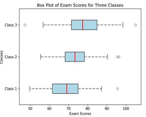
Imagine you have the exam scores of students from three classes. A box plot is a way to show how these scores are spread out −
Minimum and Maximum − The smallest and largest scores are shown as the ends of the plot.
Quartiles (Q1, Q2, Q3) − The scores are split into four parts. The middle score is the median (Q2). The scores below the median are the first quartile (Q1), and those above are the third quartile (Q3). It helps you see where most of the scores lie.
Interquartile Range (IQR) − The range between Q1 and Q3 is called the interquartile range.
Box − The box in the middle represents the interquartile range. So, it is showing you where half of the scores are.
Whiskers − Lines (whiskers) extend from the box to the smallest and largest scores, helping you see how spread out the scores are.
Outliers − If there are any scores way above or below the rest, they might be shown as dots beyond the whiskers. These are like the standout scores.
Box Plot in Matplotlib
We can create a box plot in Matplotlib using the boxplot() function. This function allows us to customize the appearance of the box plot, such as changing the whisker length, adding notches, and specifying the display of outliers.
The boxplot() Function
The boxplot() function in Matplotlib takes one or more datasets as input and generates a box plot for each dataset.
Following is the syntax of boxplot() function in Matplotlib −
Syntax
plt.boxplot(x, notch=None, patch_artist=None, widths=None, labels=None, ...)
Where,
x is the dataset or a list of datasets for which the box plot is to be created.
If notch (optional) is True, it creates a vertical box plot; if False, creates a horizontal box plot.
If patch_artist (optional) is True, it fills the box with color.
widths (optional) represents the width of the boxes.
labels (optional) sets labels for each dataset, useful when plotting multiple box plots.
These are just a few parameters; there are more optionals parameters available for customization.
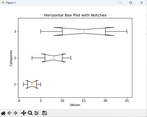
Example - Horizontal Box Plot with Notches
We can create a horizontal box plot with notches to display the distribution of a dataset in a horizontal orientation. It includes notches around the median lines, providing a visual estimate of the uncertainty around the median values.
In the following example, we are creating a horizontal box plot with notches around the medians for three data sets, where each box represents a set of values along the y-axis categories −
import matplotlib.pyplot as plt

# Data
data = [[1, 2, 3, 4, 5], [3, 6, 8, 10, 12], [5, 10, 15, 20, 25]]

# Creating a horizontal box plot with notches
plt.boxplot(data, vert=False, notch=True)
plt.title('Horizontal Box Plot with Notches')
plt.xlabel('Values')
plt.ylabel('Categories')
plt.show()
Output
After executing the above code, we get the following output −
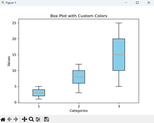
Example - Box Plot with Custom Colors
We can create a box plot with custom colors, graphically representing the data with different colors to fill the boxes. Each box represents the distribution of values within a category, and by adding a custom color, we introduce a stylistic touch that makes it easier to differentiate between categories.
In here, we are enhancing the box plot by filling the boxes with a custom color i.e. skyblue −
import matplotlib.pyplot as plt
data = [[1, 2, 3, 4, 5], [3, 6, 8, 10, 12], [5, 10, 15, 20, 25]]

# Creating a box plot with custom colors
plt.boxplot(data, patch_artist=True, boxprops=dict(facecolor='skyblue'))
plt.title('Box Plot with Custom Colors')
plt.xlabel('Categories')
plt.ylabel('Values')
plt.show()
Output
Following is the output of the above code −
Example - Grouped Box Plot
We can create a grouped box plot to compare the distributions of multiple groups side by side. Each group has its own set of boxes, where each box represents the distribution of values within that group.
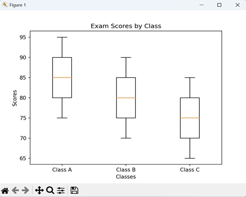
Now, we are creating a grouped box plot to compare the exam scores of students from three different classes (A, B, and C). Each box represents the distribution of scores within a class, allowing us to easily observe and compare the central tendencies, spreads, and potential outliers across the three classes −
import matplotlib.pyplot as plt
import numpy as np
class_A_scores = [75, 80, 85, 90, 95]
class_B_scores = [70, 75, 80, 85, 90]
class_C_scores = [65, 70, 75, 80, 85]

# Creating a grouped box plot
plt.boxplot([class_A_scores, class_B_scores, class_C_scores], labels=['Class A', 'Class B', 'Class C'])
plt.title('Exam Scores by Class')
plt.xlabel('Classes')
plt.ylabel('Scores')
plt.show()
Output
On executing the above code we will get the following output −
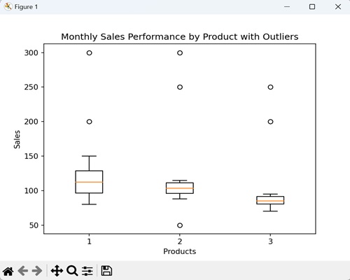
Example - Box Plot with Outliers
A box plot with outliers is a graphical representation of data that includes additional information about extreme values in the dataset. In a standard box plot, we represent outliers, data points significantly different from the majority, as individual points beyond the "whiskers" that extend from the box.
This plot helps in identifying exceptional values that may have a significant impact on the overall distribution of the data.
In the example below, we are creating a box plot that provides a visual representation of the sales distribution for each product, and the outliers highlight months with exceptionally high or low sales −
import matplotlib.pyplot as plt
import numpy as np

# Data for monthly sales
product_A_sales = [100, 110, 95, 105, 115, 90, 120, 130, 80, 125, 150, 200]
product_B_sales = [90, 105, 100, 98, 102, 105, 110, 95, 112, 88, 115, 250]
product_C_sales = [80, 85, 90, 78, 82, 85, 88, 92, 75, 85, 200, 95]

# Introducing outliers
product_A_sales.extend([300, 80])
product_B_sales.extend([50, 300])
product_C_sales.extend([70, 250])

# Creating a box plot with outliers
plt.boxplot([product_A_sales, product_B_sales, product_C_sales], sym='o')
plt.title('Monthly Sales Performance by Product with Outliers')
plt.xlabel('Products')
plt.ylabel('Sales')
plt.show()
Output
On executing the above code we will get the following output −