- Matplotlib - Home
- Matplotlib - Introduction
- Matplotlib - Vs Seaborn
- Matplotlib - Environment Setup
- Matplotlib - Anaconda distribution
- Matplotlib - Jupyter Notebook
- Matplotlib - Pyplot API
- Matplotlib - Simple Plot
- Matplotlib - Saving Figures
- Matplotlib - Markers
- Matplotlib - Figures
- Matplotlib - Styles
- Matplotlib - Legends
- Matplotlib - Colors
- Matplotlib - Colormaps
- Matplotlib - Colormap Normalization
- Matplotlib - Choosing Colormaps
- Matplotlib - Colorbars
- Matplotlib - Working With Text
- Matplotlib - Text properties
- Matplotlib - Subplot Titles
- Matplotlib - Images
- Matplotlib - Image Masking
- Matplotlib - Annotations
- Matplotlib - Arrows
- Matplotlib - Fonts
- Matplotlib - Font Indexing
- Matplotlib - Font Properties
- Matplotlib - Scales
- Matplotlib - LaTeX
- Matplotlib - LaTeX Text Formatting in Annotations
- Matplotlib - PostScript
- Matplotlib - Mathematical Expressions
- Matplotlib - Animations
- Matplotlib - Celluloid Library
- Matplotlib - Blitting
- Matplotlib - Toolkits
- Matplotlib - Artists
- Matplotlib - Styling with Cycler
- Matplotlib - Paths
- Matplotlib - Path Effects
- Matplotlib - Transforms
- Matplotlib - Ticks and Tick Labels
- Matplotlib - Radian Ticks
- Matplotlib - Dateticks
- Matplotlib - Tick Formatters
- Matplotlib - Tick Locators
- Matplotlib - Basic Units
- Matplotlib - Autoscaling
- Matplotlib - Reverse Axes
- Matplotlib - Logarithmic Axes
- Matplotlib - Symlog
- Matplotlib - Unit Handling
- Matplotlib - Ellipse with Units
- Matplotlib - Spines
- Matplotlib - Axis Ranges
- Matplotlib - Axis Scales
- Matplotlib - Axis Ticks
- Matplotlib - Formatting Axes
- Matplotlib - Axes Class
- Matplotlib - Twin Axes
- Matplotlib - Figure Class
- Matplotlib - Multiplots
- Matplotlib - Grids
- Matplotlib - Object-oriented Interface
- Matplotlib - PyLab module
- Matplotlib - Subplots() Function
- Matplotlib - Subplot2grid() Function
- Matplotlib - Anchored Artists
- Matplotlib - Manual Contour
- Matplotlib - Coords Report
- Matplotlib - AGG filter
- Matplotlib - Ribbon Box
- Matplotlib - Fill Spiral
- Matplotlib - Findobj Method
- Matplotlib - Hyperlinks
- Matplotlib - Image Thumbnail
- Matplotlib - Plotting with Keywords
- Matplotlib - Create Logo
- Matplotlib - Multipage PDF
- Matplotlib - Multiprocessing
- Matplotlib - Print Stdout
- Matplotlib - Compound Path
- Matplotlib - Sankey Class
- Matplotlib - MRI with EEG
- Matplotlib - Stylesheets
- Matplotlib - Background Colors
- Matplotlib - Basemap
Matplotlib Events
- Matplotlib - Event Handling
- Matplotlib - Close Event
- Matplotlib - Mouse Move
- Matplotlib - Click Events
- Matplotlib - Scroll Event
- Matplotlib - Keypress Event
- Matplotlib - Pick Event
- Matplotlib - Looking Glass
- Matplotlib - Path Editor
- Matplotlib - Poly Editor
- Matplotlib - Timers
- Matplotlib - Viewlims
- Matplotlib - Zoom Window
Matplotlib Widgets
- Matplotlib - Cursor Widget
- Matplotlib - Annotated Cursor
- Matplotlib - Button Widget
- Matplotlib - Check Buttons
- Matplotlib - Lasso Selector
- Matplotlib - Menu Widget
- Matplotlib - Mouse Cursor
- Matplotlib - Multicursor
- Matplotlib - Polygon Selector
- Matplotlib - Radio Buttons
- Matplotlib - RangeSlider
- Matplotlib - Rectangle Selector
- Matplotlib - Ellipse Selector
- Matplotlib - Slider Widget
- Matplotlib - Span Selector
- Matplotlib - Textbox
Matplotlib Plotting
- Matplotlib - Line Plots
- Matplotlib - Area Plots
- Matplotlib - Bar Graphs
- Matplotlib - Histogram
- Matplotlib - Pie Chart
- Matplotlib - Scatter Plot
- Matplotlib - Box Plot
- Matplotlib - Arrow Demo
- Matplotlib - Fancy Boxes
- Matplotlib - Zorder Demo
- Matplotlib - Hatch Demo
- Matplotlib - Mmh Donuts
- Matplotlib - Ellipse Demo
- Matplotlib - Bezier Curve
- Matplotlib - Bubble Plots
- Matplotlib - Stacked Plots
- Matplotlib - Table Charts
- Matplotlib - Polar Charts
- Matplotlib - Hexagonal bin Plots
- Matplotlib - Violin Plot
- Matplotlib - Event Plot
- Matplotlib - Heatmap
- Matplotlib - Stairs Plots
- Matplotlib - Errorbar
- Matplotlib - Hinton Diagram
- Matplotlib - Contour Plot
- Matplotlib - Wireframe Plots
- Matplotlib - Surface Plots
- Matplotlib - Triangulations
- Matplotlib - Stream plot
- Matplotlib - Ishikawa Diagram
- Matplotlib - 3D Plotting
- Matplotlib - 3D Lines
- Matplotlib - 3D Scatter Plots
- Matplotlib - 3D Contour Plot
- Matplotlib - 3D Bar Plots
- Matplotlib - 3D Wireframe Plot
- Matplotlib - 3D Surface Plot
- Matplotlib - 3D Vignettes
- Matplotlib - 3D Volumes
- Matplotlib - 3D Voxels
- Matplotlib - Time Plots and Signals
- Matplotlib - Filled Plots
- Matplotlib - Step Plots
- Matplotlib - XKCD Style
- Matplotlib - Quiver Plot
- Matplotlib - Stem Plots
- Matplotlib - Visualizing Vectors
- Matplotlib - Audio Visualization
- Matplotlib - Audio Processing
Matplotlib Useful Resources
- Matplotlib - Quick Guide
- Matplotlib - Cheatsheet
- Matplotlib - Useful Resources
- Matplotlib - Discussion
Matplotlib - Histogram
A histogram is like a visual summary that shows how often different values appear in a set of data. Imagine you have a collection of numbers, like ages of people. A histogram divides these numbers into groups, called "bins," and then uses bars to represent how many numbers fall into each bin. The taller the bar, the more numbers are in that group.
Histogram in Matplotlib
We can create a histogram in Matplotlib using the hist() function. This function allows us to customize various aspects of the histogram, such as the number of bins, color, and transparency. Histogram in Matplotlib is used to represent the distribution of numerical data, helping you to identify patterns.
The hist() Function
The hist() function in Matplotlib takes a dataset as input and divides it into intervals (bins). It then displays the frequency (count) of data points falling within each bin as a bar graph.
Following is the syntax of hist() function in Matplotlib −
Syntax
plt.hist(x, bins=None, range=None, density=False, cumulative=False, color=None, edgecolor=None, ...)
Where,
x is the input data for which the histogram is determined.
bins (optional) is the number of bins or the bin edges.
range (optional) is the lower and upper range of the bins. Default is the minimum and maximum of x
If density (optional) is True, the histogram represents a probability density function. Default is False.
If cumulative (optional) is True, a cumulative histogram is computed. Default is False.
These are just a few parameters; there are more optionals parameters available for customization.
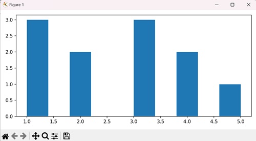
Example - Creating a Vertical Histogram
In Matplotlib, creating a vertical histogram involves plotting a graphical representation of the frequency distribution of a dataset, with the bars oriented vertically along the y-axis. Each bar represents the frequency or count of data points falling within a particular interval or bin along the x-axis.
In the following example, we are creating a vertical histogram by setting the "orientation" parameter to "vertical" within the hist() function −
import matplotlib.pyplot as plt
plt.rcParams["figure.figsize"] = [7.50, 3.50]
plt.rcParams["figure.autolayout"] = True
x = [1, 2, 3, 1, 2, 3, 4, 1, 3, 4, 5]
plt.hist(x, orientation="vertical")
plt.show()
Output
We get the output as shown below −
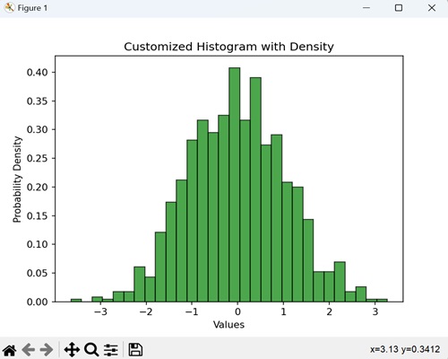
Example - Customized Histogram with Density
When we create a histogram with density, we are providing a visual summary of how data is distributed. We use this graph to see how likely different numbers are occurring, and the density option makes sure the total area under the histogram is normalized to one.
In the following example, we are visualizing random data as a histogram with 30 bins, displaying it in green with a black edge. We are using the density=True parameter to represent the probability density −
import matplotlib.pyplot as plt
import numpy as np

# Generate random data
data = np.random.randn(1000)

# Create a histogram with density and custom color
plt.hist(data, bins=30, density=True, color='green', edgecolor='black', alpha=0.7)
plt.xlabel('Values')
plt.ylabel('Probability Density')
plt.title('Customized Histogram with Density')
plt.show()
Output
After executing the above code, we get the following output −
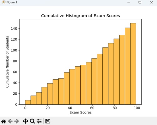
Example - Cumulative Histogram
When we create a cumulative histogram, we graphically represent the total number of occurrences of values up to a certain point. It shows how many data points fall below or equal to a certain value.
In here, we are using a histogram where each bar represents a range of exam scores, and the height of the bar tells us how many students, in total, scored within that range. By setting the cumulative=True parameter in the hist() function, we make sure that the histogram shows the cumulative progression of scores −
import matplotlib.pyplot as plt
import numpy as np

# Generate random exam scores (out of 100)
exam_scores = np.random.randint(0, 100, 150)

# Create a cumulative histogram
plt.hist(exam_scores, bins=20, cumulative=True, color='orange', edgecolor='black', alpha=0.7)
plt.xlabel('Exam Scores')
plt.ylabel('Cumulative Number of Students')
plt.title('Cumulative Histogram of Exam Scores')
plt.show()
Output
Following is the output of the above code −
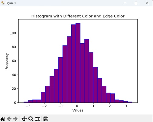
Example - Histogram with Different Color and Edge Color
When creating a histogram, we can customize the fill color and edge color, adding a visual touch to represent the data distribution. By doing this, we blend the histogram with a stylish and distinctive appearance.
Now, we are generating a histogram for random data with 25 bins, and we are presenting it in purple color with blue edges −
import matplotlib.pyplot as plt
import numpy as np
data = np.random.randn(1000)

# Creating a histogram with different color and edge color
plt.hist(data, bins=25, color='purple', edgecolor='blue')
plt.xlabel('Values')
plt.ylabel('Frequency')
plt.title('Histogram with Different Color and Edge Color')
plt.show()
Output
On executing the above code we will get the following output −
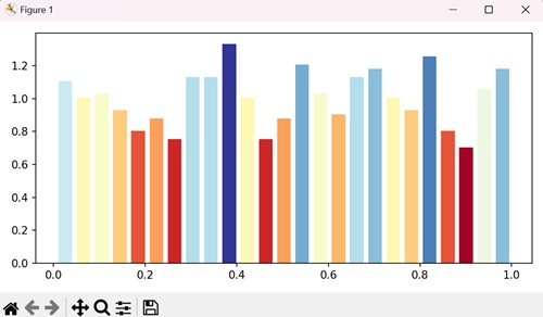
Example - Histogram with Colors
To plot a histogram with colors, we can also extract colors from the "cm" parameter in the setp() method.
import numpy as np
from matplotlib import pyplot as plt
plt.rcParams["figure.figsize"] = [7.00, 3.50]
plt.rcParams["figure.autolayout"] = True
data = np.random.random(1000)
n, bins, patches = plt.hist(data, bins=25, density=True, color='red', rwidth=0.75)
col = (n-n.min())/(n.max()-n.min())
cm = plt.cm.get_cmap('RdYlBu')
for c, p in zip(col, patches):
   plt.setp(p, 'facecolor', cm(c))
plt.show()
Output
On executing the above code we will get the following output −
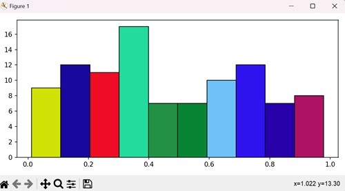
Example - Histogram with different Colors
In here, we are specifying different colors for different bars in a matplotlib histogram by iterating in the range of number of bins and setting random facecolor for each bar −
import numpy as np
import matplotlib.pyplot as plt
import random
import string

# Set the figure size
plt.rcParams["figure.figsize"] = [7.50, 3.50]
plt.rcParams["figure.autolayout"] = True

# Figure and set of subplots
fig, ax = plt.subplots()

# Random data
data = np.random.rand(100)

# Plot a histogram with random data
N, bins, patches = ax.hist(data, edgecolor='black', linewidth=1)

# Random facecolor for each bar
for i in range(len(N)):
   patches[i].set_facecolor("#" + ''.join(random.choices("ABCDEF" + string.digits, k=6)))

# Display the plot
plt.show()
Output
On executing the above code we will get the following output −
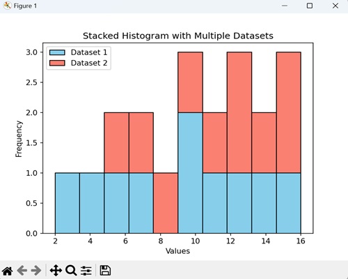
Example - Stacked Histogram with Multiple Datasets
A stacked histogram with multiple datasets is a visual representation that combines the distributions of two or more sets of data. The bars are stacked on top of each other, allowing for a comparison of how different datasets contribute to the overall distribution.
In the example below, we represent two different datasets "data1" and "data2" with specific values, showing their distributions in different colors (skyblue and salmon) −
import matplotlib.pyplot as plt
import numpy as np

# Sample data for two datasets
data1 = np.array([2, 4, 5, 7, 9, 10, 11, 13, 14, 15])
data2 = np.array([6, 7, 8, 10, 11, 12, 13, 14, 15, 16])

# Creating a stacked histogram with different colors
plt.hist([data1, data2], bins=10, stacked=True, color=['skyblue', 'salmon'], edgecolor='black')
plt.xlabel('Values')
plt.ylabel('Frequency')
plt.title('Stacked Histogram with Multiple Datasets')
plt.legend(['Dataset 1', 'Dataset 2'])
plt.show()
Output
On executing the above code we will get the following output −