- Matplotlib - Home
- Matplotlib - Introduction
- Matplotlib - Vs Seaborn
- Matplotlib - Environment Setup
- Matplotlib - Anaconda distribution
- Matplotlib - Jupyter Notebook
- Matplotlib - Pyplot API
- Matplotlib - Simple Plot
- Matplotlib - Saving Figures
- Matplotlib - Markers
- Matplotlib - Figures
- Matplotlib - Styles
- Matplotlib - Legends
- Matplotlib - Colors
- Matplotlib - Colormaps
- Matplotlib - Colormap Normalization
- Matplotlib - Choosing Colormaps
- Matplotlib - Colorbars
- Matplotlib - Working With Text
- Matplotlib - Text properties
- Matplotlib - Subplot Titles
- Matplotlib - Images
- Matplotlib - Image Masking
- Matplotlib - Annotations
- Matplotlib - Arrows
- Matplotlib - Fonts
- Matplotlib - Font Indexing
- Matplotlib - Font Properties
- Matplotlib - Scales
- Matplotlib - LaTeX
- Matplotlib - LaTeX Text Formatting in Annotations
- Matplotlib - PostScript
- Matplotlib - Mathematical Expressions
- Matplotlib - Animations
- Matplotlib - Celluloid Library
- Matplotlib - Blitting
- Matplotlib - Toolkits
- Matplotlib - Artists
- Matplotlib - Styling with Cycler
- Matplotlib - Paths
- Matplotlib - Path Effects
- Matplotlib - Transforms
- Matplotlib - Ticks and Tick Labels
- Matplotlib - Radian Ticks
- Matplotlib - Dateticks
- Matplotlib - Tick Formatters
- Matplotlib - Tick Locators
- Matplotlib - Basic Units
- Matplotlib - Autoscaling
- Matplotlib - Reverse Axes
- Matplotlib - Logarithmic Axes
- Matplotlib - Symlog
- Matplotlib - Unit Handling
- Matplotlib - Ellipse with Units
- Matplotlib - Spines
- Matplotlib - Axis Ranges
- Matplotlib - Axis Scales
- Matplotlib - Axis Ticks
- Matplotlib - Formatting Axes
- Matplotlib - Axes Class
- Matplotlib - Twin Axes
- Matplotlib - Figure Class
- Matplotlib - Multiplots
- Matplotlib - Grids
- Matplotlib - Object-oriented Interface
- Matplotlib - PyLab module
- Matplotlib - Subplots() Function
- Matplotlib - Subplot2grid() Function
- Matplotlib - Anchored Artists
- Matplotlib - Manual Contour
- Matplotlib - Coords Report
- Matplotlib - AGG filter
- Matplotlib - Ribbon Box
- Matplotlib - Fill Spiral
- Matplotlib - Findobj Method
- Matplotlib - Hyperlinks
- Matplotlib - Image Thumbnail
- Matplotlib - Plotting with Keywords
- Matplotlib - Create Logo
- Matplotlib - Multipage PDF
- Matplotlib - Multiprocessing
- Matplotlib - Print Stdout
- Matplotlib - Compound Path
- Matplotlib - Sankey Class
- Matplotlib - MRI with EEG
- Matplotlib - Stylesheets
- Matplotlib - Background Colors
- Matplotlib - Basemap
Matplotlib Events
- Matplotlib - Event Handling
- Matplotlib - Close Event
- Matplotlib - Mouse Move
- Matplotlib - Click Events
- Matplotlib - Scroll Event
- Matplotlib - Keypress Event
- Matplotlib - Pick Event
- Matplotlib - Looking Glass
- Matplotlib - Path Editor
- Matplotlib - Poly Editor
- Matplotlib - Timers
- Matplotlib - Viewlims
- Matplotlib - Zoom Window
Matplotlib Widgets
- Matplotlib - Cursor Widget
- Matplotlib - Annotated Cursor
- Matplotlib - Button Widget
- Matplotlib - Check Buttons
- Matplotlib - Lasso Selector
- Matplotlib - Menu Widget
- Matplotlib - Mouse Cursor
- Matplotlib - Multicursor
- Matplotlib - Polygon Selector
- Matplotlib - Radio Buttons
- Matplotlib - RangeSlider
- Matplotlib - Rectangle Selector
- Matplotlib - Ellipse Selector
- Matplotlib - Slider Widget
- Matplotlib - Span Selector
- Matplotlib - Textbox
Matplotlib Plotting
- Matplotlib - Line Plots
- Matplotlib - Area Plots
- Matplotlib - Bar Graphs
- Matplotlib - Histogram
- Matplotlib - Pie Chart
- Matplotlib - Scatter Plot
- Matplotlib - Box Plot
- Matplotlib - Arrow Demo
- Matplotlib - Fancy Boxes
- Matplotlib - Zorder Demo
- Matplotlib - Hatch Demo
- Matplotlib - Mmh Donuts
- Matplotlib - Ellipse Demo
- Matplotlib - Bezier Curve
- Matplotlib - Bubble Plots
- Matplotlib - Stacked Plots
- Matplotlib - Table Charts
- Matplotlib - Polar Charts
- Matplotlib - Hexagonal bin Plots
- Matplotlib - Violin Plot
- Matplotlib - Event Plot
- Matplotlib - Heatmap
- Matplotlib - Stairs Plots
- Matplotlib - Errorbar
- Matplotlib - Hinton Diagram
- Matplotlib - Contour Plot
- Matplotlib - Wireframe Plots
- Matplotlib - Surface Plots
- Matplotlib - Triangulations
- Matplotlib - Stream plot
- Matplotlib - Ishikawa Diagram
- Matplotlib - 3D Plotting
- Matplotlib - 3D Lines
- Matplotlib - 3D Scatter Plots
- Matplotlib - 3D Contour Plot
- Matplotlib - 3D Bar Plots
- Matplotlib - 3D Wireframe Plot
- Matplotlib - 3D Surface Plot
- Matplotlib - 3D Vignettes
- Matplotlib - 3D Volumes
- Matplotlib - 3D Voxels
- Matplotlib - Time Plots and Signals
- Matplotlib - Filled Plots
- Matplotlib - Step Plots
- Matplotlib - XKCD Style
- Matplotlib - Quiver Plot
- Matplotlib - Stem Plots
- Matplotlib - Visualizing Vectors
- Matplotlib - Audio Visualization
- Matplotlib - Audio Processing
Matplotlib Useful Resources
- Matplotlib - Quick Guide
- Matplotlib - Cheatsheet
- Matplotlib - Useful Resources
- Matplotlib - Discussion
Matplotlib - Axes Limits
What are Axes Limits?
Axes limits in Matplotlib define the range of values displayed along the x-axis and y-axis in a plot. They determine the span of data visible within the plot area specifying the minimum and maximum values shown on each axis.
Setting axes limits in Matplotlib provides control over the range of data displayed within a plot allowing customization and focus on particular segments of the data or visual patterns.
Key Points about Axes Limits
X-axis and Y-axis Limits − Axes limits can be set independently for the x-axis and y-axis. These limits dictate the range of values displayed along each axis.
Customization − Limits can be manually set using plt.xlim() for the x-axis and for the y-axis plt.ylim() or using ax.set_xlim() and ax.set_ylim() methods when working with an axis object ax.
Automatic Calculation − Matplotlib automatically calculates and sets the axes limits based on the range of data plotted by default. However manual adjustment allows focusing on specific regions or enhancing visualization.
Use Cases for Axes Limits
Zooming In or Out − Adjusting the limits allows focusing on specific parts of the data by zooming in or out within the plot.
Data Emphasis − Highlighting specific ranges of the data to emphasize patterns or trends.
Avoiding Outliers − Limiting the axes range can be exclude outliers or irrelevant data points for better visualization.
Functions to Customize the Axes limits
Lets go through the available functions one by one to customize the axes limits of a plot.
plt.xlim()
The plt.xlim() function in Matplotlib is used to set the limits for the x-axis in a plot. It allows us to specify the range of values that will be displayed along the x-axis.
Syntax
The following is the syntax and parameters for setting the axes limits for the x-axis.
plt.xlim(left, right)
Where,
left − The minimum value to be displayed on the x-axis.
right − The maximum value to be displayed on the x-axis.
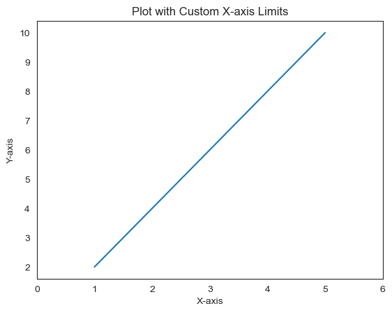
Example
In this example plt.xlim(0, 6) sets the x-axis limits from 0 to 6 by allowing the plot to display only the data within this range along the x-axis.
import matplotlib.pyplot as plt
# Sample data
x = [1, 2, 3, 4, 5]
y = [2, 4, 6, 8, 10]

# Creating a plot
plt.plot(x, y)

# Setting x-axis limits
plt.xlim(0, 6)  # Set x-axis limits from 0 to 6
plt.xlabel('X-axis')
plt.ylabel('Y-axis')
plt.title('Plot with Custom X-axis Limits')
plt.show()
Output
plt.ylim()
The plt.ylim() function in Matplotlib is used to set the limits for the y-axis in a plot. It allows us to specify the range of values that will be displayed along the y-axis.
plt.ylim() provides control over the range of values displayed along the y-axis in a Matplotlib plot enabling customization and focus on particular segments of the data or visualization.
Syntax
The below is the syntax and parameters for setting the axes limits for the y-axis.
plt.ylim(bottom, top)
Where,
bottom − The minimum value to be displayed on the y-axis.
top − The maximum value to be displayed on the y-axis.
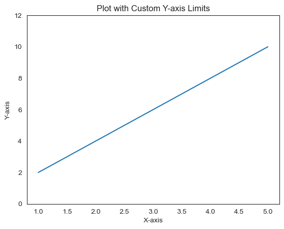
Example
In this example plt.ylim(0, 12) sets the y-axis limits from 0 to 12 by restricting the display of data along the y-axis within this range.
import matplotlib.pyplot as plt
# Sample data
x = [1, 2, 3, 4, 5]
y = [2, 4, 6, 8, 10]

# Creating a plot
plt.plot(x, y)

# Setting y-axis limits
plt.ylim(0, 12)  # Set y-axis limits from 0 to 12
plt.xlabel('X-axis')
plt.ylabel('Y-axis')
plt.title('Plot with Custom Y-axis Limits')
plt.show()
Output
ax.set_xlim()
The ax.set_xlim() function in Matplotlib is used to set the x-axis limits for a specific axis object ax. This method allows us to define the range of values displayed along the x-axis for a particular subplot or axis within a figure.
Syntax
Here is the syntax and parameters to set the axes limits using ax.set_xlim().
ax.set_xlim(left, right)
Where,
left − The minimum value to be displayed on the x-axis.
right − The maximum value to be displayed on the x-axis.
Example
In this example we are using the ax.set_xlim(0, 6) function to set the x-axis limits from 0 to 6 for the specific axis ax.
import matplotlib.pyplot as plt
# Sample data
x = [1, 2, 3, 4, 5]
y = [2, 4, 6, 8, 10]

# Creating a figure and axis
fig, ax = plt.subplots()

# Plotting data on the axis
ax.plot(x, y)

# Setting x-axis limits for the specific axis (ax)
ax.set_xlim(0, 6)  # Set x-axis limits from 0 to 6 for the axis 'ax'
ax.set_xlabel('X-axis')
ax.set_ylabel('Y-axis')
ax.set_title('Plot with Custom X-axis Limits')
plt.show()
Output

Use Cases for ax.set_xlim()
Subplot Customization − Setting different x-axis limits for individual subplots within a figure.
Focused Visualization − Emphasizing of specific x-axis ranges within a subplot to highlight patterns or trends.
ax.set_ylim()
The ax.set_ylim() function in Matplotlib is used to set the limits for the y-axis in a plot when working with an axis object ax. It allows us to specify the range of values that will be displayed along the y-axis on a specific subplot or axis.
ax.set_ylim() is useful for customizing the y-axis limits on specific subplots or axes when working with multiple plots within a figure in Matplotlib.
Syntax
The below is the syntax and parameters of the ax.set_ylim() function available in matplotlib.
ax.set_ylim(bottom, top)
Where,
bottom − The minimum value to be displayed on the y-axis.
top − The maximum value to be displayed on the y-axis.
Example
In this example ax.set_ylim(0, 12) sets the y-axis limits from 0 to 12 specifically for the subplot or axis ax. It restricts the display of data along the y-axis within this range for the specified subplot.
import matplotlib.pyplot as plt
# Sample data
x = [1, 2, 3, 4, 5]
y = [2, 4, 6, 8, 10]

# Creating subplots
fig, ax = plt.subplots()

# Plotting on the axis
ax.plot(x, y)

# Setting y-axis limits using axis object
ax.set_ylim(0, 12)  # Set y-axis limits from 0 to 12
ax.set_xlabel('X-axis')
ax.set_ylabel('Y-axis')
ax.set_title('Plot with Custom Y-axis Limits')
plt.show()
Output

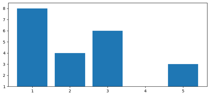
Automatically setting Y-axis limits for a bar graph
In this example to set Y-axis limit, we can use ylim() method and put maximum and minimum limit values.
from matplotlib import pyplot as plt
plt.rcParams["figure.figsize"] = [7.50, 3.50]
plt.rcParams["figure.autolayout"] = True
x = [1, 2, 3, 4, 5]
y = [8, 4, 6, 1, 3]
max_y_lim = max(y) + .5
min_y_lim = min(y)
plt.ylim(min_y_lim, max_y_lim)
plt.bar(x, y)
plt.show()
Output
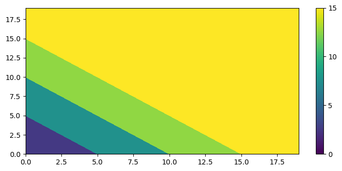
Setting the limits on a colorbar of a contour plot
Here in this example we are setting the limits on a colorbar of a contour plot using the contourf() funtcion.
from matplotlib import pyplot as plt
import numpy as np
from matplotlib.cm import ScalarMappable
plt.rcParams["figure.figsize"] = [7.50, 3.50]
plt.rcParams["figure.autolayout"] = True
x = np.arange(20)
y = np.arange(20)
data = x[:, None] + y[None, :]
X, Y = np.meshgrid(x, y)
vmin = 0
vmax = 15
fig, ax = plt.subplots()
qcs = ax.contourf(
   X, Y, data,
   vmin=vmin, vmax=vmax
)
fig.colorbar(
   ScalarMappable(norm=qcs.norm, cmap=qcs.cmap),
   ticks=range(vmin, vmax+5, 5)
)
plt.show()
Output