- Matplotlib - Home
- Matplotlib - Introduction
- Matplotlib - Vs Seaborn
- Matplotlib - Environment Setup
- Matplotlib - Anaconda distribution
- Matplotlib - Jupyter Notebook
- Matplotlib - Pyplot API
- Matplotlib - Simple Plot
- Matplotlib - Saving Figures
- Matplotlib - Markers
- Matplotlib - Figures
- Matplotlib - Styles
- Matplotlib - Legends
- Matplotlib - Colors
- Matplotlib - Colormaps
- Matplotlib - Colormap Normalization
- Matplotlib - Choosing Colormaps
- Matplotlib - Colorbars
- Matplotlib - Working With Text
- Matplotlib - Text properties
- Matplotlib - Subplot Titles
- Matplotlib - Images
- Matplotlib - Image Masking
- Matplotlib - Annotations
- Matplotlib - Arrows
- Matplotlib - Fonts
- Matplotlib - Font Indexing
- Matplotlib - Font Properties
- Matplotlib - Scales
- Matplotlib - LaTeX
- Matplotlib - LaTeX Text Formatting in Annotations
- Matplotlib - PostScript
- Matplotlib - Mathematical Expressions
- Matplotlib - Animations
- Matplotlib - Celluloid Library
- Matplotlib - Blitting
- Matplotlib - Toolkits
- Matplotlib - Artists
- Matplotlib - Styling with Cycler
- Matplotlib - Paths
- Matplotlib - Path Effects
- Matplotlib - Transforms
- Matplotlib - Ticks and Tick Labels
- Matplotlib - Radian Ticks
- Matplotlib - Dateticks
- Matplotlib - Tick Formatters
- Matplotlib - Tick Locators
- Matplotlib - Basic Units
- Matplotlib - Autoscaling
- Matplotlib - Reverse Axes
- Matplotlib - Logarithmic Axes
- Matplotlib - Symlog
- Matplotlib - Unit Handling
- Matplotlib - Ellipse with Units
- Matplotlib - Spines
- Matplotlib - Axis Ranges
- Matplotlib - Axis Scales
- Matplotlib - Axis Ticks
- Matplotlib - Formatting Axes
- Matplotlib - Axes Class
- Matplotlib - Twin Axes
- Matplotlib - Figure Class
- Matplotlib - Multiplots
- Matplotlib - Grids
- Matplotlib - Object-oriented Interface
- Matplotlib - PyLab module
- Matplotlib - Subplots() Function
- Matplotlib - Subplot2grid() Function
- Matplotlib - Anchored Artists
- Matplotlib - Manual Contour
- Matplotlib - Coords Report
- Matplotlib - AGG filter
- Matplotlib - Ribbon Box
- Matplotlib - Fill Spiral
- Matplotlib - Findobj Method
- Matplotlib - Hyperlinks
- Matplotlib - Image Thumbnail
- Matplotlib - Plotting with Keywords
- Matplotlib - Create Logo
- Matplotlib - Multipage PDF
- Matplotlib - Multiprocessing
- Matplotlib - Print Stdout
- Matplotlib - Compound Path
- Matplotlib - Sankey Class
- Matplotlib - MRI with EEG
- Matplotlib - Stylesheets
- Matplotlib - Background Colors
- Matplotlib - Basemap
Matplotlib Events
- Matplotlib - Event Handling
- Matplotlib - Close Event
- Matplotlib - Mouse Move
- Matplotlib - Click Events
- Matplotlib - Scroll Event
- Matplotlib - Keypress Event
- Matplotlib - Pick Event
- Matplotlib - Looking Glass
- Matplotlib - Path Editor
- Matplotlib - Poly Editor
- Matplotlib - Timers
- Matplotlib - Viewlims
- Matplotlib - Zoom Window
Matplotlib Widgets
- Matplotlib - Cursor Widget
- Matplotlib - Annotated Cursor
- Matplotlib - Button Widget
- Matplotlib - Check Buttons
- Matplotlib - Lasso Selector
- Matplotlib - Menu Widget
- Matplotlib - Mouse Cursor
- Matplotlib - Multicursor
- Matplotlib - Polygon Selector
- Matplotlib - Radio Buttons
- Matplotlib - RangeSlider
- Matplotlib - Rectangle Selector
- Matplotlib - Ellipse Selector
- Matplotlib - Slider Widget
- Matplotlib - Span Selector
- Matplotlib - Textbox
Matplotlib Plotting
- Matplotlib - Line Plots
- Matplotlib - Area Plots
- Matplotlib - Bar Graphs
- Matplotlib - Histogram
- Matplotlib - Pie Chart
- Matplotlib - Scatter Plot
- Matplotlib - Box Plot
- Matplotlib - Arrow Demo
- Matplotlib - Fancy Boxes
- Matplotlib - Zorder Demo
- Matplotlib - Hatch Demo
- Matplotlib - Mmh Donuts
- Matplotlib - Ellipse Demo
- Matplotlib - Bezier Curve
- Matplotlib - Bubble Plots
- Matplotlib - Stacked Plots
- Matplotlib - Table Charts
- Matplotlib - Polar Charts
- Matplotlib - Hexagonal bin Plots
- Matplotlib - Violin Plot
- Matplotlib - Event Plot
- Matplotlib - Heatmap
- Matplotlib - Stairs Plots
- Matplotlib - Errorbar
- Matplotlib - Hinton Diagram
- Matplotlib - Contour Plot
- Matplotlib - Wireframe Plots
- Matplotlib - Surface Plots
- Matplotlib - Triangulations
- Matplotlib - Stream plot
- Matplotlib - Ishikawa Diagram
- Matplotlib - 3D Plotting
- Matplotlib - 3D Lines
- Matplotlib - 3D Scatter Plots
- Matplotlib - 3D Contour Plot
- Matplotlib - 3D Bar Plots
- Matplotlib - 3D Wireframe Plot
- Matplotlib - 3D Surface Plot
- Matplotlib - 3D Vignettes
- Matplotlib - 3D Volumes
- Matplotlib - 3D Voxels
- Matplotlib - Time Plots and Signals
- Matplotlib - Filled Plots
- Matplotlib - Step Plots
- Matplotlib - XKCD Style
- Matplotlib - Quiver Plot
- Matplotlib - Stem Plots
- Matplotlib - Visualizing Vectors
- Matplotlib - Audio Visualization
- Matplotlib - Audio Processing
Matplotlib Useful Resources
- Matplotlib - Quick Guide
- Matplotlib - Cheatsheet
- Matplotlib - Useful Resources
- Matplotlib - Discussion
Matplotlib - Bar Graphs
A bar plot is a graphical representation of data where rectangular bars or columns are used to represent different categories. The height of each bar corresponds to the value it represents.
The horizontal axis (x-axis) typically represents the categories or groups being compared, while the vertical axis (y-axis) represents the values or quantities associated with each category. Each bar starts at the axis and extends horizontally or vertically, depending on the orientation of the graph.
Bar Graphs in Matplotlib
We can create a bar graph in Matplotlib using the bar() function. We can specify the categories or positions for the bars along with their corresponding heights. To customize the graph, we can use additional options like colors, labels, and titles.
The bar() Function
The bar() function is used to create bar graphs. It takes two main parameters: the positions of the bars on the x-axis and the heights of the bars.
Following is the syntax of bar() function in Matplotlib −
Syntax
plt.bar(x, height, width=0.8, align='center', color=None, label=None)
Where,
x is the positions of the bars on the x-axis.
height is the heights of the bars.
width (optional) is the width of the bars. Default is 0.8.
align (optional) is alignment of the bars. Default is 'center'.
color (optional) is the color of the bars. Default is None, which results in the default color.
label (optional is a label for the legend.
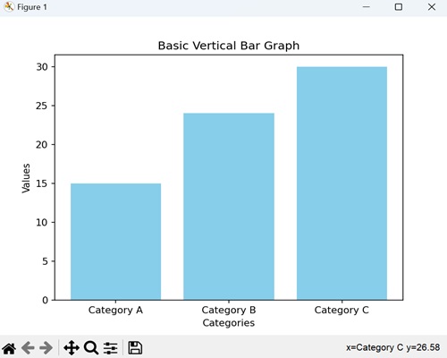
Let us start by drawing a basic vertical bar graph.
Example - Basic Vertical Bar Graph
In a basic vertical bar graph, we represent data where each bar or column corresponds to different categories, and we use the heights of these bars to indicate the values associated with that category.
In the following example, we have three categories ('Category A', 'Category B', 'Category C') with corresponding values (15, 24, 30). We are then using the plt.bar() function to create a vertical bar graph, where each bar represents the value of its respective category −
import matplotlib.pyplot as plt
categories = ['Category A', 'Category B', 'Category C']
values = [15, 24, 30]

plt.bar(categories, values, color='skyblue')
plt.xlabel('Categories')
plt.ylabel('Values')
plt.title('Basic Vertical Bar Graph')
plt.show()
Output
After executing the above code, we get the following output −
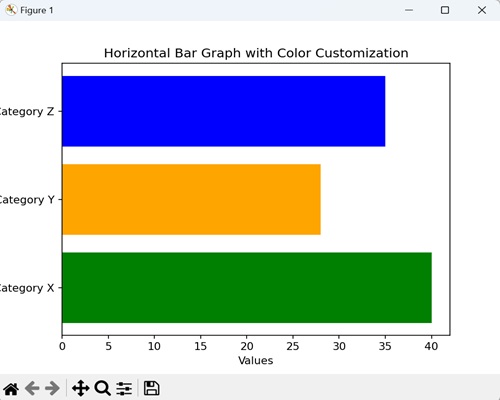
Example - Horizontal Bar Graph
In a horizontal bar graph, we represent data by plotting bars horizontally along a horizontal axis (x-axis). In this type of graph, we associate the lengths of the bars with the values they represent, and we display the categories along the vertical axis (y-axis).
In here, we are providing three categories ('Category X', 'Category Y', 'Category Z') with corresponding values (40, 28, 35). We are then using the barh() function to create a horizontal bar graph, where each bar extends horizontally based on its value. We are also customizing the color of each bar by passing the color argument to the function −
import matplotlib.pyplot as plt

categories = ['Category X', 'Category Y', 'Category Z']
values = [40, 28, 35]

plt.barh(categories, values, color=['green', 'orange', 'blue'])
plt.xlabel('Values')
plt.ylabel('Categories')
plt.title('Horizontal Bar Graph with Color Customization')
plt.show()
Output
Following is the output of the above code −
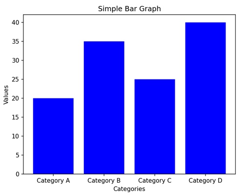
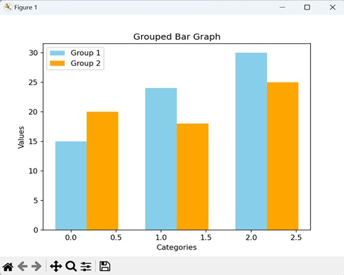
Example - Grouped Bar Graph
In a grouped bar graph, we stack multiple vertical bars next to each other for different categories. It is useful when you want to compare values for the same subcategories across different groups.
Now, we are providing three categories ('Category A', 'Category B', 'Category C') with values for two different groups (Group 1 and Group 2). We are then using the bar() function twice, once for each group, and positioning the bars side by side for each category −
import matplotlib.pyplot as plt
import numpy as np

# Defining categories and their corresponding values for two groups
categories = ['Category A', 'Category B', 'Category C']
values1 = [15, 24, 30]
values2 = [20, 18, 25]

# Setting the width of the bars
bar_width = 0.35
# Calculating bar positions for both groups
bar_positions1 = np.arange(len(categories))
bar_positions2 = bar_positions1 + bar_width

# Creating the first set of bars (Group 1)
plt.bar(bar_positions1, values1, width=bar_width, label='Group 1', color='skyblue')
# Create the second set of bars (Group 2) next to the first set
plt.bar(bar_positions2, values2, width=bar_width, label='Group 2', color='orange')

# Adding labels to the axes
plt.xlabel('Categories')
plt.ylabel('Values')

# Adding a title to the graph
plt.title('Grouped Bar Graph')

# Displaying a legend to identify the groups
plt.legend()

# Showing the plot
plt.show()
Output
On executing the above code we will get the following output −
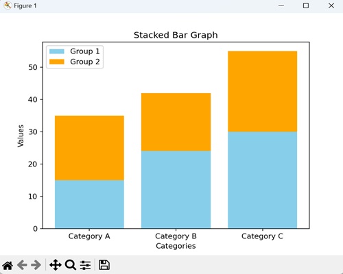
Example - Stacked Bar Graph
In a stacked bar graph, we put one bar on top of another. Each bar represents a category, and the height of the combined bars at each category shows the total value. It is useful for comparing the total values across categories.
In the example below, we have three categories ('Category A', 'Category B', 'Category C') with values for two different groups (Group 1 and Group 2). We are using the bar() function twice, but this time, the bars for Group 2 are stacked on top of the bars for Group 1. The bottom parameter called in the second bar() function indicates that Group 2 bars should start where Group 1 bars end −
import matplotlib.pyplot as plt
# Defining categories and values for two groups
categories = ['Category A', 'Category B', 'Category C']
values1 = [15, 24, 30]
values2 = [20, 18, 25]

# Creating the first set of bars (Group 1) without any offset
plt.bar(categories, values1, label='Group 1', color='skyblue')

# Creating the second set of bars (Group 2) plotted with 'bottom' set to the values of Group 1
# This makes Group 2 bars stacked on top of Group 1 bars
plt.bar(categories, values2, bottom=values1, label='Group 2', color='orange')

# Adding labels to the axes
plt.xlabel('Categories')
plt.ylabel('Values')

plt.title('Stacked Bar Graph')
plt.legend()
plt.show()
Output
On executing the above code we will get the following output −
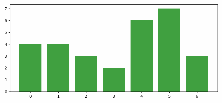
Example - Dynamically Updating a Bar Graph
In Matplotlib, dynamically updating a bar graph refers to the process of continuously changing or refreshing the data displayed in the bars of a bar graph in real-time.
This updating can occur based on external factors such as live data streams, user interactions, or changes in underlying data.
In the example below, we dynamically update a bar plot in Matplotlib. We begin by creating a new figure or activating an existing one. Next, we specify the data points and colors for plotting bars using the bar() method. Finally, we use the FuncAnimation() function to animate the bar heights and face colors −
import numpy as np
from matplotlib import animation as animation, pyplot as plt, cm

plt.rcParams["figure.figsize"] = [7.50, 3.50]
plt.rcParams["figure.autolayout"] = True

fig = plt.figure()

data = [1, 4, 3, 2, 6, 7, 3]
colors = ['red', 'yellow', 'blue', 'green', 'black']
bars = plt.bar(data, data, facecolor='green', alpha=0.75)

def animate(frame):
   global bars
   index = np.random.randint(1, 7)
   bars[frame].set_height(index)
   bars[frame].set_facecolor(colors[np.random.randint(0, len(colors))])

ani = animation.FuncAnimation(fig, animate, frames=len(data))

plt.show()
Output
The output obtained is as follows −