
Article Categories
- All Categories
-
 Data Structure
-
 Networking
-
 RDBMS
RDBMS
-
 Operating System
-
 Java
Java
-
 MS Excel
-
 iOS
iOS
-
 HTML
HTML
-
 CSS
CSS
-
 Android
-
 Python
-
 C Programming
-
 C++
C++
-
 C#
C#
-
 MongoDB
-
 MySQL
MySQL
-
 Javascript
-
 PHP
PHP
-
 Economics & Finance
Selected Reading
How to manually set the colors of density plot for categories in R?
To create density plot with manually setting the colors of categories, we can follow the below steps −
- Frist of all, create a data frame.
- Load ggplot2 package and creating the density plot for the categories.
- Create the density plot for the categories in the data frame by using scale_fill_manual function.
Create the data frame
Let's create a data frame as shown below −
categories<-sample(LETTERS[1:3],20,replace=TRUE)
DV<-sample(1:1000,20)
df<-data.frame(categories,DV)
df
On executing, the above script generates the below output(this output will vary on your system due to randomization) −
  categories DV
1  A         681
2  C         770
3  A         204
4  B         692
5  A         852
6  A         125
7  B         797
8  C         464
9  A         769
10 C         923
11 C         184
12 A         816
13 A         755
14 A         554
15 A         577
16 B         989
17 A         683
18 B         887
19 B         787
20 B       757
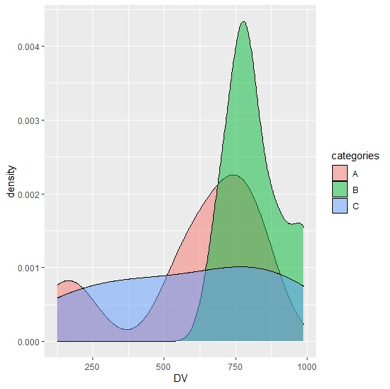
Load ggplot2 package and create density plot for categories
Use geom_density with fill function inside aes to create density plot for categories filled with different colors −
library(ggplot2)
categories<-sample(LETTERS[1:3],20,replace=TRUE)
DV<-sample(1:1000,20)
df<-data.frame(categories,DV)
ggplot(df,aes(DV))+geom_density(aes(fill=categories),alpha=0.5)
Output
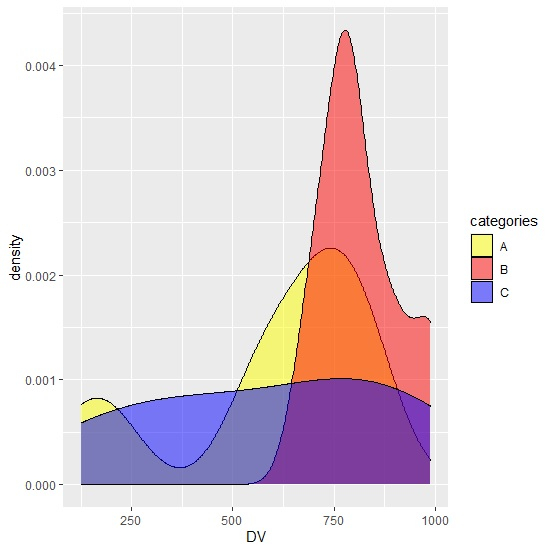
Create the density plot for categories by manually setting the colors
Use scale_fill_manual function of ggplot2 package to create the density plot with manually defining the colors of densities −
categories<-sample(LETTERS[1:3],20,replace=TRUE)
DV<-sample(1:1000,20)
df<-data.frame(categories,DV)
library(ggplot2)
ggplot(df,aes(DV))+geom_density(aes(fill=categories),alpha=0.5)+scale_fill_manual(val
ues=c("A"="yellow","B"="red","C"="blue"))
Output

Updated on: 2026-03-11T22:50:58+05:30
2K+ Views

Advertisements