
Article Categories
- All Categories
-
 Data Structure
-
 Networking
-
 RDBMS
RDBMS
-
 Operating System
-
 Java
Java
-
 MS Excel
-
 iOS
iOS
-
 HTML
HTML
-
 CSS
CSS
-
 Android
-
 Python
-
 C Programming
-
 C++
C++
-
 C#
C#
-
 MongoDB
-
 MySQL
MySQL
-
 Javascript
-
 PHP
PHP
-
 Economics & Finance
Selected Reading
How to create violin plot for categories with grey color palette using ggplot2 in R?
To create violin plot for categories with grey color palette using ggplot2, we can follow the below steps −
- First of all, create a data frame.
- Then, create the violin plot for categories with default color of violins.
- Create the violin plot for categories with color of violins in grey palette.
Creating the data frame
Let's create a data frame as shown below −
> Group<-sample(c("First","Second","Third"),25,replace=TRUE)
> Score<-sample(1:1000,25)
> df<-data.frame(Group,Score)
> df
On executing, the above script generates the below output(this output will vary on your system due to randomization) −
     Group  Score
1   Second   405
2    Third   947
3    First    78
4    First   243
5   Second    45
6   Second   682
7    First   608
8   Second   657
9    First   230
10   First   900
11  Second    99
12   First   937
13  Second   957
14   Third   962
15   First   668
16   Third   228
17  Second   398
18  Second   744
19   First   997
20  Second   612
21   First   706
22   First   958
23   First   446
24   Third   895
25   Third   396
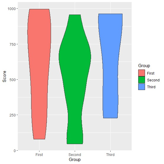
Creating violin plot with bars in default colors
Loading ggplot2 package and creating violin plot with default colors of violins −
> Group<-sample(c("First","Second","Third"),25,replace=TRUE)
> Score<-sample(1:1000,25)
> df<-data.frame(Group,Score)
> library(ggplot2)
> ggplot(df,aes(Group,Score,fill=Group))+geom_violin()
Output
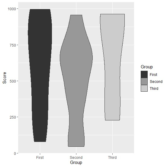
Creating violin plot with violins in grey color palette
Use scale_fill_grey to create the violin plot with violins in grey color palette −
> Group<-sample(c("First","Second","Third"),25,replace=TRUE)
> Score<-sample(1:1000,25)
> df<-data.frame(Group,Score)
> library(ggplot2)
> ggplot(df,aes(Group,Score,fill=Group))+geom_violin()+scale_fill_grey()
Output

Updated on: 2026-03-11T22:50:57+05:30
428 Views

Advertisements