
Article Categories
- All Categories
-
 Data Structure
-
 Networking
-
 RDBMS
RDBMS
-
 Operating System
-
 Java
Java
-
 MS Excel
-
 iOS
iOS
-
 HTML
HTML
-
 CSS
CSS
-
 Android
-
 Python
-
 C Programming
-
 C++
C++
-
 C#
C#
-
 MongoDB
-
 MySQL
MySQL
-
 Javascript
-
 PHP
PHP
-
 Economics & Finance
How To Display Leader Lines In Pie Chart In Excel?
Pie charts are a common and useful approach to show data distribution; however, it can occasionally be difficult to identify each data point precisely. Leader lines are helpful in situations like these. Leader lines make it simpler for readers to recognise and comprehend the values shown in the chart by linking the data labels to their appropriate data slices.
You will be guided step?by?step through the process of adding leader lines to your Excel pie chart in this tutorial. This tutorial will provide you with the knowledge and abilities you need to improve the clarity and visual attractiveness of your pie chart, regardless of whether you are making a report, a professional presentation, or simply visualising data for personal use.
Display Leader Lines In Pie Chart In Excel
Here we will first create a pie chart for the given data, then add data labels and drag them out to complete the task. So let us see a simple process to know how you can display leader lines in a pie chart in Excel.
Step 1
Consider an Excel sheet where the data in the sheet is similar to the below image.
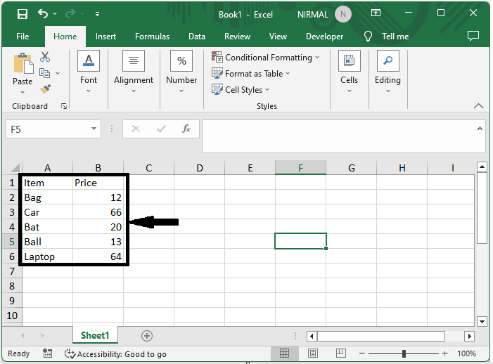
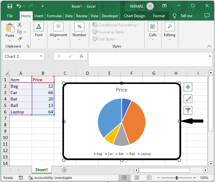
First, select the range of cells, then click on Insert and select Pie Chart to create a pie chart on the sheet.
Select cells > Insert > Chart.
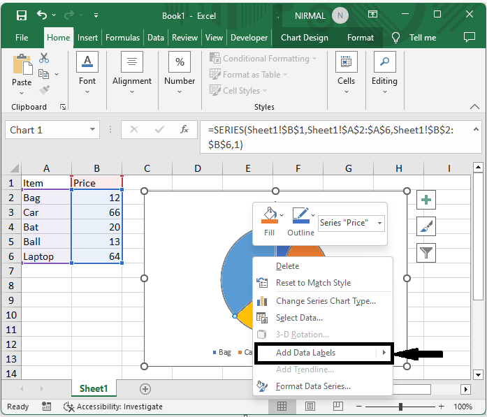
Step 2
Then right?click on the chart and select "Add Data Labels." Then we can see that the data labels will be added to the chart.
Right click > Data labels.
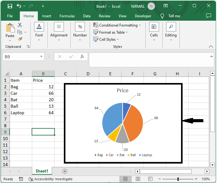
Step 3
Then drag the data labels outside of the chart to complete the task.
Conclusion
In this tutorial, we have used a simple example to demonstrate how you can display leader lines in a pie chart in Excel to highlight a particular set of data.

1K+ Views
