
Article Categories
- All Categories
-
 Data Structure
-
 Networking
-
 RDBMS
RDBMS
-
 Operating System
-
 Java
Java
-
 MS Excel
-
 iOS
iOS
-
 HTML
HTML
-
 CSS
CSS
-
 Android
-
 Python
-
 C Programming
-
 C++
C++
-
 C#
C#
-
 MongoDB
-
 MySQL
MySQL
-
 Javascript
-
 PHP
PHP
-
 Economics & Finance
How to Create a Pie Chart for YES or NO Answers in Excel
Pie charts are an effective visual tool that let you show facts in an easy-to-understand way. We will walk you through the steps of making a pie chart that is intended to display the distribution of YES and NO replies in this lesson. A pie chart can help you visually convey your findings whether working with survey results, voting data, or any other type of categorical data. You will be taught how to arrange your data, make a pie chart, alter its appearance, and clearly explain your observations by carefully following the offered step-by-step instructions.
For this tutorial, no prior Excel experience is necessary. Everything from preparing your data to creating your pie chart's final touches will be covered. So let's get started and discover how to use Excel to make an instructive and eye-catching pie chart that displays YES/NO answers!
Create A Pie Chart For YES/NO Answers
Here we will first count the number of yeses and noes, then create the chart to complete the task. So let us see a simple process to know how you can create a pie chart for YES/NO answers in Excel.
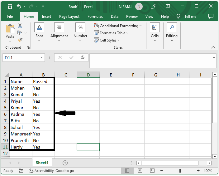
Step 1
Consider an Excel sheet where you have yes or no values, similar to the below image.
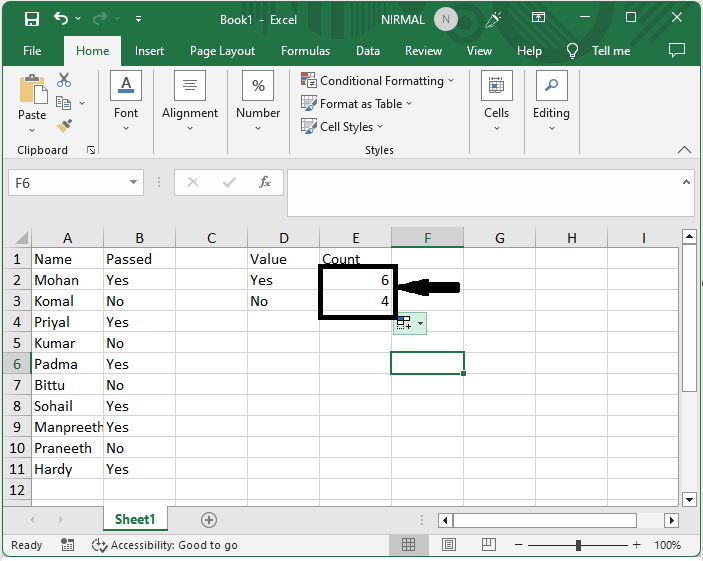
Step 2
First, click on an empty cell and enter the formula as =COUNTIF($B$2:$B$11,D2) and click Enter to get the first value. Then drag down using the autofill handle.
Empty cell > Formula > Enter > Drag.
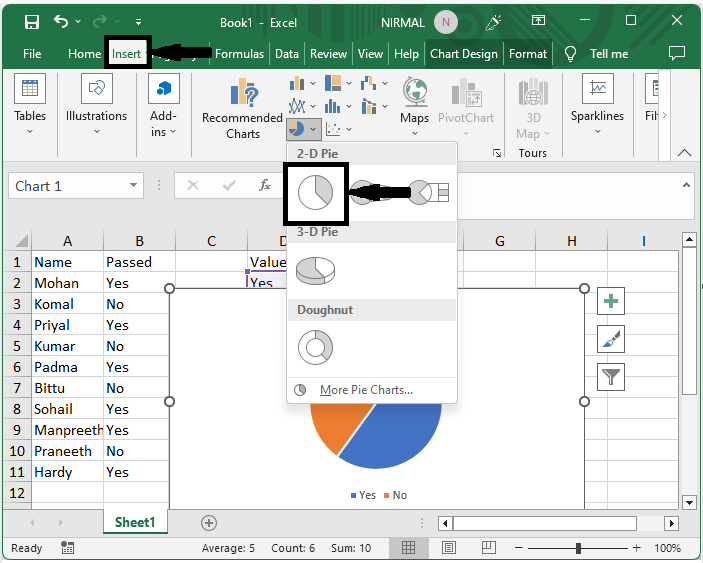
Step 3
Then select the range of cells, click on insert, and select pie chart.
Select cells > Insert > Pie Chart.
This is how you can create a pie chart for yes or no answers in Excel.
Conclusion
In this tutorial, we have used a simple example to demonstrate how you can create a pie chart for YES/NO answers in Excel to highlight a particular set of data.

10K+ Views
