
Article Categories
- All Categories
-
 Data Structure
-
 Networking
-
 RDBMS
RDBMS
-
 Operating System
-
 Java
Java
-
 MS Excel
-
 iOS
iOS
-
 HTML
HTML
-
 CSS
CSS
-
 Android
-
 Python
-
 C Programming
-
 C++
C++
-
 C#
C#
-
 MongoDB
-
 MySQL
MySQL
-
 Javascript
-
 PHP
PHP
-
 Economics & Finance
How to Create a Bar Chart from Yes No Cells in Excel?
Often used to depict categorical data, bar charts are an effective tool for data visualisation. In this tutorial, we'll walk you through the steps of making a bar chart that's specifically made to show Yes/No data. We will show you how to convert your Yes/No cells into a visually pleasing bar chart that clearly conveys your data using Excel's built-in features. Whether you want to track survey results, analyse voting patterns, or display any other binary information, this tutorial will equip you with the knowledge and skills to present your findings in a clear and engaging manner.
For this course, no prior knowledge of Excel or data visualisation is necessary. To make sure you can easily follow along, we will provide comprehensive instructions that are complemented by screenshots. By the end of this session, you will be capable of producing bar charts from Yes/No cells with assurance, enabling you to present your data in an engaging manner. Let's get started and explore the world of Excel charts by learning how to convert your Yes/No cells into aesthetically stunning and useful bar charts!
Create a Bar Chart from Yes No Cells
Here we will first make changes to the data and then create a Bar chart. So let us see a simple process to know how you can create a bar chart from yes/no cells in Excel.
Step 1
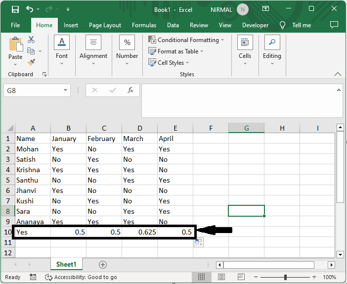
Consider an Excel sheet where the data you have yes and no values in one column.
First, click on an empty cell, in this case cell A12, and enter the formula as =COUNTIF(B2:B9,"YES")/COUNTA(B2:B9) and click Enter. Then drag right using the autofill handle.
Empty Cell > Formula > Enter.
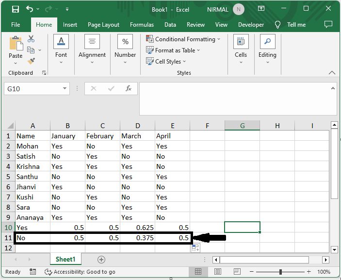
Step 2
Again, click on an empty cell, in this case A13, and enter the formula as =COUNTIF(B2:B15,"NO")/COUNTA(B2:B15) and click enter. Then drag right using the autofill handle.
Empty Cell > Formula > Enter.
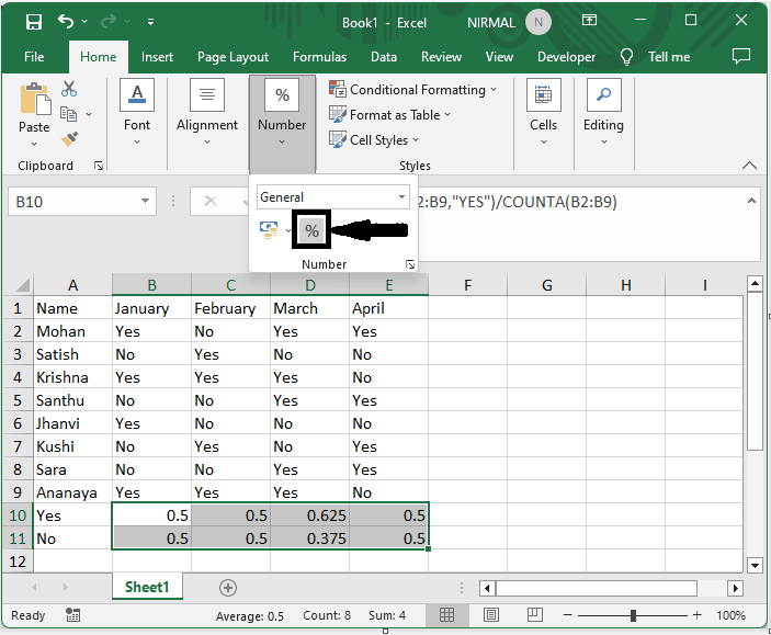
Step 3
Then select the range of cells, then click on percentage under Home.
Select cells > Home > Percentage.
Step 4
Again, select the range of cells, then click on insert and select bar chart.
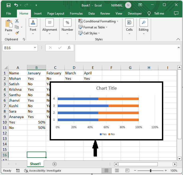
This is how you can create a bar chart from yes or no cells in Excel.
Conclusion
In this tutorial, we have used a simple example to demonstrate how you can create a bar chart from yes/no cells in Excel to highlight a particular set of data.

6K+ Views
