- Excel Charts - Home
- Excel Charts - Introduction
- Excel Charts - Creating Charts
- Excel Charts - Types
- Excel Charts - Column Chart
- Excel Charts - Line Chart
- Excel Charts - Pie Chart
- Excel Charts - Doughnut Chart
- Excel Charts - Bar Chart
- Excel Charts - Area Chart
- Excel Charts - Scatter (X Y) Chart
- Excel Charts - Bubble Chart
- Excel Charts - Stock Chart
- Excel Charts - Surface Chart
- Excel Charts - Radar Chart
- Excel Charts - Combo Chart
- Excel Charts - Chart Elements
- Excel Charts - Chart Styles
- Excel Charts - Chart Filters
- Excel Charts - Fine Tuning
- Excel Charts - Design Tools
- Excel Charts - Quick Formatting
- Excel Charts - Aesthetic Data Labels
- Excel Charts - Format Tools
- Excel Charts - Sparklines
- Excel Charts - PivotCharts
Excel Charts - Chart Styles
You can use Chart Styles to customize the look of the chart. You can set a style and color scheme for your chart with the help of this tool.
Follow the steps given below to add style and color to your chart.
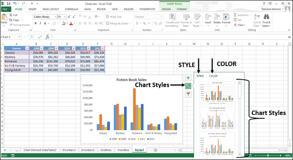
Step 1 − Click on the chart. Three buttons appear at the upper-right corner of the chart.
Step 2 − Click the  Chart Styles icon. STYLE and COLOR will be displayed.
Style
You can use STYLE to fine tune the look and style of your chart.
Step 1 − Click STYLE. Different style options will be displayed.
Step 2 − Scroll down the options. Point to any of the options to see the preview of your chart with the currently selected style.
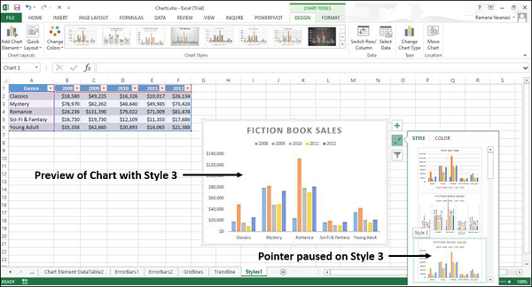
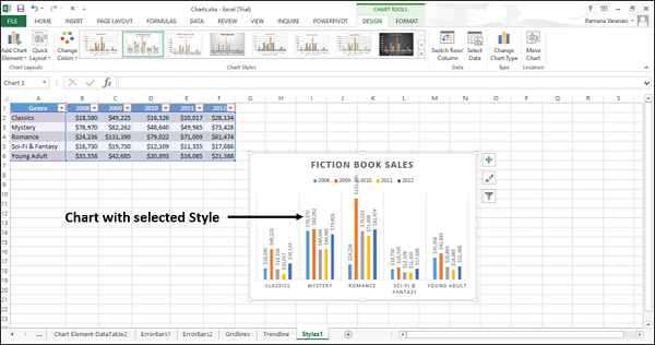
Step 3 − Choose the style option you want. The chart will be displayed with the selected style.
Color
You can use the COLOR options to select the color scheme for your chart.
Step 1 − Click COLOR. Different color scheme will be displayed.
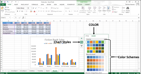
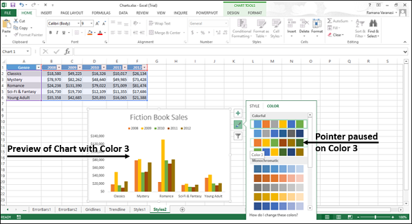
Step 2 − Scroll down the options. Point on any of the options to see the preview of your chart with the currently selected color scheme.
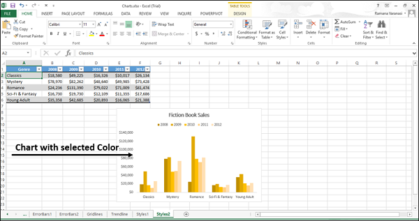
Step 3 − Choose the color option you want. The chart will be displayed with the selected color.
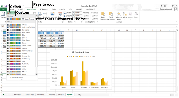
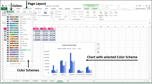
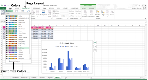
You can change the color schemes through the Page Layout tab also.
Step 1 − On the Page Layout tab, in the Themes group, click the Colors button on the Ribbon.
Step 2 − Select any color scheme of your choice from the list.
You can also customize the colors and have your own color scheme.
Step 1 − Click the option Customize Colors
A new window Create New Theme Colors appears. Let us take an example.
Step 2 − Click the drop-down arrow to see more options.
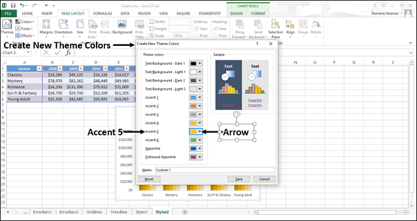
A small window - Theme Colors appear.
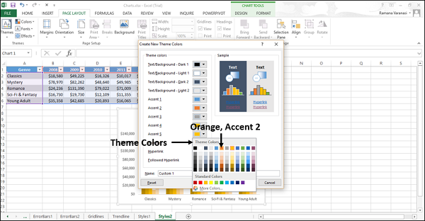
Step 3 − Click Orange Accent 2 as shown in the following screen shot.
Step 4 − Give a name to your color scheme. Click Save.
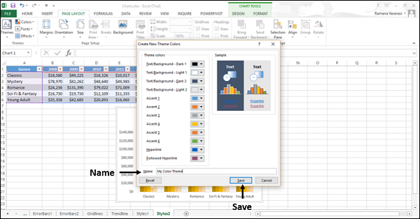
Your customized theme appears under Custom in the Colors menu, on the Page Layout tab on the ribbon.