
Article Categories
- All Categories
-
 Data Structure
-
 Networking
-
 RDBMS
RDBMS
-
 Operating System
-
 Java
Java
-
 MS Excel
-
 iOS
iOS
-
 HTML
HTML
-
 CSS
CSS
-
 Android
-
 Python
-
 C Programming
-
 C++
C++
-
 C#
C#
-
 MongoDB
-
 MySQL
MySQL
-
 Javascript
-
 PHP
PHP
Conditional formatting stacked bar chart in Excel
When working with charts, there will be instances when you wish to emphasise objects in a certain way depending on whether they are positive or negative, or if they are above or below a benchmark or an average. Even while conditional formatting may be applied to cells, it is not as simple to apply the same style to a bar chart as it is to individual cells. There is no easy way to accomplish this that does not involve some sort of manual labour. On the other hand, the best part is that there is a way around this problem.
In this tutorial, we are going to learn how use conditional formatting for stacked bar chart in excel.
Conditional formatting Stacked bar chart
Conditional formatting in an Excel worksheet can be applied with only a moderate amount of effort. It can be found under the Home tab of the Excel ribbon and is an integral part of the Excel ribbon. Let?s see the following example to use conditional formatting in stacked bar chart.
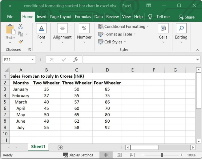
Step 1
In our Excel sheet, we have the sales sheet of two-wheeler, three-wheeler and four-wheeler of a company from the month of January to July. See the following image.
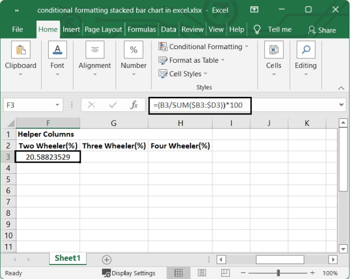
Step 2
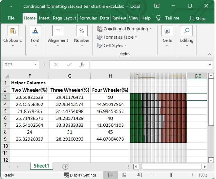
First, we will need to create some helper columns. A helper column in Excel is an additional column introduced to the data set for the sole purpose of making certain computations or analyses more simple. In Excel sheets, the usage of a "helper column" is common practice for simplifying complicated formulas.
We need to figure out the percentage of each product carried in each month. Choose a cell next to your data and type the following formula in it. In our example we have selected F3 and we want the calculations for B3 cell.
=(B3/SUM($B3:$D3))*100
After typing the above formula, press Enter.
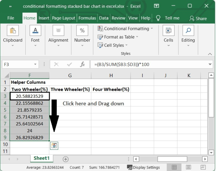
Step 3
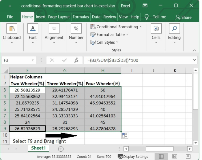
Drag the AutoFill handle over all of the cells to figure out what each value is as a percentage.
Step 4
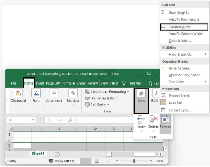
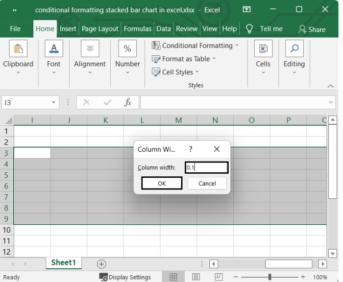
Now start the process of building the stacked bar using conditional formatting. Select 100 column ranges adjacent to the cells containing the formula. In our example we have selected from I3 to DD. Then click "Home > Format > Column Width". Set the column width to "0.1," then click "OK."
Step 5
Keep the columns selected and go to Home > Conditional Formatting > New Rule.
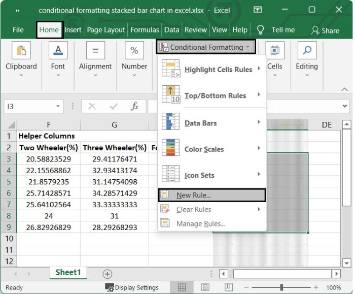
Step 6
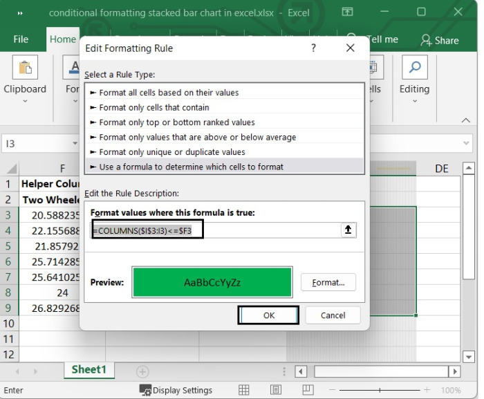
In the New Formatting Rule dialogue, under Select a Rule Type, choose Use a formula to decide which cells to format. Then, in the Format values where this formula is true text box, type the following formula.
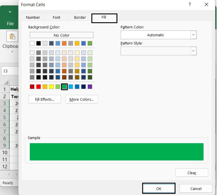
=COLUMNS($I$3:I3)<=$F3
The above formula is applied according to our example. You can change the cell value according to your need.
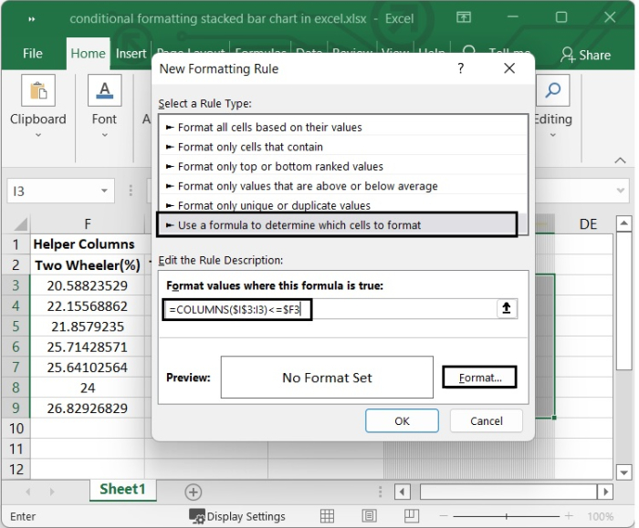
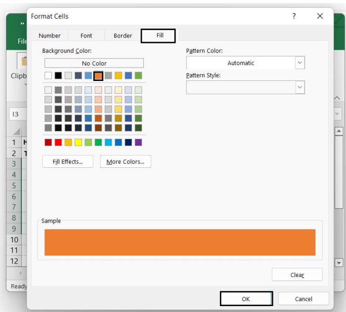
Then click Format to bring up the Format Cells dialogue box. Under the Fill tab, choose a colour. To close the window, click OK.
Step 7
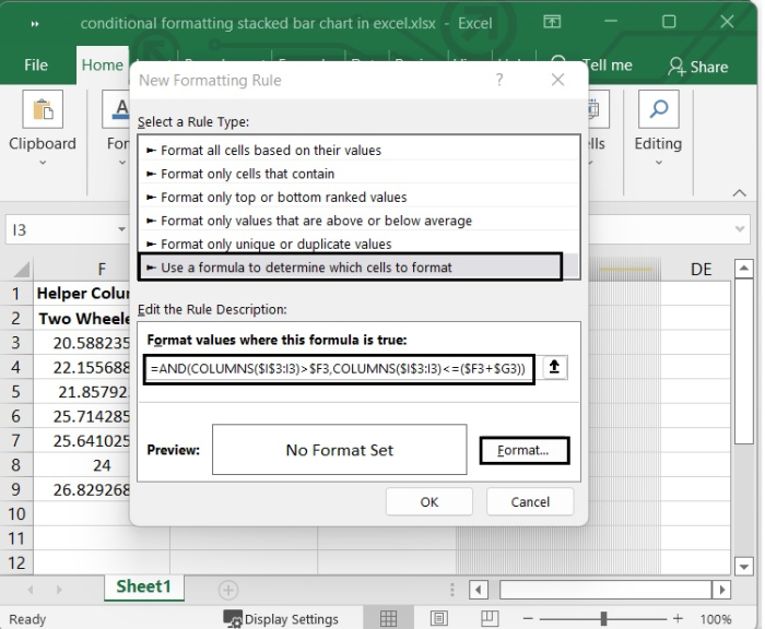
In the New Formatting Rule dialogue, under Select a Rule Type, choose Use a formula to decide which cells to format.Then, in the Format values where this formula is true text box, type the following formula.
=AND(COLUMNS($I$3:I3)>$F3,COLUMNS($I$3:I3)<=($F3+$G3))
Then Click Format to bring up the Format Cells dialogue box. Under the Fill tab, choose a colour. To close the window, click OK.
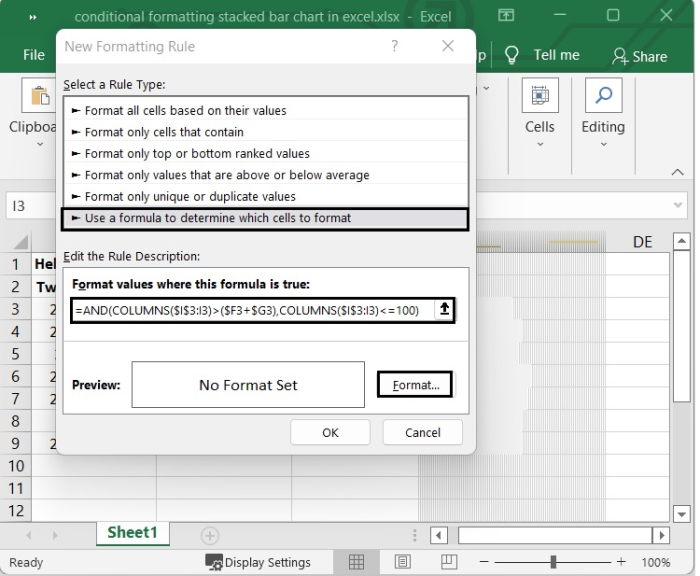
Step 8
Lastly, use conditional formatting for the third time.
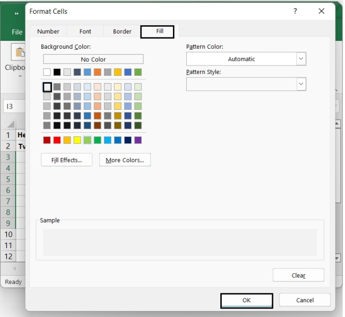
New Formatting Rule dialogue > Select a Rule > Use a formula to decide which cells to format. Then, in the Format values where this formula is true text box, type the following formula.
=AND(COLUMNS($I$3:I3)>($F3+$G3),COLUMNS($I$3:I3)<=100)
Then in the Format Cells dialog, under Fill tab, select one colour. To close the window, click OK > OK. See the below given image.
That?s it. Now after closing the window, you can see the stacked bar chart. We have added borders to it from "Home > Borders" to give a nice look to it. See the following image.

1K+ Views
