
Article Categories
- All Categories
-
 Data Structure
-
 Networking
-
 RDBMS
RDBMS
-
 Operating System
-
 Java
Java
-
 MS Excel
-
 iOS
iOS
-
 HTML
HTML
-
 CSS
CSS
-
 Android
-
 Python
-
 C Programming
-
 C++
C++
-
 C#
C#
-
 MongoDB
-
 MySQL
MySQL
-
 Javascript
-
 PHP
PHP
-
 Economics & Finance
How to Create a Chart with Both Percentage and Value in Excel?
Charts are great tools for properly visualising data and communicating ideas. It's frequently helpful to include both the actual values and their related percentages in a chart when presenting statistics. With this combination, you can give a thorough overview of your data, which makes it simpler for your audience to comprehend and evaluate the facts.
In this tutorial, we will explore step-by-step instructions on how to create a chart in Excel that displays both the values and percentages. Whether you're preparing a business presentation, analysing survey results, or creating a report, this tutorial will equip you with the knowledge to create visually appealing and informative charts in Excel. So, let's dive in and discover the techniques and tools you need to create charts that showcase both the values and percentages in Excel!
Create a Chart with Both Percentage and Value
Here we will first create a column chart, then add two helper columns, then add the helper data to the chart, and finally format the chart to complete the task. So let us see a simple process to learn how you can create a chart with both percentage and value in Excel.
Step 1
Consider an Excel sheet where the data in the sheet is similar to the below image.
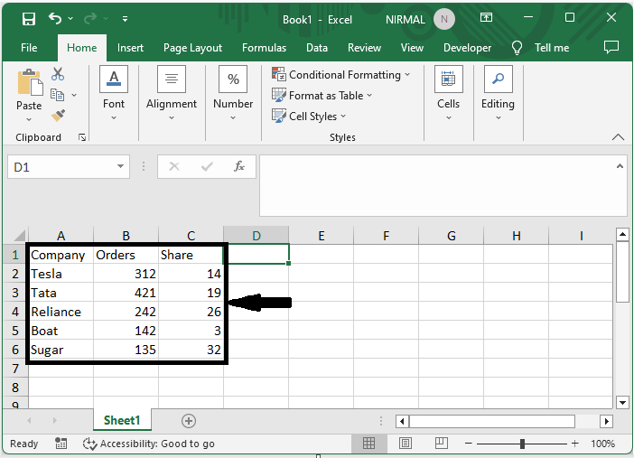
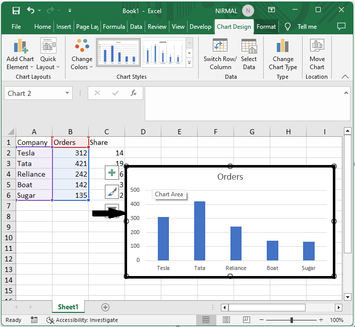
First, select the range of cells, then click on insert and select column chart.
Select Cells > Insert > Chart.
Step 2
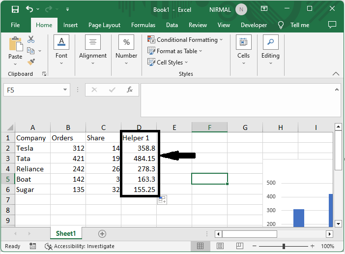
Then click on an empty cell and enter the formula as =B2*1.15, then click enter. Then drag down using the autofill handle.
Empty Cell > Formula > Enter > Drag.
Step 3
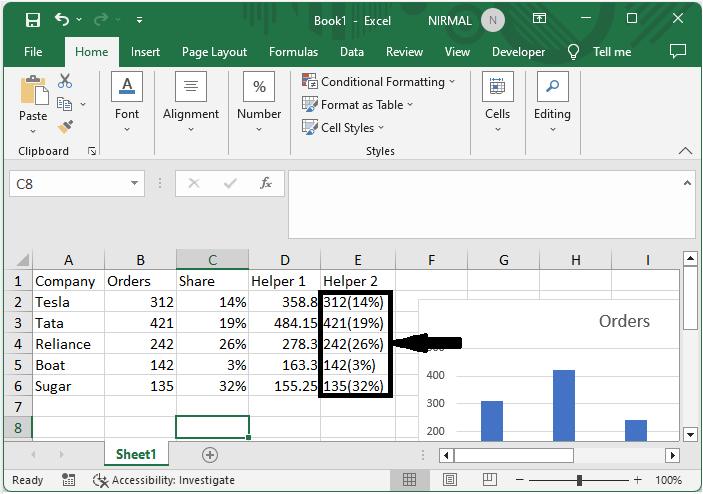
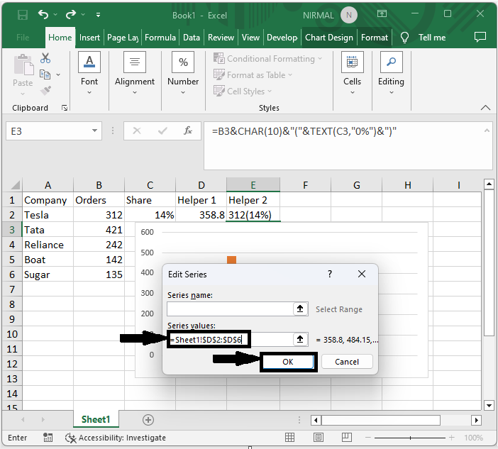
Then again, click on an empty cell and enter the formula as =B2&CHAR(10)&"("&TEXT(C2,"0%")&")", then click enter and drag down using the auto fill handle.
Empty Cell > Formula > Enter > Drag.
Step 4
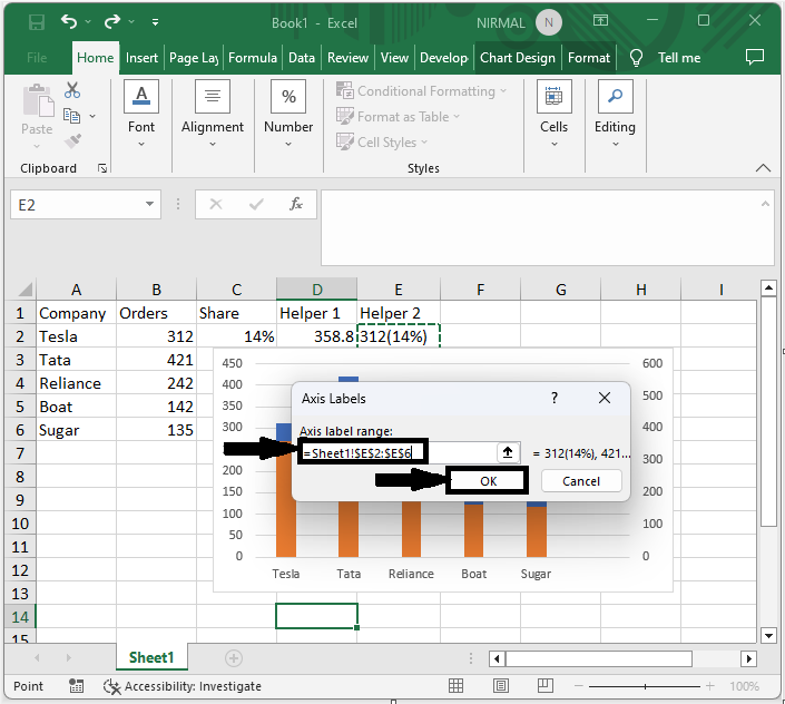
Now right-click on the chart and click on Select Data. Then click on add under legend entries, select helper1 values in the series values, and click OK.
Right-click > Select Data > Add > Series Values > Ok.
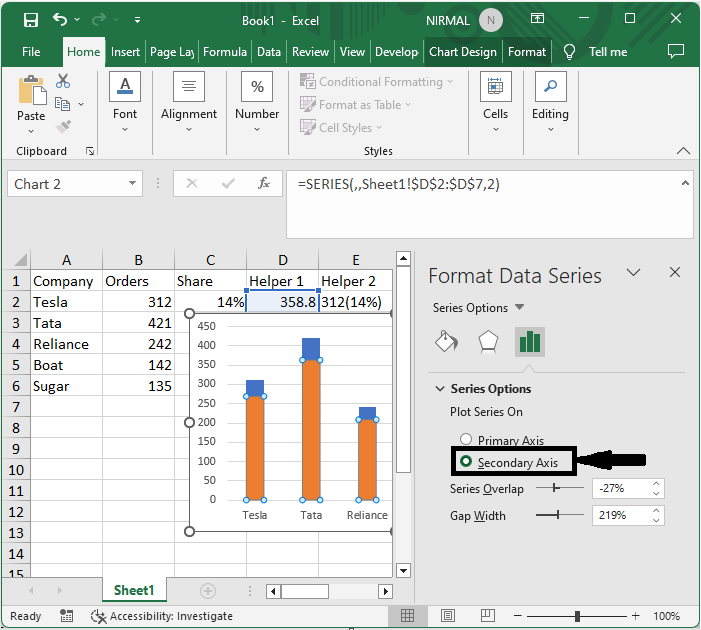
Step 5
Then right-click on new series and select format series. Then click on the secondary axis.
Right-click > Format Series > Secondary Axis.
Step 6
Then right-click on the chart and click on Select Data, then click on Series 2, and click on Edit. Then select the helper 2 values for the series values and click OK.
Right-click > Select Data > Edit > Series Values > Ok.
Step 7
Then right-click on the chart and select Data Labels.
Right-click > Add Data Labels.
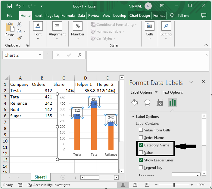
Step 8
Then right-click on the bar and select Format Data Labels. Then uncheck the box named Values and check Category Name.
Right-click > Format Data Labels > Uncheck > Check.
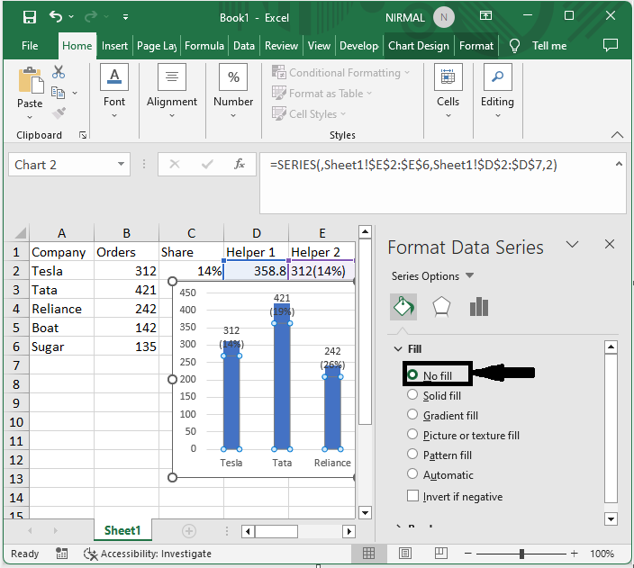
Step 9
Then right-click on the series and select format series. Then change the fill to no fill.
Right-click > Format Series > No Fill.
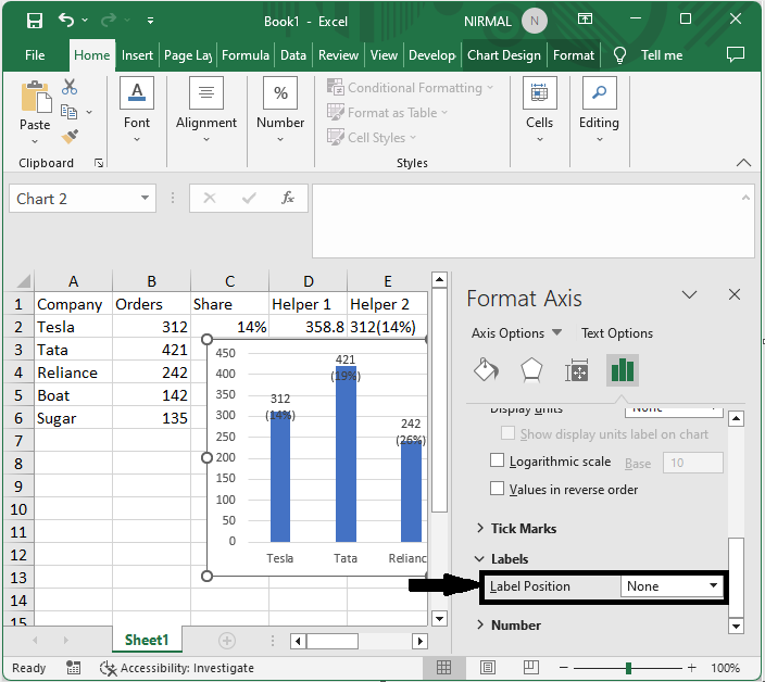
Step 10
Finally, right-click on the secondary axis and select format axis then set the label position to none.
Right-click > Label Position.
Conclusion
In this tutorial, we have used a simple example to demonstrate how you can create a chart with both percentage and value in Excel to highlight a particular set of data.

2K+ Views
