
Article Categories
- All Categories
-
 Data Structure
-
 Networking
-
 RDBMS
RDBMS
-
 Operating System
-
 Java
Java
-
 MS Excel
-
 iOS
iOS
-
 HTML
HTML
-
 CSS
CSS
-
 Android
-
 Python
-
 C Programming
-
 C++
C++
-
 C#
C#
-
 MongoDB
-
 MySQL
MySQL
-
 Javascript
-
 PHP
PHP
-
 Economics & Finance
How To Create A Heat Map With Conditional Formatting In Excel?
Heat maps are an excellent tool for visualizing large data sets, making patterns and trends easy to identify. In Excel, creating a heat map with conditional formatting can be a straightforward process that can greatly enhance your ability to analyze and understand your data. Conditional formatting is a powerful feature in Excel that allows you to apply formatting to cells based on their values, making it ideal for creating heat maps.
In this tutorial, you will learn how to create a heat map with conditional formatting in Excel step-by-step, including choosing the right data, selecting the appropriate colors and formatting, and customizing the visualization to suit your needs. Whether you're a business analyst, a student, or simply an Excel user looking to improve your data analysis skills, this tutorial will give you the tools and knowledge to create stunning and informative heat maps in Excel.
Create A Heat Map With Conditional Formatting
Here we can complete the task directly using the conditional formatting. So let us see a simple process to know how you can create a heat map with conditional formatting in Excel.
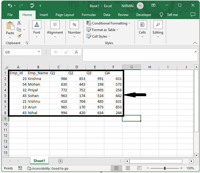
Consider an Excel sheet where you have data in a table format similar to the below image.
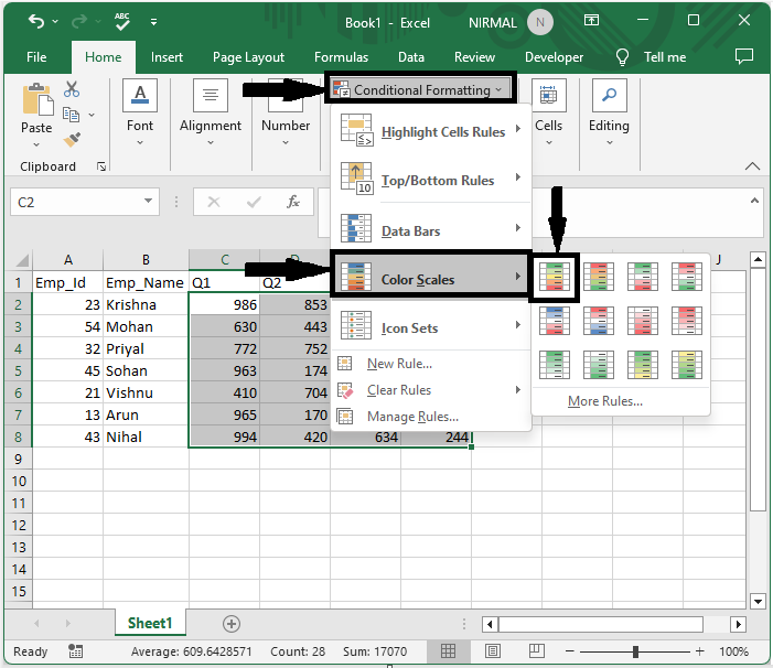
Now select the range of cells, then click on conditional formatting and select colour scales, and select any one of the types to complete the task.
Select cell > Conditional formatting > Colour scales.
This is how we can create a heat map with conditional formatting in Excel. You can also format the colours of the cells by editing the rules.
Conclusion
In this tutorial, we have used a simple example to demonstrate how you can create a heat map with conditional formatting in Excel to highlight a particular set of data.

299 Views
