- Matplotlib - Home
- Matplotlib - Introduction
- Matplotlib - Vs Seaborn
- Matplotlib - Environment Setup
- Matplotlib - Anaconda distribution
- Matplotlib - Jupyter Notebook
- Matplotlib - Pyplot API
- Matplotlib - Simple Plot
- Matplotlib - Saving Figures
- Matplotlib - Markers
- Matplotlib - Figures
- Matplotlib - Styles
- Matplotlib - Legends
- Matplotlib - Colors
- Matplotlib - Colormaps
- Matplotlib - Colormap Normalization
- Matplotlib - Choosing Colormaps
- Matplotlib - Colorbars
- Matplotlib - Working With Text
- Matplotlib - Text properties
- Matplotlib - Subplot Titles
- Matplotlib - Images
- Matplotlib - Image Masking
- Matplotlib - Annotations
- Matplotlib - Arrows
- Matplotlib - Fonts
- Matplotlib - Font Indexing
- Matplotlib - Font Properties
- Matplotlib - Scales
- Matplotlib - LaTeX
- Matplotlib - LaTeX Text Formatting in Annotations
- Matplotlib - PostScript
- Matplotlib - Mathematical Expressions
- Matplotlib - Animations
- Matplotlib - Celluloid Library
- Matplotlib - Blitting
- Matplotlib - Toolkits
- Matplotlib - Artists
- Matplotlib - Styling with Cycler
- Matplotlib - Paths
- Matplotlib - Path Effects
- Matplotlib - Transforms
- Matplotlib - Ticks and Tick Labels
- Matplotlib - Radian Ticks
- Matplotlib - Dateticks
- Matplotlib - Tick Formatters
- Matplotlib - Tick Locators
- Matplotlib - Basic Units
- Matplotlib - Autoscaling
- Matplotlib - Reverse Axes
- Matplotlib - Logarithmic Axes
- Matplotlib - Symlog
- Matplotlib - Unit Handling
- Matplotlib - Ellipse with Units
- Matplotlib - Spines
- Matplotlib - Axis Ranges
- Matplotlib - Axis Scales
- Matplotlib - Axis Ticks
- Matplotlib - Formatting Axes
- Matplotlib - Axes Class
- Matplotlib - Twin Axes
- Matplotlib - Figure Class
- Matplotlib - Multiplots
- Matplotlib - Grids
- Matplotlib - Object-oriented Interface
- Matplotlib - PyLab module
- Matplotlib - Subplots() Function
- Matplotlib - Subplot2grid() Function
- Matplotlib - Anchored Artists
- Matplotlib - Manual Contour
- Matplotlib - Coords Report
- Matplotlib - AGG filter
- Matplotlib - Ribbon Box
- Matplotlib - Fill Spiral
- Matplotlib - Findobj Method
- Matplotlib - Hyperlinks
- Matplotlib - Image Thumbnail
- Matplotlib - Plotting with Keywords
- Matplotlib - Create Logo
- Matplotlib - Multipage PDF
- Matplotlib - Multiprocessing
- Matplotlib - Print Stdout
- Matplotlib - Compound Path
- Matplotlib - Sankey Class
- Matplotlib - MRI with EEG
- Matplotlib - Stylesheets
- Matplotlib - Background Colors
- Matplotlib - Basemap
Matplotlib Events
- Matplotlib - Event Handling
- Matplotlib - Close Event
- Matplotlib - Mouse Move
- Matplotlib - Click Events
- Matplotlib - Scroll Event
- Matplotlib - Keypress Event
- Matplotlib - Pick Event
- Matplotlib - Looking Glass
- Matplotlib - Path Editor
- Matplotlib - Poly Editor
- Matplotlib - Timers
- Matplotlib - Viewlims
- Matplotlib - Zoom Window
Matplotlib Widgets
- Matplotlib - Cursor Widget
- Matplotlib - Annotated Cursor
- Matplotlib - Button Widget
- Matplotlib - Check Buttons
- Matplotlib - Lasso Selector
- Matplotlib - Menu Widget
- Matplotlib - Mouse Cursor
- Matplotlib - Multicursor
- Matplotlib - Polygon Selector
- Matplotlib - Radio Buttons
- Matplotlib - RangeSlider
- Matplotlib - Rectangle Selector
- Matplotlib - Ellipse Selector
- Matplotlib - Slider Widget
- Matplotlib - Span Selector
- Matplotlib - Textbox
Matplotlib Plotting
- Matplotlib - Line Plots
- Matplotlib - Area Plots
- Matplotlib - Bar Graphs
- Matplotlib - Histogram
- Matplotlib - Pie Chart
- Matplotlib - Scatter Plot
- Matplotlib - Box Plot
- Matplotlib - Arrow Demo
- Matplotlib - Fancy Boxes
- Matplotlib - Zorder Demo
- Matplotlib - Hatch Demo
- Matplotlib - Mmh Donuts
- Matplotlib - Ellipse Demo
- Matplotlib - Bezier Curve
- Matplotlib - Bubble Plots
- Matplotlib - Stacked Plots
- Matplotlib - Table Charts
- Matplotlib - Polar Charts
- Matplotlib - Hexagonal bin Plots
- Matplotlib - Violin Plot
- Matplotlib - Event Plot
- Matplotlib - Heatmap
- Matplotlib - Stairs Plots
- Matplotlib - Errorbar
- Matplotlib - Hinton Diagram
- Matplotlib - Contour Plot
- Matplotlib - Wireframe Plots
- Matplotlib - Surface Plots
- Matplotlib - Triangulations
- Matplotlib - Stream plot
- Matplotlib - Ishikawa Diagram
- Matplotlib - 3D Plotting
- Matplotlib - 3D Lines
- Matplotlib - 3D Scatter Plots
- Matplotlib - 3D Contour Plot
- Matplotlib - 3D Bar Plots
- Matplotlib - 3D Wireframe Plot
- Matplotlib - 3D Surface Plot
- Matplotlib - 3D Vignettes
- Matplotlib - 3D Volumes
- Matplotlib - 3D Voxels
- Matplotlib - Time Plots and Signals
- Matplotlib - Filled Plots
- Matplotlib - Step Plots
- Matplotlib - XKCD Style
- Matplotlib - Quiver Plot
- Matplotlib - Stem Plots
- Matplotlib - Visualizing Vectors
- Matplotlib - Audio Visualization
- Matplotlib - Audio Processing
Matplotlib Useful Resources
- Matplotlib - Quick Guide
- Matplotlib - Cheatsheet
- Matplotlib - Useful Resources
- Matplotlib - Discussion
Matplotlib - Colors
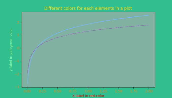
Matplotlib provides several options for managing colors in plots, allowing users to enhance the visual appeal and convey information effectively.
Colors can be set for different elements in a plot, such as lines, markers, and fill areas. For instance, when plotting data, the color parameter can be used to specify the line color. Similarly, scatter plots allow setting colors for individual points. The image below illustrates the colors for the different elements in a plot −
Color Representation Formats in Matplotlib
Matplotlib supports various formats for representing colors, which include −
RGB or RGBA Tuple
Hex RGB or RGBA String
Gray Level String
"Cn" Color Spec
Named colors
Below are the brief discussions about each format with an appropriate example.
The RGB or RGBA Tuple format
You can use the tuple of float values in the range between [0, 1] to represent Red, Green, Blue, and Alpha (transparency) values. like: (0.1, 0.2, 0.5) or (0.1, 0.2, 0.5, 0.3).
Example - Usage of RGB tuple
The following example demonstrates how to specify the face color of a plot using the RGB or RGBA tuple.
import matplotlib.pyplot as plt
import numpy as np

# sample data
t = np.linspace(0.0, 2.0, 201)
s = np.sin(2 * np.pi * t)

# RGB tuple for specifying facecolor
fig, ax = plt.subplots(figsize=(7,4), facecolor=(.18, .31, .31))

# Plotting the data
plt.plot(t, s)

# Show the plot
plt.show()
print('successfully used the RGB tuple for specifying colors..')
Output
On executing the above code we will get the following output −
successfully used the RGB tuple for specifying colors..
The Hex RGB or RGBA String format
A string representing the case-insensitive hex RGB or RGBA, like: '#0F0F0F' or '#0F0F0F0F' can be used to specify a color in matplotlib.
Example - Usage of Hex RGB
This example uses the hex string to specify the axis face color.
import matplotlib.pyplot as plt
import numpy as np

# Example data
t = np.linspace(0.0, 2.0, 201)
s = np.sin(2 * np.pi * t)

# Hex string for specifying axis facecolor
fig, ax = plt.subplots(figsize=(7,4))
ax.set_facecolor('#eafff5')

# Plotting the data
plt.plot(t, s)

# Show the plot
plt.show()
print('successfully used the Hex string for specifying colors..')
Output
On executing the above code we will get the following output −
successfully used the Hex string for specifying colors..
Also, a shorthand hex RGB or RGBA string(case-insensitive) can be used to specify colors in matplotlib. Which are equivalent to the hex shorthand of duplicated characters. like: '#abc' (equivalent to '#aabbcc') or '#abcd' (equivalent to '#aabbccdd').
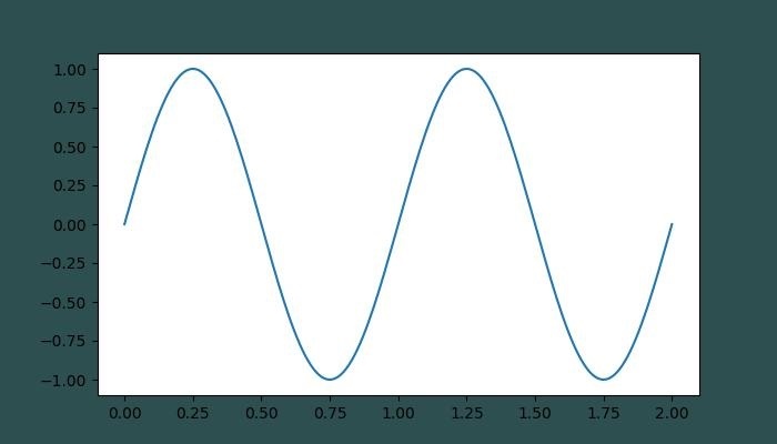
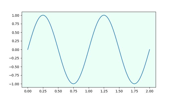
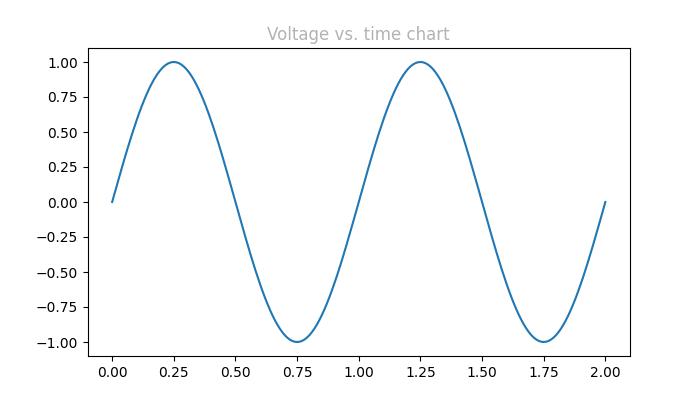
The Gray Level String format
We can use a string representation of a float value in the range of [0, 1] inclusive for the gray level. For example, '0' represents black, '1' represents white, and '0.8' represents light gray.
Example - Usage of Gray Level Format
Here is an example of using the Gray level string for specifying the title color.
import matplotlib.pyplot as plt
import numpy as np

# Example data
t = np.linspace(0.0, 2.0, 201)
s = np.sin(2 * np.pi * t)

# create a plot
fig, ax = plt.subplots(figsize=(7,4))

# Plotting the data
plt.plot(t, s)

# using the Gray level string for specifying title color
ax.set_title('Voltage vs. time chart', color='0.7')

# Show the plot
plt.show()
print('successfully used the Gray level string for specifying colors..')
Output
On executing the above code we will get the following output −
successfully used the Gray level string for specifying colors..
The "Cn" Color notation
A "Cn" color Spec, i.e., 'C' followed by a number, which is an index into the default property cycle (rcParams["axes.prop_cycle"]) can be used to specify the colors in matplotlib.
Example - Usage of Cn Color
In this example, a plot is drawn using the Cn notation (color='C1'), which corresponds to the 2nd color in the default property cycle.
import matplotlib.pyplot as plt
import numpy as np

# Example data
t = np.linspace(0.0, 2.0, 201)
s = np.sin(2 * np.pi * t)

# create a plot
fig, ax = plt.subplots(figsize=(7,4))

# Cn notation for plot
ax.plot(t, .7*s, color='C1', linestyle='--')

# Show the plot
plt.show()
print('successfully used the Cn notation for specifying colors..')
Output
On executing the above code we will get the following output −
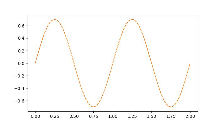
successfully used the Cn notation for specifying colors..
The Single Letter String format
In Matplotlib, single-letter strings are used as shorthand notations to represent a set of basic colors. These shorthand notations are part of the base colors available as a dictionary in matplotlib.colors.BASE_COLORS container. And each letter corresponds to a specific color.
The single-letter shorthand notations include: 'b': Blue, 'g': Green, 'r': Red, 'c': Cyan, 'm': Magenta, 'y': Yellow, 'k': Black, and 'w': White.
Example - Usage of Single letter Format
In this example, each base color is plotted as a bar with its corresponding single-letter shorthand notation.
import matplotlib.pyplot as plt
import matplotlib.colors as mcolors
import numpy as np

# Get the base colors and their names
base_colors = mcolors.BASE_COLORS
color_names = list(base_colors.keys())

# Create a figure and axis
fig, ax = plt.subplots(figsize=(7, 4))

# Plot each color as a bar
for i, color_name in enumerate(color_names):
   ax.bar(i, 1, color=base_colors[color_name], label=color_name)

# Set the x-axis ticks and labels
ax.set_xticks(np.arange(len(color_names)))
ax.set_xticklabels(color_names)

# Set labels and title
ax.set_title('Base Colors')

# Add legend
ax.legend()

# Show the plot
plt.show()
print('Successfully visualized all the available base colors..')
Output
On executing the above code we will get the following output −
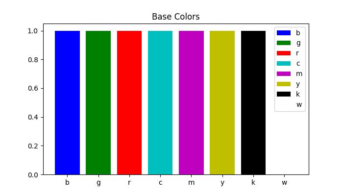
Successfully visualized all the available base colors..
Other formats
Also we can use the Case-insensitive color name from the xkcd color survey with 'xkcd:' prefix, X11/CSS4 ("html") Color Names, and Tableau Colors.
Example - Usage of various Color Formats
Here is an example that demonstrates the use of different color formats, including X11/CSS4 colors, xkcd colors, and Tableau Colors in a Matplotlib plot.
import matplotlib.pyplot as plt
import numpy as np

# Example data
t = np.linspace(0.0, 2.0, 201)
s = np.sin(2 * np.pi * t)

# create a plot
fig, ax = plt.subplots(figsize=(7, 4))

# Plotting the data
plt.plot(t, s)

# 5) a named color:
ax.set_ylabel('Specifying color using the X11/CSS4 name', color='peachpuff')

# 6) a named xkcd color:
ax.set_xlabel('Specifying color name from the xkcd color survey', color='xkcd:crimson')

# 8) tab notation:
ax.set_title('Specifying color using the Tableau Colors', color='tab:orange')

plt.show()
print('Successfully used the X11/CSS4, xkcd, and Tableau Colors formats...')
Output
On executing the above code we will get the following output −
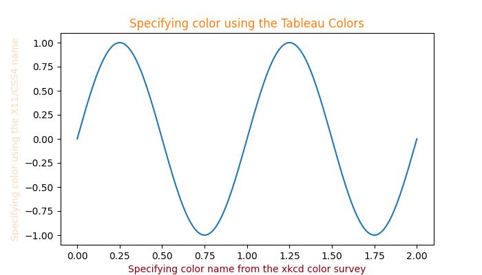
Successfully used the X11/CSS4, xkcd, and Tableau Colors formats...
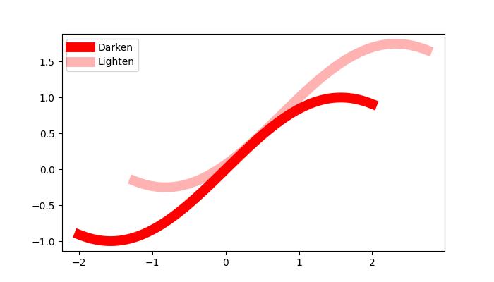
Darken or lighten a color
To darken or lighten any color, you can use the apha parameter of the plot() method, greater the aplha value will darker the color and smaller value will lighten the color.
Example - Usage of Alpha
Here is an example that creates a Plot of two lines with different value of alpha, to replicate darker and lighter color of the lines.
import numpy as np
from matplotlib import pyplot as plt

# Sample data
xs = np.linspace(-2, 2, 100)
ys = np.sin(xs)

# Create a figure
fig, ax = plt.subplots(figsize=(7, 4))

# plot two lines with different alpha values
ax.plot(xs, ys, c='red', lw=10, label="Darken")
ax.plot(xs+.75, ys+.75, c='red', lw=10, alpha=0.3, label="Lighten")
ax.legend(loc='upper left')

plt.show()
Output
On executing the above code we will get the following output −