- Matplotlib - Home
- Matplotlib - Introduction
- Matplotlib - Vs Seaborn
- Matplotlib - Environment Setup
- Matplotlib - Anaconda distribution
- Matplotlib - Jupyter Notebook
- Matplotlib - Pyplot API
- Matplotlib - Simple Plot
- Matplotlib - Saving Figures
- Matplotlib - Markers
- Matplotlib - Figures
- Matplotlib - Styles
- Matplotlib - Legends
- Matplotlib - Colors
- Matplotlib - Colormaps
- Matplotlib - Colormap Normalization
- Matplotlib - Choosing Colormaps
- Matplotlib - Colorbars
- Matplotlib - Working With Text
- Matplotlib - Text properties
- Matplotlib - Subplot Titles
- Matplotlib - Images
- Matplotlib - Image Masking
- Matplotlib - Annotations
- Matplotlib - Arrows
- Matplotlib - Fonts
- Matplotlib - Font Indexing
- Matplotlib - Font Properties
- Matplotlib - Scales
- Matplotlib - LaTeX
- Matplotlib - LaTeX Text Formatting in Annotations
- Matplotlib - PostScript
- Matplotlib - Mathematical Expressions
- Matplotlib - Animations
- Matplotlib - Celluloid Library
- Matplotlib - Blitting
- Matplotlib - Toolkits
- Matplotlib - Artists
- Matplotlib - Styling with Cycler
- Matplotlib - Paths
- Matplotlib - Path Effects
- Matplotlib - Transforms
- Matplotlib - Ticks and Tick Labels
- Matplotlib - Radian Ticks
- Matplotlib - Dateticks
- Matplotlib - Tick Formatters
- Matplotlib - Tick Locators
- Matplotlib - Basic Units
- Matplotlib - Autoscaling
- Matplotlib - Reverse Axes
- Matplotlib - Logarithmic Axes
- Matplotlib - Symlog
- Matplotlib - Unit Handling
- Matplotlib - Ellipse with Units
- Matplotlib - Spines
- Matplotlib - Axis Ranges
- Matplotlib - Axis Scales
- Matplotlib - Axis Ticks
- Matplotlib - Formatting Axes
- Matplotlib - Axes Class
- Matplotlib - Twin Axes
- Matplotlib - Figure Class
- Matplotlib - Multiplots
- Matplotlib - Grids
- Matplotlib - Object-oriented Interface
- Matplotlib - PyLab module
- Matplotlib - Subplots() Function
- Matplotlib - Subplot2grid() Function
- Matplotlib - Anchored Artists
- Matplotlib - Manual Contour
- Matplotlib - Coords Report
- Matplotlib - AGG filter
- Matplotlib - Ribbon Box
- Matplotlib - Fill Spiral
- Matplotlib - Findobj Method
- Matplotlib - Hyperlinks
- Matplotlib - Image Thumbnail
- Matplotlib - Plotting with Keywords
- Matplotlib - Create Logo
- Matplotlib - Multipage PDF
- Matplotlib - Multiprocessing
- Matplotlib - Print Stdout
- Matplotlib - Compound Path
- Matplotlib - Sankey Class
- Matplotlib - MRI with EEG
- Matplotlib - Stylesheets
- Matplotlib - Background Colors
- Matplotlib - Basemap
Matplotlib Events
- Matplotlib - Event Handling
- Matplotlib - Close Event
- Matplotlib - Mouse Move
- Matplotlib - Click Events
- Matplotlib - Scroll Event
- Matplotlib - Keypress Event
- Matplotlib - Pick Event
- Matplotlib - Looking Glass
- Matplotlib - Path Editor
- Matplotlib - Poly Editor
- Matplotlib - Timers
- Matplotlib - Viewlims
- Matplotlib - Zoom Window
Matplotlib Widgets
- Matplotlib - Cursor Widget
- Matplotlib - Annotated Cursor
- Matplotlib - Button Widget
- Matplotlib - Check Buttons
- Matplotlib - Lasso Selector
- Matplotlib - Menu Widget
- Matplotlib - Mouse Cursor
- Matplotlib - Multicursor
- Matplotlib - Polygon Selector
- Matplotlib - Radio Buttons
- Matplotlib - RangeSlider
- Matplotlib - Rectangle Selector
- Matplotlib - Ellipse Selector
- Matplotlib - Slider Widget
- Matplotlib - Span Selector
- Matplotlib - Textbox
Matplotlib Plotting
- Matplotlib - Line Plots
- Matplotlib - Area Plots
- Matplotlib - Bar Graphs
- Matplotlib - Histogram
- Matplotlib - Pie Chart
- Matplotlib - Scatter Plot
- Matplotlib - Box Plot
- Matplotlib - Arrow Demo
- Matplotlib - Fancy Boxes
- Matplotlib - Zorder Demo
- Matplotlib - Hatch Demo
- Matplotlib - Mmh Donuts
- Matplotlib - Ellipse Demo
- Matplotlib - Bezier Curve
- Matplotlib - Bubble Plots
- Matplotlib - Stacked Plots
- Matplotlib - Table Charts
- Matplotlib - Polar Charts
- Matplotlib - Hexagonal bin Plots
- Matplotlib - Violin Plot
- Matplotlib - Event Plot
- Matplotlib - Heatmap
- Matplotlib - Stairs Plots
- Matplotlib - Errorbar
- Matplotlib - Hinton Diagram
- Matplotlib - Contour Plot
- Matplotlib - Wireframe Plots
- Matplotlib - Surface Plots
- Matplotlib - Triangulations
- Matplotlib - Stream plot
- Matplotlib - Ishikawa Diagram
- Matplotlib - 3D Plotting
- Matplotlib - 3D Lines
- Matplotlib - 3D Scatter Plots
- Matplotlib - 3D Contour Plot
- Matplotlib - 3D Bar Plots
- Matplotlib - 3D Wireframe Plot
- Matplotlib - 3D Surface Plot
- Matplotlib - 3D Vignettes
- Matplotlib - 3D Volumes
- Matplotlib - 3D Voxels
- Matplotlib - Time Plots and Signals
- Matplotlib - Filled Plots
- Matplotlib - Step Plots
- Matplotlib - XKCD Style
- Matplotlib - Quiver Plot
- Matplotlib - Stem Plots
- Matplotlib - Visualizing Vectors
- Matplotlib - Audio Visualization
- Matplotlib - Audio Processing
Matplotlib Useful Resources
- Matplotlib - Quick Guide
- Matplotlib - Cheatsheet
- Matplotlib - Useful Resources
- Matplotlib - Discussion
Matplotlib - Colorbars
A colorbar is a visual representation of the color scale used in a plot. It displays the color scale from the minimum to the maximum values in the data, helping us understand the color variations in the plot.
In the following image you can observe a simple colorbar that is highlighted with a red color rectangle −
Colorbars in Matplotlib
The Matplotlib library provides a tool for working with colorbars, including their creation, placement, and customization.
The matplotlib.colorbar module is responsible for creating colorbars, however a colorbar can be created using the Figure.colorbar() or its equivalent pyplot wrapper pyplot.colorbar() functions. These functions are internally uses the Colorbar class along with make_axes_gridspec (for GridSpec-positioned axes) or make_axes (for non-GridSpec-positioned axes).
And a colorbar needs to be a "mappable" (i.e, matplotlib.cm.ScalarMappable) object typically an AxesImage generated via the imshow() function. If you want to create a colorbar without an attached image, you can instead use a ScalarMappable without an associated data.
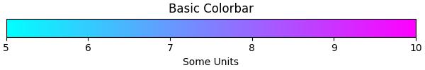
Example - Usage of Horizontal Colorbar
Here is an simple example that creates a horizontal colorbar without an attached plotusing the ScalarMappable class.
import numpy as np
import matplotlib as mpl
import matplotlib.pyplot as plt

# Create a figure and axis for the colorbar
fig, ax = plt.subplots(figsize=(6, 1), constrained_layout=True)

# Define a colormap and normalization for the colorbar
cmap = mpl.cm.cool
norm = mpl.colors.Normalize(vmin=5, vmax=10)

# Create a ScalarMappable without associated data using the defined cmap and norm
scalar_mappable = mpl.cm.ScalarMappable(norm=norm, cmap=cmap)

# Add a horizontal colorbar to the figure
colorbar = fig.colorbar(scalar_mappable, cax=ax, orientation='horizontal', label='Some Units')

# Set the title and display the plot
plt.title('Basic Colorbar')
plt.show()
Output
On executing the above code we will get the following output −
Example - Creating a Simple Colorbar
Here is another example creates a simple colorbar for the plot using the pyplot.colorbar() function with default parameters.
import matplotlib.pyplot as plt
import numpy as np

# Generate sample data
data = np.random.random((10, 10))

# Create a plot with an image and a colorbar
fig, ax = plt.subplots(figsize=(7,4))
im = ax.imshow(data, cmap='viridis')

# Add a colorbar to the right of the image
cbar = plt.colorbar(im, ax=ax)

# Show the plot
plt.show()
print('Successfully drawn the colorbar...')
Output
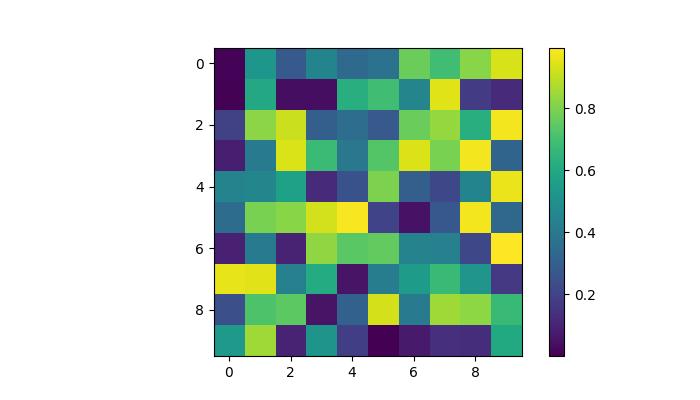
Successfully drawn the colorbar...
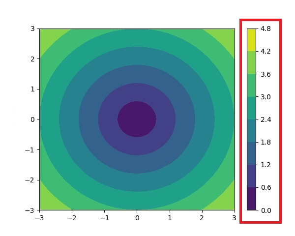
Automatic Colorbar Placement
Automatic placement of colorbars is a straightforward approach. This ensures that each subplot has its own colorbar, providing a clear indication of the quantitative extent of the image data in each subplot.
Example - Automatic Colorbar Placement
This example demonstrates the automatic colorbar placement for multiple subplots.
import matplotlib.pyplot as plt
import numpy as np

# Create a 2x2 subplot grid
fig, axs = plt.subplots(1, 2, figsize=(7,3))
cmaps = ['magma', 'coolwarm']

# Add random data with different colormaps to each subplot
for col in range(2):
   ax = axs[col]
   pcm = ax.pcolormesh(np.random.random((20, 20)) * (col + 1), cmap=cmaps[col])

   # Add a colorbar for the each subplots
   fig.colorbar(pcm, ax=ax, pad=0.03)

plt.show()
print('Successfully drawn the colorbar...')
Output
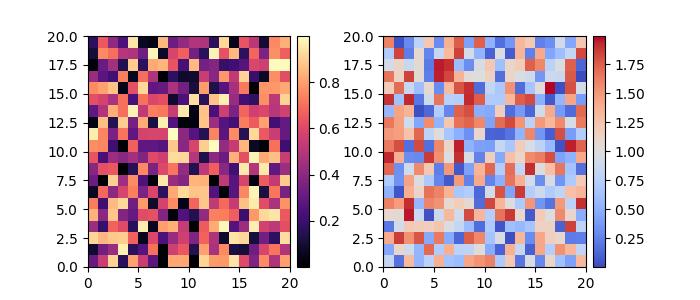
Successfully placed the colorbar...
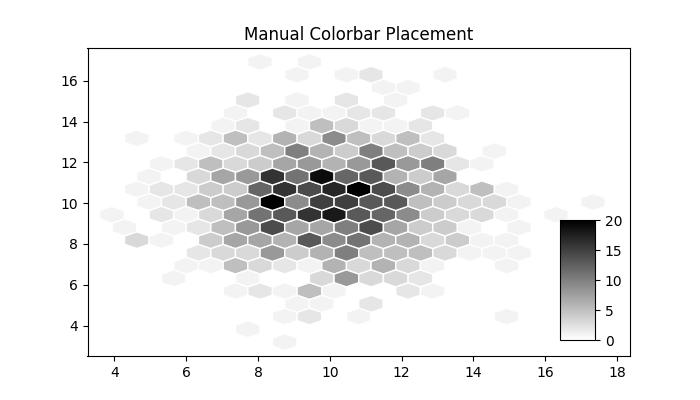
Manual Colorbar Placement
This approach allows us to explicitly determine the location and appearance of a colorbar in a plot. Which may be necessary when the automatic placement does not achieve the desired layout.
By creating inset axes, either using inset_axes() or add_axes(), and then assigning it to the colorbar through the cax keyword argument, users can get the desired output.
Example - Manual Colorbar Placement
Here is an example that demonstrates how to determine the colorbar placement manually in a plot.
import numpy as np
import matplotlib as mpl
import matplotlib.pyplot as plt

# Generate random data points
npoints = 1000
x, y = np.random.normal(10, 2, (2, npoints))

# Create a subplot
fig, ax = plt.subplots(figsize=(7,4))

# Set title
plt.title('Manual Colorbar Placement')

# Draw the plot
hexbin_artist = ax.hexbin(x, y, gridsize=20, cmap='gray_r', edgecolor='white')

# Manually create an inset axes for the colorbar
cax = fig.add_axes([0.8, 0.15, 0.05, 0.3])

# Add a colorbar using the hexbin_artist and the manually created inset axes
colorbar = fig.colorbar(hexbin_artist, cax=cax)

# Display the plot
plt.show()
Output
On executing the above code we will get the following output −
Customizing Colorbars
The appearance of colorbars, including ticks, tick labels, and labels, can be customized to specific requirements. Vertical colorbars typically have these elements on the y-axis, while horizontal colorbars display them on the x-axis. The ticks parameter is used to set the ticks, and the format parameter helps format the tick labels on the visible colorbar axes.
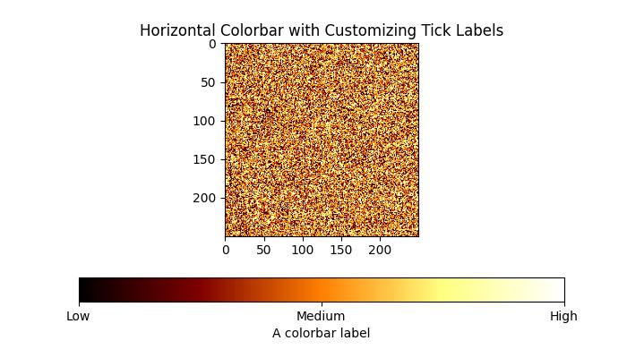
Example - Horizontal and Labelled Colorbar
This example uses the imshow() method to display the data as an image, and places a colorbar horizontally to the image with a specified label.
import matplotlib.pyplot as plt
import numpy as np

# Create a subplot
fig, ax = plt.subplots(figsize=(7, 4))

# Generate random data
data = np.random.normal(size=(250, 250))
data = np.clip(data, -1, 1)

# Display the data using imshow with a specified colormap
cax = ax.imshow(data, cmap='afmhot')
ax.set_title('Horizontal Colorbar with Customizing Tick Labels')

# Add a horizontal colorbar and set its orientation and label
cbar = fig.colorbar(cax, orientation='horizontal', label='A colorbar label')

# Adjust ticks on the colorbar
cbar.set_ticks(ticks=[-1, 0, 1])
cbar.set_ticklabels(['Low', 'Medium', 'High'])

# Show the plot
plt.show()
Output
On executing the above code we will get the following output −
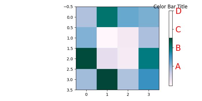
Example - Customizing a Color Bar
This example demonstrates how to customize the position, width, color, number of ticks, font size and more properties of a colorbar.
import numpy as np
from matplotlib import pyplot as plt

# Adjust figure size and autolayout
plt.rcParams["figure.figsize"] = [7.00, 3.50]
plt.rcParams["figure.autolayout"] = True

# Generate random data
data = np.random.randn(4, 4)

# Plot the data with imshow
im = plt.imshow(data, interpolation='nearest', cmap="PuBuGn")

# Add colorbar and adjust its position
# Decrease colorbar width and shift position to the right
clb = plt.colorbar(im, shrink=0.9, pad=0.05)

# Set the top label for colorbar
clb.ax.set_title('Color Bar Title')

# Customize color of ticks
clb.ax.set_yticks([0, 1.5, 3, 4.5], labels=["A", "B", "C", "D"])

# Change color and font size of ticks
clb.ax.tick_params(labelcolor='red', labelsize=20)

plt.show()
Output
On executing the above code you will get the following output −