
Article Categories
- All Categories
-
 Data Structure
-
 Networking
-
 RDBMS
RDBMS
-
 Operating System
-
 Java
Java
-
 MS Excel
-
 iOS
iOS
-
 HTML
HTML
-
 CSS
CSS
-
 Android
-
 Python
-
 C Programming
-
 C++
C++
-
 C#
C#
-
 MongoDB
-
 MySQL
MySQL
-
 Javascript
-
 PHP
PHP
-
 Economics & Finance
How to Apply Custom Number Format in an Excel Chart?
You have tried applying custom number format in the cells using the format cells, but have you ever tried applying custom number format in an Excel chart? It is a very simple process to apply custom number formatting in an Excel chart; it can be done by formatting the axis. Read this tutorial to learn how to add a custom number format to Excel charts in a straightforward manner.
Applying Custom Number Format in an Excel Chart
Here we will first create a chart for the given data and then change the scale of the axis. Let us see a simple process to apply custom number formatting to an Excel chart.
Step 1
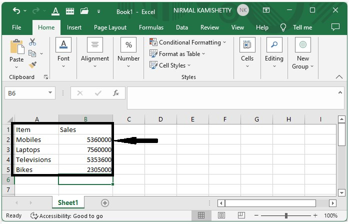
Consider the following scenario: we have an excel sheet with data that is similar to the data in the image below.
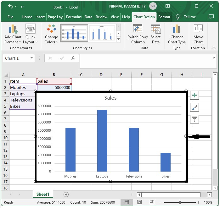
We will be using a bar chart to understand the process. So, to create a bar chart, select the data, click on "Insert," and then click on "Bar chart" to generate a bar chart as shown in the below image.
Step 2
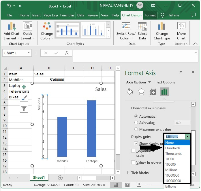
Now, right-click on the chart's axis and select the format axis; a new pop-up window with the name format axis will appear.
Now, from the axis options, change the display units to millions.
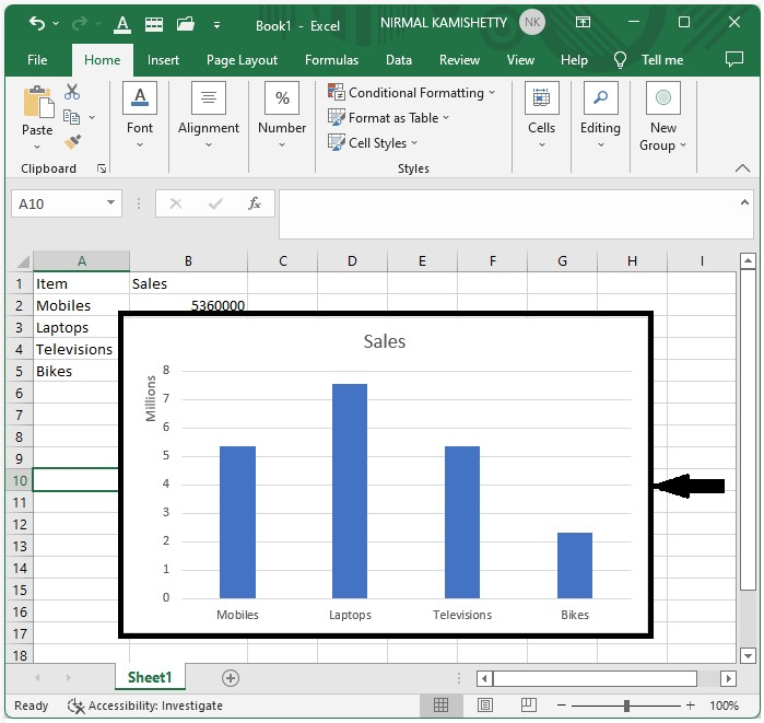
Now, you should get to see a screen like the one shown below:
Applying Custom Number Format for Dates
Here we will first create a chart and then format the scale to change the date format. Let's see a simple process to apply a custom number format for dates in Excel.
Step 1
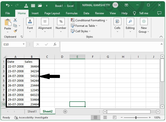
Let us consider the Excel sheet where the data is similar to the below image.
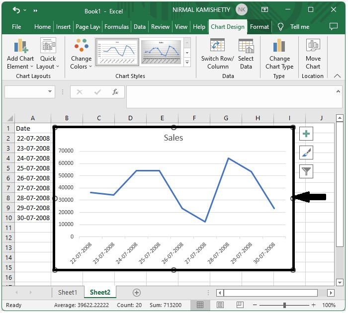
We will be using a line chart to understand the process. So, to create a line chart, select the data, click on "Insert," and then click on "Line chart" to generate a line chart as shown in the below image.
Step 2
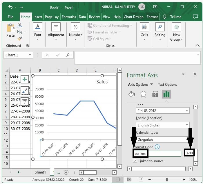
Now, click on the chart's axis, then right-click on it and select format axis; a new pop-up window named format axis will appear. Format the axis to dd-mm and click on "OK" then close the format axis as shown in the below image.
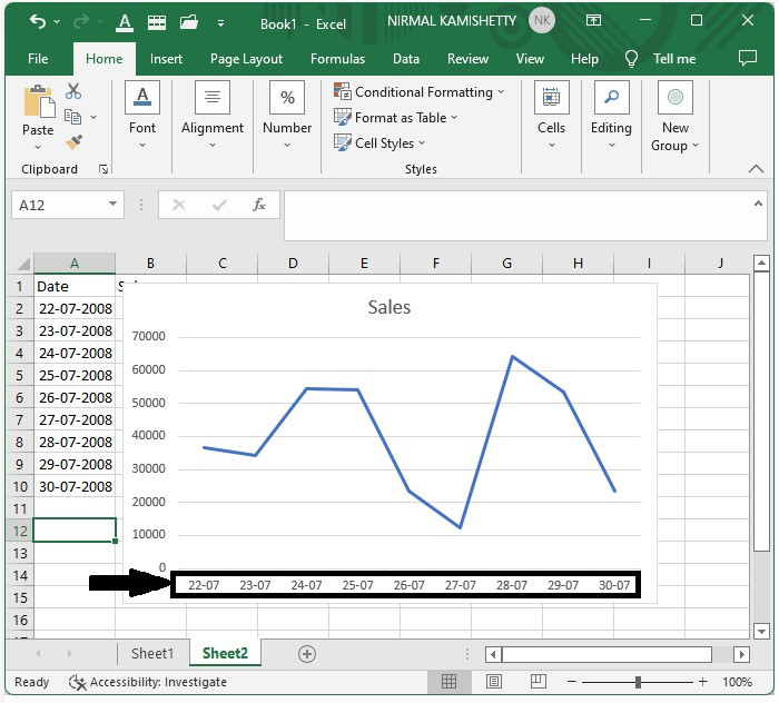
Our final output will be similar to the below image.
Conclusion
In this tutorial, we used a simple example to demonstrate how we can apply custom axes to the Excel chart to highlight particular sets of data.

755 Views
