- Excel Dashboards - Home
- Introduction
- Excel Features Create Dashboards
- Conditional Formatting
- Excel Charts
- Interactive Controls
- Advanced Excel Charts
- Excel PivotTables
- Power PivotTables & PivotCharts
- Power View Reports
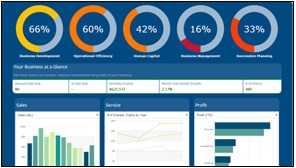
- Key Performance Indicators
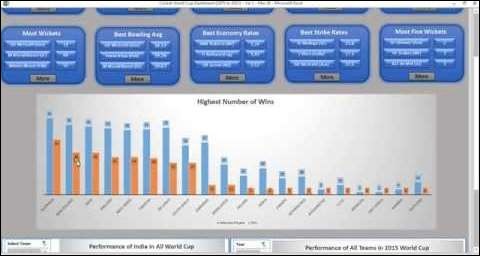
- Build a Dashboard
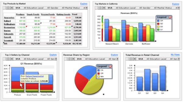
- Examples
Excel Dashboards - Quick Guide
Excel Dashboards - Introduction
For those who are new to dashboards, it would be ideal to get an understanding of the dashboards first. In this chapter, you will get to know the definition of dashboard, how it got its name, how they became popular in IT, key metrics, benefits of dashboards, types of dashboards, dashboard data and formats and live data on dashboards.
In information technology, a dashboard is an easy to read, often single page, real-time user interface, showing a graphical presentation of the current status (snapshot) and historical trends of an organizations or departments key performance indicators to enable instantaneous and informed decisions to be made at a glance.
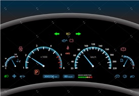
Dashboards take their name from automobile dashboards. Under the hood of your vehicle, there may be hundreds of processes that impact the performance of your vehicle. Your dashboard summarizes these events using visualizations so that you have the peace of mind to concentrate on safely operating your vehicle. In a similar way, business dashboards are used to view and/or monitor the organizations performance with ease.
The idea of digital dashboards emerged from the study of decision support systems in the 1970s. Business dashboards were first developed in the 1980s, but due to the problems with data refreshing and handling, they were put on the shelf. In the 1990s, the information age quickened pace and data warehousing, and online analytical processing (OLAP) allowed dashboards to function adequately. However, the use of dashboards did not become popular until the rise of key performance indicators (KPIs), and the introduction of Robert S. Kaplan and David P. Norton's Balanced Scorecard. Today, the use of dashboards forms an important part of decision making.
In todays business environment, the tendency is towards Big Data. Managing and extracting real value from all that data is the key for modern business success. A welldesigned dashboard is a remarkable information management tool.
Dashboard Definition
Stephen Few has defined a dashboard as a visual display of the most important information needed to achieve one or more objectives which fits entirely on a single computer screen so it can be monitored at a glance.
In the present terms, a dashboard can be defined as a data visualization tool that displays the current status of metrics and key performance indicators (KPIs) simplifying complex data sets to provide users with at a glance awareness of current performance.
Dashboards consolidate and arrange numbers and metrics on a single screen. They can be tailored for a specific role and display metrics of a department or an organization on the whole.
Dashboards can be static for a one-time view, or dynamic showing the consolidated results of the data changes behind the screen. They can also be made interactive to display the various segments of large data on a single screen.
Key Metrics for Dashboard
The core of the dashboard lies in the key metrics required for monitoring. Thus, based on whether the dashboard is for an organization on the whole or for a department such as sales, finance, human resources, production, etc. the key metrics that are required for display vary.
Further, the key metrics for a dashboard also depend on the role of the recipients (audience). For example, Executive (CEO, CIO, etc.), Operations Manager, Sales Head, Sales Manager, etc. This is due to the fact that the primary goal of a dashboard in to enable data visualization for decision making.
The success of a dashboard often depends on the metrics that were chosen for monitoring. For example, Key Performance Indicators, Balanced Scorecards and Sales Performance Figures could be the content appropriate in business dashboards.
Dashboard Benefits
Dashboards allow managers to monitor the contribution of the various departments in the organization. To monitor the organizations overall performance, dashboards allow you to capture and report specific data points from each of the departments in the organization, providing a snapshot of current performance and a comparison with earlier performance.
Benefits of dashboards include the following −
Visual presentation of performance measures.
Ability to identify and correct negative trends.
Measurement of efficiencies/inefficiencies.
Ability to generate detailed reports showing new trends.
Ability to make more informed decisions based on collected data.
Alignment of strategies and organizational goals.
Instant visibility of all systems in total.
Quick identification of data outliers and correlations.
Time saving with the comprehensive data visualization as compared to running multiple reports.
Types of Dashboards
Dashboards can be categorized based on their utility as follows −
- Strategic Dashboards
- Analytical Dashboards
- Operational Dashboards
- Informational Dashboards
Strategic Dashboards
Strategic dashboards support managers at any level in an organization for decision making. They provide the snapshot of data, displaying the health and opportunities of the business, focusing on the high level measures of performance and forecasts.
Strategic dashboards require to have periodic and static snapshots of data (e.g. daily, weekly, monthly, quarterly and annually). They need not be constantly changing from one moment to the next and require an update at the specified intervals of time.
They portray only the high level data not necessarily giving the details.
They can be interactive to facilitate comparisons and different views in case of large data sets at the click of a button. But, it is not necessary to provide more interactive features in these dashboards.
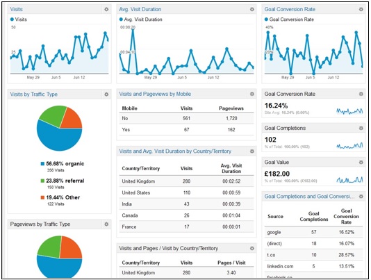
The following screenshot shows an example of an executive dashboard, displaying goals and progress.
Analytical Dashboards
Analytical dashboards include more context, comparisons, and history. They focus on the various facets of data required for analysis.
Analytical dashboards typically support interactions with the data, such as drilling down into the underlying details and hence should be interactive.
Examples of analytical dashboards include Finance Management dashboard and Sales Management dashboard.
Operational Dashboards
Operational dashboards are for constant monitoring of operations. They are often designed differently from strategic or analytical dashboards and focus on monitoring of activities and events that are constantly changing and might require attention and response at a moment's notice. Thus, operational dashboards require live and up to date data available at all times and hence should be dynamic.
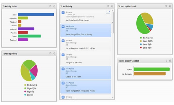
An example of an operation dashboard could be a support-system dashboard, displaying live data on service tickets that require an immediate action from the supervisor on high-priority tickets.
Informational Dashboards
Informational dashboards are just for displaying figures, facts and/or statistics. They can be either static or dynamic with live data but not interactive. For example, flights arrival/departure information dashboard in an airport.

Dashboard Data and Formats
The data required for a dashboard depends on its category. The premise for the data is that it should be relevant, error-free, up to date and live if required. The data can possibly be from various and different sources and formats (Spreadsheets, Text Files, Web Pages, Organizational Database, etc.).
The results displayed on a dashboard must be authentic, correct and apt. This is crucial since the information on a dashboard would lead to decisions, actions and/or inferences. Thus, along with the data being displayed, the medium chosen for the display is equally important as it should not give an erroneous impression in the data portrayal. The focus should be on the ability of the data visualization that would unambiguously project the conclusions.
Live Data on Dashboards
As discussed earlier in this chapter, data warehousing and online analytical processing (OLAP) is making it possible to refresh the dynamic dashboards instantly with live data. It is also making those who design the dashboards be independent of the organizations IT department for obtaining data.
Thus, the dashboards have become the most sought after medium from top management to a regular user.
Excel Features to Create Dashboards
You can create a dashboard in Excel using various features that help you make data visualization prominent, which is the main characteristic of any dashboard. You can show data in tables with conditional formatting to highlight the good and bad results, you can summarize the data in charts and PivotTables, you can add interactive controls, and you can define and manage KPIs and so on.
In this chapter, you will get to know the most important Excel features that come handy when you are creating a dashboard. These features help you arrive at the dashboard elements that simplify complex data and provide visual impact on the current status or performance in real time.
Excel Tables
The most important component of any dashboard is its data. The data can be from a single source or multiple sources. The data might be limited or might span several rows.
Excel tables are well suited to get the data into the workbook, in which you want to create the dashboard. There are several ways to import data into Excel, by establishing connections to various sources. This makes it possible to refresh the data in your workbook whenever the source data gets updated.
You can name the Excel tables and use those names for referring your data in the dashboard. This would be easier than referring the range of data with cell references. These Excel tables are your working tables that contain the raw data.
You can arrive at a summary of the analysis of data and portray the same in an Excel table that can be included as a part of a dashboard.
Sparklines
You can use Sparklines in your Excel tables to show trends over a period of time. Sparklines are mini charts that you can place in single cells. You can use line charts, column charts or win-loss charts to depict the trends based on your data.
Conditional Formatting
Conditional formatting is a big asset to highlight data in the tables. You can define the rules by which you can vary color scales, data bars and/or icon sets. You can either use the Excel defined rules or create your own rules, based on the applicability to your data.
You will learn these conditional formatting techniques in the chapter Conditional Formatting for Data Visualization.
Excel Charts
Excel charts are the most widely used data visualization components for dashboards. You can get the audience view the data patterns, comparisons and trends in data sets of any size strikingly adding color and styles.
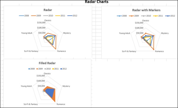
Excel has several built-in chart types such as line, bar, column, scatter, bubble, pie, doughnut, area, stock, surface and radar if you have Excel 2013.
You will understand how to use these charts and the chart elements effectively in your dashboard in the chapter − Excel Charts for Dashboards.
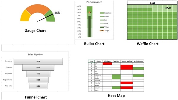
In addition to the above-mentioned chart types, there are other widely used chart types that come handy in representing certain data types. These are Waterfall Chart, Band Chart, Gantt chart, Thermometer Chart, Histogram, Pareto Chart, Funnel Chart, Box and Whisker Chart and Waffle Chart.
You will learn about these charts in the chapter − Advanced Excel Charts for Dashboards.
Excel Camera
Once you create charts, you need to place them in your dashboard. If you want to make your dashboard dynamic, with the data getting refreshed each time the source data changes, which is the case with most of the dashboards, you would like to provide an interface between the charts in your dashboard and the data at the backend. You can achieve this with the Camera feature of Excel.
Excel PivotTables
When you have large data sets and you would like to summarize the results dynamically showing various facets of the analysis results, Excel PivotTables come handy to include in your dashboard. You can use either the Excel tables or the more powerful data tables in the data model to create PivotTables.
The main differences between the two approaches are −
| Excel Tables | Data Tables |
|---|---|
| Data from only one table can be used to create PivotTable. | Data from more than one table can be used to create PivotTable, defining relationships between the tables. |
| When the tables increase in the no. of rows, the memory handling and storage will not be optimistic. | Can handle huge data sets with thousands of rows of data with memory optimization and decreased file size. |
If you try to create a PivotTable with more than one Excel table, you will be prompted to create relationship and the tables with the relationship get added to the data model.
You will learn about PivotTables in the chapter − Excel PivotTables for Dashboards.
If you have data in the Data Model of your workbook, you can create Power PivotTables and Power PivotCharts that span data across multiple data tables.
You will learn about these in the chapter − Excel Power PivotTables and Power PivotCharts for Dashboards.
Dynamic Dashboard Elements with Interactive Controls
You can make your dashboard elements interactive with easy to use controls such as scrollbars, radio buttons, checkboxes and dynamic labels. You will learn more about these in the chapter − Interactive Controls in Excel Dashboards.
Scrollbars
Radio Buttons
Checkboxes
Excel Power PivotTables and Power PivotCharts
Excel Power PivotTables and Power PivotCharts are helpful to summarize data from multiple resources, by building a memory optimized Data Model in the workbook. The Data Tables in the Data Model can run through several thousands of dynamic data enabling summarization with less effort and time.
You will learn about the usage of Power PivotTables and Power PivotCharts in dashboards in the chapter - Excel Power PivotTables and Power PivotCharts for Dashboards.
Excel Data Model
Excel Power PivotTable and Power PivotChart

Excel Power View Reports
Excel Power View Reports provide interactive data visualization of large data sets bringing out the power of Data Model and interactive nature of dynamic Power View visualizations.
You will learn about how to use Power View as dashboard canvas in the chapter - Excel Power View Reports for Dashboards.
Power View Report
Key Performance Indicators (KPIs)
Key Performance Indicators (KPIs) are integral part of many dashboards. You can create and manage KPIs in Excel. You will learn about KPIs in the chapter − Key Performance Indicators in Excel Dashboards.
Key Performance Indicators
Excel Dashboards - Conditional Formatting
Conditional Formatting for Data Visualization
If you have chosen Excel for creating dashboard, try to use Excel tables if they serve the purpose. With Conditional Formatting and Sparklines, Excel Tables are the best and simple choice for your dashboard.
In Excel, you can use conditional formatting for data visualization. For example, in a table containing the sales figures for the past quarter region-wise, you can highlight the top 5% values.
You can specify any number of formatting conditions by specifying Rules. You can pick up the Excel built-in Rules that match your conditions from Highlight Cells Rules or Top / Bottom Rules. You can also define your own Rules.
You choose the formatting options that are appropriate for your data visualization - Data Bars, Color Scales, or Icon Sets.
In this chapter, you will learn conditional formatting Rules, formatting options, and adding/managing Rules.
Highlighting Cells
You can use Highlight Cells Rules to assign a format to the cells that contain the data meeting any of the following criteria −
Numbers within a given numerical range: Greater Than, Less Than, Between, and Equal To.
Values that are Duplicate or Unique.
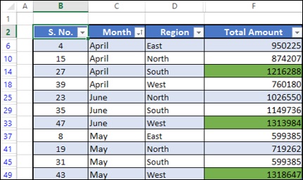
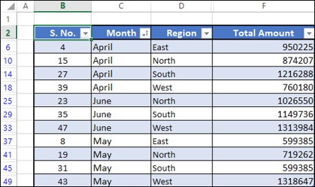
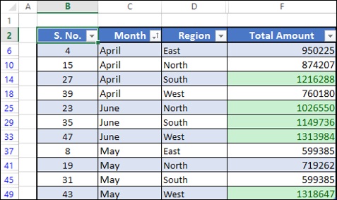
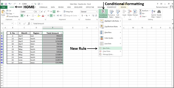
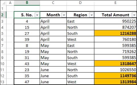
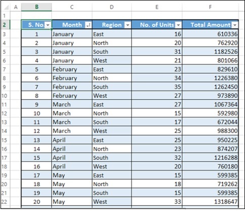
Consider the following summary of results that you want to present −
Suppose you want to highlight the Total Amount values that are more than 1000000.
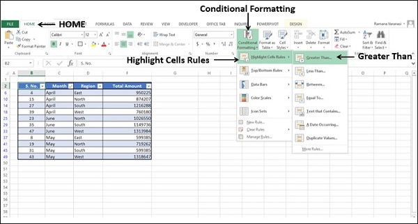
- Select the column Total Amount.
- Click on Conditional Formatting in the Styles group under Home tab.
- Click on Highlight Cells Rules in the dropdown list.
- Click on Greater Than in the second dropdown list that appears.
Greater Than dialog box appears.
In the Format cells that are GREATER THAN: box, specify the condition as 1000000.
In the box with, select the formatting option as Green Fill with Dark Green Text.
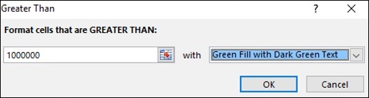
- Click the OK button.
As you can observe, the values satisfying the specified condition are highlighted with the specified format.
Top / Bottom Rules
You can use Top / Bottom Rules to assign a format to the values meeting any of the following criteria −
Top 10 Items − Cells that rank in the top N, where 1 <= N <= 1000.
Top 10% − Cells that rank in the top n%, where 1 <= n <= 100.
Bottom 10 Items − Cells that rank in the bottom N, where 1 <= N <= 1000.
Bottom 10% − Cells that rank in the bottom n%, where 1 <= n <= 100.
Above Average − Cells that are Above Average for the selected range.
Below Average − Cells that are Below Average for the selected range.
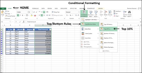
Suppose you want to highlight the Total Amount values that are in top 5%.
- Select the column Total Amount.
- Click on Conditional Formatting in the Styles group under Home tab.
- Click on Top/Bottom Rules in the dropdown list.
- Click on Top Ten% in the second dropdown list that appears.
Top Ten% dialog box appears.
In the Format cells that rank in the TOP: box, specify the condition as 5%.
In the box with, select the formatting option as Green Fill with Dark Green Text.
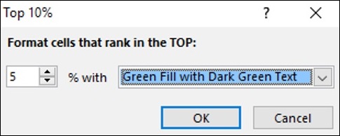
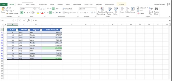
Click the OK button. The top 5% values will be highlighted with the specified format.
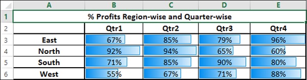
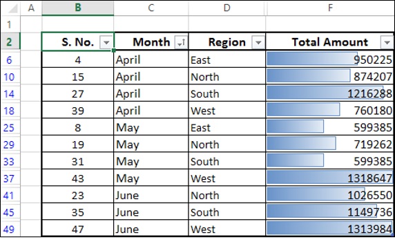
Data Bars
You can use colored Data Bars to see the value relative to the other values. The length of the Data Bar represents the value. A longer Bar represents a higher value, and a shorter Bar represents a lower value. You can either use solid colors or gradient colors for Data Bars.
Select the column Total Amount.
Click on Conditional Formatting in the Styles group under Home tab.
Click on Data Bars in the dropdown list.
Click on Blue Data Bar under Gradient Fill in the second dropdown list that appears.
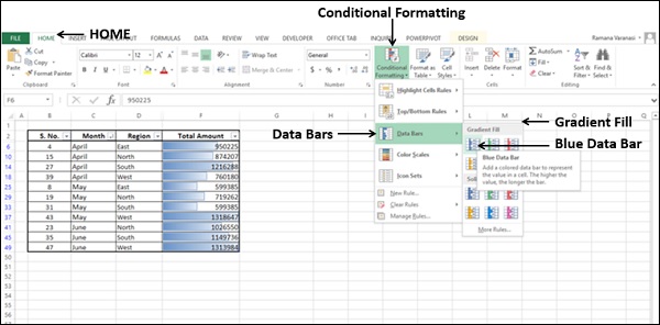
The values in the column will be highlighted showing small, intermediate and large values with blue colored gradient fill bars.
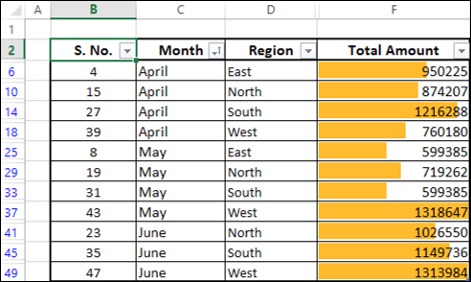
Select the column Total Amount.
Click on Conditional Formatting in the Styles group under Home tab.
Click on Data Bars in the dropdown list.
Click on Orange Data Bar under Solid Fill in the second dropdown list that appears.
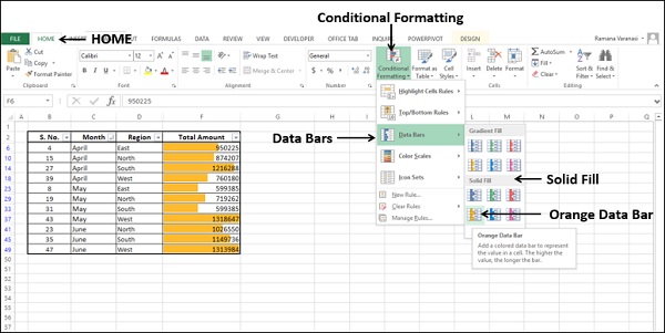
The values in the column will be highlighted showing small, intermediate and large values by bar height with orange colored bars.
Suppose you want to highlight the sales as compared to a sales target, say 800000.
Create a column with values = [@[Total Amount]]-800000.
Select the new column.
Click on Conditional Formatting in the Styles group under Home tab.
Click on Data Bars in the dropdown list.
Click on Green Data Bar under Gradient Fill in the second dropdown list that appears.
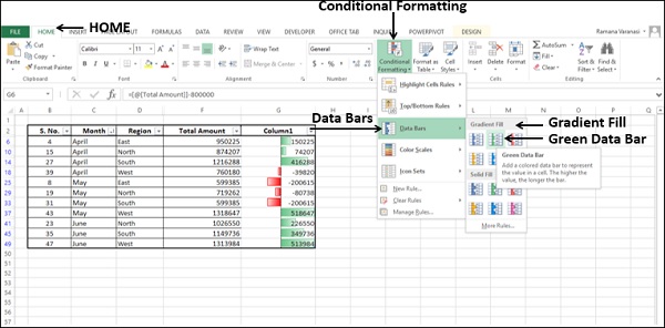
The Data Bars will start in the middle of each cell, and stretch to the left for negative values and to the right for positive values.
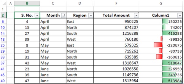
As you can observe, the Bars stretching to the right are green in color indicating positive values and the Bars stretching to the left are red in color indicating negative values.
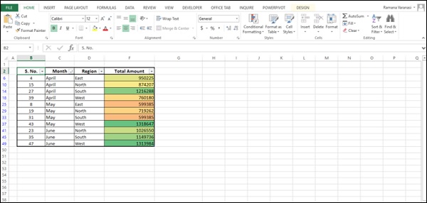
Color Scales
You can use Color Scales to see the value in a cell relative to the values in the other cells in a column. The color indicates where each cell value falls within that range. You can have either a 3-color scale or 2-color scale.
Select the column Total Amount.
Click on Conditional Formatting in the Styles group under Home tab.
Click on Color Scales in the dropdown list.
Click on Green-Yellow-Red Color Scale in the second dropdown list that appears.
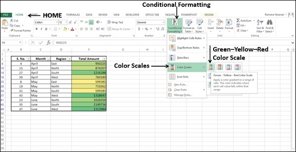
As in the case of Highlight Cells Rules, a Color Scale uses cell shading to display the differences in cell values. As you can observe in the preview, the shade differences are not conspicuous for this data set.
- Click on More Rules in the second dropdown list.
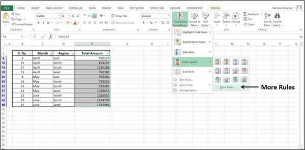
New Formatting Rule dialog box appears.
Click on Format all cells based on their values in the Select a Rule Type box.
In the Edit the Rule Description box, select the following −
Select 3-Color Scale in the Format Style box.
Under Midpoint, for Value type 75.
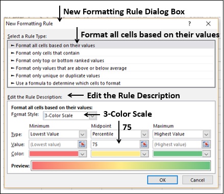
Click the OK button.
As you can observe, with the defined color scale, the values are distinctly shaded depicting the data range.
Icon Sets
You can use icon sets to visualize numerical differences. In Excel, you have a range of Icon Sets −
| Icon Set Type | Icon Sets |
|---|---|
| Directional | 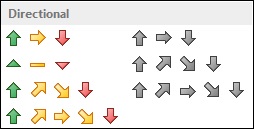 |
| Shapes | 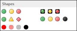 |
| Indicators | 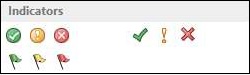 |
| Ratings | 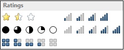 |
As you can observe, an Icon Set consists of three to five symbols. You can define criteria to associate an icon with the values in a cell range. E.g. a red down arrow for small numbers, a green up arrow for large numbers, and a yellow horizontal arrow for intermediate values.
Select the column Total Amount.
Click on Conditional Formatting in the Styles group under Home tab.
Click on Icon Sets in the dropdown list.
Click on 3 Arrows (Colored) in the Directional group in the second dropdown list that appears.
Colored arrows appear in the selected column based on the values.
Using Custom Rules
You can define your own Rules and format a range of cells satisfying a particular condition.
- Select the column Total Amount.
- Click on Conditional Formatting in the Styles group under Home tab.
- Click on New Rule in the dropdown list.
New Formatting Rule dialog box appears.
Click on Use a formula to determine which cells to format, in the Select a Rule Type Box.
In Edit the Rule Description box, do the following −
Type a formula in the box - Format values where this formula is true. For example, = PercentRank.INC($E$3:$E$13,E3)>=0.7
Click on Format button.
Choose the format. E.g. Font bold and Fill orange.
Click on OK.
Check the Preview.
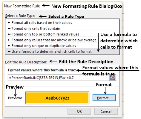
Click on OK if the Preview is alright. The values in the data set that are satisfying the formula will be highlighted with the format you have chosen.
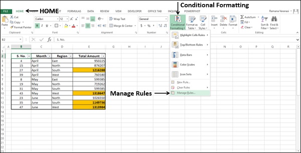
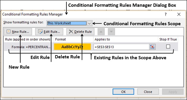
Managing Conditional Formatting Rules
You can manage the conditional formatting Rules using the Conditional Formatting Rules Manager dialog box.
Click Conditional Formatting in the Styles group under Home tab. Click Manage Rules in the dropdown list.
Conditional Formatting Rules Manager dialog box appears. You can view all the existing Rules. You can add a new Rule, delete a Rule and/or edit a Rule to modify it.
Excel Dashboards - Excel Charts
If you choose charts for visual display of data, Excel charts help you to pick up and change the different views. Excel provides several chart types that enable you to express the message you want to convey with the data at hand in your dashboard with a graphical representation of any set of data.
In addition, there are certain sophisticated charts that are useful for some specific purposes. Some of these are available in Excel 2016. But, they can also be built from the built in chart types in Excel 2013.
In this chapter, you will learn about the chart types in Excel and when to use each chart type. Remember that in one chart in the dashboard, you should covey only one message. Otherwise, it may cause confusion in the interpretation. You can size the charts in such a way that you can accommodate more number of charts in the dashboard, each one conveying a particular message.
Apart from the chart types that are discussed in this chapter, there are certain advanced charts that are widely used to depict the information with visual cues. You will learn about the advanced chart types and their usage in the chapter Advanced Excel Charts for Dashboards.
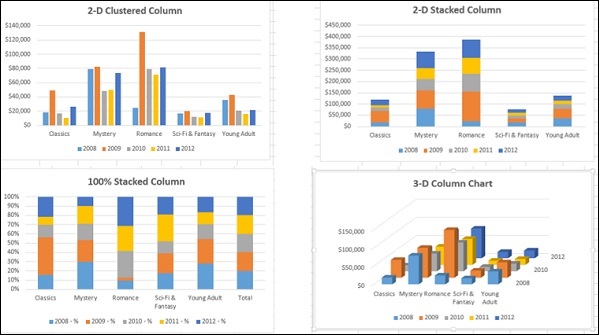
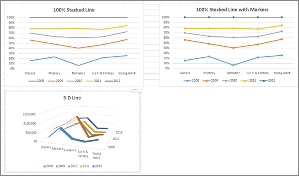
Types of Charts
You can find the following major chart types if you have Excel 2013 −
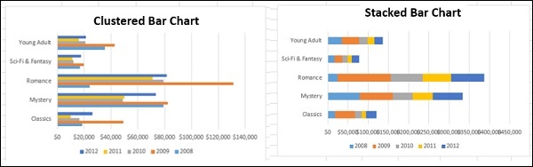
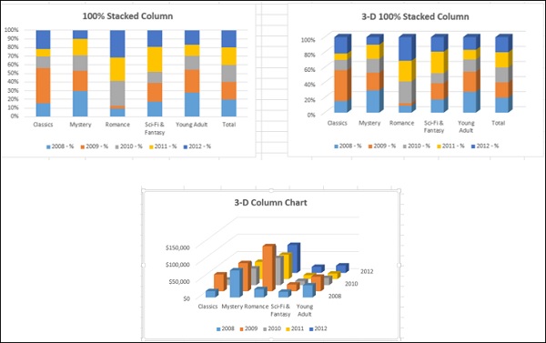
Column Charts
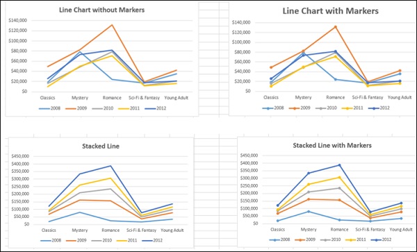
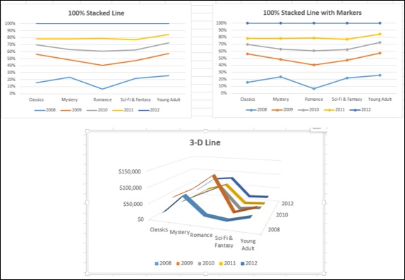
Line Charts
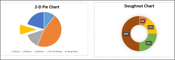
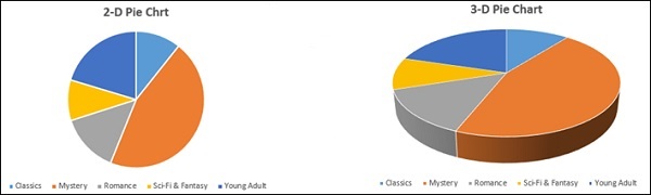
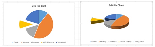
Pie Charts
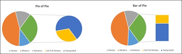
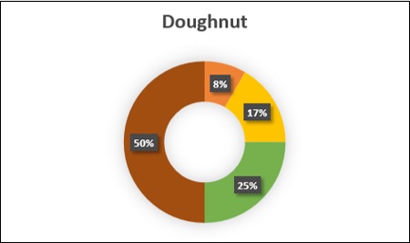
Doughnut Chart
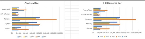
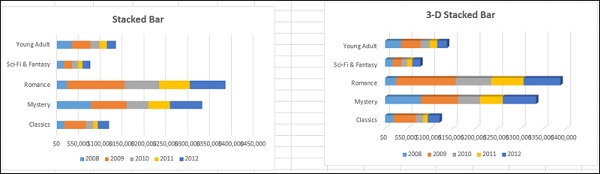
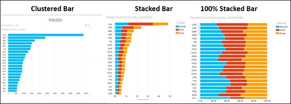
Bar Charts
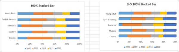
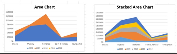
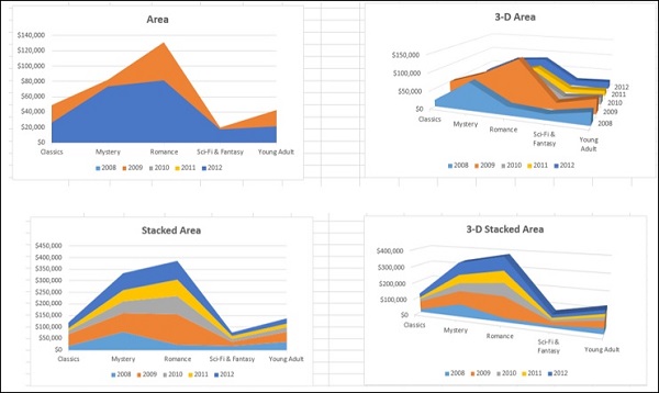
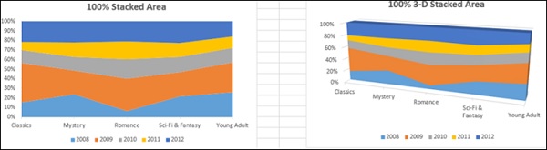
Area Charts
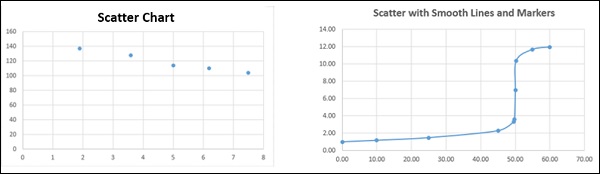
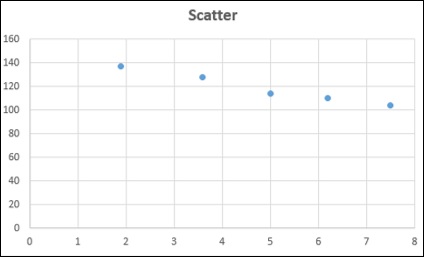
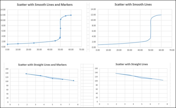
XY (Scatter) Charts
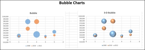
Bubble charts
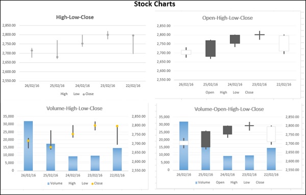
Stock Charts
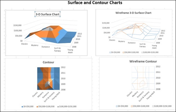
Surface Charts
Radar Charts
To learn about these charts, refer to the tutorial − Excel Charts.
Combo Charts
When you have mixed type of data, you can display it with Combo (Combination) charts. The charts can either have only the Primary Vertical Axis or a combination of Primary Vertical Axis and Secondary Axis. You will learn about Combo charts in a later section.
Selecting the Appropriate Chart Type
To display the data by a chart in your dashboard, first identify the purpose of the chart. Once you have clarity on what you want to represent by a chart, you can select the best chart type that depicts your message.
Following are some suggestions on selecting a chart type −
If you want to compare data values, you can choose a bar chart, pie chart, line chart, or scatter chart.
If you want to show distribution, you can do so with a column chart, scatter chart or line chart.
If you want to show trends over time, you can use a line chart.
If you want to represent parts of a whole, a pie chart can be an option. But, while you use a pie chart, remember that only two to three different data points with very different data values can be effectively depicted with the varying sizes of the Pie slices. If you try to depict more number of data points in a Pie chart, it can be difficult to derive the comparison.
You can use Scatter chart if any of the following is the purpose−
You want to show similarities between large sets of data instead of differences between data points.
You want to compare many data points without regard to time. The more data that you include in a Scatter chart, the better the comparisons you can make.
Recommended Charts in Excel helps you to find a chart type that is suitable to your data.
In Excel, you can create a chart with a chart type and modify it later any time easily.
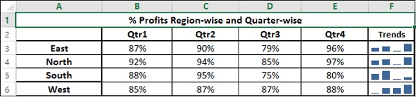
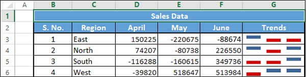
Showing Trends with Sparklines in Tables
Sparklines are tiny charts placed in single cells, each representing a row of data in your selection. They provide a quick way to see trends. In Excel, you can have Line Sparklines, Column Sparklines or Win/Loss Sparklines.
You can add Sparklines to your table quickly with the Quick Analysis tool.
Identify the data for which you want to add Sparklines.
Keep an empty column to the right side of the data and name the column. Sparklines will be placed in this column.
Select the data.
Quick Analysis tool button  appears at the bottom right corner of your selected data.
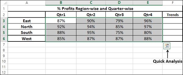
Click on the Quick Analysis
button. Quick Analysis tool appears.Click on SPARKLINES. Chart options appear.
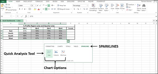
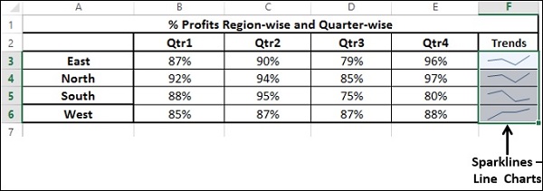
Click on Line. Line Charts will be displayed for each row in the selected data.
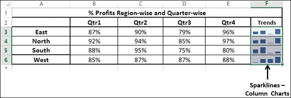
Click on Column. Column Charts will be displayed for each row in the selected data.
Win/Loss charts are not suitable for this data. Consider the following data to understand how Win/Loss charts look.
Using Combo Charts for Comparisons
You can use Combo charts to combine two or more chart types to compare data values of different categories, if the data ranges are varying significantly. With a Secondary Axis to depict the other data range, the chart will be easier to read and grasp the information quickly.
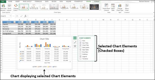
Fine Tuning Charts Quickly
You can fine tune charts quickly using the three buttons  ,
,  and
and  that appear next to the upper-right corner of the chart.
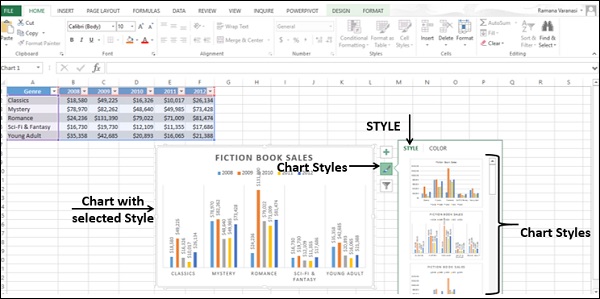
With
Chart Elements, you can add or remove axis, axis titles, legend, data labels, gridlines, error bars, etc. to the chart.With
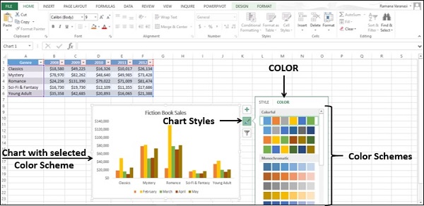
Chart Styles, you can customize the look of the chart by formatting the chart style and colors.With
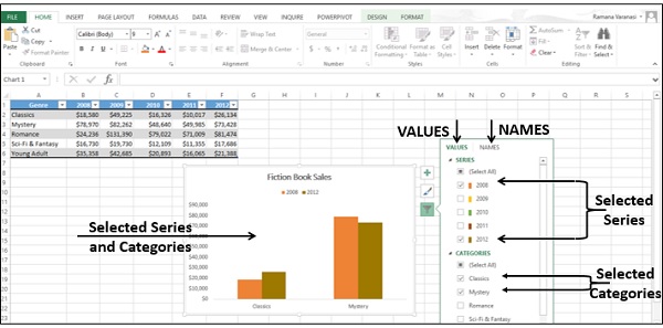
Chart Filters, you can dynamically edit the data points (values) and names that are visible on the chart being displayed.
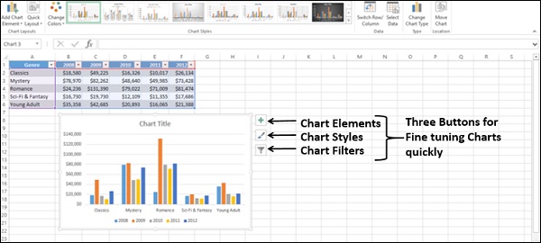
You can select / deselect Chart Elements.
You can format the Gridlines to show the depth axis.
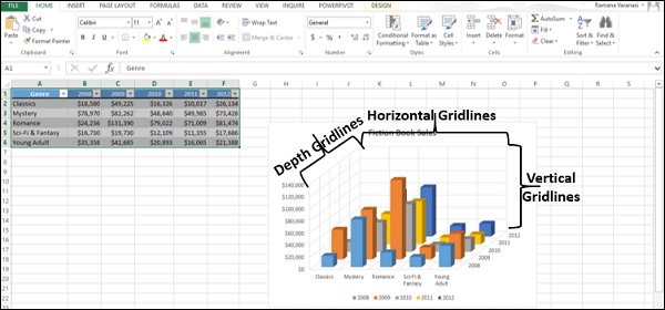
You can set a Chart Style.
You can choose a color scheme for your chart.
You can dynamically select values and names for display.
Values are the data series and the categories.
Names are the names of the data series (columns) and the categories (rows).
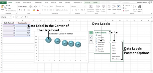
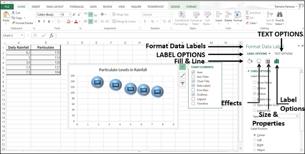
Using Aesthetic Data Labels
You can have aesthetic and meaningful Data Labels.
You can place Data Labels at any position with respect to the data points.
You can format Data Labels with various options, including effects.
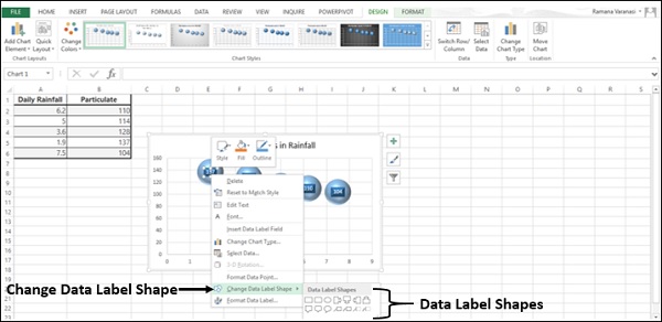
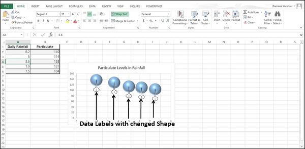
You can change Data Labels to any shape.
Data Labels can be of different sizes. You can resize each Data label so that the text in it would be visible.
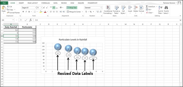
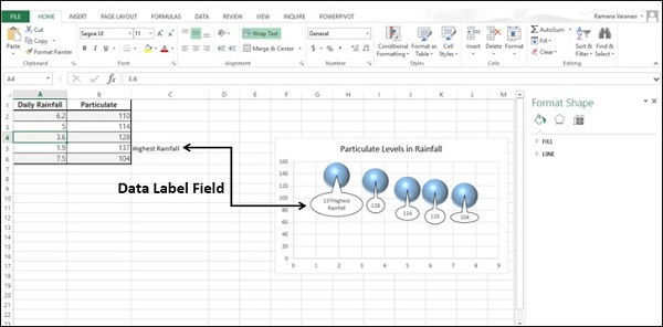
You can include text from data points or any other text for any of the Data Labels so as to make them refreshable and thus dynamic.
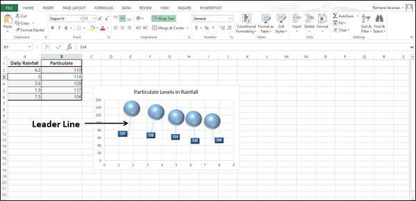
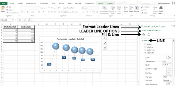
You can connect Data Labels to their data points with Leader Lines.
You can place Data Labels with Leader Lines at any distance from the data points by moving them.
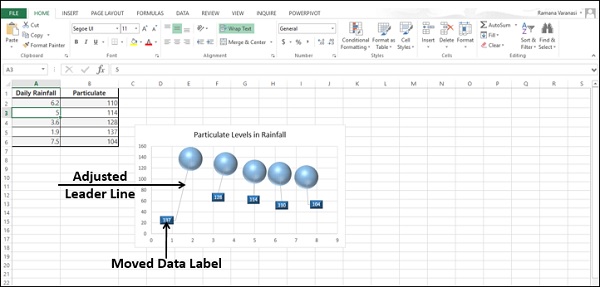
You can format Leader Line to make them conspicuous.
You can choose any of these options to display the Data Labels on the chart based on your data and what you want to highlight.
Data Labels stay in place, even when you switch to a different type of chart. But, finalize the chart type before formatting any chart elements, including Data Labels.
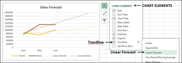
Using Trendlines in Charts
You can depict forecast of the results in a chart using Trendlines.
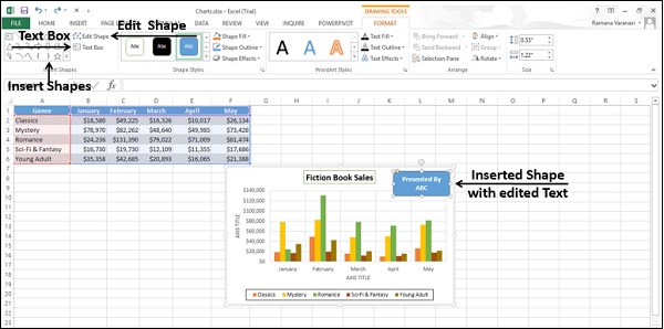
Using Shapes in Charts
You can insert different types of Shapes in your chart. After you insert a Shape, you can add Text to it, with Edit Text. You can Edit Shape with Change Shape and/or Edit Points.
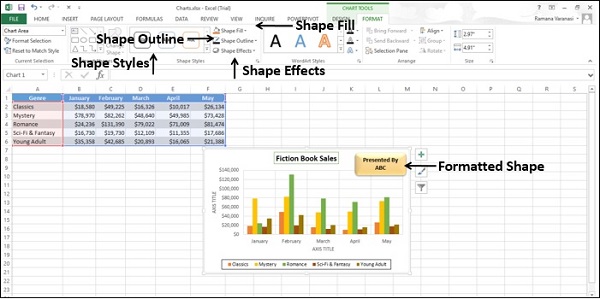
You can change the Style of the Shape, choose a Shape Fill Color, Format Shape Outline and add Visual Effects to the Shape.
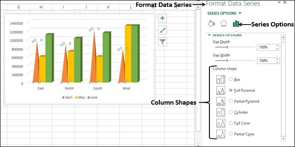
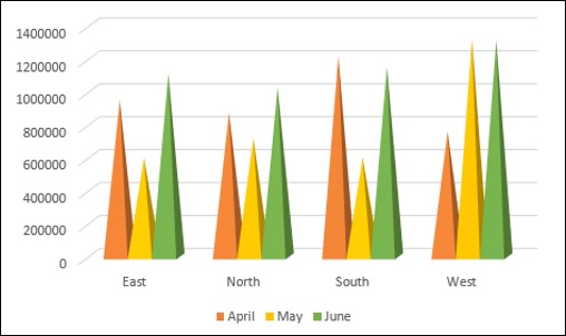
Using Cylinders, Cones, and Pyramids
In 3-D Column charts, by default, you will have boxes.
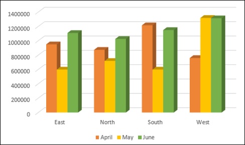
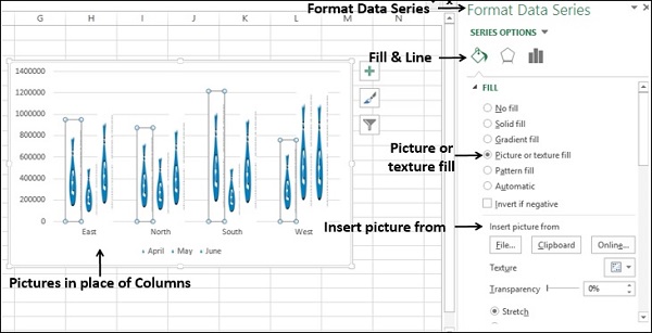
To make your charts more conspicuous in dashboards, you can choose other 3-D column shapes like cylinders, cones, pyramids, etc. You can select these shapes in the Format Data Series pane.
Columns with Pyramid shape
Columns with Cylinder shape
Columns with Cone shape
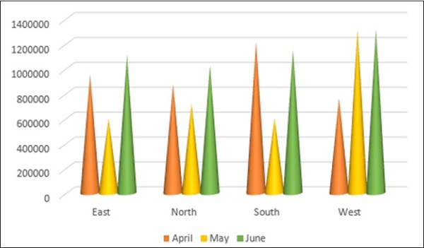
Using Pictures in Charts
You can create more emphasis on your data presentation by using a Picture in place of Columns.
Excel Dashboards - Interactive Controls
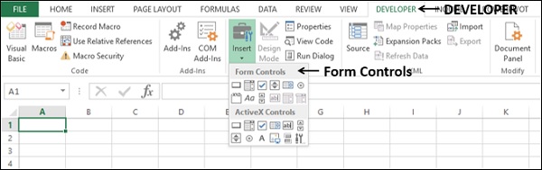
If you have more data to display on the dashboard that does not fit into a single screen, you can opt for using Excel controls that come as a part of Excel Visual Basic. The most commonly used controls are scrollbars, radio buttons, and checkboxes. By incorporating these in the dashboard, you can make it interactive and allow the user to view the different facets of the data by possible selections.
You can provide interactive controls such as scroll bars, checkboxes and radio buttons in your dashboards to facilitate the recipients to dynamically view the different facets of data being displayed as results. You can decide on a particular layout of the dashboard along with the recipients and use the same layout then onwards. Excel interactive controls are simple to use and does not require any expertise in Excel.
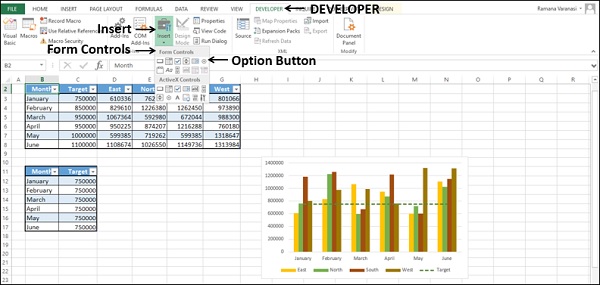
The Excel interactive controls will be available in the DEVELOPER tab on the Ribbon.
If you do not find the DEVELOPER tab on the Ribbon, do the following −
- Click on Customize Ribbon in the Excel Options box.
- Select Main Tabs in the Customize the Ribbon box.
- Check the Developer box in the Main Tabs list.
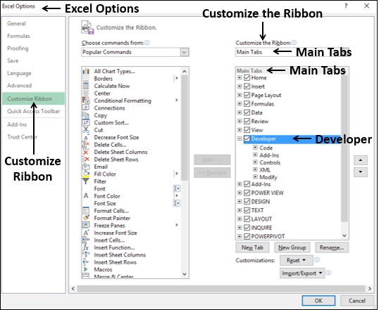
- Click the OK. You will find the DEVELOPER tab on the Ribbon.
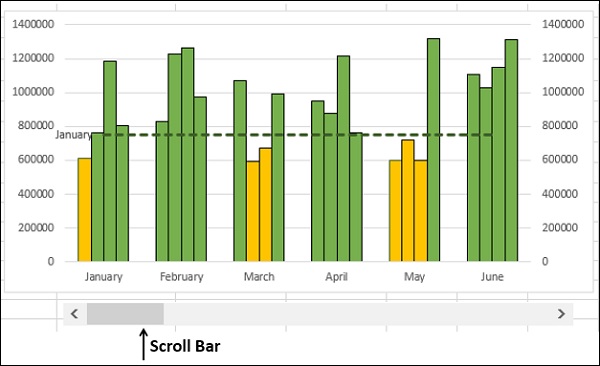
Scroll Bars in Dashboards
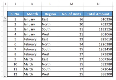
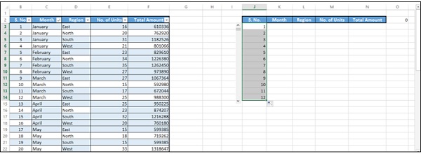
One of the features of any dashboard is that each component in the dashboard is as compact as possible. Suppose your results look as follows −
If you can present this table with a scroll bar as given below, it would be easier to browse through the data.
You can also have a dynamic Target Line in a Bar chart with scroll bar. As you move the scroll bar up and down, the Target Line moves up and down and those bars that are crossing the Target Line will get highlighted.
In the following sections, you will learn how to create a scroll bar and how to create a dynamic target line that is linked to a scroll bar. You will also learn how to display dynamic labels in scroll bars.
Creating a Scrollbar
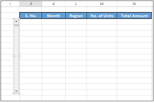
To create a scrollbar for a table, first copy the headers of the columns to an empty area on the sheet as shown below.
Insert a scrollbar.
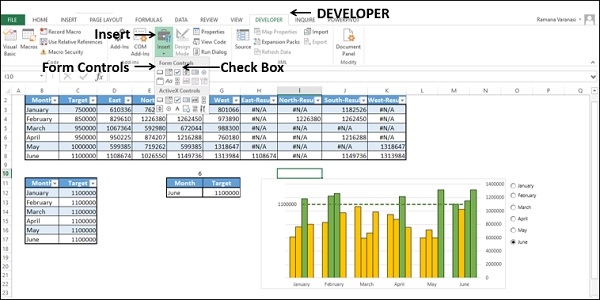
Click on the DEVELOPER tab on the Ribbon.
Click on Insert in the Controls group.
Click on Scroll Bar icon under Form Controls in the dropdown list of icons.
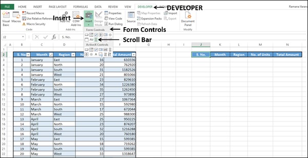
Take the cursor to the column I and pull down to insert a vertical scroll bar.
Adjust the height and width of the scroll bar and align it to the table.
Right click on the scroll bar.
Click on Format Control in the dropdown list.
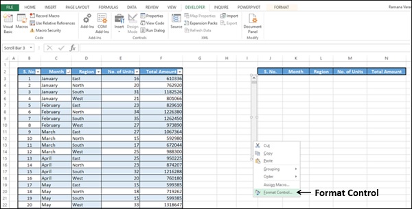
Format Control dialog box appears.
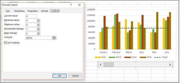
Click on the Control tab.
Type the following in the boxes that appear.
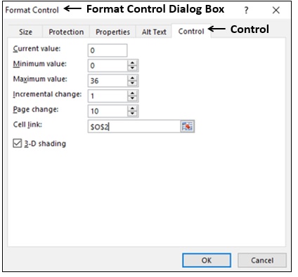
Click the OK button. The scroll bar is ready to use. You have chosen the cell O2 as the cell link for the scroll bar, which takes values 0 36, when you move the scroll bar up and down. Next, you have to create copy of the data in the table with a reference based on the value in the cell O2.
In the cell K3, type the following −
= OFFSET(Summary[@[S. No.]],$O$2,0).
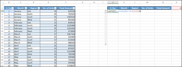
Hit the Enter button. Fill in the cells in the column copying the formula.
Fill in the cells in the other columns copying the formula.
Your dynamic and scrollable table is ready to be copied to your dashboard.
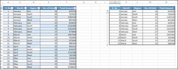
Move the scroll bar down.
As you can observe, the value in the cell - scroll bar cell link changes, and the data in the table is copied based on this value. At a time, 12 rows of data is displayed.
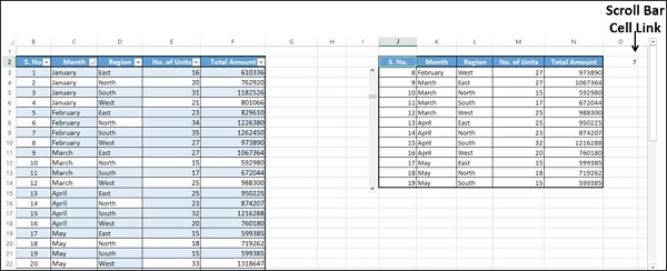
Drag the scroll bar to the bottom.
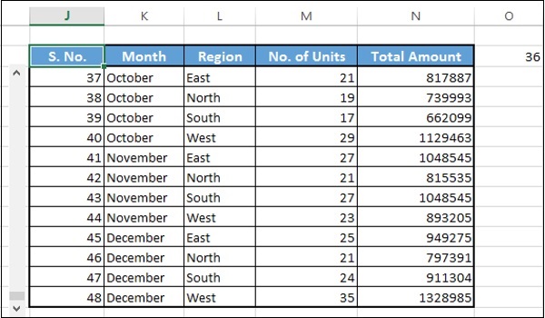
The last 12 rows of the data is displayed as the current value is 36 (as shown in the cell O2) and 36 is the maximum value that you have set in the Form Control dialog box.
You can change the relative position of the dynamic table, change the number of rows to be displayed at a time, cell link to scroll bar, etc. based on your requirement. As you have seen above, these need to be set in the Format Control dialog box.
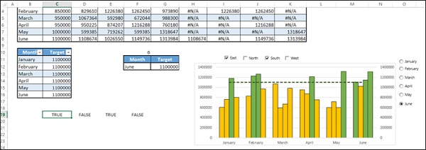
Creating a Dynamic and Interactive Target Line
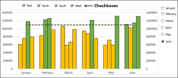
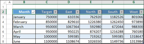
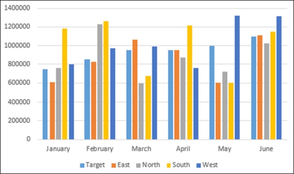
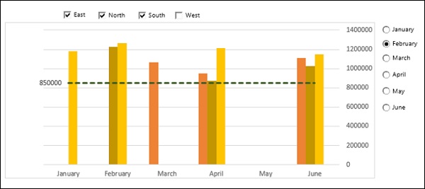
Suppose you want to display the sales region-wise over the last 6 months. You also have set targets for each month.
You can do the following −
- Create a column chart showing all this information.
- Create a Target Line across the columns.
- Make the Target Line interactive with a scroll bar.
- Make the Target Line dynamic setting the target values in your data.
- Highlight values that are meeting the target.
Create a column chart showing all this information
Select the data. Insert a clustered column chart.
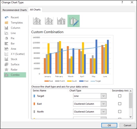
Create a Target Line across the columns
Change the chart type to combo. Select chart type as Line for the Target series and Clustered Column for the rest of the series.
Create a base table for the Target Line. You will make this dynamic later.
Change the data series values for the Target Line to the Target column in the above table.
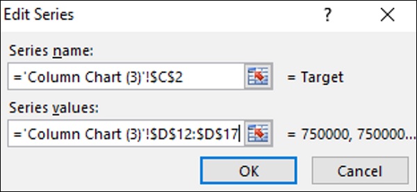
Click the OK button.
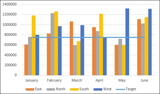
Change the color scheme for the Clustered Column. Change the Target Line into a green dotted line.
Make the Target Line interactive with a scroll bar
Insert a scroll bar and place it below the chart and size it to span from January to June.
Enter the scroll bar parameters in the Format Control dialog box.
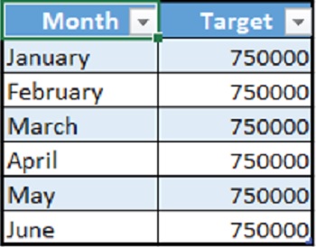
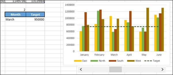
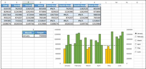
Create a table with two columns − Month and Target.
Enter the values based on the data table and scroll bar cell link.
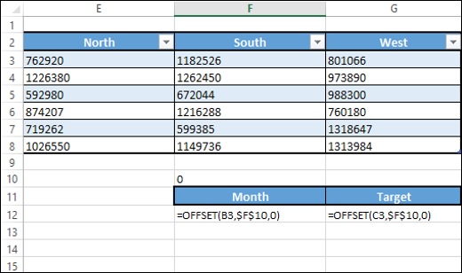
This table displays the Month and the corresponding Target based on the scroll bar position.
Make the Target Line dynamic setting the target values in your data
Now, you are set to make your Target Line dynamic.
Change the Target column values in the base table you created for the Target Line by typing = $G$12 in all the rows.
As you are aware, the cell G12 displays the Target value dynamically.
As you can observe, the Target Line moves based on the scroll bar.
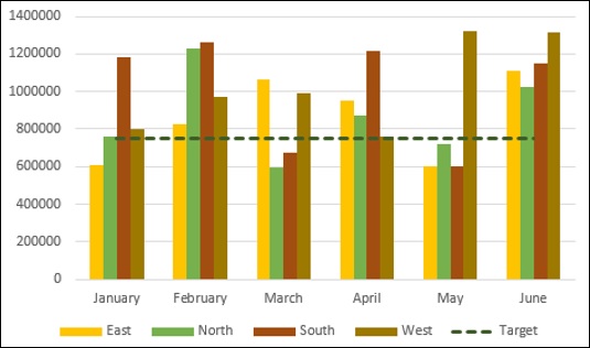
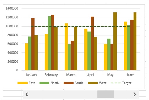
Highlight values that are meeting the target
This is the final step. You want to highlight the values meeting the target at any point of time.
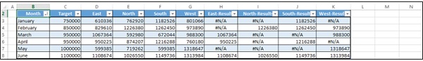
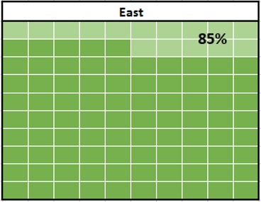
Add columns to the right side of your data table − East-Results, North-Results, SouthResults and West-Results.
In the cell H3, enter the following formula −
= IF(D3 >= $G$12,D3,NA())
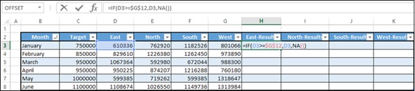
Copy the formula to the other cells in the table. Resize the table.
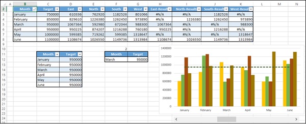
As you can observe, the values in the columns - East-Results, North-Results, SouthResults and West-Results change dynamically based on the scroll bar (i.e. Target value). Values greater than or equal to the Target are displayed and the other values are just #N/A.
Change the Chart Data Range to include the newly added columns in the data table.
Click on Change Chart Type.
Make the Target series be Line and the rest Clustered Column.
For the newly added data series, select Secondary Axis.
Format data series in such a way that the series East, North, South and West have a fill color orange and the series East-Results, North-Results, South-Results and WestResults have a fill color green.
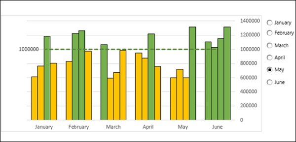
Enter a Data Label for the Target Line and make it dynamic with the cell reference to the Month value in the dynamic data table.
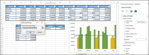
Your chart with dynamic Target Line is ready for inclusion in the dashboard.
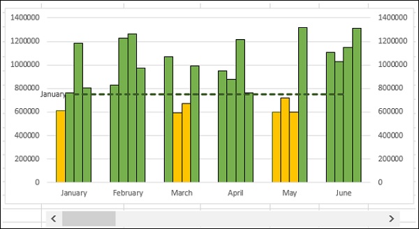
You can clear the secondary axis as it is not required. As you move the scroll bar, Target Line moves and the Bars will get highlighted accordingly. Target Line also will have a Label showing the Month.
Excel Option (Radio) Buttons
Radio buttons are normally used to select an option from a given set of options. It is always depicted by a small circle, which will have a dot in it when selected. When you have a set of radio buttons, you can select only one of them.
In Excel, Radio buttons are referred to as Option Buttons.
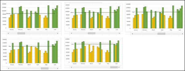
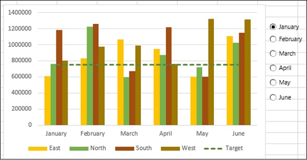
You can use Excel Option Buttons in charts to choose the data specifics the reader wants to have a look at. For example, in the example in the previous section you have created a scroll bar to get a dynamic Target Line with target values based on Month. You can use Option Buttons to select a Month and thus the target value, and base the Target Line on the target value. Following will be the steps −
- Create a column chart showing all this information.
- Create a Target Line across the columns.
- Make the Target Line interactive with Option Buttons.
- Make the Target Line dynamic setting the target values in your data.
- Highlight values that are meeting the target.
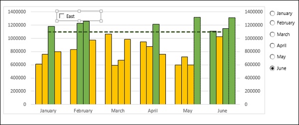
Steps 1 and 2 are same as in the previous case. By the end of the second step, you will have the following chart.
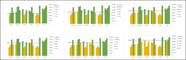
Make the Target Line interactive with Option Buttons
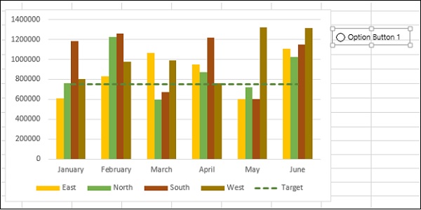
Insert an Option Button.
Click on the DEVELOPER tab on the Ribbon.
Click on Insert in the Controls group.
Click on Option Button icon under Form Controls in the dropdown list of icons.
Place it at the top right corner of the chart.
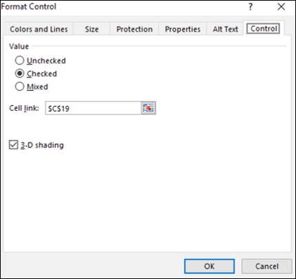
Right click on the Option button. Click the Format Control option in the dropdown list.
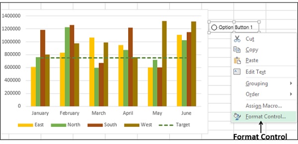
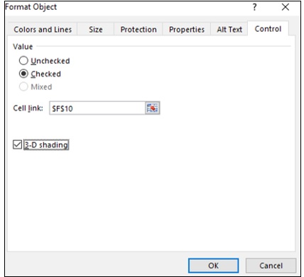
Enter the Option Button parameters in the Format Object dialog box, under the Control tab.
The cell F10 is linked to the Option Button. Make 5 copies of the Option Button vertically.
As you can observe, all the Option Buttons have the same name, referred to as Caption Names. But, internally Excel will have different names for these Option Buttons, which you can look at either in the Name box. Further, as Option Button 1 was set to link to the cell F10, all the copies also refer to the same cell.
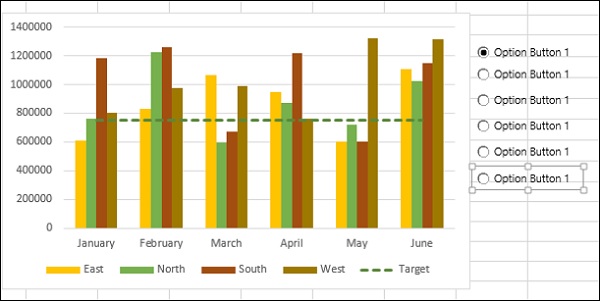
Click on any of the Option Buttons.
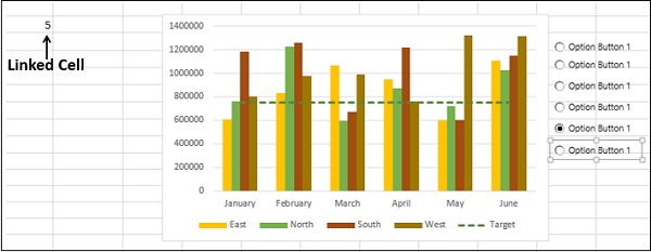
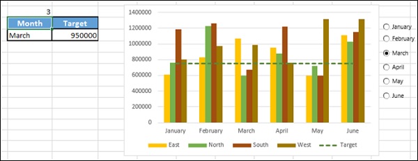
As you can observe, the number in the linked cell changes to the serial number of the Option Button. Rename the Option Buttons to January, February, March, April, May and June.
Create a table with two columns − Month and Target. Enter the values based on the data table and scroll bar cell link.
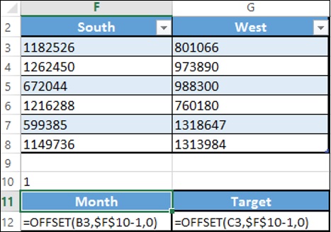
This table displays the Month and the corresponding Target based on the selected Option Button.
Make the Target Line dynamic setting the target values in your data
Now, you are set to make your Target Line dynamic.
Change the Target column values in the base table you created for the Target Line by typing = $G$12 in all the rows.
As you are aware, the cell G12 displays the Target value dynamically.
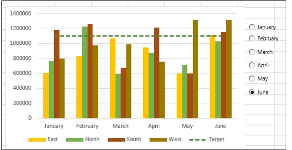
As you can observe, the Target Line is displayed based on the selected Option Button.
Highlight values that are meeting the target
This is the final step. You want to highlight the values meeting the target at any point of time.
Add columns to the right side of your data table − East-Results, North-Results, SouthResults and West-Results.
In the cell H3, enter the following formula −
= IF(D3 >= $G$12,D3,NA())
Copy the formula to the other cells in the table. Resize the table.
As you can observe, the values in the columns − East-Results, North-Results, SouthResults and West-Results change dynamically based on the scroll bar (i.e. Target value). Values greater than or equal to the Target are displayed and the other values are just #N/A.
Change the Chart Data Range to include the newly added columns in the data table.
Click on Change Chart Type.
Make the Target series be Line and the rest Clustered Column.
For the newly added data series, select Secondary Axis.
Format data series in such a way that the series East, North, South and West have a fill color orange and the series East-Results, North-Results, South-Results and WestResults have a fill color green.
Add a dynamic Data Label to the Target Line with value from the cell $G$12.
Clear the secondary axis as it is not required.
Under the VIEW tab on the Ribbon, uncheck the Gridlines box.
Change the Label option to High in the Format Axis options. This shifts the Vertical Axis Labels to the right, making your Target Line Data Label conspicuous.
Your chart with dynamic Target Line and Option Buttons is ready for inclusion in the dashboard.
As you select an Option Button, Target Line is displayed as per the target value of the selected Month and the Bars will get highlighted accordingly. Target Line also will have a Data Label showing the target value.
Excel Checkboxes
Checkboxes are normally used to select one or more options from a given set of options. Checkboxes are always depicted by small squares, which will have a tick mark when selected. When you have a set of Checkboxes, it is possible to select any number of them. For example,

You can use Excel Check Boxes in charts to choose the data specifics the reader wants to have a look at. For example, in the example in the previous section, you have created column chart that displays the data of 4 Regions East, North, South and West. You can use Check Boxes to select the Regions for which data is displayed. You can select any number of Regions at a time.
You can start with the last step of the previous section −
Insert a Checkbox.
Click on the DEVELOPER tab on the Ribbon.
Click on Insert in the Controls group.
Click on Check Box icon under Form Controls in the dropdown list of icons.
Place it at the top left corner of the chart.
Change the name of the Check Box to East.
Right-click on the checkbox. Click on Format Control in the dropdown list.
Enter the Check Box parameters in the Format Control dialog box, under the Control tab.
Click the OK button. You can observe that in the linked cell C19, TRUE will be displayed if you select the Check Box and FALSE will be displayed if you deselect the Check Box.
Copy the Check Box and paste 3 times horizontally.
Change the Names to North, South and West.
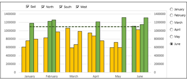
As you can observe, when you copy a Check Box, the linked cell remains the same for the copied Check Box also. However, since Check Boxes can have multiple selections, you need to make the linked cells different.
Change the linked cells for North, South and West to $C$20, $C$21 and $C$22 respectively.
The next step is to have only the selected Regions data in the Chart.
Create a table structure as follows −
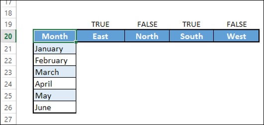
- Type = IF($C$19,H3,NA()) in the cell C21.
- Type = IF($D$19,I3,NA()) in the cell D21.
- Type = IF($E$19,J3,NA()) in the cell E21.
- Type = IF($F$19,K3,NA()) in the cell F21.
- Fill in other rows in the table.
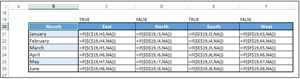
Add the Target column.
Change the Chart data to this table.
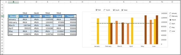
The Chart displays the data for the selected Regions that is more than the target value set for the selected Month.
Excel Dashboards - Advanced Excel Charts
You are aware that charts are useful in conveying you data message visually. In addition to the chart types that are available in Excel, there are some widely used application charts that became popular. Some of these are also included in Excel 2016.
In case you are using Excel 2013 or earlier versions, please refer to the tutorial Advanced Excel Charts to learn about these charts and how to create them with the built-in chart types.
Types of Advanced Excel Charts
Following advanced Excel chart types will come handy to include in your dashboards −
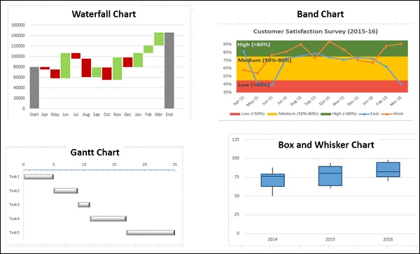
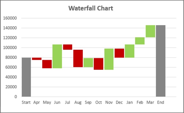
Waterfall Chart
Waterfall charts are ideal for showing how you have arrived at a net value such as net income, by breaking down the cumulative effect of positive and negative contributions.
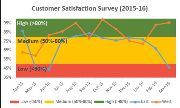
Band Chart
Band chart is suitable to represent data across a time period graphically, confiding each data point to a defined interval. For example, customer survey results of a product from different regions.
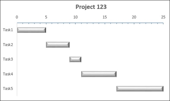
Gantt Chart
A Gantt chart is a chart in which a series of horizontal lines shows the amount of work done in certain periods of time in relation to the amount of work planned for those periods.
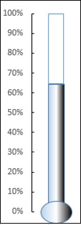
Thermometer Chart
When you have to represent a target value and an actual value, you can emphatically show these values with a Thermometer chart.
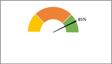
Gauge Chart
A Gauge Chart shows the minimum, the maximum and the current value depicting how far from the maximum you are.
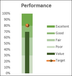
Bullet Chart
Bullet chart can be used to compare a measure to one or more related measures and relate the measure to defined quantitative ranges that declare its qualitative state, for example, good, satisfactory and poor. You can use Bullet chart to display KPIs also.
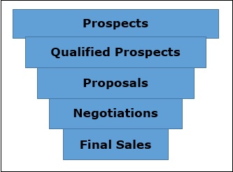
Funnel Chart
Funnel chart is used to visualize the progressive reduction of data as it passes from one phase to another. E.g. Sales Pipeline.
Waffle Chart
Waffle chart is a good choice to display work progress as percentage of completion, goal achieved vs Target, etc.
Heat Map
A Heat Map is a visual representation of data in a Table to highlight the data points of significance.
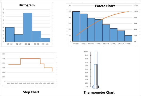
Step Chart
If you have to display the changes that occur at irregular intervals that remain constant between changes, Step chart is useful.
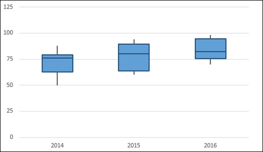
Box and Whisker Chart
Box and Whisker charts are commonly used in statistical analysis. For example, you can use a Box and Whisker chart to compare experimental results or competitive exam results.
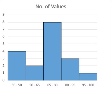
Histogram
A Histogram is a graphical representation of the distribution of numerical data and is widely used in Statistical Analysis.
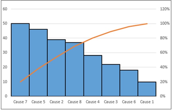
Pareto Chart
Pareto chart is another chart widely used in Statistical Analysis for decision making. It represents the Pareto analysis, also called 80/20 Rule, meaning that 80% of results are due to 20% of causes.
Displaying Quarterly Performance with Bullet Charts
Suppose you have to display the performance of the sales team quarterly on the dashboard. The data can be as given below.
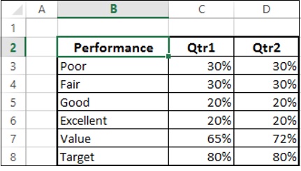
You can display this information on the dashboard using Bullet chart as follows −
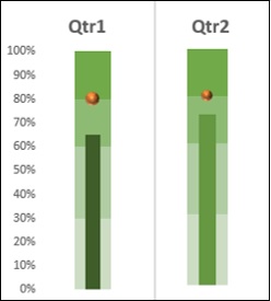
As you can observe, this occupies less space, yet conveys a lot of information.
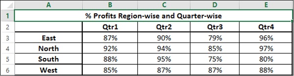
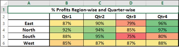
Displaying Profit % Region-Wise with Waffle Charts
Suppose you have to display the Profit % for the regions − East, North, South and West.
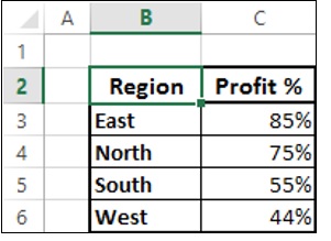
You can display this information emphatically on your dashboard with Waffle charts as shown below.
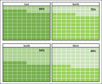
This display not only depicts the values, but also a good comparison.
Excel Dashboards - PivotTables
If you have your data in a single Excel table, you can summarize the data in the way that is required using Excel PivotTables. A PivotTable is an extremely powerful tool that you can use to slice and dice data. You can track, analyze hundreds of thousands of data points with a compact table that can be changed dynamically to enable you to find the different perspectives of the data. It is a simple tool to use, yet powerful.
Excel gives you a more powerful way of creating a PivotTable from multiple tables, different data sources and external data sources. It is named as Power PivotTable that works on its database known as Data Model. You will get to know about Power PivotTable and other Excel power tools such as Power PivotChart and Power View Reports in other chapters.
PivotTables, Power PivotTables, Power PivotCharts and Power View Reports come handy to display summarized results from big data sets on your dashboard. You can get mastery on the normal PivotTable before you venture into the power tools.
Creating a PivotTable
You can create a PivotTable either from a range of data or from an Excel table. In both the cases, the first row of the data should contain the headers for the columns.
You can start with an empty PivotTable and construct it from scratch or make use of Excel Recommended PivotTables command to preview the possible customized PivotTables for your data and choose one that suits your purpose. In either case, you can modify a PivotTable on the fly to get insights into the different aspects of the data at hand.
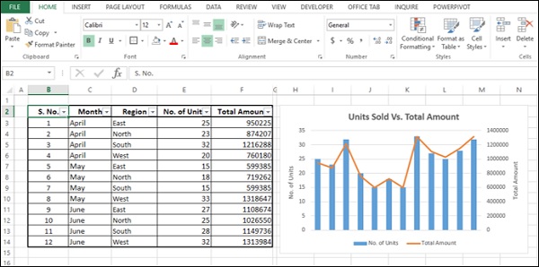
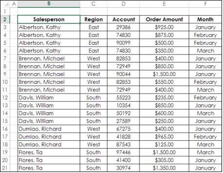
Consider the following data range that contains the sales data for each Salesperson, in each Region and in the months of January, February and March −
To create a PivotTable from this data range, do the following −
Ensure that the first row has headers. You need headers because they will be the field names in your PivotTable.
Name the data range as SalesData_Range.
Click on the data range − SalesData_Range.
Click on the INSERT tab on the Ribbon.
Click on PivotTable in the Tables group.
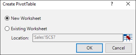
Create PivotTable dialog box appears.
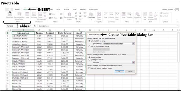
As you can observe, in Create PivotTable dialog box, under Choose the data that you want to analyze, you can either select a Table or Range from the current workbook or use an external data source. Hence, you can use the same steps to create a PivotTable form either a Range or Table.
Click on Select a table or range.
In the Table/Range box, type the range name − SalesData_Range.
Click on New Worksheet under Choose where you want the PivotTable report to be placed.
You can also observe that you can choose to analyze multiple tables, by adding this data range to Data Model. Data Model is Excel Power Pivot database.
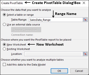
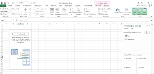
Click the OK button. A new worksheet will get inserted into your workbook. The new worksheet contains an empty PivotTable.
Name the worksheet − Range-PivotTable.
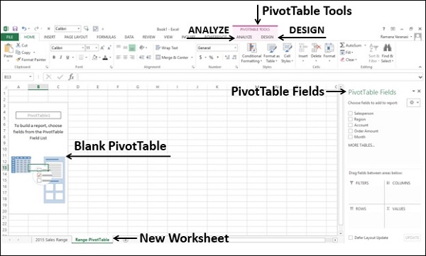
As you can observe, PivotTable Fields list appears on the right side of the worksheet, containing the header names of the columns in the data range. Further, on the Ribbon, PivotTable Tools − ANALYZE and DESIGN appear.
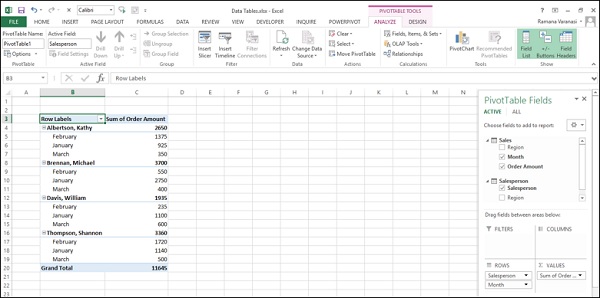
You need to select PivotTable fields based on what data you want to display. By placing the fields in appropriate areas, you can obtain the desired layout for the data. For example to summarize the order amount salesperson-wise for the months − January, February and March, you can do the following −
Click on the field Salesperson in the PivotTable Fields list and drag it to ROWS area.
Click on the field Month in the PivotTable Fields list and drag that also to ROWS area.
Click on Order Amount and drag it to ∑ VALUES area.
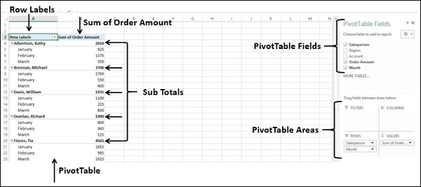
Your PivotTable is ready. You can change the layout of the PivotTable by just dragging the fields across the areas. You can select / deselect fields in the PivotTable Fields list to choose the data you want to display.
Filtering Data in PivotTable
If you are required to focus on a subset of your PivotTable data, you can filter the data in the PivotTable based on a subset of the values of one or more fields. For example in the above example, you can filter the data based on the Range field so that you can display data only for the selected Region(s).
There are several ways to filter data in a PivotTable −
- Filtering using Report Filters.
- Filtering using Slicers.
- Filtering data manually.
- Filtering using Label Filters.
- Filtering using Value Filters.
- Filtering using Date Filters.
- Filtering using Top 10 Filter.
- Filtering using Timeline.
You will get to know the usage of Report Filters in this section and Slicers in the next section. For other filtering options, refer to the Excel PivotTables tutorial.
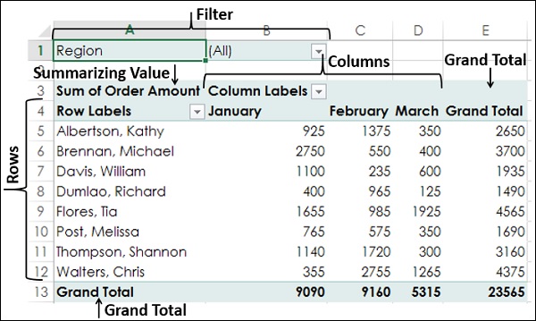
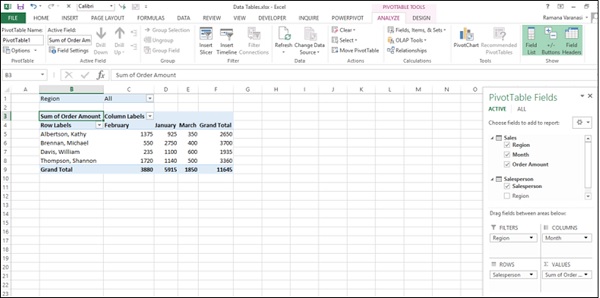
You can assign a Filter to one of the fields so that you can dynamically change the PivotTable based on the values of that field.
- Drag the field Region to FILTERS area.
- Drag the field Salesperson to ROWS area.
- Drag the field Month to COLUMNS area.
- Drag the field Order Amount to ∑ VALUES area.
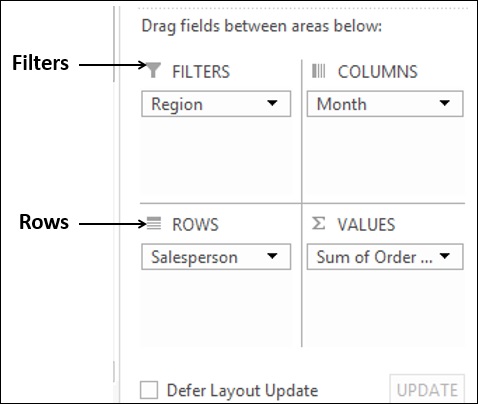
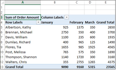
The Filter with the label as Region appears above the PivotTable (in case you do not have empty rows above your PivotTable, PivotTable gets pushed down to make space for the Filter).

As you can observe,
Salesperson values appear in rows.
Month values appear in columns.
Region Filter appears on the top with default selected as ALL.
Summarizing value is Sum of Order Amount.
Sum of Order Amount Salesperson-wise appears in the column Grand Total.
Sum of Order Amount Month-wise appears in the row Grand Total.
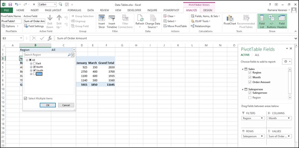
Click on the arrow in the Region Filter.
Dropdown list with the values of the field Region appears.
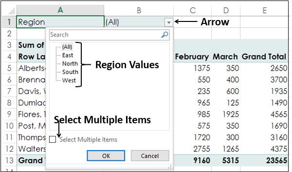
Check the box Select Multiple Items. Check boxes will appear for all the values. By default, all the boxes are checked.
Uncheck the box (All). All the boxes will get unchecked.
Check the boxes - South and West.
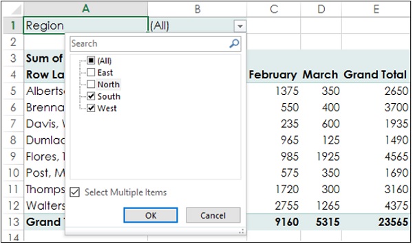
Click the OK button. Data pertaining to South and West regions only will get summarized.
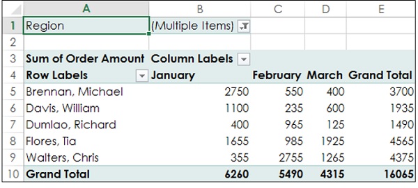
As you can observe, in the cell next to the Region Filter - (Multiple Items) is displayed, indicating that you have selected more than one value. But how many values and / or which values is not known from the report that is displayed. In such a case, using Slicers is a better option for filtering.
Using Slicers in PivotTable
Filtering using Slicers has many advantages −
You can have multiple Filters by selecting the fields for the Slicers.
You can visualize the fields on which the Filter is applied (one Slicer per field).
A Slicer will have buttons denoting the values of the field that it represents. You can click on the buttons of the Slicer to select/ unselect the values in the field.
You can visualize what values of a field are used in the Filter (selected buttons are highlighted in the Slicer).
You can use a common Slicer for multiple PivotTables and / or PivotCharts.
You can hide / unhide a Slicer.
To understand the usage of Slicers, consider the following PivotTable.
Suppose you want to filter this PivotTable based on the fields − Region and Month.
- Click on the ANALYZE tab under PIVOTTABLE TOOLS on the Ribbon.
- Click on Insert Slicer in the Filter group.
Insert Slicers dialog box appears. It contains all the fields from your data.
- Check the boxes Region and Month.
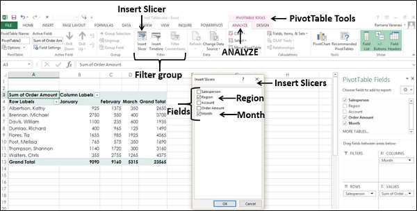
Click the OK button. Slicers for each of the selected fields appear with all the values selected by default. Slicer Tools appear on the Ribbon to work on the Slicer settings, look and feel.
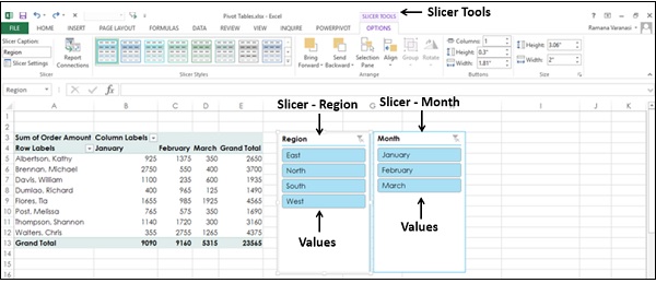
As you can observe, each Slicer has all the values of the field that it represents and the values are displayed as buttons. By default, all the values of a field are selected and hence all the buttons are highlighted.
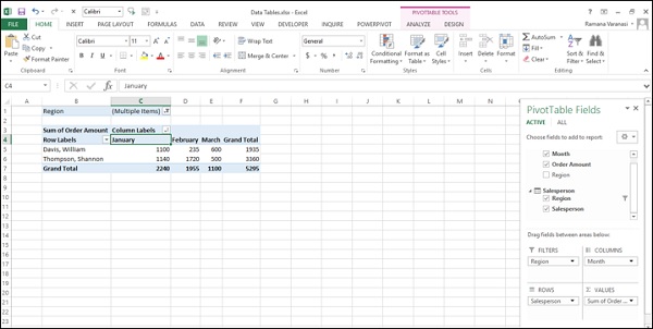
Suppose you want to display the PivotTable only for South and West regions and for the February and March months.
Click on South in the Region Slicer. Only South will be highlighted in the Slicer Region.
Keep Ctrl key pressed and click on West in the Region Slicer.
Click on February in the Month Slicer.
Keep Ctrl key pressed and click on March in the Month Slicer. Selected values in the Slicers are highlighted. PivotTable will be summarized for the selected values.
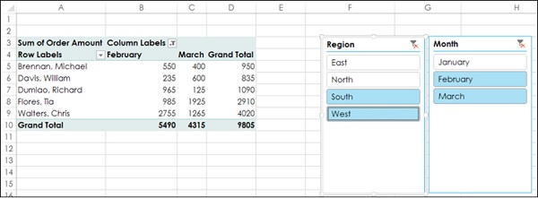
To add/remove values of a field from the filter, keep the Ctrl key pressed and click on those buttons in the respective Slicer.
Power PivotTables & Power PivotCharts
When your data sets are big, you can use Excel Power Pivot that can handle hundreds of millions of rows of data. The data can be in external data sources and Excel Power Pivot builds a Data Model that works on a memory optimization mode. You can perform the calculations, analyze the data and arrive at a report to draw conclusions and decisions. The report can be either as a Power PivotTable or Power PivotChart or a combination of both.
You can utilize Power Pivot as an ad hoc reporting and analytics solution. Thus, it would be possible for a person with hands-on experience with Excel to perform the high-end data analysis and decision making in a matter of few minutes and are a great asset to be included in the dashboards.
Uses of Power Pivot
You can use Power Pivot for the following −
- To perform powerful data analysis and create sophisticated Data Models.
- To mash-up large volumes of data from several different sources quickly.
- To perform information analysis and share the insights interactively.
- To create Key Performance Indicators (KPIs).
- To create Power PivotTables.
- To create Power PivotCharts.
Differences between PivotTable and Power PivotTable
Power PivotTable resembles PivotTable in its layout, with the following differences −
PivotTable is based on Excel tables, whereas Power PivotTable is based on data tables that are part of Data Model.
PivotTable is based on a single Excel table or data range, whereas Power PivotTable can be based on multiple data tables, provided they are added to Data Model.
PivotTable is created from Excel window, whereas Power PivotTable is created from PowerPivot window.
Creating a Power PivotTable
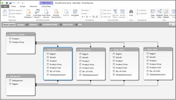
Suppose you have two data tables Salesperson and Sales in the Data Model. To create a Power PivotTable from these two data tables, proceed as follows −
Click on the Home tab on the Ribbon in PowerPivot window.
Click on PivotTable on the Ribbon.
Click on PivotTable in the dropdown list.
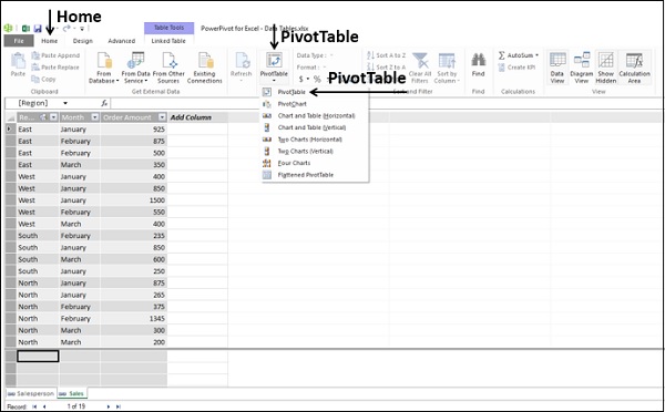
Create PivotTable dialog box appears. Click on New Worksheet.
Click the OK button. New worksheet gets created in Excel window and an empty Power PivotTable appears.
As you can observe, the layout of the Power PivotTable is similar to that of PivotTable.
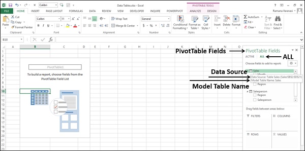
The PivotTable Fields List appears on the right side of the worksheet. Here, you will find some differences from PivotTable. The Power PivotTable Fields list has two tabs − ACTIVE and ALL, that appear below the title and above the fields list. ALL tab is highlighted. The ALL tab displays all the data tables in the Data Model and ACTIVE tab displays all the data tables that are chosen for the Power PivotTable at hand.
Click the table names in the PivotTable Fields list under ALL.
The corresponding fields with check boxes will appear.
Each table name will have the symbol
 on the left side.
If you place the cursor on this symbol, the Data Source and the Model Table Name of that data table will be displayed.
- Drag Salesperson from Salesperson table to ROWS area.
- Click on the ACTIVE tab.
The field Salesperson appears in the Power PivotTable and the table Salesperson appears under ACTIVE tab.
- Click on the ALL tab.
- Click on Month and Order Amount in the Sales table.
- Click on the ACTIVE tab.
Both the tables Sales and Salesperson appear under the ACTIVE tab.
- Drag Month to COLUMNS area.
- Drag Region to FILTERS area.
- Click on arrow next to ALL in the Region filter box.
- Click on Select Multiple Items.
- Click on North and South.
- Click the OK button. Sort the column labels in the ascending order.
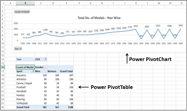
Power PivotTable can be modified dynamically to explore and report data.
Creating a Power PivotChart
A Power PivotChart is a PivotChart that is based on Data Model and created from the Power Pivot window. Though it has some features similar to Excel PivotChart, there are other features that make it more powerful.
Suppose you want to create a Power PivotChart based on the following Data Model.
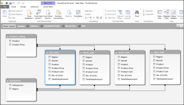
- Click on the Home tab on the Ribbon in the Power Pivot window.
- Click on PivotTable.
- Click on PivotChart in the dropdown list.
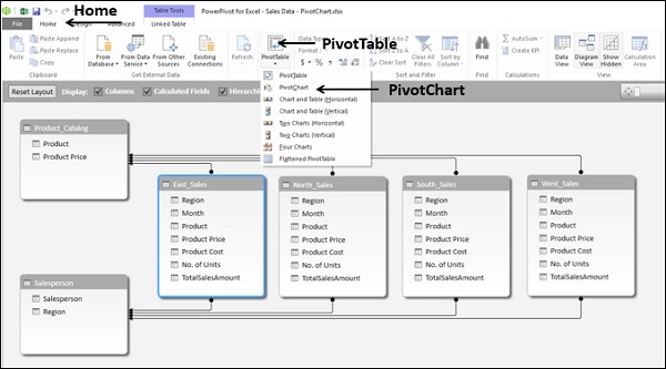
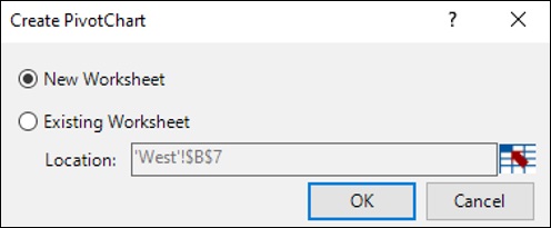
Create PivotChart dialog box appears. Click New Worksheet.
Click the OK button. An empty PivotChart gets created on a new worksheet in the Excel window. In this chapter, when we say PivotChart, we are referring to Power PivotChart.
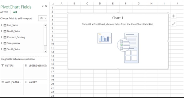
As you can observe, all the tables in the data model are displayed in the PivotChart Fields list.
- Click on the Salesperson table in the PivotChart Fields list.
- Drag the fields Salesperson and Region to AXIS area.
Two field buttons for the two selected fields appear on the PivotChart. These are the Axis field buttons. The use of field buttons is to filter data that is displayed on the PivotChart.
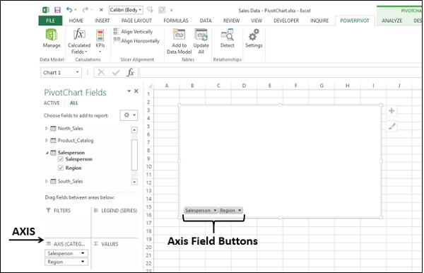
Drag TotalSalesAmount from each of the 4 tables East_Sales, North_Sales, South_Sales and West_Sales to ∑ VALUES area.
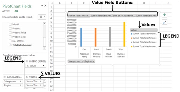
As you can observe, the following appear on the worksheet −
- In the PivotChart, column chart is displayed by default.
- In the LEGEND area, ∑ VALUES gets added.
- The Values appear in the Legend in the PivotChart, with title Values.
- The Value Field Buttons appear on the PivotChart.
You can remove the legend and the value field buttons for a tidier look of the PivotChart.
Click on the
button at the top right corner of the PivotChart.Deselect Legend in the Chart Elements.
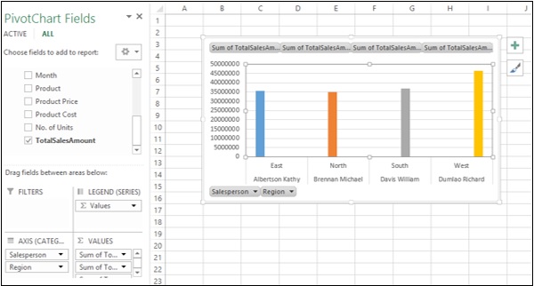
Right click on the value field buttons.
Click on Hide Value Field Buttons on Chart in the dropdown list.
The value field buttons on the chart will be hidden.
Note that display of Field Buttons and/or Legend depends on the context of the PivotChart. You need to decide what is required to be displayed.
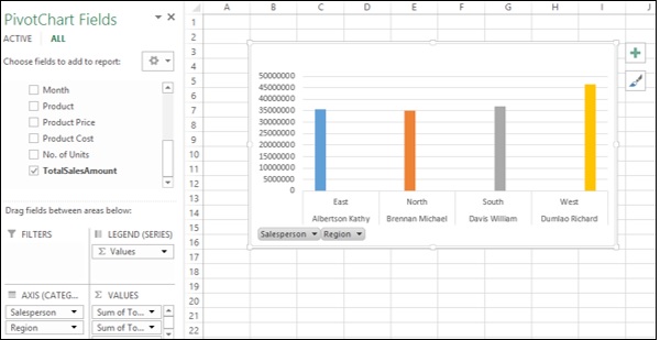
As in the case of Power PivotTable, Power PivotChart Fields list also contains two tabs − ACTIVE and ALL. Further, there are 4 areas −
- AXIS (Categories)
- LEGEND (Series)
- ∑ VALUES
- FILTERS
As you can observe, Legend gets populated with Values. Further, Field Buttons get added to the PivotChart for the ease of filtering the data that is being displayed. You can click on the arrow on a Field Button and select/deselect values to be displayed in the Power PivotChart.
Table and Chart Combinations
Power Pivot provides you with different combinations of Power PivotTable and Power PivotChart for data exploration, visualization and reporting.
Consider the following Data Model in Power Pivot that we will use for illustrations −
You can have the following Table and Chart Combinations in Power Pivot.
Chart and Table (Horizontal) - you can create a Power PivotChart and a Power PivotTable, one next to another horizontally in the same worksheet.
Chart and Table (Vertical) - you can create a Power PivotChart and a Power PivotTable, one below another vertically in the same worksheet.
These combinations and some more are available in the dropdown list that appears when you click on PivotTable on the Ribbon in the Power Pivot window.
Hierarchies in Power Pivot
You can use Hierarchies in Power Pivot to make calculations and to drill up and drill down the nested data.
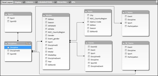
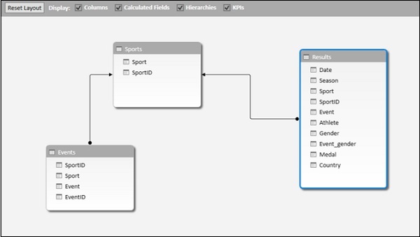
Consider the following Data Model for illustrations in this chapter.
You can create Hierarchies in the diagram view of the Data Model, but based on a single data table only.
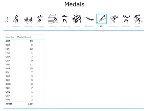
Click on the columns Sport, DisciplineID and Event in the data table Medal in that order. Remember that the order is important to create a meaningful hierarchy.
Right-click on the selection.
Click on Create Hierarchy in the dropdown list.
The hierarchy field with the three selected fields as the child levels gets created.
- Right-click on the hierarchy name.
- Click on Rename in the dropdown list.
- Type a meaningful name, say, EventHierarchy.
You can create a Power PivotTable using the hierarchy that you created in the Data Model.
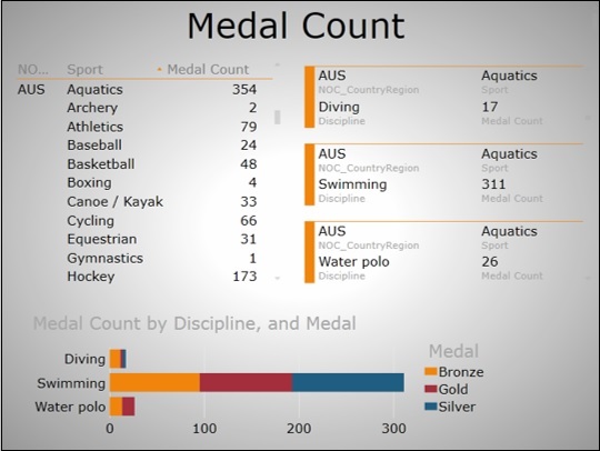
- Create a Power PivotTable.
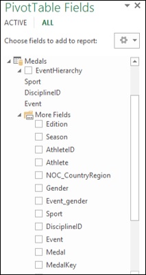
As you can observe, in the PivotTable Fields list, EventHierarchy appears as a field in Medals table. The other fields in the Medals table are collapsed and shown as More Fields.
- Click on the arrow
 in front of EventHierarchy.
 - Click on the arrow in front of More Fields.
The fields under EventHierarchy will be displayed. All the fields in the Medals table will be displayed under More Fields.
Add fields to the Power PivotTable as follows -
- Drag EventHierarchy to ROWS area.
- Drag Medal to ∑ VALUES area.
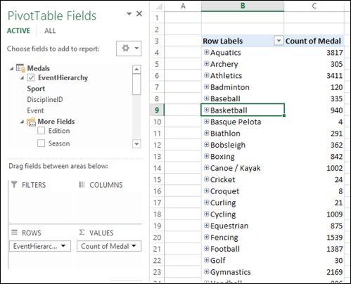
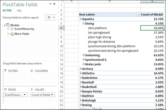
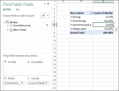
As you can observe, the values of Sport field appear in the Power PivotTable with a + sign in front of them. The medal count for each sport is displayed.
Click on the + sign before Aquatics. The DisciplineID field values under Aquatics will be displayed.
Click on the child D22 that appears. The Event field values under D22 will be displayed.
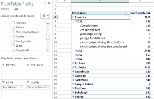
As you can observe, medal count is given for the Events, that get summed up at the parent level DisciplineID, that get further summed up at the parent level Sport.
Calculations Using Hierarchy in Power PivotTables
You can create calculations using a hierarchy in a Power PivotTable. For example in the EventsHierarchy, you can display the no. of medals at a child level as a percentage of the no. of medals at its parent level as follows
- Right-click on a Count of Medal value of an Event.
- Click on Value Field Settings in the dropdown list.
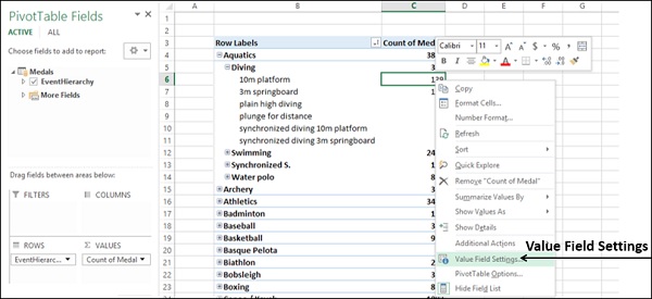
Value Field Settings dialog box appears.
- Click on Show Values As tab.
- Click on the box Show values as.
- Click on % of Parent Row Total.
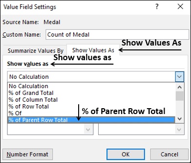
- Click the OK button.
As you can observe, the child levels are displayed as the percentage of the Parent Totals. You can verify this by summing up the percentage values of the child level of a parent. The sum would be 100%.
Drilling Up and Drilling Down a Hierarchy
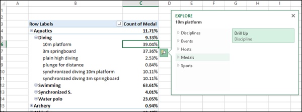
You can quickly drill up and drill down across the levels in a hierarchy in a Power PivotTable using Quick Explore tool.
Click on a value of Event field in the Power PivotTable.
Click on the Quick Explore tool -
 that appears at the bottom right corner of the cell containing the selected value.
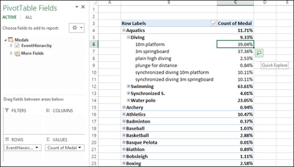
EXPLORE box with Drill Up option appears. This is because from Event you can only drill up as there are no child levels under it.
Click on Drill Up. Power PivotTable data gets drilled up to Discipline level.
Click on the Quick Explore tool -
that appears at the bottom right corner of the cell containing a value.
EXPLORE box appears with Drill Up and Drill Down options displayed. This is because from Discipline you can drill up to Sport or drill down to Event levels.
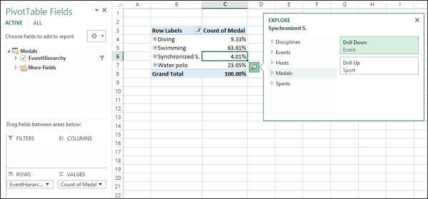
This way you can quickly move up and down the hierarchy in a Power PivotTable.
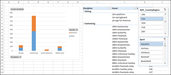
Using a Common Slicer
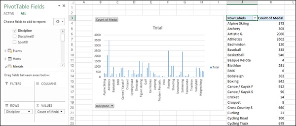
You can insert Slicers and share them across the Power PivotTables and Power PivotCharts.
Create a Power PivotChart and Power PivotTable next to each other horizontally.
Click on Power PivotChart.
Drag Discipline from Disciplines table to AXIS area.
Drag Medal from Medals table to ∑ VALUES area.
Click on Power PivotTable.
Drag Discipline from Disciplines table to ROWS area.
Drag Medal from Medals table to ∑ VALUES area.
- Click on ANALYZE tab in PIVOTTABLE TOOLS on the Ribbon.
- Click on Insert Slicer.
Insert Slicers dialog box appears.
- Click on NOC_CountryRegion and Sport in Medals table.
- Click on OK.
Two Slicers NOC_CountryRegion and Sport appear.
Arrange and size them to align properly next to the Power PivotTable as shown below.
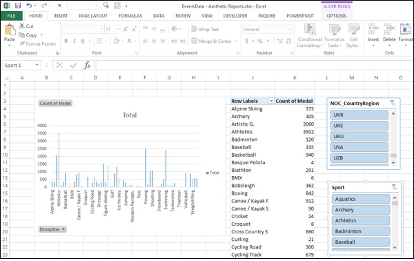
- Click on USA in the NOC_CountryRegion Slicer.
- Click on Aquatics in the Sport Slicer.
The Power PivotTable gets filtered to the selected values.
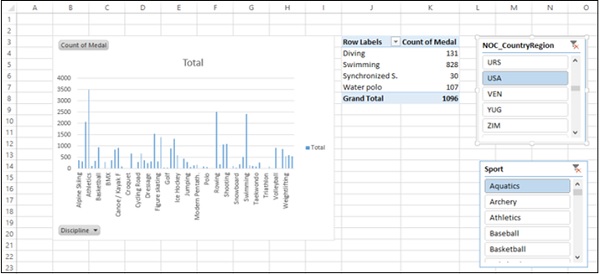
As you can observe, the Power PivotChart is not filtered. To filter Power PivotChart with the same filters, you can use the same Slicers that you have used for the Power PivotTable.
- Click on NOC_CountryRegion Slicer.
- Click on the OPTIONS tab in SLICER TOOLS on the Ribbon.
- Click on Report Connections in the Slicer group.
Report Connections dialog box appears for the NOC_CountryRegion Slicer.
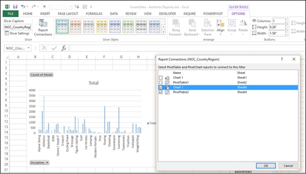
As you can observe, all the Power PivotTables and Power PivotCharts in the workbook are listed in the dialog box.
Click on the Power PivotChart that is in the same worksheet as the selected Power PivotTable.
Click the OK button.
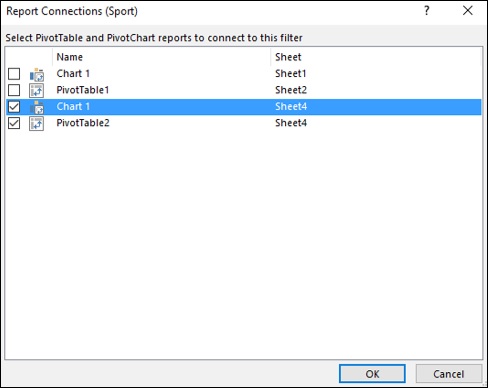
Repeat for Sport Slicer.
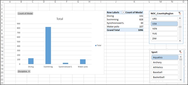
The Power PivotChart also gets filtered to the values selected in the two Slicers.
Next, you can add more detail to the Power PivotChart and Power PivotTable.
- Click on the Power PivotChart.
- Drag Gender to LEGEND area.
- Right click on the Power PivotChart.
- Click on Change Chart Type.
- Select Stacked Column in the Change Chart Type dialog box.
- Click on the Power PivotTable.
- Drag Event to ROWS area.
- Click on the DESIGN tab in PIVOTTABLE TOOLS on the Ribbon.
- Click on Report Layout.
- Click on Outline Form in the dropdown list.
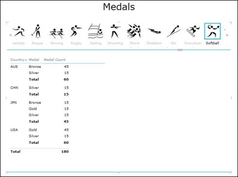
Aesthetic Reports for Dashboards
You can create aesthetic reports with Power PivotTables and Power PivotCharts and include them in dashboards. As you have seen in the previous section, you can use Report Layout options to choose the look and feel of the reports. For example with the option - Show in Outline Form and with Banded Rows selected, you will get the report as shown below.
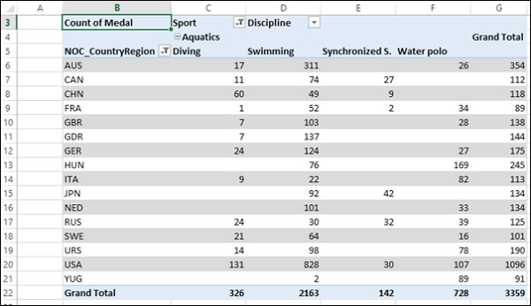
As you can observe, the field names appear in place of Row Labels and Column Labels and the report looks self-explanatory.
You can select the objects that you want to display in the final report in the Selection pane. For example, if you do not want to display the Slicers that you created and used, you can just hide them by deselecting them in the Selection pane.
Excel Dashboards - Power View Reports
Excel Power View enables interactive data visualization that encourages intuitive ad-hoc data exploration. The data visualizations are versatile and dynamic, thus facilitating ease of data display with a single Power View report.
You can handle large data sets spanning several thousands of rows on the fly switching from one visualization to another, drilling up and drilling down the data and displaying the essence of the data.
Power View reports are based the Data Model that can be termed as the Power View Database and that optimizes the memory enabling faster computations and displays of data. A typical Data Model will be as shown below.
In this chapter, you will understand the salient features of Power View reports that you can incorporate in your dashboard.
Power View Visualizations
Power View provides various types of data visualizations −
Table
Table visualization is the simplest and default visualization. If you want to create any other visualization, first table will be created that you need to convert to the required visualization by Switch Visualization options.
Matrix
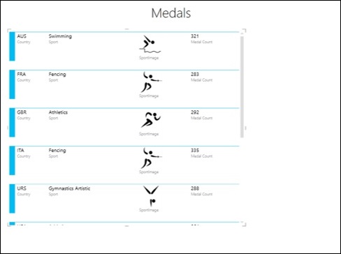
Card
Charts
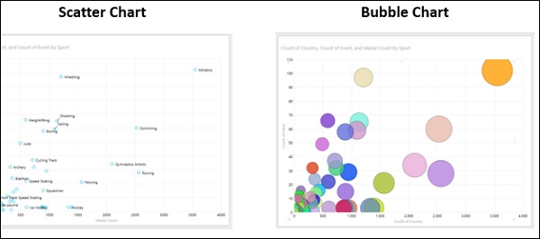
Power View has following chart types in visualizations −
- Line Chart
- Bar Chart
- Column Chart
- Scatter Chart
- Bubble Chart
- Pie Chart
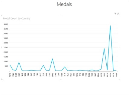
Line Chart
Bar Chart
Column Chart
Scatter Chart and Bubble Chart
Pie Chart
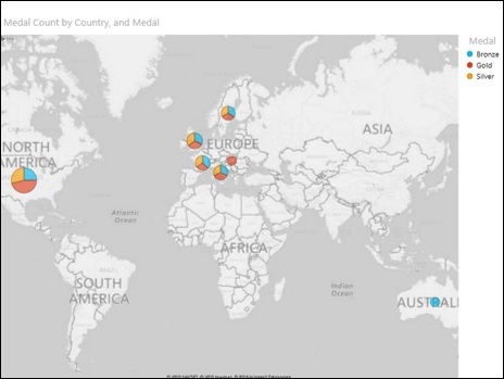
Map
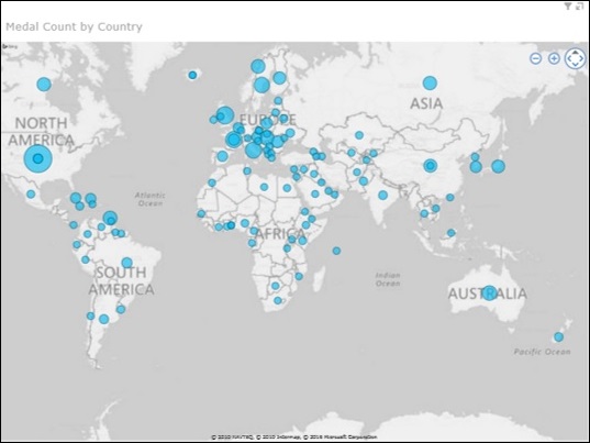
Map with Pie Charts
Combination of Power View Visualizations
Power View visualizations unlike Excel charts are powerful as they can be displayed as combination with each one depicting and/or highlighting significant results.
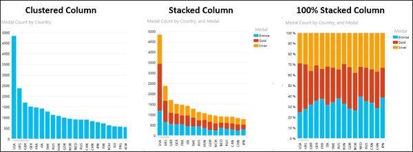
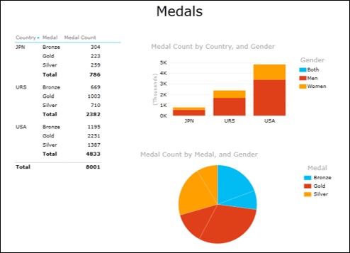
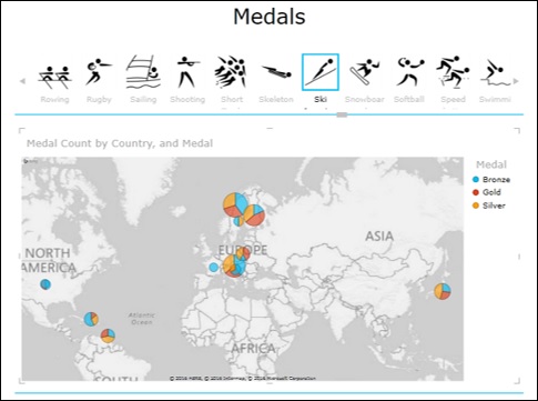
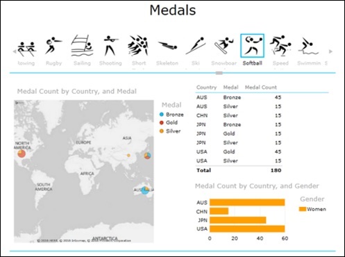
For example, you can have three visualizations in Power View −
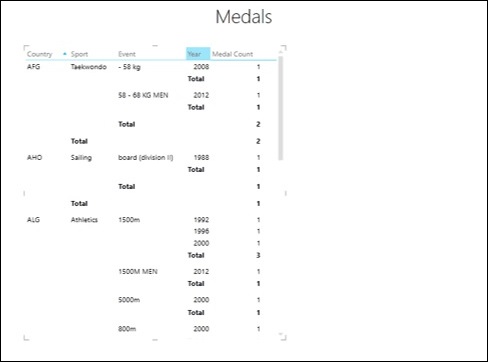
Table visualization − displaying Country, Medal and Medal Count.
Stacked Column chart visualization − displaying Country, Gender and Medal Count.
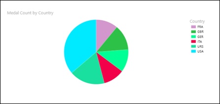
Pie chart visualization − displaying Medal, Gender and Medal Count.
Interactive Nature of Charts in Power View Visualizations
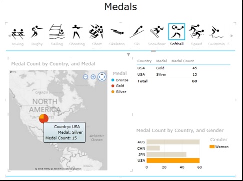
Suppose you click on a Pie slice in the above Power View. You will observe the following −
The Pie slice that is clicked will be highlighted while the rest of the Pie slices will get dimmed.
The Table will display only the data corresponding to the highlighted slice.
The Clustered column will highlight the data corresponding to the highlighted slice and the rest of the chart will get dimmed.
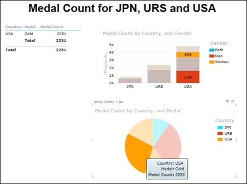
This feature helps you to enable your audience viewing results from large data sets to explore the significant data points.
Slicers in Power View
You can use common Slicers in Power View to filter the data that is displayed by all the visualizations in Power View.
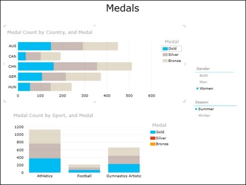
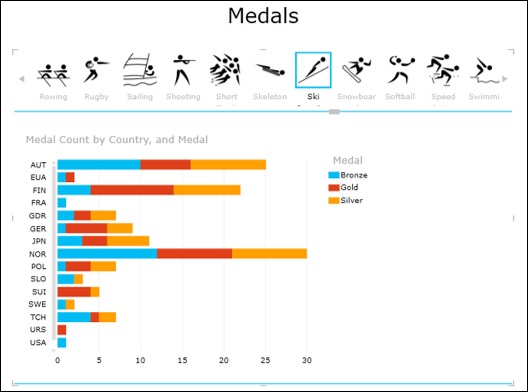
For example, in the following Power View, you have 2 visualizations −
Stacked Bar chart displaying Medal Count by Country and Medal.
Stacked Column chart displaying Medal Count by Sport and Medal.
Suppose you have two Slicers one for Gender and one for Season, the data in both the charts will get filtered to the selected fields in the Slicers.
Tiles in Power View
In Power View, Tiles help you to pick one data point of a field and view the corresponding values. Tiles can be used in Table, Matrix, Card, Stacked Bar chart and Map visualizations.
Tiles in Table visualization
Tiles in Matrix visualization
Tiles in Card visualization
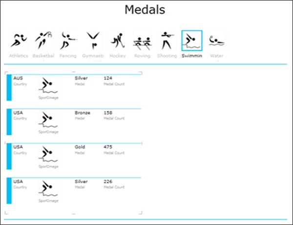
Tiles in Stacked Bar Chart visualization
Tiles in Map visualization
Tiles can be used with a combination of visualizations also.
You can use the interactive nature of the charts in such visualizations also.
Power View Reports
You can produce aesthetic Power View reports that you can include in your dashboard.
This could be done by choosing a suitable background, choosing the font, font size, color scales, etc.
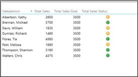
Key Performance Indicators
Key Performance Indicators (KPIs) are quantifiable measurements for assessing what is achieved against the set goals/ targets /business objectives. In dashboards, KPIs necessarily will have a position to display visually where a person / department / organization stands currently compared to where it is supposed to be.
Examples of KPIs include the following −
Sales department of an organization might use a KPI to measure monthly gross profit against projected gross profit.
Accounting department might measure monthly expenditures against revenue to evaluate costs.
Human resources department might measure quarterly employee turnover.
Business professionals frequently use KPIs that are grouped together in a business scorecard to obtain a quick and accurate historical summary of business success or to identify trends.
Dashboards either viewed publicly or selectively present continuously monitored KPIs and hence are chosen as the best monitoring and reporting tools.
Components of a KPI
A KPI essentially contains three components −
- Base Value
- Target Value / Goal
- Status
Though it is the Status that one would be interested in, the Base Value and Target Value are also equally important as a KPI need not be static and can undergo changes as the time proceeds.
In Excel, Base Value, Target Value and Status are defined as given in the following sections.
Base Value
A Base Value is defined by a calculated field that resolves to a value. The calculated field represents the current value for the item in that row of the Table or Matrix. E.g. aggregate of sales, profit for a given period, etc.
Target Value
A Target Value (or Goal) is defined by a calculated field that resolves to a value, or by an absolute value. It is the value against which the current value is evaluated. This could be one of the following −
A fixed number that is the goal all the rows should achieve. E.g. Sales target for all the salespersons.
A calculated field that might have a different goal for each row. E.g. Budget (calculated field), department-wise in an organization.
Status Thresholds and Status
Status is the visual indicator of the value. Excel provide different ways of visualizing Status as against Target Value.
You can use Bullet chart to visualize KPIs. You can illustrate the status thresholds by shaded regions of a column and the status as a column superimposed on the status thresholds.
You can define and visualize KPIs in Power View also.
Defining KPIs in Excel
To define a KPI, you need have the following in place −
- Base Value
- Target Value
- Status Thresholds (e.g. Poor, Good, Excellent)
For example, to define a KPI to monitor sales performance, you need to do the following −
Identify the cell(s) that contain the calculated values of total sales. This is for Base Value.
Define Target Value that can be absolute or varying.
Define the Status thresholds that help you visualize the Status.
Visualizing KPIs with Bullet Charts
You can visualize KPIs with Bullet charts, in which the following will be clearly depicted.
- The Target
- Status Thresholds
- The Value (Status)
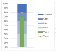
Visualizing KPIs with Power View
You can visualize KPIs that are defined in Power View using icons.
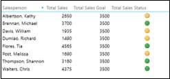
You can also produce an aesthetic report in Power View with the KPIs that can be included in your dashboard.
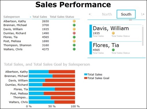
As you can observe, in the Power View you could portray the results as follows −
Table visualization with icons for displaying KPI status.
100% Stacked Bar Chart visualization depicting the percentage achieved with respect to the Goal. You can also notice that it gives a clear comparison of the performance of all the Salespersons.
Card visualization depicting the KPI status of the Salespersons along with the Region they belong to. You can interactively scroll through the Tiles to display results for different Regions that would give scope to assess performance region-wise also.
Excel Dashboards - Build a Dashboard
In the previous chapters, you have learnt about various Excel features that come handy in setting up your dashboard. In this chapter, you will learn how to build a dashboard, i.e., the steps that are required to get the dashboard in place. You will also get to know the dos and donts regarding dashboards.
As any dashboard is based on the specific intent of what the audience is most interested about, dashboard components and dashboard layout varies from case to case.
Initial Preparation
The first step in building a dashboard is the initial preparation. Take some time in understanding the following −
Why do you need the dashboard? − Is this dashboard for a specific task, like showing the status of a project, or does it need to achieve a broader goal, like measuring business performance? Understanding why you are building the dashboard will guide you in the design.
What purpose the dashboard will serve?− Your dashboard should highlight only the data that adds value. You should understand the data that is required. Anything outside that is unnecessary.
What is the source of data? − You should understand from where the data comes. It can just be an Excel worksheet or it can be through data connections to your Excel workbook from various dynamic data sources.
Who is the audience for the dashboard? − Is this for a manager, an executive, a stakeholder, an external vendor or general audience? Understand their requirements and preferences such as how much time do they have to look at the dashboard, the level of detail they expect and how they would like to digest the information. For example, while choosing a chart type, knowing the audience helps you to decide on whether you have to show relations between values or you have to draw a specific comparison.
Does the dashboard need to be static or dynamic? − Can the dashboard be updated periodically, say, weekly or monthly, or does it require to get updated to continuously streamline the data changes that happen at the backend? This choice will change the way you build the dashboard.
Does the dashboard need to be just a display or is it to be interactive? − Can the dashboard have read-only access or do you have to provide interactive controls / features that enable certain people to explore the data as required? This choice also will change the way you build the dashboard.
Once you have answers to these questions, decide on what Excel features you need and you dont need. This is because your goal and expertise is to produce an effective dashboard that suits the purpose.
Next, identify the components of the dashboard. These can be text, tables, charts, interactive controls, etc. Decide on the dashboard layout with these components.
Mockup your Excel dashboard on a PowerPoint slide. Draw boxes for each component to get a sense of the layout and add quick sketches of the components that you want to include. You can also do this on a piece of paper. Get approval for this mockup from the management and/or the key audience before you start working on the actual dashboard. This will save time on rework. However, it is quite possible that you might have to tweak in some changes to the dashboard as the dashboard gets into usage and you receive feedback. But, the approved dashboard mockup is a real good starting for your work.
Organize the Data Source for the Excel Dashboard
Before building the dashboard in Excel, you need to organize the data source. In Excel, this is possible in various ways −
If the data is just an Excel table, establish a link to your workbook from the workbook where the data will get updated.
If the data is from multiple Excel tables, or if it is from various data sources, it is a good option to build the Data Model in your workbook.
You can either import the data into the workbook periodically or establish data connections so as to refresh the data as when it gets updated, based on whether the dashboard has to be static or dynamic.
Set Up the Excel Dashboard Workbook
Once you have organized the data, you need to structure your workbook. Insert two to three worksheets in the workbook − one worksheet for your dashboard and one or two worksheets for the data (data or PivotTable/PivotCharts or Power View Reports, which you can hide). This will help you to organize and maintain your Excel workbook.
Prepare the Data for the Excel Dashboard
Based on the choices you have, i.e. the answers you have for the questions in the Initial Preparation step, prepare the data for the Excel dashboard. The data can be any of the following −
- Results from data analysis
- Results from data exploration
- Data resulting from computations on the input data
- Data summarization from PivotTables or PowerPivot Tables
Select the Dashboard Components
You have learnt about the various Excel features that you can use in a dashboard. Based on your requirements for the dashboard at hand, select any of the following Excel features for the dashboard components.
- Tables
- Sparklines
- Conditional Formatting.
- Charts
- Slicers
- Interactive Controls
- PivotTables
- PivotCharts
- PowerPivot Tables
- PowerPivot Charts
- Power View Reports
- KPIs
Selecting the dashboard components will help you to align to your approved dashboard mockup layout.
Identify the static and dynamic components and the components that are to be grouped for Slicers, if any.
Identify Parts of the Dashboard for Highlighting
Identify those parts of the dashboard that require immediate attention, such % Complete or the Current Status. You can use bigger font and a striking font and font color for these.
Decide on how much color you want to incorporate in your dashboard. This decision can be based on the audience for the dashboard. If the dashboard is for executives and/or managers, choose colors that impact the visualization of the results being displayed. You can add a dashboard background color to make the dashboard components pop. You can use the same color code for similar charts or related results. You can use conditional formatting too.
A careful selection of the parts of the dashboard for highlighting makes it effective.
Build the Dashboard
This is the crucial and final step in creating your Excel dashboard. This step involves assembling your dashboard components that you can efficiently and effectively do by using Excel camera. You will learn how to use Excel camera in the next section.
Once the dashboard components are assembled, give it a final touch −
- Give a title to the dashboard.
- Incorporate a timestamp.
- Include the copyright information, if required.
In the next few chapters, you will learn how to use these steps for creating a dashboard based on some examples. There is no universal rule or layout for a dashboard apart from some commonality. It all depends on your requirements. And your goal is to produce an effective dashboard.
Using Excel Camera
Excel camera helps you in capturing snapshots from your worksheets and place them in a different worksheet. For example, you can capture a table with conditional formatting on a worksheet and place it on your dashboard. Whenever the data gets updated, the dashboard will get refreshed to display the changed data.
You can include the Excel camera as part of your Quick Access Bar as follows −
- Right-click on the small arrow on the Quick Access Toolbar.
- Click on More Commands in the Customize Quick Access Toolbar list.
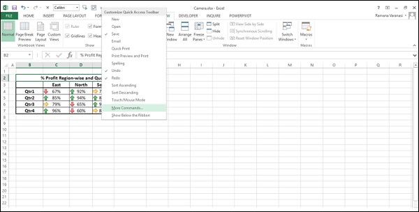
Excel Options dialog box appears.
- Click on Quick Access Toolbar.
- Select All Commands under Choose commands from.
- Click on Camera in the commands list.
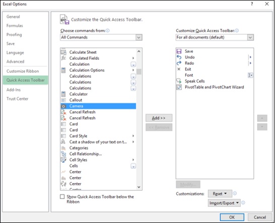
Click on the Add » button. Camera appears in the right side list.
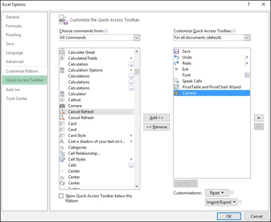
Click the OK button. The camera icon appears on the Quick Access Toolbar in your workbook.
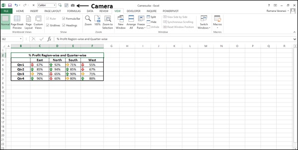
You can use Excel camera as follows −
Select the range of cells to be captured.
Click on camera on the Quick Access Toolbar.
The range of cells appear with a dashed line border.
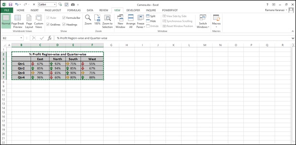
Click on the worksheet where you want to place the captured region. It can be your dashboard sheet.
Click at a position where you want to place it.
The captured region appears at that point.
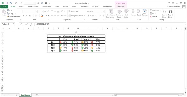
Whenever you make changes to the original data, the changes will get reflected in the dashboard.
Date and Time Stamp on Excel Dashboard
You can incorporate a Date or Date and Time Stamp on your dashboard to display when the data was last update. You can do this using the Excel functions TODAY () and NOW ().
To incorporate a Date Stamp, enter =TODAY () in the cell where you want to place the Date Stamp on your data worksheet.
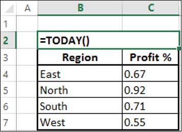
This will display the current date whenever the workbook is updated.
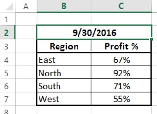
Ensure that the cell where you entered the TODAY () function is formatted to the Date format that you want to display.
Capture the display with camera and place it on the dashboard.
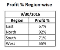
The date on the dashboard will reflect the date when the workbook was last updated.
You can incorporate a Date and Timestamp on your dashboard in a similar way with the function NOW ().
Enter = NOW () in the cell where you want to place the Date and Time Stamp on your data worksheet.
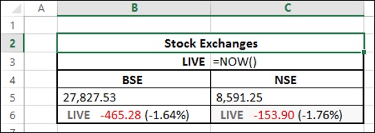
- Ensure that you have the right format for Date and Time.
- Capture the display with camera and place it on the dashboard.
The date and time stamp will get incorporated on the dashboard and will reflect the date and time when the workbook was last updated.
Test, Sample, and Enhance the Dashboard
You need to test your dashboard to ensure that it displays the data accurately.
- Test it in various possible scenarios.
- Test for the precise updates (static or dynamic as is the case).
- Test the interactive controls, if any.
- Test the look and feel.
You might have to do some trial runs to ensure that your dashboard is as you wanted.
The next step is to get the dashboard evaluated by sample audience, especially those who approved your mockup dashboard. As they will be using the dashboard, they will undoubtedly have input as to its use and effectiveness. This feedback helps you to ensure that your dashboard is effective. Do not hesitate to ask for feedback.
Once you get the feedback, enhance it with required changes, if any. Your Excel dashboard is ready to use.
Share the Dashboard
You need to make the Excel dashboard available to the intended audience. You can do it in several ways.
Mail the Excel dashboard workbook (You have to hide the worksheets other than the dashboard worksheet. You can also protect the workbook.).
Save the Excel dashboard workbook on a shared network drive.
Share the dashboard online.
If the Excel dashboard is static you can mail it but if it is dynamic or has interactive controls, then it should have a connection to the backend data and hence requires sharing online.
You can share an Excel dashboard online with any of the following options −
Microsoft OneDrive.
With your Windows Live account, you will get access to OneDrive where you can post and share documents.
New Microsoft Office Online.
Microsoft SharePoint.
You can also save the Excel workbook file as an Acrobat Reader file (.pdf) and post it to web. But, once again this option is only for the static dashboards.
Tips for Effective Excel Dashboards
To make an Excel dashboard effective, you need to do certain things and avoid some. Some tips for effective Excel dashboards are as follows −
Keep it simple.
A simple, easy to understand dashboard is much more effective than a jazzy dashboard. Remember that it is the data that needs emphasis.
According to Glenna Shaw, you need to strike a balance between making your dashboard attractive enough to hold your audiences interest, but not so stylized that it obscures the information displayed.
Better avoid 3D effects, gradients, extra shapes and unnecessary gadgets.
If you can achieve emphatic display with conditional formatting or Sparklines, prefer using Tables to Charts.
Use Excel Conditional Formatting.
Use Excel Conditional Formatting that provides several options to automatically update based on the values in your table.
Select appropriate chart types.
Remember that there is no general rule for using a chart type. Sometimes conventional chart types like column chart, bar chart, doughnut chart, etc. convey the message emphatically more than the sophisticated charts that are coming into existence.
You can use Excel Recommend Charts command to initially evaluate the suitable chart types.
As you can change the chart type with a single Excel command − Change Chart Type, you can play around to visualize the display and choose the appropriate chart.
Use interactive controls.
Use interactive controls such as scroll bars, option (radio) buttons and check boxes that help the user easily and effectively visualize the different aspects of the data.
Use Excel Data Model for Big Data.
If you have large data sets from various data sources, you better use the Excel Data Model that can handle thousands of rows of data with memory optimization and can group data tables with relationships.
Choose appropriate colors.
Be careful in choosing the colors. Use the colors judicially to provide sufficient impact, but not override their purpose. Moreover, if the audience is likely to include color blind, restrain from using Red and Green colors. In such cases, though traffic light symbols sound effective for the data being displayed, they are not suitable for the dashboard. Use a gray scale instead.
Use Slicers.
Slicers are more effective than dropdown lists as they have a visual impact.
You can group charts, PivotTables, PivotCharts to use a common Slicer.
Group the Excel dashboard components together.
You can add visual interest to your dashboard by inserting a shape, such as a rectangle and placing your dashboard components that can be grouped on top of that shape. For example, if you are using a common Slicer, you can group all the dashboard components that share the Slicer.
Use Excel data hierarchies.
If your data has innate data hierarchies, define them in the Data Model and use them to interactively drill up and drill down the data.
Avoid crowded dashboard layout.
Remember that display of more information than that is necessary will overwhelm the audience and beat the focus on the actual purpose.
Do not include any data or chart in your dashboard, if you can do away with it.
This is an important checkpoint while testing your dashboard. Evaluate each dashboard component if is necessary and sufficient.
The dashboard components and the layout should support the single purpose of your dashboard.
Excel Dashboards - Examples
There are several possible types of dashboards. There are no set of standards for dashboards, except for some dos and donts. You can understand the purpose and use your imagination to select the components and layout for your dashboard. However, you need to be on the same page with the viewers of the dashboard and hence their preferences are to be taken care to make it effective. A dashboard can get modified as the time proceeds based on the context and changing needs.
As you have learnt in the earlier sections, the purpose of a dashboard is to effectively display the necessary and sufficient data with added visual impact as required by the potential audience. The layout of the dashboard and its components vary across the different viewers based on their preferences.
Example Executive Dashboard
In this chapter, you will learn about a sample Executive dashboard. Once again, this dashboard can vary from company to company based on the requirements and preferences.
Key Metrics
Executive dashboards normally focus on the business performance, revenue, profits, new customers, etc. Hence, Executive dashboards essentially display the KPIs. The visual impact necessary in this case would be to provide results at a glance, with not much detail as the executives will not normally have much time to dwell into the specifics unless it is absolutely necessary.
An executive can be a head of the company or head of a specific department in a large company. The head of a company can be a CEO (Chief Executive Officer) or a MD (Managing Director). The executive would be mostly interested at a brief of the operational KPIs of the departments and the performance of the company as a whole.
Department-wise Operational KPIs
Following are some examples of Departments and their operational KPIs −
- Finance
- Revenue
- Expenses
- Profits
- Sales
- Region-wise performance
- New Customers
- Human Resources (HR)
- Recruitments
- Attrition
Excel Dashboard Structure
For the display of the KPIs, most of the executives still prefer Gauge charts to Bullet charts. Ensure the preferences before you start designing the dashboard.
An example of a simple Excel Executive dashboard can be as shown below.
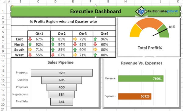
Example - Project Management Dashboard
The purpose of a Project Management dashboard is to provide the project execution status and the salient project features to be available at a snapshot. A project manager should use this portrayed data not only for project monitoring, but also for reporting to the top management and customer.
Key Metrics
The key metrics in project management would be the following −
- Task completion status
- Risks status
- Issues status
- Project budget vs. actuals
Components for Project Overview
To obtain a project snapshot, the major components that would be useful would be the following −
- Snapshot of the project plan
- Tasks status by percentages
- A glimpse of open risks
Excel Dashboard Structure
An example Excel project management dashboard looks as shown below.
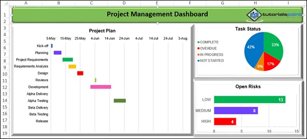
Example - Sales Management Dashboard
Sales management involves examining the data region wise and analyzing quarterly so as to get insights into the sales trend and sales forecasting. This would help in comparing the sales performance with the competitors, appraising the sales team, identifying potential strengths and weaknesses and planning for the future.
Key Metrics
The Key Metrics involved in the Sales Management are the following −
- Total Sales Region-wise and Month-wise
- Sales trend over the quarter
- Sales forecasts
Components for Sales Management
To represent the above given Metrics in a dashboard, the following Excel features can be used −
- Excel Table to display the Sales Values and Trends (Sparklines).
- Sales with Clustered Column chart.
- Sales trend with a Line chart and Trendline - Linear.
- Sales forecast with a Line chart and Trendline Linear Forecast.
Excel Dashboard Structure
A sample sales management dashboard will be as shown below −
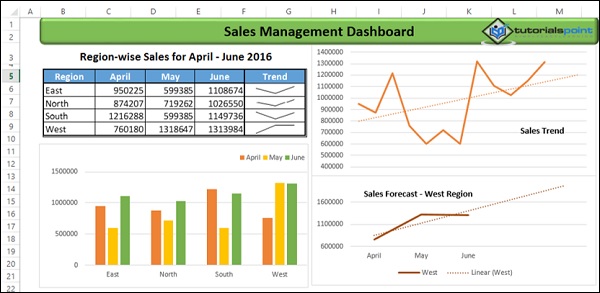
Example Training Management Dashboard
Training Management would normally be interested to have an overview the money spent and training coverage, so as to compare with the competitors. In addition to this, the training feedback given by the trainees would help the management to decide on where to leverage the training resources.
Key Metrics
The key metrics in the training management would be the following −
Budget vs. Expenses.
Training Time Planned vs. Actual.
Training Coverage No. of People Targeted vs. No. of People Actually trained. This can be expressed as a percentage.
Training Feedback For each of the trainings conducted, the average feedback from the trainees, in the scale 1 5 (1 Lowest, 5 Highest).
Components for Training Management Dashboard
You can choose the following Excel features as components for the dashboard, based on the above given metrics.
Clustered Bar chart for Budget vs. Expenses.
Area Chart for Planned vs. Actual time for training.
Thermometer chart for Training Coverage as a % actual as compared to target as 100%.
Clustered Column chart for Training Feedback for the trainings conducted.
Excel Dashboard Structure
A sample Training Management Excel dashboard can be as shown below −
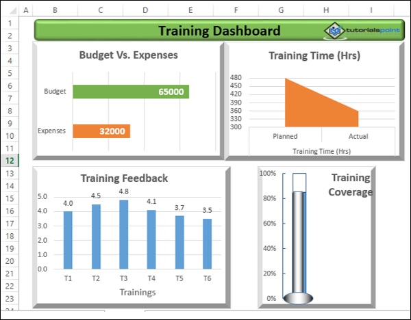
Example Service Management / Support Dashboard
Service Management or Support or Help Desk involves receiving service tickets and providing resolution as soon as possible. Hence, a dashboard updated daily would help to enhance the service management and thus improve customer satisfaction.
Key Metrics
Key Metrics for service management would be the following −
- No. of Tickets received support person-wise.
- No. of Tickets resolved support person-wise
- Avg. Speed of Resolution support person-wise assuming 8-hours work.
- Resolution % - support person-wise.
- Total No. of Tickets received and Total No. of Tickets resolved.
- Resolution %.
- Avg. Satisfaction Scores received - support person-wise.
- Overall Satisfaction Score.
Components for Service Management Dashboard
The Excel features that can be used to represent the above given Metrics as components of a dashboard would be the following −
- Excel Table for 1 5 with Conditional Formatting applied to 5.
- Bullet chart for 6.
- Clustered Bar chart for 7.
- Bullet chart for 8.
Additionally, you can include the date that corresponds to the data on the dashboard, with the Excel function - TODAY ().
Excel Dashboard Structure
A sample service management dashboard can be as shown below −
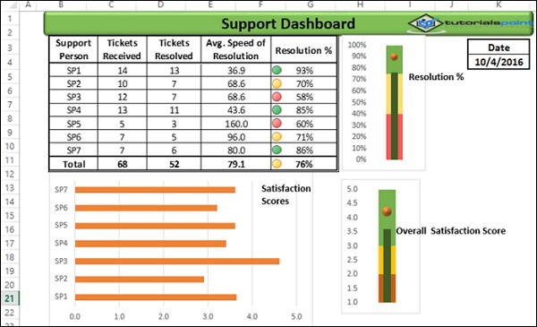
Dashboards - More Example
Dashboard can literally be used to display any results that require attention. The examples that you had seen in the previous chapters are only a hand pick of various applications where dashboards are being used. Further, the dashboard components and dashboard layout for the same purpose also can vary based on the user preferences. Hence there are no standard dashboard formats.
In this chapter, you will have a brief on some more areas where dashboards are being used. You can use your own imagination for a dashboard based on the data you have and the purpose it has to serve.
Olympics Dashboard
You can have a dashboard displaying the data analysis results of the Olympics data. Following is a sample dashboard that is created from 35000+ rows of data using Excel Data Model and Excel Power View.
Tourism Dashboard
A sample tourism dashboard regarding the number of visitors to a specific site can be as shown below.
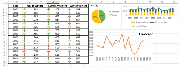
Hospital Management Dashboard
A hospital management dashboard is a form of executive dashboard with the level of detail as required by the specific manager. A sample used in a hospital is as given below.
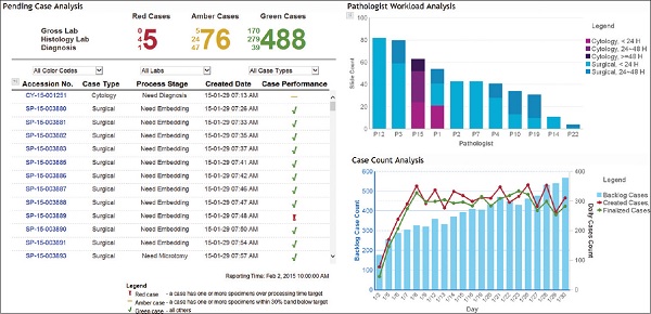
Restaurant Dashboard
A sample dashboard that is used in a restaurant is as shown below.
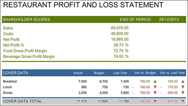
Sports Dashboard
Sports arena is the most sought-after place for dashboards. Every sport will have a live dashboard displaying the required statistics for the game that is on. A sample dashboard is as shown below.