- Excel Dashboards - Home
- Introduction
- Excel Features Create Dashboards
- Conditional Formatting
- Excel Charts
- Interactive Controls
- Advanced Excel Charts
- Excel PivotTables
- Power PivotTables & PivotCharts
- Power View Reports
- Key Performance Indicators
- Build a Dashboard
- Examples
Excel Dashboards - Interactive Controls
If you have more data to display on the dashboard that does not fit into a single screen, you can opt for using Excel controls that come as a part of Excel Visual Basic. The most commonly used controls are scrollbars, radio buttons, and checkboxes. By incorporating these in the dashboard, you can make it interactive and allow the user to view the different facets of the data by possible selections.
You can provide interactive controls such as scroll bars, checkboxes and radio buttons in your dashboards to facilitate the recipients to dynamically view the different facets of data being displayed as results. You can decide on a particular layout of the dashboard along with the recipients and use the same layout then onwards. Excel interactive controls are simple to use and does not require any expertise in Excel.
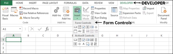
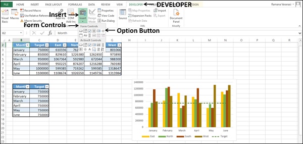
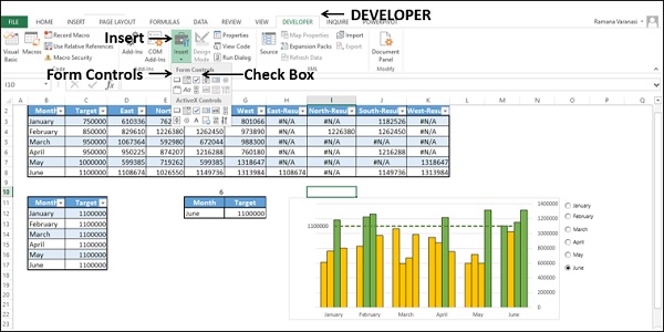
The Excel interactive controls will be available in the DEVELOPER tab on the Ribbon.
If you do not find the DEVELOPER tab on the Ribbon, do the following −
- Click on Customize Ribbon in the Excel Options box.
- Select Main Tabs in the Customize the Ribbon box.
- Check the Developer box in the Main Tabs list.
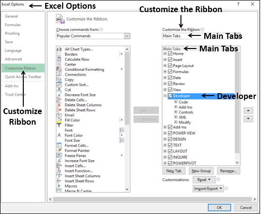
- Click the OK. You will find the DEVELOPER tab on the Ribbon.
Scroll Bars in Dashboards
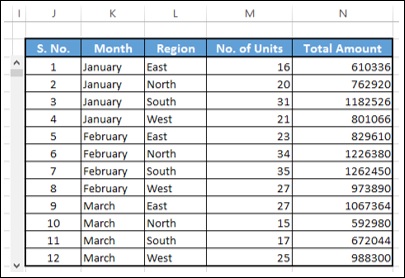
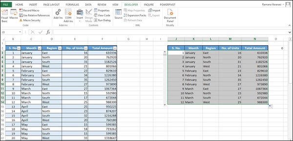
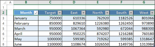
One of the features of any dashboard is that each component in the dashboard is as compact as possible. Suppose your results look as follows −
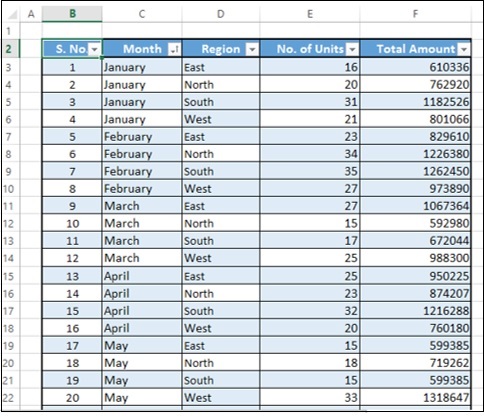
If you can present this table with a scroll bar as given below, it would be easier to browse through the data.
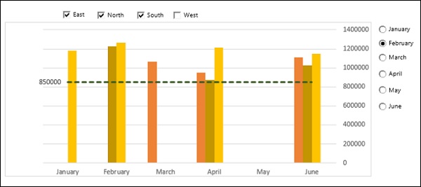
You can also have a dynamic Target Line in a Bar chart with scroll bar. As you move the scroll bar up and down, the Target Line moves up and down and those bars that are crossing the Target Line will get highlighted.
In the following sections, you will learn how to create a scroll bar and how to create a dynamic target line that is linked to a scroll bar. You will also learn how to display dynamic labels in scroll bars.
Creating a Scrollbar
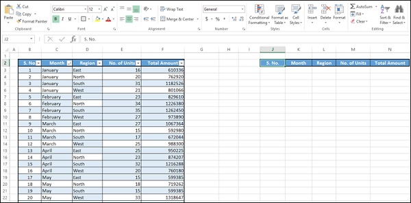
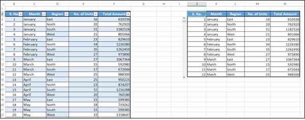
To create a scrollbar for a table, first copy the headers of the columns to an empty area on the sheet as shown below.
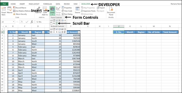
Insert a scrollbar.
Click on the DEVELOPER tab on the Ribbon.
Click on Insert in the Controls group.
Click on Scroll Bar icon under Form Controls in the dropdown list of icons.
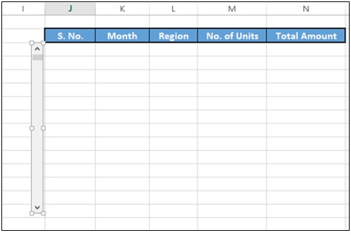
Take the cursor to the column I and pull down to insert a vertical scroll bar.
Adjust the height and width of the scroll bar and align it to the table.
Right click on the scroll bar.
Click on Format Control in the dropdown list.
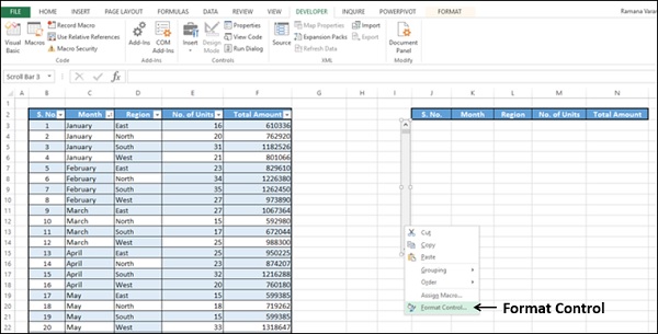
Format Control dialog box appears.
Click on the Control tab.
Type the following in the boxes that appear.
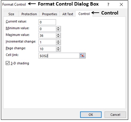
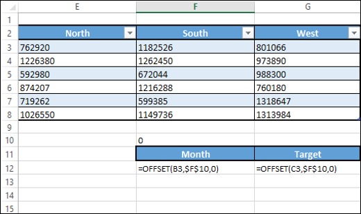
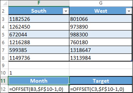
Click the OK button. The scroll bar is ready to use. You have chosen the cell O2 as the cell link for the scroll bar, which takes values 0 36, when you move the scroll bar up and down. Next, you have to create copy of the data in the table with a reference based on the value in the cell O2.
In the cell K3, type the following −
= OFFSET(Summary[@[S. No.]],$O$2,0).
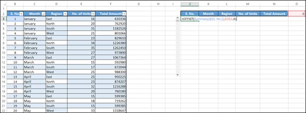
Hit the Enter button. Fill in the cells in the column copying the formula.
Fill in the cells in the other columns copying the formula.
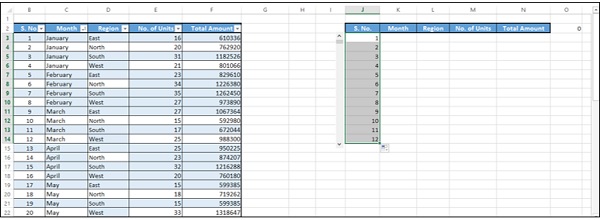
Your dynamic and scrollable table is ready to be copied to your dashboard.
Move the scroll bar down.
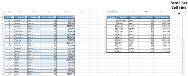
As you can observe, the value in the cell - scroll bar cell link changes, and the data in the table is copied based on this value. At a time, 12 rows of data is displayed.
Drag the scroll bar to the bottom.
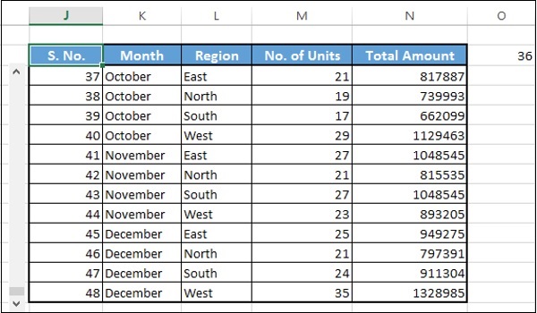
The last 12 rows of the data is displayed as the current value is 36 (as shown in the cell O2) and 36 is the maximum value that you have set in the Form Control dialog box.
You can change the relative position of the dynamic table, change the number of rows to be displayed at a time, cell link to scroll bar, etc. based on your requirement. As you have seen above, these need to be set in the Format Control dialog box.
Creating a Dynamic and Interactive Target Line
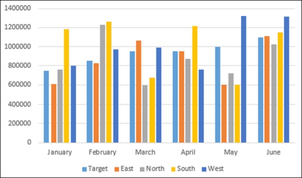
Suppose you want to display the sales region-wise over the last 6 months. You also have set targets for each month.
You can do the following −
- Create a column chart showing all this information.
- Create a Target Line across the columns.
- Make the Target Line interactive with a scroll bar.
- Make the Target Line dynamic setting the target values in your data.
- Highlight values that are meeting the target.
Create a column chart showing all this information
Select the data. Insert a clustered column chart.
Create a Target Line across the columns
Change the chart type to combo. Select chart type as Line for the Target series and Clustered Column for the rest of the series.
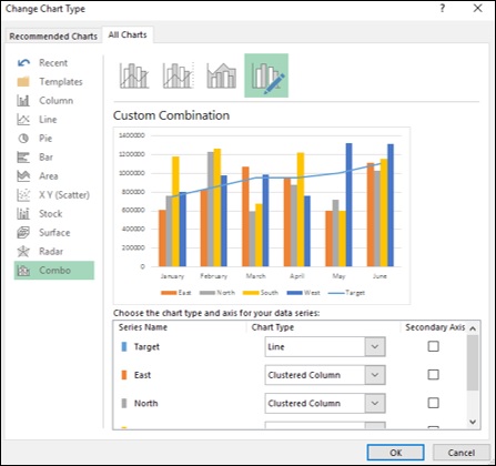
Create a base table for the Target Line. You will make this dynamic later.
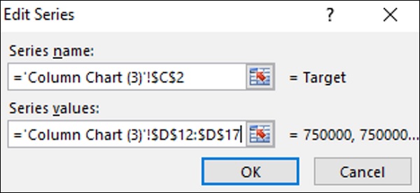
Change the data series values for the Target Line to the Target column in the above table.
Click the OK button.
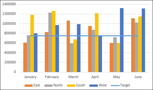
Change the color scheme for the Clustered Column. Change the Target Line into a green dotted line.
Make the Target Line interactive with a scroll bar
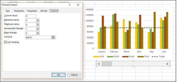
Insert a scroll bar and place it below the chart and size it to span from January to June.
Enter the scroll bar parameters in the Format Control dialog box.
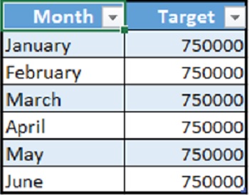
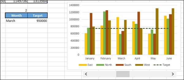
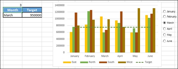
Create a table with two columns − Month and Target.
Enter the values based on the data table and scroll bar cell link.
This table displays the Month and the corresponding Target based on the scroll bar position.
Make the Target Line dynamic setting the target values in your data
Now, you are set to make your Target Line dynamic.
Change the Target column values in the base table you created for the Target Line by typing = $G$12 in all the rows.
As you are aware, the cell G12 displays the Target value dynamically.
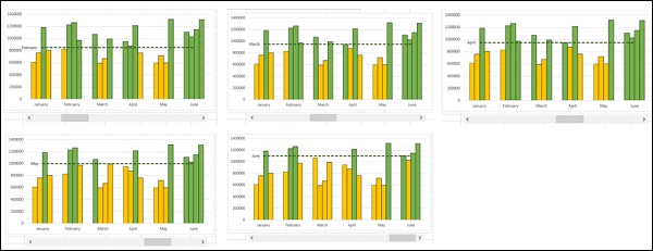
As you can observe, the Target Line moves based on the scroll bar.
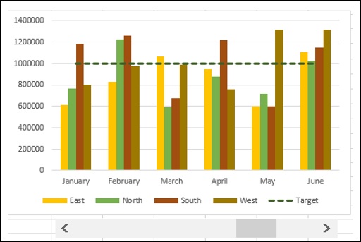
Highlight values that are meeting the target
This is the final step. You want to highlight the values meeting the target at any point of time.
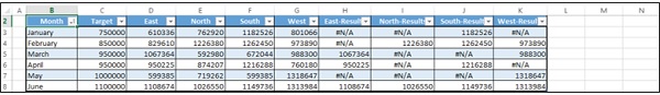
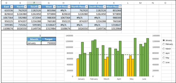
Add columns to the right side of your data table − East-Results, North-Results, SouthResults and West-Results.
In the cell H3, enter the following formula −
= IF(D3 >= $G$12,D3,NA())
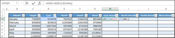
Copy the formula to the other cells in the table. Resize the table.
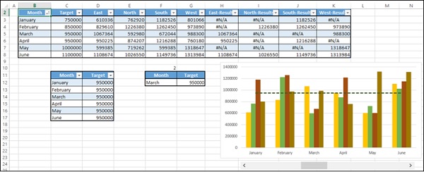
As you can observe, the values in the columns - East-Results, North-Results, SouthResults and West-Results change dynamically based on the scroll bar (i.e. Target value). Values greater than or equal to the Target are displayed and the other values are just #N/A.
Change the Chart Data Range to include the newly added columns in the data table.
Click on Change Chart Type.
Make the Target series be Line and the rest Clustered Column.
For the newly added data series, select Secondary Axis.
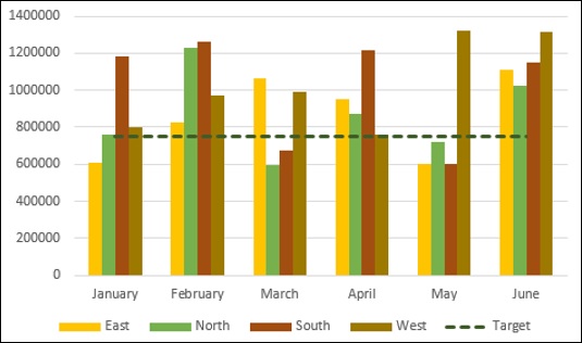
Format data series in such a way that the series East, North, South and West have a fill color orange and the series East-Results, North-Results, South-Results and WestResults have a fill color green.
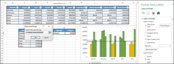
Enter a Data Label for the Target Line and make it dynamic with the cell reference to the Month value in the dynamic data table.
Your chart with dynamic Target Line is ready for inclusion in the dashboard.
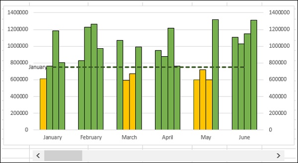
You can clear the secondary axis as it is not required. As you move the scroll bar, Target Line moves and the Bars will get highlighted accordingly. Target Line also will have a Label showing the Month.
Excel Option (Radio) Buttons
Radio buttons are normally used to select an option from a given set of options. It is always depicted by a small circle, which will have a dot in it when selected. When you have a set of radio buttons, you can select only one of them.
In Excel, Radio buttons are referred to as Option Buttons.
You can use Excel Option Buttons in charts to choose the data specifics the reader wants to have a look at. For example, in the example in the previous section you have created a scroll bar to get a dynamic Target Line with target values based on Month. You can use Option Buttons to select a Month and thus the target value, and base the Target Line on the target value. Following will be the steps −
- Create a column chart showing all this information.
- Create a Target Line across the columns.
- Make the Target Line interactive with Option Buttons.
- Make the Target Line dynamic setting the target values in your data.
- Highlight values that are meeting the target.
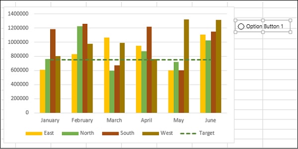
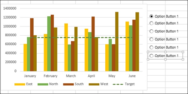
Steps 1 and 2 are same as in the previous case. By the end of the second step, you will have the following chart.
Make the Target Line interactive with Option Buttons
Insert an Option Button.
Click on the DEVELOPER tab on the Ribbon.
Click on Insert in the Controls group.
Click on Option Button icon under Form Controls in the dropdown list of icons.
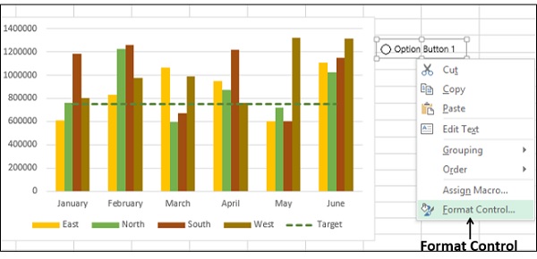
Place it at the top right corner of the chart.
Right click on the Option button. Click the Format Control option in the dropdown list.
Enter the Option Button parameters in the Format Object dialog box, under the Control tab.
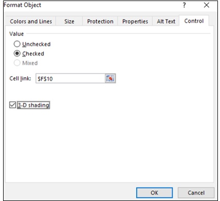
The cell F10 is linked to the Option Button. Make 5 copies of the Option Button vertically.
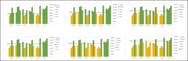
As you can observe, all the Option Buttons have the same name, referred to as Caption Names. But, internally Excel will have different names for these Option Buttons, which you can look at either in the Name box. Further, as Option Button 1 was set to link to the cell F10, all the copies also refer to the same cell.
Click on any of the Option Buttons.
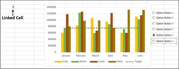
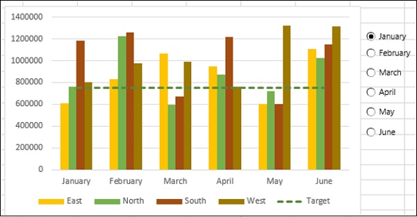
As you can observe, the number in the linked cell changes to the serial number of the Option Button. Rename the Option Buttons to January, February, March, April, May and June.
Create a table with two columns − Month and Target. Enter the values based on the data table and scroll bar cell link.
This table displays the Month and the corresponding Target based on the selected Option Button.
Make the Target Line dynamic setting the target values in your data
Now, you are set to make your Target Line dynamic.
Change the Target column values in the base table you created for the Target Line by typing = $G$12 in all the rows.
As you are aware, the cell G12 displays the Target value dynamically.
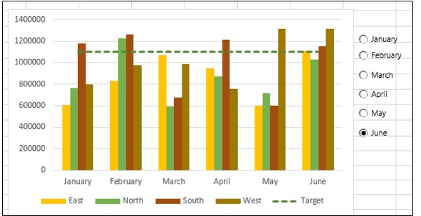
As you can observe, the Target Line is displayed based on the selected Option Button.
Highlight values that are meeting the target
This is the final step. You want to highlight the values meeting the target at any point of time.
Add columns to the right side of your data table − East-Results, North-Results, SouthResults and West-Results.
In the cell H3, enter the following formula −
= IF(D3 >= $G$12,D3,NA())
Copy the formula to the other cells in the table. Resize the table.
As you can observe, the values in the columns − East-Results, North-Results, SouthResults and West-Results change dynamically based on the scroll bar (i.e. Target value). Values greater than or equal to the Target are displayed and the other values are just #N/A.
Change the Chart Data Range to include the newly added columns in the data table.
Click on Change Chart Type.
Make the Target series be Line and the rest Clustered Column.
For the newly added data series, select Secondary Axis.
Format data series in such a way that the series East, North, South and West have a fill color orange and the series East-Results, North-Results, South-Results and WestResults have a fill color green.
Add a dynamic Data Label to the Target Line with value from the cell $G$12.
Clear the secondary axis as it is not required.
Under the VIEW tab on the Ribbon, uncheck the Gridlines box.
Change the Label option to High in the Format Axis options. This shifts the Vertical Axis Labels to the right, making your Target Line Data Label conspicuous.
Your chart with dynamic Target Line and Option Buttons is ready for inclusion in the dashboard.
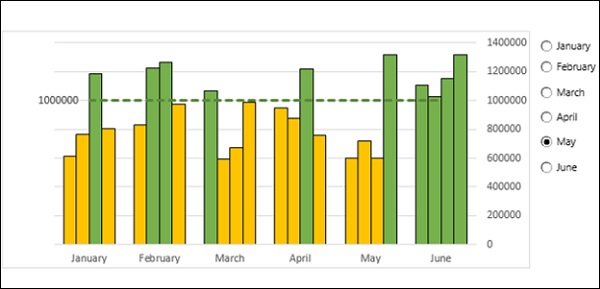
As you select an Option Button, Target Line is displayed as per the target value of the selected Month and the Bars will get highlighted accordingly. Target Line also will have a Data Label showing the target value.
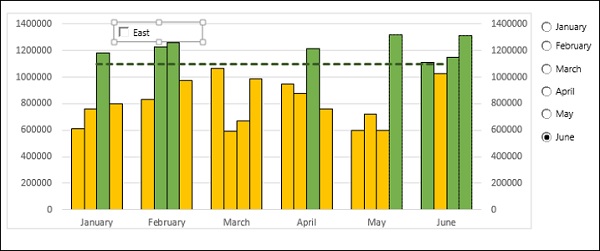
Excel Checkboxes
Checkboxes are normally used to select one or more options from a given set of options. Checkboxes are always depicted by small squares, which will have a tick mark when selected. When you have a set of Checkboxes, it is possible to select any number of them. For example,

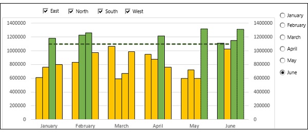
You can use Excel Check Boxes in charts to choose the data specifics the reader wants to have a look at. For example, in the example in the previous section, you have created column chart that displays the data of 4 Regions East, North, South and West. You can use Check Boxes to select the Regions for which data is displayed. You can select any number of Regions at a time.
You can start with the last step of the previous section −
Insert a Checkbox.
Click on the DEVELOPER tab on the Ribbon.
Click on Insert in the Controls group.
Click on Check Box icon under Form Controls in the dropdown list of icons.
Place it at the top left corner of the chart.
Change the name of the Check Box to East.
Right-click on the checkbox. Click on Format Control in the dropdown list.
Enter the Check Box parameters in the Format Control dialog box, under the Control tab.
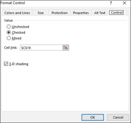
Click the OK button. You can observe that in the linked cell C19, TRUE will be displayed if you select the Check Box and FALSE will be displayed if you deselect the Check Box.
Copy the Check Box and paste 3 times horizontally.
Change the Names to North, South and West.
As you can observe, when you copy a Check Box, the linked cell remains the same for the copied Check Box also. However, since Check Boxes can have multiple selections, you need to make the linked cells different.
Change the linked cells for North, South and West to $C$20, $C$21 and $C$22 respectively.
The next step is to have only the selected Regions data in the Chart.
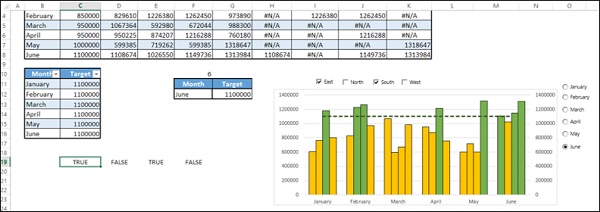
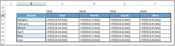
Create a table structure as follows −
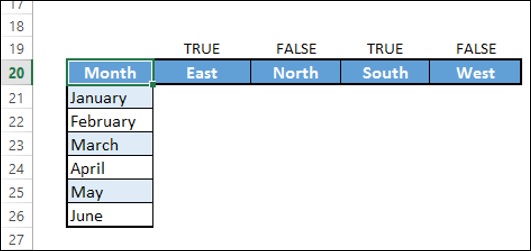
- Type = IF($C$19,H3,NA()) in the cell C21.
- Type = IF($D$19,I3,NA()) in the cell D21.
- Type = IF($E$19,J3,NA()) in the cell E21.
- Type = IF($F$19,K3,NA()) in the cell F21.
- Fill in other rows in the table.
Add the Target column.
Change the Chart data to this table.
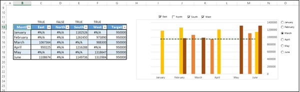
The Chart displays the data for the selected Regions that is more than the target value set for the selected Month.