- Excel Dashboards - Home
- Introduction
- Excel Features Create Dashboards
- Conditional Formatting
- Excel Charts
- Interactive Controls
- Advanced Excel Charts
- Excel PivotTables
- Power PivotTables & PivotCharts
- Power View Reports
- Key Performance Indicators
- Build a Dashboard
- Examples
Excel Dashboards - Excel Charts
If you choose charts for visual display of data, Excel charts help you to pick up and change the different views. Excel provides several chart types that enable you to express the message you want to convey with the data at hand in your dashboard with a graphical representation of any set of data.
In addition, there are certain sophisticated charts that are useful for some specific purposes. Some of these are available in Excel 2016. But, they can also be built from the built in chart types in Excel 2013.
In this chapter, you will learn about the chart types in Excel and when to use each chart type. Remember that in one chart in the dashboard, you should covey only one message. Otherwise, it may cause confusion in the interpretation. You can size the charts in such a way that you can accommodate more number of charts in the dashboard, each one conveying a particular message.
Apart from the chart types that are discussed in this chapter, there are certain advanced charts that are widely used to depict the information with visual cues. You will learn about the advanced chart types and their usage in the chapter Advanced Excel Charts for Dashboards.
Types of Charts
You can find the following major chart types if you have Excel 2013 −
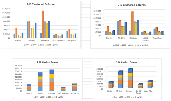
Column Charts
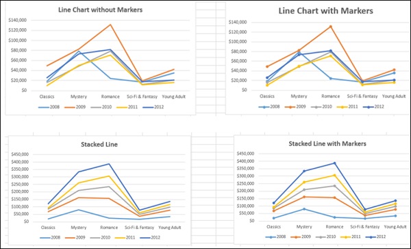
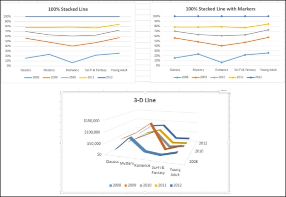
Line Charts
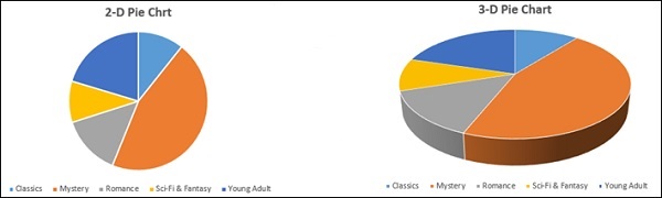
Pie Charts
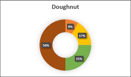
Doughnut Chart
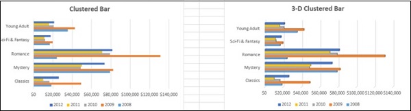
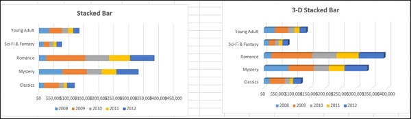
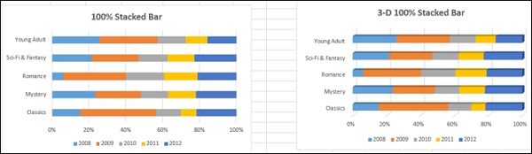
Bar Charts
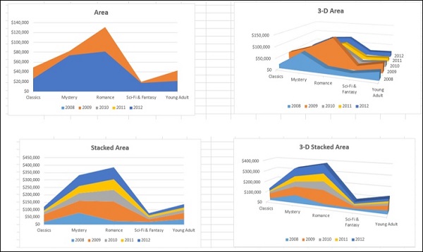
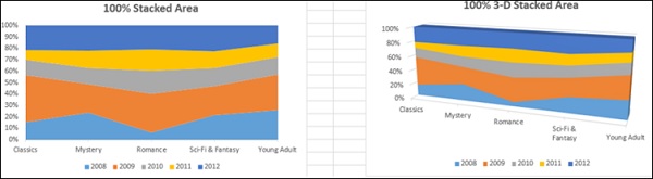
Area Charts
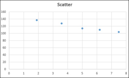
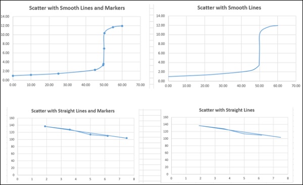
XY (Scatter) Charts
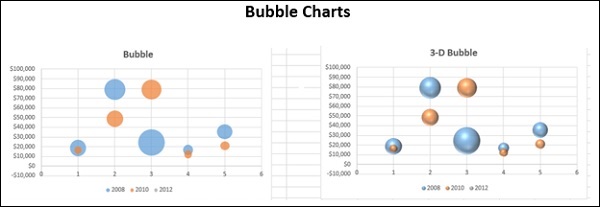
Bubble charts
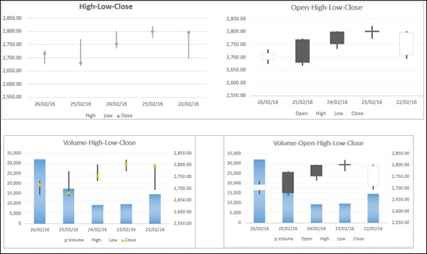
Stock Charts
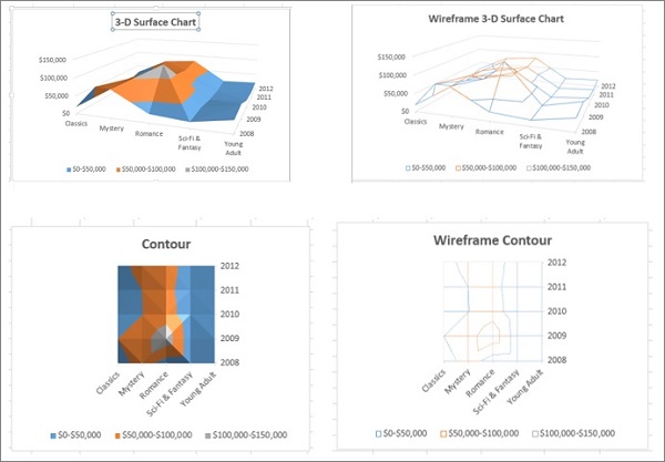
Surface Charts
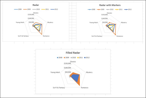
Radar Charts
To learn about these charts, refer to the tutorial − Excel Charts.
Combo Charts
When you have mixed type of data, you can display it with Combo (Combination) charts. The charts can either have only the Primary Vertical Axis or a combination of Primary Vertical Axis and Secondary Axis. You will learn about Combo charts in a later section.
Selecting the Appropriate Chart Type
To display the data by a chart in your dashboard, first identify the purpose of the chart. Once you have clarity on what you want to represent by a chart, you can select the best chart type that depicts your message.
Following are some suggestions on selecting a chart type −
If you want to compare data values, you can choose a bar chart, pie chart, line chart, or scatter chart.
If you want to show distribution, you can do so with a column chart, scatter chart or line chart.
If you want to show trends over time, you can use a line chart.
If you want to represent parts of a whole, a pie chart can be an option. But, while you use a pie chart, remember that only two to three different data points with very different data values can be effectively depicted with the varying sizes of the Pie slices. If you try to depict more number of data points in a Pie chart, it can be difficult to derive the comparison.
You can use Scatter chart if any of the following is the purpose−
You want to show similarities between large sets of data instead of differences between data points.
You want to compare many data points without regard to time. The more data that you include in a Scatter chart, the better the comparisons you can make.
Recommended Charts in Excel helps you to find a chart type that is suitable to your data.
In Excel, you can create a chart with a chart type and modify it later any time easily.
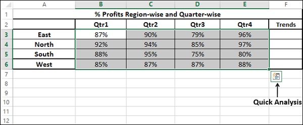
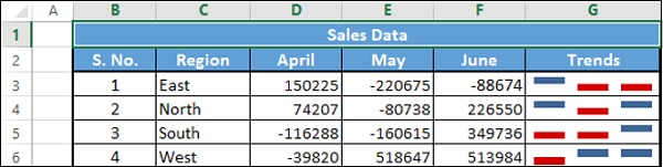
Showing Trends with Sparklines in Tables
Sparklines are tiny charts placed in single cells, each representing a row of data in your selection. They provide a quick way to see trends. In Excel, you can have Line Sparklines, Column Sparklines or Win/Loss Sparklines.
You can add Sparklines to your table quickly with the Quick Analysis tool.
Identify the data for which you want to add Sparklines.
Keep an empty column to the right side of the data and name the column. Sparklines will be placed in this column.
Select the data.
Quick Analysis tool button  appears at the bottom right corner of your selected data.
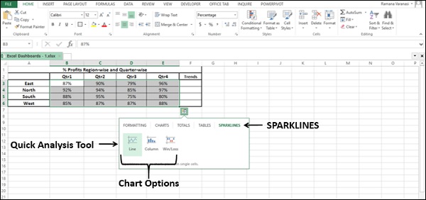
Click on the Quick Analysis
button. Quick Analysis tool appears.Click on SPARKLINES. Chart options appear.
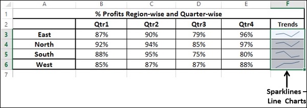
Click on Line. Line Charts will be displayed for each row in the selected data.
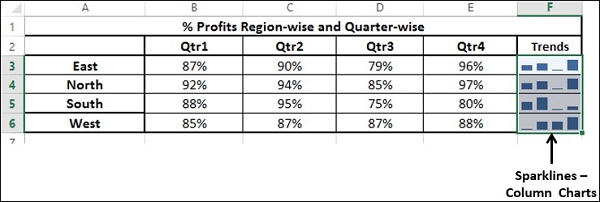
Click on Column. Column Charts will be displayed for each row in the selected data.
Win/Loss charts are not suitable for this data. Consider the following data to understand how Win/Loss charts look.
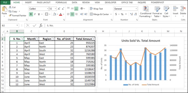
Using Combo Charts for Comparisons
You can use Combo charts to combine two or more chart types to compare data values of different categories, if the data ranges are varying significantly. With a Secondary Axis to depict the other data range, the chart will be easier to read and grasp the information quickly.
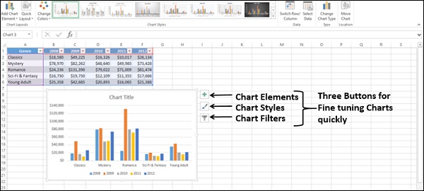
Fine Tuning Charts Quickly
You can fine tune charts quickly using the three buttons  ,
,  and
and  that appear next to the upper-right corner of the chart.
With
Chart Elements, you can add or remove axis, axis titles, legend, data labels, gridlines, error bars, etc. to the chart.With
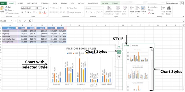
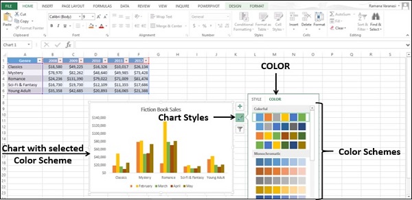
Chart Styles, you can customize the look of the chart by formatting the chart style and colors.With
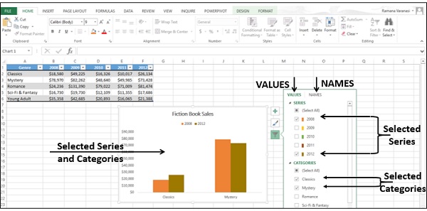
Chart Filters, you can dynamically edit the data points (values) and names that are visible on the chart being displayed.
You can select / deselect Chart Elements.
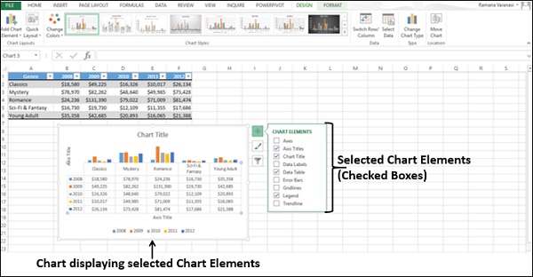
You can format the Gridlines to show the depth axis.
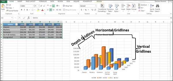
You can set a Chart Style.
You can choose a color scheme for your chart.
You can dynamically select values and names for display.
Values are the data series and the categories.
Names are the names of the data series (columns) and the categories (rows).
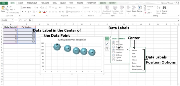
Using Aesthetic Data Labels
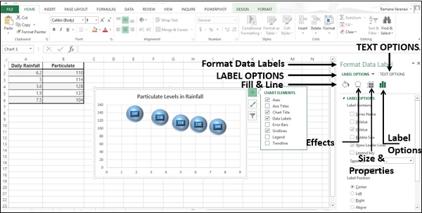
You can have aesthetic and meaningful Data Labels.
You can place Data Labels at any position with respect to the data points.
You can format Data Labels with various options, including effects.
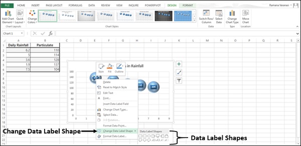
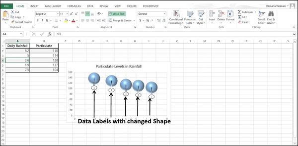
You can change Data Labels to any shape.
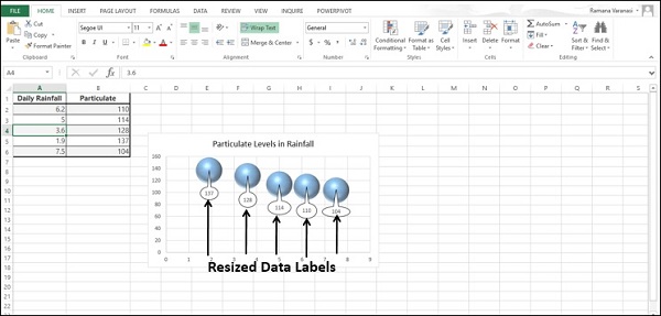
Data Labels can be of different sizes. You can resize each Data label so that the text in it would be visible.
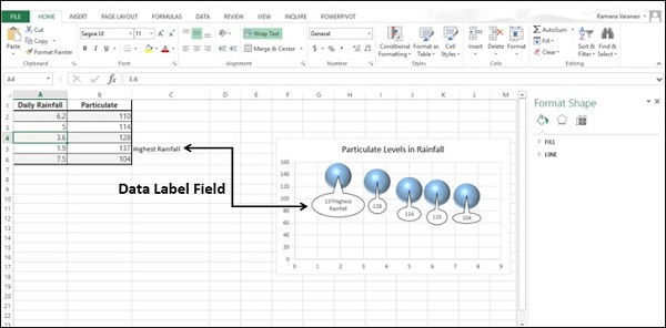
You can include text from data points or any other text for any of the Data Labels so as to make them refreshable and thus dynamic.
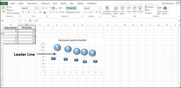
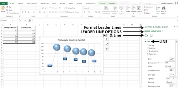
You can connect Data Labels to their data points with Leader Lines.
You can place Data Labels with Leader Lines at any distance from the data points by moving them.
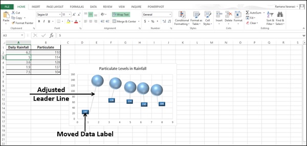
You can format Leader Line to make them conspicuous.
You can choose any of these options to display the Data Labels on the chart based on your data and what you want to highlight.
Data Labels stay in place, even when you switch to a different type of chart. But, finalize the chart type before formatting any chart elements, including Data Labels.
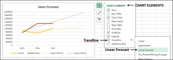
Using Trendlines in Charts
You can depict forecast of the results in a chart using Trendlines.
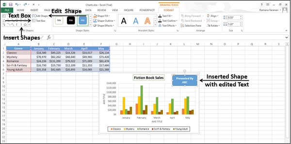
Using Shapes in Charts
You can insert different types of Shapes in your chart. After you insert a Shape, you can add Text to it, with Edit Text. You can Edit Shape with Change Shape and/or Edit Points.
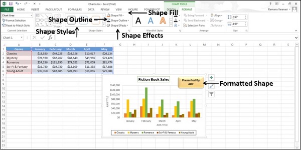
You can change the Style of the Shape, choose a Shape Fill Color, Format Shape Outline and add Visual Effects to the Shape.
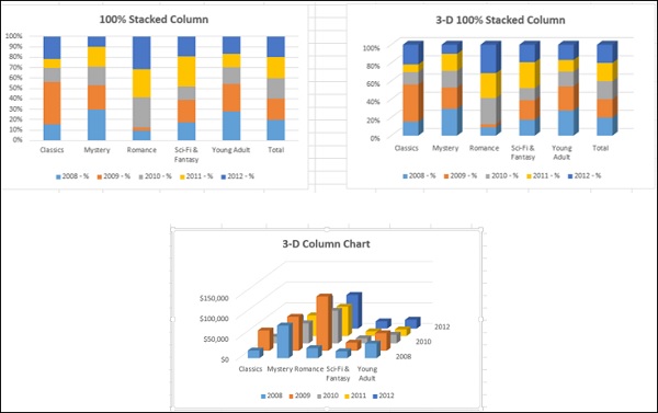
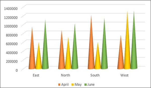
Using Cylinders, Cones, and Pyramids
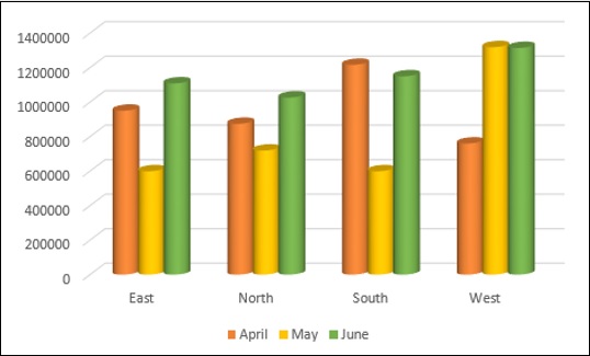
In 3-D Column charts, by default, you will have boxes.
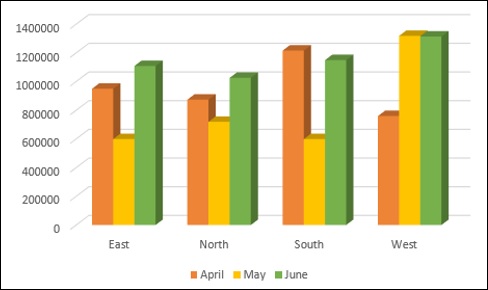
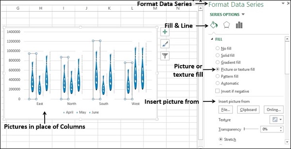
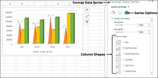
To make your charts more conspicuous in dashboards, you can choose other 3-D column shapes like cylinders, cones, pyramids, etc. You can select these shapes in the Format Data Series pane.
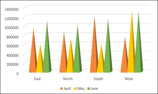
Columns with Pyramid shape
Columns with Cylinder shape
Columns with Cone shape
Using Pictures in Charts
You can create more emphasis on your data presentation by using a Picture in place of Columns.