- Excel Dashboards - Home
- Introduction
- Excel Features Create Dashboards
- Conditional Formatting
- Excel Charts
- Interactive Controls
- Advanced Excel Charts
- Excel PivotTables
- Power PivotTables & PivotCharts
- Power View Reports
- Key Performance Indicators
- Build a Dashboard
- Examples
Excel Dashboards - PivotTables
If you have your data in a single Excel table, you can summarize the data in the way that is required using Excel PivotTables. A PivotTable is an extremely powerful tool that you can use to slice and dice data. You can track, analyze hundreds of thousands of data points with a compact table that can be changed dynamically to enable you to find the different perspectives of the data. It is a simple tool to use, yet powerful.
Excel gives you a more powerful way of creating a PivotTable from multiple tables, different data sources and external data sources. It is named as Power PivotTable that works on its database known as Data Model. You will get to know about Power PivotTable and other Excel power tools such as Power PivotChart and Power View Reports in other chapters.
PivotTables, Power PivotTables, Power PivotCharts and Power View Reports come handy to display summarized results from big data sets on your dashboard. You can get mastery on the normal PivotTable before you venture into the power tools.
Creating a PivotTable
You can create a PivotTable either from a range of data or from an Excel table. In both the cases, the first row of the data should contain the headers for the columns.
You can start with an empty PivotTable and construct it from scratch or make use of Excel Recommended PivotTables command to preview the possible customized PivotTables for your data and choose one that suits your purpose. In either case, you can modify a PivotTable on the fly to get insights into the different aspects of the data at hand.
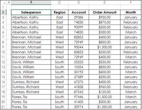
Consider the following data range that contains the sales data for each Salesperson, in each Region and in the months of January, February and March −
To create a PivotTable from this data range, do the following −
Ensure that the first row has headers. You need headers because they will be the field names in your PivotTable.
Name the data range as SalesData_Range.
Click on the data range − SalesData_Range.
Click on the INSERT tab on the Ribbon.
Click on PivotTable in the Tables group.
Create PivotTable dialog box appears.
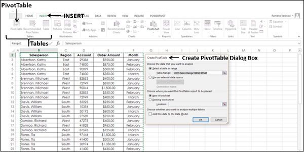
As you can observe, in Create PivotTable dialog box, under Choose the data that you want to analyze, you can either select a Table or Range from the current workbook or use an external data source. Hence, you can use the same steps to create a PivotTable form either a Range or Table.
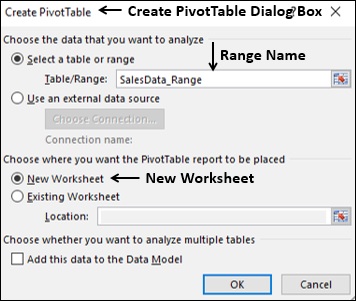
Click on Select a table or range.
In the Table/Range box, type the range name − SalesData_Range.
Click on New Worksheet under Choose where you want the PivotTable report to be placed.
You can also observe that you can choose to analyze multiple tables, by adding this data range to Data Model. Data Model is Excel Power Pivot database.
Click the OK button. A new worksheet will get inserted into your workbook. The new worksheet contains an empty PivotTable.
Name the worksheet − Range-PivotTable.
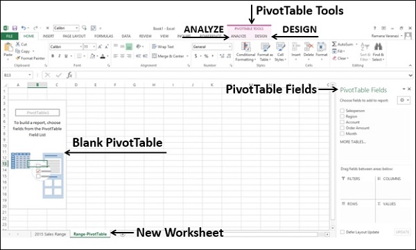
As you can observe, PivotTable Fields list appears on the right side of the worksheet, containing the header names of the columns in the data range. Further, on the Ribbon, PivotTable Tools − ANALYZE and DESIGN appear.
You need to select PivotTable fields based on what data you want to display. By placing the fields in appropriate areas, you can obtain the desired layout for the data. For example to summarize the order amount salesperson-wise for the months − January, February and March, you can do the following −
Click on the field Salesperson in the PivotTable Fields list and drag it to ROWS area.
Click on the field Month in the PivotTable Fields list and drag that also to ROWS area.
Click on Order Amount and drag it to ∑ VALUES area.
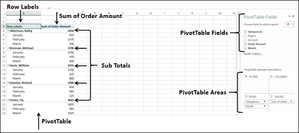
Your PivotTable is ready. You can change the layout of the PivotTable by just dragging the fields across the areas. You can select / deselect fields in the PivotTable Fields list to choose the data you want to display.
Filtering Data in PivotTable
If you are required to focus on a subset of your PivotTable data, you can filter the data in the PivotTable based on a subset of the values of one or more fields. For example in the above example, you can filter the data based on the Range field so that you can display data only for the selected Region(s).
There are several ways to filter data in a PivotTable −
- Filtering using Report Filters.
- Filtering using Slicers.
- Filtering data manually.
- Filtering using Label Filters.
- Filtering using Value Filters.
- Filtering using Date Filters.
- Filtering using Top 10 Filter.
- Filtering using Timeline.
You will get to know the usage of Report Filters in this section and Slicers in the next section. For other filtering options, refer to the Excel PivotTables tutorial.
You can assign a Filter to one of the fields so that you can dynamically change the PivotTable based on the values of that field.
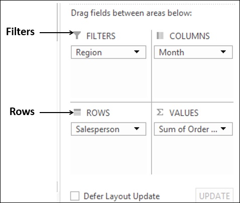
- Drag the field Region to FILTERS area.
- Drag the field Salesperson to ROWS area.
- Drag the field Month to COLUMNS area.
- Drag the field Order Amount to ∑ VALUES area.
The Filter with the label as Region appears above the PivotTable (in case you do not have empty rows above your PivotTable, PivotTable gets pushed down to make space for the Filter).
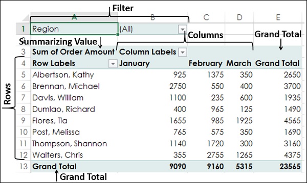
As you can observe,
Salesperson values appear in rows.
Month values appear in columns.
Region Filter appears on the top with default selected as ALL.
Summarizing value is Sum of Order Amount.
Sum of Order Amount Salesperson-wise appears in the column Grand Total.
Sum of Order Amount Month-wise appears in the row Grand Total.
Click on the arrow in the Region Filter.
Dropdown list with the values of the field Region appears.
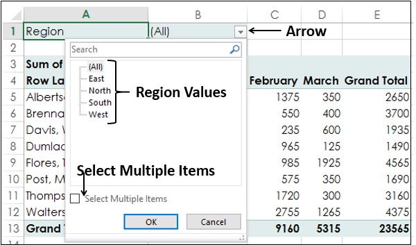
Check the box Select Multiple Items. Check boxes will appear for all the values. By default, all the boxes are checked.
Uncheck the box (All). All the boxes will get unchecked.
Check the boxes - South and West.
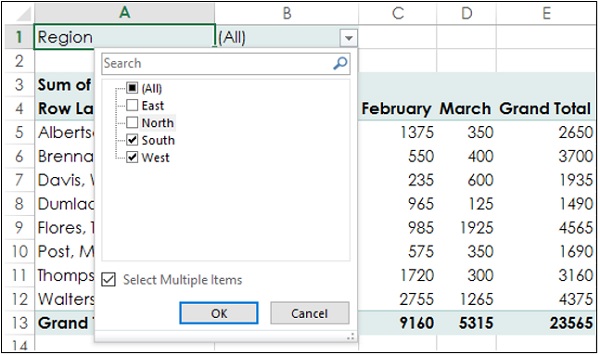
Click the OK button. Data pertaining to South and West regions only will get summarized.
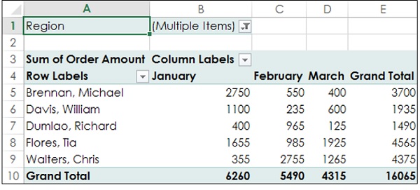
As you can observe, in the cell next to the Region Filter - (Multiple Items) is displayed, indicating that you have selected more than one value. But how many values and / or which values is not known from the report that is displayed. In such a case, using Slicers is a better option for filtering.
Using Slicers in PivotTable
Filtering using Slicers has many advantages −
You can have multiple Filters by selecting the fields for the Slicers.
You can visualize the fields on which the Filter is applied (one Slicer per field).
A Slicer will have buttons denoting the values of the field that it represents. You can click on the buttons of the Slicer to select/ unselect the values in the field.
You can visualize what values of a field are used in the Filter (selected buttons are highlighted in the Slicer).
You can use a common Slicer for multiple PivotTables and / or PivotCharts.
You can hide / unhide a Slicer.
To understand the usage of Slicers, consider the following PivotTable.
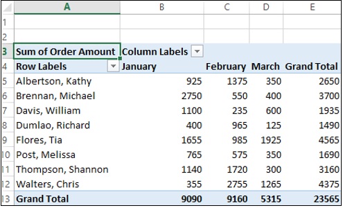
Suppose you want to filter this PivotTable based on the fields − Region and Month.
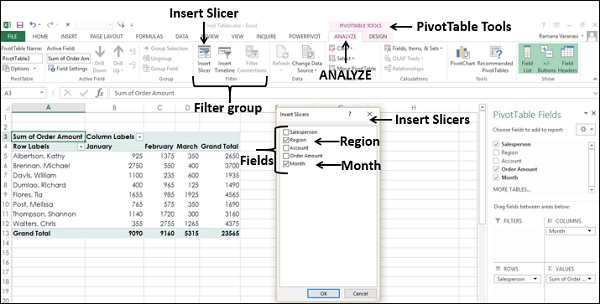
- Click on the ANALYZE tab under PIVOTTABLE TOOLS on the Ribbon.
- Click on Insert Slicer in the Filter group.
Insert Slicers dialog box appears. It contains all the fields from your data.
- Check the boxes Region and Month.
Click the OK button. Slicers for each of the selected fields appear with all the values selected by default. Slicer Tools appear on the Ribbon to work on the Slicer settings, look and feel.
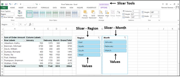
As you can observe, each Slicer has all the values of the field that it represents and the values are displayed as buttons. By default, all the values of a field are selected and hence all the buttons are highlighted.
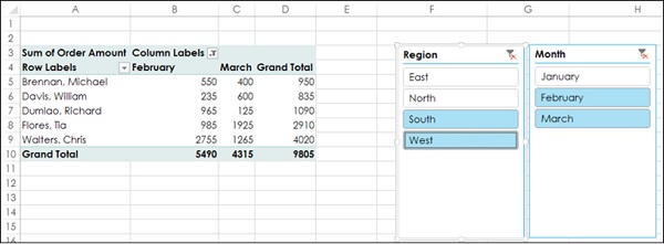
Suppose you want to display the PivotTable only for South and West regions and for the February and March months.
Click on South in the Region Slicer. Only South will be highlighted in the Slicer Region.
Keep Ctrl key pressed and click on West in the Region Slicer.
Click on February in the Month Slicer.
Keep Ctrl key pressed and click on March in the Month Slicer. Selected values in the Slicers are highlighted. PivotTable will be summarized for the selected values.
To add/remove values of a field from the filter, keep the Ctrl key pressed and click on those buttons in the respective Slicer.
