- Excel Dashboards - Home
- Introduction
- Excel Features Create Dashboards
- Conditional Formatting
- Excel Charts
- Interactive Controls
- Advanced Excel Charts
- Excel PivotTables
- Power PivotTables & PivotCharts
- Power View Reports
- Key Performance Indicators
- Build a Dashboard
- Examples
Excel Dashboards - Build a Dashboard
In the previous chapters, you have learnt about various Excel features that come handy in setting up your dashboard. In this chapter, you will learn how to build a dashboard, i.e., the steps that are required to get the dashboard in place. You will also get to know the dos and donts regarding dashboards.
As any dashboard is based on the specific intent of what the audience is most interested about, dashboard components and dashboard layout varies from case to case.
Initial Preparation
The first step in building a dashboard is the initial preparation. Take some time in understanding the following −
Why do you need the dashboard? − Is this dashboard for a specific task, like showing the status of a project, or does it need to achieve a broader goal, like measuring business performance? Understanding why you are building the dashboard will guide you in the design.
What purpose the dashboard will serve?− Your dashboard should highlight only the data that adds value. You should understand the data that is required. Anything outside that is unnecessary.
What is the source of data? − You should understand from where the data comes. It can just be an Excel worksheet or it can be through data connections to your Excel workbook from various dynamic data sources.
Who is the audience for the dashboard? − Is this for a manager, an executive, a stakeholder, an external vendor or general audience? Understand their requirements and preferences such as how much time do they have to look at the dashboard, the level of detail they expect and how they would like to digest the information. For example, while choosing a chart type, knowing the audience helps you to decide on whether you have to show relations between values or you have to draw a specific comparison.
Does the dashboard need to be static or dynamic? − Can the dashboard be updated periodically, say, weekly or monthly, or does it require to get updated to continuously streamline the data changes that happen at the backend? This choice will change the way you build the dashboard.
Does the dashboard need to be just a display or is it to be interactive? − Can the dashboard have read-only access or do you have to provide interactive controls / features that enable certain people to explore the data as required? This choice also will change the way you build the dashboard.
Once you have answers to these questions, decide on what Excel features you need and you dont need. This is because your goal and expertise is to produce an effective dashboard that suits the purpose.
Next, identify the components of the dashboard. These can be text, tables, charts, interactive controls, etc. Decide on the dashboard layout with these components.
Mockup your Excel dashboard on a PowerPoint slide. Draw boxes for each component to get a sense of the layout and add quick sketches of the components that you want to include. You can also do this on a piece of paper. Get approval for this mockup from the management and/or the key audience before you start working on the actual dashboard. This will save time on rework. However, it is quite possible that you might have to tweak in some changes to the dashboard as the dashboard gets into usage and you receive feedback. But, the approved dashboard mockup is a real good starting for your work.
Organize the Data Source for the Excel Dashboard
Before building the dashboard in Excel, you need to organize the data source. In Excel, this is possible in various ways −
If the data is just an Excel table, establish a link to your workbook from the workbook where the data will get updated.
If the data is from multiple Excel tables, or if it is from various data sources, it is a good option to build the Data Model in your workbook.
You can either import the data into the workbook periodically or establish data connections so as to refresh the data as when it gets updated, based on whether the dashboard has to be static or dynamic.
Set Up the Excel Dashboard Workbook
Once you have organized the data, you need to structure your workbook. Insert two to three worksheets in the workbook − one worksheet for your dashboard and one or two worksheets for the data (data or PivotTable/PivotCharts or Power View Reports, which you can hide). This will help you to organize and maintain your Excel workbook.
Prepare the Data for the Excel Dashboard
Based on the choices you have, i.e. the answers you have for the questions in the Initial Preparation step, prepare the data for the Excel dashboard. The data can be any of the following −
- Results from data analysis
- Results from data exploration
- Data resulting from computations on the input data
- Data summarization from PivotTables or PowerPivot Tables
Select the Dashboard Components
You have learnt about the various Excel features that you can use in a dashboard. Based on your requirements for the dashboard at hand, select any of the following Excel features for the dashboard components.
- Tables
- Sparklines
- Conditional Formatting.
- Charts
- Slicers
- Interactive Controls
- PivotTables
- PivotCharts
- PowerPivot Tables
- PowerPivot Charts
- Power View Reports
- KPIs
Selecting the dashboard components will help you to align to your approved dashboard mockup layout.
Identify the static and dynamic components and the components that are to be grouped for Slicers, if any.
Identify Parts of the Dashboard for Highlighting
Identify those parts of the dashboard that require immediate attention, such % Complete or the Current Status. You can use bigger font and a striking font and font color for these.
Decide on how much color you want to incorporate in your dashboard. This decision can be based on the audience for the dashboard. If the dashboard is for executives and/or managers, choose colors that impact the visualization of the results being displayed. You can add a dashboard background color to make the dashboard components pop. You can use the same color code for similar charts or related results. You can use conditional formatting too.
A careful selection of the parts of the dashboard for highlighting makes it effective.
Build the Dashboard
This is the crucial and final step in creating your Excel dashboard. This step involves assembling your dashboard components that you can efficiently and effectively do by using Excel camera. You will learn how to use Excel camera in the next section.
Once the dashboard components are assembled, give it a final touch −
- Give a title to the dashboard.
- Incorporate a timestamp.
- Include the copyright information, if required.
In the next few chapters, you will learn how to use these steps for creating a dashboard based on some examples. There is no universal rule or layout for a dashboard apart from some commonality. It all depends on your requirements. And your goal is to produce an effective dashboard.
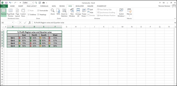
Using Excel Camera
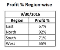
Excel camera helps you in capturing snapshots from your worksheets and place them in a different worksheet. For example, you can capture a table with conditional formatting on a worksheet and place it on your dashboard. Whenever the data gets updated, the dashboard will get refreshed to display the changed data.
You can include the Excel camera as part of your Quick Access Bar as follows −
- Right-click on the small arrow on the Quick Access Toolbar.
- Click on More Commands in the Customize Quick Access Toolbar list.
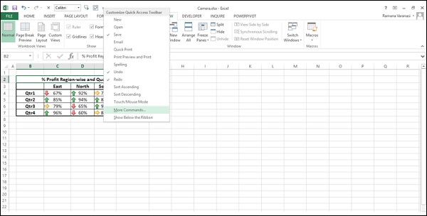
Excel Options dialog box appears.
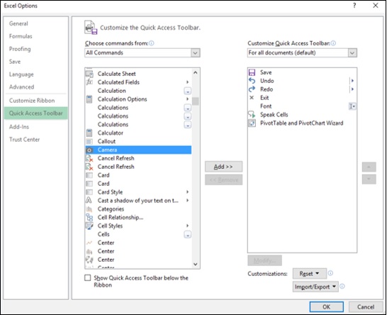
- Click on Quick Access Toolbar.
- Select All Commands under Choose commands from.
- Click on Camera in the commands list.
Click on the Add » button. Camera appears in the right side list.
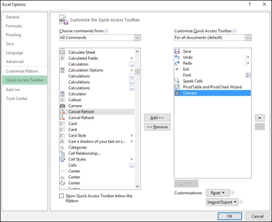
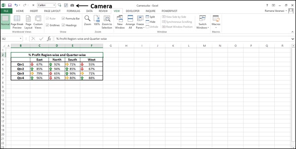
Click the OK button. The camera icon appears on the Quick Access Toolbar in your workbook.
You can use Excel camera as follows −
Select the range of cells to be captured.
Click on camera on the Quick Access Toolbar.
The range of cells appear with a dashed line border.
Click on the worksheet where you want to place the captured region. It can be your dashboard sheet.
Click at a position where you want to place it.
The captured region appears at that point.
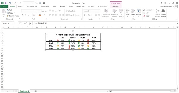
Whenever you make changes to the original data, the changes will get reflected in the dashboard.
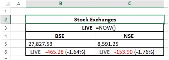
Date and Time Stamp on Excel Dashboard
You can incorporate a Date or Date and Time Stamp on your dashboard to display when the data was last update. You can do this using the Excel functions TODAY () and NOW ().
To incorporate a Date Stamp, enter =TODAY () in the cell where you want to place the Date Stamp on your data worksheet.
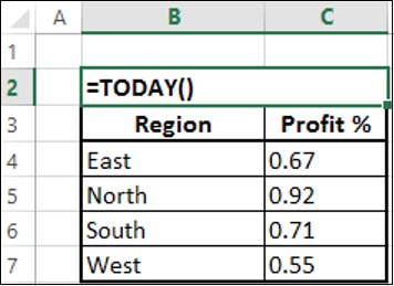
This will display the current date whenever the workbook is updated.
Ensure that the cell where you entered the TODAY () function is formatted to the Date format that you want to display.
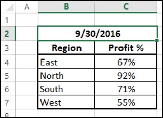
Capture the display with camera and place it on the dashboard.
The date on the dashboard will reflect the date when the workbook was last updated.
You can incorporate a Date and Timestamp on your dashboard in a similar way with the function NOW ().
Enter = NOW () in the cell where you want to place the Date and Time Stamp on your data worksheet.
- Ensure that you have the right format for Date and Time.
- Capture the display with camera and place it on the dashboard.
The date and time stamp will get incorporated on the dashboard and will reflect the date and time when the workbook was last updated.
Test, Sample, and Enhance the Dashboard
You need to test your dashboard to ensure that it displays the data accurately.
- Test it in various possible scenarios.
- Test for the precise updates (static or dynamic as is the case).
- Test the interactive controls, if any.
- Test the look and feel.
You might have to do some trial runs to ensure that your dashboard is as you wanted.
The next step is to get the dashboard evaluated by sample audience, especially those who approved your mockup dashboard. As they will be using the dashboard, they will undoubtedly have input as to its use and effectiveness. This feedback helps you to ensure that your dashboard is effective. Do not hesitate to ask for feedback.
Once you get the feedback, enhance it with required changes, if any. Your Excel dashboard is ready to use.
Share the Dashboard
You need to make the Excel dashboard available to the intended audience. You can do it in several ways.
Mail the Excel dashboard workbook (You have to hide the worksheets other than the dashboard worksheet. You can also protect the workbook.).
Save the Excel dashboard workbook on a shared network drive.
Share the dashboard online.
If the Excel dashboard is static you can mail it but if it is dynamic or has interactive controls, then it should have a connection to the backend data and hence requires sharing online.
You can share an Excel dashboard online with any of the following options −
Microsoft OneDrive.
With your Windows Live account, you will get access to OneDrive where you can post and share documents.
New Microsoft Office Online.
Microsoft SharePoint.
You can also save the Excel workbook file as an Acrobat Reader file (.pdf) and post it to web. But, once again this option is only for the static dashboards.
Tips for Effective Excel Dashboards
To make an Excel dashboard effective, you need to do certain things and avoid some. Some tips for effective Excel dashboards are as follows −
Keep it simple.
A simple, easy to understand dashboard is much more effective than a jazzy dashboard. Remember that it is the data that needs emphasis.
According to Glenna Shaw, you need to strike a balance between making your dashboard attractive enough to hold your audiences interest, but not so stylized that it obscures the information displayed.
Better avoid 3D effects, gradients, extra shapes and unnecessary gadgets.
If you can achieve emphatic display with conditional formatting or Sparklines, prefer using Tables to Charts.
Use Excel Conditional Formatting.
Use Excel Conditional Formatting that provides several options to automatically update based on the values in your table.
Select appropriate chart types.
Remember that there is no general rule for using a chart type. Sometimes conventional chart types like column chart, bar chart, doughnut chart, etc. convey the message emphatically more than the sophisticated charts that are coming into existence.
You can use Excel Recommend Charts command to initially evaluate the suitable chart types.
As you can change the chart type with a single Excel command − Change Chart Type, you can play around to visualize the display and choose the appropriate chart.
Use interactive controls.
Use interactive controls such as scroll bars, option (radio) buttons and check boxes that help the user easily and effectively visualize the different aspects of the data.
Use Excel Data Model for Big Data.
If you have large data sets from various data sources, you better use the Excel Data Model that can handle thousands of rows of data with memory optimization and can group data tables with relationships.
Choose appropriate colors.
Be careful in choosing the colors. Use the colors judicially to provide sufficient impact, but not override their purpose. Moreover, if the audience is likely to include color blind, restrain from using Red and Green colors. In such cases, though traffic light symbols sound effective for the data being displayed, they are not suitable for the dashboard. Use a gray scale instead.
Use Slicers.
Slicers are more effective than dropdown lists as they have a visual impact.
You can group charts, PivotTables, PivotCharts to use a common Slicer.
Group the Excel dashboard components together.
You can add visual interest to your dashboard by inserting a shape, such as a rectangle and placing your dashboard components that can be grouped on top of that shape. For example, if you are using a common Slicer, you can group all the dashboard components that share the Slicer.
Use Excel data hierarchies.
If your data has innate data hierarchies, define them in the Data Model and use them to interactively drill up and drill down the data.
Avoid crowded dashboard layout.
Remember that display of more information than that is necessary will overwhelm the audience and beat the focus on the actual purpose.
Do not include any data or chart in your dashboard, if you can do away with it.
This is an important checkpoint while testing your dashboard. Evaluate each dashboard component if is necessary and sufficient.
The dashboard components and the layout should support the single purpose of your dashboard.
