- Excel Dashboards - Home
- Introduction
- Excel Features Create Dashboards
- Conditional Formatting
- Excel Charts
- Interactive Controls
- Advanced Excel Charts
- Excel PivotTables
- Power PivotTables & PivotCharts
- Power View Reports
- Key Performance Indicators
- Build a Dashboard
- Examples
Excel Dashboards - Advanced Excel Charts
You are aware that charts are useful in conveying you data message visually. In addition to the chart types that are available in Excel, there are some widely used application charts that became popular. Some of these are also included in Excel 2016.
In case you are using Excel 2013 or earlier versions, please refer to the tutorial Advanced Excel Charts to learn about these charts and how to create them with the built-in chart types.
Types of Advanced Excel Charts
Following advanced Excel chart types will come handy to include in your dashboards −
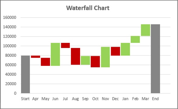
Waterfall Chart
Waterfall charts are ideal for showing how you have arrived at a net value such as net income, by breaking down the cumulative effect of positive and negative contributions.
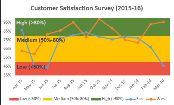
Band Chart
Band chart is suitable to represent data across a time period graphically, confiding each data point to a defined interval. For example, customer survey results of a product from different regions.
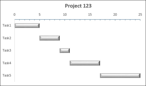
Gantt Chart
A Gantt chart is a chart in which a series of horizontal lines shows the amount of work done in certain periods of time in relation to the amount of work planned for those periods.
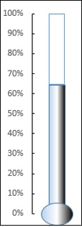
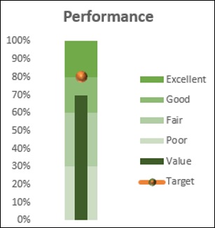
Thermometer Chart
When you have to represent a target value and an actual value, you can emphatically show these values with a Thermometer chart.
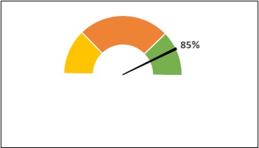
Gauge Chart
A Gauge Chart shows the minimum, the maximum and the current value depicting how far from the maximum you are.
Bullet Chart
Bullet chart can be used to compare a measure to one or more related measures and relate the measure to defined quantitative ranges that declare its qualitative state, for example, good, satisfactory and poor. You can use Bullet chart to display KPIs also.
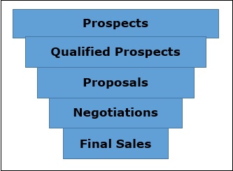
Funnel Chart
Funnel chart is used to visualize the progressive reduction of data as it passes from one phase to another. E.g. Sales Pipeline.
Waffle Chart
Waffle chart is a good choice to display work progress as percentage of completion, goal achieved vs Target, etc.
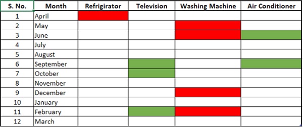
Heat Map
A Heat Map is a visual representation of data in a Table to highlight the data points of significance.
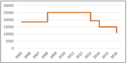
Step Chart
If you have to display the changes that occur at irregular intervals that remain constant between changes, Step chart is useful.
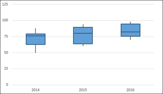
Box and Whisker Chart
Box and Whisker charts are commonly used in statistical analysis. For example, you can use a Box and Whisker chart to compare experimental results or competitive exam results.
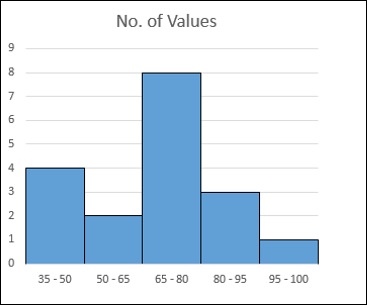
Histogram
A Histogram is a graphical representation of the distribution of numerical data and is widely used in Statistical Analysis.
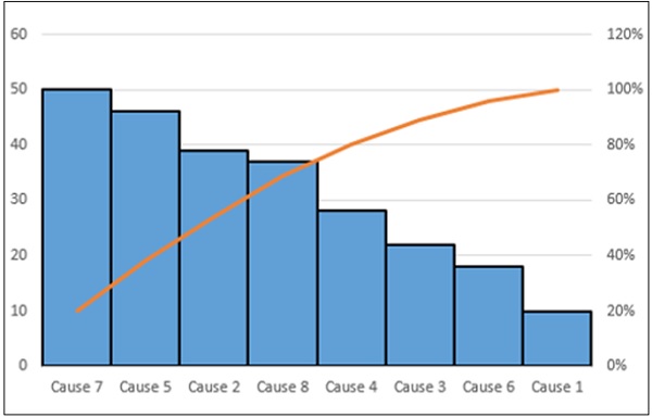
Pareto Chart
Pareto chart is another chart widely used in Statistical Analysis for decision making. It represents the Pareto analysis, also called 80/20 Rule, meaning that 80% of results are due to 20% of causes.
Displaying Quarterly Performance with Bullet Charts
Suppose you have to display the performance of the sales team quarterly on the dashboard. The data can be as given below.
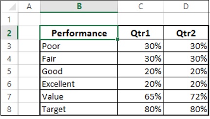
You can display this information on the dashboard using Bullet chart as follows −
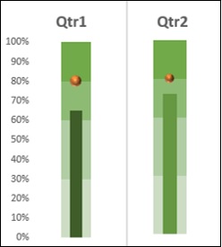
As you can observe, this occupies less space, yet conveys a lot of information.
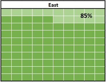
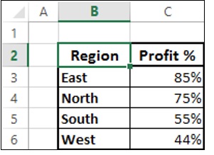
Displaying Profit % Region-Wise with Waffle Charts
Suppose you have to display the Profit % for the regions − East, North, South and West.
You can display this information emphatically on your dashboard with Waffle charts as shown below.
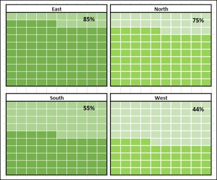
This display not only depicts the values, but also a good comparison.
