- Excel Dashboards - Home
- Introduction
- Excel Features Create Dashboards
- Conditional Formatting
- Excel Charts
- Interactive Controls
- Advanced Excel Charts
- Excel PivotTables
- Power PivotTables & PivotCharts
- Power View Reports
- Key Performance Indicators
- Build a Dashboard
- Examples
Excel Dashboards - Examples
There are several possible types of dashboards. There are no set of standards for dashboards, except for some dos and donts. You can understand the purpose and use your imagination to select the components and layout for your dashboard. However, you need to be on the same page with the viewers of the dashboard and hence their preferences are to be taken care to make it effective. A dashboard can get modified as the time proceeds based on the context and changing needs.
As you have learnt in the earlier sections, the purpose of a dashboard is to effectively display the necessary and sufficient data with added visual impact as required by the potential audience. The layout of the dashboard and its components vary across the different viewers based on their preferences.
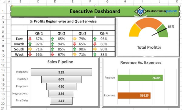
Example Executive Dashboard
In this chapter, you will learn about a sample Executive dashboard. Once again, this dashboard can vary from company to company based on the requirements and preferences.
Key Metrics
Executive dashboards normally focus on the business performance, revenue, profits, new customers, etc. Hence, Executive dashboards essentially display the KPIs. The visual impact necessary in this case would be to provide results at a glance, with not much detail as the executives will not normally have much time to dwell into the specifics unless it is absolutely necessary.
An executive can be a head of the company or head of a specific department in a large company. The head of a company can be a CEO (Chief Executive Officer) or a MD (Managing Director). The executive would be mostly interested at a brief of the operational KPIs of the departments and the performance of the company as a whole.
Department-wise Operational KPIs
Following are some examples of Departments and their operational KPIs −
- Finance
- Revenue
- Expenses
- Profits
- Sales
- Region-wise performance
- New Customers
- Human Resources (HR)
- Recruitments
- Attrition
Excel Dashboard Structure
For the display of the KPIs, most of the executives still prefer Gauge charts to Bullet charts. Ensure the preferences before you start designing the dashboard.
An example of a simple Excel Executive dashboard can be as shown below.
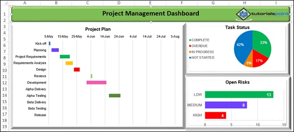
Example - Project Management Dashboard
The purpose of a Project Management dashboard is to provide the project execution status and the salient project features to be available at a snapshot. A project manager should use this portrayed data not only for project monitoring, but also for reporting to the top management and customer.
Key Metrics
The key metrics in project management would be the following −
- Task completion status
- Risks status
- Issues status
- Project budget vs. actuals
Components for Project Overview
To obtain a project snapshot, the major components that would be useful would be the following −
- Snapshot of the project plan
- Tasks status by percentages
- A glimpse of open risks
Excel Dashboard Structure
An example Excel project management dashboard looks as shown below.
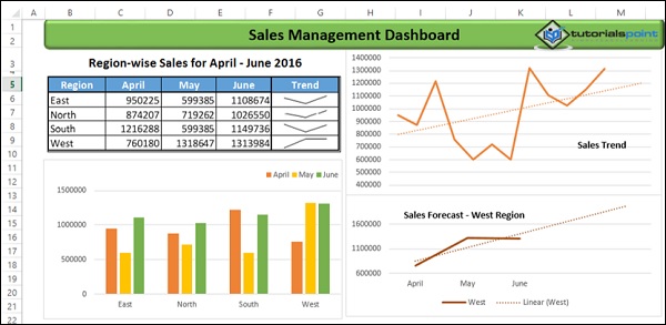
Example - Sales Management Dashboard
Sales management involves examining the data region wise and analyzing quarterly so as to get insights into the sales trend and sales forecasting. This would help in comparing the sales performance with the competitors, appraising the sales team, identifying potential strengths and weaknesses and planning for the future.
Key Metrics
The Key Metrics involved in the Sales Management are the following −
- Total Sales Region-wise and Month-wise
- Sales trend over the quarter
- Sales forecasts
Components for Sales Management
To represent the above given Metrics in a dashboard, the following Excel features can be used −
- Excel Table to display the Sales Values and Trends (Sparklines).
- Sales with Clustered Column chart.
- Sales trend with a Line chart and Trendline - Linear.
- Sales forecast with a Line chart and Trendline Linear Forecast.
Excel Dashboard Structure
A sample sales management dashboard will be as shown below −
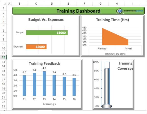
Example Training Management Dashboard
Training Management would normally be interested to have an overview the money spent and training coverage, so as to compare with the competitors. In addition to this, the training feedback given by the trainees would help the management to decide on where to leverage the training resources.
Key Metrics
The key metrics in the training management would be the following −
Budget vs. Expenses.
Training Time Planned vs. Actual.
Training Coverage No. of People Targeted vs. No. of People Actually trained. This can be expressed as a percentage.
Training Feedback For each of the trainings conducted, the average feedback from the trainees, in the scale 1 5 (1 Lowest, 5 Highest).
Components for Training Management Dashboard
You can choose the following Excel features as components for the dashboard, based on the above given metrics.
Clustered Bar chart for Budget vs. Expenses.
Area Chart for Planned vs. Actual time for training.
Thermometer chart for Training Coverage as a % actual as compared to target as 100%.
Clustered Column chart for Training Feedback for the trainings conducted.
Excel Dashboard Structure
A sample Training Management Excel dashboard can be as shown below −
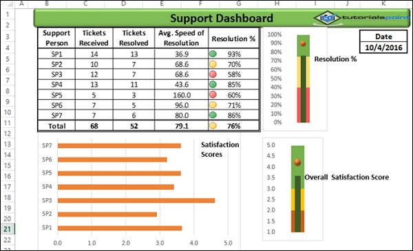
Example Service Management / Support Dashboard
Service Management or Support or Help Desk involves receiving service tickets and providing resolution as soon as possible. Hence, a dashboard updated daily would help to enhance the service management and thus improve customer satisfaction.
Key Metrics
Key Metrics for service management would be the following −
- No. of Tickets received support person-wise.
- No. of Tickets resolved support person-wise
- Avg. Speed of Resolution support person-wise assuming 8-hours work.
- Resolution % - support person-wise.
- Total No. of Tickets received and Total No. of Tickets resolved.
- Resolution %.
- Avg. Satisfaction Scores received - support person-wise.
- Overall Satisfaction Score.
Components for Service Management Dashboard
The Excel features that can be used to represent the above given Metrics as components of a dashboard would be the following −
- Excel Table for 1 5 with Conditional Formatting applied to 5.
- Bullet chart for 6.
- Clustered Bar chart for 7.
- Bullet chart for 8.
Additionally, you can include the date that corresponds to the data on the dashboard, with the Excel function - TODAY ().
Excel Dashboard Structure
A sample service management dashboard can be as shown below −
Dashboards - More Example
Dashboard can literally be used to display any results that require attention. The examples that you had seen in the previous chapters are only a hand pick of various applications where dashboards are being used. Further, the dashboard components and dashboard layout for the same purpose also can vary based on the user preferences. Hence there are no standard dashboard formats.
In this chapter, you will have a brief on some more areas where dashboards are being used. You can use your own imagination for a dashboard based on the data you have and the purpose it has to serve.
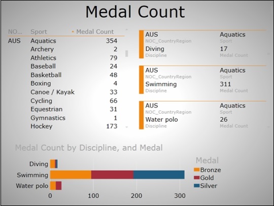
Olympics Dashboard
You can have a dashboard displaying the data analysis results of the Olympics data. Following is a sample dashboard that is created from 35000+ rows of data using Excel Data Model and Excel Power View.
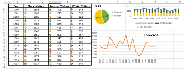
Tourism Dashboard
A sample tourism dashboard regarding the number of visitors to a specific site can be as shown below.
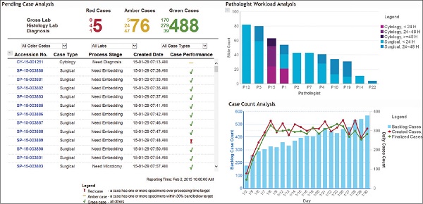
Hospital Management Dashboard
A hospital management dashboard is a form of executive dashboard with the level of detail as required by the specific manager. A sample used in a hospital is as given below.
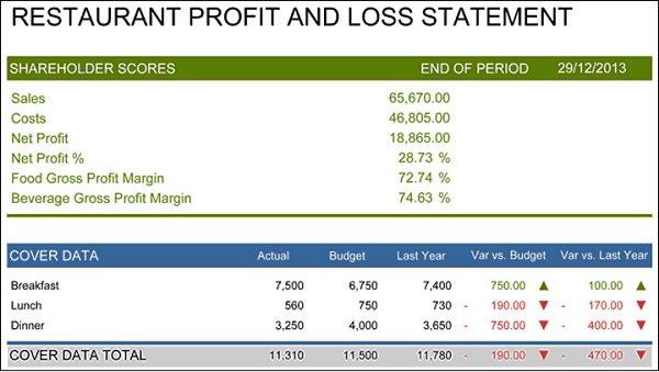
Restaurant Dashboard
A sample dashboard that is used in a restaurant is as shown below.
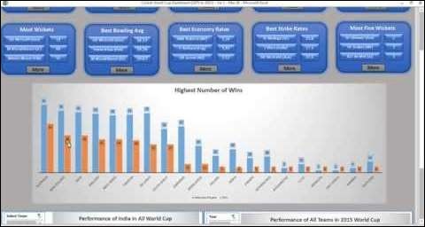
Sports Dashboard
Sports arena is the most sought-after place for dashboards. Every sport will have a live dashboard displaying the required statistics for the game that is on. A sample dashboard is as shown below.