- Excel Dashboards - Home
- Introduction
- Excel Features Create Dashboards
- Conditional Formatting
- Excel Charts
- Interactive Controls
- Advanced Excel Charts
- Excel PivotTables
- Power PivotTables & PivotCharts
- Power View Reports
- Key Performance Indicators
- Build a Dashboard
- Examples
Power PivotTables & Power PivotCharts
When your data sets are big, you can use Excel Power Pivot that can handle hundreds of millions of rows of data. The data can be in external data sources and Excel Power Pivot builds a Data Model that works on a memory optimization mode. You can perform the calculations, analyze the data and arrive at a report to draw conclusions and decisions. The report can be either as a Power PivotTable or Power PivotChart or a combination of both.
You can utilize Power Pivot as an ad hoc reporting and analytics solution. Thus, it would be possible for a person with hands-on experience with Excel to perform the high-end data analysis and decision making in a matter of few minutes and are a great asset to be included in the dashboards.
Uses of Power Pivot
You can use Power Pivot for the following −
- To perform powerful data analysis and create sophisticated Data Models.
- To mash-up large volumes of data from several different sources quickly.
- To perform information analysis and share the insights interactively.
- To create Key Performance Indicators (KPIs).
- To create Power PivotTables.
- To create Power PivotCharts.
Differences between PivotTable and Power PivotTable
Power PivotTable resembles PivotTable in its layout, with the following differences −
PivotTable is based on Excel tables, whereas Power PivotTable is based on data tables that are part of Data Model.
PivotTable is based on a single Excel table or data range, whereas Power PivotTable can be based on multiple data tables, provided they are added to Data Model.
PivotTable is created from Excel window, whereas Power PivotTable is created from PowerPivot window.
Creating a Power PivotTable
Suppose you have two data tables Salesperson and Sales in the Data Model. To create a Power PivotTable from these two data tables, proceed as follows −
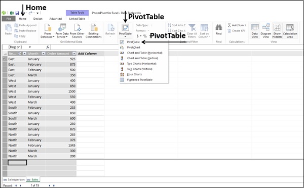
Click on the Home tab on the Ribbon in PowerPivot window.
Click on PivotTable on the Ribbon.
Click on PivotTable in the dropdown list.
Create PivotTable dialog box appears. Click on New Worksheet.
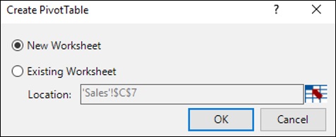
Click the OK button. New worksheet gets created in Excel window and an empty Power PivotTable appears.
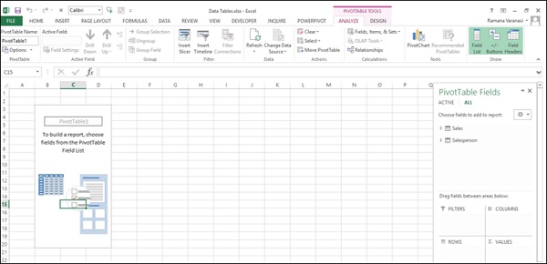
As you can observe, the layout of the Power PivotTable is similar to that of PivotTable.
The PivotTable Fields List appears on the right side of the worksheet. Here, you will find some differences from PivotTable. The Power PivotTable Fields list has two tabs − ACTIVE and ALL, that appear below the title and above the fields list. ALL tab is highlighted. The ALL tab displays all the data tables in the Data Model and ACTIVE tab displays all the data tables that are chosen for the Power PivotTable at hand.
Click the table names in the PivotTable Fields list under ALL.
The corresponding fields with check boxes will appear.
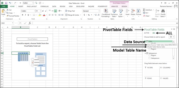
Each table name will have the symbol
 on the left side.
If you place the cursor on this symbol, the Data Source and the Model Table Name of that data table will be displayed.
- Drag Salesperson from Salesperson table to ROWS area.
- Click on the ACTIVE tab.
The field Salesperson appears in the Power PivotTable and the table Salesperson appears under ACTIVE tab.
- Click on the ALL tab.
- Click on Month and Order Amount in the Sales table.
- Click on the ACTIVE tab.
Both the tables Sales and Salesperson appear under the ACTIVE tab.
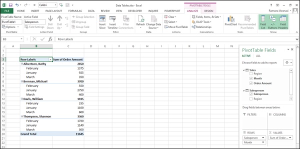
- Drag Month to COLUMNS area.
- Drag Region to FILTERS area.
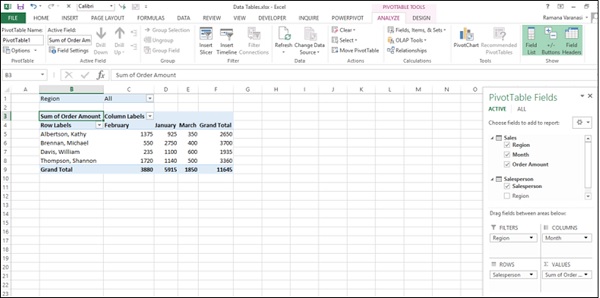
- Click on arrow next to ALL in the Region filter box.
- Click on Select Multiple Items.
- Click on North and South.
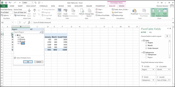
- Click the OK button. Sort the column labels in the ascending order.
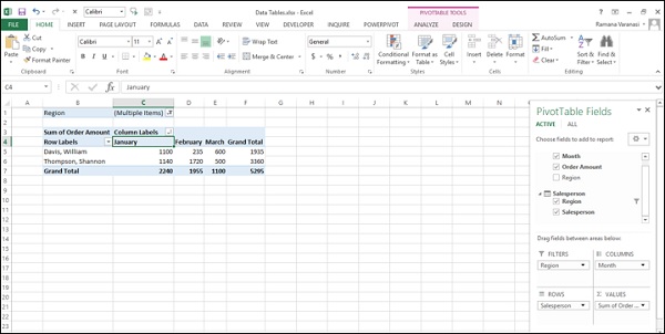
Power PivotTable can be modified dynamically to explore and report data.
Creating a Power PivotChart
A Power PivotChart is a PivotChart that is based on Data Model and created from the Power Pivot window. Though it has some features similar to Excel PivotChart, there are other features that make it more powerful.
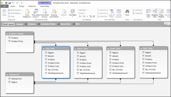
Suppose you want to create a Power PivotChart based on the following Data Model.
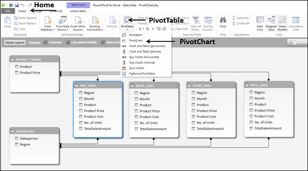
- Click on the Home tab on the Ribbon in the Power Pivot window.
- Click on PivotTable.
- Click on PivotChart in the dropdown list.
Create PivotChart dialog box appears. Click New Worksheet.
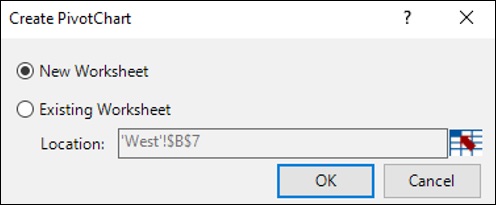
Click the OK button. An empty PivotChart gets created on a new worksheet in the Excel window. In this chapter, when we say PivotChart, we are referring to Power PivotChart.
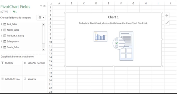
As you can observe, all the tables in the data model are displayed in the PivotChart Fields list.
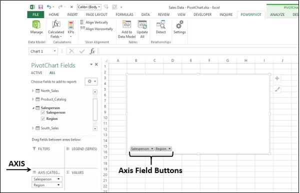
- Click on the Salesperson table in the PivotChart Fields list.
- Drag the fields Salesperson and Region to AXIS area.
Two field buttons for the two selected fields appear on the PivotChart. These are the Axis field buttons. The use of field buttons is to filter data that is displayed on the PivotChart.
Drag TotalSalesAmount from each of the 4 tables East_Sales, North_Sales, South_Sales and West_Sales to ∑ VALUES area.
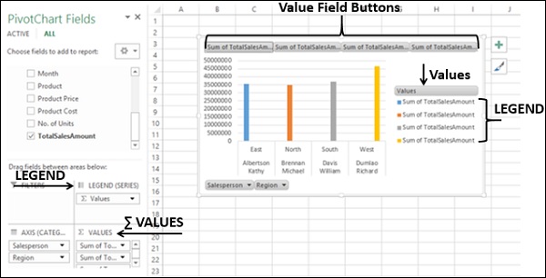
As you can observe, the following appear on the worksheet −
- In the PivotChart, column chart is displayed by default.
- In the LEGEND area, ∑ VALUES gets added.
- The Values appear in the Legend in the PivotChart, with title Values.
- The Value Field Buttons appear on the PivotChart.
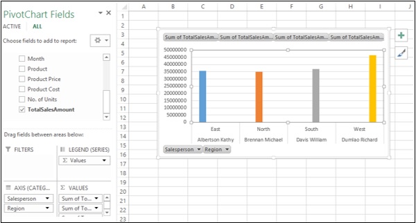
You can remove the legend and the value field buttons for a tidier look of the PivotChart.
Click on the
 button at the top right corner of the PivotChart.
Deselect Legend in the Chart Elements.
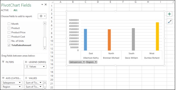
Right click on the value field buttons.
Click on Hide Value Field Buttons on Chart in the dropdown list.
The value field buttons on the chart will be hidden.
Note that display of Field Buttons and/or Legend depends on the context of the PivotChart. You need to decide what is required to be displayed.
As in the case of Power PivotTable, Power PivotChart Fields list also contains two tabs − ACTIVE and ALL. Further, there are 4 areas −
- AXIS (Categories)
- LEGEND (Series)
- ∑ VALUES
- FILTERS
As you can observe, Legend gets populated with Values. Further, Field Buttons get added to the PivotChart for the ease of filtering the data that is being displayed. You can click on the arrow on a Field Button and select/deselect values to be displayed in the Power PivotChart.
Table and Chart Combinations
Power Pivot provides you with different combinations of Power PivotTable and Power PivotChart for data exploration, visualization and reporting.
Consider the following Data Model in Power Pivot that we will use for illustrations −
You can have the following Table and Chart Combinations in Power Pivot.
Chart and Table (Horizontal) - you can create a Power PivotChart and a Power PivotTable, one next to another horizontally in the same worksheet.
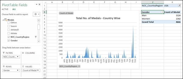
Chart and Table (Vertical) - you can create a Power PivotChart and a Power PivotTable, one below another vertically in the same worksheet.
These combinations and some more are available in the dropdown list that appears when you click on PivotTable on the Ribbon in the Power Pivot window.
Hierarchies in Power Pivot
You can use Hierarchies in Power Pivot to make calculations and to drill up and drill down the nested data.
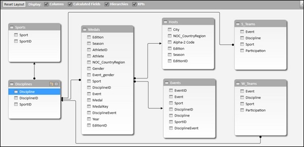
Consider the following Data Model for illustrations in this chapter.
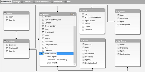
You can create Hierarchies in the diagram view of the Data Model, but based on a single data table only.
Click on the columns Sport, DisciplineID and Event in the data table Medal in that order. Remember that the order is important to create a meaningful hierarchy.
Right-click on the selection.
Click on Create Hierarchy in the dropdown list.
The hierarchy field with the three selected fields as the child levels gets created.
- Right-click on the hierarchy name.
- Click on Rename in the dropdown list.
- Type a meaningful name, say, EventHierarchy.
You can create a Power PivotTable using the hierarchy that you created in the Data Model.
- Create a Power PivotTable.
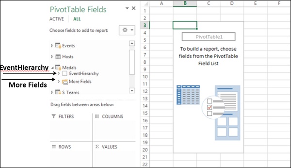
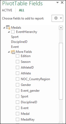
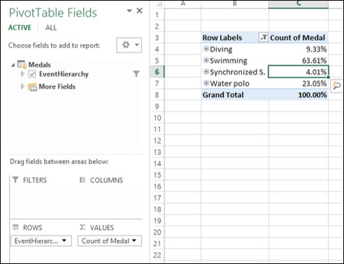
As you can observe, in the PivotTable Fields list, EventHierarchy appears as a field in Medals table. The other fields in the Medals table are collapsed and shown as More Fields.
- Click on the arrow
 in front of EventHierarchy.
 - Click on the arrow in front of More Fields.
The fields under EventHierarchy will be displayed. All the fields in the Medals table will be displayed under More Fields.
Add fields to the Power PivotTable as follows -
- Drag EventHierarchy to ROWS area.
- Drag Medal to ∑ VALUES area.
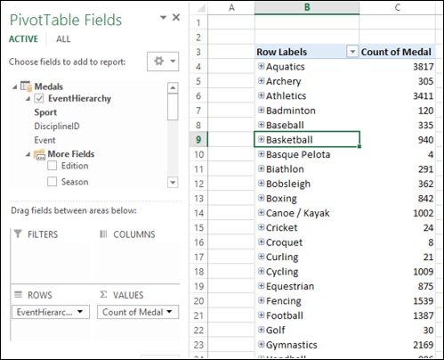
As you can observe, the values of Sport field appear in the Power PivotTable with a + sign in front of them. The medal count for each sport is displayed.
Click on the + sign before Aquatics. The DisciplineID field values under Aquatics will be displayed.
Click on the child D22 that appears. The Event field values under D22 will be displayed.
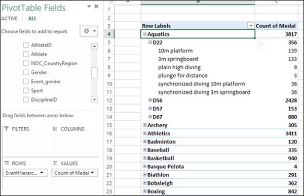
As you can observe, medal count is given for the Events, that get summed up at the parent level DisciplineID, that get further summed up at the parent level Sport.
Calculations Using Hierarchy in Power PivotTables
You can create calculations using a hierarchy in a Power PivotTable. For example in the EventsHierarchy, you can display the no. of medals at a child level as a percentage of the no. of medals at its parent level as follows
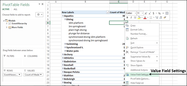
- Right-click on a Count of Medal value of an Event.
- Click on Value Field Settings in the dropdown list.
Value Field Settings dialog box appears.
- Click on Show Values As tab.
- Click on the box Show values as.
- Click on % of Parent Row Total.
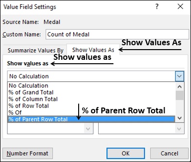
- Click the OK button.
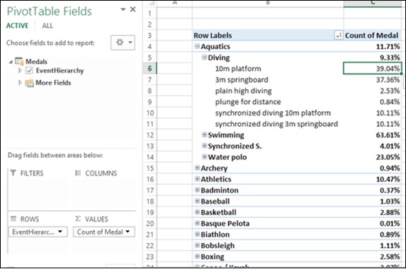
As you can observe, the child levels are displayed as the percentage of the Parent Totals. You can verify this by summing up the percentage values of the child level of a parent. The sum would be 100%.
Drilling Up and Drilling Down a Hierarchy
You can quickly drill up and drill down across the levels in a hierarchy in a Power PivotTable using Quick Explore tool.
Click on a value of Event field in the Power PivotTable.
Click on the Quick Explore tool -
 that appears at the bottom right corner of the cell containing the selected value.
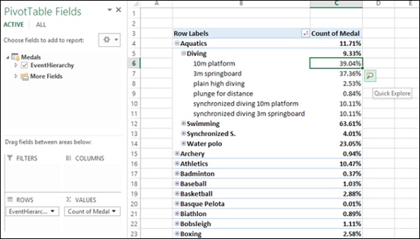
EXPLORE box with Drill Up option appears. This is because from Event you can only drill up as there are no child levels under it.
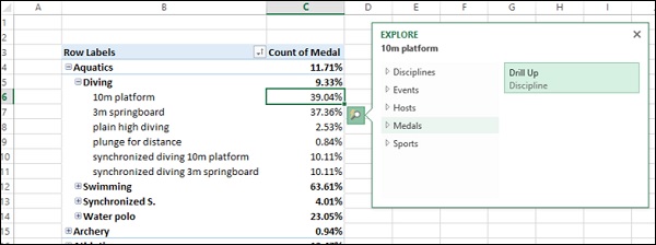
Click on Drill Up. Power PivotTable data gets drilled up to Discipline level.
Click on the Quick Explore tool -
that appears at the bottom right corner of the cell containing a value.
EXPLORE box appears with Drill Up and Drill Down options displayed. This is because from Discipline you can drill up to Sport or drill down to Event levels.
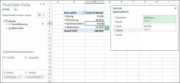
This way you can quickly move up and down the hierarchy in a Power PivotTable.
Using a Common Slicer
You can insert Slicers and share them across the Power PivotTables and Power PivotCharts.
Create a Power PivotChart and Power PivotTable next to each other horizontally.
Click on Power PivotChart.
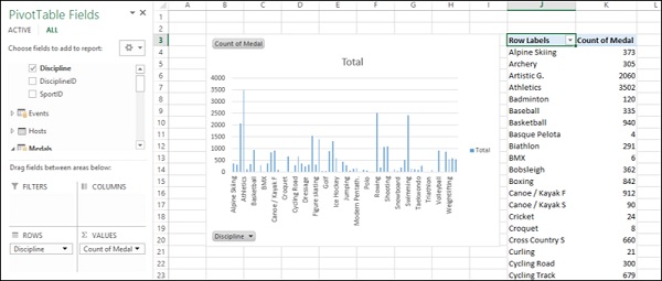
Drag Discipline from Disciplines table to AXIS area.
Drag Medal from Medals table to ∑ VALUES area.
Click on Power PivotTable.
Drag Discipline from Disciplines table to ROWS area.
Drag Medal from Medals table to ∑ VALUES area.
- Click on ANALYZE tab in PIVOTTABLE TOOLS on the Ribbon.
- Click on Insert Slicer.
Insert Slicers dialog box appears.
- Click on NOC_CountryRegion and Sport in Medals table.
- Click on OK.
Two Slicers NOC_CountryRegion and Sport appear.
Arrange and size them to align properly next to the Power PivotTable as shown below.
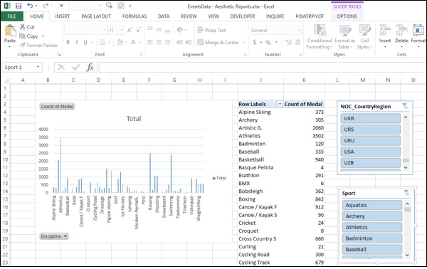
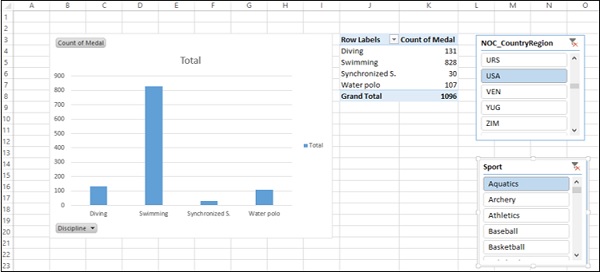
- Click on USA in the NOC_CountryRegion Slicer.
- Click on Aquatics in the Sport Slicer.
The Power PivotTable gets filtered to the selected values.
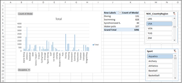
As you can observe, the Power PivotChart is not filtered. To filter Power PivotChart with the same filters, you can use the same Slicers that you have used for the Power PivotTable.
- Click on NOC_CountryRegion Slicer.
- Click on the OPTIONS tab in SLICER TOOLS on the Ribbon.
- Click on Report Connections in the Slicer group.
Report Connections dialog box appears for the NOC_CountryRegion Slicer.
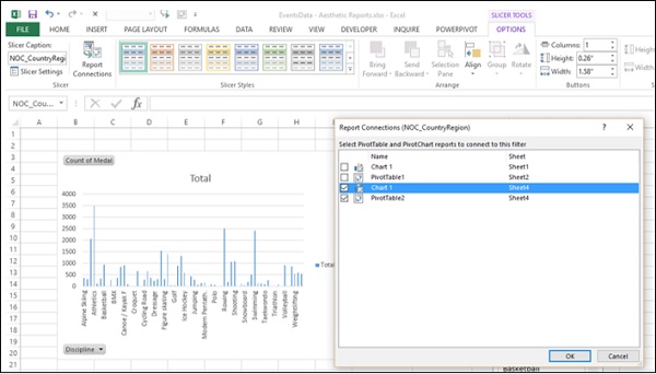
As you can observe, all the Power PivotTables and Power PivotCharts in the workbook are listed in the dialog box.
Click on the Power PivotChart that is in the same worksheet as the selected Power PivotTable.
Click the OK button.
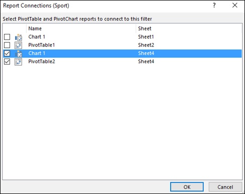
Repeat for Sport Slicer.
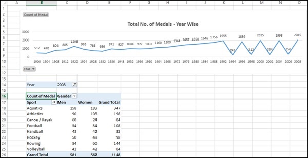
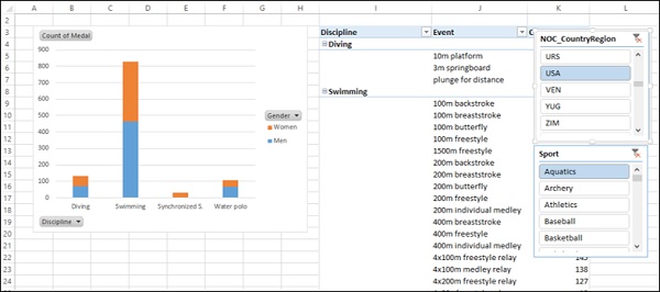
The Power PivotChart also gets filtered to the values selected in the two Slicers.
Next, you can add more detail to the Power PivotChart and Power PivotTable.
- Click on the Power PivotChart.
- Drag Gender to LEGEND area.
- Right click on the Power PivotChart.
- Click on Change Chart Type.
- Select Stacked Column in the Change Chart Type dialog box.
- Click on the Power PivotTable.
- Drag Event to ROWS area.
- Click on the DESIGN tab in PIVOTTABLE TOOLS on the Ribbon.
- Click on Report Layout.
- Click on Outline Form in the dropdown list.
Aesthetic Reports for Dashboards
You can create aesthetic reports with Power PivotTables and Power PivotCharts and include them in dashboards. As you have seen in the previous section, you can use Report Layout options to choose the look and feel of the reports. For example with the option - Show in Outline Form and with Banded Rows selected, you will get the report as shown below.
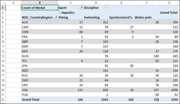
As you can observe, the field names appear in place of Row Labels and Column Labels and the report looks self-explanatory.
You can select the objects that you want to display in the final report in the Selection pane. For example, if you do not want to display the Slicers that you created and used, you can just hide them by deselecting them in the Selection pane.
